Collection · 100 studies

Claude Opus 5.5 100 HTML Files

One hundred self-contained pages made with Claude Opus 5.5: generative art, physics simulations, playable instruments and games, editorial layouts, dashboards and small tools. Each page was written individually as a single offline file, with every line of CSS and JavaScript inline and no fonts, images or libraries loaded from anywhere. Open any piece in a new tab, or expand a card to read the exact prompt that produced it.

100 studies
001

Aurora Glass — Stillwater

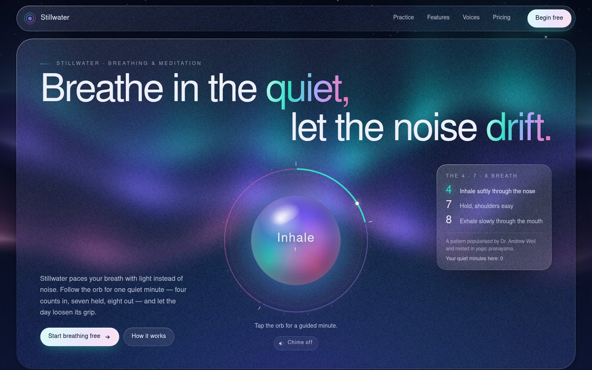
A landing page for "Stillwater", a fictional breathing and meditation app, built as refined glassmorphism over a living night sky. A full-viewport canvas paints a faint twinkling star field and three slow aurora curtains (teal #2de2c4, violet #7b5cff, rose #ff6fa8) on deep midnight #070b1f; everything else floats above it on frosted glass with grain and a hairline inner highlight. The hero is an editorial composition rather than a centred template: a huge, ultra-light two-line headline staggered left/right, a breathing orb centred beneath it on a 4-7-8 dial, the lede and calls to action anchored bottom-left, and a glass legend card top-right that lights up the current phase. Below: three tilting feature cards with small animated SVG vignettes, a glass testimonial strip with a drifting marquee, a pricing section with a sliding glass billing pill, and a footer that states plainly that the product and people are fictional.
Open
Original prompt
Design a premium landing page for "Stillwater", a fictional breathing and meditation app, in refined glassmorphism. Background: deep midnight (#070b1f) with three slow-drifting aurora ribbons rendered on a canvas (layered, sine-deformed gradient bands in teal #2de2c4, violet #7b5cff and rose #ff6fa8, additive blending, very soft) over a faint twinkling star field. Foreground: frosted-glass panels (backdrop-filter blur + saturate, 1px inner highlight border, subtle grain) — a hero with a large, airy, light-weight sans headline; a centred "breathing orb" that expands and contracts on a 4-7-8 rhythm with a caption that cross-fades Inhale / Hold / Exhale; a row of three feature cards; a testimonial strip; and a pricing section whose monthly/yearly toggle animates a sliding glass pill. Delight: cards tilt in 3D toward the pointer with a moving specular glare; the aurora bends gently toward the cursor. Interaction: hover/tilt cards; click the orb to start/stop a guided one-minute session with a progress ring; pricing toggle. Mobile: cards stack, the orb stays hero-centred.
002

Neon Rain

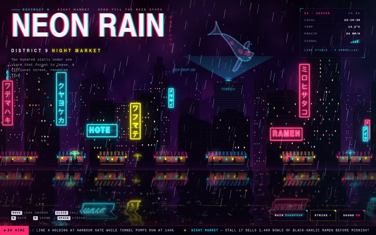
A full-viewport, live-rendered cyberpunk street at night in the fictional District 9 night market. Four parallax skylines step back from ink black (#05010f) to deep violet (#1a0433) against a smog-lit sky, with hundreds of windows that switch on and off over time. Hand-traced katakana-like neon signs hang off the near towers in hot magenta, cyan and acid yellow. They fail the way real neon fails: stutters, dropouts, brownouts and one dead glyph, and a HOTEL sign whose "L" stays dark, a joke the news ticker picks up. A wireframe holographic koi swims above Tower 61 inside a projector beam. Market stalls glow under striped awnings, steam rises from the stalls and pedestrians with glowing umbrella shafts walk the kerb. Everything is mirrored into a rain-rippled, blurred wet street, and dense diagonal rain splashes and rings across it. A thin monospace HUD, a condensed chromatic-aberration title and a scrolling fictional newswire complete the frame.

Open
Original prompt
Create an immersive cyberpunk street at night titled "NEON RAIN — District 9 Night Market" (fictional). A full-viewport canvas scene with four parallax layers of skyline silhouettes (#05010f → #1a0433) and randomly lit windows; holographic vertical signs with katakana-like glyphs drawn in canvas that flicker with believable neon failure (brief dropouts, buzz); a wet street reflecting the signs (mirrored, blurred, rippled); dense diagonal rain with splash particles on the ground. Palette: hot magenta #ff2a6d, cyan #05d9e8 and acid-yellow #f9f002 accents on ink black. Overlay a thin HUD: time, temperature, "SIGNAL" bars and a scrolling ticker of fictional news in monospace. Typography: condensed uppercase sans with chromatic-aberration text-shadow. Interaction: the pointer moves the parallax camera; a click triggers a lightning flash that briefly lights the whole skyline plus a thunder rumble (Web Audio noise, after a gesture, with a mute toggle); a toggle switches rain intensity. Must stay fluid at 60fps using pooled particles.
003

Raster — Swiss Poster Machine

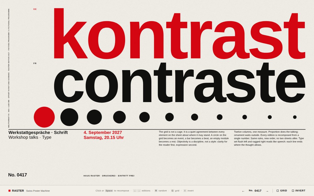
RASTER is a poster machine that sets one Weltformat-style sheet on off-white paper (#f2efe8) using only signal red #e30613, black #111 and white. The sheet is built on a live modular grid: 12 columns in landscape and 6 columns on portrait phones, with rows derived so that modules stay nearly square. Every composition comes from a four-digit edition number that doubles as the seed. It picks a zone split, where the display type sits beside or above a column of small type, and one of seven motifs: Zahl (a numeral as tall as the zone with an overprinted red sun), Drei Sprachen (one word stacked in German, French and Italian), Bogen (concentric quarter arcs in the manner of the Beethoven posters), Kreis (disc, moon and a word across the base), Takt (a time signature above bars), Senkrecht (a word climbing a strip beside a halftone field of dots) and Diagonale (a band of rotated bars). Small type is set flush left with its cap height hung from the grid line. It includes a bilingual headline, a red date (sometimes knocked out of a red panel), ragged body columns, an edition mark ("No. 0417") and a rotated imprint caption that says the programme is fictional.

Open
Original prompt
Build "RASTER — Swiss Poster Machine", an homage to the International Typographic Style. The page is a single poster on an off-white (#f2efe8) sheet set on a strict 12-column modular grid (revealable with the G key or a toggle that shows hairline cyan grid lines). Palette strictly signal red #e30613, black #111 and white. A heavy grotesque sans stack ("Helvetica Neue", Helvetica, Arial, "Nimbus Sans", sans-serif) used with extreme scale contrast: a giant numeral or word, small flush-left body text, rotated captions. Geometric elements (circles, bars, quarter-arcs) occupy grid cells. Every click (or Space) recomposes the poster from a new seed — elements slide and rotate to new cells with crisp eased FLIP-style transitions, never overlapping text illegibly. Show the seed as an edition mark ("No. 0417"). A small control strip: previous/next composition, grid toggle, invert (black ground). It must look like a museum-quality, Müller-Brockmann-inspired print at any viewport, reflowing the grid for portrait phones.
004

The Clockmaker's Orrery

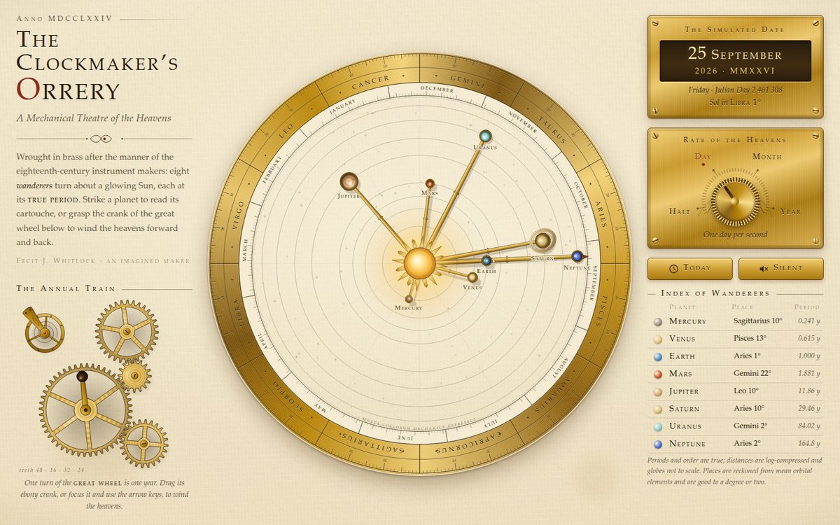
"The Clockmaker's Orrery" is an imagined 1774 brass instrument laid out as a museum plate on aged parchment: an engraved title and gear train on the left, the orrery itself filling the centre, and a column of screwed-down brass plates on the right. Eight painted globes ride on tapered brass arms around a glowing, slowly turning Sun. Each arm stands at its planet's real heliocentric longitude for the simulated date, reckoned from J2000 mean orbital elements plus the equation of the centre, and each moves at its true orbital period. Distances are log-compressed. Around the planets runs a silvered kalendar ring, with day ticks and month names placed where the Earth stands on each date, and a brass zodiac ring engraved with Latin sign names, degree ticks and numerals. A dotted index hand from the Earth arm points at today's date on that ring. The Earth carries a tiny Moon on its own sub-arm. In the corner, a hand-cranked annual gear train (48/16/32/24 teeth, phase-correct meshing) and an oscillating balance wheel turn with simulated time.

Open
Original prompt
Create "The Clockmaker's Orrery", an interactive mechanical model of the solar system in the style of an 18th-century brass instrument. Parchment background (#efe3c6 with a subtle radial vignette and paper fibres from layered gradients), deep ink lines (#2b1d0e), and brass/gold metallic gradients (#b8860b → #f3d27a → #7a5410) for arms, rings and gears. Centre: a glowing sun; eight planets on brass arms orbiting at correct relative orbital periods (Mercury 0.241 y … Neptune 164.8 y) with log-compressed distances; an engraved zodiac ring with degree ticks around the edge; interlocking gears in a corner that rotate in sync with simulated time. Typography: engraved-looking serif small caps ("Iowan Old Style", "Palatino Linotype", Palatino, "P052", Georgia, serif) with generous letter-spacing. UI: a brass-styled readout of the simulated date, a speed dial (pause, 1 day/s, 1 month/s, 1 year/s), and click-a-planet to open an ornate cartouche with its name, period and a short engraved description. Delight: optional tiny ticking sound (Web Audio, after a gesture) and hover glints on the brass. SVG for the instrument, requestAnimationFrame for motion.
005

Sumi — Ink in Water

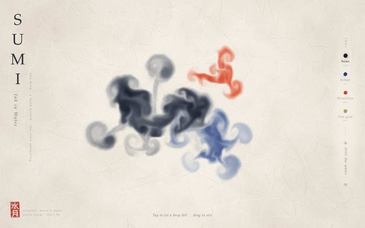
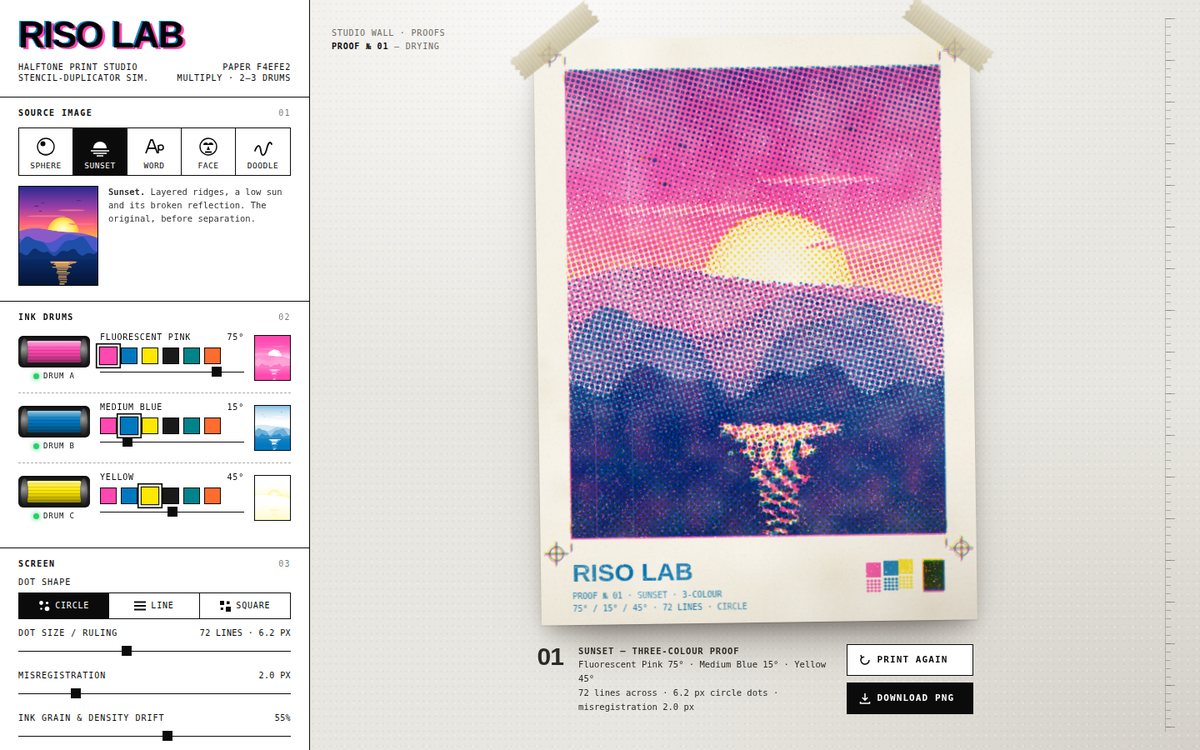
Sumi — Ink in Water is a quiet, full-screen ink painting that you make by letting drops fall into water over handmade washi. A small stable-fluids solver runs underneath. Each drop blooms as a feathered source whose ink thins as it empties, which leaves dark rims and paler centres. Its advancing front sheds irregular vortex pairs that curl into mushroom caps and smoke-like filaments. Dragging stirs the water, and a very slow divergence-free current keeps everything drifting gently. The ink is rendered as Beer–Lambert absorbance, multiplied over procedurally generated paper that has formation clouds, kozo fibres, bark flecks, grain and a deckle shadow, so overlapping colours mix the way pigments do. Thin tidelines form where a front thins out, and the paper keeps a faint stain of where the ink lingered. The page is framed like a hanging scroll. An upright vertical title "SUMI" sits over a sideways italic subtitle and a whispered verse. A carved red hanko reading 水月 (suigetsu, "moon in water") signs the lower-left corner beside a small colophon. A minimal serif toolbar on the right offers the four inks, "Still the water" and a sound toggle.

Open
Original prompt
Make "Sumi — Ink in Water", a meditative fluid simulation. A full-screen canvas showing warm washi paper (#f4efe6 with procedurally generated fibre noise). Clicking or tapping drops ink that blooms, curls and diffuses like sumi ink in water — implement a small grid-based stable-fluids solver (advection, diffusion, pressure projection) at reduced resolution with smooth upscaling, or an equivalent dye-advection approach; dragging the pointer stirs the water. Default ink is deep sumi black-indigo (#1b1f2a); a minimal vertical toolbar on the right, set in a quiet serif, switches to indigo (#2c3e75), vermillion (#d23c26) or pale gold (#b89b5e). A red hanko seal in the corner (SVG, carved-looking characters approximated with geometric strokes) signs the piece; a "Still the water" button slowly fades the ink away. Typography: an elegant vertical title using writing-mode: vertical-rl. Delight: an occasional falling ink droplet when idle; ink leaves faint tidelines at its edges. Must run smoothly on laptops and lower its resolution on mobile.
006

Loud House Records — Issue 07

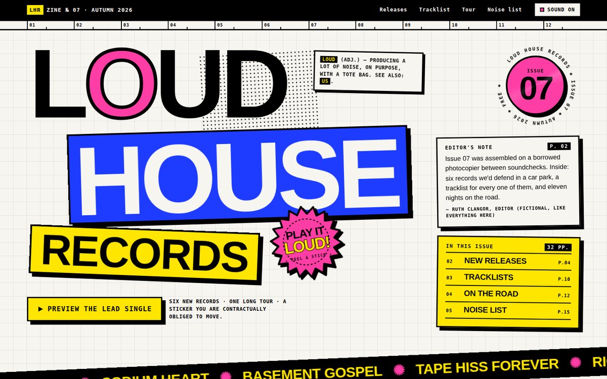
A neo-brutalist web zine for the fictional label Loud House Records, laid out like a photocopied fanzine pasted onto a visible 32px grid with a numbered 12-column ruler. The masthead collages a giant black "LOUD" (with a pink stroked O that jumps on every kick drum), a tilted cobalt "HOUSE" slab and a yellow "RECORDS" block, all with 4px black borders and hard 8px offset shadows, beside a spinning "Issue 07" roundel, an editor's note and a contents index. Two crossing marquee strips carry the release names; below come six record cards with procedurally generated geometric sleeves, a sticky tracklist with per-track tempos, a yellow tour spread with rubber-stamped SOLD OUT marks, a pink/black sign-up spread and a black back cover. The palette is strictly cobalt #1d3cff, yellow #ffe600, black, off-white #f7f5f0 and one hit of pink #ff3ea5; type is an oversized heavy grotesk stack against uppercase monospace metadata.

Open
Original prompt
Design "LOUD HOUSE RECORDS — Issue 07", a neo-brutalist web zine for a fictional independent record label. Raw, confident and loud: flat saturated colours (cobalt #1d3cff, electric yellow #ffe600, black #000, off-white #f7f5f0, one hit of hot pink #ff3ea5), 3–4px black borders everywhere, hard offset shadows (8px 8px 0 #000) with no blur, oversized uppercase grotesk headlines, monospace metadata, and a deliberately collaged layout on a visible grid. Sections: a massive masthead with a marquee strip of release names; a "NEW RELEASES" grid of album cards whose covers are generated geometric CSS/SVG art, unique per card; a tracklist table; a tour-dates list with rotated SOLD OUT stamps; and a sign-up box. Interaction: cards physically "press down" on hover/click (shadow collapses, element translates); a sticker you can drag anywhere; a "SHUFFLE COVERS" button that re-rolls the cover art; and a "preview" button that plays a short synthesized drum loop (Web Audio, after a gesture). Must remain highly legible and responsive.
007

Soft Machine

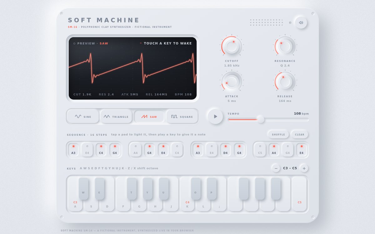
SOFT MACHINE (model SM-16, a fictional instrument) is a fully playable polyphonic synthesizer sculpted as a single slab of soft clay (#e4e8ee) floating on a matching clay page. Every control is raised out of or pressed into that one surface with paired #ffffff / #b8bec7 shadows, and the only colour anywhere is warm coral #ff6b5a, used for LEDs, knob value arcs, the tempo fill and the glowing oscilloscope trace. An OLED-like inset screen dominates the upper left: before any sound it shows a live, band-limited preview of the chosen waveform as it would leave the filter (Fourier series times a two-pole low-pass response, so resonance produces real ringing), then switches to the actual AnalyserNode signal once you play. Four rotary knobs (cutoff, resonance, attack, release), a four-way waveform selector, a play/tempo transport, a 16-step sequencer in four grouped trays and a two-octave soft keyboard complete the device. Engraved small-caps labels in muted slate, screws in the corners, a speaker grille and a power LED that flickers with the output level give it the feel of a real object.

Open
Original prompt
Create "SOFT MACHINE", a playable neumorphic synthesizer. Everything is sculpted from one soft clay surface (#e4e8ee) with paired light/dark shadows (#ffffff / #b8bec7), raised and pressed states, and a single accent — warm coral #ff6b5a — for active LEDs and the waveform. Layout: a device centred on the page with an OLED-like inset screen showing a live oscilloscope (AnalyserNode drawn on canvas); four rotary knobs (cutoff, resonance, attack, release) dragged vertically; a waveform selector (sine/triangle/saw/square) as neumorphic segmented buttons; a 16-step sequencer row of soft pads; and a two-octave keyboard of soft keys. Typography: a rounded sans stack ("SF Pro Rounded", Nunito, "Varela Round", "Segoe UI", system-ui, sans-serif) with small-caps labels in muted slate. Interaction: click/touch keys or use computer keys A–K to play (Web Audio oscillator → filter → envelope); knobs update the sound in real time with smooth value tooltips; the sequencer plays/stops with adjustable tempo. Audio starts only after the first gesture. Responsive: the device scales down and the keyboard becomes compact on phones without page overflow.
008

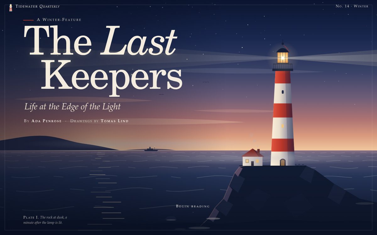
The Last Keepers

"The Last Keepers" is a long-read feature from the fictional Tidewater Quarterly. It is typography-led: Iowan Old Style / Palatino body text at a ~62-character measure on cream paper (#f6f1e7), ink-navy (#14213d) type, signal-red (#c0392b) accents and fog-grey rules. The first frame is a full-bleed SVG dusk seascape with a red-and-white banded lighthouse on basalt, a cottage with woodsmoke, a steamer on the horizon, gulls, drifting fog and a live sea. Its rotating lamp throws two beams, and the light really lands on the headline: a lit copy of the Didone headline is clipped to the beam's shape every frame, so the letters glow wherever the beam crosses them. The original ~900-word impressionistic story then runs through four chapters: an ornamental boxed drop cap, small-caps bylines and run-ins, pull quotes that break out of the column, and marginal notes that float into the right margin on wide screens. "The Watch" is a sticky scene that turns from dusk to night as you scroll, with a keeper's clock and log. "The Lens" is an engraved-style plate of a Fresnel lens, in section and elevation, that assembles itself as you scroll. The page closes with endnotes, a note that the story is fiction, and a navy colophon.

Open
Original prompt
Design a long-read editorial feature: "The Last Keepers — Life at the Edge of the Light", a fictional magazine story about lighthouse keepers. Write original, evocative literary prose (~900 words), impressionistic rather than presenting invented facts as real history. Typography-led: a classic book serif ("Iowan Old Style", "Palatino Linotype", Palatino, "P052", Georgia, serif) for body text at a comfortable measure, a large Didone-feeling headline, an ornamental drop cap, small-caps bylines, pull quotes that break the column, and marginal notes on wide screens. Palette: cream paper #f6f1e7, ink navy #14213d, signal red #c0392b, fog grey. Hero: a full-bleed SVG illustration of a lighthouse on rocks at dusk with a rotating light beam that sweeps across the headline and a gently animated sea. Scroll storytelling: sections fade and rise in; a reading-progress bar styled as a lighthouse beam; a section where the background shifts from dusk to night as you scroll; and an illustrated "anatomy of a lens" figure (Fresnel lens rings) that assembles on scroll. Footnotes pop up on click. Must read beautifully on phones.
009

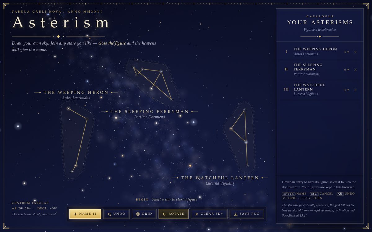
Asterism — Draw Your Own Sky

Asterism is an antique celestial atlas that you engrave yourself. A full-bleed canvas shows a deep indigo night (#060818 to #141a3d) under an aquatint grain, with about 4,300 seeded stars on a real celestial sphere: a logarithmic magnitude distribution, colour temperatures from blue-white to amber, gentle twinkle and diffraction glints on the brightest. A Milky Way of clustered noise particles follows the true galactic plane, with a dark rift toward the galactic centre. A stereographic projection lets the sky turn slowly about the pole, and you can drag it anywhere. Click one star, then another, and fine gold (#e8c872) line work is drawn between them. Each line stops just short of its stars, as the old plates did. Closing a figure (or pressing Name it) gives it a mythic English name and a true Latin participle subtitle ("The Weeping Heron / Ardea Lacrimans"). The figure then inks itself in edge by edge, gains an engraved cartouche label in widely tracked serif capitals, and is wrapped in a rounded-hull halo of dotted outline and breathing burin hatching. A thin gold double frame with corner ornaments and a degree-tick ruler holds the page. A glass catalogue panel lists every figure with Roman numerals.

Open
Original prompt
Build "Asterism — Draw Your Own Sky", an interactive star chart where you invent constellations. A deep indigo night gradient (#060818 → #141a3d) with a procedurally placed star field (varying magnitude, subtle colour temperature from blue-white to amber, twinkle), a faint Milky Way band made of clustered noise particles, and fine gold line work (#e8c872) in the style of antique celestial atlases. Click one star and then another to draw gold connecting lines; when you close a shape (or press "Name it"), the constellation receives a generated mythic name (combined from curated word lists, e.g. "The Weeping Heron") and an engraved label with a faint illustrated halo appears. A side panel (glass, collapsible on mobile) lists your constellations; hovering highlights them. Also: a slowly rotating sky (drag to rotate), a toggle for a coordinate grid of curved RA/Dec-style lines, "Clear sky" and "Save as PNG". Constellations persist in localStorage. Typography: elegant serif capitals with wide tracking and italic Latin-flavoured subtitles.
010

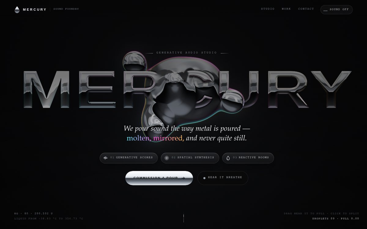
Mercury

A luxurious hero page for MERCURY, a fictional generative-audio studio. On a near-black (#050506) stage, a live WebGL fragment shader renders a cluster of liquid-chrome droplets: a heavy core lobe with two inner lobes, six orbiting satellites on tilted 3D rings, a pointer-driven tendril and click-spawned droplets. The giant wide, heavy "MERCURY" wordmark is drawn inside the same shader as polished chrome with a bevel, a hard horizon line and a slow specular sweep, so the metal can genuinely pass behind and in front of the letters: satellites cross in front on one side of their orbit and behind on the other, while the core drifts through the letter plane over time. Around it, a quiet editorial frame: minimal mono navigation with a sound toggle, a serif-italic one-line manifesto, three frosted-glass capability chips, a chrome CTA that drips a droplet on hover, and accurate mercury facts in the corners (Hg, 80, 200.592 u, liquid from −38.83 °C to 356.73 °C). Below the hero, a studio statement, a list of fictional "selected pours" and a contact block; as you scroll, the sculpture shrinks into the bottom-right corner and stays with you.

Open
Original prompt
Create "MERCURY", a hero page for a fictional generative-audio studio whose centrepiece is a liquid chrome blob. On near-black (#050506), render a metaball cluster (canvas or SVG gooey filter) shaded as polished liquid metal — environment-map-like banding in silvers (#e8ecf1, #9aa3ad) and deep blacks with a thin iridescent rim (cyan → magenta → gold). The blobs orbit, merge and split organically; the cursor acts as a magnet, pulling a droplet that stretches and then snaps back with viscous easing. A giant wordmark "MERCURY" in a wide, heavy sans with a chrome gradient fill and a slow specular sweep; the blob passes behind and in front of letters (layering). Minimal navigation, a one-line manifesto, three glass "capability" chips, and a CTA button whose hover makes a small droplet drip from it. Interaction: pointer magnetism, click to split a droplet off, scrolling gently shrinks the blob into the corner. Tasteful, luxurious, silky 60fps; reduced motion shows a static sculpted frame.
011

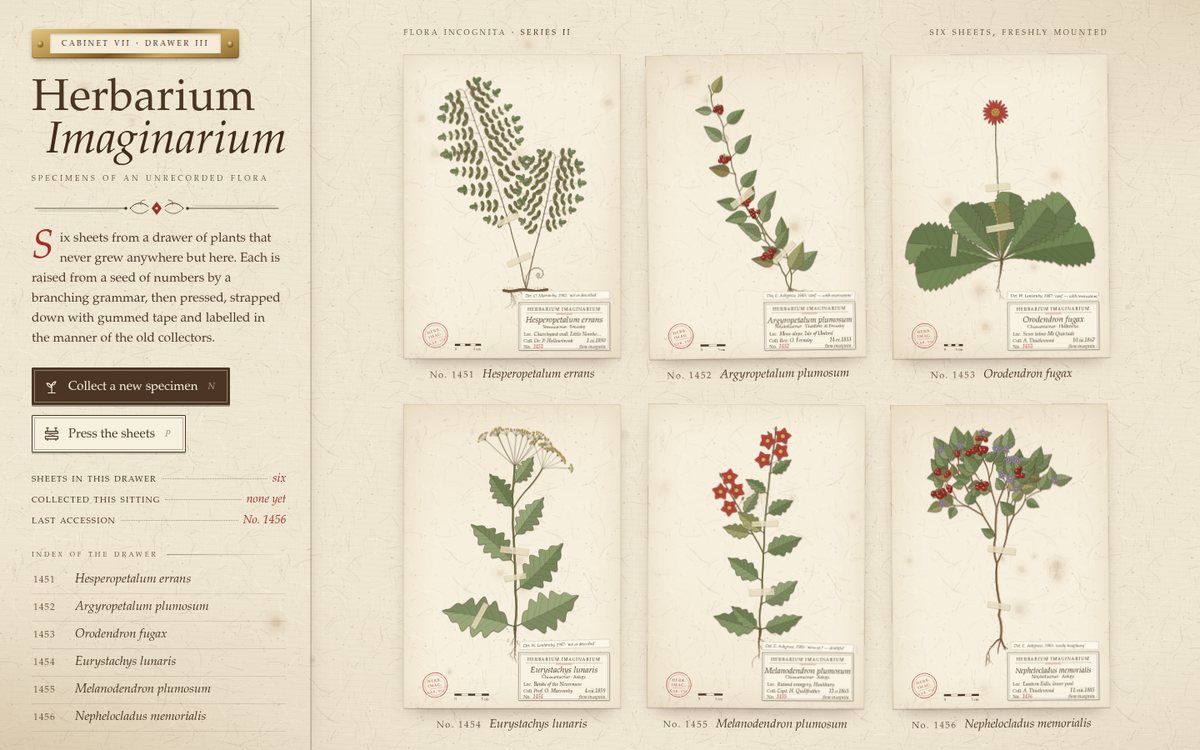
Herbarium Imaginarium

Herbarium Imaginarium is laid out as the index card and open drawer of a Victorian specimen cabinet. A sticky left panel carries a brass drawer-label holder, the title in Palatino-style roman and italic, an ornamental rule with a madder lozenge, a drop-capped introduction, the two actions, a dotted-leader ledger and an index of the drawer. To its right, six herbarium sheets sit in a 3 × 2 grid, sized so that the whole drawer fits one desktop screen. Each sheet is aged paper (#f6efdd with a procedural fibre tile and random foxing) carrying a plant that exists nowhere else. The plant is grown by a small parametric L-system with six growth habits (spike, much-branched shrub, umbellifer, fern, climbing vine, rosette with scapes) and inked in SVG in sepia and faded botanical greens, with madder berries and seeds. Gummed paper tape straps the stems, and every sheet has a printed-and-handwritten label with a generated Latin binomial, an accession stamp, a centimetre scale bar and sometimes a seed packet or a determination slip. Everything is clearly fictional: the plants, collectors, localities and names are all invented.

Open
Original prompt
Design "Herbarium Imaginarium", a Victorian botanical specimen cabinet of procedurally grown plants that do not exist. Aged paper (#efe6d2 with foxing spots and fibre texture from layered radial gradients), sepia ink (#4a3622), faded botanical greens (#6b7f4e, #9aa77a) and madder-red accents for seeds and berries. Each specimen card shows a plant grown by an L-system/recursive branching algorithm and drawn in SVG with ink-like stroke variation, leaves, buds and occasional flowers; a paper tape strip "holding" the stem; a handwritten-feeling label in an italic serif with an invented Latin binomial (generated from syllable lists), a collection date and a specimen number. A grid of six specimens on desktop, one or two on mobile. Interaction: "Collect a new specimen" grows a plant stroke by stroke (animated stroke-dashoffset); clicking a card opens it large in a lightbox with a magnifying-loupe hover; a "Press" button toggles a flattened pressed-flower look (desaturated, slightly translucent). Typography: "Iowan Old Style", Palatino, "P052", Georgia, serif, with italic labels and ornamental rules.
012

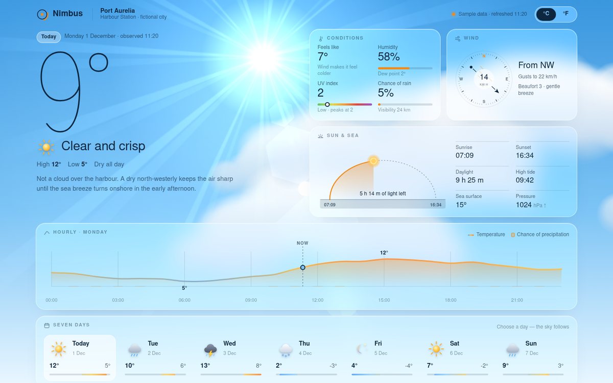
Nimbus — Weather for Port Aurelia

Nimbus is a calm, editorial weather dashboard for the fictional harbour city of Port Aurelia during an invented early-December week. A full-viewport canvas sky sits behind everything and is the hero: it renders five distinct weathers (clear day, rain, thunderstorm, snow, clear night) and cross-fades between them, while frosted-glass cards float above it. Text colour, glass tint, accent and glow are scene variables, so the whole interface re-inks itself: navy ink on the bright day and snow skies, pale ink on rain, storm and night. The current temperature is a huge hairline numeral drawn as single-stroke SVG paths that write themselves in, so it stays thin on every platform. Around it sit a conditions card (feels-like from the wind-chill formula, humidity with a Magnus dew point, UV on a WHO-coloured scale, precipitation chance), an animated wind compass, a sun-and-sea card with the sunrise/sunset arc, tide and sea temperature, a 24-hour chart, and a seven-day strip. Every figure is invented sample data and the page says so.

Open
Original prompt
Build "Nimbus", an elegant weather dashboard for the fictional coastal city of Port Aurelia (clearly fictional sample data). The hero is an animated sky that changes with the selected condition: clear day (drifting sun glare, soft clouds), rain (parallax raindrops, darker gradient), snow (flakes with sway), thunderstorm (lightning flashes) and clear night (stars, moon). The palette adapts per condition but stays sophisticated (e.g. day #7cc4f5 → #e8f6ff, night #0b1026 → #2b2f63). Foreground glass cards: current temperature as a huge thin numeral, feels-like, humidity and UV; an animated wind compass; a sunrise/sunset arc with the sun's current position; a 24-hour temperature line chart (SVG smooth curve with gradient fill and hover tooltip); and a 7-day forecast strip with custom SVG weather icons that animate on hover. Interaction: clicking a forecast day switches the whole scene and its data with a smooth cross-fade; a °C/°F toggle. Typography: a clean sans with tabular numerals.
013

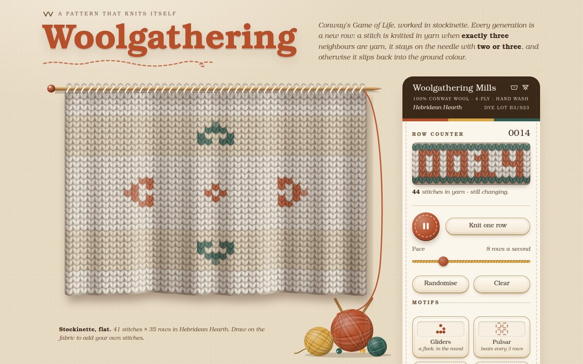
Woolgathering

"Woolgathering" presents Conway's Game of Life as a piece of Fair Isle knitting hanging from a wooden needle on an oatmeal linen wall. Every cell is a hand-shaded stockinette stitch: two twisted, slightly fuzzy yarn loops forming a V, drawn in cream ground yarn when dead and in rust, mustard or forest when alive. Rows are banded like a Fair Isle yoke, mirrored about the middle row with a second oatmeal ground behind the wide bands, and the page opens by knitting the cloth down from the needle before an eightfold snowflake motif starts to bloom symmetrically. Beside the cloth, a dark "ball band" label with a knitted row counter holds warm, stitched-edge controls, four colourways and the preset motifs. Three balls of wool, two crossed needles and a working strand that tugs with every row complete the still life.

Open
Original prompt
Create "Woolgathering", Conway's Game of Life rendered as a living piece of knitting. Each cell is drawn on a canvas as a knit stitch (a small V-shaped pair of loops with shading); live cells are coloured yarn and dead cells are background yarn, so the evolving pattern reads as Fair Isle knitwear. Palette of cosy wools: oatmeal #e9dcc5 background, rust #b5502b, mustard #d9a441, forest #2f5d50, cream #f6efe2 — plus a colourway selector with four palettes. Add a subtle fuzz/halo on stitches and gentle drape shading across the fabric. Frame the canvas as if it hangs from knitting needles (SVG at the top) with yarn-ball illustrations. Warm rounded controls: play/pause, step, speed, randomise, clear, and preset patterns (glider, pulsar, Gosper glider gun, a snowflake motif). Draw cells with pointer or touch. Show the generation count as a knitted row counter. Typography: a friendly serif ("Cooper", Georgia, "URW Bookman", serif).
014

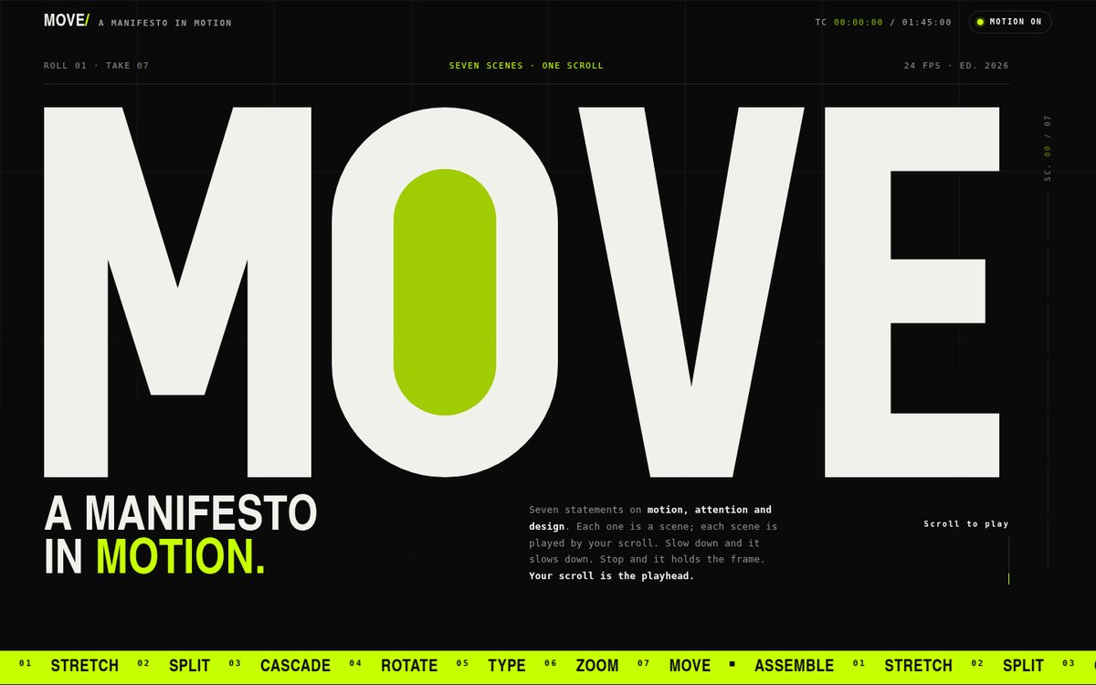
MOVE — A Manifesto in Motion

MOVE is a scroll-played kinetic typography manifesto in three colours only: black #0a0a0a, off-white #f1f1ec and acid #c6ff00. It opens on a film-slate title card where a hand-drawn SVG "MOVE" rises letter by letter, its O counter already filled with acid, above an acid ticker. Seven sticky full-screen scenes follow, each with its own original statement and its own motion driven by scroll progress: "Nothing arrives whole." assembles from scattered, rotated glyphs; "Time is material." stretches each word with scaleX until the three lines form a justified block (with live ×n readouts); "Transitions are the content." is sliced by an acid blade and its two halves part to reveal an acid insert band; "Every move sets off the next." rises letter by letter like dominoes standing up in perspective, with a knock of overshoot; "Look again. Then closer." turns on a solid four-faced 3D prism like a trivision billboard; "If it moves, it must mean something." is typed with a caret, including a typed-and-struck-through "DECORATE" that is backspaced; and the finale zooms into the counter of the O in "MOVE" until the acid counter becomes the background of the closing "YOUR MOVE." page. Monospace annotations (SC. 03 / 07, t = 0.600, a running timecode) frame everything like an editor's timeline.

Open
Original prompt
Design "MOVE — A Manifesto in Motion", a scroll-driven kinetic typography experience. Black background (#0a0a0a), off-white type (#f1f1ec) and one acid accent (#c6ff00). Seven original manifesto statements about motion, attention and design each get a full-screen scene with a distinct typographic motion driven by scroll progress: letters assembling from scattered positions; words stretching horizontally with scaleX; a line splitting in half to reveal an accent line; characters cascading like dominoes; a word rotating in 3D; a sentence typed out with a caret; and a giant word zooming until its counter becomes the next scene's background. Use sticky sections and custom scroll-progress mapping, with CSS transforms only for performance. Typography: a heavy grotesque/condensed sans stack for display and monospace for small annotations such as scene numbers ("SC. 03 / 07"). A progress rail on the side. Reduced motion: statements appear statically with simple fades.
015

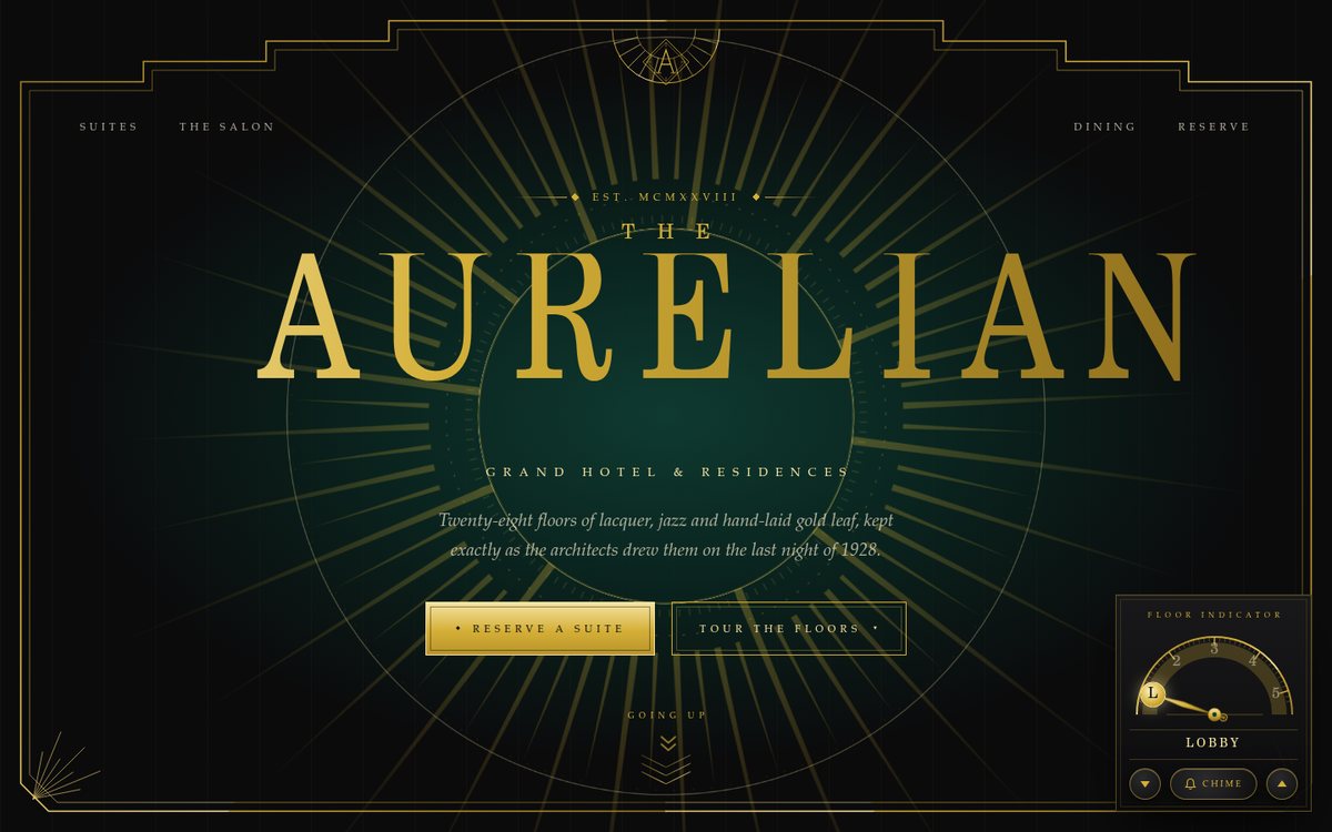
The Aurelian

A symmetrical, jazz-age landing page for The Aurelian, a fictional 1928 grand hotel, built as a tower you ride through: the hero is the lobby, and each section below is a floor reached by a brass elevator dial. Black lacquer and deep emerald grounds carry gold ornament that grades from #d4af37 to #f5e3a1: a slowly turning sunburst radiates behind a tall, vertically stretched Didot-stack wordmark, while a stepped ziggurat frame draws itself in gold from the bottom centre outwards on both sides at once, ending in a keystone fan that cradles the diamond monogram. Below come three arched suite cards with painted SVG window vignettes, an emerald Salon with a frieze of Deco fans that unfold as they scroll into view, a supper club whose menu is an engraved ivory card with a guilloche rosette, and a reservation desk with double-bracketed, stepped-corner inputs. It is elegant and mirrored on desktop and stacks into a single column on phones.

Open
Original prompt
Create a landing page for "The Aurelian", a fictional 1928 Art Deco grand hotel. Black lacquer (#0b0b0c) and deep emerald (#0f3d33) grounds with gold (#d4af37, grading to #f5e3a1) geometric ornament — sunbursts, stepped ziggurat frames, chevrons and fan motifs, all inline SVG. Typography: tall, thin, high-contrast display capitals (stack: Didot, "Bodoni 72", "Bodoni MT", "C059", Georgia, serif) with wide letter-spacing, plus refined small caps. Sections: a hero with an animated sunburst radiating behind the hotel name and a symmetrical Deco frame that draws itself in gold; "The Suites" as three arched cards with gilded hover states; a dining section with a menu styled as an engraved card; an elevator-dial floor selector that scrolls to sections while its needle rotates; and a reservation form with Deco-bordered inputs. Delight: a gold-foil shimmer sweeping across headings and fan patterns that open on scroll. Elegant and symmetrical on desktop, gracefully stacked on phones.
016

Plaza Aeterna

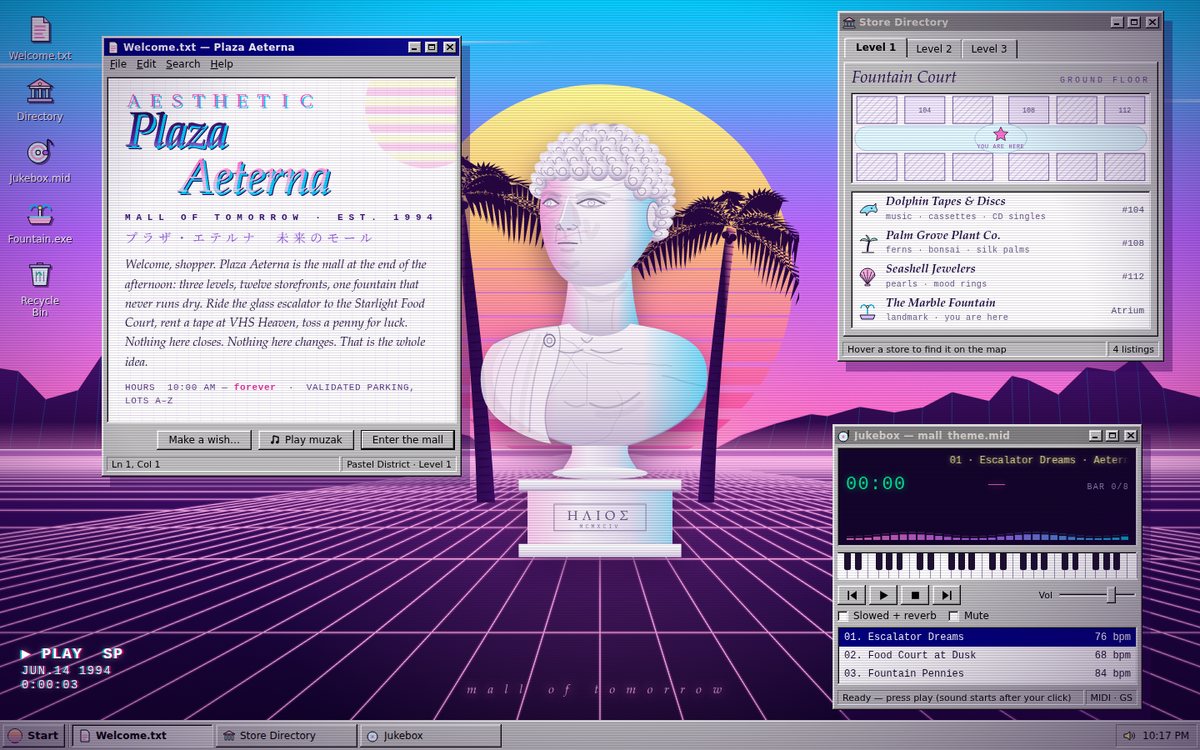
Plaza Aeterna is a fictional 1994 shopping mall shown as a Windows-95-style desktop floating in a vaporwave sunset. The sky runs from cyan through violet to hot pink, with a striped yellow-to-magenta sun, wireframe mountain ranges and a neon grid floor rushing toward the viewer. Two procedurally drawn palms frame a marble bust of Helios on a plinth, which turns slowly on its axis while pink and cyan light rake across it. Bevelled grey windows with navy title bars float over the scene: a Welcome.txt note with full-width AESTHETIC lettering and a chrome serif-italic logotype, a tabbed Store Directory with pastel shop icons and a live floor plan, and a Jukebox MIDI player that synthesises lo-fi mall muzak. A taskbar, Start menu, VHS on-screen display and CRT scanlines complete the illusion. On phones the windows become a column of stacked cards under a full-height hero of the sun and bust.

Open
Original prompt
Build "PLAZA AETERNA — Mall of Tomorrow (Est. 1994)", a vaporwave dreamscape. Background: a sunset gradient (#ff71ce → #b967ff → #01cdfe) with a striped retro sun, a 3D-perspective neon grid floor scrolling toward the viewer, palm silhouettes, and a slowly rotating marble bust built from layered SVG shapes with procedurally generated marble veining. Overlay draggable Windows-95-style windows (bevelled grey #c0c0c0, navy title bars) containing: a "Store Directory" with pastel icons, a mock MIDI player that plays a synthesized chord progression (Web Audio, after a gesture), and a "Welcome" message in full-width styling (A E S T H E T I C). Typography: a mixture of serif italics, pixel-feeling monospace and widely spaced letters. Interaction: drag windows by their title bars, minimise them to a taskbar with a Start button and clock, click desktop icons to open windows, and a VHS tracking glitch on hover. Responsive: windows become stacked cards on phones.
017

Harmonia — Pendulum Wave

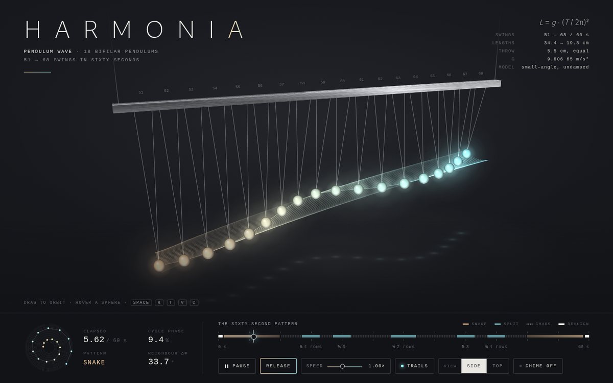
Harmonia presents the classic pendulum-wave apparatus as a quiet piece of kinetic art on a charcoal (#16171b) stage. Eighteen bifilar pendulums (each bob hangs from two fine white strings in a V, so it swings in a single plane) hang from a brushed-metal bar seen in a slightly elevated three-quarter perspective. Their lengths come from L = g(T/2π)² so that they complete exactly 51, 52 … 68 oscillations in 60 seconds (34.4 cm down to 19.3 cm). Every bob starts from the same 5.5 cm throw and follows the exact small-angle solution, so the snake, the two-, three- and four-row splits, the chaos and the realignment at 60 s all come out of the physics rather than from choreography. The glowing spheres run through a spectrum from peach #ffd6a5 to ice #9bf6ff, and optional light trails sweep out translucent silk ribbons as the wave line moves through space. Beneath the stage, a monospace instrument console shows elapsed time, cycle phase, the named pattern, the neighbour phase offset, an orrery-like phase dial, and a scrubbable 60-second timeline marked with the pattern regions and the ¼ ⅓ ½ ⅔ ¾ split points.

Open
Original prompt
Create "Harmonia — Pendulum Wave", a physically accurate pendulum-wave simulation as minimalist kinetic art. Charcoal background (#16171b); 18 pendulums whose lengths are chosen so they complete 51, 52, 53… oscillations in 60 seconds (the classic pendulum-wave set-up), rendered from a slightly elevated 3D perspective with fine white strings and glowing spheres in a gradient spectrum from #ffd6a5 to #9bf6ff, plus optional light trails that paint Lissajous-like ribbons. A thin brushed-metal mounting bar at the top. Beneath, an elegant monospace readout: elapsed time, cycle phase, and a timeline scrubber showing where you are in the 60-second pattern (snake, split, chaos, realignment). Controls: play/pause, speed (0.25×–4×), trails toggle, view toggle (side / top-down), and "Release", which pulls every pendulum back and lets them drop. Optional soft chime whenever a pendulum crosses centre (Web Audio pentatonic, after a gesture, muted by default). Typography: thin sans plus mono.
018

Foxglove Hollow

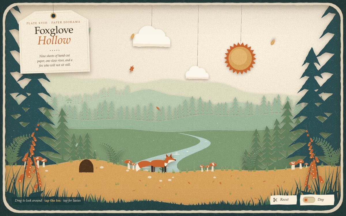
Foxglove Hollow is a full-screen paper theatre: nine sheets of scissor-cut paper stacked inside a dark teal board frame with a deckle-edged cream mat, each sheet throwing a soft shadow onto the one behind it. From back to front: a cream sky, pale far hills, a rolling hill with tiny pines and two cottages, a sage pine ridge, a meadow crossed by a winding river, moss pines on two banks, towering deep-teal pines that frame the hollow, the ochre forest floor (burrow, mushroom clusters, ferns, pebbles, fallen leaves and the fox) and a foreground fringe of grass and burnt-orange foxgloves. The sun, clouds, moon and stars hang from threads like a little fly-system, and the title is written on a luggage tag swinging from a string. Every shape is generated at runtime from a seeded random cut, so the composition recomputes from scratch for portrait or landscape screens rather than just scaling.

Open
Original prompt
Design "Foxglove Hollow", a layered paper-cut forest diorama. Seven to nine stacked layers of hand-cut-looking paper (SVG paths with slightly irregular edges) — distant hills, pines, a winding river, mushrooms, ferns, a small fox and foreground grasses — each casting a soft drop shadow onto the layer behind it so the scene has real depth. Day palette: sage #9bb89b, moss #5f7f5b, deep teal #274e52, ochre #d9a45b, burnt orange #c8642d, cream sky #f3e8d2. Night palette: indigo layers, tiny glowing windows, fireflies and a paper moon. Subtle paper grain from procedural noise. Interaction: pointer movement creates parallax between layers (touch-drag on mobile); a day/night toggle recolours every layer with a staggered transition; clicking the fox makes it hop to a new spot; paper leaves drift gently. The title sits on a small paper tag hanging from a string, in a warm serif. The composition must recompute nicely for portrait screens.
019

HELIOS/OS

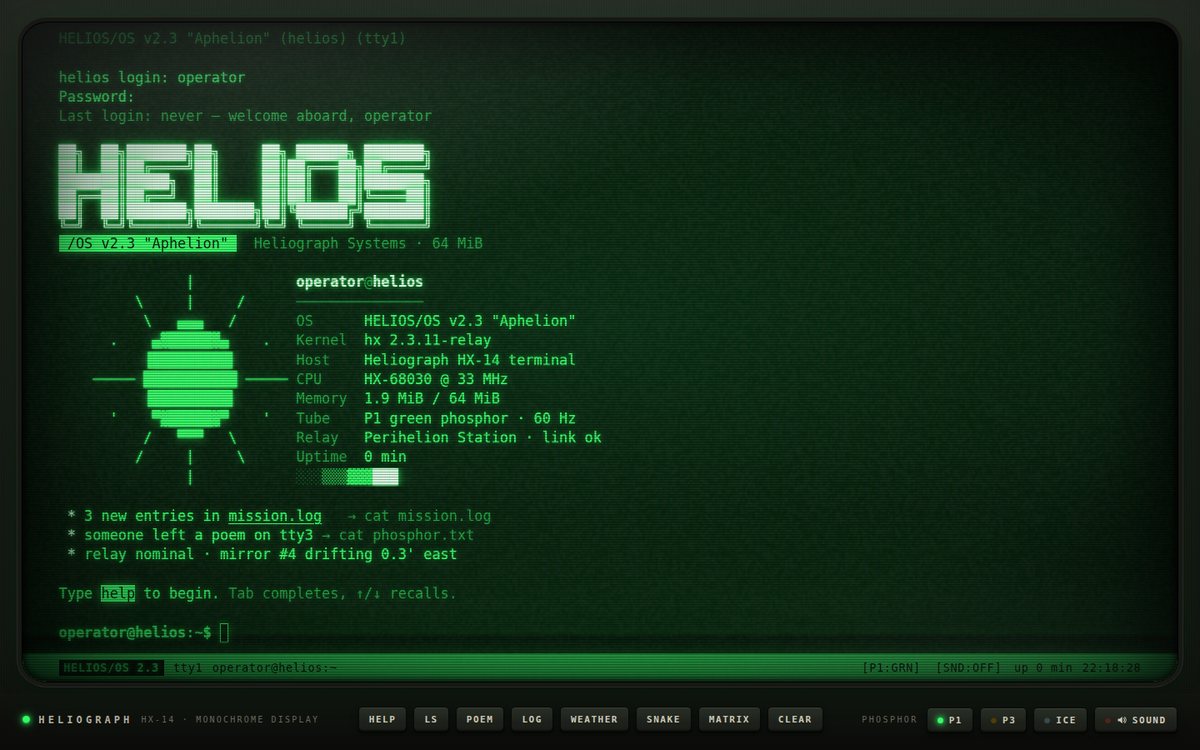
HELIOS/OS v2.3 "Aphelion" is a fictional 1987 operating system running on a fictional Heliograph HX-14 monochrome terminal aboard a relay station. The page is the whole monitor: a graphite bezel with a power LED, an engraved badge and a row of physical keys frames a curved, glowing phosphor tube. The tube powers on with a collapsing-beam animation, runs a POST screen (a vendor sun badge, a counting memory test, device detection, a kernel progress bar and service checks), auto-types the operator login, then prints a neofetch-style welcome: a box-drawing HELIOS logo, a block-shaded sun emblem beside a system card, and a short message of the day. From there it is a working shell with a small fictional filesystem and a light storyline (a mission log, a decoded signal, a poem someone left on tty3). Three phosphors are available: P1 green (#33ff66 on #031a07), P3 amber (#ffb000 on #1a0f00) and ice (#9fe7ff).

Open
Original prompt
Build "HELIOS/OS v2.3", a retro CRT terminal operating system simulation. Full-screen phosphor green (#33ff66 on #031a07) with themes for amber (#ffb000 on #1a0f00) and ice (#9fe7ff). CRT effects in CSS/canvas: scanlines, subtle screen curvature (vignette, rounded corners, inner shadow), phosphor glow/bloom text-shadow, gentle flicker and a rolling refresh bar. On load: a believable BIOS boot sequence (memory check counting up, device list) followed by a login banner. A working shell with an input line and blinking block caret supporting: help, ls, cat <file> (several short fictional files including a poem and a mission log), clear, date, whoami, theme <green|amber|ice>, matrix (glyph rain for a few seconds), weather (ASCII art), snake (a small playable ASCII snake game inside the terminal), command history with ↑/↓, and tab completion. Typography: a monospace stack. Keyboard-first, with tap-to-focus on phones so the soft keyboard appears. Optional typing sounds (Web Audio clicks, off by default).
020

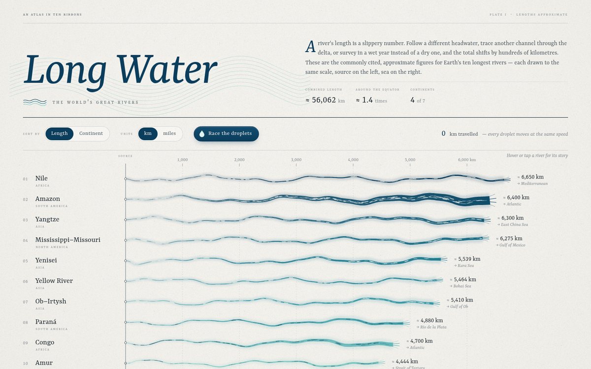
Long Water — The World's Great Rivers

An editorial data-art plate printed on pale limestone paper. A large italic serif masthead, "Long Water", floats over faint contour lines, next to a short essay on why river lengths are slippery and three headline figures (combined length, times around the Equator, continents). Below, the ten longest rivers run from a shared "source" line on the left to their seas on the right. Each is a meandering ribbon whose horizontal extent is drawn to one km scale. It starts as a pale thread and swells into a deep-blue mouth that fans into a small delta. The ribbon's final width is scaled to the square root of approximate mean discharge, so the Amazon's flood and the Nile's thread tell a second story beside length. Shade follows a sequential scale from #0b3d5c (longest) to #7fc8c2 (shortest). Thin ink labels give rank, name, continent in small caps, "≈" tabular lengths and the receiving sea. A legend, a scale bar and a footnote on measurement uncertainty close the page. On phones the ribbons turn into ten vertical flows that pour down the page under rotated labels.

Open
Original prompt
Create "Long Water — The World's Great Rivers", an elegant data-art visualization comparing the ten longest rivers. Use these commonly cited approximate lengths (label them "approx." and note that sources vary): Nile 6,650 km; Amazon 6,400; Yangtze 6,300; Mississippi–Missouri 6,275; Yenisei 5,539; Yellow River 5,464; Ob–Irtysh 5,410; Paraná 4,880; Congo 4,700; Amur 4,444. Each river is a flowing, meandering SVG ribbon whose length is proportional to its real length, flowing left to right with particles drifting along it like current. Palette: deep river blues and teals on pale limestone (#f3f1ec) — a sequential scale from #0b3d5c to #7fc8c2 — with thin ink labels. Typography: refined serif titles, small-caps continent labels, tabular numerals. Interaction: hover a river to highlight it and show a tooltip (length, continent, where it flows out); sort toggle (by length / by continent); unit toggle (km / miles); a "race" button where droplets travel every river at the same speed so the differences in length can be felt. Include an elegant legend and a short intro paragraph. Mobile: ribbons become vertical flows.
021

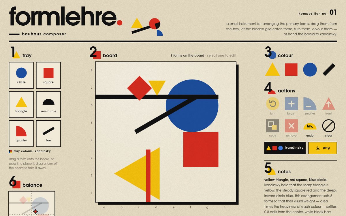
Formlehre — Bauhaus Composer

"formlehre — bauhaus composer" is a tactile composition toy laid out like a printed Bauhaus sheet: a deep-cream paper page with a heavy black rule under an oversized lowercase masthead, and five-plus numbered sections whose giant numerals each sit on a coloured primary form (1 tray, 2 board, 3 colour, 4 actions, 5 notes, 6 balance). The centre of the page is a warm cream board (#f1ead8) with a hard black offset shadow and chess-style a–h / 1–8 edge labels; forms in red #d62d20, yellow #f4c20d, blue #1d4e9e and black #111 are dragged onto it from a tray, caught by a hidden 8×8 grid with a springy settle, and edited with handles, swatches and geometric toolbar buttons. A "kandinsky" button composes a balanced arrangement from his colour–form pairings, and a live balance map shows where the composition's visual weight sits. All headings and UI copy are lowercase in the spirit of Herbert Bayer's universal alphabet, set in a geometric sans stack (Futura, Century Gothic, Avenir Next, URW Gothic).

Open
Original prompt
Build "Formlehre — Bauhaus Composer", a tactile composition toy honouring Bauhaus design. A board on warm cream (#f1ead8) with a tray of primary shapes — circle, square, triangle, semicircle, quarter-circle, bar — in the Bauhaus triad red #d62d20, yellow #f4c20d and blue #1d4e9e, plus black #111. Drag shapes onto the board; they snap to a hidden 8×8 grid with a satisfying spring; rotate with the wheel or R key, scale with handles, recolour by clicking a swatch, bring to front. A "Kandinsky" button auto-composes a balanced composition using Kandinsky's colour–form associations (yellow triangle, red square, blue circle) with a short explanatory caption. Typography: a geometric sans stack (Futura, "Century Gothic", "Avenir Next", "URW Gothic", sans-serif) with lowercase-only headings in the Bayer "universal" spirit and large numeral section markers. The toolbar is made of coloured geometric buttons. Export the composition as PNG. Keyboard: Delete removes, arrows nudge. Works with touch.
022

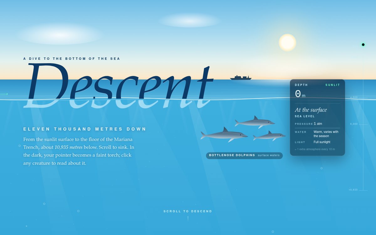
Descent — Eleven Thousand Metres Down

A scroll-driven descent from a bright split-level ocean surface down to the floor of the Challenger Deep. The first frame shows the waterline cutting through the italic serif title "Descent": the upper half is navy on a pale morning sky with a sun, drifting clouds and a distant ship, and the lower half is refracted, pale and swaying underwater, with dolphins and sunlight shafts below. As you scroll, a fixed background gradient sinks through the five zone colours (#1e90c8, #0b3a66, #04142b, #020812, #000204). A glass depth gauge counts true metres and shows zone name, pressure (1 atm + 1 per 10 m), water temperature and light notes, with a proportional 0 to 10,935 m track. Sixteen hand-drawn SVG subjects appear at typical depths: dolphins, sardines, moon jelly, lanternfish, hatchetfish, vampire squid, sperm whale, Atolla, anglerfish, gulper eel, comb jelly, tripod fish and sea pigs on an abyssal ledge, dumbo octopus, snailfish between trench walls, the 1960 bathyscaphe Trieste, and amphipods at a food fall on the floor. It ends on "10,935 m", a short historical note and a "Return to surface" button.

Open
Original prompt
Create "Descent — Eleven Thousand Metres Down", a scroll-driven journey from the ocean surface to the bottom of the Mariana Trench (~10,935 m). As you scroll, the background transitions through the ocean zones — sunlight (#1e90c8), twilight (#0b3a66), midnight (#04142b), abyssal (#020812) and hadal (#000204) — while a fixed depth gauge counts metres and shows the zone name, pressure (≈ 1 additional atmosphere per 10 m) and temperature notes. Illustrated SVG/canvas creatures appear at approximately correct depths: dolphins and sunlit fish near the top, jellyfish, a sperm whale (~1,000 m and deeper), an anglerfish with a glowing lure, a vampire squid, a gulper eel, amphipods, and finally the trench floor. Deeper creatures are bioluminescent, with pulsing blue/green light; marine snow drifts through the water; light rays from the surface fade out gradually. Short, accurate captions (keep claims general and well established). Interaction: scroll; in the dark zones the pointer is a faint torch revealing nearby creatures; clicking a creature opens a caption card. It ends with an elegant "Return to surface" button that smooth-scrolls up.
023

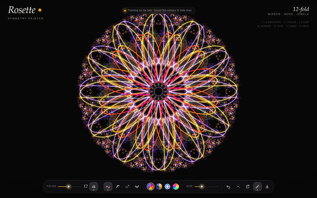
Rosette — Symmetry Painter

Rosette is a radial-symmetry drawing instrument on a near-black #070707 canvas. Every stroke is copied across 3 to 24 rotational folds, and each fold can also be mirrored, so the copies form a dihedral rosette. With mirror on, the mirrored copies take the next colour in the palette, which interleaves two colours into a jewel-like pattern. The page opens on a finished mandala that the instrument painted itself and keeps painting slowly until someone touches the canvas. The title "Rosette" is set in an italic old-style serif with a slowly turning ✺. A frosted glass dock floats at the bottom and holds the controls. Four palettes change the mood. Jewels uses #ff006e, #fb5607, #ffbe0b, #8338ec and #3a86ff. Byzantine uses golds with lapis and deep blues. Porcelain turns the ground to white and paints in cobalt glaze. Rainbow cycles the hue along the stroke.

Open
Original prompt
Build "Rosette — Symmetry Painter", a radial-symmetry drawing instrument. A black canvas (#070707) where every stroke is mirrored across N rotational segments (selectable 3–24, plus mirror on/off) around the centre, producing mandala-like jewel artwork. Brushes: glowing neon line (additive blending), ink line with velocity-based width, dotted stardust, and ribbon. Palette presets: "Jewels" (#ff006e #fb5607 #ffbe0b #8338ec #3a86ff), "Byzantine" (golds and deep blues), "Porcelain" (cobalt on white — switches the background to white), plus a hue-cycling rainbow mode. A faint guide shows the segment lines while drawing and fades out afterwards. UI: a floating, elegant control dock (glass on dark) with segment slider, brush picker, palette swatches, undo, clear (with a dissolve animation) and PNG download. Delight: an idle "autodraw" that paints slowly on its own until the user touches the canvas, and a gentle rotation mode that spins the artwork. Touch-friendly with pointer capture.
024

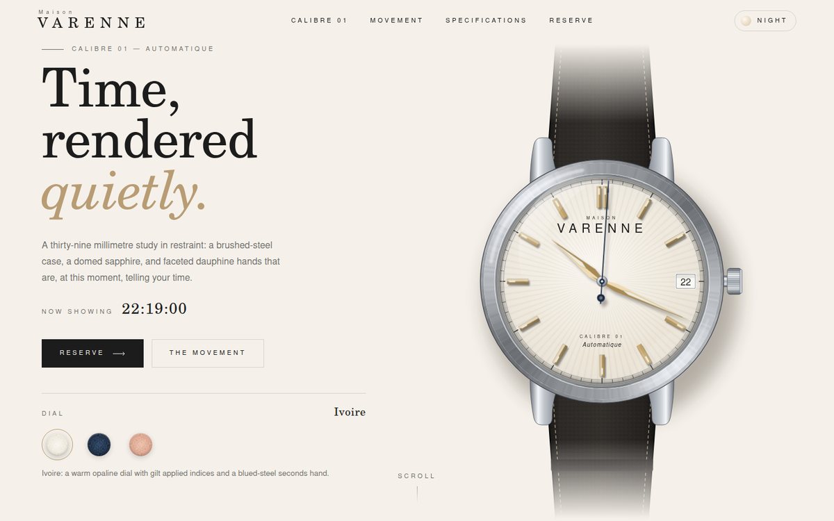
Maison Varenne — Calibre 01

A quiet, editorial product page for "Maison Varenne, Calibre 01", a fictional 39 mm automatic watch. The palette is ivory (#f5f1ea), champagne (#d8c3a5) and charcoal (#1c1c1c), with a midnight-blue (#1b2a41) dial variant. The hero splits into a high-contrast serif headline ("Time, rendered quietly.") on the left and a large gradient-built SVG watch on the right. The watch shows the viewer's real local time with faceted dauphine hands and a seconds hand that beats eight times a second (4 Hz). It opens in the classic 10:10:35 catalogue pose, then glides to the true time. Below the hero, a sticky scroll scene opens the watch into eight layers in 3D. Then comes a technical-drawing specification sheet, and finally a charcoal reservation desk. A Night toggle turns the page dark so that the luminescent hands and indices glow.

Open
Original prompt
Design a product page for "Maison Varenne — Calibre 01", a fictional minimalist luxury watch. Palette: ivory #f5f1ea, champagne #d8c3a5, charcoal #1c1c1c and a hint of midnight blue #1b2a41 for a dial variant. The hero is a large, photoreal-feeling SVG watch built entirely from gradients: a brushed-steel case with conical highlights, a domed sapphire reflection, applied indices with tiny shadows, dauphine hands showing the REAL current local time, and a smoothly sweeping seconds hand (8 beats per second). Typography: a refined high-contrast serif for headings with wide-tracked small sans captions. Sections with generous whitespace: an exploded view of the movement whose layers separate on scroll; a dial variant selector (ivory / midnight / salmon) that recolours the watch with a smooth transition; a specification table; and a "Reserve" CTA. Interaction: hovering the watch tilts it slightly and moves the sapphire reflection; a "Night" toggle shows lume glowing on the hands and indices. Quiet, precise animation — nothing gaudy.
025

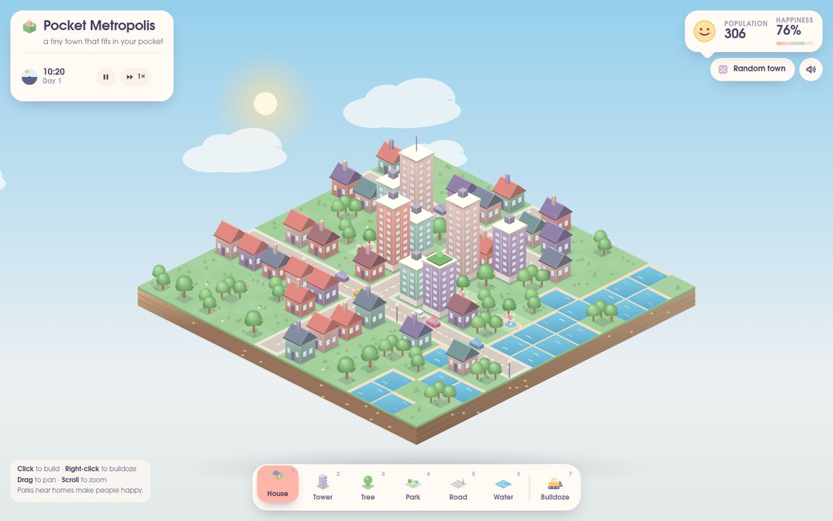
Pocket Metropolis

Pocket Metropolis is a small pastel city-builder that fits in your pocket. A 12×12 isometric island floats in a soft sky, with grassy tiles on a layered soil base and a blurred shadow underneath. Every object is drawn procedurally on a single canvas: gabled houses in peach, blush, mint and lavender with chimneys and doors, and pastel towers with window grids, pilasters and rooftop tanks, gardens or blinking antennas. There are round-canopy trees that sway, parks with winding paths, flowerbeds, fountains, benches and strollers, and roads that auto-join their markings, sidewalks and zebra crossings. Water tiles have sandy banks and drifting glints. Little cars keep to the right-hand lane of connected roads. A slow day/night cycle moves the sun and moon along an arc, tints every surface through an ambient-light model, flips side-lighting and shadow direction between morning and evening, and at night lights up windows, streetlamps, antennas and headlights. The HUD is set in a rounded, friendly sans and rendered as cream cards: a title card with a sun/moon dial clock, a speech-bubble stats card whose drawn face smiles or frowns with happiness, and a raised pastel toolbar.

Open
Original prompt
Create "Pocket Metropolis", an isometric tiny-city builder toy. A canvas-rendered isometric grid (12×12 on desktop, fitted on mobile) in soft pastels: grass #a8d5a2, water #7ec8e3, roads #d6d0c4, and buildings in peach #ffb5a7, blush #fcd5ce, mint #b8e0d2 and lavender #cdb4db, with gentle ambient-occlusion shading on each block face. A bottom toolbar places houses, towers, trees, parks, roads and water; buildings pop in with a squash-and-stretch bounce. Little cars travel along connected road tiles and tiny people stroll in parks. A day/night cycle slowly shifts the lighting (sky gradient behind, windows lighting up at night, glowing streetlamps). A stats bubble shows population and happiness (parks near homes increase it). Interaction: click/tap tiles to place; right-click/long-press to bulldoze with a puff of dust; drag to pan; pinch/scroll to zoom; "Random town" seeds a charming city. Persist to localStorage. Typography: a rounded, friendly sans.
026

PULSE — Generative Audio Visualizer

PULSE is a full-screen generative music instrument and visualizer on deep plum-black #0c0612. A single canvas fills the viewport; before any sound it already breathes as a symmetric flower of 128 bars that fades orange #ff9a3c at the top through hot pink #ff3c78 and violet #7b2ff7 to cyan #16d9e3 at the bottom, with orbiting sparks smeared into smoky spiral trails. The first click starts an original track synthesized entirely in the browser (A minor, 110 BPM) that moves through a new section every 8 bars (Intro, Groove, Lift, Drop, Breakdown, Drop II, Drift, then cycles with variations), and the visuals switch from breathing to listening. Typography is a wide, widely tracked uppercase geometric sans with a sunset-gradient "P U L S E" wordmark, set against small monospace readouts; the controls live in a single frosted pill dock.

Open
Original prompt
Build "PULSE — Generative Audio Visualizer". On first click, a built-in generative electronic track starts, synthesized entirely with Web Audio (kick, hi-hat from filtered noise, a bassline and an arpeggiated pad in a minor key at ~110 BPM, evolving every 8 bars). An AnalyserNode drives the centrepiece: a radial frequency bloom — 128 bars around a circle with mirrored symmetry, a pulsating core that swells on each kick, orbiting particles that accelerate with high frequencies, and a smoky trail (canvas feedback with a slight zoom/rotation each frame). Before audio starts, an idle breathing version of the visual must already look beautiful. Palette: sunset-to-violet gradient (#ff9a3c → #ff3c78 → #7b2ff7 → #16d9e3) on deep plum-black #0c0612. Typography: wide, spaced uppercase sans for the title and a small monospace readout of BPM, bar count and track section. Controls: play/pause; mode switch between "Bloom", "Tunnel" (concentric rings rushing toward the viewer) and "Horizon" (mirrored waveform landscape); volume. Optional "Use microphone" button with a graceful fallback if permission is denied.
027

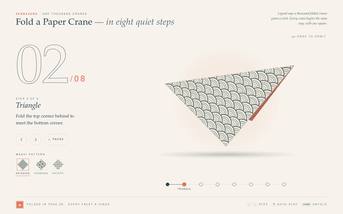
Senbazuru — Fold a Paper Crane

"Senbazuru — Fold a Paper Crane" folds a real, physically consistent paper crane in the browser. A square of washi (indigo #264653 pattern on cream, coral #e76f51 reverse) is simulated as rigid facets hinged along true crease lines. It passes through eight stages (square, triangle, square base by reverse-folding the corners, front petal fold, back petal fold / bird base, narrowing, inside-reverse-folded neck and tail, then a reverse-folded head and opening wings) and each fold animates as hinge rotations that keep the paper attached. Front and back faces are always correct, so the coral reverse appears exactly where real paper would show it: the lifted petals and the wings. The layout is Japanese-minimal on off-white #f7f3ec with plenty of space: a huge hairline-outline step numeral, the step name in italic serif, one line of instruction, quiet circular controls, three washi swatches, and an eight-dot progress rail under the model. A pale coral sun sits behind the paper, and a soft ground shadow sits beneath it. At the finale the crane flaps gently, floats and slowly turns, and a counter reads "1 of 1000" (it keeps counting cranes folded in this browser).

Open
Original prompt
Create "Senbazuru — Fold a Paper Crane", an animated, step-by-step origami crane made with CSS 3D transforms or canvas 3D projection. A square of patterned washi paper (generated seigaiha waves or asanoha pattern in indigo #264653 on cream, with a coral #e76f51 reverse side) folds through about eight key stages — square base, bird base, narrowing folds, head fold, wings — with smooth hinge rotations, correct front/back faces and soft directional shading on each facet that changes with its angle. A clean Japanese-minimal layout: off-white #f7f3ec, lots of space, the step number as a large thin numeral, a one-line instruction for each step, and a progress rail of eight dots. Interaction: next/previous buttons, arrow keys and an auto-play toggle; drag to orbit the model; a picker for three washi patterns. Finale: the finished crane flaps gently and floats above a soft shadow while a counter reads "1 of 1000". Typography: an elegant serif plus tiny wide-tracked sans labels.
028

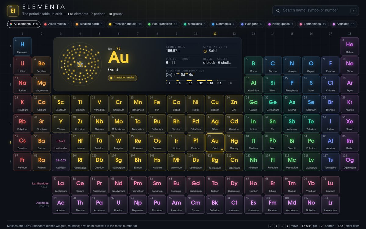
Elementa

Elementa is a premium dark (#0d1117) periodic table of all 118 elements. It follows the standard 18-column layout with the lanthanide and actinide rows set below, dashed "57–71" and "89–103" placeholders in group 3, group numbers across the top and period numbers down the side. Each tile is a softly tinted glass square in its category colour (the ten brief hexes at low opacity with glowing borders). It shows the atomic number in mono, the symbol in a geometric sans with a colour glow, and the name. On desktop the large detail panel sits inside the table's natural gap above the transition metals. The panel pairs an animated Bohr diagram with the element's identity, standard atomic weight, state at about 20 °C, period and group, block, full electron configuration and a K–Q shell ladder. The page's ambient glow, the panel wash and the group/period highlights all take on the colour of the element you are looking at. On phones and small tablets the panel moves above the table, which pans horizontally inside its own scroller.

Open
Original prompt
Design "Elementa", an interactive periodic table of all 118 elements with a premium dark look (#0d1117). Each tile shows atomic number, symbol and name, coloured by category with a harmonious palette (alkali metals #ff6b6b, alkaline earth #ffa94d, transition metals #ffd43b, post-transition #69db7c, metalloids #38d9a9, nonmetals #4dabf7, halogens #748ffc, noble gases #da77f2, lanthanides #f783ac, actinides #e599f7) at soft opacity with glowing borders. Use standard atomic weights, rounded sensibly. The layout follows the standard 18-column table with the f-block below; on narrow phones the table pans horizontally inside its own scroll container (the page itself must not overflow). Interaction: hovering or focusing a tile fills a large detail panel with an animated Bohr-model shell diagram (electrons orbiting on shells with correct per-shell counts), category, atomic mass and state at room temperature; the category legend buttons filter and highlight; a search box jumps to an element. Keyboard navigable with arrow keys.
029

Carriage Return — A Typewriter for Letters

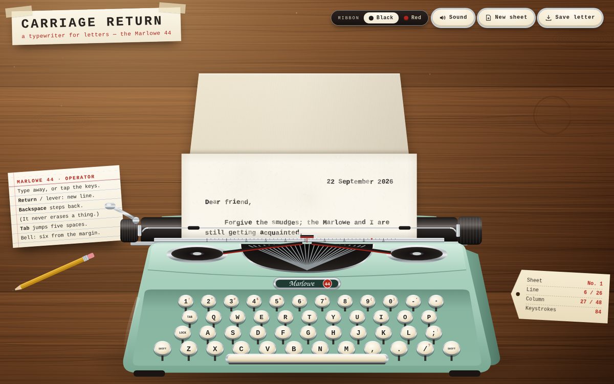
Carriage Return puts a fictional mint-green portable, the Marlowe 44, on a lamplit walnut desk. It is drawn in hand-written SVG in a slight three-quarter view: an enamel shell (#9fc9b6) with a darker side cheek, chrome-rimmed cream keys on visible stems, ribbon spools in chrome cups, a fan of typebars in the basket and a script badge. A sheet of #faf6ec paper stands in the machine the way paper really does. The unfed rear part leans back behind the platen in perspective, while the typed front part rises from the platen and grows a line at a time. Every keystroke stamps a character onto a 2× paper canvas with deliberate imperfections, and the carriage (platen, knobs, bail, margin scale and paper) steps left under a fixed printing point. The bell rings six spaces from the margin; Return swings the chrome lever and glides the carriage home with a line feed. The desk is procedural walnut planks with knots and a dried coffee ring, lit by a warm lamp and drifting dust motes. Beside the machine sit a ruled operator's index card, a pencil and a shipping tag that tracks the sheet, line, column and keystrokes. The first sheet arrives already dated, with a short salutation.

Open
Original prompt
Build "Carriage Return — A Typewriter for Letters", an interactive typewriter writing experience featuring a fictional machine, the "Marlowe 44". A three-quarter illustrated typewriter (SVG; mint-green enamel #9fc9b6 with cream keys and chrome details) sits at the bottom, and a sheet of textured paper (#faf6ec) feeds out above it. Typing on the physical keyboard (or tapping on-screen keys) stamps characters onto the paper with realistic imperfections: slight baseline jitter, varied ink density, an occasional faint double strike, ribbon texture. The carriage visibly shifts left as you type, a bell dings near the right margin, and Enter triggers a carriage return with the lever animation and a line feed. Synthesized sounds (Web Audio clicks and bell) after the first gesture, with a mute toggle. Typography: a typewriter monospace stack ("Courier Prime", "American Typewriter", "Courier New", "Nimbus Mono PS", monospace). Extras: a red/black ribbon toggle, "New sheet" pulls the paper out with an animation, and "Save letter" downloads a PNG of the page. A warm desk background with wood-grain gradients and soft lamplight.
030

Orbital — N-Body Gravity Playground

Orbital is a full-screen n-body gravity playground set in deep space (#03040a). A procedurally generated nebula of domain-warped value noise in indigo (#1b1464) and plum (#5f0f40), crossed by dark dust lanes, sits behind three parallax star layers that twinkle and drift as the camera moves. Bodies attract with softened Newtonian gravity, integrated by a fixed-timestep velocity-Verlet scheme; they leave glowing trails that fade along their length and merge on contact, conserving mass and momentum, blending their colours and releasing a flash and shock ring. Colour and glow follow mass on a logarithmic scale, from icy blue pebbles through white to hot orange giants with soft diffraction spikes. The page opens on a live galaxy collision: two cores, each wrapped in a disk of 420 massless dust particles on circular orbits, fall together and throw out tidal debris. A quiet mission-control HUD in monospace and a single floating dock hold every control.

Open
Original prompt
Create "Orbital — N-Body Gravity Playground". A full-screen canvas of deep space (#03040a) with a subtle nebula (layered noise gradients in #1b1464 and #5f0f40) and parallax stars. Click and drag to fling a new body: the drag vector sets its velocity, shown as a dotted aiming line with a predicted trajectory that accounts for existing masses. Bodies attract with softened Newtonian gravity, leave glowing fading trails, and merge on collision (conserving momentum and mass, mixing colours) with a flash. Colour and glow reflect mass (small icy blue → large hot orange/white). Presets: "Binary star", "Solar system", "Figure-eight three-body", "Galaxy collision" (hundreds of light particles around two cores). A minimal monospace HUD shows body count, total energy and simulation speed. Controls: mass selector for new bodies, pause, slow motion, trail length, clear, and "follow" (camera tracks the heaviest body). Scroll/pinch to zoom, right-drag or two-finger drag to pan. Use a fixed-timestep velocity-Verlet integrator.
031

Nijūshi Sekki — The Twenty-Four Seasons

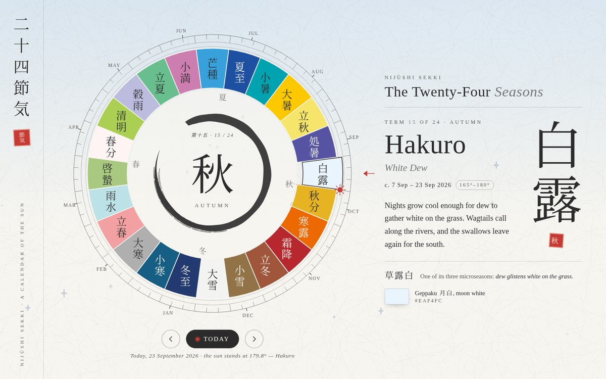
Nijūshi Sekki is a contemplative calendar built around a large SVG volvelle of the twenty-four solar terms. The wheel is laid out in the traditional East Asian way, with spring (east) on the left, summer (south) at the top, autumn on the right and winter at the bottom. It is divided into 24 arcs, one for every 15° of the sun's ecliptic longitude, and each arc is painted in a traditional Japanese colour suited to its time of year (kōbai-iro plum pink, sakura-iro, moegi, fuji-iro, ruri-iro, himawari-iro, kikyō-iro, akane-iro, kakishibu-iro, kon-iro and more), with the term's kanji standing upright in it. Around the wheel run 72 fine ticks for the microseasons (kō), a month ring placed at the sun's true longitude on the first of each month, and today's sun: a vermilion disc computed from the date, with a dashed hand to the centre. At the heart of the wheel, a brush-drawn ensō holds the season's kanji. The whole washi page (#f8f5ee with kozo fibres, sumi #2b2b2b ink) is tinted by the selected term's colour and sky, and a quiet generative motif drifts behind everything. To the right (below on phones), the selected term appears as large vertical kanji with a vermilion seal, its romanized name with macrons, the English meaning, its approximate date range and longitude span, an original short description, one of its three traditional microseasons and its colour swatch. A footnote says plainly that the dates are approximate.

Open
Original prompt
Design "Nijūshi Sekki — The Twenty-Four Seasons", a contemplative calendar of the traditional East Asian 24 solar terms. A large circular SVG dial divided into 24 arcs at 15° intervals of the sun's ecliptic longitude, each filled with a traditional Japanese colour suited to that part of the year (e.g. sakura-iro #fef4f4, moegi #aacf53, ruri #1e50a2, kuchiba #e0c38c, kakishibu). The current date's term is marked by a small sun computed from today's date (approximate dates are fine; say so). Selecting a term shows its romanized name, kanji and English meaning (e.g. Risshun 立春 "Beginning of Spring"), its approximate date range, a short poetic description, and a softly animated seasonal generative motif behind the text (petals, rain, fireflies, falling leaves, snow). Typography: vertical Japanese text using writing-mode for the kanji and an elegant serif for English. Palette: washi white #f8f5ee and sumi #2b2b2b, tinted by the selected term's colour. Interaction: click arcs, arrow keys to step through, a "Today" button. Responsive: the dial scales and the detail panel moves below it on phones.
032

Mythic — Holographic Card

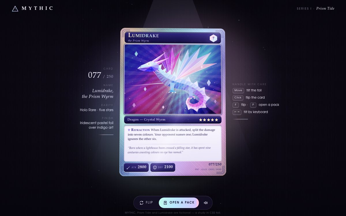
MYTHIC is a fictional trading-card game. The page presents a single Holo Rare, Lumidrake, the Prism Wyrm (No. 077/250 from the invented Prism Tide set), like a museum piece under a soft purple spotlight on dark velvet (#0e0b16). The card is a real 3D object: it sways gently on its own, tilts toward the pointer on a damped spring, lifts as it flips to a guilloche-patterned back, and every foil layer reads its live rotation. The art is entirely SVG and mostly procedural. A faceted crystal dragon (a Catmull-Rom spine extruded into lit triangle facets, with shard wings, back spikes, horns and claws) sits over a forty-ray starburst, with a white beam entering its chest and leaving as a seven-colour spectrum, all on deep indigo. Around it is an embossed silver-pastel frame, engraved name and type plates, a pearl text box with an ability and an italic serif flavour line, ATK/DEF plaques, five rarity stars and the set number. Side plaques in a spaced serif and a floating pill toolbar complete the gallery setting.

Open
Original prompt
Create "MYTHIC — Holographic Card", a premium collectible trading card with realistic holographic foil. One large card centred on a dark velvet background (#0e0b16 with a soft spotlight). The card art depicts an original creature, "Lumidrake, the Prism Wyrm", composed entirely of SVG shapes: a stylised crystalline dragon silhouette over a starburst. The foil: layered conic/linear rainbow gradients with color-dodge/overlay blend modes, a procedural glitter texture, and a diagonal glare band — all driven by pointer position so the rainbow shifts and the glare slides as the card tilts in 3D (rotateX/Y with spring easing and perspective). An embossed frame, a stat block (ATK/DEF, rarity stars), italic-serif flavour text and a set number "077/250". Interaction: pointer tilt (touch-drag on mobile); click to flip the card to its patterned back; a "Pack opening" button plays a short sequence in which a foil pack tears open and the card slides out with a flash. Foil palette: iridescent pastels over deep indigo art.
033

Labyrinthos

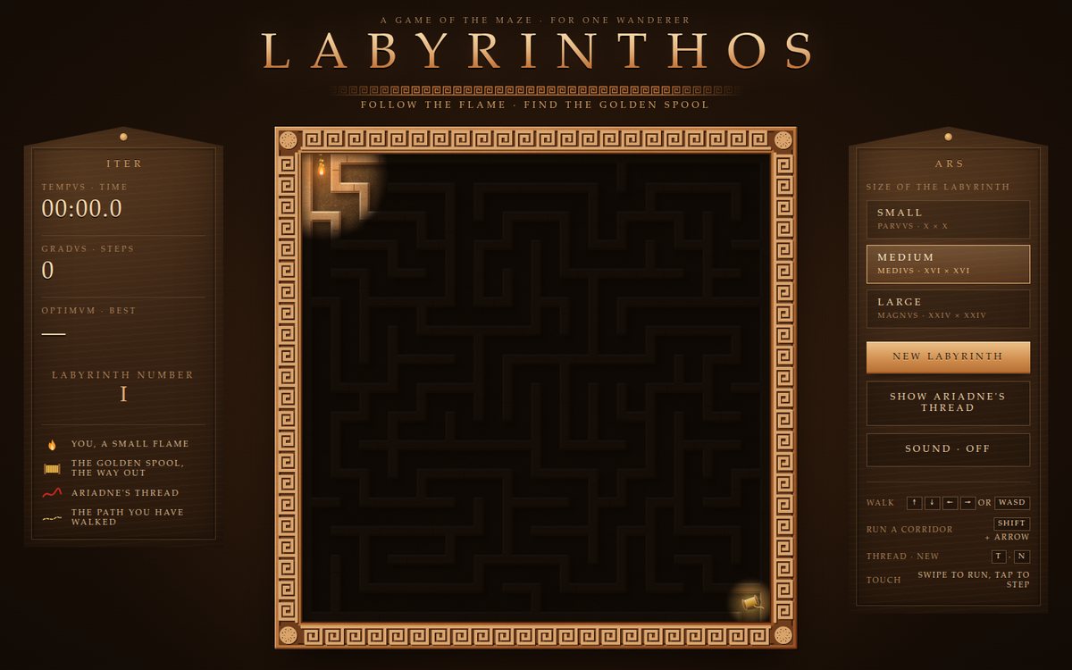
"Labyrinthos" is a torch-lit maze game built as a carved stone tablet seen from above, set in a dark umber chamber between two pedimented steles. Every round starts in full light: a sandstone slab, scored with the mason's setting-out lines, is cut into a perfect maze before your eyes, with a glowing chisel spark and flying stone chips following the recursive backtracker as it winds through the grid. Then darkness falls. You are a small flickering flame at the entrance whose light reveals only a warm circle of terracotta walls and dusty floor, while the corridors you have already passed stay dimly remembered and a thin golden thread traces the path you have walked. In the far corner a golden thread spool glows like a beacon. The frame is a recessed channel carrying a relief Greek-key meander with rosettes at the corners. Inscriptional Roman capitals with wide spacing, Latin labels (TEMPVS, GRADVS, OPTIMVM, EXITVS INVENTVS) and a gilded laurel wreath on the victory screen complete the antique mood.

Open
Original prompt
Build "Labyrinthos", a maze game styled as an ancient stone labyrinth seen from above. Generate a new perfect maze each round (recursive backtracker or Wilson's algorithm), rendered on canvas as carved terracotta/sandstone walls (#c4773b, #e2b07a, with highlight and shadow edges for relief) on a darker dusty floor (#6b4a2b), with subtle noise texture and a Greek-key meander border. The player is a small flickering flame that lights only a radius around it — the rest of the maze is dark (fog of war that dimly remembers visited corridors). Controls: arrow keys/WASD, swipes on touch, and an on-screen d-pad on mobile. The exit is a glowing golden thread spool. Features: the maze visibly carves itself at the start of each round; a "Show Ariadne's thread" hint animates the solution path (BFS) as a red thread; a timer; three sizes; and a victory screen with a laurel illustration. Typography: an inscriptional Roman-capitals feeling serif with wide spacing.
034

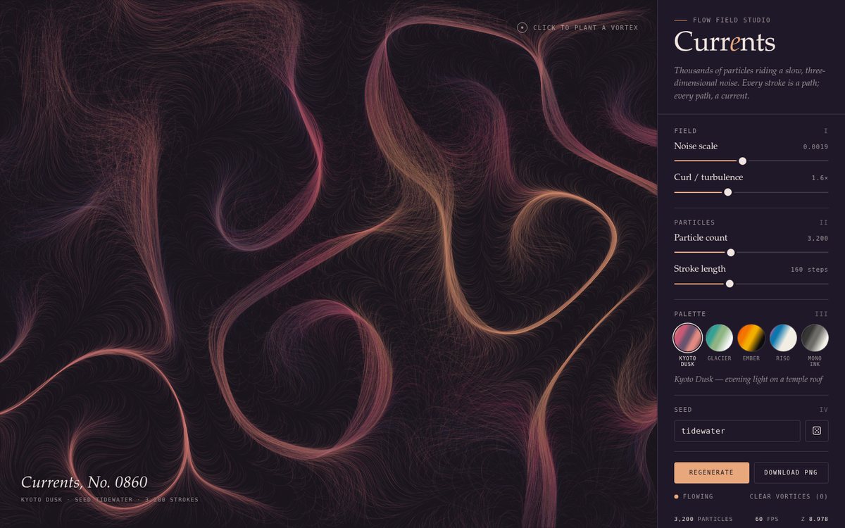
Currents — Flow Field Studio

Currents is a quiet generative studio: the artwork fills the window edge to edge and a slim, typographically calm side panel sits to its right (a pull-up sheet on phones). Thousands of particles ride a seeded 3D simplex-noise vector field and lay down long, hair-fine, semi-transparent strokes that pile up into silky ribbons wherever the currents converge, like wind maps or marbled paper. The field's z-axis drifts slowly, so the piece keeps evolving, and a very slow, periodic fade keeps it from silting up. Five curated palettes each re-theme the whole room: Kyoto Dusk (dusky violet ground, peach, rose, mauve, salmon), Glacier (pale ice ground, slate, teal, moss), Ember (near-black ground with additive orange light), Riso (cream paper, fluorescent pink and blue multiplied like a risograph print, with paper grain) and Mono Ink (sumi-black ink on warm paper). The title is set in a book serif with an italic accent, controls are labelled in understated monospace, and a museum-style caption names each piece ("Currents, No. 0860") from its seed.

Open
Original prompt
Create "Currents — Flow Field Studio", generative art made of thousands of particles following a Perlin/simplex noise vector field (implement the noise inline). Particles leave long, fine, semi-transparent strokes that accumulate into silky flowing textures like wind maps or marbled paper. Five curated palettes, each with its own background: "Kyoto Dusk" (#1a1423; #e8a87c #d45d79 #6e5773 #ea9085), "Glacier" (#f4f7f6; #264653 #2a9d8f #8ab17d), "Ember" (#0d0d0d; #ff4800 #ff7b00 #ffb700), "Riso" (paper #f2eee3; fluorescent pink #ff48b0 and blue #0078bf with multiply blending) and "Mono Ink". A slim, elegant side panel holds noise scale, particle count, stroke length, curl/turbulence, palette, a seed field, "Regenerate" and "Download PNG". Clicking the canvas plants an attractor/vortex that bends the field locally; the piece slowly evolves over time (the noise's z-axis). Typography: understated monospace labels and a serif title. Must stay performant (typed arrays, batched paths).
035

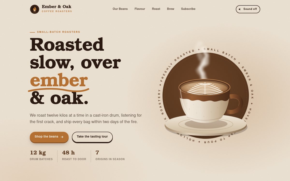
Ember & Oak Coffee Roasters

A warm, tactile landing page for Ember & Oak, a fictional small-batch roastery, built in the brief's espresso, roasted brown, crema, oat and copper palette with a faint paper grain over everything. The hero pairs a chunky Cooper-style serif headline ("Roasted slow, over ember & oak", with a hand-inked copper underline) with a large SVG stoneware cup seen at a three-quarter angle: a two-tone drip glaze, a saucer, steam that curls through an animated turbulence displacement, a rosetta that pours itself into the crema, and a slowly turning seal of ring text. Below, an espresso ticker lists the season's regions, then come a drag-and-snap carousel of origin cards with hand-drawn landscapes, a flavour wheel on a warm oat panel, a dark roasting section where a bean darkens from green to glossy French roast, a brew bar with step timers, and a copper subscription block with a kraft coffee bag.

Open
Original prompt
Design a landing page for "Ember & Oak Coffee Roasters" (fictional). Warm palette: espresso #2b1a12, roasted brown #5c3a21, crema #c8a27a, oat #efe5d6, copper #b87333. Hero: a large SVG coffee cup at a three-quarter angle with animated curling steam (turbulence-displaced SVG paths) and a latte-art rosetta in the crema that redraws on hover. Sections: "Our Beans" — a horizontal scroll-snap carousel of origin cards (fictional estates in real coffee-growing countries such as Ethiopia, Colombia and Guatemala), each with a custom SVG illustration and altitude/process notes; an interactive tasting-notes flavour wheel (SVG donut with sub-segments — fruity, floral, sweet, nutty, spices, roasted) where hovering expands segments and selecting one shows matching beans; a "Roast level" slider that shifts a bean illustration from green to dark roast with crackle particles at first crack; brew-guide steps with timers; and a subscription CTA. Typography: characterful serif headings (Cooper, Rockwell, Georgia, serif) with a clean sans for body text. Tactile hover states throughout.
036

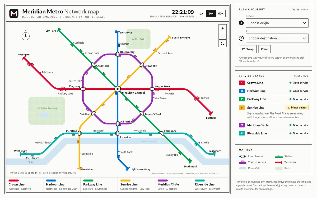
Meridian Metro

Meridian Metro is a live network diagram for an invented city, drawn in the tradition of Beck and Vignelli. It looks like a printed poster: a double-ruled sheet on warm white paper, with a title band, a legend strip along the foot and a sidebar of passenger information. Six lines in the brief's colours run only at 90° and 45° with rounded bends: a west–east Crown Line, a north–south Harbour Line, two diagonals (Parkway and Sunrise) that meet at the eight-spoke Meridian Central hub, an octagonal Meridian Circle and a Riverside Line that follows the pale-blue River Vell. There are 40 stations: interchanges are white capsules with black outlines, ordinary stops are coloured ticks and termini are cross-bars. Two dotted parks and a north arrow complete the sheet. Timetabled trains glide along both sides of every track and pause at each station. The sidebar holds a Dijkstra journey planner, a service-status board (one line has minor delays, which the simulation actually applies) and a map key.

Open
Original prompt
Create "Meridian Metro", an animated transit map for a fictional city in the tradition of Beck and Vignelli diagrams. White ground (#fbfbf9); six coloured lines (#e4002b red, #0072ce blue, #00a651 green, #ffb81c amber, #9b26b6 purple, #00b2a9 teal) drawn as thick SVG paths with only 45° and 90° bends; interchange stations as white capsules with black outlines, regular stations as tick marks; a river as a pale blue band and a park area. Station names in a clean humanist sans with careful placement. Trains (small rounded rectangles in the line colour) run along the lines on simulated schedules, pausing at stations. Interaction: hover a line to spotlight it (others fade); hover or click a station for a card with next departures whose countdowns tick live; a route planner — pick origin and destination to highlight the shortest path (Dijkstra on the station graph) with transfer count and estimated time; zoom/pan on mobile. The line legend doubles as toggles. Include a subtle "service status" panel ("Good service", "Minor delays"). It should look like a crisp printed map.
037

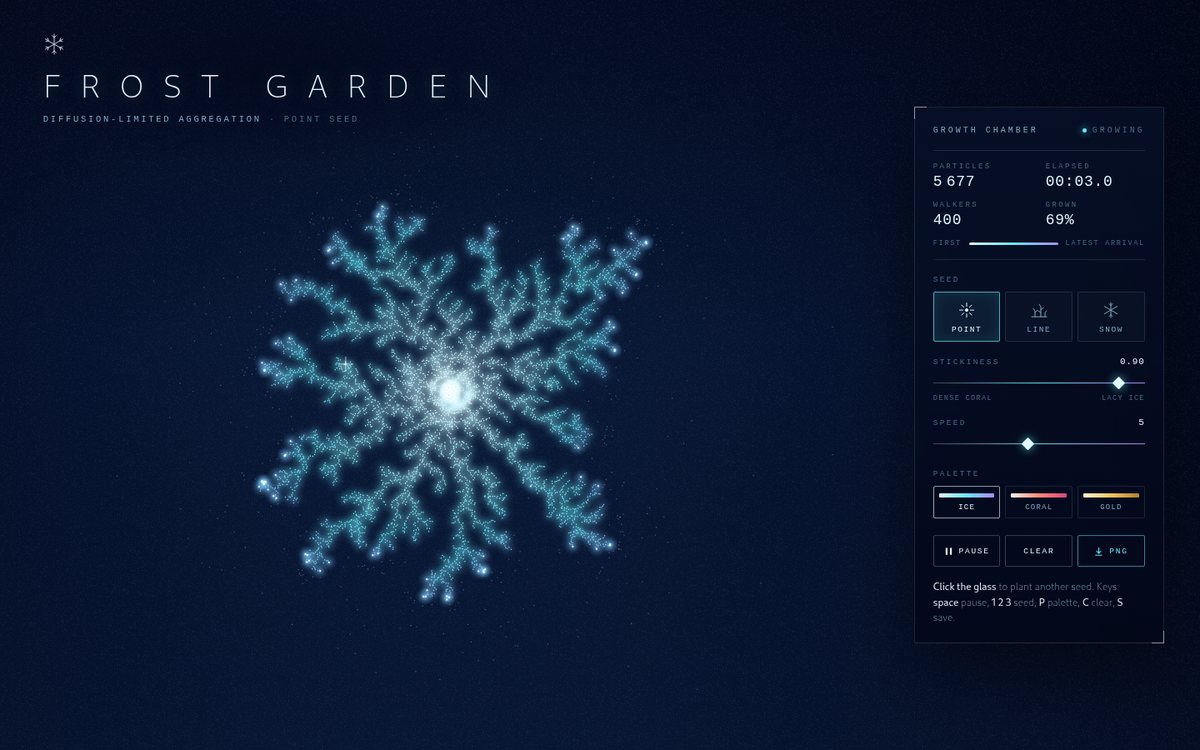
Frost Garden — Diffusion-Limited Aggregation

Frost Garden treats diffusion-limited aggregation as a pane of night glass where ice grows in real time. Against a deep blue-black field (#020617 into #0b1d3a, with a faint frosted-glass grain) hundreds of random walkers drift as faint motes, and each one that touches the crystal freezes onto it with a brief flash. Every particle is coloured by when it arrived, from pale ice #e0f7ff through cyan #67e8f9 to violet #a78bfa, and a soft additive glow layer makes the dense heart of the structure look lit from within. Three growth modes give three different pictures: a radial point-seed frost, window frost rising in a forest of fronds from a glowing sill, and six-armed stellar snowflakes with 60° side branches. The title is set in thin, widely spaced capitals, and a slim frosted instrument panel with crystalline corner marks holds the monospace readout and the controls.

Open
Original prompt
Build "Frost Garden — Diffusion-Limited Aggregation", a crystal-growth simulation that produces delicate branching ice and coral structures. A canvas with a deep blue-black gradient (#020617 → #0b1d3a). Random walkers diffuse and stick when they touch the growing cluster; stuck particles are coloured by arrival time (pale ice #e0f7ff through cyan #67e8f9 to violet #a78bfa) with a soft glow, so the structure looks like frost lit from within. Use an efficient approach (spawn walkers near the cluster radius, grid occupancy, many steps per frame) so growth is visibly lively. Modes: "Point seed" (radial frost), "Line seed" (frost growing up from the bottom like on a window) and "Snow" (6-fold symmetric growth). Interaction: click to add seed points; a stickiness slider (branch density); speed; palette (Ice / Coral / Gold filigree); pause; download. A subtle particle count and elapsed time in elegant monospace. Title in thin, widely spaced capitals.
038

HYPERBRICK

HYPERBRICK is a complete, playable Breakout game built as a synthwave arcade cabinet. A backlit marquee carries the chrome-and-neon logo; below it a screwed-down bezel with pink and cyan neon rims frames a portrait CRT playfield (scanlines, vignette, glass glare), flanked on desktop by illuminated side panels for score, hi-score, stage, lives, a combo meter and a live power-up legend. The whole cabinet stands in a synthwave landscape: a huge striped sun, stars, and a CSS perspective grid rushing toward the viewer. Inside the screen, a painted sky, striped sun and neon-rimmed mountains sit behind glowing glass bricks, and the floor is an animated perspective grid whose speed rises with your combo. On phones the side panels fold into a compact HUD strip and the logical playfield grows taller, so the game stays a true portrait field.

Open
Original prompt
Create "HYPERBRICK", a polished, playable Breakout-style arcade game with a synthwave aesthetic. A canvas playfield framed by an arcade bezel; background dark purple (#12002b) with a perspective grid horizon and a glowing sun. Bricks in glowing neon rows (#ff2e97, #ff9e00, #fff200, #00f5d4, #00bbf9, #9b5de5); a sleek neon capsule paddle; a ball that leaves a motion trail. Juicy feedback: bricks shatter into particles, screen shake on impact, a combo counter with pop text, paddle squash, flashes, and synthesized sound effects (Web Audio blips whose pitch rises with the combo; mute toggle). Power-ups drop from some bricks: multi-ball, wide paddle, laser, slow-mo. Five hand-designed levels (e.g. heart, invader, spiral) plus an endless mode. Controls: mouse/touch drag and arrow keys; Space to launch/pause. Screens: a title screen with an attract-mode demo, pause, and game over with a high score saved in localStorage. Typography: bold italic sans with neon glow for the HUD. Scales to phone screens with a portrait playfield.
039

Galerie Nocturne

Galerie Nocturne is a small museum corridor after closing time, built entirely in CSS 3D. Warm plaster walls (#e9e2d6 where the light falls) stand in darkness, lit only by ceiling track spots. Each spot throws a scallop of light down the wall and a pale beam through the air. A polished black-and-white marble floor reflects the room. Eight original generative paintings hang on alternating walls, each drawn on canvas from a fixed seed so it is identical on every visit: a pointillist harbour sunset, a primary-colour grid, a soft colour-field painting, a bulging op-art checkerboard, an ink-wash mountain hanging scroll, a Bauhaus-style geometric abstraction, a plotter-style flow field, and a gold mosaic sun. Works sit in gilded frames with bead mouldings or in slim black frames with silk or white mats, and each has a crisp museum placard. The titles are set in a Didot/Bodoni-class serif, and the placards and interface in a Helvetica-class sans. All artists, dates and works are fictional.
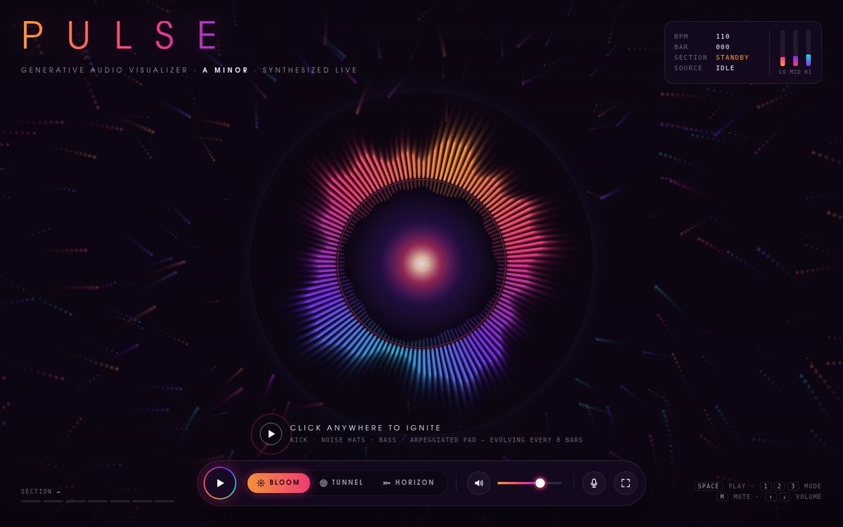
Open
Original prompt
Build "Galerie Nocturne", a walk-through virtual museum room in CSS 3D. A corridor with a polished marble floor (CSS gradients plus reflection), warm walls (#e9e2d6), soft ceiling spotlights casting pools of light, and eight framed paintings hung on the side walls. Each painting is an original generative artwork rendered on canvas and seeded so it is stable: a colour-field piece, a primary-colour grid, a geometric abstraction, a pointillist sunset, a flow field, an op-art piece, an ink landscape and a gold mosaic. Gilded or slim black frames with museum placards (title, fictional artist, year, medium). Navigation: arrow keys/WASD or on-screen buttons move the camera along the corridor with smooth easing; clicking a painting walks up to it and shows it frontally with a detail card; Escape steps back. A small floor-plan minimap shows your position. Typography: a museum-grade sans for placards and a classic serif for the title. On phones, fall back to a swipeable wall of the same framed works.
040

Nonna Lucia's Lemon Ricotta Tart

A warm, illustrated family recipe card for a fictional grandmother's lemon ricotta tart. A cream page with a faint dotted-linen print opens on a two-part hero. On the left is a "Ricettario di famiglia" kicker, a tilted italic terracotta "Nonna Lucia's" over a heavy serif "Lemon Ricotta Tart", a short story and an at-a-glance strip. On the right is a hand-drawn scene: a terracotta arch with a lemon-yellow sun, a golden fluted tart topped with candied lemon slices on a plate, a green gingham cloth fading into the page, a whole lemon, a cut half and leaves. Lemon slices slowly spin on the tart's surface (in perspective) and float around the scene. Below, a sticky ingredients card on the left and nine numbered method cards on the right carry the same palette of lemon #f7d44c, leaf #5b8c51, terracotta #c65d3b, cream #fbf6ea and ink #2e2a24. The current step is outlined with a lemon offset shadow, and Nonna's tips sit in tilted italic margin notes. A print stylesheet turns the page into a clean black-on-white card.

Open
Original prompt
Design "Nonna Lucia's Lemon Ricotta Tart", a beautiful interactive recipe page. Mediterranean citrus palette: lemon #f7d44c, leaf green #5b8c51, terracotta #c65d3b, cream #fbf6ea, ink #2e2a24. Hero: a hand-drawn-style SVG illustration of the tart with lemons and leaves (wobbly line quality, flat colour fills, subtle paper texture), with lemon slices that rotate gently. Two columns on desktop (ingredients left, method right), one column on mobile. Features: a servings scaler (−/+) that recalculates every quantity with nice fractions (½, ¾) plus a metric/US toggle; an ingredient checklist with a satisfying strike-through animation; numbered steps that can be marked done, each with a built-in countdown timer where relevant (e.g. bake 35 min) showing ring progress and playing a gentle chime when finished (Web Audio); and a "cook mode" that enlarges the current step. Typography: warm serif headings ("Iowan Old Style", Palatino, "P052", Georgia, serif) with an italic, handwritten-flavoured style for notes such as "Nonna's tip". Include a short story intro and a print stylesheet (@media print).
041

Midnight Window

"Midnight Window" is a full-screen, nearly wordless nocturne: you are looking through a fogged window at night while rain runs down the glass. Behind it, an out-of-focus city glows in amber #ffb347 streetlights, warm-white windows, tail-light red #ff4b4b pairs that slowly drift away and teal #3fd0c9 signage on deep blue-black #0a0f1f. On the glass, condensation softens everything into milky halos, except where a hand has already wiped a band clear across the streetlights. Tiny beads speckle the pane, larger drops gather, merge, hesitate and slide in wobbling paths that cut thin clear trails through the fog, and every drop acts as a small lens showing the scene flipped and magnified. The only type is a small wordmark, the date and a light serif caption with the live local time, for example "It's 00:47. The city is still awake." A compact frosted control bar holds rain intensity, a city / forest toggle, a wipe button and a sound toggle.

Open
Original prompt
Create "Midnight Window", rain on a window pane at night. Behind the glass, a canvas shows a blurred city bokeh scene (soft glowing circles in amber #ffb347, warm white, tail-light red #ff4b4b and teal signage #3fd0c9 on deep blue-black #0a0f1f), drifting slowly. On the glass: realistic raindrops — small static beads plus larger drops that grow, then slide down in wobbly paths leaving trails and merging with others; each drop refracts the background (render the background flipped and magnified inside the drop). Condensation fogs the glass; the user can wipe it clear with pointer or finger, and the cleared area slowly fogs back. Ambient layers: occasional distant lightning and rain sound synthesized with Web Audio (filtered noise plus droplet ticks) behind a "sound" toggle. A small caption in a light serif: "It's 00:47. The city is still awake." using the live local time. Controls: rain intensity slider and a city/forest background toggle (forest = green bokeh). Performance-minded.
042

Infinite Coastline — Mandelbrot & Julia Explorer

A full-screen, black-and-gold instrument for exploring the Mandelbrot set and its Julia sets. The fractal fills the window with smooth, continuous colouring, and the palette is mapped relative to the lowest escape value in view, so the far exterior falls to black and the coastline glows. Thin gold typography and hairline panels with corner ticks frame the image: a spaced-caps "Infinite Coastline" title, a position readout (real, imaginary, zoom in scientific notation, auto-rising iteration count, cursor or seed c, render progress and time), a bookmark panel whose live thumbnails are rendered by the page itself, and a toolbar with zoom, reset, four palette swatches (Aurum, Abyss, Magma, Pastel Dream), colour cycling, the Julia toggle and PNG export. A circular gold-ringed lens trails the cursor and shows, live, the Julia set for the point beneath it.

Open
Original prompt
Build "Infinite Coastline — Mandelbrot & Julia Explorer". A full-screen canvas rendering the Mandelbrot set with smooth (continuous) colouring and a choice of cyclic palettes: "Aurum" (black → deep blue → gold → white), "Abyss" (navy → cyan → white), "Magma" and "Pastel Dream". Render progressively (low-resolution preview, then refinement in chunks scheduled with requestAnimationFrame, optionally in a Web Worker created from an inline Blob) so the UI never freezes. Interaction: click/tap to zoom in on a point (animated); right-click or a button to zoom out; drag to pan; mouse-wheel zoom; and a live mini Julia-set window that follows the cursor showing the Julia set for the hovered c — press J to make it the main view. HUD: coordinates, zoom level and iteration count (rising automatically with zoom); bookmarks of famous locations (Seahorse Valley, Elephant Valley, a triple spiral, a mini-brot). Palette-cycling animation toggle. Download PNG. A sleek dark UI with thin gold typography.
043

Atelier Noire — Autumn/Winter

ATELIER NOIRE is an editorial lookbook for a fictional couture house's Autumn/Winter collection. It uses four colours: bone #efe9e1, blush #e8c4b8, oxblood #5a1a1d and black #0d0d0d. The page opens with a two-layer curtain wipe (oxblood, then black) that lifts off an "AN" monogram. Behind it is a cover where a giant Didone "ATELIER" sits behind a tall coated figure and an italic oxblood "Noire" overprints in front of it. On desktop the collection runs as one long horizontal strip driven by the ordinary vertical wheel. The strip holds eight numbered looks with asymmetric layouts, an italic manifesto ("Take away until the silhouette holds its breath."), a Materials plate of eight woven swatches, and a "Fin." colophon. A blush "RESTRAINT" set at 66vh slides behind everything at its own parallax rate. Each look is an original SVG fashion croquis drawn with elongated proportions from gradient-folded cloth, a hat brim, lapels, capes, drapes and trains. Giant Didone numerals ("01"–"08") sit behind the figures. Tiny tracked sans labels carry the look number and the material notes. On phones the same content becomes a vertical editorial scroll.

Open
Original prompt
Design "ATELIER NOIRE — Autumn/Winter Collection" (fictional), a high-fashion editorial lookbook. Palette: bone #efe9e1, blush #e8c4b8, oxblood #5a1a1d, black #0d0d0d. Typography is the star: an ultra-high-contrast Didone display stack (Didot, "Bodoni 72", "Bodoni MT", "C059", serif) set enormous and overlapping the imagery, mixed with tiny tracked sans labels. Since no photographs are allowed, each "look" is an abstract fashion illustration built from CSS/SVG — elongated silhouettes, draped fabric shapes with gradient folds, a hat brim, the geometry of a coat — elegant and minimal like fashion croquis. Layout: a horizontal-scroll gallery on desktop (the wheel drives horizontal movement) and vertical on mobile; asymmetric compositions with numbered looks ("LOOK 07"), material captions, and a giant word ("RESTRAINT") sliding in parallax behind. Interaction: hovering a look reveals a detail-zoom fabric swatch (procedural tweed, silk sheen, herringbone); a custom cursor becomes a thin ring labelled "VIEW"; a progress bar. Page-load intro: a curtain wipe.
044

Selene — Tide & Moon Clock

"Selene" is a nocturne: a navy sky with faint stars, a large moon at its true phase for today, and a still, moonlit sea below. The sea rises and falls with an illustrative semi-diurnal tide. The moon sits inside a 24-hour dial with midnight at the top. Its tide ring swells outward at high water and draws in at low water, with times labelled and a pointer at the current hour. On either side, two quiet panels in light Garamond-style italics and small caps give the lunar state (phase name, illumination, age, time to the next full and new moon) and the tidal state (rising or falling, height within the range, spring or neap, next high and low). The tide is plainly marked as illustrative and not for navigation. A glass time scrubber floats on the water. Its track is lined with phase icons and it travels thirty days either side of today, so the moon waxes and wanes under your thumb.

Open
Original prompt
Create "Selene — Tide & Moon Clock", a poetic instrument showing today's moon phase and a stylised tidal cycle. Compute the current moon phase from the date (synodic month ≈ 29.53059 days from the reference new moon of 2000-01-06 18:14 UTC) and render a large, photoreal-leaning moon on canvas with a correct terminator, craters and maria from procedural noise shading, and earthshine on the dark side. Below it, a flowing sea of layered animated SVG waves (navy #0b1d3a, #13315c, #1d4e89 with silver highlights #c9d6e3) whose level rises and falls with a simplified semi-diurnal tide model (two highs and two lows per ~24h50m, clearly labelled illustrative, not for navigation). A circular 24-hour dial around the moon marks tide highs/lows and the current time. Text: phase name, illumination %, days until the next full/new moon, and the next (illustrative) high tide. Interaction: a date scrubber travels ±30 days so you can watch the moon wax and wane; hovering the sea makes it sparkle; a calm night mode dims the UI. Typography: a light, elegant serif with small caps.
045

Vitrail — Stained Glass Generator

Vitrail is a stained-glass workshop set in a dim stone chapel. A tall Gothic lancet, an equilateral pointed arch clipped with an SVG clipPath, glows in an ashlar wall. Its glass is a Voronoi tessellation computed live in JavaScript, with each cell a pane of ruby, sapphire, emerald, amber or amethyst glass. Every pane has its own cut of a procedural sheet texture (mottled density, drawn streaks and trapped seed bubbles) and a gentle thickness gradient. Dark lead came with a highlight, solder joints at every junction and a heavy outer frame hold it together. Sunlight comes through the glass: the sun is a hotspot behind the panes, coloured light spills onto the carved stone, faint coloured shafts full of drifting dust hang in the air, and the window's image falls on the flagstone floor, sheared and stretched by the sun angle, with the lead lines casting thin shadows through the pool. The window frame is SVG stonework: a splayed reveal, concentric carved rolls lit from the upper left, a hood mould with label stops, voussoir joints, colonnettes with capitals and bases, and a sloping sill. A rose-window mode swaps in a circular window with radially symmetric glass, stone spokes, a carved hub and a cusped rim. The side panel is set in inscriptional capitals under an illuminated initial V, drawn in SVG with gold leaf, a diapered blue field and vine tendrils.

Open
Original prompt
Build "Vitrail — Stained Glass Generator". A tall Gothic lancet window (pointed-arch SVG clipPath) filled with a Voronoi tessellation computed in JavaScript (half-plane clipping is fine), where each cell is a pane of jewel-toned glass — ruby #9b111e, sapphire #0f52ba, emerald #046307, amber #ffbf00, amethyst #9966cc — with subtle internal texture (noise, bubbles, streaks) and thick dark lead came lines (#1a1a1a with a slight highlight). Light pours through: the glass glows and coloured light patches are cast, blurred, onto a stone floor below, shifting as a "sun angle" slider moves. Interaction: click inside the window to add a cell (it splits smoothly); drag cell sites to watch the leading reflow; a "Rose window" mode switches to a circular window with radially symmetric cells; palettes (Chartres blues, Sunset, Modern pastel). The surrounding stone tracery is drawn in SVG with carved shading. Typography: a classical inscriptional serif with an illuminated initial letter drawn in SVG.
046

Tend — A Habit Garden

Tend is a calm, greenhouse-flavoured habit tracker in which every habit is a potted plant. The page sits on soft #f4f6f0 with sage #9cb59a, deep green #2f4f3a, clay #d98e73 and sun yellow #f2c14e; the header pairs today's date and a time-of-day greeting ("Good evening, gardener.") with a small landscape of sage hills where the sun (or a crescent moon at night) sits on an arc that follows the actual hour. Each habit card holds an arched glasshouse window with a hand-built SVG plant in a terracotta pot whose growth stage — seed, sprout, leaves, bud, bloom — is driven by the current streak, a big rounded streak number, a "Water today" button, and a 12-week heatmap in greens. A Stats tab turns the same data into concentric completion rings, best-streak bars with miniature plants, summary tiles and a weekday rhythm chart. Type uses a rounded/humanist system stack (ui-rounded, SF Pro Rounded, Seravek, Segoe UI and friends) with tabular numerals.

Open
Original prompt
Design "Tend — A Habit Garden", an elegant habit tracker in which every habit is a plant that grows with its streak. Soft sage palette: #f4f6f0 background, sage #9cb59a, deep green #2f4f3a, clay #d98e73, sun yellow #f2c14e. A header with today's date and a greeting based on the time of day. Each habit card holds a small SVG plant whose growth stage (seed → sprout → leaves → bud → bloom) reflects the current streak, a "done today" button with a satisfying bloom/particle animation, the streak count, and a 12-week contribution-style heatmap in greens (hover shows the date). Add, edit and delete habits in a modal (name, an icon from a set of SVG glyphs, colour). All data persists in localStorage; on first run, prefill three example habits with generated history so the page feels alive. A stats view shows a completion-rate ring chart and best streaks. Typography: a friendly humanist sans with rounded numerals. Micro-interactions: plants sway slightly; a watering-can cursor over the done button. Fully keyboard accessible and responsive.
047

Vast — A Scroll Across the Solar System

"Vast" is a horizontal journey from the Sun to Pluto at true relative scale, on a pure black sky with minimal thin, widely tracked white type. The Sun is drawn 600 pixels wide on desktop (240 on phones), and every diameter and mean distance follows from that single choice (1 pixel = 2,319 km on desktop). Earth is a 5.5-pixel dot 64,500 pixels from the Sun, Jupiter is a 60-pixel banded sphere, and Neptune lies almost two million pixels away. The emptiness is the subject. Short factual and poetic lines drift through the void ("Most of space is this."). Planets too small to see get a thin locator ring and a magnifying loupe that states its magnification. A mechanical rolling-digit odometer reports kilometres from the Sun, AU, light-time and current speed, and a light-speed mode carries you at exactly c relative to the scale, so Earth arrives after 8 min 19 s of real time.

Open
Original prompt
Create "Vast — A Scroll Across the Solar System", a horizontally scrolling journey through the solar system at true relative scale: once the Sun's width is chosen (e.g. ~600px), every distance and diameter follows from real mean values, so Earth is a few pixels across and Neptune lies an enormous scroll away. Vertical wheel/scroll maps to horizontal travel; touch swipes work; a fast-travel control jumps between planets; and a "speed of light" button auto-travels at light speed relative to the scale (Earth arrives after ~8 min 20 s — show a real-time counter). Pure black background (#000) with very minimal white type; planets rendered as small canvas spheres with subtle banding and atmospheric shading. While crossing the emptiness, poetic and factual messages appear in the void ("Most of space is this.") and an odometer shows kilometres travelled and light-time. Typography: thin sans with generous letter-spacing. Keep all facts well established (mean distances in km, diameters).
048

Squishy — Claymorphism UI Kit

"Squishy — Claymorphism UI Kit" is a playful landing page for a fictional product, built so almost everything looks like modelling clay and moves like it too. On a cream-lilac (#f7f1ff) ground in bubblegum, butter, mint, periwinkle and peach, a floating clay navigation pill leads to an asymmetric hero. On the left is a puffy multi-colour "Squishy" wordmark with extruded letters and a separate clay i-dot. On the right six clay icons (a smiling star, a sleepy cloud, a heart, a typing chat bubble, a toggle switch and a rocket) bob and wiggle over a soft clay cushion. Clicking an icon squashes it, stretches it into a hop, lands it with a jiggle and bursts it into clay confetti. Below come a component tray, tilted feature cards, a palette of copyable clay swatches, pricing with a squishy billing switch, a bouncy FAQ and a butter-to-peach call to action. Copy is original, and the page states that the product is fictional.
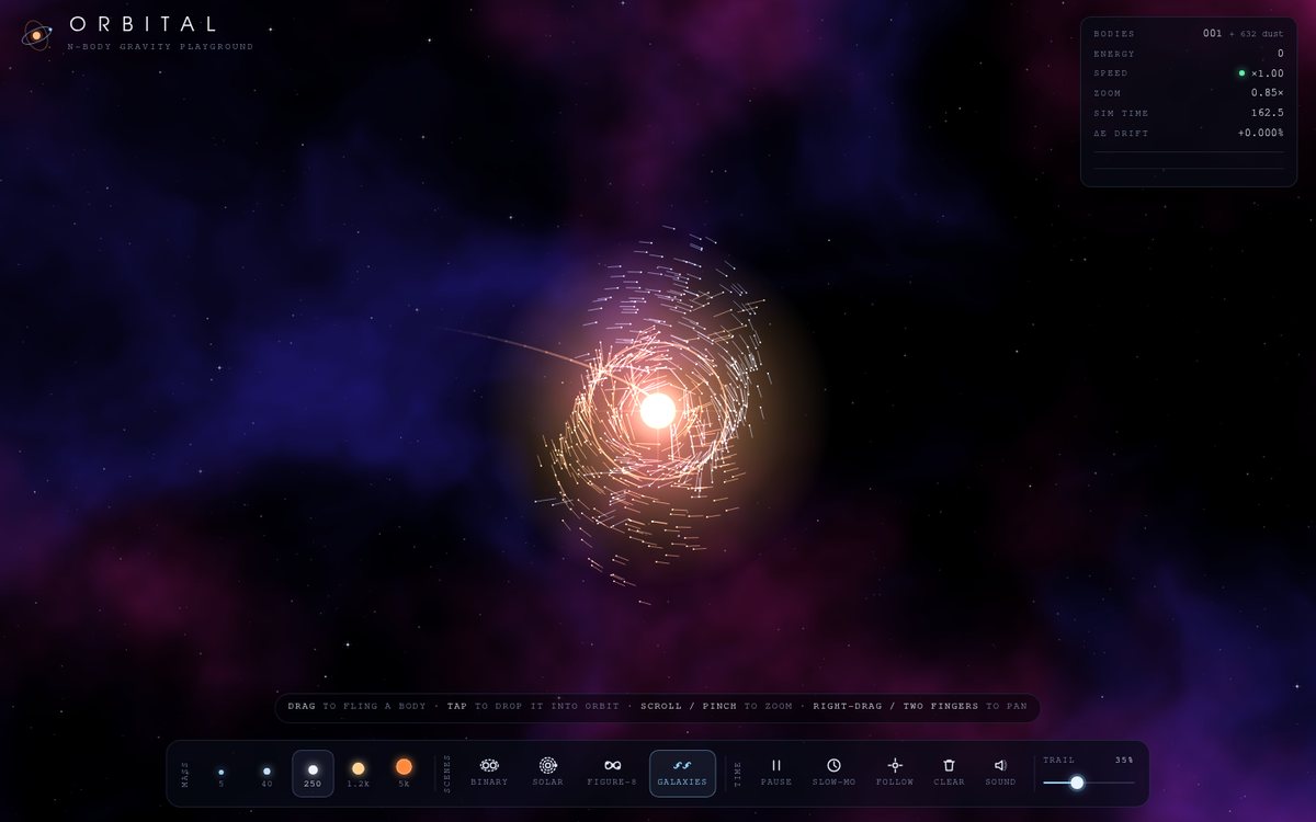
Open
Original prompt
Build "Squishy — Claymorphism UI Kit" (a fictional product), a playful landing page in claymorphism: puffy, soft 3D shapes made with layered inner/outer shadows and radial gradients so elements look like modelling clay. Candy-pastel palette: bubblegum #ffb3c6, butter #ffe5a5, mint #b8f2e6, periwinkle #aab7ff, peach #ffcfb0 on a cream-lilac background (#f7f1ff). Hero: a cluster of 3D clay icons (heart, cloud, star, chat bubble, toggle switch, rocket) built purely with CSS/SVG that bob and wiggle; clicking one makes it squash and stretch with elastic physics and burst into little clay confetti. Sections: a component showcase (clay buttons with pressed states, toggles, sliders, a progress bar that fills with a jelly wobble), feature cards, a pricing section with a squishy toggle, and an FAQ accordion whose panels open with bouncy height animations. Typography: a chunky rounded sans (Nunito, "Varela Round", "SF Pro Rounded", "Segoe UI", system-ui, sans-serif) at heavy weights. Every interactive element should feel tactile.
049

Riso Lab — Halftone Print Studio

Riso Lab is a clean black-and-white print-studio tool whose output is pinned to a warm plaster wall. The left panel is Swiss-plain: hairline rules, tiny uppercase monospace labels, square slider thumbs, and a "RISO LAB" wordmark printed as three overlapping multiply layers. One of five procedural artworks (a lit sphere over a dusk floor, a layered-ridge sunset, a big tilted word you type, a flat geometric face, or your own doodle) is separated into three spot inks and screened as halftone at each drum's angle. The proof overprints fluorescent pink #ff48b0, medium blue #0078bf and yellow #ffe800 (plus black, teal and orange) on #f4efe2 paper with real multiply blending. The poster hangs from two torn washi-tape strips with a slight tilt and soft shadow, and carries print furniture: four registration targets and crop ticks printed by every drum (so misregistration shows as colour-fringed marks), a colour bar with solid, tint and overprint patches, and a colophon set in the darkest ink. A museum-style caption under the poster records the proof number, inks, angles, ruling and misregistration.

Open
Original prompt
Create "Riso Lab — Halftone Print Studio", a tool that turns procedural artwork into a two- or three-colour risograph print simulation. The source image is generated in-page, chosen from: a gradient sphere, a sunset landscape, a big typographic word the user types, a geometric face made of shapes, or a doodle drawn on a small canvas. The output renders colour separations as halftone dot screens at classic angles (e.g. 15°, 45°, 75°) in fluorescent pink #ff48b0, medium blue #0078bf, yellow #ffe800 and black, printed on off-white paper (#f4efe2) with multiply blending, slight misregistration, ink-density variation and paper grain. Controls: dot size/LPI, per-ink screen angle, misregistration amount, ink colours, dot shape (circle, line, square) and PNG download. Each ink has a small "drum" control that toggles its layer with a satisfying roller animation. Layout: a clean studio UI in white and black with tiny monospace labels, the print displayed like a poster pinned up with tape.
050

Loading, Beautifully

"Loading, Beautifully" is a refined specimen gallery of sixteen original loaders and micro-interactions, laid out as a 4×4 grid of small stages on warm charcoal (#141414); it drops to three columns on tablets and two on phones. Each card pairs a stage, a faint dotted cutting-mat texture and a warm accent glow on hover, with a caption strip: a monospace index, the loader's name, the technique it demonstrates, a replay button and a "copy CSS" button. Every piece is drawn with CSS and inline SVG in the harmonised palette #e07a5f, #f2cc8f, #81b29a, #3d405b and #f4f1de. The masthead sets a large, tightly tracked sans title against monospace labels, with three hopping palette dots as its ellipsis, clickable palette swatches, and Pause all / Replay all controls. The sixteen: Tidal Blob, Orbit Trails, Ink Check, Liquid Fill, Origami Tiles, Breathing Ring, Helix, Typewriter, Pendulum, Comet, Pixel Wave, Page Flip, Elastic Heart, Day / Night switch, Download → Done, and Skeleton Shimmer.

Open
Original prompt
Design "Loading, Beautifully — a Gallery of 16 Loaders & Micro-interactions". A refined grid gallery (4×4 on desktop, two columns on mobile) on warm charcoal (#141414) where each card is a small stage demonstrating an original loading animation or micro-interaction made with CSS/SVG (JS only for toggling): e.g. a morphing blob, orbiting dots with trails, a pen stroke drawing a checkmark, a liquid-fill progress, folding squares, a breathing ring, a DNA ladder, a typewriter ellipsis, a pendulum, a gradient spinner with a comet tail, a pixel wave, a page flip, an elastic heart-like burst, a day/night toggle switch morph, a download button that morphs into a progress ring and then a success tick, and a skeleton-shimmer card. Each card has a title, a "replay" button and a "copy CSS" button that copies that card's CSS to the clipboard with a toast. Harmonised muted accents (#e07a5f, #f2cc8f, #81b29a, #3d405b, #f4f1de). Typography: a crisp sans with monospace labels.
051

Hytte — A Winter Cabin

Hytte is a whole-screen illustrated interior: a Scandinavian log cabin at night, drawn in SVG with warm wood tones (#7a4a2a, #a0673c) and lit like a painting. A carved wooden placard reading HYTTE, "a winter cabin", hangs from a nail above a big mullioned window. Through the window, a snowy spruce forest at three depths sits under stars and a rippling green-to-violet aurora (#4dffb4 → #8a5cff) while snow falls outside. A blue enamel mug steams on the sill. A tripod reading lamp with a linen shade stands beside a pendulum wall clock that keeps the real local time. On the right is a rough stone chimney breast with an arched firebox, a timber mantel carrying candles, a red Dala horse and a spruce sprig, a basket of birch logs, and a grey tabby asleep on a braided rag rug in front of the hearth. The fire is animated, and its flicker drives the lighting of the whole room: a warm glow modulates over a cool night tone. On portrait screens the scene is recomposed, with the window above and the fireplace below.

Open
Original prompt
Create "Hytte — A Winter Cabin", a cosy interactive scene: the interior of a log cabin at night, illustrated in SVG/CSS with warm wood tones (#7a4a2a, #a0673c). A stone fireplace with an animated fire (layered flame shapes with flicker plus canvas embers rising); a large window onto a snowy spruce forest with falling snow at several depths and a green-violet aurora (#4dffb4 → #8a5cff) rippling in the sky; a steaming mug on the sill; a reading lamp; and a sleeping cat that breathes. Warm vs cold light: the firelight flicker subtly modulates the room's lighting. Interaction: click the lamp to toggle it (room lighting changes); click the fireplace to add a log (the fire flares, more embers); click the window to open it (cold wind — snow blows inside briefly and the fire dims); click the cat to make its ear twitch; an optional ambient sound toggle (synthesized fire crackle and wind). A title placard in a Scandinavian-style serif. The composition adapts to portrait screens (window above, fireplace below).
052

Helix — The Double Helix Explained

Helix is a clean, editorial biotech explainer. On the left, a large canvas on an off-white dotted-grid "lab bench" (#f7f9fb) shows an idealised B-DNA double helix, rendered in true 3D with perspective. It is right-handed, has 10.5 base pairs per turn and a 0.34 nm rise, and its two backbones are offset about 135° around the axis, which produces a visibly wide major groove and a narrow minor groove. The helix slowly rotates on a slightly diagonal axis, beside a bold "The Double Helix" headline and a one-turn scale bracket. On the right, a white annotation panel lists five numbered features (5′→3′ direction, sugar–phosphate backbone, major groove, minor groove, hydrogen bonds). Live leader lines run from each note to numbered pins that track the matching feature as the molecule turns. Below the notes are the key measurements, a sequence builder with a colour-coded complementary strand, and a legend. An "Unzip & replicate" sequence animates a simplified semi-conservative replication. A dark mode moves the whole piece to deep navy.

Open
Original prompt
Build "Helix — The Double Helix Explained", an educational, beautiful interactive visualization. Centre: a rotating B-DNA double helix drawn on canvas with 3D projection — two sugar-phosphate backbones as glossy ribbons (#2ec4b6 and #e71d36 with depth shading) and base pairs as rungs coloured by nucleotide (A #ff9f1c, T #ffbf69, G #6a4c93, C #8ac926), with correct pairing (A–T, G–C), ~10.5 base pairs per turn, and depth fading for the back strands. A clean biotech palette on off-white (#f7f9fb) with a dark-mode toggle. A side panel with annotations and leader lines (major/minor groove; hydrogen bonds: 2 for A–T, 3 for G–C; 5'→3' direction), a sequence input where typing A/T/G/C rebuilds the helix live (auto-generating the complementary strand), and an "Unzip" button that animates replication — the strands separate and new complementary nucleotides float in. Interaction: drag to rotate, scroll to zoom, hover a base pair to highlight and label it. Typography: a modern sans with a monospace sequence display.
053

Arcana Nocturne — A Three-Card Reading

"Arcana Nocturne" is a three-card tarot reading staged on a midnight-purple velvet table under drifting gold and silver star dust. A faint astrological wheel turns slowly behind three dashed slots (Past, Present, Future) marked with a crescent, a sun and a star. On load the reader spreads the deck: 22 card backs, each an intricate symmetric design of a sunburst eye inside a gilded medallion with crescents, a lattice ground and fleuron corners, fan out in a gentle arc. Drawing a card lifts it from the fan and flies it to its slot, where it turns over in 3D with a glint of light to reveal one of 22 original, procedurally drawn Major Arcana faces in gold foil and moonlight silver (a lightning-struck tower, a moon between two towers, an eight-pointed star over water, and so on). Each face has an arched night window, a numeral cartouche and a title plate. Under each card appears an engraved small-caps name, its orientation and an original italic interpretation. After the third card the deck gathers away and a single line ties the reading together. The whole page is framed as entertainment.

Open
Original prompt
Create "Arcana Nocturne — A Three-Card Reading". A midnight-purple ground (#140a24) with drifting star dust and a velvet tablecloth texture; gold-foil (#d4af37 → #f7e7a1) and moonlight-silver accents. A deck of the 22 Major Arcana, each face designed procedurally in SVG with an original geometric/esoteric motif (e.g. The Moon: crescents and a path between two towers; The Star: eight-pointed stars above water; The Tower: lightning-struck tower geometry), framed with an ornate gold border, a Roman numeral and the title in engraved serif capitals. The back: an intricate symmetric pattern around a central sun/eye. Interaction: "Shuffle" animates the deck riffling; the user fans the deck and picks three cards (Past, Present, Future), which fly to their positions and flip in 3D with a glint; each revealed card shows an evocative, original short interpretation (framed as entertainment). Cards tilt with a shimmer on hover. Optional reversed cards. Typography: serif small caps with generous letter-spacing; body text in an italic serif.
054

ELASTIC — Letterforms on Springs

ELASTIC is a dark typographic playground in deep ink (#111018), hot magenta (#ff2e88) and cyan (#29e7cd). A giant word, BOUNCE by default and editable in the dock, is drawn in the heaviest system sans on an offscreen canvas and sampled into a hexagonal lattice of roughly 2,500 points, each tied to its home by a damped spring. At rest the letters are magenta dot-matrix glyphs sitting between dashed cap-height and baseline guides, with sidebearing ticks and a per-glyph point count ("B · 477") underneath like a type specimen. As soon as anything moves, velocity turns points cyan, short comet tails form, and a soft CSS-blurred bloom makes the whole word glow. On load the points fly in from a scattered ring, then a ghost pointer combs once through the word to show the spring jiggle before handing control to you. The UI is a restrained monospace dock: word field, render mode, repel/attract, three physics sliders and a magenta Explode button.

Open
Original prompt
Build "ELASTIC — Letterforms on Springs", an experimental typography playground. A giant word (default "BOUNCE", editable via an input) is converted into points sampled from its glyphs (draw the text on an offscreen canvas and sample filled pixels); each point is tied to its home position by a spring. Render the points as connected dots/filaments forming the letters. The pointer repels (or attracts — toggle) points with a force field; releasing lets them spring back with overshoot and jiggle. Click to explode the word into particles that reassemble. Palette: hot magenta #ff2e88 on deep ink #111018, with cyan #29e7cd on fast-moving points (velocity-coloured). Modes: dots; lines (connecting nearby neighbours); threads (points tied to home with visible springs). Sliders: stiffness, damping, force radius. UI typography in small monospace; the display lettering is generated from the heavy system sans. Responsive: sampling density adapts to screen size for performance.
055

Dune Engine — Falling Sand Sandbox

Dune Engine is a falling-sand physics toy styled as a desert-dusk instrument. A large pixel-art canvas, framed in terracotta, sits under a dusk-blue sky with faint stars and a banded retro sun low on the horizon; a sand-coloured tool panel holds textured element swatches, the brush, the controls and three scenes. The title "DUNE ENGINE" is drawn in a 5×7 bitmap font whose grains fall into place like sand. The simulation is a real cellular automaton on 3–4 px cells: sand piles and sinks through water, water shimmers and levels out sideways, oil floats and catches fire, fire flickers upward and burns wood and plants, steam rises and rains back down, lava crawls, melts sand into glass and crusts into stone where it meets the sea, and plants creep into any water they touch. It opens on an erupting volcano scene with a glowing lava conduit, a forested flank and an oily sea.

Open
Original prompt
Create "Dune Engine — Falling Sand Sandbox", a cellular-automaton physics toy. A pixel-art canvas (each cell 3–4px) with elements: Sand (warm variations #e6c07b, #d8a95b), Water (#3d7ee0 with shimmer, flows sideways), Stone (static greys), Fire (flickers, rises, burns wood, turns water to steam), Wood (#8b5a2b), Steam (rises and condenses back into water), Oil (floats on water, highly flammable), Lava (turns sand into glass), and Plant (grows into water). Correct density-based interactions (sand sinks in water, oil floats). Desert-dusk UI palette: sand #f3e3c3, terracotta #c1440e, deep dusk blue #1f2a44. An element picker as a row of textured swatches with icons, brush-size slider, pause, clear, and "Scenes" (hourglass, volcano, oasis). Pointer/touch painting interpolated along the stroke. A tiny monospace readout of particle count and fps. Efficient: typed arrays, bottom-up updates with alternating direction, ImageData rendering.
056

Casa Lumen — Architectural Blueprint

Casa Lumen is a drawing sheet for a fictional modernist house on blueprint blue (#0b3d91 to #134a9e), with a fine and a coarse grid, film grain, a double sheet border and zone letters and numbers in the margin. Its left side is the live drawing, in white (#e8f1ff) and cyan (#9fd3ff) line work. Its right side is a drafting column: a room schedule, general notes, a 1:100 scale bar and a full title block (project, drawing name, scale 1:100, sheet A-101, drawn by, checked, date, revision history). The house is designed to be internally consistent across three views. It is an 18 × 11 m single-storey pavilion wrapped around a glass patio open to the sky, with a 16-riser stair up to an upper studio and a roof slab that cantilevers 1.20 m over a south terrace. The South Elevation shows the same openings, and Section A–A (cut through the stair and patio) shows the noon sun at 75° and 28° for latitude 38.5° N passing under the overhang. Every view draws itself like a hand drafting. A Pencil mode re-draws the sheet in graphite on warm paper.

Open
Original prompt
Design "Casa Lumen — Architectural Blueprint", an animated technical drawing of a fictional modernist house. Blueprint blue (#0b3d91 to #134a9e with a fine grid of lighter lines) with white/cyan line work (#e8f1ff, #9fd3ff). The plan draws itself on load: walls first (thick lines with hatched cuts), then doors with swing arcs, windows, stairs, furniture outlines, dimension lines with arrowheads and measurements, room labels, a north arrow, and a title block in the corner (project name, scale 1:100, sheet A-101, drawn by). Use staggered SVG stroke-dashoffset animations, like a hand drafting. Interaction: hovering a room fills it with translucent cyan and shows its area (m²) in a floating label; switch between "Floor plan", "Elevation" (south façade) and "Section" views with a cross-drawing transition; a "Pencil mode" switch re-renders the drawing as graphite on paper (#f5f3ee paper, #333 pencil). Typography: technical lettering (monospace/architectural sans stack, uppercase).
057

Hi-Fi Walnut — Vinyl Listening Room

Hi-Fi Walnut is a private listening room rendered as a luxury object. On deep green felt (#1f3b2d) lit by a warm lamp sits a top-down walnut turntable: a figured veneer plinth (#5c3d2e) with a brass inlay line, hinges and nameplate, a brushed-aluminium platter with strobe markings and an amber strobe lamp, a black record with fine grooves, dark silent bands exactly where the tracks change, and fixed specular light arcs that stay put while the record and its label turn underneath. An S-shaped aluminium tonearm with a brass counterweight lifts, swings onto the lead-in, lowers with a needle-drop thump and then tracks inward through the side. Below the turntable an integrated amplifier holds two cream analogue VU meters that glow amber and swing with the music, and a knurled brass volume knob. On the right a cream liner-notes card (#efe6d8) carries generative CSS cover art, album titles in display-serif small caps, the track list, a brass progress rail, the transport and a crate of three records. All three fictional albums are ambient pieces generated live with Web Audio: the candlelit Rhodes, flute and brushes of "Moss & Lantern Light", the rainy organ and electric piano of "Tidewater Hours", and the music-box bell arpeggios of "Brass Constellations".

Open
Original prompt
Build "Hi-Fi Walnut — Vinyl Listening Room", a luxury music player. A photoreal-leaning turntable in CSS/SVG: a walnut plinth (#5c3d2e, wood grain from layered gradients), a brushed-aluminium platter, a black record with realistic grooves (repeating radial gradients) and specular light arcs that stay fixed while the record spins, a centre label designed per album, and a tonearm that swings onto the record when playing. Music: three original "albums" synthesized with Web Audio — ambient generative pieces (e.g. Rhodes-like FM chords under a slow melody, with soft vinyl-crackle noise), each with a distinct mood. The UI panel: generative CSS album art, track title, animated progress, play/pause, next, a volume knob, and a pair of VU meters whose needles respond to the audio (AnalyserNode). Palette: walnut, brass #c9a227, cream #efe6d8 and a deep green felt background #1f3b2d. Typography: elegant serif album titles with small caps. Changing albums triggers a record-swap animation.
058

Radical Shapes — Milano Design Fest '86

RADICAL SHAPES is a landing page for a fictional festival, the Milano Design Fest '86, designed as if the Memphis movement had made its own website. Every block has a thick black outline and a hard offset shadow, and the page sits on a 12-column grid, so the loud patterns stay organised. The hero stacks the chunky geometric title (black-stroked letters with two-colour offset shadows) over a tilted terrazzo slab on graph paper, with a dotted turquoise disc, a squiggle band and a dozen hand-drawn Memphis objects floating around it: a striped cylinder, a zigzag, a dotted triangle, a half-moon, a banded sphere, a totem column, a lightning bolt and a rainbow arch. Below the hero come a black countdown band with yellow flip-card digits and saw-tooth edges; six designer cards with patterned headers and geometric portraits; a lilac graph-paper schedule with day tabs and a shaped-dot timeline; an illustrated map of a made-up district drawn from chunky SVG blocks; and three perforated tickets on a terrazzo pink field.

Open
Original prompt
Design "RADICAL SHAPES — Milano Design Fest '86" (fictional), a Memphis-Group-inspired event landing page. Palette: black #111, pink #ff90b3, turquoise #2ec4b6, yellow #ffd23f, lilac #b388eb, red #ef476f on white, with terrazzo/confetti patterns and squiggle backgrounds (SVG patterns). The composition is bold, playful and asymmetric: geometric objects (cylinders, zigzags, dotted triangles, half-moons) float and rotate slowly around the hero title. Typography: chunky geometric sans headlines, bold outlines and two-colour offset text shadows. Sections: a countdown to the fictional opening with flip digits; a lineup of fictional designers on cards with patterned headers; a schedule timeline; a venue map made of playful illustrated blocks; and ticket tiers. Interaction: shapes bounce away from the cursor; clicking the hero spawns new random Memphis shapes with a pop; cards wobble on hover; a pattern-shuffler button changes every background pattern. Keep chaos from overwhelming readability: a strong grid underneath.
059

Karesansui — A Zen Sand Garden

Karesansui is a small dry garden to tend by hand, seen from directly above. A mitred frame of dark wood (#5b3f2a) holds a bed of fine pale gravel (#e8e0cf). The gravel is raked into gently wavering straight furrows that break into concentric rings around two moss islands (#6b7d4b) and a lone stone. Stones and moss are generated procedurally and lit by a sun that slowly swings from morning to evening, so the furrows, stones and every cast shadow change as it moves. Red and amber maple leaves occasionally tumble across on the wind and settle, each trailed by its own drifting shadow. The page around the garden is dark and quiet. A vertically set title (枯山水 / KARESANSUI, with a small vermilion 静 seal) sits on the left, a slim washi-paper tool bar on the right, and small italic serif captions below.

Open
Original prompt
Create "Karesansui — A Zen Sand Garden": a top-down view of a raked gravel garden on canvas with fine sand texture (#e8e0cf with grain noise and subtle lighting), a few natural stones (procedurally shaped and shaded, with moss patches #6b7d4b) and a wooden border frame (#5b3f2a). Dragging with the rake carves parallel grooves (4–5 tines) that follow your path, with realistic light and shadow on the ridges; the ripple tool draws concentric rings around a stone on click. Tools in a minimal vertical bar: rake, ripple, place stone, smooth (softly erases grooves), and "return to calm" (animated smoothing). Ambient touches: a maple leaf occasionally drifts across and settles; soft shadows move slowly as if the sun were passing; an optional distant wind chime (Web Audio, after a gesture). Typography: small, elegant serif captions and a vertically set title. Touch on mobile is first-class.
060

QUANTA Terminal

A dark, dense, professional trading terminal for a clearly fictional market. Near-black ground (#0b0e11), hairline-bordered panel surfaces (#12161c), emerald gains, crimson losses and a gold accent (#f0b90b). A slim header carries the QUANTA hex mark, a pulsing "Simulated market" badge, live equity and a UTC clock. Beneath it, an edge-faded ticker tape scrolls all ten instruments. The workspace is a six-panel grid: a live order book with depth bars (left), the candlestick chart (centre), a watchlist with sparklines (right), a portfolio donut, a split buy/sell ticket and a recent-trades feed (bottom row). All instruments (Axolotl Mining, Zephyrine Air, Nimbus Nine…) and the "Quanta Dollar" quote currency are invented, and a footer states that everything is simulated in the browser. On tablets the grid reflows into two columns. On phones it becomes a sticky tab bar (Chart / Book / Trades / Trade / Markets / Wallet) showing one panel at a time.

Open
Original prompt
Build "QUANTA Terminal", a dark, premium trading dashboard with clearly fictional tickers and simulated data (labelled "Simulated market"). Near-black ground (#0b0e11), panel surfaces #12161c, gains emerald #16c784, losses crimson #ea3943, gold accent #f0b90b, hairline borders. Layout: a scrolling ticker tape at the top; a main candlestick chart (canvas) with volume bars, moving averages, a crosshair with OHLC tooltip, time-range tabs and smooth panning/zooming; a live order book with depth bars that flicker as orders update; a recent-trades feed; a watchlist with sparklines; a portfolio allocation donut; and a buy/sell ticket with validation and a confirmation toast. Data evolves in real time via a random walk with volatility clustering. Typography: tabular numerals, a clean sans, monospace for prices; prices flash green/red on change. Responsive: panels reflow into tabs on mobile. Smooth and crisp at high DPI.
061

Dusk Meadow — Fireflies

"Dusk Meadow — Fireflies" is a quiet, full-screen canvas landscape: a sky that slowly deepens from indigo #141b41 to a dusty-rose horizon #e8a0a0, stars that appear one by one as it darkens, a thin crescent moon with faint earthshine rising over layered hills, and a treeline of rounded canopies and spires in near-black greens (#0b1a12). A pale mist drifts along the meadow floor, and the foreground is a thicket of tall grass silhouettes swaying in a travelling wind. About 120 fireflies drift through three depth bands, blinking warm yellow-green #e8ff8a with bloom, and over roughly a minute they find each other and begin to flash together, lighting the whole meadow in shared pulses. The title is set in a delicate italic serif, with one accurate line about synchronous fireflies. A small, translucent control card in the bottom-left fades away when you leave it alone.

Open
Original prompt
Create "Dusk Meadow — Fireflies", a tranquil canvas scene. A meadow at dusk: a sky gradient from deep indigo (#141b41) to a very soft dusty rose at the horizon (#e8a0a0), layered silhouettes of rolling hills and a treeline in near-black greens (#0b1a12), and a foreground of hundreds of grass blades swaying in a noise-driven wind field and bending away from the pointer. About 120 fireflies wander with boids-like motion, each blinking on its own rhythm in warm yellow-green (#e8ff8a) with bloom, and slowly synchronising their flashes over time (Kuramoto-style coupling) — a quiet emergent delight. The pointer is a gentle lantern: fireflies drift toward it when it is held still and scatter when it moves fast. A crescent moon rises slowly and stars appear as the sky darkens. Minimal controls at the bottom-left that fade when idle: sync strength, wind, and sound (synthesized crickets). Title in a delicate italic serif.
062

GROOVY — Lava Lamp

A warm 1970s evening scene: a brass-capped "Model 71" lava lamp (a fictional model) stands on a walnut sideboard in front of concentric-circle wallpaper in #f4a259, #bc4b51 and #5b8e7d on #f4e1c1. Inside the tapered glass, wax blobs driven by a small heat simulation warm over the bulb, bud off the molten pool, stretch as they rise, cool under the cap, drift back down, merge and split. They are rendered as glossy, backlit metaballs with an inner glow and a halo of scattered light in the liquid. The lamp colours the room: a screen-blended glow on the wall and a pool of light on the tabletop follow the chosen combination, and the whole room dims when the lamp is switched off. "GROOVY" is hand-built from fat, round-capped SVG strokes with a chocolate outline, an offset rust shadow and a cream inline, and each letter wobbles slowly like warm wax. Chunky cream cards with offset shadows hold the story copy and a retro control panel.

Open
Original prompt
Build "GROOVY — Lava Lamp", a 1970s lava lamp rendered with real metaball physics. A classic lamp silhouette (chrome/gold base and cap drawn in SVG with metallic gradients) centred on warm retro wallpaper (repeating SVG pattern of orange/brown circles, #f4a259, #bc4b51, #5b8e7d on #f4e1c1). Inside the glass, wax blobs heated at the bottom rise, cool and sink, merging and splitting (metaball field computed on a low-resolution grid with smooth thresholded edges, glossy highlights and inner glow). Colour combinations: "Classic" (red wax in yellow liquid), "Purple Haze" (magenta in blue), "Lime" (green in violet) and "Ocean". Interaction: click the lamp's switch to turn it on/off (the light fades, the wax slows and settles); a temperature knob; a colour-combo switch; the pointer heats the glass locally. The whole room's glow is tinted by the lamp colour. Typography: a groovy rounded bold display with an outline shadow.
063

Skyward — A Brief History of Flight

Skyward is a horizontal, drag-scrollable timeline of flight from 1783 to 1969, told as a climb. The sky is painted live on a canvas and changes with the year at the centre of the screen. It starts as a pink dawn over the Montgolfier balloon, turns cerulean for the age of the Wrights, Blériot and the Atlantic crossings, deepens through 1947, and becomes star-filled space with the Earth's limb glowing below for Sputnik, Gagarin and Apollo 11. Thirteen well-established milestones stand on white "flight strip" cards: 1783 Montgolfier balloon, 1853 Cayley's glider, 1891 Lilienthal, 1903 Wright Flyer, 1909 Blériot, 1919 Alcock and Brown, 1927 Lindbergh, 1932 Earhart, 1939 He 178, 1947 Bell X-1, 1957 Sputnik 1, 1961 Gagarin and 1969 Apollo 11. The cards rise higher above the time axis as the years go on. Each card has an original SVG line illustration of the craft, its date and place, and a short serif caption. Opening a card gives the full story and key figures. A paper plane flies below the axis trailing a dashed contrail, and an instrument-style altimeter reads out the year. Type pairs a condensed aviation sans (DIN, Bahnschrift, Nimbus Sans Narrow) for numerals and labels with an old-style serif for captions.

Open
Original prompt
Design "Skyward — A Brief History of Flight", an interactive horizontal timeline. Sky palette: dawn blue #bde0fe, cerulean #3a86ff, cloud white, sunset accent #ff8fab, ink #1d3557. A long drag-scrollable (and wheel/keyboard) timeline from 1783 to 1969 with well-established milestones: 1783 first crewed hot-air balloon flight (Montgolfier brothers' balloon); 1853 Cayley's crewed glider; 1891 Lilienthal's gliders; 1903 the Wright Flyer at Kitty Hawk (12 seconds, 120 feet); 1909 Blériot crosses the English Channel; 1919 Alcock and Brown make the first non-stop transatlantic flight; 1927 Lindbergh's solo transatlantic flight; 1932 Amelia Earhart's solo transatlantic flight; 1939 first jet-powered flight (Heinkel He 178); 1947 Chuck Yeager breaks the sound barrier in the Bell X-1; 1957 Sputnik 1; 1961 Yuri Gagarin orbits Earth; 1969 Apollo 11 lands on the Moon. Each milestone has an elegant SVG line illustration of the craft, its date and a short caption. Parallax clouds at several depths; a small paper plane travels along the timeline. Clicking a milestone expands its card. A progress altimeter shows the year. Typography: an aviation-inspired sans with serif captions.
064

Fridge Verse — Magnetic Poetry

"Fridge Verse" puts you nose to nose with a kitchen fridge. A tall enamel door (a #eef0f2 vertical gradient with faint metallic noise and a sweeping sheen) stands against a sage subway-tile wall, with a freezer compartment and a chrome seam across the top. A chunky chrome handle stands off the right side and casts its shadow on the door. About 125 word magnets cling to the door: small #fffdf7 tiles set in a classic Times-style serif, each tilted slightly, with a few pale pink, mint and butter tiles for flair. The rest of the fridge carries its own clutter: a drawn polaroid of a seaside sunset pinned by a red dome magnet, a glossy strawberry and a lemon-slice magnet. A ruled index card held by a blue magnet always shows the poem currently arranged on the door, ready to copy. The toolbar in the freezer strip is set in a rounded sans. It holds the theme packs (Love, Ocean, Space, Kitchen), a chunky red Shake button, Tidy and a sound toggle.

Open
Original prompt
Build "Fridge Verse — Magnetic Poetry", a tactile word-magnet toy. A large enamel fridge door (subtle vertical gradient #eef0f2 with faint metallic noise and a chrome handle at the side) holding about 120 word magnets: small white tiles (#fffdf7) with a slight drop shadow and a serif word, each rotated slightly at random, a few coloured (pale pink, mint, butter) for flair. Choose a vocabulary (nouns, verbs, adjectives, suffixes -s, -ing, -ed) that makes poetic combinations likely. Dragging a magnet gives a pleasing lift (shadow grows, slight rotation) and a snap back onto the door; magnets may overlap. Features: a "Shake" button that scatters magnets with physics; theme packs (Love, Ocean, Space, Kitchen); a poem detector that reads tiles arranged in lines left to right and shows the current poem in a small card you can copy; a few decorative fridge items (a drawn polaroid picture, a fruit magnet). Persist positions in localStorage. Typography: classic serif tiles with a rounded sans for the UI.
065

Patchwork — A Generative Quilt

Patchwork is a cottage-craft page that pieces a new quilt on every visit. It sits on warm linen and is set in a chunky warm serif with an embroidered, dashed underline and a spool-and-needle mark. The quilt is built entirely in SVG from seven traditional blocks: Log Cabin, Flying Geese, Half-Square Triangles, Nine Patch, Pinwheel, Churn Dash and Ohio Star. Each block is drawn from real piecing geometry in a unit square and turned a random quarter-turn. The blocks sit in sashing with cornerstones, a printed border and a wavy binding. Every patch is cut from procedural SVG fabric patterns: gingham, calico florals with five-petal flowers and leaves, polka dots, straight or bias stripes, chambray weave, flecked muslin and near-solids. The palettes are cottage-warm (Farmhouse's barn red, mustard, denim, cream and sage, plus Indigo, Sunset and Scandinavian). Patches get puffy quilted shading and dashed hand-stitching inset along every seam. A sewn-on label card gives the quilt a whimsical fictional name, a number, block counts with mini icons and its finished size, and holds the controls. A "Drape on line" mode hangs the quilt from wooden pegs on a sagging washing line under an open sky, where it billows in the wind.

Open
Original prompt
Create "Patchwork — A Generative Quilt". Every visit (and every click on "Stitch a new quilt") generates a unique quilt made from traditional blocks — Log Cabin, Flying Geese, Half-Square Triangles, Nine Patch, Pinwheel, Churn Dash, Ohio Star — laid out on a grid with sashing and borders. Fabrics are procedural SVG patterns: gingham, calico florals (tiny flower motifs), polka dots, stripes and chambray, in warm cottage palettes (e.g. barn red #9e2a2b, mustard #e09f3e, denim #335c67, cream #fff3b0, sage #9fb8ad). Visible dashed stitching, slight puffy shading on each patch (quilted look via inner shadows) and a wavy binding edge. Interaction: hovering a block lifts it slightly and shows its pattern name; clicking cycles its pattern; a palette chooser (Farmhouse, Indigo, Sunset, Scandinavian); a "drape" toggle shows the quilt hanging on a line, waving gently in the wind. Download PNG. Typography: a warm serif with an embroidery-like dashed underline.
066

Planet Forge — Procedural World Generator

Planet Forge is a procedural world generator styled as a deep-space survey console. The left stage is a cosmic black field with a painted nebula and seeded starfield, where a slowly rotating planet is shaded per pixel: fractal terrain mapped to biomes, drifting clouds, a soft day/night terminator with sparkling city lights on the night side, an atmospheric rim and halo, and optional rings that cast a real shadow band across the globe while the planet shadows the rings in turn. Moons orbit on faint traced ellipses and pass in front of and behind the planet. A survey record in the top-left gives each world a catalogue designation ("JH-4471 e"), a class, playful but plausible stats and a fictional field note; the right-hand console of thin cyan (#4cc9f0) lines and clipped-corner glass panels holds presets, sliders, toggles, seed and export.

Open
Original prompt
Build "Planet Forge — Procedural World Generator". A canvas renders a rotating sphere with per-pixel shading (ray–sphere intersection or a pre-baked equirectangular texture sampled by rotation): terrain from fractal noise mapped to biomes (deep ocean, shallows, beaches, forests, deserts, mountains, ice caps by latitude), an animated cloud layer, an atmospheric rim glow, a day/night terminator with city lights on the night side, and optional rings casting a shadow. A cosmic black background with a faint nebula and stars. A sci-fi control panel (thin lines, cyan #4cc9f0 accents, glass panels) with sliders for sea level, temperature, cloud cover, terrain roughness, ring toggle, moon count, rotation speed and seed, plus presets (Earthlike, Desert world, Ocean world, Lava world, Ice world, banded Gas giant). Each planet receives a catalogue designation (e.g. "KX-4471 b") and playful stats. Interaction: drag to rotate, "Randomize", PNG download. Keep rendering efficient (render at lower resolution and upscale smoothly).
067

ASCII TIDES

ASCII TIDES is a living seascape drawn only with monospace characters, glowing like amber phosphor (#ffb000 on #140c00) by default, with Seafoam (#7fffd4 on #001414) and Paper (ink #222 on #f2ecdc) palettes. Rows of tildes, dashes, colons and dots form real rolling swells that rise, occlude the water behind them and break into frothy '*', '#' and '@' foam along their crests. A small character-built sailboat bobs and leans on the waves, and a glitter path of '+' and '*' sparkles beneath a character sun, or at night a gibbous moon. Clouds drift across the sky, gulls flap by during the day, and stars twinkle (with the occasional shooting star) after dark. A time-of-day dial moves the sun across the sky from dawn to dusk and night, pointer or touch drags ripples through the water, and a box-drawn caption in the corner reports the time, the light and the swell.

Open
Original prompt
Create "ASCII TIDES", an animated ocean scene made entirely of monospace characters rendered into a <pre> or a canvas character grid. Characters map to wave height and foam (e.g. " .,:;~=≈*#@"). Layers: a sky with slowly drifting ASCII clouds and a sun or moon made of characters, a horizon, rolling swells (sum of sines plus noise), foam crests, and a small character-built boat bobbing on the surface. Palette: amber phosphor #ffb000 on #140c00 by default, switchable to "Seafoam" (#7fffd4 on #001414) and "Paper" (ink #222 on #f2ecdc). Pointer/touch disturbances create ripples that propagate across the water (2D wave equation on the grid). A time-of-day slider changes the sky (stars at night). Typography: a monospace stack with tight line-height; the grid adapts to the viewport to keep characters crisp. A tiny caption in the corner inside an ASCII box-drawing frame. Smooth at 30–60fps with efficient string building.
068

Mira Okafor — Bento Portfolio

A bento-grid portfolio for Mira Okafor, a fictional product designer. It is a calm, gallery-like grid on #f5f5f7 with white 24px-radius tiles, hairline-soft shadows, tight system-sans typography, one vivid lime accent (#c3f53c) and a deep indigo (#1b1f3b) feature tile. Twelve tiles of varied sizes sit on a 4-column named-area grid: - an intro with an illustrated avatar, availability ping and oversized tight-tracked name - a live analog and digital Lisbon clock with day/night glyph - a "Now playing" card with an equalizer - the indigo Tandem case-study tile, with a CSS-drawn phone rising from its bottom edge and its app feed scrolling - counting stats - an abstract SVG street map of Lisbon with a pulsing pin - floating tool chips - a generative gradient-mesh poster tile - rotating testimonials - a 3D CSS book for "Currently reading" - a wide Fieldnote case-study tile with an animated mini dashboard - a dark contact tile with a magnetic lime button Project tiles expand into full-screen case studies through a shared-element transition. All people, projects, quotes and numbers are fictional and labelled as such.

Open
Original prompt
Design a bento-grid portfolio for "Mira Okafor — Product Designer" (fictional). Neutral palette: #f5f5f7 page, #ffffff tiles, #1d1d1f text, one vivid lime accent #c3f53c and a deep indigo feature tile #1b1f3b. A responsive bento grid of 10–12 tiles of varied sizes with 24px radii and delicate shadows: an intro tile with name and role; a local-time tile with a live analog clock; a "Now playing" tile with an animated equalizer; a project tile containing a mini animated UI mockup (a CSS-drawn phone screen scrolling); a stats tile with counting numbers; a location tile with a stylised abstract SVG map and a pulsing pin; a tools tile with floating chips; a testimonial tile; a "Currently reading" tile with a CSS book; a contact tile with a magnetic button; and a dark tile with a generative gradient mesh. Interaction: tiles lift and reveal extra detail on hover; a cursor spotlight glides across tile surfaces; clicking a project tile expands it into a full-screen case-study overlay with a smooth shared-element transition. Typography: a system sans with tight tracking.
069

Apiary — The Honeycomb

Apiary is a living honeycomb that fills the screen: hundreds of pointy-top hexagonal cells in amber #f6a821, gold #ffc93c, deep honey #c77d0a and wax #fff1c1, separated by dark comb walls (#2a1a05). Empty cells read as faceted wax tubes lit from the upper left. Honey cells are translucent and glow from within, each filled to its own level with a curved meniscus and a small specular glint. Capped cells, clustered toward the top of the frame as in a real comb, are pale domed wax lids. Seven bees with banded abdomens, fuzzy thoraxes and ghosted, motion-blurred wings trace figure-eight waggle dances whose dotted trails fade on the comb, then fly off to visit cells and top them up. A warm glass panel with a serif title and small-caps labels holds an illustrated honey jar, the Harvest button, live counts of honey, capped and empty cells, and a two-sentence account of the waggle dance with a diagram and a live readout of what the current dancer is signalling.

Open
Original prompt
Build "Apiary — The Honeycomb", an interactive hexagonal-grid artwork. The screen fills with hexagonal cells (canvas or SVG) in honey tones — amber #f6a821, gold #ffc93c, deep honey #c77d0a, wax #fff1c1 — with dark comb gaps (#2a1a05). Cells have a subtle inner bevel and translucency: some are filled with glowing honey (animated fill level with a meniscus shine), others are empty wax, a few are capped. Hovering sends a spreading ripple of brightness through neighbouring cells (delayed by hex distance). A handful of bees (small creatures with blurred beating wings) fly figure-eight "waggle dance" paths and visit cells, filling them over time. Interaction: click a cell to fill it with honey (drip animation); drag across cells to paint; a "Harvest" button drains the cells with a flowing animation into a jar counter; the grid regenerates on resize. A side panel explains the waggle dance in two short, accurate sentences. Typography: a warm serif title with small-caps labels.
070

Grandmaster's Study

Grandmaster's Study is a complete two-player (hot-seat) chess game staged like a fine board on a green leather desk under a warm lamp. The board alternates maple (#e8d0aa) and walnut (#8a5a3b) squares with real-looking grain: maple runs horizontally and walnut vertically, as on a hand-made board. It sits in a deep red-brown lacquered frame with a gloss highlight, a thin brass inlay, gold-filled engraved serif coordinates on all four sides and four screwed brass corner fittings. The pieces are original Staunton-inspired SVG silhouettes in warm ivory (#f7f0e1) and ebony (#1e1b18), lit from the upper left with highlights, detail lines and soft cast shadows. Beside the board, a classic serif panel carries the title, a status plate, brass control buttons, a green-baize tray of captured pieces with the material balance, and a cream score sheet with a red margin, blue ruled lines, editable player names and moves in algebraic notation. On phones the board fills the width and the panel stacks below.

Open
Original prompt
Create "Grandmaster's Study", an elegant, playable two-player chess board (local hot-seat). A luxurious board of maple (#e8d0aa) and walnut (#8a5a3b) squares with subtle wood-grain gradients, a lacquered frame with brass corner fittings, and file/rank coordinates engraved in serif. Pieces drawn in SVG as original Staunton-inspired silhouettes — ivory (#f7f0e1, warm shading) and ebony (#1e1b18, soft highlights). Full legal chess rules: legal move generation with check detection, castling, en passant, promotion (with a chooser), and checkmate/stalemate detection. UX: click or drag pieces; legal moves shown as subtle dots/rings; last move highlighted; check shown as a red glow on the king; a move list in algebraic notation in a side panel styled like a score sheet; a captured-pieces tray; undo; flip board; new game. Smooth gliding piece animations and a soft synthesized "clack" on each move (toggle). Responsive: the board fits the width on phones with the panel below. Typography: a classic serif.
071

Chroma — Colour Palette Studio

Chroma is a calm, precise palette studio in a white interface (#ffffff, #f4f4f5 panels, #18181b ink) set in a crisp system sans with monospace values. Five full-height colour columns fill the screen, and they become horizontal bands on phones. Each column shows the nearest of the 148 CSS named colours, a large editable hex, RGB, HSL and OKLCH values, and a contrast chip with its WCAG grade. Each also has drag, lock, copy and adjust controls in quiet translucent circles. A sidebar holds an OKLCH harmony wheel that draws the rule's geometry (triangle, rectangle, arc or line) with a draggable point per colour, plus the rule's name and description and a lightness ramp. Below the fold, "Check it, try it, take it" gathers a 7×5 WCAG contrast matrix, a live mock interface for a fictional trip-planning app whose roles are assigned automatically, an OKLab gradient with a side-by-side comparison against sRGB interpolation, and CSS or JSON export.

Open
Original prompt
Build "Chroma — Color Palette Studio", an elegant tool for generating harmonious palettes. A clean white UI (#ffffff, #f4f4f5 panels, #18181b text). The main view is five tall colour columns filling the screen (horizontal bands on mobile); each shows hex, RGB, HSL and a name (nearest match from a curated list of ~150 named colours) and has lock, copy and adjust controls. Space (or a button) generates a new palette that respects locked colours using harmony rules — analogous, complementary, split-complementary, triadic, tetradic, monochromatic — computed in OKLCH for perceptual evenness (implement the conversion). Extra panels: a WCAG AA/AAA contrast checker for text on each colour; a live preview card (a mini UI mockup) using the palette; a gradient preview; and export (CSS variables, JSON) copied to the clipboard. Interaction: drag columns to reorder, click a hex to edit it, and a colour-wheel diagram showing the harmony geometry with draggable points. Smooth colour transitions. Typography: a crisp sans plus monospace.
072

Somewhere Inside

"Somewhere Inside" is a quiet double-exposure plate. A large human profile with a low bun faces right on pale, grainy mist (#f2efe9 to #d9d4cc) and works as a window onto a whole landscape at dusk. Inside, a sky of #1d2b53 to #7e2553 to #ff9e7d rises behind layered mountain ranges, drifting fog, a pine treeline, a still lake that reflects everything, a glittering moon path and a tiny rowing boat. The lake sits in the neck and the forest along the shoulders. Ink-dark birds cross the edge of the silhouette, so they read as dark shapes against the sky inside and as ink marks on the mist outside. Beside the face, an italic serif column holds the title and original four-line poem fragments that fade in and out, with a scene index below. Clicking the portrait travels further in: the landscape cross-fades to an Ocean (rising moon, lighthouse on a headland whose flaring lamp sits where the eye would be, rolling swells) and then to a City (skyline of lit windows, blinking radio mast, reflections on a river, a night train crossing a bridge). Each scene has its own palette and accent colour.

Open
Original prompt
Create "Somewhere Inside", a double-exposure art piece: a large human profile silhouette (a smooth SVG path of a face in profile with shoulders) acts as a mask revealing a whole landscape inside it — layered mountain ranges, a pine forest, a lake reflecting the moon, drifting fog and birds — while outside the silhouette is a pale misty gradient. Palette: a dusk gradient inside (#1d2b53 → #7e2553 → #ff9e7d), mist outside (#f2efe9 → #d9d4cc), ink details. The inner landscape moves in subtle parallax with the pointer (and slowly on its own), fog layers drift, and the moon's reflection shimmers. Original poetic text fragments fade in and out beside the profile in an elegant italic serif. Interaction: pointer parallax; clicking cycles the inner landscape between "Mountains", "Ocean" (waves and a lighthouse) and "City" (skyline with lights), each with its own palette and a smooth cross-fade. A film-grain overlay. The composition reflows for mobile, with the silhouette scaled and centred.
073

Silicon — Living Circuit Board

"Silicon" is a fictional development board rendered as one large responsive SVG and laid on a dark teal anti-static mat beside a datasheet-style control panel. The board is green solder mask with noise texture, a soft sheen and hatched copper pours. Its gold traces, routed at 45 degrees with mask clearance halos, connect a 64-pin QFP processor (U1), a TSOP memory (U2), a SOIC logic chip (U3), a DPAK regulator (U4) and a QFN USB bridge (U5). Around them sit a 25 MHz crystal, aluminium electrolytic capacitors with vent crosses and polarity stripes, carbon-film resistors with correct four-band colour codes, SMD parts, five status LEDs and a power LED, a 2x10 header, USB-C and barrel-jack connectors, a slide switch and a small OLED module. White silkscreen marks every reference (U1, R12-style labels, C4, "REV 2.1"), and a monospace title block sits in the corner. The page boots itself: the switch slides on, the power LED lights, warm-white power flows down the 3V3 trunk, the LEDs light in sequence, the OLED types a boot log, and cyan data pulses start racing from chip to chip.

Open
Original prompt
Build "Silicon — Living Circuit Board". An SVG printed circuit board in rich green solder mask (#0a4d2e with subtle texture) with gold traces and pads (#d4a537 with highlights), white silkscreen labels (component references such as U1, R12, C4, "REV 2.1"), chips (black epoxy with pin legs and printed markings), capacitors, resistors with colour bands, LEDs and a crystal oscillator. Signals — glowing pulses of cyan (#3cf2ff) and warm white light — travel along traces from chip to chip, routed along a graph of trace segments. Interaction: hovering a component highlights all of its connected traces and shows a spec tooltip; a "power" switch boots the board (LEDs light in sequence, a small OLED component shows boot text); clicking a chip "overclocks" it (faster pulses, a slight heat shimmer); a "logic probe" cursor mode shows voltage readings on traces. A title block in silkscreen monospace in the corner. Scales responsively via viewBox.
074

Iridescence — Soap Bubbles

Iridescence is a light, airy scene: a pale sky that fades from powder blue (#dbeafe) to blush (#fef3f2) with a warm sun bloom in one corner and faint clouds drifting across. Soap bubbles of many sizes rise slowly and drift on a gentle wind, wobbling as they go; one large "hero" bubble anchors the opening frame. Each bubble is mostly transparent, with swirling bands of magenta, gold, cyan and green that strengthen toward the rim, a bright four-pane window reflection in the upper left and a smaller glint lower right. The bands keep turning slowly over time. The title "iridescence" is set in an ultralight, widely spaced sans filled with a slowly sliding pastel-iridescent gradient. A tiny counter of bubbles popped, with a spinning rainbow ring, sits in the top corner, and soft glassy pills hold the hints, a wind vane, Blow and Sound.

Open
Original prompt
Create "Iridescence — Soap Bubbles". A soft, bright sky (#dbeafe → #fef3f2 gradient with faint drifting clouds). Bubbles of varied sizes float upward and drift on a gentle wind, wobbling as their shape oscillates; each is rendered with thin-film interference colours — swirling bands of magenta, gold, cyan and green on a mostly transparent sphere — plus a bright window-shaped specular highlight and a smaller secondary one, with the swirl animating over time (canvas gradients and noise-driven hue shifts). Bubbles collide softly. Interaction: clicking/tapping a bubble pops it — it bursts into a ring of tiny droplets and a quick shimmering film fragment, with a soft "pop" (Web Audio, after the first gesture); dragging blows a new bubble from a wand (it grows with drag distance and detaches on release); wind direction follows pointer movement. A tiny, elegant "bubbles popped" counter. Typography: an airy light sans title that is itself slightly iridescent.
075

Brush & Ink — Calligraphy Pad

Brush & Ink is a quiet, lamp-lit calligraphy desk. A sheet of rice paper with a deckled edge, drifting fibres and faint laid lines lies on a dark procedurally grained wooden desk; to its left a lacquer-dark tool rail with vertical 筆墨 lettering, to its right an illustrated inkstone with an ink stick, a bamboo brush on a porcelain rest and a carved red seal. On load the brush writes 永 (eternity), the character used to teach the "eight principles of yong", stroke by stroke, followed by a small vertical inscription giving the current season and year in the sexagenary cycle, and the seal. From then on the paper is yours: strokes swell when you move slowly and thin when you move fast, respond to pen pressure, taper at the ends, bleed a soft halo into the paper and run dry over long strokes into streaky "flying white".
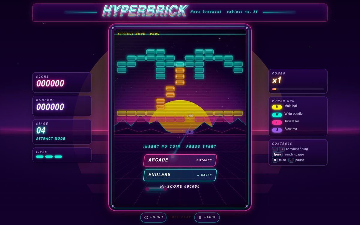
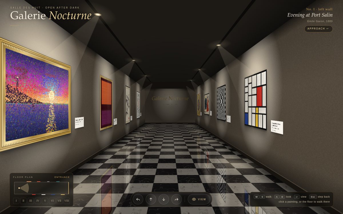
Open
Original prompt
Build "Brush & Ink — Calligraphy Pad". A sheet of rice paper (#f5f0e1 with visible fibres and an optional faint grid of practice squares) on a dark wood desk (#2b1d14), with an inkstone and a brush illustrated at the side. Drawing produces convincing brush strokes: width responds to speed (slow = thick, fast = thin) and to pointer pressure when available; ink runs out over a long stroke, producing dry-brush "flying white" texture; stroke ends taper; ink bleeds slightly into the paper (a subtle blurred halo). Ink colours: sumi black, diluted grey and vermillion. Tools: brush size, ink wetness, undo, clear (the paper slides away and a fresh sheet slides in), a red seal stamp you can place (SVG seal with generated square characters), and PNG download. Include a "trace" mode that shows faint model strokes of a simple character (e.g. 永) to practise over. Typography: small, elegant serif labels with vertical-text accents.
076

ARES VII Mission Control

ARES VII Mission Control is a "NASA-punk" flight-control dashboard for an invented crewed Mars transfer, and it is labelled throughout as simulated. Slate panels (#0e1116) sit on a faint cyan grid, each with safety-orange corner brackets, a numbered monospace header and small status chips. Off-white numerals, cyan data traces and amber caution states complete the palette. The header carries the mission patch, a live mission elapsed time, a countdown to Mars orbit insertion and a clock that switches between Earth UTC and Mars time, plus a sound toggle and a physical-looking MASTER CAUTION lamp. Six panels fill the grid: a heliocentric Hohmann-transfer diagram, four scrolling strip-chart telemetry channels, an animated vehicle schematic, a 12-light subsystem matrix, four crew biomedical cards with live ECG sweeps, and a comms log whose traffic is governed by the one-way light time. The fiction rests on real mechanics. The transfer uses a = 1.262 AU and e = 0.208 (258.9 days). Position comes from solving Kepler's equation, speed from vis-viva, and light time from the Earth–ship range. Array power falls as 1/r², crew dose accumulates at the ~1.84 mSv/day the Curiosity rover's RAD instrument measured in cruise, and the Mars clock uses the Mars24 Mars Sol Date formula.

Open
Original prompt
Create "ARES VII Mission Control", a dashboard for a fictional crewed Mars mission with clearly simulated telemetry. Aesthetic: "NASA-punk" — dark slate panels (#0e1116), safety orange #ff6b1a, off-white #e8e6e3, amber warnings #ffb000, cyan data #4ee1ff, thin grid lines, rounded-rectangle panels with corner brackets and tiny monospace labels. Panels: a mission elapsed time (MET) counter and a countdown to orbit insertion; a trajectory diagram (SVG Hohmann transfer between Earth and Mars with the spacecraft moving along it); live telemetry charts (cabin O₂, CO₂ ppm, power, velocity) as smoothly scrolling line charts; crew status cards with heart-rate waveforms; a comms log whose messages arrive after a one-way light-time delay; a subsystem status grid with nominal/caution/warning lights; and an animated spacecraft schematic. Interaction: click subsystems for detail; an "acknowledge" button when a random caution appears (flashing, with a Web Audio beep after a gesture); a toggle between Earth time and Mars sol time. A responsive grid that collapses gracefully.
077

The Glass Alibi

The Glass Alibi is a short, original film-noir mystery played in black and white on a letterboxed silver screen. Port Calloway, 1947: private eye E. Crane takes a late-night visit from torch singer Nora Vale, whose alibi for the killing under Pier 9 is a lipstick-stained glass at the Blue Lantern. Five scenes (office, rain-soaked alley, jazz club, dressing room, fog-bound pier) branch into three endings (Red on the Glass, The Last Ferry, Wrong Song), and whether you solve it depends on noticing one thing. Everything is rendered in greys, with chiaroscuro light cones, rain, grain, vignette and projector flicker, except the single key clue: a crimson lipstick mark in #b3001b that appears on the tube in the gutter, the rim of the glass on table six, the cold-cream rag, and the clue entries in the case file. Narration types out in a period serif, choices arrive as typed index cards, and each scene opens and closes with an iris wipe and a silent-film intertitle.

Open
Original prompt
Build "The Glass Alibi", a short interactive film-noir detective story (original, about six scenes with branching choices and two or three endings). Black-and-white visuals with dramatic chiaroscuro: venetian-blind shadow bands sweeping across the scene, rain streaking the window (canvas), a flickering desk lamp, a steaming coffee cup, film grain and vignette overlays, and occasional old-film frame jitter. Scenes are illustrated with SVG silhouettes (office, rainy alley, jazz club, pier) in greys, with a single accent colour reserved for the key clue (a red lipstick mark #b3001b). Narration and dialogue appear with a typewriter effect in a period serif; choices are presented as typed index cards. Include an ambient sound toggle (synthesized rain and a low, jazzy bass line). Features: a case-file notebook that collects clues, iris-wipe scene transitions, and restart. Typography: a Courier-like monospace for notes and a condensed serif for titles.
078

Four Seasons — A Fractal Tree

Four Seasons is a quiet, painterly landscape with one generative tree standing on a gentle rise, rolling hills dotted with small trees behind it, and a sky, a sun and drifting clouds that all follow the time of year. The tree is grown recursively from a seed and sways in a gusty, noise-driven wind, with the thinnest twigs bending the most. Scrub through the year and it changes: fresh green buds and pale pink blossom in spring, a dense summer canopy with dappled light on the grass, leaves turning red, orange and gold in autumn before tumbling down into a pile around the trunk, and bare winter limbs gathering snow while flakes fall across a white meadow. A gentle italic serif title sits top-left; top-right, a small circular dial with the twelve months set around its rim, coloured season arcs, a leaf-tipped hand, a dot for today's date and a season glyph at its centre. The page opens on today's date in the northern hemisphere.

Open
Original prompt
Create "Four Seasons — A Fractal Tree", a generative tree swaying in the wind whose appearance follows a seasons slider. Trunk and branches are grown recursively (randomised angles, tapering widths, gentle curvature) and drawn on canvas with bark colouring; noise-driven wind bends branches in proportion to their depth. Seasons: Spring (pale blossoms #ffc8dd and fresh green buds), Summer (a lush green canopy #52b788 with dappled light), Autumn (leaves turning #e76f51, #f4a261, #e9c46a and falling with tumbling physics to pile on the ground) and Winter (bare branches, snow accumulating on limbs, snowfall). Sky and ground transition smoothly with the season. Interaction: drag the slider (or press "Play the year" for a 60-second cycle); click the tree to shake it (leaves or snow fall); "New seed" grows a new tree with a growth animation. Typography: a gentle serif title with month names around a small circular season dial.
079

Pulsar Ridges

Pulsar Ridges is an original, animated homage to the stacked pulse plots of radio astronomy: sixty crisp #f5f5f5 lines on pure black (#000). Each line is a signal profile that occludes the lines behind it, so the stack reads as a landscape seen from a low angle. The profiles never stop moving. Pulses roll from the back of the stack toward the viewer, a noisy hiss shivers along every line, and the centre swells with clusters of sharp peaks. The pointer becomes the source of the signal: the peak region follows it horizontally, and lines near it swell into a raised mound. Clicking cycles through four signals, Pulsar, Terrain, Audio and Heartbeat. The only typography is a small, uppercase, widely tracked monospace credit line at the bottom, like the text on an album sleeve.

Open
Original prompt
Build "Pulsar Ridges", an animated, original piece in the spirit of classic stacked ridge-line plots. Black background (#000) with ~60 stacked white lines (#f5f5f5) drawn on canvas with occlusion (each line filled black beneath so nearer lines hide farther ones); each profile comes from layered noise plus a central peak region and animates continuously, so the ridges roll like a landscape of signals. Interaction: the pointer position becomes the source of the peaks (ridges swell toward the cursor); clicking switches data modes: "Pulsar" (sharp central peaks), "Terrain" (mountain noise), "Audio" (a built-in synthesized drone analysed with an AnalyserNode drives the lines, after a gesture) and "Heartbeat" (ECG-like spikes). Settings: line count, amplitude, speed, colour mode (white, amber, spectrum gradient). Minimal typography: a small, uppercase, widely tracked monospace caption at the bottom like an album credit. PNG download. Perfectly crisp on high-DPI screens.
080

Luminote — Piano with Falling Lights

A nocturnal, immersive piano visualizer. A deep #0a0a12 stage fills the screen above a realistic three-octave keyboard (C3–C6, 37 keys) with a lacquered fallboard and a thin red felt line. Glowing rounded bars fall toward the keys, each coloured by pitch class on a soft chromatic rainbow (rose C through orange, lime, cyan and indigo to magenta B). When a bar lands, its key sinks and glows, a light beam rises from it, and a burst of sparks and an elliptical bloom flare up. Faint key lanes, octave marks, drifting dust and a violet horizon glow give the stage depth. A floating glass control bar carries the rainbow small-caps "Luminote" wordmark, the three modes, a melody picker, play/restart, a tempo slider, a label toggle and mute. The page opens in Listen mode, already raining the opening of Für Elise silently, with a breathing "Tap anywhere to wake the piano" pill.
Open
Original prompt
Create "Luminote — Piano with Falling Lights". A full-width three-octave piano keyboard along the bottom (glossy black and ivory keys with realistic depth and pressed states), playable by mouse/touch (multi-touch) and computer keyboard (two rows mapped). Above it, a dark stage (#0a0a12) where notes fall toward the keys like a rhythm-game visualizer: glowing rounded bars coloured by pitch (a soft chromatic rainbow), with sparks and a light burst when they land. Sound: a pleasant piano-like tone synthesized with Web Audio (several detuned harmonics, fast attack, exponential decay, and reverb from a convolver with a generated noise impulse). Modes: "Free play" — played notes rise as light trails; "Listen" — auto-plays public-domain melodies (Ode to Joy, the opening of Für Elise, Twinkle Twinkle Little Star, the opening of Gymnopédie No. 1) with falling notes; "Learn" — the song waits for you to press the right key. Tempo slider and a note-name toggle. Typography: a refined sans with small caps.
081

SIGNAL/NOISE

"SIGNAL/NOISE" is the portfolio of k.oshiro, a clearly fictional glitch artist, designed as a controlled corruption: pure black #000 and white #fff with RGB channel accents (#ff0040, #00ff9f, #0070ff), a heavy grotesk for display and monospace for everything else. A hex-dump sidebar scrolls endlessly down the left edge (it collapses into a three-line strip on phones). A two-line "SIGNAL/ NOISE" headline fills the hero, with its channels split and horizontal slices displaced in periodic bursts, and a short manifesto sits in the space beside "NOISE". Below are a stat strip, a 4×2 grid of eight live generative works, an About section whose monospace text decodes itself out of glyph noise, an exhibitions list and a large lowercase contact line. CRT scanlines sit over everything and occasional full-screen tears rip through the page, but hierarchy, spacing and contrast keep it navigable, and one "Stabilize" switch calms every effect.

Open
Original prompt
Design "SIGNAL/NOISE", the portfolio of a fictional glitch artist, "k.oshiro". Stark black #000 and white #fff with RGB channel accents (#ff0040, #00ff9f, #0070ff). The page is intentionally corrupted but controlled: a headline with RGB split and horizontal slice displacement that re-randomises periodically; project thumbnails that are generative canvases (pixel-sorted gradients, datamosh-like block smears, scanline interference) and glitch harder on hover; CRT scanlines and occasional full-screen tear events; a scrolling "corrupted" hex-dump sidebar. Sections: a works grid (eight generative pieces with titles and years), an about text in monospace that types itself with random character corruption resolving into readable text, an exhibitions list and contact. Interaction: hovering intensifies the glitch; clicking a work opens it full-screen with a "corruption" slider; a "stabilize" toggle calms every effect (and prefers-reduced-motion defaults to stable). Typography: monospace and a heavy grotesk. Despite the chaos, it stays navigable and legible.
082

Rosée — Eau de Parfum

A quiet-luxury product page for Rosée, an eau de parfum from the fictional Maison Élorine, in blush #f4d6d0, cream #fff8f3, rose gold #b76e79 to #e8b4a0 and deep plum #3b1f2b. The hero pairs a tall, octagonal faceted glass bottle with a jewel-cut gold cap, standing on a cream plinth inside a soft halo, with a rose-gold Didone wordmark "ROSÉE" drawn in SVG (hairline serifs, heavy stems, a light sweep of shine). The pink liquid inside is alive: its surface ripples gently, and as the pointer moves the bottle leans slightly toward it while the liquid lags, sloshes and settles, tilting against the pointer. Rose petals flutter down in 3D and steer around every text block. Below the hero, a layered pyramid presents the top, heart and base notes, each revealed with hand-drawn botanical line illustrations that draw themselves. An editorial "Story" follows, with a drop cap, a pull quote and a fictional perfumer's signature. Wide-tracked sans captions set off the high-contrast serif throughout.

Open
Original prompt
Create a product page for "Rosée — Eau de Parfum" by a fictional maison. Palette: blush #f4d6d0, rose gold #b76e79 → #e8b4a0, cream #fff8f3, deep plum text #3b1f2b. Hero: a tall faceted glass bottle drawn in SVG with realistic refraction highlights and a gold cap, holding pink liquid whose surface sloshes in a gentle wave and responds to pointer tilt (the liquid level tilts against the pointer). Rose petals (gradient SVG shapes) drift down the page with a 3D flutter, staying clear of the text column. Sections: the fragrance pyramid (top/heart/base notes) as an elegant layered triangle where each note appears on hover with a small botanical line illustration; "The Story" editorial paragraph; a size selector (30/50/100 ml) that resizes the bottle smoothly and updates the price; and a luxurious "Add to bag" button with a shimmering sweep. Typography: a refined high-contrast serif with wide-tracked sans captions.
083

Connected — A Dot-Matrix Globe

Connected is a rotating dot-matrix Earth floating in a midnight #050a18 starfield. 12,000 points (7,000 on phones) sit evenly on a Fibonacci sphere. Each one is classified as land or ocean by a hand-encoded 72 × 36 bitmap of the continents (5° cells, stored as compact run lengths) that is sampled bilinearly, so the 5° steps soften into rounded coastlines. Land dots glow from #5ad1e6 to #a6fff2 under a light from the upper left, ocean dots are a quiet #1b2a4a, and the continents on the far side show faintly through, like glass. A cyan atmosphere haloes the sphere and a rim light catches its edge. Great-circle arcs fly between fifteen real cities: London, New York, Tokyo, São Paulo, Lagos, Sydney, Mumbai, Cairo, Los Angeles, Singapore, Moscow, Johannesburg, Mexico City, Dubai and Beijing. Arcs are coral when eastbound and gold when westbound, and each has a white-hot head, a tapering tail and a pulsing ring when it lands. A glass side panel shows clearly simulated traffic statistics in a clean geometric sans (Futura, Century Gothic, URW Gothic).

Open
Original prompt
Build "Connected — A Dot-Matrix Globe". A rotating 3D globe rendered on canvas as a sphere of evenly spaced dots (Fibonacci sphere), with bright land dots and faint ocean dots — land determined from an embedded low-resolution land mask (a compact hand-encoded bitmap, e.g. a 72×36 character grid of the continents). Palette: midnight background #050a18, ocean dots #1b2a4a, land dots #5ad1e6 → #a6fff2, arcs in coral #ff6f61 and gold #ffd166. Animated great-circle arcs travel between about fifteen major world cities placed at their real latitude/longitude (London, New York, Tokyo, São Paulo, Lagos, Sydney, Mumbai, Cairo…), each with a glowing head, a fading tail and a pulsing ring on arrival. An atmospheric glow halos the globe. Interaction: drag to rotate with inertia; hover a city dot for its name; click a city to fly the globe round to face it; auto-rotation resumes after idle. A side panel with clearly simulated stats ("connections per second"). Typography: a clean geometric sans.
084

Crystalline — No Two Alike

"Crystalline — No Two Alike" is a quiet laboratory of ice on a deep winter-blue field (#0c1b33 → #1c3a5e), where soft snow falls through three depths of focus. On the left, a slim panel in thin, wide-tracked sans with delicate serif italics holds the conditions in the cloud: temperature and humidity sliders and a small, simplified Nakaya diagram whose glowing cursor can be dragged directly. A one-line, deliberately approximate explanation of the resulting habit sits below. On the right, one large, slowly rotating snowflake glows like translucent ice, with a catalogue plaque beneath it (number, date and time, habit name). "Grow a snowflake" grows a new crystal outward from a tiny hexagonal seed, numbers and dates it, and files it in the catalogue below. The catalogue is a grid of smaller flakes. Each card opens an enlarged view with its conditions and seed, a "grow alike" action and an SVG download.

Open
Original prompt
Create "Crystalline — No Two Alike", a procedural snowflake generator. Each snowflake grows with 6-fold (dihedral) symmetry using a branching algorithm — main arms with side dendrites, plates and needles that vary with "temperature" and "humidity" parameters, loosely echoing the Nakaya diagram. Rendered in SVG/canvas as translucent ice with inner facets, edge highlights and a faint glow on a deep winter-blue background (#0c1b33 → #1c3a5e). The hero shows one large flake slowly rotating; below it, a gallery of smaller generated flakes. Background: gentle snowfall of micro-flakes with depth blur. Interaction: "Grow a snowflake" animates growth outward from a hexagonal seed; temperature and humidity sliders show how the form changes (plates at some settings, dendrites at others — keep the explanation light and approximate); clicking a gallery flake enlarges it; each flake gets a catalogue number and date; download as SVG. Typography: a thin, wide-tracked sans with a delicate serif italic.
085

Maison Lierre — Paris 1899

Maison Lierre is an Art Nouveau poster page for a fictional botanical tea house in Paris, 1899. It is an original homage to the era's great poster artists, not a copy of any of them. A fixed ornamental frame wraps the viewport: a teal outer rule, a gilt inner rule with notched corners, whiplash corner flourishes ending in spirals and lily buds, ivy climbing both sides, and small cartouches at top and bottom. All of it draws itself on load and sways gently. At the centre of the hero, "MAISON LIERRE" is set in custom SVG lettering: monoline capitals with curled terminals, drawn on in teal and gold. It sits inside a circular halo of hand-set mosaic tesserae ringed by sunburst rays, with gold glints sparkling across the tiles. Two tall stylised lilies with whiplash petals, stamens and blade leaves flank the halo, and ivy garlands wreathe it above a curved ribbon reading "Botanical Teas · Paris 1899". Below, organic panels with gilt-and-olive double borders hold the house's story, which opens on an illuminated drop cap. Three arch-topped cards present the signature blends with botanical vignettes (chamomile and lime blossom, a scalloped rose, jasmine sprays), and vines grow around a card when you hover it. There is an afternoon-tea menu with dotted leaders and period franc prices, and a calling-card contact panel with an "ML" monogram. A toggle switches between "Day" (cream paper) and "Salon" (deep teal with glowing gold lines). On phones the frame simplifies to the rules and small corner flourishes.

Open
Original prompt
Design "Maison Lierre — Botanical Teas, Paris 1899" (a fictional tea house) as an Art Nouveau poster page in the spirit of the era's great poster artists (original artwork, nothing copied). Palette: muted sage #a3b18a, olive #588157, antique gold #c9a227, terracotta #bc6c25, cream #fefae0, deep teal #264653. The page is framed by an ornate SVG border of whiplash curves, stylised lilies and ivy that draw themselves on load and sway gently; a circular halo motif with radiating mosaic sits behind the title; flowing, organic panels hold the content (the house's story, three signature blends, an afternoon-tea menu, a contact card). Decorative initials and dividers. Typography: a serif stack plus custom SVG-drawn title lettering with curved terminals. Interaction: hovering a blend grows vines around its card; a subtle gold sparkle on the halo; a toggle between "Day" (cream) and "Salon" (deep teal with glowing gold lines). Graceful responsiveness: the border simplifies on phones.
086

Rule 30 — Tapestries of Elementary Cellular Automata

"Rule 30" is presented as a museum installation: a cream, linen-textured gallery label on the left (a textile-label serif with monospace numbers), a working loom hung on a dark gallery wall in the centre, and a column of loom controls on the right. The loom weaves an elementary cellular automaton live: every pick of the shuttle computes one new generation from the row above, and the cloth scrolls upward out of the loom as it grows, so Rule 30's chaos, Rule 90's Sierpiński triangles and Rule 110's gliders appear as jacquard fabric. In the default Kilim palette the ground is indigo #1b263b warp, the pattern floats in madder #a4161a weft with a saffron #f4a300 band every 36 picks, and cream #f1e9da selvedges and marker stripes frame it; Monochrome linen and Neon loom re-dye the whole cloth.

Open
Original prompt
Build "Rule 30 — Tapestries of Elementary Cellular Automata". Explore all 256 Wolfram elementary cellular-automaton rules rendered as woven textiles: each cell is a small woven block with warp/weft shading, so Rule 30's chaos, Rule 90's Sierpiński triangles and Rule 110's structures read as jacquard fabric. Palette sets: "Kilim" (madder red #a4161a, indigo #1b263b, saffron #f4a300, cream #f1e9da), "Monochrome linen" and "Neon loom". The rule is displayed as its eight neighbourhood patterns → output, each clickable to toggle a bit, building a custom rule number live. The tapestry scrolls continuously upward as new rows are generated (like a loom producing cloth), with a shuttle illustration moving across. Controls: rule number input/slider, random or single-cell start, speed, palette, and "famous rules" chips (30, 90, 110, 184, 150, 45, 73). Hovering the tapestry shows the rule applied at that cell. Typography: a textile-label serif with monospace numbers.
087

Pages from Juno's Sketchbook

"Pages from Juno's Sketchbook" is the portfolio of Juno, a clearly fictional illustrator, built as a physical spiral-bound sketchbook lying on a desk beside a pencil and an eraser. A kraft cover with an elastic band, a lined label, a red rubber stamp, a star, a "hello!" dot and a die-cut cat sticker opens onto dot-grid pages (#fbf8f1 with faint blue dots) held by a metal wire coil threaded through punched holes. Inside: a hello note with a self-portrait, two pages of selected work (six projects shown as polaroids stuck down with washi tape), a page of process scribbles (thumbnails, a joke "ideas vs. cups of coffee" chart, a tool checklist), and a contact page written on an airmail envelope that opens to reveal a letter. Everything is drawn in graphite #3d3d3d with highlighter-yellow #fff176 washes and a single red-pencil accent #d64545, and every illustration draws itself line by line as its page appears. On desktop the pages peel over like real paper; on phones the book lies open as one long scroll.

Open
Original prompt
Create "Pages from Juno's Sketchbook" (a fictional illustrator), a portfolio designed as a physical sketchbook. Dot-grid paper (#fbf8f1 with faint blue dots), graphite lines (#3d3d3d), highlighter yellow (#fff176) and a single red-pencil accent (#d64545). All illustrations are SVG line drawings with a hand-drawn wobble (SVG turbulence displacement plus slightly irregular paths) that draw themselves as they enter the viewport. Elements: washi-tape strips holding polaroid-style frames of CSS/SVG doodle artworks; sticky notes in a casual handwriting stack ("Segoe Print", "Bradley Hand", "Comic Neue", Chalkboard, cursive); margin doodles (coffee rings, arrows, stars); a spiral binding along the left edge. Sections: a hello note, selected work (six sketched projects), process scribbles, and contact written on an envelope. Interaction: pages flip horizontally with a page-curl animation on desktop and scroll on mobile; doodles wiggle on hover; a pencil cursor leaves a faint fading trail.
088

Tempus — Hourglass Timer

Tempus is a focus timer built around a physically simulated hourglass standing in a desert at dusk. The sky runs from violet #2d1b3d to apricot #d98d62, with a low sun glowing through the glass, layered dunes, faint stars and drifting dust motes. The hourglass has a turned-wood (#6b4226) and brass (#c9a227) frame: two carved caps with grain lines and brass knobs, three turned posts with brass rings (the back one seen faintly through the glass), and brass collars where the bulbs meet the caps. Its SVG glass bulbs carry soft tint, inner shading and long specular reflections. Inside, every grain of sand (#e3b778 family) is simulated. The top pile drains into a conical crater, a thin continuous stream falls through the neck, and a mound builds below with grains tumbling down its slopes. Beside it is an elegant panel: a letter-spaced TEMPUS mark; a large, light classic-serif numeral (old-style figures where the font provides them) inside a ticked dial with a sand-gold progress arc; brass-rimmed preset chips (1, 5, 15, 25 min); a custom-minutes field; and Pause/Start, Flip, Reset and chime controls.

Open
Original prompt
Build "Tempus — Hourglass Timer", a beautiful focus timer with a physically simulated hourglass. Two glass bulbs drawn in SVG with realistic reflections inside a turned-wood and brass frame (#6b4226, #c9a227); sand simulated as particles (or a cellular sand grid) flowing through the neck: the top pile drains with a conical dip, a thin stream falls, and a mound builds in the lower bulb with grains tumbling down its slopes. Warm desert-glass palette: sand #e3b778, glass tint #e8f4f8, dusk background #2d1b3d → #d98d62. Set the duration with elegant preset chips (1, 5, 15, 25 min) or a custom input; the flow rate adapts so the sand runs out exactly on time. Click the hourglass (or a flip button) to flip it with a smooth 180° rotation — the sand keeps flowing with gravity reversed. Remaining time appears as a large, thin numeral with a progress arc; a gentle chime plays at the end (Web Audio). Pause/resume. Typography: classic serif numerals with old-style figures.
089

SENTINEL — Radar Array

SENTINEL is a radar and sonar console built as UI art for a clearly fictional training exercise ("Exercise Grey Heron", picket station K-7, all contacts fictional). Phosphor green #39ff88 glows on olive-black #020a05 under CRT scanlines and a vignette, with stencil-cut headings and monospace readouts everywhere. The centrepiece is a large plan-position-indicator scope: a bezel with 1°, 5° and 10° bearing ticks and 000–350 labels, range rings that rescale smoothly between 10, 25 and 50 nm, a dotted graticule, and a rotating sweep with a conic afterglow wedge. A true phosphor-persistence layer holds island coastlines, sea clutter, a drifting rain squall and speckle, and the returns fade after each pass. Aircraft, ships, a helicopter, a fishing boat, a ferry and a fast unknown move on plausible tracks. Each shows blips that flare when swept and then decay, trails of past plots, velocity leaders, domain symbols and data tags (ID, heading, speed, altitude). Around the scope sit a sortable track table with a symbol legend, system status lamps with live values and level bars, a target-lock readout with CPA/TCPA and an A-scope trace, a Doppler waterfall, an own-ship heading tape and a timestamped event log. Sonar mode turns everything blue-green: expanding ping rings replace the sweep, subsurface and biologic contacts appear, and the waterfall becomes a LOFAR-style tonal display. An amber P3 phosphor mode is also available.

Open
Original prompt
Create "SENTINEL — Radar Array", a radar/sonar console as polished UI art, set in a clearly fictional scenario. Phosphor green (#39ff88) on dark olive-black (#020a05), with an amber mode. The centrepiece: a circular PPI radar scope on canvas with range rings, bearing ticks (0–359°), a rotating sweep beam with a fading afterglow wedge, and contacts (blips) that brighten when swept and then decay; contacts move along plausible tracks (aircraft, ships, a fast unknown), each with a small data tag (ID, heading, speed, altitude) and a trail of past positions. Surrounding console panels: a contact table, a signal-strength waterfall/spectrogram, system status indicators, a compass heading readout and a scrolling event log. Interaction: click a contact to lock on (target reticle, detailed readout); a range selector (10/25/50 nm) that rescales smoothly; a radar/sonar toggle — sonar switches to a blue-green water palette with pings and a Web Audio ping sound after a gesture. Typography: monospace with stencilled headings.
090

Horologe — The Word Clock

Horologe is a typographic word clock that spells the current time on an original 11×10 letter grid: "IT IS TWENTY FIVE TO TEN", to five-minute precision, with four corner dots adding the single minutes. The English layout is my own arrangement. It adds NOON and MIDNIGHT for 12:00, and its seven filler letters secretly spell MOMENTS. The second-language layout is an original Spanish grid ("SON LAS NUEVE Y MEDIA", "ES LA UNA MENOS CUARTO", "… EN PUNTO") whose fillers spell MOMENTO. Letters are set in a clean geometric sans on a grid that spaces them widely. Inactive letters are faint (#2a2a2a on #111) and active ones glow warm white (#fff6e5) with a soft bloom; they fade off and on in a gentle, reading-order stagger when the time changes. Four faces restyle everything, including the page, controls and dots: Obsidian (black glass with a diagonal reflection), Paper (letterpress ink on #f3efe6), Copper (letters etched into a brushed-copper plate, lit ones backlit and glowing) and Neon (magenta tubes on a dark brick wall, flickering as they strike). Beneath the face, a serif subtitle gives the date in words ("Tuesday, the twenty-second of September") with the year spelled out. The face always stays square and scales to fill the screen.

Open
Original prompt
Build "Horologe — The Word Clock", a typographic clock that spells the current time in words on a grid of letters (an original English layout in the letter-grid clock tradition: "IT IS HALF PAST TEN", five-minute precision plus four corner dots for single minutes). An 11×10 letter grid in a clean, wide-tracked sans; inactive letters are faint (#2a2a2a on #111) and active ones glow warm white (#fff6e5) with soft bloom, fading on and off in a gentle stagger when the time changes. Faces: "Obsidian" (dark), "Paper" (ink on #f3efe6), "Copper" (letters etched into a brushed-copper gradient, lit ones glowing) and "Neon" (magenta tube glow). A small subtitle gives the date in words. Interaction: a face switcher; clicking the grid toggles between the English layout and a second-language layout (e.g. Spanish); a fullscreen button; and a "demo" button that runs through a whole day in 20 seconds. The clock scales to fill any screen while keeping its square grid.
091

Alpenglow — A Day in the Mountains

Alpenglow is a full-screen canvas landscape that lives through a whole day, in a quiet, graphic style. Six mountain ridges are generated by midpoint displacement and recede from dark forested hills to tall, snow-capped peaks, each layer lighter and bluer with distance. Beneath them, a still lake mirrors the scene with gentle ripples. Pines line the nearest shores, a reed-fringed bank frames the lower left, and birds occasionally cross by day. The first frame opens at sunrise, as pink alpenglow (#ff9eaa, #ffd6a5) catches the summits over a lavender valley. From there the day plays through in 60 seconds: bright noon blues, golden hour, sunset reds, violet dusk, and a starry night with a moon and the occasional meteor, before blue hour returns. Small letter-spaced sans type shows the time, a poetic name for the phase ("Blue hour", "Afterglow") and a line of description. A glass dock holds the time slider, whose track is painted with the day's own sky colours and marked with moon, sunrise, sun and sunset icons.

Open
Original prompt
Create "Alpenglow — A Day in the Mountains", a parallax landscape that cycles through a full day. Six procedurally generated mountain ridge layers (midpoint displacement) with atmospheric perspective (farther = lighter and bluer), a foreground lake reflecting sky and mountains with gentle ripples, pine silhouettes on the nearest ridge, and birds that occasionally cross. Time of day animates (or is scrubbed with a slider): pre-dawn indigo, sunrise with pink alpenglow on the peaks (#ff9eaa, #ffd6a5), bright noon blues, golden hour, sunset reds, dusk violets, and a starry night with a moon and the occasional meteor. The sun and moon follow arcs; sky gradients interpolate smoothly between keyframes; ridge colours are recomputed for each moment. Interaction: pointer parallax; a time slider with icons; "Play day" (60 seconds); clicking the sky regenerates the mountains from a new seed. Typography: a small, elegant sans showing the current time and a poetic name for each phase ("Blue hour").
092

Ambience — Soundscape Mixer

Ambience is a calm, tactile mixer for natural sound, set in the requested earthy palette: cream #fefae0 paper, moss #606c38, deep forest #283618, sand #dda15e and clay #bc6c25. A sticky side panel holds the brand, a large clay play button inside a breathing, audio-reactive orb, a live status line, master volume, four presets (Stormy cabin, Beach at dusk, Deep focus, Summer night) and a sleep timer with a progress ring. The main area is a 3×3 grid of cream cards, one per sound, each topped by a hand-drawn SVG vignette: rain from a cloud into rippling puddles, a thundercloud with lightning, gusting wind with tumbling leaves, rolling sea swells, a campfire, two birds on a branch, crickets under a crescent moon with fireflies, a café cup with steam and chatter bubbles, and a singing bowl for the drone pad. Every sound is synthesized in real time with the Web Audio API, and the page background slowly re-tints (wet, green, warm, night) to match whatever is in the mix.

Open
Original prompt
Build "Ambience — Soundscape Mixer", a calm app for mixing natural ambient sounds, all synthesized with Web Audio (no audio files): rain (filtered noise plus random droplet clicks), thunder (low noise bursts), wind (band-pass-swept noise), ocean waves (noise with slow amplitude swells), campfire (crackle impulses and a low rumble), forest birds (short FM chirps at random intervals), crickets (pulsed high sine tones), café murmur (band-limited noise through formant-like filters) and a soft drone pad. Each sound is a card with a hand-crafted SVG illustration that animates subtly while that sound is active (raindrops fall, flames flicker, waves roll), a volume slider and an on/off toggle. Earthy, calm palette: moss #606c38, deep forest #283618, cream #fefae0, sand #dda15e, clay #bc6c25. Presets ("Stormy cabin", "Beach at dusk", "Deep focus"), a master volume, and a sleep timer that fades everything out. The background gradient shifts subtly with the active mix. Typography: a soft humanist sans. Audio starts only after a gesture.
093

Windwalker — A Kinetic Sculpture Simulation

"Windwalker" is a full-screen beach scene in which an original multi-legged wind sculpture, built from pale-yellow tubes with darker joints and topped by translucent billowing sails and a red pennant, strides along the sand. Behind it are a pale sky with a soft sun, drifting clouds, distant birds and a teal sea with rolling wave lines and a sliding swash. Every leg is a true Jansen linkage using the canonical lengths (a=38, b=41.5, c=39.3, d=40.1, e=55.8, f=39.4, g=36.7, h=65.7, i=49, j=50, k=61.9, l=7.8, m=15). Each frame, all joints are solved from circle–circle intersections of the crank angle, and the body is moved so the planted foot never slips. Red-pencil dashed curves trace each foot's characteristic path, footprints fade in the sand behind, and small sand puffs rise at each touchdown. The interface reads like an engineer's field notebook: a taped, ruled title label, a monospace readout strip, a graph-paper "fig. 1" diagram of a single leg with every length labelled, a control dock, and below the scene a notes page with the full table of link lengths and how the solver works.

Open
Original prompt
Create "Windwalker — A Kinetic Sculpture Simulation", inspired by Theo Jansen's wind-walking beach creatures (an original rendering). Simulate the Jansen linkage with its canonical link lengths (a=38, b=41.5, c=39.3, d=40.1, e=55.8, f=39.4, g=36.7, h=65.7, i=49, j=50, k=61.9, l=7.8, m=15), solving every joint position each frame from the crank angle with circle–circle intersections. Draw a multi-legged creature (e.g. 6–12 legs with phase offsets) walking across a beach (sand #e9d8b4, sea #6fb3c7, sky #f0f4f5) in its pale-yellow tube aesthetic (#f4e3a1 tubes with darker joints), with each foot's path traced as the characteristic curve and a wind sail driving it. Interaction: a wind slider (walking speed); a "single leg diagram" toggle showing one linkage with labelled lengths and its foot trajectory; a trace-paths toggle; buttons to add/remove leg pairs; drag to pan along the beach. Parallax clouds and footprints fading in the sand behind it. Typography: an engineering-notebook sans with monospace labels.
094

Aquarelle — Generative Watercolour Landscapes

Aquarelle is a painting table rather than a web page. A sheet of warm, cold-press watercolour paper with a slightly deckled edge is taped at its corners to a procedurally grained oak table, tilted a little and casting a soft shadow. Beside it sits a dark enamel paint box with four sets of pans, a wet-in-wet slider with a water-drop handle, and two buttons: a paper "Paint another" and a brass "Sign & download". Each generation paints a fresh landscape inside a crisp masked border, and you watch it build over about six seconds while an italic status line narrates the steps: laying in the sky, dropping in the sun or lifting out the moon, glazing the far hills, blocking in the mountains, pulling the lake across, mirroring the reflections, dabbing the far shore, washing in the foreground, then dabbing in conifers or round trees, birds, grass flicks and splatter. Four seasonal palettes change the mood: Ultramarine & Burnt Sienna, Sap Green Spring, Quinacridone Sunset (with a low, lifted sun) and Payne's Grey Winter (with a lifted moon and snow-capped peaks). The type pairs a calligraphic script title ("Aquarelle") with a delicate old-style serif (a Garamond, Baskerville and Palatino stack) set in italics and letterspaced capitals.

Open
Original prompt
Build "Aquarelle — Generative Watercolor Landscapes". Each generation paints a new landscape in convincing watercolour: layered translucent washes built by recursively deforming polygons (many low-alpha layers with jittered edges) for sky gradients, distant hills, mid-ground mountains, a lake, trees as dabbed blobs, and a sun or moon — all on textured cold-press paper (procedural grain, with pigment darkening where it pools at edges). Palettes rotate among seasonal watercolour sets: "Ultramarine & Burnt Sienna", "Sap Green Spring", "Quinacridone Sunset" and "Payne's Grey Winter". The painting builds up layer by layer over about six seconds, as if being painted. Interaction: "Paint another"; palette choice; a "wet-in-wet" slider controlling bleed; clicking the paper drops water that creates a cauliflower bloom in the wet wash; "Sign & download" adds a small signature and date before saving a PNG. The painting sits on a wooden easel/table background. Typography: a delicate serif with a script-like italic.
095

Lines of Force — Magnetic Field Explorer

Lines of Force is a physics bench in steel grey: a sheet of millimetre paper, pinned at the corners, lies on a brushed-metal table beside an off-white lab notebook of controls and notes. Red-and-blue bar magnets and a steel horseshoe sit on the paper, and their field is drawn live in one of three styles: tens of thousands of iron filings that swing into alignment like the classic classroom experiment, ink field lines with arrowheads traced from pole to pole, or a heat map of field strength in a paper-to-teal-to-navy sequential palette with contour lines. A brass-rimmed compass follows the pointer and settles along the field with a damped swing, a monospace readout reports |B| and its angle, and a figure caption beneath the sheet describes the arrangement and view, like a plate in a physics textbook.

Open
Original prompt
Create "Lines of Force — Magnetic Field Explorer". A lab-styled canvas where you place and drag bar magnets (red N / blue S halves, #d62828 / #1d4e89) on a sheet of paper; the field is computed from magnetic dipoles (or magnetic charges at the poles) and rendered in three switchable styles: (1) iron filings — thousands of tiny dark filings aligned with the field, denser where it is stronger, like the classic school experiment on off-white paper; (2) field lines — smooth streamlines traced from the poles with arrowheads, in elegant ink; (3) a heat map of field magnitude in a refined sequential palette. A small compass follows the pointer and points along the field. Interaction: drag magnets; rotate with the wheel, R key or a handle; double-click to flip polarity; add/remove magnets; presets (single bar, attracting pair, repelling pair, quadrupole, horseshoe). Short explanatory captions in a sidebar. Palette: steel grey #6c757d, paper #f8f6f1, red/blue poles. Typography: a clean scientific sans.
096

MONOLITH — Architecture & Landscape

MONOLITH is the portfolio of a fictional brutalist architecture and landscape studio, built on a severe 12-column grid whose hairline guides stay visible over the whole page. The hero is a full-bleed wall of procedurally generated board-formed concrete (formwork panel joints, 150 mm board marks, tie holes with rust-free drip stains). Over it sit a tight uppercase grotesk "MONOLITH" across the full width, a short manifesto, precise uppercase captions, and a large axonometric of the chapel "Vessel" standing on a model plinth. A heavy charcoal manifesto slab slides in from the left. Five fictional buildings follow as rows of vast negative space, each an axonometric monolith beside tabulated data (location, latitude, year, area in m², height), with a huge outlined index number behind. Next, a pinned sequence assembles the Archive of Rain piece by piece as you scroll. A horizontal material library shows concrete, weathering steel, larch, low-iron glass and oxidised copper as live procedural textures, and a charcoal studio footer ends the page. Oxidised-copper green (#4f7f73) is the only accent. A fixed sun control drives every drawing: shadows, face shading and even the light across the hero concrete follow a real equinox sun path at 50° N.

Open
Original prompt
Design "MONOLITH — Architecture & Landscape" (a fictional studio), a brutalist-minimal architecture portfolio: raw concrete surfaces (procedural texture from layered noise with formwork tie-hole dots and board-mark grain) in greys #8d8d8a, #b5b3ad, #d6d4ce and charcoal #262624, with a single accent of oxidised-copper green #4f7f73. Typography: huge, tight, uppercase grotesk headlines and precise small captions with project data (location, year, area in m²). Composition: a severe grid, vast negative space, heavy slabs. Five fictional buildings appear as axonometric SVG drawings of monolithic volumes whose light and shadow shift as a "sun angle" slider moves (shadows computed from the angle). Scroll storytelling: slabs slide in; a building assembles piece by piece as you scroll; a horizontal material-library strip shows concrete, corten, timber and glass as procedural textures. Interaction: the sun slider; hovering a project rotates its axonometric slightly; clicking opens a project sheet. Calm, heavy, precise motion.
097

Harmonograph — A Drawing Machine

Harmonograph is laid out like a plate from a Victorian book of scientific recreations. On a dark mahogany desk sits a cream sheet (#f6f1e3) where a simulated three-pendulum machine draws in very fine sepia ink (#3e2c1c): two damped pendulums steer the pen in x and y and a third, rotary pendulum rocks the paper, so the figure spirals inward into the dense, decaying Lissajous knots these parlour machines were loved for. Beside the plate, an engraving of the pendulum table in hatched sepia line work swings in step with the drawing, and below it a walnut instrument panel with brass trim holds engraved ratio tabs, six knurled brass dials and inkwell swatches. A cartouche names the current frequency ratio as a musical interval (perfect fifth, fourth, octave and so on) with its size in cents and how far it is detuned, and every drawing is captioned as a numbered plate in serif small caps. Indigo and oxblood inks are also offered, as is gold ink on black paper.

Open
Original prompt
Build "Harmonograph — A Drawing Machine", simulating the Victorian pendulum drawing device. Two or three damped pendulums (x, y and rotary) combine to trace delicate, decaying Lissajous-like curves: x(t) = A1·sin(f1·t + p1)·e^(−d1·t) + A2·sin(f2·t + p2)·e^(−d2·t), and similarly for y. Render a very fine pen line accumulating on cream paper (#f6f1e3) in sepia ink (#3e2c1c) or selectable inks (indigo, oxblood, or gold on black paper). The machine is illustrated beside the drawing (a wooden table with pendulums swinging in sync, SVG). Controls styled as brass knobs and engraved dials: frequencies (with harmonic-ratio presets such as 2:3, 3:4 and near-unison detuning), phases, damping, pen width and speed. "Release pendulums" starts a fresh drawing that animates stroke by stroke; "Randomize" picks tasteful parameters; "Save drawing" downloads a PNG. Show the current ratio as a musical interval name (fifth, fourth). Typography: Victorian scientific-instrument labels in serif small caps.
098

Pip and the Paper Moon

Pip and the Paper Moon is an original bedtime picture book that you read like a real hardback. A small fox called Pip notices that the moon gives light to everyone but never gets anything back, and sets out to find it a gift: a pebble dropped into the moon on the pond, a feather, an acorn and a blackberry that gets eaten, then a lantern festival where Pip learns to cut paper so it glows and sends a little paper moon up to keep the real one company. The book opens on a sparkling cover, runs through eight illustrated spreads and closes on "The End" and a "Read it again" page. Every picture is painted from SVG shapes in a peach, dusty-pink, mauve, pale-blue, midnight and warm-yellow watercolour palette, with wobbly hand-painted edges, soft glows, gentle outlines and paper grain. The book sits on a midnight cover board with a visible page stack, while fireflies drift over the whole scene. On desktop it is a two-page spread; on phones it becomes a single page, with the picture cropped around each spread's focal point and the text set large underneath.

Open
Original prompt
Create "Pip and the Paper Moon", an interactive children's picture book (an original short story in eight spreads about a little fox who wants to give the moon a gift). Watercolour-pastel illustrations built from SVG shapes with soft gradients, paper texture and gentle outlines: a forest at dusk, a pond reflecting the moon, a hill, a lantern festival, and more. Palette: peach #ffcdb2, dusty pink #e5989b, mauve #b5838d, pale blue #a8dadc, midnight #1d3557, warm yellow #ffd166. Book UX: a two-page spread on desktop and a single page on mobile; a realistic 3D page turn (CSS 3D with shading on the curling page) triggered by clicking page corners, arrow keys or swiping. Each spread hides small delights: tap the fox to make it hop, tap stars to twinkle and chime, tap the pond for ripples, fireflies follow the finger. Large, readable story text in a friendly rounded serif; a "Read along" mode highlights each word in turn and turns the page automatically. A cover page with a sparkling title.
099

Droste — The Infinite Room

Droste — The Infinite Room is a flat, mid-century-modern illustration that never ends. A room with warm striped walls (#f1dac4), a teal lounge chair (#2a9d8f), a mustard floor lamp (#e9c46a), an oval geometric rug, a potted rubber plant, a tulip side table, a sunburst clock that shows the real time, and a window onto hills under a moving sky has a framed painting on its wall. The painting contains the same room, which contains the painting, and so on. The camera drifts into the painting continuously and wraps seamlessly at each level, and scrolling reverses it into an endless zoom out. Every level carries its own gently shifted palette and its own time of day in the windows, from dawn through golden hour to a starry night with the lamp aglow. The journey therefore keeps changing while the room stays the same. Two more scenes share the conceit: an Escher-like spiral staircase whose portal lies at the bottom of the stairwell, and an ocean window with a lighthouse, sailboat and gulls, whose portal is a canvas on an easel. A "Droste twist" bends the whole infinite image into the famous logarithmic spiral. The only labels are tiny, tracked, geometric-sans captions on paper chips.

Open
Original prompt
Build "Droste — The Infinite Room", an endless-zoom artwork: a self-similar scene that zooms forever — a room with a framed picture on the wall that contains the same room, which contains the picture… Render on canvas by drawing the scene recursively at successive scales (each level scaled by the frame ratio), animating the zoom continuously and wrapping seamlessly each time a full level is reached. The room is illustrated in a flat, elegant mid-century-modern style: warm walls (#f1dac4), a teal armchair (#2a9d8f), a mustard lamp (#e9c46a), a geometric rug, a window with a changing sky and a plant; the framed painting is the recursion portal. Each depth level shifts the palette subtly so the journey feels alive. Interaction: scroll/pinch controls zoom speed and direction (zooming out is infinite too); click to switch scenes ("Room", "Spiral staircase" with an Escher-like spiral, "Ocean window"); pause; and a "Droste twist" toggle that applies a logarithmic-spiral (conformal) transform for the famous Droste spiral effect. Typography: tiny modernist sans captions.
100

Organic Wave Lab — Ripple Tank

A full-screen ripple tank that feels like a luminous physics instrument. The whole viewport is a live water surface solved from the discrete 2D wave equation and lit from above: deep teal troughs (#0b4f6c), aqua slopes (#3ee6d6), coral-tinted crests (#ff7b6b), sharp specular glints and soft caustic brightening where waves focus. It opens mid-experiment. A glowing wave paddle sends plane waves into a pearl-white barrier, and two slits spread them into a fan of interference fringes with clear nodal lines. Two organic, asymmetric-cornered glass instruments float above the water. On the left is the lab console (tools, experiments, medium, oscillators, palette, actions). At the bottom right is a probe oscilloscope, joined by an animated dashed "lead" to a crosshair probe in the water. Three palettes restyle both the water and the glass: Lagoon, Bioluminescent (electric blue on midnight with cyan-green crests) and Monochrome ink (an ink-wash print on warm paper). On phones the tank runs in portrait (waves travel downward), the console becomes a bottom sheet and the scope docks top-right.

Open
Original prompt
Create "Organic Wave Lab — Ripple Tank", an interactive wave-interference laboratory. A full-screen 2D wave simulation (discrete wave equation on a grid with damping and absorbing boundaries) rendered with gorgeous shading: a water-like surface lit from above with normal-based highlights, coloured from aqua #3ee6d6 through deep teal #0b4f6c with coral #ff7b6b crests (plus palettes "Lagoon", "Bioluminescent" and "Monochrome ink"). Tools: click to drop a droplet; place continuous oscillating point sources (adjustable frequency/phase) to show interference patterns; draw walls/barriers with the pointer; and presets — double-slit experiment, single-slit diffraction, a lens (a region of slower wave speed that focuses waves), reflection in a parabolic dish, and rain. A lab-instrument UI panel (glassy, rounded, organic shapes) with sliders for wave speed, damping and source frequency, plus a probe that plots amplitude over time at a point as a live oscilloscope trace. Performance: a Float32Array grid at reduced resolution, drawn via ImageData and smoothed. Typography: a rounded scientific sans.
No studies match your search.