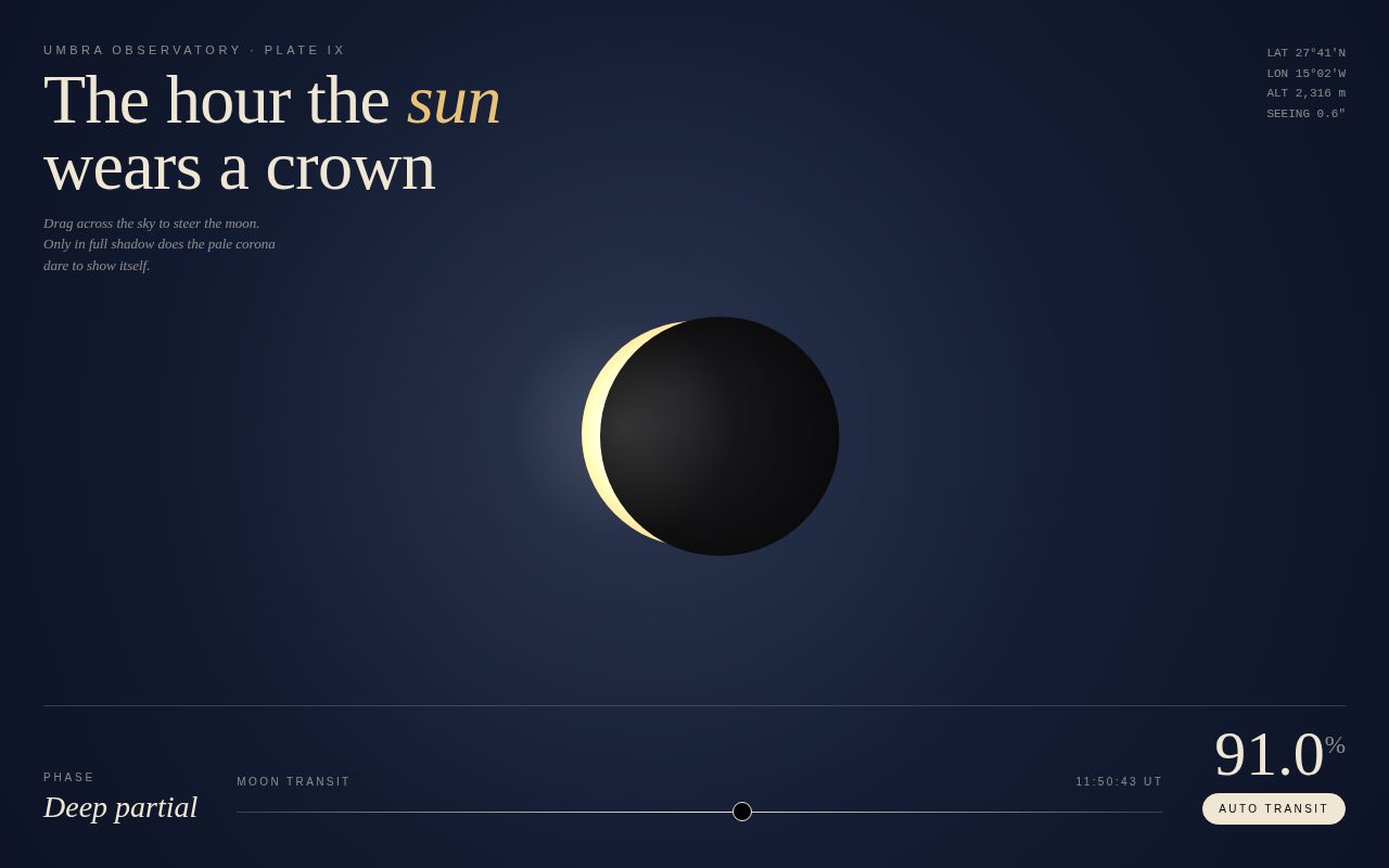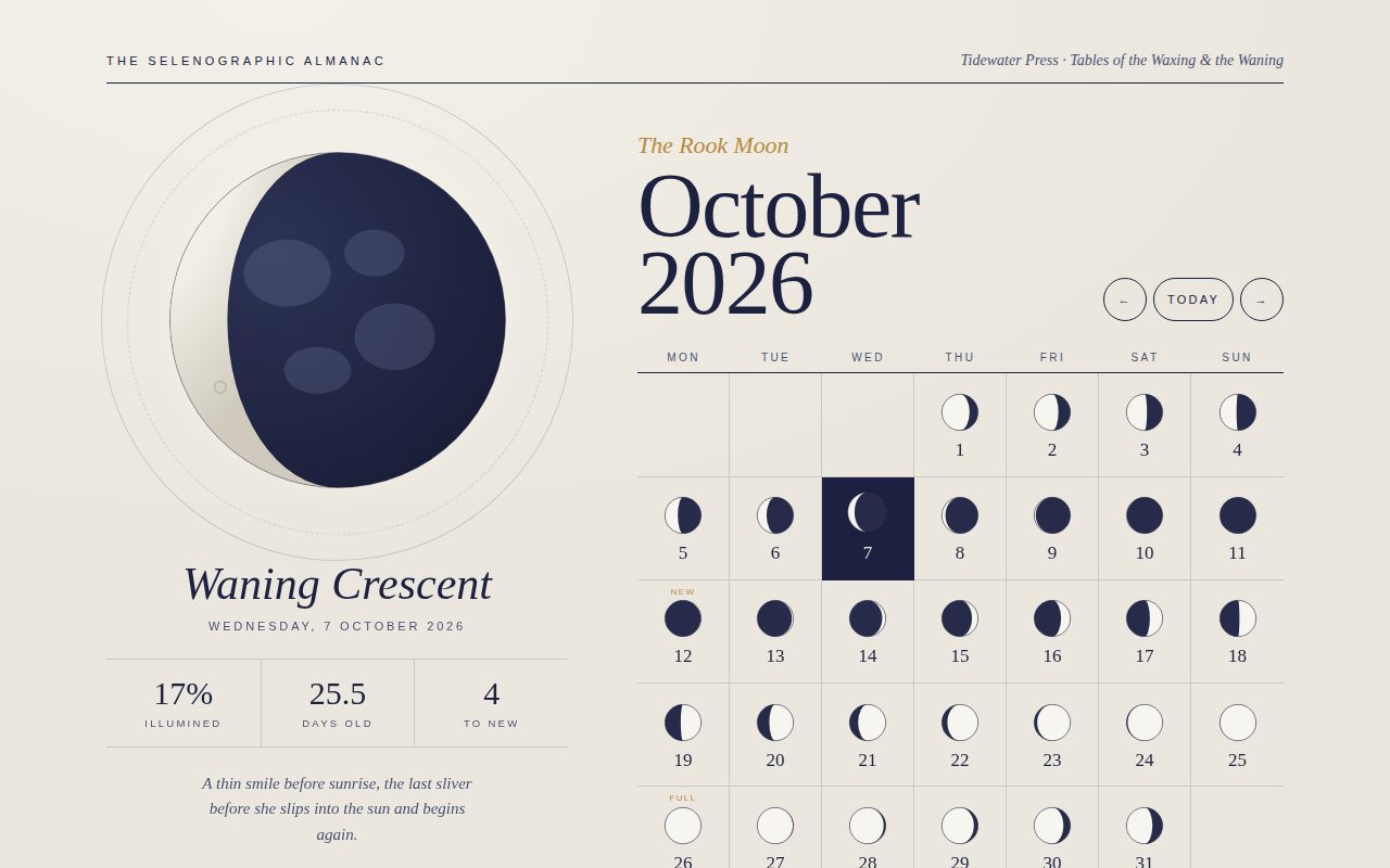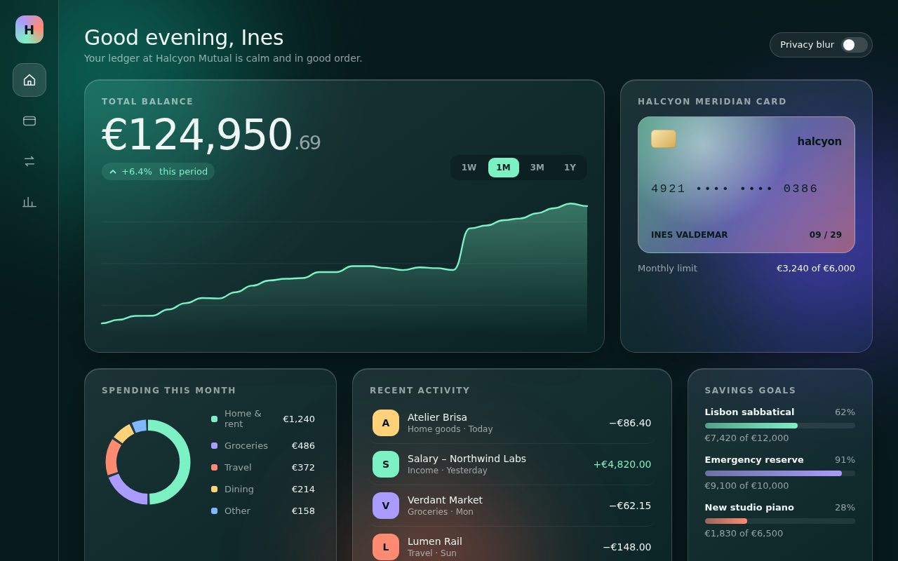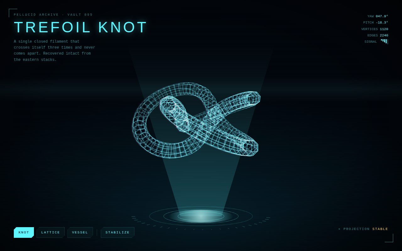
Claude Haiku 5.5 · 100 HTML Files

Claude Haiku 5.5 100 HTML Files

A gallery of 100 self-contained, standalone HTML studies. Each one is a single file with inline CSS and JavaScript, works offline, and needs no external resources. Open any piece in a new tab, or expand a card to read the original generation prompt.

100 studies
Screenshot of Aurora Glass
001

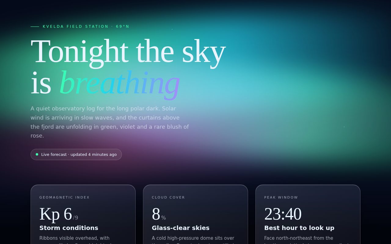
Aurora Glass

A calm, premium night-sky landing page for an imaginary Arctic observatory. Slow aurora ribbons drift behind a starfield and a silhouetted ridge, while frosted glass cards float in front, catching the light. The serif headline with its gradient italic word sets an editorial, luxurious tone, and the cards present the night's forecast with large numerals and soft gradient meters.

Original prompt
Build a single standalone HTML page called "Aurora Glass" for a fictional polar observatory, the Kvelda Field Station at 69°N. The background is a deep night gradient (#050a1a fading up from #0b1a3a at the bottom) with a fixed sky layer: a field of tiny radial-gradient stars that slowly twinkle, three huge blurred (48px) aurora ribbons built from horizontal linear gradients in mint green #3dffb0, teal #22d3ee, violet #a78bfa and rose #f472b6, blended with mix-blend-mode: screen, each drifting, rotating and stretching vertically on its own 22 to 34 second keyframe loop. A black inline-SVG mountain ridge and a dark fade sit along the bottom edge. Typography pairs "Iowan Old Style"/Palatino/Georgia for the display serif with "Avenir Next"/Segoe UI/Helvetica Neue for body. The hero has a green uppercase eyebrow with a leading hairline, a large serif headline "Tonight the sky is breathing" where "breathing" is italic with a green-teal-violet gradient clip, a muted lede paragraph, and a frosted pill status badge with a pulsing green dot. Below sits a responsive auto-fit grid of three frosted glass cards (backdrop-filter blur 22px with saturation, 1px translucent border, inner highlight, deep shadow, 24px radius) showing the geomagnetic Kp index, cloud cover and peak viewing window, each with a big serif numeral, a short heading and copy, plus a gradient meter that fills on load or a chip. Interaction: on pointer move each card tilts in 3D (up to about 7 to 8 degrees, perspective 1100px, inner content translated in Z by 40px) and a radial white glare follows the pointer using overlay blend; on leave the card springs back with an expo-out ease. Cards are focusable with a mint focus ring. Under prefers-reduced-motion the ribbons, twinkle, pulse and meter animations stop and the tilt is disabled, while the glare still tracks. No external resources.
Screenshot of The Floating Orrery
002

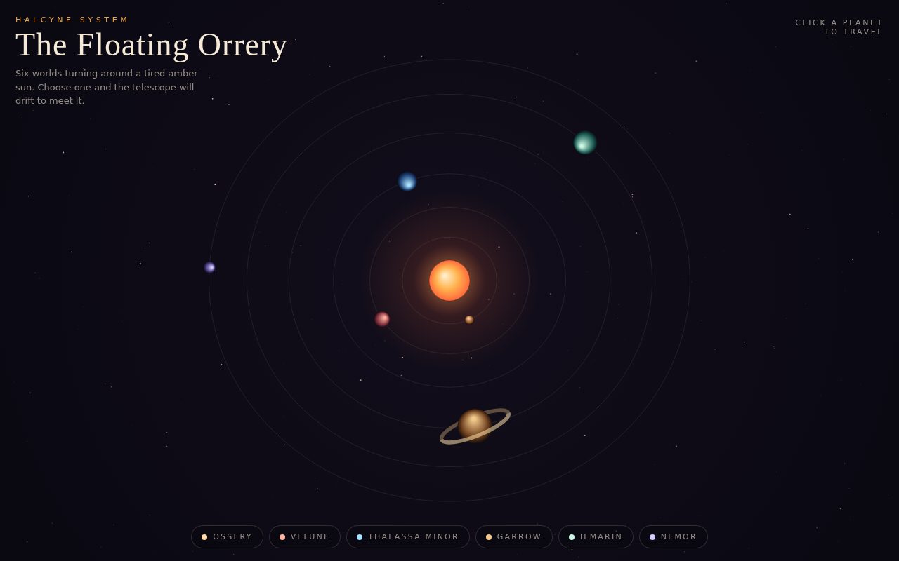
The Floating Orrery

A cinematic, quietly luxurious orrery toy. A warm amber star anchors six hand-tuned worlds drifting through a deep violet void, while layered stars slide past at different speeds to give real depth. Selecting a world glides the telescope toward it and opens an elegant serif placard with its lore and statistics, like a museum label for an imaginary solar system.

Original prompt
Build a standalone full-screen canvas page called "The Floating Orrery" showing the fictional Halcyne System: an amber sun with six invented planets (Ossery, Velune, Thalassa Minor, Garrow, Ilmarin, Nemor) on slightly flattened elliptical orbits, each with its own size, angular speed, two-stop color pair and short evocative description; Garrow is a banded giant with a ring drawn in two halves so the back arc sits behind the planet and the front arc in front. Palette: near-black violet void #07060d with a soft radial vignette to #120e1c, cream text #f4ead7, ochre accent #e8a64a, coral sun edge #ff7a59. Typography: Didot/"Bodoni 72"/Georgia high-contrast serif for the title and planet names, Futura/"Century Gothic"/Trebuchet MS for labels in wide-tracked uppercase. Layout: brand block top-left (ochre eyebrow "Halcyne System", serif title, one-line intro), a "Click a planet to travel" hint top-right that fades after the first selection, a row of pill buttons along the bottom (one per planet with a color dot, aria-pressed state that inverts to cream), and an info panel bottom-right (moved above the nav on phones) with world numeral, name, description and a three-column stat strip (orbit, day length, moons) plus a round close button that rotates on hover. Canvas: sized to devicePixelRatio (capped at 2), redrawn each frame via requestAnimationFrame; three parallax star layers that wrap around the screen and shift by different depth factors as the camera moves, with gentle twinkle; thin cream orbit ellipses, with the selected orbit in ochre; a glowing sun with a wide halo and a slight breathing scale; planets lit with an offset radial gradient so the highlight always faces the sun. Interaction: clicking a planet (or its button) sets it as the camera target; camera x, y and zoom ease toward the moving planet using frame-rate-independent exponential smoothing, zoom chosen from planet size; on phones the focus point shifts upward so the panel does not cover the planet. Hovering shows a dashed ring and the planet name; the cursor becomes a pointer over planets. Clicking empty space, the close button or Escape returns to the full system view. Reduced motion slows orbits to a crawl, disables twinkle and breathing, and snaps the camera instead of easing.
Screenshot of BLUNT Manifesto
003

BLUNT Manifesto

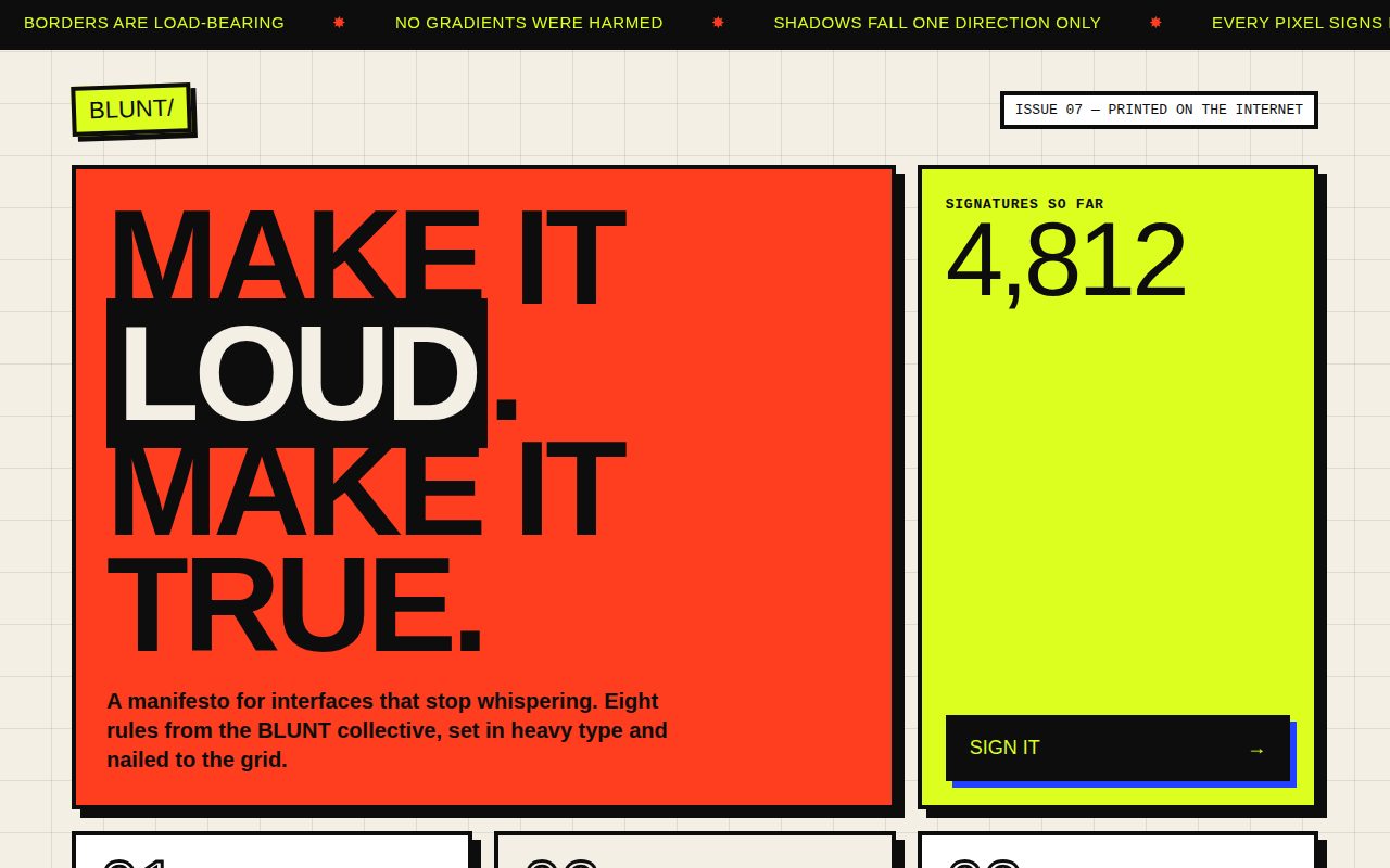
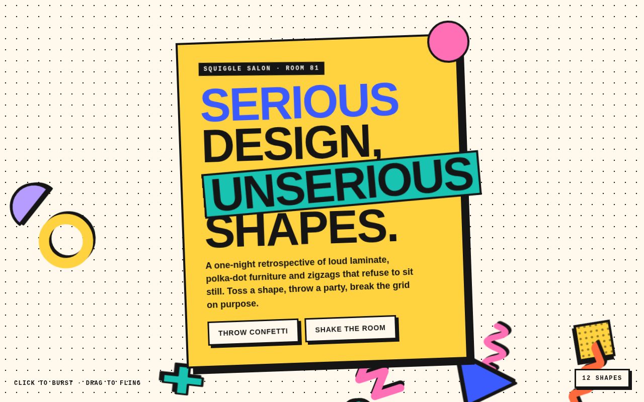
A loud, confident neo-brutalist manifesto page that celebrates exposed structure. Thick borders, a single hard shadow direction, oversized black type and a four-color palette create a poster-like grid, while a constant headline ticker gives it the energy of a protest banner. Interactions are tactile and stepped, so every press feels like a stamp landing on paper.

Original prompt
Build a standalone neo-brutalist HTML page called "BLUNT — A Manifesto for Honest Interfaces" for a fictional design collective. Palette: warm paper #f3efe4 with a faint 48px ink grid in the page background, pure ink #0d0d0d, acid yellow #dcff1f, signal red #ff3d1f, ink blue #2440ff and a mercy pink #ff9ad5. Typography: "Arial Black"/Impact for every headline and number, "Helvetica Neue"/Arial for body, "Courier New"/ui-monospace for metadata, plus one Georgia italic pull quote. Every block has a 4px solid black border and a hard, unblurred 8px by 8px black offset shadow. At the very top a full-width black ticker with acid-yellow uppercase slogans separated by red ✸ marks scrolls continuously (content duplicated in JS and translated -50% in a linear loop), pausing on hover. Under it, a tilted acid logo badge "BLUNT/" and a monospace issue label. A 12-column grid holds: a red hero spanning 8 columns with an enormous uppercase headline "Make it loud. Make it true." where "loud" is reversed out on an ink highlight; an acid signature panel spanning 4 columns with a giant tabular counter (4,812) and a black "Sign it →" button with a blue hard shadow; six numbered rule cards in a 3-up grid (outlined stroke-only numerals 01 to 06, uppercase heading, short manifesto copy, a monospace footer tag), with alternating white, paper and acid backgrounds; a pink Georgia italic quote block from an invented member; and a black "Your agreement" panel with two thick bordered progress bars whose acid fill steps in 8 discrete jumps and whose label uses mix-blend-mode difference. Motion language is deliberately stepped and physical: cards lift up-left on hover with a bigger shadow, sink into the page on press, buttons translate by their shadow offset when pressed, and an "AGREED" stamp pops in with an overshoot. Responsive: hero and side panels go full width under 860px, rules go 2-up, then 1-up under 560px with smaller shadows. Reduced motion slows the ticker drastically and removes transitions.
Screenshot of Hearth Soft Thermostat
004

Hearth Soft Thermostat

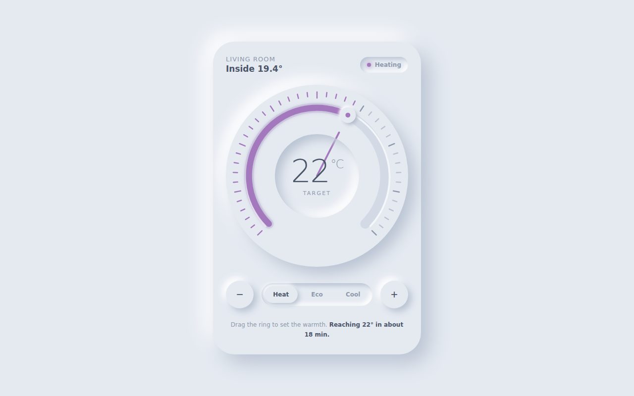
A tactile, calm thermostat rendered entirely in soft extruded and recessed surfaces. The ring glows from cool blue to ember orange as you set the warmth, the needle springs into place with a satisfying wobble, and the numerals roll alongside it. Small details such as the lit tick marks, glowing status dot and pressed-in buttons make the object feel physical and premium.

Original prompt
Build a standalone soft-UI (neumorphic) thermostat page called "Hearth Soft Thermostat" for a fictional smart-home brand. Palette: a single pale blue-gray surface #e5eaf1 for the page and every element, with light shadows #ffffff and dark shadows #b9c3d2, text slate #4a5568, secondary #8d98aa, and an accent that is computed live from the target temperature, blending cool blue rgb(76,141,255) through lavender to warm orange rgb(255,122,61). Typography: rounded system stack ("SF Pro Rounded", Nunito, Segoe UI, system-ui), light 300 weight tabular numerals for the big reading, small wide-tracked uppercase labels. Layout: one centered device card (max 420px, 44px radius) raised with large paired shadows. Top row: "Living room / Inside 19.4°" and an inset status pill with a glowing accent dot (Heating, Cooling, Holding, or Eco variants). Center: a large circular raised dial (aspect-ratio 1) with an inline SVG overlay (viewBox 300): 41 ticks spanning 270 degrees from −135 to +135 (every fifth one longer), a recessed track arc with a faint white highlight arc, a value arc in the accent color doubled by a blurred glow copy, a raised round knob with drop-shadow filters and a colored center dot at the target position, and a thin needle from the center. Ticks light up in the accent color up to the needle. Inside, a recessed circular well shows the temperature in large light digits with a small °C superscript and a "Target" label. Below: round raised minus and plus buttons that press into an inset state, and an inset segmented control with Heat, Eco and Cool where the selected segment is raised (each mode applies a preset). Footer copy estimates time to reach the target. Motion: the needle is driven by spring physics (stiffness 170, damping 11, four substeps per frame) toward the target angle, so it overshoots and settles; on load it sweeps up from the minimum. The displayed number follows the needle, not the target, so digits roll with the spring. The room temperature drifts slowly toward the target every four seconds. Interaction: pointer drag anywhere on the dial (pointer capture, touch-action none) sets the target from the angle in 0.5° steps between 10° and 30°, with a dead zone at the bottom gap; the dial is an ARIA slider supporting arrow keys, PageUp/PageDown, Home and End. Reduced motion snaps the needle with no spring.
Screenshot of Kestrel Rain HUD
005

Kestrel Rain HUD

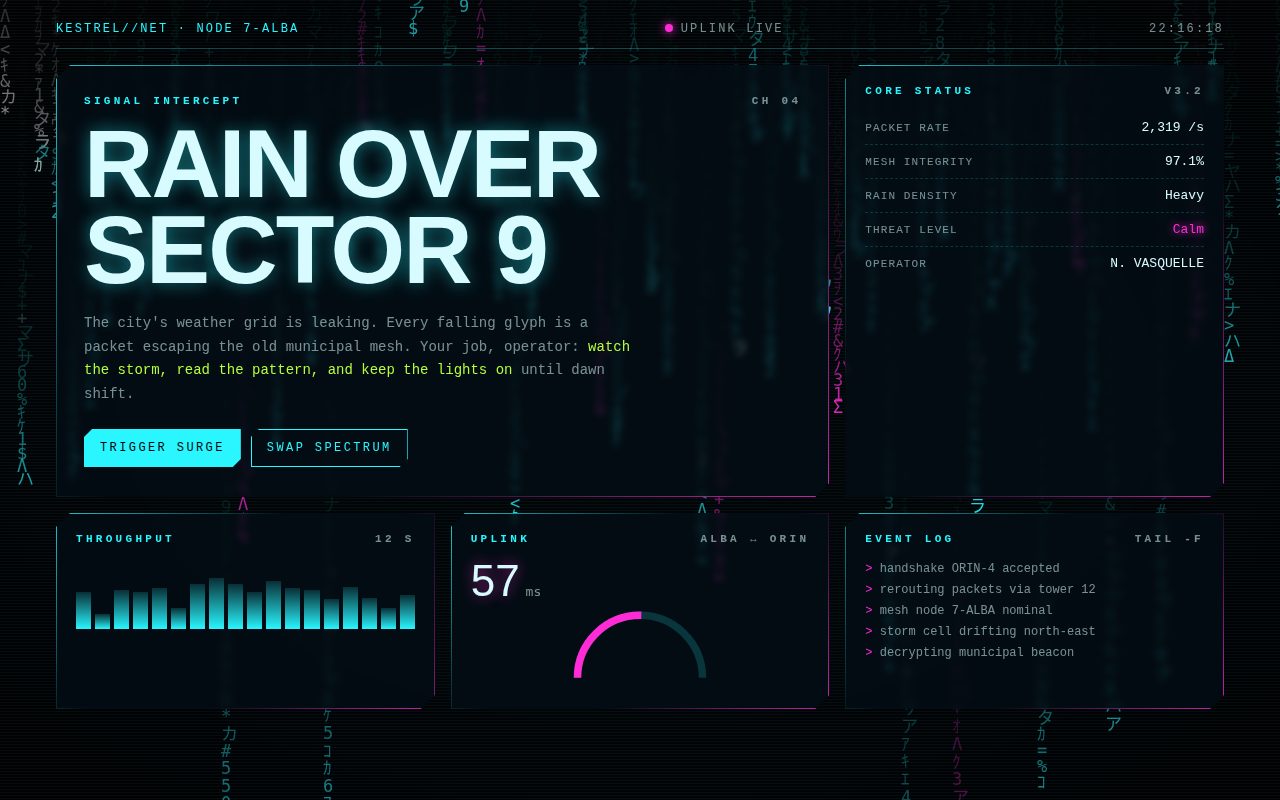
A moody neon operator console floating above a storm of falling glyphs. Chamfered translucent panels with gradient hairline borders carry live-feeling telemetry, while the rain behind them reacts to the pointer and to surge events. Hovering any panel makes it glitch and flicker like a failing display, giving the whole interface a tense, cinematic edge.

Original prompt
Build a standalone cyberpunk HUD page called "KESTREL//NET — Cyber Rain HUD" for a fictional city network operator. Background: a full-screen canvas of falling glyph rain (katakana, half-width kana, digits, Greek letters and symbols) on near-black #03050a, sized to devicePixelRatio (capped at 2), with trails made by painting a translucent black rectangle every step; it updates on a throttled requestAnimationFrame cadence (about 25 steps per second, slower under reduced motion). Most columns are cyan #29f6ff, every seventh column magenta #ff2bd6, random bright white sparkles, and glyphs near the pointer render pure white like a flashlight. Over it sits a fixed overlay of 1px scanlines and a dark radial vignette. Typography: ui-monospace/"SF Mono"/Menlo/Consolas for all interface text, "Arial Black"/Impact for the huge headline and big numbers. Layout: a 12-column grid with a top bar (cyan node ID "KESTREL//NET · NODE 7-ALBA", a blinking magenta "Uplink live" dot, a live clock), an 8-column hero panel with the headline "Rain over Sector 9", story copy with lime-highlighted instructions and two chamfered buttons ("Trigger surge" solid cyan, "Swap spectrum" ghost outline), a 4-column core-status panel with dashed-divider stat rows (packet rate, mesh integrity, rain density, threat level in glowing magenta, operator name), and three equal panels: an 18-bar throughput histogram with eased heights, an uplink latency readout with a semicircular SVG gauge driven by stroke-dashoffset, and a tail-style event log whose newest line is lime. Panels use clip-path chamfered corners, a translucent dark fill with slight backdrop blur, and a 1px gradient border (cyan to magenta) made with a masked pseudo-element. Glitch on hover or focus: the headline gets RGB-split magenta and cyan copies via ::before and ::after with content attr(data-text), animated through stepped clip-path inset slices and offsets, plus a tiny jitter; panel headings flicker like failing neon. Data updates every second (with randomness) and a new log line arrives every 2.6 seconds. "Trigger surge" spikes rain speed and every metric, decaying back smoothly; "Swap spectrum" cycles the global accent pair through cyan/magenta, lime/cyan and magenta/amber for both the HUD and the rain. Responsive: hero and side panels stack under 900px; the three small panels go 2-up then 1-up. Reduced motion slows the rain and disables blink, glitch and flicker animations.
Screenshot of Quicksilver Mercury Study
006

Quicksilver Mercury Study

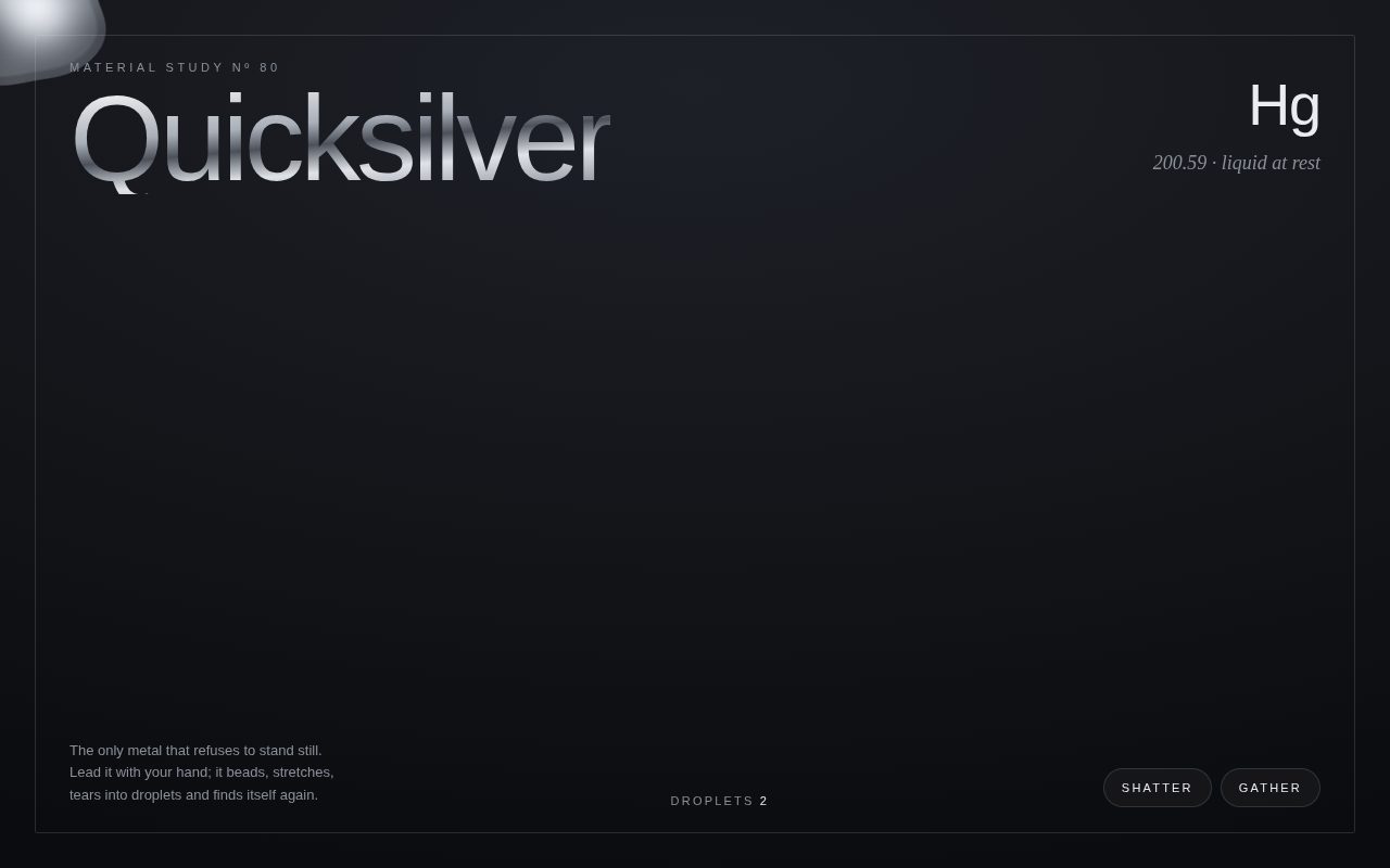
A dark, gallery-like specimen page where a pool of liquid mercury lives on screen. The metal is built entirely from SVG circles fused with a goo threshold filter and lit with a specular lighting pass, so it reads as a reflective, heavy liquid. It trails the pointer like a stretched bead, sheds and reabsorbs satellite droplets, and shatters into scattered beads that slowly find each other again. Ultra-light chrome headline type, a serif italic chemistry footnote and hairline framing give it a restrained museum-placard feel.

Original prompt
Build a standalone HTML page called "Quicksilver", a material study of liquid mercury. Concept: SVG goo-filter metaballs that follow the pointer and split and merge. Full-viewport inline SVG on a deep graphite radial background (#1d2027 to #0b0c0f). Inside, a group of circles filled with a chrome radial gradient (white highlight, cool greys, near-black band, pale rim) is rendered through one SVG filter: Gaussian blur (stdDeviation 14) plus an alpha-threshold color matrix (alpha 26, offset -11) to fuse circles into metaballs, then a small blur feeding feSpecularLighting with a point light, composited back inside the shape so the liquid gets a wet specular sheen. Blob system: one leader blob spring-chases the pointer (stiffness about 0.14, damping 0.78) and shrinks slightly when moving fast; a tail of seven decreasing circles follows it link by link so it stretches like a bead of metal; six satellite droplets orbit the leader in drifting Lissajous paths, constantly budding off and re-merging. When the pointer is idle the leader traces a slow Lissajous loop. Clicking or tapping (or pressing Space, or the "Shatter" button) bursts every follower outward with random velocity and sheds six short-lived droplets that shrink and vanish; followers bounce off the edges and after a while are pulled back to merge. "Gather" recalls everything immediately. The point light trails the leader so highlights slide across the surface. A live "Droplets" counter clusters touching circles to report how many separate pools exist. Typography: Helvetica Neue ultra-light (weight 200) for a huge "Quicksilver" headline filled with a metallic linear-gradient text clip; Georgia italic for the element note "Hg 200.59 · liquid at rest"; tiny tracked uppercase eyebrow "Material Study Nº 80". A thin hairline frame inset from the viewport edges. Pill buttons in translucent glass with lift on hover and visible focus rings. Custom cursor hidden on hover-capable devices so the mercury itself is the cursor. Reduced motion: much softer springs and slower orbits. Responsive: footer copy and element note hide under 520px.
Screenshot of The Almanac of Small Weathers
007

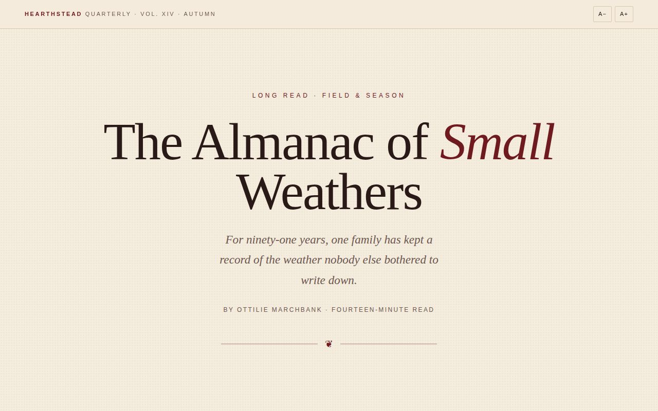
The Almanac of Small Weathers

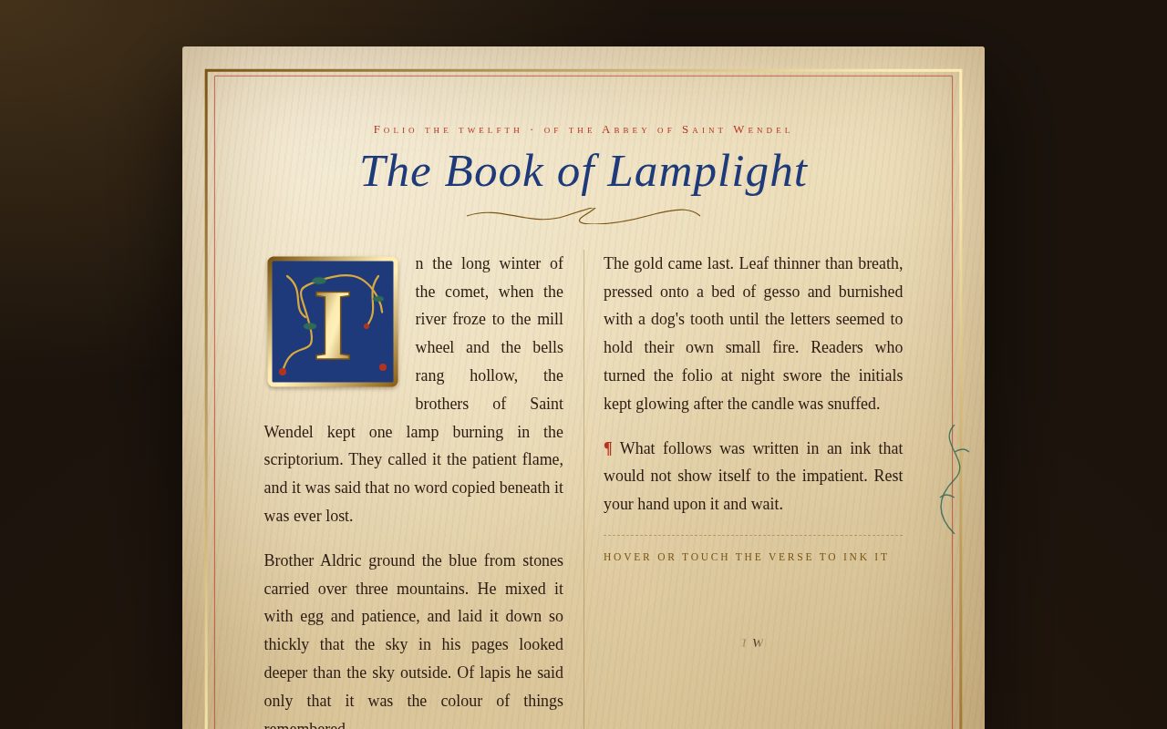
A quiet, literary long-read laid out like a high-end quarterly magazine. Cream paper with a faint printed grain, oxblood ink for accents, a towering Didot headline and a classic drop cap set the tone. The essay tells the story of a farm family's ninety-one-year ledger of the weathers nobody else records, with margin annotations from the ledger itself, a sweeping pull quote and a small data strip of the ledger's averages. Paragraphs rise gently into view as the reader scrolls, and a thin oxblood bar tracks reading progress.

Original prompt
Build a standalone HTML page that reads like a premium print-magazine long-form feature. Concept: editorial almanac, a magazine-style long-form essay with drop caps, pull quotes and scroll reveals, in cream and oxblood. Fictional publication "Hearthstead Quarterly", Vol. XIV, Autumn. Essay: "The Almanac of Small Weathers" by Ottilie Marchbank, about the Penhallow family's ninety-one-year hand-kept ledger of non-meteorological "weathers" (frost leaving the gate latch, swifts departing, hen fogs, church bells sounding sour before thunder), started by Agnes Penhallow in 1934 and now kept by her great-granddaughter Wren. Write real, warm copy in three numbered sections (I Method, II Measures, III Inheritance). Palette: cream #f4ecdc page with a faint oxblood dot-grain texture made from a 5px radial-gradient, ink #2a1a17, muted brown #6b5750, oxblood #6e1a1f accents, tan hairlines #d8c9b0. Type: Iowan Old Style / Palatino / Georgia for body text; Didot / Bodoni / Georgia display for headlines, drop cap and pull quote; Gill Sans / Helvetica Neue for small tracked uppercase labels. Layout: sticky translucent masthead with publication name and A− / A+ text-size buttons; a 3px oxblood reading-progress bar pinned to the top; centered hero with kicker, huge Didot headline with an italic oxblood word, italic dek, byline and a fleuron ornament between rules. Article body is a three-column grid (margins plus a 36rem measure); margin notes with an oxblood left rule sit in the right column on desktop and fold inline on mobile. The opening paragraph uses a 5.4em floated oxblood drop cap and a small-caps first line. A full-width pull quote with a heavy top rule and thin bottom rule in large Didot italic. A four-cell "ledger data" strip of average dates (first frost Oct 19, swifts Aug 06, 23 hen fogs, 4 sour bells) that becomes 2x2 on mobile, with a paper-tone hover. End with a small oxblood square end mark and a quiet colophon footer. Motion: every block fades and rises 22px into place with a long cubic-bezier(.2,.7,.1,1) ease via IntersectionObserver; the pull quote scales up slightly instead. Progress bar updated with requestAnimationFrame-throttled scroll. Reduced motion: no reveals, no smooth scroll. Selection highlight in oxblood.
Screenshot of Calibre Nocturne 38
008

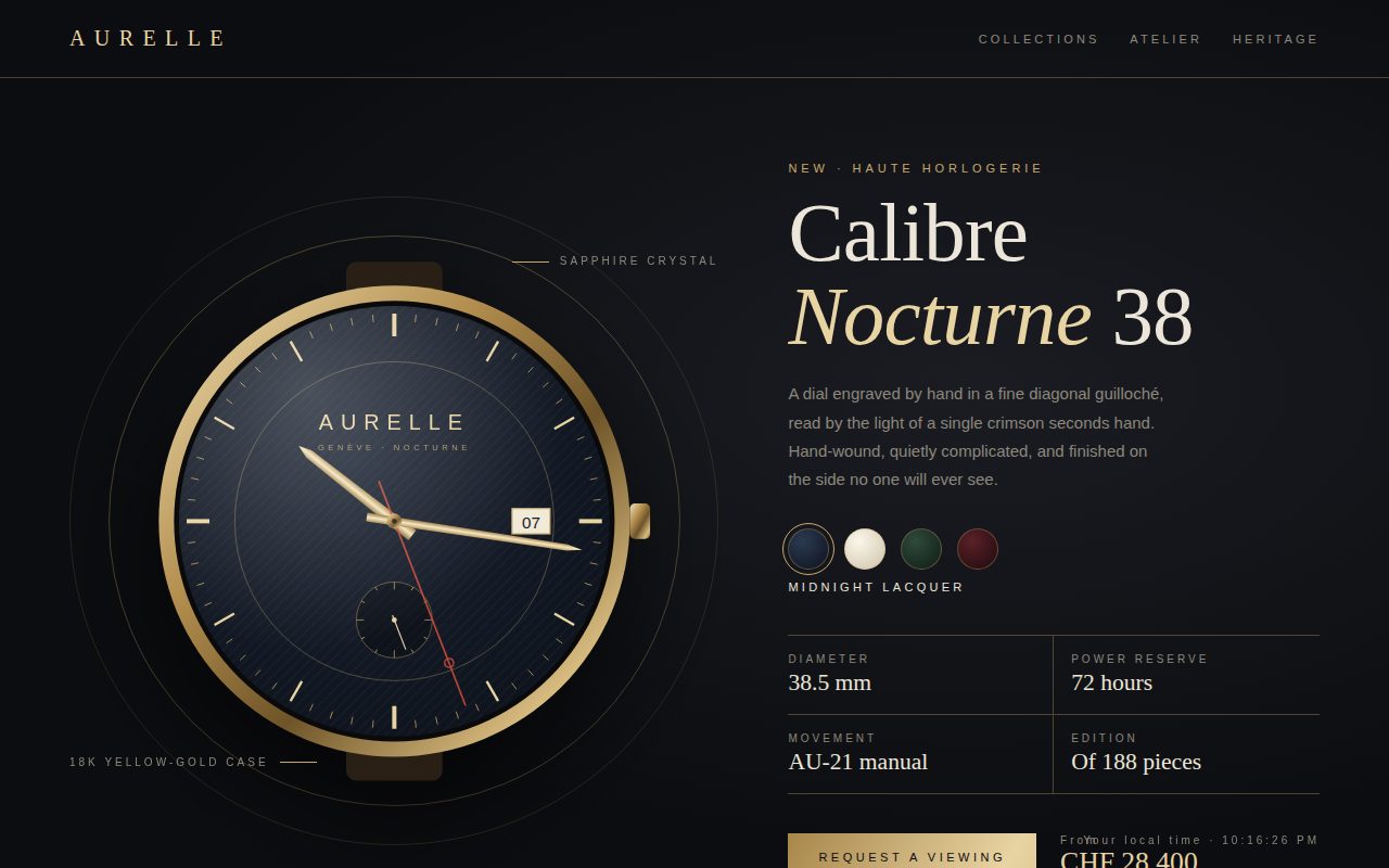
Calibre Nocturne 38

A hushed, dark luxury product page in the manner of a haute horlogerie maison. A finely detailed SVG watch with a guilloche dial, gold dauphine hands and a crimson sweeping seconds hand keeps the real time, framed by thin champagne-gold hairline circles and callouts. Didot headlines, light sans labels and generous spacing give it a calm, expensive feel, while dial swatches let the visitor try different finishes on the live watch.

Original prompt
Build a standalone HTML page that is a minimal luxury product page for a fictional watch: Maison Aurelle "Calibre Nocturne 38". Concept: luxury watch dial with an inline SVG watch that shows live time, and gold hairlines. Palette: near-black #0c0d10 with a soft radial lift, champagne gold #c9a96a and pale gold #e8d3a2 for hairlines and accents, warm ivory text #ece6da, muted taupe #8d887d, a single crimson #c94a3a seconds hand. Type: Didot / Bodoni 72 / Georgia for the brand, headline and spec values; light-weight Helvetica Neue for body and tracked uppercase labels. Layout: hairline-bordered top nav with a letter-spaced serif brand and three nav words that get a gold underline sweeping in on hover; a two-column hero (stacks on mobile) with the watch on the left inside two concentric gold hairline circles and two annotation callouts ("Sapphire crystal", "18k yellow-gold case") with short gold rules; on the right an eyebrow, a large Didot "Calibre Nocturne 38" with italic gold "Nocturne", a short paragraph, dial colour swatches, a two-by-two spec grid divided by gold hairlines (38.5 mm, 72 hours, AU-21 manual, edition of 188), and a CTA row with a brushed-gold gradient "Request a viewing" button and a price "CHF 28,400". The watch is drawn in a -200..200 SVG viewBox: brushed gold case gradient, crown, leather strap stubs, a dial radial gradient overlaid with a 45-degree guilloche line pattern, 60 generated tick marks (heavier at the quarters), an inner chapter ring, brand and "GENÈVE · NOCTURNE" text, a small-seconds subdial at six o'clock, a white date window at three, tapered gold dauphine hour and minute hands, a crimson seconds hand with a lollipop ring, a gold cap, and a crystal glare highlight. Motion: hands read the real clock every animation frame so the seconds hand sweeps smoothly like a high-beat movement; the date window shows today's date; a small fixed readout shows local time. Interaction: swatches (Midnight Lacquer, Opaline Ivory, Forest Enamel, Burgundy Sunray) swap the dial gradient stops and announce the name; selected swatch gets a gold halo ring. Pointer over the stage tilts the watch in 3D (up to 14 degrees) with a long expo ease and moves the crystal glare; leaving springs back. CTA button shifts its gold gradient and widens its letter-spacing on hover, then confirms "Atelier will be in touch" on click. Reduced motion: seconds hand ticks once per second instead of sweeping, and tilt is disabled.
Screenshot of Currents in Ink
009

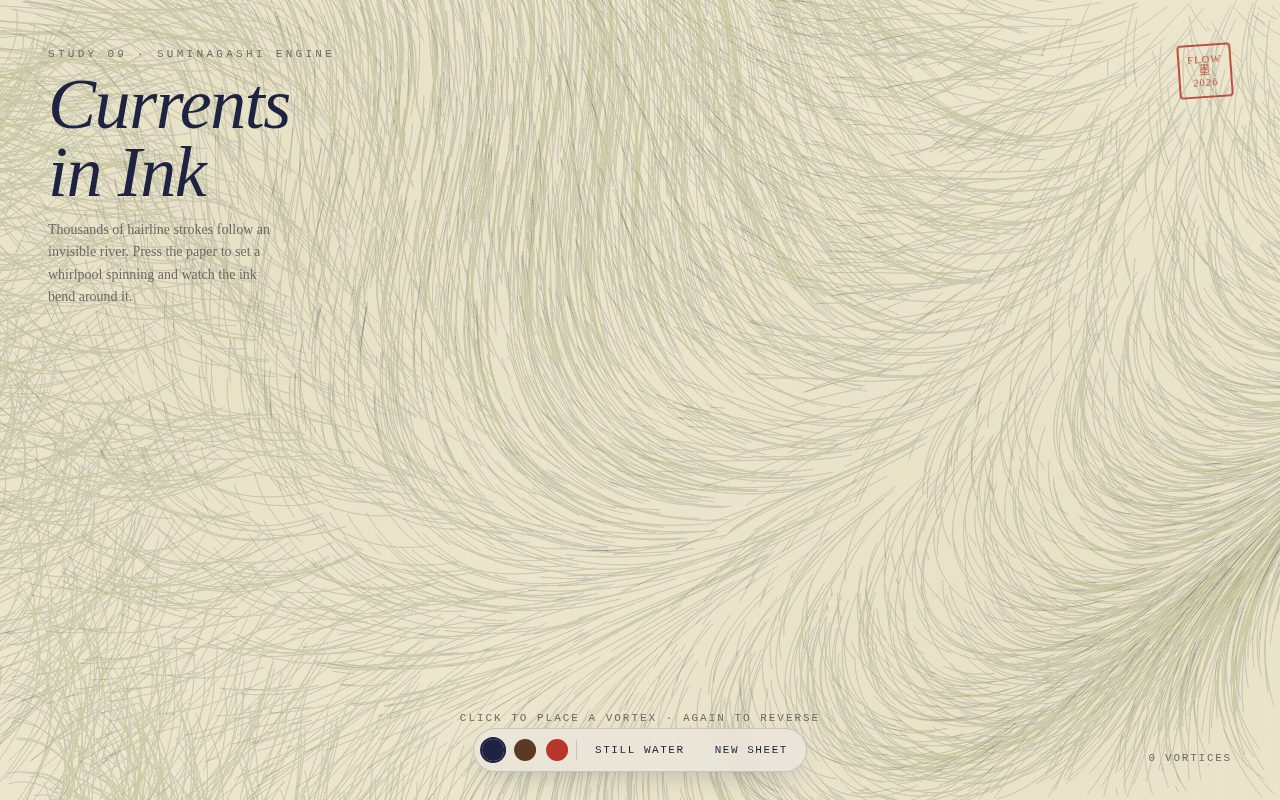
Currents in Ink

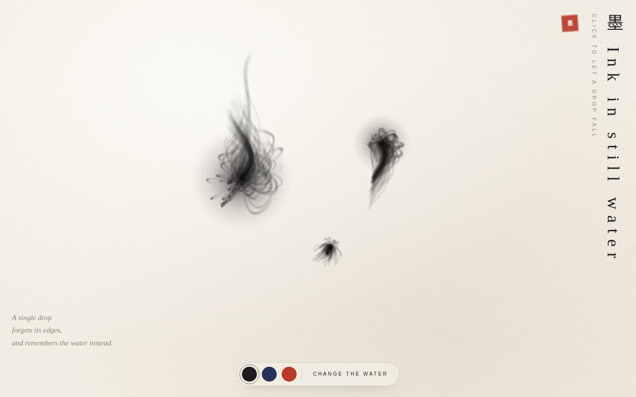
A meditative generative-art page in which thousands of hairline ink strokes drift across warm paper along an invisible, slowly shifting current, accumulating into marbled trails like Japanese paper marbling. The visitor becomes the stone in the stream: each click sets a whirlpool spinning that bends and coils the ink around it. A restrained Georgia italic title, a vermilion seal and a small frosted toolbar keep the interface quiet so the drawing stays centre stage.

Original prompt
Build a standalone HTML page called "Currents in Ink". Concept: a canvas flow field of ink particles; click to add vortices. Full-viewport DPR-aware canvas on warm rice-paper #ece7dc, with a CSS overlay of faint stain blooms and fine vertical fibre lines in multiply blend to suggest paper. Ink: deep indigo #1d2340 by default, with sepia #5a3a22 and vermilion #b8352a alternatives. Particle system: a count scaled to the viewport area (capped at 2600) of particles with random lifetimes; each frame every particle reads an angle from a smooth, slowly evolving field made of layered sines and a radial term, moves a short step, and draws a hairline segment, all batched into one path stroked at 16% alpha. The canvas is never fully cleared; instead a very low-alpha paper wash fades old strokes so the ink builds into marbled, suminagashi-like trails. Vortices: clicking places a whirlpool that adds a tangential swirl (falling off with distance squared) and a slight inward pull; consecutive vortices alternate spin direction; clicking an existing vortex reverses it; at most nine live vortices, the oldest easing out. Each vortex is marked by a thin vermilion ring that contracts into place and breathes slightly, and a small ink drop is dotted at the click point. Vortex strength eases in and out. Typography: Georgia italic display title "Currents in Ink" top-left with a Courier New tracked uppercase eyebrow "Study 09 · Suminagashi engine" and a short Georgia paragraph; a slightly rotated vermilion hanko-style seal stamp top-right; a vortex counter bottom-right in Courier. Bottom center: a frosted pill toolbar with three round ink swatches (pressed state ring), a divider, "Still water" (dissolves all vortices) and "New sheet" (wipes the paper). A hint line above the toolbar fades out after the first click. Springy cubic-bezier press feedback on buttons. Resize is debounced and reseeds particles. Reduced motion: fewer, slower particles, slower field evolution, no ring breathing.
Screenshot of Bloom Mesh Gradient
010

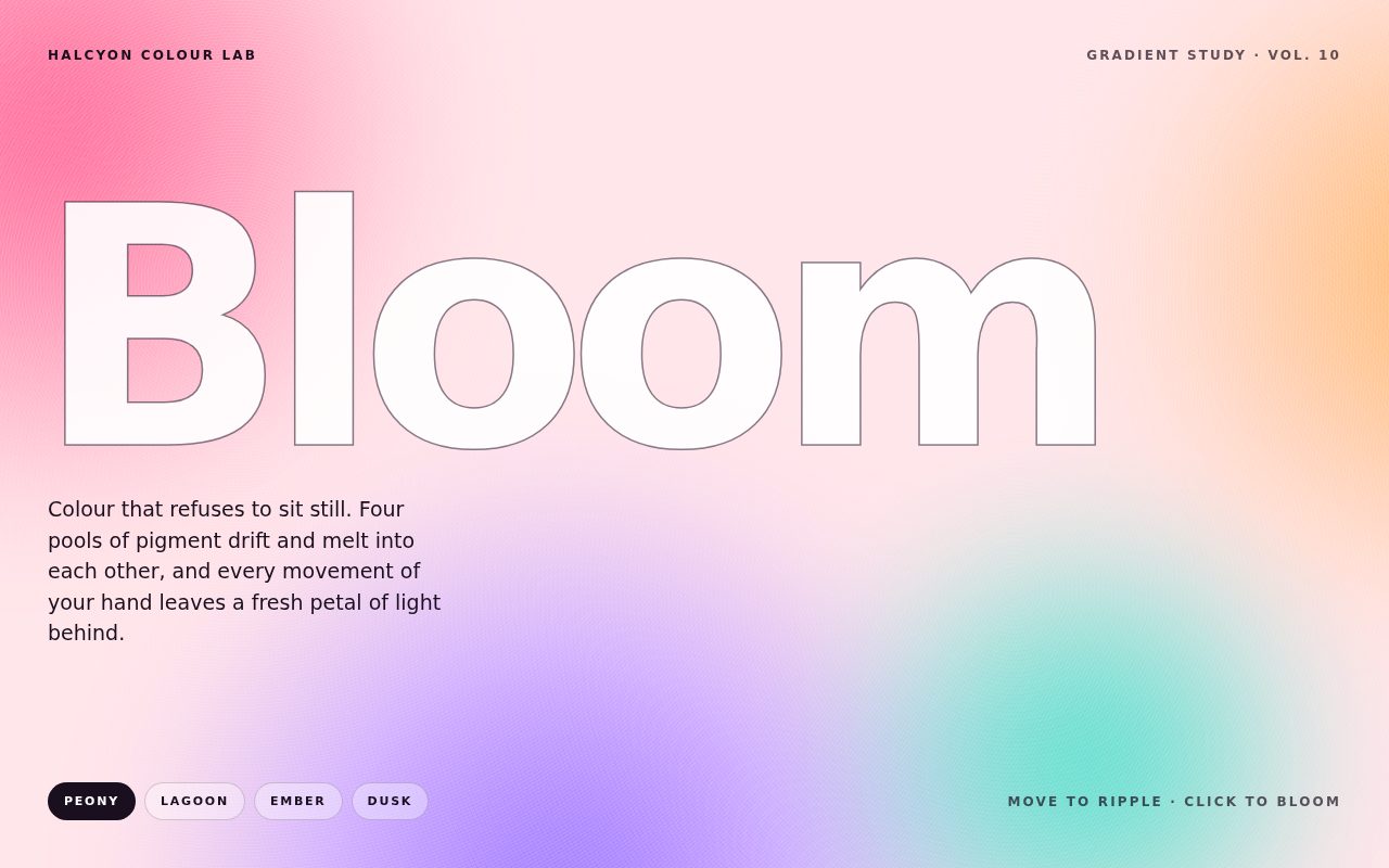
Bloom Mesh Gradient

A vivid, poster-like colour study where a soft mesh gradient made from four blurred pools of pigment continuously drifts and recombines behind one enormous word. The type is set in overlay blend so the gradient blooms through the letters, edged by a fine outline ghost. Moving the pointer trails petals of luminous colour that swell and dissolve, a click releases a bigger blossom, and four curated palettes cross-fade the whole composition from pink peony to lagoon, ember and dusk.

Original prompt
Build a standalone HTML page called "Bloom" for a fictional "Halcyon Colour Lab", gradient study Vol. 10. Concept: a morphing CSS mesh gradient behind huge type, with hover ripples of colour. Background: an oversized fixed layer (inset -20%) blurred 60px and saturated, containing four huge radial-gradient blobs (40 to 65vmax) driven by CSS custom properties --c1..--c4 over a --base colour. Each blob drifts and scales with its own alternate-direction keyframe loop (17s, 19s, 23s, 27s) on a symmetric cubic-bezier(.65,0,.35,1) ease so the colours constantly melt into new mesh arrangements. Register the colour variables with @property so palette changes cross-fade smoothly over 1.6s. Palettes: Peony (pink #ff5e8a, apricot #ffb36b, violet #8b6cff, mint #43d6c4 on blush #fde7ea), Lagoon (cyan, seafoam, ultramarine, lime on pale aqua), Ember (red, saffron, raspberry, tangerine on cream), Dusk (electric violet, rose, ink, coral on deep plum, with light text). A fine overlay grain from two repeating radial gradients in overlay blend. Typography: a single colossal word "Bloom" in Arial Black / Helvetica Neue / Impact at clamp(84px,24vw,360px), tight -0.065em tracking, filled white in overlay blend mode so the gradient glows through it, with a duplicate outline-only ghost layer (1.5px text stroke) stacked exactly on top for crisp definition; the tracking loosens slightly when the hero is hovered. A short medium-weight system-ui lede beneath. Top bar and bottom bar in small bold tracked uppercase system-ui. Bottom-left: four frosted glass pill palette buttons with springy lift on hover and an inverted pressed state. Ripples: as the pointer moves (throttled to every 70ms and 24px), spawn a 240px radial blob tinted with the next palette colour in screen blend inside a blurred layer; it scales from 0.2 to 2.6 and fades over 1.8s, then removes itself. Clicking anywhere releases three staggered, larger ripples like a flower opening. Arrow keys cycle palettes. Reduced motion: blob drift slowed to 120s loops, ripples disabled, palette changes instant. Full-height grid layout with no scrolling; responsive hiding of secondary labels on phones.
Screenshot of The Meridian Walk
011

The Meridian Walk

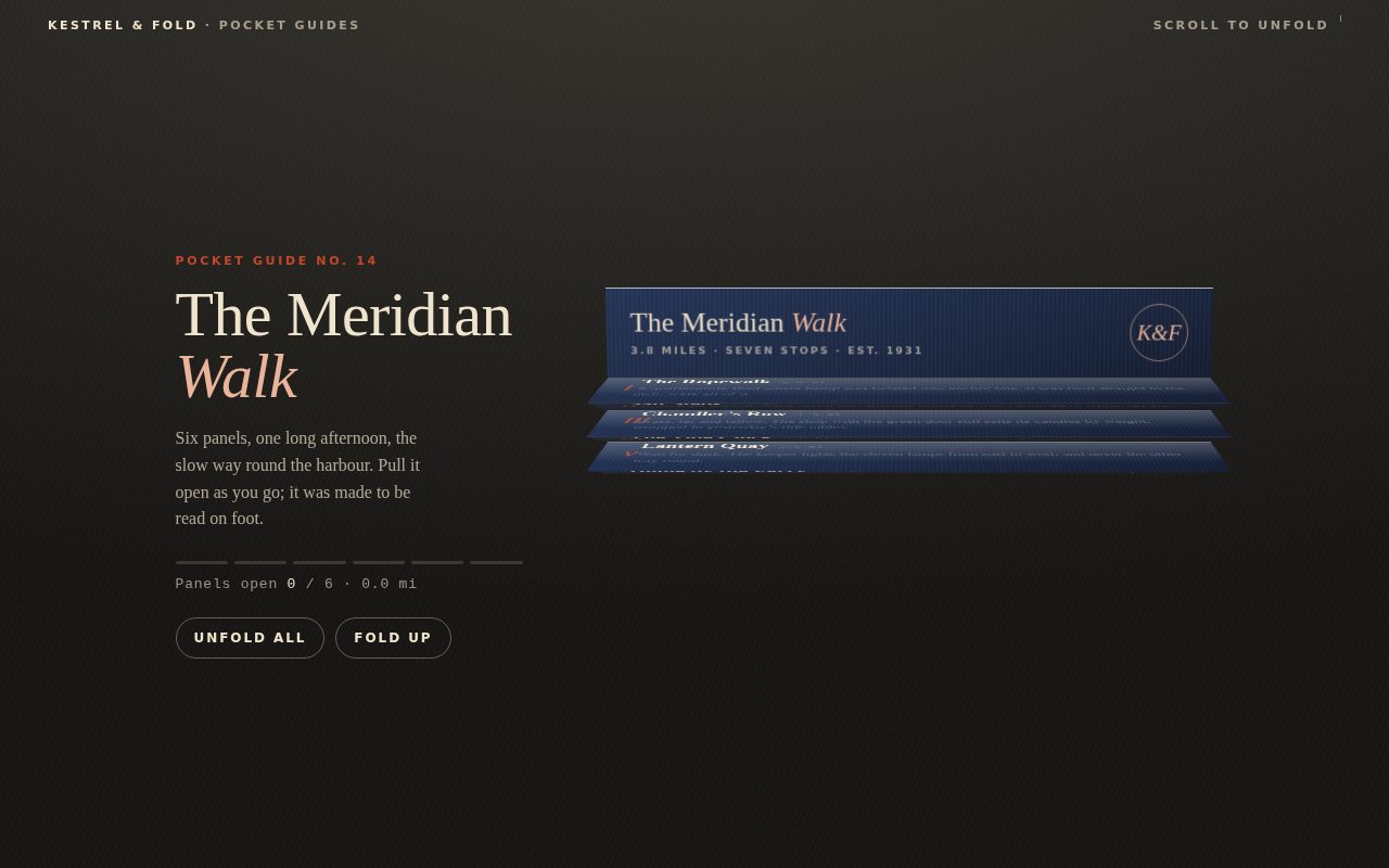
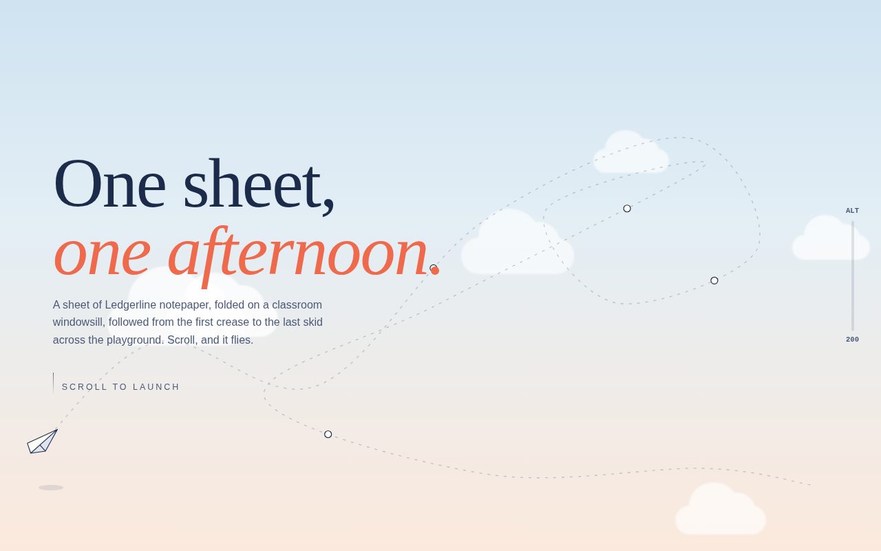
A premium, tactile scroll piece in which a hand-folded pocket guide hangs from its navy cover over a dark desk and opens panel by panel into a true 3D accordion as the reader scrolls. Alternating creases catch and lose the light, a dotted vermilion route threads continuously across every panel once it lies flat, and the quiet editorial serif typography and invented harbour stops make it read like a keepsake from a small letterpress printer.

Original prompt
PROMPT

Build a standalone HTML page called "The Meridian Walk", a folded pocket walking guide from an invented printer, Kestrel & Fold. The concept is paper-accordion-fold: 3D folded paper panels that unfold as the page scrolls, using CSS transforms only (no canvas, no WebGL).

Palette: a dark charcoal desk background (#22211e fading to #171614, lifted to #3a3731 at the top with a radial gradient and a faint diagonal hairline texture). Warm cream paper panels (#f8f1e2 to #f4ecda to #e6d8ba) with very fine horizontal and vertical fibre lines from repeating-linear-gradients. Deep ink navy text (#1c2944, soft #56607a). Vermilion accent (#c4472a) for numerals, the dotted route and progress bars. The cover panel is navy with cream and peach (#e9b49a) type.

Type: "Iowan Old Style", Palatino, Georgia serif for headlines and body, with italic Roman numerals for the panels. "Gill Sans" / Trebuchet small caps tracked to .22em for labels, and ui-monospace for mileage and the readout.

Layout: a fixed thin masthead ("Kestrel & Fold · Pocket Guides" left; "Scroll to unfold" with an animated dripping hairline on the right). A 420vh scroll track holds a sticky full-height stage with two columns on desktop: a meta column (small vermilion kicker "Pocket Guide No. 14", a large serif title with italic "Walk", a short intro, a six-segment progress meter, a monospace readout "Panels open N / 6 · X mi", and two pill buttons "Unfold all" and "Fold up"), and a scene column max 560px wide with perspective 1300px viewed from above. On phones (under 760px) it stacks into one column, hides the intro paragraph and tightens the buttons.

The guide is seven nested .fold elements. Each fold is panel-height (clamp(66px, 10.6vh, 112px)), has transform-origin at its top edge, uses transform-style: preserve-3d, and holds the next fold absolutely positioned at top:100%. Panel 0 is the navy cover (title, "3.8 miles · seven stops · est. 1931", a round "K&F" seal that rotates on hover). Panels i to vi are the stops: The Ropewalk 0.0 mi, Salt Steps 0.6, Chandler's Row 1.3, The Tide Clock 2.0, Lantern Quay 2.9, Home by the Ferry 3.8. Each has a short evocative line. Each face is a three-column grid: an italic numeral, the text, and a small map strip with a grid texture and an SVG dotted vermilion route whose x position at the bottom of one panel matches the top of the next, so the route runs continuously down the unfolded sheet with a stop dot on each panel.

Motion: JavaScript reads scroll progress p (0 to 1) through the track and sets a --r rotateX custom property on each fold. Each panel i has an absolute tilt that alternates in sign, (+/-)80deg * (1 - s_i), where s_i is a cubic in-out eased, staggered unfold value (start offset 0.62 per panel). Because the folds are nested, the relative rotation written to each one is its absolute tilt minus its parent's. This gives a true zig-zag accordion that opens top-down. Lighting comes from the face normal: panels tilted away get a darker multiply overlay (--shade), panels tilted toward the viewer get a cream highlight (--lite). A soft blurred contact shadow under the guide grows in scaleY with progress. Updates are throttled with requestAnimationFrame on scroll.

Details: the panel heading gets a vermilion underline that draws in on hover or focus, and the route dot turns vermilion. Buttons invert to cream on hover and press to scale .96. The progress meter segments fill per panel, and the readout updates the miles walked. A colophon after the track: a vermilion gradient rule, the italic line "Fold it back along the creases it already knows.", and a printer's note.

Interaction: scroll to unfold. Click a panel (or press Enter or Space on it) to smooth-scroll to the point where that panel has just opened; clicking the cover folds everything. "Unfold all" and "Fold up" scroll to the end and the start of the track.

Reduced motion: the track collapses to auto height, the stage is no longer sticky, the guide renders fully unfolded, smooth scrolling and the hint animation are off, and transitions are near zero.
Screenshot of Starcatcher Arcade Cabinet
012

Starcatcher Arcade Cabinet

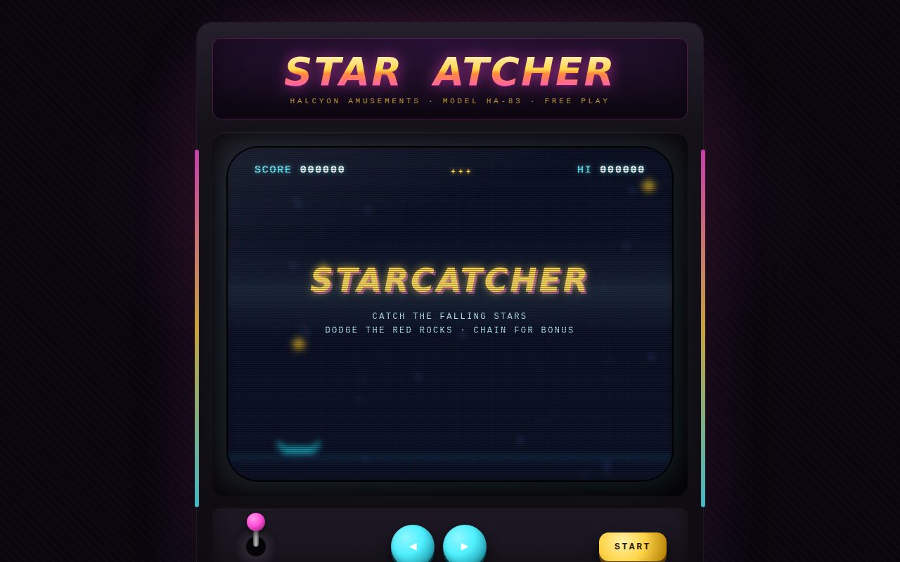
A lovingly built arcade cabinet in a dim, neon-lit room. Its curved CRT turns on from a single bright line and hosts a small, fully playable star-catching game rendered in true low-resolution pixels. Scanlines, an aperture-grille mask, a rolling refresh bar and a blurred phosphor bloom make the glass feel physical, while the gradient neon marquee, tactile 3D arcade buttons and a tilting joystick finish the illusion of a cabinet from a 1983 arcade.

Original prompt
PROMPT

Build a standalone HTML page that is an arcade cabinet for an invented 1983 game, "Starcatcher" by Halcyon Amusements (Model HA-83, Free Play). The concept is crt-arcade: CRT scanlines, phosphor glow and a tiny catch-the-stars mini game.

Palette: a near-black arcade room (#09070d) with a soft magenta glow (rgba #ff4fd8) behind the cabinet, a cyan glow near the floor and a faint diagonal carpet texture. The cabinet is matte plum-black (#241f2b to #141118 to #0e0c11) with thin glowing side light strips (magenta to gold to cyan). Screen black-blue #050811. Game colours: cyan cart #4ff0ff, gold stars #ffd54a twinkling to #fff6c9, rare magenta bonus stars #ff4fd8, red rocks #ff5a3c, and a dim blue parallax starfield.

Type: "Courier New" / ui-monospace for the HUD, the instructions and the plate. "Arial Black" / Impact heavy italic for the marquee logo and the screen titles. The marquee logo is filled with a gradient (cream, gold, orange, magenta) through background-clip text, with a magenta neon drop-shadow and one letter that buzzes off and on.

Layout: a centred cabinet up to 720px wide, made of (1) a marquee panel with the logo and a tracked subtitle; (2) a bezel framing a 4:3 screen with curved corners (border-radius 7% / 9%); (3) a control panel with a decorative joystick that tilts with input, two round cyan arcade buttons (left and right) and a gold START button; (4) a key-legend plate below. Under 480px the joystick hides and the buttons fill the row.

Rendering: the game runs at 160x120 logical pixels on an offscreen buffer canvas. Each frame the buffer is blitted with smoothing off onto the main canvas, which is sized to devicePixelRatio (capped at 2) and kept in sync with ResizeObserver and resize events, for crisp chunky pixels. The same buffer is also copied to a second 160x120 canvas stretched over the screen with CSS blur(5px), saturate and mix-blend-mode: screen, which gives a cheap phosphor bloom. Sprites are tiny ASCII-art bitmaps (a 5x5 star, a 7x7 bonus star, a 5x5 rock, a 15x4 cart) drawn with fillRect.

CRT layers over the canvas: an RGB aperture-grille mask (repeating 1px red, green and blue stripes), multiply scanlines every 3px, a slow rolling brightness bar, a vignette with a glass glare that flickers on a stepped keyframe, and a power-on animation in which the screen grows from a bright horizontal line to full size.

Game: catch falling stars (+10) and magenta bonus stars (+50, which also give back a life up to 5), and dodge red rocks (which cost a life and shake the screen). A missed gold star also costs a life. Catching 5 in a row gives a x2 chain and 10 gives x3, shown as a magenta "x2 CHAIN" HUD label and a glowing underline on the cart. Spawn rate, speed and the share of rocks increase over time. Particles burst on every catch. The DOM HUD shows SCORE, lives as gold ✦ glyphs, and a HI score saved in localStorage (wrapped in try/catch). Overlay states: an attract mode with an autopilot cart chasing stars and a blinking "PRESS START", GAME OVER with the final score and a new-high-score line, and PAUSED.

Interaction: arrow keys or A and D move the cart; Space or Enter starts; P pauses; the game pauses automatically when the tab is hidden. A mouse hovering over the glass steers the cart, and touch dragging steers it too (touch-action none). The on-cabinet buttons can be held to move, with a pressed state that sinks the button 5px. The START button starts or restarts.

Reduced motion: the power-on, the roll bar, the flicker, the marquee buzz and the blinking text are all disabled, and the screen shake is skipped.
Screenshot of Formlehre Composition Machine
013

Formlehre Composition Machine

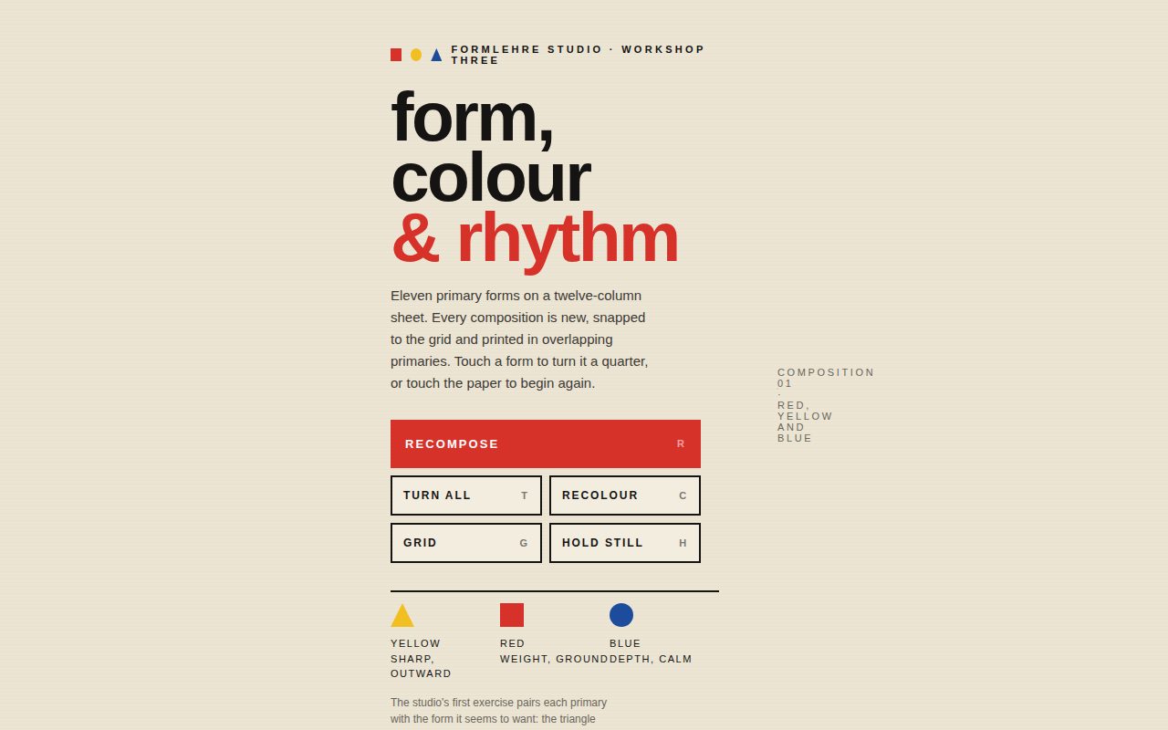
An interactive Bauhaus-inspired poster generator. Eleven primary forms in red, yellow, blue and black sit on a printed sheet and overprint one another like real ink, and each recompose throws them, with springy overshoot and a cascading stagger, into a new grid-snapped arrangement while the big composition number ticks upward. Quiet geometric typography, a colour-theory legend and hard-edged square controls frame it as a teaching tool from a design workshop.

Original prompt
PROMPT

Build a standalone HTML page titled "Formlehre · A Composition in Primary Forms" for an invented design school workshop, Formlehre Studio, Workshop Three. The concept is bauhaus-composition: primary geometric shapes that the user clicks to rotate and to recompose the layout.

Palette: a warm unbleached paper background (#ece5d4) with faint horizontal print lines, and a lighter poster sheet (#f3eddf) with a fine halftone dot texture (7px radial-gradient grid). The primaries are signal red #d7322a, chrome yellow #f1bf22, ultramarine blue #1d4c9c and soft black #151413. Every form is printed with mix-blend-mode: multiply, so overlaps read as overprinted ink (yellow over blue turns olive, red over yellow turns vermilion).

Type: a geometric sans stack (Futura, Futura PT, Century Gothic, Avenir Next, Trebuchet MS), bold and lowercase for display ("form, colour & rhythm" with the second line in red), tracked uppercase for labels, and tabular numerals for the composition number.

Layout: two columns on desktop. The left column (260 to 360px) holds a kicker with tiny red-square, yellow-circle and blue-triangle icons, the large lowercase headline, a short lede, a control grid of square black-bordered buttons (a full-width red "Recompose R", then "Turn all T", "Recolour C", "Grid G", "Hold still H" with key hints), a three-part legend matching yellow to the triangle, red to the square and blue to the circle with one-line meanings, and a short studio note. The right column holds a 4:5 poster up to 560px wide (also limited by viewport height) with a soft lifted shadow. Inside the poster are a vertical-rl tracked label "Form follows joy" in the top right and a caption at the bottom: a small "Formlehre Studio" label over "komposition" and a huge two-digit composition number. Below the poster is a live status line. Under 820px the layout stacks with the poster first and full width.

Shapes: eleven absolutely positioned buttons on a 12 x 15 square-cell grid, placed with CSS custom properties (--x, --y, --w, --h, --r, --c) and calc() for left, top, width, height and rotate. Types: a large circle (7 cells, red), a half circle (6x3, blue), a square (4x4, yellow), a triangle (clip-path, blue), a quarter circle (border-radius 100% 0 0 0, yellow), a long horizontal black bar, a tall red vertical bar, a black ring (radial-gradient mask), a small black circle, a 3x3 dot grid (tiled radial mask) and a striped blue block (repeating-linear-gradient mask).

Composition logic: each recompose snaps forms to the grid with simple rules. The big circle anchors on thirds-like positions; the horizontal bar spans the sheet at a random row; the vertical bar sits in the upper half; everything else is placed randomly within bounds. Non-round forms add a random multiple of 90deg (squares sometimes add 45deg). Rotation always accumulates, so forms turn forward and never snap back. Half of all recomposes also rotate the colour permutation among six orderings of red, yellow and blue (black stays black). The composition number increments and the status line names the leading colours.

Motion: left, top and transform transition over 0.8 to 0.95s on a springy overshoot curve, cubic-bezier(.68,-0.3,.26,1.32), staggered 45ms per shape for group moves and with no delay for single clicks. On load every form scales up from zero, then the first composition plays. An autoplay recomposes every 4.2s until the user presses "Hold still". Hover brightens a form, and focus shows a dashed black outline. The grid toggle fades in a blue 12x15 construction grid over the poster.

Interaction: click a form to turn it a quarter. Click empty paper (or press Recompose or R) to reshuffle and reset the autoplay timer. T turns every non-round form, C recolours, G toggles the grid, and H pauses or plays the autoplay.

Reduced motion: autoplay is disabled, the forms appear at full scale without flying in, and position and rotation changes are instant (only colour fades).
Screenshot of Raster 27 Poster
014

Raster 27 Poster

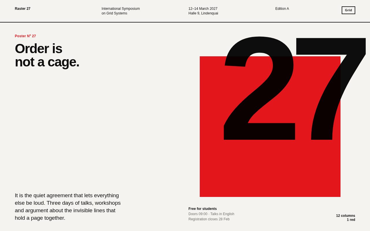
A disciplined, poster-like single page for a fictional symposium about grids, built entirely from one sans-serif family, black, off-white and one red. A colossal "27" overprints a red square in the hero, oversized tabular numerals count up as each section enters view, and a live countdown runs in a black band. Everything sits on a visible-on-demand 12-column grid, so the page doubles as a lesson in the Swiss style it celebrates.

Original prompt
PROMPT

Build a standalone HTML page in the Swiss International Typographic Style for an invented event, "Raster 27 · International Symposium on Grid Systems", 12 to 14 March 2027 at Halle 9, Lindenquai, organised by the fictional Lindenquai Society for Visual Order. The concept is swiss-poster-numerals: a poster with giant numerals, an asymmetric grid and animated counters.

Palette: off-white paper #f4f3ef, near-black ink #0e0e0e, warm grey #6f6f6b for secondary text, and a single signal red #e2161b. Nothing else. One inverted black section for the countdown.

Type: one family, two weights. Use "Helvetica Neue", Helvetica, Nimbus Sans, Arial; 700 for display and 500 or regular for text. Tabular numerals everywhere (font-feature-settings "tnum"). Display numerals are set very tight (letter-spacing -0.06em to -0.075em, line-height 0.74 to 0.85). Labels are small 12px bold and everything is flush left, ragged right.

Layout: a strict 12-column CSS grid with clamp() gutters and page padding, reused in every section and in a fixed overlay.
- Header row on a 2px black rule: "Raster 27" in cols 1 to 3, the event name in 4 to 6, dates and venue in 7 to 9, and "Edition A" plus a square "Grid" toggle button in 10 to 12.
- Hero (full viewport): a red square block about 38% wide sitting high on the right. Overlapping it with multiply blending is a giant "27" (clamp 200px to 640px, about 40vw) aligned to the right edge of cols 4 to 12. Top left: a red "Poster Nº 27" label and the headline "Order is / not a cage." Bottom row: a short paragraph in cols 1 to 4, grey meta in cols 7 to 9 ("Free for students / Doors 09:00 / Registration closes 28 Feb"), and "12 columns / 1 red" right-aligned in cols 10 to 12.
- Stats band: four 3-column cells divided by hairlines, each with a huge counter (03 Days, 48 Speakers, 12 Columns, 1,440 Seats), a bold label and a grey one-liner.
- Programme: a section header (a small label plus a large bold sentence "Every session starts on the minute and ends on a baseline."), then five rows: an index number, a big time numeral (09:30, 11:00, 13:45, 15:20, 17:00), a session title and an invented speaker.
- Countdown: a black band with a red label "Days until the grid opens", a giant day count with a red full stop, and live hours, minutes and seconds below.
- Footer with two short lines.
On phones (under 760px) the header splits into two rows, the hero stacks (headline, then the numeral at 62vw, then the text), stats go two per row, programme rows stack under their index, and the grid overlay switches to 6 columns.

Motion: crisp, with no bounce, using an expo-out curve cubic-bezier(.16,1,.3,1).
- The hero "27" counts up from 00 on load with easeOutExpo over 1.8s and recounts quickly on hover.
- An IntersectionObserver reveals sections (fade and rise 28px, staggered 90ms in groups of four) and starts each stat counter when it enters view. Hovering or focusing a stat replays its count, draws a 6px red bar across its top edge from the left, and turns the numeral red.
- Programme rows fill with a black panel rising from below on hover or focus; the text turns paper-white and the time turns red.
- The countdown counts up to the real number of days until 12 March 2027 09:00 when it comes into view, then ticks every second.
- The red hero block drifts a few pixels against the pointer (an inverse parallax up to 36px) with a slow 1.2s ease.

Interaction: the Grid button or the G key fades in a fixed overlay of twelve translucent red columns that line up exactly with the page grid, so you can see the system the layout is built on. Hover and focus states on stats and programme rows; all of them are keyboard focusable with red outlines.

Reduced motion: reveals are shown at once, counters jump straight to their final values, and the parallax and fill transitions are off.
Screenshot of Ripple Tank Interference
015

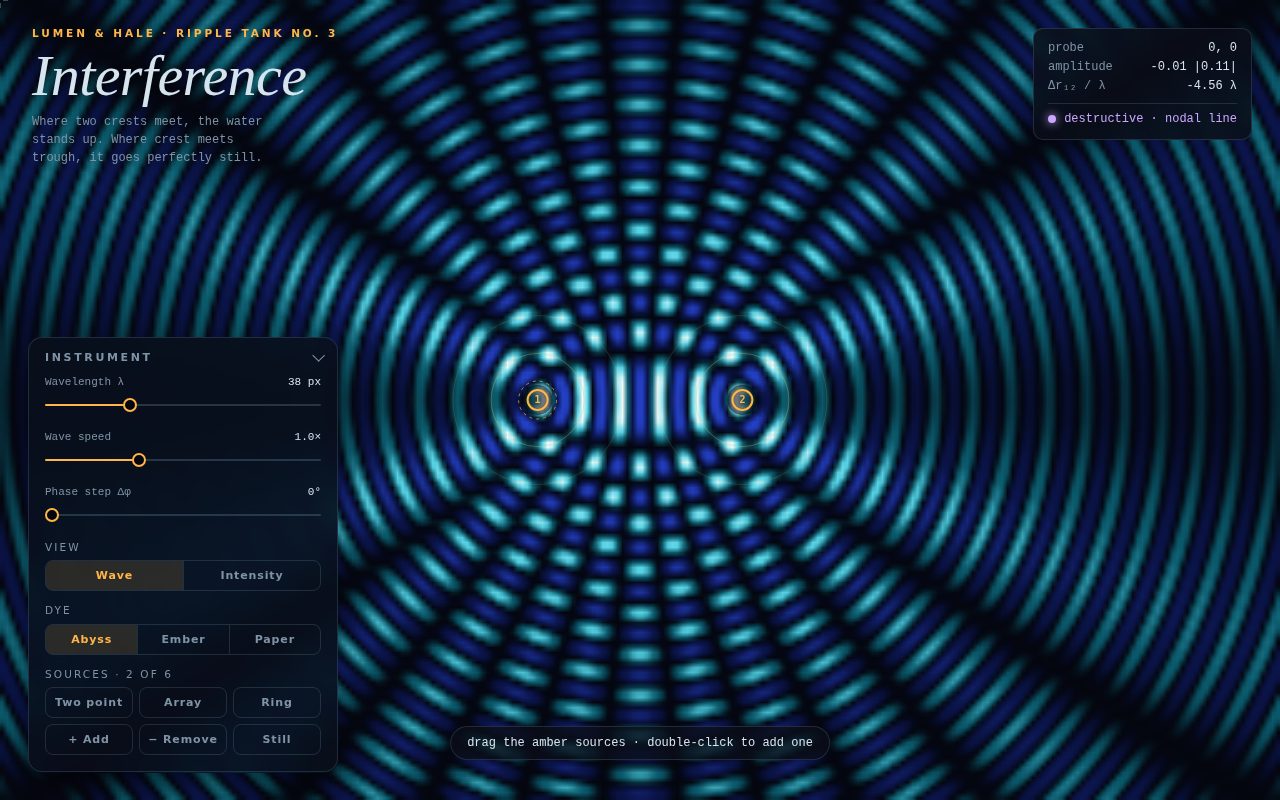
Ripple Tank Interference

A full-bleed scientific instrument for exploring wave interference. Amber point sources sit in a dark tank and send out expanding crests that cross into glowing antinodes and perfectly still nodal lines, rendered as a smooth colour-mapped field. Frosted instrument panels with serif and monospace typography, three dye palettes, a live probe that explains constructive versus destructive interference at the cursor, and phased-array presets make it feel like a premium lab tool rather than a demo.

Original prompt
PROMPT

Build a standalone HTML page, "Interference", presented as a laboratory ripple tank from an invented instrument maker, Lumen & Hale (Ripple Tank No. 3). The concept is wave-interference: a full-screen canvas interference pattern made by wave sources the user can drag.

Palette: a deep ink-navy tank (#04060f) with selectable "dye" colour maps, each a diverging 256-entry lookup table with smoothstep blending between stops.
- Abyss (default): troughs ultramarine #2440c4 to #0b1446, still water black #04060f, crests teal #0b5a6c to cyan #58d4e6 to near-white #f0feff.
- Ember: troughs plum #8a1f66, still water black, crests rust #a63a12 to orange #f39a3a to cream #fff1c9.
- Paper: still water parchment #efe9dc, crests ink #121110 and troughs blue-grey. The page background switches to match.
Sources are amber #ffb547 everywhere. Panel text is pale blue-grey #d6e4ee, dim labels #7f93a6, and the constructive and destructive verdicts are cyan #7eeaff and lilac #c9a7ff.

Type: an italic "Iowan Old Style" / Palatino / Georgia serif for the large "Interference" title; "Avenir Next" / Segoe UI / system-ui tracked uppercase for labels and buttons; ui-monospace for every readout, slider value and the hint.

Layout: the canvas fills the viewport (no page scroll). Top left: an amber kicker "Lumen & Hale · Ripple Tank No. 3", the serif title and a one-line mono caption ("Where two crests meet, the water stands up. Where crest meets trough, it goes perfectly still."). Top right: a frosted probe readout showing pointer coordinates, instantaneous and envelope amplitude, the path difference between sources 1 and 2 in wavelengths, and a glowing verdict dot ("constructive · antinode", "destructive · nodal line", "mostly ..."). Bottom left: a 310px frosted "Instrument" panel built as a details/summary disclosure. It holds custom range sliders (wavelength 16 to 90px, wave speed 0 to 3x, phase step 0 to 360 degrees; thin tracks with an amber filled portion and hollow amber thumbs), a Wave / Intensity segmented view switch, a dye switch (Abyss / Ember / Paper), presets (Two point, Array, Ring) and actions (+ Add, − Remove, Still/Flow). A pill hint at the bottom centre ("drag the amber sources · double-click to add one") fades away after the first interaction or after 9 seconds. On phones the panel becomes a full-width bottom sheet that starts collapsed, the probe sits just above it (hidden while the sheet is open), and the caption and hint are hidden.

Simulation: the field is computed on a low-resolution grid (cell size chosen so there are about 42k cells, at least 3px) into an ImageData through a Uint32Array view, then drawn with bilinear smoothing onto a full-screen canvas sized to devicePixelRatio (capped at 2). For each source, a per-cell distance array and an amplitude falloff 1/sqrt(1 + r/70) are cached in Float32Arrays and recomputed only when that source moves or the window resizes. Wave view sums a·sin(k·r − ωt + q·Δφ) over the sources and maps the result to the diverging LUT. Intensity view computes the time-averaged envelope |Σ a·e^{i(k r + qΔφ)}| and maps it from still (dark) to bright, which shows the static nodal lines; it only redraws when something changes. The phase step applies q·Δφ to source q, so the Array preset turns into a steerable phased-array beam.

Markers: each source is an amber ring with its index number on a dark halo, and it grows while hovered or dragged. The selected source gets a dashed outer ring. In wave mode, three faint amber crest rings expand from each source exactly in phase with the field (crest radius = (ωt − qΔφ + π/2)/k mod λ). A small split crosshair marks the probe.

Interaction: drag sources with the pointer (pointer capture, grab and grabbing cursors). Double-click or double-tap empty water to add a source (up to 6). Presets rearrange the sources. Remove deletes the selected one. Still/Flow freezes or resumes time. The canvas is focusable: number keys 1 to 6 select a source and the arrow keys nudge it (Shift for bigger steps). The probe updates about 11 times a second. The canvas fades in on load.
Reduced motion: the page opens in Intensity view (static), and if Wave view is chosen, time runs at 15% speed. Fade transitions are off.
Screenshot of Tidewords, Six Weights
016

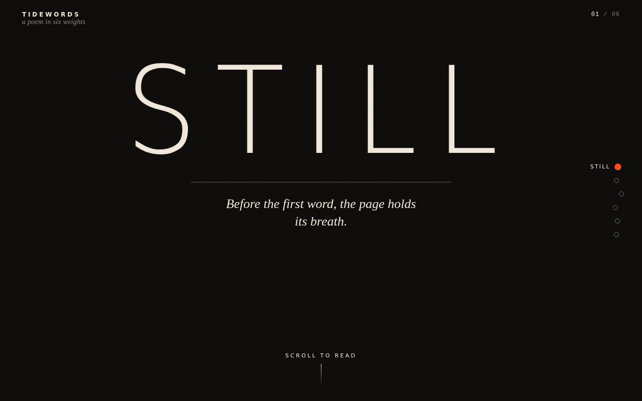
Tidewords, Six Weights

A kinetic typographic poem in which a single giant word occupies a sticky stage and is physically reshaped by scrolling. As the reader descends, the word moves from a hushed hairline STILL to a leaning, italicised LEAN, a swollen black HEAVY, a hollow outlined THIN, a skewed, rippling RUSH on a flood of vermilion, and finally an upright, settled REST. Each word is accompanied by a line of serif italic verse, and the whole stage shifts its background and ink colour between stanzas so the poem reads as a sequence of moods rather than a list of words.

Original prompt
PROMPT

Concept 016 scroll-kinetic-type: scroll-driven type whose weight and skew morph through a short poem.

Build a single standalone HTML page called "Tidewords: A Poem in Six Weights". A tall scroll track (about 720vh) holds a sticky full-viewport stage. In the center of the stage sits one giant uppercase word (font-size min(21vw, 30vh)), split into per-letter spans, with a thin progress rule beneath it and a single italic line of verse beneath the rule. The poem has six stanzas, each a keyword plus a line:
1. STILL: "Before the first word, the page holds its breath."
2. LEAN: "Letters tilt toward a wind they cannot see."
3. HEAVY: "Meaning gathers weight the way rain gathers on roofs."
4. THIN: "Then it thins, a hairline of ink across the dusk."
5. RUSH: "Faster now; the sentence outruns its speaker."
6. REST: "And settles, upright, into the quiet it came from."

Each stanza defines a typographic state: font-weight (100 to 900), skewX (0 to -24deg), letter-spacing (-0.04em to 0.28em), horizontal scale (0.86 to 1.1), outline amount (THIN becomes a hollow -webkit-text-stroke outline), letter wave amplitude, and background/foreground RGB. Scroll progress maps to a float stanza index; params blend between neighbouring stanzas with a smoothstep(0.22, 0.78) so each stanza has a calm plateau, then are eased toward the target each frame (lerp factor 0.12). The displayed word swaps at the midpoint, letters dropping in with a staggered blur-and-rise keyframe (55ms per letter). Scroll velocity adds extra skew that grows letter by letter, so fast scrolling makes the word lean like it is being dragged. In RUSH the whole stage floods vermilion (#ff4a1c) with ink-black type, and a sine wave ripples weight and baseline across the letters.

Palette: ink #0f0e0c, bone #efe8da, vermilion accent #ff4a1c, with slight warm and cool shifts per stanza. A faint dotted grain overlay (two radial-gradient dot grids in overlay blend) and a soft vignette sit on the stage.
Type: display in "Helvetica Neue" / "Segoe UI Variable Display" / system-ui (variable weights render smoothly where the system font is variable); verse and colophon in "Iowan Old Style" / Palatino / Georgia italic; counter in ui-monospace with tabular numerals.
Layout: top bar with the wordmark "TIDEWORDS" and italic subtitle at left, a "01 / 06" counter at right; a vertical dot rail on the right edge whose labels slide in on hover/focus and whose active dot fills vermilion (horizontal row at the bottom on phones); a "Scroll to read" hint with a pouring line that fades once reading starts; after the track, a colophon section ("Six weights, one breath.") with a pill button "Read it again".
Motion: rAF loop, eased param following, letter wave, velocity skew. Reduced motion: no easing lag, no wave, no velocity skew, no drop-in animation; the poem still changes with scroll.
Screenshot of Kettle and Kite Atelier
017

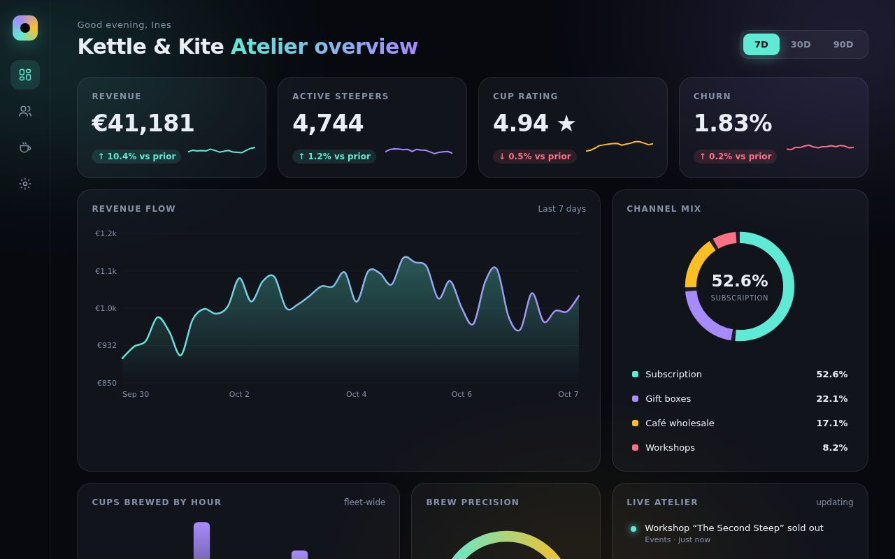
Kettle and Kite Atelier

A premium dark analytics dashboard for a fictional tea-subscription studio. Glass tiles float over a slow aurora of teal, violet and amber light, each with a pointer-following spotlight. The page opens on shimmering skeletons that resolve into count-up KPIs with sparklines, a self-drawing revenue curve with a precise crosshair tooltip, a gapped donut of sales channels, growing hourly bars, a precision gauge and a live feed of small atelier events. Every chart is hand-built inline SVG, and changing the date range makes the whole board morph smoothly to the new numbers.

Original prompt
PROMPT

Concept 017 elegant-dashboard: dark dashboard with fictional metrics, inline SVG animated charts, glass tiles.

Build a standalone HTML page titled "Steep: Kettle & Kite Atelier Overview", an analytics dashboard for an invented tea-subscription atelier called Kettle & Kite. Background is near-black navy (#07090f) with a fixed, slowly drifting aura of blurred radial gradients in teal (#5eead4), violet (#a78bfa) and amber (#fbbf24). All panels are frosted glass tiles: rgba(255,255,255,.045) fill, 1px rgba(255,255,255,.09) border, 20px radius, backdrop-filter blur(18px) saturate(140%), and a 260px radial spotlight that follows the pointer inside each tile. Rose (#fb7185) is reserved for negative signals.

Type: system-ui / -apple-system / "Segoe UI" for interface text; ui-rounded / "SF Pro Rounded" with tabular numerals for figures. Small uppercase tracked labels for tile headings.

Layout: a 72px icon rail on the left (conic-gradient logo, four stroke-icon buttons, hidden on phones), then a header with a time-aware greeting ("Good evening, Ines"), the title "Kettle & Kite Atelier overview" with a teal-to-violet gradient on the second half, and a segmented 7D / 30D / 90D control with a sliding teal pill. A 12-column grid holds: four KPI tiles (Revenue in euros, Active steepers, Cup rating in stars, Churn %) each with a count-up value, a coloured delta pill (rose when the change is bad, and for churn a decrease counts as good) and a sparkline; a wide "Revenue flow" smoothed line/area chart with a gradient stroke, y-axis euro labels, date ticks, and a hover crosshair, ringed dot and glass tooltip; a "Channel mix" donut (Subscription, Gift boxes, Café wholesale, Workshops) built from four pathLength=100 circles with small gaps, a centre readout, and a legend that highlights segments on hover or focus; a "Cups brewed by hour" bar chart of twelve two-hour windows with a morning and afternoon peak, bars growing from the baseline with staggered delays; a "Brew precision" semicircle gauge with a teal-to-amber gradient arc; and a "Live atelier" activity feed with glowing dots that receives a new invented event every seven seconds. Columns collapse to 2-up at tablet and 1-up on phones.

Data: generated from a seeded mulberry32 PRNG per range so each range is stable. The line chart always has 40 points; switching ranges morphs the old series into the new one over 800ms with ease-out cubic, while KPIs count up, donut segments animate their dash arrays and offsets, bars rescale and the gauge sweeps.

Loading state: every tile starts as a shimmering skeleton for about 700ms, then tiles reveal in a 70ms stagger and the line chart draws itself in with stroke-dashoffset.

Reduced motion: all transitions and animations collapse to instant; values are set directly.
Screenshot of Starlings over Saltmarsh
018

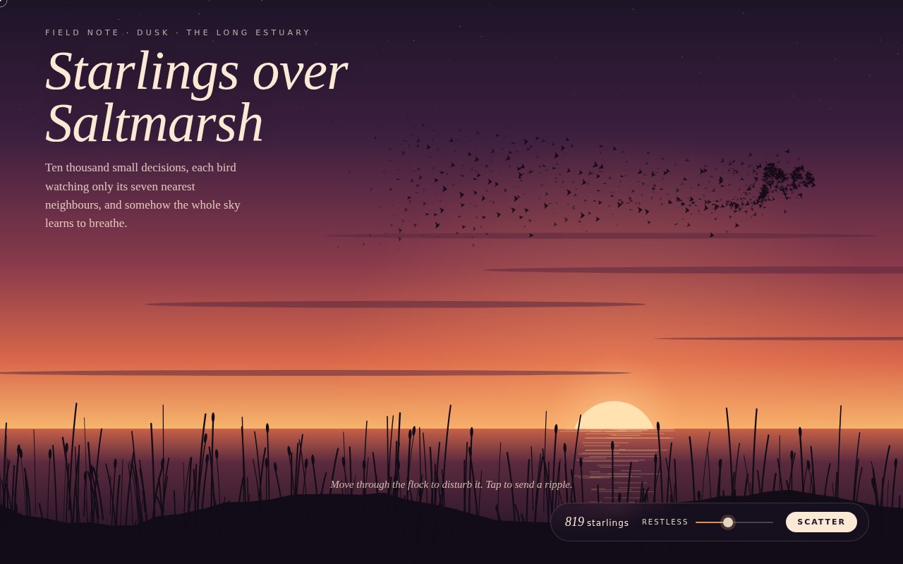
Starlings over Saltmarsh

A quiet, painterly simulation of a starling murmuration at sunset. Hundreds of small dark birds, each obeying only local rules of alignment, cohesion and separation, fold into rolling sheets across a plum-to-apricot sky above a reed-lined estuary where the low sun is breaking on the water. Moving the pointer through the flock behaves like a hawk diving in: the birds tear open around it and close behind it. The overlay reads like a naturalist's field note, with a large italic title and a small, warm control pill.

Original prompt
PROMPT

Concept 018 murmuration-boids: canvas boids flocking, pointer disturbs the flock, dusk palette.

Build a standalone HTML page titled "Starlings over Saltmarsh": a full-viewport canvas showing a murmuration of starlings wheeling above an estuary at dusk. The canvas is sized to devicePixelRatio (capped at 2) and rebuilt on debounced resize.

Background (painted once per resize to an offscreen canvas, then blitted each frame): a vertical sky gradient from deep plum #1d1428 through #3d1f3f, rose #8a3b4c and ember #d9674a to a pale apricot horizon #f6b56d; a sparse field of faint stars near the top; a low sun (#ffe2b0) clipped by the horizon with a large warm radial glow; thin streaky cloud ellipses; water below the horizon fading from #c76148 to near-black #150f1e with broken horizontal sun-glints; and a near-black (#120c18) marsh bank with a few hundred curved reed strokes and occasional bulrush heads, all from a seeded PRNG so it is stable. The horizon sits at 76% of the height (70% on phones).

Flock: Float32Array storage for position, velocity, depth (0.55 to 1.3) and wing phase. Bird count scales with area (W*H/1250, clamped 180 to 1100, 60% under reduced motion). A uniform spatial hash grid (46px cells, linked list in Int32Arrays) limits neighbour checks to 3x3 cells and at most 14 neighbours. Forces: alignment 0.06, cohesion 0.0035, inverse-square separation within 15px, a weak pull toward a Lissajous-wandering attractor so the flock forms rolling sheets, soft margins that keep birds on screen and above the horizon, random jitter, and min/max speed clamps. Depth scales speed slightly for parallax. Birds are drawn as small chevron silhouettes whose wing span flaps with a per-bird sine, batched into three depth buckets with increasing opacity (one path and fill per bucket) to keep the loop cheap.

Pointer: acts like a hawk. Birds within 135px (95px on phones) flee with a quadratic falloff, opening a hole that ripples through the flock. A thin cream ring and dot replace the hidden cursor. Pointer-down launches an expanding ripple ring that shoves birds outward as its band passes them.

Type and UI: top-left header with tracked uppercase kicker "Field note · dusk · the long estuary", a large Georgia italic title "Starlings over / Saltmarsh", and a short serif paragraph. Bottom-right glass pill panel (plum translucent, blurred) with a live italic count of starlings, a "Restless" range slider (ember-filled track, cream thumb) that raises max speed and jitter, and a cream "Scatter" button that bursts the flock outward from its centre. A serif italic hint "Move through the flock to disturb it. Tap to send a ripple." fades after the first tap or nine seconds. Sans: "Avenir Next" / "Gill Sans" / Trebuchet MS.

Reduced motion: flock speed at 35%, wings stop flapping, fewer birds, slower ripples.
Screenshot of Meridian Sky Clock
019

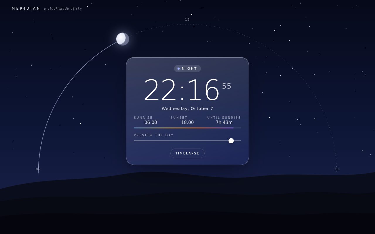
Meridian Sky Clock

A living clock where the sky itself is the dial. The page reads the visitor's local time and paints the matching sky, from deep navy midnight through peach dawn, clear midday blue and a magenta sunset, while the sun or moon sits at the right point on a dotted arc over layered hills. A glass card at the centre names the moment ("Golden hour", "Blue hour"), shows the time in large ultra-light numerals, and counts down the daylight left. The viewer can scrub through the whole day or run a timelapse and watch the light change continuously.

Original prompt
PROMPT

Concept 019 sky-clock-arc: time-of-day sky gradient, sun and moon travel an arc, glass clock card.

Build a standalone HTML page titled "Meridian: A Clock Made of Sky". The entire viewport is a sky that tells the viewer's real local time. A fixed .sky layer uses a three-stop vertical linear-gradient (CSS variables --top, --mid, --low) whose colours are interpolated every animation frame from eleven hourly keyframes with smoothstep easing: midnight navy (#05070f / #0b1330 / #1a2147), pre-dawn indigo, blue hour into a peach horizon (#e58f7a), sunrise blue over apricot (#ffd3a1), clear morning and midday blues (#2a7fe0 / #6fb6f2 / #d6effa), a warm afternoon horizon (#f4d9a8), a magenta-and-tangerine sunset (#c0607a / #ffa05a), plum dusk, and back to night. Three layered SVG hill silhouettes at the bottom (stretched with preserveAspectRatio none) take a keyframed hill colour, each layer shaded darker toward the front.

The sun and moon travel a semicircular arc centred on the horizon. Sunrise is modelled at 06:00 and sunset at 18:00; the sun maps 06:00 to 18:00 onto the arc from left horizon to right horizon, and the moon does the same from 18:00 to 06:00. The arc is drawn in a full-viewport SVG as a dotted guide with small "06", "12" and "18" tick labels, plus a solid trail from the left horizon to the current body (warm for the sun, cool for the moon). The sun is a radial-gradient disc with a large layered glow, and a 900px screen-blended halo follows it, growing stronger near the horizon. The moon is a pale disc with an inset shadow forming a crescent. About 110 twinkling star dots fade in after 19:00 and out by 06:30.

A frosted glass card sits centred inside the arc above the horizon on desktop (anchored at the bottom on phones, where the horizon is raised to make room). It contains: a pill showing the named phase of day (Night, Blue hour, Sunrise, Morning, Midday, Afternoon, Golden hour, Sunset, Dusk) with a glowing accent dot whose colour changes per phase; a huge ultra-light HH:MM with small superscript seconds; the long-form date; a three-column meta row (Sunrise 06:00, Sunset 18:00, and "Daylight left" or "Until sunrise" counted down in hours and minutes); a thin day-progress bar with a dawn-to-dusk gradient; a "Preview the day" range slider covering 00:00 to 23:59; and pill buttons "Timelapse" and "Return to now". Top-left wordmark "MERIDIAN" with an italic Georgia tagline "a clock made of sky".

Type: "Avenir Next" / Avenir / Futura / "Century Gothic" / Trebuchet MS, weight 200 for the clock numerals with tabular figures; tracked uppercase micro-labels. Card: gradient white glass, 28px radius, blur(22px) saturate(150%), inset highlight and deep soft shadow.

Reduced motion: stars stop twinkling and timelapse runs at a third of the speed.
Screenshot of Nightdrive, Radio Halcyon
020

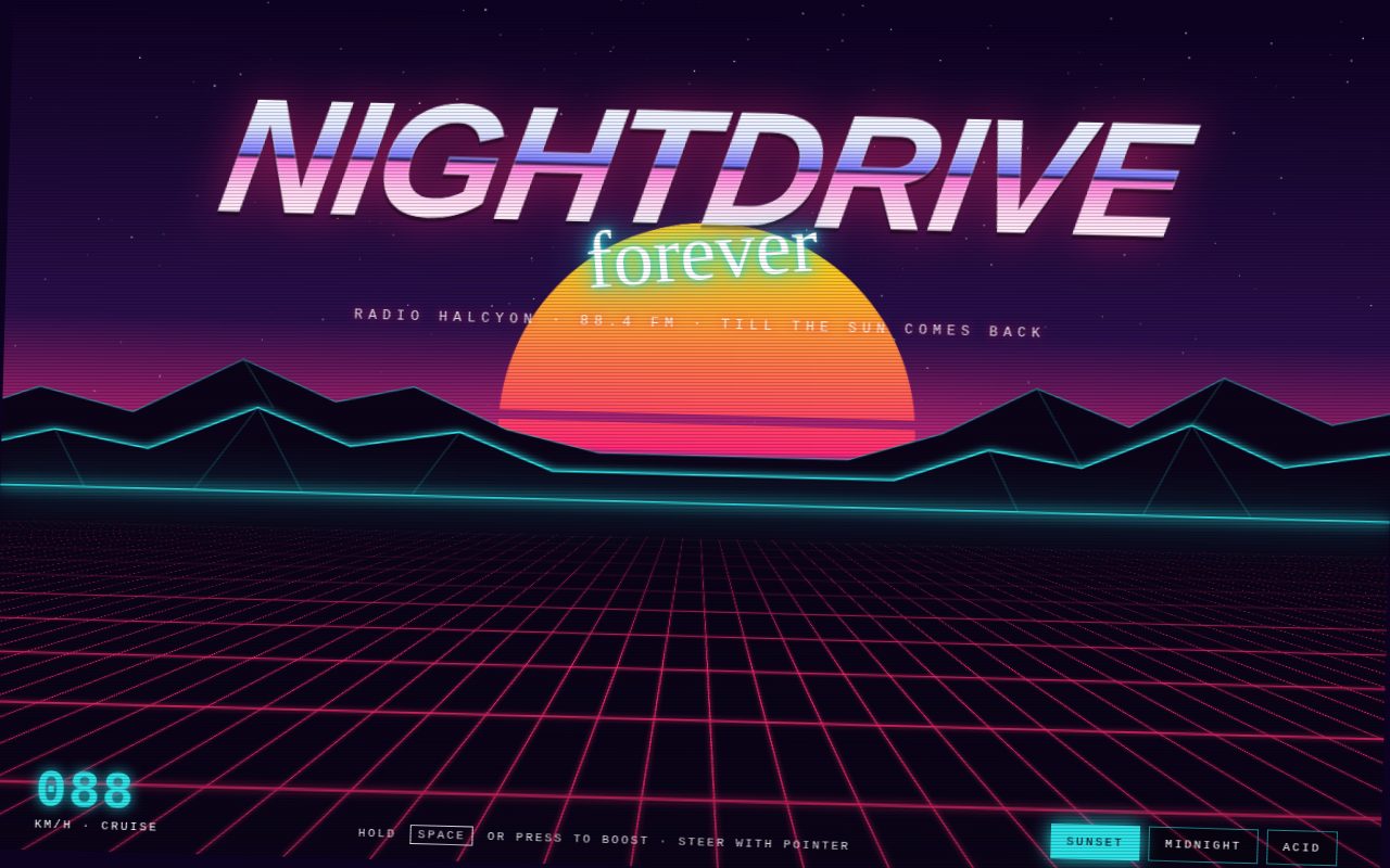
Nightdrive, Radio Halcyon

A retro-futurist synthwave postcard you can drive. A slatted gradient sun sinks behind neon wireframe mountains while a magenta grid races toward the viewer along an endless perspective floor, all held together by a glowing cyan horizon line with a scanning highlight. A chrome-lettered NIGHTDRIVE title with a neon script "forever" floats above the sun, and a monospace HUD reads out the cruising speed. Steering banks the whole horizon, boosting turns the stars into hyperspace streaks, and three "cassette" buttons swap the entire scene between Sunset, Midnight and Acid colourways.

Original prompt
PROMPT

Concept 020 synthwave-horizon: perspective grid, setting sun, animated horizon line.

Build a standalone HTML page titled "Nightdrive: Radio Halcyon 88.4", a full-screen synthwave driving scene for an invented late-night radio station. The horizon sits at 58% of the viewport height (56% on phones), stored as a CSS variable --hz.

Sky: linear-gradient from deep violet-black #0d0221 through #2a0f4a to hot pink #ff2e88 at the horizon, behind a devicePixelRatio-aware canvas of twinkling stars that fade toward the horizon. A wide screen-blended radial glow sits on the horizon line.

Sun: a large disc (min(58vw, 48vh)) with a vertical gradient from yellow #ffd319 through pink #ff2975 to violet #8c1eff, cut by a mask-image gradient into horizontal slats whose gaps widen toward the bottom, with a pink drop-shadow glow. It slowly sets and rises (translateY -6% to 22%, 26s, ease-in-out, alternate) behind the mountains.

Mountains: an inline SVG strip anchored to the horizon with two jagged ridgelines filled with the floor colour and stroked in neon cyan #2de2e6 (front ridge with a cyan drop-shadow), plus faint wireframe facet lines down the peaks; strokes use vector-effect non-scaling-stroke.

Floor: a .ground block from the horizon to the bottom with perspective 220px and perspective-origin at its top edge. Inside, a very wide plane (700% width, 260% height) rotated rotateX(78deg) from its bottom edge, painted with two 2px linear-gradient grid lines in magenta #ff2a6d on an 80px tile with a glow. JavaScript animates background-position every frame so the grid rushes toward the viewer, with lateral drift from steering. A gradient haze over the ground fades the far grid into the horizon.

Horizon line: a 2px cyan line with a double glow, whose opacity pulses gently and brightens with speed, and a white highlight that scans across it every 3.2s.

Title block: "NIGHTDRIVE" in heavy italic Futura / "Avenir Next" / "Arial Black", skewed -8deg, filled with a chrome gradient that has a dark horizon band at 50% (white, ice blue, periwinkle, near-black, pink, white), thin white text stroke and pink glow; beneath it the word "forever" in "Brush Script MT" / "Segoe Script" cursive, rotated -6deg with a layered neon cyan glow; then a tracked monospace line "Radio Halcyon · 88.4 FM · till the sun comes back".

HUD (monospace, uppercase): bottom-left speed readout in large glowing cyan digits ("088 km/h · cruise"), centre hint "Hold Space or press to boost · steer with pointer" (hidden on phones), bottom-right three square cassette buttons Sunset / Midnight / Acid that swap the whole palette via a data-theme attribute on the root (Midnight: blue-black sky, electric blue horizon, cyan grid, violet neon, white-to-blue sun; Acid: green-black sky, lime horizon, chartreuse grid, magenta neon, yellow-to-green sun). Each palette change triggers a brief stepped white scanline flash like a tape channel change. A fixed scanline overlay covers everything.

Motion: rAF loop with delta time. Speed eases toward a target (1 cruising, 3.4 boosting); the grid speed, the readout (speed x 88) and horizon brightness follow it, and above 1.2 the stars become radial streaks from the vanishing point. Pointer x sets a steering value that eases in: the whole world banks up to 1.6deg, the grid slides sideways, and mountains and sun parallax at different rates. Arrow keys also steer.

Reduced motion: the grid stops, the sun no longer sets, the horizon scan stops, stars do not twinkle, boosting is disabled and the palette flash is skipped.
Screenshot of Evening Bellflower Herbarium
021

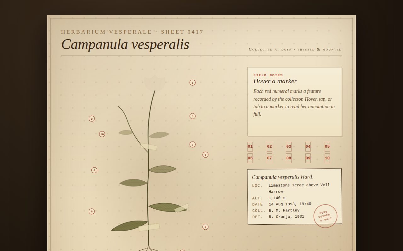
Evening Bellflower Herbarium

A sepia museum herbarium sheet for a fictional dusk-flowering bellflower. A hand-drawn inline SVG plant draws itself root to bloom on a foxed paper sheet, with gummed tape, a typed accession label and an ink stamp. Red numbered pins mark ten features, and each opens a collector's field note in a card beside the plate, so the page feels like reading a 19th-century specimen with a curator next to you.

Original prompt
Build a standalone HTML page that reads as a scanned museum herbarium sheet for an invented evening-blooming bellflower, "Campanula vesperalis", collected in 1893. Set the whole page on a dark walnut-brown radial backdrop with a single cream-to-tan paper sheet centered on it (max width ~980px), drop shadow, inner vignette of foxing stains, a faint dotted fiber texture made of tiled radial gradients, and a thin inset hairline border. Palette: paper #efe3c8 to #e6d5b2, ink brown #3b2a1a, soft ink #6b5238, sepia #8a6a42, faded olive leaf #6f6a3a, dusk-violet petal #8b5a6b, and an archival red #a2452e for annotation markers. Typography: "Iowan Old Style"/Palatino/Georgia serif for headings and prose, italic for the Latin binomial, small caps for the institution line, and "Courier New"/ui-monospace for the specimen label, numerals and index buttons.
Layout: a two-column grid (plate left, notes right) collapsing to one column under 760px. Header across the top: small spaced caps "Herbarium Vesperale · Sheet 0417" above the big italic species name, with "Collected at dusk · pressed & mounted" on the right. The plate is an inline SVG (viewBox 600x760) drawing the whole plant: taproot with laterals, a wiry stem with one branch, lance leaves filled olive with an overlaid diagonal hatching pattern, midrib veins, a main bell-shaped corolla and a second nodding flower with an exserted stigma, two buds, a seed capsule, a soft sepia stain ellipse behind, and three semi-transparent gummed tape strips.
Motion: on load, roots and stems draw in with stroke-dashoffset (3.2s, ease cubic-bezier(.65,.05,.25,1)), then leaves, flowers, buds and capsule fade in with staggered delays. The plant group sways by under a degree around its root over 9s. Reduced motion disables drawing, fades, sway and the pulse halo.
Interaction: ten numbered red pins are generated in script, each tied by a dashed leader line to a feature (corolla, stigma, bud, capsule, leaf, rosette, node, tape, taproot, stem). Hovering, focusing or tapping a pin (or its matching index button in a 5x2 Courier grid) fills the pin red with a springy radius change, shows the leader, starts a pulsing halo, and cross-fades the field-note card on the right to that annotation's title and paragraph. The empty state invites the viewer to hover a marker. Below sits a typed specimen label (locality, altitude, date, collector, determiner) slightly rotated, with a red circular "HERB. VESPER. № 0417" stamp, and a footer quoting the collector's margin note.
Screenshot of Tidepool Seven
022

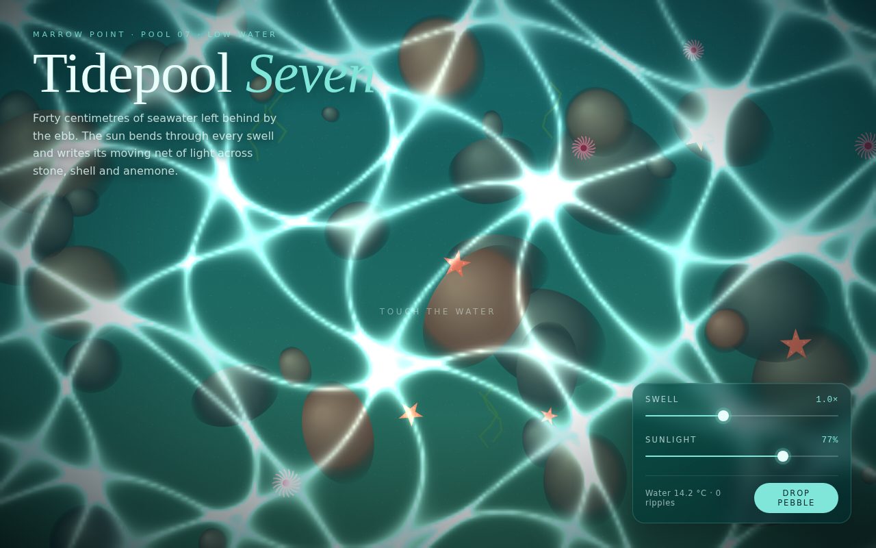
Tidepool Seven

A meditative top-down view of a sunlit rock pool. A procedurally painted floor of pebbles, starfish, anemones and weed sits under a living net of caustic light, computed per pixel at low resolution and blended additively so it glows. Touching the water sends out ripples that bend the light net in rings, and a small frosted-glass instrument panel tunes the swell and the strength of the sun.

Original prompt
Build a full-viewport canvas page that looks straight down into a shallow rock pool at low tide, with sunlight caustics moving across the floor. Palette: deep sea #04262c, teal #0b4b52, aqua accent #7fe6d9, foam white #e9fffb, sand #cdb78a, coral #ee8a6b. Typography: Didot / "Bodoni 72" / Georgia high-contrast serif for a large title "Tidepool Seven" with "Seven" in italic aqua; "Avenir Next" / "Segoe UI" / system-ui for body, small spaced uppercase labels; ui-monospace for numeric readouts.
Rendering: on resize, paint a static seabed to an offscreen canvas with a seeded PRNG: teal-to-olive vertical gradient, sand speckles, rounded pebbles made of offset radial gradients, a few coral-red five-armed starfish with pale dots, pink anemones drawn as radiating quadratic tentacles around a dark core, and zigzag green weed strokes. Each frame, draw that bed and then compute caustics into a small low-resolution ImageData buffer (about one-fifth width, capped near 52k pixels). Per pixel, domain-warp the coordinates with sines over time, then sum two sine fields; brightness is exp(-5.5*|field|) for each, added and squared, so bright thin lines form a shifting net. Write only alpha into a pre-filled pale aqua buffer, then upscale with smoothing onto the main canvas using the "lighter" composite, plus a second slightly enlarged faint pass for bloom. A CSS vignette and a top light gradient sit over the canvas. Canvas sized to devicePixelRatio (max 2), debounced resize, requestAnimationFrame loop with clamped delta time.
Ripples: each ripple has a center, age and amplitude. In the caustic loop it pushes the warped coordinates radially using a Gaussian wavefront travelling outward (sin(dist*7-age*9), decaying with age), so the light net visibly bends in rings. Thin foam-white and aqua circles are also stroked on the main canvas. Maximum eight ripples, each removed after six seconds.
Layout: title block top-left with the eyebrow "Marrow Point · Pool 07 · Low water" and a two-sentence lede. Bottom-right frosted-glass control panel (backdrop blur, aqua hairline, rounded 18px) rising in on load, containing "Swell" (time speed) and "Sunlight" (caustic gain) custom range sliders with glowing thumbs and filled tracks, a live readout of water temperature and ripple count, and a pill "Drop pebble" button with a springy press. A breathing "Touch the water" hint fades away after the first ripple.
Reduced motion: time runs at 0.15x, ripples age slowly, and the panel and hint animations are turned off.
Screenshot of Riso Night Market Poster
023

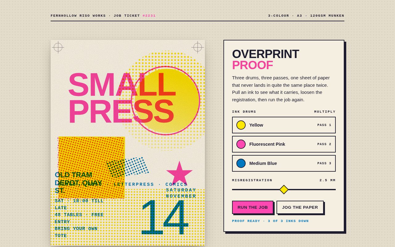
Riso Night Market Poster

A tactile risograph print simulation. A bold three-ink poster for a fictional small-press night market is built entirely from CSS halftone screens, solid shapes and type, overprinted with multiply blending so pink over yellow makes coral and blue over pink makes violet. A print-shop job ticket lets you pull individual inks, loosen the registration and rerun the job pass by pass, so you can see how the image comes apart into its separations.

Original prompt
Build a standalone page showing a three-colour risograph event poster for an invented "Fernhollow Small Press Night Market" next to a print-shop job ticket. Every colour must come from CSS: halftone dots made with radial-gradient backgrounds, overprinting with mix-blend-mode: multiply, and visible misregistration between the ink layers. Inks are true riso swatches: Yellow #ffe800, Fluorescent Pink #ff48b0, Medium Blue #0078bf, on warm paper #f5efe2. The page sits on a slightly darker table colour #e4dccb with a faint 9px dot texture. Ink black is #1d1b2e. Type: "Arial Black" / Impact for huge poster words and buttons, "Helvetica Neue" / Arial for body, "Courier New" / ui-monospace for small print, labels and status.
Poster: a 3:4 sheet, width min(88vw, 500px), with font-size set to one twentieth of the width so every element is sized in em and scales exactly. It has three absolutely stacked layers, each with multiply blend. Yellow: a halftone sun circle (inner solid disc, mask fading the dots), a solid yellow block, and a halftone strip along the bottom. Pink: "SMALL PRESS" in giant Arial Black, an outlined ring, a halftone block screened at 15 degrees and a five-point star. Blue: "NIGHT MARKET", a rotated halftone band screened at 75 degrees, a spaced kicker line "ZINES · RISO · LETTERPRESS · COMICS", a Courier venue and time block, "SATURDAY NOVEMBER", and a huge "14". The halftone screens are oversized rotated ::before pseudo-elements inside clipped boxes. Corner registration marks and an inline SVG feTurbulence paper grain are multiplied on top.
Misregistration: each layer reads --dx, --dy and --rot custom properties. Script assigns per-ink random seeds scaled by a "Misregistration" slider (0 to 5 mm) and adds a pointer parallax in a different direction per layer, so moving over the poster slides the inks apart.
Job ticket: a paper card with a 2px ink border and a hard 6px offset shadow. It holds the heading "Overprint proof" (pink word multiplied), a short paragraph, three ink-drum toggle buttons (round swatch, name, PASS number; switching one off overlays paper-coloured dots on the swatch and prefixes "OFF ·"), a diamond-thumb slider, "Run the job" (pink) and "Jog the paper" buttons with press-down offset-shadow micro-interactions, and an aria-live status line. A header strip reads "Fernhollow Riso Works · Job ticket #2231" and "3-colour · A3 · 120gsm Munken". Two columns on desktop, stacked and centered under 820px.
Motion: toggled layers fade and lift by 14px. "Run the job" clears all layers, re-jogs the registration, then lays the inks down one pass at a time with a top-to-bottom clip-path roller wipe (0.9s, cubic-bezier(.7,0,.25,1)), and the status reads "Pass n of 3 · Ink". Reduced motion removes the wipe and the parallax and shortens the passes.
Screenshot of Halcyon Generative EQ
024

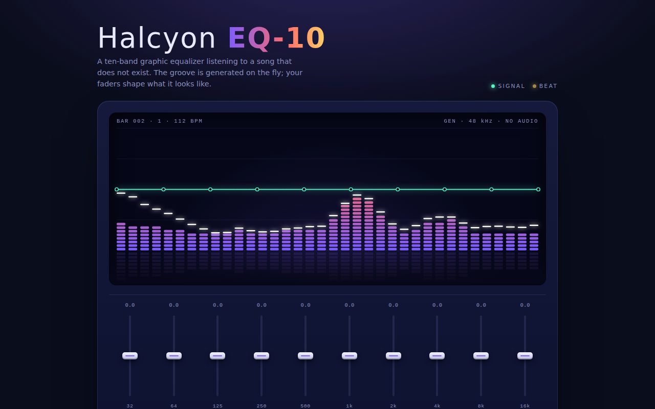
Halcyon Generative EQ

A sleek dark equalizer that listens to music that does not exist. A procedural groove with kick, snare, hats and a drifting melody drives a segmented LED spectrum with falling peak caps and a soft reflection. Ten tactile faders, presets and a tempo control reshape that spectrum live, and a glowing response curve drawn over the bars shows the EQ shape you have set.

Original prompt
Build a standalone page for an invented hardware-style plug-in, "Halcyon EQ-10": a ten-band graphic equalizer that visualizes a groove generated in code, with no audio at all. Palette: midnight ink #0a0d1c with a raised panel gradient #151a3c to #0e1230, hairlines rgba(160,170,255,.14), text #e9eaff, muted lavender #8a8fbf, and a bar gradient from electric violet #7c5cff through coral #ff6b6b to amber #ffd166, plus a mint #5ef2c4 accent for the response curve. Soft violet and coral radial glows sit at the top and bottom-right of the page. Type: Futura / "Century Gothic" / "Avenir Next" geometric sans for the title, with "EQ-10" in a gradient-clipped bold; ui-monospace / "SF Mono" / Menlo with tabular numerals for every readout.
Layout: a centered column (max 980px). The header holds the title, a one-line tagline, and two blinking status LEDs (Signal steady, Beat tied to the tempo through a --beat custom property). Below is a rounded device panel with a deep inset screen (canvas, height clamp(200px, 42vh, 340px)) overlaid with a monospace bar and beat counter and "GEN · 48 kHz · NO AUDIO". Under the screen is a 10-column fader bank (32 Hz to 16 kHz), each with a live dB readout (amber when boosted, ice blue when cut, muted at zero), then a row of preset chips (Flat, Bass lift, Vocal, Air, Smile, Surprise) and a gradient Tempo slider (70 to 160 BPM). A short usage note sits underneath.
Faders: custom role="slider" elements with a track, centre zero line, gradient fill from zero to thumb, and a glossy cap thumb that scales up with a springy ease and a violet glow on hover, focus or drag. Pointer capture handles dragging, double-click resets, and the keyboard supports arrows (0.5 dB, Shift for 3 dB), Home, End and 0. ARIA valuenow and valuetext are kept current. Presets tween all gains over 620ms with an ease-out cubic; Surprise produces a random sine-shaped curve.
Generator and canvas: a devicePixelRatio-aware canvas with N display bars (20, 28 or 36 depending on width), each mapped to a log-frequency position u. Energy combines smooth value noise, a kick envelope on the low bands every beat, a snare on beats 2 and 4 in the mids, fast hi-hat ticks on eighth notes in the highs, and a wandering melodic Gaussian bump with a harmonic. Each bar's energy is multiplied by 10^(dB/20), using a Catmull-Rom interpolation of the ten fader gains, then smoothed with fast attack and slow release. Bars draw as stacked rounded LED segments coloured by height from a precomputed 41-step gradient. White glowing peak caps fall back with accelerating gravity, a faint mirrored reflection fades into the floor, and a glowing mint response curve with node dots and a dashed 0 dB line is drawn over the bars. Reduced motion slows time to 0.35x, smooths the bars heavily and stops the LED blinking.
Screenshot of Orbital Ring Clock
025

Orbital Ring Clock

A strict, airy Swiss poster that is also a working clock. Three concentric rings fill clockwise for hours, minutes and seconds, a single red point orbits the outer ring once a minute, and a monumental Helvetica readout, a world-zone list and a legend row sit on a rigorous 12-column grid. Selecting a ring brings its value into the centre of the dial, and choosing a city re-times the whole composition.

Original prompt
Build a standalone Swiss International Style clock page for an invented watchmaker, "Ringwerk Zeitmesser Modell 03 · Orbital". Palette: chalk paper #f2f0eb, ink #111, warm grey #8c8a85, rule lines #d6d3cc, and a single signal red #e30613 used only for seconds and for the active state. Type: "Helvetica Neue" / Helvetica / Arial throughout, bold with tight negative tracking for display sizes, tabular numerals for every number. No other typefaces.
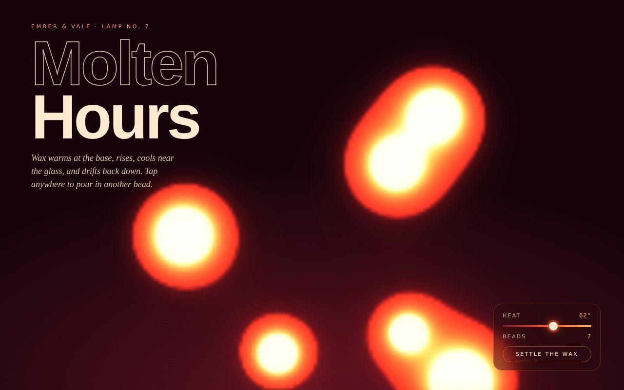
Layout: a 12-column grid (max 1180px) under a 6px black top rule. A three-cell header strip holds the maker and model, the tagline "Three rings, one orbit. Hour, minute, second." and a grey reference "Ref. RW-03-1180 / Signal red on chalk". The dial (inline SVG, viewBox -56 -56 112 112) spans columns 1 to 7. The side column (8 to 12) holds a red kicker naming the active zone, the huge "Orbital" title, a giant digital HH:MM with small red seconds superscripted, the long-form date, a short paragraph, a numbered time-zone list (Local, Zürich, Tokyo, New York, São Paulo, each with its own live HH:MM), and 24 h / 12 h toggles. A three-column legend row under a black rule shows big Hours, Minutes and Seconds numbers with a line-weight key, and a grey focus note sits below. Under 820px everything stacks into one column and the dial centers.
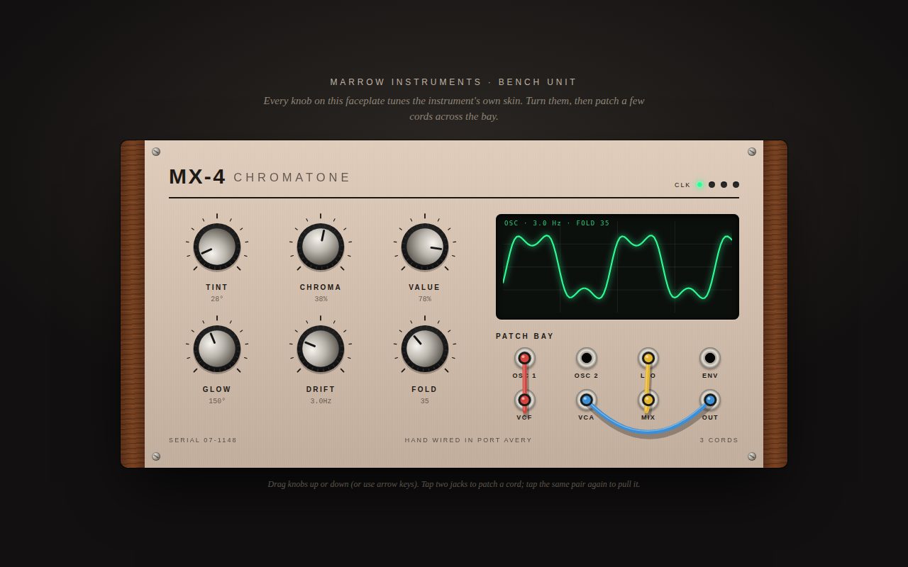
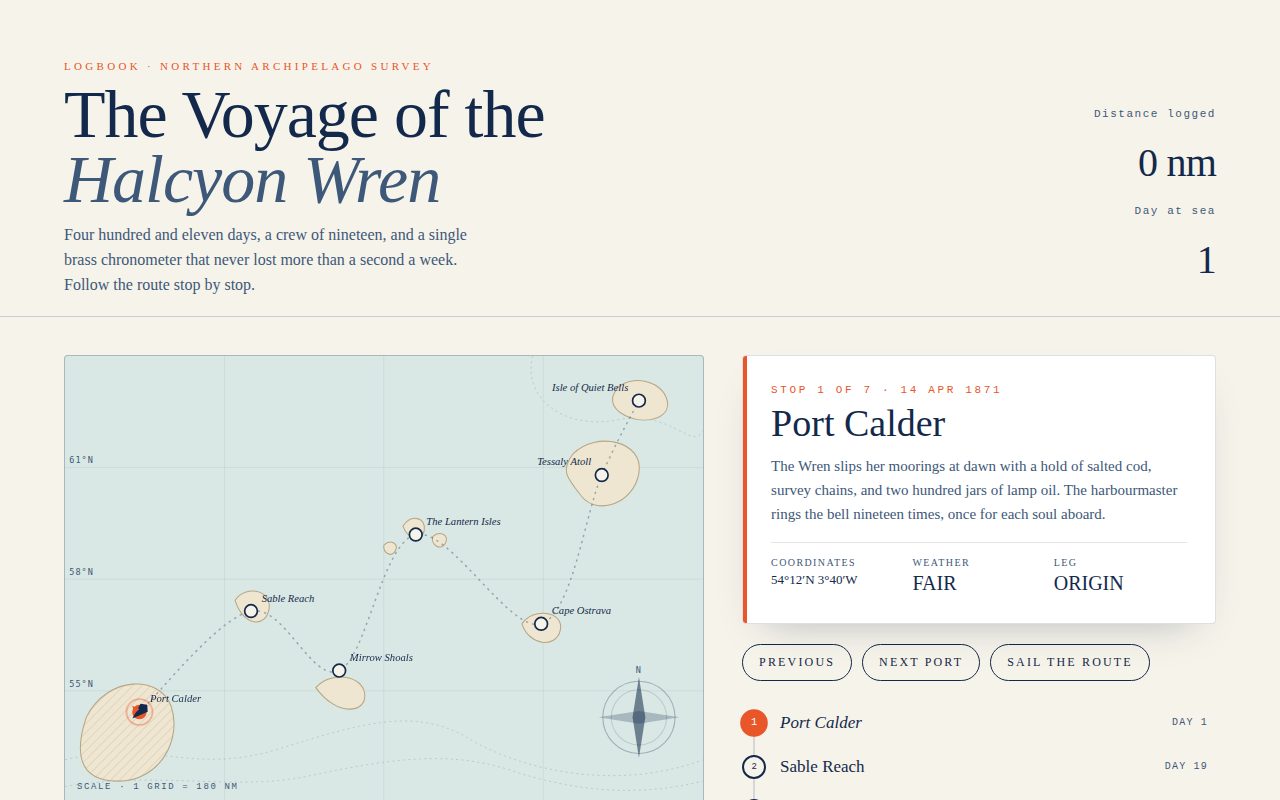
Dial: 60 ticks generated in script (heavier every 5) with numerals 15, 30, 45 and 60 outside the rings. Three concentric rings, each a hairline track plus a progress arc drawn as a circle with pathLength=100 rotated -90 degrees and driven by stroke-dasharray: outer seconds r=44 (thin red), middle minutes r=35 (1.4), inner hours r=25 (2.6, a 12-hour turn). Each ring also has a marker dot at its leading edge. The seconds dot is red and orbits continuously with millisecond smoothness, followed by a short fading red trail segment built from a four-value dasharray. A centre hub shows the value of the focused ring (default seconds) with a small grey label.
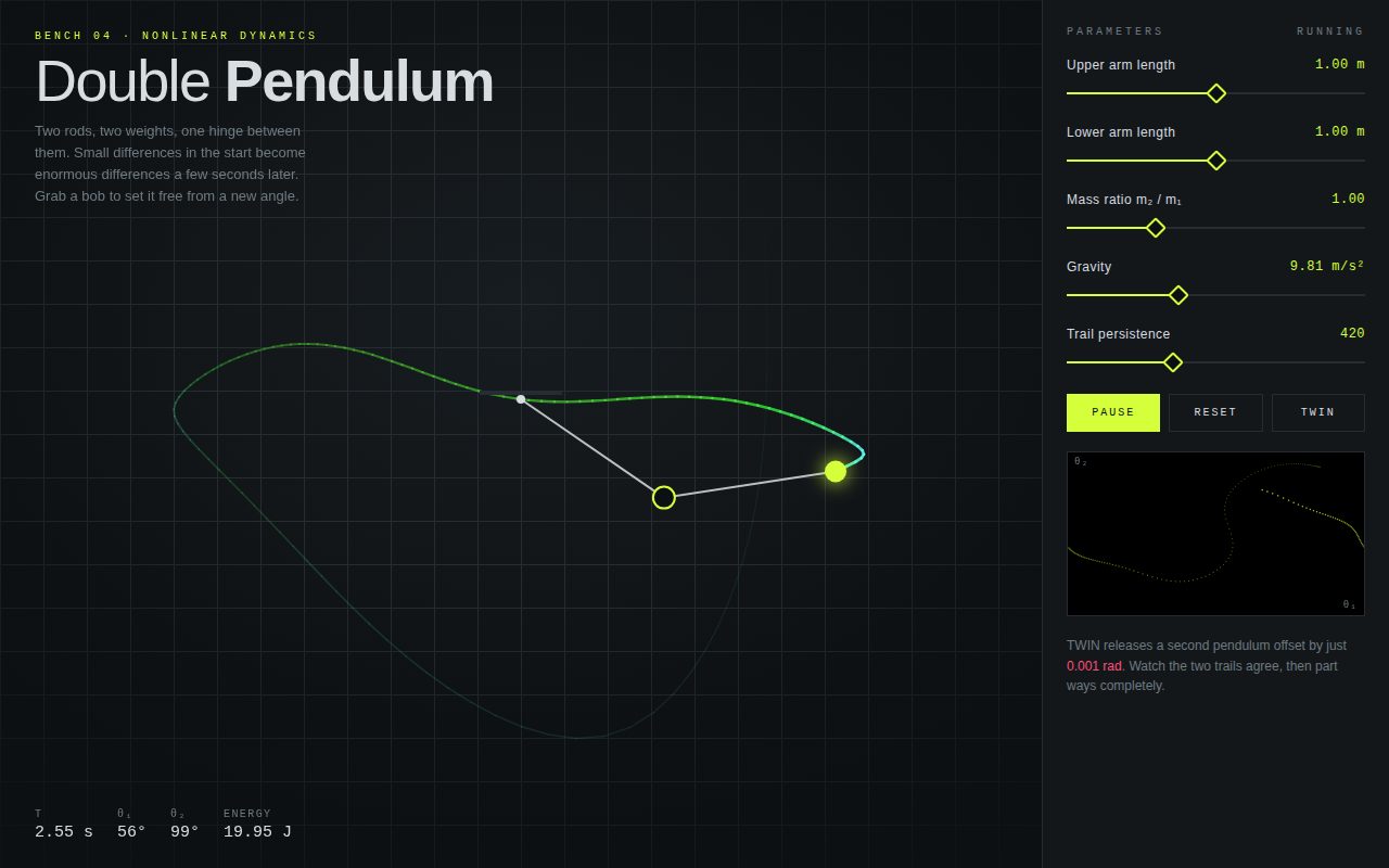
Interaction: hovering a ring sets it as the hub's subject. Focusing or clicking one makes the selection sticky and thickens its arc with an eased stroke-width transition. Keyboard focus shows a dashed red track, and Enter or Space selects. Zone buttons slide right on hover, a red underline grows across the active one, and choosing one recomputes the time with Intl.DateTimeFormat formatToParts for that timezone (offline, no fetching). The 12 h toggle switches every readout and adds AM or PM. Time parts are recomputed only when the second changes. Each frame just interpolates milliseconds.
Reduced motion: the loop switches from requestAnimationFrame to a once-per-second setTimeout, so the dot steps instead of gliding, and transitions are removed.
Screenshot of Squishworks Clay Studio
026

Squishworks Clay Studio

A tactile, pastel claymorphism showcase where six soft 3D blobs sit on a warm putty surface like freshly kneaded modelling clay. Layered inner and outer shadows sell the volume, organic border-radius values give each blob its own lumpy silhouette, and a hand-rolled spring simulation makes every hover and tap feel physical. A clay tray at the bottom tallies squishes and reports the clay's mood, turning a simple shading study into a small, joyful toy.

Original prompt
Build a standalone HTML page for "026 clay-blobs: claymorphism soft 3D blobs with spring squish on hover." Make it a fictional studio called Squishworks Clay Studio. Background is warm putty (#f6e9e1) with two faint radial washes (peach top-left, lilac bottom-right). Typography uses a rounded system stack (ui-rounded, "SF Pro Rounded", "Arial Rounded MT Bold", Nunito, "Trebuchet MS", system-ui), with heavy 800 to 900 weights. Header has a small clay pebble logo and a clay pill button labeled "Reshape the clay". The centered hero has a small uppercase kicker, a huge two-line headline "Press gently. / They press back.", with the second line in peach and stacked text-shadows so it looks extruded. Below it, a 3 by 2 grid (2 by 3 on phones) of six clay blobs: Apricot, Mintleaf, Lavendough, Butterpat, Puddle, Blush, in peach, mint, lilac, butter, sky and rose. Each blob is a button with an organic asymmetric border-radius, layered inset shadows (dark tinted bottom-right, white top-left), a soft drop shadow, a blurred specular highlight pseudo-element, and two little dot eyes that blink flat when squished. Each blob has a name and a one-line personality caption. Motion: a JavaScript spring (stiffness about 0.16, damping about 0.78) drives scaleX/scaleY and a small rotation, transform-origin at the bottom so blobs squash on the floor. Hover widens and flattens a little, click slams it to 1.32 by 0.62 and lets it wobble back, sometimes re-randomizing its border-radius (which eases over 1.2s by CSS transition). An idle timer gives a random blob a tiny jiggle every 1.8s. Below sits a clay tray with a squish counter, an inset groove meter that fills with a peach-rose-lilac gradient with an overshoot easing, and a mood line that changes every five squishes. The Reshape button re-randomizes all shapes in a staggered cascade. Reduced motion: stiffer, heavily damped springs, no idle jiggle, no CSS transitions.
Screenshot of Mirrorwerk Chrome Type
027

Mirrorwerk Chrome Type

A cinematic dark-studio type specimen where a single giant word is cast in liquid chrome. The metallic look comes entirely from a multi-stop gradient clipped to the letterforms, with a dark horizon band that slides as the pointer moves, so the reflection seems to follow your eye. A sweeping glint, a blurred floor reflection, and gentle 3D tilt complete the illusion of polished metal under studio lights, while the control panel lets you engrave your own word and switch between chrome, gold leaf and prismatic finishes.

Original prompt
Build a standalone HTML page for "027 chrome-type-studio: animated chrome gradient text with moving reflections on a dark backdrop." Frame it as Mirrorwerk, a fictional type foundry filming a "take" in a dark studio. Backdrop is near-black (#07080b) with a soft blue-grey radial spotlight in the middle and faint vertical studio-panel lines every 80px. A tiny top bar reads "Mirrorwerk type studio" with a blinking red recording dot on the left and "Take 027 / polished in real time" on the right, in small tracked uppercase Helvetica Neue. Center stage: a huge condensed word set in Impact / Haettenschweiler / Arial Black, uppercase, clamp(3.2rem, 15vw, 11rem), filled with a ten-stop vertical metallic gradient via background-clip:text (bright top, dark horizon band at about 46 to 50 percent, bright lower highlights), background-size 100% 260% so the horizon can slide. Add drop-shadow filters for a top bevel and deep cast shadow. Under the word, a mirrored floor reflection: the same word flipped with scaleY(-1), blurred, faded with a mask gradient. A diagonal white glint band sweeps across the letters every 4.5s using an overlay-blended gradient layer. JavaScript eases the pointer position (lerp 0.08) and maps vertical position to the gradient's background-position (the horizon reflection rides with the cursor), horizontal position to the glint angle, and both to a subtle 3D rotateX/rotateY tilt of the stage under perspective 900px; a slow sine drift keeps the horizon moving when idle. Below sits a glassy control panel: a text input to engrave your own word (max 16 characters, mirrored to the reflection live) and three finish buttons with swatch dots, Chrome, Gold leaf and Prism (iridescent pastels), which swap the gradient by changing the body class and update aria-pressed. Reduced motion: no glint sweep, no idle drift, no tilt, no blinking dot.
Screenshot of Plotlet Pixel Garden
028

Plotlet Pixel Garden

A cozy 8-bit pocket garden rendered at true low resolution and scaled up crisply. A full day passes in about a minute: the dithered sky moves from indigo through coral dawn to bright noon and violet dusk, the sun and moon trade places, and the whole scene dims to moonlight. Visitors sow four kinds of flowers that grow in visible stages, respond to the light by opening and closing, and add small details like sun-tracking sunflowers, glowing bluebells and night fireflies, all framed by chunky pixel UI.

Original prompt
Build a standalone HTML page for "028 pixel-garden: pixel-art grid garden that grows on click, with a day and night cycle." Call the fictional toy Plotlet. Page background is deep plum (#1c1426) with a faint 16px checker texture; all type is a monospace system stack (ui-monospace, SF Mono, Menlo, Consolas, Courier New), bold and uppercase for UI. The title "Plotlet" is marigold (#ffc94a) with stepped hard shadows in rose and near-black, like an 8-bit logo. A HUD of three pixel-bordered chips (borders made from four hard box-shadows, no radius) shows the in-game clock, the phase name (Deep night, Dawn, Morning, Noon, Afternoon, Dusk, Night) and the bloom count. The garden is a 96 by 64 virtual-pixel canvas rendered into an ImageData buffer each frame, then scaled up by the largest integer factor that fits the container times devicePixelRatio with smoothing off, inside a chunky pixel frame. Scene layers: a sky gradient interpolated between nine time-of-day keyframes (midnight indigo, dawn coral, noon blue, dusk violet-orange) and quantized into seven bands with 2 by 2 Bayer dithering; twinkling stars that fade in by night; a sun with a soft halo and a crescent moon travelling opposite arcs; two layers of sine-wave hills; a grass line with tufts; and speckled soil with pebbles from a precomputed noise table. Scene pixels are shaded by a light level so night turns everything blue-dim. Clicking drops a seed pixel that falls to the soil, puffs dust, and becomes a plant. Four seed packets: tulip (red cup, opens to show a gold core), daisy (white star with a yellow heart), sunflower (tall, 3 by 3 brown core with a petal ring, turns its head toward the sun), bluebell (arching stem with hanging bells that glow unshaded after dark). Plants grow in stages (seed, sprout with leaves, stem with alternating leaves, bud, bloom) at a rate scaled by daylight, and close their petals at night. Fireflies wander and blink after dusk. A hovering cursor highlights the target soil column. Empty state: a bouncing pixel arrow with "Tap the soil to plant". A toast warns when a patch is crowded; at 40 plants the oldest goes to seed. Controls: seed packet toggles with aria-pressed, a time speed button (1x, 3x, 8x), and "Till soil" to clear. Canvas is focusable and Enter plants at a random spot. Reduced motion: a four times slower day, frozen fireflies, steady stars, no bouncing arrow.
Screenshot of Fieldnote Magnetic Instruments
029

Fieldnote Magnetic Instruments

A crisp, paper-toned lab page where the whole background is a sheet of iron filings that turn, stretch and gather around the cursor like a real magnet is passing underneath. The interface feels the pull too: pill buttons and a large vermilion core button drift toward the pointer and spring back when released. Switching between attract, repel and vortex modes changes the field's character, and a discharge pulse sends a visible shockwave rippling across every filing.

Original prompt
Build a standalone HTML page for "029 magnetic-field-buttons: magnetic buttons and a canvas dot field attracted to the cursor." Frame it as Fieldnote, a fictional instrument lab, in a bright editorial style that contrasts with dark showcase pages: warm paper (#f3f0e8), ink (#16181d), electric cobalt (#1f3cff) and vermilion (#ff4a1c). Typography: "Avenir Next", Avenir, "Segoe UI", "Helvetica Neue", system-ui for display and UI, very heavy 800 weight with tight negative tracking; ui-monospace for kickers and the readout bar. A full-viewport fixed canvas sits behind everything and holds a grid of about two thousand short "iron filing" strokes (26px gap, 22px on phones), each with a home position, velocity and a slight random resting angle, drawn in translucent ink. Each frame, filings within 190px of the pointer feel a force with quadratic falloff: Attract pulls them in, Repel pushes them out harder, Vortex pushes them tangentially with a slight inward bias. A spring (k 0.07, damping 0.84) returns them home. Each filing rotates to point at the cursor (or along the tangent in vortex mode), lengthens with influence, and shifts from ink to cobalt, then vermilion near the core of the field. A faint cobalt ring and a dot mark the cursor. The loop skips drawing when the field is at rest. Foreground layout: a nav with a two-dot logo mark (vermilion plus cobalt) and "Instrument series 029"; a two-column hero with a cobalt monospace kicker, a giant headline "Everything leans toward you." with the second phrase in cobalt, a short lede, and three outlined pill mode buttons (Attract, Repel, Vortex) with aria-pressed. On the right is a large vermilion circular "Discharge" button with concentric halo rings. Every button is magnetic: within a radius based on its size, it translates toward the pointer by up to 38 percent of the offset and its inner label moves half as much again for parallax; on exit it snaps back with an overshooting cubic-bezier. Clicking Discharge emits an expanding shockwave ring through the filing field (a 40px band that pushes filings outward and fades with distance) and pops the button's halo. A bottom monospace readout shows the mode, a smoothed field strength in "T", and the pulse count. Touch releases the field on pointerup. Reduced motion: much smaller button travel, heavily damped and stiff filings, faster weaker shockwave, no halo pop, no cursor ring.
Screenshot of Descent: Eleven Kilometers Down
030

Descent: Eleven Kilometers Down

A cinematic scroll documentary that sinks the reader from a warm, sunlit surface to the darkest point in the ocean. The water color deepens continuously as you scroll, silhouettes of creatures from each zone drift past at parallax speeds, and the particle layer changes from surface bubbles to marine snow to living light. A fixed instrument gauge and readout track depth, pressure, temperature and remaining light in real time, so every paragraph feels like another stage of a dive.

Original prompt
Build a standalone HTML page for "030 ocean-depth-story: scroll storytelling down ocean layers, parallax, depth gauge." Title it "Descent: Eleven Kilometers Down". It is a long vertical scroll story from the surface to Challenger Deep (10,935 m) in seven sections: a hero, the Sunlight zone (0 to 200 m), Twilight (200 to 1,000 m), Midnight (1,000 to 4,000 m), Abyss (4,000 to 6,000 m), Hadal trenches (6,000 to 10,935 m), and a final floor scene. Typography: an editorial serif stack ("Iowan Old Style", "Palatino Linotype", Palatino, Georgia) for headlines and body, light 400 weight with italic secondary phrases in a dimmer tone; "Helvetica Neue"/Arial for tiny tracked uppercase zone tags, facts and the gauge. Color: a fixed full-screen water layer whose background is interpolated by scroll progress through seven stops, from shallow turquoise (#7fd6e6) through cerulean, navy and ink to near-black (#010206). The accent is bioluminescent mint (#5ff5d2), with a pale sand (#f1d9a6) for the trench creature. The hero has a peach-to-aqua sky gradient, a soft sun disc, two layered SVG wave bands that swell sideways, a huge "Des-cent" wordmark with an italic second half, a subtitle, and a "Scroll to dive" cue with a dripping line. Each zone section has a mint tag (scientific zone name and depth range), a big two-part headline, a paragraph of evocative but accurate copy, and two fact figures. These blocks fade and rise in through IntersectionObserver. Inline SVG creature silhouettes sit in each zone and parallax at different rates (data-speed multipliers on their offset from viewport center): a fish school built from a reusable symbol and a sea turtle in the sunlight; a translucent violet jellyfish and a lanternfish with glowing photophores in twilight; an anglerfish with a radial-gradient pulsing lure at midnight; a tripod fish on stilt fins in the abyss; a pale segmented amphipod in the trench. A fixed canvas overlay draws about 90 particles: rising ring bubbles near the surface, then drifting marine snow that fades in with depth, then pulsing mint bioluminescent glows below 800 m. Particles also drift against scroll velocity for parallax. A fixed vertical depth gauge on the right shows a track with tick labels (0, 200, 1k, 4k, 6k, 10.9k m), a gradient fill and a glowing marker. A glassy readout card in the bottom right shows the zone name, an eased depth counter in meters, pressure (1 + depth / 10.06 atm), interpolated temperature, and remaining light percent (exp(-depth / 43)). Depth is calculated from which section crosses the viewport midline and how far through it you are. The floor section ends with a "Return to the surface" pill button that smooth-scrolls to the top. On phones, gauge labels and secondary stats hide. Reduced motion: no smooth scroll, no wave, drip or glow animations, reveals shown immediately, no parallax, static particles, instant depth counter.
Screenshot of Signal Loss
031

Signal Loss

A dark broadcast-gallery page where every image is a stack of clip-path slices of itself. Untouched, the hero title and three CSS-painted frames look clean and precise; the moment the pointer or keyboard focus lands on one, it fractures into slipping horizontal bands that invert, hue-shift and smear, while a low-resolution static field behind the page surges in density and the corruption meter climbs. The acid magenta and cyan palette on ink black, the outlined Arial Black title, and the monospace timecode chrome give it the feel of a premium video-art exhibition rather than a random glitch effect.

Original prompt
Prompt

031 datamosh-slices: glitch art from clip-path slicing and canvas noise, triggered on hover.

Build a single standalone HTML page called "Signal Loss", a gallery of codec-failure artworks. Palette: near-black ink (#07070a), bone paper (#ecebe4), acid magenta (#ff2bd6), cyan (#21f3ff), lime (#c6ff3d) for status accents, slate (#62626e) for secondary text, hairlines in #24242c. Typography: "Arial Black"/Impact for a huge uppercase two-line title ("SIGNAL" filled, "LOSS" as an outlined stroke word with a magenta "o"), "Helvetica Neue"/Arial for body and captions, ui-monospace/"Courier New" for the broadcast chrome, and Georgia for a closing editorial pull statement.

Layout: a monospace status bar at the top (blinking magenta REC dot with "CH 31 / Live feed", a "Corruption" meter bar with cyan-to-magenta fill and a percentage, and a running SMPTE-style timecode). Under it, the hero block: kicker line, giant title, a lede paragraph explaining that the images forgot their keyframes, and a hint line ("Hover to corrupt, click or Enter to force a keyframe"). Below, a three-column grid of frames (single column under 760px), each a pure-CSS composition: "Sunset Codec" (purple-to-magenta-to-orange sky, yellow sun disc, scanlines, magenta horizon stripes), "The Blue Room" (glowing cyan doorway with a dark arched figure, teal floor glow), and "Highway Zero" (conic-gradient road vanishing to a horizon, lime dashed centre line, blurred magenta streetlight dashes). Each has a caption row with a title and a monospace frame code. Close with a two-column "On datamoshing" note in Georgia and a monospace footer for the fictional "Vectorfield Broadcast Archive".

Technique: every glitchable element (.mosh) has a .src child; JavaScript clones that child N times (9 to 11) into absolutely positioned, aria-hidden slices, each clipped with clip-path: inset(top% 0 bottom% 0). At rest the slices are equal bands with no transform, so they read as one image. On hover or focus, each 45 to 155 ms the bands are re-cut with random heights (some thin, some thick), about 70% of them shift horizontally (a third with large offsets, the rest small), occasionally scaleX, and pick a filter from invert, hue-rotate with saturation, high contrast or brightened hue shift. Leaving restores clean bands. Clicking (or Enter/Space) fires a "keyframe": a difference-blend white flash and a 380 ms clean hold.

Behind everything, a fixed full-screen canvas at roughly 1/7 resolution (DPR-aware, pixelated scaling, screen-blended) paints static: sparse grey pixels, occasional tinted magenta or cyan scan bands, and block smears made by drawImage-ing the canvas onto itself with horizontal offsets. A global intensity value eases from 0.06 to 1 whenever any element is being corrupted, raising noise density and smear count, and drives the corruption meter. Noise redraws at about 30 fps. Under prefers-reduced-motion the noise is drawn once, the REC blink stops, and hovering applies a single static glitch state instead of a continuous one. Touch: tapping a frame toggles its corruption (and calms the others).
Screenshot of The Meridian Complex
032

The Meridian Complex

A quiet, premium astronomy explorer in which a whole nebula is painted with nothing but layered radial gradients. Five depth planes and two infinite starfields move at different rates as you drift and magnify, so the cloud feels volumetric: dust lanes slide past in front, faint violet washes hang far behind, and bright cores bloom as you zoom in. Serif typography, gold accents and frosted instrument panels make it feel like an observatory's own interactive plate, and four charted beacons give the wandering a destination, each with a short piece of evocative science writing.

Original prompt
Prompt

032 nebula-explorer: layered radial-gradient nebula, drag to pan, wheel to zoom.

Build a single standalone HTML page, "The Meridian Complex", a fictional observatory's explorable star-forming nebula (Observatory Halcyon, Plate 7). Palette: void black #04030a with a deep indigo centre glow, starlight cream #f4efe6, rose #ff7a9c, teal #5fe6d2, gold #ffc76a as the selection accent, violet washes, and smoky glass panels rgba(14,10,30,.55) with hairline cream borders. Typography: "Iowan Old Style"/Palatino/Georgia for the title, card headings and prose (title "The Meridian Complex" with "Complex" italic in gold), ui-monospace/Menlo for tiny tracked uppercase instrument labels and readouts.

Scene: a fixed full-screen stage built from stacked layers, each with a parallax factor p. Two infinite starfields are full-viewport divs whose many tiny radial-gradient dots tile via background-repeat; their background-size and background-position are recomputed from the camera (scale z^p, offset cam*p) so they never run out, and the brighter one twinkles with a slow opacity keyframe. Above them, three screen-blended nebula planes made only of large elliptical radial-gradients: a far plane (3200x2200, p 0.45) of violet and navy washes, a mid plane (2400x1600, p 0.75) of magenta, teal, rose, blue and amber clouds, and the main plane (p 1) with four bright features: a rose-gold emission core (the Lantern Veil), a saffron protostar, a blue ring nebula drawn as a transparent-centred radial gradient (the Hollow Bell), and a teal glow. A normal-blend silhouette plane holds three dark rounded dust pillars with teal inset rim light (the Corvid Pillars), plus cross-shaped diffraction-spike stars built from pseudo-elements. A foreground dust plane (p 1.35) of dark lanes moves faster than the camera for depth. A fixed radial vignette darkens the edges.

Camera: x, y, z with targets; each frame eases position exponentially (rate 7/s) and zoom in log space (rate 4.5/s). Each layer gets transform translate(centre) scale(z^p) translate(-cam*p - half size). Bounds clamp pan to the nebula and zoom to 0.6x to 4.5x. Drag pans with inertial drift after release (friction decay), wheel zooms about the cursor, two-finger pinch zooms about the midpoint, arrow keys pan and +/- zoom when the stage is focused. The page opens from a "Calibrating optics" loading screen with a pulsing gold scan line, then glides in from 0.62x to 1x.

HUD: top-left title block; top-right monospace readout of fictional RA, Dec, magnification and field width in light-years that update live; bottom-left glass card (backdrop blur) that starts as a navigator hint and swaps with a rise-in animation to a beacon description with distance and age; "Next beacon" and "Overview" pill buttons; bottom-right a mini map with gradient blobs and a gold viewport rectangle (click to jump), and round +/- zoom buttons. Four beacon markers are HTML buttons positioned in screen space every frame (constant size at any zoom), each a thin ring with a pinging halo and an italic-free serif label that slides in on hover; clicking flies the camera to the feature at its own zoom and turns its ring gold. Mobile: readout hidden, card spans the bottom, mini map moves top-right and shrinks. Reduced motion: no twinkle, ping, intro glide, inertia or easing (camera jumps).
Screenshot of Wren Hollow Sketchbook
033

Wren Hollow Sketchbook

A tactile, quiet page that turns stroke-dashoffset animation into the feeling of watching someone draw. An open notebook with ruled lines, a red margin and a coiled spiral holds a pencil sketch that is drawn one stroke at a time, with a little pencil riding the tip of the line, small pauses as it lifts, and a final wash of colored-pencil hatching. The facing page fills with handwritten field notes once the drawing is done. Four colored index tabs switch between subjects, each with its own pencil color that recolors the hatching, pencil, underline and controls.

Original prompt
Prompt

033 sketchbook-strokes: stroke-dashoffset line-drawing animation on notebook paper, pencil palette.

Build a single standalone HTML page, "Wren Hollow Sketchbook", an open spiral-bound notebook lying slightly rotated (-0.6deg) on a dark green-slate desk (#2b312e) with a warm lamp glow and a deep drop shadow. Palette: cream paper #f7f1e2, blue ruled lines rgba(74,116,186,.26) every 32px, a red margin line, graphite #3b3b3e with a soft grey #8a8a8c for light construction lines, and four colored-pencil accents: ochre #d1972a, terracotta #c4623f, sage #6f9161, cobalt #3c5aa8. The active accent is a CSS custom property (--acc) swapped per sketch. Typography: a handwriting stack ("Bradley Hand", "Segoe Print", "Chalkboard SE", "Noteworthy", "Comic Sans MS", cursive) for headings, notes and buttons; "Courier New" for red rubber-stamp labels; Georgia italic for plate captions. All text sits on the 32px rule rhythm.

Layout: a three-column grid (left page, 34px spiral, right page). The spiral is a repeating radial-gradient ring pattern every 32px with metallic shading; pages have inner gutter shadows. Left page: stamp row ("Wren Hollow" / plate number), handwritten heading "Things that stayed still", a 400x400 inline SVG sketch, and a control row with a handwritten "Redraw" button (accent underline grows on hover) and a "Scrub" range input styled as a dashed pencil line with a tiny pencil-shaped thumb (eraser, ferrule, accent body). Right page: stamp row with the day and "Field notes", the sketch's handwritten title with a wobbly accent underline that draws itself, three lines of notes in blue-black ink, a plate caption, two pencil-shaped swatches (graphite and accent), and a faint margin doodle. Colored pencil index tabs (Teapot, Lighthouse, Fern, Bicycle) stick out of the right edge as vertical-text tabs that slide out on hover and sit flush when selected. Under 820px: single column, the spiral becomes a horizontal coil strip, tabs become a row of top tabs, the margin shrinks.

Drawing engine: each sketch is a list of hand-authored cubic Bezier paths tagged graphite, light construction, or accent, plus closed fill shapes. JavaScript builds the paths, measures each with getTotalLength, sets stroke-dasharray to the length and builds a timeline: duration = length / 300 units per second (min 0.2s) plus a 0.14s pencil lift between strokes. A requestAnimationFrame loop advances time; each stroke's dashoffset follows an ease-in-out-sine of its local progress, so lines accelerate and settle like a real hand. A small SVG pencil (graphite tip, wood cone, accent hexagon body, ferrule, pink eraser), rotated -40deg, is moved with getPointAtLength to the live drawing tip and fades out when finished. A feTurbulence plus feDisplacementMap filter gives every line a slight graphite wobble. When the drawing completes, a 38-degree hatch pattern in the accent color fades into the fill shapes, the title underline draws itself, and the notes are revealed line by line with left-to-right clip-path wipes staggered 0.7s apart, like being written. The scrub slider maps directly onto the timeline so the sketch can be drawn forward or erased backward by hand.

Sketches and copy: Grandmother's teapot (ochre, rising steam), Keeper's light at Wren Point (terracotta bands and lantern, beams, gulls, waves), an unfurling fern (sage leaflets, a tiny ladybird), and the blue bicycle (cobalt frame, basket of marigolds). Reduced motion: drawings appear complete instantly, no transitions.
Screenshot of Béton Brut
034

Béton Brut

A slow, heavy, monochrome tribute to brutalist architecture in which every surface is built from CSS gradients that imitate board-marked concrete, and the only thing that moves is the light. Moving the pointer across the page (or scrolling on a phone) drags the sun across the sky: highlights migrate from one face of each slab to the other, hard shadows swing beneath cantilevers, darkness creeps across deep window reveals and a tower's shadow sweeps across the ground. Long, decelerating reveals let the buildings pour themselves upward into place, giving the page the patience and weight of the material.

Original prompt
Prompt

034 monochrome-concrete: brutalist architecture mood from CSS gradients, slow reveal, monochrome.

Build a single standalone HTML page, "Béton Brut", presented as Volume IV of a fictional "Atlas of Poured Stone". Strictly monochrome: a seven-step warm grey scale from #0f0f0e through #1c1c1b, #383735, #6a6864, #9d9a94, #c9c6bf to #ebe8e2. No hue anywhere. Typography: "Arial Narrow"/"Helvetica Neue Condensed" in weight 800 uppercase for the giant title, plate numerals and headings; "Helvetica Neue"/Arial for body; Georgia italic for subtitles and the closing quote; "Courier New" for tracked uppercase labels, spec tables and the sun dial.

Concrete material: a shared --tex custom property stacks four gradients: horizontal board-form seams every 13px, fine vertical timber grain, and two offset dot grids of dark and light speckle at irregular sizes (7x9px and 11x6px) for aggregate. Every mass uses background: var(--tex), tone.

Light model: a single --sun variable from 0 (morning, light from the left) to 1 (evening, light from the right) plus --sunY = sin(pi * sun) for height. Every block has two pseudo-element highlight gradients whose opacities are 1 - sun and sun, so the lit face swaps sides; cast shadows are hard box-shadows whose x offset is calc((.5 - var(--sun)) * N px); window recesses use inset box-shadows driven the same way; the tower's ground shadow is a parallelogram skewX(calc((sun - .5) * 140deg)) from its base; a sun disc in the hero and in each plate travels an arc using --sun and --sunY. With a fine pointer, the pointer's x position sets the sun target; on touch (or after four idle seconds) scroll progress sets it. The sun eases toward its target exponentially (rate 2.2/s) for a slow, heavy feel. A fixed glassy dial at bottom right shows a dashed arc with a moving dot and a solar time from 7:00 to 19:00.

Layout and reveal: a full-height hero with a two-tone dusk sky and ground, a sun disc, a tracked label row, and a huge centered "BÉTON / BRUT" (second word outlined with text-stroke) that rises and fades in over 2.4s, a skyline of six textured blocks of different tones that pour upward from below with staggered delays, and a lede that fades in last. A black curtain scales away from the top on load. Then three plates in an alternating 1.5fr/1fr grid (single column under 760px), each with a figure and a text column (giant grey numeral, condensed title, italic subtitle, body copy, monospace spec list with fictional dates, ateliers and dimensions): I "The Stepped Hall", an inverted ziggurat of four widening slabs with dark ribbon windows, standing on four pilotis, each slab casting its shadow onto the one below via z-index ordering; II "The Coffered Wall", an 8x6 grid of deep window boxes generated as buttons, with inset shadows that sweep across the recesses as the sun moves and lamps that can be switched on to glow pale; III "The Tower and Its Shadow", a finned tower with an overhanging cap and a dark slot, and a ground shadow that swings from one side to the other. Plates slow-reveal on scroll with IntersectionObserver: text fades and lifts over about 2s, building parts rise via clip-path inset wipes staggered 0.22s apart. A final textured black section holds a Georgia italic quote ("Concrete remembers everything that touched it while it was soft." Ines Vos, site diary, 1966) and a colophon. Reduced motion: transitions become instant, the curtain is removed, and the sun follows input without easing.
Screenshot of Letters to the Weather
035

Letters to the Weather

A warm, literary page that watches an original poem being typed onto paper one imperfect keystroke at a time, while the world behind the page changes with every stanza from dawn peach to noon blue, storm slate, dusk violet and finally night. Uneven ink, a solid caret that only blinks when the typist hesitates, pauses at punctuation, a carriage-return bell and a single corrected typo make it feel like a person at a machine, and the soft glowing halo around the sheet ties the paper to the shifting sky.

Original prompt
Prompt

035 typewriter-poem: typewriter reveal with a blinking caret, ambient background shifts per stanza.

Build a single standalone HTML page, "Letters to the Weather", an original five-stanza poem typed live onto a sheet of paper fed through a fictional "Ondine Model 35" typewriter with a two-colour ribbon. The poem follows one day of weather as an exchange of letters: I Dawn (morning arrives like an unstamped letter), II Noon (the street reads it twice, a window throws its square of gold across the kitchen), III Squall (rain types fast on the roof), IV Dusk (evening edits what was said, the last bus carries off the verbs), V Night (the speaker answers in ink the colour of the dark and leaves it, unstamped, on the step).

Typography: "American Typewriter" falling back to "Courier Prime"/"Courier New" for the title, byline and poem; Georgia italic for the stanza label and the closing signature; system-ui for the brand bar and control buttons. Ink #1f1d1a for the poem, ribbon red #b3312c for the title, Roman stanza numerals in the margin and the block caret.

Ambient: five fixed full-screen gradient layers crossfade over 2.8s, one per stanza: Dawn (peach-to-coral with a warm glow rising from below), Noon (sky blue to butter with a pale sun bloom top-right), Squall (slate and dark teal with a cold glow), Dusk (indigo to plum to amber horizon), Night (deep navy radial). Each stanza also sets --fg (UI text colour, dark for the light skies and pale for the dark ones), --glow (a huge soft box-shadow halo around the paper) and --mote (colour of 16 slowly drifting blurred dust motes that rise and fade on randomized 9-19s loops). Colour and shadow changes are smoothed with CSS transitions.

Layout: a slim top bar with the brand and five round Roman-numeral stanza buttons (the current one filled); a centered italic stanza label that cross-fades on change; a 640px paper sheet with faint fibre texture and a highlight, a dark glossy platen roller drawn across its top edge with a shadow falling onto the paper, title and byline, and the poem area; a signature line that rises in at the end ("Typed on an Ondine 35, ribbon half spent."). A fixed dark frosted pill toolbar at the bottom holds Pause/Resume (primary), Speed (steady, brisk, slow) and Begin again, plus a hint about hurrying.

Typing engine: the poem is compiled into an op list (stanza start, line start, character, delete, end of line, pause, end). A setTimeout chain plays it with human timing: 46-98ms per key, extra after spaces, +230ms after commas and semicolons, +420ms after full stops, 520ms at each carriage return and 1.5s between stanzas, all scaled by the speed setting. A scripted typo ("kitchin") is typed, paused on, backspaced letter by letter and retyped correctly. Every character is its own span with randomized ink density (opacity 0.72-1) and a sub-pixel vertical offset, and lands with a quick blur-to-sharp strike animation. A red block caret follows the last character, holding solid while keys are struck and blinking with steps() while idle. A small red "ding" flashes at each line end. The page auto-scrolls to keep the caret in view. Clicking the paper or pressing Space hurries the current stanza to completion instantly. Stanza dots jump to any stanza (instantly typing everything before it). After the poem ends, an IntersectionObserver lets the ambient sky follow whichever stanza is centered as you scroll. Screen readers get the full poem text in a visually hidden element while the animated layer is aria-hidden. Reduced motion: the whole poem appears at once, motes are hidden, caret does not blink and transitions are instant.
Screenshot of Six Rooms Cube
036

Six Rooms Cube

A dusky, architectural navigation piece in which a studio's six areas of practice live on the faces of a single floating cube. Each face is a distinct material swatch, from coral sunlight to cream plaster to sage garden, set with an elegant high-contrast serif and quiet monospace indices, so turning the cube feels like walking from room to room in a carefully built house.

Original prompt
Build a standalone HTML page, "cube-navigator": a CSS 3D rotating cube used as site navigation, where the six faces are the six sections of a fictional architecture studio called Atelier Kestrel. Background: a deep ink-indigo radial gradient (#2a2552 at top fading to #141226 and #0b0a17), with a soft coral glow pooled under the cube that slowly breathes (scale and opacity, 7s loop). The cube is sized with a CSS variable --s = min(68vmin, 400px) so it fits a 375px phone; faces are positioned with rotateY/rotateX plus translateZ(--s/2) and the cube is pushed back by translateZ(-s/2) inside a 1400px perspective. Each face has its own palette: 01 Threshold (indigo), 02 Light (coral #ff6b4a gradient, dark text), 03 Material (cream #f4ecdc paper, ink text), 04 Garden (sage #9fc2a8 gradient), 05 Sound (violet, top face), 06 Archive (near-black, bottom face). Every face carries a small monospace index label, a large Didot / Bodoni / Georgia serif headline with tight leading, a short paragraph of studio philosophy in Avenir Next / Helvetica Neue, a large faint line-art SVG glyph bleeding off the bottom-right corner (door, sun, brick coursing, sprout, sound arcs, envelope), and a diagonal sheen overlay. Header: serif wordmark "Atelier Kestrel" with italic coral surname, and a monospace coordinate readout "Room 01 / 06 · Threshold" that updates. Below the cube, a row of pill buttons (number + room name); the active one fills coral. Motion: cube rotations use a 1.1s cubic-bezier(.7,-.02,.18,1.02) ease with a slight tilt so side faces show depth; rotations take the shortest path. Interaction: click a pill, use arrow keys (left/right cycles the four side rooms, up/down to the top and bottom rooms), or drag the cube freely with pointer events; on release it snaps to the nearest face. Reduced motion: transitions become instant and the glow stops breathing.
Screenshot of Molten Hours
037

Molten Hours

A warm, hypnotic lava lamp that fills the whole screen with glowing wax. Blobs of amber and flame-colored wax swell, merge, and pull apart as they heat at the base and cool near the top, with hot cream cores where they touch. Heavy outlined display type and a small frosted control panel make it read like a luxury product page for a lamp you can play with.

Original prompt
Build a standalone HTML page, "lava-metaballs": a full-screen canvas lava lamp for a fictional lighting maker, Ember & Vale, Lamp No. 7, titled "Molten Hours". Background in CSS: a radial gradient glowing from the bottom center (#5a1220 to #3a0b16 to near-black #16040a), with a faint overlay grain made from a repeating radial gradient in overlay blend. Render metaballs on a low-resolution offscreen canvas (one cell per 5 to 7 CSS pixels) by summing r^2/d^2 for every blob, then upscale to the DPR-sized main canvas with smoothing so edges come out soft and waxy. Color the field through a five-stop warm ramp (deep ember #5a0a18, red #c81e1e, flame #ff5a2a, amber #ffb347, cream core #ffecc8): a dim translucent halo below the threshold, a quickly brightening rim near it, and hotter, paler cores where blobs overlap. Add a cheap bloom pass by drawing the same small image again blurred with additive blending at low alpha. Physics: each blob has a temperature; it heats near the base (rate set by a Heat slider), cools near the top, and buoyancy follows temperature so blobs rise, stall, and sink in a convincing lava-lamp cycle; add slow sinusoidal sideways drift, damping, soft wall bounces, and a gentle radius wobble. New blobs grow in over half a second. Typography: top left, a small letter-spaced rose label, then a huge "Arial Black" headline "Molten / Hours" with "Molten" as an outlined stroke in screen blend and "Hours" solid cream, followed by an italic Georgia line of copy. Bottom right: a frosted dark glass panel with a Heat slider (gradient track ember to amber, glowing cream thumb), a monospace bead counter, and a pill button "Settle the wax" that reseeds the lamp. On mobile the panel spans the width. Cap at 16 blobs and show a small "The lamp is full" toast when the cap is reached. Reduced motion: all velocities run at a quarter speed.
Screenshot of Chromatone Bench Unit
038

Chromatone Bench Unit

A tactile, warm-lit hardware fantasy: a wood-cheeked synth faceplate with chunky silver knobs, a glowing oscilloscope, and colorful patch cords sagging across the bay. The twist is that the instrument's controls tune its own appearance, so dialing TINT, CHROMA, and VALUE repaints the brushed faceplate while GLOW recolors every LED and trace, letting the visitor design their own unit.

Original prompt
Build a standalone HTML page, "analog-synth-panel": a skeuomorphic synthesizer faceplate for a fictional instrument, the Marrow Instruments MX-4 Chromatone, where the knobs recolor the panel itself. Page backdrop: dark warm charcoal (#1a1714) with a soft radial vignette; above the rig, a small Futura / Century Gothic letter-spaced kicker and an italic Georgia line of copy. The rig is a three-column grid: walnut end cheeks built from layered repeating-linear-gradients (dark grain lines over a #5b2f17 to #7a4322 gradient) and a central faceplate whose color comes from CSS custom properties --h, --s, --l (hsl), finished with fine vertical brushed-metal hairlines, a light top-to-bottom sheen, and four Phillips screws drawn with radial gradients. Text color flips between ink and cream depending on the lightness value. Header: bold Futura "MX-4" with a lighter spaced "CHROMATONE", a thick rule underneath, and four clock LEDs that step in sequence in the --glow accent color. Left: six knobs generated as inline SVG (tick ring of 11 marks, dark radial-gradient skirt with drop shadow, knurled grip lines, brushed silver radial-gradient cap, black pointer line), each with a bold letter-spaced label and a monospace readout. Knobs: TINT (panel hue), CHROMA (saturation), VALUE (lightness), GLOW (accent hue for LEDs, scope trace, and focus rings), DRIFT (oscillator rate), FOLD (wavefolding depth). Right: a recessed black oscilloscope screen with a faint grid and a glowing SVG trace that animates a folded sine wave driven by DRIFT and FOLD, plus a patch bay of eight jacks (OSC 1, OSC 2, LFO, ENV, VCF, VCA, MIX, OUT) drawn as nickel ring radial gradients. Patch cords are an SVG overlay: quadratic Bezier curves sagging with distance and gently swaying, drawn with a drop shadow path, a colored body, a thin specular highlight, and plug ends. Footer row: serial number, "Hand wired in Port Avery", and a live cord count. On mobile the knobs and scope stack in one column. Reduced motion: the scope, LEDs, and cord sway freeze.
Screenshot of Halcyon Wren Voyage
039

Halcyon Wren Voyage

A calm, cartographic infographic that reads like a beautifully kept ship's logbook. A sea-glass chart with sandy islands and a compass rose carries an orange route that draws itself as a tiny ship sails from port to port, while a timeline and a narrative card beside it tell the story of each landfall, with distance and days at sea ticking upward as the voyage advances.
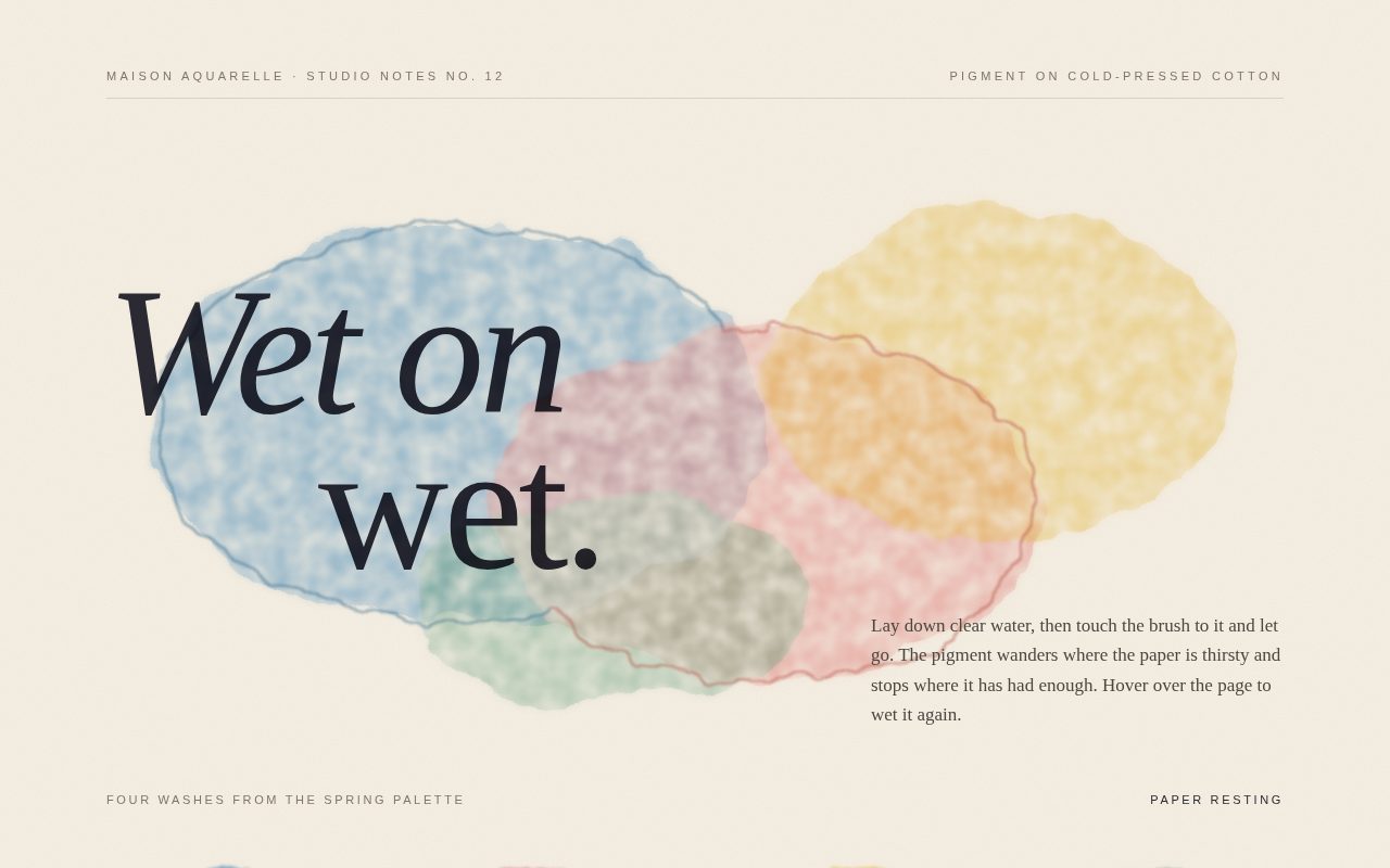
Original prompt
Build a standalone HTML page, "voyage-timeline": an interactive infographic of a fictional 1871 to 1872 survey voyage, "The Voyage of the Halcyon Wren", seven stops across an invented northern archipelago. Palette: paper white #f6f3ea page, sea-glass chart #d9e8e4, navy ink #13294b with a softer #3d5878, sand-colored islands #efe6d2 edged #b7a684 with a diagonal hatch overlay, and one signal orange #e8562a for the route and the current stop. Type: Iowan Old Style / Palatino / Georgia for headlines and body (italic for the ship's name and active stop), ui-monospace for coordinates, day counts and labels. Header: orange letter-spaced kicker, a large serif title, a short paragraph about the crew of nineteen and the brass chronometer, and on the right two live tallies (Distance logged in nautical miles, Day at sea) that count up as the ship sails. Layout: a two-column grid; left is an inline SVG nautical chart (graticule lines with latitude labels, dashed depth contours, hand-drawn island blobs, a compass rose), a faint dotted "ghost" route, the solid orange route drawn with stroke-dashoffset up to the selected stop, waypoint markers that become filled when passed and orange with an expanding pulse ring when current, and a small ship glyph that travels along the path via getPointAtLength and rotates to the tangent. The route is a Catmull-Rom curve converted to cubic Beziers, with per-stop cumulative lengths measured so the ship eases exactly to each port (cubic in-out, duration scaled by distance). Right column: a white detail card with an orange spine (stop number and date, big serif port name, a paragraph of log narrative, and a stats row for coordinates, weather and leg distance) that fades and lifts as it swaps; pill controls Previous, Next port, and Sail the route (autoplay, toggles to Drop anchor); and a vertical timeline of numbered dots joined by a connector line whose orange fill grows to the current stop. On narrow screens the columns stack. Reduced motion: no pulse, instant transitions, the ship jumps instead of sailing.
Screenshot of Chaos Bench Pendulum
040

Chaos Bench Pendulum

A precise, instrument-grade simulation of a double pendulum set on a dark engineering grid. A lime bob whips through looping arcs, leaving a luminous trail that brightens toward cyan when it moves fast, while a side rail of hairline sliders lets the visitor change arm lengths, mass ratio, gravity, and trail length. A twin pendulum and a live phase portrait make the butterfly effect visible: two nearly identical starts that soon trace completely different paths.

Original prompt
Build a standalone HTML page, "double-pendulum-lab": a dark laboratory instrument for exploring chaos with a canvas double pendulum, labeled "Bench 04 · Nonlinear Dynamics". Palette: graphite #0d1012 stage with a 40px engineering grid in #262c31 and a radial vignette, a slightly lighter control rail #13171a, text #d7dde0 and dim #6f7a81, with three electric accents: lime #d4ff3a (primary pendulum and controls), cyan #38e1ff (fast trail), rose #ff4f7b (twin pendulum). Type: Helvetica Neue in light and bold weights for the big "Double Pendulum" title, ui-monospace / SF Mono / Menlo for every label, readout and button. Layout: a two-column grid with the full-height stage on the left and a 320px parameter rail on the right; below 820px they stack with the stage at about 62vh. The stage holds a top-left HUD (lime kicker, title, short explanation of sensitivity to initial conditions) and a bottom-left readout row for time, θ1, θ2, and total energy. Physics: the standard Lagrangian double-pendulum equations integrated with RK4 in 8 substeps per frame, masses m1 = 1 and m2 set by a ratio slider, lengths in meters scaled to fit 40 percent of the smaller stage dimension with the pivot at 46 percent height. Rendering on a devicePixelRatio-sized canvas: thin pale rods, a hollow upper bob, a glowing filled lower bob with canvas shadowBlur, a small pivot mount, and a fading trail of the lower bob drawn as segments whose alpha and width grow with recency and whose hue shifts from lime to cyan with speed. Rail: sliders for upper arm length, lower arm length, mass ratio, gravity (1 to 25 m/s²), and trail persistence (0 to 1200 points), styled as hairline tracks with a lime progress fill and diamond thumbs that glow on hover; buttons PAUSE/RUN, RESET, and TWIN; a small phase-portrait canvas plotting θ1 against θ2 as slowly fading dots; and a note explaining the twin. TWIN spawns a rose pendulum offset by 0.001 rad so the two trails visibly diverge. Users can drag either bob to set new angles, which clears the trails and restarts time. Reduced motion: the simulation starts held and only runs when the user presses RUN.
Screenshot of Galleria Pastello Statues
041

Galleria Pastello Statues

A pastel vaporwave tableau set inside an imaginary 1990s mall museum. A CSS marble bust stands between fluted columns in front of a banded grid sun and an endlessly scrolling neon floor grid. A giant outlined "MARBLE" headline, a Windows-95 placard and a mall-announcement ticker give it its nostalgic, ironic tone. Three "editions" restyle the whole scene: Dawn Mall, Midnight Plaza and Seafoam Atrium. Each comes with its own fictional artwork caption.

Original prompt
PROMPT

Build a single standalone HTML5 page, "Galleria Pastello", a vaporwave shopping-mall museum where pastel marble statues stand in front of a striped grid sun. Everything is drawn in CSS: no images, no canvas, no external fonts.

Scene and layout: one full-viewport stage (100svh, min 620px). The sky is a vertical gradient from deep violet (#24164a) through purple (#7d4ac4) and hot pink (#ff8fcf) to peach (#ffd3b0), meeting the horizon at 58% height. A large sun (52vmin circle, yellow #fff27a to pink #ff6fb8) sits on the horizon. Its lower half is cut into horizontal bars by a CSS mask-image gradient, and a pink drop-shadow glows around it. Below the horizon is a perspective floor: a container with perspective 240px holding a plane rotated rotateX(76deg) and tiled with cyan 2px grid lines (70px cells). Its background-position scrolls endlessly toward the viewer. A white horizon line glows pink and a peach haze fades into the floor.

Statues: a "mbl" marble class stacks a soft radial highlight, two repeating-linear-gradient vein layers (lavender and pink at 118deg and 32deg), a base gradient and an inset shadow. The central bust is a <button> built from spans: a plinth in a dark-to-pink gradient with a "FIG. 03" label, a toga-draped torso shaped with clip-path and diagonal fold lines, a shaded neck, and an oval head. The head's face is suggested with radial-gradient eye sockets, a nose shadow and a lip line, and its curly hair is a tiled radial-gradient dot pattern. Fluted Doric columns flank the bust. They are made from repeating vertical gradients with a capital and base, and the right column is broken with a jagged clip-path top. A floating marble orb with a glowing cyan ring and a half-pink, half-cyan pyramid bob slowly.

Typography: "Arial Black"/Impact for the giant outlined word MARBLE (transparent fill, white text-stroke, pink offset duplicate in screen blend). "Courier New" is used for the full-width subtitle, labels, ticker and placard. "Helvetica Neue"/Arial is the base.

UI: the top-left brand reads "GALLERIA PASTELLO / Hall of Eternal Escalators". The top right has three pill buttons for exhibition editions: Dawn Mall (pink/peach), Midnight Plaza (navy/magenta grid/orange sun) and Seafoam Atrium (teal/mint/white grid). Each edition swaps all CSS custom properties. A Windows-95-style "placard.txt" window sits bottom-left. It has a bevelled border and a pink-lavender-cyan title bar, and shows the piece name, date/material and a wry one-line note. Its minimise button collapses the body. A scrolling bottom ticker carries mall announcements. A faint scanline overlay covers the whole scene.
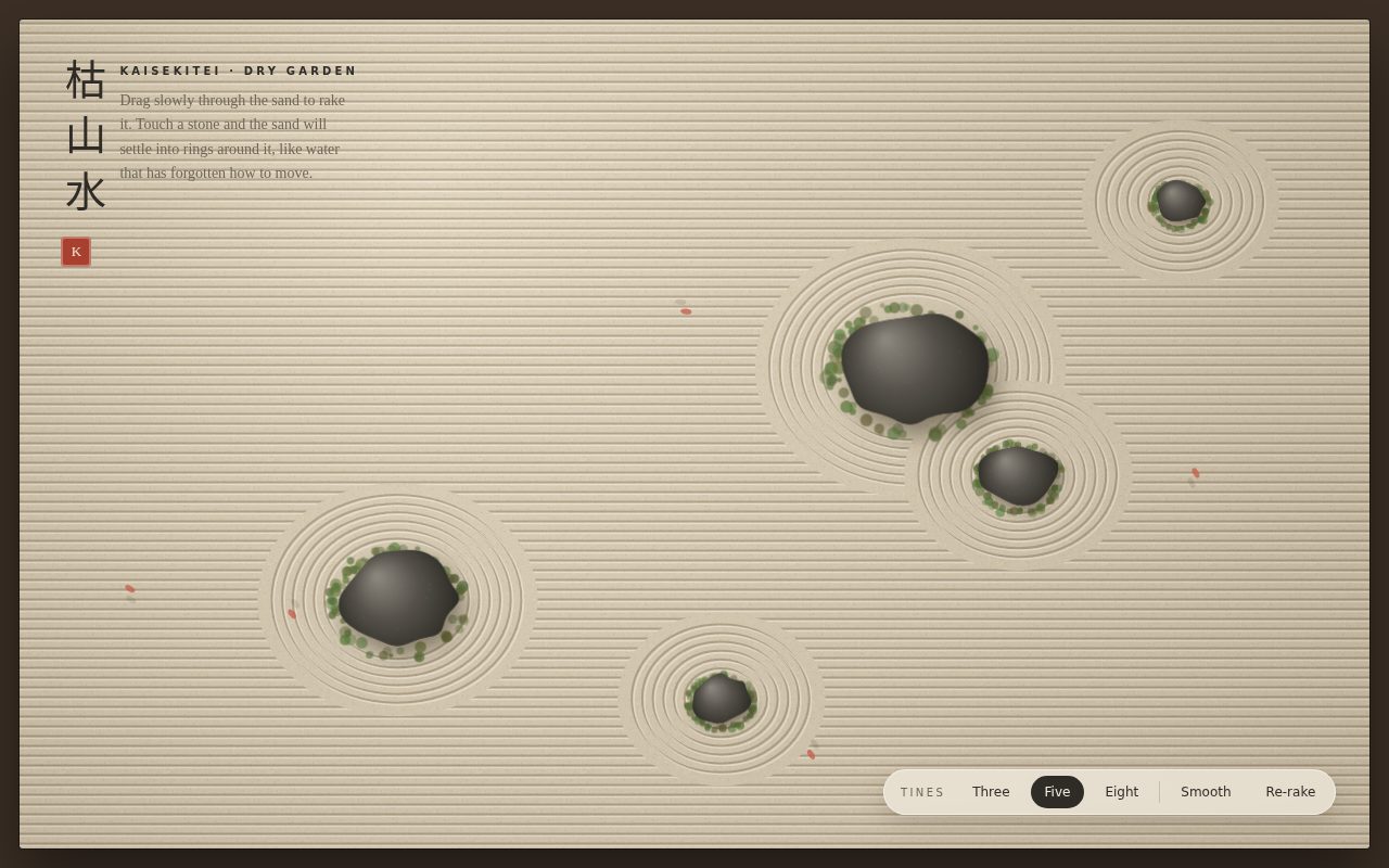
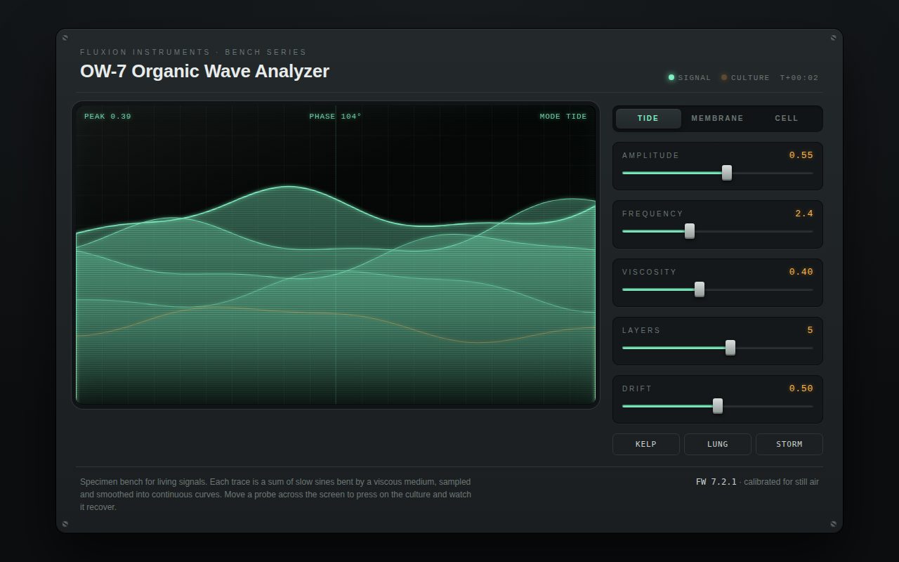
Motion: the grid floor scrolls, the orb and pyramid float, and the ticker marquees. Pointer movement drives a lerped parallax (--px/--py custom properties). The sun, title, columns, props and bust move at different depths, and the rAF loop stops when settled. Switching editions fires a CRT "channel change" flash that expands from a thin line with scanlines. Clicking the bust slides pink-to-cyan sunglasses onto it with a springy cubic-bezier(.3,1.7,.45,1) scaleX, and the head tilts. Hovering also nudges the head. prefers-reduced-motion stops the grid, bobbing, ticker, flash and parallax.

Responsive: at 375px the bust and columns lift above the placard, the hint hides and the props shift inward. Nothing scrolls horizontally.
Screenshot of Sumi, Weight of Ink
042

Sumi, Weight of Ink

A restrained, scroll-like page on handmade washi. Paper fibres and specks come from SVG turbulence, and ink brush strokes have displaced, dry-brush edges that paint themselves in. English text runs in vertical right-to-left columns: an upright SUMI title, four short meditations on the hours of an ink painter's day, and a colophon. A large ensō circle forms the visual centre and a single vermilion seal provides the only colour. Generous empty space, slow easing and a near-monochrome palette keep it calm and premium.

Original prompt
PROMPT

Build a single standalone HTML5 page called "SUMI: a study in the weight of ink". It is a quiet, Japanese-inspired minimal composition written in English and laid out in vertical columns that read right to left. The paper and brushwork are generated entirely with inline SVG filters. No images, no web fonts.

Paper: a fixed, full-viewport inline SVG sits behind everything. It holds two rects with feTurbulence filters. The first is a long-fibre layer (fractalNoise, baseFrequency "0.008 0.22") pushed through a feColorMatrix to tinted brown alpha at 18% opacity, giving kozo fibres. The second is a fine speckle layer (baseFrequency 0.85) at 22% for inclusions. The body background is a soft radial gradient of warm washi tones: #f6f0e3 to #f1eadb to #e6dcc8.

Palette: sumi ink #1c1a17, diluted grey #6b655b, a single vermilion seal colour #c63d2b. Nothing else.

Typography: "Iowan Old Style", "Palatino Linotype", Palatino, Georgia. Vertical text uses writing-mode: vertical-rl. The title SUMI uses text-orientation: upright with wide tracking, so the letters stack like a hanging scroll. The italic subtitle, section headings (22px, tracked) and body copy (15.5px, line-height 1.9) use rotated mixed orientation. Section numerals i to iv and the colophon accents are vermilion. The colophon is small uppercase with 0.28em tracking.

Layout: the main element is a horizontal flex row with flex-direction: row-reverse and wrapping, so reading starts at the right. From right to left: the title column with a vermilion hanko seal button beneath it, then a large ensō brush circle with a caption, then four vertical "Four quiet hours" articles, then a vertical colophon. Each article has a fixed block height (min(66vh, 440px)) and contains a numeral, a heading, a hand-drawn vertical brush stroke SVG and a short paragraph. The articles are First Light, The Long Noon, Dusk Wash and Night Ink, each a short aphorism about grinding ink, letting a stroke go, wash and resting the brush. The colophon credits fictional "Kōyō Paper Works, hand-laid kozo, 42 g/m², one colour, one breath". Below 720px the ensō takes a full row and the columns wrap with shorter heights, so nothing scrolls sideways.

Brushwork: there are two filters. "brush" uses feTurbulence plus feDisplacementMap for ragged, bleeding edges. "dry" thresholds streaky turbulence through feColorMatrix and feComposite "in" to punch dry-brush (kasure) gaps, then displaces. Each stroke path uses pathLength="1" and is revealed by animating stroke-dashoffset from 1 to 0 with cubic-bezier(.55,.05,.35,1), staggered per column. The ensō is generated in JS from about 120 points around a slightly wobbling radius, with a random start angle and an 84 to 94% sweep. It has a thick "brush" body path (width 15) and a thinner "dry" tail path (width 7) that runs further, so the stroke ends in a scratchy trail.

Motion and details: the title and subtitle rise in softly. The strokes draw on load. A faint, multiply-blended ink-wash bloom follows a fine pointer with lerp easing, and its rAF loop stops when idle. The seal has a rough displaced edge, rotates slightly on hover and presses down when clicked. Each press leaves a fading vermilion "imprint" with a dry-brush texture below it.

Reduced motion: strokes appear already drawn, entrance animations and the follower are disabled, and the seal imprint is skipped.
Screenshot of Lumen Relay Orbit Reveal
043

Lumen Relay Orbit Reveal

A premium dark landing page for an invented interplanetary relay network that opens with an orbit loader. Satellites circle a small planet while a mono signal counter climbs. When it completes, the loader morphs into the page: the ring grows into the hero orbit, the core swells into the hero planet, and each satellite flies to its home in the logo, the call-to-action and the hero's moon. Copy, telemetry and feature panels then rise into place. The palette is midnight, peach and ice-blue, and the type pairs Avenir with a mono.

Original prompt
PROMPT

Build a single standalone HTML5 landing page for a fictional deep-space communications company, "Lumen Relay". Its signature moment is the loading sequence: an orbit loader does not fade away. It physically morphs into the page. The loader's ring, core and three satellites each fly to their real counterparts in the layout.

Palette: midnight #0a0c1b and #12162e backgrounds, peach #ff8a5b as the main accent, ice blue #cfe3ff for satellites and focus rings, lilac #9d8cff in the headline gradient, text #e9eefc, muted #8e97b8, hairlines rgba(207,227,255,.14). The page background has tiled tiny radial-gradient stars plus a soft peach glow at the upper right and a lilac glow at the lower left.

Typography: "Avenir Next", "Helvetica Neue", system-ui for display and body. The h1 is 600 weight, clamp(40px, 6.2vw, 84px), tight -0.025em tracking, and its last word "home." is italic with a peach-to-lilac gradient clip. ui-monospace/SF Mono/Menlo is used for the loader counter, status, eyebrow, telemetry and footer, with wide uppercase tracking.

Loader (about 2.7 s): a fixed overlay with a radial midnight background. At its centre are a dashed 1px ice ring (radius up to 70px), a 44px planet core (radial gradient #ffe0cc to peach to #b2465a to #2a1838 with an inset shadow and a peach glow), and three glowing ice satellites, 120 degrees apart. A requestAnimationFrame loop sets each satellite's left/top so it orbits, accelerating as progress rises. A mono counter ticks 000 to 100 in irregular bursts, with a status line that steps through "Acquiring carrier", "Locking Doppler shift", "Decoding frame" and "Handshake complete".

Morph and reveal: when the counter hits 100, the overlay background and text fade out. With the Web Animations API, each loader piece animates its left/top/width/height to the getBoundingClientRect of its target over 1150 ms with cubic-bezier(.75,0,.2,1), staggered. Animating geometry instead of scale keeps the 1px dashed borders crisp. The ring becomes the hero's dashed orbit ring and the core becomes the large hero planet. The satellites go to the hero's orbiting moon, the dot in the nav logo and the dot inside the primary CTA. Targets stay visibility:hidden until the hand-off, then swap in seamlessly. Elements that contain targets fade without translating, so the landing positions are exact. Meanwhile the content rises in with staggered opacity/translate transitions. After hand-off, scroll unlocks, the hero moon begins a slow 26 s orbit and the telemetry numbers count up with a quartic ease-out.

Page: the nav has the logo with the orbit mark, links (Network, Missions, Signal log) and a pill "Replay sequence" button. The two-column hero has an eyebrow ("Deep-space relay network · est. 2041"), the headline "Every signal finds its way home.", a lede about thirty-eight relay stations, a peach primary CTA "Send a transmission" with a glowing dot and a ghost CTA. On the right is the planet stage: a banded planet with a soft-light stripe overlay, a dashed orbit ring and a peach halo. A four-cell mono telemetry strip follows: 38 relays, 1.4 light-hours, 99.982% integrity, 0 lost messages. Then three bordered feature panels (Patient routing, Cold-storage echoes, Quiet hours), each with a mini orbit icon whose moon starts circling on hover, and a mono footer.

Responsive: below 820px the links hide, the planet moves above the text at min(62vw, 280px), telemetry becomes 2x2 and features stack. Nothing scrolls horizontally at 375px.

Reduced motion: the loader is skipped and content simply fades in. Orbits and the count-up animation are disabled, and the numbers show their final values.
Screenshot of Prismata Kaleidoscope
044

Prismata Kaleidoscope

A meditative, jewel-toned drawing toy. A full-screen canvas turns each stroke into a rotational, optionally mirrored kaleidoscope pattern with additive neon glow, velocity-sensitive line weight and palette-driven hue drift. A floating glass toolbar controls symmetry, brush, palette, afterglow trails, clearing and PNG export. A gentle autopilot draws on its own when the canvas sits idle. Gradient serif display type and a monospace UI give it a polished studio-instrument feel.

Original prompt
PROMPT

Build a single standalone HTML5 page, "Prismata: a mirror for your hand". It is a full-screen canvas kaleidoscope where every pointer stroke is repeated around the centre into N rotational segments, optionally mirrored, and glows with additive colour on a deep violet-black field.

Canvases: two fixed, full-viewport canvases sized to devicePixelRatio (capped at 2). "art" holds the persistent drawing. "ui" sits on top with pointer-events: none and redraws only on pointer events: faint radial symmetry guides (N spokes, brighter while the pointer is active), a gold centre dot and a ring reticle sized to the brush. On resize the art is copied to an offscreen canvas and redrawn centred, so nothing is lost.

Drawing engine: each pointer move (using getCoalescedEvents when available) creates a segment from the last to the current point relative to the centre. One path is built by applying setTransform plus rotate(k * 2π/N) for every segment, and, when Mirror is on, a scale(1,-1) reflection. That gives up to 32 strokes in a single path. The path is stroked twice with globalCompositeOperation "lighter": a wide 10%-alpha glow pass (3.2 × width) and a bright 85% core pass. Brush width follows pointer speed: fast strokes thin out and slow ones swell, with smoothing. Hue advances with distance travelled, so long gestures sweep through the active palette.

Palettes (cycled by one button with a gradient swatch): Spectrum (full hue wheel), Ember (red to amber), Glacier (cyan to violet), Orchid (magenta to lilac).

Typography and look: the "Prismata" wordmark is italic Didot / Bodoni 72 / Georgia, filled with a pink-gold-cyan-violet gradient. Everything else is ui-monospace / SF Mono / Menlo, uppercase with wide tracking. The background is a radial gradient (#141027 to #0b0916 to #07060d). The top right shows a large serif fold count (segments × 2 when mirrored, labelled "fold symmetry").

Toolbar: a floating frosted-glass pill at bottom centre (backdrop blur and saturate, 1px hairline, deep shadow). It holds a Segments range (3 to 16) with a live value, a Brush range (1 to 12), Mirror and Afterglow toggle buttons with aria-pressed and gold active states, a palette button, Clear and Save. The range thumbs are custom white dots on a pink-to-cyan track. It wraps neatly at 375px.

Empty state: a centred pulsing, rotating gold ring with an inner dashed cyan ring and a glowing core above "Draw anywhere / every stroke becomes many". It fades and scales away on the first stroke and returns after Clear.

Autopilot: after 5 s idle on a blank canvas (12 s once something is drawn), a ghost hand traces a slow Lissajous-style curve through the same engine and a gold "autopilot · touch to take over" label appears. Any pointerdown stops it instantly. Afterglow mode fades the art each frame with a low-alpha destination-out fill, so strokes leave trails. Afterglow and autopilot share one requestAnimationFrame loop that stops itself when neither is active.

Save exports a PNG composited onto the background gradient. Keyboard shortcuts: [ and ] change segments, M toggles mirror, C clears, S saves. With prefers-reduced-motion, autopilot and the hint pulse are disabled.
Screenshot of Casa Sabbia Terrazzo
045

Casa Sabbia Terrazzo

A warm, editorial product catalogue for an invented terrazzo atelier. Every stone surface is generated live from about a hundred seeded radial-gradient chips. A large hero slab can be "poured" again or switched to a new blend, and chips scatter on in an animated reveal. Below it, a staggered library of nine sample cards in sand, clay, olive, saffron and lagoon tones can be filtered by tone, reshuffled one at a time and added to a sample box. Didot headlines, Avenir body text, polished sheens and springy micro-interactions give it a crafted, premium feel.

Original prompt
PROMPT

Build a single standalone HTML5 page for a fictional terrazzo maker, "Casa Sabbia, Terrazzo atelier, est. 1962". It is a warm, tactile sample catalogue in which every stone surface is real CSS. The terrazzo is built from many radial-gradient "chips" generated by JavaScript, with no images.

Palette: a warm sand page (#e9dcc6), bone cards (#f7f1e6), clay #c46a4a and terracotta #b5543a accents, charcoal ink #2e2823, muted brown text #7b6e60, and hairlines rgba(46,40,35,.14). Each slab has its own base and four aggregate colours.

Typography: Didot / "Bodoni 72" / "Bodoni MT" / Georgia for the logo, the giant hero line, section heading and sample names. "Avenir Next" / "Gill Sans" / "Helvetica Neue" for body and UI, with uppercase tracked pill labels. ui-monospace for product codes and the pour tag.

Terrazzo engine: a seeded mulberry32 RNG makes about 100 radial-gradient layers per surface:
- 16 large chips, each an ellipse (W × H px at x%, y%, colour 0 to 94% then transparent 100% for a crisp edge) plus an offset second lobe in the same colour, so outlines look broken and irregular
- 34 medium chips
- 36 tiny specks
- two tiled micro-speck layers (background-size 11×13 and 17×15) for fine sand texture
- the slab base colour as the final layer

A scale factor enlarges chips for the hero slab and for a faint fixed full-page backdrop in low-contrast sand tones. The pour animation reveals layers five per frame with requestAnimationFrame, so chips appear to scatter onto the slab.

Layout: the header has the serif logo and a dark pill "Sample box" counter with a clay badge that springs (scale bump) when it changes. The two-column hero has an eyebrow "Collection Nº 7, Poured in Ravenna Vecchia", the headline "Stone, poured slowly." (italic terracotta "slowly.") and a lede about lime, sand, marble, brick and river-glass chips honed for three days. On the right is a large 5:4 slab with an asymmetric radius (28px with a 120px bottom-left sweep), a deep warm drop shadow and an inset rim. A tilted bone "tag" sticker shows the blend name and pour number. Two pills sit on the slab: "Change blend" cycles through the nine blends and "Pour again" reseeds. Next comes "The sample library" with tone filter pills (All, Warm, Neutral, Cool, Bold, using aria-pressed). The grid of nine bone cards has three columns on desktop, with every middle-column card dropped 40px for a staggered rhythm. It auto-fills at minmax(250px, 1fr) on smaller screens.

Each card has a 4:3 terrazzo slab, a hover-revealed circular ↻ reshuffle button that spins, the serif name and mono code (CS-014 and so on), four pebble-shaped aggregate swatches, the finish and price per m², and a "Request sample" toggle. The toggle turns clay with "In your box ✓" and updates the header counter. The blends are Siena Dusk, Olive Grove, Rosa Marina, Basalt Salt, Saffron Bloom, Lagoon Chip, Cotto Rust, Ivory Quarry and Pomegranate. The footer carries the atelier address and lead time.

Motion: a polished sheen (a 115-degree white gradient band) sweeps across a slab on hover, cards lift and tilt -0.4 degrees with eased shadows, buttons have spring easing, and filtering re-staggers visible cards with a rise-in animation (55 ms steps). With prefers-reduced-motion, pours render instantly and sheen, lift and entrance animations are removed.

Responsive: below 820px the hero stacks and the tag moves inside the slab. At 375px the grid is a single column and nothing overflows horizontally.
Screenshot of Kestrel Relay Control
046

Kestrel Relay Control

A tactile cassette-futurism control deck where beige enamel faceplates, amber phosphor screens and chunky toggles make a fictional orbital relay feel physically present. Every instrument is connected: turning the dials reshapes the oscilloscope trace, pushes the VU needles, and changes the rhythm of the lamp matrix, while the master switches change the whole room's state and leave a timestamped trail in the teletype log.

Original prompt
Build a single standalone HTML page titled "Kestrel Relay Control" that feels like a cassette-futurism control room from a 1970s/80s science-fiction film: an orbital relay backup deck for the fictional firm Kestrel Dynamics. Background is a near-black warm brown (#191714) with a soft radial lift at the top. All instruments sit on beige enamel faceplates (#d8cdb4 to #c7b99b vertical gradient) with a light top bevel, dark bottom bevel, deep drop shadow, and two CSS-drawn screw heads in the top corners. Accent colors: burnt orange #e2662b, olive #6f7a3c, amber phosphor #ffb23e, teal #3f8f8a, alarm red #d8392b. Typography: "Helvetica Neue"/"Arial Narrow"/Arial heavy uppercase for the brand header, "Courier New"/ui-monospace for every label, readout and log line, letter-spaced 0.12 to 0.22em.

Layout: a header row with the brand plate (title with "Relay" in orange, a monospace subtitle and four skewed racing stripes in orange, amber, olive, teal) next to a black amber-glowing "Mission elapsed" clock counting DDD:HH:MM:SS. Below, a 12-column grid: tuning bank of three SVG rotary dials (FREQ, GAIN, DRIFT) with tick rings, cream skirt, knurled dark cap and orange pointer, each with an amber value chip; a carrier oscilloscope in a black bezel with rounded CRT screen, amber graticule, scanlines and vignette, drawn on a DPR-aware canvas with phosphor persistence; two analog VU meters in SVG on cream faces with a red overload arc and spring-physics needles; an 8x5 lamp matrix of glowing indicator bulbs; four chunky toggle switches (PWR BUS, COOLANT, UPLINK, ALARM) with chrome levers, springy overshoot and status LEDs; and a full-width operations teletype log with blinking block cursor beside a mechanical split-flap-style tape counter. On tablets the dials, scope and meters go full width; on phones everything stacks.

Motion: oscilloscope sine trace whose frequency, amplitude and wobble follow the dials, with a second teal trace when uplink is on; meter needles chase the gain with damped spring physics and drift-based jitter; the lamp matrix scans diagonal patterns at a rate set by DRIFT; the tape counter rolls while powered; alarm makes every faceplate flash a red outline and floods the lamp bank red in alternating checkerboard. Power off dims the scope and lamps and drops the needles. Reduced motion slows the scope, removes jitter, slows lamp scanning and stops flashing.
Screenshot of Still Life, Reassembled
048

Still Life, Reassembled

A movable cubist still life where a guitar, a newspaper and a bottle are broken into fourteen overlapping cut-paper planes. Because the pieces multiply into one another like translucent paper, every rearrangement produces colors nobody painted, and the museum-plaque framing makes the playful recomposition feel like curating a lost study.

Original prompt
Make a standalone HTML page called "Still Life, Reassembled": an interactive cubist collage in the spirit of early twentieth-century papier colle, presented like a museum room for the fictional Atelier Ferrand and the imaginary Musee des Plans. Palette: warm paper cream #efe6d2 on a slightly darker laid-paper page #e3d8c0 with faint vertical lines, charcoal ink #2b2724, ochre #c8962e, slate blue #4b6a8a, terracotta #b5532f, sage #8a9a74, wood brown #a8743f and night blue #1f3550. Typography: Didot / "Bodoni 72" / Georgia for the headline and body (with a large slate drop cap on the lede), "Gill Sans" / Futura / "Trebuchet MS" in tracked uppercase for kicker, buttons, plaque and hints, and Georgia for a tiny two-column fictional newspaper fragment.

Layout: on desktop a two-column grid, with a narrow text column on the left (kicker "Room IV - Atelier Ferrand" with a terracotta rule, a huge headline "Still Life," with an indented italic terracotta "Reassembled", a lede, a short note about multiply blending, three square-edged outline buttons, and a museum plaque), and a wide collage on the right inside a thick charcoal frame. On phones the columns stack and the board changes from a 5:4 to a 4:5 ratio. Below the frame a tracked caption reads "Drag to recompose - double-click to turn".

The board is an isolated paper surface with a light radial bloom and fine horizontal lines. Fourteen absolutely positioned pieces, each a wrapper (for blend mode, rotation and focus) around a clip-path face: a slate quadrilateral, an ochre wedge, a terracotta table edge, a wood-grain guitar body from a repeating-linear-gradient, a dark sound hole circle, a newspaper fragment titled "La Gazette des Ateliers" with real fictional headlines, a sheet-music staff of stripes, a sage half-circle arc, a charcoal sliver, a dotted bottle silhouette using a radial-gradient dot pattern, a stencil "VIOL" label, a fretted guitar neck, a night-blue diamond in hard-light, and an ivory shard. Most pieces use mix-blend-mode multiply so overlaps create new colors.

Motion: on load the pieces fly in from scattered, rotated positions with a staggered spring-like cubic-bezier(.2,.9,.25,1) ease and fade. Picking a piece lifts it with a drop shadow and slight scale and brings it to the top. Shuffle animates all pieces to new random positions, angles and stacking; Reset glides them home. Buttons fill with a slanted charcoal panel sliding up on hover. A small paper status tag drops in at the board corner to name each action. Reduced motion skips the fly-in and all transitions.
Screenshot of The Lapis Courtyard
049

The Lapis Courtyard

A contemplative tile wall where each eight-pointed star turns an eighth of a revolution when the pointer passes over it. The alternating petal glazes make every turn leave a visible trace, so the courtyard slowly becomes a record of the visitor's path, while ripples and glaze changes wash across the whole arch like light moving through a real courtyard.

Original prompt
Create a standalone HTML page called "The Lapis Courtyard", a wall of Islamic-inspired eight-pointed star tiles drawn in inline SVG, presented inside a tall arched niche, from the tilework of a fictional palace, the Qasr Nadira. Default "Lapis" glaze: page deep lapis night #0b1734, tile ground #13306b, ivory stars #f4ead2, turquoise inner stars #1f8a9a, gold #d4af5a for strapwork, corner diamonds and alternate petals, cinnabar #b8452f for the other petals, ivory text #f1e6cc. Two alternate glazes: "Saffron" (burnt orange ground #b4651f, cream stars, oxblood inner stars, teal and saffron petals, dark brown strapwork, near-black brown page) and "Malachite" (green ground #0f5a48, cream stars, indigo inner stars, gold and mint petals, gold strapwork, deep green page). All colors are CSS custom properties on the body, so switching glaze crossfades every SVG fill and stroke over 0.9s.

Typography: "Iowan Old Style" / "Palatino Linotype" / Palatino / Georgia throughout; a gold small-caps eyebrow tracked at 0.42em, a large regular-weight title with "Courtyard" in gold italic, and an italic dek. A small outlined double-square star ornament sits above the title.

Layout: centered column (max 980px). The mosaic sits in an arch made by an elliptical top border-radius, with a gold gradient rim, deep drop shadow, inner top shading and a slow soft-light sheen that sweeps across the glaze every 9 seconds. The SVG grid is 8 by 6 tiles on desktop and 5 by 7 on phones (rebuilt on resize when the breakpoint changes). Each 100-unit tile has a static layer (ground square and gold corner diamonds that join with neighbours into small crosses) and a rotating layer: a 16-vertex octagram of radius 49 with gold strapwork outline, a smaller turquoise octagram, a rosette of eight ellipse petals alternating two glazes, and a gold center disc. Below the arch, a two-column section explains the geometry ("Two squares, one star") beside a panel of round glaze chips with conic-gradient swatches and an elongated hexagonal gold "Turn the courtyard" button.

Motion: each star group rotates by 45 degrees per turn using transform-box fill-box and a long, gentle cubic-bezier(.25,1,.3,1) ease; because petals alternate colors, every eighth turn visibly swaps them, so the wall records where the pointer has passed. Clicking a tile sends a ripple: every tile turns after a delay proportional to its distance from the clicked tile. A ripple from the top-left corner plays shortly after load. Reduced motion removes the sheen, shortens the rotation to a quick linear turn and fires ripples instantly.
Screenshot of The Perseid Vigil
050

The Perseid Vigil

A calm, cinematic night sky over a mountain cabin where a meteor shower streams from a single radiant point. The page balances a painterly static scene with a lively additive meteor layer, and turns each click into a golden fireball and a small whispered wish, so watching the sky feels like a personal ritual rather than a demo.

Original prompt
Build a standalone HTML page called "The Perseid Vigil": a full-screen canvas meteor shower seen from a fictional mountain called Hollow Ridge, framed as a quiet field note. The sky is a vertical gradient from near-black indigo #03041a through #0b1240 and #24205a to a dusky mauve #5a3a6a and an ember horizon #c27355, with a warm radial glow low on the left. A diagonal Milky Way band is painted from several faint lavender radial ellipses plus thousands of tiny dust points distributed with a gaussian spread. Stars are scattered more densely toward the top, with a few larger stars and occasional warm or cool tints; 80 extra stars twinkle each frame.

Foreground: two mountain ridges built from summed sines with fixed random seeds (a far ridge in #1c1940 with a thin violet mist above the near ridge, and a near ridge in #090818), a jagged pine treeline of triangles along the near ridge, and a small cabin silhouette with a chimney and a single warm lit window #ffc47a with a soft orange halo. Sky and foreground are pre-rendered to two offscreen canvases on resize so each frame only composites them around the live layer, keeping meteors behind the mountains.

Meteors radiate from a radiant point above the upper right. Each has a speed, life, length and width, a tail drawn as a linear gradient stroke from a bright head to transparent, a radial head glow, and additive "lighter" compositing; colors vary between white, ice blue, faint green and gold. A fade envelope eases them in and out. Fireballs launched by the user are slower, longer, golden and shed small falling sparks.

Typography and UI: "Hoefler Text" / "Iowan Old Style" / Georgia in italic for the large title "The Perseid Vigil" (with a small-caps "A field note on" above it) and for the body copy; "Optima" / Candara / "Segoe UI" for tracked uppercase labels. Text is pale lavender #e9e5f6 with dimmer #a9a3c6 and an ember accent #ffcf8a. Top left: eyebrow, title and a short paragraph about comet dust. Bottom: a tally of "Seen tonight" and "Wishes spent" in large serif tabular numerals (the wish count flashes ember), and a frosted control capsule with a custom "Shower" range slider whose track fills with ember and a glowing white thumb, plus a gradient "Launch a meteor" pill button. A centered italic hint "click anywhere in the sky" fades in and out once. Each click floats an italic ember wish (for example "for slow mornings", "to remember this sky") upward and away from the click point. The UI rises in with a gentle ease on load and stacks into a column on phones.

Reduced motion: no twinkling, a very sparse automatic shower, slower meteors, no sparks, and wishes simply fade without rising.
Screenshot of torus.sh Amber Terminal
051

torus.sh Amber Terminal

A warm, retro computing piece where a glowing ASCII torus spins inside a carefully drawn terminal window. The amber phosphor, scanlines and vignette sell the illusion of a warm CRT tube, while a short boot sequence and a self-rewriting shell prompt give the scene a narrative. Every glyph is an actual lighting value calculated from 3D geometry, so the ring reads as a solid, shaded object made entirely of punctuation.

Original prompt
Build a standalone HTML page titled "torus.sh: Amber Terminal": an animated ASCII donut rendered in monospace inside macOS-like terminal chrome. Palette: warm amber phosphor (#ffb547) on a deep brown-black screen (#1c130a), with a radial brown-to-black page background, chrome bar in dark walnut (#2a1d10 to #3b2916) carrying red, yellow and green window dots. Typography: ui-monospace / SF Mono / Menlo / Consolas / Courier New throughout; letter-spaced uppercase header "torus.sh" with a quiet subtitle. Layout: centered terminal window (max 860px) with a title bar reading "operator@kiln-07: ~/rings", a screen area containing a short typed boot log, a <pre> holding a 72x30 (52x24 on phones) character torus, a shell prompt with a blinking block caret, and a control strip of outlined key buttons (space hold, r ramp, t phosphor, f tempo) plus a live fps and cell counter. Below the window, a three-column footer of short captions about dragging, shading and phosphor. The screen gets CRT scanlines and a vignette via a pseudo-element; the donut text gets a double amber glow text-shadow. Motion: the torus is computed every frame with a z-buffer and per-point luminance mapped onto a character ramp; it rotates on two axes, eases toward a base angular velocity, and the boot log appears line by line before the donut fades to full opacity. Interaction: drag the torus with the pointer to fling it (velocity carries and then eases back to the lazy spin), buttons or keys pause, cycle four character ramps (classic, dense, dots, block shades), cycle phosphor tubes (amber, P1 green, ice blue via body classes that swap CSS variables) and cycle tempo (0.5x to 4x). The shell prompt line rewrites itself to show the command equivalent of each action. Reduced motion: the caret stops blinking, the boot log appears instantly and the donut starts held still (it can still be dragged).
Screenshot of Rime, A Frost Study
052

Rime, A Frost Study

A quiet winter window at night. Fern-like ice dendrites creep in from the frame toward the centre, branching at the six-fold angles real frost favours and glowing faintly against a deep navy sky. The whole pane brightens and dims on a slow breathing rhythm, and a frosted glass plaque with a short italic text sets the mood. You can seed new crystals, or wipe the glass with a finger and watch the frost slowly fill the cleared path again.

Original prompt
Build a standalone HTML page titled "Rime: A Frost Study": a full-screen canvas where fractal frost crystals grow across a dark window pane, with a slow breath-like pulse. Palette: night navy (#050d19 to #0b1d33) with faint periwinkle and teal radial glows behind the glass, frost white (#eaf7ff), pale cyan (#9fd6f0), lilac breath fog (#b9b6ff). Typography: an italic old-style serif for the title and body (Iowan Old Style, Palatino, Georgia) paired with letter-spaced uppercase Helvetica Neue/Arial for labels. Layout: the canvas fills the viewport, framed by an inset window-frame shadow; a frosted glass plate (backdrop blur, hairline border) sits bottom-left with the eyebrow "Hoarfrost study · No. 4", the large italic title "Rime", a three-sentence passage about frost, a breathing indicator (a small ring whose inner dot scales with a --breath CSS variable), the current phase word (inhale/exhale) and two pill buttons, Thaw and Freeze edges. A right-aligned hint stack at the top lists the gestures and a live count of growing branches. Growth: crystals are seeded along all four edges, pointing inward; each branch steps forward 1.6 device pixels per tick with slight curl and jitter, drawn twice (a wide faint cyan halo then a thin bright core) onto an offscreen accumulation canvas, spawning side branches at plus or minus 60 degrees (ice dendrite geometry) up to depth 4, and sometimes finishing with a tiny six-pointed star. A cap of 900 live branches keeps it cheap. Breath: a 6.5 second sine cycle modulates the frost layer opacity and a soft lilac fog radial gradient, and drives the plate's breathing indicator. Interaction: a tap seeds a six-armed crystal at that point; dragging melts a soft path through the frost with destination-out radial gradients, like a finger on a cold window; Thaw fades everything away and reseeds the edges; Freeze edges adds new edge seeds. Canvas is DPR-aware and preserves the frost image on resize. Reduced motion: no pulse, growth is computed instantly and new seeds appear fully grown.
Screenshot of Vesper Sunset Landing
053

Vesper Sunset Landing

A premium marketing page for an imaginary app that helps people wind down in the evening. The hero is a fully illustrated vector sunset over the sea, and scrolling literally sets the sun: it slips below the horizon, the sky shifts to indigo and stars appear, carrying the visitor into the darker content sections below. Elegant Didone headlines, a glowing coral CTA and restrained copy keep it focused on one action: start your first evening.

Original prompt
Build a standalone HTML landing page titled "Vesper: End the Day on Purpose" for a fictional evening-ritual app called Vesper, with an animated sunset hero and a strong call to action. Palette: apricot (#ffb88a), coral (#ff7a5c), rose (#e2557a), plum (#5b2a5e), indigo (#1d1638), near-black ink (#130e24) and cream text (#fff4ea). Typography: high-contrast Didone display (Bodoni 72, Didot, Bodoni MT, then Iowan Old Style and Georgia) for headlines with italic emphasis, and system-ui for body and UI. Layout: a fixed nav (logo mark of a half sun over two horizon lines, text links that underline from the left, a cream pill "Get Vesper") that turns to blurred glass after the hero; a full-viewport hero built as one inline SVG scene (viewBox 1440x900, xMidYMax slice) with a violet-to-peach sky gradient, a night sky layer and 90 generated stars that fade in, a large radial-gradient sun and halo clipped to the horizon, distant plum headlands, a gradient sea with six shimmering reflection bars, dark foreground shorelines and a small flock of birds crossing the sky. Left-aligned hero copy: kicker, a huge Didone headline "End the day / on purpose.", a short lede, and a glassy pill sign-up form with an email field and a gradient apricot-to-coral CTA button that has a sweeping light sheen on hover. Below: an indigo section with three numbered rituals (big italic gradient numerals, hairline dividers), a centered italic testimonial, a final CTA section with a coral glow rising from the bottom and the price, and a small footer. Motion: scrolling drives a --set variable from 0 to 1 over the first viewport, which sinks the sun below the horizon, fades the halo and water reflection, and crossfades the sky to night as the stars emerge; pointer movement eases a --px/--py parallax on the far and near land layers; reflection bars breathe with staggered scaleX keyframes; sections reveal with IntersectionObserver on an expo-out curve; a dripping line scroll cue. Interaction: the form validates the email, shows a spinner loading state on the button, then a success message with a plausible evening time; invalid input shows a gentle error. The final CTA scrolls back up and focuses the email field. On phones the nav links hide and the form stacks. Reduced motion: no shimmer, birds or cue animation, no parallax, reveals shown immediately, while the scroll-linked sunset still works as a static state change.
Screenshot of Halcyon Bento Spotlight
054

Halcyon Bento Spotlight

A sleek product-feature page in the style of a modern bento grid, presented for an invented night camera. A single coloured light follows the cursor across the whole grid, tracing the hairline borders of every tile it passes and softly washing their interiors, while each tile carries its own small live visual: rotating star trails, a dial, a breathing histogram, a counting stat and a filling battery meter. The effect feels like moving a torch across a dark instrument panel.

Original prompt
Build a standalone HTML page titled "Halcyon Night Camera": a bento grid of feature cards for a fictional night-photography app, with a cursor-tracking spotlight glow. Palette: near-black graphite (#0c0c10), cards in a subtle #1a1a22 to #15151b gradient with 8% white hairline borders, text #ededf2 and muted #8d8d9c, accents electric violet (#a78bfa), aqua (#5eead4) and lime (#d9f99d); the spotlight hue is an HSL variable that drifts from violet toward blue-cyan as the cursor moves left to right. Typography: Helvetica Neue/Arial in tight negative tracking for headlines and big numbers, ui-monospace for small uppercase labels and footer. Layout: a header with a pill tag ("Halcyon 3 · now shooting" with a glowing lime dot), a large headline "The camera that waits for the dark." with the second half in a violet-to-aqua gradient, and a short side paragraph. Then a six-column bento grid: a 4x2 hero tile with an inline SVG of star trails (46 generated concentric arcs around a pole star, slowly rotating over 120 s) above a dark ridge silhouette, headline and a white pill "Try a stack" button; then 2-column tiles for Exposure (big number plus a conic-gradient tick dial ring that rotates on hover, cycling values 1/4 to 30 seconds on each hover), Live histogram (28 bars reshaped every 1.6 s with a Gaussian peak), Dynamic range (a 0 to 14.2 stops counter that counts up with an ease-out-quart when scrolled into view), On-device privacy (lock icon tile), a customer quote, and Battery-aware (a lime-to-aqua meter that fills to 82% on view). The grid collapses to 4 columns on tablets and a single column on phones. Spotlight: one global pointermove listener, throttled through requestAnimationFrame, writes --mx/--my to every card relative to its own rect, so the glow spans gaps and lights the borders of neighbouring cards. Each card's ::before is a 1px border ring (mask-composite exclude trick) filled with a radial gradient at the cursor; ::after is a softer interior wash that fades in while the grid is hovered. Cards lift 3px on hover, stagger in on load, and keyboard focus moves the spotlight onto the focused card with a focus ring. The hero button runs a short fake "Stacking 100 frames…" loading state and then refreshes the histogram. Reduced motion: no rotation, no histogram cycling, no staggered entry, counters jump to their final values.
Screenshot of Safelight Darkroom Grid
055

Safelight Darkroom Grid

A small discovery piece in which the screen is a pitch-dark sheet of graph paper and your cursor is a red safelight. Under the light, a brighter grid and a short prose poem about developing photographs come into view, but only within the glowing circle. Nine key words are hidden in the text; finding each one marks it on a counter and leaves a faint ember trace behind. Hang lanterns to keep areas lit, and when every word is found the whole print develops at once.

Original prompt
Build a standalone HTML page titled "Safelight: A Darkroom Grid": a dark full-screen grid where a radial cursor spotlight reveals hidden text, framed as a photographic darkroom lit only by a red safelight. Palette: near-black (#050303), safelight red (#ff3b2f), ember orange (#ff6a3d) for keywords, warm paper cream (#f4e6d6) for text, and a deep oxblood (#140504) inside the lit area. Typography: an old-style serif (Iowan Old Style, Palatino, Georgia) for the hidden prose and the italic title, ui-monospace in letter-spaced uppercase for the HUD. Layout: a fixed stage with two stacked layers. The base layer shows only a faint 48px red grid (7.5% opacity lines). The lit layer above it contains the same grid at much higher intensity, an oxblood fill, and a two-paragraph prose passage about developing a print in a darkroom, with nine italic glowing keywords (red, tray, harbour, shadows, window, light, patience, line, silver); this layer is hidden by a CSS mask-image built from radial gradients, so it only shows inside the spotlight. A cloned, transparent copy of the prose sits in the base layer so that discovered keywords can stay faintly visible in exactly the same position. HUD: top-left "Plate 07 · Darkroom" with the italic title Safelight; top-right a "Developed 0 / 9" counter with nine tick marks that light red as words are found; bottom-left gesture hint, bottom-right a "Douse lanterns" button. A custom crosshair cursor ring follows the pointer on hover-capable devices. Motion: the spotlight position and radius are lerped every animation frame, with a subtle two-sine flicker in the radius like an old bulb; before the visitor touches anything the light wanders on a slow Lissajous path to hint at what is hidden. Interaction: moving the pointer searches; a keyword counts as developed when the spotlight centre passes within about 40% of the radius; clicking hangs a small glowing lantern that keeps a smaller permanent pool of light (up to three, oldest removed) and also develops words directly under it; mouse wheel or the [ and ] keys resize the spotlight between 70 and 360px; the Douse button removes lanterns. When all nine are found, the mask is removed and the whole lit layer floods in, followed by a closing italic line. Reduced motion: no wandering, no flicker, no easing; the spotlight snaps directly to the pointer.
Screenshot of The Last Tram to Halvard
056

The Last Tram to Halvard

A cinematic title sequence rendered entirely in silver and black. Letterbox bars part to reveal a rain-soaked street at midnight, a lone silhouette under a lamppost and slatted window light falling across the scene. Animated film grain, gate flicker and stray scratches give the illusion of projected nitrate stock, while a framed intertitle card carries a short five-card noir story with invented cast and crew credits. The key light drifts after the pointer like a spotlight operator following the viewer.

Original prompt
056 noir-grain: black-and-white film look, animated grain, letterbox bars, title card.
Build a single standalone HTML page that plays like the opening reel of a fictional 1940s noir film, "The Last Tram to Halvard" from the invented studio Vantablack Pictures. Palette is strictly monochrome: near-black #050505, warm silver paper #ecebe6, smoke grey #8d8b86, ash #2a2927; the whole stage is forced through grayscale(1) contrast(1.12). Typography: a high-contrast Didone stack (Didot, "Bodoni 72", "Bodoni MT", Georgia) in italic for the main title, with a tracked-out uppercase subtitle line; all credits, timecode and HUD in "Courier New"/ui-monospace with wide letter-spacing. Layout: a full-viewport scene built only from CSS and one inline SVG: a dark street with a horizon line at 58%, a black silhouette in a trench coat and fedora in the centre, a lamppost on the right with a soft halo, Venetian-blind light stripes (skewed repeating-linear-gradient masked to an elliptical key light), diagonal rain streaks, a wet puddle sheen and a heavy vignette. Black letterbox bars (12vh each) close to a full black screen on load and then part with a slow cubic-bezier(.7,0,.2,1) reveal. Centered in the frame is an intertitle card: thin silver double rule (border + offset outline) on translucent black, a monospace kicker, the italic title, a short rule, an italic line of story copy, and a monospace credit line. Motion: a low-resolution canvas (3px cells) refreshes random grey noise at ~24fps in overlay blend for film grain, a stepped keyframe flicker adds faint exposure pops, occasional vertical film scratches appear at random x positions, the blinds sway slowly, rain slides diagonally, and the key light (radial gradient + blind mask centre) eases toward the pointer. The top bar reads "Reel 4 · Nitrate" and "2.39 : 1"; the bottom bar holds a running SMPTE timecode, reel dots for the five cards, and a "Next card" button. Five cards tell a tiny story (title, three chapters, Fin). Reduced motion: no flicker, sway or rain animation, a single static grain frame, faster plain fades.
Screenshot of Kinetica Week
057

Kinetica Week

A loud, poster-like festival page built from stacked, full-bleed bands of giant condensed type that run in alternating directions. The bands idle gently, then surge, lean and reverse as the visitor scrolls, so the act of reading the page becomes the throttle. Bold flat colour bands, an outlined-type row and an italic serif row keep the rhythm varied, and short editorial copy about the invented festival gives the motion a reason to exist.

Original prompt
057 velocity-marquee: giant multi-row marquee, alternating directions, speed responds to scroll.
Build a standalone HTML page promoting "Kinetica Week", an invented week-long motion-type festival on the ferry docks of the fictional city Port Lumen. Palette: warm cream #f3eee3, near-black ink #121110, tomato #ff4a1c, cobalt #2337ff and butter yellow #ffd84a. Typography: Impact / Haettenschweiler / "Arial Narrow Bold" for giant condensed uppercase display words, "Helvetica Neue"/Arial for body copy and labels, one band set in italic Georgia for contrast, ui-monospace for the velocity readout. Layout: a fixed top bar in mix-blend-mode difference with the festival name and dates; an intro section with an enormous headline "Speed is a typeface." (the last word in tomato), a short paragraph and an animated scroll cue; then six full-bleed marquee bands (17vw type) separated by a three-column stats section and a dark closing section with a pill CTA. Each band has its own colour treatment: ink with cream text, cream with outlined (text-stroke) words, tomato, cobalt with butter text, cream italic serif, ink again. Words are separated by spinning eight-point star SVG glyphs. Motion: each band is a JavaScript-driven track of cloned units translated with translate3d and wrapped seamlessly by measured unit width; bands alternate direction and have different base speeds. Scroll velocity is measured each frame and eased into a multiplier (up to ~16x), scroll direction flips every band's direction, and velocity also applies a skewX lean to the type. Hovering or focusing a band eases it almost to a stop and floods it butter yellow. A fixed pill gauge bottom-left shows a conic-gradient dial filling with velocity and a live "x" multiplier readout, plus a Freeze toggle. Reduced motion: very slow base speed, damped scroll response, no skew, no spinning stars.
Screenshot of Gravitas Observatory
058

Gravitas Observatory

An interactive gravity sandbox in which a glowing grid of light behaves like stretched fabric. Two seeded wells give the first frame depth; each click drops a new mass that sinks in with a spring, sends a shock ripple across the lattice and recolours the bent region from cool cyan to hot rose. Over time heavy bodies drift toward one another and merge into deeper wells, while a frosted observatory panel frames the experiment with calm editorial copy and precise monospace readouts.

Original prompt
058 gravity-warp-grid: canvas grid bent by gravity wells; click to drop a mass.
Build a standalone HTML page called "Gravitas Observatory", an invented physics bench where a luminous lattice of spacetime fills a full-screen canvas. Palette: deep void #04050c with a faint violet radial bloom in the centre; grid lines coloured in six buckets by how far each segment has been displaced, running from dusty slate blue through ice cyan #9fe8ff and violet #b48cff to hot rose #ff7ab8, so the deepest parts of each well glow. Typography: ui-monospace / "SF Mono" / Menlo for interface labels and readouts, "Iowan Old Style" / Palatino / Georgia for the headline, with the word "fabric" in italic ice blue. Layout: the canvas fills the viewport (sized to devicePixelRatio, capped at 2, rebuilt on resize, grid spacing 28px or 22px on phones); a frosted-glass control panel floats top-left with an eyebrow label, headline "Spacetime is a fabric, and you are holding the weights.", a short explanatory paragraph, a gradient-track mass slider (2 to 30 solar masses) with a live output, Drift and Clear buttons, and a stats strip for well count (max 9) and peak warp in pixels; a collapse toggle reduces the panel to just its eyebrow. A centered bottom hint invites the first click and fades away once used. Motion: each grid node is displaced toward every mass by a softened inverse-square pull capped to avoid crossing; the pointer acts as a faint probe mass that eases in and out; dropping a mass spring-animates its weight in with overshoot and launches a radial ripple ring that pushes the lattice outward as a decaying sine band. With Drift on, masses attract each other, slide together with damping and merge into a heavier well, emitting a new ripple. Masses render as black event-horizon discs with a thin bright rim and a rose/violet glow. Segments are batched into one Path2D per colour bucket for a cheap single-pass stroke. Reduced motion: no ripples, no drift by default, masses appear at full weight instantly.
Screenshot of Spirograph Studio
059

Spirograph Studio

A tactile, paper-and-ink take on the classic geared drawing toy. A ghosted mechanism of ring, wheel and pen rolls across a circular plate, laying down a hypotrochoid line by line until the rosette closes on itself. Adjusting the teeth or the pen hole retunes the geometry live, and multiple layers in different inks overprint each other with a multiply blend, producing rich, printerly rosettes on warm drafting paper.

Original prompt
059 spirograph-studio: progressive spirograph drawing with parameter sliders.
Build a standalone HTML page styled as a drafting-table instrument from an invented maker, "Orbis Drafting Co., Plate No. 7". Palette: warm drafting paper #f6f1e7 with a faint 24px graph-paper grid, ink navy #1d2433, muted brown-grey #7a7262, tan rules #d8ccb4, and five ink colours: vermilion #e2462b, prussian #1f3f78, viridian #1c7d64, saffron #e8a21b and plum #7a2e6b. Typography: geometric sans ("Avenir Next", Avenir, Futura, "Century Gothic") for headings and controls, "Courier New"/ui-monospace for numeric readouts and plate labels. Layout: a header with "Spirograph Studio" (second word in vermilion) over a heavy rule; a two-column grid on desktop with a large circular paper plate on the left (radial-gradient paper with a double ring halo and soft drop shadow) and a specification sheet on the right (off-white card with a hard 6px offset shadow); stacked single column under 820px. The plate holds two stacked canvases sized to devicePixelRatio: a persistent art canvas and a gear overlay canvas redrawn every frame. Under the plate a monospace tag reads the current curve parameters. The sheet has a short explanation, four dashed-divided range fields (ring teeth 40 to 144, wheel teeth 12 to 100, pen hole 0.10 to 1.00, drawing speed 1 to 10) with ruler-tick tracks and target-style thumbs, a row of round ink swatches, four pill buttons (Pause/Resume, New layer, Surprise me, Fresh paper), a progress bar and a loops counter. Motion: the hypotrochoid x = (R-r)cos t + d cos((R-r)/r t), y = (R-r)sin t - d sin((R-r)/r t) is drawn progressively in small 0.015 radian steps per frame with multiply compositing so overlapping inks deepen; the overlay shows the toothed outer ring, the rolling wheel with spokes that counter-rotate, the pen arm and a coloured pen tip. The drawing stops automatically when the curve closes after r/gcd(R,r) loops. Layers persist and are re-rendered on resize. Springy thumb and swatch hovers. Reduced motion: drawing completes almost instantly and transitions are removed.
Screenshot of Squiggle Salon
060

Squiggle Salon

A loud, joyful Memphis-design poster page where the decoration is alive. Chunky outlined shapes in candy colours tumble in, squash against the floor, spin off walls and hop about behind a tilted yellow exhibition card. Clicking anywhere throws a burst of mini confetti shapes, any shape can be grabbed and flung, and a Shake button sends the whole room airborne. Polka dots, stripes, zigzags and hard offset shadows keep every element faithful to the 1980s Milan design vocabulary.

Original prompt
060 memphis-confetti: Memphis-design squiggles and confetti shapes that bounce playfully.
Build a standalone HTML page for "Squiggle Salon, Room 81", an invented one-night retrospective of 1980s Memphis-style design. Palette: bone white #fff8ec background covered in a 22px black polka-dot grid, with bubblegum #ff6fb5, teal #19c3b2, sunshine #ffd23f, cobalt #3b5bff, coral #ff6a3d and lilac #b79cff, all outlined in near-black #151515. Typography: "Arial Black" / "Helvetica Neue" / Futura for chunky uppercase headlines and buttons, "Trebuchet MS" / "Gill Sans" bold for body copy, "Courier New" for labels and counters. Layout: a full-viewport stage of physics-driven shapes behind a centered, slightly rotated yellow poster card with a thick black border, a 12px hard offset shadow and a pink circle sticker peeking from behind its top-right corner. The card holds a black tilted label, the headline "Serious design, unserious shapes." (first word in cobalt, "unserious" on a rotated teal block), a short paragraph and two hard-shadow buttons, "Throw confetti" and "Shake the room". A tip sits bottom-left and a live shape counter bottom-right in a bordered box. Shapes are inline SVGs in absolutely positioned divs with a hard drop-shadow filter: a wavy squiggle, a zigzag, a triangle, a polka-dot-filled circle, a half-moon, a thick ring, a striped pill, a plus sign and a dotted tilted square (dots and stripes via shared SVG patterns defined once). Motion: on load the big shapes rain in from above; each body has gravity, wall and floor bounces with restitution, spin that couples to horizontal speed, and a squash-and-stretch spring that compresses on impact (scale anchored at the bottom). Resting shapes occasionally hop on their own so the room never settles. The card pops in with an overshooting cubic-bezier. Buttons lift and tilt on hover and press flat on click. Confetti bursts are capped at 70 bodies, recycling the oldest confetti first. Reduced motion: no physics loop; shapes are placed as a static scattered composition, clicks add only a few pieces, Shake rearranges them instantly.
Screenshot of The Book of Lamplight
061

The Book of Lamplight

A warm, reverent single-page folio that feels like a page lifted from a medieval scriptorium. Cream vellum with fibrous texture sits under a moving pool of candlelight, wrapped in a glinting gilt frame. A lapis-and-gold illuminated initial grows its vines on load, the body reads in two justified columns of Palatino, and vermilion glosses and an ink-shy hidden verse reward slow, attentive reading.

Original prompt
Build a standalone HTML page, "illuminated-manuscript": a single manuscript folio from a fictional abbey (Saint Wendel), titled "The Book of Lamplight". The page sits on a dark candlelit backdrop (deep brown-black radial gradient) with a warm radial glow that eases after the pointer like lamplight. The folio is a centered vellum sheet (max 880px) built from layered gradients: cream #f1e4c4 to #e3cfa0, with faint repeating-linear-gradient fibres in multiply blend and an inset brown vignette. It arrives with a slow rise and slight rotation settle.
Border: an inline SVG gilt frame stretched over the folio with a gold linear gradient (#7a5412, #d9a940, #fff0b8, #8c6118) whose middle stop slowly glints between gold and pale gold, plus a thin vermilion inner rule.
Header: small-caps vermilion rubric line with wide tracking, italic lapis (#1f3a7a) title in Palatino Linotype / Book Antiqua / Iowan Old Style / Georgia, and an SVG flourish whose stroke draws itself with stroke-dashoffset.
Body: two-column justified text (columns: 2 300px, gilt column rule) that collapses to one column on phones. The first paragraph opens with an SVG illuminated initial "I": a lapis square framed in gilt, gold vines that draw themselves, verdigris leaves that bud in with a springy scale, vermilion berries, and a gilt letterform. The initial floats left with drop shadow.
Copy: four short paragraphs about monks keeping one lamp burning through a comet winter, grinding lapis, and burnishing gold leaf. Certain words ("the patient flame", "lapis", "dog's tooth") are glosses: hovering, focusing, or tapping them draws a vermilion underline and reveals a marginal note card whose text appears as if ink is being wiped on, using a sliding linear-gradient mask.
Hidden verse: a final dashed-ruled block whose text is invisible until the reader rests the pointer on it; a circular pool of ink spreads from the touch point (radial-gradient background clipped to text, radius animated with requestAnimationFrame), pausing when the pointer leaves, then settling into solid ink.
A small verdigris vine sits in the right margin on desktop. Colophon in small caps: "Here ends the twelfth folio, Deo gratias".
Reduced motion: all animations collapse to instant; lamplight follows directly; ink reveals immediately.
Screenshot of Flightpath
062

Flightpath

A light, airy scrollytelling page in pastel sky tones where the reader's scroll literally flies a paper plane along a looping dotted route. The coral trail inks itself behind the plane, clouds drift in parallax, and five dog-eared paper cards narrate the plane's afternoon from the first crease to a skid across a hopscotch square. Serif italics and clean geometric sans give it a picture-book-meets-editorial feel.

Original prompt
Build a standalone HTML page, "paper-plane-path": a scroll-driven story of one paper plane's flight across an afternoon sky. Background is a fixed vertical gradient from pale sky blue #cfe3f1 through #e3eef5 to peach #fbe9dc. Seven soft white CSS clouds (pill shapes with pseudo-element puffs) are scattered at random depths and drift upward at different parallax rates as you scroll.
A fixed, full-viewport SVG layer sits above the clouds and below nothing interactive. In it, JavaScript builds a looping flight route from normalized points scaled to the current viewport (one set of points for landscape, another for portrait), converted from Catmull-Rom to cubic Bezier segments. The route is drawn as a faint navy dotted line; a coral (#ef6a4c) trail path on the same geometry is revealed with stroke-dashoffset as you progress. A folded paper plane built from three SVG paths (white top, pale grey underside, navy fold lines) is placed with getPointAtLength, rotated to the path tangent, mirrored vertically when heading left so it never flies upside down, and gently bobs. A soft ellipse shadow tracks beneath it, darker as the plane gets lower. Small waypoint dots at 20/40/60/80% fill coral as they are passed. Plane position eases toward scroll progress with a lerp in requestAnimationFrame. The route is rebuilt on resize.
Content: six full-height sections. The hero has a huge Georgia headline "One sheet, one afternoon." with the second line italic coral, a short paragraph about a fictional "Ledgerline" notepaper sheet, and an animated dripping line with "Scroll to launch". Five chapter cards (Fold, Launch, Updraft, Loop, Landing) alternate left and right on desktop and center on phones; each is translucent paper with backdrop blur, a dog-eared top-right corner, a coral tracked uppercase step label in Avenir Next / Helvetica Neue, an italic Georgia heading, and short narrative copy. Cards rise and fade in via IntersectionObserver. The last card has a pill "Fold another" button with a springy tilt hover that scrolls back to the top.
A right-edge HUD (desktop only) shows an "ALT" label, a thin coral progress gauge, and a three-digit monospace altitude derived from the plane's height.
Reduced motion: no smooth scroll, no bob, no easing, no card transitions.
Screenshot of A Year of Night
063

A Year of Night

A refined, dark analytics piece that turns a fictional observatory's logbook into a glowing contribution-style calendar. Squares shade from cool indigo to ember and gold, so the year's clear spells and meteor showers burn visibly out of the grid. A sliding pill switches between three invented datasets, the grid re-inks in a rolling wave, and every square carries a small human note from the ledger.

Original prompt
Build a standalone HTML page, "heatmap-year": a dark-theme year heatmap calendar for a fictional observatory, "Kestrel Ridge Observatory, Logbook 2025". Background near-black #0a0d12 with two faint radial washes (magenta top right, violet bottom left). Panels #11161e with #1e2632 hairline borders and 14 to 18px radii. Type: system-ui for headings and body (light 300 weight headline with a bold gradient word "night" running magenta to ember to gold), ui-monospace / SF Mono / Menlo for eyebrows, labels, legend, and tooltip dates. A pulsing gold dot leads the eyebrow.
Colour scale (six steps): #171d27 empty, #2b2350 indigo, #5a2d82 violet, #a8347a magenta, #ef6640 ember, #ffd27a gold.
Data: three generated metrics from a seeded PRNG (mulberry32-style) so values are stable: clear-sky hours (seasonal cosine favouring winter, random overcast zero days), meteors logged (Gaussian peaks at the Quadrantids, Perseids, Orionids, and Geminids), and kettles boiled (cold-season curve plus Saturday visitor nights). Each day gets a short invented ledger note.
Layout: header, then a toolbar with a segmented pill tab control (a gradient pill slides between "Clear-sky hours", "Meteors logged", "Kettles boiled") and a Less-to-More legend. The board is a CSS grid of 365 squares (plus blank lead cells so weeks start Monday), 7 rows with columns flowing by week on desktop, month labels positioned over their starting week, and Mon/Wed/Fri/Sun row labels. Below 760px the grid transposes to 7 columns with weeks as rows (max 360px wide, month starts marked with a gold inset line) so there is never horizontal scroll.
Motion: on load, squares pop in from scale .2 in a diagonal wave (delay by week and weekday) with a springy cubic-bezier. Switching metric recolours squares in a rolling wave and the stats count up with an ease-out cubic.
Stats row: year total, best night (with date), longest non-zero streak, and a 12-bar monthly mini chart whose bar heights animate.
Tooltip: glassy fixed card showing the date in monospace caps, the value large with unit, and the italic ledger note; it clamps to the viewport and flips below near the top.
Reduced motion: no pop-in wave, no pulsing, instant transitions.
Screenshot of Five Movements in Sine
064

Five Movements in Sine

An editorial, almost musical page where thirty rainbow sine lines are overprinted on warm paper and swell and subside as you scroll through five short movements. Large Didone italics float over the bundle, a lab-like monospace readout reports amplitude and phase, and the colours mix where lines cross because they are drawn in multiply mode like inks.

Original prompt
Build a standalone HTML page, "spectrum-sines": layered sine waves in a rainbow phase sweep, printed onto warm paper, whose amplitude is controlled by scroll. Background is bone paper #f4f1ea with a faint multiply grain from a repeating radial gradient; ink is #16140f with a muted #7a7468 for labels. Typography pairs a high-contrast Didone stack (Didot, Bodoni 72, Bodoni MT, Hoefler Text, Georgia) for huge headlines, often italic, with ui-monospace / SF Mono / Menlo in tracked uppercase for small technical labels.
Canvas: one fixed full-viewport canvas sized to devicePixelRatio (capped at 2), resized on window resize. It draws 30 polylines (20 on phones) across the width, each the sum of three sines with a sine-shaped edge envelope. Each line's hue steps around the colour wheel (0 to 290 degrees, slowly rotating over time) and its phase is offset by its index, so the bundle reads as a rainbow twisting through itself. Lines are drawn with the multiply composite mode so crossings print darker mixed colours, as if overprinted on paper. Amplitude is driven by scroll: target amplitude is sin(progress times pi) to the power 1.3, so the page starts calm, crests in the middle, and falls quiet again; it eases with a lerp. Scroll velocity adds a decaying shiver to the amplitude. The pointer creates a local Gaussian pressure ripple that bends all lines near it and decays when the pointer stops.
Content: five full-height centered movements over the canvas, each with a monospace numeral label: I Hush ("Spectrum" in giant italic), II Swell ("The red leans toward the violet"), III Crest ("Full voice" filled with an animated sliding spectral gradient), IV Interference ("Where peaks meet troughs"), V Afterglow ("And then, quiet." with an outlined pill button "Play it again" that smooth-scrolls to top). Body copy sits on a translucent paper chip for legibility. Sections fade and rise in with IntersectionObserver.
Fixed chrome: top bar with "Spectrum" and the current movement (I / V to V / V); bottom-left readout showing amplitude to two decimals with a thin spectral meter, phase in degrees, and voice count (phase and voices hidden on phones). A scroll hint line ticks downward on the first screen.
Reduced motion: the time-driven phase and spectral slide stop; the waves are redrawn only on scroll, still reflecting amplitude.
Screenshot of The Little Tin Harbour
065

The Little Tin Harbour

A warm, handmade page that behaves like a stop-motion short. Construction-paper hills, a red tin boat, scalloped waves, and a sun on a wooden stick are all cast with paper shadows and jump forward in deliberate stepped frames, trembling slightly between each one as if placed by hand. A clapperboard counts frames, and torn paper buttons let the viewer pause, step, change frame rate, and crank the sun down for night.

Original prompt
Build a standalone HTML page, "stop-motion-cutout": a tiny stop-motion film of a paper cutout harbour, "The Little Tin Harbour", animated in stepped frames rather than smooth tweens. Page background is kraft paper (#c49a6c with a lighter radial centre and fine vertical fibre lines). The title is set in Gill Sans / Gill Sans MT / Trebuchet MS, cream with a stacked tomato and ink hard shadow, each letter wrapped in a span with a random small tilt so it looks hand-cut. A Georgia italic subtitle says it was shot on a kitchen table.
Stage: a dark brown cardboard frame with two strips of semi-transparent masking tape at the top corners, containing one inline SVG scene (viewBox 800x460, scales to width). Every cutout piece is a group with an feDropShadow paper shadow. Palette: sky #f6d7a7, mustard #e7b33a, ochre hills #d79a3a, teal #2f7f7a and #1f5c5a, light sea #4aa39a, tomato #e0533d, cream #f3e7cf, ink #2a1e14. Elements: a smiling sun with a zigzag ray polygon mounted on a visible wooden stick; a crescent moon on its own stick hidden below the frame; two cream clouds of circles; three flapping ink-line birds with two wing frames; ochre far hills; teal near hill with a cream cottage and lighthouse whose lamp blinks at night; three scalloped wave strips (paths generated in JS, wider than the frame); and a tomato-red boat with cream sail, mustard jib, pennant, and portholes riding between the back waves and the front wave. A grain overlay and a vignette whose opacity flickers per frame sit over the SVG.
Motion: a requestAnimationFrame loop with a time accumulator advances whole frames at 8 fps (or 12). Each frame: waves shift by fixed steps in alternating directions and hop 2px on odd frames, the boat moves 3 units and takes one of eight quantized bob and tilt poses, clouds and birds step forward, bird wings swap paths every two frames, and every paper piece gets a tiny random translate and rotate (the "boil" of hand-placed cutouts). Day to night happens in nine visible steps: the sun stick lowers out of frame, the moon stick rises, the sky colour steps to #22385c, and cutout stars fade in.
Slate: below the stage, a black film clapperboard (Courier New, mustard values) shows production, scene (04 DAY / 05 NIGHT), a four-digit frame counter, and the frame rate; its striped clapper flips when any control is used. Controls are torn-paper tabs (clip-path polygons) in cream, mustard, mint, and salmon: Pause / Roll camera, Step frame, Bring the night / morning, Shoot on twos / ones.
Reduced motion: the film starts paused, the boil and vignette flicker are disabled, and the viewer steps frames by hand.
Screenshot of Midwater Lanterns
066

Midwater Lanterns

A deep-sea night scene in which translucent, glowing jellyfish pulse slowly through inky water, trailing threads of light. The bells are drawn as scalloped domes with gradient fills, inner organs and twinkling rim lights, and their tentacles sway with simple verlet physics. A restrained serif title and monospace instrument readouts give it the feel of a research-station field note, while additive blending makes every overlap of light bloom softly against the dark.

Original prompt
Build a standalone HTML page called "Midwater Lanterns": a full-screen canvas of bioluminescent jellyfish with tentacle physics drifting through a dark ocean at about 800 m depth. Palette: near-black navy water (#010309 at the bottom rising to a faint teal-blue #062c44 at the top), with each jelly glowing in one hue from cyan (186), violet (280), magenta (320), sea-green (168), blue (205) and orchid (295). Draw everything with additive ("lighter") compositing so overlapping light blooms. Each jelly has a domed bezier bell with a scalloped rim, a linear-gradient translucent fill, a pale stroke, a glowing inner organ with four radial canals, a row of twinkling rim photophores, and a soft radial halo. The bell pulses on a sine cycle: on contraction it narrows, grows taller and pushes the jelly along its heading; between pulses it relaxes, slows with drag and sinks slightly. Eight tentacles hang from the rim as verlet chains (13 to 17 points, follow-the-leader length constraints, light gravity, slight sideways drift), the two central oral arms thicker and tinted. Jellies wander upward with a slowly drifting heading and wrap around the screen edges. Add 140 specks of marine snow falling with a sideways sway (fewer on phones and with reduced motion).
Typography: Georgia / Iowan Old Style italic for a large glowing title "Midwater Lanterns", an uppercase tracked subtitle, and a short serif paragraph; ui-monospace for a small eyebrow label ("Station 7 · Twilight Zone"), the hint, the depth and temperature gauge, and pill buttons. Layout: title block top-left, hint top-right (hidden on phones), gauge and controls bottom row that wraps on narrow screens. A CSS veil adds a faint surface light from above and a vignette below.
Interaction: moving the pointer becomes a lure; jellies within 340 px steer toward it, a faint glow follows the pointer, and the depth gauge shifts with pointer height. Clicking or tapping releases a burst of plankton sparks and startles nearby jellies: they flash brighter, turn away and contract hard. "Release a lantern" adds a new jelly rising from below (max 18). "Lights out" fades the ambient water to black while the photophores and outlines brighten. Reduced motion slows everything to 35% speed and cuts particles. Canvas is DPR-aware (capped at 2) and resizes with a debounce.
Screenshot of Make Room Between Letters
067

Make Room Between Letters

A Swiss-flavoured festival poster in which four enormous words fill the full width of the sheet. When the visitor hovers one, it exhales: its letters spread apart and shrink to stay justified, while the other lines tighten and swell. The bone paper, vermilion accent, heavy grotesque type, tidy information columns and a spinning admission badge make it read like a printed poster that has learned to breathe.

Original prompt
Build a standalone HTML page that works as a huge typographic festival poster, "Make Room Between Letters", for a fictional event, Kesselhaus Type Days N°09. The letter-spacing of the poster reacts to hover. Palette: warm bone paper (#efe8da) with a faint dotted grain made from repeating radial gradients, near-black ink (#121110), one vermilion accent (#ff3a1d) and a muted taupe (#6d665c) for small print. Type: a heavy grotesque display stack ("Arial Black", "Helvetica Neue", Helvetica, Arial) in uppercase for the giant words; Helvetica Neue for the body text; ui-monospace for the tracking readout and the line indices.
Layout: a centred poster up to 1260 px wide. At the top, a header bar with a big "N°09" and the festival name on the left and the venue and dates on the right (dates in vermilion), over a 3 px black rule. Then the main stack of four words, MAKE / ROOM / BETWEEN / LETTERS, one per line. Each line is justified to the full stack width by computing its font size from its measured natural width: fontSize = width / (w0 + n * tracking). The lines are treated differently: black solid, vermilion solid, outlined with -webkit-text-stroke, and black solid. Under the stack, a monospace readout shows the current tracking value in thousandths of an em (for example +240 or −55) and a status line. Below that, three columns (Manifesto, a numbered Programme list with vermilion leading-zero counters, Admission), then a small footer. A circular vermilion badge with "FREE ENTRY · ALL WEIGHTS WELCOME" set on an SVG textPath and a central "Aa" slowly rotates over the top-right of the stack, blended with multiply. On phones it becomes a small fixed badge in the bottom-right corner and the columns stack into one.
Motion and interaction: hovering, tapping or focusing a line opens it to +0.24em tracking while the other lines tighten to −0.055em. Each value is driven by a damped spring, so the opened line breathes wider and smaller while its neighbours grow larger and denser, and the stack reflows. Individual letters flash vermilion as the pointer passes over them (the red line flashes black, the outlined line fills red) and fade back after 0.9 s. After 2.6 s of no input, an idle cycle opens each line in turn. The lines are keyboard focusable, the up and down arrow keys move between them, and a vermilion underline marks focus. Reduced motion snaps the tracking with no spring, turns off the idle cycle and stops the badge rotating.
Screenshot of Studio Wren Launch Wall
068

Studio Wren Launch Wall

A tactile corkboard in a wooden frame, where pastel sticky notes held by tape or pushpins carry a small studio's real to-dos in a handwritten hand. Picking a note up lifts it off the cork with a deep shadow and a tilt that follows your hand, and letting go springs it back into place. A frosted toolbar adds new notes in five paper colors, a tidy button snaps everything into a grid, and a little bin swallows discarded notes with a crumple animation.

Original prompt
Build a standalone HTML page: a full-viewport corkboard called "Studio Wren · Launch wall" for a fictional design studio's spring catalogue, covered in sticky notes you can drag around. Palette: cork tan (#c4935e) built from three layered, offset radial-gradient speckle patterns plus a vignette and an inline SVG feTurbulence grain overlay (multiply blend). The board sits inside a wooden frame made of stacked inset box-shadows (#6b4426, #3a2211 and a pale bevel line). Note colors: sunflower #ffe46b, mint #b4efc6, rose #ffb6c9, sky #a8dbff and tangerine #ffc580, each with a white sheen gradient, a darker bottom edge and an asymmetric bottom-right radius that suggests a lifted, curling corner. Notes are held by either a translucent torn-edge strip of tape (a clip-path polygon) or a glossy blue pushpin (a radial gradient). A pinned paper label in the top-left carries the title in Georgia italic, with a red pin. Type: handwriting system stack ("Segoe Print", "Bradley Hand", "Marker Felt", "Chalkboard SE", "Comic Sans MS", cursive) for note text; ui-monospace for tags, tools and toasts.
Content: six starter notes with real studio to-dos (print deadline, paper stock call, hidden birds idea, sage swatch, team noodle lunch, "done is a feature"), each with a small mono hashtag.
Interaction: pointer-drag any note. On pickup it rises to the top, scales up 6% and gets a deep lifted shadow. While moving, it tilts in the direction of horizontal velocity, then springs back to its resting angle on release, using a cubic-bezier(.3,1.45,.5,1) transform transition. A wire bin in the bottom-right lifts its lid and swells when a note hovers over it; dropping the note there plays a crumple keyframe (spins, shrinks and blurs into the bin) and a toast confirms it. A frosted bottom toolbar has five color swatches (aria-pressed), "+ Note", which pops a new note in with a spring and opens it for editing, and "Tidy", which springs every note into a grid. Edit text by double-clicking, using the pencil button (always visible on touch) or pressing Enter. Escape or blur saves, and empty text falls back to a sentence. Keyboard: notes are focusable, arrow keys nudge them (Shift moves further), and Delete sends one to the bin. Positions are stored as fractions of the board, so notes re-flow on resize and stay inside the frame. The board persists to localStorage (wrapped in try/catch). Reduced motion removes tilt, scaling and spring transitions.
Screenshot of Lake Ostra, Tape 3
069

Lake Ostra, Tape 3

A nostalgic home-video piece: a dusk lake scene made entirely of CSS gradients plays on a rounded CRT, smeared by the faults of worn magnetic tape. Strips of picture tear sideways, a white noise band rolls down the screen, the colors fringe red and cyan, and a blocky on-screen display counts frames. A tactile VCR deck and a handwritten cassette label finish the scene, and the tracking control lets the viewer pull the picture back into focus.

Original prompt
Build a standalone HTML page that recreates watching an old home video on a living-room VCR, with VHS tracking distortion, a timecode overlay and mostly CSS keyframe effects. The tape is "Lake Ostra, July '89". Layout, centred on a dark plum-black room (#0e0c11 with a faint purple glow): a small mono kicker line, a rounded 4:3 CRT television in a dark gradient bezel, a silver-black VCR deck (fictional brand "Okami HQ-90") and a handwritten cassette label card on lined paper, slightly rotated.
The scene inside the screen is built only from CSS gradients and clip-paths: a dusk sky going from indigo to magenta to coral to apricot, a glowing sun disc, two layers of violet hills, a jagged tree-line silhouette, a lake with a rolling horizontal ripple pattern and a shimmering sun glint (a masked repeating gradient), a dark pier with posts, and a small rowboat drifting slowly.
VHS layers, from bottom to top: an SVG filter for chromatic aberration (red and green-blue channels split with feOffset, then screen-blended), plus saturate, contrast and a slight blur; a stepped jitter keyframe on the whole tape; two JS clones of the scene clipped into thin horizontal strips with stepped clip-path keyframes and shifted sideways by calc(var(--trk) * px) to make tracking tears; a rolling white noise band moving down the picture; a skewed head-switching noise strip at the bottom; feTurbulence static that jumps between positions with steps(); scanlines; a vignette; and a blue "VIDEO 1" or STOP screen. The OSD uses bold Courier New with red and cyan text-shadow fringing: PLAY ▶ / PAUSE ❚❚ (blinking) / ◀◀ REW / FF ▶▶ / STOP ■ top-left, SP top-right, a date stamp "JUL 14 1989 PM 6:42" bottom-left, and a live H:MM:SS:FF timecode bottom-right that runs at 30 fps, at 8x speed for rewind and fast-forward, and stops on pause.
Interaction: a single CSS variable --trk (0 to 1), set from a TRACKING slider (−50 to +50, starting badly misaligned at +28), scales every distortion: tear offsets, noise band opacity, static opacity, jitter amplitude and the chromatic offset in the SVG filter. Dragging the picture up or down or pressing the arrow keys also adjusts tracking. An OSD meter of ▮▯ blocks appears while adjusting and shows "AUTO TRACKING OK" when locked near zero, and the deck LED reads LOCKED. Chunky transport keys (rewind, play, pause, fast-forward, stop) press in with aria-pressed and a green LED glow; Space toggles play and pause. On load the screen is blue with "VIDEO 1", then playback starts. Reduced motion removes jitter, tears, the rolling band, static movement and scene animation, leaving static scanlines.
Screenshot of Small Lenses at Dawn
070

Small Lenses at Dawn

A quiet, photographic close-up of a backlit leaf beaded with dew. Every drop works as a small lens: inside it the leaf and the golden bokeh appear upside down and compressed, framed by a dark rim, a bright caustic and a glinting highlight that turns to follow the visitor's light. Drops can be placed, swelled, merged and sent sliding down the leaf, leaving trails of tiny beads, under a calm serif title that reads like a naturalist's caption.

Original prompt
Build a standalone HTML page called "Small Lenses": a full-screen canvas that looks like a macro photograph of a leaf at dawn, covered in dew drops that really refract the scene. Clicking adds new drops. Palette: deep forest black-green (#071209), leaf greens from #1c4816 through #68ad3c to a bright midrib highlight #94cf58, pale vein lime (rgba 215,240,150), warm dawn gold (#f3e3a2, rgba 255,230,160) and a muted sage (#a9c3a0) for small print. Type: Georgia / Iowan Old Style italic for a large title "Small Lenses" with an uppercase tracked subtitle "A study of dew"; ui-monospace for a time stamp ("Dawn · 05:42 · 98% humidity", with a breathing lime dot), the hint, the drop counter and pill buttons; a big italic Georgia numeral for the count.
Rendering: draw the static macro scene once per resize into an offscreen, DPR-scaled canvas. That scene has a diagonal dark-green gradient; about 46 soft bokeh discs in gold and green, seeded for stability; a huge leaf (two bezier curves) running diagonally from the bottom-left to the top-right with a drop shadow; a cross-width gradient that lights the midrib; a base-to-tip shading gradient; 3200 tiny light and dark texture specks; 13 pairs of curved lateral veins with highlight and shadow strokes and fine branch veins; a bright midrib; a dark outline; a warm light leak from the top-left; and a vignette. The leaf outline is kept as a Path2D for hit-testing. Each frame, blit the scene, add a soft warm glow at the light position, then draw the drops from smallest to largest. Each drop gets a soft contact shadow cast away from the light, then an elliptical clip inside which a 2.3x wider region of the scene is drawn flipped on both axes (an inverted wide-angle refraction, like real dew), a faint brightening, an edge-darkening radial gradient, a bright caustic crescent on the side away from the light, a twinkling specular highlight with a sharp hot spot toward the light, and a thin dark rim. Tiny drops (under 3 px) are drawn as a dark bead with a highlight dot.
Physics: drops ease toward a target radius. Overlapping drops merge, conserving area and weighting the new position by size. Drops larger than a threshold slide downward with gravity and a slight wobble, leave a trail of tiny beads (taking area from the sliding drop) and collect smaller drops they pass. Drops that leave the screen are removed.
Interaction: the pointer acts as the sun; every highlight, caustic and shadow re-orients toward it with easing, and it drifts back to the top-left when the pointer leaves. Tapping the leaf (checked with isPointInPath) places a drop, and holding swells it until release, when a large drop starts to slide. "Mist" sprinkles 34 tiny new drops that grow in. "Shake leaf" jolts every medium or large drop into a brief slide. The counter tracks the number of drops. Layout: copy top-left, hint bottom-left (hidden on phones), counter and buttons bottom-right. Reduced motion stops sliding and makes growth instant. The canvas is DPR-aware (capped at 2), and drop positions scale proportionally on resize.
Screenshot of Sixty-Four Leaps
071

Sixty-Four Leaps

A calm, editorial visualization of the knight's tour. A warm paper chessboard fills one side of the page, and a vermilion line slowly traces the knight's path square by square while numbers collect in each corner. Dashed candidate rings show Warnsdorff's rule at work, and a typographic side panel keeps score with large serif numerals, a rolling algebraic move log, and a closing verdict that says whether the tour is open or closed.

Original prompt
Prompt

Build "Sixty-Four Leaps", a standalone HTML page that animates a knight's tour on a minimal 8x8 chessboard drawn in inline SVG. Mood: a quiet mathematics study printed on warm paper. Palette: paper #f3eee4 background with a faint white radial bloom top-left and a whisper of vermilion bottom-right; light squares #efe8da, dark squares #d8cfbc; ink #1c1b19; muted text #8a8376; single accent vermilion #c4402b. Visited squares tint toward blush (#f2dfd6 / #e3c4b6) with a slow 0.6s fill transition. Type: Georgia / Iowan Old Style for the display headline and body; ui-monospace / SF Mono / Menlo for coordinates, move numbers, labels, buttons and the move log.

Layout: two-column grid on desktop (board about 55%, text panel about 45%), stacking to one column under 840px with the board on top; no horizontal scroll at 375px. The board SVG uses a viewBox of 800 units plus margins for file letters (a-h) below and rank numbers (8-1) to the left, a thin ink frame around the squares. The side panel has a mono eyebrow "Study 071 · Warnsdorff, 1823", a large serif headline "Sixty-four leaps, never twice." with the second phrase italic in vermilion, a short lede explaining Warnsdorff's rule, a three-cell stats row (Move / 64, current square in algebraic notation, number of onward choices) with a strong ink top rule, pill buttons (Play/Pause in vermilion, Step, Random start), a hairline tempo slider, a rolling mono move log with the current square highlighted as a vermilion chip, an italic verdict line, and a small footer note.

Algorithm: Warnsdorff's heuristic from the chosen square; ties broken by distance from the board centre on the first attempt, then random tie-breaks over up to 300 retries until a full 64-square tour is found. On completion check whether the last square is a knight move from the first: if so draw a dashed closing line and announce a closed tour, otherwise announce an open tour ending at the final square.

Motion: each leap draws a vermilion line segment via stroke-dashoffset with an ease-in-out cubic-bezier, a small node circle pops in with an overshooting spring (the start node is solid vermilion), the dark knight disc with a white chess-knight glyph glides to the new square via a CSS transform transition, and the move number fades into the corner of the visited square. Before each leap, dashed rings mark every legal unvisited candidate with its onward-degree count; the chosen one is drawn solid in vermilion. Before starting, hovering a square shows a faint ghost knight and a breathing vermilion dot hint reads "Choose any square to set the knight down". Reduced motion removes the draw, pop, glide and breathing animations and does not autoplay.
Screenshot of Heliograph Solar Chronicle
072

Heliograph Solar Chronicle

A dark, cinematic long-scroll chronicle of seven famous solar flares from the Carrington Event to the May 2024 storms. A canvas sun stays pinned beside the story and responds to whichever event is in view: its corona swells, coronal loops climb and a flash with a particle burst fires from the active region in proportion to the flare's X-ray class. Huge condensed years, a logarithmic flux meter and fact chips make each entry feel like a data plate in a museum of the Sun.

Original prompt
Prompt

Build "Heliograph", a standalone scroll-driven timeline of historic solar flares. Palette: near-black void #08060b, warm parchment text #f4e6d4 with 56% and 14% alpha variants for muted text and hairlines, flare orange #ff8a2a, hot gold #ffd27a, ember red #e8442e. Type: condensed light sans (Avenir Next Condensed, Arial Narrow, Helvetica Neue) at weight 200 for huge years and the class readout; Iowan Old Style / Georgia for the narrative; ui-monospace for dates, chips, scale ticks and labels in wide-tracked uppercase.

Structure: (1) A full-height hero with a mono kicker, an enormous two-line uppercase "Solar Flares" title filled with a white-to-gold-to-ember gradient clipped to the text, a short lede, a "Descend" cue with a dripping gradient line, and a glowing horizon hairline that slowly breathes. (2) A two-column chronicle: on the left, a sticky full-height panel holding a canvas sun and a numeric readout (big condensed class such as X9.3, plus year and flux in scientific notation); on the right, eight tall articles separated by a hairline rail on their left edge. A glowing gradient rail fill grows with scroll progress, and each article has a dot on the rail that blooms gold when active. Events: Carrington 1859 (est. X45), August 1972 (est. X20), March 1989 Quebec blackout (X15), Bastille Day 2000 (X5.7), Halloween 2003 (X28+, sensors saturated), September 2017 (X9.3), May 2024 Region 3664 (X8.7), then a closing "alphabet of brightness" article explaining the A-B-C-M-X logarithmic ladder with gradient bars. Each event has a mono date, a giant year that turns into a gradient when active, a serif headline and paragraph, a logarithmic flux meter with A..X10+ ticks that sweeps to the event's value with an expo-out easing, a data line, and pill fact chips. (3) A centred italic outro. A fixed column of small jump dots sits on the right edge on desktop, with year labels that slide in on hover.

Canvas sun: sized to devicePixelRatio and the panel. Each frame it draws a corona radial gradient whose radius and alpha scale with an eased intensity value, 28 faint tapered streamer wedges that breathe and slowly rotate, a limb-darkened disk gradient (cream, gold, orange, deep red edge), a pre-rendered granulation noise texture composited in overlay mode and slowly rotating inside a clip, a dark sunspot pair near the upper-right limb, four coronal loops drawn as glowing quadratic curves (a wide translucent stroke under a thin bright one) whose height rises with intensity, and on each new active event a white flash at the active region plus an outward burst of fading particles whose count scales with flare class. Intensity maps log10(flux) so that C-class is quiet and X45 is maximum. The page background also warms through a CSS custom property driven by intensity.

Mobile (under 820px): single column, the sun panel becomes a sticky 42vh strip at the top with a fade-out gradient, the rail moves to a left gutter, and the jump dots are hidden. Reduced motion: no particle bursts or flash, intensity snaps without easing, the sun redraws only on scroll, CSS loops are stopped and smooth scrolling is disabled.
Screenshot of Moss and Lantern
073

Moss and Lantern

A pocket-sized dusk-forest platformer rendered as true low-resolution pixel art and scaled up crisply inside a glowing arcade bezel. The lamplighter's lantern pools warm light in a darkening vignette while hills and pines drift in parallax behind. Tight controls with coyote time, jump buffering and variable jump height make the short level satisfying, and fireflies, checkpoints and a lit goal lantern give it a gentle sense of completion.

Original prompt
Prompt

Build "Moss & Lantern", a tiny pixel-art platformer on a single canvas that runs offline in one HTML file. Story: a hooded lamplighter walks a dusk forest gathering 17 fireflies and carries their light to a great lantern at the forest's end. Palette (invented, eight core colours): night #130f22, indigo #1b1530, plum #3a2550, deep plum #2a1c3f, moss #4f8a4b, leaf #9bc45a, lantern amber #ffb547, cream #f7e7c6, rose cloak #d9576b, plus wood #8a5a3b/#c98a52, hill #2b2148 and tree silhouette #1d2a3e. Type: "Courier New" / ui-monospace bold, uppercase with wide tracking, for the page title, HUD, overlays and key legend.

Page: dark night background with a soft amber glow at the top and a moss glow at the bottom. A header reads "Moss & Lantern" (ampersand glowing amber) with a small tagline. The game sits in an arcade-cabinet frame: a rounded gradient bezel with a hairline border and a deep drop shadow, holding a 192x112 aspect-ratio screen. A key legend below uses styled kbd chips. Under 820px or on coarse pointers, chunky on-screen buttons appear (left, right and a wide amber JUMP) with a press-down offset-shadow animation.

Engine: render at 192x112 internal pixels into an offscreen buffer, then scale it to a devicePixelRatio-sized display canvas with image smoothing off. Fixed 1/120 s physics step inside requestAnimationFrame, dt clamped. Tiles are 8 px; the level is 96x14 tiles authored with rectangle-fill commands: solid moss-topped ground with three pits, one-way wooden planks, stepped blocks, a wall to hop over, spike pairs, two checkpoint lantern posts and a goal lantern gate. Physics: gravity 900, jump velocity 262 (about 4.5 tiles), extra gravity when jump is released early for variable height, acceleration and friction with reduced air control, 90 ms coyote time and a 100 ms jump buffer, axis-separated AABB tile collision, and one-way platforms that only catch you from above. Spikes and falling into a pit cause a rose-and-cream burst, a small screen shake, and a respawn at the last lit checkpoint.

Art: a dithered six-band dusk sky pre-rendered once; twinkling stars and a cratered moon with a soft glow; parallax rolling hills (sum of sines) and a pine silhouette layer drawn as 1 px columns; ground tiles with hashed speckles, a moss top, leaf tufts and a teal underline; planks with nail dots; pale spike pairs. The player is an 8x8 hooded sprite with idle, two run frames and a jump pose, flipped by facing, carrying a lantern that casts an additive amber glow. Fireflies bob and glow. Dust puffs on jump and landing, sparkles on pickup. A radial vignette of darkness follows the player so the lantern light feels real. The camera eases with a look-ahead in the facing direction and drifts slowly across the level behind the title screen.

UI: HTML overlays (crisp text): a title card with the story, an amber "Begin the walk" button with a pressed offset shadow and a blinking "or press enter"; a HUD with the firefly count and a running timer; a win card with count, time and a message graded by how many fireflies were found. Reduced motion: no parallax, twinkle, bob or shake, fewer particles, no blinking.
Screenshot of Oriel Coffee Menu
074

Oriel Coffee Menu

A quiet, print-like specialty coffee menu built almost entirely from type and hairlines. Didone headlines, tracked small caps and italic tasting notes sit in a ruled grid on oat-coloured paper. Hovering a drink lets espresso ink bloom from the cursor with a turbulent, bleeding edge and reverses the type to cream, and tapping a drink reveals the bar's brew recipe.

Original prompt
Prompt

Build a minimal specialty-coffee menu page for a fictional shop, "Oriel Coffee Room & small roastery". Palette: oat background #f3ede3, card paper #f8f4ec, espresso ink #231813, crema accent #b4733a, muted brown-grey #8c7b6c, hairlines rgba(35,24,19,.16), and cream #f3e6d2 for text on ink. Type: a high-contrast Didone stack (Didot, Bodoni 72, Bodoni MT, then Iowan Old Style / Georgia) for the masthead, drink names, prices and italic tasting notes; Avenir Next / Helvetica Neue for wide-tracked uppercase labels; ui-monospace for item numbers and recipe labels.

Layout: a masthead with an enormous "Oriel" (up to about 190px, tight tracking), an italic crema subtitle beneath, three thin crema steam curves rising from just after the word, and a right-aligned uppercase address and hours block; a solid ink rule underneath. An intro row pairs a large italic Didone sentence with a right-aligned tab list (All, Espresso, Filter, With milk, Not coffee) carrying small mono count superscripts and a hairline underline that wipes in from the left on the selected tab. The menu is a borderless typographic grid (three columns on desktop, two on tablets, one on phones) where shared hairlines form the cells instead of floating cards. Each cell shows a mono number and category, a Didone drink name joined by a dotted leader to an italic crema price, a tracked uppercase origin and process line, and an italic tasting note at the bottom. Twelve drinks in total, three per category, each with a believable recipe. A footer under an ink rule carries roasting and water notes.

Signature interaction, "ink hover": each cell holds an ink layer whose espresso-coloured circle starts at the exact point where the pointer enters and scales up with a slow ease-in-out until it floods the cell. An inline SVG feTurbulence + feDisplacementMap filter makes its edge bleed like ink on paper. Text crossfades to cream and the price to a warm caramel. When the pointer leaves, the ink drains back toward the exit point. Keyboard focus floods from the centre. Clicking, tapping, Enter or Space toggles the cell open: the tasting note slides up and away and a four-column recipe strip (dose, yield or water, time, temperature) rises in, while the cell stays inked. Filtering fades all cells out, swaps the visible set, and staggers the survivors back in. Reduced motion: the steam is static and transitions become near-instant.
Screenshot of Still Life with Light
075

Still Life with Light

A moody, painterly lighting study in which six matte, satin or lacquered spheres sit on a dark studio floor and respond in real time to a draggable lamp. Every pixel of every sphere is shaded by hand-written Lambert and Blinn-Phong maths with floor bounce, ambient occlusion and rim light, while soft cast shadows swing across the floor and a warm pool of light follows the lamp across the wall.

Original prompt
Prompt

Build "Still Life with Light", a full-viewport canvas study of six shaded 3D spheres resting on a dark studio floor, lit by a single lamp the viewer drags around. Palette: near-black studio #141210, wall gradient #0f0e0c to #1d1a17, floor gradient #2a2420 to #14110f, warm text #efe6d8 with muted and hairline alphas, lamp accent #ffcf8a. Sphere colours: terracotta (200,85,61), sage (143,169,138), cobalt (47,78,168), bone (233,225,209), ochre (217,164,65), plum (107,58,91). Type: Georgia italic for the large title (the word "with" set upright in the lamp accent), Georgia for the short lede, Helvetica Neue for tracked uppercase labels, and ui-monospace for the azimuth, elevation and Kelvin readout.

Scene: a horizon at about 58% of the height (52% on phones) divides wall from floor, with a faint highlight line. Six spheres sit at varied depths; nearer ones are lower and larger, with radius scaled from min(width, height). They are sorted back to front. Each sphere is shaded per pixel into its own offscreen canvas. Normals, nz and an antialiased edge alpha are precomputed into Float32Arrays at resize. Each frame computes the lamp direction for that sphere from its centre toward the lamp at (x, y, reach) and applies: wrapped Lambert diffuse, Blinn-Phong specular with a material-dependent exponent, a sky-to-floor hemispheric ambient term, warm floor bounce on the underside, contact ambient occlusion near the bottom, a Fresnel-style rim on the lit side, and, for lacquer, a cheap environment reflection that picks up the floor or the dark wall from the reflected vector. Colours are converted to linear (gamma 2.2) before shading and back with a square root. Materials: Clay (broad wrap, almost no spec), Satin (soft sheen), Lacquer (tight, hot highlight and reflective rim).

Atmosphere: a large radial pool of lamp-coloured light on the wall around the lamp, a flattened elliptical pool on the floor beneath it, a dark contact shadow under each sphere, and a soft elliptical cast shadow stretched away from the lamp whose length grows as the lamp lowers or moves sideways, and which fades with length. The lamp is drawn as a white-hot core with a tinted halo, a thin ring and crosshair ticks; the ring grows and brightens while dragging. The lamp colour comes from a Tone slider that blends amber, neutral and cool blue, with a Kelvin readout from about 2700 to 6500.

UI: top-left title block with a small tracked eyebrow ("Study 075 · one lamp, six spheres"), a big italic title and a two-line lede (hidden on phones); top-right mono readout of azimuth, elevation and Kelvin (moved above the dock on phones); a bottom-centred frosted dock with a segmented pill material switch (the active pill is filled cream), a Reach slider for lamp distance, and a Tone slider with a warm-to-cool gradient track. A centred italic hint pill "Drag anywhere to move the lamp" fades out after the first interaction or five seconds.

Motion: the lamp eases toward the pointer with a quick lerp while dragging. After five idle seconds it drifts on a slow Lissajous path so the terminators keep turning, and it redraws only when something changes. Reduced motion disables the idle drift. The canvas is sized to devicePixelRatio and rebuilt on resize, and the animation runs on requestAnimationFrame.
Screenshot of Cormorant Station Radar
076

Cormorant Station Radar

A phosphor-green radar console for an invented coastal station. A circular scope inside a heavy bezel sweeps the bay and paints islands, range rings and bearing ticks. Echoes from trawlers, squalls and buoys light up as the beam passes and fade before it comes round again. A cool instrument column with corner-bracketed panels tracks the echo count, the bearing and a selectable track lock. The whole page sits under a fine scanline veil, and amber is used for the one contact the operator is watching.

Original prompt
Build a standalone HTML page called "Cormorant Station Radar": a radar sweep map with generated blips that fade. The setting is a fictional coastal surveillance post, Cormorant Station, watching a Northern Approach with an invented surface-search radar called MK-VII "Heron". Palette: near-black green background (#020a06) under a soft radial green glow (#07301b), phosphor green ink (#7dffb0), pale highlight mint (#d6ffe6), dim green labels (#3f8a60), and a single amber accent (#ffb347) reserved for the locked track. Typography: monospace only (ui-monospace, SF Mono, Menlo, Consolas, Courier New), wide letter-spacing, uppercase labels, small text-shadow glow on the important numbers. A full-page CRT scanline overlay (repeating linear gradient, multiply blend) sits above everything.

Layout: a header bar with station name and a live UTC clock; below, a two-column grid with a large circular scope on the left (square aspect ratio, inside a dark metal bezel built from a conic gradient with a dashed inner ring and a glass highlight overlay) and a 300px instrument column on the right. On screens under 820px the column stacks under the scope. A short evocative paragraph sits at the bottom.

Scope (canvas, sized to devicePixelRatio, rebuilt on ResizeObserver): a static background layer is pre-rendered to an offscreen canvas with a radial green fill, six procedurally wobbled islands drawn in world coordinates (nautical miles) with a faint fill and dashed coastline, four range rings with mile labels, a crosshair, and bearing ticks every 5 degrees with three-digit labels every 30 degrees. Every frame: draw the background, then a 90-degree afterglow wedge made of ~34 thin arc slices whose alpha falls off with a power curve, then a glowing gradient sweep line. Contacts are simulated in nautical miles with slow headings; when the sweep crosses a contact's bearing (angular test against the previous frame's angle) it records an echo position and lights to full brightness, then decays over just over one rotation, so blips glow where they were last heard rather than where they are now. Contact classes: trawler, cargo, skiff, squall (drawn as a large diffuse cloud), buoy (stationary), ferry, unknown. Contacts expire and new ones enter from the edge to keep about 18 in play.

Instrument panels: thin bordered panels with corner brackets. Panel one shows the echo count, live sweep bearing and revolution counter, plus a 12/24/48 nm range toggle (aria-pressed; the active one is a solid green pill with glow) that redraws the islands and rings at the new scale. Panel two is a Track Lock readout (aria-live) showing ID, class, bearing, range, course, speed and echo age for the locked contact, with an empty state that has a tiny animated radar icon and an instruction line. Panel three is a contact log of up to 12 visible echoes as buttons in a stable order, which slide in when new and lock that track on click.

Motion: the sweep takes 4.2 seconds per revolution; the lock reticle (four amber corner brackets, a dashed projected course vector and an ID label) pulses gently; clicks leave an expanding ring. Under prefers-reduced-motion the sweep slows to 16 seconds per revolution, the afterglow uses fewer slices, the reticle stops pulsing and CSS blinks and spinners stop.
Screenshot of Quickhand Atelier
077

Quickhand Atelier

A quiet painting studio on warm grained paper where the speed of your wrist is the brush. Slow, lingering strokes bloom wide and saturated. Quick flicks narrow to dry, streaky lines with visible bristle texture as the pigment runs out. Strokes glaze over one another with multiply blending, so color builds up like real paint. A small italic masthead, a needle gauge of wrist pace and a floating pill of blob-shaped pigment swatches frame the sheet without crowding it.

Original prompt
Build a standalone HTML page called "Quickhand Atelier": a full-screen canvas brushstroke painting studio where brush width follows pointer velocity. Mood: a calm painter's studio on warm, toothy paper. Palette: paper cream (#f2ebdd) with a soft white light pool top-left, a warm umber shadow bottom-right and a fine fractal-noise grain from an inline data-URI SVG feTurbulence tile; ink brown text (#2a221b), muted taupe labels (#8a7a66). Pigments, all invented names: Persimmon #d9502b, Prussian #1f3b63, Ochre #c48a1c, Viridian #2f7a5f, Madder #9c2342 and Lamp Black #1d1a17. The selected pigment becomes the page accent (CSS variable). Typography: Iowan Old Style / Palatino / Georgia in italic for display, small caps for meta lines, and Helvetica Neue / Arial for the toolbar.

Layout: two stacked fixed canvases fill the viewport. Top-left masthead "Quickhand Atelier" in large italic (the second word takes the pigment color) with a small-caps line "study no. 7 · N strokes". Top-right is a "wrist pace" gauge: a dotted semicircular SVG dial with a springy needle, a word state (at rest, lingering, flowing, darting) and a dot whose diameter previews the current brush width. Centered empty state: "Paint with pace." with a one-sentence explanation and an SVG brush line that draws itself in a loop; it lifts and fades on the first stroke. A floating pill toolbar sits bottom center with blob-shaped pigment swatches (asymmetric border-radius, inner highlights, hover wobble and lift, a small dot under the selected one), a brush-size slider, an italic toggle between "speed thins" and "speed swells", and Undo, Wash and Keep buttons. On phones the toolbar wraps into rows and the gauge moves above it.

Stroke engine: pointer events with coalesced events. Velocity is smoothed in px/ms; the target width is base*(0.14 + 1.25/(1+1.5v)) in thin mode, or the inverse in swell mode; width eases toward the target. Each segment is a filled quad between perpendicular offsets of the two widths plus a round dab. Eleven per-stroke random bristles cut thin destination-out streaks along the stroke, stronger as the brush speeds up and as its load of pigment runs dry over about 2600px of travel, which gives a dry-brush finish. The live stroke is drawn opaque on its own canvas shown at 0.9 opacity with multiply blend; on pointerup it is composited onto the paint canvas with multiply at 0.9 alpha so overlapping strokes deepen like glazes. Canvases are sized to devicePixelRatio and the painting is kept on resize.

Extras: an undo stack of up to 8 canvas snapshots (Ctrl or Cmd+Z), Wash fades and blurs the sheet away before clearing, and Keep exports a PNG on a paper-colored background through toBlob. Keys 1 to 6 pick pigments, and [ and ] change the size. Under prefers-reduced-motion the hint line is static, Wash clears instantly and UI transitions are removed.
Screenshot of The Patient Train
078

The Patient Train

An editorial page for an invented clockmaker. A walnut-and-brass gear train of ten wheels turns as you read. Every wheel is generated from real gear geometry and placed at its exact meshing distance, and each one turns in the opposite direction to its neighbour at the right ratio, with a half-tooth phase offset so tooth always meets gap. Serif typography in Didot and small caps tells the story of each wheel. As each section comes into view, its wheels glow and the rest of the train recedes.

Original prompt
Build a standalone HTML page called "The Patient Train": interlocking SVG gears where scrolling drives the rotation, with correct meshing logic. Concept: a long-form showcase from a fictional horology workshop, "Marrow & Vell, Clerkenwell, est. 1791", explaining a ten-wheel gear train while the train turns beside the text. Palette: dark walnut (#160f0a to #24170e) with faint vertical wood-grain stripes made from two repeating linear gradients, cream text (#efe3c8), muted parchment labels (#a8916b), brass accent (#c9a14a) and an oxblood small-caps kicker color (#b0442f). Brass wheels use a diagonal gradient from #f6da8a to #c4913a to #6d4518; steel pinions use #eef0f3 to #9097a1 to #44484f. Typography: Didot / Bodoni 72 / Bodoni MT for display headings, Iowan Old Style / Palatino / Georgia for body text, small caps with wide tracking for labels, and ui-monospace for the formulas.

Layout: a two-column grid, max width 1400px. The left column is the article of tall sections. The right column is a sticky full-height stage with a warm radial light, the SVG gear train, a vertical brass "reserve" bar that empties as you scroll, and a HUD under the train showing the current wheel's name, tooth count, speed ratio to the driver with its direction, and the turns it has made in tabular figures. Under 860px it becomes one column: the stage sticks to the top 54% of the screen with a shadow fade and the article scrolls up beneath it.

Gear construction (JavaScript-generated SVG, viewBox 0 100 600 500): module m = 4, so pitch radius r = m*N/2, addendum m and dedendum 1.25m. Each tooth is a trapezoid sampled at five points per pitch, with the tooth center at angle 0. Wheels with 24 or more teeth get five or six circular lightening windows cut with the evenodd fill rule; each wheel also has an engraved ring, a steel hub and a screw slot so the rotation can be read. A static radial "glint" circle sits over each wheel without rotating, so the highlight stays fixed while the metal turns under it, and one feDropShadow filter covers the whole train. Ten wheels are placed by (parent, angle), so each center sits exactly r1 + r2 from its parent: Great Wheel 48 (driver), Centre Pinion 20, Centre Wheel 32, Third Pinion 14, Idler 24, Fourth Wheel 40, Escape Pinion 16, Motion Wheel 36, Escape Wheel 12, Winding Wheel 28. Meshing: child angle = c0 − (Np/Nc)·parent angle, with c0 = φ + 180 + 180/Nc + (Np/Nc)·φ, where φ is the placement direction. This guarantees that a tooth always meets a gap.

Motion: the driver's target angle is scrollY*0.34 plus a hand-drag offset plus a slow 1.2 degrees per second idle drift; the shown angle eases toward the target with frame-rate-independent exponential smoothing. Sections fade and rise in as they reach the middle of the viewport (IntersectionObserver). The active section lights its wheels with a pale gold outline and dims the rest of the train to 38% opacity. A scroll-hint mouse icon animates in the hero. Under prefers-reduced-motion there is no drift and no easing (the wheels follow scroll and drag exactly), and the section fades and hint animation are removed.

Copy: hero "The Patient Train" with counts (10 wheels, 270 teeth, module 4), then sections on the Great Wheel, the Centre Pinion and Wheel, the Idler and Fourth Wheel, the Third Pinion and Escape, the Motion and Winding Wheels, and a closing note on why the teeth agree, which shows the formulas.
Screenshot of Softwell Player
079

Softwell Player

A tactile, almost silent music player shaped from one soft sage surface, as if pressed out of clay-coloured felt. Every control is raised out of or sunk into the same material, and pressing play visibly pushes the button into the card. Each imagined track brings its own accent color, which washes across the disc label, the progress bar and the visualizer. A synthetic, tempo-aware spectrum makes the inset well pulse as though music were playing.

Original prompt
Build a standalone HTML page called "Softwell Player": a soft neumorphic music player with a generated visualizer and no audio. Softwell is an invented label. Palette: a single sage-mist surface (#e4e9e5) lit from the top left, with pure white highlights (#ffffff) and sage-gray shade (#b5bfb8) for every raised and inset shadow; ink (#46524b) and muted sage (#8a978f) text. Each track has its own accent that the whole UI eases to through a registered @property --accent color transition: coral #ef7b5c, teal #3fa5a0, amber #d99a2b, plum #9a6fc4 and sky #5b8fd9. Typography: rounded system faces (ui-rounded, SF Pro Rounded, Hiragino Maru Gothic, then system-ui, Helvetica Neue, Arial), bold titles, small uppercase tracked labels and tabular numerals for times.

Layout: a two-column shell (a 400px player card and a 340px queue card) that stacks into one centered column under 780px. Both cards are soft raised slabs with 36 to 40px radii. Player card from top to bottom: a row with a round restart button, a "Softwell · now playing / Side A · 1 of 5" label and a round heart like button; a raised well holding an inset vinyl disc with fine repeating radial grooves and a raised accent-colored center label with a radial highlight, a spindle hole and the track number; title and artist, which fade and slide when the track changes; an inset visualizer well; a scrubber with times, an inset track, an accent gradient fill and a raised knob with an accent core; a control row of shuffle, previous, a large play button, next and repeat; and an inset intensity slider. Queue card: five fictional tracks (Tidewater Hours by Lumen Harbor, Paper Lanterns, Slowly by Oda Fenwick, Glasshouse Weather by The Quiet Orchard, Northbound Static by Mirela Vance, Small Hours Bloom by Hollis & Wren), each a row button with its number, title, artist and duration. The current row is pressed inset and swaps its number for a tiny three-bar CSS equalizer. A small note at the bottom explains that the music is imagined.

Behavior: pressed and toggled states (playing, shuffle, repeat, like) turn raised shadows into inset ones. The play button sinks into the surface while playing. The disc rotates once every 7 seconds while playing. Time advances in real time and the track moves on at the end, following shuffle or repeat. The visualizer is a DPR-aware canvas with 30 round-capped vertical bars mirrored about the midline in the accent color. Their heights come from a synthetic spectrum per track: a decaying low-frequency profile plus a brightness tilt, slow per-band sine wobble, and kick, snare and hi-hat envelopes timed to the track's BPM. Bars rise quickly and fall slowly. When paused they settle to a gentle breathing line, and before the first play the well shows the empty-state line "Press play. Nothing will sound, but everything will move." The heart pops with a spring animation. Under prefers-reduced-motion the disc and queue equalizer stop, the visualizer runs at a quarter of the tempo with heavy smoothing and lower amplitude, and transitions are removed.
Screenshot of Prismata Founders' Foil
080

Prismata Founders' Foil

A collector's showcase for one invented trading card. A gilt-framed founder's foil of a crystalline celestial warden floats in a violet night and tilts toward your pointer in real 3D, while a color-dodge rainbow foil, a moving glare and a sliding shadow all react to the angle of the light. You can switch between three foil stocks (prismatic micro-lines, cosmic glitter and an etched crosshatch) and flip the card to its gold-starred back.

Original prompt
Build a standalone HTML page called "Prismata Founders' Foil": a holographic foil trading card with a pointer-driven rainbow sheen. Prismata is an invented card game, and the card is "Aurelith, Prism Warden", founder's card 042 of 180. Palette: near-black indigo stage (#07060d) with a few tiny radial-gradient stars, a violet nebula glow (rgba 98,64,190) on the right and a teal haze bottom-left; pale lavender text (#ece8ff), muted violet labels (#8d86ad) and an antique gold (#e8c987) for the card frame accents. Typography: Copperplate / Copperplate Gothic / Palatino for the card name, stats and page headline; Avenir Next / Futura / Century Gothic for the UI; Georgia italic for flavor text. The page headline is filled with a slowly drifting pastel iridescent gradient clipped to the text.

Layout: two columns, with copy and controls on the left and the card stage on the right. Under 820px they stack with the card on top. Left column: kicker "Prismata · Series III · Founders' Foil", the headline, a short paragraph, a pill segmented control for the foil pattern (Prism, Cosmos, Etched) plus a Flip button, a live readout row (Tilt degrees, Sheen percent and the name of the dominant color band) and a short instruction line.

Card (63:88 aspect, up to 340px wide, container queries so all text scales in cqw): a 3D element with preserve-3d and two faces with hidden backfaces. Front: a brushed-gold gradient frame around a deep indigo inner panel holding a title bar with three glowing violet gem pips; a 4:3 art window with an inline SVG illustration (a crystalline winged warden built from gradient polygon shards in lilac and ice-blue, amber eyes, a four-point star above, halo rings, stars and two layers of mountain silhouette against a violet-to-navy sky); a gold-ruled type line "Celestial Warden / ✦ Founder"; ability text ("Refraction") with an italic flavor quote; and a stats row (Ward 9, Lumen 12, Reach 4) with the set number and an invented illustrator credit. Back: a conic sunburst of two indigos, a double gold inset border, a gold eight-point star emblem and the word PRISMATA.

Holo layers on each face: (1) a foil div with mix-blend-mode color-dodge, filtered for brightness and contrast, holding a repeating 112-degree seven-band HSL rainbow at 400% size whose background-position follows the pointer (--mx, --my), with an opacity that rises with distance from the center (--hyp). Prism mode adds fine vertical micro-lines. Cosmos mode adds three tiled radial-gradient glitter layers drifting at different parallax rates. Etched mode adds a crosshatch of ±45-degree lines with higher contrast. (2) A glare div with overlay blend and a radial highlight at the pointer. (3) A one-time soft-light sheen sweep during the intro. A blurred violet floor shadow slides and narrows with the tilt.

Motion: pointer position over the card sets target tilt (±15 degrees in Y, ±13 degrees in X) and the light position. All values follow a damped spring in JavaScript, which writes CSS variables every frame. The flip is also a slightly underdamped spring on a --fl variable, so the card overshoots a little as it turns. Intro: the card starts face-down and springs over to the front, then the sheen sweeps across. After about 1.8 seconds without input the card sways slowly in a Lissajous pattern so the foil keeps shimmering. Under prefers-reduced-motion the tilt range is halved, springs are stiffer, there is no idle sway, no intro flip or sweep, the flip snaps instantly and the headline gradient stops drifting.
Screenshot of The Lantern Keeper Titles
081

The Lantern Keeper Titles

A moody opening-credits sequence for an invented mid-century film. Black letterbox bars frame the screen while serif letters condense out of blur one at a time, as if focusing through a projector lens. Each scroll step brings a new card into the lantern-lit center: the title, an epigraph, and the cast and crew credits. Grain, vignette, a ticking timecode and an amber progress hairline make it feel like a real reel being projected.

Original prompt
Build a standalone HTML page for "cinematic-title-sequence": a letter-by-letter cinematic title reveal that continues as the viewer scrolls. Frame it as the opening of a fictional 1950s film, "The Lantern Keeper", from an invented studio, Halvard Pictures. Palette: near-black stage (#050505), warm lantern amber (#e8b56a) for accents, bone white (#efe6d6) for type, and a muted taupe (#7d7366) for secondary labels. Typography: a high-contrast Didone serif stack (Didot, Bodoni 72, Bodoni MT, Iowan Old Style, Georgia) for titles and names, widely tracked uppercase Helvetica Neue/Arial for small credit roles and HUD labels. Layout: fixed black letterbox bars at top and bottom that start at 9vh and ease open to 6vh after load; a small HUD row inside the frame showing "Reel 01" and a running 24fps timecode; a thin amber progress hairline riding on the bottom bar. Content is a vertical sequence of full-viewport scenes, each centered: the main title card (kicker plus "The / LANTERN / KEEPER"), an italic epigraph about the sea forgetting the shore, four credit cards (Starring, With, Music by, Written and Directed by) with invented names, and an end card "Only in the dark / Winter, 1954" with a "Roll it again" button. Motion: JavaScript splits every text element into per-character spans; when a scene crosses 45 percent visibility, characters fade in from blur(14px), slight upward offset and 1.08 scale with long cubic-bezier(.2,.7,.1,1) easing, staggered per letter and sequenced per element so the kicker resolves before the title. A soft amber radial glow behind each scene fades in and flickers like a lantern. Under each credit an amber hairline draws outward. Atmosphere comes from a stepped CSS film-grain layer made of repeating radial gradients and a dark vignette. A "Scroll to continue" cue appears after the title resolves with a dripping amber line. Scenes un-light when scrolled back above, so they re-reveal. Reduced motion: no grain jitter, no flicker, no blur or transform, just quick fades without stagger. Accessibility: split elements carry aria-label with the original text and character spans are aria-hidden.
Screenshot of The Marlow Evening Courier
082

The Marlow Evening Courier

A lovingly typeset front page of a fictional seaside broadsheet, printed on warm newsprint and laid on a dark desk. A blackletter masthead crowns justified multi-column copy about a sea that has become unusually polite, complete with a drop cap, an engraved lighthouse illustration, side briefs about a stubborn clock tower and queueing gulls, and a weather box. Swapping editions re-presses the headline and stamps it in red, while a wire ticker crawls along the bottom of the screen.

Original prompt
Build a standalone HTML page for "broadsheet-newspaper": an old broadsheet front page with columns, headlines and a running ticker. Invent the paper "The Marlow Evening Courier", a seaside town daily est. 1871, with gently comic local news. Palette: aged newsprint cream (#f1ead9) with a deeper fold tone (#e7dec7), letterpress ink (#1b1814), a faded brown-grey for secondary text (#5b5246) and a single spot red (#a3261b) for kickers, stamp and ticker label. The sheet sits on a dark walnut desk (#2c2822) with a deep drop shadow, a faint horizontal fold line across its middle, and subtle paper texture from layered radial gradients and fine repeating lines. Typography: a blackletter masthead stack (Old English Text MT, Engravers Old English, fallback Georgia), body and headlines in Iowan Old Style / Palatino / Georgia, and condensed Arial Narrow / Franklin Gothic for bylines, datelines, ears and ticker. Layout: ear boxes either side of the price box; huge masthead; double-ruled dateline with an edition switcher (Morning, Late City, Extra); a centered lead headline with red kicker and italic deck; below, a two-part grid with the main story set in CSS multi-columns with column rules, justified hyphenated text, a bold drop cap and an inline SVG engraving of a lighthouse at dusk built from hatched lines; a sidebar of three collapsible news briefs and a boxed weather report. A fixed black ticker strip with a red "Wire" label runs headlines along the bottom. Motion: switching edition swaps the lead story with a press animation (scale-down from 1.18 with brief blur, overshoot easing) and slams a rotated red rubber stamp onto the header. Brief headlines get an ink underline that draws in on hover. The ticker loops seamlessly with a duplicated track and pauses on hover or focus. Collapses on phone to a single column. Reduced motion: ticker slows dramatically and press/stamp animations are skipped.
Screenshot of Sumi Ink in Still Water
083

Sumi Ink in Still Water

A meditative ink study on textured rice paper. Each tap releases a drop of sumi, indigo or vermilion that spreads out in feathered, curling tendrils, building layered blooms that multiply into one another like real ink in a shallow dish. A vertical title, a red seal and a brief verse frame the composition, and a single button washes the water clean to begin again.

Original prompt
Build a standalone HTML page for "sumi-ink-bloom": ink drops that bloom in water, drawn on a full-screen canvas, where each click lets another drop fall. Mood: a quiet calligraphy studio. Palette: warm rice-paper cream (#f3eee3) with a fibrous texture from two crossed repeating-linear-gradients and soft radial highlights; sumi black ink (#1d1b1f) as the default, with alternate inks in indigo (#26345c) and vermilion seal red (#b8382a); muted taupe (#8b8378) for secondary text. Typography: Iowan Old Style / Hiragino Mincho / Yu Mincho / Georgia for the poetic text, with tiny tracked uppercase Helvetica Neue for labels. Layout: the canvas fills the viewport with mix-blend-mode multiply so ink soaks into the paper; a vertical-rl title "墨 Ink in still water" sits at the top right beside a small rotated red square seal; a three-line italic verse rests at the bottom left and fades away after the first drop; a frosted pill toolbar at bottom center holds three round ink swatches (with an animated ring on the active one) and a "Change the water" button. Motion: each drop spawns about 150 particles flung outward with a squared-random speed distribution, damped at 0.965 per frame and nudged by a slowly evolving sine-based flow field so tendrils curl organically, with a very slight downward drift; each particle stamps a growing low-alpha disc onto a persistent canvas so ink accumulates into feathered blooms, while a radial-gradient core expands softly over the first 70 frames. Clicks spawn a main drop plus two smaller satellite drips shortly after. Opening sequence: three drops of differing size fall at staggered times. "Change the water" fades a paper-colored wash over the canvas, clears it, then replays the opening. Canvas is sized to devicePixelRatio (capped at 2) and preserves its drawing across resizes. Reduced motion: each bloom is computed instantly in a synchronous loop with no animation and no satellite drips.
Screenshot of Descent
084

Descent

A scroll-driven fall through the atmosphere. As the reader scrolls, an instrument rail counts altitude down from 100 km while temperature and pressure update live. The sky shifts from starry black to deep indigo and then to bright haze, and the planet's curved limb rises and flattens into a horizon. Each layer, from the coldest air on Earth at the mesopause to the full breath of sea level, gets a large monospace altitude figure, a short story and a strip of facts.

Original prompt
Build a standalone HTML page for "altitude-infographic": a vertical scroll infographic of altitude stages, framed as "Descent, a field guide to falling" from the edge of space down to sea level. Stages (one full-height section each): the Kármán Line at 100 km, the Mesopause at 85 km, the Stratopause at 50 km, the Ozone Layer at 25 km, the Tropopause at 11 km, Summit Altitude at 8.85 km, the Cloud Deck at 2 km and Sea Level at 0 km, each with a short evocative paragraph and a three-cell fact strip (temperature, pressure in hPa, and one signature fact). Palette: the whole sky is a fixed background gradient interpolated per stage from space black (#03040b) through midnight indigo, deep cobalt, and airliner blue to pale sea-level haze (#c4deee), with a darker top band; text in cool white (#eef3ff) with 62 percent white for secondary copy; a single warm accent (#ffb46b) for units, the cue and the altitude marker. Typography: Avenir Next / Futura / Segoe UI / Helvetica Neue for headings and copy, ui-monospace / SF Mono / Menlo for big altitude numerals and instrument readouts. Layout: a fixed left instrument rail (132px on desktop, 74px on phones) with a live readout of altitude in km, temperature and pressure, and below it a vertical scale line with a dot button for every stage placed on a logarithmic altitude scale, plus a glowing accent marker that slides to the current altitude; the main column holds a giant intro title and then the stage cards. A planet disc fixed at the bottom of the viewport, with a blue atmospheric glow, starts as a small curved limb and swells into an almost flat, wider horizon as you descend; a CSS star field of tiled radial-gradient dots fades out below roughly the ozone layer. Motion: scroll position is converted into a fractional stage index from section centers, eased with a smoothstep and a 0.12 lerp in requestAnimationFrame; sky colors and temperature interpolate linearly, pressure interpolates logarithmically. Cards rise and fade in on entering via IntersectionObserver. Rail buttons smooth-scroll to their stage and the nearest stage dot lights in accent with a springy scale. Reduced motion: no lerp lag, no card translate, no smooth scrolling.
Screenshot of Probability Field
085

Probability Field

An interactive meditation on quantum uncertainty. A calm field of faint dots wakes up wherever the pointer goes, swelling into a glowing cyan and magenta cloud whose shape follows the chosen orbital: a soft sphere, a two-lobed dumbbell, a four-petal clover, or double-slit fringes. Clicking performs a measurement: one dot is chosen according to the odds, flashes white and keeps the mark, and the cloud collapses before spreading out again. Over many clicks the marks build up into a histogram of where the particle turned up.

Original prompt
Build a standalone HTML page for "quantum-probability": a full-screen dot grid where probability clouds bloom around the pointer on hover, with click-to-measure collapse. Palette: a violet-black void (#07050f) with a soft radial lift (#140c2a) at the center; idle dots as faint lavender-grey specks (#8a84ad at low alpha); probability glows from electric cyan (#4ff0e6) at the cloud's center to hot magenta (#ff5fd2) at its edges; measurement hits flash in warm white (#fff0c8). Typography: ultralight Helvetica Neue for the title "Probability Field" with "Field" in a cyan-to-magenta gradient clip, and ui-monospace / SF Mono / Menlo for the sub-copy, live stats and controls. Layout: a canvas fills the viewport and draws a centered grid of dots (22px pitch, 17px on phones). Title and explanatory line sit top left; a monospace stats block at top right shows the current state, the positional spread delta-x in grid cells, and the measurement count (hidden on phones). A frosted toolbar at bottom center offers orbital states 1s, 2p, 3d and a double-slit pattern, plus a clear button; the active state takes a cyan-to-magenta gradient fill. A centered breathing ring with "Move to observe" is the empty state and fades on first movement. Motion: a cloud follows the pointer with 0.09 lerp. Each dot's probability is a Gaussian envelope shaped by the chosen state (cos squared lobes for 2p, cos squared of 2 theta for 3d, cosine-squared fringes for the slit), modulated by a slow outward ripple, with the lobes slowly rotating. Dot radius, alpha and halo scale with probability, and only dots within a bounding box are evaluated to keep the loop cheap. With no pointer, the cloud dims to 42 percent and drifts in a gentle Lissajous path. Clicking samples one dot weighted by probability, marks it with a persistent warm accumulating hit, emits an expanding ring, and collapses the cloud amplitude to zero so it visibly re-spreads. The crosshair cursor is drawn on canvas. Canvas sizes to devicePixelRatio (capped at 2) and rebuilds the grid on resize. Reduced motion: no ripple, no rotation, no idle drift, no lerp lag, faster ring fade.
Screenshot of The Rose of the Hours
086

The Rose of the Hours

A candlelit, museum-quality presentation of a medieval rose window. The SVG window is built from concentric rings of jewel-toned glass held in lead and stone tracery. A warm pool of sunlight moves slowly across it, waking each pane as it passes, and throws blurred coloured light onto a perspective floor below. A gilt-bracketed ledger reads the window aloud, one light at a time: the signs of heaven, the labours of the months, and the virtues between them. Three liturgical hours each give the light a different colour.

Original prompt
PROMPT

Build "086 rose-window": a stained-glass rose window drawn in inline SVG with animated light, as a standalone offline HTML page for the fictional Abbey of Saint Ondine.

Palette: candle-dark nave (radial #28201a to #060504), pot-metal glass colours ruby #b3122e, cobalt #1e3fae, emerald #13775a, amber #e09a1c, violet #5b2a86, rose #c2416b, azure #2f86c9, gold #f2c14e; lead lines near-black #0c0a08; stone tracery #3d342b; ink #efe6d4 and muted #a3957d; gilt accent #d8b25a. A CSS variable --tint (RGB triple) colours the sunlight and changes with the chosen hour.

Type: "Iowan Old Style", "Palatino Linotype", Palatino, Georgia serif throughout. Small-caps, widely tracked kicker labels; a large light-weight title "The Rose of the Hours" with "Rose" in gilt italic; a big italic gilt numeral floated in the caption panel.

Layout: header row with kicker and title above a gilt hairline. On desktop a two-column grid: the window (max 620px, square) on the left, a "ledger" caption panel with gilt corner brackets on the right. On mobile the panel stacks below. Under the window, a perspective "floor" where blurred coloured light pools are projected (a rotated, blurred div with five radial gradients, masked to fade out).

Window geometry (viewBox -210..210), built by script: dark backing fields; an amber oculus (r 40) with a ruby centre; 12 zodiac roundels at radius 66 alternating rose/azure; 12 pointed lancets between r 96 and 172 alternating ruby/cobalt, each with a small gold/emerald roundel and a rose/azure medallion; 12 virtue roundels at radius 160 between the lancets alternating violet/emerald; 24 gold beads at radius 185; stone tracery rings at r 41, 91, 179 and a thick 13px rim at 195, plus 12 short stone spokes around the oculus. 37 selectable lights in total (oculus, 12 signs, 12 labours of the months, 12 virtues), each with real copy.

Light and motion: a userSpaceOnUse radial gradient "sun" overlay in screen blend sits over the glass. Every pane's opacity is computed per frame from a Gaussian of its distance to the sun (0.36 base up to 1), plus a slow per-pane shimmer. The sun eases toward its target (factor 0.05). When idle for 2.6s it drifts in a slow Lissajous loop around the chosen hour's position. The floor pool slides with the sun. A static grain texture (generated once on a canvas, used as a data URL) is multiplied over the glass so the glass looks mottled without per-frame filter cost.

Interaction: the pointer carries the sun across the glass. Clicking or pressing Enter/Space on a light selects it: it gets a pale-gold lead outline and full brightness, the sun moves onto it, and the ledger cross-fades to its ring name, title, numeral and description. A segmented pill control picks the hour of light (Lauds: rosy, east-low; Sext: white-gold, high; Vespers: deep amber, west-low), which retints the gradient, the halo and the page glow. Reduced motion: no drift or shimmer. The light jumps straight to the pointer, the selection or the hour.
Screenshot of Comet Carnival Pinball
087

Comet Carnival Pinball

A small, warm, retro-carnival pinball machine that really plays. A gilt-framed plum backglass shows a glowing orange score above a chrome-railed teal playfield painted with a sunburst and a comet. Cherry pop bumpers flash and kick, orange slingshots snap, and the Z-A-P lanes light up mustard as they are rolled over. A thumb-friendly control pad and a house-rules card make it easy to play on a phone or a desktop.

Original prompt
PROMPT

Build "087 pinball-mini": a playable canvas pinball table with flippers and bumpers, presented as a fictional 1970s pocket machine called "Comet Carnival, Pocket Table No. 7". Standalone and offline.

Palette: room backdrop of plum carnival stripes (repeating conic gradient #2c1426 / #22101d radiating from the top); playfield deep teal #0b2f37 to #13606b with a #1d7d86 centre glow; cream #f6e7c8 rails and flippers; tangerine #f26b21; mustard #f2b134; cherry red #d7263d bumpers; chrome ball (white to #c7ced6 to #4a525b radial). Backglass in plum with a gilt #c9a46a border and a faint mustard sunburst.

Type: Futura, "Avenir Next", "Century Gothic", "Trebuchet MS" for the brand and labels (heavy uppercase, wide tracking, cream-to-mustard-to-tangerine gradient-clipped title). Score shown in ui-monospace / Menlo / "Courier New" as a glowing orange dot-matrix-style readout.

Layout: a centred cabinet column (max 452px): the backglass with title, ball indicators, score and multiplier; then a brushed-chrome frame holding a portrait canvas (logical 400x720, scaled to fit both width and viewport height, sized to devicePixelRatio); then a three-button control pad (Left, a round cherry "Pull" plunger, Right). On desktop a "House rules" card with keyboard shortcuts and the stored best score sits beside the cabinet; on mobile it stacks below. An overlay veil on the table holds the attract and game-over messages and an "Insert coin" pill button with a pressed-down 3D shadow.

Table geometry: an elliptical top arch (24 segments), side walls, a right-hand shooter lane with a spring plunger, angled inlane slopes, two tapered-look flippers (pivots 115/255 at y 612), two orange slingshots that kick, three cherry pop bumpers with star caps, four posts forming three Z-A-P rollover lanes, a static art layer painted once to an offscreen canvas (sunburst rays, scattered stars, a comet, the faint word CARNIVAL, inlane arrows, an apron, a SHOOTER label).

Physics: 8 substeps per frame, gravity 0.32, speed cap 24. Circle-vs-segment and circle-vs-circle collisions with restitution. Flippers are capsules whose angular velocity is added to the ball at the contact point. Bumpers add a 5.5 outward kick, slings 6.5. The plunger charges while held and launches at 15 to 25.

Motion details: bumpers and slings flash and fade; a light halo blooms on bumper hits; a small screen shake; an upward chevron chase in the centre lane; a short golden ball trail; the score pops when it changes; ball indicators shrink and fade as balls are lost.

Scoring: bumper 100, sling 10, each Z/A/P lane 500. Completing ZAP gives 5000 and raises the multiplier, up to x5. Three balls. The best score is saved in localStorage inside try/catch.
Screenshot of Hollowell Honeycomb
088

Hollowell Honeycomb

A dark, warm, editorial cover where the whole background is living comb. The light runs outward through the hexagons in soft rings from wherever you move, as if passing a waggle dance through the hive. Tapping pours honey into nearby cells, which glow and then get a wax-cap highlight before slowly fading. A Bodoni headline and Gill Sans copy sit on a smoky scrim, and three honey varieties recolour the comb, the badge and the accents.

Original prompt
PROMPT

Build "088 honeycomb-wave": a full-bleed canvas hex grid that lights in waves spreading out from the cursor, in a honey palette, presented as the cover of an almanac for the fictional Hollowell Apiary "on the chalk downs". Standalone and offline.

Palette (three switchable honey varieties, each a four-stop ramp from wax-dark to pale peak):
- Wildflower: #1f1309, #9a4f12, #efa630, #fff0c2 (wax accent #c58a3c)
- Heather: #1c0d0b, #7a2614, #c8641e, #ffd69a (accent #b0623e)
- Lime blossom: #141509, #6a6516, #d9c94a, #fbf7cf (accent #a9a04a)
Cream text #fff3d1. The body background is the darkest stop, so the gaps between hexes read as dark wax walls. CSS variables (--base, --honey, --wax) cross-fade when the variety changes.

Type: a Didot / "Bodoni 72" / "Bodoni MT" / Georgia high-contrast serif for the headline, badge numeral and stat numbers. Gill Sans / "Gill Sans MT" / Optima / Candara for body copy and wide-tracked uppercase labels.

Layout: a fixed full-viewport canvas behind everything. The overlay shell is a flex column with pointer-events off. At the top: the "Hollowell Apiary / On the chalk downs" wordmark on the left and a hexagonal clip-path badge with the variety number and name on the right. At the bottom left: a copy block on a dark radial/linear scrim with the headline "Every cell remembers the summer." ("remembers" in honey italic), a lede paragraph, three pill buttons for the honey varieties (each with a small hexagon swatch), two live stats (cells capped, waves sent), and a hint line.

Grid: pointy-top hexagons with a circumradius of 15 to 26px depending on width, drawn 1.6px smaller to leave wax gaps. Cells are grouped into 40 brightness buckets so each bucket is filled with a single path (one fillStyle per bucket), which keeps the frame cheap.

Motion: each wave is a ring expanding at 560px/s with a Gaussian band (sigma 36px) whose amplitude decays as exp(-1.05t). Cell light eases toward its target (0.28 per frame). There is a soft glow under the pointer. Moving the pointer more than 70px sends a 0.55-strength wave, a click or tap sends a 1.25 wave, and the hive sends gentle idle waves at random every 2.6 to 4.8 seconds. Pouring fills cells within about 4.2 cells with "honey" that decays slowly (x0.9984 per frame). Cells above the capped threshold get a pale wax-cap highlight stroke and count toward "Cells capped". Choosing a variety sends a central wave. Space pours at a random spot.
Screenshot of Ferrous Bloom Study
089

Ferrous Bloom Study

A dark, high-end science-gallery page. A pool of liquid black in layered depth rows is lit by violet-to-teal studio rim light. As the steel magnet follows the cursor down toward it, the surface swells and then gives way all at once into crowns of glossy spikes that lean toward the magnet, quiver on springs, and collapse back into a mirror when the magnet is lifted. Live readouts report the field and the spike count, and short notes below explain the physics.

Original prompt
PROMPT

Build "089 ferrofluid-spikes": a canvas ferrofluid pool whose surface rises into a lattice of glossy black spikes when a magnet controlled by the cursor comes near. It is presented as a lab specimen page, "Ferrous Bloom, Specimen FB-04, Halden Field Lab" (fictional). Standalone and offline.

Palette: graphite studio backdrop (#11121a to #0b0c11 to #060609) lit by a soft violet radial glow centred on the magnet; fluid in near-black (#121218 at the crests to #030304 at the bottom); a rim light drawn as a horizontal gradient violet #8b6cff, pale lavender-white #d9dcff, teal #2fd6c3; ink #e9ecf4, dim labels #7d8296; hairlines rgba(233,236,244,.14). The magnet is a brushed-steel puck with a red south band and an "N" mark.

Type: "Helvetica Neue" / Helvetica / Arial at very light weight with tight tracking for the giant title "Ferrous Bloom" ("Bloom" bold, violet-to-teal gradient-clipped). ui-monospace / "SF Mono" / Menlo for uppercase lab labels, readouts and buttons.

Layout: a full-viewport hero canvas with a HUD overlay. Top left: specimen label, title and a one-line subtitle. Top right: a frosted readout panel with Field (mT), Spikes (count), and a status line with an indicator dot ("Surface calm, below threshold" / "Rosensweig threshold crossed"). Bottom: a frosted control bar with a gradient-track "Coil" range slider, a "Pulse" toggle and a "Hold to energize" button. Below the hero, a three-column notes section (Suspension, Instability, Release) with short real copy, stacking on mobile.

Simulation and rendering: four depth rows of spike sites (scale 0.55 to 1.0, spacing 30px times scale, alternate rows offset by half a spacing). The field at each site is 1/(1+(dx^2+dz^2)/r0^2) times a vertical falloff from the magnet height, where dz grows for rows further back. A broad Gaussian bulge forms under the magnet. Spikes appear only when the field passes a 0.3 threshold (the Rosensweig instability), with height following a power curve. Each spike's height uses spring dynamics (stiffness 0.14, damping 0.8), so peaks overshoot and shiver as they rise and fall, and they lean toward the magnet. Each row is drawn as one silhouette path sampled every 2px, using the sharp profile h*(1-|u|)^2.4 from the nearest spikes. It is filled with a dark vertical gradient, then clipped to draw a coloured rim light along the surface, curved specular streaks down the left flanks of the spikes, and a glint at each tip. Dashed, animated field lines curve from the magnet to the pool when the field is strong. A pulse mode oscillates the coil current; energizing boosts it by 55% with a teal glow under the magnet.
Screenshot of Azure Meridian Posters
090

Azure Meridian Posters

A gilded 1930s booking-hall poster brought to life. Sunburst rays turn slowly behind a striped deco sun, a lighthouse beam sweeps the harbour, and a three-funnel liner crosses a sea of gold reflection bars, all inside a double gold frame with fan corners. The heavy condensed title turns to gold leaf letter by letter under the pointer. Ticket stubs beside the poster repaint it for three fictional ports, each with its own sky, sea and sailing schedule.

Original prompt
PROMPT

Build "090 art-deco-travel-poster": an art deco travel poster for the fictional steamship company "Azure Meridian Line", with sunburst rays, gold, and hover effects on the lettering. It hangs like a framed print in a booking hall, beside a set of ticket-style destination selectors. Standalone and offline.

Palette: a dark wall #0b0d14 with faint gold vertical pinstripes; gold leaf #c9a24b with a gilt gradient (#f7e3a1, #c9a24b, #7d5f22); cream #f3e6c4. The poster colours are CSS variables that switch per destination:
- Port Solenne: night-blue sky #10203a into coral #e46f4f into peach #f6d7a6; sun #fff1c9 to #f2a541; sea #13304f to #08121f; land #1a1430; accent coral.
- Isle Verrine: #0c2627, jade #3fa38f, pale #e8f0c8; sun #fffbe0 to #e3c35a; sea #0f4a4a to #061d1c; accent jade.
- Cap Doré: #1d1236, orchid #9b4d8a, apricot #f7c59f; sun #fff0d0 to #e9a23b; sea #2a1a48 to #120a22; accent #c25b8a.
Gradient stops and fills read the variables through CSS classes and style properties (not presentation attributes), so the whole scene re-tints at once.

Type: the condensed sans "Avenir Next Condensed" / "Arial Narrow" / "Franklin Gothic Medium" / Arial in heavy uppercase for the two-line poster title and the section heading. Copperplate / "Copperplate Gothic Light" / Optima for spaced small-caps labels. Georgia italic for the taglines and body text. Poster text is sized in container query units (cqw) with px fallbacks, so it scales with the poster.

Layout: on desktop a two-column hall: a 2:3 poster (max 560px) with a gilt hairline and a deep drop shadow, and beside it a "Choose your passage" column with three ticket buttons (with punched notches, a perforated dashed stub showing the sailing days, and a conic-gradient swatch). On mobile they stack. Poster composition (SVG viewBox 600x900): a vertical sky gradient; 18 rotating sunburst wedges clipped above the horizon; a half-sunk sun with deco stripes cut out by a mask; a stepped deco skyline on the right; a striped lighthouse on the left with a sweeping light-beam gradient; the sea with gilt reflection bars that shrink with distance; six drifting dashed gold wave lines; a three-funnel ocean liner sailing slowly back and forth; a dark bottom band with a gold rule; a double gold frame with quarter-circle fan ornaments in each corner. HTML overlays: the line name, the giant two-line title, an italic tagline, and a footer with the sailing day, the classes of travel, and a circular gold seal showing "N days to the sun".

Motion: the sunburst rotates slowly (140s), the beam sweeps (7s alternate), the ship sails (46s ease-in-out alternate), the waves flow with dashoffset at staggered speeds, and a diagonal gilt sheen sweeps across the poster on hover. Pointer parallax moves the rays, sun, land and ship layers at different depths. When a destination is chosen, the title letters rise one by one (45ms stagger, blur-to-sharp).

Hover type effect: the hovered title letter lifts, scales slightly and becomes gold leaf (a gradient clipped to the text), and its neighbours lift a little, with springy cubic-bezier easing.
Screenshot of Momentum Stack
091

Momentum Stack

A letterpress-flavored typographic broadside in which eight rows of massive grotesque words hang on springs. Scroll velocity, not scroll position, shears the stack: rows lean in alternating directions in proportion to how hard the page is flung, stretch slightly taller under strain, and settle with a damped wobble once motion stops. Newsprint, black ink, and a single vermilion accent keep it austere, while outlined words, italic margin notes, and a live velocity meter add editorial detail.

Original prompt
PROMPT

Build a single standalone HTML page for concept 091, "stacked-skew-type": stacked type whose skew responds to scroll velocity. Frame it as a broadside from a fictional letterpress studio, "Inertia Press". Palette: warm newsprint paper #efe8da, near-black ink #141210, a single vermilion accent #e8401c, and a muted taupe #8b8273 for secondary text. Overlay a very faint fixed horizontal line texture with multiply blend to suggest printed paper.

Typography: "Arial Black" / Impact for the heavy grotesque display type, all caps with tight negative tracking; Georgia / "Iowan Old Style" for body copy and italic marginal notes; ui-monospace for numerals and the speed readout.

Layout: a fixed thin header with the brand wordmark (a red slash) and a velocity meter (an outlined bar that fills red, plus a monospace number). A tall intro with a small kicker, a three-line giant headline ("Words / lean into / speed." with the middle line in red), a serif lede, and an animated "drip" line hint saying "Scroll fast. Then stop." Then the main stack: eight full-bleed rows separated by 2px black rules, each holding an index number and one or more enormous words (Momentum, Shear Force, Lean Back, Velocity, Drag & Drift, Spring, Settle Down, Stillness). Some words are solid black, some red, some outlined with -webkit-text-stroke. Each row also has a hidden italic margin note. After the stack, a 12-column essay section with a heading on the left and two-column serif text on the right with a red drop cap. Footer with credits and a hard-shadow button "Give it a shove".

Motion: every frame, measure scroll velocity (px/ms), map it to a target skew clamped to +/-22deg, and drive the actual skew through a damped spring (stiffness 0.11, damping 0.78) so a sudden stop produces a short wobble. Write the result into a CSS variable --skew on the root; each word multiplies it by its own --k factor (alternating signs and strengths from -1.3 to 1.4) so rows shear in opposing directions like riffled pages. Also scale words vertically up to 14% with skew magnitude via --stretch. The header meter mirrors the magnitude. The footer button injects an impulse into the spring for a shove even without scrolling.

Interaction: hover or keyboard-focus a row to flood it with ink from the bottom (scaleY transition with a sharp ease), reversing the text to paper color and revealing its italic note. Rows are focusable with tabindex.

Responsive: clamp() sizes for all type, notes hidden and essay stacked under 760px, no horizontal scroll (rows clip overflow). Reduced motion: skew and stretch held at zero, drip hint static.
Screenshot of Umbra Observatory Totality
092

Umbra Observatory Totality

A cinematic observatory plate in which the viewer steers the moon across the sun. As obscuration climbs, the blue sky drains to black, glare collapses into a single blazing diamond ring, and then the pearly corona blooms outward in hundreds of soft additive streamers, ringed by small red prominences and a field of emerging stars. Refined serif typography, hairline controls, and live scientific readouts frame the canvas like a page from an astronomical atlas.

Original prompt
PROMPT

Build a single standalone HTML page for concept 092, "eclipse-corona": an animated total solar eclipse with a corona glow and flares. Present it as Plate IX from a fictional "Umbra Observatory". The whole background is a full-viewport, devicePixelRatio-aware canvas; a thin HTML overlay carries the type and controls.

Palette: near-black night #03040a, bone white #efe6d4 for text with a 55% dim variant and 18% hairlines, a gold accent #e9c27a for the word "sun" and the Totality label, and hydrogen-alpha red for prominences. The sky itself is computed: a radial gradient that goes from daylight blue during partial phases to near-black at totality, with an orange horizon afterglow fading in at the bottom when the sun is fully covered.

Typography: "Iowan Old Style" / Palatino / Georgia for the large headline ("The hour the sun wears a crown", with "sun" in gold italic) and the italic phase name; small spaced uppercase "Helvetica Neue" labels; ui-monospace for fictional observing coordinates and a UT clock.

Layout: top-left masthead with the plate label, headline, and an italic instruction; top-right monospace coordinates (hidden on phones). Bottom panel separated by a hairline: phase name on the left, a hairline range slider labelled "Moon transit" with the UT time in the middle, and a large obscuration percentage plus a pill "Auto transit" toggle on the right. On phones the slider drops to its own row.

Rendering: the sun is a disc with limb-darkening gradient. The moon is 6% larger and travels a slightly diagonal path across it. Compute true obscuration with the circle-circle overlap formula and derive everything from it: sky brightness (visible fraction ^0.45), star visibility, corona alpha (smoothstep 0.93 to 1, squared), prominence alpha, a diamond-ring bead (smoothstep 0.95 to 0.992, fading out at totality) placed on the sun's limb opposite the moon center with six star spikes, and a big additive glare centered on the visible crescent. The corona is pre-rendered once per resize into an offscreen canvas: a soft base glow plus 220 additive streamers built from curved quadratic wedges filled with radial gradients, longer near the equator, plus 90 fine filaments. Each frame it is drawn twice with "lighter" compositing, slowly counter-rotating and gently breathing for a shimmering, living look. Prominences are several looping bezier arcs in red with shadow blur that wobble over time and peek past the moon's limb. Stars twinkle in at totality. A faint red chromosphere ring outlines the moon during totality.

Motion: auto transit uses pos = sin(t*0.18)^3 so the moon lingers near center and totality lasts a few seconds each pass. Readouts update live: obscuration %, phase name (Clear sun, Partial, Deep partial, Diamond ring, Totality), and a fictional UT time mapped from the moon position.

Interaction: drag anywhere on the sky (pointer events with capture, touch-action none) to steer the moon horizontally; the range slider does the same for keyboard users. Either pauses auto transit; the pill button resumes it from the current position. Reduced motion: auto transit off, the moon parked at totality, prominence wobble and corona breathing disabled.
Screenshot of Selenographic Almanac
093

Selenographic Almanac

A printed-almanac style lunar calendar in pale parchment and indigo ink. Every night of the month is drawn as an accurate miniature SVG phase computed from the synodic cycle, while a large, finely textured moon on the left shows the selected night, its terminator sweeping smoothly to the new phase. Didone headlines, invented moon names, small gold Full and New tags, and a short verse for each phase give it the feel of a collectible reference page.

Original prompt
PROMPT

Build a single standalone HTML page for concept 093, "lunar-phase-calendar": a moon-phase calendar with SVG phases. Frame it as a page from "The Selenographic Almanac", published by a fictional "Tidewater Press". It should feel like a refined printed almanac rather than an app: light, cool, high-contrast serif.

Palette: pale cool parchment #ebe7de with a faint lighter radial bloom in the top-left, deep indigo ink #1c2140 and a softer indigo #4a5072, indigo hairlines at 16% opacity, moon silver #f7f5ef against shadow indigo #262b4a, and an antique gold accent #b8893b for full and new moon tags and the month's moon name.

Typography: high-contrast Didone stack ("Didot", "Bodoni 72", "Bodoni MT", Georgia) for the month title, phase name (italic), numerals, and verse; small widely spaced uppercase "Helvetica Neue" for labels, weekdays, and buttons.

Layout: masthead rule with publication name and italic subtitle. Two columns on desktop (5fr / 7fr), stacked on phones. Left: a sticky panel with a large SVG moon (about 340px) ringed by a thin solid circle and a slowly rotating dashed orbit circle; below it the italic phase name, an uppercase date line, a three-cell stats strip (percent illumined, age in days, days to the next full or new moon), and a short italic verse describing that phase. Right: a giant month title with an invented moon name above it in gold italic (Hearth, Hollow, Thaw, Seedling, Lantern, Linden, Ember, Barley, Orchard, Rook, Frostbell, Long-Night Moon), round outlined nav buttons (previous, Today, next), a Monday-first weekday row over a heavy rule, and a 7-column grid of day buttons separated by hairlines. Each day shows a small SVG moon of that night and its date number; today has an ink pill on its number; the selected day is inverted to ink; days where the phase crosses full or new get a tiny gold "Full" / "New" tag. A legend and a footer note the synodic month constant.

Astronomy: compute the moon's age at local noon from a reference new moon (2000-01-06 18:14 UTC) modulo 29.530588853 days. Illumination = (1 - cos(2*pi*f)) / 2. Phase names use windows around 0, 1/4, 1/2, 3/4. Each phase is drawn as one SVG path: an outer semicircle on the lit side plus a terminator elliptical arc with rx = r*|cos(2*pi*f)|, choosing arc sweep flags by waxing/waning and crescent/gibbous (lit on the right while waxing).

Large moon detail: dark indigo base with faint "earthshine" maria, the lit path filled with an off-center radial gradient, and maria ellipses plus a few crater rings clipped to the lit shape so surface features appear only where sunlit. A CSS drop-shadow glow scales with illumination.

Motion: selecting a day tweens the big moon's phase along the shortest way around the cycle with a quartic ease-out, so the terminator visibly sweeps. Month changes fade and lift the grid in. Hovering a day enlarges and tilts its small moon with a springy overshoot.

Interaction: click a day to select it; arrow keys move one night or one week, crossing month boundaries automatically (roving tabindex); prev/next buttons change month; Today returns to the current date. Reduced motion: no orbit rotation, no grid fade, and the big moon jumps instantly.
Screenshot of Halcyon Mutual Ledger
094

Halcyon Mutual Ledger

A serene, luxurious banking dashboard in which frosted glass panels float above drifting teal, violet, and coral light. The total balance counts up into place, a mint sparkline draws itself across a selectable range, and a softly iridescent virtual card tilts toward the cursor. A spending donut, recent transactions, and savings goals complete the overview, all populated with invented, seeded data, and a single privacy switch blurs every figure for viewing in public.

Original prompt
PROMPT

Build a single standalone HTML page for concept 094, "glass-bank-dashboard": a fictional private-banking dashboard with invented data, glass panels, and a sparkline. The bank is "Halcyon Mutual"; the account holder is the invented "Ines Valdemar"; merchants (Atelier Brisa, Northwind Labs, Verdant Market, Lumen Rail, Casa Oro Bistro) are invented too.

Palette: deep sea-teal night background #06191b behind three huge, heavily blurred, slowly drifting gradient orbs (emerald #0f8f78, violet #5b45d6, coral #e3664f). Text #eef7f3 with a 58% muted variant. Accents: mint #7cf2c4 (primary, chart line, toggles), violet #a99bff, coral #ff8a72, amber #ffd27a, sky #7fb8ff for categories.

Typography: "Avenir Next" / "Segoe UI" / system-ui for a calm humanist UI; tabular numerals for all money; ui-monospace for the card number.

Glass treatment: panels with a 145deg white-to-transparent gradient, 1px 16% white border, backdrop-filter blur(22px) saturate(140%), inset top highlight, soft drop shadow, 22px radius. Panels rise and fade in with staggered delays.

Layout: an 84px glass icon rail on the left (conic-gradient logo tile, four stroke icons with an active state) that becomes a fixed bottom tab bar under 720px. Main area is a 12-column grid: a time-aware greeting with a "Privacy blur" switch; a wide hero panel (8 cols) with the total balance counting up with quintic easing, a mint delta pill, a segmented range control (1W/1M/3M/1Y) with a springy sliding pill indicator, and an SVG area sparkline; a 4-column card panel with a gradient virtual card (gold chip, masked number, name, expiry) plus limit usage; a spending donut with a legend; a recent-activity list with colored initial tiles and signed amounts; and savings goals with animated gradient progress bars. Columns reflow at 1100px and stack fully on phones.

Data: a seeded Park-Miller PRNG generates a 365-day balance random walk with a gentle seasonal sine and monthly salary bumps. The sparkline renders the last N days as a smooth cubic path with a gradient area fill and redraws with a stroke-dashoffset draw-in on each range change; the delta pill shows the percentage change across that range.

Interaction: pointer over the chart shows a dashed crosshair, a ringed dot, and a frosted tooltip with the exact value and date. The virtual card tilts in 3D toward the pointer with a soft-light glare that follows it. Hovering or focusing a legend row dims the other donut segments and thickens the chosen one. Transaction rows nudge right on hover. The Privacy blur switch blurs every monetary figure across the page. Rail icons set the active page state. Reduced motion: orbs still, no panel entrance, no line draw, no count-up, no card tilt, and bars appear at once.
Screenshot of Pellucid Archive Hologram
095

Pellucid Archive Hologram

A dark archival console projecting glowing cyan wireframe relics above a beam emitter. Each object builds itself from the base upward behind a bright sweep line, then hangs in the air, slowly turning, with subtle chromatic fringing, depth-weighted brightness, scanlines, flicker, and the occasional burst of signal interference. Sparse monospace telemetry and chamfered controls complete the feeling of handling a fragile recording that exists only as light.

Original prompt
PROMPT

Build a single standalone HTML page for concept 095, "hologram-wireframe": a scanline holographic projection of a wireframe model on canvas. Frame it as the viewing console of a fictional "Pellucid Archive, Vault 095", where artifacts survive only as light. Three relics: a Trefoil Knot, a Geodesic Lattice, and a Votive Vessel, each with a short invented provenance line.

Palette: void #02070d under a radial teal floor glow (#06202b near the bottom), hologram cyan #5ff6ff with 50% and 14% variants, a faint magenta #ff4fd8 used only as a chromatic-aberration ghost, and a warm amber #ffcf5a for the status word.

Typography: ui-monospace / "SF Mono" / Menlo / "Courier New" for all HUD text and buttons; an ultra-light (200) uppercase "Helvetica Neue" with wide tracking and a cyan text-shadow glow for the relic name.

Layout: a full-viewport canvas with a CSS repeating-gradient scanline overlay (multiply) and a dark vignette. A HUD inset from the edges with two corner brackets: top-left the vault label, glowing relic name, and description; top-right monospace telemetry (yaw, pitch, vertex and edge counts, a five-bar signal meter; hidden on phones). Bottom row: chamfered-corner buttons (clip-path) for Knot / Lattice / Vessel and a Stabilize toggle, plus a blinking status line ("Projection materializing / stable / interference / locked").

Geometry: (1) a (2,3) torus knot swept into a tube of 140 x 8 vertices using a curvature-based frame, with ring and longitudinal edges; (2) an icosahedron subdivided once and normalized onto a sphere (42 nodes) plus spokes to an inner core, drawn with node dots; (3) a lathed vessel from a 12-point profile with 28 segments and one deliberately chipped rim section. Perspective-project with yaw and pitch each frame into a Float32Array.

Rendering: a projector emitter at the base (glowing ellipse, three concentric rings, a rotating half-ring of tick marks) casting a fading trapezoid beam up toward the model. Edges are sorted into four depth buckets so nearer lines are brighter, and each bucket is stroked as one path in three additive passes: a magenta ghost offset left, the sharp cyan line offset right, and a wide faint cyan glow pass. A gentle vertical bob, a slow bright band rolling down the screen, random brightness flicker, and occasional glitch bursts that copy horizontal slices of the canvas back onto itself with sideways offsets. On load and when switching relics, the model materializes bottom-up: edges appear only below a rising level, marked by a bright horizontal sweep line.

Interaction: drag to rotate (yaw with inertia, clamped pitch); arrow keys rotate too. A tap without dragging triggers interference and a partial re-materialization. Relic buttons switch models with a glitch. Stabilize suppresses flicker and glitches and fills the signal meter. Telemetry updates live. Reduced motion: no auto-spin, bob, rolling band, flicker, glitch, or build-up sweep; the model appears whole and only moves when dragged.
Screenshot of Platonic Catalogue
096

Platonic Catalogue

A dark, gallery-plate presentation of the five Platonic solids. A single wireframe solid tumbles slowly in the centre of a black stage, its edges drawn in warm paper white with depth shading and its vertices picked out in vermilion. Editorial italic serif names, a monospace data plate, an outlined Roman numeral and a quiet five-column index give it the feel of a printed museum catalogue brought to life. Each click collapses the current solid to a point and blooms the next one out of it.

Original prompt
Build "Platonic Catalogue", a standalone HTML page for slot 096 wireframe-polyhedra: rotating wireframe polyhedra; click to switch shapes. Frame it as a plate from a fictional design atelier ("Atelier Vertex, Plate Series IV") cataloguing the five Platonic solids. Palette: near-black ink background #0d0c0b, warm paper off-white #f1ebe0 for lines and text, a single vermilion accent #e2412b for vertices and highlights, muted taupe #8a8378 for secondary labels. Typography: italic Georgia serif for the solid's name and short essay copy, Helvetica Neue for the masthead, ui-monospace for data readouts (vertices, edges, faces, classical element). Layout: a full-height three-row grid; top header with the masthead and big italic title on the left and a monospace data plate on the right; a central canvas stage with a short descriptive note in the upper-left and a giant outlined Roman numeral (I to V, stroked in translucent vermilion) in the upper-right; a five-column footer index of the solids with a red top rule on the active one. The canvas draws the solid in perspective with depth-shaded edges (nearer edges brighter and thicker), red vertex dots (dimmer at the back), faint concentric orbit rings and crosshair guides, and a soft red floor-shadow ellipse. Vertices are generated mathematically (cube, tetrahedron, octahedron, dodecahedron and icosahedron from golden-ratio coordinates) and edges found by shortest-distance pairing. Motion: continuous gentle tumble that slows when hovered; drag to spin with inertia that eases back to the idle rate; clicking (a tap without drag) transmutes to the next solid with an eased collapse-and-bloom: the shape shrinks to a point while twisting, swaps, then grows back while untwisting, and the text and numerals update at the midpoint. Keyboard: canvas is focusable; Enter or Space or arrows switch. Reduced motion: rotation slowed to a crawl, transitions faster, hint pulse disabled. Canvas sized to devicePixelRatio with resize handling. Copy assigns each solid to its classical element with a one-sentence poetic description.
Screenshot of Wet on Wet
097

Wet on Wet

A quiet, paper-toned page about watercolour where the colour itself is made from SVG filters rather than images. Translucent washes of blue, rose, yellow and green overlap behind an oversized italic title, their edges torn and granulated by turbulence noise and rimmed with darker pigment the way a drying wash pools at its border. Four swatch cards present a spring palette; each one blooms outward and reveals a note on the pigment's character when the viewer hovers, so the page appears to rewet under the pointer and dry again when left alone.

Original prompt
Build "Wet on Wet", a standalone HTML page for slot 097 watercolor-bleed: watercolor wash built from SVG filters, bleeding on hover. Present it as studio notes from a fictional paint house, "Maison Aquarelle, Studio Notes No. 12". Palette: warm cotton paper #f6f0e4 with a full-page fractal-noise grain overlay multiplied on top; ink #2b2a33 for text; washes in cerulean #7fa9c4 / #5f93b8, rose #e6a39a / #d0708a, hansa yellow #e8c56f / #e8b94a, and sap green #8fb39a / #5f8d6c, all blended with mix-blend-mode multiply so overlaps darken like real glazes. Typography: Iowan Old Style / Palatino / Georgia for the huge italic hero ("Wet on / wet.") and body copy; Gill Sans / Trebuchet for small tracked uppercase labels. Layout: a thin header rule with two labels; a hero where four overlapping ellipses are pushed through an SVG filter chain (feTurbulence into feDisplacementMap for ragged edges, feGaussianBlur and arithmetic composite for soft cores, a second noise mask for granulation) plus a darker eroded-edge outline filter that mimics the pigment rim that forms as a wash dries; the giant italic title multiplies over it with a short paragraph aligned right. Below, a legend line with a live status ("Paper resting" / "Paper wet, pigment moving") and an auto-fit grid of four tall swatch buttons, each with its own turbulence filter, radial-gradient blot and caption (name in italic serif, pigment code in small caps). Finish with a two-column essay with a cerulean drop cap and a centred footer note. Motion: a requestAnimationFrame loop eases each filter's displacement scale: pointer movement over the hero raises the hero bleed and nudges the turbulence frequency by pointer position; hovering or focusing a swatch raises its displacement so the edge creeps outward while the blot scales up slowly (1.4s, soft cubic-bezier) and a descriptive sentence fades in; leaving lets the colour settle back slowly. Clicking a swatch toggles a persistent "wet" state. Reduced motion: no CSS transitions, slower easing, no turbulence drift.
Screenshot of Kaisekitei Dry Garden
098

Kaisekitei Dry Garden

A full-screen raked sand garden framed in dark wood. Fine, grainy sand is combed into straight parallel lines that swirl into concentric rings around five mossy stones. Dragging the pointer pulls a multi-tine rake through the sand, carving embossed grooves that follow the path smoothly, and tapping a stone resettles the sand around it in rings. Small italic phrases surface and fade as the viewer works, and a few red petals drift across the bed, making the page feel calm, tactile and unhurried.

Original prompt
Build "Kaisekitei", a standalone HTML page for slot 098 zen-sand-garden: raked sand canvas; drag to draw ripples around stones. The whole viewport is a single dry garden bed set inside a dark wooden frame (#3b2f25) with a small inset, rounded corners and a deep drop shadow. Palette: pale sand #d8ccb4 with a procedurally generated grain tile (light and dark single-pixel specks) used as a canvas pattern; grooves drawn as a dark umber line offset up-left and a warm white line offset down-right so every rake mark reads as embossed; charcoal stones with a radial gradient from warm grey to near black, a soft cast shadow and a speckled moss collar in olive greens; a vermilion seal (#a8402f) and drifting red petals as the only accents. Typography: vertical Mincho / Georgia heading "枯山水" with a small square seal, a Georgia paragraph of instructions with a tracked uppercase system-ui label "Kaisekitei · Dry Garden", italic Georgia for transient toasts, system-ui for controls. Layout: title block top-left; frosted-glass pill toolbar bottom-right with tine count toggles (Three, Five, Eight), a Smooth button and a Re-rake button; a centred italic toast near the bottom. Canvas engine: an offscreen sand canvas holds all raking; on load it is filled with the grain pattern, raked with horizontal parallel grooves every 9px, then each of five stones (positioned in normalised coordinates) gets six concentric elliptical ring grooves after the sand under the ring zone is smoothed. Stones are pre-rendered to sprite canvases at devicePixelRatio. Dragging: each pointer move of at least 4px first smooths a butt-capped strip the width of the rake with the grain pattern, then draws one groove segment per tine, using a normal vector blended with the previous one so curves stay continuous; tine points that fall inside a stone break the line. Tapping a stone smooths its surroundings and rakes fresh rings, with an expanding pale ripple ring as feedback and a toast. A dashed cursor circle previews the rake width; cursor switches to pointer over stones. Five petals drift diagonally across the garden. Resize copies the old sand into the new size (debounced). Reduced motion: petals stop and the canvas only redraws when something changes; toast transitions are removed.
Screenshot of The Lamplighter's Daughter
099

The Lamplighter's Daughter

A dark theatre programme seen through a moving spotlight. Red velvet curtains with a gold-fringed valance part to reveal an elegant Didone-set programme: title, cast list with dotted leaders, a three-act scene guide and a note from the director. Everything outside a warm circular beam stays in near darkness, so the reader literally holds the lamp, echoing the story of a lamplighter on the last night of gas light. A house-lights button brings the whole page up for comfortable reading.

Original prompt
Build "The Lamplighter's Daughter", a standalone HTML page for slot 099 stage-spotlight: theatre curtains, spotlight follows the cursor, program-style layout. The page is an evening programme for a fictional play at the fictional Gaslight Playhouse. Palette: near-black stage #0b0807 with a subtle warm vertical gradient, programme cream #efe4cc for text, antique gold #c9a24a and dark gold #8a6a26 for ornaments and labels, deep velvet reds from #3d070c through #a3222f for the curtains. Typography: Bodoni 72 / Didot / Georgia for the display title and cast names, italic Georgia for the lede, character actors and director's note, Gill Sans / Trebuchet in wide-tracked uppercase for kickers and section labels. Layout: a single centred programme column: kicker, giant title with an italic gold subtitle, a gold-hairline ornament with a star, a lede paragraph, a Dramatis Personae list with dotted leader lines between role and actor, an Order of Scenes grid of three acts with big gold Roman numerals (stacking to one column on phones), and a two-column director's note with signature. Faint perspective floorboards sit at the bottom of the viewport. Stage dressing: two fixed velvet curtains built from repeating-linear-gradient folds with side shading and a gold fringe hem, plus a scalloped valance with a gold fringe across the top; a "Places, please" cue sits centred until curtain-up. On load the curtains part over 2.6s with a theatrical cubic-bezier, leaving a sliver of drape at each side. Spotlight: a fixed overlay whose radial gradient is driven by CSS custom properties --x, --y, --r; it is clear and slightly warm inside the beam, falls off to near-black outside, and a screen-blended warm cone sits beneath. A requestAnimationFrame loop eases the beam toward the pointer, widens it on press, adds a tiny carbon-arc flicker to the radius, follows keyboard focus, and after 3.5s idle slowly wanders the stage on a Lissajous path. A pill button bottom-right toggles house lights (fades the darkness away) with aria-pressed and changing label. Reduced motion: curtains open instantly, beam snaps to the pointer without easing, no flicker or idle wandering, no transitions.
Screenshot of Fluxion OW-7 Wave Lab
100

Fluxion OW-7 Wave Lab

A dark, tactile laboratory instrument for watching organic waveforms. A graphite chassis with screws, LEDs and a bezelled phosphor screen hosts layered SVG curves that swell, ripple and breathe like living tissue. Faders on the side panel reshape the signal in real time, a mode switch turns the same maths into tidal fills, fine membrane strands or wobbling cells, and a probe follows the pointer to press on the culture and let it recover. Amber readouts and a running clock make it feel like a working piece of bench equipment.

Original prompt
Build "Fluxion OW-7", a standalone HTML page for slot 100 organic-wave-lab: organic flowing SVG morphing paths with sliders, lab-instrument styling. Present it as a single piece of bench equipment from a fictional maker, "Fluxion Instruments, Bench Series: OW-7 Organic Wave Analyzer". Palette: near-black room #0c0e0f with a soft top radial glow; brushed graphite chassis gradient #23282a to #1a1e20 with bevelled inset highlights, four corner screws drawn in CSS; phosphor mint #7ef0c1 for traces, grid and LEDs; amber #ffb547 for numeric readouts, the probe ring and one accent trace; muted grey-green labels #6c7774. Typography: Helvetica Neue / Arial for the brand and tracked uppercase control labels; ui-monospace for readouts, clock and preset buttons. Layout: a header strip with the brand on the left and blinking SIGNAL and CULTURE LEDs plus a running T+mm:ss clock on the right; a two-column body with a recessed CRT-like scope screen (rounded bezel, inner glow, glass sheen and scanline overlay, grid pattern and crosshair axes, live PEAK / PHASE / MODE readouts) and a control column containing a three-way segmented mode switch (Tide, Membrane, Cell), five hardware-style fader sliders (Amplitude, Frequency, Viscosity, Layers, Drift) whose tracks fill with phosphor up to the thumb and whose values glow amber, and three preset buttons (KELP, LUNG, STORM). The column stacks under the scope below 820px. A footer explains the instrument in a sentence. Engine: a requestAnimationFrame loop rebuilds each layer's SVG path every frame from sampled points using Catmull-Rom to cubic Bezier conversion. Tide mode stacks filled waves with a vertical fade gradient; Membrane mode draws tightly spaced unfilled strands; Cell mode draws closed polar blobs that wobble around a drifting centre. Each wave is a sum of three sines whose higher harmonic is damped by Viscosity; Drift and Viscosity set the time speed; slider values are smoothed so changes flow rather than jump. A glow filter (blur merged with source) gives phosphor bloom. Pointer over the screen moves an amber probe ring that pulls line waves toward the pointer with a Gaussian falloff (wider when viscous) or pushes cell outlines away; pressing intensifies it. Presets tween all sliders with ease-in-out. Reduced motion: wave speed cut to 15 percent, presets apply quickly, LED blinking stopped.