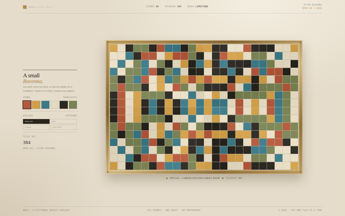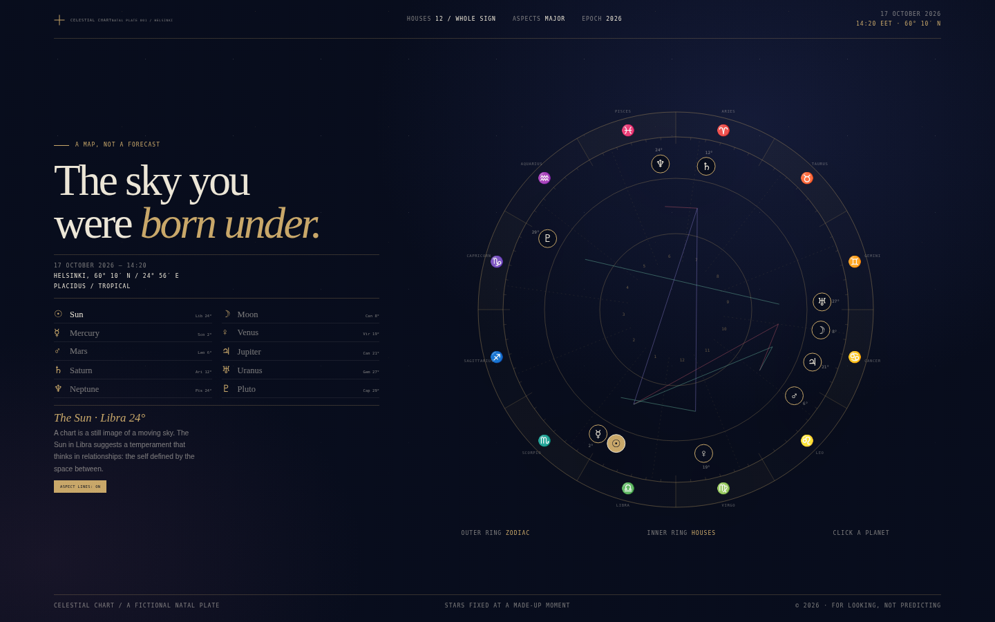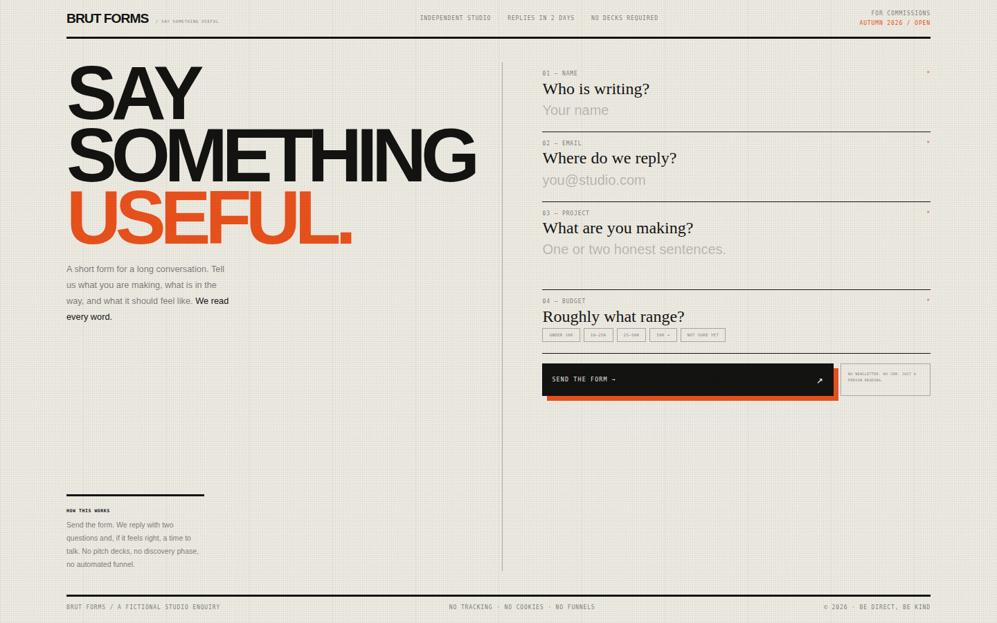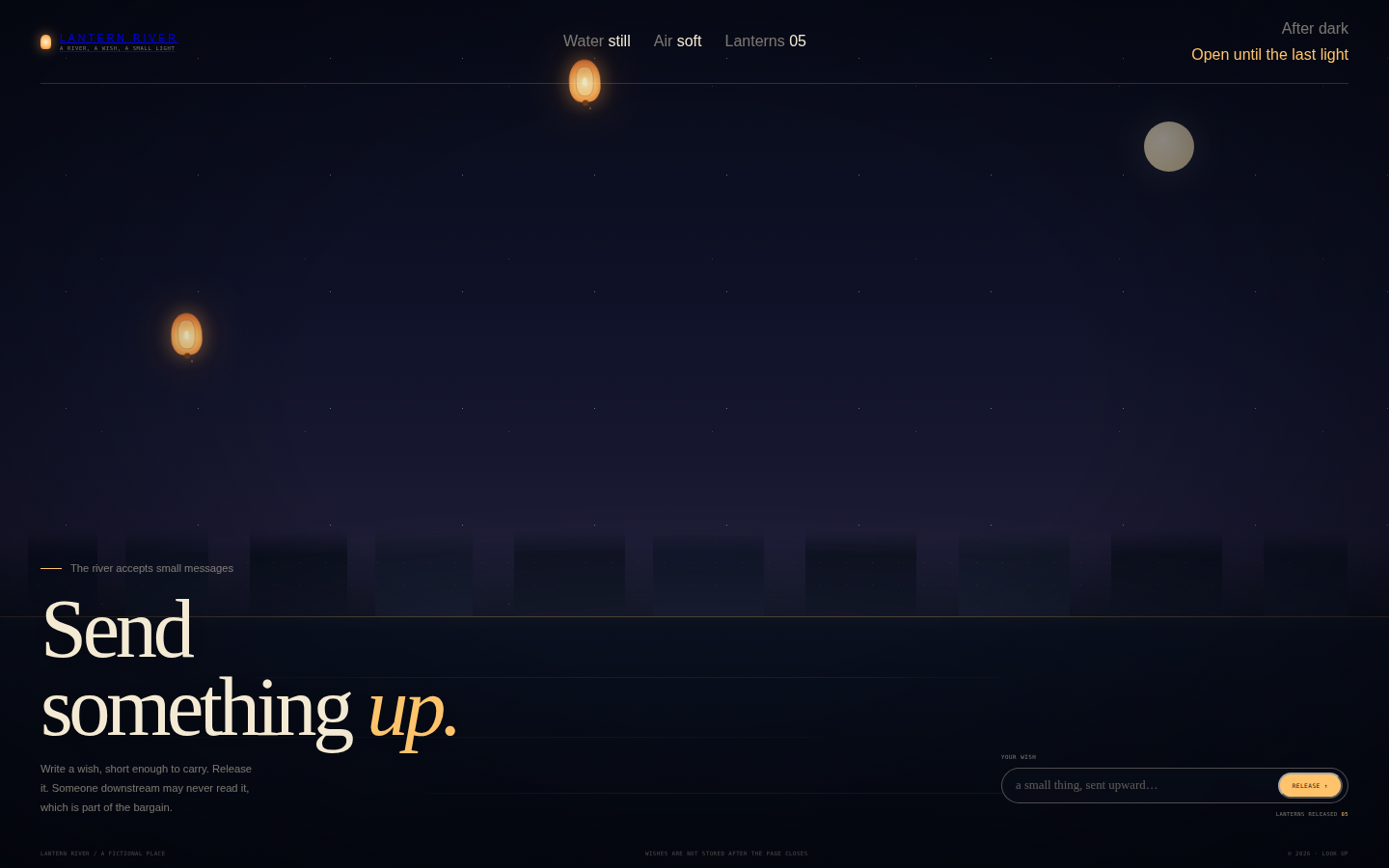
Collection · 100 studies

DeepSeek v4.1 Flash 1017 100 HTML Files

One hundred self-contained visual studies — generative art, physics, typography, interfaces and scenes — generated with DeepSeek v4.1 Flash. Open any piece in a new tab, or expand a card to read the original generation prompt.

100 studies
001
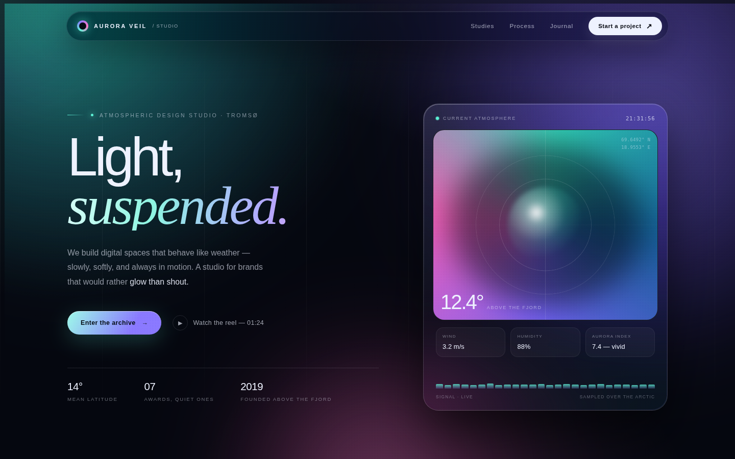
A premium glassmorphism hero that behaves like a piece of atmospheric instrumentation. The aurora is the only loud element; every interface surface is thin, translucent and precise, so the colour appears to be sampled from the sky rather than painted onto the page. The composition is deliberately asymmetric — a large editorial statement on the left balanced by a small, dense instrument card on the right — with the lower third opening into three quiet study cards.
Open
Original prompt
Design a single-page site for a fictional "atmospheric light studio" called Aurora Veil. The feeling is cold northern light trapped inside frosted glass: a near-black midnight background, enormous soft aurora ribbons of teal, violet and rose drifting behind a centered hero, and a floating glass instrument panel that reads the "current atmosphere". Use an oversized editorial sans headline ("Light, suspended.") with the final word in an elegant italic serif, tight and cinematic. Add a slim glass navigation pill, a live clock and aurora index inside the panel, three "study" cards below the fold, and a slow ticker of poetic phrases at the bottom. Everything must feel expensive, quiet and luminous — generous negative space, hairline borders, inner highlights, film grain, no clutter. Colour palette: #05070f ink, #5ef2d6 teal, #8c7bff violet, #ff7ac8 rose, #eef2ff cream. Type: system grotesque with Palatino/Georgia serif italic accents. Animations should be slow (12–24s drift), never bouncy. Fully responsive, single self-contained HTML file, inline CSS and JS, no external assets.
001-aurora-veil.txt
002
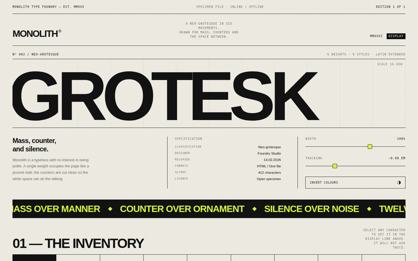
An anti-glassmorphism statement piece: structural, flat and confident. The page is organised like a type specimen brochure — a masthead, a giant display line, marginalia in monospace, numbered sections and a glyph inventory — using hairline rules to expose the grid rather than hide it. The acid green appears only where the page wants the eye to go, so the whole composition reads as black type on paper with one electric interruption.
Open
Original prompt
Create a brutalist typographic specimen page for a fictional neo-grotesque typeface called MONOLITH. It must feel like a printed type catalogue from an uncompromising foundry: warm off-white paper (#efede4), hard black ink (#121212) and one acid accent (#d8ff3e), with visible grid rules, monospaced metadata labels and enormous display type that bleeds toward the edges of the page. The hero is a single word "GROTESK" set at roughly 15vw with tight negative tracking; controls let the viewer adjust its width and letter-spacing live, switch to an inverted ink/paper scheme, and click any glyph in a full A–Z 0–9 inventory to replace the hero character. Include a black marquee manifesto strip, a letter-anatomy plate with dashed measurement callouts, a specification table, and a colophon footer. No rounded corners except the pill control, no gradients, no soft shadows — only mass, counter and silence. Fully responsive single file, inline CSS and JS, no external fonts or assets.
002-monolith-specimen.txt
003
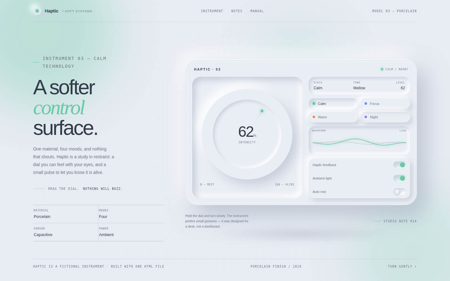
An antidote to neon: a soft, physical interface with the visual weight of a well-made object. Neumorphism is used with discipline — one material, four accents, deep but diffuse shadows — so the page reads as industrial design rather than a CSS effect. The dial is the hero and the oscilloscope gives the object a pulse; everything else stays quiet around them.
Open
Original prompt
Design a neumorphic "calm technology" control surface called Haptic, presented as a single sculpted device floating on a pale, dotted studio backdrop. The palette is cool porcelain (#e8ebf2) with warm coral, mint, sky and lilac accents; every control is extruded from the same material with paired light and dark shadows, generous radii and no hard borders. The device contains a large rotatable dial with a glowing inset ring, three tactile toggle switches, four mood presets (Calm, Focus, Warm, Night), and a soft oscilloscope canvas whose wave amplitude follows the dial. Include a small brand header, a right-hand live readout ("state / intensity / tone"), and quiet microcopy. The mood should be closer to a Dieter Rams appliance than a toy: restrained, tactile, premium. Fully responsive, one standalone HTML file, inline CSS and JS, no external assets.
003-haptic-surface.txt
004
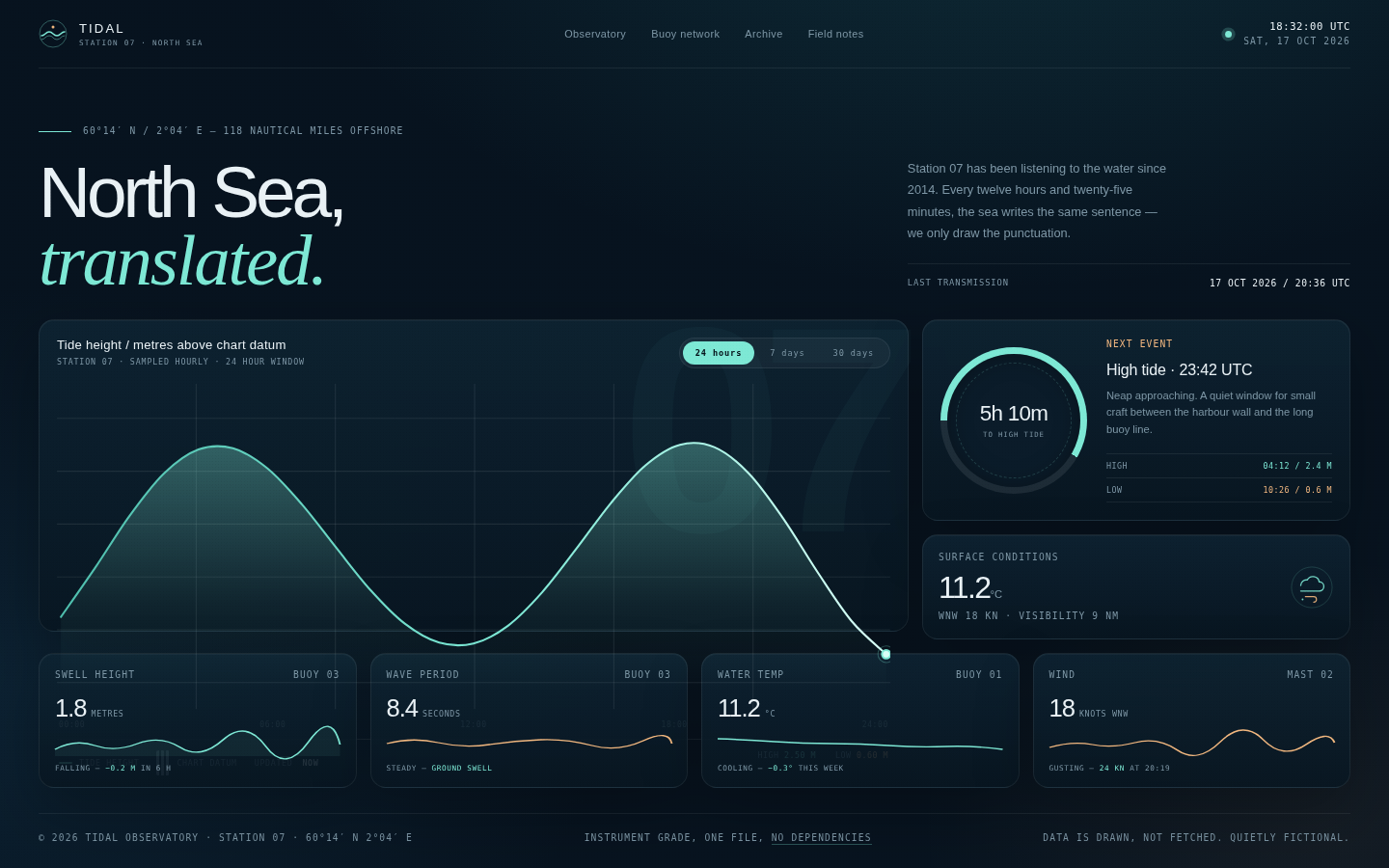
A premium data instrument rather than a generic admin dashboard. The page reads left-to-right like a well-printed nautical chart: quiet masthead, oversized serif/sans headline, then one dominant chart with generous breathing room and small, precise telemetry around it. Aqua is used as signal light — the curve, the live pulse, the tide clock — while sand marks the next event. Everything is on a strict baseline grid and animates slowly, like water.
Open
Original prompt
Build a dark, instrument-grade tide observatory dashboard for a fictional North Sea station called TIDAL 07. The palette is deep ocean navy (#07131f), panel ink (#0d1f2d), bioluminescent aqua (#7ee8d5) and sand (#f2b880), with crisp off-white type. It should feel like a scientific buoy console redesigned by a luxury studio: hairline grids, tiny monospaced labels, one enormous editorial headline ("North Sea, translated."), a live UTC clock, station coordinates, and a large interactive tide-height chart. Add a 24H / 7D / 30D range switcher that redraws the curve with a stroke-draw animation, a hover crosshair with a floating tooltip, a pulsing live marker, a circular tide clock, and three telemetry cards with sparklines. The composition must stay legible and beautiful on mobile. Single self-contained file, inline CSS/JS/SVG, no external libraries, fonts or images.
004-tidal-observatory.txt
005
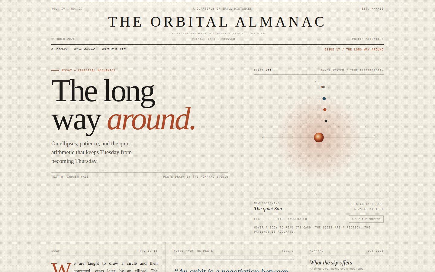
A love letter to print: the page is composed on a strict editorial grid with rules that behave like typographic furniture, not decoration. The orrery is the single piece of theatre, set against quiet columns of justified serif text and precise microcopy. Rust marks the sun, the drop cap and the italic in the headline; blue is reserved for the pull quote and data. The pacing is deliberately slow and readable, like a spread you would tear out and keep.
Open
Original prompt
Design an editorial print-magazine spread about orbital mechanics, titled "The Orbital Almanac". It should look like a beautifully printed quarterly: warm cream paper (#f2ede1), dense black serif text (#1c1b17), rust orange (#ae4b2a) and ink blue (#26485c), double rules, drop caps, justified columns, tiny tracked sans-serif captions, and an oversized serif headline "The long way around." with an italic rust accent. The spread includes a masthead, contents bar, a lead essay in three justified columns, a pull quote, an "Almanac for October" table of celestial events, a small moon-phase plate, and an interactive SVG orrery with four planets travelling along elliptical paths. The orrery must feel like an antique scientific plate redrawn by a contemporary art director: hairline ellipses, a glowing rust sun, small numbered planets and a caption that changes when a planet is hovered. Include a "hold the orbits" control that pauses the motion. Fully responsive, one standalone HTML file, inline CSS/JS/SVG, no external fonts, images or libraries.
005-orbital-almanac.txt
006
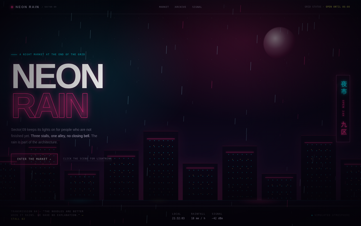
A piece of interactive atmosphere rather than a conventional product page. The design is built from depth layers: rain in front, neon signage in the middle, building silhouettes and street reflections behind, and a thin HUD above everything. Magenta and cyan are used as actual light sources — they bloom, reflect and flicker — while acid yellow appears only in the smallest labels. The composition should feel like standing in the rain with your collar up, deciding whether to go in.
Open
Original prompt
Build a cinematic cyberpunk night-market landing page called "Neon Rain", set in a fictional Sector 09. The mood is rain-soaked Tokyo alley at 2am: near-black purple sky, hot magenta, electric cyan and a single acid-yellow accent, wet asphalt reflections, layered building silhouettes, and a large vertical neon sign. The hero carries an oversized glitch headline "NEON RAIN", a small uppercase transmission line, a glowing "Enter the market" button, and HUD-style corner metadata. Rain must fall on a full-screen canvas with wind and depth; clicking anywhere triggers a lightning flash and swaps the transmission text. Add a scanline/flicker overlay, a slow marquee of market announcements, and a below-the-fold directory of three neon stalls. Fully responsive, one standalone HTML file, inline CSS/JS/SVG only, no external fonts, images or libraries.
006-neon-rain.txt
007
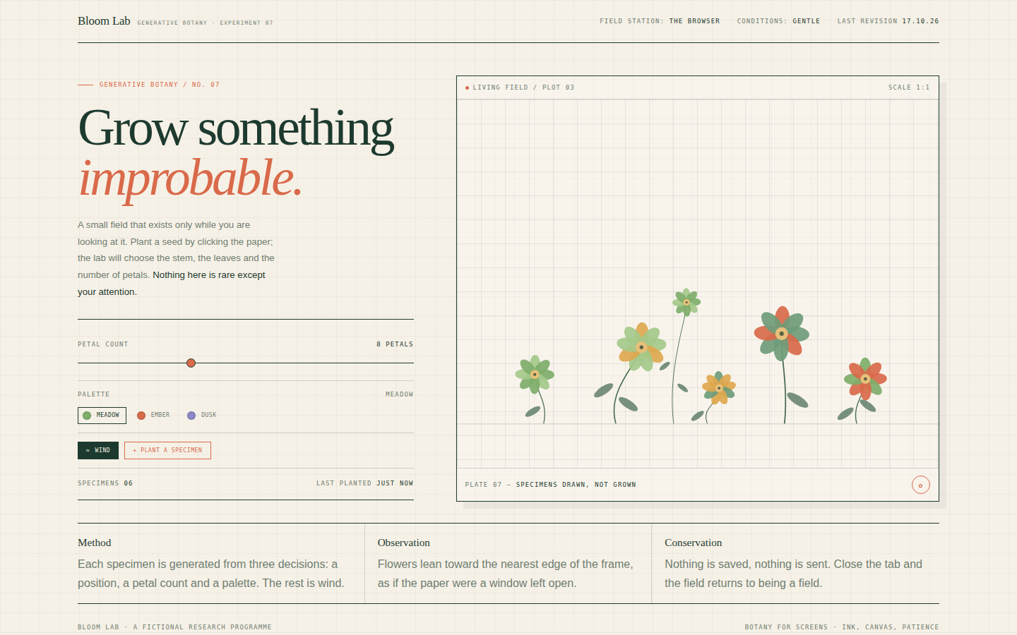
A quiet scientific instrument for making flowers. The page borrows the visual language of a botanical field notebook — graph paper, small caps labels, a serif display face, ruled tables — and lets a living canvas be the only organic, imperfect thing on the page. Each flower is drawn from a seeded palette and petal count, so the field feels authored, never random noise. Coral is used as the single warm interruption.
Open
Original prompt
Create "Bloom Lab", a refined generative-botany experiment presented as a premium editorial playground. Warm paper background (#f6f1e7) with graph-paper grid, deep botanical green ink (#1d3a2f), coral (#d96a4a) and soft meadow colours. Split layout: on the left, a laboratory title "Grow something improbable." in a large serif with an italic coral accent, a short artist's note, specimen count, and elegant controls — petal-count slider, three palette swatches (Meadow, Ember, Dusk), a wind toggle and a "Plant a specimen" button. On the right, a tall canvas field with hand-drawn stems, leaves and multi-petal flowers that grow on click and sway gently in the wind. Add a pressed-flower caption card and a "field notes" footer. It must feel like a design museum's interactive exhibit, not a toy. Fully responsive, one standalone HTML file with inline CSS and JS, no external assets.
007-bloom-lab.txt
008
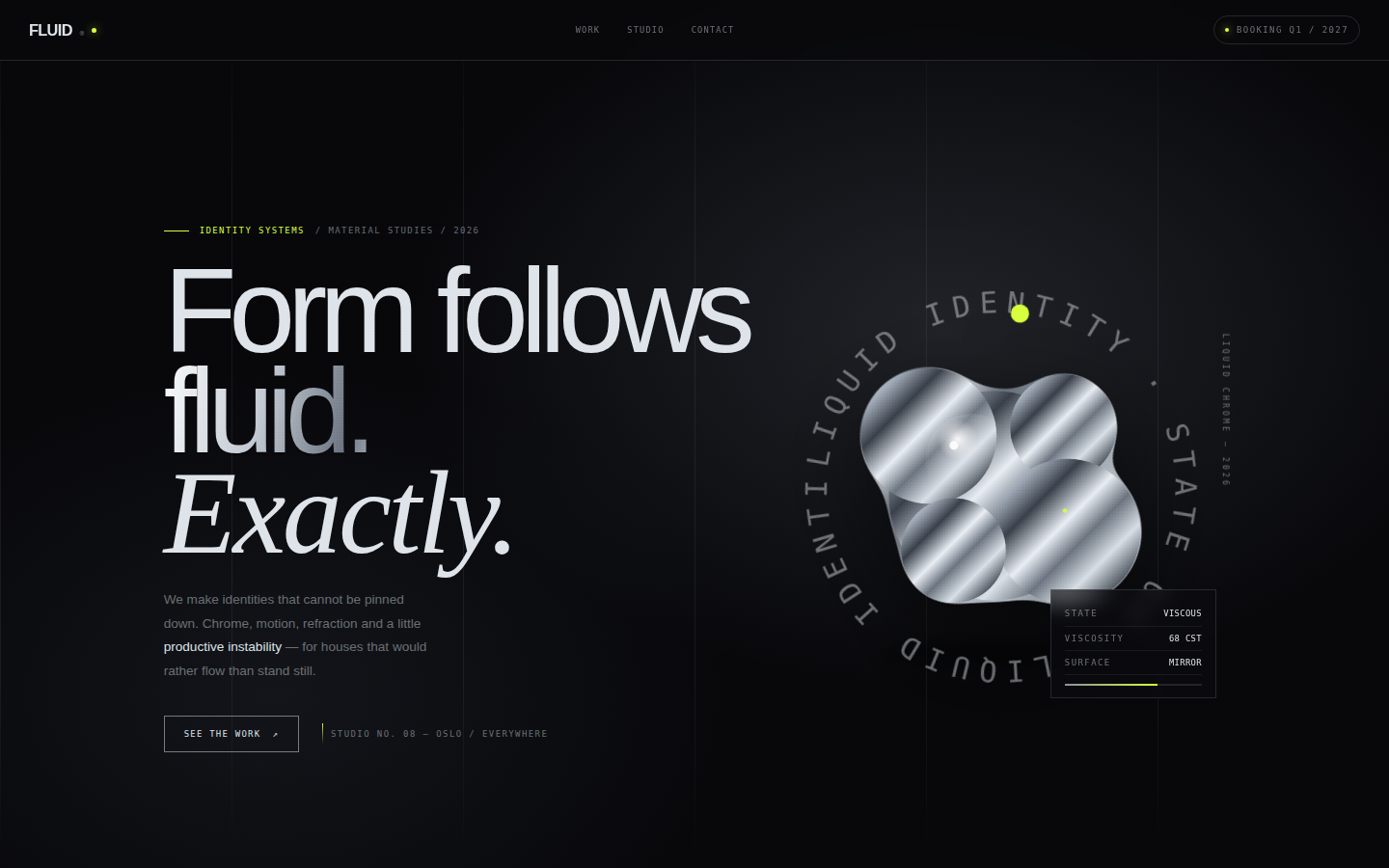
A digital object that behaves like a luxury material study. The metaball is the centrepiece — a single continuous chrome form that never resolves into separate circles — surrounded by severe typography and generous black space. The page uses contrast as its main tool: soft organic motion against hard grid rules, mirror highlights against matte black, tiny acid type against vast neutral fields. It should read like the identity launch for a fashion house that makes objects from melted mirrors.
Open
Original prompt
Create a high-fashion identity-studio landing page for a fictional brand called FLUID. The aesthetic is liquid chrome on graphite: a near-black (#0a0a0d) gallery-like space, mirror-polished silver gradients, one tiny acid-chartreuse signal, and an enormous metallic wordmark. The hero features the statement "Form follows fluid." set in a tight grotesque with a chrome gradient and a small italic serif counterpoint, plus a living SVG metaball sculpture made of five merging chrome blobs that drift organically and lean toward the cursor. Add a circular rotating micro-label, a live "state / viscosity" readout, a manifesto section, and three project index rows that flood with a chrome sweep on hover. Every surface should feel machined and expensive; no colour except silver, black and one acid accent. Fully responsive, one standalone HTML file, inline CSS/JS/SVG, no external assets.
008-liquid-chrome.txt
009
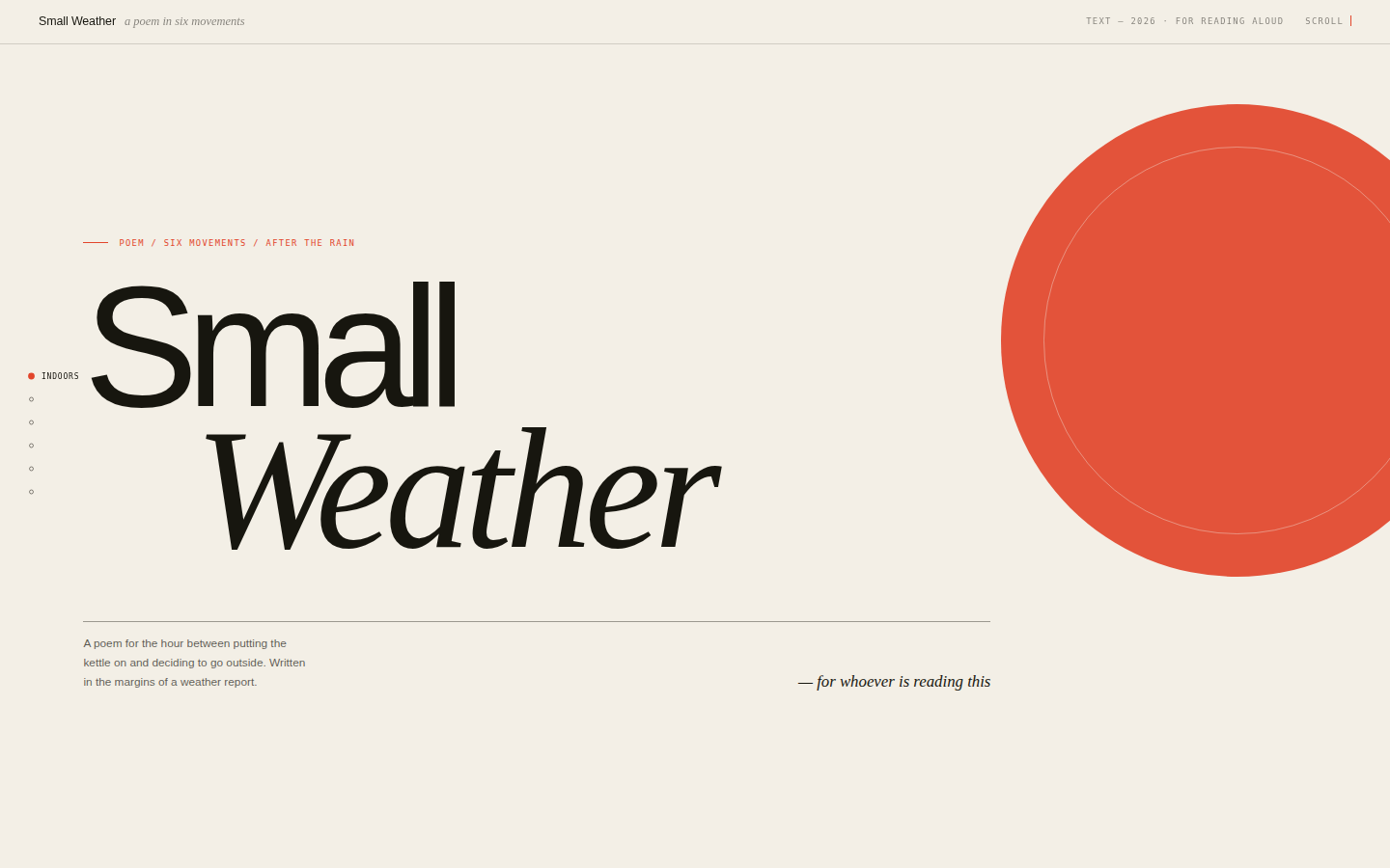
A poem should be staged, not decorated. This page treats each movement like a poster in a series: one idea, lots of air, a single geometric event, and type large enough to be read from across a room. The cream ground keeps it human; vermilion marks the emotional stresses; petrol blue is the cool counterweight. Motion is slow and vertical, timed to reading rather than scrolling, so the words arrive just before the eye needs them.
Open
Original prompt
Create a scroll-driven kinetic typography experience for an original poem titled "Small Weather — a poem in six movements." The design is Swiss-editorial meets contemporary art book: warm cream paper, near-black ink, vermilion red and deep petrol blue, with enormous grotesque lines (up to 8vw), italic serif accents, hairline rules and a fixed vertical index of the six movements. Each movement occupies a full viewport, uses a different alignment and a single abstract shape — a red disc, a blue horizon bar, an outlined circle, a rain of thin rules — and its lines rise into place as it enters view. Include an opening title spread, a scroll progress rule at the very top, active-movement tracking in the rail, and a closing colophon. Fully responsive, one standalone HTML file with inline CSS and JS, no external fonts, images or libraries.
009-small-weather.txt
010
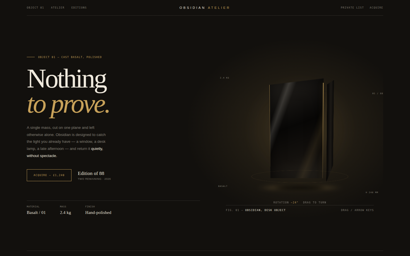
A digital plinth. The page is mostly darkness and air, lit by one warm gold line and the sheen on the object. Typography does the luxury work: a high-contrast serif at display scale, wide-set small caps, and numbers treated like catalogue entries. The object is deliberately enigmatic — you rotate it to understand it, but it never becomes a familiar product shot. Every detail should suggest weight, scarcity and restraint.
Open
Original prompt
Create a luxury product page for a fictional desk sculpture called "Obsidian", Object 01 from the Obsidian Atelier. It should feel like a collectible design catalogue: warm near-black (#14120f), bone white (#efe9dd), and brushed gold (#c8a25a), with an oversized Didone-style serif headline "Nothing to prove." and restrained grotesque microcopy. The hero features a CSS-built 3D obsidian slab — polished, faceted, with a hairline gold edge and a soft reflected shadow — that the visitor can drag to rotate, with keyboard arrows and a live angle readout. Add edition details, a weight/silence/light triptych, a specification band, a quiet "Acquire" interaction that acknowledges the reservation with an inline note, and a slow reveal on scroll. No external images: the object must be made entirely from CSS gradients, transforms and pseudo-elements. Fully responsive, one standalone HTML file, inline CSS and JS.
010-obsidian-object.txt
011
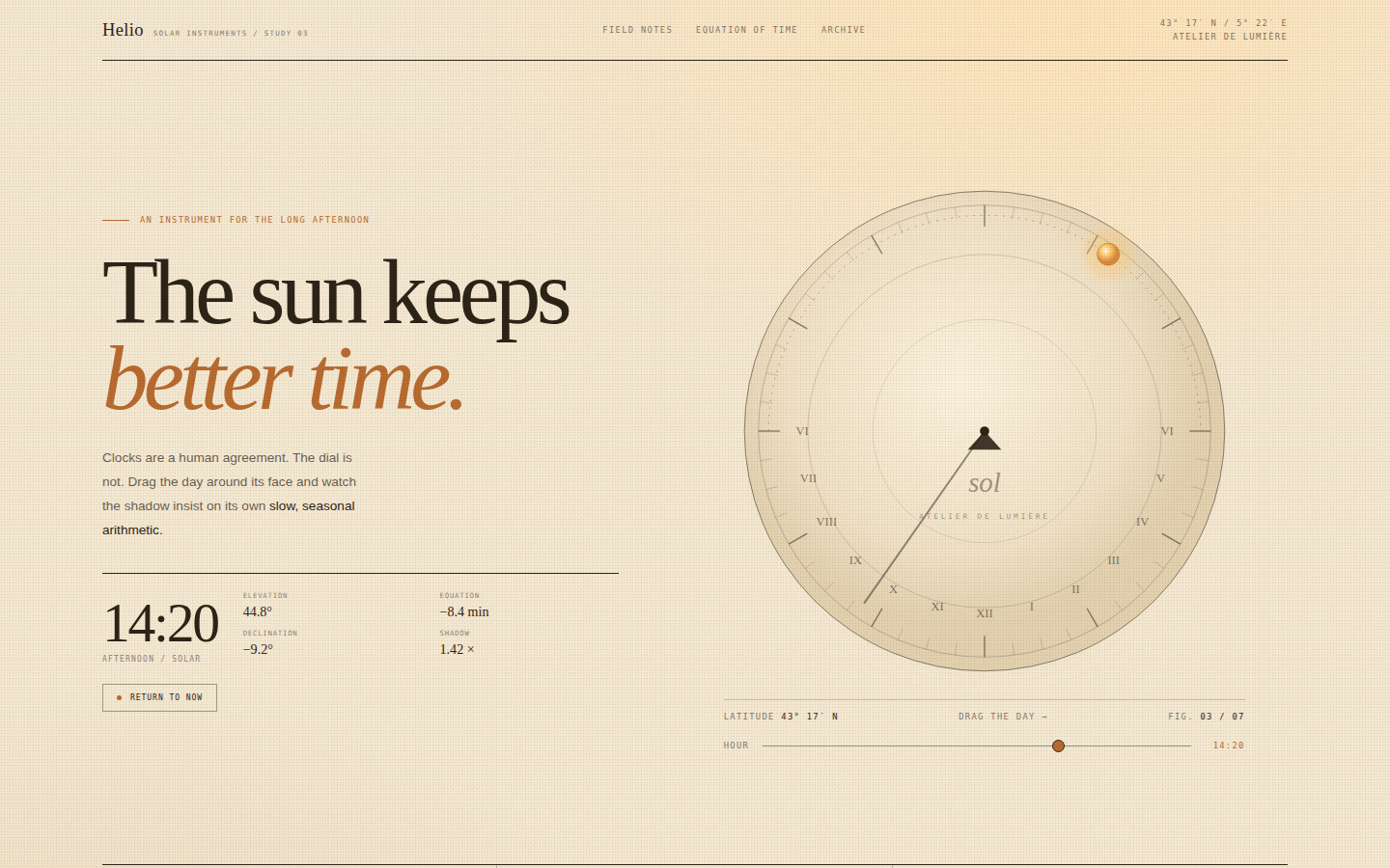
An instrument you want to touch. The palette is drawn from terracotta, raw linen and late-afternoon light; nothing is pure white or pure black. The dial is the visual anchor and is treated like an engraved brass plate redrawn in SVG, while the typography is quiet enough to let it be the hero. Warm gradients suggest sunlight raking across paper, and the shadow line gives the whole composition a direction.
Open
Original prompt
Create a warm, sunlit interactive sundial study titled "Helio". The page should feel like a Mediterranean astronomy atelier: sand-coloured paper (#f3e7d0), deep umber ink, ochre and burnt orange, with an oversized serif headline "The sun keeps better time." The layout pairs editorial copy and a solar-time readout on the left with a large interactive sundial on the right. The sundial is an SVG instrument: concentric circles, Roman hour numerals, tick marks, a triangular gnomon and a long shadow line that rotates as the visitor drags around the dial or moves a time slider. A small sun travels along the day arc; a readout shows the hour, solar elevation and the equation of time. Include a trio of field notes, coordinates, and a "return to now" control. Fully responsive, one standalone HTML file with inline CSS and JS, no external fonts or images.
011-sundial-hours.txt
012
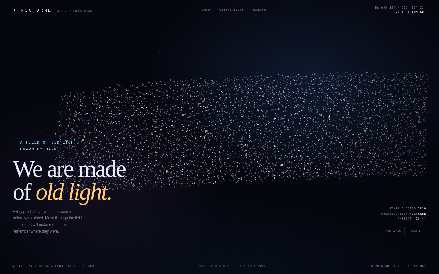
A quiet, astronomical version of a hero section — closer to an observatory plate than a website header. The word is legible as a constellation only when you look for it; individual stars remain distinct points with their own brightness and drift. UI is placed at the edges like annotations on a star chart, leaving the centre to the sky. The single amber star is the emotional anchor.
Open
Original prompt
Create a full-viewport generative star-field experience called "Nocturne". On load, thousands of tiny stars form the word "NOCTURNE" across a deep midnight sky, then drift slowly; a few nearby stars are joined by faint cyan constellation lines. Moving the pointer repels the nearest stars and clicking them sends a ripple through the field before it reforms. The composition is cinematic and minimal: an index at the top, a large editorial statement "We are made of old light." in the lower left, and a small technical readout in the lower right. Palette: near-black navy (#04060d), starlight ivory (#e4ebff), a single warm amber star and pale cyan lines. Use a monospaced scientific vocabulary, a serif italic accent and very restrained UI. The canvas must be the hero. Fully responsive, one standalone HTML file with inline CSS and JS, no external libraries, images or fonts.
012-nocturne-stars.txt
013
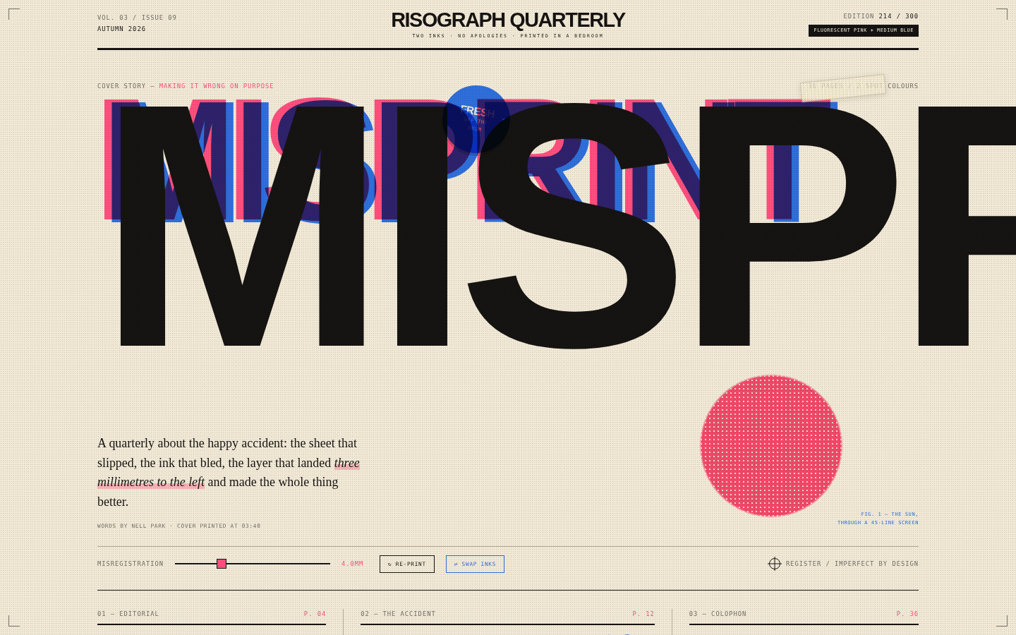
A joyful print object: slightly crooked, loudly coloured, and confident. The composition uses riso's constraints as features — only two inks, visible dots, imperfect registration — and builds a cover with poster energy. Black carries the reading text; pink and blue are reserved for display type, shapes and marks. Tape, staples and crop marks make the page feel physically assembled rather than rendered.
Open
Original prompt
Design an energetic risograph-printed zine spread called "Misprint", a fictional quarterly about small printing accidents. Palette: warm newsprint cream, fluorescent pink (#ff4f7e), riso blue (#2f6fdb) and black, with visible halftone dots, overprint blend modes, registration marks and slightly rotated layers. The masthead reads "RISOGRAPH QUARTERLY / ISSUE 09". The cover story is titled "Misprint" in enormous condensed type, printed twice in pink and blue with a deliberate offset; a halftone sun/circle sits behind it. Include a live "misregistration" slider that separates the ink layers, a "re-print" button that randomises the offsets, a taped-on sticker, a short editorial column, and a back-page colophon. It should feel handmade and energetic, but designed with real typographic care. Fully responsive, one standalone HTML file, inline CSS/JS only, no external fonts, images or libraries.
013-riso-misprint.txt
014
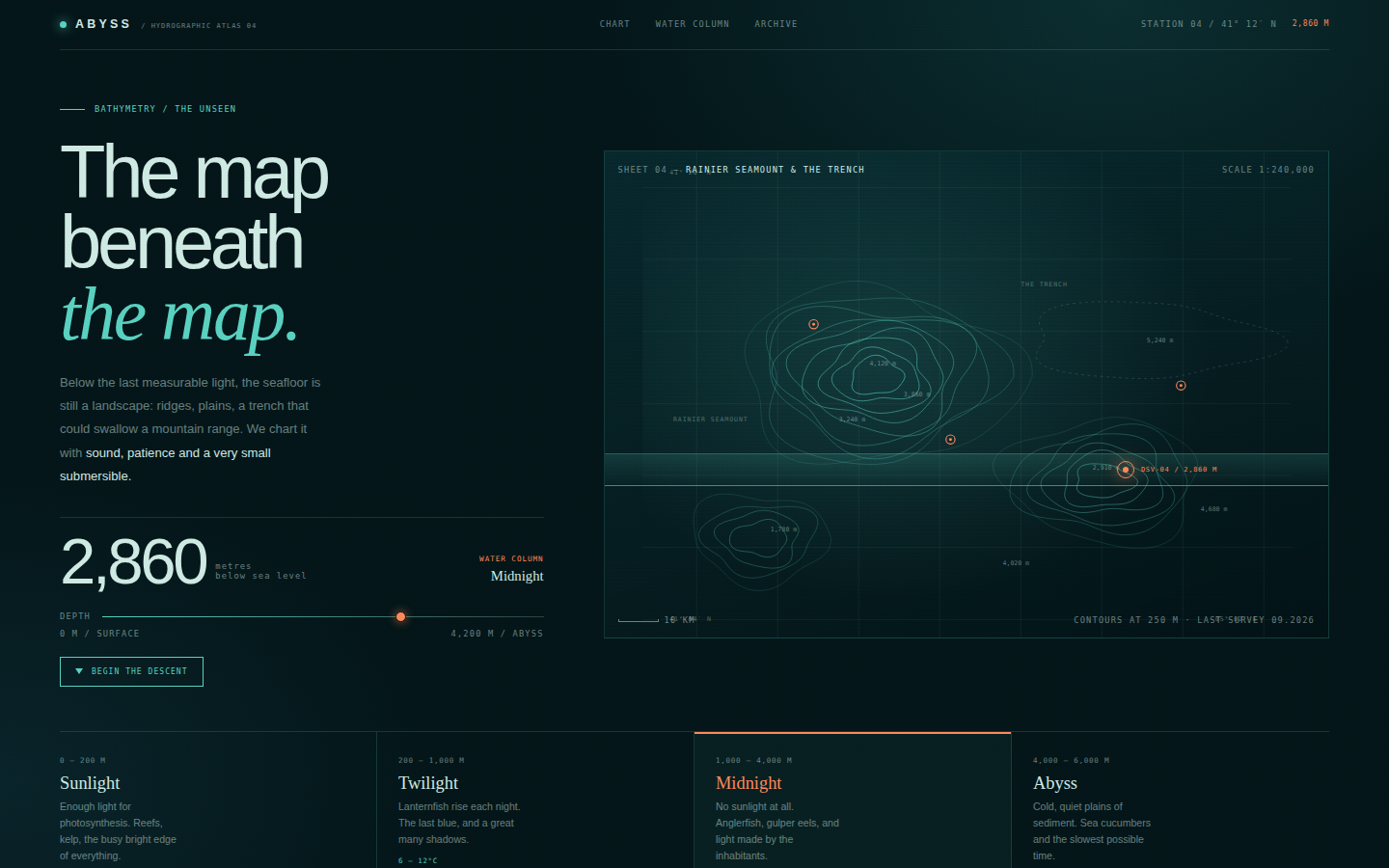
A scientific plate redesigned as a luxury object: quiet, precise, slightly ominous. The map is the hero and is drawn rather than photographed, with contour lines that feel engraved and a horizon line that behaves like a sonar sweep. Coral is reserved for the human presence — the station, the marker, the number you are changing. Typography mixes a severe grotesque with an italic serif for poetic asides.
Open
Original prompt
Create "Abyss", a dark hydrographic atlas page that maps the seafloor as a piece of data art. Palette: near-black teal (#041619), deep panel (#06252a), pale seafoam text (#cfe9e3), bioluminescent teal contours (#5ad1c1) and a single coral marker (#ff8a5c). The hero pairs an editorial left column — title "The map beneath the map.", a large live depth readout, a depth slider and a "Dive" button — with a wide SVG bathymetric chart on the right, built from dozens of hand-generated concentric contour lines around three seamounts, faint graticule lines, soundings and station markers. A glowing depth horizon sweeps down the chart as the slider moves. Below, a four-zone depth band (Sunlight, Twilight, Midnight, Abyss) highlights the current zone and describes its life and temperature. Fully responsive, one standalone HTML file with inline CSS/JS/SVG, no external assets.
014-abyss-atlas.txt
015
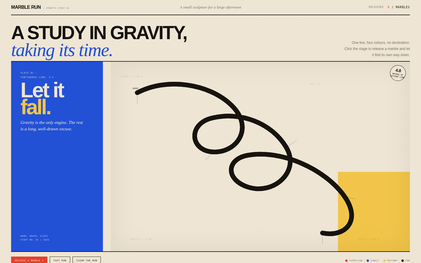
Playful but composed. The track is treated as a drawn object — a single continuous line with real weight — and the page as the poster around it. The palette is limited to four flat colours plus paper, with the marbles as the only glossy, translucent elements. Motion is the artwork: every click produces a small, satisfying event that follows the same confident route.
Open
Original prompt
Create an interactive kinetic-art page called "Marble Run": a single elegant marble track drawn in SVG, spanning a full-viewport cream stage with bold cobalt, vermilion, mustard and black accents. The track should have sweeping curves, a loop and a long final descent, rendered as a deep groove with a thin bright centre line, supported by slender posts and soft shadows. Clicking anywhere releases a coloured glass marble that accelerates along the path, leaving a faint trail; multiple marbles can run at once. Include a small editorial masthead ("A study in gravity, taking its time"), a counter of marbles released, a speed toggle and a reset. The composition should feel like a museum kinetic sculpture poster: generous space, confident geometry, joyful colour. Fully responsive, one standalone HTML file, inline CSS/JS/SVG, no external libraries, fonts or images.
015-marble-run.txt
016
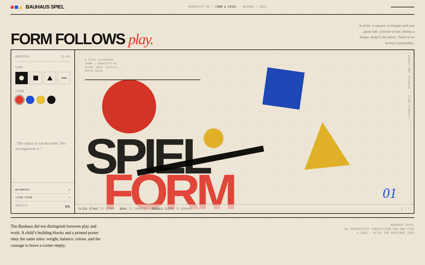
Bold, flat, joyful and disciplined. This is not a random shape generator: the initial composition is art-directed with strong diagonal rhythm, one large primary form anchoring each corner, and typography treated as another geometric element. The interaction is deliberately simple so every visitor can make a poster in seconds without breaking the visual system.
Open
Original prompt
Design "Bauhaus Spiel", an interactive geometric composition playground in the spirit of the Bauhaus poster tradition. Paper cream, hard black ink, and the three canonical primaries — red, blue and yellow — applied as flat, overprinted shapes. The page is arranged like a studio workbench: a compact masthead, a left tool rail for choosing circle / square / triangle / rule and selecting one of the four colours, and a large stage with a curated initial composition and oversized typography. Visitors click the stage to stamp a new shape, drag any shape to reposition it, and double-click one to remove it. Overlapping shapes use multiply blending to feel printed. Include a "recompose" button that rearranges the curated layout, a live object count, and a short manifesto footer. Fully responsive, one standalone HTML file with inline CSS/JS, no external assets.
016-bauhaus-spiel.txt
017
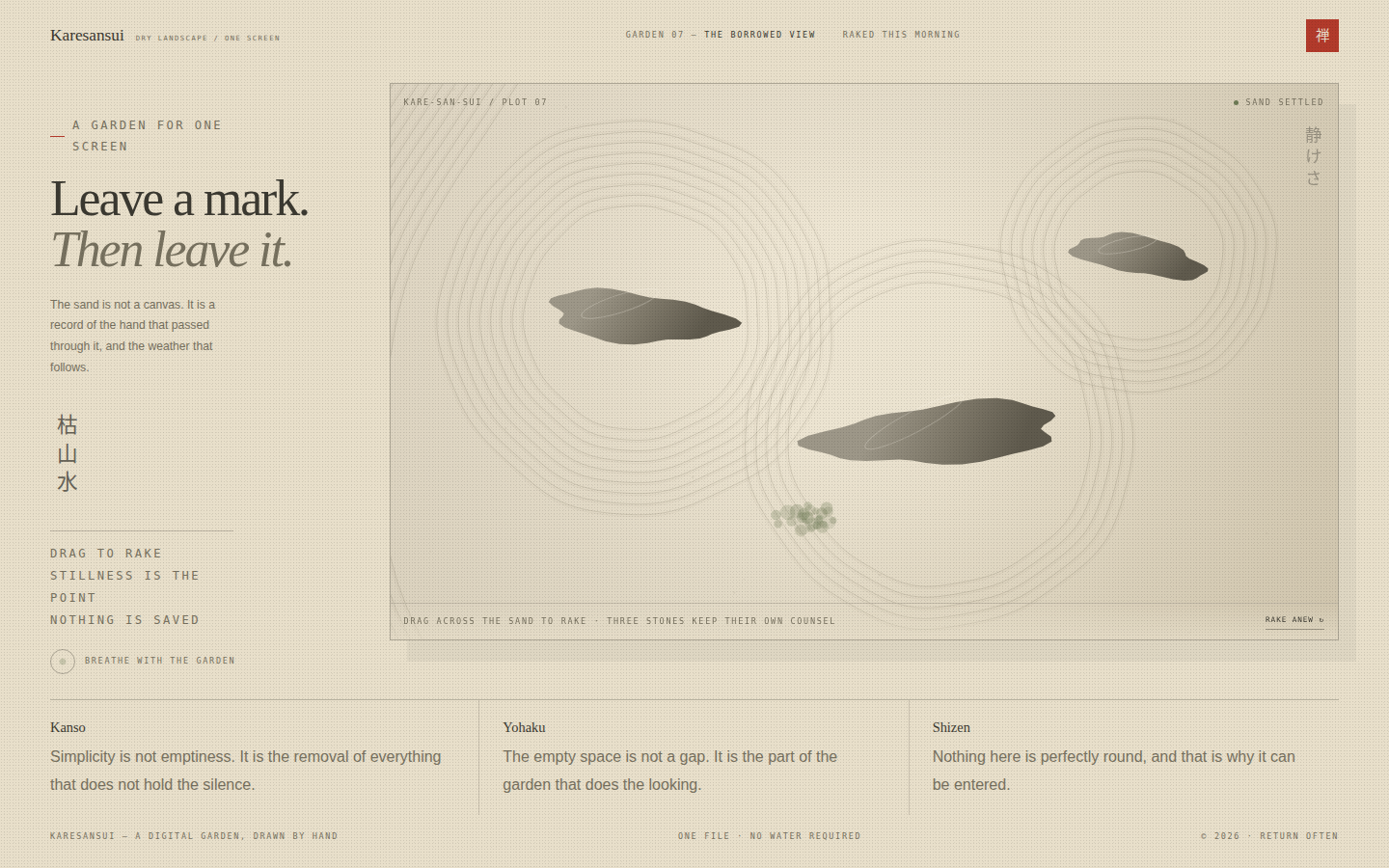
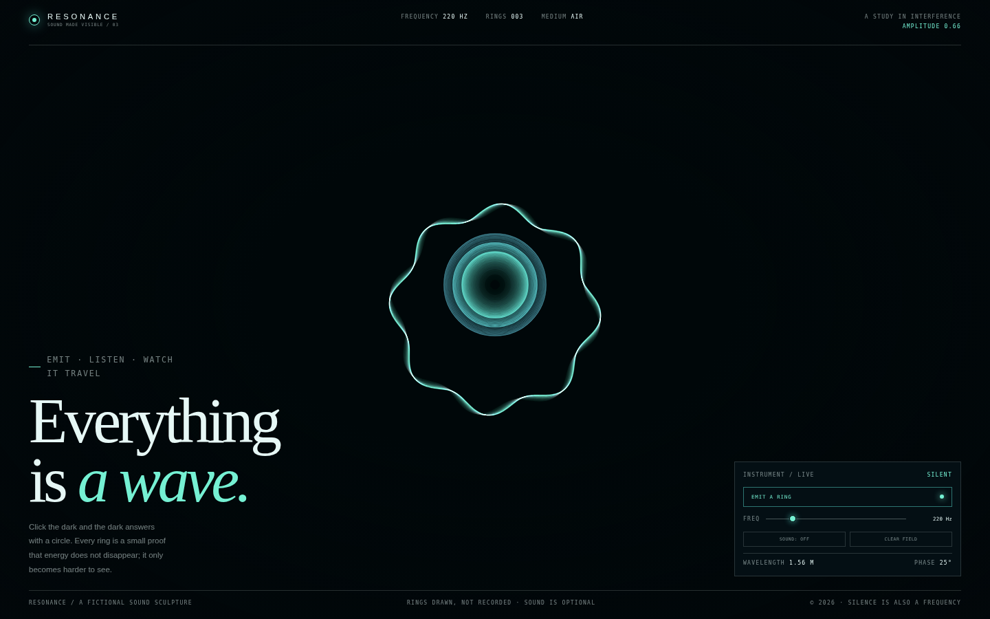
Stillness as an interface. The garden is drawn, not decorated: every line is a rake mark, every shadow belongs to a stone. The page should slow the visitor down — no buttons competing for attention, no gradients that shout. Vermilion appears exactly once, like a hanko stamp on a scroll. The interaction is therapeutic rather than productive.
Open
Original prompt
Create a meditative interactive zen garden called "Karesansui". The page is almost entirely a raked sand canvas: warm sand (#e8dfca), fine grooves in shadow and light, three irregular stones, a patch of moss, and a single vermilion seal for contrast. The interface is minimal — a small masthead, a vertical Japanese title, a quiet instruction, and one reset control. Dragging across the sand should carve new rake lines that follow the pointer with several parallel tines, while the initial composition shows concentric rings around each stone, interrupted naturally. Include a slow breathing indicator, a short note on karesansui, and a footer. Typography: restrained serif and wide-tracked monospace; no bright interface colours. Fully responsive, one standalone HTML file with inline CSS/JS, no external assets.
017-zen-garden.txt
018
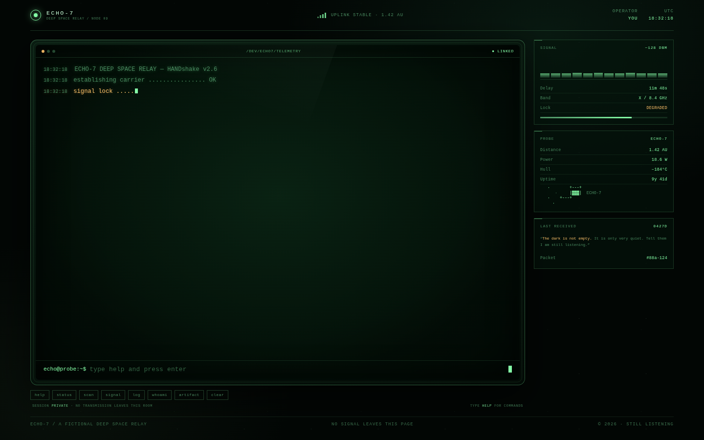
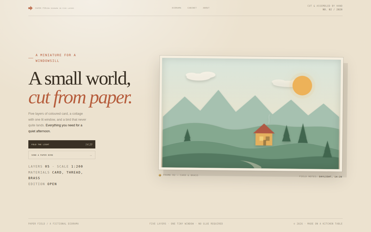
A room-sized piece of science fiction, reduced to one screen. The terminal is the hero and is treated like a physical object: thick bezel, glass reflection, green phosphor bloom and the slight instability of an old display. The side panel behaves like a bank of analogue instruments. Typography is entirely monospaced, with one amber accent for alerts. The mood is lonely, curious and quietly hopeful.
Open
Original prompt
Create a fictional retro-futurist terminal experience: a CRT console for the deep-space probe ECHO-7, stranded at the edge of the solar system. A near-black room with a faint star field and a phosphor-green terminal window (with subtle glass curvature, scanlines, glow and occasional glitch). The boot sequence types itself: handshake, telemetry checks, a cryptic line from the probe. Visitors can type real commands — help, status, scan, signal, log, whoami, artifact, clear — with typed responses, a blinking block cursor and command chips for the curious. A right-hand side panel shows telemetry (distance, signal delay, power, hull) and an analog signal meter. The terminal must be genuinely interactive, not a screenshot. Fully responsive, one standalone HTML file, inline CSS/JS, no external fonts, images or libraries.
018-echo-terminal.txt
019
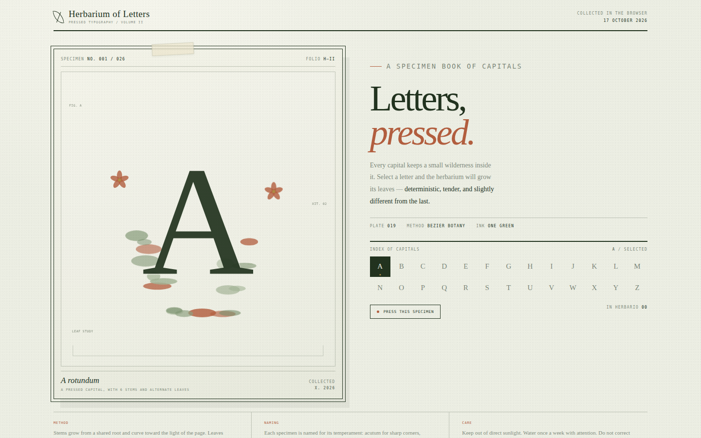
A quiet, tactile crossover between natural-history illustration and typography. The plate is treated as a real herbarium sheet: generous paper, double rules, tiny annotation numbers, a hand-written label. Colour is used sparingly — green stems, sage leaves, a few terracotta flowers, gold for the smallest marks. The generated botanical form is deterministic for each letter, so the collection feels catalogued rather than random.
Open
Original prompt
Create a botanical specimen-book page titled "Herbarium of Letters" where each letter of the alphabet is presented as a pressed plant. Palette: pale sage paper (#eef0e5), deep forest ink (#22331f), terracotta (#b45f3f) and antique gold (#c9a24b). The main plate shows a huge serif capital surrounded by an SVG botanical arrangement — curved stems, alternate leaves and small five-petal flowers — generated from the letter's character code, with a hand-numbered specimen label. A second column carries the title "Letters, pressed.", a short essay, and a 26-letter index; clicking a letter re-draws the plate, changes the Latin-style specimen name and animates the leaves. A "press this specimen" action adds the letter to a small herbarium list and stamps the plate. Fully responsive, one standalone HTML file with inline CSS/JS/SVG, no external images or fonts.
019-herbarium-letters.txt
020
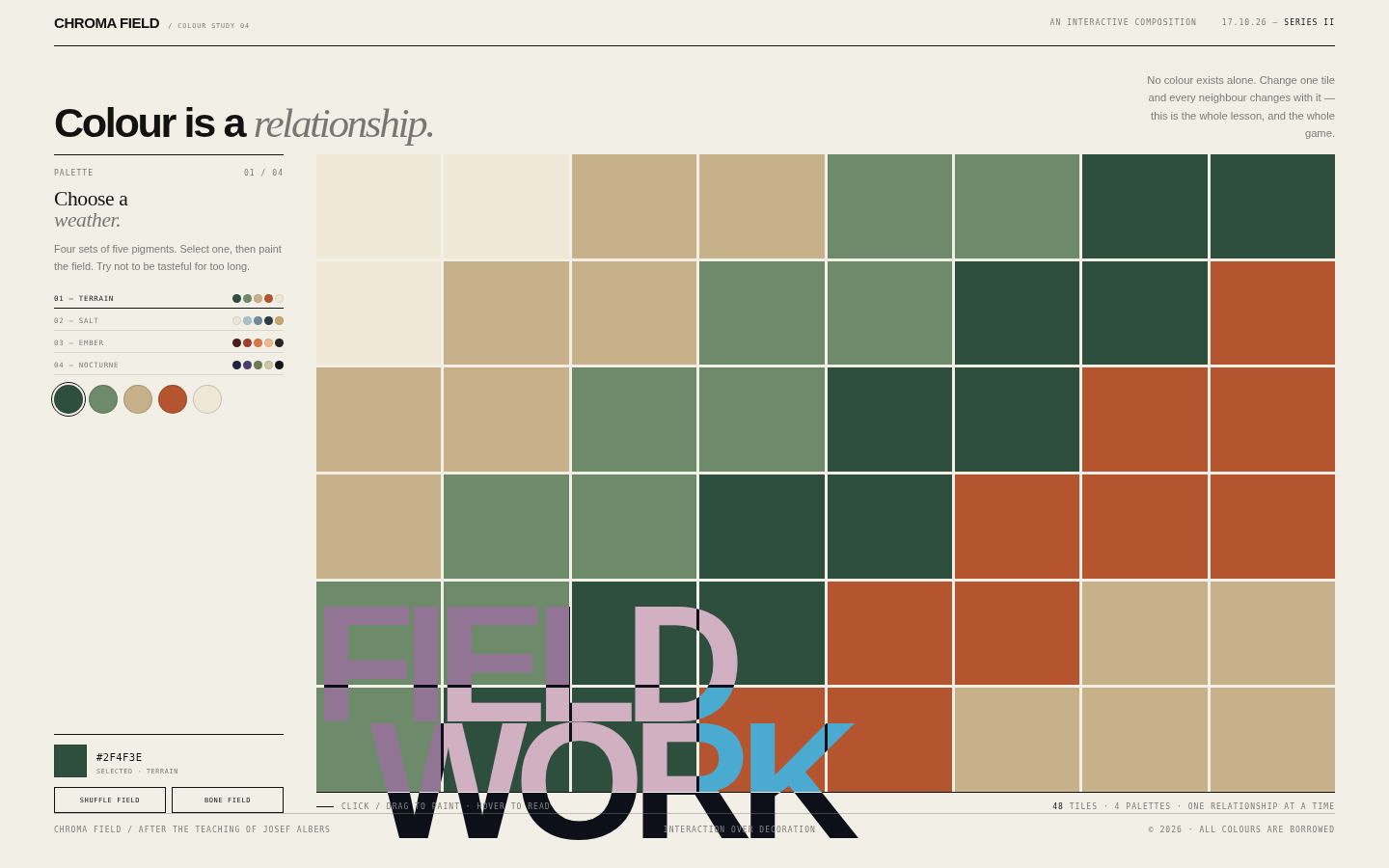
A colour workshop disguised as a poster. The grid is the artwork and the interface is deliberately quiet: tiny labels, one strong type gesture, and no rounded cards or shadows. Colour does all the emotional work while a strict underlying grid keeps the composition calm. The overlap of the word FIELD in difference blend makes the visitor's own colour choices alter the typography.
Open
Original prompt
Create a Swiss-modern interactive colour study called "Chroma Field". The page is a controlled composition: a narrow left control column and a large 8 × 6 field of flat colour tiles separated by hairline gaps, with oversized typography overlapping the grid in difference blend mode. Palette sets are sophisticated rather than primary — Terrain (forest, sage, sand, rust, bone), Salt (chalk, pale blue, slate, ink), Ember (oxblood, clay, apricot, smoke) and Nocturne (indigo, violet, moss, cream). Visitors choose a palette, click or drag across tiles to paint them, hover to read the hex and coordinates, and "shuffle the field" to generate a new harmonious block composition. Include a live selected-colour readout, a field count, and a short note about Josef Albers-style colour relationships. Fully responsive, one standalone HTML file with inline CSS/JS, no external assets.
020-chroma-field.txt
021
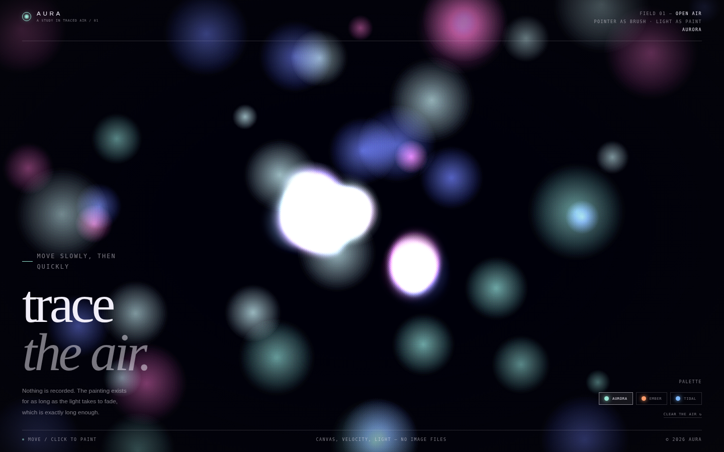
An experience rather than a page: the cursor is a brush, the screen is dark air, and colour behaves like light rather than paint. Everything around the canvas is deliberately quiet so the moving image carries the emotion. The typography is large, thin and confident, placed only at the edges, never competing with the plume.
Open
Original prompt
Create a full-screen interactive light painting called "Aura". A near-black space holds soft additive plumes of colour that bloom from the cursor as it moves, drifting and fading like smoke seen through a lens. Three palettes — Aurora (teal, violet, rose), Ember (amber, coral, red) and Tidal (blue, aqua, white) — can be switched live. The interface is minimal and editorial: a small masthead, one oversized serif statement "trace the air." in the lower left, a palette switch and clear control in the lower right, and faint field notes at the edges. On load a gentle pre-drawn plume should make the screen feel inhabited. Add a subtle grain and vignette so the colour feels photographic. Fully responsive, one standalone HTML file with inline CSS/JS, no external assets.
021-aura-trace.txt
022
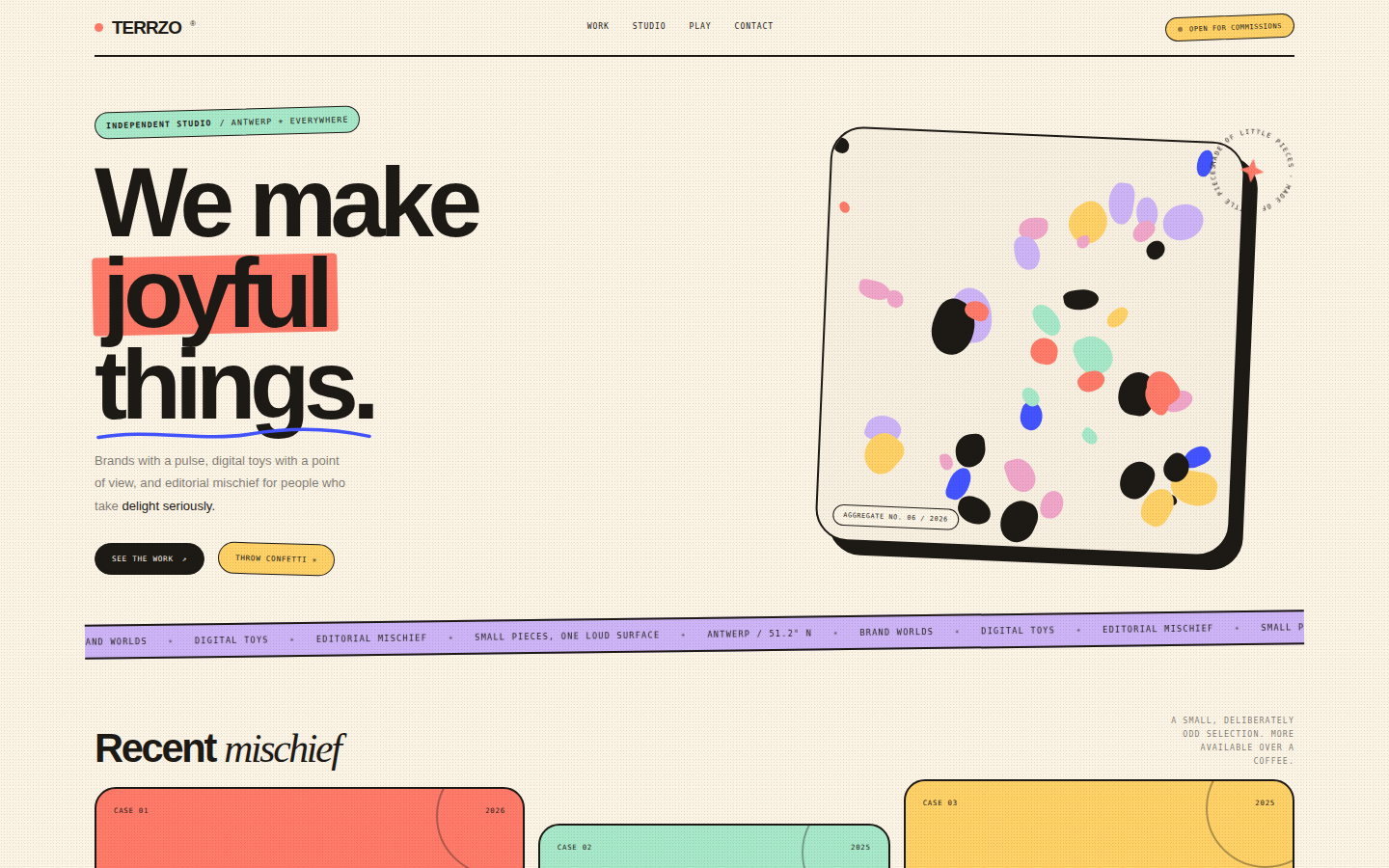
Joy with art direction. The page borrows the visual logic of terrazzo — many small, irregular pieces making one confident surface — and applies it to layout: chips, cards and type blocks are placed like aggregate in a slab. Thick black strokes and a tight editorial grid keep the playfulness from becoming chaos. Every interaction should feel like handling good paper.
Open
Original prompt
Design a playful, premium portfolio page for a fictional design studio called TERRZO®, inspired by terrazzo: a warm cream page scattered with irregular coloured chips, thick black rules, chunky friendly typography and rounded panels. Palette: cream, ink, coral, mint, cobalt, butter and lilac. The hero says "We make joyful things." with coloured highlight blocks and a hand-drawn underline; beside it sits a large terrazzo tile built from dozens of irregular CSS chips, with a rotating circular badge. Add three asymmetric project cards, a colourful marquee, a "throw confetti" interaction that releases paper chips across the screen, and a generous footer. It must feel like a bright, confident independent studio — not a children's page. Fully responsive, one standalone HTML file with inline CSS/JS, no external assets.
022-terrzo-studio.txt
023
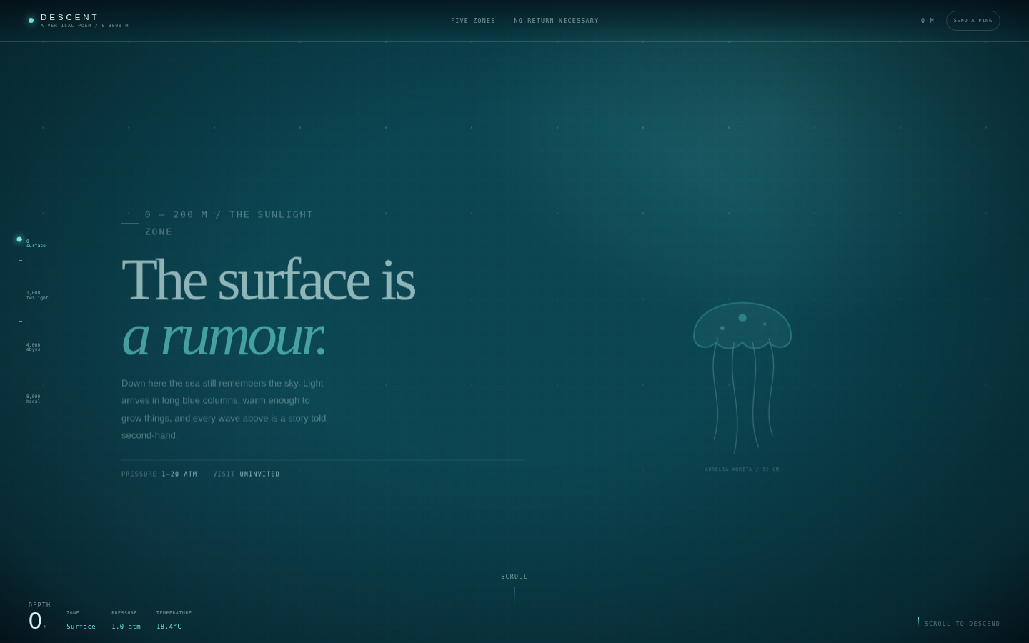
A descent you can feel in the scrollbar. The page is a vertical column of water rather than a series of cards: the background darkens continuously, the creatures become stranger, and the interface behaves like a submersible's instrument panel. Typography alternates between a calm editorial serif and precise monospaced telemetry. Bioluminescence is the only warm light.
Open
Original prompt
Create a scroll-driven descent through the ocean's depth zones titled "Descent". The page starts in dark teal surface water and grows darker as the visitor scrolls, ending in near-black hadal space. A fixed sensor panel shows the current depth, zone, pressure and temperature, updating with scroll; a vertical depth rail marks 0, 1,000, 4,000 and 8,000 m. Five full-height narrative sections — Surface, Twilight, Midnight, Abyss, Hadal — carry poetic copy, scientific asides and a glowing bioluminescent creature drawn inline in SVG (jellyfish, lanternfish, anglerfish, siphonophore, amphipod). Add drifting marine snow, a sonar ping button that emits a ripple and surfaces a note, and an ending that returns to the surface. Fully responsive, one standalone HTML file with inline CSS/JS/SVG, no external assets.
023-deep-descent.txt
024
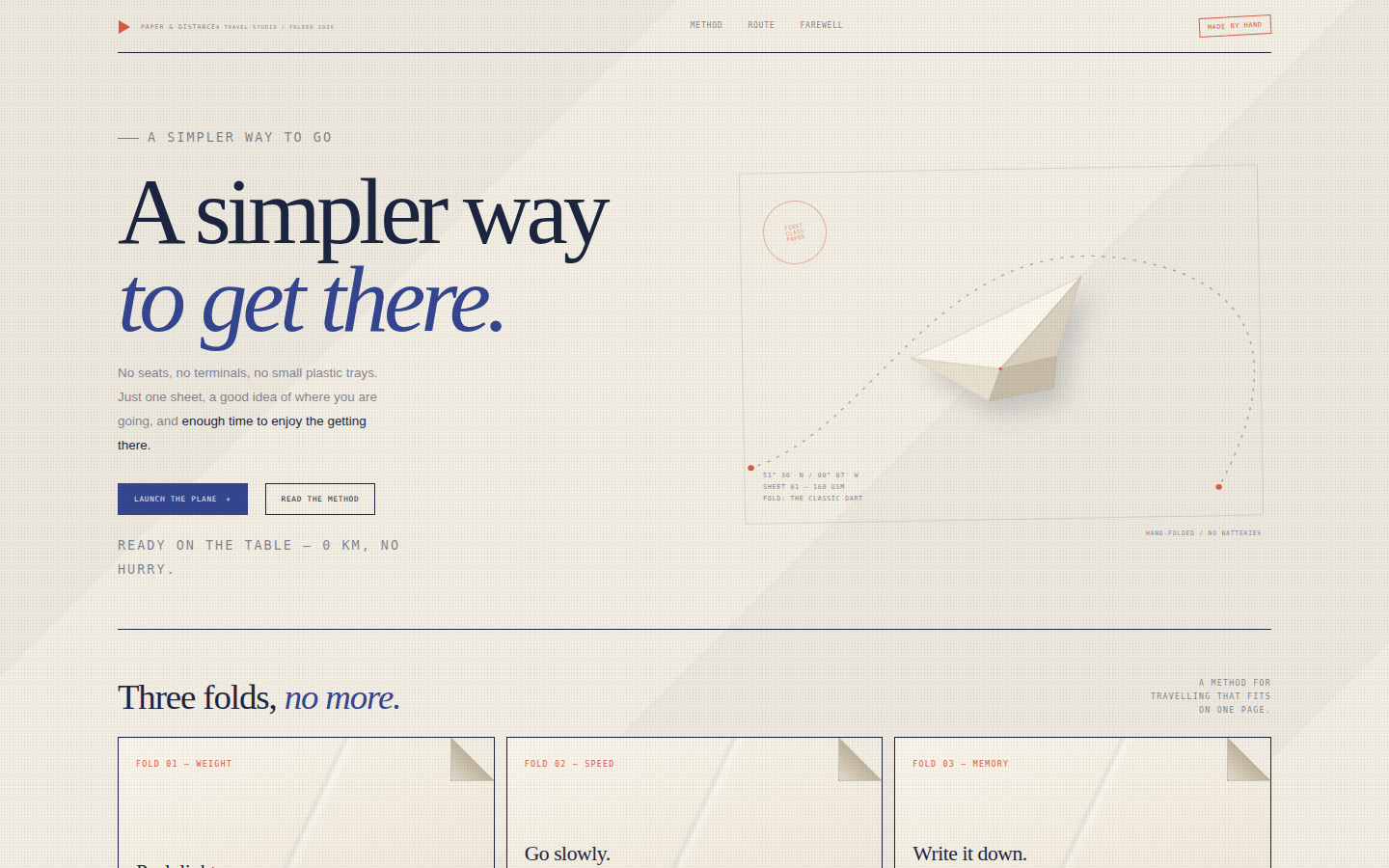
Travel as an act of attention, not consumption. The page looks like something folded on a kitchen table: creases, paper edges, a stamp, a route drawn by hand. Indigo is the ink; vermilion is the one thing you would circle twice. There are no photographs — the imagination is asked to do the work.
Open
Original prompt
Design a quiet, tactile landing page for a fictional travel studio called "Paper & Distance". The aesthetic is folded paper: warm off-white and cream stock, indigo ink, a single vermilion accent, and soft shadows at every crease. The hero says "A simpler way to get there." in a large editorial serif with an italic indigo phrase, beside a hand-folded paper plane drawn in SVG, floating above a dotted flight path. Clicking "Launch the plane" sends it along a gentle arc; the message updates when it lands. Below, three folded-paper cards (Pack light / Go slowly / Write it down) can be unfolded to reveal a sentence; a route diagram with dashed lines and stamped stops closes the page. Fully responsive, one standalone HTML file with inline CSS/JS/SVG, no external assets.
024-paper-distance.txt
025
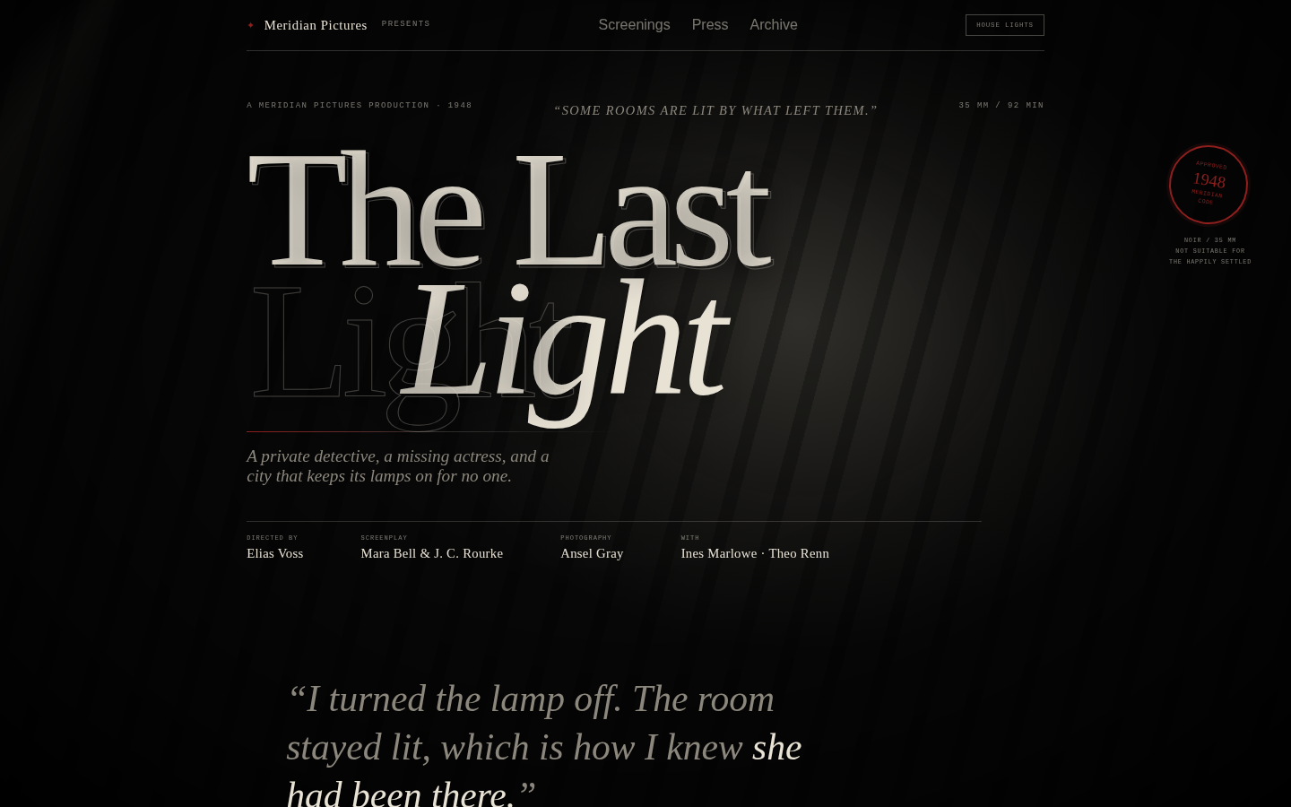
A title card you could project. The composition is built like a frame: strong black margins, one shaft of light, the title placed slightly off-centre, and credits arranged like a studio contract. Texture does the period work — grain, scratches, weave, bloom — without a single image asset. Red appears only in the stamp and the smallest programme marks.
Open
Original prompt
Create a cinematic film-noir title page for a fictional 1948 film called "The Last Light". Almost monochrome: black, smoke grey, bone white and one deep blood red. A huge high-contrast serif title dominates the frame, with "LIGHT" in italic and an outlined ghost duplicate offset behind it. A single warm spotlight rakes across the page and follows the pointer; venetian-blind shadows fall diagonally over the title; film grain, gate weave, and a faint projector flicker animate the whole frame. Include a studio credit, director and cast block, a red certification stamp, a runtime/rating line, and a bottom programme strip with three screening times. A "house lights" button dims the spotlight and toggles a brighter, colder version of the scene. Fully responsive, one standalone HTML file with inline CSS/JS, no external images or fonts.
025-noir-light.txt
026
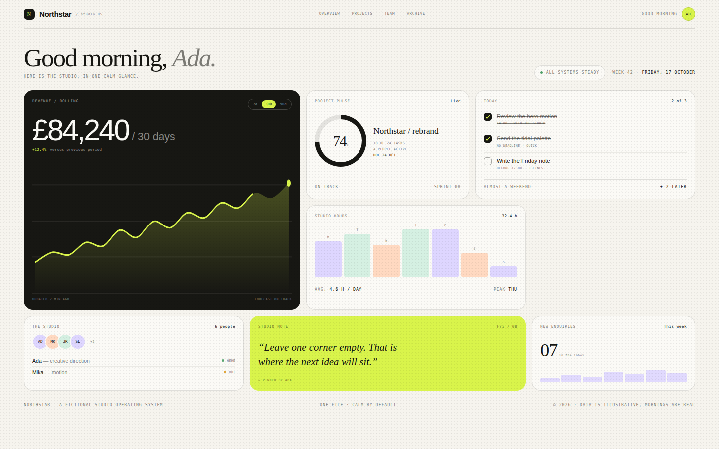
A calm, expensive control room that feels human. Bento is used for hierarchy, not decoration: the revenue card is the anchor, the pulse ring is the heartbeat, tasks and people are the texture. The palette keeps the interface warm and editorial rather than corporate blue. Data is crisp and legible, with just enough motion to feel alive.
Open
Original prompt
Design a light, premium bento-grid dashboard for a fictional design studio called Northstar. Off-white canvas, ink-black type, hairline borders and four soft accent washes — lime, lavender, peach and mint. The header greets the user by name with a large serif line and a date. The grid mixes one large revenue card with an inline SVG area sparkline and a 7d / 30d / 90d switcher, a circular project-pulse card, a checklist card with three real toggles, a weekly bar chart, a team card with initials avatars, and a small studio note. Rounded 18px cards, restrained shadows, generous padding, monospaced labels and one vivid lime highlight. Fully responsive, one standalone HTML file with inline CSS/JS/SVG, no external assets or fonts.
026-bento-metrics.txt
027
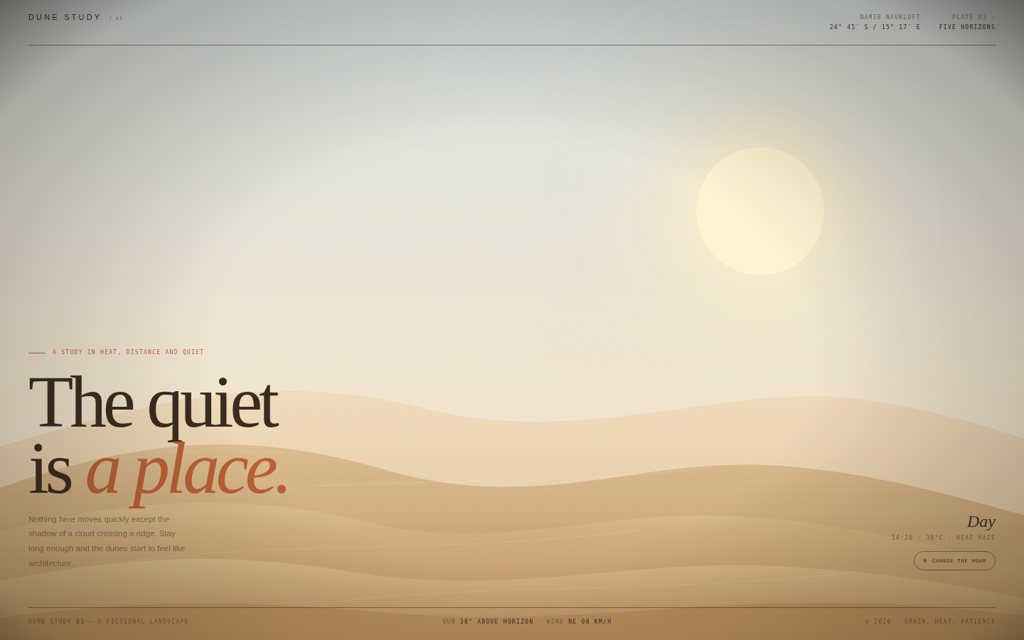
A landscape you can stand in. The page is almost entirely image — but the image is made of gradients and layered vector dunes. The interface is reduced to a single control so the visitor can only do one thing: change the hour and watch the desert reply. The type sits low and small in the frame, like a caption on a large print.
Open
Original prompt
Create an atmospheric full-screen desert study called "Dune Study 03". Five layered dunes, a low sun, a dust haze and a single line of type: "The quiet is a place." The palette shifts between three hours — Day (pale sand, bleached blue sky), Dusk (burnt orange, rose and violet) and Night (indigo, silver sand and a small moon) — via one button. Dunes respond to pointer movement with gentle depth parallax and have soft grain and a dry heat shimmer. Typography: an oversized editorial serif statement in the lower left, a small location label, and a scientific monospaced caption. Include a compact header, a footer strip with coordinates and temperature, and no other interface clutter. Fully responsive, one standalone HTML file with inline CSS/JS/SVG, no external images or fonts.
027-dune-study.txt
028
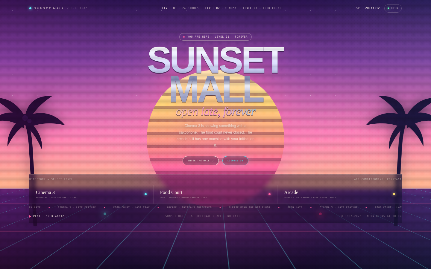
A knowingly artificial paradise, art-directed rather than ironic. The composition is symmetrical and monumental: sun, palms, grid, chrome title, neon storefronts. It should feel like a mall at closing time in a film that was never released. The nostalgia is precise — chrome, grid, VHS, hot pink and cyan — but the typography is contemporary and expensive.
Open
Original prompt
Create a vaporwave mall landing page called "SUNSET MALL", set in a permanent 1987 sunset. A pink-to-violet sky, a huge striped sun, a purple perspective grid floor stretching to the horizon, dark palm silhouettes, chrome display type and magenta/cyan neon. The hero reads "SUNSET MALL" in a polished chrome gradient with an italic serif "open late, forever" underneath. Include a small header with VHS timestamp, a paired CTA ("Enter the mall" and a neon lights toggle), three storefront cards (Cinema 3, Food Court, Arcade) with neon borders, a marquee strip of announcements, and a VHS playback bar. Toggle the neon to dim the scene and reveal a "closed" state. Fully responsive, one standalone HTML file with inline CSS/JS/SVG, no external images or fonts.
028-sunset-mall.txt
029
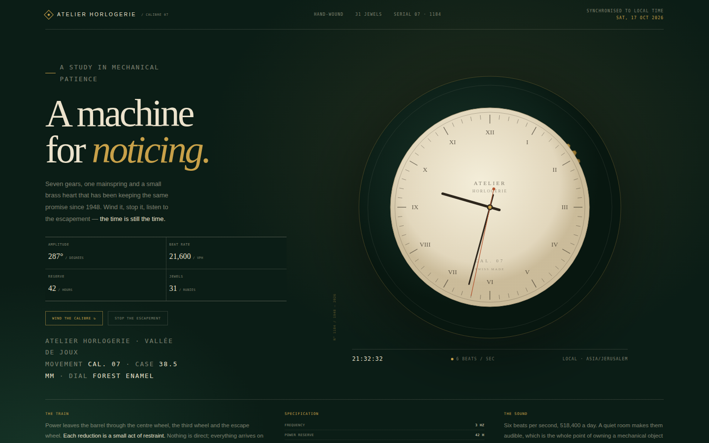
An instrument portrait. The clock is treated like a museum object photographed on green velvet: warm metal against darkness, precise engraving, no decorative noise. The interface disappears into the object. Type is small and exact, except for the editorial statement, which is set in a high-contrast serif and allowed to breathe.
Open
Original prompt
Create an elegant horology study called "Calibre 07". Deep forest-green background, warm brass and ivory, a faint workshop spotlight and a large mechanical clock assembly built entirely in SVG: three interlocking brass gears with visible teeth, a chapter ring with sixty hand-drawn ticks, Roman-hour markers, and hour, minute and second hands showing the real local time. The left column holds the title "A machine for noticing.", a short essay on mechanical time, and small readouts for amplitude, beat and power reserve. Two controls — "Wind" and "Stop the escapement" — let the visitor speed up the gear train or pause it. Include a serial number, a poinçon mark and a quiet footer. Fully responsive, one standalone HTML file with inline CSS/JS/SVG, no external assets.
029-clockwork-study.txt
030
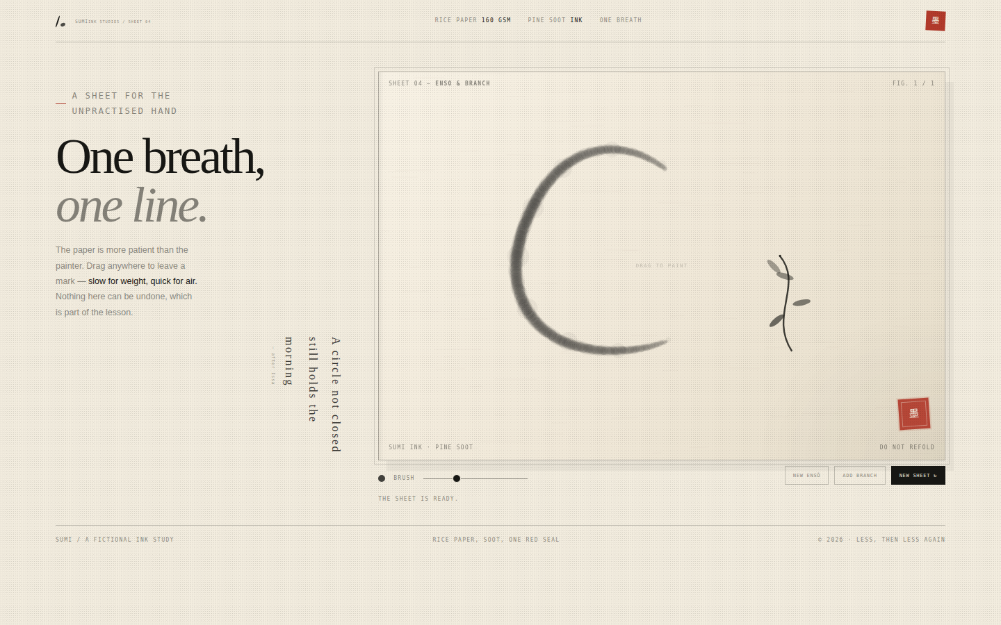
The page is a sheet of paper, not an app. Controls are printed in the margin like instructions on a brush box; the painting takes almost all the room. Black is never pure — it carries warmth and variation. The red seal is the only saturated colour, and it anchors the composition like a signature. Interaction should slow the hand down.
Open
Original prompt
Create a sumi-e ink painting studio called "Sumi — one breath, one line." Warm rice paper, black ink, a single vermilion seal, and generous empty space. The page is a single sheet: a small masthead, a large hand-painted ensō circle and a branch with leaves already on the paper, a vertical haiku, and a red hanko stamp. Visitors can drag anywhere on the paper to paint ink strokes with taper and bleed; a brush-size slider changes the weight, "Enso" paints a fresh circle, and "New sheet" resets to the opening composition. The canvas should feel absorbent — soft edges, tiny splatters, fibres — not like a digital marker. Typography mixes a restrained serif title with vertical Japanese-style text and tiny monospaced notes. Fully responsive, one standalone HTML file with inline CSS/JS, no external images or fonts.
030-ink-breathe.txt
031
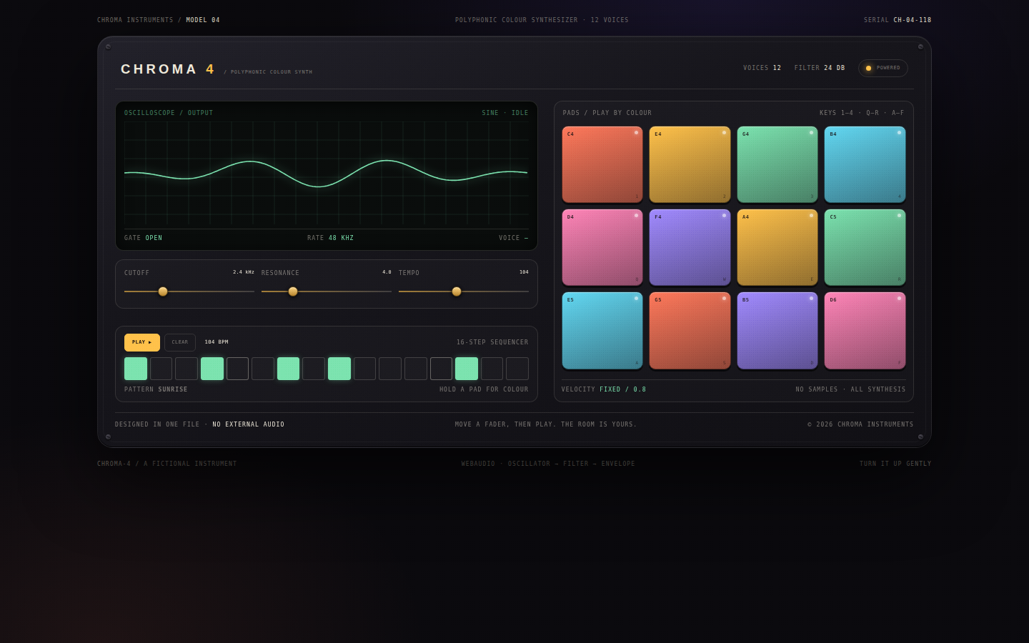
A piece of imaginary hardware you want to touch. The panel is quiet and expensive — no gradients shouting, just warm light, precise labels, tactile shadows and twelve small windows of colour. The synthesizer is real enough to reward curiosity: every pad has a voice, the faders change it, and the sequencer turns the page into a performance.
Open
Original prompt
Create a playable retro-futurist synthesizer called CHROMA-4 inside a luxurious hardware panel. Dark charcoal and brushed graphite, warm ivory labels, and twelve luminous pads in coral, amber, mint, cyan, violet and rose. The layout: a logo header with power LED, a large oscilloscope canvas, three slim hardware faders (cutoff, resonance, tempo), a 4×3 pad grid with note names and keyboard hints, a sixteen-step sequencer strip, transport controls, and small engraved serial numbers. Clicking a pad plays a real synthesized note via WebAudio, lights the pad and animates the scope; the sequencer can run patterns at variable tempo, with a moving playhead. Everything must be usable and beautiful on mobile. Fully responsive, one standalone HTML file with inline CSS/JS, no external libraries, fonts or audio files.
031-chroma-synth.txt
032
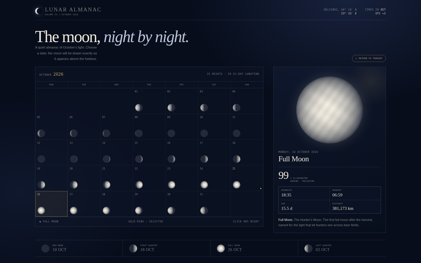
A quiet astronomical object, closer to a printed almanac than a calendar app. The moons do the talking; everything else is thin rules, generous margins and precise small caps. The blue is deep enough to feel like a night sky without becoming a novelty, and gold appears only on the selected day and the full-moon marker.
Open
Original prompt
Create an elegant lunar almanac for October 2026. Deep midnight-blue paper with a faint star field, ivory type, silver moons and a single antique-gold accent. The layout is a large seven-column calendar whose day cells contain real moon-phase drawings, paired with a detail panel showing a big rendered moon, its name, illumination percentage, moonrise and moonset, and a short note. Below, a row of four principal phases (new, first quarter, full, last quarter) with dates. The moon must be rendered from actual lunar phase maths on canvases — a shaded sphere with a terminator, not a flat icon — and clicking any day redraws the large moon and updates the data. Include a "Return to tonight" control and an almanac header with location and coordinates. Fully responsive, one standalone HTML file with inline CSS/JS, no external images or fonts.
032-lunar-almanac.txt
033
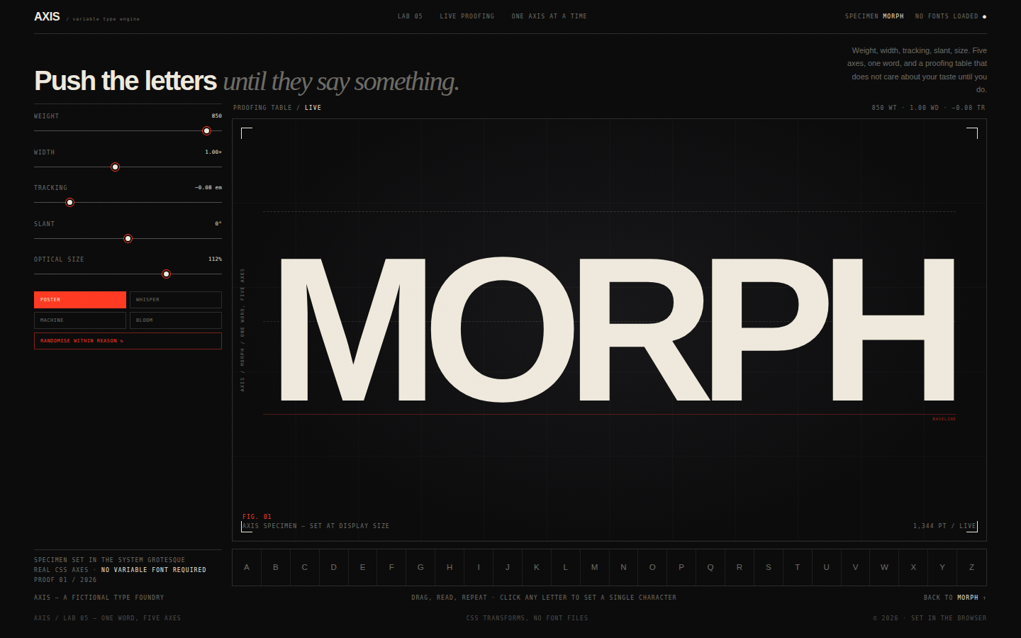
A working proofing table rather than a marketing page. The word is the object under inspection; the controls are instruments; the grid and crop marks make the page feel like a print workshop after hours. The black stage makes every adjustment dramatic. Red is used for measurements and active controls, never for decoration.
Open
Original prompt
Create "AXIS", a variable-type playground with the energy of a type foundry lab. Near-black background, warm cream type and a single hot-red accent, with fine grid lines and monospaced instrumentation. The hero is an enormous word — "MORPH" — whose weight, width, letter-spacing, slant and optical size can be changed live with five hardware-style sliders. A control rail on the left includes the sliders, numeric readouts, four preset buttons (Poster, Whisper, Machine, Bloom) and a randomise button. The bottom strip contains a scrollable alphabet and a small essay about variable type. All type transformations must be real CSS (font-weight, scaleX, letter-spacing, skew, font-size), and the stage should show crop marks and baseline guides like a proofing table. Fully responsive, one standalone HTML file with inline CSS/JS, no external fonts or assets.
033-axis-type.txt
034
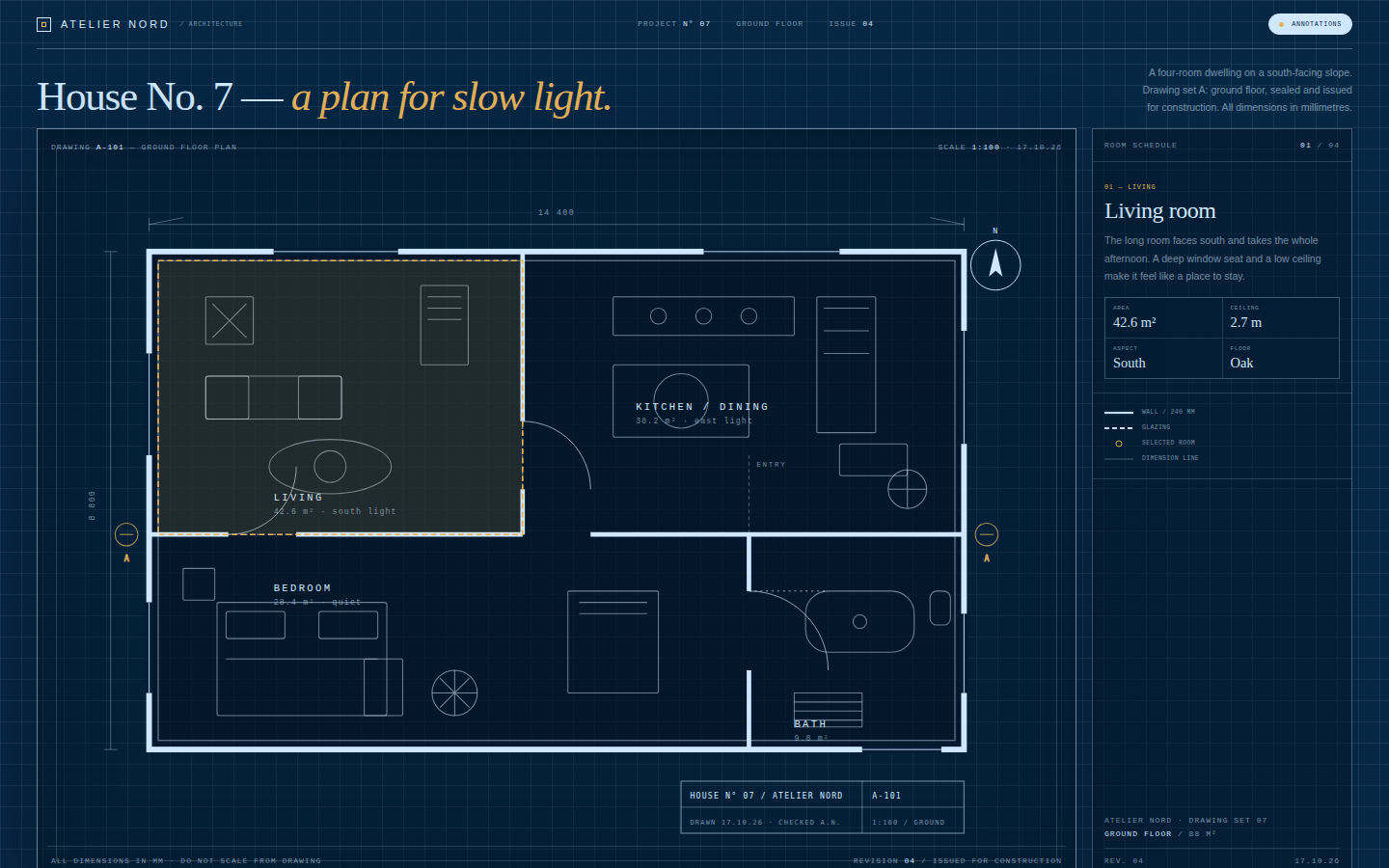
A drawing, not an illustration of a drawing. Every line has a drafting purpose: wall poché, dimension chains, swing arcs, section markers, hatch. The blueprint blue is deep enough to feel like a cyanotype; white lines glow faintly; a single warm ochre marks the selected room. The interface behaves like a drawing set cover sheet — quiet, technical, exact.
Open
Original prompt
Create an architectural blueprint page for a fictional modernist house, "House No. 7". Deep blueprint blue paper, pale cyan-white linework, a faint drafting grid, dimension lines with arrowheads, door swings, furniture outlines, a north arrow and a proper title block. The grounded floor plan is the hero, drawn as one clean inline SVG, with four rooms overlaid as interactive hotspots. A slim right-hand specification panel shows the selected room's name, area, ceiling height and a short note, plus a legend for walls, glazing and joinery. A "Show annotations" toggle hides and reveals dimensions, room labels and furniture notes. Include an editorial masthead with project number, scale and revision date. Fully responsive, one standalone HTML file with inline CSS/JS/SVG, no external assets.
034-blueprint-house.txt
035
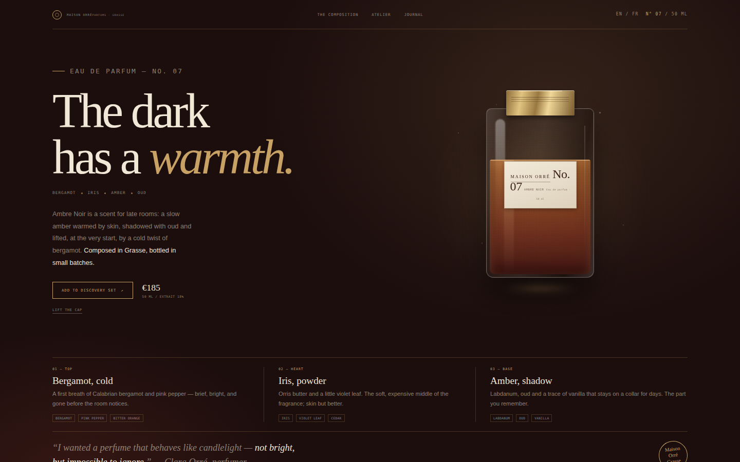
Quiet luxury, not gloss. The page is mostly darkness and one warm pool of light; the bottle is the single bright object, built from gradients rather than a photograph. Type is the other luxury material: a large serif with tight, confident spacing, tiny tracked sans labels, and gold used as a line, never as a fill.
Open
Original prompt
Create a luxury perfume landing page for a fictional house, Maison Orré, presenting "Ambre Noir No. 07". The palette is warm near-black burgundy, antique gold and ivory; the mood is a dim atelier at dusk, lit by one low lamp. The left column carries a small house mark, the fragrance name in an oversized high-contrast serif ("The dark has a warmth."), a note line (bergamot, iris, amber), and a quiet price and CTA. The right side holds a CSS-built glass bottle — amber liquid, gold cap, cream label, edge highlights and a soft reflection — that tilts with the pointer. Clicking "Lift the cap" raises the cap to reveal the atomiser. Below, a three-part composition of top, heart and base notes and a short perfumer's note. Fully responsive, one standalone HTML file with inline CSS/JS, no external images or fonts.
035-ambre-noir.txt
036
A scientific instrument with a poetic title. The rings are precise, not psychedelic: thin, luminous, mathematically spaced, with occasional interference. The interface sits at the edges like lab equipment, leaving the centre to the phenomenon. Colour is used to encode frequency, so the sculpture changes hue as the slider moves.
Open
Original prompt
Create a full-screen generative sound sculpture called "Resonance". A near-black teal space, concentric rings of cyan, violet and magenta expanding from the pointer, a faint central waveform, and huge editorial type at the edges: "Everything is a wave." The interface is minimal — a small masthead, a bottom control tray with an "Emit" button, a frequency slider, a sound-on toggle and a live readout of hertz and amplitude. Clicking or tapping emits a visible ring and, only if sound is enabled, a soft synthesized tone. Rings drift, interfere and fade like ripples on dark water. The page should feel like an instrument for looking at sound. Fully responsive, one standalone HTML file with inline CSS/JS, no external audio or images.
036-resonance-rings.txt
037
Handcraft over spectacle. The scene should feel assembled on a kitchen table from coloured card: imperfect edges, layered shadows, a little too much charm. The palette is muted and natural by day, deep blue-green and amber by night. Typography is a friendly serif with small monospaced captions, like a label on the back of a diorama.
Open
Original prompt
Create a charming layered paper-cut diorama called "Paper Field". A framed miniature landscape sits on a warm paper background: a pale sky with cut-paper clouds, distant mountains, rolling hills, tiny firs, a cottage with a curl of smoke, and a foreground meadow — each layer a solid paper colour with a soft cut shadow. The left column carries the title "A small world, cut from paper.", a short note and two controls: "Fold the light" (day/night) and "Send a bird". At night the sky deepens, windows glow, stars and fireflies appear, and the scene becomes a lantern. Moving the pointer shifts the layers at different depths. Fully responsive, one standalone HTML file with inline CSS/JS/SVG, no external images or fonts.
037-paper-diorama.txt
038
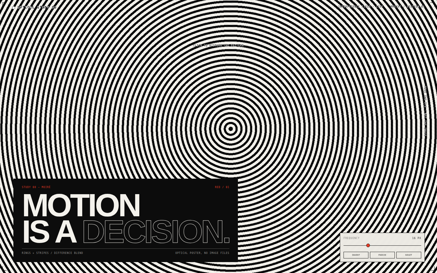
Optical, not decorative. The page is an experiment in interference: two simple patterns become complex only through their relationship. Typography is treated as another hard-edged shape, pinned to the lower left with no softness. Red is used exactly once, as a printer's mark would be.
Open
Original prompt
Create a bold op-art interactive poster called "Optical Study 08". A white field of concentric black rings sits under a second layer of fine black stripes set at an angle with difference blending, producing moiré interference. A huge black-and-white typographic block in the lower left reads "MOTION IS A DECISION." in tight grotesque capitals, with a single red index label. Moving the pointer warps and rotates the pattern; a frequency slider changes the ring spacing, an invert button flips the field, and a freeze button stops the slow rotation. The composition should feel like a 1960s kinetic poster redesigned for a screen. Fully responsive, one standalone HTML file with inline CSS/JS, no external images or fonts.
038-optical-motion.txt
039
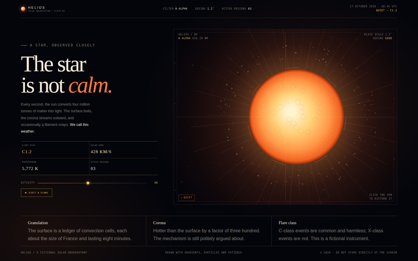
Awe with instrumentation. The sun is not a flat circle but a volatile surface seen through a filter: granulation, limb darkening, prominences, a restless corona. The page frames it like an observatory plate, with measurement marks and calm type holding the chaos in place. Heat is the whole colour story.
Open
Original prompt
Create a dramatic solar observation page called "Helios". On a deep near-black field, a living sun burns: a bright core, orange limb, flickering granulation, arcs of plasma and a corona of fine rays, with particles orbiting and occasionally escaping. The left column carries an editorial statement "The star is not calm." in a high-contrast serif, a short text about solar weather, four live readouts (X-ray class, solar wind, temperature, active regions), an "Activity" slider and an "Eject a flare" button. Clicking the sun triggers a coronal ejection with a shockwave ring and bright particles. The palette is black, ember orange, gold and bone; typography mixes serif display with precise monospaced telemetry. Fully responsive, one standalone HTML file with inline CSS/JS, no external images or fonts.
039-solar-flare.txt
040
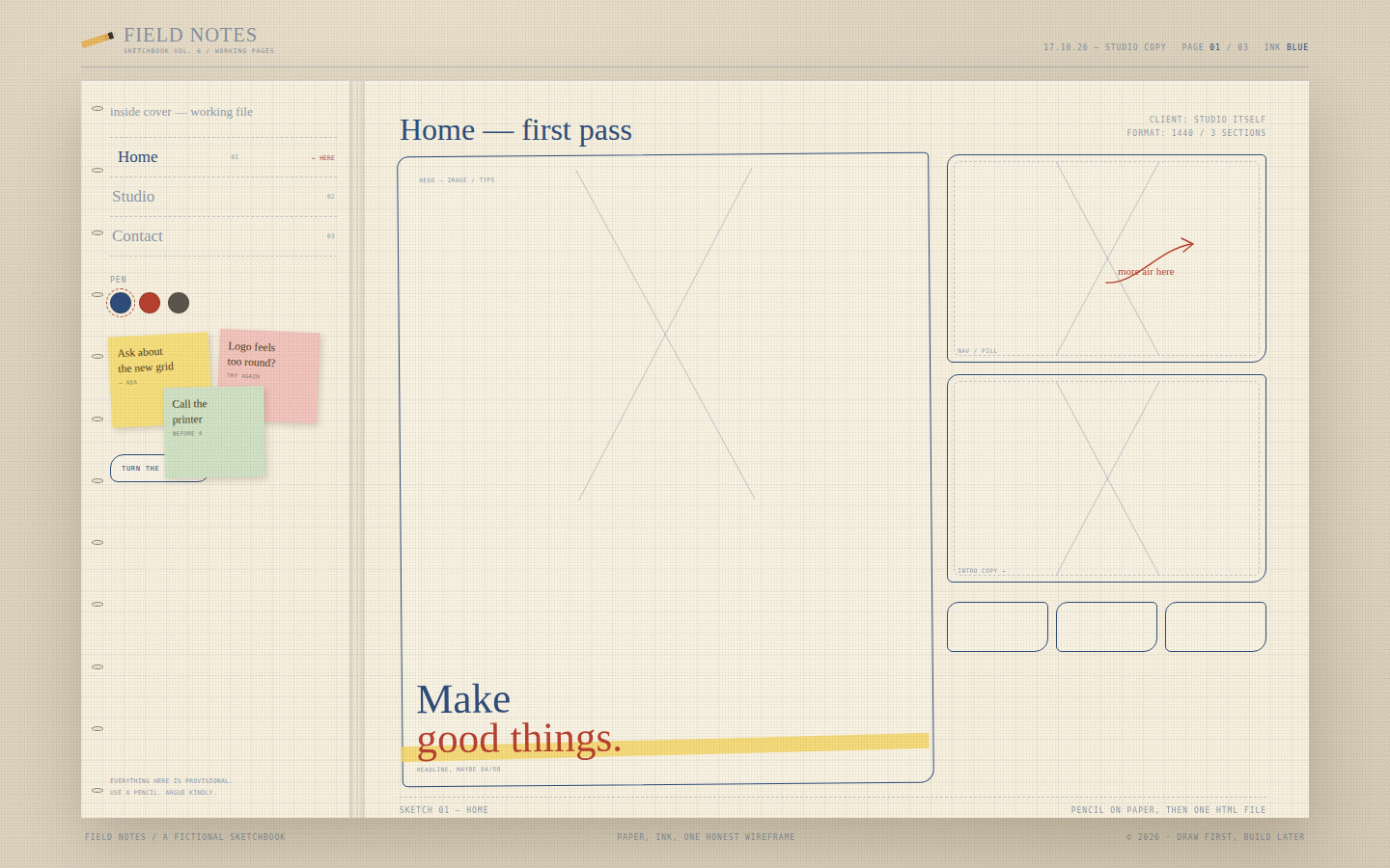
The charm is in the imperfections: lines that do not quite meet, boxes that lean, arrows with too much personality. The palette is paper, blue ballpoint, red pencil, graphite and a single yellow highlighter. The layout is a real spread with a spine, and the interactivity is small and tactile — tabs, pens, notes, a page turn.
Open
Original prompt
Create a playful hand-drawn sketchbook page for a fictional design practice, "Field Notes, vol. 6". A warm paper spread with a faint blue grid, spiral binding, wobbly pencil borders, highlighter marks, sticky notes and annotation arrows. The left page is an inside cover with three tabs (Home, Studio, Contact), a row of pen-colour swatches, a "Turn the page" button and three draggable sticky notes. The right page shows a different low-fidelity wireframe for each tab: a hero with a big X-box and scribbled headline, a studio page with a portrait doodle and team boxes, and a contact page with an envelope and form fields. Everything should look drawn by a confident hand, not generated by a UI kit. Fully responsive, one standalone HTML file with inline CSS/JS/SVG, no external images or fonts.
040-sketchbook-pages.txt
041
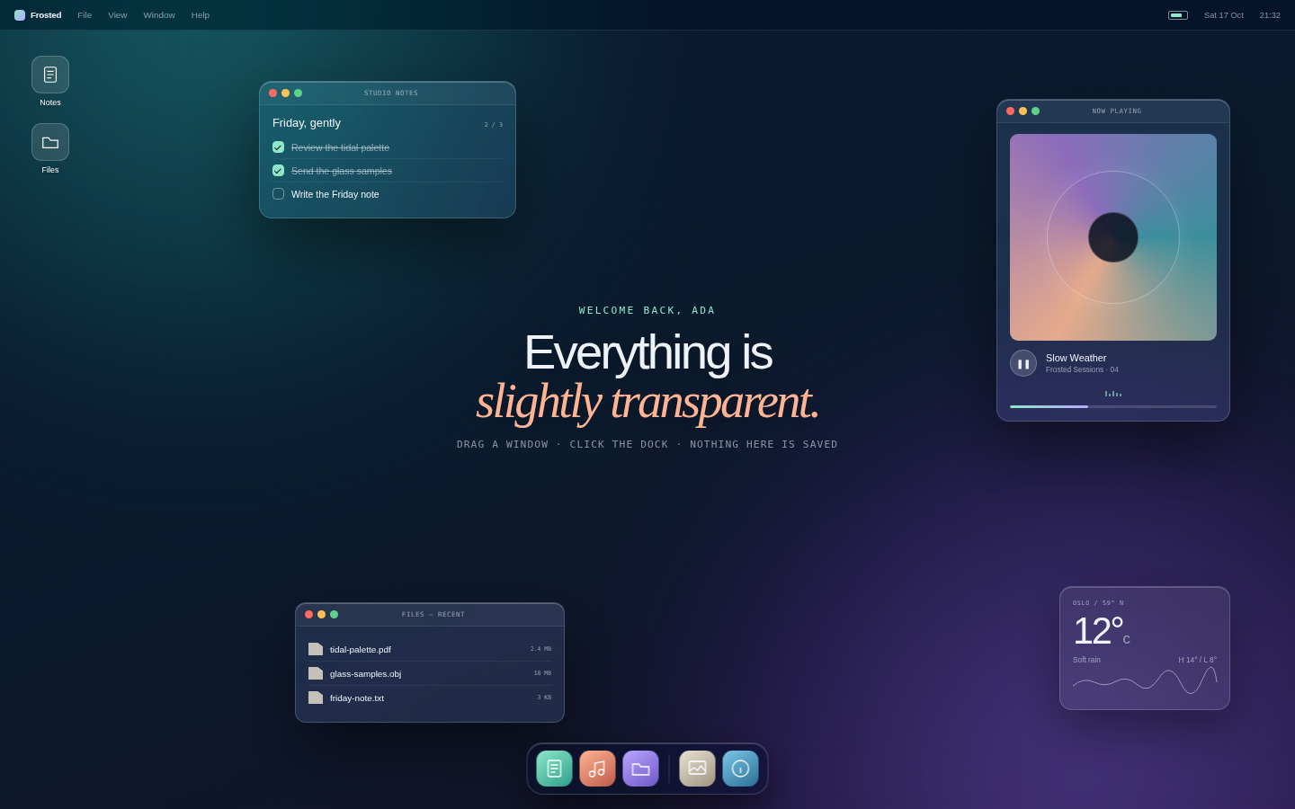
A desktop you want to live in for five minutes. It should feel like a real operating system designed by a glass artist: quiet chrome, luminous wallpaper, soft depth. The interaction model is familiar enough to be immediately understood, but every surface is more beautiful than it needs to be.
Open
Original prompt
Create a fictional desktop operating system called "Frosted" living inside one HTML page. A deep aurora wallpaper, a translucent glass menu bar, three draggable windows, a weather widget, desktop icons and a magnifying dock. The windows are Studio Notes (a checklist), Now Playing (an abstract album cover, progress bar and controls) and a compact Files window. All surfaces use frosted glass with thin borders and inner highlights; the palette is midnight blue with mint, peach and lilac accents. Clicking dock icons opens, focuses or minimises windows; windows can be dragged by their title bars and brought to the front. The clock is live, the wallpaper can shuffle between three aurora schemes, and a small toast confirms actions. Fully responsive, one standalone HTML file with inline CSS/JS, no external assets.
041-frosted-os.txt
042
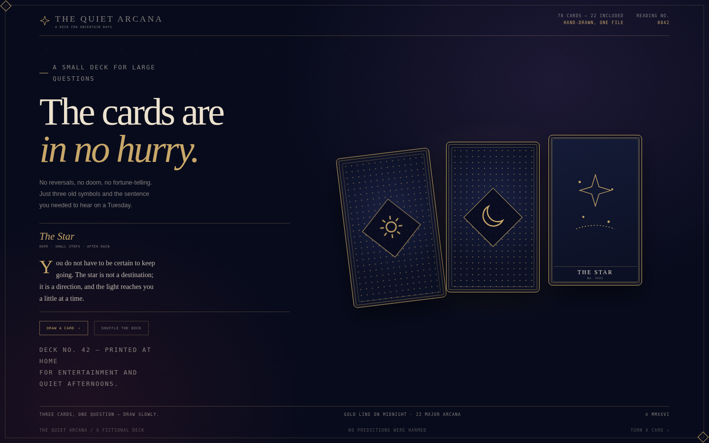
Mystical without theatre. The page should feel like a small, well-made object: heavy paper, gold foil, a quiet room. The illustrations are line engravings, not fantasy paintings, and the readings are written like gentle advice rather than prophecy. Motion is slow and deliberate, like turning a card over on a table.
Open
Original prompt
Create an elegant tarot experience called "The Quiet Arcana". Midnight-blue room, antique gold linework, cream type and a muted wine accent. The left column holds a high-serif title "The cards are in no hurry.", a short invitation, a live reading panel and two actions: Draw a card and Shuffle. The right side holds three large tarot cards fanned across the space, each with an ornate navy-and-gold back and a hand-drawn face for The Sun, The Moon or The Star. Clicking a card flips it in 3D and updates the reading; Draw chooses one at random, Shuffle nudges all three. Add a gold rule frame, small constellation marks, a deck number and a footer. Fully responsive, one standalone HTML file with inline CSS/JS/SVG, no external fonts or images.
042-quiet-arcana.txt
043
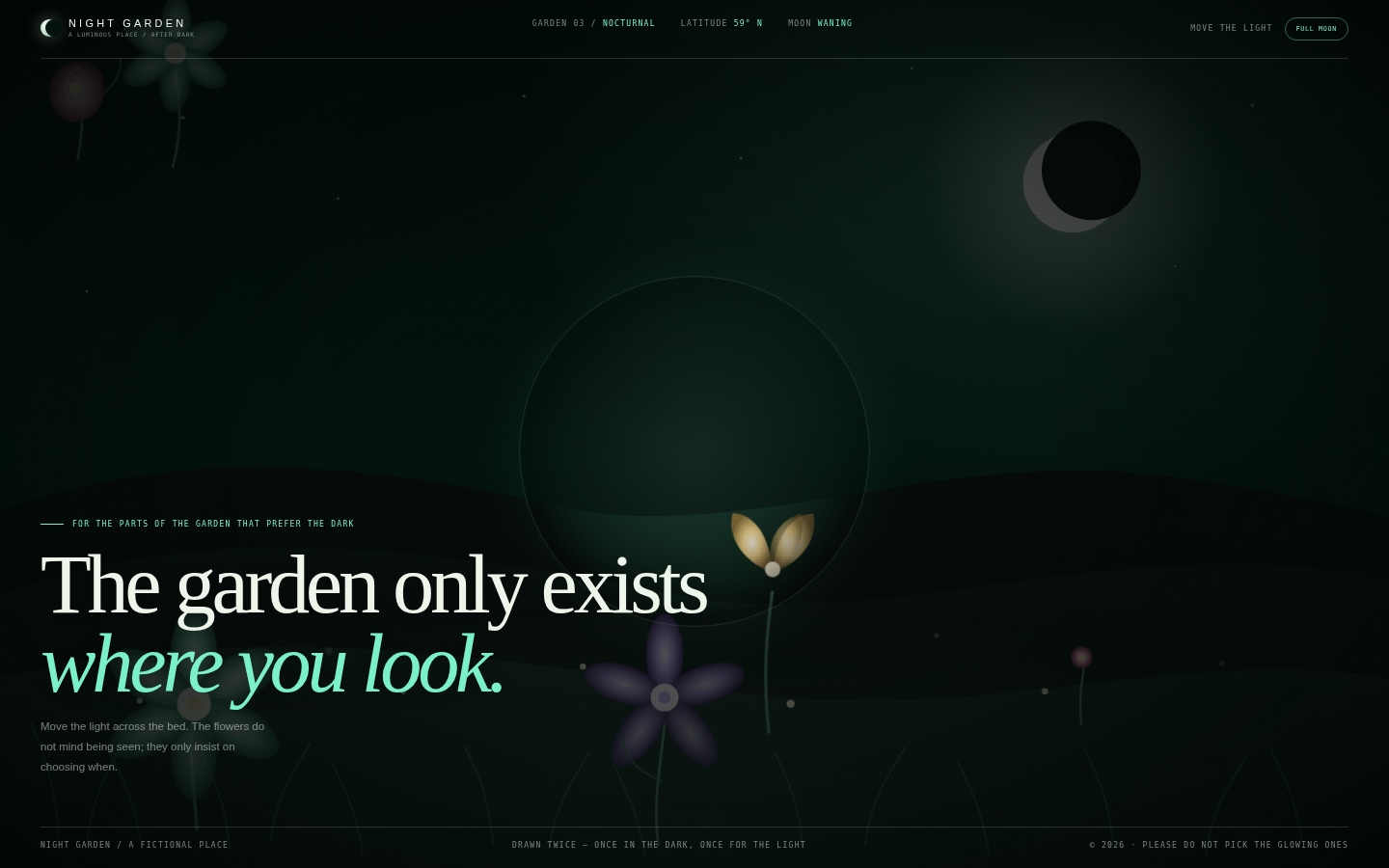
A page that rewards moving the pointer. The darkness is not empty — it holds a complete garden, but only the part under the light is allowed to be bright. The illustration should feel like a contemporary botanical engraving coloured with bioluminescent ink: strange shapes, fine stems, a moon that looks borrowed from a dream.
Open
Original prompt
Create an atmospheric "Night Garden" — a dark, enchanted botanical scene that is only fully visible inside a soft circle of light following the cursor. A near-black green backdrop with a low luminous moon, layered hills, tall grasses, strange luminous flowers and drifting fireflies. The whole illustration is drawn inline in SVG and shown twice: a dim base layer and a vivid layer revealed through a radial mask. Large serif type sits low in the frame: "The garden only exists where you look." A slim masthead and a single "Full moon" toggle that widens the light complete the interface. Fully responsive, one standalone HTML file with inline CSS/JS/SVG, no external images or fonts.
043-night-garden.txt
044
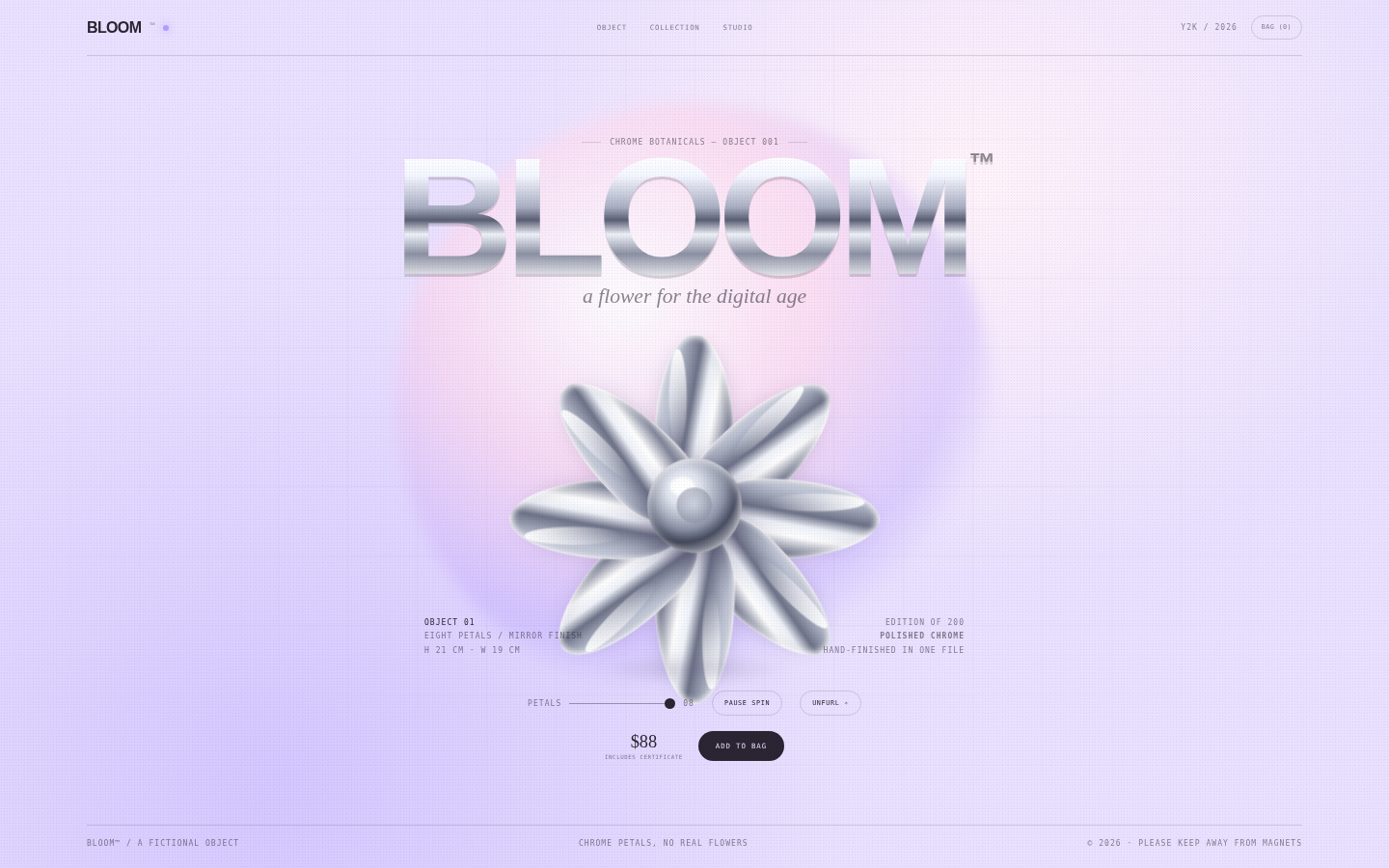
Optimistic futurism, not irony. The early-2000s references are refined: chrome, lilac, bubble type, tiny technical labels, a flower that looks machined and impossible. The page is bright and airy, with the flower as a single precious object on a clean plinth rather than a busy collage.
Open
Original prompt
Create a Y2K-inspired product page for a fictional chrome flower called BLOOM™. Soft lilac studio background, a large iridescent gradient orb, faint grid lines, and an eight-petal chrome flower sculpture at the centre. Petals are CSS shapes with polished metallic gradients, a dark edge and a specular highlight; the flower rotates slowly and tilts with the pointer. A huge chrome wordmark "BLOOM" sits behind/above it, with bubble-like supporting text, tiny Y2K interface labels and generous white space. Include a petal-count slider, a spin toggle and an "Unfurl" button that briefly opens the flower and releases sparkles, plus a price and a small collection note. Fully responsive, one standalone HTML file with inline CSS/JS, no external images or fonts.
044-chrome-bloom.txt
045
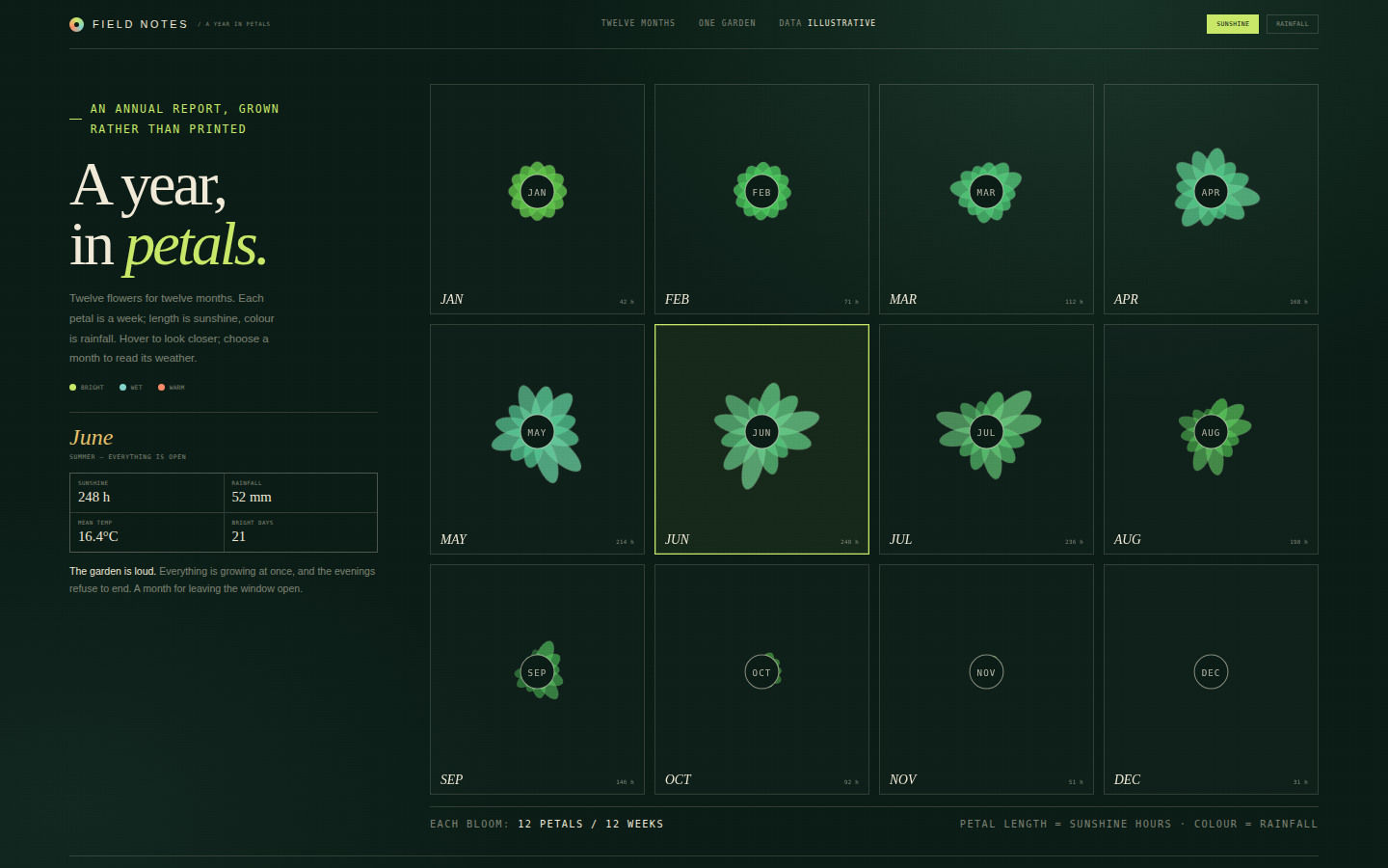
Data with a pulse. The flowers are legitimate little charts — twelve petals for twelve weeks — not decoration, and the seasonal note gives each month a voice. The composition is a wall of blooms seen from above, like a botanical field guide crossed with an annual report. The dark green ground makes chartreuse and coral feel alive.
Open
Original prompt
Create an editorial data-art page called "A Year in Petals" that charts a fictional year of weather as twelve radial flower diagrams. Deep ink-green background, warm cream text, chartreuse, coral and pale sky-blue. A left column holds the title "A year, in petals.", a short explanation and a selected-month panel with rainfall, sunshine, mean temperature and a one-line seasonal note. The right side is a 4×3 grid of flowers, one per month; each flower has twelve petals whose lengths encode weekly sunshine and whose colours shift with rainfall. A Sunshine / Rainfall toggle remaps the petal lengths, hovering enlarges a flower, and clicking selects it and updates the panel. Fully responsive, one standalone HTML file with inline CSS/JS/SVG, no external libraries or fonts.
045-data-bloom.txt
046
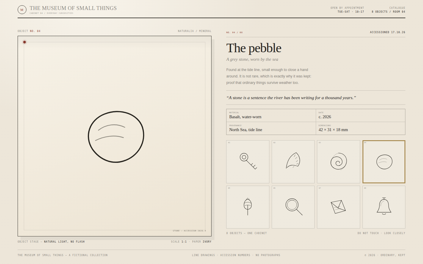
Craft and restraint. Every object is a simple line drawing with a single accent colour, presented like a specimen on paper. The page should feel like a cabinet you are allowed to open — quiet, dusty, precise, and full of small stories. Typography is a high-contrast serif with monospaced catalogue data.
Open
Original prompt
Create a refined digital cabinet of curiosities called "The Museum of Small Things". Warm museum ivory, deep ink, oxblood and brass; the aesthetic of a quiet natural-history museum with beautiful labels. The layout is a large object stage on the left and a 2×4 cabinet grid on the right. Eight small objects are drawn as fine inline SVG line illustrations — a key, a feather, a shell, a pebble, a seed pod, a lens, a folded letter and a small bell. Hovering an object lifts it; clicking places a large version in the stage and updates a catalogue panel with name, date, material, provenance and a short note. Include a museum masthead, catalogue number, accession stamps and a footer. Fully responsive, one standalone HTML file with inline CSS/JS/SVG, no external images or fonts.
046-small-things.txt
047
A portfolio for someone who lives in a code editor, built with the same care as a magazine. The interface is convincing but more beautiful than any real IDE: generous line height, a calm colour system, a soft outer glow and a terminal with personality. The code itself is the copy — reading it should tell you who this person is.
Open
Original prompt
Create a developer portfolio designed as a modern code editor. A dark IDE window fills the page: mac-style window chrome, a file explorer with four files, tabs, a line-numbered gutter and syntax-highlighted source code that tells the story. Files include about.ts, projects.tsx, contact.json and readme.md; clicking a tab or file loads its code with a short typing reveal. A terminal panel at the bottom responds to a "Run" button, printing a playful output, and the status bar shows branch, language and a live clock. Palette: editor graphite, soft off-white text, violet keywords, green strings, amber numbers and a single coral accent. Fully responsive, one standalone HTML file with inline CSS/JS, no external fonts or libraries.
047-syntax-portfolio.txt
048
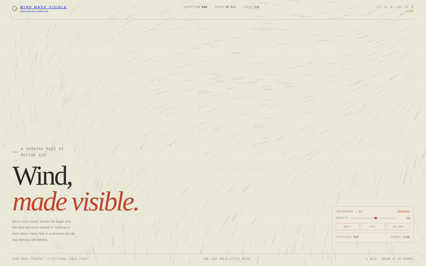
A drawing made by physics. The page looks like a meteorological plate from a design annual: cream paper, graphite ink, a single red trace. The field is dense but never noisy; lines fade in and out so the surface feels continuously drawn rather than animated. Interface controls are small, monospaced and precise, allowing the artwork to occupy almost the whole page.
Open
Original prompt
Create an interactive flow-field artwork called "Wind Made Visible". Warm paper background, fine ink lines, one vermilion accent, and a scientific-instrument interface at the edges. Thousands of short line segments trace a continuously evolving vector field, accumulating into silky wind currents across the page. Moving the pointer bends the field around it; "Gust" briefly increases the wind speed; a density slider adds or removes particles; "Still" pauses the motion. Large editorial serif type sits in the lower left: "Wind, made visible." with a short caption and coordinates. Fully responsive, one standalone HTML file with inline CSS/JS, no external images or fonts.
048-wind-field.txt
049
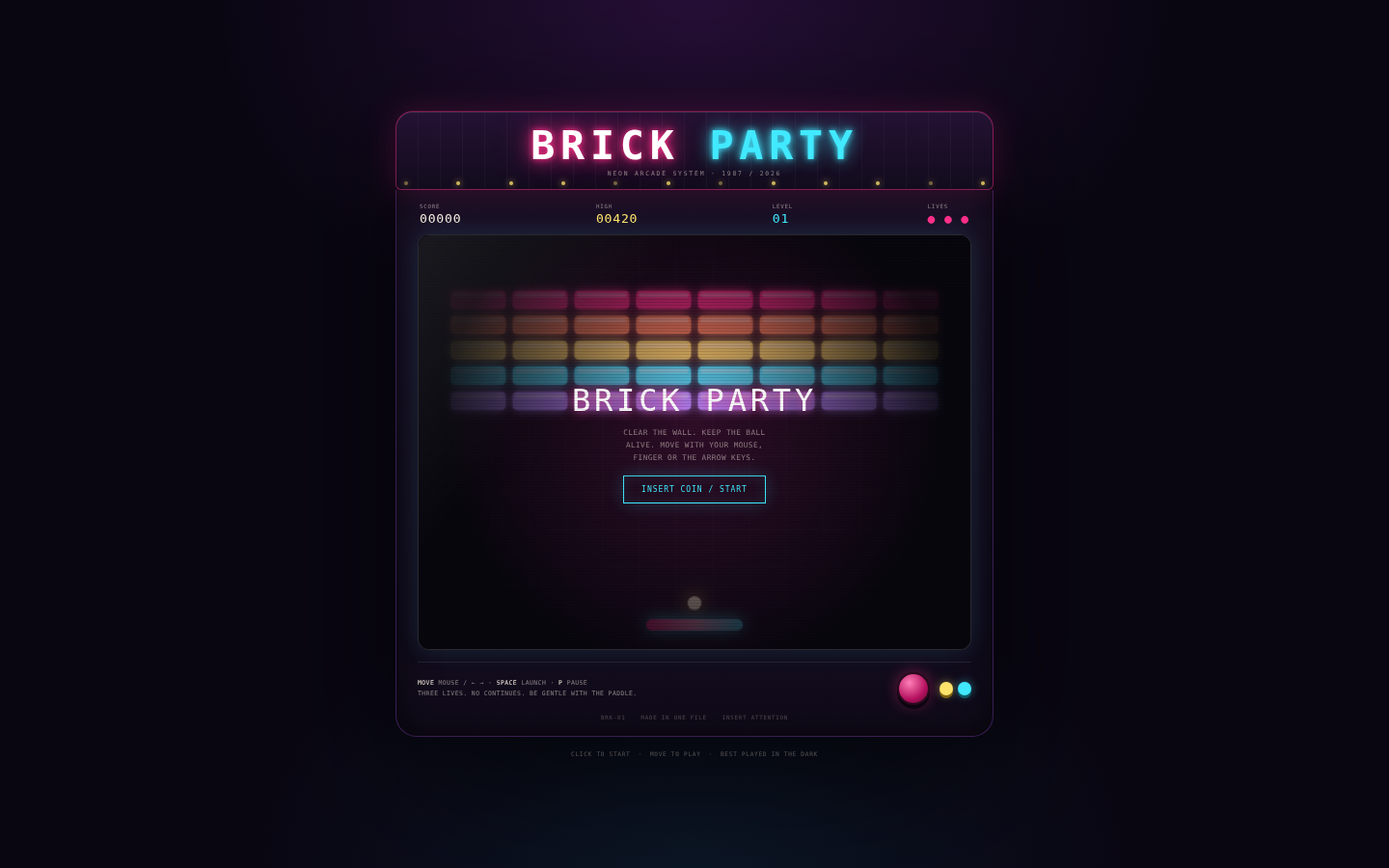
The cabinet is the artwork: an object you would find in the corner of a very stylish bar, glowing after midnight. The game is simple and responsive, with tactile neon bricks, a chrome-ish paddle and an addictive loop. Nostalgia is handled with restraint — pixel type, scanlines and glow, but a refined palette and clean layout.
Open
Original prompt
Create a playable neon brick-breaker game presented as a beautiful retro arcade cabinet called "BRICK PARTY". Dark arcade room, magenta and cyan neon, a marquee with chunky pixel-inspired lettering, a glass screen with scanlines, a scoreboard, and a small control panel with instructions. The game itself is complete and playable: a paddle, a ball, five rows of coloured bricks, score, three lives, win and lose overlays, and a start/restart button. Move with the mouse, touch or arrow keys. Add glowing particles when bricks break and a subtle screen shake. Fully responsive, one standalone HTML file with inline CSS/JS, no external images, fonts or libraries.
049-brick-party.txt
050
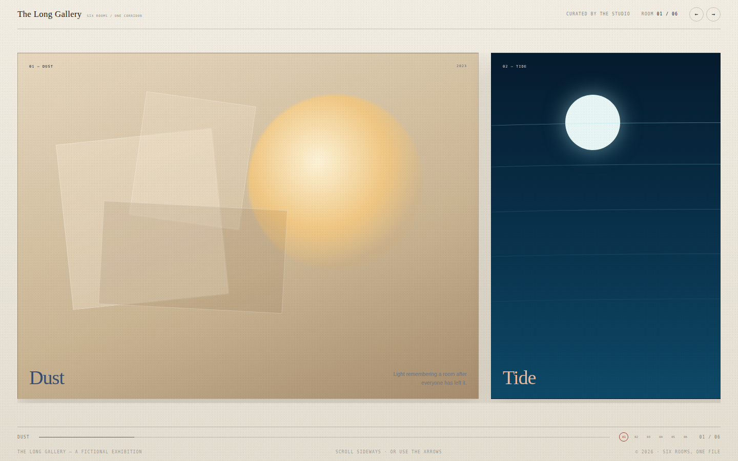
An exhibition experienced as a walk. Each room is a different visual temperature, and the transition between them is part of the composition. The interface stays at the edges like gallery wayfinding: thin rules, small numbered labels, a progress line. The panels should feel like large prints, not slides.
Open
Original prompt
Create a horizontal-scrolling gallery called "The Long Gallery", composed of six full-height art panels arranged along one long corridor. Each panel is a distinct abstract artwork made only from CSS: Dust (warm beige, a blurred sun, floating translucent planes), Tide (deep blue layered wave lines), Fold (off-white paper polygons with hard shadows), Signal (black with vertical neon bars), Bloom (crimson and pink radial petals) and Return (cream with a glowing arched doorway). Every panel carries a number, title, year and a short curator's note. A slim header shows the gallery name and current room count; arrow buttons and dots navigate; the page scrolls horizontally with snap, or via buttons and keyboard arrows. Fully responsive, one standalone HTML file with inline CSS/JS, no external images or fonts.
050-long-gallery.txt
051
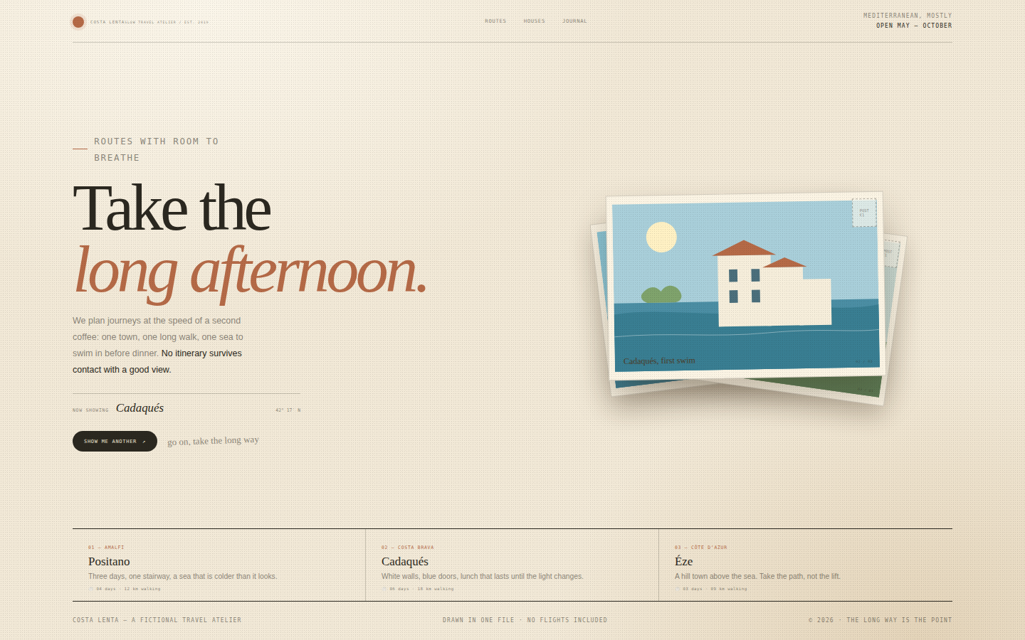
Slow travel as an editorial object. The page should feel like a postcard found in a book: warm, sun-faded, lightly worn, handwritten. The illustrations are flat and graphic — white walls, one blue sea, a single sun — rather than photographic. Typography is a generous serif with small monospaced travel data and just enough handwriting to feel personal.
Open
Original prompt
Create a sun-bleached travel-studio landing page called "Costa Lenta", a fictional slow-travel atelier on the Mediterranean. Warm paper cream, olive green, terracotta, sea blue and ink. The hero pairs an oversized serif headline "Take the long afternoon." with a stack of three illustrated postcards: whitewashed houses above a blue bay, a table of lemons and olives, and a quiet swimming cove. Clicking a postcard brings it to the front, updates the destination caption and shifts the page's accent colour. Include a small itinerary strip with three stops, handwritten annotations, a postage stamp, and a footer. Fully responsive, one standalone HTML file with inline CSS/JS/SVG, no external images or fonts.
051-costa-lenta.txt
052
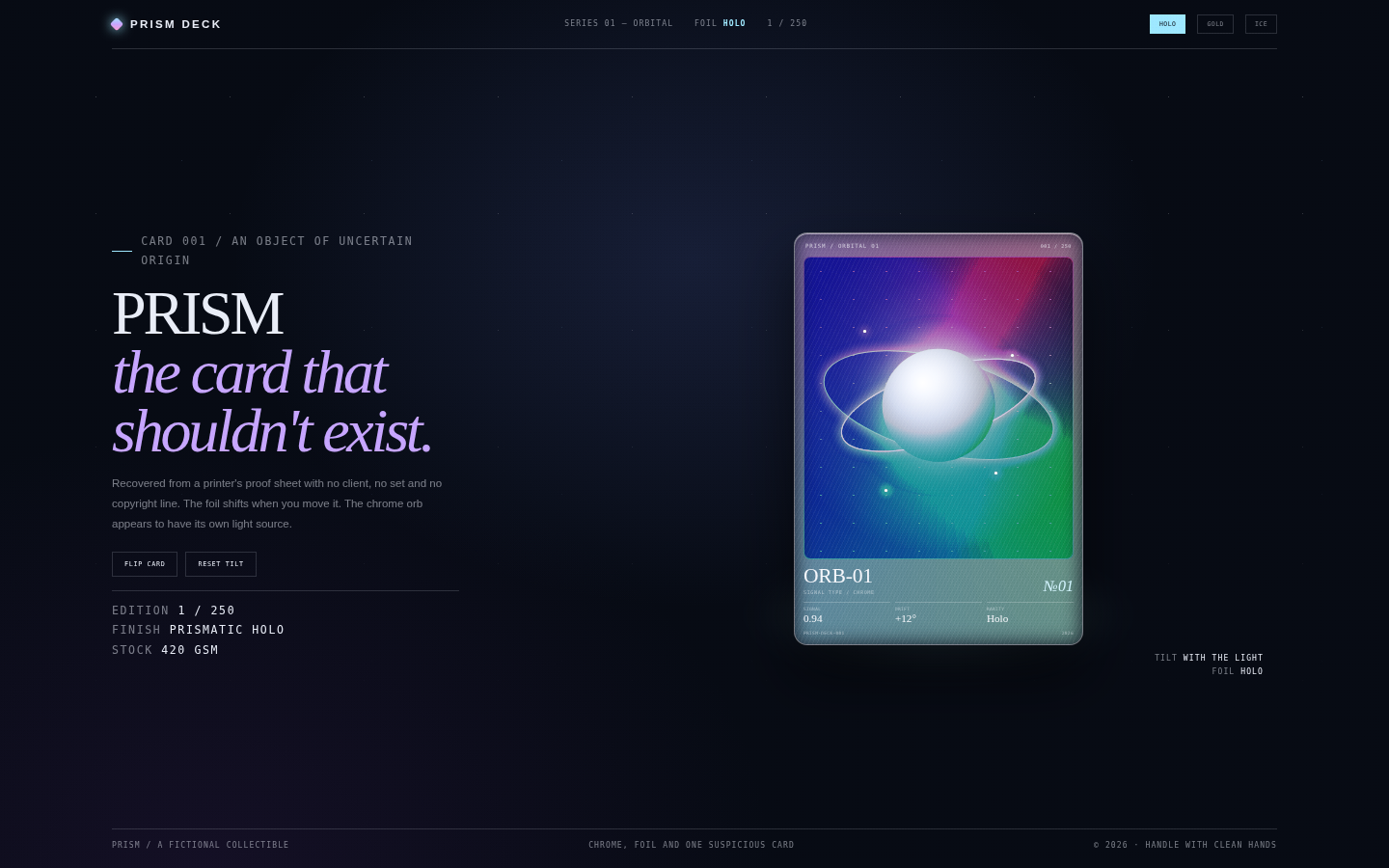
Collectible culture treated as an art object. The card is the hero and must look expensive: foil that shifts, clean printing, a chrome planet rendered in gradients, immaculate microtype. The room around it is dark and instrumental, making the card feel lit from within. Rarity changes are subtle and material, not confetti.
Open
Original prompt
Create a holographic trading-card showcase called "PRISM". Deep blue-black room, faint grid and stars, one 300×430 collectible card floating at the centre with a rainbow foil surface, chrome orb artwork, tiny serial typography, stat bars and a holographic glare that follows the pointer. The card tilts in 3D as the cursor moves and flips to a matte back with specs, a barcode and a manifesto line. Around it, editorial fragments: "PRISM / the card that shouldn't exist", a rarity selector (Holo / Gold / Ice) that changes the foil palette, a Flip button, and small technical captions. Fully responsive, one standalone HTML file with inline CSS/JS, no external images or fonts.
052-prism-card.txt
053
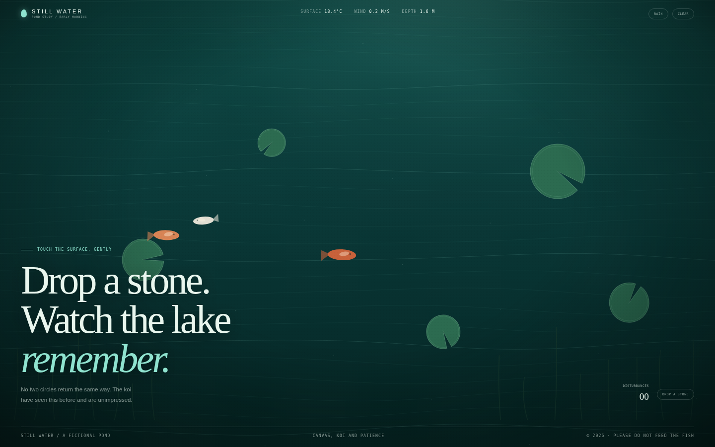
A digital pond that behaves like a real one: quiet, reflective, responsive to touch but never busy. The water is painted from gradients and sine lines rather than photographed, and the koi and lily pads are simple, confident shapes. Typography is calm and large, placed at the edges so the surface remains the subject. The interface is almost apologetic for existing.
Open
Original prompt
Create a serene interactive pond called "Still Water". A full-screen canvas of deep teal water with soft caustic light, lily pads, three slow koi and reed silhouettes. Clicking or dragging the water sends out concentric ripples; a "Rain" toggle adds gentle random droplets; a ripple counter tracks disturbances. Large editorial serif type sits low in the frame: "Drop a stone. Watch the lake remember." with a small scientific caption and controls in cream and pale aqua. The mood is early morning, no wind. Fully responsive, one standalone HTML file with inline CSS/JS, no external images or fonts.
053-still-water.txt
054
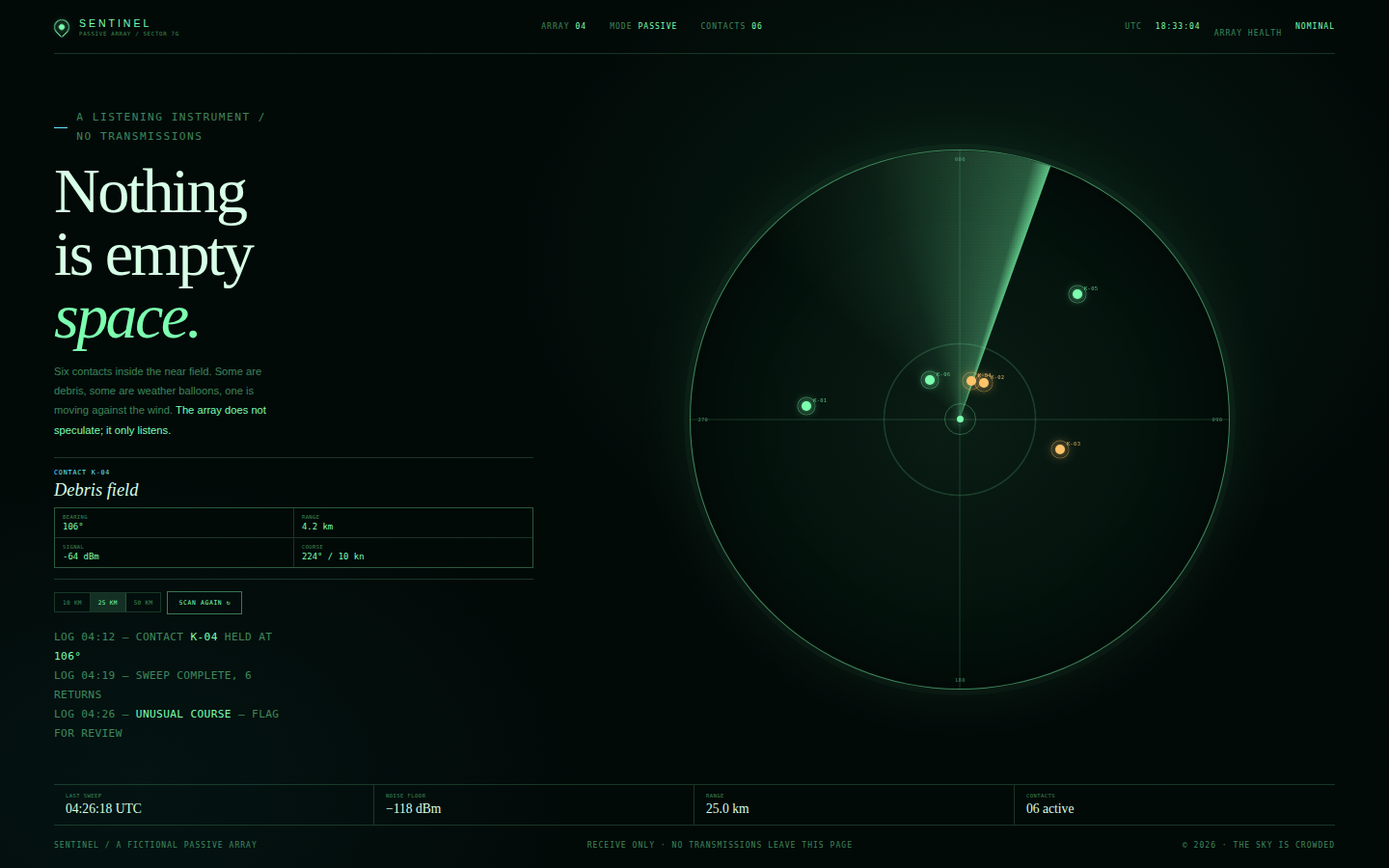
A military-grade instrument designed by a science-fiction art director. Every pixel should feel calibrated: thin rings, exact ticks, restrained glow, no unnecessary decoration. Green is the primary signal colour, cyan marks live data, amber marks warnings. The typography contrasts a cold editorial serif with tiny monospaced readouts.
Open
Original prompt
Create a futuristic radar interface called "Sentinel / Passive Array 04". Near-black green room, phosphor green and cold cyan, faint grid and scanlines. The layout pairs a left editorial and telemetry column with a large circular radar on the right: concentric range rings, crosshair, bearing labels, a rotating sweep and several contact blips with pulse rings. The left column carries the title "Nothing is empty space." in a severe serif, a short paragraph, range buttons (10 / 25 / 50 km), a Scan button, and a hovered-contact readout. Clicking empty radar adds a contact; Scan regenerates the field; hovering a blip shows its designation, bearing, range and signal. Include a bottom status strip with UTC and array health. Fully responsive, one standalone HTML file with inline CSS/JS/SVG, no external assets.
054-sentinel-radar.txt
055
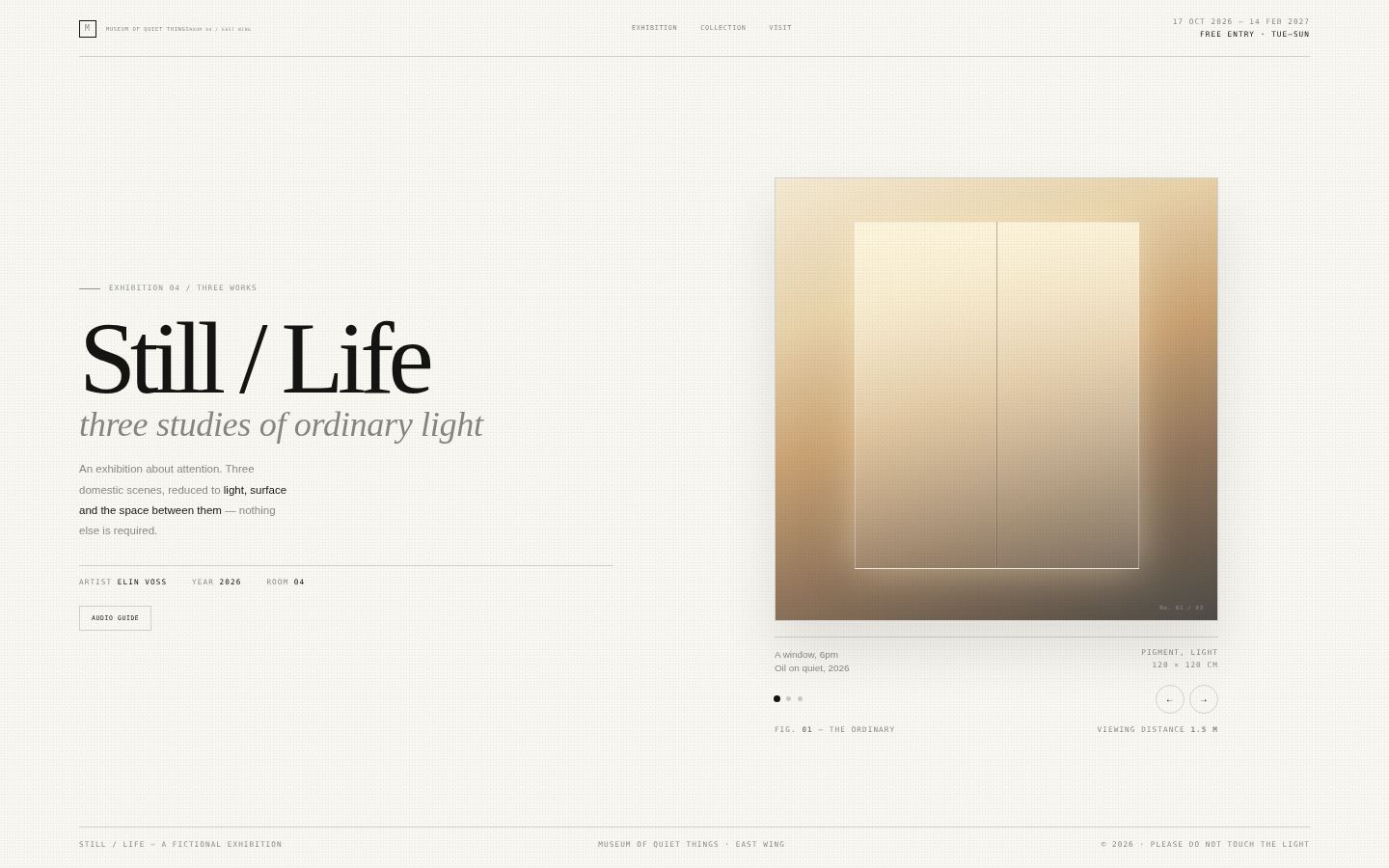
Less, precisely. The page should feel like a real contemporary art museum: white walls, perfect spacing, labels set in a small sans face, one beautiful object at a time. The art is restrained abstraction made of gradients and geometry, and the interface disappears into the wall text. Silence is the main material.
Open
Original prompt
Create a minimal white-cube gallery page for a fictional exhibition titled "Still / Life", subtitled "three studies of ordinary light". Pure warm white, black type, one pale grey-green accent, enormous negative space. A fixed museum masthead, a large serif exhibition title on the left, and a framed artwork on the right with a museum label beneath it. Three works can be viewed with quiet arrows: "A window, 6pm" (a soft gradient pane), "A glass of water" (thin ellipses and a shadow) and "A folded cloth" (diagonal tonal folds), each drawn purely in CSS. Add an "Audio guide" toggle that opens a short wall text panel, work numbers, and a footer with dates and opening hours. Fully responsive, one standalone HTML file with inline CSS/JS, no external images or fonts.
055-still-life.txt
056
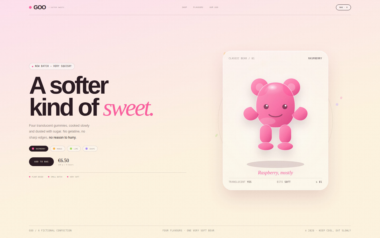
Joy with a product-design brain. The gummy is the hero object: believable translucency, a sugar bloom, a highlight, a shadow. The palette is sweet but controlled, typography is chunky but well set, and the page has enough white space to feel like a boutique rather than a candy aisle. Every interaction should feel squishy but tasteful.
Open
Original prompt
Create a playful premium candy brand page called "GOO", for translucent gummy bears. Bubblegum pink and butter-cream gradient background, soft blobs, scattered candy dots, a large single gummy bear drawn in SVG with glossy translucent gradients and a sugar highlight, and chunky friendly typography. The left column carries the headline "A softer kind of sweet.", a short note, a flavour selector (Raspberry, Mango, Lime, Grape), a price and an Add to bag button. Selecting a flavour changes the gummy colour, background wash and flavour label with a soft transition; clicking the bear makes it wobble and releases small gummies. Include a bag counter, a strip of three brand promises and a footer. Fully responsive, one standalone HTML file with inline CSS/JS, no external images or fonts.
056-goo-candy.txt
057
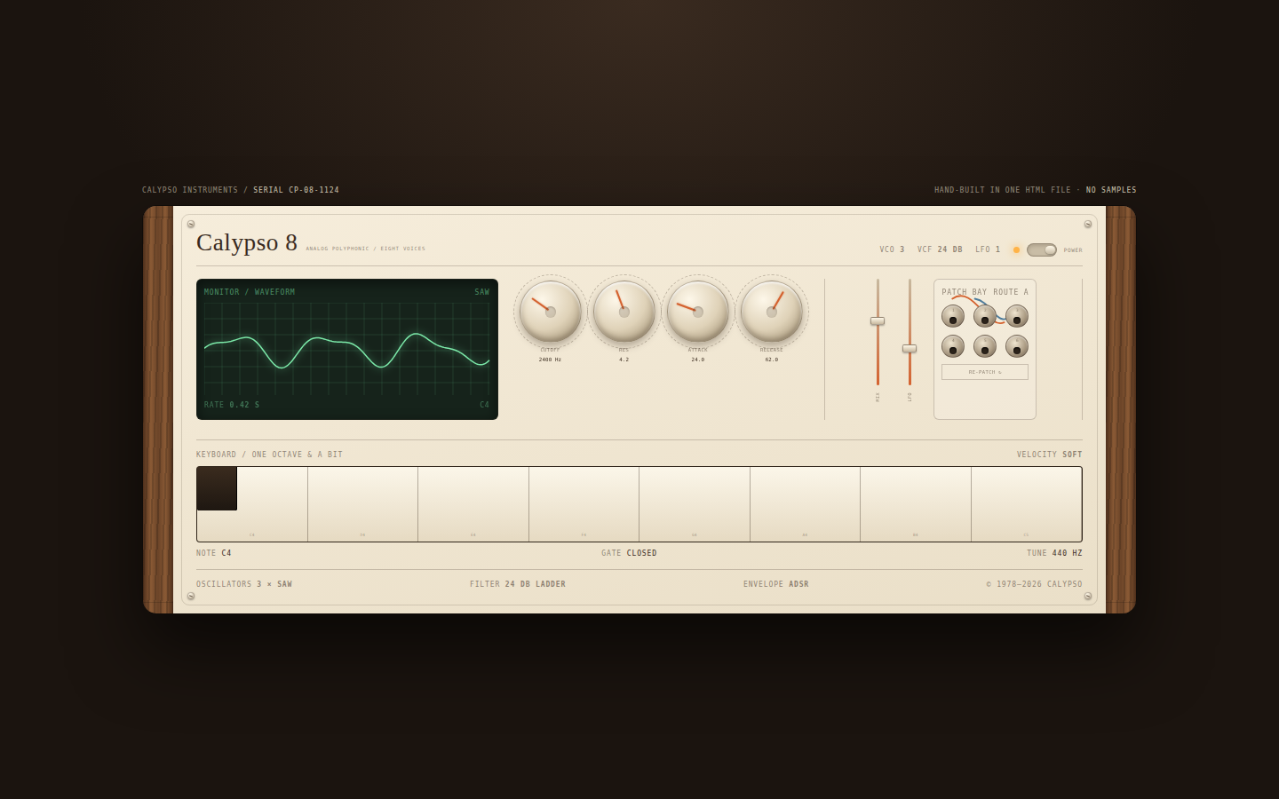
An instrument photographed on a workbench: warm, tactile and slightly worn. The design is inspired by 1970s European synths but redrawn with contemporary precision — no fake scratches, just beautiful materials, generous spacing and engraved labels. Orange is used only for indicators, cables and the power lamp.
Open
Original prompt
Create a warm, vintage analog synthesizer panel called "Calypso 8". Cream enamel faceplate, walnut side cheeks, burnt-orange accents and dark brown engraving. The panel contains a small green oscilloscope, four large cream knobs (Cutoff, Resonance, Attack, Release) with tick rings and orange indicators, two vertical sliders, a patch bay with six jacks and two curved patch cables, a power switch with an amber lamp, and a fourteen-key keyboard along the bottom. Knobs can be dragged or operated with arrow keys; the oscilloscope waveform responds to the knob values and to keys being played. A "Re-patch" button changes the cable routing colours. Include serial plate and specification notes. Fully responsive, one standalone HTML file with inline CSS/JS/SVG, no external images or fonts.
057-calypso-synth.txt
058
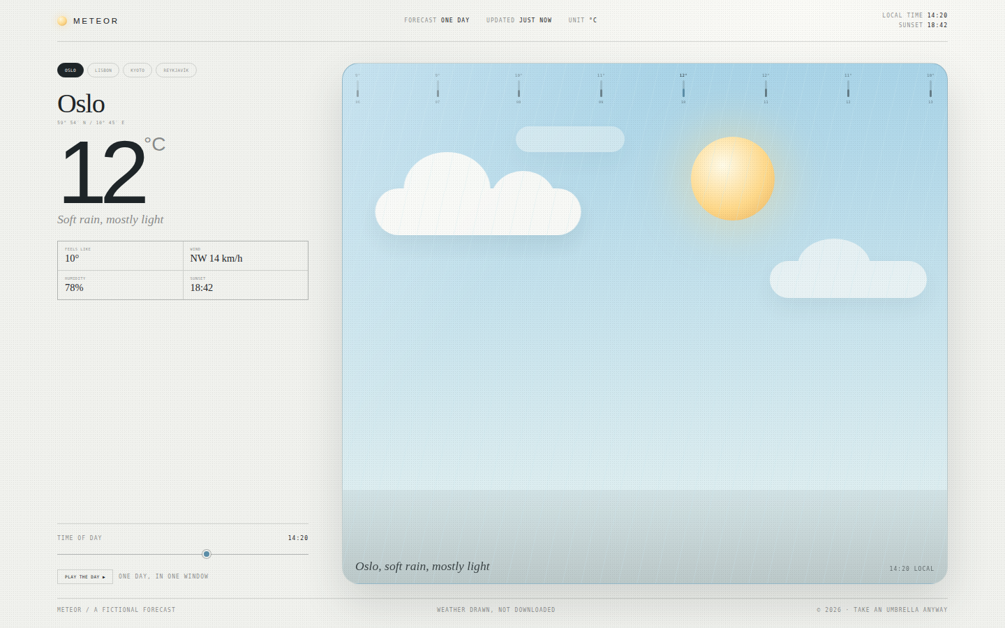
Weather as a window, not an app. The scene is the hero and changes character completely between cities. Typography is restrained: a huge light temperature, a small serif city name, precise monospaced data. The colour palette stays quiet so the weather can do the talking, and motion is soft and continuous, like actual weather.
Open
Original prompt
Create a minimal, beautiful weather experience called "Meteor". Off-white interface, a large rounded weather window that occupies most of the page, ice-blue and warm-yellow accents, and a refined editorial layout. The window shows a full CSS weather scene — sun, drifting clouds, rain, snow or fog — that changes with the selected city. A left column holds four city tabs (Oslo, Lisbon, Kyoto, Reykjavík), a large temperature, condition line and small details (feels like, wind, humidity, sunset). A bottom strip shows eight hourly temperatures as a tiny bar forecast. A time-of-day slider moves the sun or moon across the scene and shifts the sky gradient. Fully responsive, one standalone HTML file with inline CSS/JS, no external images or fonts.
058-meteor-weather.txt
059
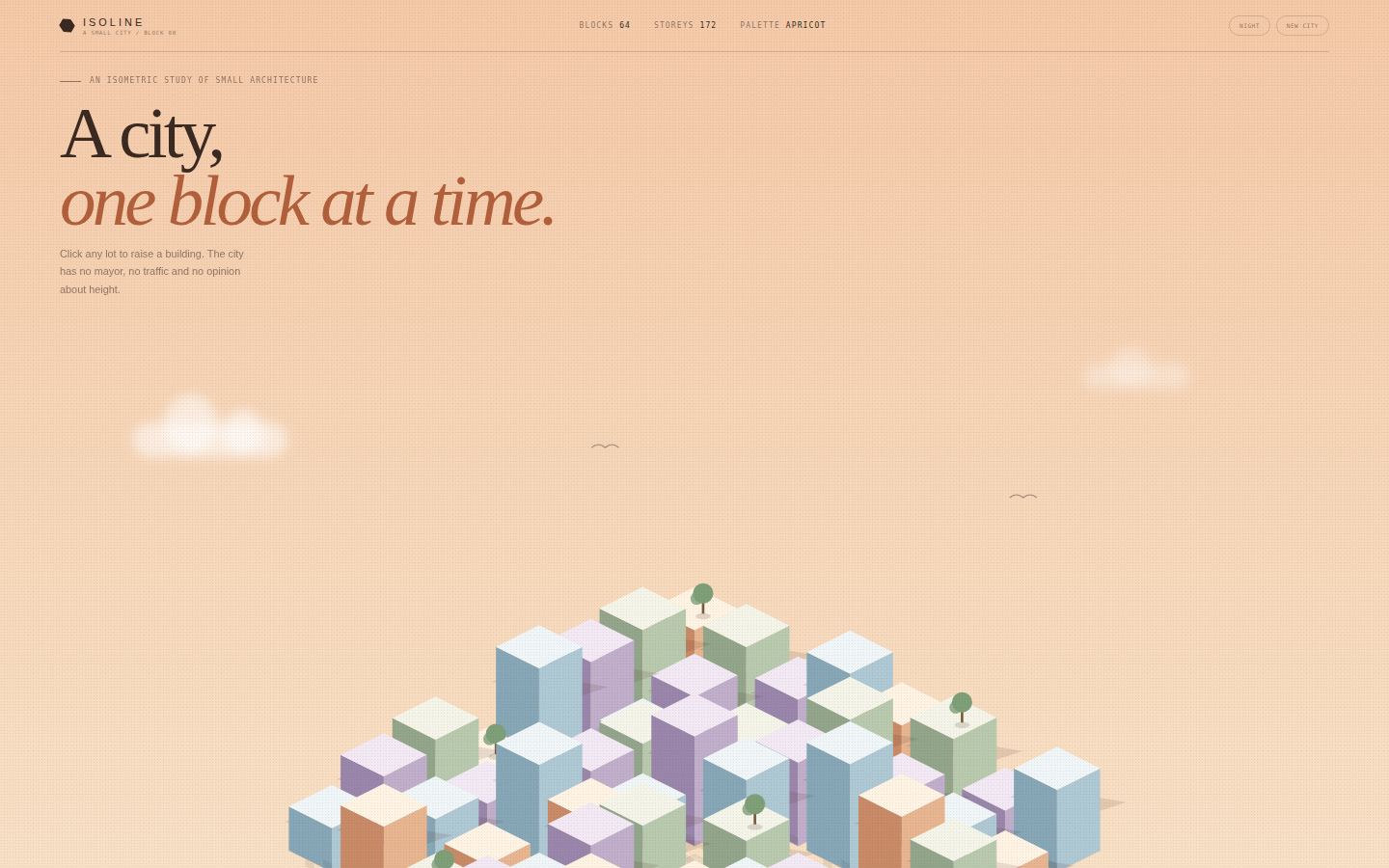
A toy city with architectural discipline. The isometric projection is exact, the palette is restrained (cream, peach, sage, sky, lilac), and the buildings vary enough to feel authored rather than random. The scene is framed like a poster, with type and controls floating above it and the city filling the lower two-thirds of the frame.
Open
Original prompt
Create an interactive isometric city called "Isoline". A warm peach-to-cream sky, soft clouds and birds, and a detailed isometric city drawn in SVG: eight-by-eight blocks, pastel buildings with three visible faces, tiny windows, trees, shadows and paved lots. Visitors can click any lot to add or raise a building; "New city" regenerates the whole town with a new palette and skyline; a Day / Night toggle lights the windows and deepens the sky. A large editorial headline "A city, one block at a time." sits over the top left, with a small control bar and building count bottom right. Fully responsive, one standalone HTML file with inline CSS/JS/SVG, no external images or fonts.
059-isoline-city.txt
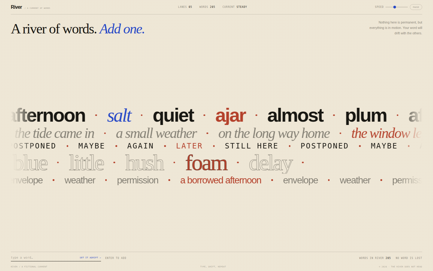
060
A kinetic type specimen that behaves like water. The lanes are currents: some fast and thin, some slow and monumental. Word choice and spacing matter as much as motion. The page is a place to leave a word, not a corporate hero — playful, literary and quietly absurd.
Open
Original prompt
Create a full-screen typographic word river called "River". Warm cream background, ink-black type, one cobalt accent. Five horizontal lanes of drifting words move at different speeds and sizes, mixing a high-contrast serif, a tight grotesque and small monospaced phrases. A visitor can type a word into a small input at the bottom; it joins the largest lane as a highlighted word, and the word count updates. Controls pause the current and change its speed. Large editorial framing: "A river of words. / Add one." top left, a short instruction, and a quiet footer. Fully responsive, one standalone HTML file with inline CSS/JS, no external fonts or images.
060-word-river.txt
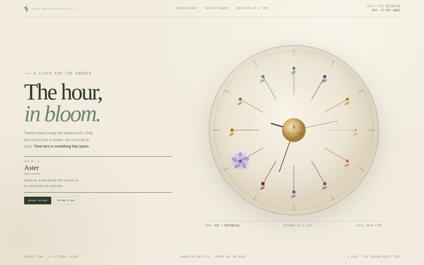
061
Time as a garden rather than a grid. The dial should feel engraved and hand-coloured: fine rings, small botanical labels, twelve distinct silhouettes. The open flower becomes a quiet event each hour, and the interface surrounding it stays calm and editorial. The palette is drawn from pressed flowers and old paper.
Open
Original prompt
Create a botanical clock called "Floral Time". A warm paper background, sage green, terracotta, gold and rose; the aesthetic of an antique herbarium crossed with a modern wall clock. A large circular dial contains twelve flowers, one for each hour, arranged around a ring of stems and leaves. The current hour's flower is fully open; the others remain closed buds. A slender second hand shaped like a leaf sweeps the dial, and the hour and minute hands are drawn as stems. The left column carries the title "The hour, in bloom.", a short note, a selected-flower card with name and meaning, and two buttons: "Advance an hour" and "Return to now". Hovering or clicking a flower previews it. Fully responsive, one standalone HTML file with inline CSS/JS/SVG, no external assets.
061-bloom-clock.txt
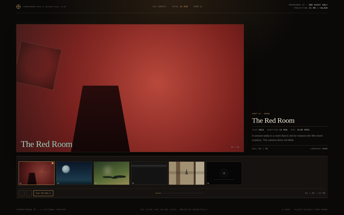
062
The romance of a small repertory cinema. The interface is almost entirely darkness and one warm rectangle of light; the filmstrip is a physical object with perforations and slight sheen. Each "still" is a graphic abstraction — colour, geometry, grain — that suggests a film without showing one. The typography is festival-catalogue: a high serif, tiny credits, precise metadata.
Open
Original prompt
Create a cinematic film archive called "Cinémathèque 07" for six imaginary short films. Dark projection room, warm amber light, dust motes and a 35mm filmstrip. A large screen shows the selected film's "still" — an abstract CSS composition rather than an image — with the title overlaid in an elegant serif. Beside or below it, a details panel lists year, duration, director and a one-line note. Beneath the screen runs a horizontal filmstrip with six numbered frames, sprocket holes top and bottom, and the selected frame marked in amber. Buttons step through the reel; "Play the reel" auto-advances every few seconds. Fully responsive, one standalone HTML file with inline CSS/JS, no external images or fonts.
062-film-archive.txt
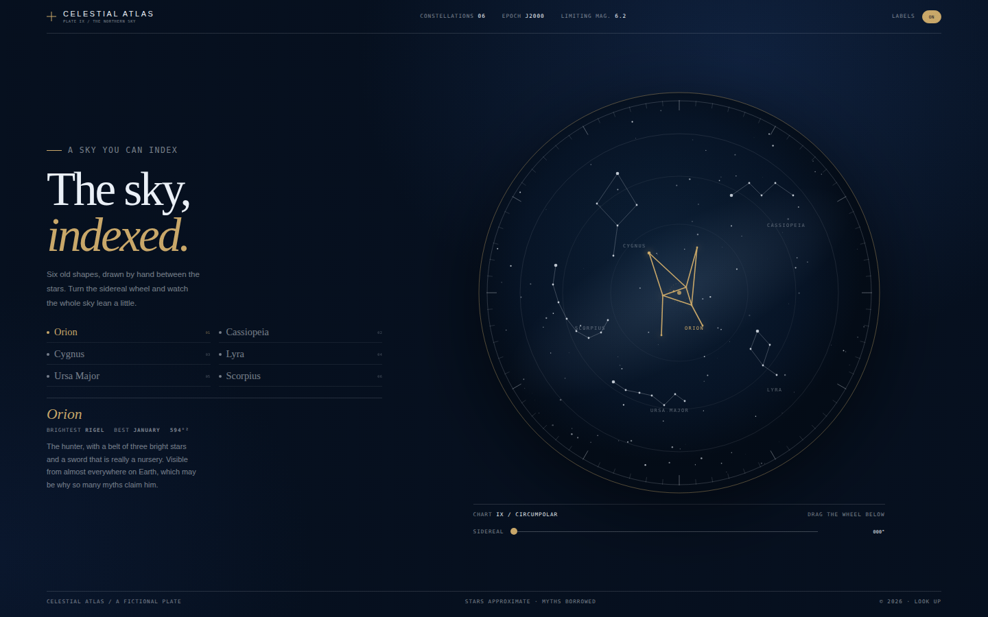
063
A plate from a contemporary celestial atlas: precise, quiet and a little romantic. The chart should feel engraved — thin gold lines, scattered stars, careful labels — while the interface is modern and readable. The dark blue is deep enough for stars to glow, and gold is reserved for the selected constellation and the instruments.
Open
Original prompt
Create an antique-modern star atlas called "Celestial Atlas". Deep midnight blue, ivory star marks, gold engraving and a fine circular chart. The layout pairs an editorial left column — title "The sky, indexed.", a short note, a list of six constellations and a details card — with a large circular star chart on the right. The chart has degree ticks, faint coordinate rings, a Milky Way haze, small stars and constellation lines; selecting a constellation highlights it in gold and shows its myth, brightest star and best viewing month. A sidereal-time slider rotates the whole sky; a labels toggle shows constellation names. Fully responsive, one standalone HTML file with inline CSS/JS/SVG, no external images or fonts.
063-celestial-atlas.txt
064
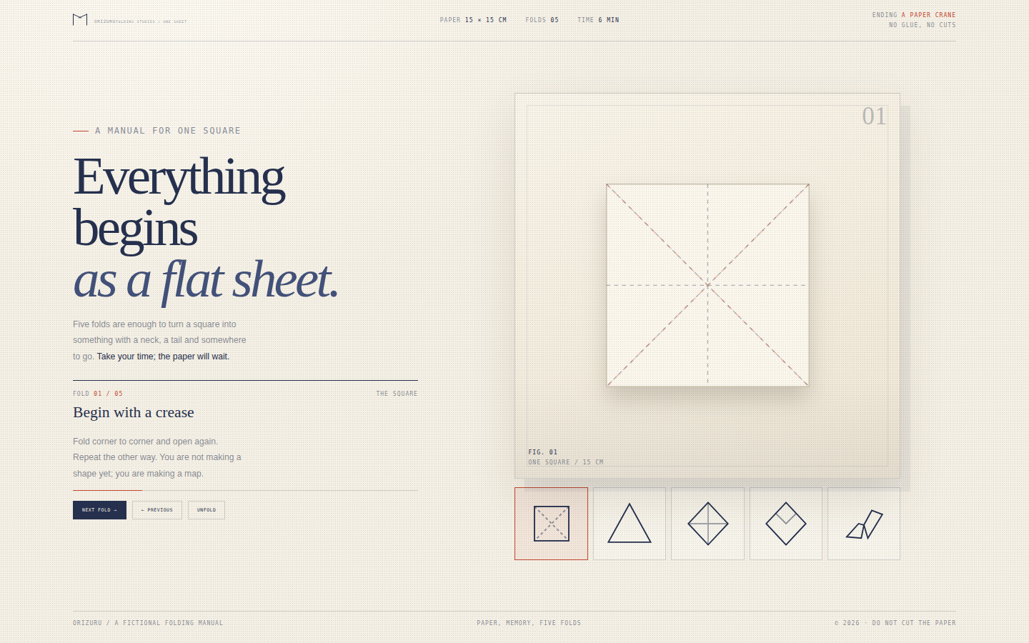
Craft, patience and paper. The page should feel like a beautifully printed instruction card from a craft museum: numbered steps, precise diagrams, generous margins. The finished crane is the reward, drawn as a refined geometric object rather than a cartoon. Indigo carries the linework, vermilion marks the one detail you should not miss.
Open
Original prompt
Create a quiet origami study called "Orizuru — five folds to a bird". Warm paper cream, indigo, vermilion and soft grey. The page is a folding manual: a left column with the title "Everything begins as a flat sheet.", a step counter, the current fold instruction and Previous/Next controls; a large stage on the right showing one square of paper through five stages — flat sheet with creases, triangle, kite, crane base and finished crane. The crane illustration is made from clean polygon facets with shadows and a vermilion accent. A row of five step thumbnails sits below the stage. Fully responsive, one standalone HTML file with inline CSS/JS/SVG, no external images or fonts.
064-orizuru-folds.txt
065
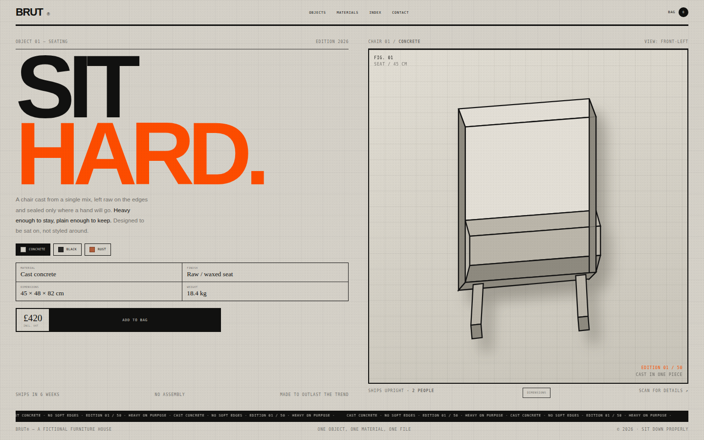
Furniture presented as an object of conviction. No soft lighting, no lifestyle photography, no rounded corners: just hard geometry, weight and a price. The page should feel like a spec sheet printed on a concrete wall, with one orange mark that behaves like safety tape. Type is large, tight and unapologetic.
Open
Original prompt
Create a raw, gallery-grade e-commerce page for a fictional furniture object: BRUT® Chair 01. Concrete-grey paper, hard black rules, safety orange accents and oversized uncompromising typography. The layout is a brutalist product sheet: a giant title "SIT HARD." on the left, a short material paragraph, a specification table, price, and an add-to-bag button; on the right a large product stage with an SVG chair drawn from concrete-grey planes and black edges, dimension callouts, and a raw floor shadow. Include a top navigation with a cart count, an edition number, and a footer. Colour variants (Concrete, Black, Rust) change the chair's palette. Fully responsive, one standalone HTML file with inline CSS/JS/SVG, no external images or fonts.
065-brut-objects.txt
066
A hole-in-the-wall ramen bar at 1am, lit by its own signage. The composition is dense but legible: neon vertical sign, one beautiful bowl, a menu you can read at a glance. The palette is deliberately limited to black, pink, cyan and egg yellow, with warmth coming from the broth illustration.
Open
Original prompt
Create a neon late-night ramen shop page called "NOODLE//9". Near-black room with hot pink, cyan and warm egg-yolk neon; a vertical flickering sign, a large illustrated bowl of ramen with steam and chopsticks, and a compact menu with four items and prices. The left column carries an oversized outlined headline "Slurp after midnight.", a short late-night note, spice-level buttons and an "Add to order" action with a ticket counter. The bowl reacts to the spice level by shifting broth colour and steam intensity; hovering a menu item highlights it and shows its ingredients. Include a "OPEN 24H" neon badge, a wet-floor reflection, scanlines and a small footer. Fully responsive, one standalone HTML file with inline CSS/JS/SVG, no external images or fonts.
066-noodle-nine.txt
067
A quiet object portrait. The terrarium should feel like something you would keep on a desk and look at instead of a screen: glass with weight, condensation, a miniature ecosystem that is doing fine without you. The interface around it is small, precise and botanical, like a care label.
Open
Original prompt
Create a serene product-style page for a fictional glass terrarium, "Terrarium No. 4". Warm cream background, forest greens, moss, sand and stone, with one soft spotlight. The hero is a large glass vessel drawn in CSS and SVG: transparent dome with highlight arcs, condensation, layered sand and soil, pebbles, ferns, moss and a tiny mushroom. The left column carries the title "A world under glass.", a short note, a conditions panel (humidity, light, temperature) and two controls: "Mist" and "Open lid". Misting animates droplets and raises the humidity readout; opening the lid releases a small paper butterfly and changes the status. Include a care card and a footer. Fully responsive, one standalone HTML file with inline CSS/JS/SVG, no external images or fonts.
067-terrarium.txt
068
A calendar you would actually keep on a wall. It should feel printed on thick stock and drawn on with a brush: imperfect, quiet, slightly irregular. The interface is nearly invisible; the paper and the month do the work. Vermilion appears once or twice, like a stamp.
Open
Original prompt
Create a tactile wall calendar called "Ink Calendar" for October 2026. Warm cream paper, black sumi ink, one vermilion seal and soft pencil-grey annotations. A single calendar sheet hangs from a nail by a linen thread, with a large ink-wash mountain and sun illustration at the top, the month set in a generous serif, a seven-column day grid, a narrow margin for handwritten notes and a red hanko stamp. Clicking a day selects it and leaves a small ink dot; the margin note changes to a line for that date. "Tear off the month" animates the sheet falling away and reveals November with a new ink drawing. Include a header, care note about paper and a footer. Fully responsive, one standalone HTML file with inline CSS/JS/SVG, no external images or fonts.
068-ink-calendar.txt
069
Typography as a living material. The word should feel like it is being held in place by collective attention, not printed. On the dark ground the particles read as lit dust or a murmuration; the single ember particles are like sparks in a print run. The UI is small and print-like so the swarm owns the page.
Open
Original prompt
Create an interactive particle-typography toy called "Swarm Type". Near-black ground, chalk-white and acid-green particles with occasional ember-orange ones, and a huge canvas where thousands of small dots gather into a word. The default word is "FLUX"; an input at the bottom lets visitors set any word or short phrase, and the swarm reforms instantly. Moving the pointer pushes particles aside; "Scatter" explodes them and "Reform" brings them home. The interface is minimal: a small masthead, a statement "A word is a crowd.", particle count, palette buttons and a round input bar. Fully responsive, one standalone HTML file with inline CSS/JS, no external images or fonts.
069-swarm-type.txt
070
A listening room, not a streaming service. The player is a single composed object: one beautiful cover, one waveform, four tracks and a lot of quiet. The interface is dark and warm, with a single coral light for progress. Typography is a high-contrast serif for titles and tiny monospaced metadata.
Open
Original prompt
Create a refined music-player page called "The Quiet Hours" for a fictional album of the same name. Deep charcoal room, warm cream type, coral and lavender accents. The player card pairs a square CSS album cover (soft gradient, grain, a large serif letter) with track information, a live waveform, transport controls, timeline and volume. Below, a playlist of four tracks with durations and small mood tags. Selecting a track changes the cover palette, title, waveform and duration. Play begins a simulated, silent playback: the timeline moves, the waveform fills in coral and the equaliser animates. Fully responsive, one standalone HTML file with inline CSS/JS, no external images, audio or fonts.
070-quiet-hours-player.txt
071
The last page of a tasting menu: rich, quiet and confident. The deep green makes cream and gold feel expensive, and the illustrations are simple enough to read as plate presentations rather than cartoons. Typography is a high-contrast serif with tiny tracked capitals, and every rule is a considered line, not a box.
Open
Original prompt
Create an elegant dessert menu page for a fictional restaurant, Maison Sucré. Deep forest-green room, cream menu card, antique-gold rules and serif typography. The layout is a two-panel menu: on the left, the heading "The sweet course.", tabs for Desserts and Petits Fours, and a list of four items with descriptions, dotted leaders and prices; on the right, a detail panel showing the selected dessert as a refined SVG illustration on a plate, its name, a longer description, the recommended pairing and a "Choose this" action. Include a restaurant masthead, service hours, a gold seal and a footer. Fully responsive, one standalone HTML file with inline CSS/JS/SVG, no external images or fonts.
071-maison-sucre.txt
072
A structure that is also the artwork. The hexagons should feel like a honeycomb — interlocking, warm, precise — but each cell is a distinct poster fragment. Gold hairlines and dark umber create a nocturnal, gallery-like mood; cream type keeps it readable. The side panel is a quiet catalogue card, not a modal shout.
Open
Original prompt
Create a honeycomb portfolio called "COMB" for a fictional design studio. Deep umber background, warm gold, honey and cream. A bold serif headline "Cells of work." sits above a honeycomb grid of nine hexagonal project cells, arranged in staggered rows, each with a number, short title, category and an abstract gradient composition. Filter buttons (All, Brand, Digital, Spaces) reflow the visible cells; clicking a cell opens a side panel with the project title, year, description and a "next cell" action. Include a slim masthead, a count of visible cells and a footer. Fully responsive, one standalone HTML file with inline CSS/JS, no external images or fonts.
072-comb-index.txt
073
Scientific wonder, carefully typeset. The planet should look plausible at a glance — bands, clouds, ice caps, a dark limb — and beautiful at a second glance. The UI is an observatory instrument: thin rules, tiny labels, numeric readouts and one warm accent for the button. The dark room makes the planet the only source of colour.
Open
Original prompt
Create a planet-generation laboratory called "World Foundry". Deep space black with a soft nebula glow, a large procedurally drawn planet on the right, and a narrow control column on the left. Four sliders control radius, water, cloud cover and temperature; four presets (Ocean, Desert, Ice, Gas) apply curated combinations; "Forge a new world" randomises and generates a new name and seed. The planet is drawn on canvas with bands, continents, cloud swirls, polar caps, a terminator shadow and an atmosphere rim, plus one small moon on an orbit. Readouts show radius, water, cloud, mean temperature, gravity and a generated designation. Fully responsive, one standalone HTML file with inline CSS/JS, no external images or fonts.
073-world-foundry.txt
074
A design-school worksheet with real joy. The wheel is the only saturated object; everything around it is precise, warm and legible. The palette preview is the payoff — it shows the same four colours behaving as background, text and accent, so the lesson is visual rather than explanatory.
Open
Original prompt
Create an interactive colour-theory lesson called "Chroma School — lesson 05". Warm white studio background, black type and a vivid colour wheel. The left column carries the title "Colour is a conversation.", a short lesson note, a draggable HSL colour wheel, hue/saturation/lightness sliders and four harmony buttons (Complementary, Analogous, Triad, Tetrad). The right side shows a generated four-colour palette as large swatches with hex values and a preview poster that uses the palette in bold typographic blocks. Clicking a swatch makes it the new base colour; "Shuffle" picks a new harmonic hue. Fully responsive, one standalone HTML file with inline CSS/JS, no external images or fonts.
074-chroma-school.txt
075
A room with the lights low. The page should have almost no interface — one breathing object, one timing control, and enough darkness around them to let the shoulders drop. Typography is thin, generous and quiet. Motion is slow and continuous, never bouncy.
Open
Original prompt
Create a minimal meditation timer called "Still". Deep twilight background, a soft gradient aura, and a large breathing circle at the centre made of concentric translucent rings. The interface is reduced to: a title "A room to breathe.", a phase label inside the circle (Breathe in / Hold / Breathe out / Hold), a countdown, three duration presets (1, 3, 5 minutes), a start/pause control and a reset. The circle expands and contracts at a four-second rhythm while running; a thin outer ring shows remaining time; a quiet chime sounds when the session ends. Include a small session count and a calm footer. Fully responsive, one standalone HTML file with inline CSS/JS, no external images or fonts.
075-still-timer.txt
076
A prop you want to pick up. The folder should feel physically present: slightly misaligned papers, sharp folds, a string closure, carbon-copy type. Redactions are the interaction — each one is a small act of reading something you were not meant to see. The mood is deadpan bureaucratic, not spy-movie camp.
Open
Original prompt
Create a classified dossier page styled as a manila folder on a dark wooden desk, for a fictional "Bureau of Unresolved Affairs". Warm manila paper, typewriter type, black redaction bars, red rubber stamps, paperclips and a coffee ring. The folder contains a subject photograph (an abstract silhouette), filed metadata, three tabs (Subject, Timeline, Assets) and paragraphs punctuated by redactions. Clicking a redaction reveals the hidden text; a counter tracks how many remain, and when all are revealed a large "DECLASSIFIED" stamp appears. Include a "Declassify all" control, typewriter signatures, case number and a footer. Fully responsive, one standalone HTML file with inline CSS/JS, no external images or fonts.
076-dossier.txt
077
A scientific instrument pointed at a beautiful impossibility. The fractal is the only image; the interface is precise, dark and typographic. The palette should be sophisticated rather than psychedelic — ember, deep ocean, graphite and a restrained rose. The page should reward the first click and then keep rewarding it.
Open
Original prompt
Create an interactive Mandelbrot fractal explorer called "Mandelbrot Field". Deep black page with a large square canvas and a narrow scientific control column. The hero statement reads "The edge of everything." in an elegant serif; controls include iteration depth, a palette selector (Ember, Deep, Mono, Rose), zoom-out and reset buttons, a live coordinate readout and a scale display. Clicking the fractal zooms in at that point; shift-click zooms out; the render is recoloured instantly when the palette changes and re-computed when iterations change. Include a small explanation of the set and a footer. Fully responsive, one standalone HTML file with inline CSS/JS, no external images or fonts.
077-fractal-explorer.txt
078
Security printing as an art form. The note should reward a close look: overlapping wave patterns, hairline rules, a portrait drawn only in engraved lines, tiny repeated text. It is clearly a specimen, never counterfeit currency: serials read SPECIMEN and a red diagonal stamp sits across the corner. The desk and shadow make it feel physically present.
Open
Original prompt
Create a beautiful fictional banknote specimen page called "The Mint of Small Things". A dark wooden desk, a single large note centred with a soft shadow, and a small control panel. The note is built in SVG and CSS with intricate guilloche rosettes, engraved portrait linework, microtext bands, a serial number, denomination, signatures, a security thread and a watermark area. Three palettes (Sage, Indigo, Rose) can be generated; "New note" changes denomination, serial, portrait pattern and rosette seed; "Hold to the light" darkens the note and reveals a glowing security thread, hidden pattern and watermark. Include a header, specimen stamp, facts panel and footer. Fully responsive, one standalone HTML file with inline CSS/JS/SVG, no external images or fonts.
078-small-things-note.txt
079
A book as an object, not a slideshow. The paper should feel thick enough to turn, with a visible stack, a spine shadow and a slight curl on hover. Illustrations are quiet and diagrammatic — maps, constellations, a room — and the prose is short enough to read in the time it takes to turn a page.
Open
Original prompt
Create an interactive 3D flip book telling a short illustrated story called "The Cartographer's Sleep". Warm paper, ink blue and vermilion; a book on a table with a visible spine, page edges and a soft shadow. The left page carries the title and a short introduction; the right side is a stack of three turning sheets with stories and simple SVG illustrations — a map, a window, a sleeping figure and a small boat. Clicking the page corner or the Next button turns a sheet in 3D; Previous turns it back. Page numbers, a progress line and a "close the book" reset complete the interface. Fully responsive, one standalone HTML file with inline CSS/JS/SVG, no external images or fonts.
079-cartographer-flipbook.txt
080
The romance of print, reproduced with care. The page should feel like a real broadsheet: narrow columns, dense typography, rules that organise rather than decorate, and a photograph that is clearly printed rather than glossy. Red is reserved for the edition mark and one or two small details.
Open
Original prompt
Create a beautiful broadsheet newspaper front page called "The Evening Signal". Warm newsprint, dense black ink, one red accent, hairline rules and justified serif columns. The masthead is huge and centered, with a date line, edition mark, price and a small weather box. The lead story, "The City Learns to Listen", has a deck, a three-column body with a drop cap, and an abstract halftone-style photograph made only in CSS. A right-hand rail carries an index, weather, a quote and classifieds; below, a second story and a small notice. A Morning / Late edition toggle changes the lead headline, deck, body, date line and accent. Clicking the lead story opens a clipping overlay with the full article. Fully responsive, one standalone HTML file with inline CSS/JS, no external images or fonts.
080-evening-signal.txt
081
Quantum mechanics as an instrument panel. The canvas is the experiment and should look precise: thin axes, glowing probability, a measured point that feels like an event. The interface is quiet and technical, with one serif statement providing the emotional register. Colour encodes energy levels, from calm cyan to hot violet.
Open
Original prompt
Create a scientific-visual page called "Quantum Waves" showing a particle in a one-dimensional box. Deep near-black space, pale cyan and violet data, cream typography. The left column holds the statement "A particle is a rumour until measured.", a short explanation, an energy-level slider (1–6), a superposition toggle, a Measure button and live readouts (energy, nodes, uncertainty). The right side shows a large canvas: the wavefunction as a glowing curve, the probability density as a soft filled area, faint axes, nodal marks and a cloud of drifting sample particles. Hovering shows position; clicking Measure collapses the cloud to a single bright point with a vertical line. Fully responsive, one standalone HTML file with inline CSS/JS, no external images or fonts.
081-quantum-waves.txt
082
The page is a material, not a layout. Silk should feel continuous and heavy, with highlights that travel along the folds. Typography is small and precise so the fabric remains the hero, and the one line of display type is placed like a label pinned to the cloth. The palette is quiet, expensive and warm.
Open
Original prompt
Create a luxurious fabric-study page called "Soie" for a fictional silk atelier. Warm ivory background, rose, champagne, sage and muted aubergine; a full-screen SVG composition of flowing silk ribbons with soft gradients, fine highlight lines and depth blur. The overlay is minimal: a masthead "SOIE / maison de tissus", an editorial title "Softness, in motion." with an italic accent, a short note, a tension slider at the bottom and three palette buttons (Ivory, Rose, Sage). Moving the pointer pulls the ribbons; "Let it fall" releases them with a decay; the tension slider changes the number and amplitude of the folds. Fully responsive, one standalone HTML file with inline CSS/JS/SVG, no external images or fonts.
082-soie-silk.txt
083
A small, beautiful machine rather than a full arcade sim. The table is designed like a neon diagram: thin rails, concentric bumpers, a constellation of pegs, and two confident flippers. The surrounding cabinet is mostly dark so the table glows. Interaction should feel immediate and slightly forgiving.
Open
Original prompt
Create a playable neon pinball machine called "Silverball, table 03". A dark arcade room with a tall glass table, glowing pegs, three bumpers, two flippers and a chrome ball. The page includes a marquee, score display, ball count, a start overlay, and instructions. Physics are simple but convincing: gravity, wall bounces, circular peg collisions, bumper boosts and flipper hits. Left and right arrows (or clicking the left/right side) flip the paddles; the ball launches from the right lane and drains at the bottom. Include a game-over state, a high score and glowing particles on impact. Fully responsive, one standalone HTML file with inline CSS/JS, no external libraries, images or fonts.
083-silverball.txt
084
The physical pleasure of small tiles. The panel should feel heavy and old: deep grout, stone colours, a double gold frame, a plaque screwed to the bottom. The controls are workshop tools, not app widgets. The generated medallion gives an immediate "how was that made?" moment before the visitor starts painting.
Open
Original prompt
Create a tactile mosaic studio called "MUSA". Warm stone background, a framed mosaic panel of hundreds of tiny tessera tiles, and a narrow atelier control rail with six stone colours (terracotta, ochre, sea, ivory, black, olive), three pattern buttons (Medallion, Wave, Scatter), a Clear control and a placed-tile counter. The mosaic is a 24×16 grid with visible grout, slightly irregular tiles and a classical rosette generated on load. Visitors paint by clicking or dragging across the panel; pattern buttons regenerate a symmetrical medallion or wave composition; Clear empties the grout. Include a museum plaque, a gold double frame and a footer. Fully responsive, one standalone HTML file with inline CSS/JS, no external images or fonts.
084-musa-mosaic.txt
085
An heirloom chart rather than a horoscope app. The wheel should look engraved: hairline brass rules, small glyphs, careful degree marks. Typography is a high-contrast serif with tracked small caps and tiny mono data. The interface is quiet and lets the visitor read the chart like a map.
Open
Original prompt
Create an elegant natal-chart page called "Celestial Chart". Warm laid paper, oxblood and brass engraved lines, with a large circular astrology wheel on the left: zodiac band with glyphs, twelve house cusps, ten planets placed at their degrees, and coloured aspect lines across the centre. The right column holds the title "The sky you were born under.", the birth data, a list of planets with glyphs and degrees, and a toggle for aspect lines. Hovering or selecting a planet highlights it and updates a short interpretation card; the chart is fixed to 17 October 2026, 14:20, Helsinki. Fully responsive, one standalone HTML file with inline CSS/JS/SVG, no external images or fonts.
085-celestial-chart.txt
086
A form that feels like a printed application for something worth applying to. No rounded corners, no soft shadows, no friendly illustrations: just hierarchy, weight and a clear sense of consequence. Orange is used only for errors, focus and the one active chip.
Open
Original prompt
Create a brutalist enquiry form called "BRUT FORMS". Off-white paper, black ink, safety orange and raw grid lines. The left column holds an oversized headline "Say something useful." and a short manifesto; the right holds a numbered form with Name, Email, Project and Budget fields drawn as underlined inputs with huge labels, a budget chip group and a large black submit block. Real inline validation appears in orange under invalid fields; on success the form is replaced by a stamped confirmation card with a reset action. Include a masthead, response-time note and footer. Fully responsive, one standalone HTML file with inline CSS/JS, no external images or fonts.
086-brutal-forms.txt
087
A page that feels like standing at the water at 9pm. The lanterns are the only warm light; everything else is indigo, blue-black and a little hazy. Interaction should feel ceremonial but simple: write a short wish, let it go, watch it join the others. No gamification, no confetti.
Open
Original prompt
Create a dreamlike lantern-release page called "Lantern River". Deep indigo night, a low city silhouette, a dark river with soft reflections, and dozens of warm paper lanterns drifting upward. A large serif title "Send something up." sits at the lower left; a slim input at the bottom lets visitors write a wish, and the release button creates a new lantern carrying that wish. Clicking a lantern shows its message. Include a live count, a quiet instruction and a footer. Fully responsive, one standalone HTML file with inline CSS/JS, no external images or fonts.
087-lantern-river.txt
088
An object with weight and patience. The radio should look like something inherited, not bought: warm wood, cream enamel, brass details, a dial you want to turn slowly. The interface is physical, with only the station list offering a shortcut. Static is treated as a texture and a mood, not an error.
Open
Original prompt
Create a warm vintage radio page centred on a fictional valve receiver, the "Marconi 8". Dark walnut room, a radio cabinet with wood grain, cream enamel faceplate, a glass tuning dial with FM/AM scales and a red needle, a large knurled tuning knob, volume knob, band buttons and a small power lamp. A side panel lists four stations; clicking one tunes the receiver. Dragging the tuning knob or moving the slider shifts the needle and frequency, with static fading in between stations and a station name locking at the right point. Include signal readouts and a quiet footer. Fully responsive, one standalone HTML file with inline CSS/JS, no external images or fonts.
088-rotary-tuner.txt
089
A confident research product page that explains nothing it cannot show. The preview is the proof: type a phrase, get a composition that could not have existed before, with its seed visible. The mesh background gives the page a nervous, living quality without becoming a gimmick. Dark, precise, slightly cold, with lime used only for live data.
Open
Original prompt
Create a research-preview landing page called "Latent". Near-black canvas, electric blue and acid-lime accents, a huge grotesque headline "A model that dreams in coordinates.", a prompt field with suggestion chips and a live generative preview card. The preview draws a unique abstract composition on a canvas from a hash of the prompt, with a scanner line, seed, palette and generation time. Behind everything, a slow neural mesh of nodes and connecting lines reacts to the pointer. Below the hero, three numbered capability notes and a small benchmark strip. Fully responsive, one standalone HTML file with inline CSS/JS/canvas, no external images or fonts.
089-latent-space.txt
090
The page should feel like a hot wall at the end of an afternoon: ochre plaster, one warm bulb, dark paper shapes. Shadows are the whole point, so they must respond visibly to the lamp rather than being a static drop shadow. The interface is a shelf of cut paper, not a toolbar.
Open
Original prompt
Create a warm shadow-theatre page called "Shadow Play". An ochre plaster wall fills the scene, lit by a single hanging lamp whose position can be moved with a slider. Four paper-cut silhouettes — a bird, a rabbit, a hand and a tree — rest on the wall with soft cast shadows; visitors drag them anywhere. A cream control shelf at the bottom holds the title "Shadow / play", a short instruction, the lamp slider and tray buttons that add another bird, rabbit, hand or tree. Shadows shift direction and softness as the lamp moves. Include a small inventory count. Fully responsive, one standalone HTML file with inline CSS/JS/SVG, no external images or fonts.
090-shadow-play.txt
091
A map you would find folded in a field notebook: warm paper, hairline contours, index lines in rust, tiny coordinates. The tool should feel analog and precise rather than like a dashboard. Every slider changes the terrain immediately, and the same seed always produces the same landscape.
Open
Original prompt
Create a cartographic instrument called "Contour No. 6". A large paper-toned map canvas draws real contour lines from a procedural elevation field, with index contours heavier, a fine survey grid and a warm terracotta accent. Overlay a serif title "Read the ground.", a legend of elevation bands, and a live coordinate and elevation readout. Below, a survey control bar holds three sliders (Relief, Detail, Contours), preset buttons (Island, Ridge, Valley), a re-seed button and a grid toggle. Clicking the map drops a survey marker. Fully responsive, one standalone HTML file with inline CSS/JS/canvas, no external images or fonts.
091-topography.txt
092
A story you read by moving through it. Each room should feel like a different temperature and time of day: warm hall, green kitchen, blue stair, plum attic, moss garden. The type carries everything; decoration stays abstract — a window of light, a rule, a number. The marginalia rewards curiosity without interrupting the reading.
Open
Original prompt
Create a long-form scroll story called "Echoes". A full-screen cover reads "A house remembers in five rooms."; five full-viewport chapters follow — Hall, Kitchen, Stair, Attic, Garden — each with its own deep palette, an enormous outlined chapter number, a serif title, a short poetic paragraph and a small marginal note hidden behind a "marginalia" control. A fixed header holds the title and a live room index, a thin top progress bar fills with scroll, and a dot navigation on the right jumps between rooms. Type is large, quiet and editorial with generous white space. Fully responsive, one standalone HTML file with inline CSS/JS, no external images or fonts.
092-echoes-story.txt
093
A quiet physics demonstration with the atmosphere of a darkened lecture theatre. The prism should read as glass: pale edge highlights, translucent faces, a faint inner reflection. The spectrum is the only saturated colour on the page, so it must feel earned. Nothing moves unless the visitor moves it.
Open
Original prompt
Create an optics study called "Prism". A dark studio page shows a glass triangular prism on an SVG stage, a white beam entering from the left and a fan of seven spectral rays leaving to the right. Visitors drag the prism to move it and use Tilt and Dispersion sliders to bend the spectrum; wavelength chips (400–700 nm) highlight individual rays and show their names. Include a serif headline "White is a crowd.", a short explanation, a readout of the apex angle and a reset control. Fully responsive, one standalone HTML file with inline CSS/JS/SVG, no external images or fonts.
093-prism.txt
094
The pleasure of an airport board in a quiet station: cream cards, dark gaps, the little mechanical clack implied by motion. This is a clock you can watch, not a dashboard. The board is the hero, centred and large, with the controls treated as a station timetable strip underneath.
Open
Original prompt
Create a live split-flap station clock. A dark board with six cream flip cards shows hours, minutes and seconds in a monospaced face, separated by blinking colons, with a destination plate above reading the selected city. A control bar offers four cities (Local, Helsinki, Tokyo, New York), a 12/24-hour toggle, a "Flip all" test button and the full date. Every second the relevant cards flip with a mechanical rotation; changing city flips the whole board. Include station-hall ambience, departure-board typography and a footer. Fully responsive, one standalone HTML file with inline CSS/JS, no external images or fonts.
094-split-flap.txt
095
A quiet, slightly eerie biology lesson. The network should look alive: thin hyphae advancing, branching, occasionally flaring brighter at the tips. The page is mostly darkness so the growth is the only event. Controls should feel like lab equipment left on a bench, not a game HUD.
Open
Original prompt
Create a living mycelium growth page called "Mycelium". A near-black forest floor fills the screen under a slow-growing network of glowing threads that branch outward from seeded colonies. Overlay a serif title "The forest is one organism.", a short explanation, a live statistics card (colonies, threads, nodes), and a bottom control bench with Growth, Branching and Spore controls, a teal/amber palette toggle, pause and reset. Clicking anywhere on the ground seeds a new colony. Fully responsive, one standalone HTML file with inline CSS/JS/canvas, no external images or fonts.
095-mycelium.txt
096
A science exhibit after hours: one tank of dark water, two points of disturbance, and a pattern that seems more intelligent than its rules. The palette should stay narrow — plum, ember, a little cream — so the interference itself supplies the drama. Controls look like bench instruments with engraved labels, stacked in a vertical rail rather than a bar.
Open
Original prompt
Create an interactive ripple-tank page called "Wave Lab". A plum-and-ember full-screen canvas renders a live two-source interference field, computed per pixel: concentric rings from two draggable source markers add and cancel into bright crests and dark troughs. Overlay a serif caption block in the lower left ("Two waves make a third."), a left instrument rail holding the Frequency, Phase and Separation sliders plus Pause and Recenter, and a vertical gauge on the right for frequency, wavelength, separation, phase and node count. Dragging either source moves it and reshapes the whole field. Fully responsive, one standalone HTML file with inline CSS/JS/canvas, no external images or fonts.
096-wave-lab.txt
097
A children's natural-history book for adults who like type. The letters should feel like characters rather than specimens: a little wonky, with eyes in the wrong place and ears that do not quite fit. Colour is coded by class, but the page stays papery and printed, with rules, folios and catalogue numbers.
Open
Original prompt
Create a playful typographic bestiary called "Type Zoo". A cream editorial page presents twelve letters, each paired with a creature: A for Axolotl, B for Bear, C for Crane and so on. The letters are huge serif characters given small animal features — eyes, ears, a beak, a fin — and each card shows the species, Latin name and class. Filters (All, Mammals, Birds, Water, Reptiles) and a search field narrow the grid. Clicking a card opens a detail dialog with an enlarged letter, habitat, diet, voice and a short field note, plus previous/next navigation. Fully responsive, one standalone HTML file with inline CSS/JS, no external images or fonts.
097-type-zoo.txt
098
The camera as an instrument: black anodised metal, engraved chrome, one red dot. The viewfinder is the only warm thing in the interface, and its brightness is controlled by the visitor. The iris should look mechanical — overlapping blades, a clean polygon hole — not like a decorative circle.
Open
Original prompt
Create a photographic exposure laboratory called "Aperture". A dark chrome-and-black interface surrounds a live simulated viewfinder: a warm dusk landscape seen through a seven-blade iris whose opening changes with the f-stop. Aperture, shutter and ISO controls update an EV readout and meter, and the scene brightens or darkens accordingly; an Auto button finds a balanced exposure, and the red shutter release flashes and adds a frame to a filmstrip. Include an editorial headline "Let the light in.", the exposure triangle explained in three short notes, and a frame counter. Fully responsive, one standalone HTML file with inline CSS/JS/SVG, no external images or fonts.
098-aperture.txt
099
A page about impermanence, with the atmosphere of a dark room and one low fire. The smoke should be legible for a moment — you can almost read it — then gone. The interface is sparse, warm and quiet; the only bright colour is an ember orange used for the burn action and the sparks.
Open
Original prompt
Create a fleeting message page called "Smoke Signals". A near-black warm room holds a live canvas of smoke; a serif headline reads "Say it in smoke." A message field at the bottom turns typed words into drifting smoke particles shaped like the letters, which rise, bend with the wind and dissolve. Wind and Density sliders alter the behaviour, "Clear the air" empties the canvas, and a counter records how many messages have been burned. Include a note that nothing is saved. Fully responsive, one standalone HTML file with inline CSS/JS/canvas, no external images or fonts.
099-smoke-signals.txt
100
The last page of a series should feel like the title page of a collected works: calm, assured, a little ceremonial. The cento is explained honestly — every line is borrowed — and the interaction makes the visitor a co-author. The index of one hundred numbers is both navigation and ornament, a quiet tally of everything that came before.
Open
Original prompt
Create a final editorial page called "Cento". Warm ivory paper, oxblood and antique gold, monumental serif type. A hero reads "Everything borrowed." with a definition of the cento form. Below, a two-column studio: on the left a poem card where chosen lines appear; on the right a 10×10 index of one hundred numbered fragments, each a button. Clicking a number adds its line to the poem; clicking again removes it. Buttons offer "Draw six lines" and "Clear". A counter tracks selected lines, a giant outlined "100" sits behind the hero, and a colophon closes the page. Fully responsive, one standalone HTML file with inline CSS/JS, no external images or fonts.
100-cento.txt
No studies match that search.