Collection · 100 studies

Qwen3.8-Flash-Next 100 HTML Files

One hundred self-contained visual studies — generative art, physics, typography, interfaces and scenes — generated with Qwen3.8-Flash-Next. Open any piece in a new tab, or expand a card to read the original generation prompt.

100 studies
001
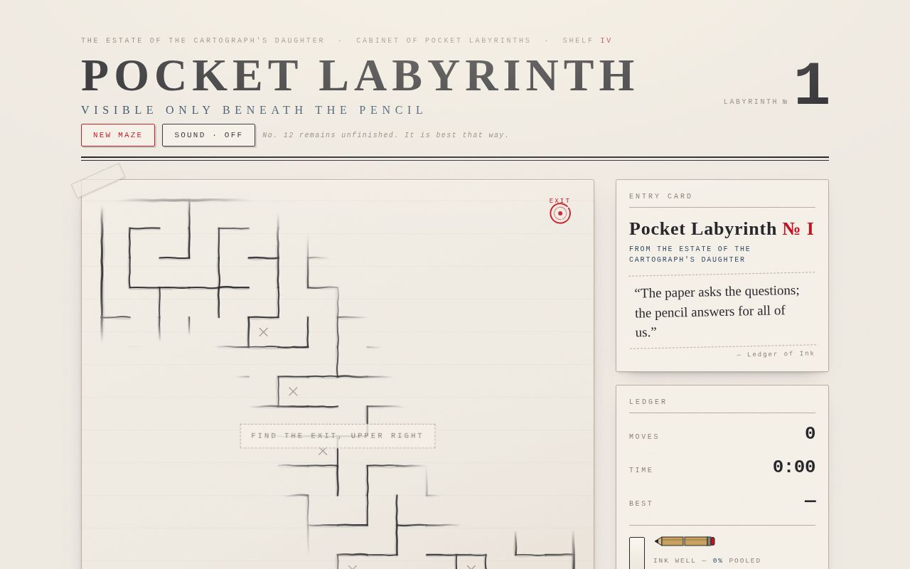
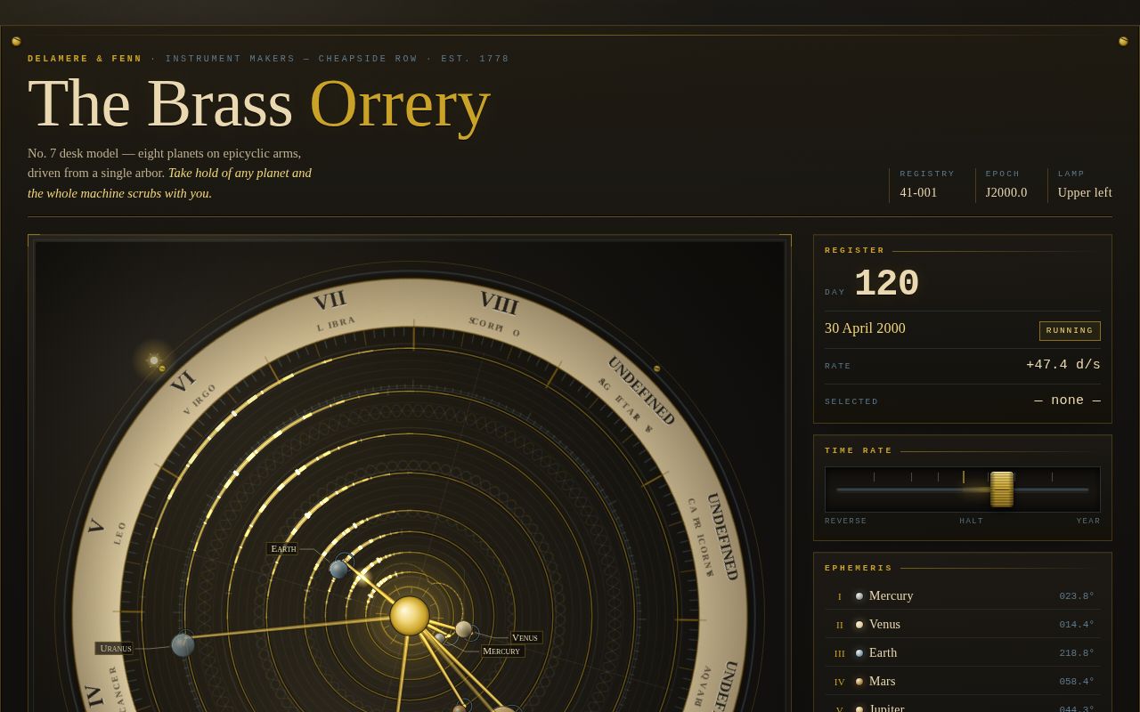
A dark, candlelit instrument page: an engraved dial plate on a charcoal bench carries eight brass planets on epicyclic arms, each running at its true orbital period. Drag a planet and you scrub time for the whole machine; release it and it springs back into orbit trailing fading brass. A machined time-rate lever spins the orrery up, and as it accelerates every ring flashes with a travelling specular gleam from the fixed lamp at upper left — the page's signature moment. An ivory-and-steel console to the right reads out the simulated date, rate and live ephemeris, and doubles as the keyboard interface.
Open
Original prompt
Build a single-page, self-contained interactive art piece: a toy brass desk orrery rendered in canvas 2D, presented as a museum instrument on a dark workbench. MOOD. Quiet, warm, mechanical, candlelit. A museum lab at dusk: charcoal-black bench, one fixed lamp high at the upper left, and a brass machine turning under it. Nothing glowing-neon, nothing glassy. The pleasure is in engraved metal, aged ivory, and the slow sweep of real orbital periods. PALETTE (contract — these exact hexes dominate). #141210 charcoal-black — page ground, bezel, plate under-dial. #C9A227 brass — arms, rings, lever, sun, rules, key accents. #EAD9B0 ivory — engraved inlay band, numerals, labels, hairlines, body text. #5D7A8C pale steel — epicycle hoops, screws, secondary data, cool shadow. Supporting tones are mixtures of the four (deeper brass #8A6B18 / #7A5C14 for engraved lines on light; brighter brass #F0D67A only for specular gleam hits). TYPOGRAPHY. System stacks only. Display and instrument lettering: Georgia / 'Palatino Linotype' / Palatino / serif, set in small caps with wide tracking for engraved labels and Roman-style dial numerals. Data readouts: ui-monospace / Menlo / Consolas / monospace, uppercase, tight letterspacing, for epoch day, date, rate and longitudes. Extreme scale contrast: 10–11px engraved labels against a 64px+ display title, with a 40px monospace epoch number as the loudest data. LAYOUT. Desktop: an engraved brass frame around a two-column grid — a stage on the left (the orrery, fills available space, square-ish) and a narrow instrument console on the right (~340px) with the readout, the time-rate lever, the eight-planet ephemeris list and toggle buttons. A header plaque carries the maker's name, model number and a one-line description. Mobile (<900px): single column — plaque, square canvas stage, console below; nothing overflows at 360px. THE ORRERY (canvas 2D, devicePixelRatio-aware, resize-observed). · Eight planets — Mercury, Venus, Earth, Mars, Jupiter, Saturn, Uranus, Neptune — on true relative periods (87.97 / 224.70 / 365.26 / 686.98 / 4332.59 / 10759.22 / 30688.50 / 60195.00 days) and true mean longitudes at J2000 (252.25, 181.98, 100.46, 355.43, 34.35, 93.06, 173.01, 48.36 degrees). Time is days from J2000 and the console prints the matching calendar date. · Each planet rides an epicyclic arm: a tapered brass deferent bar from the central sun to a pale-steel epicycle hoop, and a short brass crank from the hoop to the planet sphere. Slight radius compression so all eight sit inside the dial. · The dial is an engraved plate: dark lacquer field inlaid with ivory hairline guilloché circles, a radial tick field (1° / 5° / 30° grades), an ivory annulus near the rim carrying dark serif sector numerals and constellation names, plus canvas-speckle ageing. The dial rotates once per Earth year, so the engraving drifts under the arms. Caching: the dial is drawn once to an offscreen canvas and blitted with rotation/scale, rebuilt only on resize or zoom bucket change. · A brass sun boss at the centre with engraved rays and a warm bloom; a bezel outside the dial with four screws and a small etched lamp mark at the light position. SIGNATURE MOMENT. A fixed light source sits high at the upper left (an etched lamp mark on the bezel, with a warm wash across the plate). Every orbit ring is a graduated brass wheel that turns with its own body: ~48 radial graduations cut into the hoop, stroked in 'lighter' composite with brightness = cos^9 of the angle between the graduation and the lamp, so each mark ignites for a moment as it passes under the light and the whole ring reads as a gleam running around the brass. Arms get the same treatment as a specular blob sliding along the bar, planets get a lamp-direction terminator and rim light. Because brightness is a function of angle, speeding time speeds the flash: dragging the time-rate lever makes the machine strobe with brass highlights as ring after ring passes the lamp. Clicking LAMP cycles the light to four fixed positions and the gleam pattern rewrites itself instantly. INTERACTION. · Drag any planet: hit-tested in screen space; the planet lifts off its arm (the arm end shows a ghost ring, a pale steel guide line connects them) and scrubbing its angle scrubs simulated time for all eight planets, proportionally to their periods. Release: a damped spring (slight overshoot, never jitter) snaps the planet back into orbit along a bright brass trail that fades over ~1.5s. · Wheel or pinch to zoom (0.5×–2.8×, eased). · The time-rate lever: a machined brass knob on a steel track, signed logarithmic-ish map, centre detent at HALT, reverse runs time backwards. Keyboard accessible as role="slider" with arrows, Home/End, Page keys. · Ephemeris list: eight real <button> rows (Roman index, name, period, live longitude, brass dot) — click or focus to select a planet, then ←/→ on the canvas scrubs that planet; 1–8 select directly, +/- zoom, Space halts. · Toggles: LABELS (ivory leader lines + serif names), TRAILS, RINGS, LAMP, SOUND, RESET VIEW. All live, none decorative. · Cursor becomes grab/grabbing over planets; hovering a planet brightens its ring and row. FIRST THREE SECONDS. An engraved sweep: the ivory dial is scribed in via a rotating conic wipe over ~0.9s, then the eight orbit rings expand from the centre staggered outward on a custom cubic-bezier (.16,.84,.28,1), then the sun blooms, arms swing their zero positions in, planet spheres scale up on a decelerating curve with a small overshoot, and finally the labels and console rows fade-and-settle with tracking tightening. The console plaque letters rise with wide→normal tracking. If the viewer has not touched anything after the entrance, Earth pulses once with a dashed "drag me" ghost ring and the hint plate glows; both retire permanently on first interaction. SOUND. Off by default, explicit brass toggle, Web Audio only, created on first user gesture: a short filtered metallic tick with a faint second partial when any planet crosses the lamp direction, rate-capped; volume tied to how fast time runs. TEXTURE AND FINISH. Inline SVG feTurbulence grain overlay at very low opacity, screen-blended; layered radial gradients for bench falloff and lamp wash; engraved double rules (light above, dark below) on every plate edge; hover states everywhere; visible :focus-visible brass outlines offset 2px on all controls. REDUCED MOTION. Ambient time rate starts at HALT, the entrance jumps to its finished state, trails and pulsing nudges are suppressed, and all CSS transitions collapse — the machine still responds to the viewer's own drags and lever input. COPY. Written as a real instrument maker's documentation: maker's plaque ("Delamere & Fenn, Instrument Makers — Cheapside Row"), model and registry numbers, an engraved legend plate of controls, a short "notes on the seventh model" paragraph about the spring-driven arbor and the single lamp, and small per-planet footnotes. No lorem, no placeholders, no "made with" captions.
001-brass-orrery.txt
002
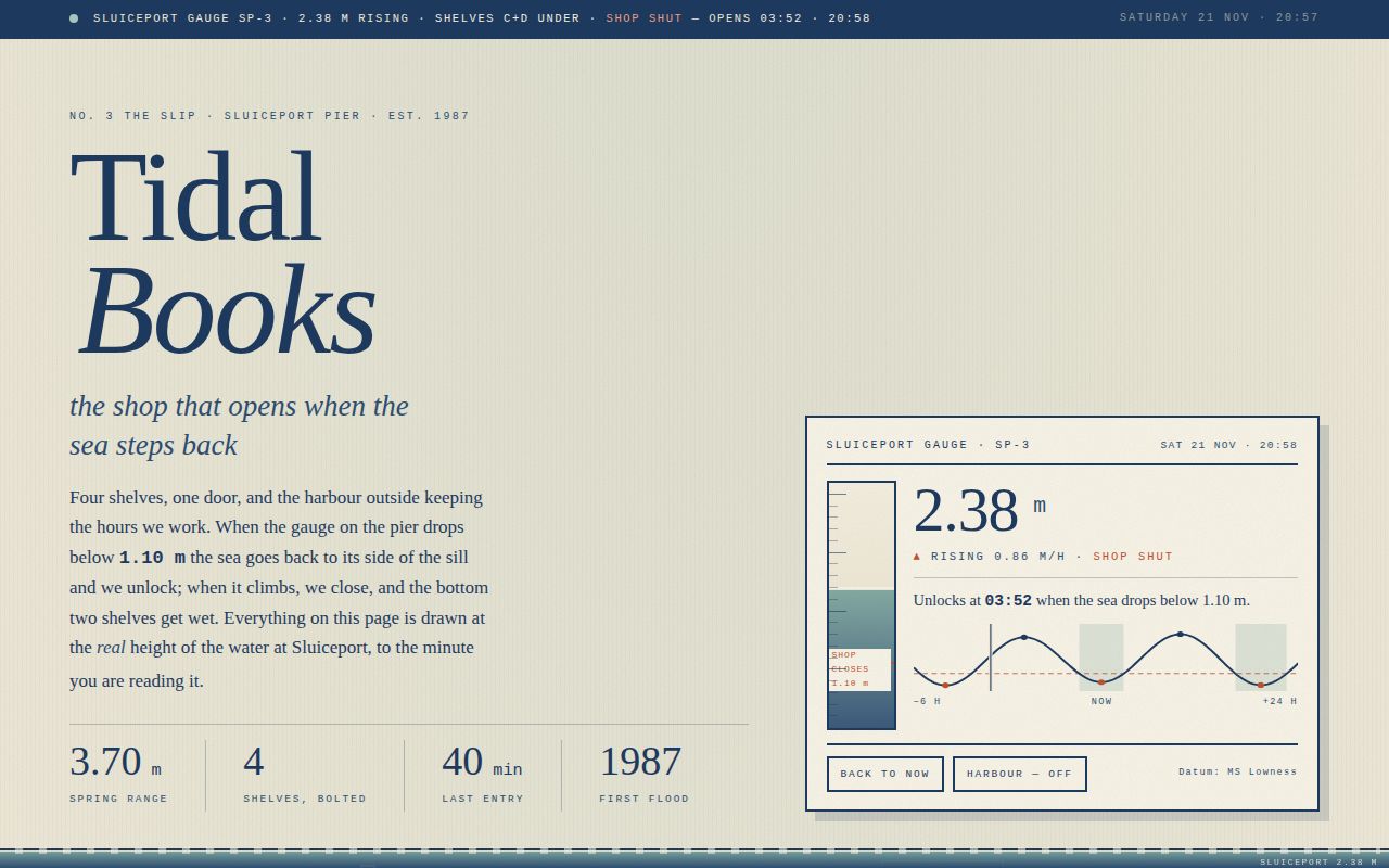
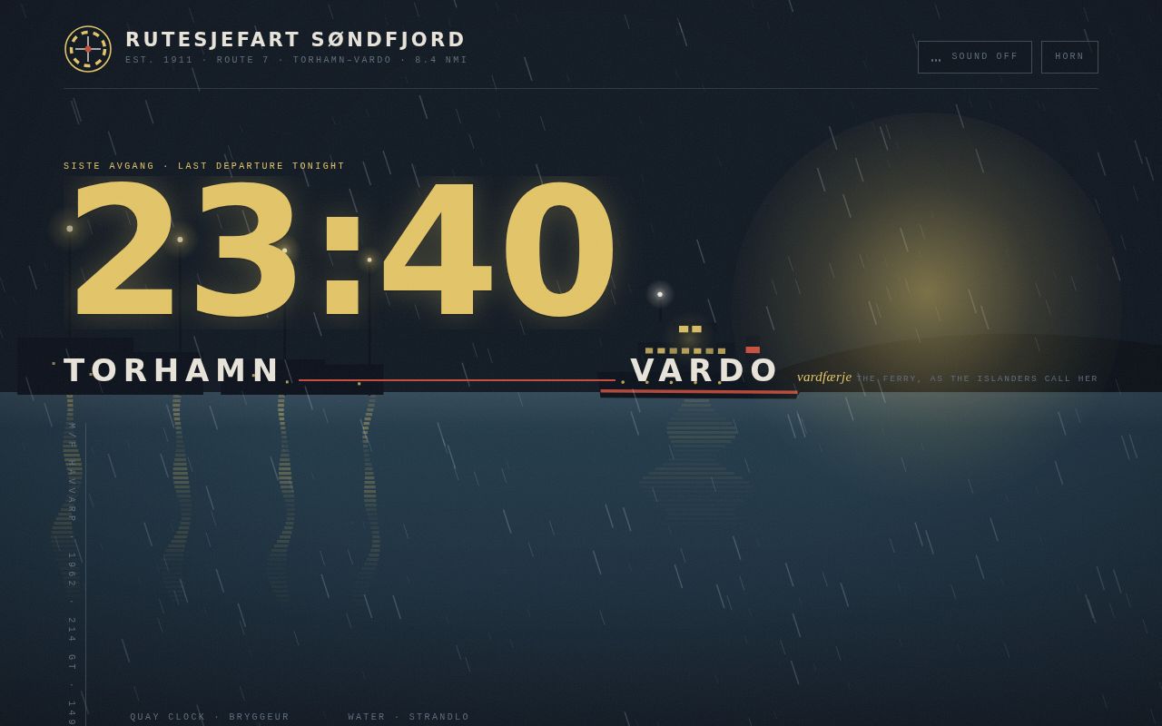
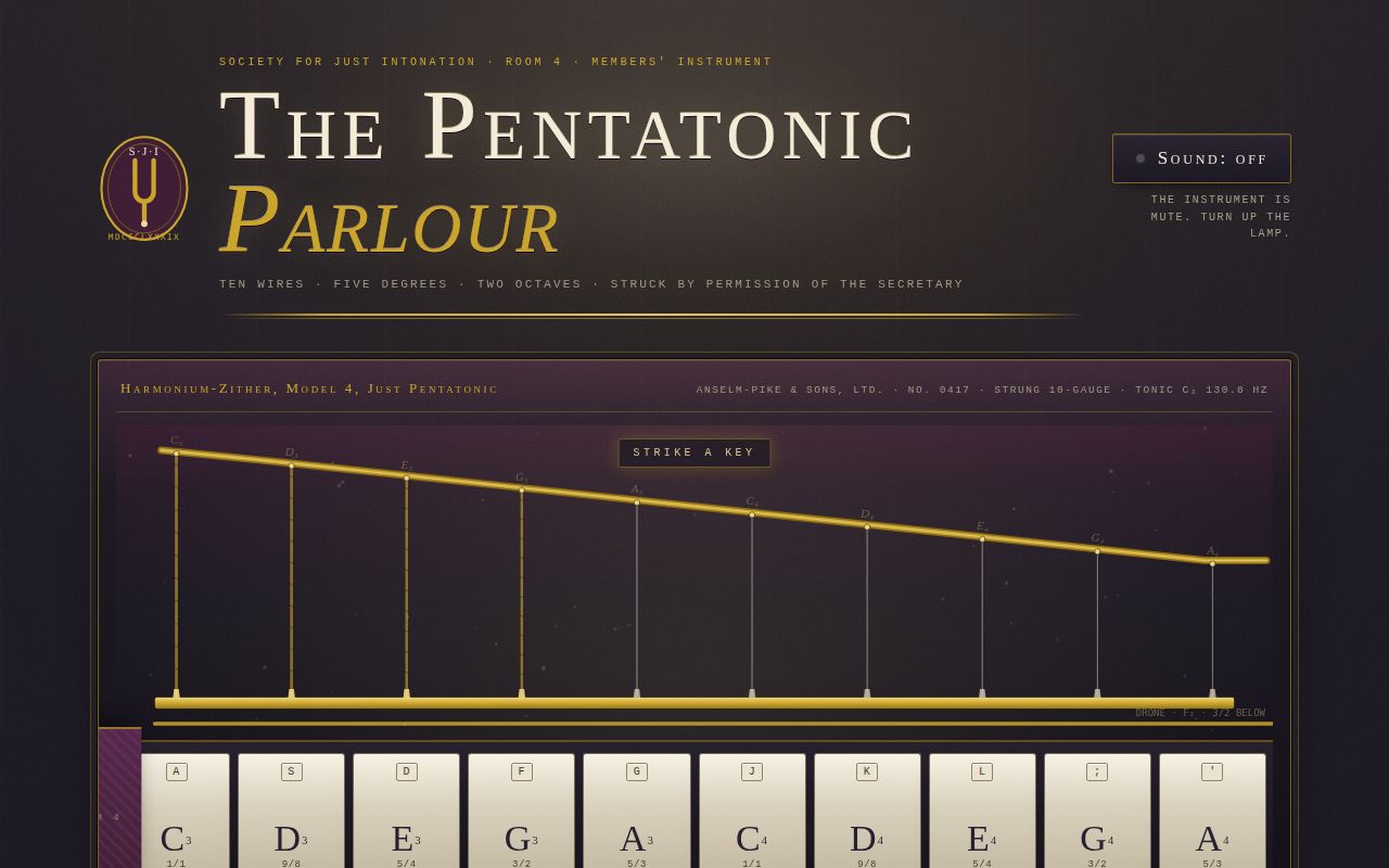
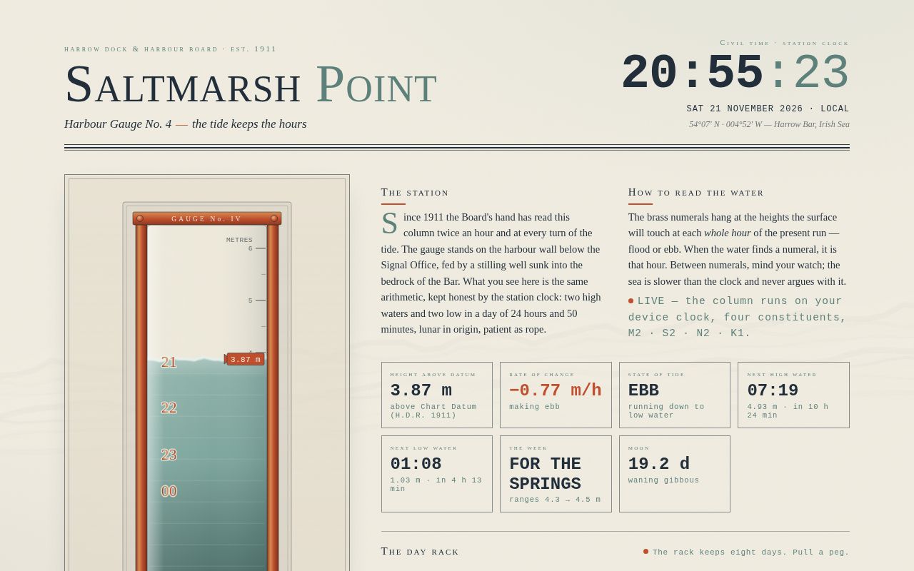
A harbour office plate from a fictional Irish Sea station where the tide itself keeps the hours. A brass-framed glass gauge rises through warm cream paper, its seafoam water surface trembling with summed sine ripples, while brass numerals hang at the exact heights the water will touch at each whole hour of the present flood or ebb. Behind everything, the caustic shadow the tide throws — ribbons of interference light — swings slowly across the paper as the cycle turns, and an instrument row reports height, rate, state and the next two turns of the tide in tabular monospace. Eight brass day pegs offer a week of the station's tide curves, each drawn stroke-by-stroke when pulled. It is a working clock, a plausible harmonic tide model, and a piece of maritime stationery at once.
Open
Original prompt
Build a single-page "tool" that reads as the public instrument of a fictional harbour tide station: SALTMARSH POINT, Gauge No. 4, kept by the (invented) Harrow Dock & Harbour Board since 1911. The page tells the true time using a real, running clock plus a live water column whose height is computed from a genuine semidiurnal tide model — the water itself is the clock face. MOOD. An early-20th-century harbour office instrument plate: warm paper, engraved thin rules, small-caps serif headings, monospace instrument digits. Quiet, precise, slightly ceremonial. Light page, no dark theme. PALETTE (contract). Paper #F2EEE3 (with derived deeper papers #E9E2D2, #DFD7C4 for panels/plates); Seafoam #7FA8A0 (derived deep #5E837C for shadowed water, pale #AEC9C2 for the surface zone); Harbour ink #22303C (all text, rules, engraving lines); Buoy orange #C1502E (accents only: active peg, now-pointer, key numbers). Brass is rendered as a metallic gradient derived from buoy orange: #8F3A20 → #C1502E → #D98E55 → #A8542F, used on the gauge rails, screws and hour numerals. TYPOGRAPHY. Two system stacks only: Georgia/Palatino serif for display and labels (used in small caps with wide tracking for headings; 44–64px masthead vs 10–11px labels), and ui-monospace/Menlo/Consolas/Courier for all numerals (clock at clamp(40px,6vw,68px), tabular-nums; readouts at 26–30px). Strong scale contrast: 10px tracked captions beside 60px instrument digits. LAYOUT. Masthead: station name and a rule-lined plate on the left, the big live civil clock + date on the right, separated by double hairline rules. Below, two columns (stacked under 900px, comfortable from 360px): LEFT = the gauge itself in its brass frame; RIGHT = briefing copy, a row of instrument readouts (height, rate, state, next HW/LW, springing/neaping, moon age), then the day rack (8 brass pegs) and the drawer panel it opens. Footer: station colophon and the harbour master's note. A fixed paper-grain overlay (feTurbulence, no images) and a fixed caustic canvas sit behind all content. THE GAUGE (SVG + DOM, real clock). A tall vertical glass tube in a brass channel frame with screws, mounted on the paper. Inside, water fills to the height given by a four-constituent harmonic model: h(t) = Z0 + A·cos of M2 (12.4206 h, A 2.35 m) + S2 (12.0 h, A 0.52 m) + N2 (12.6583 h, A 0.16 m) + K1 (23.9345 h, A 0.26 m), Z0 = 2.80 m above Chart Datum — a real semidiurnal cycle with spring–neap beating. Right side of the tube: metre graduations every 0.5 m with labels every 1 m; dashed CHART DATUM and MSL lines. Left side: BRASS HOUR NUMERALS — the core conceit. On the present monotonic branch (since the last low/high water), the numerals are placed at the exact heights the water will reach at each whole civil hour; when the surface touches a numeral, it is that hour. The set rebuilds smoothly as hours pass and at each turn of the tide. A buoy-orange pointer triangle rides the surface with a live height tag. SIGNATURE MOMENT. The water surface is alive: an SVG path sampled from two or three summed sine trains with different wavelengths/speeds, recomputed every animation frame, with a bright glint stroke along the crest line; hovering (or touching) the tube briefly raises ripple amplitude like a disturbed glass. The water casts a CAUSTIC SHADOW: on the fixed canvas behind the page, several interference-band ribbons of warm light (#FFFCF0) and pale harbour-ink shadow swing across the paper, anchored at the live waterline and sweeping horizontally as the tide turns (phase of the M2 cycle drives the sweep; a slow lamp flicker modulates it). The caustics visibly migrate while you watch. ENTRANCE (first three seconds). Staggered, designed: hairline rules wipe open (scaleX, custom cubic-bezier(.16,1,.3,1)); masthead words lift in 40ms steps; the brass frame scales down into place; the water rises from Chart Datum to its true level over ~1.8s with a custom ease; brass numerals stagger in; the caustic canvas fades up; the day pegs drop one by one; finally the interaction hint. Reduced motion: everything appears settled at frame one, single static sine, caustics drawn once and only updated at half-minute intervals. INTERACTION (hover/read only, plus day pegs). No editing, no inputs. Hover: numerals brighten and reveal their minute-offset fine print; readout tiles lift a hair with a deeper ink underline; the tube responds to pointer proximity with livelier ripples. Click a DAY PEG: the drawer opens with a 24-hour tide curve for that day, self-drawn (stroke-dashoffset), showing HW and LW dots with times and heights, hour ticks, and (only for today) a dashed now-line that tracks. Clicking the active peg again closes the drawer. All pegs are real <button>s with visible :focus-visible rings (2px #C1502E, offset) and aria-pressed state; the drawer announces itself via an aria-live polite region. Touch: pointer events throughout, pegs ≥44px targets. COPY. Real-to-the-fiction English, no lorem: station identity line ("54°07′ N · 004°52′ W — Harrow Bar"), datum note ("Heights in metres above Chart Datum, Harrow Dock Reference 1911"), an instruction panel titled "How to read the water" explaining the hour numerals and trusting the watch, a legend for the rack ("The rack keeps eight days. Pull a peg."), and a signed colophon note from "R. Teague, Harbour Master." Model constants are disclosed honestly in the footer as a four-constituent fit to station records. TECHNICAL. One self-contained HTML file, inline CSS/JS, zero network requests; rAF single loop driving water, caustics, clock and readouts (text updated only on change); canvas handles devicePixelRatio + debounced resize; numerical extremum search (scan + bisection) for next/previous HW/LW, rates by central difference; every DOM lookup null-guarded; no console.log, no TODO, no external anything.
002-tide-clock.txt
003
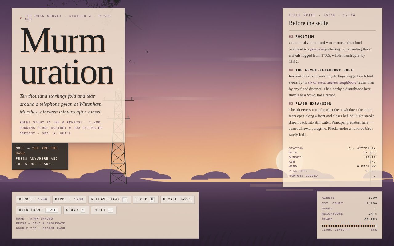
A single full-viewport generative field study that behaves like a field station's live dusk survey of a starling murmuration over Wittenham Marshes, nineteen minutes after sunset — the whole page is the scene, presented as a printed plate rather than a website. Its one strong idea: the viewer is not a spectator but the predator. The cursor flies an ink sparrowhawk over a canvas of 1,200 boid agents orbiting a lattice telephone pylon, and every press reads as an act of predation — the cloud tears open along an expanding shockwave front and closes behind it like smoke drawn back into still water (flash expansion). The furniture is field-notebook paper, not glass: warm-cream cards with hairline ink rules and hard offset shadows carry a naturalist's-log masthead, three numbered notes and a station data list, a controls rail, and a live readout whose density meter reacts to the flock's real spread. Typographic signature is extreme scale contrast — a 52→128px Georgia display word with an off-register apricot shadow against 10px 0.2em-tracked mono labels — over a cold-plum-to-apricot dusk palette (#4E3A57 zenith → #E8A87C band, ink #232323 birds, plum #6B4F6E treeline) with baked treeline, catenary wires, marsh, sun reflection and reeds, all under an feTurbulence grain. The first three seconds are choreographed: a cream veil wipes, the land rises out of the horizon, the masthead builds letter by letter, and the flock is born as a tight ball on the pylon head and unfolds into the sky.
Open
Original prompt
Build a single full-viewport generative art page that behaves like a field station's live dusk survey of a starling murmuration. The whole page IS the scene: no scrolling, no marketing sections, one idea executed with conviction. CONCEPT AND MOOD. Ten thousand dusk starlings fold and tear around a telephone pylon above a marsh at Wittenham, nineteen minutes after sunset. The mood is cold light and warm sky: hush, woodsmoke, wet straw, the click of far wings. The viewer is not a spectator — the viewer's cursor IS the hawk. This is a predator-response study, and every interaction should read as an act of predation. PALETTE (contract, use these hexes). #E8A87C dusk apricot sky — this is the dominant band of the sky gradient and the colour the birds read against. #232323 ink birds — every bird, every hawk, all body text, all rules. #6B4F6E far treeline — the horizon silhouette, the label rules and the small plum UI accents. Derived tones are allowed only as supports: deep dusk plum #4E3A57 at zenith, warm cream #FBEBD7 for paper panels and highlights, marsh umber #3E2C42 below the treeline. Sky gradient (top to bottom): #4E3A57 → #7B5670 → #C08183 → #E8A87C at the apricot band → #F3C89B near the horizon. Never pure white; never black. TYPOGRAPHY. System stacks only. Display: Georgia, "Palatino Linotype", Palatino, "Baskerville", serif — the word "Murmuration" set enormous (clamp 52px → 128px), weight normal, letter-spacing -0.035em, ink #232323, with a hairline apricot shadow offset 3px to make it feel printed off-register. Labels, keys, stats and data: ui-monospace, "SF Mono", Menlo, Consolas, "Courier New", monospace — 10–11px, uppercase, letter-spacing 0.2em. Extreme scale contrast (10px labels against 128px display) is the typographic signature. Italic Georgia carries the deck/subtitle. LAYOUT. Canvas fixed behind everything (inset 0, z-index 0). Overlay furniture, each panel an opaque warm-cream field card (rgba(251,235,215,.82)) with a 1px ink border at 18% opacity and a hard 3px ink/8%-opacity offset shadow — field-notebook paper, not glass: TOP-LEFT masthead (eyebrow "THE DUSK SURVEY · STATION 3 · PLATE 003", display title, italic deck, byline). RIGHT field-notes card, ~320px wide, three short numbered notes plus a two-column data list; on screens under 860px it collapses to a "Field notes" button that opens the same content as a bottom sheet with a close button and Escape support. BOTTOM-LEFT controls rail: buttons Bird −, Bird +, Release hawk, Recall hawks, Hold frame, Sound, all real <button> elements with :focus-visible rings (2px ink outline + cream halo) and aria-pressed on the toggles. BOTTOM-RIGHT live readout: AGENTS, EST. COUNT, HAWKS, NEIGHBOURS, FPS, plus a DENSITY bar that reacts to the flock's real spread. A tiny first-run nudge near the pylon reads "move — you are the hawk" and retires itself on first pointer move. SCENE (all drawn on canvas, static layers baked once into an offscreen canvas and blitted per frame): low sun disc and glow at about 72% width, 66% height; four or five thin cloud streaks; a two-band procedurally-noised treeline silhouette in #6B4F6E with a few lumps of crown; three sagging catenary wires; a lattice telephone pylon at about 30% width on desktop (62% on phones) — two converging legs, X cross-bracing, two cross-arms with insulator nubs — drawn in ink, standing slightly into the apricot band. Below the treeline: marsh band plus a pale water strip carrying a broken reflection of the sun, and a row of reed strokes along the bottom edge. An inline SVG feTurbulence grain rect sits over the whole page at ~7% opacity, multiply blended, pointer-events none. SIMULATION. Boids on a uniform spatial-hash grid (cell = perception radius, head/next Int32Array linked lists, zero per-frame allocation), 3x3 cell neighbour lookup capped at about 26 checks per bird, hard cap 1500 agents (start 1200, trimmed to 700 below 700px for phones, ±150 per press, min 300). Forces: separation, alignment, cohesion, a slow-drifting roost anchor above the pylon head that the flock orbits (weak spring plus tangential swirl so the cloud folds AROUND the pylon rather than through it); each depth band orbits its own horizontally offset anchor point, which stretches the flock into a ribbon across the sky instead of a blob, soft edge steer inside a band between zenith UI and the treeline, speed clamped between a min and max, panic variable per bird that decays exponentially and raises max speed, raises separation weight and lowers cohesion — that is what makes the cloud tear and re-knit. Each agent carries a depth z in 0..1 driving size (5→13px), alpha (0.45→0.95) and slight parallax on the roost drift, so the cloud has thickness. Birds are drawn from a pre-rendered sprite atlas (6 flap phases) via setTransform + drawImage — no per-bird save/restore. requestAnimationFrame, dt clamped, devicePixelRatio honoured (capped at 2), resize debounced, loop suspended on visibilitychange. SIGNATURE MOMENT. When the hawk dives, a shockwave ripple passes through the flock and the whole cloud splits and re-forms like smoke. Pointer-down (or tap) on the scene, the D key, or the Release-hawk button sends the cursor hawk into a stoop at the densest part of the cloud: at the moment of release an expanding ring is spawned at the hawk's position (radius grows ~620 px/s, life ~1.4s, drawn as a cream highlight annulus over a faint ink annulus). Agents the ring front sweeps past are shoved radially outward and set to full panic, so a visible wave travels through the cloud, the flock tears into two or three lobes, and as panic decays cohesion closes the wound like smoke drawn back into still water. The hawk's own path leaves a short decaying ink trail and a soft fear shadow that parts the birds beneath it. HAWKS. The primary hawk springs toward the pointer position with a heavy damped lag and banks into turns; it must feel like a two-second head start. Pressing H (or the button, or the on-scene double-tap) releases a second hawk that flies autonomously: sinusoidal wander, a preference for the flock's flank, and its own unprovoked stoop every 9–14 seconds, each spawning its own shockwave. Recall hawks removes the autonomous birds and gives them a short climb-out. Hawk bodies are drawn as falcon silhouettes (pointed wars, long tail) rather than starling sprites. ENTRANCE (first three seconds, choreographed, custom cubic-bezier easings only — no bounce, no fade-up defaults): 0.00s sky wipes down as a cream overlay dissolves; 0.15s the land layer — treeline, marsh, pole, wires, pylon, reeds — rises out of the horizon as its own baked canvas, blitted with a small upward translate and an alpha ramp on a smoothstep ease; 0.45s masthead title letter by letter, ink sliding up under a mask with 72ms stagger; 0.62s deck, byline and cards fade-and-lift in sequence; 0.80s all agents are released from a tight ball on the pylon head and unfold into the sky — the flock literally births from the entrance; 1.9s the nudge appears. Panels are never all visible at once at load. INTERACTION MODEL. Pointer move anywhere (including over panels) retargets the hawk. Pointer down on the scene = dive + shockwave (single tap on touch). Double-tap = release a second hawk. Diving or releasing a hawk while the frame is held automatically resumes motion, so a strike never lands on a frozen scene. Keys: H release second hawk, D dive, Space hold/resume the frame, M toggle sound, N toggle notes, R reset the flock to the pylon. Every key action has an equivalent button so the page is fully operable by touch and by keyboard alone. Sound is OFF by default and only ever starts on a user gesture: Web Audio synthesis only — looped filtered noise wind with a slow LFO, randomly scheduled chirps (short sine sweeps 2.4–3.9kHz), and a bandpass-swept noise whoosh on every dive. HOLD FRAME freezes physics and ambient drift and stamps a small "FRAME HELD" mark; it is also the initial state under prefers-reduced-motion, where the flock is pre-composed into a still murmuration, the entrance skips to its final state, no autonomous hawk dives occur, rings expand at a third of the speed, and the Motion button lets the viewer opt into full animation. COPY. Real, specific, written like a naturalist's log, no lorem: deck "Ten thousand starlings fold and tear around a telephone pylon at Wittenham Marshes, nineteen minutes after sunset."; byline "Plate 003 · agent study in ink and apricot · running model of 1,200 birds against an estimated 9,800 present". Notes: (1) ROOSTING — communal autumn/winter roost, cloud forms before settling, arrival from 17:05, full settle 18:32; (2) THE SEVEN-NEIGHBOUR RULE — reconstructions of roosting starlings suggest each bird steers by its six or seven nearest neighbours rather than any fixed radius, which is why disturbance travels as a wave; (3) FLASH EXPANSION — observers' term for the cloud tearing open along a front and closing behind it, principal predators sparrowhawk and peregrine, flocks under a hundred birds rarely hold. Data list: STATION 3 / 14 NOV / 16:41 SUNSET / 4°C / WIND 6 KM/H NW / 9,800 PEAK EST. / 2 RAPTORS LOGGED. Legend keys: MOVE hawk · PRESS dive · H second hawk · D stoop · SPACE hold frame · M sound · N notes · R reset.
003-starling-murmuration.txt
004
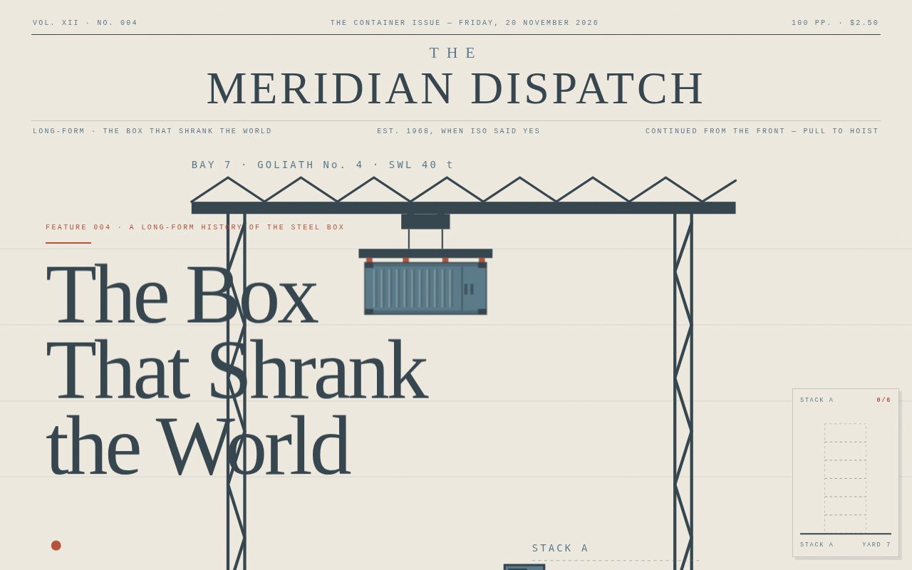
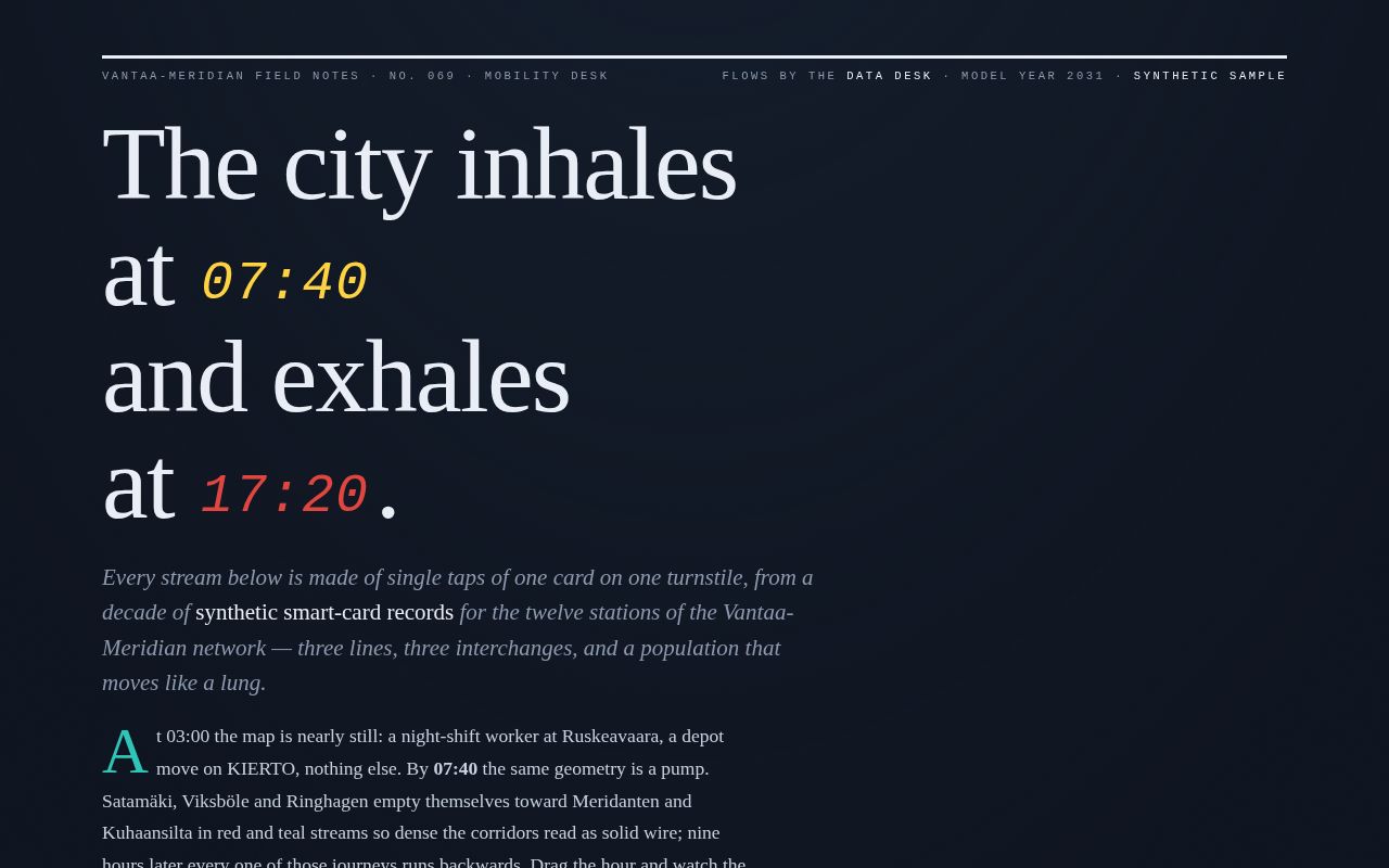
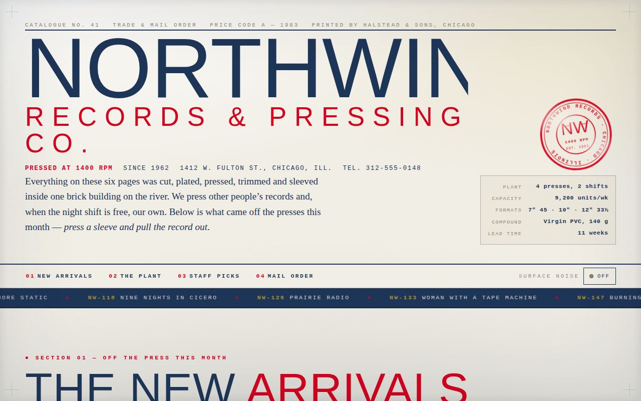
A light-newsprint long-form feature from the fictional Meridian Dispatch on how the standard steel shipping container shrank the world. The page opens as a pinned dockside bay where the reader's own scrolling drives a hand-drawn SVG gantry crane — trolley traversing, cables paying out, and a 26-foot beat at the bottom of the pull where the container slams onto the stack, shaking the whole stage and bursting a dust cloud, sealed by a rotated oxide-red "IN STACK" rubber stamp. Scrolling back lifts the box off again: the crane loads and unloads indefinitely. The article proper runs in a centred serif column with oversized ghost roman numerals, drop caps, pull quotes from invented named voices, a full-bleed $5.83-vs-$0.16 bar chart with count-up figures, a mono timeline strip, a twelve-box interactive manifest wall, typographic-mass statistics (58, 90%, 24,346), a steel coda block, and a fixed reading-progress widget that lands one corrugated container per section as you read. Steel-blue infographics and typographic mass do the arguing; newsprint keeps it calm.
Open
Original prompt
Build a single long-form editorial scroll page that reads like a Sunday-feature spread from an inventive newspaper, "The Meridian Dispatch", about how the standard steel shipping container shrank the world. Light newsprint throughout. The page is one continuous article: masthead, a pinned crane bay, five numbered sections, an interactive manifest wall, and a colophon. No marketing patterns, no cards-on-glass, no gradient headline. PALETTE (contract, use these hexes). #EFEAE0 newsprint — the page background, the paper all ink sits on; never pure white. #B5533C oxide red — kickers, section numerals, rules, stamps, focus rings, a few container bodies; the only warm voice. #37474F steel — the "ink" colour for nearly all type, the crane structure, and the drawn linework; near-black but blue. #5C7B8A sea — second ink: captions, deck text, water, quieter containers, chart fills. Derived supports only: paper shade #E4DCCD for panels, faint rule grey rgba(55,71,79,.18), dust haze #D8CFBD. TYPOGRAPHY. System stacks only. Display and body: Georgia, "Palatino Linotype", Palatino, "Times New Roman", serif — masthead and headlines set enormous with tight leading (-0.03em tracking, leading 0.88–0.94 on display sizes), real drop caps on section openers, italic decks. Labels, keys, data and stamps: ui-monospace, "SF Mono", Menlo, Consolas, "Courier New", monospace — 10–11px uppercase, letter-spacing 0.18–0.22em. Scale contrast is the typographic signature: 10px mono eyebrows against 110px+ serif display, and 90px+ "typographic mass" stat numerals inside the text stream. LAYOUT. A centred newspaper column (max 760px) for reading, broken deliberately by three full-bleed set pieces: (1) the pinned crane bay, (2) the bar-chart spread in Section II, (3) the 12-box manifest wall in Section IV. Masthead: volume/date/edition line with hairline rules above and below. Each section opens with a huge oxide-red roman numeral in the margin, a mono kicker, and a serif headline that line-masks in as it enters. SIGNATURE MOMENT — THE LANDING. The first screen is a 340vh bay containing a sticky viewport stage. A hand-drawn SVG gantry crane (portal legs, crossbeam, trolley, two hoist cables, spreader, corrugated 20-ft container, dockside truck, quay, bollards, sea band) reacts to scroll with DOM choreography: 0.10–0.22 trolley traverses with the loaded spreader; 0.22–0.58 cables pay out and the container descends; at progress 0.58 the container SLAMS onto the stack — a 460ms jolt shakes the whole pinned stage with a stepped transform keyframe (translate + rotate, no bounce easing), a dust puff of ~34 particles bursts from the impact point (positioned via getScreenCTM, removed on animationend), and a rotated oxide-red rubber stamp "IN STACK · NO. 1" thuds in beside the box. Scrolling back up past 0.58 unloads: the stamp and stack box vanish, the container re-attaches to the cables and rides back to pick-up position — the crane can be loaded and unloaded indefinitely. After landing, the trolley returns empty while the reader continues. READING-PROGRESS STACK. A fixed dockside widget (bottom right, ~150px) holds a 6-slot stack outline; each of the five article sections plus a final "coda" box drops one corrugated container into it as the section scrolls into view, with a micro-jolt and dust on the widget itself. Slots alternate sea / oxide / steel bodies. A mono counter reads "IN STACK · 3 / 6". Screen readers get aria-live updates. SECTION II CHART. Full-bleed SVG bar chart: cost to move a ton of cargo, break-bulk $5.83 vs containerised $0.16 (1970 US GAO figures, noted as rounded). Bars grow from zero on entry with cubic-bezier(.16,1,.3,1) over 1.2s; the two numbers count up from 0 with a rAF counter when the chart first enters the viewport. INTERACTION — HOVER BOXES FOR MANIFEST DATA. Section IV is a wall of 12 tappable/hoverable container buttons (real <button>s). Hover or keyboard focus pops a manifest card above the box: container ID (owner prefix + 6 digits + check digit), tare/gross weight, contents, route (origin → destination), seal number, and one human detail line. Touch: tap toggles the card, tapping another closes the first, Escape closes all. Cards alternate steel and sea backgrounds with a hairline border and a hard offset shadow; focus-visible draws a 3px oxide-red ring. ENTRANCE (first three seconds, custom easings only — cubic-bezier(.22,1,.36,1) and cubic-bezier(.16,1,.3,1), no bounce, no generic fade-up): 0.00s masthead hairlines draw horizontally from centre; 0.25s headline lines rise under per-line overflow masks with 90ms stagger, the final period in oxide red scales in; 0.90s the crane strokes draw on (stroke-dashoffset); 1.40s the trolley begins its traverse so the first thing you see is the rig moving; the deck text and byline fade in at 1.15s. A mono scroll-hint "PULL — THE RIG IS LOADED" with a small down-glyph sits bottom-left and retires on first scroll >40px. COPY DIRECTION. Real long-form journalism voice, ~5 sections, specific (verified) dates and figures: April 26, 1956, the Ideal X, 58 containers, Newark → Houston; $5.83 vs $0.16 per ton; ISO 668 (1968) corner-casting standardisation; Sea-Land's transatlantic Fairland, May 1966; Vietnam-era military containerisation 1965–67; Felixstowe's 1967 Berth 8; the Ever Given, March 23, 2021, ~20,124 TEU, refloated after six days; today's ~24,000-TEU ships. All quotes are invented and attributed to invented named speakers (e.g. Dolores Frayne, berthing clerk; Cdr. Harriet Voss, USNS-adjacent supply officer; Mak Suk-ling, night checker at Yantian); a reader's note in the colophon states interviews are dramatised reconstructions while dates and arithmetic are from the record. No lorem ipsum. Manifest-wall cargo lines should be wry and concrete (frozen tilapia, a disassembled Ferris wheel, one empty box returning for its next box). STRUCTURE. 1) Masthead + pinned crane bay (headline "THE BOX THAT SHRANK THE WORLD", deck, byline). 2) Section I — IDLE HOOKS (Newark 1956 narrative, drop cap, pull quote). 3) Section II — THE ARITHMETIC OF A TON (chart + margin note). 4) Section III — THE NAVY'S BOX (Vietnam 1965–67, mono timeline strip of dates with red ticks). 5) Section IV — THE MANIFEST WALL (interactive). 6) Section V — THE PORTS THE BOX ATE (Felixstowe, Newark's closure, Shenzhen, Ever Given, big 90% numeral block, coda). 7) Colophon + reader's note + back-to-top button (real button, scrolls smoothly unless reduced motion). MOTION AND PERFORMANCE. One rAF-throttled scroll handler drives the crane rig and section observers; IntersectionObserver handles reveals, stack widget and counters; no layout thrash (only transform/attribute writes inside rAF). prefers-reduced-motion: crane rig jumps to a sensible static pose per scroll band with no shake, no dust (impact shown as a still puff shape that fades once, no repeat), all reveals instant, count-ups set final value, trolley fixed mid-traverse on load. Every interactive element (manifest buttons, stack widget, back-to-top, skip link) is keyboard-reachable with visible focus. Responsive 360px → desktop: below 860px the crane stage keeps its sticky full-viewport bay, deck text sits over a newsprint scrim, manifest wall reflows to 2 columns of buttons (360px-safe), the stack widget shrinks to 96px and moves to bottom-right with reduced slots height; the chart stacks vertically under 560px.
004-container-revolution.txt
005
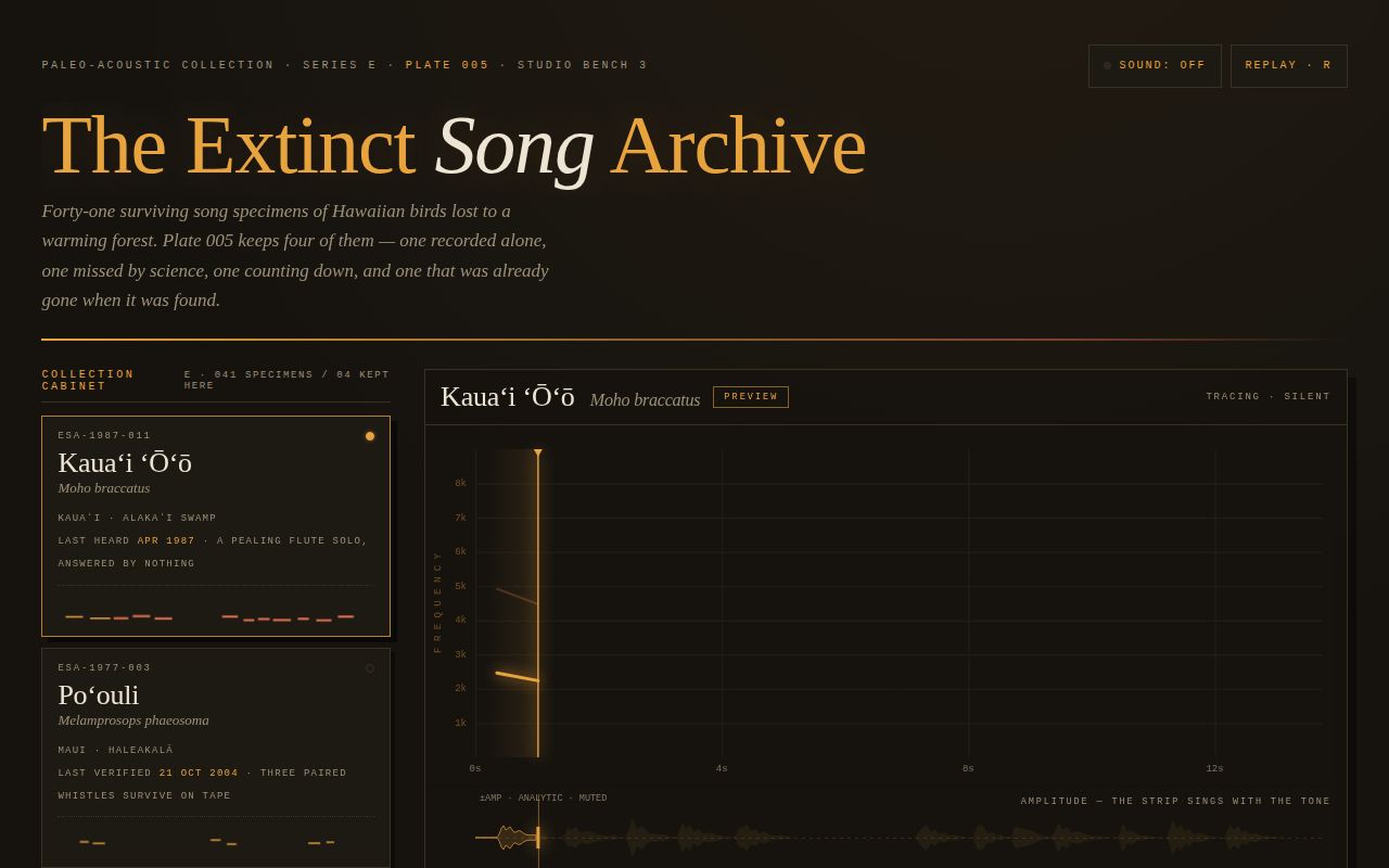
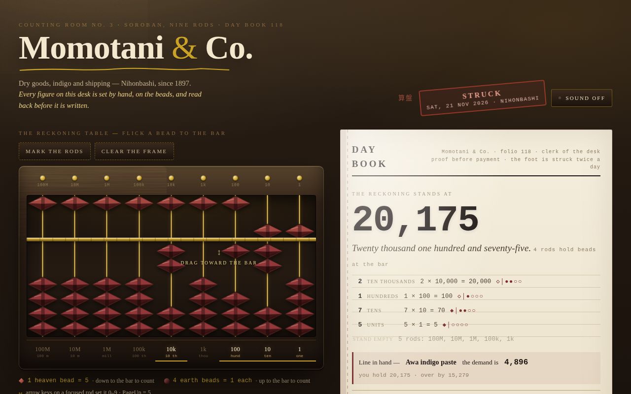
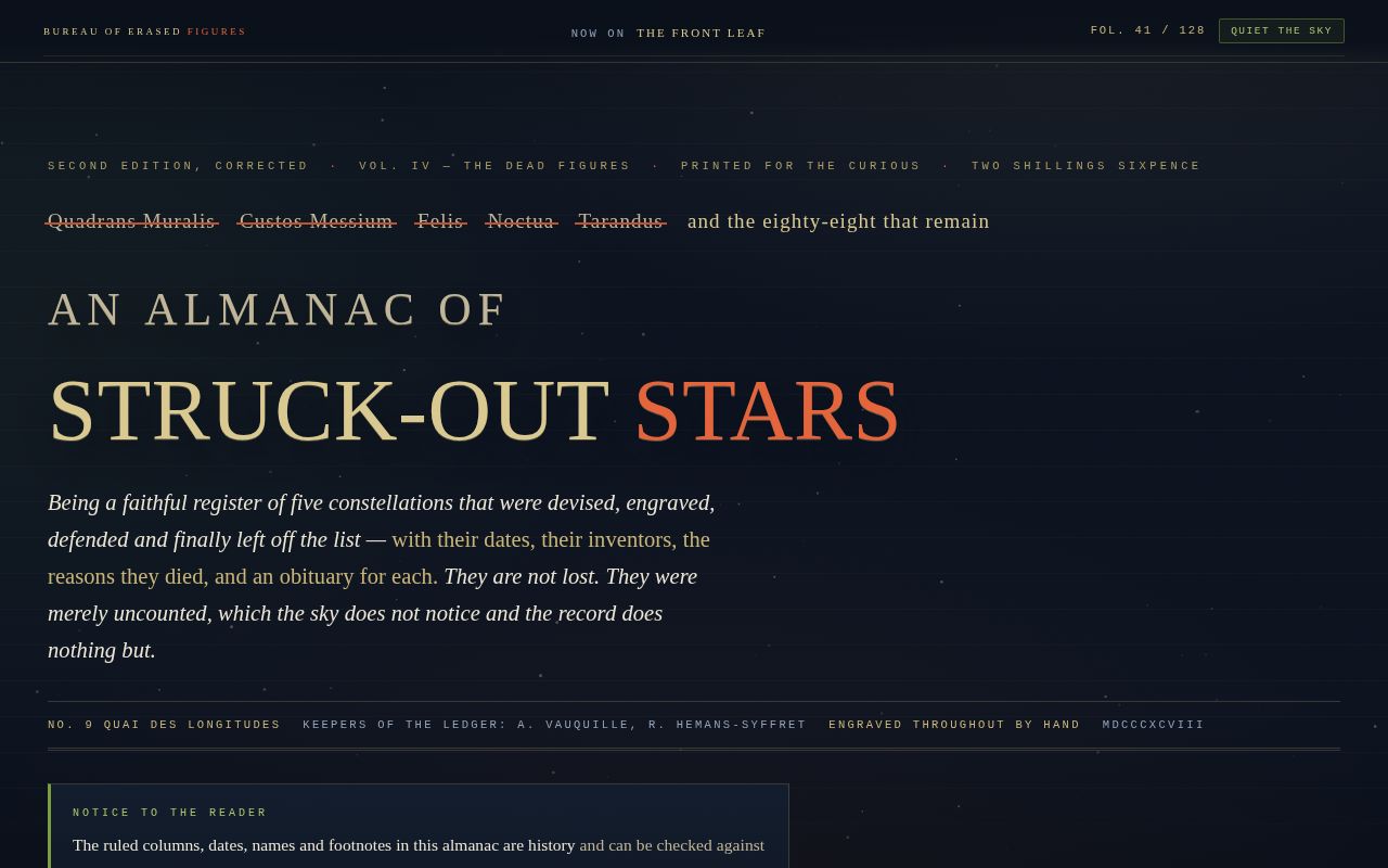
The Extinct Song Archive is a single self-contained museum plate — a dark studio bench in amber-on-brown phosphor where four extinct Hawaiian birds are kept as specimen songs. On the left, a "Collection Cabinet" rail holds four real button cards (Kauaʻi ʻōʻō, Poʻouli, Kauaʻi ʻAkikiki, and the hatched ʻAlaʻala Kiwikiu reconstruction), each with a catalogue number, serif species name, scientific name, last-heard line, a status LED and an inline-SVG mini-spectrogram sparkline. On the right, one large specimen plate pairs a canvas spectrogram — frequency and time axes, glowing note traces, a phosphor playhead — with an amplitude waveform strip beneath that literally sings: while a song plays it reads the live Web Audio signal through an AnalyserNode. Sound is off by default behind a visible SOUND button; every song is synthesized in the browser from a hand-transcribed note table — flute whistles, paired peals, descending trills, buzzy rasps — with convolution reverb and a low tape-hiss bed. A plate-meta grid (duration, notes, peak frequency, band, reel, gain, signal-to-noise), a two-sentence curatorial label in Georgia, and a three-column colophon (about the plate / why the forest went quiet / an honesty note on invented archive data) complete the exhibit. The palette is fixed — #16130F studio brown, #E8A33D amber phosphor, #D96C4F coral peaks on ivory #EDE4D3 text — and typography runs on a deliberate contrast of large serif display against 9–10px tracked uppercase monospace data, the whole thing feeling like an oscillograph warming up in a closed room.
Open
Original prompt
Build a single self-contained page that behaves like one plate in a museum's paleo-acoustic collection: an archive of the last recorded songs of extinct (and functionally lost) Hawaiian birds. The page is a dark studio bench: a cabinet of species cards on the left, and one large "specimen plate" on the right — a canvas spectrogram with a frequency axis, a time axis, and, directly beneath it, an amplitude waveform that literally sings. Sound is OFF by default behind a visible toggle; Web Audio synthesis only; no audio files, no network requests. CONCEPT AND MOOD. The viewer is an archive visitor at a bench where four song specimens are kept: the Kauaʻi ʻōʻō (last recorded singing alone into a tape machine in the Alakaʻi, 1987), the poʻouli (no verified record since 21 October 2004, Haleakalā, Maui), the ʻakikiki (a descending trill heard only in breeding season; the last known wild bird, Pakele, was last seen 29 August 2025), and the ʻAlaʻala kiwikiu — known only from subfossil bones, whose plate is an honest RECONSTRUCTION built from the songs of its closest living relative, the Maui kiwikiu. The mood is amber-on-brown phosphor: an oscillograph in a closed room, tape hiss memory, reverence without sentimentality. Copy is museum-label English: precise, quiet, devastating. Collection data that is invented (catalogue numbers, reel IDs, durations, archive totals) is labelled as invented in the colophon; the bird facts and dates above are real. PALETTE (contract, use these hexes). #16130F studio brown — the page and plate ground, the background of every canvas. #E8A33D amber phosphor — the spectrogram traces, the playhead, axis labels, the title, active states, focus rings. #D96C4F coral peaks — loudest/harmonic trace energy, the waveform peak fill, the PINNED chip, small danger/emphasis marks. Supports, derived but quiet: card panel #1D1913, hairline rule #3A3125, ivory label text #EDE4D3, dim ivory #9C9078, grid line #241F18. Never pure white; near-black is only #16130F. TYPOGRAPHY. System stacks only. Display and curatorial prose: Georgia, "Palatino Linotype", Palatino, "Book Antiqua", Baskerville, serif — the title "The Extinct Song Archive" at clamp(34px → 76px), with a small-caps feel achieved by case and tracking, not webfonts; species names large serif italic; prose at 15px with 1.6 leading. ALL data, labels, keys, axes and captions: ui-monospace, "SF Mono", Menlo, Consolas, "Courier New", monospace — 9–11px, uppercase, letter-spacing 0.16–0.24em. Signature contrast: 10px tracked monospace against a 76px serif title, and 34px serif species names against 9px axis numerals. LAYOUT. Two-column bench at ≥980px: left rail ~330px (collection cabinet: header strip "COLLECTION CABINET", four species cards, legend), right plate (flex 1). Each card is a real <button>: catalogue number, Hawaiian name (serif), scientific name (italic), island + last-heard line, a 220×34 mini-spectrogram sparkline drawn as inline SVG generated from the species' note table, and a status LED. Below the cards: a designed interaction legend (hover · click · M · R · Esc). Right plate, top to bottom: a status bar (SPECIMEN ESA-xxxx, a PREVIEW/PINNED chip, unpin button), the spectrogram canvas (height clamp 240–440px) with left kHz axis and bottom time axis, the amplitude waveform strip canvas (~90px), then a plate-meta grid (DURATION / NOTES / PEAK FREQ / BAND / REEL / GAIN / SIGNAL-TO-NOISE, all computed or invented-but-labelled) and a two-sentence curatorial label in Georgia. Footer: three colophon columns (about the plate / about the cause — avian malaria carried by introduced mosquitoes climbing the mountains as the climate warms / honesty note about invented catalogue data). At <980px the rail stacks below the plate; at 360px everything remains readable and no horizontal scroll appears. SIGNATURE MOMENT. The waveform sings. When a song plays, the amplitude strip is fed by a real AnalyserNode reading the actual Web Audio output — its peaks rise and fall exactly with the synthesized tones. When sound is off, the same strip is driven by the analytic envelope of the note schedule so the plate still performs. Simultaneously the spectrogram "rebuilds": traces draw left-to-right under a glowing phosphor playhead at the true audio clock rate, note by note, with a persistence tail so fresh marks are brighter, then settle to full. Hovering a card previews its song; clicking pins it (locked plate, coral chip, plays once then holds). The ʻAlaʻala kiwikiu plate renders its traces as hatched reconstruction strokes with a rotated "RECONSTRUCTION — NEVER RECORDED" rubber-stamp overlay. SONGS (Web Audio, synthesized, each distinct). Per-note oscillators scheduled on the AudioContext clock. Kauaʻi ʻōʻō: 5–7 pure flute whistles per phrase (sine + faint octave), 1.4–3.0 kHz, slow glides, gentle vibrato, long releases, two phrases and a pause, ~13 s. Poʻouli: thin paired whistles 3.6–5.6 kHz, quick attack, short, sparse, ~10 s, quieter. ʻAkikiki: 2–3 descending trills (12–16 ticks, 30–45 ms each, 7.8 kHz sliding to 5.2 kHz) plus stray "weet" contacts, ~11 s. ʻAlaʻala kiwikiu: buzzy rasps — sawtooth through a Q≈8 bandpass, 1.6–3 kHz with tremolo, scratchy trills, ~12 s. Master chain: note gains → master gain → split dry/wet through a ConvolverNode whose impulse response is generated in JS (exponentially decaying noise, ~1.1 s) → AnalyserNode → destination. A very low filtered-noise hiss bed plays only while a specimen is playing. AudioContext is created on the first user gesture that enables sound; the Sound button is the only way sound can start, it is visibly labelled (SOUND: OFF / SOUND: ON, aria-pressed), and M toggles it. ENTRANCE (first three seconds, custom cubic-beziers, no bounce, no fade-up-by-default). 0.00s the masthead hairline sweeps left→right (scaleX, cubic-bezier(.16,.84,.24,1)); 0.18s the title rises from under a clip mask, the deck fades in behind it; 0.45s the plate frame strokes in (border opacity), axis labels flicker on like a warming tube; 0.6–1.4s the four cards slide in from the left, 90ms stagger, their mini-spectrograms drawing in via stroke-dashoffset; 1.5s the featured ʻōʻō plate silently rebuilds once, playhead and all, with no audio — the archive introducing itself. A one-line nudge "hover a card — click to pin" sits by the legend and retires after first interaction. MOTION & AMBIENCE. A faint scanline glow drifts over the spectrogram while idle (alpha ≈ 0.05 band, 20 s loop, rAF); loudest note marks carry a slow breathing coral glow; the LED on the playing card pulses. All ambient loops stop when the document is hidden. prefers-reduced-motion: entrance jumps to final state, the trace rebuild completes instantly (full plate drawn), scanline and breathing stop, the waveform draws a frozen envelope snapshot instead of animating; songs still play on request because the audio, not the motion, is the content. A MOTION button is not required; reduced-motion is honoured automatically and completely. INTERACTION MODEL. Pointer enter / keyboard focus on a card → preview that species (plate rebuilds live, waveform sings, audio only if sound is on). Pointer leave → plate returns to the pinned specimen if one exists, otherwise keeps the last preview fully drawn. Click / Enter / Space on a card → pin (status chip PINNED in coral, unpin button appears, that species plays once and its plate locks; clicking the pinned card again unpins). Keys: M toggles sound, R replays the current specimen, Esc unpins. Touch: tap = pin (tap again = unpin); no hover states are required for anything to work. Every control is a <button> with a visible :focus-visible ring (2px #E8A33D, 3px offset, plus amber glow). Canvases resize with devicePixelRatio (capped at 2) and redraw on debounced resize. rAF loops run only while a plate is tracing or ambient motion is allowed. COPY (real, museum-label quality, no lorem). Deck: "Forty-one surviving song specimens of Hawaiian birds lost to a warming forest. Plate 005 keeps four of them." ʻŌʻō label: "Recorded alone in the Alakaʻi Swamp in 1987: a male answering his own duet. The female's part was never on tape and is now nowhere." Poʻouli label: "Described to science in 1974 and missed by it soon after. The archive keeps three thin paired whistles — the whole of what this bird is known to have sounded like on tape." ʻAkikiki label: "A descending trill, heard only in the breeding season. Pakele, the last known wild bird, was last counted on 29 August 2025. Captive survivors remain; the forest is waiting for the mosquitoes to lose the mountain." Kiwikiu label: "Known from subfossil bones from ʻAlaʻula Swamp, Oʻahu, described in 2020 — a species that was already extinct when it was discovered. This plate is a reconstruction, voiced from its closest living relative, the Maui kiwikiu. Hatched traces mark inferred material." Legend: HOVER preview · CLICK pin · R replay · M sound · ESC unpin. Colophon: honesty note that catalogue numbers, reel IDs and durations are invented display data; conservation note naming the mechanism of loss: introduced mosquitoes carrying avian malaria, climbing the mountains as the climate warms.
005-extinct-song-archive.txt
006
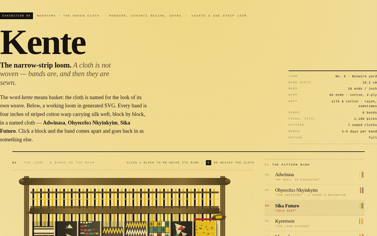
A cream, daylight workshop sheet whose whole subject is the arithmetic of a kente cloth: a generated SVG loom where striped warp ends descend from the beam and eight narrow bands are woven, block by block, in seven historically named Asante patterns. On arrival the loom weaves the cloth itself — a wooden shuttle flies the width of each band and the new cloth tightens thread by thread behind it, the beater punching down with a click. Click any block and its band re-weaves into the next named pattern; R re-weaves the whole cloth from a new seed; the console keeps the pattern bank, the reading of the last cloth you touched, the colour glossary and a ledger of every band, with honest sourced copy about whose cloth this is and what the names actually mean.
Open
Original prompt
Build a single-page, self-contained interactive art piece: a working Asante kente loom drawn in generated SVG, presented as a light-coloured workshop sheet. The viewer watches a cloth arrive band by band, can re-weave any band into another historically named pattern, and reads what each named cloth is said to carry. MOOD. Daylight, warm and dry, exact. Harmattan light on a mud-and-stucco workshop wall at Bonwire; a counting board, a pattern bank, a pigment tray. Not ethnic-decorative, not tourist-souvenir, not dark-and-moody. The pleasure is in the arithmetic of the weave — the fact that a famous cloth is eight plain-looking bands sewn edge to edge — and in the honest, sourced language of the craft (warp, weft, pick, shed, fell, beater, band). PALETTE (contract — these exact hexes dominate). #17140F black — page ink, the loom's shadow side, the warp ends at the fell, ground of the dense blocks; every hairline and rule. #E3B505 gold — silk weft, active states, focus outlines, the shuttle body's lit edge. #2E6F40 green — silk weft, verified marks, quiet secondary accents, block dividers. #B3261E red — the only alarm colour: loom state, current pick, the reading panel's name rule, pinned ledger chips. #F4E1A1 cream — the page ground (paper), the cotton undyed warp, the light in the wood. Derived wood tones for the loom frame only: #4A3A1C, #6B5426, #8A6D33 (all mixtures of black + gold + a little cream). No hue outside the five contracts appears except these wood mixtures. TYPOGRAPHY. System stacks only, two families, hard contrast. · Display + body: Georgia / 'Palatino Linotype' / Palatino / 'Times New Roman' / serif. Masthead title at clamp(3.4rem, 13vw, 7.6rem), weight 700, letter-spacing -0.035em, black. Pattern names in the bank and the reading panel at 1.05–3rem serif with the Akan orthography intact (Ohyeɛɛfoɔ, Nnwötoa) and font-variant-ligatures: none so the ɛ vowels survive untouched. · Labels + data: ui-monospace / Menlo / Consolas / 'Courier New' / monospace, uppercase, 9.5–11.5px, letter-spacing .18–.26em, for eyebrows, section numbers, counters, button legends, thread colours, and the "current pick" ticker. · Small caps serif for colour names. Scale contrast target: 9.5px labels against a 120px display. Leading 1.62 in prose, 1.18 in display. LAYOUT. Desktop (>=940px): a two-column working spread — the loom stage on the left (scaling SVG, ~1.5fr) and a 340px console on the right. A masthead spans both, with the title at left and a monospace "loom ticket" at right (loom no., band width 10.2 cm, reed 20 epi, warp: 60 ends cotton 2-ply, weft: 40 picks per block, silk and cotton, "made to order — 3 to 5 days a band"). Under the stage: a horizontally scrollable band ledger (scroll-snap, fade edge affordance, "drag →" hint). Below the fold: a five-step process rail with drawn SVG diagrams, then a culture-and-sources section, then a colophon. Mobile (<940px): single column — masthead, stage, ledger, console, rail, notes. Band count regenerates with the seed at 10 / 8 / 6 / 5 bands (>=1100 / >=760 / >=520 / <520 container px) so nothing becomes a thumbnail. Nothing overflows at 360px. THE CLOTH (all SVG, generated in JS, viewBox recomputed on band-count change). · Bands run vertically: warp is the length of the band (the direction the cloth grows down the loom), the shuttle flies across the four-inch width. Bands sit side by side sewn edge-to-edge, exactly as a finished cloth is displayed. · Each band = a striped warp (repeating colour sequence: black, cream, gold, cream) plus a stack of blocks: weft-faced PATTERN blocks (58–96 units tall, 40 picks) separated by short plain-warp sections (15–29 units, 10 picks) where the warp stripes show through. · Plain sections are drawn as fine horizontal pick lines at ~34% opacity over warp stripes; pattern blocks are drawn on a black ground so the silk colours read as laid-in weft. · Above the cloth: the warp sheet (thin coloured ends) from the warp beam down to the fell, a heddle frame that bobs, and two pulley bars. The bottom beam is the cloth beam. A wooden beater comb hangs at the fell. · Grain: inline SVG feTurbulence (fractalNoise, baseFrequency .9, 3 octaves) at low opacity over the whole page; wood gradients on beams; a pointer-following sheen (linearGradient x1/x2 shifted in a rAF-throttled pointermove) across the cloth, so the silk looks like silk. · Determinism: a mulberry32 PRNG keyed on a clothSeed; resize regenerates the identical cloth at a new band count. R advances the seed. SEVEN NAMED PATTERNS (the bank; each has its own motif generator, documented gloss, and a deliberately hedged "usually given" reading — see SOURCES below for what is published and what is common talk): 1. Adwinasa / Adweneasa — "my skill is exhausted". Tight 4-colour check field, diamonds at alternate lattice points; the densest cloth on the loom. 2. Ohyeɛɛfoɔ Nkyinkyim — "the twisting". Stacked chevrons (14–20 peaks) with a red hairline above and below; the chief's nkyinkyim. 3. Sika Futuro — "gold dust". A field of 78% gold with scattered black/green dust specks. 4. Kyeretwie — "the lion catcher". Black/cream banded field with a red-gold checker band in the lower half. 5. Mmeeda — "the unheard-of". Deliberately off-balance combs of unequal bars. 6. Kyemfere — "potsherd". Broken triangles, one inverted at the centre. 7. Nnwötoa — "snail's bottom". Nested squares with an off-centre coil. SIGNATURE MOMENT. The shuttle. When a band is woven (on load, on a block click, on R, or from the ledger), a wooden boat shuttle — tapered body, horn tips, a bobbin of the band's dominant colour, an eyelet — flies horizontally across that band's width while a clip rect uncovers the cloth ahead of it. Behind the shuttle the band tightens thread by thread: picks are grouped into eight columns, each column igniting at 62ms intervals, every pick settling from slack (translateY -7px, opacity .32, scale .985) to drum-tight on cubic-bezier(.22,.78,.18,1). At arrival the heddle drops, the beater comb punches down 14 units and rebounds, the band squeezes scaleY 1.018 → 1, and a synthesized click sounds — a 24ms bandpassed noise burst (wood on wood) plus a 0.09s low damped triangle (the thud of the cloth). The monospace ticker prints "PICK 27 / 40 · PICKING SIKA FUTURO" in red as it happens. Entrance: on arrival the loom weaves itself — the warp sheet draws down from the beam, then the eight or ten bands weave in sequence, staggered ~170ms, with the title and ticket rising underneath. INTERACTION. · Click any block (or Enter/Space on a focused band) → that band re-weaves with the next named pattern in the bank and the reading panel rewrites itself. · Click a bank button → sets that pattern on the current band, marks the chip pinned. · ←/→ on the stage move the current band; Home/End jump to first/last. · R anywhere on the page re-weaves the whole cloth (new seed, staggered shuttle passes, ledger rebuild, counters tick up). · Console buttons: RE-WEAVE CLOTH (R), SEW EDGES (spreads the bands apart 13 units to show the strip structure, or sews them back), SHEEN, SOUND. · Ledger chips: click a chip → weave that band and scroll it into view. · Cursor: pointer over the cloth, grab on the ledger; hover lifts a block with a cream hairline; hover on a bank button previews its thread colours. · Everything pointer-driven uses Pointer Events, so touch works identically. FIRST THREE SECONDS. The paper is empty cream; a black hairline draws across, the warp ends scribe themselves down from the beam (dashoffset, 90ms stagger), the cloth beams slide in from opposite edges, and then the bands weave themselves left to right behind the shuttle while the title letters rise from a 2px offset and the ticket counts up. Reduced motion: everything arrives at rest, the shuttle sits parked in the race, no transitions, no sheen drift, and a "MOTION REDUCED — shuttle held" note appears in the ticket. SOUND. Off by default; explicit SOUND toggle; Web Audio only, created on first gesture. Clicks are rate-capped (>=45ms apart, max ~8 per weave). When a user presses R the sound unmutes itself once, with a "sound on" tick, because a silent signature moment is a bug. TEXTURE AND FINISH. feTurbulence grain; ruled black hairlines and gold 2px focus outlines (offset 3px, :focus-visible); monospace counters; small surprises — the shuttle parks where the last band was woven, a pinned chip carries a red dot, the empty-state reading panel is honest ("Nothing on the shuttle yet — click a block in the cloth."), and the proverb plate quotes two published Akan sayings (Sanufua / "it is no abomination to go back…" and "one person does not travel the road") labelled as commonly published proverbs rather than as pattern glosses. COPY. Real, specific, respectful, sourced. A short essay explains that kente is Asante and Ewe heritage cloth, that named patterns are a form of authorship (Ross: over three hundred named designs), that a printed "kente pattern" furnishing fabric is a reproduction, not kente, and that in June 2020 the wearing of kente stoles by American politicians was criticised in the press — presented as a question of knowledge and credit, not as a scold. A SOURCES list separates what is published (Doran H. Ross, Wrapped in Pride, UCLA Fowler Museum 1998; Daniel Delis Hill, History of World Costume and Fashion 2011, on adweneasa meaning "my skill is exhausted" and on postwar rayon; Lisa Aronson in the Berg Encyclopedia of World Dress and Fashion: Africa 2010, on sika futuro "gold dust" and kyeretwie "the lion catcher"; Seattle Art Museum on mmeeda and on naming after chiefs, queen mothers, events, plants, animals and proverbs; Princeton University Art Museum on nnwötoa "snail's bottom" and nkyɛmfrɛ "broken pots"; Robin Givhan, The Washington Post, June 2020) from what is workshop talk ("usually given"). Pronunciations are flagged as rough guides. No lorem, no placeholders, no "made with" captions.
006-kente-weave.txt
007
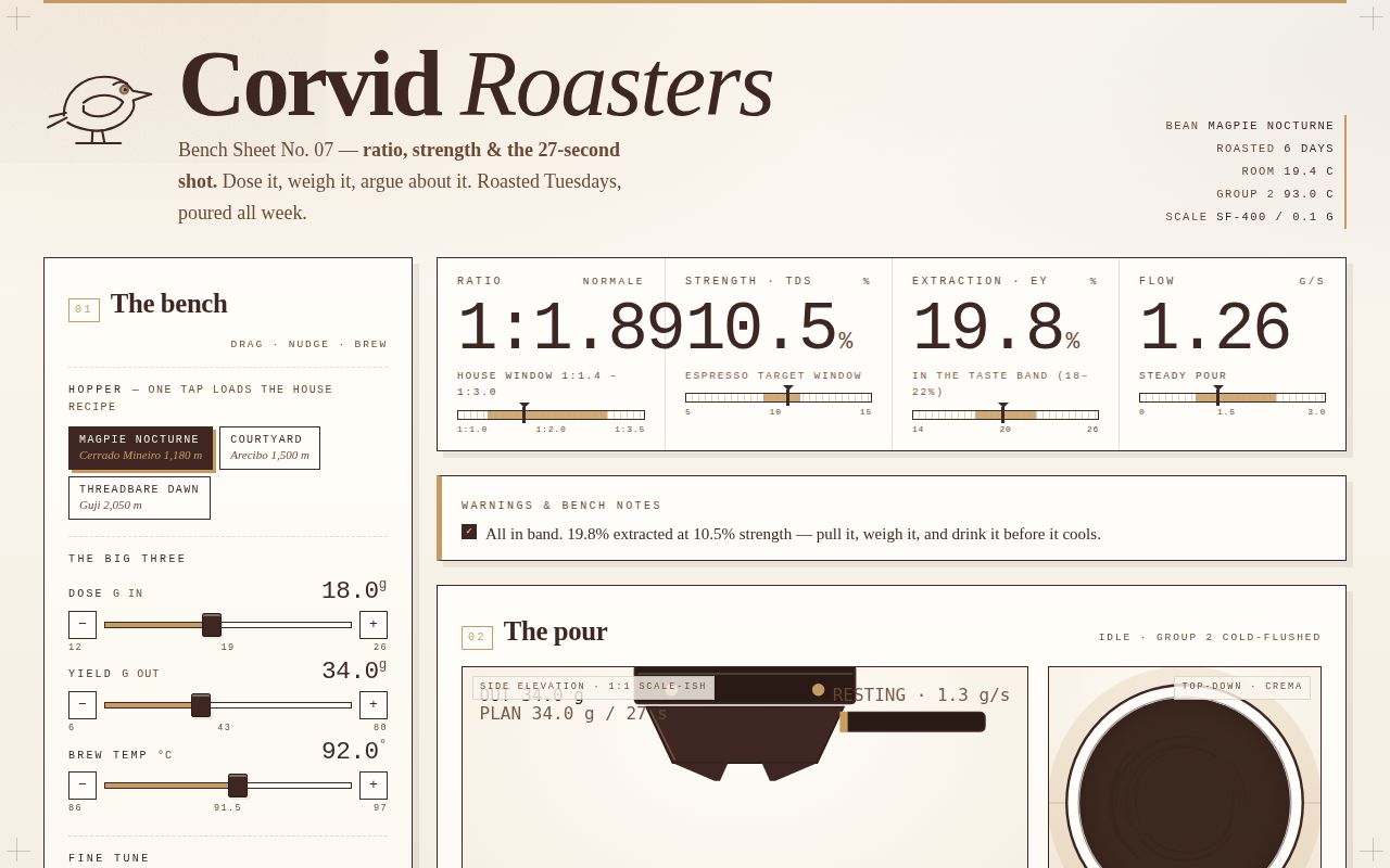
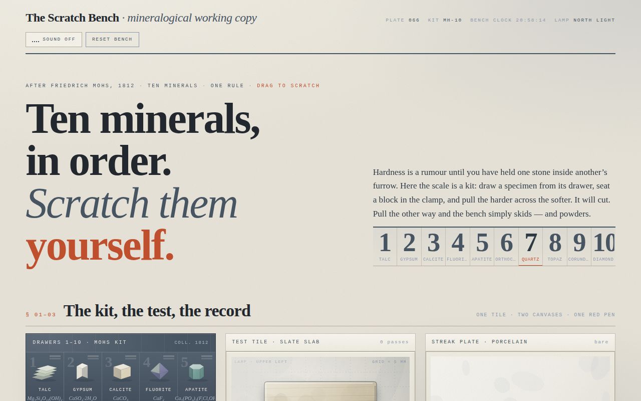
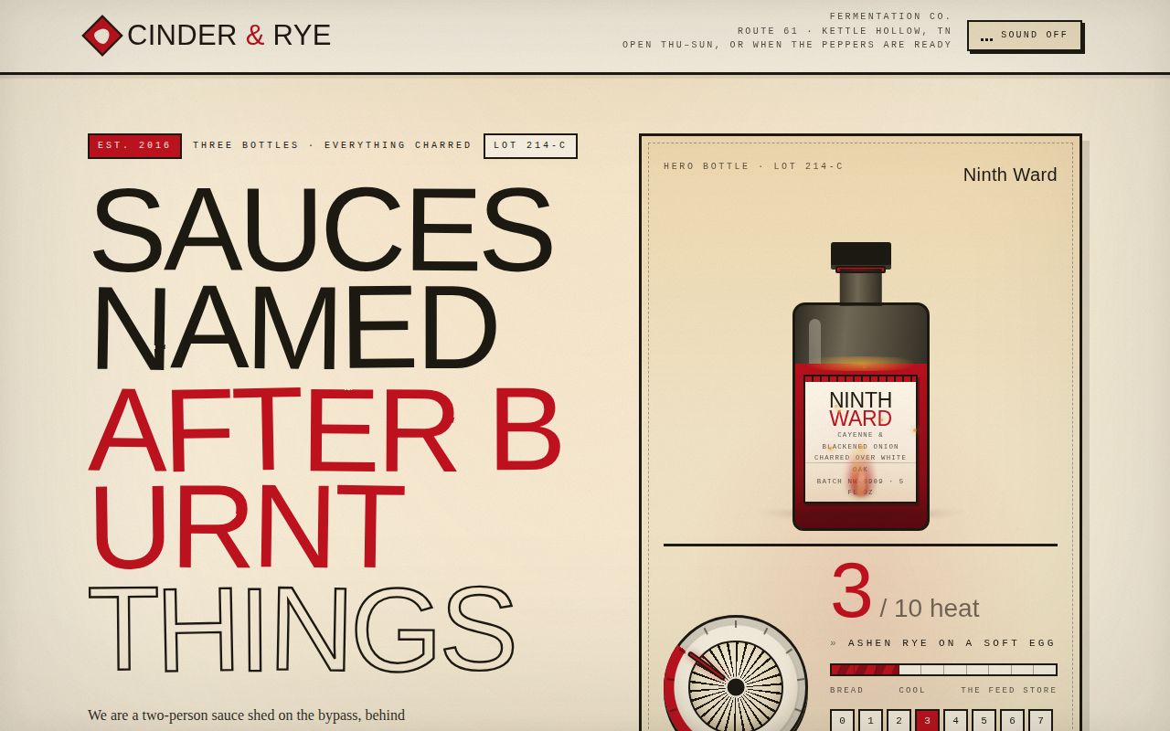
Espresso Ratio is a self-contained roastery bench sheet for the invented Corvid Roasters: half calculator, half brewing theatre. A sticky BENCH console on the left carries five sliders (dose, yield, temperature, grind, shot time), bean-chip presets, basket buttons and serve-as chips; everything to the right recomputes live from real espresso arithmetic — ratio, puck retention, brew water, extraction yield and TDS by mass balance, flow, caffeine and per-shot cost — and prints itself as giant tabular-mono numerals, banded gauges, a generated recipe ticket, barista-voiced warnings, tasting notes and "the bar's call". The signature moment is BREW: a shot pours in real time across two canvases and an SVG flow trace on one clock — twin streams that thin and blond, a cup that fills, crema spreading with tiger stripes and popping bubbles — and cutting it early rewrites the recipe from what actually landed in the cup, stamps the ticket and logs the shot. The whole thing sits on kraft-cream paper in exactly four contract hexes, with grain, crop marks, stains and a hand-drawn crow, and it all folds to a single column on phones and freezes gracefully under prefers-reduced-motion.
Open
Original prompt
Build a single-page, self-contained interactive tool: a working espresso ratio calculator printed as a roastery bench sheet for the invented Corvid Roasters, and behind it a brewing theatre that replays a real-time 27-second shot on canvas. The viewer drags dose / yield / temperature (plus grind, shot time, basket, bean, serve-as), watches strength and extraction recompute instantly, reads a generated recipe ticket and tasting notes in the roaster's voice, and presses BREW to pour the shot — cutting it early if they like, which rewrites the recipe from what actually landed in the cup. MOOD. Morning, indoors, a small production roastery that takes itself seriously but not solemnly. Kraft-and-cream paper, a bench clipboard, a scale readout, a punch card, an ash tray, coffee stains you are allowed to have. Precise instrument, warm hand. Not coffee-shop-chalkboard, not latte-art pastel, not dark-mode dashboard, not gradient-glassmorphism. The pleasure is in the arithmetic — mass balance, TDS, the SCA brew-control band — and in the honesty of the language: puck, screen, blonding, cut the shot, tiger striping, headspace, channel, gush. PALETTE (contract — these exact hexes dominate everything). #FAF6EF café paper — the page ground, the sheet, the inside of the cup, the ticket. #3E2723 espresso — all ink, type, rules, panel borders, the portafilter body, the liquid, the drawn crow, shadow edges. #C89B62 crema — the working accent: slider fills, active chips, gauge target bands, focus outlines, the crema bloom, the bloom grade, hairline highlights on the liquid, the drawn-on masthead rule. #9D2B2B warning red — the ONLY alarm hue: real warnings (gushing, choking, sour risk, over-extraction), the BREW timer's last 5 seconds, the poured "CUT" rubber stamp, the live trace's deviation flag. Derived tones are allowed only as mixtures of those four (e.g. #2A1A16 near-black espresso core, #6B4A35 mid liquid, #E4D6BE shadowed paper, #8A5A3B dilute crema) — no hue enters the page from outside the contract. TYPOGRAPHY. System stacks only, two families, dramatic scale contrast. · Display + prose: Georgia / 'Palatino Linotype' / Palatino / 'Times New Roman' / serif. Masthead wordmark at clamp(3rem, 11vw, 6.2rem), weight 700, letter-spacing -.03em, espresso. Section heads serif 1.35–2rem with a mono number before them. Tasting-note prose serif 1.05rem / 1.62 — this is the only place the brand is allowed to be lyrical. · Instrument type: ui-monospace / Menlo / Consolas / 'Courier New' / monospace with font-variant-numeric: tabular-nums. Live numbers (ratio, TDS, EY, grams, seconds) at clamp(2.4rem, 8.5vw, 4.6rem); labels, chips, buttons, ledger rows and legends at 9.5–11.5px UPPERCASE with letter-spacing .16–.26em. Target contrast: 10px labels against 74px numerals. · No webfonts, no emoji, no icon font. Iconography is hand-drawn inline SVG (crow, portafilter, basket, tamper, thermometer, droplet) built from strokes in espresso ink. LAYOUT. Desktop (>=980px): masthead spans the page — drawn crow mark and wordmark at left, a monospace "bench ticker" at right (bean, roast date, ambient 19.4 °C, group temp, scale serial). Below it a two-column working spread: a 320–360px BENCH console on the left (bean hopper chips, five sliders, basket buttons, serve-as chips, the BREW button) that is sticky while the right column scrolls; the right column carries the STATES row (three giant readouts + gauges), the BREW THEATRE, the RECIPE TICKET beside the TASTING NOTES, then full-width HOW THE SHEET COMPUTES, the five CORVID BENCH RULES, the BENCH LOG and a colophon. Mobile (<980px): single column, bench first (controls before results), theatre stacked, ticket and notes stacked, nothing wider than the viewport at 360px; the ticket's perforation is redrawn horizontally. THE MATH (real, and shown on the page — no fake numbers). ratio = yield ÷ dose, shown as 1:2.00 puck water = 2.0 × dose (grounds hold about two grams of water per gram) brew water = yield + 2.0 × dose extraction EY% = 19.4 + 2.6(ratio−2) + .16(temp−93) + .62(5−grind) + 2.1·ln(time/27) + .02(roast−50), clamped 11–28 strength TDS% = EY × dose ÷ yield (mass balance, exactly) flow = yield ÷ time, g/s caffeine ≈ dose × 7.4 × (EY ÷ 19.4) mg, labelled an estimate puck weight = dose + 2.0 × dose grams to the knock box Bands, printed as gauges with the target window in crema: TDS <7.5 thin · 7.5–9.2 light · 9.2–11.2 espresso target window · 11.2–13.0 heavy/syrupy · >13.0 concentrate. EY <18 under · 18–22 the taste band (SCA brew-control chart, real figures) · >22 over. Ratio window 1.4–3.0; flow >2.2 g/s gushing (grind finer); <0.9 g/s choking (grind coarser); temp <90 sour risk, >96 scald/ash risk; dose above basket capacity = no headspace. Each failure is a red line in the WARNINGS block, in a barista's sentences. THE SIGNATURE MOMENT — BREW. Pressing BREW runs a live 27-second-class shot (duration = the shot-time slider, so 27 s at default) driven by one requestAnimationFrame loop over two canvases plus an SVG trace, all sharing one clock. 1. PORTAFILTER + STREAM (side view, canvas A). A drawn group-head, basket and twin spouts; at t≈2.5 s the first dark beads appear at the bottom of the basket (blonding), then two ribbons of espresso fall into the cup. Each ribbon is a filled path with a sway, a width that THINS continuously through the shot, and a colour that runs from near-black #2A1A16 through #6B4A35 caramel and back to a thin, dark, ashy tail in the last 15% — visibly thinning and darkening. Droplets break off the tail; the ribbon hits the liquid and throws ripples. The cup fills, its surface rising in lockstep with the grams model poured(t) = yield·f^0.92. 2. CREMA BLOOM (top-down, canvas B). The same pour seen from above: a pale ring of cup, the dark liquid disc, and crema spreading outward from the two impact points in real time — coverage growing with poured mass, colour lifting from hazelnut to blond, tiger stripes drawn as low-alpha curved streaks whose density comes from the bean's roast, and up to ~260 bubbles that drift outward and pop. A live BLOOM GRADE ("7.8 / 10 — fine and even, holds a sugar sprinkle 4 s") climbs with it. 3. FLOW TRACE (inline SVG). A ghost target curve and the actual grams-out polyline drawn point by point, the axis ticks in mono, a red deviation flag if the pour runs more than 20% off the plan. 4. While brewing, the timer counts T + 12.4 s in tabular mono, the BREW button becomes a red CUT THE SHOT button, and the STATES numbers tick with the pour. Pressing CUT (or letting it finish) sets yield to the grams actually poured, snaps the slider, recomputes everything, stamps the ticket with a rotated rubber "CUT" mark in #9D2B2B carrying the real poured weight and elapsed seconds, and appends a row to the bench log. Steam wisps rise off the finished cup. Reduced motion: no rAF pour. BREW renders the completed final frame — full cup, settled crema, finished trace — with the timer showing the end time, and a line in the ticket explaining that the replay is simplified for reduced motion. FIRST THREE SECONDS. A designed entrance, not a fade-up: a crema hairline wipes across the masthead (scaleX, cubic-bezier(.16,.84,.24,1)); the crow mark strokes itself on (stroke-dashoffset, 900 ms, cubic-bezier(.2,.9,.2,1)); the wordmark letters stagger up 34 px on a 26 ms interval with a 3° settle; the bench ticker types itself out; then the panels reveal in reading order with a 900 ms cubic-bezier(.2,.8,.2,1) rise and the stat numerals roll from 0 to value. Everything honours prefers-reduced-motion by arriving already in place. CONTROLS. Five custom-styled range inputs (dose 12–26 g/.5, yield 6–80 g/.5, temp 86–97 °C/.5, grind 1–10/.5 shown as µm, time 15–45 s/1), each with its own mono value readout, a crema-filled track computed in JS, a −/+ nudge button pair (real buttons), aria-valuetext, and a focus-visible ring in crema with a 2px espresso offset. Bean hopper chips (Magpie Nocturne dark 78, Courtyard medium 52, Threadbare Dawn light 22) load full recipe presets with the sliders easing to their new positions. Basket buttons 14/18/20/22 g. Serve-as chips (straight, macchiato, cortado, americano) rewrite the ticket's build step, total volume and a milk note. Hover states everywhere: chips lift 1px and gain an offset hard shadow; ticket rows underline in crema; the log rows indent. COPY. All invented, all specific, no lorem. Corvid Roasters, Unit 7, Kiln Yard Road; "roasted Tuesdays, poured all week"; three real-tasting bean descriptions with origin blends, altitude, roast level and price per kilo so the per-shot cost can be computed; five numbered bench rules with opinions ("Weigh the cup, not the clock. The clock is a rumour."); tasting notes assembled from pools keyed to extraction band, strength band, temperature, roast and flow, always two or three concrete notes plus one turn of phrase ("blackcurrant skin, and the argument you lose with a friend at 7 a.m."), followed by "THE BAR'S CALL" — a single imperative sentence that changes with the parameters and tells you what to move. Footer colophon: sheet no., revision, "no network, nothing leaves this page", knock-box tally. DETAILS THAT REWARD ATTENTION. feTurbulence paper grain over the whole sheet at low alpha; two faint espresso ring stains behind the ticket corner; crop marks at the four page corners; dashed perforation on the ticket with punched holes; the crow's eye is the only thing on the page that ever moves in the masthead while idle; the timer turns red in its last 5 seconds; the cut stamp lands with a hard cubic-bezier settle and slight rotation; if you pour a ristretto below 1:1.5 the warnings block adds a line about the grinder; the bench log caps at 8 rows and the oldest scrolls out.
007-espresso-ratio.txt
008
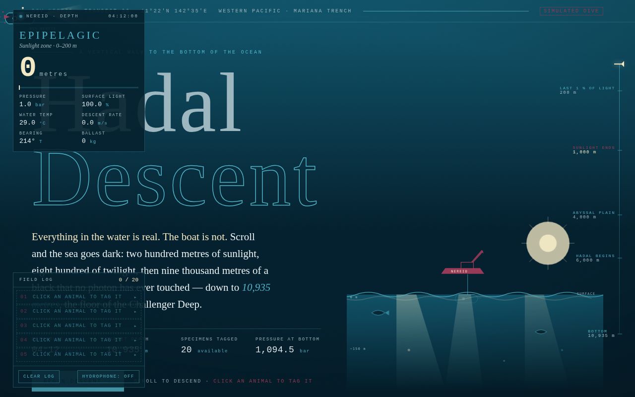
A single continuous scroll carries the viewer from sunlit surface water down 10,935 m to the floor of the Mariana Trench. The composition is one vertical column of sea rendered as five parallax layers (sky, far, mid, near, foreground) plus a marine-snow canvas, with a sticky instrument stage that never leaves the screen: a tabular-figure depth readout, a live pressure readout computed as depth/10 + 1 bar, irradiance, temperature, descent rate measured from actual scroll velocity, a right-edge depth ruler with stops at 200, 1,000, 4,000 and 6,000 m, and a five-slot field log. Zone chapters — epipelagic, mesopelagic, bathypelagic, abyssopelagic, hadalpelagic — scroll up over the scene in Georgia at editorial scale, each with real animals drawn as hand-authored SVG silhouettes: sunfish and moon jellies at the surface, lanternfish, counter-illuminating hatchetfish and vampire squid in the twilight, an anglerfish with a glowing esca and a red-beamed dragonfish in the midnight, sea pigs and tripod fish on the abyssal plain, and hadal snailfish, atlipfish and a giant amphipod swarm in the trench itself. The page's own lightness is a function of scroll: the document background fades from #05202E toward #000000 as the sun coefficient falls, and at exactly 1000 m the last daylight dies — light shafts are removed, the page is true black, and forty-eight photophores begin to blink. Twenty specimens can be clicked or keyboard-activated to tag them, which pins a jelly-rose tag, fills a log slot, sounds a synthesized hydrophone ping (sound off by default) and opens a museum-style tag slip; the dive closes by reporting how many of the twenty were seen.
Open
Original prompt
CONCEPT AND ARC. Build a single self-contained page that is one continuous vertical descent: the viewer starts standing on the surface of the western Pacific and scrolls straight down 10,935 m to the floor of the Mariana Trench. There is no chapter navigation and no pagination — one column of water, five real pelagic zones, an instrument HUD that never leaves the screen, and a field-log interaction that lets the viewer tag the animals they pass. The reader is aboard the DSV Nereid, a simulated dive: the vehicle, dive number, bearing, ballast and timestamps are invented; the depths, zones, pressures, temperatures, animals and their documented behaviours are real. The page must read as an expedition record that happens to be beautiful, not as a landing page. Opening line sets the contract ("Everything below is real. The boat is not."). Copy is logbook register: first person plural, precise, spare, occasionally devastating at the bottom. PALETTE (contract — these hexes appear in code). #05202E abyssal navy — the water at rest; body background, panel fills. #4FB3C6 twilight cyan — the last readable light: rules, zone names, instrument strokes, hull line, the mesopelagic glow. #F2E8C4 angler glow — the only "warm" light allowed: anglerfish esca, photophores, the depth numerals at depth, focus rings, bottom light. #A63D5B jelly rose — biological alert: tagged state, the 1000 m photic-limit rule, vessel marks, the amphipod swarm, section numerals. Derived supports (quiet, never headline): #0E4258 upper water, #1C2E36 instrument ink, #E9F2F4 pale water text, #9DB7C0 dim water text, #000000 true black — reached ONLY at the signature moment and below. The forbidden look (navy + purple/cyan gradient + glass cards + blurred blobs) must not appear; the water gradient is a scientific light falloff, never decorative, and no element is glassmorphic. TYPOGRAPHY (system stacks only, no webfonts). Instrumental/UI: ui-monospace, "SF Mono", Menlo, Consolas, "Courier New", monospace — uppercase, letter-spacing .14–.28em, 9–12px for labels, and clamp(38px,7vw,68px) for the depth number in tabular figures. Display: Georgia, "Palatino Linotype", Palatino, "Book Antiqua", Baskerville, Times, serif — masthead "HADAL / DESCENT" at clamp(56px,13vw,168px), letter-spacing .06em, line-height .88; zone names at clamp(30px,6.4vw,64px) uppercase with .22em tracking. Prose: Georgia, Palatino, serif at 15–17px / 1.72 with a 60–66ch measure. Contrast discipline: 9px tracked mono against 168px serif on the same screen, and 34px serif animal names against 11px mono instrument keys. LAYOUT. 1. Masthead (100vh): top strip "DSV NEREID · TRANSECT 08 · WESTERN PACIFIC"; left masthead block (kicker, the two-line title, a serif deck, a mono 4-column key-figure table: DEPARTURE 04:12 / TARGET 10,935 M / WATER COLUMN 24.6 KM² / CREW 2); a "BEGIN DESCENT" button that releases the first-run nudge and scrolls; and, bottom-right, an at-rest surface scene drawn entirely in SVG — a broken wave line, sun disc, light shafts, a distant hull and crane silhouette in jelly rose with "NEREID" lettering. 2. The well: one sticky 100vh stage that holds the whole water column, inside a tall scroll track (30 × 100vh, 34 × 100vh below 720px). Chapter articles (one per zone, plus a bottom article) are absolutely positioned inside the well so they scroll OVER the sticky scene at the depth where they belong. Chapters never cover the HUD and are inset from the ruler. 3. Persistent HUD (fixed): left instrument card — zone name, giant depth readout with unit, then a 3-column mini table (PRESSURE bar = depth/10 + 1 computed live; IRRADIANCE % of surface light, 2^(−depth/30); TEMPERATURE °C, a piecewise falloff 29 → 1.6 °C; DESCENT RATE m/s from real scroll velocity; BEARING 214° true; BALLAST kg); right edge a depth ruler with four labelled stops (200 / 1,000 / 4,000 / 6,000 m) and a live marker with a rose tail; bottom-left a tag log (5 slots, "+N" overflow, CLEAR button, each slot a real button that scrolls to that specimen) and a hydrophone toggle. The first log slot is a dashed ghost "1 SLOT FREE" until the first tag — that is the interaction hint, designed in. 4. Colophon: three mono columns — ABOUT THIS DIVE (invented), WHAT IS REAL (depths, zones, pressures, animals, citations of behaviours), HOW TO READ THE INSTRUMENTS (the formulas, including the honest note that the bar formula is an approximation that reads ~1,094.5 bar at 10,935 m against surveyed values near 1,086 bar). SCENE AND MOTION LANGUAGE (SVG parallax layers). Five stacked absolutely-positioned layer wrappers (sky, far, mid, near, fg), each an inner div translated every frame by y = 0.5·H − p·columnHeight·parallax, with parallax 0.35 / 0.6 / 1.0 / 1.35 / 1.8. Children are placed inside their layer at top = depthToProgress(depth) · columnHeight · parallax, so the same animal is at a different rate in each layer and the column genuinely has depth. columnHeight = wellHeight − H, recomputed on resize. One rAF-throttled scroll handler (a `ticking` flag) plus resize/touchmove/passive listeners does all of it. Marine snow: a single canvas across 0.35–1.8 factors, ≤260 particles (fewer on phones, fewer for coarse pointers), each with its own factor, radius, drift and opacity; the pool is a Float32Array, no per-frame allocation; particles rise as you descend and drift sideways in a slow current. Redrawn on resize with devicePixelRatio capped at 2. Light shafts and caustics live in the sky layer, their opacity driven by the sun coefficient; the whole page's background gradient is driven by the same coefficient (see signature). Bioluminescence: ~48 photophore nodes scattered by depth across the mid and near layers; each carries randomized CSS animation-duration (2.4–7.8 s) and delay, and only appears once its own depth has been reached and the 1000 m gate has opened. Hull glint: a fixed thin SVG overlay draws the submersible as a hairline profile that bobs on a spring (px += (dx − px)·0.09) following the pointer, with three rose thruster bubbles and a cone of angler-glow light whose opacity rises with depth. A 20 s slow "current" translate runs over the near layer at ±8 px, and the dumbo octopus undulates and the siphonophore pulses (transform keyframes). All ambient loops stop on document.hidden. SIGNATURE MOMENT — THE DEATH OF SUNLIGHT AT EXACTLY 1000 M. sun = clamp(1 − depth/1000, 0, 1), eased. Every visual system in the page is bound to it: the page background is rgb(mix(black, #05202E, sun)) with a depth-dependent cyan wash in the top stop, so the document's own lightness is a function of scroll and reaches #000000 at 1,000 m and stays there; the surface gradient, the shafts, the caustics and the top-stop cyan wash all scale to zero at the same instant. At the first frame where depth ≥ 1000 the page performs one irreversible sequence: the photic-limit rule at 1000 m flashes once (opacity .35 → .9 → .35 over 600 ms, never a strobe), the shafts are removed from the DOM, the 48 photophores switch on and begin blinking on their staggered schedules, the instrument card's zone key flips to BATHYPELAGIC · NO PHOTONS, and a one-line log entry types itself in: "1000 m — the last photon of daylight is behind you. Everything that glows from here makes its own." Scrolling back up past 1000 m restores the light gradient but the log entry and the blinking persist (a dive does not un-happen); the entry is re-armed only if the viewer returns to the surface screen. Below the gate, the only light in the composition is biological. INTERACTIONS. Scroll = descend (the whole page). Depth readout, ruler marker, lightness, zone name, temperature, irradiance and descent rate are all live. Click / tap / Enter / Space on any specimen button = TAG IT. A jelly-rose tag pin scales in on the animal, its log slot fills (name, depth, a tick mark), a synthesized hydrophone ping sounds if audio is on, and the tag slip — a rose-bordered instrument card with common name, italic binomial, ZONE / DEPTH / LENGTH / DEEPEST RECORD / STATUS and a two-sentence field note — slides up above the log. Clicking again UNTAGS (aria-pressed flips). Specimens are real <button>s; far ones get tabindex="-1" so Tab only walks what is actually on screen. :focus-visible draws an angler-glow ellipse and lifts z-index. Hover previews: the animal brightens, scales 1.06 on a custom cubic-bezier, and a rose reticle blinks over it. Tag-log slot click, and "BEGIN DESCENT", and the 1000 m nudge all smooth scroll to the owning depth. Hydrophone (SOUND: OFF by default, aria-pressed): created on first gesture, Web Audio only — a brown-noise bed through a depth-tracking lowpass, a slow LFO amplitude wobble, an occasional 915 ms two-tone sonar ping (880 → 660 Hz through a decaying feedback delay), and the tag blip. Master gain peaks at 0.16. H toggles it. Keys: H sound, C clear log, Escape closes the slip. Reduced motion: the entrance jumps to final state, no bobbing, no current, no pulse rings, no scanline, photophores become steady points, the page removes its smooth-scroll override and keeps only one 600 ms light-out fade. The 1000 m blackout still happens — it is content, not decoration. CREATURES (20 specimens, real, with their real depth habits). Epipelagic 0–200 m: ocean sunfish (Mola mola), green sea turtle (Chelonia mydas), moon jelly (Aurelia aurita), Pacific sardine school (Sardinops sagax). Mesopelagic 200–1000 m: lanternfish (Myctophidae) with photophore rows, silver hatchetfish (Argyropelecus) with ventral counter-illumination, vampire squid (Vampyroteuthis infernalis, 600–900 m oxygen minimum layer), cookiecutter shark (Isistius brasiliensis). Bathypelagic 1000–4000 m: humpback anglerfish (Melanocetus johnsonii) with a glowing esca, barbeled dragonfish (Malacosteus) with its red private beam, gulper (Eurypharynx pelecanoides), dumbo octopus (Grimpoteuthis). Abyssopelagic 4000–6000 m: sea pig (Scotoplanes globosa), tripod fish (Bathypterois grallator), giant isopod (Bathynomus giganteus), xenophyophore (Syringammina). Hadal 6000–10935 m: hadal snailfish (Pseudoliparis swirei, the deepest fish ever recorded, 8,336 m in this trench), atlipfish (Liparidae, the hadal liparids filmed in the trench's lower reaches), giant amphipod (Alicella gigantea) swarm, and one 1960 Trieste-era baited ballast weight near the bottom. The species roster is generated in JS from one data table (id, name, binomial, zone, depth, length, deepest record, note, shape id, colour, scale, drift, x) and rendered as inline SVG from a 20-drawing silhouette map — each animal is hand-drawn geometry (paths, ellipses, circles, lines), never emoji, never an external image. BOTTOM AND AFTER. At 10,935 m the trench walls converge, the seafloor silhouettes in, a 10,000 m scale bar appears (a human, a bus and the hull at true proportion against the depth), the light is a single angler-glow disc, the log reports its own catch ("you tagged N of 20"), and the honesty note names the real pressures on this trench: 2019 hadal amphipods found with plastic fibres in their guts, and mining interest in the polymetallic nodules of the abyssal plains. Then the colophon on black.
008-hadal-descent.txt
009
A hand-built pinball machine for the browser: CATHEDRAL, Cabinet No. 009, presented the way a museum would present a surviving 1983 Halcyon Amusements electro-mechanical cabinet — brass plate, marquee, backglass dot-matrix, apron buttons, rule card and a service readout that ticks in real time. At its centre is a canvas playfield running honest 2D physics: gravity at 2050 units/s², restitution tuned per surface, pop bumpers that kick, slingshots that punch, drop targets that fold, a full orbit loop that the ball must be fast enough to clear, and rotating-capsule flippers that throw the ball with angular velocity rather than a canned impulse. Tap the left or right half of the glass, or hold Left/Right/Space, to flip; drag the chrome plunger knob down and let go to send the ball into the building. The payoff is the signature moment: bank the three ALTAR targets, enter the reliquary, and the table drops every lamp except the wizard target, the three bumpers begin to pulse in rhythm at 128 BPM, gold beat-rings expand from the rose window, and the multiplier climbs x1 to x5 across three balls of multiball until the last one drains and the choir stalls pay.
Open
Original prompt
Build a single-page, self-contained pinball machine that is also a small exhibition plate for an invented 1983 electro-mechanical cabinet. The machine is called CATHEDRAL, built by the fictional Halcyon Amusements of Chicago "for the nave of the roadshow". The viewer sees a real, playable table rendered on canvas 2D with hand-written physics — gravity, restitution, friction, flipper torque, ball-ball impulses — inside a red cabinet with chrome rails and a lamp-gold dot-matrix scorecard. This is not a toy that pretends to be a game; the ball must actually fall, actually bounce, and actually drain if you do not flip. MOOD. 2 a.m. in an arcade that closed years ago: neon under glass, waxed wood, the smell of hot transformer. Midnight-blue playfield, cabinet red everywhere that is furniture, chrome where something is polished steel, lamp gold where something is lit. Serious about its own myth (cathedral architecture drawn in fine wire: a rose window, three naves, a reliquary), not serious about itself. Copy voice is a mix of service-manual understatement and roadshow bark — "the ball is the only honest thing in the building", "tilt is a moral condition". No emoji, no gradient headlines, no glassmorphism cards, no floating blobs. PALETTE (contract — these four hexes own the page). #16213E midnight — the playfield ground, the scorefield panel, the inner shadow of the cabinet, all dark fills and the under-glow of every neon stroke. #C0392B cabinet — the cabinet body, the apron, the flipper blades, the START button, the marquee's red filament, the rule underlines. The only warm solid. #E8E8E8 chrome — rails, legs, plunger steel, lane guides, the ball, the body copy on dark, target faces. Chrome is rendered as a 4-stop gradient (#4A5468 → #E8E8E8 → #9AA6BC → #E8E8E8) so it reads as polished metal, never as flat grey. #FFD23F lamp — lit lamps, the dot-matrix score, the wizard target, the jackpot number, focus outlines, the plunger knob. Derived tones are only mixes of these four (e.g. #0B1020 deep midnight, #223055 raised midnight, #8E2A20 shadowed cabinet red, #FFF0A8 hot lamp, #7C8AA5 cool chrome shadow). No hue enters from outside the contract. TYPOGRAPHY. System stacks only, three registers, dramatic scale contrast. · Cabinet lettering: ui-monospace / Menlo / Consolas / "Courier New" / monospace, uppercase, tracking +0.22em for labels at 10px and +0.16em for the 11px message line, and the score readout at clamp(2.4rem, 7.4vw, 4.4rem) weight 700 in lamp gold with a 0 0 18px glow. · Marquee: same mono at clamp(2.3rem, 11.5vw, 5.4rem), weight 700, letter-spacing -.02em, chrome-white with a red filament outline (text-shadow layers) — the neon sign is drawn with shadow, not with a gradient fill. · Plaque prose: Georgia / "Palatino Linotype" / Palatino / "Times New Roman" / serif at .98rem / 1.68 — the only place the machine is allowed to be lyrical (the lore card, the tilt scoldings, the wizard-mode lettering). · No webfonts, no icon fonts, no external anything. LAYOUT. Three columns ≥1120px; two columns ≥720px; one column below, playfield first and everything after it. Page grid is max-width 1240px, padding clamp(14px, 3vw, 40px), background the midnight vignette layered from: a radial highlight at the top, a repeating-linear-gradient of cabinet wood grain (4px stripes at 96deg of rgba(22,33,62,.9) over rgba(11,16,32,.9)), and an inline-SVG feTurbulence grain layer (desaturated fractalNoise, baseFrequency .85) at opacity .055 with mix-blend-mode:overlay over the whole page (pointer-events:none, position:fixed). · LEFT — brass plate: maker line, MODEL 009-SS, "1,204 cabinets built", the table's serial, and a small "ATTRACT MODE" indicator that blinks at 1.1 Hz. · CENTER — the cabinet: marquee (title + "SOLID STATE · 1983"), the chrome rail, the backglass dot-matrix (SCORE / BALL / MULTIPLIER / LAST BALL / HIGH), the canvas playfield (aspect 460:760, width capped at min(100%, 74vh×460/760, 460px), framed by a 2px dark-chrome border with an inset midnight reveal and four chrome "glass screws" in the corners), and the apron bar carrying the real buttons — START, LAUNCH, PAUSE, TILT, SOUND, CALM, plus the drag plunger knob. · RIGHT — the rule card (three numbered rules, in the machine's voice), the control legend (keys and touch halves, drawn as keycaps), the lore card, a live "SERVICE MENU" strip (ball count, flipper torque, restitution readouts that tick as the physics runs — a detail that rewards attention), and TILT! in clamp(48px,13vw,104px) cabinet-red serif with a red bloom, over its one-line scolding in italic serif. THE TABLE (geometry in 460×760 logical units, drawn and simulated). Rose window at the top centre: chrome tracery rings, gold hub, eight mullions; it lights up when the loop is completed. Three nave lanes (vertical guide wires) at the upper middle; completing all three lights NAVE I·II·III in gold. Three pop bumpers (r≈24) in a triangle across the upper third — cabinet-red caps, gold rings, chrome skirts; each hit scores, kicks the ball outward, pulses its ring and fires a 510→380 Hz blip. Two slingshots above the flippers (red faces, chrome edges) that punch the ball and score. Six drop targets on the right arc — three narrow "STained glass" targets that open the RELIQUARY door when all are down, and three wide "ALTAR" targets that arm wizard mode. The LOOP is a full orbit at the upper left: a one-way entry gate on its lower leg, and when the ball enters it is taken over by a constraint solver — a 216-point path sampled from a circle (centre 126,176, radius 96) with a 60° gap facing the playfield (150° to 210°), entered only when the ball's bearing is inside that window at speed. The ball threads the gap, keeps its speed, must clear the apex (reduced gravity, centripetal normal against the outer rail), and is released at the other side of the gap with its tangential velocity. If it is too slow at the apex it falls out of the loop into the playfield, which is the correct and thrilling failure. Left and right outlanes with chrome posts; a centre DRAIN between the flippers; a separate right-hand ball lane 40 units wide with a chrome plunger knob at the bottom that the viewer drags down and releases (pointer capture, keyboard arrows on it too, and a LAUNCH button that charges and fires). The lane mouth carries a one-way gate from (392,324) to (440,296): it opens upward for the launched ball and is solid coming down, so a ball that falls back along the right wall is caught, rolled down the slope and dropped into the playfield instead of recycling in the lane for ever. A ball-search watchdog kicks any ball sitting under 26 u/s for 3.2 s (with a chrome flare and a line of backglass copy) and calls it drained at 8.5 s, because a frozen table is the one sin a pinball machine cannot commit. PHYSICS — must feel real, not floaty. Fixed timestep: sub-steps of dt = 1/240 s, up to 12 sub-steps per frame, with an accumulator capped at 0.25 s so a stall never explodes the table. Gravity 1500 units/s² (the ball falls like a 2.6 oz steel ball, not a bead), speed clamped at 1500 u/s. Walls restitution .30 with Coulomb-limited tangential friction (μ=.12, applied as a per-sub-step impulse capped at μ×the normal impulse so a ball rolls down a slope instead of gluing to it), posts .42, slingshot .35 with a 640-unit/s normal punch, drop targets .42 / friction .06, flipper .28/.52 depending on which face is hit, linear air drag ×0.9993 per sub-step (so a flipper can carry a ball and a ball can roll). Ball radius 9.5. Balls may never exceed three on the playfield (stability is a design decision, stated in the service readout). Flippers are rotating capsules (pivots at 126,628 and 294,628, blade length 74, thickness 9, angle, angular velocity ±15.5 rad/s, rest +33°, up −27°) that collide with the ball through the surface velocity at the contact point (ω × r), restitution against the RELATIVE normal velocity, and a post-impulse injection when a live flipper strikes the ball's upper face. That is what makes a flipper shot feel like a shot, and it must not be replaced by "if hit then set velocity". Ball–ball collisions: equal-mass impulses with restitution .55, plus penetration correction, so multiball jostles. No jitter: a ball resting on a wall must not buzz — velocity below the restitution threshold is absorbed. SIGNATURE MOMENT — MULTIBALL WIZARD MODE (this is the reason the page exists). All three ALTAR targets down and the RELIQUARY door open, then the ball enters the reliquary arch → WIZARD. Every lamp on the table drops to a dark blue ember EXCEPT the wizard target, which is the only lit thing in the building; the cabinet's chrome rails dim to charcoal. Then the table pulses its bumpers in rhythm: a 128 BPM beat drives a phase value; each bumper's radius, ring width and glow swell on the beat and decay between beats; the playfield's nave wires strobe one step per beat; a 2px lamp-gold ring expands from the rose window on each beat and fades; the background's radial highlight breathes with it. The score multiplier climbs x1 → x2 → x3 → x4 → x5, one step every two bars, printed in the backglass as a rising gold bar-graph; a soft synth kick and snare mark the bars when sound is on. The wizard target scores 2,500 × multiplier, and each bumper hit scores 250 × multiplier. Wizard mode runs until the last extra ball drains, then the table relights in a staggered 55 ms sweep, the cabinet chrome returns, and the machine prints "MASS COMPLETE — THE CHOIR STALLS PAY" with the wizard total banked. INTERACTION. Touch/click: the left half of the playfield is the left flipper, the right half is the right flipper (pointerdown/up/cancel, pointer capture, multi-touch safe — each pointer's half is remembered per pointerId, so two fingers work). The plunger knob is dragged down and released. START, LAUNCH, PAUSE, TILT, SOUND and CALM are real <button> elements with visible focus rings. Keyboard: Left/A = left flipper, Right/L = right flipper, Space = both, Down/Enter/P = hold to charge the plunger, S = start, X = tilt, M = sound, C = calm, Escape = pause. Every key handler preventDefaults only the keys it actually owns so the page still scrolls on Space where it should not be eaten — while the playfield has focus, Space is the machine's. Hover: buttons lift 1px and their filament brightens; the rule-card numbers fill gold; the service-menu values brighten to lamp gold and pick up a dotted underline. The playfield shows a hairline of chrome along the flipper the pointer is currently over, so touch users learn the halves. Feedback: the cabinet shakes on a .28s ease on the wizard jackpot and on tilt (suppressed in calm mode); the glass flares at the contact point of every bumper, sling and target; the drained ball leaves a ripple and the plunger lane shows a gold power gauge while it is being charged. SOUND. Off by default, one visible toggle, Web Audio only, created inside the first user gesture. Flippers: 720→420 Hz click through a band-pass. Bumper: 620→300 Hz square blip. Sling: 900→600 noise burst. Target: two-tone. Loop: rising saw sweep. Jackpot: three-note arpeggio. Beat: sine kick + filtered noise snare. Drain: descending glissando. Master gain .16 — never loud. ENTRANCE (first three seconds, designed, not faded up). t0 — the cabinet slides up 26px with a scale from .985 on a custom cubic-bezier(.16,.84,.24,1) over 700ms; the marquee is dark. t300 — each letter of CATHEDRAL ignites on its own with a two-flicker cubic-bezier(.9,.05,.35,1.05) and a 62ms stagger; the filament glow blooms. t1000 — the machine's lamp test runs on canvas for 1.9s: the three bumper rings chase left-to-right at 6 Hz while the target bank chases at 9 Hz, then everything fades out of the test and the table returns to its at-rest attract composition. t1000+ — the marquee's credit line crawls 4px on a 7s loop, the flipper hint sits under the glass for 14s and then fades on a cubic-bezier(.32,.72,.24,1), and the service readouts begin ticking at 4 Hz off the live simulation. Reduced motion — all of the above collapses to an instant final state: no flicker, no lamp test (one static frame), no cabinet shake, no attract-mode pulse, no bumper breathing, no scanline crawl, no grain flicker. The game still plays; its motion is the player's, not the page's. ACCESSIBILITY. Every interactive element is a button or a focusable region with a 2px #FFD23F focus-visible outline and 2px offset; the playfield is role="application" with an aria-label and a polite live region announcing score, ball, multiball, wizard, tilt and game over; contrast is checked against #16213E (lamp gold 11.0:1, chrome 13.0:1, cool chrome 6.5:1 — all above AA at every size used); the CALM button forces the reduced-motion presentation for anyone who wants it without the OS setting; the machine is fully playable with the keyboard alone. TECHNIQUE. One <canvas> at devicePixelRatio-aware resolution, all rendering immediate-mode with additive glow (globalCompositeOperation='lighter' for the neon pass), a pre-rendered 96×96 grain tile composited over the playfield, a pre-rendered vignette, CSS custom-property theme switching between the three states (attract / play / wizard), inline-SVG feTurbulence page grain, an IntersectionObserver on the stage that skips the canvas draw pass (but not the fixed-timestep simulation) while the cabinet is off screen, plus a visibilitychange reset of the frame clock, localStorage high score wrapped in try/catch, resize observer that re-fits the canvas without resetting the simulation. No network requests, no dependencies.
009-neon-pinball.txt
010
Risograph Studio is a working ink-bench tool, not a poster with filters applied: a single canvas sheet on which six invented Fugue Press job specs are composed live by a seeded PRNG and printed dot by dot. Each of the three drums — Fluorescent Pink, Federal Blue, Medium Yellow on the contracted #FF48B0 / #0FAAE3 / #F9E547 over a #F7F3E8 paper — gets its own greyscale separation rendered offscreen, converted to a real AM halftone lattice on a rotated square grid at its own screen angle (defaults 15°/75°/45°) with dot radius driven by sampled coverage and per-stock dot gain, then composited bottom-to-top with canvas globalCompositeOperation 'multiply' at the ink's density, so every overlap is true subtractive overprint. Above the sheet sits an instrument panel of monospace sliders (density, screen, angle, reg X, reg Y per drum), paper-stock chips, actions and a running ledger that totals ink coverage, wettest stack, dry time and refuses — with set-off blotches scattered onto the print — to let you flood the sheet. The page reads as the shop rather than a design about the shop: a machine ticker, a job ticket, a colour bar, crop marks, generated paper fibre, and lore written by people who have cleaned a drum.
Open
Original prompt
Build a single-page, self-contained interactive TOOL: a working one-colour-at-a-time risograph poster compositor for the invented Fugue Press zine, presented as the print shop's ink bench. The viewer chooses from six of the shop's real job specs, re-rolls a generative poster composition by clicking the print, and then does the thing that makes a riso print a riso print — nudges each colour layer's registration by tenths of a millimetre until the halftone rosettes sit where they should. Everything on the sheet is produced by actual AM halftone dots (rotated screens per ink), real subtractive overprint maths via multiply blend, per-stock dot gain, paper fibre and a running ink-limit ledger that refuses to flatter the work. MOOD. Back of a small two-person riso shop in a converted garage: a Riso bench with a stack of freshly cut sheets, a colour bar, a job ticket clipped to the wall, the smell of soybean ink and wax. Warm, dry, slightly over-lit. Not a design-blog "riso effect", not neon-retro-glitch, not pastel printshop, not a dark dashboard. The pleasure is in recognition: the fringe of colour where two screens miss each other, the moiré that appears when two angles are set nearly parallel, the honest admission that this machine cannot make a rich black. PALETTE (contract — these exact hexes dominate everything). #F7F3E8 paper — the page ground, the sheet, the unprinted paper-white, ticket stock. #FF48B0 pink — Riso Fluorescent Pink; drum 1; the accent of the interface itself. #0FAAE3 blue — Riso Federal Blue; drum 2; the default screen angle sits at 75°. #F9E547 yellow— Riso Medium Yellow; drum 3; the default screen angle sits at 45°. Derived tones are allowed only as mixtures of those five (ink darkened with ink under multiply, paper shaded toward #E4DCC8 for rules and #CFC5AC for muted text, ink inked toward #16120E for body copy). No hue enters the page from outside the contract. TYPOGRAPHY. System stacks only, three families, dramatic scale contrast, no webfonts, no emoji, no icon fonts. · Signage display: "Helvetica Neue", Helvetica, Arial, sans-serif at weight 900, letter-spacing -.035em to -.06em, uppercase. Masthead wordmark at clamp(3.4rem, 12.5vw, 8.6rem); drum numbers at 2.4rem; big stat numerals up to 5rem. · Instrument type: ui-monospace, Menlo, Consolas, "Courier New", monospace with font-variant-numeric: tabular-nums. Every label, value, kbd chip, table cell, slider readout and machine log line: 9–11.5px uppercase, letter-spacing .12–.24em. · Prose: Georgia, "Palatino Linotype", Palatino, "Times New Roman", serif at 15–16.5px / 1.62 for the riso-lore notes and the job standfirst. This is the only place the page is allowed to sound like a person writing. · Canvas lettering is drawn (tracked glyph-by-glyph), so poster type is artwork, not DOM. LAYOUT. Desktop (>=1000px), three columns under a masthead: masthead spans the page — FUGUE PRESS wordmark and a printed "INK BENCH Nº 4" plate at left, a monospace machine ticker at right (drum temperature, master remaining, sheets today, dry-rack count). Below: a 300–330px left BENCH rail (sticky) carrying PAPER STOCK chips, the four ACTIONS (RE-ROLL, KNOCK REGISTRATION, TRUE REGISTRATION, EXPORT PNG) and three DRUM cards, one per ink — each with an ink chip / visibility checkbox, the ink name and hex, and five sliders (DENSITY, SCREEN, ANGLE, REG X, REG Y). Centre column: the SHEET — a canvas poster at 900×1273 backing pixels (A3 at ~3.03 px/mm), shown at the largest size that fits its column, with crop marks, colour bar, a "shown at NN% of trim size" readout, and a hint line. Under the sheet: the HONEST LEDGER strip — total ink coverage, wettest stack, dry time, sheets since last master, warnings, and the machine log. Right column (scrolls normally, never sticky): the JOB TICKET (client, issue, standfirst, deadline), OVERPRINT (CSS mix-blend-mode swatch grid of pink/blue/yellow pairs and triples), HOW THE MACHINE WORKS (six numbered lore notes with a small hand-drawn cross-section of the drum and an inline SVG halftone rosette diagram), WHAT THE MACHINE CANNOT DO (six refusals), and the COLOPHON + KEYBOARD row. Mobile (<1000px): single column in working order — masthead, sheet, actions, drum cards, ledger, ticket, overprint, lore, colophon; nothing exceeds the viewport at 360px; sticky rail released; ticker wraps. SIGNATURE MOMENT. The registration sliders. Each ink has REG X and REG Y, range -3.0 mm to +3.0 mm, step 0.1. Dragging one translates that whole colour layer on the composite in real time — the halftone dots of that ink slide across the dots of the other two, the overprint rosette shears, a coloured fringe appears along one edge of every shape, moiré blooms and collapses — and the ledger's worst-stack / dry-time / warning lines recompute with the same gesture. Nothing is re-rendered during that drag except a drawImage with a fractional offset: it must feel like a hand on the feed rollers, not like a recompile. Supporting it: KNOCK REGISTRATION throws all six offsets by a random ±0.6 mm at once (with an animated settle) because that is what a re-fed sheet actually does. THE ENGINE (must be real code, not described). · Seeded PRNG (mulberry32). Six job specs × five composition templates ("sun", "stack", "eye", "grid", "gate"). Clicking the sheet picks a new seed and a new job and re-rolls. · Each ink gets a greyscale separation (solid shapes, alpha tints, radial fades, drawn type) rendered offscreen; a coverage map is sampled from it. · AM halftone: dots laid on a rotated square grid at the ink's screen pitch, radius 0.62·p·√(coverage)·(1 + dot gain from the paper stock's absorbency), one path + one fill per ink. Default screens: pink 15°, blue 75°, yellow 45°. The SCREEN slider is driven in dots per centimetre (1.2–8/cm, ≈ 3.8–25 px at 900 px width) and the pitch is clamped so no lattice ever goes finer than the drum could hold. · Composite: paper fill, then ink layers bottom-to-top with globalCompositeOperation = 'multiply' and globalAlpha = density, then a generated paper-fibre grain pattern (random specks + short fibres, no external image), then a hard-edged "set-off" ghost: a 9 px wet-stack map is recomputed with the current registration every frame, and wherever more than 6% of the trim carries a stack over 135% of a single bed, the top ink scatters translucent blotches onto the sheet — the machine's actual failure mode, not a filter. · The last-printed ink gets +5% dot spread because it lands on a wet layer (the one physical asymmetry multiply maths cannot produce; it is called out in the lore). · Draft/proof quality switching: halftone sliders re-render at reduced backing resolution while dragging and re-render at full resolution on release + idle timer, so the tool stays at frame rate. · LOUPE (L): a 46 mm loupe circle that follows the pointer over the sheet and magnifies the composite ×3.4, with crosshairs and a rim. While it is on, a click inspects instead of re-rolling. INTERACTION. Click the sheet = re-roll. Every drum card control, paper chip, toggle and button works; keyboard: R re-roll, K knock, T true registration, L loupe, S export PNG, 1/2/3 toggle inks, M machine sound; keys are ignored while a form control has focus. Machine sound is OFF by default with a visible toggle, synthesised with Web Audio only (brown-noise paper feed, filtered drum clatter, registration servo tick), and only ever starts after a user gesture. Hover states: sliders grow a focus ring and their row tints; buttons push down 1px and shift their ink shadow; the sheet's cursor is a crosshair with a small "re-roll" ghost chip that follows the pointer before first use. prefers-reduced-motion: the entrance print pass resolves instantly (layers appear at their true offsets, no wipes, no sweep, no overshoot), the ticker stops updating on a timer, the pointer chip and the "DRAG ME" nudge stay visible instead of animating, and the knock animation jumps to its end state. All content stays legible. COPY. All invented, all specific, no lorem. Fugue Press, "a quarterly of counterpoint, bad registration and the long tail of the loop"; bench name GRUBSTREET; operators F. Oyelaran and M. Tsering; stocks RECYKLASS BRIGHT 120, MOULTON WOVE 90, GREYBACK BOARD 300. Jobs: ISSUE Nº 09 "THE PAPER REMEMBERS", Nº 10 "TAPE HISS AS ORNAMENT", Nº 11 "EVERY DRUM HONOURS ITS TIMING", Nº 12 "SET-OFF", Nº 08 "THE 250-COPY PARADOX", Nº 13 "PINK DOES NOT MIND BEING UNDERNEATH". The lore panel states things a riso operator would actually say: the thermal head burns a wax-coated master and wraps it on the drum; one colour per pass and each colour is its own drum; ink is a soybean-oil wax emulsion that sits on top of the sheet rather than sinking in; fluorescent pigment absorbs ultraviolet and re-emits visible light, so Fluorescent Pink cannot be displayed on any screen and #FF48B0 is a compromise; there is no white ink, so anything white is the paper; there is no rich black, only a warm graphite of three inks that drinks too much solvent. Figures that belong to Riso's own spec sheets are hedged ("about 600 × 600 dpi, 256 levels per drum on current machines") and the panel says plainly that the shop's numbers are the shop's numbers. FIRST THREE SECONDS. Paper drops in flat; then, like sheets feeding the drums, yellow, blue and pink print in sequence with a hard-edged wipe plus a leading ink bar, each layer overshooting its registration by a few tenths of a millimetre and settling on a custom cubic-bezier (.16,.84,.28,1); a pink "DRAG ME — THIS IS THE WHOLE MACHINE" nudge sits on the pink card's REG X row and is removed the first time any registration slider moves; the ledger tallies up. No fade-up-on-scroll.
010-risograph-studio.txt
011
A single Victorian plate book page — Plate XI of the invented Nova Lepidoptera of the Hollowmere Cabinet, 1891 — rendered entirely in hand-drawn SVG and system serif type on #EFE7D3 card stock with #3A3226 plate ink, faded rose #B76E79 and sage #6E7B4F hand-colour, aged by an feTurbulence grain, foxing blooms and the collector's ink blots. Six invented moths and butterflies (Genus Noctua twice, plus Luna vestalis, Sphinx fugitivus, Asaphodes lucifuga and Thaumantis hyalina) are mounted in a plate grid with engraved captions, brass corner mounts, Georgia italic binomials and small-caps locality data. The plate is touchable: hovering a wing makes its marginal scales stand up and fan in a wave that runs from apex to tornus; clicking a specimen lifts its right wings off the board in real CSS 3D, turning them far enough over to disclose a hidden underside drawn in an altogether different manner — wash and stipple where the upper surface was hatch and rule — while a paper case label slides out of the mount with the collector's data. Below sit a locality register, the editor's signed notes explaining the two engraving hands, and a colophon.
Open
Original prompt
Build a single-page, self-contained MUSEUM EXHIBIT: one hand-coloured Victorian plate-book page — "PLATE XI. Noctuae & Saturnia of the Hollowmere Estuary" — carrying six invented Lepidoptera specimens mounted in a plate grid, each with an engraved caption, a printed case label, a locality register, and a hidden underside. The page is not a blog post about moths and not a "vintage" mood board; it is the plate itself, with the glass still on the case, and it behaves like an object: hover a wing and its scales stand up and fan; click a specimen and its right wings lift off the board in real 3D and turn far enough over to show the underside, which was engraved by a different hand in a completely different manner; and a paper label drawer slides out of the mount with the locality data. Everything is drawn — no photographs, no external anything. MOOD. A large folio volume lying open on a museum table under a north window: aged card stock with a warm grey-cream tone, iron-gall ink gone brown, hand-colouring so faded it reads as a memory of rose and sage, foxing blooms in the corners, a collector's ink blot where a pen was set down in 1891, brass corner mounts, a glass sheet over the whole plate throwing one long reflection. Scholarly, dry, slightly obsessive, quietly funny in its footnotes. Not parchment-and-parchment-ribbon, not "antique shop" sepia, not a dark dashboard, no drop-shadow-emboss clip-art, no emoji. PALETTE (contract — these exact hexes dominate every surface). #EFE7D3 card stock — the page ground, the plate, the label paper, the register rows. #3A3226 plate ink — every line, rule, letter and engraving; also darkened to rgba(58,50,38,.55) for muted text and .10–.22 for hairline rules. #B76E79 faded rose — hand-colouring: washes, lunules, eyespot rings, the collector's stamp, the disclosure badge, focus rings. Text in rose is only ever set in a darkened mixture (#8B4F59); rose is never body copy. #6E7B4F sage — the second hand-colour: ventral washes, the register's tick marks, scale under-tones, ornament leaves. Darkened mixture #55603C. Derived neutrals only from these four: paper shaded toward #DFD3B7 for panel backs and toward #C9BC9C for board shadow; ink shaded toward #241E16 for the deepest serif text. The one permitted outsider is a brass #A98B4B, used only for the four corner mounts and the pin head, at under 6% of any surface. TYPOGRAPHY. System stacks only, three roles, dramatic scale contrast, no webfonts. · Display / engraved lettering: Georgia,"Palatino Linotype",Palatino,"Times New Roman", serif — the plate title set at clamp(2.6rem,9vw,6.4rem), uppercase, letter-spacing .16em, with the SVG masthead lettering given a hairline inline shadow to read as burin work; roman numerals and fig. numbers in the same face at 11px–120px. · Latin names: Georgia italic at clamp(1.15rem,2.4vw,1.5rem), letter-spacing .01em, with the authority and date in roman small caps at 11px. This is the only italic on the page apart from the editor's marginalia. · Collection data: the same serif at 10–11.5px, font-variant: small-caps, letter-spacing .12em, every label in the form "LOCALITY ·—" with an em-dash fill. · Instrument type (counts, keys, ledger, figure numbers): ui-monospace,Menlo,Consolas, "Courier New",monospace at 9.5–11px uppercase, tracking .16–.26em, tabular-nums. Body prose is Georgia 15.5px/1.68 with a hanging first letter in the editor's notes. LAYOUT. Desktop ≥1080px, one column of plate, max width 1240px, generous margins (the volume's inner gutter is drawn as a soft vertical shadow at the left edge). 1. MASTHEAD. Left: institution line in mono ("THE HOLLOWMERE CABINET OF ZOOLOGY · CASE 4 · SHELF 2"), then the engraved plate title "PLATE XI" set as a giant roman numeral over "NOVA LEPIDOPTERA", then the engraved Latin subtitle and its English translation, then a double rule (one 3px, one 1px) with a struck-through printer's line. Right: a "KEY TO THE PLATE" legend box (mono, 9.5px) with the two interaction instructions and the key caps, above a row of brass-looking case controls: DISCLOSE PLATE, FOLD PLATE, CASE GLASS (toggle), and a live readout "WINGS LIFTED · 0/6". 2. PLATE GRID. Six specimen mounts, grid-template-columns: repeat(auto-fit,minmax(300px, 1fr)) → three across on desktop, two at ~900px, one under 660px. Each mount is a slightly-over-paper card of #EFE7D3 on the darker board tone, with four brass corner mounts, a hairline inset plate-mark rule, "FIG. 3." in mono at the top left, the engraved caption line under the specimen, and the specimen stage itself. 3. UNDER THE PLATE: the LOCALITY REGISTER — a real table of the six taxa (fig, name, sex, expanse in mm and inches, locality, coll. no., state) with small-caps headers, ruled hairlines, zebra rows in paper shades, and per-row hover that dims the other rows and scrolls the matching specimen into view and pulses it. 4. NOTES BY THE EDITOR — two-column Georgia prose with a drop cap, signed "E. H., Ludgate Hill, November 1891", explaining that the upper surfaces were engraved by W. Pettingale in a strictly linear manner and the undersides by a second, younger hand who used wash and stipple, which is the in-fiction justification for the signature reveal looking drawn differently. Plus marginalia and a small "how the plate is made" note. 5. COLOPHON — mono small caps: printed for the Cabinet by W. Pettingale & Sons, Ludgate Hill; laid paper watermarked C·A·V & CO 1868; hand-coloured by Miss F. Wray; six figures and one map; "Plates I–X lie in Case 3. Plates XII–XIX remain unpublished." (no dead navigation links anywhere on the page). Fixed over everything: an feTurbulence grain layer, three foxing blooms, one large collector's ink blot with satellite splashes, and, when CASE GLASS is on, a slow diagonal specular sweep across the plate. SIGNATURE MOMENT. Clicking a specimen lifts its right forewing and right hindwing off the board in CSS 3D. The stage carries perspective: 1100px and transform-style: preserve-3d; each wing is its own absolutely-positioned element hinged at the body line (transform-origin: 0 50%) with two faces stacked back-to-back — .face.dorsal (the engraved upper surface: hatch grids, ruled bands, veins, all in plate-ink line) and .face.ventral (rotateY(180deg), backface-visibility: hidden — the hidden underside: rose and sage washes, stippled scale-dust, concentric eyespots, marginal lunules, not one hatch line). On click the forewing goes to rotateY(-128deg) translateZ(26px), the hindwing to rotateY(-116deg) translateZ(14px), both eased on cubic-bezier(.2,.86,.24,1) over 780ms, casting a real drop-shadow that grows as they rise, so the wing turns over in the air and comes to rest above the board showing a pattern nobody had seen. Where the wing lay there remains a faint dashed wing-balance ghost, two pin holes, and a tiny engraved annotation "a · underside, from nature". A rose DISCLOSED tag fades onto the card and the mono readout counts up. Clicking again folds it flat. A lifted wing keeps the underside visible while a disclosed-by-button wing is identical, so "DISCLOSE PLATE" is a genuine reveal of all six at once. HOVER A WING TO FAN ITS SCALES. On build, every wing outline path is sampled with getPointAtLength; 20–26 teardrop scale shapes are placed along the outer margin, each rotated to the local outward normal with an inline --i index. Hovering (or focusing, or lifting) a wing runs a staggered transition — each scale lifts 2–3px along its own normal, rotates 10–18°, grows and shifts from plate ink toward rose/sage at .22 opacity, delayed by calc(var(--i) * 7ms), so a visible wave passes from the apex to the tornus. A pale iridescence gradient sweeps the wing at the same time. When a wing lifts, 6–9 loose scales drift up off it on a CSS animation, capped at 40 live particles page-wide and removed on animationend. Touch devices fan the tapped wing for 900ms via a .fanning class. LABEL DRAWER. Every mount hides a paper case label above its lower rail, clipped by overflow: hidden. On disclosure it slides down and out of the mount (transform: translateY(-101%) → 0, plus a 22px settle on cubic-bezier(.16,.84,.28,1)), with a shadow at the seam so it reads as paper leaving a slot. Its contents are set in small caps with em-dash fills: LOCALITY, HABITAT, EXPANSE, TAKEN, COLL., DET., CAB. No., STATE — one line of the collector's own hand in italic, and a condition admission that no honest plate could skip ("left antennula lost in setting", "powder rubbed on one cover of the pill-box"). The drawer has its own ink blot or hand stamp on at least three cards. THE SIX SPECIMENS (all invented; families and shapes distinct enough to read apart). FIG. 1 Noctua perlatula — Pearl-shoulder Owlet — ♀ — 41 mm — salttings, third sluice. FIG. 2 Luna vestalis — The Vestal Moon — ♂ — 96 mm — the elms of Priory Walk, lamp-light. FIG. 3 Sphinx fugitivus — The Fugitive Hawk — ♀ — 78 mm — sugar'd oak, the Oyster Bank. FIG. 4 Noctua pruinata — The Mealy Dagger — ♂ — 37 mm — Wray's Gorse, under the gate. FIG. 5 Asaphodes lucifuga — The Candle-fleeing Carpet — ♀ — 52 mm — rafted timber. FIG. 6 Thaumantis hyalina — The Ambrette Crystalwing — ♂ — 63 mm — the hothouse, on the pineapple; its wings carry unpainted hyaline windows, drawn as bare paper. Each is a spec object in JS: hand-written forewing and hindwing outline path data, vein paths, a dorsal decor recipe (hatch angle and pitch, bands, streaks, spots, lunules) and a ventral decor recipe (wash colours, stipple density, eyespot placement, band shapes) — so no two underwings are the same drawing. FIRST THREE SECONDS. The card stock is already there; then the masthead's double rule draws itself left to right (stroke-dashoffset, 620ms), the giant numeral and title letters rise under a clipped wipe with .14em→.16em tracking settling on cubic-bezier(.16,.84,.28,1), then the six mounts pin down one after another (48ms stagger) from 16px below with a half-degree tilt unwinding to zero, each followed 140ms later by its two brass corner mounts scaling in; last, a small mono nudge — "↑ click FIG. 3" — appears under the third mount and retires on the first pointer interaction anywhere on the plate. No fade-up-on-scroll, no bouncing. INTERACTION & ACCESS. The specimen stage is a real <button> with aria-expanded and a description naming the figure and what it will do; :focus-visible draws a double ink ring plus rose offset, and focusing a wing fans its scales so the fan is reachable by keyboard. Keys: D disclose all, F fold all, G toggle case glass, Esc fold all, ignored while a form control has focus. Every control is a <button>; the glass toggle carries aria-pressed; the wing counter is a polite aria-live region. Pointer events cover touch. prefers-reduced-motion removes the entrance wipes and rule drawing, zeroes wing and drawer transition durations to an instant state change, stops drifting scales, the glass sweep and the nudge pulse, and keeps every pattern, label and caption fully legible. Contrast: plate ink on card stock is the default pairing everywhere text lives (≈9:1); rose and sage are for artwork and large lettering only. No sound on this page. COPY. All invented, all specific, all in the register of an 1891 systematic monograph: the Hollowmere Cabinet of Zoology; the collector Mrs Cordelia Ash-Vane (1831–1904); the determiner and second engraver E. Hollins; the engraver W. Pettingale & Sons, Ludgate Hill; the colourer Miss F. Wray; the donor's husband's disapproving footnote about the cost of colour; dates in the period style (2/vi/1871); units given twice, metric and imperial; a note that Fig. 3 has been renamed three times and that the collector did not like any of the names; and the plain admission that two specimens were killed by a lamp. No lorem, no placeholders, no "made with" caption.
011-lepidoptera-atlas.txt
012
A warm-paper operations sheet for an invented settlement on the terminator of Kepler-186f: the Terminator Met Service's Dust & Wind Desk, Sheet 6. A basalt masthead plate carries the sol counter and the fact that this world's star never moves; below it a 130-tick year strip marks the planet's true 129.9-day orbit while three big tabs switch the desk between today and the two sols ahead. Six named ground stations in a left rail act as signal sources — tapping one reroutes rover C-7 HALYARD's relay, redraws the strip-map path and re-derives every figure on the page from a small barometric, aerosol and wind-loading model, so dust opacity, visibility, dynamic pressure, air density, frost point, suit allowance and rover solar yield are all computed rather than typed in. The dust panel, the dayward-wind rose, the pressure/air block, the three-sol forecast cards, the rover log and an honest almanac column separating real Kepler-186f astronomy from the settlement's invention fill the deck. The whole desk is then held hostage by one tile: an inbound dust cell whose ETA ticks down in real time, fogging every other panel through a genuine viewport-wide backdrop blur plus drifting canvas grit until the viewer opens the louvers and presses VENT SHELTER, at which point the room clears in a staggered wipe, the opacity falls to its post-front baseline and the sheet re-counts itself. The feeling sought is competence under a dusty sky — paperwork that keeps the colony alive.
Open
Original prompt
Build one self-contained page: the working weather sheet of an invented human settlement sitting on the terminator of Kepler-186f. It is not an article about a weather app and not a sci-fi HUD. It IS the sheet — warm paper, printed rules, instrument ink — that a duty meteorologist at Longshore Station filled in this watch. The archetype is a dashboard of DOM instrument panels whose every number is *computed* by a small physical model in JS, never hard-coded, so changing the signal source or the sol makes the whole sheet re-derive itself. The single unforgettable behaviour: a dust cell is inbound, and its haze physically fogs the entire desk — every other panel blurs and yellows behind a real backdrop-filter scrim plus drifting grit — until the viewer presses VENT SHELTER, which purges the room. MOOD. Military-weather exactness printed on warm paper: an operations sheet pinned under glass, coffee-ring honest, no neon, no glassmorphism, no dark navy, no cyan gradients. Think a navy surface-analysis chart crossed with a grain-delivery ticket and a 1970s pamphlet. Authoritative, dry, faintly funny in its footnotes. Palette is the contract: #D9C7A7 dust — the paper ground, dust fills, the haze itself, the year-strip quarter bands. #A65E3C rust — alerts, the inbound cell, active states, index bars, the storm louvers. Small rust body text is set in the darkened mix #8A4A2C (5.6:1 on paper); raw #A65E3C is reserved for large/bold numerals, rules and fills. #2F2A26 basalt — every rule, frame, label and line of body copy; deepened #1C1917 for the masthead plate; 8–16% alpha for hairlines. #8FA9B8 pale sky — the cold instrument ink: rover telemetry, nightside data, the star chart, quiet secondary readouts. Small pale-sky text is set as #3D5764 (6.3:1); #8FA9B8 at full strength appears only on basalt (5.8:1). Derived neutrals only: panel faces #F2E9D7 and #E9DCC3, recessed #DFD0B2, dust shading toward #C4AC84, sky shading toward #6E8B9C. Nothing else enters the page. TYPOGRAPHY. Three system stacks, no webfonts, personality from size/weight/tracking/case. · Instrument mono: ui-monospace,"SFMono-Regular",Menlo,Consolas,"Liberation Mono", "Courier New",monospace — tabular-nums everywhere, uppercase labels at 9.5–11px with letter-spacing .16–.26em, and the giant readouts at clamp(2.4rem,7vw,4.6rem)/700. · Authority serif: Georgia,"Iowan Old Style","Palatino Linotype",Palatino,"Times New Roman", serif — the station name, prose, forecast narrative and footnotes at 14–15.5px/1.62; the masthead wordmark at clamp(1.5rem,4.6vw,2.5rem) with .06em tracking and small caps. Scale contrast is brutal on purpose: 9px tracked labels beside 70px numerals beside a 40px sol counter. Never italic except Latin-flavoured scientific names. LAYOUT (12-col deck, max 1400px, single column from 360px). 1. MASTHEAD PLATE (basalt #1C1917, full bleed, sticky at top): left — "TERMINATOR MET SERVICE" in mono 10px/track .3em over the serif wordmark "LONGSHORE · DUST & WIND DESK" and the line "SHEET 6 · FOR SETTLEMENT USE · NOT FOR NAVIGATION"; centre — the SOL COUNTER in 70px tabular mono with "YR 34 · SOL 081/130" and a fixed-star line "THE STAR DOES NOT MOVE"; right — clock, audio toggle (off by default, synthesised Web Audio wind bed), and a MOTION key. 2. SOL BAR: three big tab buttons SOL 4471 / 4472 / 4473 (with sub-labels TODAY, +1, +2), then a 130-tick year strip generated in JS with four invented quarter bands (LONG RED, ASHFALL, WHITE DRAIN, SLACK) and a rust index mark; below it the interaction legend in 9px mono. 3. LEFT RAIL — SIGNAL SOURCE: six ground stations as list buttons, each with a two-letter indicator, a status lamp (nominal / drifting / dark), elevation, fixed sun elevation and a 3-bar sparkline. Tapping one reroutes the rover relay and re-derives the whole sheet. OVERTON SUMP is deliberately "dark" (nightward of the ridge wall, sun below the horizon, telemetry by rover bounce only) and its whole sheet goes cold and pale-sky. 4. DECK PANELS, each in a printed frame (2px basalt outer rule + 1px inner rule + corner brackets drawn with pseudo-elements, a 9px mono title strip with a right-side "SIG n" tag): · DUST OPACITY — τ as the hero numeral, a 12-step opacity ladder whose filled steps read as dust, a "STAR DISC AS SEEN" swatch (a pale-sky sun disc dimming to rust as τ rises), computed visibility V = 12·e^(−1.9τ) km, dust class name (CLEAR / HAZY / BROWN-OUT / RED DARKNESS), column loading kg/m², deposition rate. · WIND — an SVG rose whose cardinal points are replaced by the only directions that exist on a locked world: DAYWARD, NIGHTWARD, MORNING LIMB, EVENING LIMB. Arrow rotates with a damped ease, gust barb ticks, speed in m/s, and computed dynamic pressure q = ½ρv² with ρ derived from the pressure and temperature of the active station. · PRESSURE / AIR — hPa, °C, density from the ideal gas law with an invented R = 287 J/kg·K N₂–CO₂ mix and a surveyed gravity of 8.1 m/s², scale height H = 287·T/g feeding the barometric lapse from station elevation, CO₂ frost point, water dew point, and a "SUITS" allowance computed from τ. · THREE SOLS OF FORECAST — three cards (one per sol) with mini bar rails for τ, hi/lo, peak wind and a two-line serif forecast narrative each; clicking a card switches the sheet to that sol and vice-versa. The active card carries a rust spine. · CELL INBOUND (the signature tile) — a layered CSS/SVG drawing of the dust front rolling over a horizon line with the fixed red star behind it, a real ticking ETA countdown, mass flux, shelter filter load, SUMMON CELL and the big louvered VENT SHELTER button. · ROVER TELEMETRY — an SVG strip-map of the Girdle with the six station dots (also buttons), rover C-7 HALYARD, an animated dashed relay path to the selected station, packet counts, lag computed from distance, and a log of timestamped lines that appends live. · ALMANAC & PROVENANCE — a serif column that states plainly which facts are real astronomy (Kepler-186: M1 dwarf ~580 ly away in Cygnus; Kepler-186f radius ~1.17 R⊕, orbit ~0.43 AU, period ~129.9 days, outermost of five planets, discovery announced 2014 from Kepler transit data; it receives roughly a third of the top-of-atmosphere flux Earth gets, hence a frigid no-atmosphere equilibrium temperature near 188 K) and which is invention (everything about settlers, sols, stations, dust physics and the model equations). · MODEL SHEET — the six equations the desk actually runs, printed small and mono, so the fiction is auditable. 5. FOOTER strip: duty forecaster name, relief time, "SHEET BROKE 06:04", a rust hairline. SIGNATURE MOMENT — THE FOG. A single fixed, pointer-events:none scrim over the whole viewport carries `backdrop-filter: blur(var(--fog)*4.2px) saturate(1−.4·fog) sepia(.35·fog)` plus a dust-coloured tint layer and a grain veil, all driven by one CSS variable. When the cell ETA drops below 00:45 the scrim climbs 0→1 over ~45 s: every panel on the sheet genuinely fogs, the canvas grit (≤280 particles, DPR-aware, rAF) starts drifting down-dayward at a velocity taken from the active wind reading, numerals gain a 0.4 px shiver and a rust tint, and the shelter LOAD meter climbs. Push it to full and it holds — the desk stays unreadable, with a pulsing "VENT NOW" and, if abandoned ~90 s, an AUTO-PURGE note. Pressing VENT SHELTER opens the louver blades (staggered transform), fires a light sweep band across the page, drains --fog to 0 with a custom cubic-bezier over 2.6 s while panels re-sharpen in a staggered clip-path wipe, clears the grit, drops τ to the post-front baseline, re-counts every numeral, and re-arms a new ETA. Repeatable, and the tile logs each purge. ENTRANCE (first three seconds). The basalt masthead wipes down from a 0-height rule; the sol counter counts 0→4471 in 1.1 s with a heavy ease-out; the year strip's 130 ticks rise one by one with 3 ms stagger; then the panels slam in on a 40 ms stagger with a 4 px overshoot-free cubic-bezier(.16,.84,.28,1) translate+scale, their rules drawing left-to-right via clip-path; the wind arrow sweeps in from −120° and settles; the opacity ladder fills step by step. Nothing is a generic fade-up: each element's reveal is instrument-like (a needle settling, a bar filling, a counter rolling). INTERACTION. Sol tabs and forecast cards (click, Enter/Space, and keys 1/2/3). Station buttons and map dots (click/touch, arrow keys cycle stations). VENT SHELTER (button + key V, disabled and labelled PURGING during the purge). SUMMON CELL (button + key C). AUDIO toggle (key A) — off by default, created with Web Audio only after the gesture, a filtered noise bed whose cutoff tracks wind speed, plus a short filtered burst on button press. Reduced motion: fog still arrives (it is the argument of the page) but ramps slower, blur caps at 2 px, no particle drift, no shiver, counters snap, reveals become instant; a MOTION key in the masthead says so. Hover states on every control: panel lifts 2 px with a hard basalt shadow, rules darken to full, station rows grow their rust index bar, map dots bloom, buttons press inward. :focus-visible is a 2 px rust ring with 3 px offset plus a "▸" — visible on paper and on basalt. COPY. Real invented bureaucracy: station names (Longshore Dyn, Ashfall Spit, Cinder Gate, Nine Fathoms, The Anvil, Overton Sump), rover C-7 HALYARD with a faulting port rocker nobody has filed paperwork to admit, a duty forecaster ("F. Ondrisek"), relief times, filter cartridges by lot number, dust classes with settlement names, dry footnotes ("Visibility below 2 km: the walk from Dorm 3 to the drum is 19 minutes, not 11."). Terminators use "·" and hairline rules; numerals always tabular, always padded. Every data value reads as derived, and each panel carries its source tag ("SRC: LSD-1 / PKT 8412 / +0.6 SOL").
012-kepler-forecast.txt
013
A single-screen mastering desk for an invented college radio show: the viewer is DJ Marisol Vane, lining up a 16-track request list onto a 1987 cassette before the Sunday all-night broadcast. The page is one working tool, not an article — a perspective-3D deck with two faces (Side A, Side B) flippable by clicking the CSS-drawn cassette, a right-hand column with the TAPE BALANCE seesaw meter and the REQUEST STACK of unassigned chips, and a PLAY button that conjures a synthesized lo-fi motif unique to each side. The whole thing sits on eggshell paper in the four-color Memphis campus-zine palette (teal, coral, eggplant, eggshell), lettered entirely with system stacks — rotated, jittered fanzine display, tracked uppercase mono for every label and duration, Georgia serif for liner notes — so it reads as photocopied, taped-down print-shop work rather than a website. The emotional core is the 2-minute tape rule: every drag re-risks the balance, and the deck answers with a tilting needle, a "TAPE WARM ✓" stamp or a rotated coral "SKEWED" warning, until the arrangement feels like a real mixtape.
Open
Original prompt
Build one self-contained page that IS the cassette-mastering desk of an invented college radio show, "Night Shift Requests," hosted by DJ Marisol Vane on WHSR 89.3 FM (Halloway State College Broadcasting, Sundays 11pm–3am, request line 555-0147). It is a working TOOL, not an article about a tool: the viewer arranges an invented 16-track request list across Side A, Side B, and a holding "request stack," watches the two sides balance against a hard 2-minute tape rule, flips the player in 3D to see and re-type Side B's label, and presses PLAY to hear a synthesized lo-fi motif unique to each side. The flavor is Memphis-adjacent 1987 campus-zine: photocopied-bold lettering set at angles, overlapping geometric confetti (circles, triangles, zigzags, dot strips) in the four brand colors, torn-tape stationery energy, and the honest plastic of a Technics-era deck. Hand-lettered feel is achieved purely with CSS transforms, rotation, letter-level offsets and layered text-shadow misregistration — never a webfont. MOOD. Sunlit dorm-room design studio crossed with a radio-station production sheet: optimistic, slightly crooked, print-shop loud. Light background (eggshell), no dark navy, no gradients-as-decoration, no glassmorphism, no centered hero. Everything looks pinned down with tape. PALETTE (contract — only these plus derived neutrals/shades): #2EC4B6 teal — Side A accent: A-badge, list spines, focus glow, VU bars, deck lamps. #FF9F1C coral — Side B accent, the balance needle, SKEW stamp, hover ink, zigzags. Coral body text is only used at large/bold sizes or darkened to #B25C00 for small copy on eggshell (contrast-safe). #6D597A eggplant — all primary type, deck chassis, masthead band, rules, shadows; deepened to #3B2F44 for small text on light fills. #F4F1E4 eggshell — paper ground everywhere; J-card stock; label faces. Derived only: teal shade #178A80, coral tint #FFD9A0, eggplant tints #E3DCEA/#CFC3D8, paper warm-shadow #E4DECB, wound-tape brown #4A3B52. TYPOGRAPHY. System stacks only, personality from size/weight/tracking/case: · Fanzine display: "Arial Black","Arial Bold",Impact,Haettenschweiler,Helvetica,Arial, sans-serif at 900, uppercase, letter-spacing −.01em to .18em; the wordmark is per-letter rotated (−6°…+6°) and jittered vertically ±3px with a two-color text-shadow (teal 3px/ coral −3px) mimicking a misregistered two-color riso print. · Desk mono: ui-monospace,"SFMono-Regular",Menlo,Consolas,"Courier New",monospace — every label (9.5–11px, tracked .22em, uppercase), every duration (tabular-nums), the tape counter, the balance readout, the J-card track rows. · Liner serif: Georgia,"Palatino Linotype",Palatino,"Times New Roman",serif — the show pitch, liner notes and sign-off at 14–17px/1.6, occasionally italic. Scale contrast is brutal: 9px tracked labels beside a clamp(2.6rem,9vw,5.4rem) wordmark beside 11px footnotes. LAYOUT (single page, max-width 1180px, one column from 360px). 1. MASTHEAD (eggplant band with a coral dot-grid pattern, full bleed): left — rotated teal sticker "WHSR 89.3 FM"; the wordmark "NIGHT SHIFT REQUESTS" in two staggered lines; serif line "Sunday nights 11–3 with Marisol Vane · request line 555-0147 · spring 1987 master mix, take 4." Right — SOUND toggle (off by default, lamp + aria-pressed) and MOTION lamp note. Memphis confetti shapes overlap the band edges. 2. DESK GRID: left column = the PLAYER (the star), right column = TAPE BALANCE meter + REQUEST STACK (unassigned chips) + a small serif "how the desk works" legend. 3. THE PLAYER: a perspective(1500px) stage holding a .deck-3d box whose two faces (front = Side A, back = Side B, rotateY(180°), backface-visibility hidden, stacked in one CSS grid cell so height auto-fits) flip on a 0.9s cubic-bezier(.62,.03,.14,.99) turn. Each face: eggplant chassis with printed rules and corner brackets; a "deck well" holding the CASSETTE SHELL; a J-card column holding that side's tracklist with side badge (A teal / B coral), running time in 34px tabular mono, and per-row A/B/ stack move buttons; a bottom rail with transport: ⏪ PLAY/STOP ⏩ FLIP + a 3-digit tape counter and a VU strip of 14 bars that dance while playing. 4. THE CASSETTE (clicking it flips the player — the signature): CSS-only shell on paper #F4F1E4 with a 2px eggplant outline, chamfered corners via clip-path, two windows showing wound-tape spools whose DIAMETER is computed from that side's total seconds (longer side = fuller spool), toothed hubs that spin (CSS keyframes, speed by state: play 2.4s, FF 0.45s, REW reverse 0.45s, idle paused), a label with hand-set "SIDE A/B" in rotated fanzine display, and screws at four corners. It lifts 4px on hover with a hard offset shadow; a ring-shaped "click me" hint pulses once on first load. SIGNATURE MOMENT. Clicking the tape flips the whole deck 180° in 3D with a slight 4° rotateX lean mid-turn; when Side B lands, its J-card tracklist types itself out row by row, character by character (18ms/char, 260ms inter-row pause, blinking eggplant caret), and the liner note under it types after the last row. Flipping back re-types nothing on A (it is the "already written" side) except on first arrival. With prefers-reduced-motion the flip is a 0.01s cross-fade and the typing resolves instantly. TAPE BALANCE RULE. The two sides must come within 2:00 (120 s) of each other. The balance panel shows A time, B time, the absolute delta in tabular mono, and a seesaw beam that tilts proportionally (±14° max, damped transition) with a coral needle; under 120s it stamps "TAPE WARM ✓" in teal, over it a rotated coral "SKEWED" stamp appears on the deck and the message names the heavier side and by how much. If either side exceeds 30:00 (C60-per-side capacity) the counter reads "OVERFLOW" in coral. Balance recomputes on every arrangement change. INTERACTION. (a) Drag track chips between SIDE A list, SIDE B list and the REQUEST STACK using Pointer Events (mouse + touch, pointer capture, a rotated ghost clone follows the finger, drop zones highlight with a dashed coral outline, elementFromPoint hit-testing); every chip also carries tiny A / B / ▤ buttons so keyboard and one-handed users can move tracks without dragging. (b) Click the tape (or press the FLIP button) to turn the player. (c) PLAY synthesizes a lo-fi motif for the currently visible side; (d) J / K / L keys spin the reels (rewind / stop / fast-forward) with tape-scrape texture; (e) SOUND toggle arms and mutes the whole audio engine. Track durations are fixed facts of the catalog; only assignment changes. AUDIO (Web Audio only, silent until user gesture, started on first PLAY/SOUND click). Master chain: lowpass ~2700 Hz + gentle gain for tape dullness, a looping noise-buffer hiss bed at −32 dB through a bandpass, and a wow-and-flutter LFO pair (0.7 Hz ±7 cents, 6.8 Hz ±2 cents) detuning every oscillator. Each side has its own loop scheduled with a 25ms lookahead scheduler: Side A = 84 BPM, F-major four-chord loop (F / Dm / B♭ / C) with a jangly triangle-wave melody + duelling detuned second oscillator, plucked envelope; Side B = 72 BPM A-minor (Am / F / C / G), warmer, slower, with a sine bass and brushed noise hats. A soft kick marks the downbeats. PLAY also spins reels, drives the VU bars from an AnalyserNode, and ticks the tape counter. TRACK CATALOG (invented, clearly fictional, real-looking durations). The Fenwick Lights, Polite Arson, Marisol & the Meridians, Loma Twin, Ruthless Politeness, The Cassette Club, Vela Kross — 16 titles from "All-Night Diner Radio" (3:12) to "Goodnight, Campus" (2:26), each chip showing number, title, artist, and tabular duration. Default arrangement: six tracks on A (19:43), six on B (20:58), four in the stack — initially TAPE WARM so the viewer can play immediately, but any drag re-risks the balance. ENTRANCE (first three seconds, staggered, custom easings cubic-bezier(.16,.84,.24,1)): memphis confetti pops in scale(0→1) rotated; wordmark letters slam down from −18px with individual rotations settling; masthead serif line wipes in behind a teal rule; the deck rises 24px with a 120ms delay; stack chips fan in left-to-right at 45ms intervals; the balance needle sweeps from 0 to its value. With reduced motion all of this resolves to final state immediately. COPY DIRECTION. Every string written like a real person made it for real campus listeners: sticker microcopy ("trivia nights fund the transmitter"), J-card liner notes ("Side B cut live off the board at the spring flea dance — the 4:44 of tape we refuse to edit"), stack header ("unscheduled — the request phone keeps ringing"), sign-off ("dub responsibly, label honestly, leave 90 seconds of white space at the end of Side B").
013-mixtape-desk.txt
014
A seven-plate field guide to fog, printed in silver grey, slate, white and navy, by an invented publisher for an invented stretch of coast. The whole guide lies under weather: the masthead and each of the seven pen-and-ink plates are covered by a genuine drifting fog layer built from feTurbulence noise and slow gradient billows, and the reader clears it by hand — the pointer carries a soft-edged hole in the mist that follows it with damped inertia and a bright burned rim, revealing crisp line drawings of meadow fenceposts at dawn, a lighthouse under a mild thief of a wind, a hillside with the cloud brought to the ground, a boiling sea lead, a bramble feathered with rime, a valley filled white to the 140-metre contour, and a washed-out white bow at 42 degrees from a veiled sun. Drawings ink themselves in as they enter the viewport; formation conditions, tells, a glossary, an eight-entry station register and a full colophon carry the rest of the book. The one idea, executed all the way through: fog is not a texture on this page, it is something you clear.
Open
Original prompt
Build one self-contained page that IS a rained-out naturalist's field guide to the kinds of fog, not an illustrated article about fog. The archetype is a long vertical editorial — a book spread down a single column — with a named author (Dr Nell Fell, field meteorologist and keeper of the Kettleness Fog Register), an invented publisher (Thistle & Wren Field Press, Alnwick & Dunbar, est. 1974), a series line, plate numbering, marginalia, and a printed colophon. The page must open like an object and read like a person wrote it over eleven days of rain. The single unforgettable behaviour: **every plate lies under its own weather.** Each of the seven plate illustrations is a crisp navy pen drawing that is permanently covered by a real layer of drifting silver fog (feTurbulence noise + slow gradient billows). The moment the pointer enters a plate, the fog burns away from the cursor outward — a soft-edged circular hole that follows the hand, its leading rim slightly denser and brighter like mist being pushed before a warm palm — and the line drawing underneath is revealed sharp. When the pointer leaves, the fog closes again with a slow, damped breath. Nothing about the plates is a fade to opacity 0: it is a radial mask, moved every frame, and it works identically under a finger. MOOD. Quiet, damp, patient, exact. A guide printed for people who stand still in weather: cool paper white, silver mist, slate rules, ink that is navy rather than black. No warmth, no sepia, no vintage ribbon, no dashboard, no gradient headline, no centered hero with a pill button. The voice is a British field naturalist — wry, unhurried, affectionate toward farmers and lighthouse keepers, allergic to wonder. Real meteorology throughout (dew point, radiational cooling, temperature inversion, adiabatic lapse rates ~1 °C/100 m dry and ~0.6 °C/100 m saturated, lifted condensation level, WMO codes 45 and 48, supercooled droplets, rime and hoar frost, katabatic drainage, cold-air pooling, visibility classes under 1 km = deep fog, diffraction washing out the fogbow at 42°). Invented places carry the fiction: Kettleness, Wraymarsh, the Slow Water, the Tarrow valley, Dunbar, the Longhope ferry. PALETTE (contract — these exact hexes own every surface). #F7F8F9 white — page ground, plate paper, the lightest fog billows. #C8CDD2 silver — the fog itself, plate frames, rules at 20–35% alpha, table stripes. #8A929A slate — labels, rules, small caps, the closed state of controls, muted text set as #5E666E (5.4:1 on #F7F8F9) whenever it carries words. #1F2A36 navy — all body copy, all plate ink, all display type, the closed state of active controls; deepened to #16202B for the masthead block. Derived neutrals only, all in the same cool family: #E4E7EA and #EFF1F3 recessed panels, #D4D9DE fog body, #AEB5BD fog highlight, #6E767E secondary ink. No hue enters the page from outside these four. Focus rings are navy #1F2A36 doubled against #C8CDD2. TYPOGRAPHY. System stacks only, two roles, brutal scale contrast. · Book serif: Georgia,"Iowan Old Style","Palatino Linotype",Palatino,"Times New Roman", serif — body 16.5–17.5px/1.72; plate names clamp(2rem,5.4vw,3.5rem); the masthead title clamp(3rem,13vw,8.6rem) uppercase with .04em tracking and a hairline slate rule; drop caps float left at 3.9em, line-height .78, navy, with a 1px slate baseline rule under them. · Register mono: ui-monospace,"SFMono-Regular",Menlo,Consolas,"Liberation Mono", "Courier New",monospace — every label, register table, plate key and control, 9.5–11px, uppercase, letter-spacing .16–.26em, font-variant-numeric tabular-nums. Italic serif (same stack) is reserved for the Latin fog names, marginalia and pull quotes. Never emoji, never an icon font: every mark is drawn in SVG or is a CSS rule. LAYOUT. One column, max 1180px, generous margins, a sticky index rail at ≥1000px. 1. MASTHEAD (the cover). Publisher line and series number in mono, then "A FIELD GUIDE TO FOG" at 8.6rem, then the French subtitle "Espèces, conditions de formation, et conseils pour le naturaliste découragé", then the byline, then a 3px/1px double rule and the edition line. The whole masthead lies under a full-bleed fog layer that burns away from the pointer exactly as the plates do, and self-clears once on load in a slow expanding circle so the title is seen to be *made visible*. Bottom-left: a slate-on-white "TEN SECONDS" hint strip with a tiny SVG fog mark and three verbs (POINT · DRAG · HOLD). 2. NOTICE TO THE READER — drop-capped foreword written in the rain, two short paragraphs, plus a mono sidebar of station data (eleven days, four fogs, visibility that week). 3. HOW TO READ THE PLATES — the legend: the three interaction modes, keyboard route (TAB to a plate, ENTER holds it clear), and the global control bar: MIST DEPTH range, STILL AIR toggle, CLEAR PLATES toggle. All three must be real, wired, styled controls with visible focus. 4. PRIMER — "One condition, seven weathers": dew point, saturation, condensation nuclei, and the two ways to get air to its dew point (take the water out, take the heat out). Includes an inline SVG diagram of temperature and dew point converging at night, drawn with axes, a dotted saturation line and two labelled curves that stroke-draw on reveal. 5. SEVEN PLATES, alternating art-left / art-right at ≥860px, stacked at small widths: I Radiation, II Advection, III Upslope, IV Sea Smoke, V Freezing, VI Valley, VII Fogbow. Each plate = figure with: the fogged drawing (aspect 2:1.3, viewBox 640×420, 1px slate frame with corner ticks, a drawn-in-SVG plate numeral, a scale bar), an under-frame mono line "PLATE IV · 1:1 · DRAWN IN PEN AND INK · FOG NOT TO SCALE", a class line, the Latin name, the field note (130–180 words, drop cap), the FORMATION key as a mono definition grid (SKY / WIND / MOISTURE / TEMPERATURE / VISIBILITY / DURATION / HAZARD — every one filled with real meteorology), and a marginal "THE TELL" italic line. Each plate carries a HOLD CLEAR button and a live readout "CLOUD LIFTED · 0/7". 6. IF YOU ARE CAUGHT IN IT — eight numbered field instructions in a two-column list. 7. GLOSSARY FOR THE WET — definition list, slate rules, 12 terms (deep fog, dew point depression, fog drip, glaze, hoar frost, inversion, kelvin, pea-souper, rime, super- cooled droplet, visibility class, white rainbow). 8. THE KETTLENESS FOG REGISTER — a mono table, 8 real-to-the-fiction entries with dates, type, visibility, duration, wind, notes, plus a totals row; horizontal-scroll with a visible "SLIDE →" affordance below 700px. 9. EXPLANATION OF THE PLATES — seven one-line keys, mono. 10. COLOPHON — Thistle & Wren device (SVG thistle over a wren's feather, drawn in line), series statement, printing house (Rowan & Slate Litho, Dunbar), paper (Sablestone Wove 118 gsm, uncoated), plate process ("drawn by the author in pen and ink; no plate photographed"), a quiet joke about the missing eighth plate, and edition lines. SIGNATURE MOMENT (must actually work, in code). The burn-off. Implementation: each plate's fog is a stacked .fog element containing (a) an inline SVG rect painted by a per-plate feTurbulence fractalNoise filter (baseFrequency ~0.009–0.02, numOctaves 4, unique seeds) tinted through feColorMatrix to silver, (b) a base fill of #C8CDD2 at ~0.9, (c) three slow-drifting radial-gradient billows animated with transform only. The .fog element carries `mask-image / -webkit-mask-image: radial-gradient(circle Rpx at Xpx Ypx, transparent 0, transparent R·0.55, rgba(0,0,0,.35) R·0.82, #000 R)`. A single rAF loop lerps X, Y, R per pointer with damping (open ease-out over ~0.45 s, close over ~1.1 s), updates mask only when values change by >0.5px, and mirrors the same circle into a sibling .scorch element whose rim is a bright silver ring — the "burned edge". Radius scales with MIST DEPTH. Touch: pointer events only, tap toggles a held-clear state; hover states are guarded so a tap-only device never sees sticky hover. MOTION & ENTRANCE. No scroll-fade-up. On load the masthead fog clears itself in one slow breath (custom cubic-bezier(.16,.84,.3,1)) while the title's letters rise 14px with 26ms stagger, the rules draw left-to-right via scaleX, and the hint strip slides up last. Each plate, when it enters the viewport, is pen-drawn: every path/polyline/circle in the drawing measures its own length with getTotalLength() and animates stroke-dashoffset to zero with a staggered 16ms per element and a long decelerating ease, so the illustration is *inked in front of you* under the fog. Then a one-time nudge: the first plate to be revealed opens and closes its fog hole once, unprompted, to teach the gesture. Ambient drift is transform-only. prefers-reduced-motion: no self-clearing nudge, no drift (billows frozen), drawings appear finished, fog open/close is instant rather than tweened, and the STILL AIR control is on by default — all content stays fully legible and every plate still clears. INTERACTION SUMMARY. Point or drag over a plate → fog burns back from the hand, drawing sharp, frame readout counts the plate as cleared. Leave → fog closes. Enter/Space on a focused plate, or its HOLD CLEAR button → plate stays open. Buttons CLEAR PLATES / STILL AIR toggle the whole book; MIST DEPTH sets fog opacity 0.58→1.0 and the open radius. Sticky rail items jump to plates and track scroll. Nothing on the page is decorative-only that looks clickable, and nothing clickable is dead.
014-field-guide-to-fog.txt
015
A gravity-well toy that behaves like an instrument and talks like a field notebook. The screen is space: one near-black field, three suns the colour of molten gold, and a lattice of faint equipotential rings that says, before you touch anything, that this is a drawing of a field rather than a picture of a sky. Everything you do is aimed with the mouse and read off the HUD in the same breath — you pull a bowstring of ice-blue dots from a launch dock, watch a ghost of the same release already bending through the wells, let go, and the trail the probe draws becomes the argument for what just happened. When a probe drops through the throat of the well at speed and comes back out higher than it went in, the room stops: time drops to 14%, the camera leans in and frames the probe at the left third, the colour drains out of everything except the probe and three textbook vectors — v gold, a red, v⊕ ice — with the conic it is falling along traced behind them in dots and the numbers of the pass written on the diagram. It is a toy about orbital mechanics that never explains itself twice: the physics is honest, the labels are opinionated, and the reward for being patient is that the instrument occasionally stops for you.
Open
Original prompt
Build ONE self-contained page that IS a hand-worked orbital-mechanics toy, not an article about one. The viewer aims a probe by dragging it back like a slingshot, releases it into the field of a real three-body system, watches its trail draw the curvature of space, pumps the mass of individual suns by clicking them, and earns the page's signature moment: a cinematic freeze at periapsis, drawn like a physics textbook, that only fires when a slingshot has actually RAISED the probe's apoapsis. The piece must feel like a piece of scientific apparatus someone has used for years: anodised black metal, instrument mono, brass-rimmed screens, a paper field notebook with coffee rings, and typewritten log slips. No centered hero, no glassmorphism, no gradient headline, no floating blobs. MOOD. Late night in a domed observatory. Cold vacuum behind the glass, warm paper and machine oil in the room. Dark, precise, faintly romantic. The palette is the contract: #070B14 space — page and canvas ground; the vacuum behind everything. #F5C518 star gold — suns, live numeric readouts, rules, the active state of controls, the osculating orbit. Small gold text on #070B14 measures ~10.4:1. #7FD1E8 ice trails — probe paths when cold (far from the suns), velocity vectors, inactive lamps. Ice text on the inked panel measures ~11:1. #B33A3A burn red — a probe heating up near a sun, danger/impact states, the burn band of the speed bar, acceleration vectors, the CORVID sun's name. Used as ink at 12px+ bold, never as thin grey body text. Derived, only these: #0D1626 (panel metal), #16233A and #24344F (hairlines/raised edges), #E8EEF7, #A9B6C9, #6F7E93 (serif copy, mono labels, dim labels — all 4.5:1+ on their backgrounds), #E2A93C (dimmed gold, small type on the warm paper card), #3A1A21 (deep scorch). Type faces are the three stacks below; nothing is loaded. TYPOGRAPHY. System stacks only, personality from size, weight, tracking and case: · Instrument mono — ui-monospace,"SFMono-Regular",Menlo,Consolas,"Liberation Mono", monospace. Every label (9.5–10.5px, uppercase, tracked .26em), every numeric readout (font-variant-numeric: tabular-nums, 22px for periapsis, 40px bold for the focus probe's designation). · Observatory display — "Arial Black","Helvetica Neue",Impact,Haettenschweiler,Helvetica, Arial,sans-serif at 900: the masthead GRAVITY / WELL at clamp(44px,10.5vw,104px), line-height .84, letter-spacing -.03em, with a 3px gold drop offset (1px ice at -1px) that reads as print misregistration. · Field-note serif — Georgia,"Iowan Old Style","Palatino Linotype",Palatino,"Times New Roman",Times,serif at 13.5–14.5px/1.62 for all prose: the operator's note, the range bulletin, the log-slip sentences, the captions. Occasionally italic for asides. Brutal scale contrast: 9.5px tracked labels beside 104px display beside 40px numerals. LAYOUT. Two-page opening. 1. THE DRAWING SHEET (first viewport, grid 1.35fr / 1fr, 34px gutters, max-width 1420px, full-bleed #070B14 with a centimetre rule grid at 44px in rgba(127,209,232,.055)): left column = masthead block — a hairline gold rule that WIPEs open over 0.7s, the 9.5px kicker "TESSELLATE OBSERVATORY · EAST RANGE · EST. 1974 · KIT 015", the two-line display title, a serif standfirst ("Two operators, three suns, one window of clear sky between them. A slingshot toy with real inverse-square gravity and a habit of quoting Kepler at you."), a 4-cell session stat strip (PROBES AWAY / ESCAPED / CONSUMED / APOAPSIS GAIN — 9.5px labels over 26px gold tabular numerals), and the 3-button command bar: RUN/PAUSE, RESET RANGE, SOUND (a lamp beside it; SOUND is OFF by default and only ever starts audio on that click). right column = the APPARATUS CARD: a solid anodised panel (#0D1626, 1px #24344F border, 10px radius, four L-shaped brass corner marks, a raised top edge, and a 3px #B33A3A machine notch at the top-left). Its SCREEN (aspect-ratio 4/3.1, min-height 340px, overflow hidden, touch-action none) holds the canvas plus four corner-mounted micro-readouts: TOP LEFT "OSCULATING ELEMENTS" + the focus probe's 40px ice designation + ε (kpx²/ks²), e, periapsis (22px gold), apoapsis, Δ apoapsis (teal/gold by sign), sun-speed (km/s), Sun#; TOP RIGHT SIM CLOCK, TIME SCALE, FOCUS, CAM + the LAMP lamps (HOLD red when the freeze is live, ARM ice when the probe is inside 1.5× periapsis, PUMP gold for a third of a second after a pump); BOTTOM LEFT the three-line control legend (9.5px, "·" separators); BOTTOM RIGHT a 90px velocity COMPASS rose (ring, four ticks, rotating ice needle, gold centre, speed readout under it). Below the screen: a FOCUS selector, a segmented [SHORT MID LONG GHOST OFF] TRAILS control, three STAR LEDGER rows (gold monogram button + name + mass bar + value + −/+ buttons + MMIN/MAX), and an aim line (ANGLE, SPEED, a 120px × 9px #B33A3A speed bar, four round nudge buttons). The card's foot bar carries the three sun chips (MARRAM gold, IBSEN ice, CORVID burn red, with live masses) and a "mass is pumped, never asked" caption. 2. THE FIELD NOTEBOOK (full width, two columns 1.4fr/1fr, 46px gap, generous top rule): left = the FLYLEAF, an 8°-rotated paper card (#EFE7D6, inset shadow, a feTurbulence fibre grain, a 42px ring stain at 28% in #8A6B3B) carrying "OPERATOR'S NOTE", "Tessellate Observatory · East Range · night shift, third quarter" and four real serif paragraphs — the range rules (probes are massless by decree and cannot alter the suns), a "how to get the freeze" coaching paragraph, the honest physics paragraph (softening radius 6 canonical units = 1.8 thousand km; 4 sub-steps per frame, never one; suns on station-keeping springs), and a short numbered list "THREE THINGS TO TRY" (one-sun pump, twin suns, the escape window). Right = the FLIGHT LOG: a 9.5px tracked header with live COUNT and a CLEAR LOG button, a scrollable list (max-height 470px) of typewritten slips — 1px #16233A top hairline, #0B1220 paper, mono 9.5px tracked time + event + verdict on one line, then a 12.5px serif sentence that quotes real numbers from that probe's flight, then a hairline "·" rule. Empty state: "no telemetry yet — the range is warm and the window is open." Then a small 4-item RANGE BULLETIN grid with hover states. Then the page foot (#050810) with the serif sign-off: "The Three-Sun Problem has no general closed-form solution. Which is precisely why it is worth an evening." At ≤1000px the two columns become one and the apparatus stacks under the masthead; at ≤640px the readout strips drop to two columns, the compass hides, the legend shrinks, the flyleaf un-rotates to 2°, and the canvas min-height falls to 300px. Nothing ever scrolls horizontally; 100vw minus scrollbar is accounted for on every grid. THE SIMULATION. canvas 2D, one canvas, devicePixelRatio-aware and re-rendered on resize via ResizeObserver; all drawing inside one world->screen transform. · Physics: real Newtonian inverse-square. SUNS are three mutually interacting bodies integrated with semi-implicit Euler — velocity updated first, then position — in 26 sub-steps per frame at dt = 0.022 (about 34 time units a second) with Plummer softening (a = Σ G m_j Δr / (|Δr|² + s²)^1.5, s = 6). Probes are massless test particles in the same softened field; probe-probe gravity is deliberately omitted ("two-body-per-frame arithmetic, because we are also trying to finish before dawn"). Canonical units: 1 unit = 1 Mm (1000 km), 1 time unit = 60 s, G = 1; the suns are seeded at 1784 / 1406 / 480 on the 266 / 1400 Mm rails; the escape window is a 1150-unit circle about the barycentre. · Station-keeping: after each step the momentum of the triple is zeroed and the centre of mass is pulled back with a stiff spring, so the range never drifts off-screen — visible as a slow breathing of the whole system, and mentioned in the copy. · Rendering: 120 pre-generated parallax dust specks; a faint radial well gradient (gold .06 at centre to transparent at 62%) centred on the barycentre; four dashed equipotential rings per sun at 34/58/98/168 units in rgba(127,209,232,.09); suns as layered radial gradients with 16 rotating corona spikes and a slow 1.7% mass-coupled pulse; trails as per-segment strokes whose colour lerps ice->gold->burn by acceleration (t = 1 - exp(-|a|/13)) with additive 'lighter' compositing and a head glow; a 190-unit dashed "WELL THROAT" circle and a 620-unit dotted "SLING BAND" (the annulus where a close pass is most likely to earn the freeze); the ready probe at the dock with a dashed drag leash, a 6-tick aim comb and an arc label like "142° · 23.8"; the aiming GHOST: 900 steps of the exact same integrator drawn as a dotted gold path that fades along its length, plus a hollow prediction circle at periapsis. · Events: probe inside a sun's radius -> burst of 60–160 ice/gold/burn sparks, the sun flares, ESCAPE verdict CONSUMED; beyond the window -> ESCAPED, verdict HYPERBOLIC if e ≥ 1.01 else ESCAPING, and a log slip; e ≥ 1.01 without leaving -> a one-time HYPERBOLIC badge; 2200 ticks of silence -> LOST TO THE FOG. · The SIGNATURE: for each probe, the osculating elements relative to the dominant sun are recomputed every 4 sub-steps (μ, r, v, ε, h, e, a = −μ/2ε, rp = a(1−e), ra = a(1+e)); periapsis is detected as the tick after r > rprev×1.004 while falling and r < 4.5 rp. If the APEX OF THE LEG JUST SPENT — the greatest barycentric range reached since the previous periapsis, measured off the trail rather than predicted from a conic fitted underneath a star — exceeds the apex of the leg before it by more than 1.11× AND 22 units, AND the pass came inside 220 units of the barycentre at over 1.15 canonical speed (about 35 km/s), AND the range is not already holding, AND TIME SCALE is not 0×, the RANGE HOLD fires: TIME eases to 0.14× over ~0.5s, holds ~2.0s, recovers over ~0.6s; the camera pushes in (1.7× on desktop, 1.45× at ≤640px) and pans to frame the probe at 34% from the left edge; the trail stops growing; and the textbook figure is drawn — a dotted target graticule, a 140-unit ruler scale bar, the dashed gold osculating ELLIPSE with its major-axis line, centre dot, barycentre crosshair and foci, a gold radius vector to the sun labelled r = … Mm with a dotted normal at the focus, the ice velocity vector with an italic serif "v", its two dotted component projections v_∥ and v_⊥, the red acceleration vector along the radius labelled "a = GM/r²", a right-angle marker, italic serif periapsis/apoapsis markers with dashed leaders, and a dark callout box with a 2px gold left edge reading "RANGE HOLD — periapsis · e 0.614 · apoapsis raised +58% — h conserved, ε conserved, v swings at the tangent". A slow horizontal sweep of light crosses the screen; the screen border goes gold and the whole page takes a 0.25s warm flash. A log slip is written: APHELIUM RAISED. · Accessibility of the sim: the canvas is role="application" with an aria-label, an aria-describedby paragraph and an aria-live status line that announces holds, escapes and impacts. RUN/PAUSE, RESET RANGE and the focus buttons announce their own state via aria-pressed/aria-label. · prefers-reduced-motion: nothing moves on load (the range opens PAUSED with a dimmed "MOTION REDUCED — range is holding at t+0" chip); the first press of RUN starts the integration; the freeze no longer zooms or sweeps and simply draws the textbook figure for 2.4s at normal time; sun pulses, corona rotation, dust twinkle, the entrance easings and the page flash are all suppressed; the 660ms "suns are being nudged" hint is disabled. INTERACTION (pointer events throughout, touch-action none on the screen, pointer capture on the aim drag; mouse, touch and pen identical). · Drag anywhere on the screen from the dock: the ready probe sticks to the pointer, a dashed leash runs back to the dock, and release LAUNCHES with velocity (dock − pointer) × 0.007, i.e. pull back to fire forward, clamped to 860 units of pull. Aiming is live: the ghost path, compass, aim readouts and speed bar all track it. · Tap a sun (within 42 units): pumps its mass ×1.16 up to ×2.2 (radius scales as the cube root), a gold ripple ring expands from it, the PUMP lamp blinks, the ledger bar and the sun chip update, the log records MASS PUMP. Clicking empty vacuum sets that probe as the focus instead. · Keyboard: every control is a real <button> with a visible 2px #F5C518 :focus-visible ring and 2px offset (a 1px dark halo keeps it legible on paper); the ledger buttons pump and bleed with the same authority as the canvas; nudge buttons change angle ±2° and speed ±0.4; ARROWS / A / D / W / S aim, SPACE or ENTER launches, 1 2 3 pump MARRAM IBSEN CORVID, Z bleeds, R resets, P pauses. Keys are ignored while focus is in the log scroller so it can still be scrolled. · The dock re-arms 0.9s after a launch; at 14 probes in flight it refuses and the log says so. The TRAILS segmented control switches SHORT/MID/LONG/GHOST/OFF. FOCUS buttons [NEWEST][HOTTEST] or clicking a probe's head changes which probe the elements panel belongs to. CLEAR LOG empties the slips. · SOUND, off by default: on first enable an AudioContext is created inside the click and opens as a room-tone drone (48/72.5 Hz sines through a 220 Hz lowpass, a lowpassed brown-noise solar wind, a 0.16 Hz shimmer LFO). Then: a filtered noise up-sweep on launch, two wood thumps on pump, a 148 Hz bow on impact, an 880→660→1320 Hz bell triad on the freeze, and a falling 1200→180 Hz sweep on an escape. Disabling mutes and closes; nothing is ever scheduled before the first gesture. COPY DIRECTION. Everything is written as if the observatory exists and this kit shipped with it: sun names MARRAM / IBSEN / CORVID with the spectral tags G8 IIIb, K2 V and M1 subdwarf; probe names drawn from a list of real deep-sky catalogue abbreviations (VEGA, DENEB, RIGIL, ANTARES …) with sequential designations (GW-001 …); log-slip sentences in a dry, kind, experienced voice that quote that flight's real numbers ("… apoapsis up 58%, which is the whole sport."); tooltips and aria-labels that name the instrument rather than the widget. No lorem, no emoji, no "made with" captions.
015-gravity-well.txt
016
The page is a single printed artefact: a cream apothecary label nailed above a bakery bench, and the bench itself is a working fermentation calculator. The viewer turns three dials — dough temperature (16–32 °C), hydration (55–100 %), levain (5–40 %) — and everything downstream is re-derived from real Q10 mathematics: a rate constant k(T) = 2^((T−24)/10) on a Q10 of 2.0 with a 24 °C reference, multiplied by a hydration factor of 1 + 0.014·(hyd − 70) and a levain factor of (levain/20)^0.55, clamped to [0.06, 8]. Bulk needs 5.0 activity-hours and the final proof 2.4, so a 19 °C winter dough and a 31 °C summer dough produce genuinely different schedules on the seven-stage bake-day timeline (levain, autolyse, mix & salt, bulk with four coil folds, shape & bench, final proof, bake) and a different answer in the FORMULA table, where baker's percentages are worked against total flour with the levain's own flour and water subtracted out. The centre of attention is a glass jar on the bench, drawn on canvas: the dough mass rises under a rubber band, bubbles nucleate inside it, grow, drift up faster as they get bigger, dome the surface line, hold and burst into a thin rim, a dimple and two shard arcs, while the whole dome breathes on a slow sine. BAKE sends the loaf into a brick oven mouth where a left-to-right gradient front sweeps the crust from pale dough through wheat and crust brown to charcoal, steam gives way to dry heat, slashes open into ears, and the timer ticks per minute; after the hour on the rack, CUT THE LOAF splits it and draws the alveoli the fermentation actually earned. The verdict stamp — UNDER-PROOFED through AT PEAK to OVER-PROOFED — is computed from the rise index, never faked, and the whole thing reads like equipment with a paper label on it rather than a website about bread.
Open
Original prompt
Build one self-contained page that IS a baker's fermentation companion for the invented Crumb & Ledger bakery: a working TOOL, not an article about one. The viewer sets dough temperature, hydration and levain on three sliders; a glass jar of living dough on a canvas bench rises at a rate computed from real Q10-style fermentation mathematics; bubbles nucleate inside the dough, drift up, dome the surface and pop; a bake-day timeline (levain → autolyse → mix & salt → bulk with coil folds → shape & bench → final proof → bake) advances against a simulated kitchen clock; and a BAKE button sends a loaf into an oven mouth where a left-to-right gradient wipe browns the crust. After the cool, CUT THE LOAF opens the crumb. Everything must read as a print-shop apothecary label made by people who actually bake at 5 a.m. MOOD. Warm, dry, paper-light. A recipe card nailed above a bench: ruled double borders, letterpress ink, tabulated numbers, one green jar, no neon, no glassmorphism, no centred hero, no dark-mode dashboard. It should feel calibrated, not decorative — like a piece of bakery equipment with a paper label on it. PALETTE (contract — these four plus derived neutrals only): #F5EFE0 crumb — paper ground, dough body, exposed crumb faces. #D9A556 wheat — ambient activity, bulk stage, gauge arcs, slider fills, oven glow accents, the "gas" tint. Coral-free warm accent. #7A5C3E crust — all primary type and ink (deepened to #4A3423 for small copy, #2E2116 on green), crust browning target, rules, jar shelf. #4E6E58 jar — glass and labelling green: jar tints, levain/proof stage, focus ring, active timeline stage, button fill, the MOTION/SOUND lamps. Derived only: paper shade #EAE0C9, panel cream #FBF7EE, wheat deep #B07E33, wheat pale #EFD9A8, crust pale #A98763, jar deep #35503F, jar pale #C6D4C5, ink #2E2116, crumb shadow #DCCFB0. TYPOGRAPHY. System stacks only; character comes from size, weight, tracking and case. · Apothecary display: Georgia,"Palatino Linotype",Palatino,"Book Antiqua","Times New Roman",serif — the wordmark, every stage name, every large readout, the verdict stamp. Uppercase, weight 700, letter-spacing .045em–.14em, line-height .92 on the wordmark, with a 1px offset letterpress text-shadow. · Bench mono: ui-monospace,"SFMono-Regular",Menlo,Consolas,"Courier New",monospace — every label (9.5–11px, tracked .2em, uppercase), every number (font-variant-numeric tabular-nums), the formula table, the kitchen clock, the stage times. · Voice serif: the same Georgia at 15–17px/1.66 for notes and captions, occasionally italic for asides. Scale contrast is deliberate: 9px tracked labels beside a clamp(2.5rem,10vw,5rem) wordmark beside clamp(2.6rem,7vw,4.4rem) readouts beside 11px footnotes. LAYOUT. max-width 1240px, one fluid column from 360px; grid collapses at 960px. 1. PAPER: fixed grain overlay built from an inline SVG feTurbulence data URI, plus layered radial gradients (wheat wash at top-left, jar wash at bottom-right). 2. LABEL BAND (masthead): double rule top/bottom; left — 9px mono line "EST. MMXVII · STONE-MILLED DAILY"; the wordmark "CRUMB & LEDGER" in two-tone serif (CRUMB and LEDGER in crust, the "&" in wheat); dek line "Fermentation Companion · No. 16 · the bake-day bench"; right — SOUND toggle (off by default, lamp + aria-pressed) and a MOTION lamp that reads AMBIENT or STILL. 3. BENCH (two columns): LEFT = the jar card — canvas (aspect-ratio driven, 60fps, devicePixelRatio-aware, ResizeObserver), under it the stage name + kitchen clock + a "gas produced" progress bar + a rubber-band legend. RIGHT = the desk: three sliders (dough temp 16–32 °C, hydration 55–100 %, levain 5–40 %), three presets (WINTER 19° / OUR KITCHEN 24° / SUMMER 30°), a cold-retard switch (4 °C, 12 h), speed pips (PAUSE / ×60 / ×300 / ×900 / ×2400), a 5-cell readout grid (activity, bulk, proof, in the oven, out), the FORMULA table in grams with computed flour weight and levain flour/water split, and the STRUCTURE bar with the COIL FOLD button. 4. THE BAKE DAY: horizontal timeline of seven ruled stages (own scrollbar with visible affordance under 720px, never page-wide overflow). Each cell: mono index, serif name, start time, duration, and a fill bar for the active stage. A wheat diamond rides the spine. Completed stages get a jar-green tick; the active stage gets a green fill and a raised card. Inside bulk, four fold pips light up. 5. THE OVEN: left — the oven canvas (dark mouth, stone slab, loaf, gradient-wipe browning, steam, glow, crumb reveal). Right — the BAKE button (wheat→crust gradient, box-shadow oven bloom that pulses while baking), a live status readout, a rotated letterpress verdict stamp, a "what you get" line, the SONG OF THE BREAD note, and "MIX A NEW DOUGH". 6. THE MARGIN: four numbered apothecary notes in mono/serif — Q10 (with the two numbers it runs on, Q10 = 2.0 and T_ref = 24 °C), hydration, the rubber band, the cold retard. Then a colophon: mill, flour, bake number, last bake. THE MATH (must be literally in the code, and shown in the UI): activity = 2^((tempC − 24)/10) × (1 + 0.014·(hyd − 70)) × (levain/20)^0.55, clamped to [0.06, 8]. Q10 = 2, reference 24 °C. Bulk needs U_bulk = 5.0 activity-hours; proof needs U_proof = 2.4; the retard proof runs at 4 °C (activity × 2^((4−24)/10) = ×0.25) with a 6-hour floor. Rise index integrates activity over hours: rise = 1 + units/7.4, so the dough has risen ~68 % out of bulk and ~100 % (doubled) at peak, and continues past 2.2 into collapse (volume decays, the surface goes slack). Time-to-peak is derived from rise, never from a lookup table, and updates while you drag. SIGNATURE MOMENT. The dough surface inflates in real time: individual bubbles grow inside the mass, buoyancy carries them up (bigger rises faster), they push a visible dome in the surface line, hold, then burst — leaving an expanding thin rim, a dimple and two shard arcs. The whole dome breathes on a slow sine. Bubble nucleation rate and dome height scale with the computed activity, so a 19 °C dough barely stirs and a 31 °C dough froths. COIL FOLD collapses a third of them at once and the dough drops. With reduced motion, bubbles are still there and still pop, but slowly and with no breathing. THE BAKE. BAKE is enabled once the dough is mixed. Bake time = 40 min + loaf grams/45, steam phase then dry. Browning b(x,p) = clamp(1.65p − 0.65x + 0.18·sugar, 0, 1) where x is left-to-right position — a real moving front — and sugar = 0.45·e^(−((temp−30)/6)²) models residual sugar (cool, long ferments brown darker). Colour stops #EADCC0 → #D9A556 → #7A5C3E → #3B2A1C. The two slashes open into ears, steam wisps curl during the steam phase, the glow pulses, and the oven ticks per minute. Verdict, stamped rotated at −4° in jar green (wheat at peak, crust over): rise < 1.30 UNDER-PROOFED · < 1.62 CLOSE · < 1.82 EARLY · ≤ 2.10 AT PEAK · ≤ 2.28 SLACK · else OVER-PROOFED — each with a real consequence for crumb and oven spring. After the cool, CUT THE LOAF splits the loaf on a cubic-bezier(.16,.84,.24,1) 900 ms move and draws the alveoli: count and diameter driven by openness and fermentation. INTERACTION. Sliders (pointer + keyboard, live labels, computed values re-derive instantly); presets; the retard switch; five speed pips; COIL FOLD (pointerdown, plus F); BAKE (plus B); CUT THE LOAF; MIX A NEW DOUGH; SOUND toggle; MOTION toggle; the canvas itself responds to pointerdown with a ripple on the dough surface. Every control has a hover state (lift + hard offset shadow) and a visible :focus-visible ring in #4E6E58 with a wheat halo. aria-live announces stage changes and the bake verdict; the jar canvas has text alternatives; a short "HOW TO USE THIS BENCH" instruction line is printed in the label band. ENTRANCE (first three seconds). Rules draw out from width 0; the wordmark letters settle down from −14px with per-letter rotation on cubic-bezier(.16,.84,.24,1); the jar scales in and the rubber band snaps; desk cards stagger up at 70 ms intervals; the timeline fills to its computed length in one sweep; a 12×10 "press bake" dot-matrix LED (drawn on a tiny canvas) blinks once. prefers-reduced-motion resolves all of it to final state with no movement. COPY DIRECTION. Practical baker, dry and specific, no marketing: "Dough temperature, not room temperature. Probe it."; "Wet dough ferments faster and forgives less."; "Double your levain and you borrow time from tomorrow."; "A 4 °C retard is a night of almost-nothing, which is where the flavour lives."; "The crust crackles as it cools. Bakers call it the bread singing. It is the crumb contracting. Give it an hour."; "Cut it warm and you get a gummy crumb and someone else's opinion of you."; "Clock reads kitchen time. Everything here is a very good guess with arithmetic behind it." All bakery facts are invented for Crumb & Ledger; all fermentation mathematics is the standard Q10 approach, stated as an approximation.
016-sourdough-clock.txt
017
A single-sheet calligraphy desk rendered as one handcrafted HTML file. Rice-paper cream (#F6F1E4), sumi black (#1B1B1B) and seal vermilion (#C8402F) on a wooden desk; a velocity-driven canvas brush that bleeds when you slow down and splits into dry bristles when you speed up; a drawer of six procedurally carved seals; undo, clear and an ink reservoir you have to refill. Its signature is the kiss: land one unbroken stroke that starts committed and decelerates to a real tip, and the brush dips onto the paper, spatters a bead of ink, and a vermilion seal fades in at the corner with a soft thud.
Open
Original prompt
Build one self-contained page that IS a calligrapher's practice desk: a working TOY, not an article about brushes. A sheet of rice paper fills the centre of the screen; drag across it (pointer or touch) and a loaded brush paints on canvas 2D whose width, dryness and bristle split are all driven by how fast you move. Move slowly and the ink pools and bleeds into the fibres; move fast and the bristles split into separate scratchy strands and the stroke runs dry. A carved vermilion seal drops onto the sheet when a stroke is genuinely confident — that is the whole reward loop. Undo, clear, regrind the ink, stamp from a drawer of six invented seals, and follow practice prompts in the right margin (enso, the character read as "wind", mountain, river) that are presented honestly as brush forms and approximations — never as claims of authenticity. Everything must read as a real object made for people who practise: a nameplate band, a brush pot you click to select a brush, an inkstone you regrind on, a decision gauge in the margin, and a colophon in the studio's own voice. MOOD. Light, wet, quiet, patient. Morning on a wooden desk: paper cream, one black, one red. No gradients-as-decoration, no glassmorphism, no dark dashboard, no centred hero, no emoji. The page should feel like a tool with a paper label on it and ink still wet on it. Restraint over spectacle; the spectacle is under the user's hand. PALETTE (contract — these three plus derived neutrals only): #F6F1E4 rice paper — page ground, the sheet, card faces, reversed type on ink. #1B1B1B sumi ink — all type, every stroke, rules, the brush head, the pot. #C8402F seal vermilion — the seal paste, the active state, the focus ring, the decision gauge, the word "&"-style accents, STAMP button. Derived only: desk wood #D8CBAF, wood shade #C3B392, paper shade #EAE0C9, paper deep #DFD2B4, warm gray #8C8371, faint sumi #4C4A46, wash #A9A396, ink dilution #6E6A62, dimple #B9AC8E, paste deep #9E2E21, paste pale #E5765F. TYPOGRAPHY. System stacks only; personality from size, weight, tracking, case. · Nameplate serif: Georgia,"Palatino Linotype",Palatino,"Book Antiqua","Times New Roman",serif — the wordmark, every card title, every large readout, the teacher's notes. Display sizes use uppercase, weight 700, letter-spacing .1em–.24em, line-height .9, with a 1px #DFD2B4 offset for a printed-into-paper feel. · Desk mono: ui-monospace,"SFMono-Regular",Menlo,Consolas,"Courier New",monospace — every label at 9.5–11px tracked .18em–.24em uppercase, every number (tabular-nums), the gauge, the log, the stroke readout, keyboard hints. · Voice serif: the same Georgia at 15–17px/1.68 for the practice prompts and notes, italic for asides. Scale contrast is deliberate: a 10px tracked mono label sits beside a clamp(2.6rem,9vw,5.2rem) wordmark and a clamp(2rem,5vw,3rem) readout. LAYOUT. max-width 1320px, one fluid column from 360px; three columns at 1180px, two at 820px, stacked below (sheet first on phones via grid-template-areas). 1. ROOM: fixed grain overlay from an inline SVG feTurbulence data URI (no `#` inside, URL-encoded), plus layered radial washes (warm light top-left at 8% paste, cool shade bottom-right) and a 1px repeating wood-thread gradient on the body. 2. NAMEPLATE (masthead): double sumi rule top and bottom; left — 10px mono line "YAMASE KŌBŌ · 三瀬工房 · 墨の机 · EST. MMXIV"; the wordmark "INK BRUSH STUDIO" in serif caps with the third word in vermilion; dek "The wet desk · No. 17 · velocity brush, sumi on kōzo"; right — SOUND toggle (off by default, lamp + aria-pressed), MOTION lamp (AMBIENT / STILL) and an INK % readout. 3. RAIL (left, the desk furniture): an inline-SVG brush pot holding three brushes (click a brush to lift it out and select it — the selected one gets a vermilion collar and comes down 6px); under it the inkstone, a dark well whose surface shimmers, with the GRIND FRESH INK button; three sliders — INK (pigment density, drives opacity), WATER (drives bleed and dilution), SPRING (how hard the bristles splay with speed); then the action column: STAMP SEAL, UNDO (with count), CLEAR. 4. SHEET (centre): the paper, deckled on all four edges with a clip-path plus a torn fibre highlight, a 22px inset hairline (the practice grid mark), two stacked canvases — #paper (persistent ink, transparent, DPR-aware) and #air (overlay: the drawn brush cursor, drifting dust, the kiss animation, animating seals, the ghost guide). A first-run hint in tracked mono sits at the paper's centre until the first stroke. The corner seal field occupies the lower-right 132px of paper. 5. MARGIN (right): the PRACTICE desk card with four selectable prompt rows (ENSO, KAZE — "wind", YAMA — "mountain", KAWA — "river"), each with a one-line honest description and a GUIDE toggle that paints an approximate ghost on the sheet; the DECISION gauge (a 0–100 bar in vermilion with the verdict word and the REASON a stroke did not qualify, in mono); a small STAT table (strokes, longest, seals, best); and the DESK LOG, a scrolling mono record of what happened ("stroke 07 · 940px · taper 0.86 · kiss"). 6. COLOPHON: bottom band, 200ms single rule, 11px mono — the studio's disclaimer about the seals and the practice forms, keyboard shortcuts, and the ink recipe. BRUSH PHYSICS (must be literally in the code, and visible in the UI). Per pointer sample: speed = dist/dt in CSS px per ms, smoothed with an EMA (alpha .55). Let d = clamp(speed / SPRING_REF, 0, 1) be dryness (SPRING_REF ≈ 2.4, scaled by the SPRING slider) and w = 1 − d. core width = base·(0.42 + 0.86·w)·(0.75 + 0.5·ink)·loadFactor, clamped to [0.8, 96], where loadFactor shrinks as the ink reservoir empties. Segments are subdivided into bristle stamps at spacing max(1.1, width·0.16); each stamp draws n bristles (n = 3 fine / 6 mid / 10 wide) at lateral offsets from an edge-biased distribution — offsets = (|rand|^0.55 − 0.5)·2·(width/2) — so a wet stroke is full in the middle and dark at the skins, and a dry stroke throws its bristles apart: when d is high, bristle alpha is multiplied by (1 − 0.62·d) and the offsets are spread by (1 + 1.5·d), so the strand separates and the paper shows between them. Each bristle keeps its own seed so strands persist along a stroke instead of fizzing. Below 25% ink, bristles drop out at random (starved brush). When d > 0.62 (slow), an ink pool is laid under the stamp: a radial gradient, radius = width·(1 + 1.9·WATER·(1 − d)), alpha = 0.05 + 0.10·WATER, colour sumi — the bleed. WATER also divides overall alpha (dilute ink is pale) and adds a faint feathered halo at the stroke edge. SIGNATURE MOMENT — THE KISS. On pointerup, the stroke is scored: decision = lengthFactor · unbrokenFactor · taperFactor · startFactor lengthFactor = clamp((len − 90) / 430, 0, 1) unbrokenFactor = 1 − min(1, breaks·0.45) (a break = a sample gap over 150 ms with under a pixel of travel — the hesitation inside a line) taperFactor = clamp(1 − endAvg/(0.62·peak), 0, 1) (mean speed of the last fifth against peak — it must fall away to a tip) startFactor = clamp(1 − firstAvg/(1.35·peak), 0, 1) (it must commit at the top) A stroke qualifies at decision ≥ 0.60 with no break and endAvg < 0.34·peak; the gauge prints a rule at the 60 mark so the line is literally visible. When it qualifies: the drawn brush above the paper swings down and KISSES the sheet (dip of 18px on cubic-bezier(.32,.86,.28,1) in 190 ms, a 70 ms hold, lift), a bead of ink releases from the tip, falls with slight gravity and spatters into 5–9 sumi dots; the paper shudders 1.5px; and a vermilion seal fades in at the next free corner slot with a soft thud — 340 ms from scale 1.14 and blur 6px to scale 1, a paste-coloured dimple ring spreading under it, and (sound on) a synthesized thud. If it does not qualify, the gauge shows the number and the reason, in the studio's flat voice: "broke at the second mark", "lifted while still fast — no tip", "too short to judge". Three signature seals fill the corner field; after that the brush still kisses and the log says "corner full — the third seal goes in the drawer". With prefers-reduced-motion the kiss is a single 120 ms opacity change and the seal simply appears; nothing shakes. THE SEALS. A drawer of six, chosen at random (and by the STAMP button): each is drawn procedurally on canvas — a carved square, a carved circle, or a double-frame oval, in #C8402F at alpha ~0.92, path vertices jittered by a seeded PRNG so no two print alike, then 20–34 destination-out speckles punched along the edge for worn carving, and the mark itself carved OUT in negative (yin-seal style) from a small set of invented polylines. Under each is a 4px paste-deep shadow offset, and the whole is rotated ±2.4°. Names: THE PINE, TWO STREAMS, THE MOON GATE, GRAIN, REED CUT, THIRD CHILD. The colophon states plainly that these are invented marks, not real seal-script characters and not any artist's chop. PRACTICE PROMPTS. Four selectable rows; selecting one paints an approximate ghost on the overlay at 9% sumi and prints the teacher's line under it. Copy must be respectful and honest — these are brush forms to practise, not claims: ENSO — one unbroken ring. "The circle closes because the wrist never stops. Nothing about it is sacred here; it is a single stroke that must not break." KAZE — the character read as "wind". "Outer frame that turns down and hooks; a cluster of marks inside it. Order varies by hand. Practise the shapes — the meaning is not in your line yet." YAMA — mountain, three strokes: short upright, tall upright, short upright joined by a floor. "The tall one is the reason the other two exist." KAWA — river, three strokes: a short fall, then two long sweeps. "Weight comes from speed, not from pressing." A note under the card: "Guides are approximations drawn on screen, not a model copy. A teacher's hand is the only real guide." CONTROLS / KEYBOARD. S or click = STAMP SEAL · Z or Ctrl+Z = UNDO (stack of 10 paper snapshots taken at CSS resolution, restored scaled) · X = CLEAR (with a confirm-free second press within 2.5 s, label changes to "PRESS AGAIN") · G = GUIDE toggle · 1/2/3 = brush · I = grind ink. Every control is a real <button>; sliders are real <input type=range> with visible custom tracks (sumi track, vermilion thumb, focus halo). Hover state on every control: 1px lift plus a hard offset shadow in paper-deep. :focus-visible = 2px #C8402F ring with a 2px #F6F1E4 offset. aria-live="polite" region announces verdicts and seals; #paper carries a role="img" text alternative while #air is marked decorative; a short "press & drag" legend is printed on the sheet itself. SOUND. Off by default; the SOUND button is the only thing that creates an AudioContext, and only after a user gesture. Three synthesized voices, Web Audio only: a brush hiss (filtered noise burst, bandpass centre rising with speed), the seal thud (60 Hz sine with a fast decay plus a filtered noise transient), and the inkstone grind (a slow low-passed noise swell). Master gain never exceeds 0.22. ENTRANCE (first three seconds). The two nameplate rules draw out from width 0 over 620 ms; the wordmark's three words rise 16px from below with per-word rotation on cubic-bezier(.16,.84,.24,1) at 0/90/180 ms; an ENSO ghost sweeps itself onto the sheet in 1100 ms in 9% sumi and then dissolves; the brush in the pot dips once as if chosen; the rail, sheet and margin cards stagger up 60 ms apart; the inkstone surface catches light once. Under prefers-reduced-motion all of it resolves to final state instantly. COPY DIRECTION. The voice is a patient, slightly dry teacher at an invented studio, Yamase Kōbō. Specific, no marketing, no mysticism: "Ink is a quantity, not a mood. It runs out."; "Load the brush, then stop thinking about the brush."; "A dry stroke is not a mistake; a stroke you were afraid of is."; "Seal paste is vermilion and pine resin. Ours is #C8402F and canvas."; "The desk counts speed. It does not judge your hand."; "The third seal never goes on. That is the rule of this drawer." All studio facts are invented; brush behaviour is described as arithmetic on pointer velocity, never as tradition or spirituality.
017-ink-brush-studio.txt
018
A light brutalist museum landing page that behaves like poured concrete: a full-width #B8B8B0 slab carries the ANZEN wordmark, and hovering any letter grows a hairline white fracture across it that heals away when the pointer leaves. Swiss-grid rigor — 2px black rules, monospace stencil labels at extreme tracking, zero border-radius — holds the page together, while a scroll-velocity marquee reacts to scrolling, exhibit titles slam in harsh underlines, and a 12-row "Index of Offences" catalogues invented buildings that insulted their neighbours. feTurbulence grain, a hard-hat deadpan copy voice, and an octagonal society seal finish it as unmistakably its own object.
Open
Original prompt
Build a light-theme brutalist landing page for the invented Anzen Concrete Society and its museum (Est. 1968, "all rights poured"). The whole page must read as one poured slab: flat concrete planes, visible formwork seams, zero rounded corners anywhere, heavy black hairlines, and an unapologetic Swiss grid with numbered 12-column rigor. Mood: civic, dry, faintly absurd, deeply serious about gravel. PALETTE (contract): - #B8B8B0 — concrete (slabs, wordmark plate, exhibit card fills) - #FF4F00 — signal orange (accents, underlines, status dot, hover bars, numbers) - #1A1A1A — black (text, rules, inverted bands) - #E8E6E1 — pale (page ground / paper) Concrete texture must come from inline SVG feTurbulence (fractalNoise) baked into data-URI background overlays and into the big slab — never an external image. Add a faint fixed film of grain over the whole page (multiply blend). TYPOGRAPHY: system stacks only. Display grotesque via "Arial Black"/Helvetica at weight 900, size contrast up to ~19vw on the wordmark, tight negative tracking (-0.03em to -0.06em). All labels, data, tables and captions set in a monospace stack (ui-monospace/Menlo/Consolas) at 10–12px with extreme positive tracking (0.18em–0.35em) and uppercase — this is the stencil voice. Body copy is Helvetica/Arial at 15–17px, line-height 1.6, near-black on pale. Weight and size contrast do all the work; no webfonts. SIGNATURE MOMENT: the giant wordmark "ANZEN" is cut from ONE horizontal concrete slab (notched chiselled clip-path, inset shadows, aggregate noise). Each letter is a span; on hover/pointerdown a procedurally generated thin WHITE fracture line grows across that letter from left edge to right edge — a jagged SVG polyline with two short branches, animated via stroke-dashoffset (~550ms sharp ease-in-out), then "heals" away (retracts, ~950ms) on leave. The cracked letter also drops a hard orange offset shadow while fractured. If the SFX toggle (header, default OFF) is on, each fracture plays a Web-Audio-synthesised dry concrete tick (filtered noise burst), never before a user gesture. ENTRANCE (first three seconds): on load, the slab SLAMS in from above as one piece (translateY -6vh → 0, scaleY 1.04 → 1, custom cubic-bezier(.16,.9,.12,1), ~620ms); letters stagger 60ms apart; simultaneously a black stencil rule wipes out from the left across the header and the kicker/labels fade-track in from 0.4em offset with staggered opacity+tracking settle. No fade-up defaults. MOTION: a full-bleed black marquee band ("STENCIL BANNER") sits under the hero — monospace stencil text separated by ◼ and ✳ glyphs, driven by a single rAF loop: constant crawl + scroll-velocity injection (scroll deltas add momentum that decays ~0.94/frame, direction follows scroll). A second inverted marquee recurs before the manifesto. IntersectionObserver gives section kickers a one-time slam-in (translateY 18px + tracking collapse, custom bezier); manifesto numerals count/settle when seen. LAYOUT / CONTENT: 1. Sticky top bar: mini wordmark, nav (EXHIBITIONS / PROGRAMME / VISIT / MANIFESTO), live open/closed status computed from real clock (Tue–Sun 10:00–17:30, Thu till 21:00, closed Mon) with pulsing orange dot, and a [SFX OFF] toggle button. 2. Hero: kicker "MUSEUM OF THE ANZEN CONCRETE SOCIETY — EST. 1968 — KŌHOKU QUAY", the ANZEN slab, a deck paragraph, and a 4-cell stats rail (4,212 CORE SAMPLES / 12 BUILDINGS ON RECORD / 0 ROUNDED CORNERS / 58 YEARS OF POURING). 3. Stencil marquee band. 4. CURRENT EXHIBITIONS: CSS-grid of 4 exhibits with concrete-panel fills, hard 2px black borders, gallery + dates in mono, hover = harsh 6px signal orange underline slamming in under the title (scaleX, snappy asymmetric bezier, transform-origin left). Headliner: "BÉTON BRUT: 12 BUILDINGS THAT INSULTED THEIR NEIGHBOURS" (Gallery A, until 14 MAR 2027). 5. THE INDEX OF OFFENCES: full-width 12-row table/list of the invented buildings — number, name, place, year, the insult — each row hover/focus gets an orange left bar + harsh underline on the name; touch taps toggle. 6. PROGRAMME: 5 event rows (Curing 101: A 28-Day Vigil; Bord-and-Broom Workshop; Weep-Hole Listening Party; Crawl-Vault Tour with Hard Hats; Lecture: Against the Curve) with date/price mono columns. 7. VISIT: hours table, admission (free, "or one bucket of aggregate"), invented address No. 1 Board-Marked Plaza, Kōhoku Quay, tram 44 to AGGREGATE STOP, accessibility notes, and a hand-drawn SVG floor plan (rooms GALLERY A–D, WEEP HOLE, CAST YARD) with an orange YOU-ARE-HERE arrow at GATE 4. 8. MANIFESTO: black inverted band, 7 numbered tenets in huge mono numerals + grotesque statements (e.g. "A building should not apologise for being a building."; "Ornament is debt. Mass is payment."). 9. Footer: octagonal (NOT circular) society seal in SVG, membership CTA button, fine print "© 1968–2026 ANZEN CONCRETE SOCIETY — ALL RIGHTS POURED". INTERACTION MODEL: pointerdown/pointerenter so touch works everywhere; every interactive element (nav links, rows, toggle, CTA) has a visible :focus-visible 3px orange outline with 3px offset; buttons are real buttons, links are real anchor links to in-page #ids. Scroll cue in hero is a bouncing formwork arrow that jumps to exhibitions. prefers-reduced-motion: marquee freezes to static text, fractures appear/hide instantly with no stroke animation, slab entrance becomes instant visibility, pulse stops, all content fully legible. COPY VOICE: deadpan civic institutional absurdism — precise numbers, invented lore (Eiko Anzen-Burroughs, founding eleven engineers and one poet, the 1979 Waterproofing Schism), short declarative sentences. No lorem ipsum anywhere.
018-anzen-concrete-museum.txt
019
A sand-coloured specimen plate bolted to a field-station bench, in which 320 canvas ants forage entirely on local rules. A two-layer evaporating pheromone lattice, drawn as soft multiply stains, is the colony's only memory; drop a crumb and a scout finds it, and within half a minute traffic self-organises into a two-lane highway of outbound and inbound streams passing each other. RAIN wipes the lattice to 6% and the colony has to decide all over again. Palatino display type against tracked instrument mono, feTurbulence grain, corner screws, a parallaxing glass sheen, and six live readouts finish it as an instrument rather than a demo.
Open
Original prompt
Build ONE self-contained HTML page: a naturalist's observation instrument — a leafcutter ant colony sealed under a glass plate, foraging in real time on a canvas. Light theme, warm and papery, scientific but wry. The viewer is an observer at a field-station bench: they drop crumbs, the colony solves the problem with no central control, and the observer watches trails harden into a two-lane highway. Mood: brass-and-bench-coat precision, a specimen plate under glass, the quiet satisfaction of a system with no manager. PALETTE (contract — these four hexes are the spine): - #D9C8A9 sand — the plate floor, the canvas ground, panel fills - #6B4F3A soil — nest chamber + galleries, secondary ink, hairline rules, the "to nest" pheromone layer - #2B211A ant black — primary text, ant bodies, the deep rules, button ink - #8FA65E leaf green— crumbs, carried leaf fragments, the "to food" pheromone layer, focus accents, live status Derived tints are allowed (paper #F1E7D2, warm card #EADFC6, deep ink #1E1712), but no hues outside sand/soil/ant-black/leaf-green. All texture comes from inline SVG feTurbulence — never an external image. TYPOGRAPHY: system stacks only, three voices. 1. Display serif (Palatino Linotype / Book Antiqua / Georgia serif): masthead "FORMICARIUM" at clamp(46px, 11vw, 124px), tight negative tracking, with the plate number as a raised mono superscript; section titles at 26–40px. 2. Body serif (Georgia) at 15–17px / line-height 1.62, near-black ink on paper, for the deck and field notes. 3. Instrument mono (ui-monospace / SFMono / Menlo / Consolas): every label, readout, button and caption, 9.5–13px, UPPERCASE, tracking 0.14em–0.3em. Size contrast must be dramatic: 10px tracked labels against 120px display. LAYOUT (top to bottom, single column, max-width 1180px, responsive to 360px): 1. Hairline top bar: STIGMERGY OBSERVATORY / PLATE 09 left; live clock + colony status right; [SFX OFF] real <button> (Web Audio, off by default, synthesised only after a gesture). 2. Masthead: kicker line, giant FORMICARIUM display, Georgia deck paragraph, and a mono SPEC TABLE (two columns of key/value rules at 360px→1, desktop→2): SPECIES Atta bendedgateensis (invented), PLATE 240 × 150 mm, LATTICE 9-cell, POPULATION live, EST. 14 MAR 2019. 3. THE PLATE: a sand-coloured observation rectangle holding the canvas, framed by a soil-brown instrument bezel with 4 corner screws (inline SVG), an etched corner label, a scale bar (100 mm) bottom-right, and a glass overlay: layered specular gradients, a fine diagonal sheen that parallaxes a few pixels with the pointer, and a dust mote film. pointer-events:none on the glass. 4. CONTROL RAIL (wraps at small widths): buttons DROP MODE, RAIN, CLEAR TRAILS, HOLD / RESUME, SCENT VISION on/off, FEED 3 AT RANDOM, and a POPULATION range (120–520, default 320) with a live value. Every one is a real <button>/<input> with a visible :focus-visible ring. 5. READOUT RAIL: six mono gauges — FORAGERS OUT, RETURNING, FRAGMENTS DELIVERED, TRAIL DENSITY (bar), FORAGING RADIUS, LAST RAIN (logs seconds since the deluge and the surviving lattice %) — updating from the sim. A corridor detector counts lattice cells where BOTH stains are hardened; when it clears 18 cells with real returning traffic, the header status flips from FORAGING to TWO-LANE TRAFFIC — the machine telling you the highway has formed. 6. HOW THE HIGHWAY FORMS: 4 numbered steps with huge mono numerals and soil hairline separators; hover/focus slides an orange-free leaf-green rule under the number. 7. FIELD NOTES: three Georgia notes (stigmergy, coined 1959 by Pierre-Paul Grassé; leafcutters and their fungus; lane formation with no lane markings). Facts kept to ones that are safe; the colony itself is clearly invented lore. 8. Footer: SVG ant seal (drawn, not emoji), Bended Gate Field Station line, fine print. BOOT STATE: on load the colony is already established — the 320 ants are spread across the sand (about 10% carrying fragments home) so the plate is alive on the first frame, while the pheromone lattice starts completely unmarked: the first trail really does self-organise in front of the viewer. If nobody has fed the plate within ~12 s of the plate coming into view, the keeper drops a seed crumb of their own and the nudge announces it, so the signature moment plays for a passive viewer too. SIMULATION (the whole point — must actually run): - Pheromone field = TWO Float32Array layers on a coarse lattice, cell ≈ 9 CSS px (~100–135 cells across). Layer TO-FOOD is deposited by returning ants, layer TO-NEST by outbound ants. Each frame: exponential evaporation (half-life ≈ 2.2 s) and every 2nd frame a 4-neighbour diffusion blur into a recycled second array (typed arrays reused, no per-frame allocation). - The field is drawn once per frame into a small offscreen canvas the size of the lattice via one putImageData, then drawImage-scaled up with smoothing on, composited 'multiply' over the sand: trails appear as soft brown/green stains, never as hard cells. - 320 ants (pool of 520, count from the slider), each {x, y, angle, speed, hasFood, patience, legPhase}. No flocking, no leader, no A* — purely local: three-ahead gradient sampling (left/centre/right of the relevant layer), turn toward the stronger side, plus scaled random wander, plus a per-ant lateral lane bias of opposite sign for loaded vs unloaded ants so a two-lane highway self-organises on a strong trail. - Outbound ants that touch a crumb take a fragment, invert, and lay a strong initial TO-FOOD burst; deposit weight is scaled by remaining patience so short direct routes win and meandering ones evaporate. Loaded ants steer on TO-NEST plus a nest pull when close; delivering increments the fungus garden (visible green specks accumulating in the nest chamber) and the counter. - Ants are drawn as three tiny oriented ellipses (head, thorax, gaster) in #2B211A with six legs that flicker on a per-ant sine phase, an antennae pair, and a 2-frame motion smear at high speed; loaded ants carry a leaf-green polygon fragment held above the head, nodding with the leg phase. - CLICK / TAP the plate = drop a crumb (leaf fragment with veins, 30 bites, a settling ripple, max 8 on the plate, oldest retires). DROP MODE toggles click-to-feed off for dragging/scrolling over the plate. - RAIN (button or R key): both layers ×0.06 in one sweep, every ant's heading kicked and put into a 1.6 s scatter (wider wander, no trail trust), slanted droplet streaks + sheen wash across the plate for ~2 s, readout logs the remaining lattice %. Trails must visibly regrow from nothing over ~20 s. SIGNATURE MOMENT (must genuinely happen): drop one crumb on empty sand. Within a few seconds a scout finds it, and inside about thirty seconds a two-lane highway — outbound stream on one side, inbound on the other, ants passing each other at speed — is drawn in stain-brown and leaf-green across the plate. No central controller decides this; the code contains no path planner. ENTRANCE (first three seconds, designed not faded): top rule wipes from the left (custom cubic-bezier(.16,.86,.24,1), 620ms); the masthead letters rise and settle one by one, 42ms apart, with tracking collapse; the bezel scales from 0.985 and the glass plate lowers onto it (translateY(-14px)→0 + sheen sweep, 780ms) as if being set on the bench; the spec rows stagger in 40ms apart; the readouts count up from zero. A pulsing mono nudge sits at the plate centre — "DROP A CRUMB · CLICK THE SAND" — and retires for good on the first crumb. INTERACTION MODEL: pointerdown everywhere (touch works); buttons are buttons; keys R = rain, T = trails, G = scent vision, C = clear, Space = hold/resume, ignored while focus is in the range input; hovering the plate shifts the glass sheen 4px; every control has a 2px ant-black focus ring with a 2px leaf-green inner offset; the sim pauses itself via IntersectionObserver when the plate is scrolled out of view and shows "PLATE OFF BENCH". ACCESSIBILITY / MOTION: prefers-reduced-motion = no entrance animation, no pointer parallax, no droplet streaks, no leg flicker, no pulsing nudge, and the colony starts HELD with the plate drawn in one settled frame plus a clear BEGIN OBSERVATION button (motion is opt-in, content stays legible). Sound is off by default and only ever starts from a user gesture. COPY VOICE: a dry, precise, faintly fond field biologist. Specific invented details (Bended Gate Field Station, Plate 09, keeper's initials, "Colony 09 has no queen on staff"), short declarative sentences, no lorem ipsum, no placeholder sections, no "made with" captions.
019-ant-colony.txt
020
A midnight-dark single-screen tool: a canvas turntable of the invented Blue Hour Jazz Club, holding three Elmore Frost Trio records whose six sides are fully synthesized jazz loops — walking bass, brush drums, vibraphone chords, muted trumpet — rendered offline through OfflineAudioContext. You drop the needle by dragging the tonearm, scratch by dragging the vinyl (audio follows your hand), lift to stop. The record only spins while the needle is down, and as the gold label rotates past your eye the pitch bends exactly with the wow that the label's position commands — the signature fuse of sound and sight. Paper sleeve notes with invented personnel and recording lore fill the right column, and everything is drawn from the four palette hexes with serif/mono type doing all the styling.
Open
Original prompt
Build a dark, tactile, single-screen TOOL page: one hand-drawn canvas turntable that actually plays. Mood: after-hours listening room — felt black, walnut wood, one gold label, aged paper. Everything is procedurally drawn or synthesised: zero images, zero network, zero webfonts. The page must feel like a physical object under a single warm lamp. PALETTE (contract): - #141414 — felt black (page ground, platter mat, deep shadows) - #4E342E — walnut (turntable plinth, knob caps, warm accents) - #B08D57 — label gold (record label, active states, focus rings, wordmark rule) - #E5E0D8 — sleeve paper (text, sleeve-note card stock, metering chips) Supporting tones only as dark/light mixes of these: vinyl #0d0d0e, groove sheen, metal grays for the tonearm, #2a2320 felt panel. Paper card carries the only large light area on the page. TYPOGRAPHY: system stacks only. Sleeve notes and display in Georgia/Palatino serif (italic for track titles, small caps feel via letter-spacing); ALL technical labels, matrix numbers, status readouts in ui-monospace/Menlo/ Consolas at 10–11px with 0.18–0.3em uppercase tracking. Display scale contrast: 11px mono labels against ~44px serif album titles. The wordmark "MIDNIGHT VINYL" is gold serif with a hairline mono kicker "BLUE HOUR JAZZ CLUB · HOUSE TRIO ARCHIVE · EST. 1957". LAYOUT: 1. Header bar: wordmark left, kicker below it, AUDIO toggle pill right (OFF by default; when ON it glows gold with a small pulsing dot). 2. Main is a two-column grid ≥900px (stacks below): LEFT = the deck — a felt panel holding the canvas turntable (aspect 1.14:1, dpr-capped at 2), plus a machine-y control rail under it: three album select buttons (each with a procedurally drawn mini sleeve), SIDE A / SIDE B buttons, a NEEDLE DOWN/LIFT button, a REPLAY button, a draggable rotary VOLUME knob, and a mono status line ("NEEDLE UP · 0:00 / 0:37 · WOW 0.0%") that updates live. A small ghost hint ("drag the arm — drag the record") fades after first use. RIGHT = the sleeve-notes card: paper stock (feTurbulence grain), mini cover art drawn as inline SVG per album, album title, artist (The Elmore Frost Trio), label + matrix (Blue Hour Jazz Club BH-014/-021/-033), speed and press info, personnel list, a lore paragraph unique to each SIDE, and side tracklist with the current track highlighted. Below the card, a keyboard legend. 3. Footer: one mono line of invented catalog fine print. THE THREE ALBUMS (all fictional, all "The Elmore Frost Trio · Blue Hour Jazz Club"): - BH-014 "Last Call at the Meridian" (1959). Side A "Meridian Street, 2:14 AM" — Dm medium swing 104bpm, vibes lead. Side B "Rain on the Service Entrance" — Eb 6/8 ballad, brush melody. Personnel: Elmore Frost (bass), Sweet Lida Maguire (brushes), Tobin Klay (vibraphone). Lore: recorded in one take after the kitchen closed; the ice bucket audibly empties during the take; engineer Petra Njorde refused to fix a 2:14 tape squeal and it became the title. - BH-021 "The Long Way Home" (1961). Side A "Third Rail Sway" — F medium-up swing 122bpm, rhythm-changes 8-bar form, muted-trumpet melody. Side B "Ludlow, No Reply" — Ab ballad medium 84bpm. Personnel adds Ines Kwak (trumpet with a borrowed derby hat). Lore: the band took the train home after every session; side B was tracked with the station clock audible. - BH-033 "Room Tone: Blue Hour Sessions" (1963, released 1971). Side A "Half-Price Hours" — Cm 6/8 60bpm dotted, sparse. Side B "Two in the Kettle" — Bb swing 138bpm, the closer. Personnel same quartet. Lore: a "lost" acetate found in the club's kettle (the band's spare went missing in 1965), pressed 8 years late with the club's room tone left on purpose. CANVAS TURNTABLE (single canvas + offscreen sprites): - Static base sprite (redrawn on resize only): felt backdrop with vignette + noise, walnut plinth with procedural wood-grain streaks and bevel, brushed metal platter ring, arm base stack (gold collar), forked arm rest. - Record sprite (offscreen, re-rendered on album/side change): black vinyl disc, ~180 concentric groove rings with alpha jitter, lead-in groove band, run-out band, gold label with arc-set title (top) and matrix (bottom), center side letter (A/B), tiny "33⅓ RPM · MICROGROOVE" text, spindle hole. - Per frame: rotate record sprite by the spin angle (the label visibly travels), overlay two gloss lobes that rotate at 0.35× spin plus one fixed lamp specular, then draw the tonearm as a two-bar linkage with IK solved from the stylus polar position (pivot above-right of platter): tapered metal tube, gold collar at elbow, counterweight with walnut cap, headshell, and a stylus dot that gets a tiny gold glint when the needle is down. SIGNATURE MOMENT (must actually work): the record only spins while the needle is down (and while scratching), with inertia on start/stop; and wow-and-flutter detunes the audio EXACTLY as the label passes under your eye — detune is a function of the live label angle (a raised-cosine bump when the label center crosses the top of the disc, ±9 cents) plus 0.35Hz spindle-eccentricity sine (±3 cents) plus smoothed flutter noise, applied to the playback source's detune AudioParam every animation frame. Watch the pitch bend in sync with the gold label rotating past. AUDIO ENGINE (Web Audio only, nothing starts before a user gesture, sound OFF by default): - Each of the 6 sides is pre-rendered once (lazily, cached) with OfflineAudioContext at 44.1kHz stereo: 8-bar (or 4-bar) form × 2 cycles looped seamlessly. All instruments synthesized from oscillators/noise: walking bass = detuned triangle+sine, lowpass, exp decay, slide-in; ride = 6-detuned-square noise, highpass, long exp decay + 5.7k ping; chick hat on beats 3 and the "and of 4"; brush snare = bandpassed noise swell + 190Hz body; sparse pill kick; vibraphone = sine partials [1, 2, 3.02, 4.16] with 5.4Hz tremolo and beating second oscillator; muted trumpet = sawtooth → bandpass ~950Hz with vibrato. Mix buses per instrument, master ≈0.85 (no hard clipping). - Live layer (only when needle down): vinyl surface crackle (looped noise + random pops) and 50Hz turntable hum, both procedural buffers. - Needle drop plays a synthesized thump+crackle swell; lift plays a filtered swoosh. Side change mid-playback keeps the arm down and restarts at 0 with a soft needle-into-groove thump (like lifting and re-cueing). - Master chain: masterGain → soft compressor → destination. Volume knob drives masterGain; keyboard arrows adjust it when focused. INTERACTIONS (pointer events, touch included; every control a real button): 1. DRAG THE TONEARM: grab anywhere near the arm; it follows your pointer around its pivot. Cross the drop threshold (stylus radius < record edge) and the needle engages: spin ramps up, audio starts, crackle joins. Release it over the record and it holds position (freestyle), then drifts inward very slowly (like a worn auto-cue) until it hits the run-out — then auto-lifts to rest, status reads "SIDE ENDS" and REPLAY lights. Release it over the outer edge and it eases to the lead-in. 2. DRAG THE VINYL TO SCRATCH: grab the record; rotation follows your finger one-to-one; the audio source's playbackRate equals your angular velocity ÷ 33⅓rpm (audio follows — forward, backward, stopped), a real-time curve squashes the scratch to 15% amplitude and lowpasses it by velocity, and a virtual playhead tracks the groove so release springs back musically. 3. NEEDLE DOWN / LIFT button (and the D / U keys): animated cue to the lead-in groove and back to rest; also side effects for accessibility. 4. Album buttons (keys 1/2/3) swap sleeve notes, cover SVG, record label sprite and side; SIDE A/B buttons (key S) flip sides. 5. AUDIO ON/OFF header toggle gates everything; toggling off lifts nothing (the machine keeps spinning silently), toggling on re-engages audio. 6. Volume knob drag + arrows. ENTRANCE (first 3 seconds, designed): header rule wipes from the left; deck panel rises (translateY 26px→0, scale .985→1, cubic-bezier(.16,.9,.24,1)); the sleeve card slides from the right with slight rotate settle; control rail items stagger in 60ms apart; the wordmark's gold underline draws across. Custom bezings only, no bounce-by-accident, no fade-up-generic. ACCESSIBILITY & FINISH: prefers-reduced-motion — entrance becomes instant, arm cueing snaps, gloss lobes and pulsing dots freeze, content fully legible; spinning still follows state (it IS the state readout). Every interactive element gets a visible 2px #B08D57 :focus-visible outline with 2px offset. Status region is aria-live polite. Guard every getContext and query result; if Web Audio is unavailable the deck still responds visually and status reads "AUDIO UNAVAILABLE". No horizontal scroll at 360px; canvas reflows and hit zones recompute on resize.
020-midnight-vinyl.txt
021
A dark lapis instrument plate in which an n-fold girih pattern is generated live from a compass grid — concentric circles crossed by 2n radials — and drawn stroke by stroke while its construction circles bloom in and fade away. Clicking tightens the compass to more folds, G casts a new girih, and hovering singles out one cell of the plate while the rest dims. The five classical girih tiles (decagon, bobbin-hexagon, bowtie, pentagon, rhombus) are built from their edge vectors and decorated with authentic midpoint-chord strapwork in a glossary of plates; a serif register column carries the readouts and an honest, accurately hedged note on the Topkapı scroll and the 2007 Lu–Steinhardt reading of girih tiles.
Open
Original prompt
Build one self-contained HTML page (generative-art archetype, DARK theme) that behaves like the working bench of a fictional 15th-century girih master, "Banna'i Murad al-Muhandis of the Starforge Guild". The viewer stands at a forge table under lapis lamplight and watches a ten-fold strapwork pattern draw itself, tile by tile, out of compass and straightedge. Mood: reverent, instrument-precise, quietly luxurious — a manuscript plate crossed with a precision tool. PALETTE (contract — these four hexes own the page): #16223B lapis — page and panel ground, deep field behind the strapwork #C9A227 gold — the girih strapwork, rosette cores, rules, active states #F4F1E8 bone — primary text, construction circles, label type #7C3F58 plum — secondary ink: tile outlines, plate numbers, plum-lacquer panels, the isolated-tile halo Supporting tones may be derived only from these four (mix with alpha, never introduce a fifth hue). The one warm exception is a slightly brighter gold #E4BE4A for hover glow derived from #C9A227. TYPOGRAPHY (system stacks only, no webfonts): Display / body: Georgia, "Palatino Linotype", Palatino, Baskerville, Times, serif — the display title set in small-caps Georgia at clamp(44px, 9vw, 108px), with real letter-spacing discipline. Instrument labels, plate numbers, readouts: ui-monospace, "SF Mono", Menlo, Consolas, "Courier New", monospace — 10–11px, UPPERCASE, tracking .18–.24em, bone at 70%. Scale contrast is dramatic: 10px mono kickers against 100px+ display. LAYOUT: 1. Masthead: mono kicker ("STARFORGE BENCH № 21 · Banna'i Murad al-Muhandis · folio 21r"), huge small-caps title "Girih Starforge", italic bone subhead ("ten folds to the compass, one line to the whole"). A hairline gold rule with tick marks. 2. Two-column grid ≥1000px: LEFT = the FORGE PANEL (inline SVG, viewBox 0 0 900 900, square, scales by width) sitting in a plum-lacquered frame with corner ticks; RIGHT = the "register" column: a live readout block (FOLDS, TILES, RINGS, SEED), the control buttons, a legend of interactions, the scholarly note, and a tile glossary (five small SVG plates, one per prototile, each with its name, side count and interior angles). 3. Footer colophon: guild line, invented manuscript shelfmark, "no network, no pigments — one file". Everything stacks to one column below 1000px and still holds at 360px. THE PATTERN ENGINE (SVG, generated in JS, no external data) — the compass method: The plate is laid out the way a banna'i actually laid one out: a COMPASS GRID of m concentric circles (m = 4–6, radii from a seeded profile, outermost = the plate rim) crossed by 2n radial lines, where n is the fold count. Every strapwork vertex in the panel is a node of that grid — circle index j x node index p — so the whole plate is exactly n-fold rotationally symmetric and neighbouring bands meet at shared nodes instead of drifting apart. Rings are generated inside-out; ring 0 is the SHAMSA (the ring polygon — a decagon at ten folds — plus a {n/k} polygram struck across it, k chosen coprime to n, and a smaller concentric ring inside); the outermost ring is a girih BORDER band; the rings between draw their motif from a seeded pool: · "bobbin" — two counter-running zigzags, the chain of bobbins · "zigzag" — saw + rail · "lattice" — radial ticks + arc-chords · "crosshatch" — crossed diagonals (a field of rhombi) · "teeth" — saw with radial stems · "star" — one long {n/k} chord per sector (only one star band per plate) Each ring x sector is one CELL (a trapezoid of the compass grid) which is the unit of isolation, of the plum tile outline, and of the readout ("BOBBIN · 6 sides · 72°/144° · ring 3 · fold 7"). THE FIVE CLASSICAL TILES are shown for what they are, in the glossary: five small SVG plates — regular decagon (144°), elongated hexagon/"bobbin" (72°/144°, long sides τ), re-entrant bowtie (36°/108°/reflex), regular pentagon (108°) and the 72° rhombus — each generated from its edge vectors and decorated with the authentic girih rule: chords joining the MIDPOINTS of its own edges (decagon → {10/3} ten-point star, pentagon → pentagram, rhombus → the inner band, hexagon → crossed bands, bowtie → the twin pairs that do not cut the reflex corner; chords that would leave the tile are dropped by a point-in-polygon test). Midpoint crossings are why girih strapwork agrees on both sides of a shared edge, and the page says so in the code comment. Under the gold strapwork a bone construction layer is kept: the compass circles, the small compass arcs blooming at the nodes, the radial spokes, and the faint plum cell outlines that made the plate. SIGNATURE MOMENT — "the forge draws": Any reseed or fold change replays the whole plate stroke-by-stroke: construction circles BLOOM IN (scale + opacity, staggered ring by ring), the plum tile outlines ink in, then every girih chord is stroked in turn along its own path (pathLength = 1, stroke-dashoffset 1 → 0) in compass order — inside-out, then clockwise — with a bright gold "forge spark" riding the head of each line. The circles and spokes then FADE OUT to a whisper, leaving finished strapwork. Custom cubic-beziers only (e.g. cubic-bezier(.16,.84,.28,1)); no default ease, no bounce. A ring counter and "STROKES · n" readout advance live during the draw. INTERACTIONS (all pointer + keyboard + touch): · CLICK the panel (or press C, or Enter/Space while it is focused) = tighten the compass: folds step to the next value of the bench series 5, 6, 7, 8, 9, 10, 11, 12, 13, 15, 17, 19, 21 (wrapping; the bench opens at 10) and the panel re-renders through the signature draw. The click point emits a gold ripple ring so the press is felt before the redraw. · G = new girih (fresh random seed at the same fold count); R = reset bench to ten folds and the house seed; S = pin/unpin the construction layer (bone circles, node arcs, spokes and the plum cell outlines stay on the plate); V = ISOLATE MODE, which switches taps from "tighten" to "single out this cell". · ← → ↑ ↓ while the panel is focused step the fold count; Escape releases a held cell. · HOVER (mouse/pen) a cell = isolate it: the hovered cell lifts to full-opacity gold with a plum halo and heavier stroke, its ring polygon lights, and every other cell dims to 15%; a mono chip near the cursor names the cell ("BOBBIN · 6 sides · 72°/144° · ring 3 · fold 7"). On touch, turn ISOLATE MODE on and tap to hold a cell, tap again to release. · Every control is a real <button> with a visible :focus-visible ring (dashed gold, offset); pressed state is carried in aria-pressed. The panel itself is focusable (role="img" + aria-label, tabindex 0), its label states folds/cells/strokes, and every action is mirrored into an aria-live readout. SCHOLARLY NOTE (must be accurate and hedged, clearly separated from the fiction): A short "Marginalia" block, in serif with mono label: the five girih prototiles and their standard interior angles (decagon 144°, pentagon 108°, 72° rhombus, elongated hexagon, re-entrant bowtie) are documented on the Topkapı (Istanbul) scroll; in 2007 Lu and Steinhardt argued in Science that medieval Islamic builders used these tiles — and decagon-and-bobbin assemblies — to create quasi-periodic patterns five centuries before Penrose. Note explicitly that Girih Starforge is an homage, not a replica: its tiles are snapped to a compass lattice by invented generator rules, and no tile here claims to reproduce a specific historical monument. MOTION, TEXTURE, FINISH: · Entrance (first three seconds): masthead kicker/title/subhead rise on staggered custom beziers; the panel frame inks its corner ticks; then the signature draw fires. · Grain: inline feTurbulence overlay at low opacity, plus layered radial gradients to fake lamplight pooling on the lapis; plum vignette in the corners. · Hover states on buttons (fill inverts to gold/bone), glossary plates (halo + label tracking), tile isolation, and the live chip. · prefers-reduced-motion: the plate appears fully drawn, construction circles sit static at low opacity, no spark, no stagger; interactions still work instantly. · 60fps discipline: one rAF loop for the draw, cancelled on re-render; no timers leaking; SVG built once per render via DocumentFragment. COPY VOICE: a craftsman's register, not a museum placard — precise, warm, a little proud. Invented proper names (Starforge Guild, Banna'i Murad al-Muhandis, folio 21r, shelfmark MS-STF-021) and real, checkable facts only where the text claims them. No lorem ipsum, no placeholder sections, no external requests of any kind.
021-girih-starforge.txt
022
A sunlit 1931 Art Deco airline landing page whose hero is a genuine travel poster drawn entirely in CSS — stepped frame, hard-edged sunburst, radiating arcs, chevron clouds, clip-path skyline — and whose sun actually rises, blazes and sets in step with the viewer's own wall clock, recolouring the sky from pale cream at dawn through blazing #E7A33E at noon to #7A2E2E dusk and deep #0F5E5E night with a star field, while the lettering ink flips by measured luminance. Hovering or focusing one of the six destination cards despatches a pure-CSS aeroplane across the poster on a computed bank with a dashed gold route line drawn beneath it; clicking repaints the whole poster for that city — new sun tint, rays, arcs, landmark silhouette, caption, mileage, fare and lore — which in turn highlights the fare zone, stamps the timetable row and refills the ticket stub. Fare schedules in pounds-shillings-pence, a three-aircraft fleet, a departure board, a stamped pass and letterpress grain finish it as a printed object rather than a website.
Open
Original prompt
Build a LIGHT-theme landing page for "MERIDIAN SKYWAYS LIMITED", an airline founded 1931 that flies the twelve cities of the invented Meridian confederation. The entire page must read as a letterpressed 1931 travel advertisement: a letterhead across the top, a full-bleed Art Deco travel poster as the opening act, then the fare schedule, the fleet, the timetable and the offices — all of it built from geometric CSS, hard rules, gold hairlines and stepped frames. NO photographs, NO rounded corners except where a Deco medallion wants a circle, NO soft glass shadows. Everything flat, inked and printed. Mood: confident, sun-lit, faintly grandiose, an airline that believes flying is a form of civic manners. PALETTE (contract — these four hexes are the law): - #0F5E5E deep teal (ink, sky at night, ray bodies, table rules, headings) - #F1E6C6 cream (page ground, paper, poster field, light lettering) - #E7A33E sun yellow (the sun, rays, badges, focus rings, hover bars, chevron bands, all "gold ink" accents) - #7A2E2E burgundy (dusk sky, second ink, stamps, rules, the "VALID" stamp, night-side accents) Supporting tints are derived only from these four (e.g. #FBF4E1 pale paper, #0A4444 deep teal shade, #C9812B gold shade, #5A2222 burgundy shade). Paper grain comes from an inline SVG feTurbulence data-URI, plus a fixed multiply grain film over the whole page. TYPOGRAPHY: system stacks only, three voices, heavy contrast. - DISPLAY: "Futura", "Century Gothic", "Avenir Next", "URW Gothic", "Trebuchet MS", system-ui — always UPPERCASE, tracking +0.14em to +0.34em, used for the poster lettering (up to ~11vw), section names and city names. Deco lettering is drawn as geometry: letters get layered burgundy/teal text shadows for an off-register two-colour print look, never a gradient fill. - PROSE: "Palatino Linotype", Palatino, "Book Antiqua", Georgia, serif at 15–18px, line-height 1.62, teal on cream — this is the letterhead voice. - DATA: ui-monospace, "Courier New", Courier, monospace at 10–13px with +0.16em tracking for fares, timetables, telegrams, serial numbers. Section kickers are 10–11px mono at +0.34em; city names hit 34–56px display. Scale contrast should be dramatic: 10px labels beside 100px+ lettering. SIGNATURE MOMENT — THE POSTER SUN RISES ON THE VIEWER'S REAL CLOCK. The hero poster contains a sun disc, a radiating sunburst of hard rays, and a sky field. Their colours and the sun's altitude are computed live from the viewer's actual local time, interpolated continuously between eight keyframe hours (night #0F5E5E field, dawn pale #F1E6C6 with low gold, noon blazing #E7A33E, dusk #7A2E2E, back to night). Sun altitude follows a rise at 05:40, transit at 12:30 and set at 19:20 ("Meridian Standard Time"), so at 07:00 the sun is a hand's breadth above the skyline, at midday it is pinned near the top of the poster blazing gold with cream-hot core, at 20:30 it is gone and a pale crescent plus a star field (box-shadow dots) take over on deep teal. The lettering ink (cream vs teal) is chosen from the computed luminance of the sky so contrast is always real. A live readout in the letterhead and a dial beside the poster print the hour, minutes and phase ("DAWN — THE LIGHT COMES UP THE STRAITS"). A styled range input "SUN DIAL" lets anyone scrub the hour to preview any moment (it also drives the same code path); under it, one row of letterpress buttons makes the same engine demonstrably reachable by click and by keyboard: DAWN / NOON / DUSK / NIGHT presets, "- 30 MIN" and "+ 30 MIN" steppers, "NEXT PHASE" (hops to the following phase of the day) and "RESTORE LIVE SKY", which is a pressed toggle rather than a dead button. A hairline mark on the dial track shows where in the 24 hours you are standing. The state is also deep-linkable: `?hour=18.4` prints the poster at dusk. Under prefers-reduced-motion the sun is simply painted once from the real clock and the slow ray rotation stops; every dial control keeps working. INTERACTION — HOVER A DESTINATION CARD, THE POSTER PLANE FLIES. Six destination cards (VERDANIA, PORT MERIDIAN, KESTREL STRAITS, ISLA CORONADA, VALDORIA, HALCYON BAY). Entering a card with pointer, focus or touch despatches the poster aeroplane — a pure-CSS aircraft (fuselage, wings, tail fin, three engine cowlings, propeller disc) — across the poster on a real computed arc (rAF loop: x from -14% to 114%, y a parabola, bank angle from the derivative, propeller spin), while a dashed gold route line is drawn beneath it by scaleX from 0 to 1 and a thin contrail fades. The card meanwhile gains a gold rule and the mono status "PLANE EN ROUTE". Leaving it runs the plane out and retracts. INTERACTION — CLICK A CITY, THE POSTER IS REPAINTED. Activating a card repaints the hero: a diagonal gold press-wipe sweeps across the poster, then the poster's ray colour, sun tint (mixed 22% toward the city's accent), chevron pattern, ground band, radiating-arc motif, big caption, route number, mileage, flying time, fare and 40-word lore paragraph all swap to that city, and the city's LANDMARK silhouette changes (each of the six has its own clip-path polygon: terraces, dome-and-masts, twin headlands + lighthouse, mesa + cathedral spire, long arcade, pier + bay curve). The repainted poster also tells the rest of the page: the fare table highlights that city's zone, the timetable filters to that flight, and the pass stub updates. Selected card gets a pressed burgundy border + "ON THE BOARD" tag. An aria-live line confirms the change. Clicking again re-presses the wipe (never a dead button). ENTRANCE (first three seconds, designed not faded): the poster frame draws in from its centre (scaleX of the stepped border), then the sunburst rays stab out one by one from the sun's centre (stagger 26ms, cubic-bezier(.16,.86,.24,1)), then the sky washes up, then the title letters rise inside a louvered clip reveal (six vertical slats opening), then the gold rules sweep out from the left, then the plane walks in from the left margin and settles. Section headings get one-time IntersectionObserver reveals (rule draw + 14px rise, custom bezier, 90ms stagger). No generic fade-up. SCROLL: the page always opens on the poster. The poster plate is pinned with position: sticky in the left column of a two-column stage while the right column scrolls — sun dial first, then the six destinations — so the plane is never buried by the thing that summons it; below 1080px the stage becomes one column (plate, then dial, then cards). Ray rotation, cloud translate and plane altitude are driven by the stage's scroll progress through one rAF-throttled handler. A chevron marquee band (gold on teal, and teal on cream) crawls between major sections. A thin gold progress rule at the very top fills with the document scroll. LAYOUT / CONTENT, in order: 1. Letterhead: stepped "MS" sunburst monogram (CSS), the company block "MERIDIAN SKYWAYS LIMITED · AIR MAIL · PASSENGERS · EXPRESS · EST. MCMXXXI", telegram address SKYWARD, telephone 3319, a live clock/phase readout, an [SFX OFF] button (off by default), and nav to ROUTES / FARES / FLEET / TIMES / OFFICES. 2. Hero poster (the signature), pinned in the left column of the stage: Deco stepped frame, sun + rays + arcs, chevron clouds, landmark skyline, plane, and the lettering "MERIDIAN / SKYWAYS" plus "TO THE TWELVE CITIES OF THE MERIDIAN", a route badge, and a printed fare line. In the scrolling right column, the SUN DIAL control and the interaction legend come first, then the destinations. 3. DESTINATIONS: the six cards in an asymmetric Deco grid (two wide cards abreast, then 2-2-2-3 across a six-column measure), each a button with a CSS medallion (sunburst / arcs / chevrons, one per city, different geometry), city name, epithet, flight number, mileage, hours, fare in £ s d. 4. THE FARE SCHEDULE: mono table of five zones with one-way fares in pounds, shillings and pence, plus the supplement list (deck chair 2s 0d, luncheon basket 4s 6d, night-flying surcharge 15 per cent, baggage 44 lb free) and a burgundy "fares in force from 1st March 1931" note. Row hover/focus = gold left bar + underline. 5. THE FLEET: three aircraft cards — M.S. "KESTREL" Mk III (trimotor biplane, 14 seats, 138 mph, 620 mi, first flight 1929), M.S. "HALCYON" 8 (cantilever monoplane, 18 seats, 162 mph, 810 mi, 1930), M.S. "CORONADO" Twelve (flying boat, 12 seats, 121 mph, 480 mi, 1927, straits veteran) — each with a pure-CSS side-profile silhouette and mono spec columns. 6. THE TIMETABLE: seven departure rows (flight, destination, leaves Caldera Field, via, aircraft, days, class) in mono with hairline rules; the active city's row is stamped gold. 7. THE PASS: a ticket stub with perforated edge that reads the current route, fare and flight; "ISSUE PASS" punches it with a burgundy rotated VALID stamp and increments "PASSES ISSUED TODAY". 8. Footer / OFFICES: the twelve invented offices list, a CSS Deco seal ("MERIDIAN SKYWAYS · FLY BY THE SUN"), fare conditions in 10px mono, "© MCMXXXI MERIDIAN SKYWAYS LIMITED — ALL ROUTES PROUDLY ANNOUNCED". COPY VOICE: 1931 publicity prose — courteous, hyperbolic, exact about numbers. Invented but internally consistent lore (Caldera Field, the Meridian Confederation, Captain Ilda Vance, the 1929 Cormorant engine, the Verdania Compact, the Straits wind called "the Landlord"). Absolutely no lorem ipsum; every number invented but plausible and consistent between cards, fares, timetable and pass. INTERACTION MODEL: pointerenter/pointerdown plus focus for everything, so touch and keyboard get the plane and the repaint; destination cards are real buttons with aria-pressed; nav links are anchors to in-page ids with reduced-motion-aware smooth scrolling; the sun dial is a styled range input (keyboard arrows scrub the hour) with a restore button; every interactive element has a visible 3px #E7A33E :focus-visible outline with 3px offset and a burgundy shadow fallback; the SFX toggle is off by default and creates plane whoosh / repaint press / stamp sounds with Web Audio only, never before a user gesture. No horizontal scrolling at 360px; the poster lettering steps down to 8.5vw and the destination grid collapses to one column below 620px; all content stays legible and all interactions stay reachable with motion disabled.
022-meridian-skyways.txt
023
A fictional seismographic recording desk: five invented stations report onto a scrolling Woodward–Fell drum plotter drawn on canvas, with a true log µm/s axis, minute time marks, hourly calibration pulses and red off-scale clamping. Clicking the Cape Velluto chart plants an epicentre whose P and S wavefronts expand at real relative speeds and arrive on the traces at the matching sample; dragging the Gesso Fault stores strain until it ruptures. The signature is the big-quake behaviour: any M ≥ 4.0 event spawns a statistically convincing modified-Omori / Gutenberg–Richter aftershock swarm that the stylus scratches out over the following minutes, while the 132px magnitude numeral climbs on an underdamped spring, overshoots the true value and settles back. Paper grain, ink-on-cream restraint and mono/serif instrument typography make it read as one serious object.
Open
Original prompt
Build a LIGHT-theme scientific instrument page: the working drum plotter room of the invented Cape Velluto Observatory (Est. 1911, Via dei Fari 4, Torrelaga), a fictional station on the Vellutan shelf. The page is a single-screen instrument desk, not a marketing page. Mood: warm drum paper, severe ink, one alarm colour. Everything on the page must be believable as a real recording station: units, calibration pulses, paper speeds, station gains, reviewer initials, log rows. PALETTE (contract): - #EDEAE0 — drum paper (page ground, plotter sheet, map paper) - #26262B — ink (text, rules, stylus traces, the one inverted header band) - #C1121F — alert red (off-scale trace, big-quake state, strain overload, markers) Supporting tones only as dilutions of the three: #DFDACB (panel paper), #CFC9B8 (rules), #8A857A (grid / minor ink), rgba of #26262B for shadows. No fourth hue. Paper grain: inline SVG feTurbulence (fractalNoise, baseFrequency ~0.9) baked as a data-URI background, multiply-blended, over the sheet, the map and a fixed page film. No external images anywhere. TYPOGRAPHY: system stacks only. (a) Monospace voice ui-monospace/Menlo/Consolas for ALL data, axis labels, log rows and control legends: 9.5–12px, uppercase, tracking 0.14em–0.3em, tabular numbers. (b) Serif voice Georgia/Palatino/Times for the observatory nameplate, locality names and the station roster, 15–46px, with italic used for place names. Dramatic scale contrast: 9.5px mono labels against a 132px live magnitude numeral. No webfonts, no gradient text, no glassmorphism, no rounded corners above 3px. LAYOUT (top to bottom): 1. Inverted ink nameplate band: crest monogram CV/O, "CAPE VELLUTO OBSERVATORY", station code CVOS · GESSO FAULT ZONE · EST. 1911, live clock (obs. local time), status pill (QUIET / SWARM / OVERLOAD, computed from live state) and a [STYLUS SOUND · OFF] button (default OFF). 2. Drum nameplate strip: WOODWARD–FELL No. 4 HORIZONTAL PLOTTER · SER. 1963-114, with live mono readouts (paper speed, window, stylus ink %, last cal pulse, sampled events, felt reports) and the big MAGNITUDE readout at the right. 3. THE DRUM (hero): one wide canvas, 5 stacked station lanes scrolling right-to-left under a fixed stylus line. Lane labels CVL-01…CVL-05 with locality + site gain drawn in the left gutter; light minor time grid, heavier ticks every 60 s with mono clock labels; right-hand vertical axis labelled in µm/s on a LOG scale (0.1 / 1 / 10 / 100, decade ticks inside each lane); the newest 3 samples drawn as a red hot pen tip and a thin red stylus hairline at the record edge; traces that exceed lane range turn #C1121F and clamp with a printed "OFF SCALE" tag. 4. Transport row: PAPER SPEED segmented buttons (15 / 30 / 60 / 120 mm/h), HOLD/RESUME, CLEAR DRUM, CALIBRATE NOW, TEST SHOT magnitude slider + FIRE button, SENSITIVITY (trace gain) slider. Real buttons, all keyboard operable. 5. Two-column grid (stacks under 900px): LEFT — EPICENTRAL MAP canvas: stylised 120 × 90 km chart of Cape Velluto, hatched sea (Canale di Velluto), coastline, the Gesso Fault as a hachured dashed line with a draggable square handle at its locked asperity, 5 station triangles, 5 town dots with serif italic names, km scale bar, north arrow, 0.5° graticule labels. Clicking the land/sea sets an epicentre: red star + expanding P and S wavefront rings drawn at true relative speeds (Vp 6.1, Vs 3.5 km/s), and the rings arrive at each station exactly when that station's trace shows the arrival. RIGHT — STATION ROSTER (5 rows: live 44px mini trace sparkline, µm/s RMS, distance to last epicentre, gain, status bar) and the TECTONIC STRAIN gauge: vertical bar, red zone above 85 %, "CREEPING / LOCKED / RUPTURE IMMINENT" state, and a keyboard strain slider + RELEASE FAULT button. 6. EVENT LOG: table, newest first, sticky mono header — TIME, STA, M (with a tiny log-energy bar), DEPTH km, DIST km, LOCALITY (serif italic), FELT, REV. Seeded with ~12 plausible invented historical entries; live events prepend with a single-row wipe from the left. Hovering/focusing a row draws a red caret + dashed line at that event's position on the drum canvas (or "ROLLED OFF DRUM" when it has scrolled away). 7. Footnotes: observatory credits (A. Ricco, M. Vasseur, T. Ioh, R. Ferrante-Duval), magnitudes by local magnitude ML, energy from log E = 1.5M + 4.8, and an explicit note that all seismicity here is simulated fiction. SIGNATURE MOMENT (must actually work): any event of M ≥ 4.0 triggers a modified Omori aftershock sequence — rate n(t) = K/(t+c)^p sampled with p≈1.08, c≈0.12 h, K scaled by mainshock magnitude and by the strain that was stored; aftershock magnitudes are drawn from a Gutenberg–Richter distribution (b≈0.95, capped at mainshock − 0.3, floor 0.6) and located in a Gaussian swarm cloud along the fault around the mainshock. The drum visibly fills with jittering swarm bursts that decay over minutes, the status pill flips to SWARM, a "MAGNITUDE CLIMB" line reports the largest aftershock, and the big magnitude numeral rises to its new value on an underdamped spring (omega ≈ 13, zeta ≈ 0.35) so it OVERSHOOTS past the true value and settles back — the scale bar behind it overshoots too. M ≥ 4.6 also shakes the instrument panels for 260 ms (transform, never layout) and flips the header pill to OVERLOAD with a steady (non-flashing) red. PHYSICS / SIGNAL MODEL: per sample, per station — P arrival (4–7 Hz, 0.18 of source amplitude), S arrival (0.9–2.2 Hz, full amplitude, damped exponential envelope with station-dependent decay), and a coda of band-limited noise; amplitude A = 10^(0.55(M−5)) · 60/(dist+25) · depth · siteGain. Continuous background = 1-pole filtered random walk plus a per-station microseism double-sine; Isola Bruna (soft sediment) is loudest and noisiest, Capo Sereno (bedrock vault) quietest. Every 60 sim-seconds a 1 Hz square CALIBRATION PULSE (1.0 µm/s) is stamped on all five lanes and logged. Strain loads automatically at a slow tectonic rate; dragging the fault handle adds stored strain that relaxes only slowly; at 100 % the fault ruptures on its own, releases a mainshock scaled by stored strain, resets the gauge and permanently offsets the drawn fault trace a couple of pixels (elastic rebound). ENTRANCE (first three seconds, designed not faded): the ink nameplate wipes open from its centre rule (clip-path inset, cubic-bezier(.16,.86,.22,1), 620 ms); the plotter nameplate row slides up 8 px and letters track-in from 0.42em; the paper sheet's left edge "threads" across the drum as a moving highlight; the five styluses drop onto the sheet one after another (70 ms apart) leaving a small ink bloom at first contact; the map strokes its coastline in with stroke-dashoffset; log rows stagger in at 26 ms. No fade-up-on-scroll. INTERACTION MODEL: all pointer work uses pointerdown/pointermove/pointerup so touch works; the map is crosshair cursor over the field, grab/grabbing over the fault handle (28 px touch target). Every control is a real <button> or <input range> with a visible :focus-visible ring (3px #C1121F, 2px offset; on the ink band, #EDEAE0). Fire/Release/ Clear/Hold/Calibrate all have working keyboard paths, and the station roster rows are buttons that focus a lane (boldening that lane on the drum). The TEST SHOT slider is mirrored in an aria-live text line. Hover states: roster rows shift their left ink bar and lift the sparkline; transport buttons press 1px into a hard offset shadow; the paper shows a faint stylus shadow following the pointer x over the drum. prefers-reduced-motion: paper speed drops to 15 %, panel shake, ink blooms, letter track-in and wipe animations are removed (elements appear at rest), the magnitude numeral snaps to its value instead of springing, the status pill stays steady red rather than animating, and all data, labels and controls remain fully legible and operable. SOUND: off by default. [STYLUS SOUND · OFF] toggles a Web Audio paper hiss — a looping noise buffer through a bandpass whose gain tracks the summed trace RMS — plus a low 55 Hz thud + noise crack on M ≥ 4.6. The AudioContext is created only on the first toggle click. COPY VOICE: deadpan instrument-log English with Italian coastal place-names — Torrelaga, Porto Serein, Capo Sereno, Maltempo Ridge, Monte Gesso, Isola Bruna, Canale di Velluto. Specific invented numbers everywhere (ser. 1963-114, 8.2 km, ×1800 compression, reviewer initials AR/MV/TI/RF). No lorem ipsum, no marketing language, no "built with" captions.
023-seismograph-table.txt
024
A single hand-painted canvas night scene seen through the fogged window of an all-night café. The street outside — the neon OSTERIA sign, traffic lights, lit façades, wet asphalt — is rendered crisp once and then blurred into bokeh; the droplets that bead, merge and roll down the glass each re-sample the crisp image flipped and magnified, so the sign comes back into focus, upside down, inside every drop. The viewer wipes the condensation away with a finger, taps fat drops loose, summons a thunderstorm, and can turn on synthesized rain. It is an ambient piece first and an instrument second: quiet, specific, and warm on the inside edge.
Open
Original prompt
Build a single full-viewport ambient scene: the viewer is standing INSIDE a late-night café, looking out through a single fogged window onto a wet street. The whole page is the window; there is no scroll, no hero, no card grid. Mood: cold rain outside, warm room behind the viewer, quiet, a little lonely, beautiful. PALETTE (contract, use these hexes as the spine of everything) #101820 night — page background, deepest shadows, unlit buildings, vignette core #37474F slate — window frame, sill, panel fills, UI strokes, far façades #6C8EA4 rain blue — streaks, fog tint, focus/label colour, cool half of every gradient #F2C14E lamplight — the neon OSTERIA sign, lit windows, specular highlights, active UI Supporting tints, only inside the painted street scene: #C25B4E / #F2C14E / #6FA98A for the three traffic-lamp bokeh discs, #C7D3DB for the fog body, #1B2730 and #22323C for building silhouettes. No purple, no cyan, no gradient headline text. TYPOGRAPHY (system stacks only) Display / café voice: "Palatino Linotype", Palatino, "Book Antiqua", Georgia, serif — the brand lockup CAFFÈ NEBBIA in small caps at ~34px with +0.34em tracking, and the Italian caption lines in Georgia italic. Labels / instrument readouts: ui-monospace, "SF Mono", Menlo, Consolas, "Courier New", monospace — 10–11px, uppercase, +0.22em tracking, colour #6C8EA4. Dramatic scale contrast: 10px mono labels against a 34px tracked serif lockup against the ~180px canvas-drawn neon word OSTERIA painted into the scene itself. LAYOUT AND COMPOSITION Fixed 100dvh stage, overflow hidden, no horizontal scroll at 360px. Layer order, bottom to top: (1) the canvas; (2) a CSS vignette + warm interior glow that sits over the canvas with pointer-events:none; (3) a painted window frame — 12px inset border of #37474F with inner bevel shadows — plus a bottom sill bar; (4) UI text. Top-left: brand lockup + address rule "corso san mamiliano 12 · dal 1974". Top-right: a live instrument readout in mono (clock, 6°C, pioggia debole, live droplet count, wipe count) that ticks — this is the "someone is actually here" detail. Bottom-left, sitting ON the sill: a slate caption panel with the real voice of the place — a short Italian-flavoured paragraph and the menu of the night ("caffè 1,20 · amaro 3,50 · un tavolo per uno, sempre libero"). Bottom-right: three buttons in the sill — Temporale (lightning), Pioggia (rain sound), Nebbia nuova (re-fog) — each with a hand-drawn inline SVG icon, no emoji. Centred-low ghost hint: "trascina sul vetro · drag across the glass", which fades out for good the first time the viewer wipes. THE SCENE (painted procedurally to an offscreen canvas, no images) A night street across the view: vertical sky gradient #101820→#22323C, a haze band of #37474F; two rows of far façades with scattered lit windows (#F2C14E, a few #6C8EA4); a bracket-mounted NEON SIGN reading OSTERIA in ~180px Palatino, #F2C14E letters with a #6C8EA4 halo and a tube-outlined box, plus a small "APERTA TUTTA LA NOTTE" underline; a traffic light on a pole at the right with three soft bokeh discs; two street lamps with light cones; wet asphalt below the horizon line at ~62% height with vertical mirror streaks of the sign and the lamps; two silhouette pedestrians with umbrellas; a scalloped awning. Everything is drawn CRISP into this offscreen "sharp" canvas. THE BLUR The visible background is that same canvas downsampled ~1/6 and drawn back up with smoothing (plus ctx.filter blur if supported) so the street reads as a soft out-of-focus bokeh field through wet glass. The blurred copy is cached and only rebuilt on resize. SIGNATURE MOMENT — every droplet is a lens Each water droplet clips a circle and drawImages the SHARP canvas into it, rotated 180° and magnified (sampling a region ~1.9× the droplet radius), so the blurry OSTERIA sign arrives upside down, in focus, inside every drop that rolls past it. Add a thin dark rim on the lower-right, a specular white arc on the upper-left, and a faint #6C8EA4 sheen. This must genuinely work at 60fps: drops under 2.5px are drawn as plain beads, and the total droplet population is capped at 240 (trail beads are seeded per diameter of travel, not per frame, so the glass never saturates). DROPLET BEHAVIOUR Beads condense at random across the glass (~6/s, staggered so the rain visibly begins). A bead whose radius passes the slide threshold starts to run: vy accelerates by mass/radius with drag, plus a slow per-drop horizontal wander (sine with private phase and frequency). A runner that overlaps a smaller drop ABSORBS it — radius = cbrt(r1³+r2³), momentum conserved — and grows, so runs accelerate into fat, fast, wobbling drops. Runners seed a trail of tiny beads behind them and WIPE the fog layer along their path (destination-out on the fog canvas), which is how the glass clears itself. Faint diagonal rain streaks fall on the outside of the glass behind the fog. FOG / WIPING (primary interaction) A separate fog canvas filled with a #C7D3DB wash plus an inline-generated feTurbulence/noise tile and soft condensation cells. Pointer drag (and touch drag, touch-action:none, pointer capture) erases it with a soft-edged destination-out brush ~46px, leaving streaks; wiping also knocks a few droplets loose along the stroke. Fog creeps back at a barely perceptible rate; Nebbia nuova restores it in ~1.2s. A dashed #6C8EA4 cloth ring follows the cursor over the glass as a wipe preview. A tap (movement under 6px) instead slaps one fat drop onto the glass at that point, which will start to run. LIGHTNING TOGGLE Off by default. When on, every 8–18s a strike runs a double-flash envelope (140ms up, 90ms down, second peak) over the whole scene, boosts the exposure of the droplet lenses, jolts every running drop with a small velocity kick, and — if sound is on — rolls thunder after a delay proportional to "distance". Buttons show state with aria-pressed and a lit #F2C14E indicator. SOUND TOGGLE (off by default, Web Audio only, created on first gesture) Two looped noise buffers: a bandpassed rumble for the street and a highpassed hiss for the rain on the glass, with a slow LFO on the filter so it breathes. Individual droplet "plops" (short decaying filtered-noise bursts, pitch tied to drop size) fire on merges, rate-limited. Thunder is a long lowpass sweep. Everything ramps, nothing clicks. ENTRANCE (first three seconds, designed, custom easing, no fade-up-by-default) 0.0s the room is dark; 0.15s the fog breathes in (opacity 0→1, 900ms, cubic-bezier(.16,.84,.28,1)); 0.45s the brand lockup wipes in behind a clip-path while its tracking relaxes from +0.6em to +0.34em; 0.7s the caption panel rises 14px; 0.9s the readout; 1.05s the buttons stagger by 80ms; 1.6s the ghost hint appears and pulses; 0.6–3.0s the droplets seed, so the rain starts while you watch. REDUCED MOTION No running drops, no falling streaks, no flashes, no fog creep, entrance resolved to its final state instantly. Wiping, tapping, the readout and both toggles still work; the lightning toggle under reduced motion produces a single gentle brightening instead of a flash. ACCESSIBILITY AND FINISH Every control is a real <button> with a visible 2px #6C8EA4/:focus-visible #F2C14E focus ring, aria-pressed on toggles, a polite live region announcing each state change, and a descriptive aria-label on the canvas. Fully self-contained: one HTML file, inline CSS/JS, zero network requests, everything responsive from 360px up, no dead controls, no lorem, no "made with" caption.
024-rain-on-glass.txt
025
A letterpressed census of the flavour bench: thirty-six real spices, numbered by heat from fenugreek at Z01 to the Naga at Z36, seated in a nine-column grid of cuisine origins and four tiers of pungency. Each card is a paper element tile carrying a hand-drawn jar; hovering tips the jar and releases a real puff of dust from a capped particle canvas; clicking slides out a profile drawer whose centrepiece is a six-axis flavour radar that draws its own edges, vertex by vertex, before the fill arrives. The taxonomy is invented and italicised, the chemistry and the Scoville ranges are real, and the footnotes say which is which.
Open
Original prompt
Build an editorial "periodic table of the pantry". The page must read as a printed plate from a fictional guild census — a specimen sheet letterpressed onto kraft cardstock — and not as a website. One single table is the whole piece: 36 real spices arranged in a strict grid of 9 columns (cuisine origins) x 4 rows (tiers of pungency), numbered Z 1-36 by heat, each cell an atomic-number style element card. PALETTE (contract — these four hexes are the spine of everything) #E7D9BF kraft — page ground, card paper, drawer body, table rules at 18% ink #E1A93A turmeric — the ink of heat: Z numerals, tier bars, active filter chip, focus rings, radar fill at 26%, bench labels, the masthead rule #A6361E paprika — the ink of burn: card hover border, heat axis, footnote superscripts, the dust colour of hot elements, series header #4B2E2A clove — body ink: names, binomials, rules at full strength, buttons, table frame, the deep shadow of every paper edge Supporting tints, derived from clove only (no new hues): #F0E6D2 paper highlight, #D9C6A4 pressed shadow, #6B4A42 muted ink, #8A6A5A rule grey. Powder colours inside the jars are the only free colours and must stay in the turmeric/paprika/ochre/umber family. No purple, no cyan, no gradient headline text, no glassmorphism, no blobs. TYPOGRAPHY (system stacks only — no webfonts anywhere) Editorial voice: "Iowan Old Style", "Palatino Linotype", Palatino, "Book Antiqua", Georgia, serif. The masthead nameplate is display small-caps, ~clamp(38px, 8.4vw, 92px), tracking +0.06em, colour #4B2E2A, with a 1.5px #A6361E hairline under it. Binomials are always ITALIC serif — the italics are the declared fiction. Instrument voice: ui-monospace, "SF Mono", Menlo, Consolas, "Courier New", monospace. Z numerals, symbols, SHU ranges, axis labels, bench labels, buttons, footnote text: 9.5-11px, uppercase, tracking +0.16em to +0.24em, colour #4B2E2A or #6B4A42. Element names: serif, 700, 17-19px, tight leading, sentence case. Scale contrast must be violent: 9.5px mono labels against a 92px nameplate against a 26px card symbol. LAYOUT AND COMPOSITION (top to bottom) 1. Masthead strip: nameplate left; right a three-line mono colophon ("plate 025 · thirty-six elements · sorted by heat and the lift of their oils", "compiled by the Collegium Piperis, Officina Specieria · a. mdcccxiv", "one colour, letterpress, damp paper"). A thin double rule under the strip. 2. Deck paragraph: 2 sentences of real editorial prose setting the fiction and the method, set in serif at ~19px/1.55 with a turmeric drop-initial. 3. Instrument bar: mono readout "dust: n / 240 · bench: all · drawer: closed" that ticks live, plus a real "hold dust" toggle button. 4. Bench keys: nine column headers (INDICA, SERICA, NUSANTARA, LEVANTINA, MAGHREB, AMERICANA, GUINEA, SEPTENTRIO, ORIENTALIS) each with its invented italic binomial genus, a count and a one-line "note" (what that bench means, e.g. "the clove islands — nutmeg, mace and the fever bark sold as cinnamon"). Headers stay sticky at the top of the table while the grid scrolls. 5. The table: a left gutter of four bench labels (BENCH I — THE NOSE ... BENCH IV — THE BURN), each with the SHU span of that row, then the 9x4 grid of cards. A hairline grid drawn in clove at 14% so it reads as printed rules. 6. Filter strip: nine origin chips + ALL. Clicking dims (opacity .26, saturate .5) everything not on the chip. Buttons are real buttons with aria-pressed. 7. Notes & corrections: six numbered footnotes, 11px serif, with mono numbers; the real facts and the honest confusions (see FACTS). 8. Colophon: three paragraphs of invented guild prose (how the census is kept, the Index of Pungency, what is fact and what is invention). A "return to top" button. THE ELEMENT CARD (the unit of the piece) A paper tile: kraft fill, 1px clove border, 2px offset hard shadow bottom-right in #D9C6A4 (no blur — letterpress, not glass). Contents, absolutely positioned like a periodic cell: top-left Z numeral, 26px mono bold #E1A93A, with a hairline underline top-right tiny tier pips (4 dots, filled up to the bench) in paprika middle the JAR: a small hand-drawn SVG bottle, 44x54 — cork in #4B2E2A, glass wall in clove at 22%, powder wedge tinted per spice, glyph of its form (seed / pod / bark / bulb / rhizome / flower / leaf / stick / berry / resin) drawn as simple strokes. The jar is a "prop" on a shelf line. below symbol, 26px mono, letterspaced, #4B2E2A below element name, serif 700 below binomial, serif italic 11.5px #6B4A42 (cut with ellipsis at one line) bottom a 4px meter bar: fill width = IPI, #E1A93A, track clove at 10%; and the SHU range in 9px mono. Any element whose heat axis reads 7 or more carries a .burner class that pushes the border, pip and meter to paprika. Cards are <button> elements. Whole card has hover AND :focus-visible treatment. HOVER (the dusting) transform-origin: 50% 100%; the jar rotates -9deg and lifts 2px on cubic-bezier(.2,.9,.2,1) over 420ms; the card border goes #A6361E; the paper lightens; the meter bar's fill runs a faint turmeric stripe animation; the symbol slides 1px right. At the jar mouth, a full-viewport canvas emits a puff of 16-24 powder particles: gravity + drag + per-particle phase sway, sized 0.8-2.4px, coloured from that spice's powder colour, alpha decaying over ~1.4s. Particles are capped at 240; the rAF loop stops itself when the count reaches zero; DPR is read and capped at 2; resize rebuilds the canvas; hidden tab pauses the loop. CLICK — THE SIGNATURE (flavour drawer + self-drawing radar) A drawer slides in from the right: 400px on desktop, full-width bottom sheet at max-width 860px. Backdrop dims the table to clove at 46% and the table goes inert. Inside, top to bottom: 1. a large 96px symbol tile with the Z and the tier bar, 2. name, invented italic binomial, then a five-row mono meta block: bench (code plus its italic common name), tier ("Bench III — the burn"), root (where it grows), hearth (what it seasons), and index ("IPI 65 / 100"). The count of elements per bench is computed from the plate and carried in each card's aria-label. 3. THE FLAVOUR RADAR: an SVG hexagon, six axes — HEAT, WARMTH, BITTER, ASTRINGENT, AROMA (the lift), BODY. Grid rings at 2/4/6/8/10 drawn in clove at 10%; axis spokes and 9.5px mono labels in #6B4A42. The polygon is drawn by a REAL rAF stroke animation: the perimeter's stroke-dasharray is set to its total length and the offset unwinds over 780ms on cubic-bezier(.16,.84,.28,1) while each of the six vertices pops in (scale .2 to 1, staggered 60ms, paprika discs with a kraft ring), the value labels count up in mono, and only after the stroke completes does the #E1A93A fill fade in at 26% with a 2.6s slow pulse. 4. the six values as a mono list — axis name, a turmeric fill bar that runs out after the radar lands, and the numeral out of ten (7 and above goes paprika), 5. "the profile" — 2 sentences of written copy per spice, 6. "in the pot" — the best pairing, 7. "the record" — a <dl> of real data: Scoville range (a plain "0" gains "(no capsaicinoid detected)"), pungent principle, boiling point of the leading aromatic, form on the shelf, the botanical name with the honest note that only genus and species are real, and the footnote numbers raised for that element, 8. footnote markers where a figure is approximate, 9. prev/next element buttons (mono, with arrows) and a CLOSE button; Esc and clicking the backdrop close it; focus is trapped inside while open and returned to the card that opened it. ENTRANCE (first three seconds, choreographed, no fade-up-by-default) The plate is laid down and inked: 0.00s the masthead wipes in from the left behind a clip-path while its tracking relaxes +0.14em -> +0.06em (900ms, cubic-bezier(.16,.84,.28,1)); 0.18s the double rule draws left-to-right; 0.30s the deck paragraph rises 12px; 0.42s the instrument bar; 0.50s the cards reveal in a DIAGONAL wave — delay = 18ms x (column + row) — each card scaling .94->1 and opacity 0->1 with a 1px turmeric "ink flash" on its border; 1.55s the meter bars fill from zero width to their value; 1.95s the footnotes and colophon. Reduced motion resolves every one of these to its end state immediately. REDUCED MOTION No jar tilt, no particles, no wave (cards simply present), the radar renders already drawn, drawer opens with no slide. All content, filters, drawer and radar values remain reachable and legible. FACTS — accuracy rules Scoville figures must be the commonly published ranges (Aleppo ~10,000; Guajillo ~2,500; Cayenne ~50,000; Tabasco pepper ~50,000; Bhut jolokia commonly quoted ~1,041,427; Bird's eye ~70,000-80,000; Naga ~1,000,000+), and where no published figure exists print a "~" or an em dash plus a footnote, never a fake number. Botanical identities must be right: grains of paradise = Aframomum melegueta; long pepper = Piper longum; cubeb = Piper cubeba; Timut = Zanthoxylum armatum; grains of Selim = Xylopia aethiopica; sansho = Zanthoxylum piperitum; mastic = Pistacia lentiscus. Realities worth footnoting, and footnoted: chillies are New World and reached India via Goa in the 16th century, so the Capsicum entries carry an italic "post-Columbian adoptive"; "cinnamon" in most Northern markets is cassia; true mace comes from the aril of the same fruit as nutmeg; star anise has a poisonous cousin (Illicium lanceolatum) that is not the spice; horseradish and mustard burn on allyl isothiocyanate, which the Scoville scale cannot see. Every binomial in italics is INVENTED (real genus and species plus a formalising third word) and says so in the colophon; the Index of Pungency and all six radar values are declared as the guild's own organoleptic scale, not measurement. ACCESSIBILITY AND FINISH All CSS and JS inline in one file, zero network requests, no console logging, no dead controls, no placeholders, responsive from 360px up with no horizontal scroll (the plate and the ledger are the two deliberate horizontal scrollers, each with its own mono affordance - "scroll the plate ->" under the bench keys, "drag the ledger sideways ->" under the table - and scroll-snap on the plate's columns). Visible 2px #E1A93A focus ring with 2px clove offset on every interactive element, at least 4.5:1 contrast for body text, aria-live polite region announcing drawer open and filter changes, and a hidden skip link to the table.
025-spice-periodic.txt
026
A single hand-built bakelite panel from a 1938 Savoia-Aeroposta mail liner, drawn entirely in SVG and driven by one requestAnimationFrame loop. Six instruments and a brass deck clock telling the viewer's real time sit under machined bezels with slotted screws and engraved curved lettering. The artificial horizon rolls and pitches on a four-octave layered-noise field; at exactly the moments that field spikes, the little reserve-indicator needle rattles in its socket and the red RISERVA flag lifts — the panel is honest about the air outside. Tapping a gauge wakes its needle with a damped spring; grabbing the knurled brass bezel of the compass lets you dial the heading, which the turbulence keeps creeping off. SERENO / MOSSA / BURRASCA sets the violence of the air, LUME DI NOTTE dims the panel to night flight, and MOTORE brings up a synthesized engine drone.
Open
Original prompt
Build ONE page that is a single riveted bakelite instrument panel from a fictional 1938 Italian mail-airliner, the Savoia-Aeroposta "Ponente". The page is a TOOL, not an article: the viewer stands at the captain's seat, taps sleeping gauges awake, reads the artificial horizon rolling in layered-noise turbulence, and drags the brass bezel of the compass to change heading. Mood: warm cream bakelite, brass that has been polished by sleeves, black dial faces, one red for danger. Light theme throughout. No dark navy, no gradient headline, no glassmorphism, no card grid. PALETTE (contract — these four hexes are the spine of everything) #D8CDB4 bakelite cream — panel plate, dial faces of the light instruments, sky half of the artificial horizon, engraved lettering fills, paper placards #21211F dial black — page ink, dial faces of the dark instruments, all type, horizon line, engraved shadow edges, the deep tone of every shadow #A33B20 bakelite red — danger arcs, needles' red pointers, the ground half of the horizon, the RISERVA warning flag, the seconds hand, active button state #C9A227 brass — bezels, knurled rings, screws, rivets, hub caps, the deck-clock case, focus rings, the live "lume" glow Support tones used only as gradient stops of the four above: #E9E0CB, #C4B69A, #3A3A35, #8A6B18, #EDE5D2, #B5713C. Nothing purple, nothing cyan, no blue. TYPOGRAPHY (system stacks only, no webfonts) Engraved / institutional voice: "Palatino Linotype", Palatino, "Book Antiqua", Georgia, serif — the company lockup SAVOIA-AEROPOSTA in small caps, ~clamp(30px,6.4vw,64px), tracking +0.16em, engraved with a two-text-shadow trick (light above, dark below) so it reads as pressed into bakelite; Italian caption lines in Georgia italic. Instrument lettering: "Helvetica Neue", Helvetica, Arial, sans-serif, uppercase, drawn INSIDE the SVG faces at 4.5–9 user units with tracking +0.12 to +0.28em; curved legends are real <text><textPath> on circular paths (this is a named requirement, see below). Readouts / telemetry: ui-monospace, "SF Mono", Menlo, Consolas, "Courier New", monospace — 10–12px, uppercase, +0.18em, for the live strip, heading number, altitude window and buttons. The pilot's hand (one pinned paper note only): "Savoye CY", "Bradley Hand", "Segoe Script", cursive — italic, #3A3A35. Scale contrast: 9px SVG dial legends and 10px mono labels against the 64px engraved lockup. LAYOUT AND COMPOSITION Full-width warm plaster background (layered radial gradients + an inline feTurbulence grain rect, fixed, pointer-events none). Centred, one big bakelite plate (max-width 1180px) with rounded corners, a machined bevel (inset light top-left / dark bottom-right), and four rows of rivets generated as repeating radial-gradient layers along each edge. Top of the plate: a brass nameplate, riveted — lockup, then the route line "LINEA DEL TIRRENO · VOLO PM-26 · ROMA LITTORIO – PALERMO BOCCADIFALCO – GENOVA SESTRI". Right of it: the live telemetry strip in mono (ORA LOCALE, ROTTA, QUOTA, VELOCITÀ, ARIA) which ticks against the instruments. The flying row (three instruments, the horizon centred and slightly larger): VELOCIMETRO (airspeed) · ORIZZONTE ARTIFICIALE · ALTIMETRO. The secondary row: COORDINATORE DI CURVA (turn coordinator, with inclinometer ball) · BUSSOLA DI ROTTA (heading, big, draggable bezel) · INDICATORE RISERVA (the spare needle that rattles). Mounted on a brass bracket at the right of the plate (below on narrow screens): the deck clock, showing the viewer's REAL local time and date. Below the instruments: a riveted data plate (matricola, costruttore, taratura, pressione, revisione) on the left; the pinned paper foglio di rotta on the right; the button rail and the interaction legend. 360px: everything stacks into one column, instruments shrink to a min 210px cell, the clock moves below, no horizontal scroll anywhere. THE INSTRUMENTS (all SVG, built by hand in JS from shared helpers; every one has a brass bezel with four slotted screws, a specular glass overlay, a fine grain overlay, and a hub cap) VELOCIMETRO — black face, cream ticks every 20 km/h from 0 to 300, numbered every 40, brass normal-range arc 120–240, bright cream caution arc 240–268, red danger arc 268–300, red tapered needle, curved engraved legend "CHILOMETRI ORARI" on a textPath. ORIZZONTE ARTIFICIALE — the heart of the page. A rotating/translating card clipped to the dial circle: sky half #D8CDB4 with engraved hatch lines, ground half #A33B20 with engraved stipple, black horizon rule with cream pitch ladder (±2.5°, ±5°, ±10°, ±15°) and degree labels. Fixed on the glass: the brass miniaturised airplane (wings + centre dot + tail post), the bank scale (0-10-20-30-45-60 either side) and the bank pointer. ALTIMETRO — black face, cream 0–9 numerals, long needle = hundreds of metres, short fat needle = thousands, a small square window under the hub printing the thousands figure, a red arc at quota massima and a brass cruise arc on the thousands ring, curved legends "QUOTA IN METRI" and "SAVOIA-AEROPOSTA · 1938" drawn on circular textPaths. Cruise is about 2.500 m, wandering ±950 m over a few minutes. COORDINATORE DI CURVA — black face, standard-rate marks, the miniature airplane tilts with bank, and a separate inclinometer ball slides along its curved glass tube, lagging the turn. BUSSOLA DI ROTTA — cream compass card, black ring of 5° ticks, cardinal letters N E S O (Italian: N · E · S · O), 30° numerals, black lubber line at top with a red index, and a knurled brass bezel ring (96 knurl teeth) that the viewer DRAGS to set heading. INDICATORE RISERVA — small cream gauge, E–½–F marks, red needle resting in the reserve, and a red flag window that pops up reading "RISERVA" during spikes. OROLOGIO DI COPERTA — real time. Knurled brass case, cream dial, black Roman numerals I–XII drawn on an arc, minute ring, black hour/minute hands with cream lume cores, thin red seconds hand with a 10 Hz mechanical detent, a date aperture with the Italian long date, curved textPath legend "OROLOGIO DI COPERTA · SAVOIA-AEROPOSTA". SIGNATURE MOMENT — turbulence made of layered noise, and a needle that knows when it is happening A four-octave value-noise fbm (seeded hash, smoothstep interpolation, octaves at incommensurate frequencies 1 / 2.13 / 4.31 / 8.77 so it never loops visibly) is sampled every frame from three private phases. bank = (fbm(t·0.26+p1)-0.5)·2·18°·intensity, pitch = (fbm(t·0.19+p2)-0.5)·2·9°· intensity, plus a fast gust term fbm(t·1.35+p3). A separate SPIKE envelope = clamp((|gust|-0.58)/0.42,0,1) is the "burrasca" detector: when spike > 0.14 (a) the whole horizon shudders with an extra 0.9° high-frequency component, (b) the reserve needle rattles in its socket — a genuine socket-rattle: jitter proportional to spike, damped, with an occasional clatter impulse, and the red RISERVA flag lifts, (c) the inclinometer ball is thrown off centre, (d) the telemetry strip's ARIA field changes word and turns red, (e) if the engine sound is on, the drone coughs. The spike detector must visibly correlate: a viewer who watches the horizon roll hard will see the little needle chatter at exactly that moment. INTERACTIONS TAP TO WAKE — every instrument boots asleep: needle parked at zero, face dimmed to 55 %, a ghost cream "TOCCA" legend. Tapping (or Enter/Space, it is a real <button>) wakes it: the needle leaves its park with a damped spring (k≈110, damping ≈11 so it overshoots once by 6–9° and settles, never jittery), the dim lifts, the glass catches a specular sweep, the button reads awake in aria-label. Waking costs nothing but attention: instruments that are asleep feed the telemetry strip with "—". DRAG THE BEZEL — pointer-down on the knurled ring captures the pointer, drag rotates the compass card under the lubber line with the correct angular delta from the ring centre, release adds spin inertia with friction 0.94/frame and a soft stop at the detents every 5°; touch works (touch-action:none), keyboard works (←/→ ±1°, ⇧±10°, Home = 214°), and the heading is announced through a polite live region. The heading also drifts by a fraction of the current bank, so when the air goes rough the compass creeps and the viewer has to correct it. BUTTON RAIL — RISVEGLIA TUTTO (wake every needle), ARIA: SERENO → MOSSA → BURRASCA (cycles the turbulence intensity, aria-pressed + a lit brass indicator), MOTORE (Web Audio drone, OFF by default, created only on this click; two detuned sawtooth oscillators through a lowpass plus a filtered noise bed, an LFO, and a cough on each spike), LUME DI NOTTE (dims the plate to night flight and lights the cream lume dots and the lubber line). Every control is a <button> with a visible 2px #C9A227 :focus-visible ring. ENTRANCE (first three seconds, designed, custom easing cubic-bezier(.16,.84,.28,1) and cubic-bezier(.34,.02,.2,1), no fade-up-by-default) 0.00 s the plate is bare bakelite; 0.10 s the brass nameplate drops 14 px and its tracking relaxes from +0.34em to +0.16em; 0.30 s the ~100 perimeter rivets hammer in, staggered 8 ms a testa; 0.45 s the six instruments land one by one, 90 ms apart, scale .93→1 with their bezel highlights sweeping; 1.15 s the POWER-ON TEST: every needle drives to full scale and back to park in 900 ms (the classic instrument-check sweep), the reserve needle flicks past its peg; 2.10 s the compass card spins from 0 to 214°; 2.40 s the clock hands run to the real time; 2.60 s the ghost TOCCA legends breathe in and the pilot's paper note rotates into place. Turbulence fades up from rest over the first 3 s so the horizon starts moving while you watch. REDUCED MOTION No sweep entrance (everything resolves to final state), needles still wake but arrive without overshoot, turbulence is frozen at a fixed gentle bank/pitch (still shows a realistic horizon, no rattling), no specular sweeps, no ball flinging, the clock steps once per second instead of detent-sweeping, the engine sound is unchanged (it is audio, not motion). Dragging still works. ACCESSIBILITY AND FINISH Real buttons; role="slider" + aria-valuenow/min/max/text on the bezel; every SVG has a descriptive aria-label or is aria-hidden with the label on its button; polite live region for heading and wake events; contrast-checked text (ink #21211F on #D8CDB4, cream on #21211F); the rAF loop pauses on a hidden tab; every texture is vector (SVG gradients, feTurbulence) so it stays crisp at any devicePixelRatio and needs no canvas resize handling; all copy invented but specific and real-to-the-fiction (matricola A-026/S8, taratura 14 ottobre 1938, Regia Officina Aeronautica di Capodichino); no lorem, no placeholder, no dead control, no "made with" caption, zero network requests, one self-contained file.
026-aeroposta-panel.txt
027
A single hand-built repertoire board for the Portico Opening Club: an ivory piece of club stationery with a woven-felt SVG board, wooden rail and a shallow wooden tray. Three real repertoire lines — a Queen's Gambit Accepted mainline, a Slav Exchange and a Grünfeld Exchange — are walked ply by ply, each move carrying its own coach's note in handwriting on a pinned card, each position carrying the club's own assessment on a bar that swings when you hover a square. Pieces are drawn as SVG glyphs, never font characters, so they carry highlights, keylines and contact shadows. The moment the page is remembered for: on every capture the taken piece is lifted off the felt and thrown along an arc into the tray, where it overshoots, rocks twice on a damped spring and lands with a synthesised wooden clack; step backwards and it flies home.
Open
Original prompt
Build ONE page that is the repertoire explorer of the (invented) PORTICO OPENING CLUB, a small chess club that meets on Tuesdays in the loggia of a harbour building. The page is a TOOL, not an article: the viewer picks one of three repertoire lines from a tree, steps through real chess moves on a hand-drawn SVG board, reads a coach's note for every single ply, hovers any square and watches the club's assessment bar swing, and watches captured pieces slide off the felt and land in a wooden tray with a clack. Light theme throughout. No dark navy, no gradient headline, no glassmorphism, no floating blobs, no centred hero with a single pill button, no emoji icons. PALETTE (contract — these four hexes are the spine of everything) #F0EAD6 ivory board paper — page ground, club stationery, the light squares of the board, panel faces, card stock of the coach's note card #2F4F3E loggia felt — the felt of the playing table, dark squares, all deep ink for headings on ivory, the black pieces' shadowed body, the assessment bar's black half, rules and hairlines #A67C52 arcade wood — the tray the captured pieces slide into, board rails, the table edge, the small rail under the notation strip, the warm tone inside hover highlights and focus rings #B3261E notation red — the ply currently being played, capture marks (x), the check glyph, the live assessment figure, the club's "IN PLAY" lamp, the underline of the active line tab Support tones, only ever as gradient stops of the four above: #FBF7EA, #E4DAC0, #C9B993, #223A2E, #40674F, #8A6540, #6B4E30, #8E1D16. Nothing purple, nothing cyan, no blue anywhere except a very desaturated #3D5A66 used once, inside the felt weave. TYPOGRAPHY (system stacks only, no webfonts — character must come from size, weight, spacing, case and pairing) Club stationery / display: "Palatino Linotype", Palatino, "Book Antiqua", Georgia, serif. The lockup PORTICO OPENING CLUB at clamp(34px, 6.2vw, 78px), tracking +0.06em, small-caps, in #2F4F3E with a 1px #A67C52 over-shadow so it reads printed on damp paper. Line names and card headings in the same stack, italic for asides. Notation, readouts, labels: ui-monospace, "SF Mono", Menlo, Consolas, "Courier New", monospace. Move chips, the assessment number, square labels a1–h8, ply counters, all 10–15px, uppercase where a label, tracking +0.14em on 10px labels. Coach's handwriting (the note card body only): "Savoye CY", "Bradley Hand", "Segoe Script", "Comic Sans MS", cursive — 17–19px, line-height 1.55, #223A2E, slightly rotated (-0.4deg) on its card so it reads pinned, not typeset. Scale contrast is deliberate: 9px SVG square labels and 10px mono kickers against a 78px display lockup and a 40px assessment figure. LAYOUT AND COMPOSITION Fixed background: #F0EAD6 paper with (a) two large soft radial lights, (b) an inline SVG feTurbulence grain rect (fractalNoise, baseFrequency 0.8, opacity .28, mix-blend-mode multiply, pointer-events none, DPR-aware), (c) a very faint felt weave in the lower third, suggesting the table the board rests on. A 1px #A67C52 hairline rules the top of the page like the fold of a club bulletin. Masthead (two columns, stacking at 900px): left = the lockup, a mono kicker "STANZA 3 · LOGGIA · HARBOUR ARCADE", and one 2-line club sentence; right = a small "club card" block: membership number, box №27, "founded MDCCCXCVIII", the Tuesday hours, and the three-line index of the repertoire with win statistics. A hand-drawn club crest in SVG (an arch with three columns and a knight silhouette in the tympanum) sits between them and draws itself in on load with stroke-dashoffset. Main working row (three columns at ≥1120px, two at ≥760px, one below): LEFT — REPERTOIRE TREE. Three line tabs (stacked accordion) each with: number, line name, the ECO-style tag invented by the club, colour (White / Black repertoire), a mono "12 plies · 6 captures" stat, and 2–3 tag chips. Under the active tab, the move list as chips in pairs: white ply, black ply, each chip a <button>. Chips for captures carry a #B3261E × and a red left tick. CENTRE— THE BOARD. A wooden rail (#A67C52, machined bevel via inset shadows) framing the 8×8 SVG board; rank/file labels in mono along the rail; the board itself in a 0 0 800 800 viewBox so it scales fluidly; felt dark squares #2F4F3E with a woven-noise overlay, light squares #F0EAD6 with a paper-fibre overlay. Below the board: THE TRAY, a long shallow wooden tray in perspective (top face + front face + inner shadow) that collects captured pieces, ordered by capture, with a small brass tag that counts "12 pieces" and a "clear tray" button. RIGHT — ASSESSMENT & NOTE. The vertical assessment bar (0–100% of bar = white's share, #FBF7EA above, #223A2E below, a #B3261E hairline at the current mark), its big mono number, a club verdict word (DYNAMIC EQUALITY, SLIGHT PRESSURE, THE LONG CORRIDOR…), then the COACH'S NOTE CARD for the current ply: coach name, coaching year, "box №27" stamp, the handwritten note, and a "themes" row. Below it, the controls rail and the interaction legend. 360px: everything stacks in one column, the board becomes the first element after the masthead, the tray wraps to two rows, the assessment bar goes horizontal above the note card, no horizontal scroll anywhere. THE BOARD AND THE PIECES (all hand-authored SVG paths, NO unicode chess glyphs) Six piece silhouettes drawn as paths in a 0 0 100 100 box each — PAWN (bell head, collared stem, splayed base), KNIGHT (horse head profile with a notched mane, one punched eye), BISHOP (mitre with a mitre slit and a knopped finial), ROOK (crenellated tower with three merlons and a banded foot), QUEEN (five-point coronet with three pearls and a flared bodice), KING (cross finial, banded crown, wide skirt). Each is defined once in <defs> as a <symbol> and reused with <use>. White pieces: fill #F7F2E2 with a #2F4F3E 3px outline and a #A67C52 1px inner keyline; black pieces: fill #2F4F3E with a #223A2E outline and a #F0EAD6 2px specular keyline on the left cheek. Pieces sit on a soft contact shadow (an ellipse under each piece, opacity .18, offset 3px) so they read as objects on felt, not decals. SIGNATURE MOMENT — the tray When a move plays that captures, the captured piece is lifted out of its square and thrown along a cubic-bezier flight path off the near edge of the board onto the tray: (1) it rises 14% of the board width while scaling to 0.78, (2) it travels along the arc to its slot in the tray with a slight rotation (white pieces roll clockwise, black counter-clockwise), (3) on landing the piece overshoots its slot by 6px, rocks ±7deg twice on a damped spring, and the tray's front face takes a brief impact highlight; (4) a wood-clack is synthesised with Web Audio — a filtered noise burst plus a short two-partial pitched knock whose frequency depends on the piece type (pawns high and dry, queens low and hollow) — ONLY if sound is on; (5) the tray's brass counter ticks up and one #B3261E mote drifts up from the impact point. Quiet moves get only a soft tick and no flight. Stepping BACKWARDS reverses it exactly: the piece flies from its tray slot back onto its square and the tray count drops. A capture that happens in the last ply still animates; a jump of several plies re-fires the missing captures in a 110ms stagger so the tray fills like a slow-motion collapse. INTERACTIONS LINE TABS — three <button>s with aria-pressed; selecting one resets the board to the start position of that line, re-types the move list, updates the club blurb, the coach attribution, and the assessment history. MOVE CHIPS / STEP — |◀ ◀ ▶ ▶| buttons plus every move chip: click a chip to jump to that ply. The active ply's chip gains a #B3261E underline and its from/to squares light up with a #A67C52 wash and a corner-bracket overlay drawn in SVG. AUTOPLAY — "PLAY LINE" steps one ply every 620ms with a mono ply counter ticking beside it; it stops at the end or on any user input; the button toggles to PAUSE. HOVER / FOCUS A SQUARE — the assessment bar animates: it swings from the position's real value to a what-if value computed from that square's influence in the current position (pseudo-legal attacks from both sides, weighted by piece value and square centrality), returns to the true value on pointer-out; the hovered square gets a #B3261E hairline frame, the pieces that attack it pulse their keyline once, and a mono tooltip by the bar reads "e5 · 4 attackers · +0.31". Keyboard: the board is ONE tab stop with arrow-key cursor movement (Shift = 2 squares, Home = e4, Enter/Space = announce), so 64 tab stops never happen; the focus square gets the same frame. TOUCH — pointer events only (pointerenter does not exist on touch, so pointerdown on a square also sets the hover state); touch-action:none on the board; every button is at least 44px in one dimension. TRAY — clicking a piece in the tray floats it back over the board, dimming the board and printing its name, the square it was taken from and the ply it fell at, in the note card ("BISHOP · c4 · fallen on ply 9 · taken by d5xc4"). Clicking again or anywhere else returns it. SOUND — a real <button> "CLACK: OFF" toggle, off by default; the AudioContext is created on first activation only; ramps on every gain change. No control is decorative: everything clickable does something. COPY (invented but specific, no lorem, nothing presented as real history) Club: PORTICO OPENING CLUB, est. 1898, Room 3, the Loggia, Harbour Arcade, Wren's Ferry. Founded by a harbourmaster who kept a chessboard in the customs locker; the club's founding rule is quoted on the card ("no line may be played until it has been named"). Three named coaches with voices: Marguerite Dell (club trainer since 1974, dry, structural), Oskar Vance (the club's correspondence champion, loves pawn chains), and Ilse Brandt (blitz champion, talks in weather). Every ply of every line has its own one-or-two-sentence note in the coach's voice, plus a club-verdict line and a "theme" list. Invented statistics are clearly club statistics (record, average duration of the game, number of times the line has been played in the Tuesday league), never engine claims; the assessment bar is explicitly labelled the CLUB'S OWN SCALE (the club's box, №27, which "disagrees with the computer, politely"). THE THREE LINES (real chess, legal algebraic sequences; SAN shown to the viewer, and from/to pairs driven by data so the board is exact): №1 "The Portico Mainline" — Queen's Gambit Accepted (White repertoire) 1. d4 d5 2. c4 dxc4 3. Nf3 Nf6 4. e3 c5 5. Bxc4 cxd4 6. exd4 e6 7. Nc3 a6 8. Bb5+ Bd7 9. Bxd7+ Qxd7 10. Ne5 Qc7 11. Bf4 — club tag QGA/IQP-27 №2 "The Colonnade Defence" — Slav Exchange (Black repertoire) 1. d4 d5 2. c4 c6 3. Nf3 Nf6 4. cxd5 cxd5 5. Bf4 Nc6 6. e3 Bf5 7. Nc3 e6 8. Bd3 Bb4 9. Qb3 Bxc3+ 10. Qxc3 O-O 11. Rc1 Qb6 — club tag SLAV/E-27 №3 "The Veranda Counterattack" — Grünfeld, Exchange Variation (Black repertoire) 1. d4 Nf6 2. c4 g6 3. Nc3 d5 4. cxd5 Nxd5 5. e4 Nxc3 6. bxc3 Bg7 7. Bc4 O-O 8. Ne2 c5 9. O-O Nc6 10. Be3 cxd4 11. cxd4 Na5 12. Bd3 b6 13. Ng3 — club tag GRU/X-27 All eleven-ish plies per line carry a note; captures: №1 six, №2 four, №3 six, so the tray is always full enough to look used. ENTRANCE (first three seconds, designed, custom easings cubic-bezier(.16,.84,.28,1), cubic-bezier(.34,.02,.2,1), cubic-bezier(.2,.7,.2,1); no fade-up-by-default) 0.00s ivory paper, nothing on it; 0.10s the masthead hairline draws left→right in 420ms; 0.22s the lockup letters fade in by word (not by letter) with tracking easing from +0.2em to +0.06em; 0.40s the crest strokes itself in (dashoffset over 900ms) and the club card drops 12px with a 40ms shadow settle; 0.55s the board's 64 squares fill in a diagonal wave from a1 (each square 26ms apart, 8px scale-in from the felt, so the board "weaves" itself); 1.25s the 32 pieces drop onto their squares in two staggered ranks (18ms apart, 0.92→1 with a 2px overshoot settle, contact shadows arriving last); 1.85s the tray slides in from the right and the brass counter flicks to "0"; 2.15s the move chips unfurl left→right, the assessment bar rises from its 50% mark to the true value with the number counting up, and a small red lamp on the rail blinks once with "BOARD №27 LIVE". A first-run nudge: a ghost hand-drawn arrow pointing at the ▶ button with the word "STEP" that disappears on the first interaction. REDUCED MOTION (prefers-reduced-motion: reduce) No entrance choreography — everything resolves to its final state immediately; the diagonal square weave and the piece drop are skipped; the assessment bar still changes value but with a 120ms linear transition instead of a spring; captured pieces APPEAR in the tray instead of flying (no rotation, no rocking, no motes); the ghost arrow shows without pulsing; the blinking lamp stays lit. Hover behaviour, keyboard behaviour, autoplay stepping and every control still work. Sound unchanged. ACCESSIBILITY AND FINISH Real <button>s everywhere; aria-pressed on tabs, autoplay and sound; aria-live="polite" region announcing "ply 12 · Black plays Bxc3+ · bishop captured · tray: 3"; the board has role="group" with an accessible description and each square exposes its state to the single tab stop; visible :focus-visible rings of 2px #B3261E with a 2px ivory offset on every interactive element (never removed, never 1px); text contrast checked (#2F4F3E on #F0EAD6, #F0EAD6 on #223A2E, #B3261E used for large/mono figures only where it clears 4.5:1 or is paired with a text label); all rAF loops single, paused on document.hidden, with devicePixelRatio handling for the grain canvas; no console.log, no alert, no TODO, no external requests, one self-contained file.
027-chess-openings.txt
028
Endless desk therapy from an invented government department: an official-issue sheet of 360 pastel bubbles you pop by dragging (each one a pentatonic step, so a left-to-right drag is a little melody), with a giant instrument counter, a sheet timer, an intercom that says kind and useless things, and a shelf that quietly accumulates numbered certificates of stress release. When a sheet is finished it curls off the desk with a crackling peel, flies into the printer slot and comes back as butter-yellow paperwork you can peek at. Light, tactile, dryly funny, entirely self-contained.
Open
Original prompt
Build ONE self-contained HTML page: a toy. The viewer is sitting at a pale office desk with a sheet of bubble wrap waiting in front of them, issued to them by a small, kind, entirely invented government department whose whole mandate is tactile reassurance. The mood is light, dry, quietly funny, tactile, and satisfying — NOT cute, NOT neon, NOT a dashboard. Everything is pastel paper and plastic: blush, mint, pink, butter. There is no scroll story and no hero section: the page is one desk, one sheet, one console, one shelf. PALETTE (contract — these four hexes are the spine of everything) #F2E9E4 blush — desk surface, page background, certificate paper, unlit panels #B8D8D8 mint — plastic sheet backing, console panel, focus rings, "sheet ready" LED, rules and strokes, the pop-counter underline #EFC9C9 pink — inflated bubble bodies and their specular highlights, the seal ring, hover lift, abandoned-sheet warning state #F4E1A1 butter — the printed certificate stock, active/toggled states, hint chips, the printer slot lamp, seal fill Ink for all text and outlines: #4A3F3B (warm near-black, never pure black). Deeper accents used only for shadow/side faces: #E4D4CC (blush shade), #9EC0C0 (mint shade), #E0AEA9 (pink shade), #E0C578 (butter shade). No purple, no cyan, no gradient headline text, no dark mode, no glassmorphism. TYPOGRAPHY (system stacks only — personality from size, weight, tracking and case) Office voice / display: "Palatino Linotype", Palatino, "Book Antiqua", Georgia, serif. Used for: the masthead lockup STRESS REASSURANCE OFFICE in small caps at ~34px with +0.34em tracking; the appliance name Bubble-Wrap-o-Clock at clamp(38px, 7vw, 86px) with -0.02em tracking; every word on the certificate. Instrument voice: ui-monospace, "SF Mono", Menlo, Consolas, "Courier New", monospace. Used for: all labels (10–11px, uppercase, +0.2em tracking, colour #4A3F3B at 70%), all counters, timer, serial numbers, buttons, the intercom line. Hand voice: "Bradley Hand", "Segoe Script", Chalkduster, cursive — used ONLY for the Deputy Under-Secretary's signature on the certificate and the margin scribble. Required scale contrast: 10px mono labels against 112px tabular mono digits (the pop counter) against the 86px serif display word. LAYOUT AND COMPOSITION Fixed desk background (#F2E9E4) with a real feTurbulence paper grain, a warm lamp pool and a soft vignette, all pointer-events:none. Grid: on >=980px a two-column page — left column is masthead + sheet + console, right rail (286px) is the certificate shelf, the intercom and the operating procedure. Below 980px everything stacks into one column; the sheet carries its own sticky status strip (popped / total, sheet number, elapsed) pinned inside the mint frame, so the numbers stay on screen while a tall mobile sheet scrolls. Below 980px the shelf becomes a horizontal scroll-snap strip with a "swipe the stack ->" affordance and a fading right edge. No horizontal page scroll at 360px. Masthead: two stacked rules, tiny mono issue line ("issue no. 4 · tactile relief division · est. 1974"), the serif lockup, and a one-line subhead that says what the machine is for. Sheet: a mint plastic backing panel with rounded corners, welded-edge border, drop shadow onto the desk, containing the bubble grid. Top edge has a feed roller bar (a mint cylinder with a repeating ridge gradient) that the sheet appears to come out of. Console (below the sheet, butter + mint panels): the giant pop counter (popped / 360), remaining, a mm:ss sheet timer, sheets released, and four chunky buttons — NEW SHEET, SOUND, PEEK (shelf) and RESET DESK — drawn as physical keyboard keys with a bottom shade and a 2px press travel. Shelf: a drawn desk shelf (a mint board with two support shadows) holding stacked mini certificates, most recent at the front, each rotated a few degrees. THE BUBBLES (DOM grid, not canvas — 360 of them) Sheet total is ALWAYS 360 bubbles: 24×15, 18×20, 15×24, 12×30 or 10×36 depending on the available sheet width, so the count never changes with the viewport. Flat DOM list of <button type="button"> cells inside a role="group" wrapper, sized by CSS grid; only grid-template-columns changes on resize (row/col are derived from index). Inflated bubble: radial gradient pink body (#EFC9C9 → #FDF6F3 → #E0AEA9), a small white specular blob at 30% 26%, an inset ring for the weld, a 1px mint shadow underneath. Hover (fine pointers only): lifts 1.5px, specular slides, ring tightens — the bubble should look pressable before it is pressed. Pop: add class .popped → one-shot squash keyframe (scaleX 1.34 / scaleY .62 at 38%, with a slight skewX from a per-bubble --tilt variable) easing cubic-bezier(.16,.84,.24,1), settling to a deflated state: flattened, desaturated, wrinkle lines (two crossed 1px gradients), lost specular, tiny inner shadow. The deflated state is permanent for the sheet. Never animate with JS per bubble; the pop is a class toggle only. INTERACTION Pointer: pointerdown on the sheet pops the cell under the cursor and starts a drag; pointermove pops every new cell crossed (computed geometrically from the sheet rect and cell size — no elementFromPoint, no layout thrash); pointerup/pointercancel ends it. touch-action:none on the sheet so dragging never scrolls. Click alone works too. Keyboard: the sheet is a roving-tabindex grid — arrow keys move a visible mint focus cursor between bubbles, Home/End jump to row ends, Enter/Space pop the focused bubble, and Ctrl/Cmd+Enter pops the whole row. N = new sheet, S = sound, Esc closes the peek. Pitch is not random-only: each column maps to a step of a just-tuned pentatonic scale, so dragging left→right plays an ascending run and every sheet is a little melody. Random detune (±9%) and random noise-band centre keep it organic. A one-time ghost hint sits on the sheet ("drag across it · really") and disappears for good after the first pop. NEW SHEET reprints with the roller animation; if the old sheet was abandoned partly popped the intercom records it, dryly, and the sheet counter logs it as abandoned. AUDIO (Web Audio only, synthesized, silent by default, visible toggle, created after the first gesture) Master gain → a soft compressor → destination. The SOUND button flips aria-pressed, resumes the context, and unmutes; with sound off nothing is created at all. Voice POOL, hard-capped: 4 looping noise voices (one 0.25s shared white-noise buffer, each with its own bandpass + gain) and 6 tone voices (triangle osc + lowpass + gain), handed out round-robin. A pop reuses a voice: re-triggering a voice cancels its previous envelope 6ms earlier rather than allocating nodes. Excess pops inside 40ms are dropped. Pop = noise burst (bandpass 900–3000Hz, Q≈7, 0→0.5 in 2ms, exp decay ~48ms) + thock (triangle at 320–980Hz × column pitch, sweeping down 0.55× in 45ms, decay ~70ms) + a very quiet 30Hz-ish body thump on every 6th pop. Peel = the signature sound: a band-passed noise swell (300→1900Hz over 1.5s) with a rising amplitude hump, PLUS 26 tiny crackle pops scattered across the same 1.5s, plus a low wooden desk creak (sine at 88Hz sliding to 62Hz). Print = stepper-whir (a square wave gated at 22Hz through a bandpass, 0.9s) + a servo ping at the end. Button clicks = 17ms filtered noise tick (arrow-key moves use the same tick at lower gain). Shelf peek = paper flick. SIGNATURE MOMENT — the sheet peels off the desk When the 360th bubble is popped, input locks, the status LED goes butter, and: (1) a curl shadow grows along the bottom edge of the sheet; (2) the sheet, wrapped in a perspective container, lifts from its bottom edge (transform-origin 50% 0, rotateX to -76deg, translateY, a 2.2deg rotateZ) over 1.1s with cubic-bezier(.34,.02,.28,1) while a shading overlay darkens the rising face and the specular band slides across it — it reads as paper curling off a desk; (3) the peel sound plays; (4) the sheet then flies down and to the right into the printer slot, scaling to 0.14 and fading; (5) after a beat of whirring, a numbered certificate prints out of the slot: it emerges behind the slot lip, unfurls (scaleY from .3 with a slight rotateX), and settles; (6) the certificate is added to the shelf as a mini card with its worry-name, and the intercom announces the release. The certificate itself: butter stock with a 45° hatch watermark, mint double rule border, serif CERTIFICATE OF STRESS RELEASE, a serial (SRO-0001, incrementing), the sheet's invented worry title (e.g. "the group chat you left on read"), POPS 360, TIME mm:ss, DATE, the seat ("desk 4, west window"), a pink ring seal with an embossed SRO monogram and "TACTILE RELIEF · NOT A MEDICAL DEVICE", and the Deputy Under-Secretary's cursive signature over a dotted rule. Clicking (or Enter on) any shelf card peeks it full-size in a dimmed overlay with a close button and Esc; focus returns to the card that opened it. Certificates persist in localStorage (guarded in try/catch) so the shelf is not empty on a return visit — and a "this shelf is empty, that is fixable" state is designed. ENTRANCE (first three seconds, choreographed not faded) Masthead rules wipe outward from centre; the lockup's letters stagger up 8px with opacity; the roller bar slides in; then the bubbles inflate row by row from the top (delay = row × 26ms, scale .2→1, 420ms, cubic-bezier(.2,.9,.24,1), a per-bubble jitter of ±40ms so it looks printed not sequenced); the counter digits roll up once; the shelf cards fan in. Total under ~1.6s. A single soft "print whir" is queued but only ever played after the user enables sound. COPY (real-to-the-fiction, no lorem, no emoji, hand-drawn inline SVG icons only) Invented and specific throughout: Stress Reassurance Office; Bureau of Minor Relief; Form SRO-7; appliance "Bubble-Wrap-o-Clock Model 4"; "calibrated Thursday"; "the bubbles were never filled with anything important"; the intercom rotates dry office kindnesses ("Take your time. The queue outside is imaginary."). Button labels plain and physical: NEW SHEET, SOUND ON/OFF, PEEK SHELF, RESET DESK. No "made with" captions anywhere. ACCESSIBILITY AND MOTION prefers-reduced-motion: kill the row stagger, the lamp drift, the curl flight and the card fan (the sheet simply disappears and the certificate appears), keep every state change legible via colour/text, keep the pop readable as a two-step class swap with no scale overshoot. JS reads matchMedia so the peel path can skip straight to the certificate. All interactive elements have a visible :focus-visible state: 3px #B8D8D8 ring with 2px #4A3F3B inner edge and 3px offset. A polite aria-live region announces sheet completion and pop milestones; the counter itself is aria-hidden decoration with a text equivalent. Contrast: ink #4A3F3B on #F2E9E4 ≈ 8:1.
028-bubble-wrap-o-clock.txt
029
A hand-built 1952 Olympia SM3, drawn entirely in CSS and DOM, sitting on the hallway table of an invented writers' flat. It arrives alive: three unsigned poems type themselves out of the platen with swinging typebars, sinking keycaps, paper grain and margin bells, and then the machine is yours. Every character you type lands slightly wrong in exactly the way typewriter ink lands wrong — drifting baseline, tired glyphs, occasional over-inked strikes — and the carriage tracks you across a cream ruler until you hit the red margin stop, at which point the bell rings, the carriage clacks back, and the sheet jerks up a line. Type long enough and the 'e' begins to stick and double-strike until you work the little key-release lever. Sound is synthesised on demand from Web Audio and off by default; the ribbon swaps between black and red for everything typed after the change.
Open
Original prompt
Build a single-screen TOY: a 1952 Olympia SM3 manual typewriter you can actually type on, standing on the hallway table of an invented shared flat (Writers' Cold Flat, Room 6 — six rooms, one corridor, no lift, two kettles, and this machine, kept out by rota so nobody can claim it). Mood: light, cold-room-warm, patient, faintly wry. The whole page is the desk and the machine; there is no hero, no card grid, no scroll story. The visitor arrives mid-scene: three poems somebody left in the machine are already typing themselves out, and then the machine is handed over. PALETTE (contract — these four hexes are the spine of everything) #EFEBDD paper — page ground, the sheet itself, keycap faces, the cream ruler scale #2B2B2B ink — typed characters, keycap legends, deep machine shadows, the black ribbon #6B705C machine — the Olympia's olive body, carriage, levers, frames, secondary UI #9D2B2B ribbon — the red half of the ribbon, the right-margin stop, active states, focus ring Supporting derived tints only, mixed from the four above: #565B4A / #7E8470 (body bevels), #DAD3BE / #C9C1A8 (paper shadow, table grain), #3A3A38 (ink soft), #B9514F (ribbon light). No purple, no cyan, no gradient headline text, no glassmorphism. TYPOGRAPHY (system stacks only, no webfonts) Typed text: Courier Prime, Courier, "Courier New", ui-monospace, Menlo, Consolas, monospace. Fixed advance is the whole illusion. Size clamp(12px, 1.05vw + 9px, 20px); line-height 1.72. Display / flat voice: "Palatino Linotype", Palatino, "Book Antiqua", Georgia, serif — the page title at 40–74px, and the italic captions on the desk card. Machine labels + instrument readout: ui-monospace, "SF Mono", Menlo, Consolas, "Courier New", monospace, 9.5–11px, uppercase, +0.16em to +0.24em tracking. Scale contrast: 9.5px mono labels against a 66px Palatino title against 15px Courier ink. LAYOUT AND COMPOSITION Warm paper ground #EFEBDD with an inline-SVG feTurbulence grain overlay (fixed, pointer-events none) and a soft radial pool of light behind the machine. Header band (top-left, left-aligned, never centred): a stamped badge "WRITERS' COLD FLAT / ROOM 6", the title "Typewriter Poems", a one-line deck in Palatino italic, and a cast-metal nameplate strip reading OLYMPIA SM3 · SWITZERLAND · Nº 551 062 with a red ribbon underline. Main stage: two columns above 940px — the machine (1fr, max 940px) at the left, a 320px "hall table notes" column at the right. Below 940px they stack, machine first. The machine, top to bottom: 1. CARRIAGE — an olive bar spanning the machine: a cream ruler scale with tick marks and column numbers every 5, a red right-margin stop at the working margin, a red paper-release pawl, and a black carriage INDICATOR needle that slides left→right with the column. 2. PLATEN + SHEET — a dark olive roller with knurled ends and a platen knob on the right; the paper sheet rises out of it. The top edge of the sheet is masked behind the platen, so text genuinely appears to feed out of the machine. The sheet has a fibre edge, a left-hand fold shadow and a cast shadow on the table. 3. TYPEBANK — the segment: a fan of 26 dark typebars behind a slot; the struck bar swings up and strikes the platen on every keystroke. 4. KEYBOARD — a top row of ten punctuation caps ( . , ; : ? ! - ' ( ) ) and four real rows of round keycaps (cream face, olive ring, ink legend, cast shadow, 2px press travel): 1234567890 / QWERTYUIOP / ASDFGHJKL / ZXCVBNM + a backspace cap, then SHIFT · SPACE · RETURN (the return cap rings the bell like Enter does). Two ribbon spools sit above the bank; the spool matching the active ribbon colour lifts and gains a highlight, and the ribbon strip strung between them takes that colour. 5. LEVERS — in a row along the machine's left, drawn as ball-and-stem levers with mono captions, each a real button: the LINE SPACER (feeds the platen one line), the MARGIN RELEASE (returns the carriage and lets you print past its own stop) and the KEY-RELEASE LEVER (the little one). Right column: a taped-on index card (Palatino, slight rotation) with the flat's voice; the three poems "left in the machine" listed by title and typed line count — each title is a button that feeds a fresh sheet and re-types that poem alone; an instrument readout (RIBBON / LINE / COL / STRIKES / e KEY / SHEET) in mono; a legend of keys; and the four control buttons — SOUND (off by default), RIBBON BLACK/RED, NEW SHEET, REPLAY THE POEMS. ENTRANCE (first three seconds, designed not faded) Grain and light pool are already there; the badge, title, deck and nameplate snap in on a staggered 90ms cubic-bezier(.2,.8,.2,1) rise. The sheet slides up out of the platen once, and the three poems then TYPE THEMSELVES OUT at ~20ms per character with real key clicks, hammer swings, keycap depressions and margin bells, one blank line between poems. Any keystroke or a click on the sheet cuts the demo short and hands the machine over; otherwise, after the last line the carriage bells, the platen nudges, and a ghost hint breathes under the keyboard: "the machine is yours — just start typing" (it vanishes for good on the first keystroke). SIGNATURE MOMENT Hit the right margin and the whole machine answers: the bell DINGS (synthesised FM pair, ~2.5 kHz + 3.7 kHz, 1.1s decay), the carriage CLACKS — a ratchet of three metallic clicks plus a low thud — the indicator needle snaps back to column 0 with a hard overshoot easing, the carriage body shudders 2px, and the paper JERKS upward exactly one line on a two-stage keyframe (quick 6px pull, small settle back) while the platen knob rotates a detent. After roughly 150 of YOUR keystrokes the 'e' key starts sticking: it sits low in its well with an ink smear, its click goes dull, and about a third of its strikes double-strike — the 'e' overprints itself with a half-pixel offset and an uneven, heavier impression. It stays stuck until you press the little KEY-RELEASE LEVER on the left flank (or Escape), which plays a two-tap metallic tick, springs the key back up and resets the wear counter. SIGNATURE SUPPORTING DETAILS Every typed character lands imperfect: ±0.9px baseline drift, ±1.4° rotation, ±0.2px horizontal shove, opacity 0.86–1; about 6% print "worn" (faint, like a tired typeface) and 4% print "heavy" (a double-inked character). The caret is a thin olive bar, never a blinking block, and it sits exactly at the next cell. INTERACTIONS Physical keyboard: any printable character; Enter = carriage return with bell; Backspace = delete left (a soft tick, no bell); Tab = four spaces; Escape = key-release lever; Shift is honoured. Repeats are ignored so nothing runs away. On-screen keycaps are real <button>s and fire on pointerdown, so the whole machine works by touch; SHIFT latches and lights red. Ribbon button swaps the ink for everything typed AFTER the press (existing characters keep their colour — that is how a ribbon actually works, and the card says so). New sheet rolls the current sheet off the top and feeds a fresh one up from below. Replay retypes the three poems. Sound is OFF by default with a visible toggle; the AudioContext is created only on the first user gesture, and every sound is synthesised (noise-burst key clicks through a randomised bandpass, bell, carriage ratchet, lever ticks, ribbon spool whirr). ACCESSIBILITY AND MOTION prefers-reduced-motion: the poems print instantly instead of typing, paper advance and carriage shudder become plain one-line jumps, the caret stops blinking, the stuck-key pulse becomes a static outline, and all ambient animation stops; nothing is lost. Visible :focus-visible ring on every control (2px #9D2B2B, 2px offset). Real buttons, aria-pressed on the toggles, the instrument readout marked aria-live="polite", the sheet itself aria-hidden from the log so screen readers are not screamed at one character at a time. All of it holds from 360px up, the column count recomputes from the measured character advance (never below 26 columns), and there is no horizontal scroll at any width. COPY VOICE Dry, warm, specific, invented-but-true: the flat's rota, Mrs. Svojanovsky's corridor light, the kettle that is winning, "the 'e' sticks after a hundred and fifty words; that is not a defect, that is the machine's opinion of the letter 'e'". No lorem, no placeholders, no "made with".
029-typewriter-poems.txt
030
A bright glacier-wash journal page with a working snow chamber in the middle of it. Click the plate and a hexagonal lattice seeds; within a second, six arms begin reaching outwards as hundreds of vapour walkers get caught by the tips, each frozen cell replicated around the six-fold axis so the shape is symmetric by construction. A warm hand hovering over the glass steers the growth away and leaves a notch in the canopy; the temperature dial changes what kind of crystal the chamber makes, from needles at −6 °C to fernlike dendrites at −15 °C, and the Nakaya diagram beside the plate follows the dial. When a crystal has spent its vapour it tips off its seed, rotates down through the plate in six to eleven slow seconds, and lands in the snowbank at the bottom of the frame, where it joins the older crystals and begins to sparkle.
Open
Original prompt
Build a single-page "instrumented plate" from an invented winter journal: a bright glacier-wash page whose centre is a canvas field in which snow crystals grow, branch, detach, tumble down, and settle into a drifting snowbank at the bottom of the plate. Mood: cold, precise, luminous, patient — a laboratory plate photographed in daylight, not a dark demo. The whole page must read as real science journalism with a working crystal-growing instrument pasted into it. PALETTE (contract — these are the spine of everything) #DDEBF2 glacier wash — page background, sky gradient top, panel fills, band rects #9FC5D8 ice — crystal body colour, strokes, rules, idle button borders, chart ink #1F3540 deep slate — ALL type, hairlines, chart axis, control ink, vignette edge Supporting tints, used only where named: #F7FBFD frost white (crystal cores, speculars, page highlight), #6E9CB8 mid ice (secondary strokes, mono labels), #C3D9E5 vapor (field haze), #D8A07A warm (ONLY the warmth field, its cursor ring and the warm-state readout dot), #FFFFFF sparkles. No purple, no cyan, no gradient headline text, no dark theme anywhere. TYPOGRAPHY (system stacks only, no webfonts) Display: Palatino Linotype / Palatino / Book Antiqua / Georgia serif. The title "Dendrite Snowfall" at clamp(46px, 8.4vw, 112px), weight 400, "Snowfall" italic, tracking easing from +0.16em to -0.012em during the entrance. Nakaya's quotation set in this display at 21px italic. Body: Georgia / "Iowan Old Style" / Times serif at 15px/1.6 for the standfirst and field notes. Instrument voice: ui-monospace / SF Mono / Menlo / Consolas / "Courier New" at 9.5–11px, UPPERCASE, tracking +0.2em, colour #6E9CB8 — journal name, meta rule, readouts, labels, log entries, buttons, chart ticks. Required scale contrast: 9px mono labels against a 112px serif display against the ~76px-diameter crystals drawn in the field. LAYOUT (grid, no horizontal scroll from 360px up) .journal — CSS grid, min-height 100dvh, max-width 1560px centred, padding clamp(16px,2.6vw,42px): masthead band (journal name row, then title left + standfirst right), a thin meta rule carrying the live readouts, then row 2 = [plate | rail 360px], then a full-width foot bar. .plate — position:relative, min-height 520px, height clamp(520px, 64vh, 780px), 1px #1F3540/22 frame, inner shadow, four hairline corner registration ticks, a mono "PLATE 30 — LIVE GROWTH" tag top-left, a "−14.8 °C" specimen tag top-right, and a centred ghost hint that fades for good on first interaction. Inside it, one canvas (#field) fills the box; canvas CSS size = box size, backing store ×devicePixelRatio (capped at 2). .rail — the apparatus: the Nakaya habit diagram (inline SVG figure + caption), the temperature instrument (styled range input + five labelled preset buttons), FIELD NOTES (a dl of five real facts: ice Ih lattice constants, Nakaya 1936, diffusion-limited aggregation, Bentley 1885, graupel vs aggregates), and the GROWTH LOG (a live list of lab entries). .foot — buttons left (Seed / Warm breath / Clear sky / Storm front, each with a hand-drawn inline SVG icon and a mono key hint), keyboard legend right. @media (max-width 980px): single column, plate height 58vh, rail below, foot bar wraps. @media (max-width 620px): title shrinks, readouts scroll on one line, presets 3-across wrap, plate min-height 380px, foot buttons grow to 44px tall touch targets. THE GROWTH MODEL (the piece has to be honestly diffusion-limited-ish) Hex lattice in cube coordinates (x+y+z=0), flat-top pixel mapping x=1.5·s·x, y=√3·s·(z+x/2) with cell size s ≈ 4.3px (3.8px on tablet widths, 3.3px on phones). Six neighbours; rot60(x,y,z)=(-z,-x,-y) and refl(x,y,z)=(x,z,y), so EVERY frozen cell is stamped as its full 12-image dihedral orbit — perfect six-fold symmetry by construction, never by luck. One shared occupancy Map keyed "x,y,z" (two crystals can never overlap; a walker that touches another crystal respawns). Each growing crystal owns a pool of walkers (14 at birth + 1 more per 45 frozen cells, capped at 28; hard global cap 300 walkers, always well under the 600-particle rule); walkers take 5 lattice sub-steps per frame (1 under reduced motion), respawn on a ring 4-11 lattice cells outside the current radius with a 700-step patience limit, and freeze when they touch their own crystal with a probability that depends on how many occupied neighbours they have — 1 neighbour (a tip) is gated by habit.branch, 2 by habit.thick, 3+ by habit.fill. That bias is what makes needles, plates and fernlike dendrites out of one algorithm. A crystal is born on a two-ring hexagonal nucleus (37 cells) so it is legible on the first frame. A floating freeze budget (0.55 freeze credits per frame, banked to a maximum of 2.4, each orbit-freeze costing one credit) keeps the canopy from saturating in a single frame; the observed pace is ~30-40 cells a second, so a 400-cell dendrite takes a quarter of a minute to finish. Growth also follows the vapour field: supersaturation σ (driven by the temperature dial) scales the acceptance probability, so −14 °C grows visibly faster than −32 °C. A crystal matures when its frozen-cell target runs out, its radius hits the plate margin, it stalls for 6.5s or reaches 48s of age. It then holds, breathing faintly, for 2.4s, shimmers for 0.9s, and DETACHES. SIGNATURE MOMENT — the detachment The lattice is deleted, the crystal's own incrementally-stamped sprite becomes a physical object: it tips over its centre of mass, rotation accelerates under light drag with a per-flake spin, it sways on a private sine while the wind pushes it sideways, and it falls at a slow terminal velocity (≈55 px/s, 6–11 seconds of fall — a dendrite is mostly air). A soft shadow tracks the snow surface under it. When it reaches the bank it settles: stamped into a CACHED bank layer canvas, added to the settled list, and given 3 twinkling sparkles (4-point stars, capped at 70 total) among the older crystals, while the bank's undulation gains a local bump at the landing x. Older crystals keep sparkling; the bank grows. WARMTH (primary hover interaction) A pointer inside the plate is a warm body: a #D8A07A field of radius ≈120px with a dashed ring and a soft radial wash, whose strength ramps up while you move and lingers 1.2s after you leave. Inside it the acceptance probability is multiplied down toward 0 and walkers are steered along the away-vector from the source, so arms visibly bend around the heat and leave a clear notch. Warm breath spawns an expanding, fading breath blob plus a 3s vapour surge (σ up). On touch the same thing happens under the finger (touch-action: pan-y so the page still scrolls). CONTROLS Click / tap (movement <8px) anywhere in the plate seeds a new crystal there, capped at 3 concurrent (2 under 720px); seeding while full matures the oldest first. Buttons are real <button>s with SVG icons: Seed crystal (S), Warm breath (B), Clear sky (C), Storm front (Shift+S = five seeds, doubled wind, six seconds). A styled range input sweeps the dial 0 to −40 °C; the five preset buttons (Needles −6, Plates −12, Sectors −14, Dendrites −15, Columns −31) snap both the slider and the chart marker. Keyboard shortcuts work everywhere except while typing. THE NAKAYA DIAGRAM (inline SVG, 320×196, hand-built, not decorative filler) Temperature axis 0 → −40 °C with mono ticks; three #DDEBF2 growth bands; ten hand-drawn glyph placements along those bands (solid prism, needle, column, thin plate, sector with notched corners, six-arm dendrite built from one <g id="arm"> plus five rotated <use>), each carrying a native <title> tooltip ("Fernlike stellar dendrite — near −15 °C, high vapour"); a faint normalised growth-rate curve above the bands that peaks near −15 °C and dips near −5 and −25 °C; a #1F3540 marker line that slides with the dial. The active band gets a #9FC5D8 stroke. Caption credits Nakaya's 1938 monograph and states that this piece grows only basal-plane habits on a hex lattice, so columns read as needles. LIVE INSTRUMENT READOUT (meta rule) dial °C · chamber °C (the dial plus the local warmth offset, ticking toward +2 °C while your hand hovers) · σ % · wind (arrow glyph rotating with the wind, value in cm/s) · cells frozen · crystals growing · flakes in bank · session clock. Updates at 6 Hz from a string-diff function. The GROWTH LOG gets one mono lab entry per crystal: "SPEC 04 · DENDRITE · −15.0 °C · 486 CELLS · R 21 · DETACHED 14:22:31". SCIENCE COPY (real, checkable, no lorem) Nakaya grew the first artificial snow crystal in 1936 on the tip of a single rabbit hair at Hokkaido University, after over 3,000 photographs of natural crystals; "snowflakes are letters sent from heaven." Ice Ih has a = 0.452 nm, c = 0.737 nm (c/a = 1.629) — why every flake is six-sided. Diffusion-limited aggregation (Witten & Sander, 1981) gives 2-D clusters a fractal dimension near 1.71. Wilson Bentley photographed his first snowflake in 1885 in Jamaica, Vermont. The largest single crystal ever photographed measured 10.1 mm tip to tip. Riming makes graupel; aggregation makes aggregates; neither is a dendrite. ENTRANCE (first three seconds, custom cubic-beziers, nothing fade-up-generic) Grain over the whole page 0→1 in 620ms; 0.10s the masthead hairline draws left→right in 720ms cubic-bezier(.16,.84,.28,1); 0.16s the journal name and meta rule rise 8px; 0.22s the title clip-wipes upward while its tracking relaxes; 0.40s the standfirst rises; 0.55s the plate frame draws from its centre out; 0.70s the rail figures wipe in from the right, staggered 110ms; 0.90s the foot buttons stagger 80ms each; 1.10s the first crystal auto-seeds off-centre and starts growing in front of the viewer; 2.2s the ghost hint fades in and pulses. If nobody has touched anything by 22s, a synthetic warm body crosses the upper field and another crystal seeds — the plate demonstrates itself once. REDUCED MOTION Ambient wind drift stops (wind pinned to zero), walkers take one step per frame, growth is slower and calmer, matured crystals do NOT tumble: they shimmer then fade in place and reappear already settled in the bank. No pulsing hint, no entrance rises/wipes (final state is applied instantly), sparkles are static, chart transitions instant. Every control, the warmth field, seeding and the log still work. ACCESSIBILITY AND FINISH Visible 2px #1F3540 offset focus rings on :focus-visible for every button, the slider and the preset group; aria-pressed + a lit #D8A07A indicator on Warm breath; aria-live="polite" on the growth log; a descriptive aria-label on the canvas plus a visually-hidden text alternative that reports the live state; all interactive elements are real buttons or a real input; touch targets ≥44px; text contrast stays against #1F3540 on #DDEBF2. One self-contained HTML file, inline CSS/JS, zero network requests, no console noise, no dead controls, no "made with" caption.
030-dendrite-snowfall.txt
031
A single-page, fully offline observatory dome console that tracks the invented satellite MERIDIAN-7 in real time. The viewer commands an alt-azimuth dome with chrome faders, a draggable star chart and rocker nudges, watches a physical slit rotate to meet the satellite's path, and tries to press a guarded LOCK TRACK button inside the pass window while the track error is tight. When the window opens the entire board performs a staggered red-then-green illumination sweep and a log line types itself out. Retro-IBM instrument craft throughout: engraved bezels, corner screws, bakelite jewels, needle meters and monospace labelling on a #0B1420 control-room ground, lit only by #7FD1B9 and #B33A3A.
Open
Original prompt
Build a DARK-theme single-purpose instrument console: the dome control desk of the invented Vellum Ridge Station (Observatorio del Vellum Ridge, elev. 2 418 m, est. 1968), operated by a fictional night-shift astronomer. The page is a dashboard of physical DOM instruments, not a marketing page and not a scrollytelling article. It must read as a 1971 electromechanical control board rebuilt for satellite laser tracking: engraved aluminium bezels, bakelite jewel lamps, chrome faders, guarded pushbuttons, needle meters, a bone-white log printout. Every number on the board must be believable and derived from the viewer's real clock. PALETTE (contract): - #0B1420 — control room (page ground, unlit bezel interiors, slit void) - #7FD1B9 — instrument green (lit jewels, satellite trace, needles, active states, ACQ text) - #B33A3A — red lamp (alert, guard hood, pre-window sweep, REJECT, HI-WIND) - #E8E4D8 — labels (engraved bone-white text, log ink, dial numerals) Supporting values only as darkened/lightened mixtures of the four plus cold metal greys (#13253A, #0E1B29, #223449, #5C7288, #8FA4B8). No fourth hue, no purple, no cyan gradient, no glassmorphism, no rounded blobs. Corner radius never above 4px except on round instruments. Texture: inline SVG feTurbulence (fractalNoise, baseFrequency ~0.8, 1 octaves) baked as a data-URI, applied as a fixed film plus a per-panel multiply layer; plus a subtle scanline overlay and a radial vignette so the room falls away at the edges. Zero external assets. TYPOGRAPHY: system stacks only, three voices. (a) DATA/LABEL voice — ui-monospace/Menlo/Consolas/"Courier New"/monospace, uppercase, tabular-nums, tracking 0.14em–0.34em, sizes 9px–13px for legends, 16px–22px for readouts. (b) PLATE voice — Helvetica Neue/Helvetica/Arial at 26px–58px, weight 700, tracking 0.3em, engraved: colour #CFCBBF with text-shadow 0 1px 0 #05090E, 0 -1px 0 rgba(232,228,216,.10). (c) MANUAL voice — Georgia/"Times New Roman",serif italic at 12px–13.5px for the operating -manual footnotes and the station motto, colour #8FA4B8. Extreme scale contrast is required: 9px engraved legends against 58px plate lettering and 64px tabular clock numerals. LAYOUT — an instrument bench in five bays, CSS grid, three columns at ≥1180px, two at ≥760px, one column at 360px. All panels share the engraved-bezel chrome (layered inset highlights, 1px #223449 edge, darker bottom-right, four corner screws drawn with gradients). 1. NAMEPLATE BAND — VELLUM RIDGE STATION / DOME CONTROL CONSOLE II, sub-plate "SER. 1971-204 · ALT-AZ DOME 8.4 m · GRID FEED B", station code VR-2, a 64px tabular MASTER UTC clock ticking against the real Date(), a smaller CONSOLE SIM clock, a shift indicator (SHIFT B · R. OKONKWO), five header jewels (PWR, LINK, TRACK, WARN, SIM) and buttons: [SOUND · OFF] (default OFF), [LAMP TEST], [LEGEND]. 2. DOME — PLAN (round instrument): an engraved azimuth ring (ticks every 5°, labelled every 30°, N/E/S/W), inside it a metallic hemisphere with drawn panel seams and a black SLIT that physically rotates with dome azimuth via one SVG <g> transform. A green shutter bar shows slit open/closed, a green blip marks the live MERIDIAN-7 azimuth, a bone hairline marks the commanded azimuth, a HOME dog-mark at 180°. 3. POINTING (round + bar instruments): digital AZ 000.0° / ALT 00.0° readouts in green seven-ish-segment glow; a 0–90° altitude arc gauge with red limit sector above 86°; a LOG-SCALE TRACK ERROR bar meter (0.1 / 0.3 / 1 / 3 / 10 / 30 arc-min) that turns red past 1.5′; DOME DRIVE AMPS and ALT DRIVE AMPS needle meters with weighted, damped motion. 4. SKY — ALT/AZ (hero, spans two rows): circular polar chart, zenith at centre, horizon at rim; graticule rings at 30°/60° altitude, spokes every 45°, 240 seeded stars drawn as SVG circles sized by magnitude with slow twinkle; MERIDIAN-7's current pass as a solid green track with a comet tail and a numbered position, the next pass as a dashed predicted track; a translucent FOV wedge + crosshair reticle that follows the dome. Drag anywhere in the chart to command pointing; click to set; arrow keys nudge (Shift = coarse). 5. PASS SCHEDULE: table of the next six passes generated from the real clock — PASS no., AOS UTC, LOS UTC, MAX EL, MAG, AZ at AOS/LOS, and a live status cell (NEXT · WINDOW OPEN · PAST) with a T−/T+ countdown that ticks every second. 6. DOME CONTROL: two long chrome faders (AZIMUTH 0–359.9°, ALTITUDE 0–90°) with engraved scales and detents; NUDGE/AZ−/AZ+/ALT−/ALT+ rocker buttons; segmented SLEW RATE (GUIDE 0.4 · TRACK 1.6 · SLEW 4.0 °/s); toggle switches for DRIVE ENABLE, SLIT, AUTO-TRACK; the big guarded LOCK TRACK button (lift the red hood, then press); press-and-hold EMERGENCY PARK (0.8 s fill ring); TIME BASE ×1/×20/×120, CUE TO NEXT WINDOW, RE-SYNC TO LIVE. 7. INTERLOCK BOARD: 12 bakelite jewels in two columns (PWR, SLIT OPEN, SLIT LATCH, DOME BRAKE, DRIVE, TRACK, AUTO, HI-WIND, LIMIT, LINK, SIM, WARN) each with engraved legend and a bezel-coloured glow; wind-speed needle gauge in m/s with a red inhibit arc above 22 m/s. 8. CONSOLE LOG: a bone-ink monospace printout, newest line at the bottom, auto-scroll, up to 120 lines, with [CLEAR]; timestamped levels in green / red / bone. Beside it the SHIFT CARD: PASSES OBSERVED, ACQUISITIONS, AUTO-ASSISTED, BEST HOLD mm:ss, LAST ACQ, SLEW COMMANDS, and a serif italic supervisor sign-off line. MOTION AND PHYSICS: the dome is rate-limited — commanded azimuth/altitude are pursued at the selected slew rate with an acceleration-limited, critically damped servo plus a velocity feed-forward term (the console estimates the target's angular rate and adds it to the demand), so a moving satellite is caught rather than chased forever, the instrument overshoots a few hundredths of a degree and settles (never jitter). Track error is quoted in arc-minutes on a log scale; with AUTO-TRACK engaged on a wound console the dome is laid on the mask-entry point before the window opens, so the servo is already under 1.5′ at AOS; from a cold home position it takes roughly 20–45 s of live time to close, which is the whole point of the timing game. The LOCK TRACK tolerance is 1.5′ at ×1 and widens with the time base (1.5′ × base), since the servo is chasing a time-compressed target; the gate, the reason for a rejection and the current allowance are always printed on the board. Needles use a damped spring with per-meter mass so they wobble differently. The sky chart graticule draws itself on boot with stroke-dashoffset. Hover: bezels lift 1px, legends brighten to #E8E4D8, jewels bloom, table rows pick up a green left keyline, fader thumbs glow. SIGNATURE MOMENT — THE ACQUISITION SEQUENCE: the moment MERIDIAN-7 clears the 10° horizon mask (window opens), the board performs a hard-wired sequence over ~2.6 s: (1) a relay clack and every jewel on the board drops to RED in a staggered left-to-right sweep keyed to panel order; (2) the sweep flips to GREEN in the same order one beat later, the slit shutter draws open and the dome's slit and pointing rotate on an eased path to intercept the satellite's true track; (3) the TRACK ERROR meter pins right then decays, and a log line writes itself character-by-character in bone ink: "ACQ MERIDIAN-7 · 03:14:22 UTC · MAG 4.1" with the timestamp and magnitude computed from the live simulation. The operator still has to press LOCK TRACK while elevation ≥ 10° and track error ≤ 1.5′ to hold the pass: success lights the TRACK jewel steady green, starts a hold timer and appends "TRK HELD · HOLD 04:12 · MAX EL 71.4°"; a badly timed press flashes WARN red three times and appends "LOCK REJECT · EL 04.2° BELOW MASK" — the game is timing, and it runs against the real clock. REAL TIME: everything is derived from Date(). Pass indices come from a 94 min 12 s period against a fixed epoch, with per-pass azimuth entry, sweep, max elevation and magnitude drawn from a deterministic hash of the pass number, so the schedule is stable, plausible and reproducible. TIME BASE lets the viewer wind console time forward ×20 or ×120 (the counters spin, the master clock keeps real time) to reach the next window in seconds; RE-SYNC eases console time back to the master clock. Under prefers-reduced-motion the boot sweep, twinkle, needle wobble and the red→green strobe are replaced by instant, steady state changes and a single non-flashing brighten; all readouts stay legible and all interactions work. INTERACTION HINTS: a LEGEND strip, open by default and dismissible, lists the three things to try — drag the sky, slew the faders, press LOCK TRACK when the window opens. Buttons are buttons, switches are role="switch", every control has a visible 2px #7FD1B9 :focus-visible ring with a 2px offset, and all pointer interactions use pointer events for touch. COPY DIRECTION: invented but specific — instrument model numbers, serials, "GRID FEED B", "INTERLOCK: SLIT MUST BE OPEN TO RELEASE BRAKE", manual citations ("§ 4.2 — Do not command slew with the slit latched"), station motto "NIL SINE NEBULA", and log copy written by a tired professional, not a marketer. No lorem, no emoji, no "made with" caption.
031-dome-control.txt
032
A blueprint-drawn meadow airfield where the Ridgeline Fold Society keeps flight records. You pick one of three folds — Dart, Glider, Stunt — drag the little white plane back on its elastic ink band and release, and simplified lift/drag physics carry it over the gold grass while its attitude always leans into its own velocity. The payoff is the Glider: pollen spirals begin climbing from the meadow ahead, and if you fly into that invisible thermal the dashed ink flight-path keeps drawing itself for a twenty-second arc, and the hand-lettered ridge silhouette on the Club Records panel redraws with your throw pinned to it. Fold instructions for each plane appear as proper drafting diagrams, dashed and dash-dot, on graph paper.
Open
Original prompt
Build a single self-contained HTML page: the public airfield of the invented Ridgeline Fold Society, a gentle paper-airplane throwing toy rendered as a living engineering blueprint. Mood: bright, breezy, precise-but-playful — a sunny meadow under a pale blue sky, overlaid with the drafting-table language of the Society (graph rules, dash-dot fold lines, monospace field labels). PALETTE (contract): #CFE3F0 — sky blue (canvas sky gradient base, washes, panel tints) #FFFFFF — white (planes, paper panels, diagram sheet) #2B6CB0 — blueprint ink (all linework, text on light, path traces, rules) #F6E7A0 — meadow gold (grass field, highlight fills, badge grounds) Supporting neutrals only where needed: #EAF3FA (paler sky wash), #FDFBF2 (warm paper), #1D4E80 (deep ink for text contrast), #8A6D2F (dry-grass accent stroke). Body background #EAF3FA so white panels float. TYPOGRAPHY (system stacks only): · Field/display labels: ui-monospace / Menlo / Consolas stack, UPPERCASE, wide letter-spacing (0.14–0.24em), 10–12px for labels; the big display title "RIDGELINE FOLD SOCIETY" in the same mono at clamp(2.4rem,7vw,4.6rem) with tight line-height and a hand-drawn underline SVG — dramatic scale contrast against the 10px labels. · Body prose: Georgia, 'Times New Roman', serif. · Hand-lettered leaderboard names: 'Segoe Script', 'Bradley Hand', 'Comic Sans MS', cursive fallback stack, slightly rotated per entry. · Italic Georgia for the Society motto and field notes. LAYOUT: 1. Masthead: crest (tiny inline-SVG paper plane in a compass rose), the display title, motto "Altitude is a discipline. —Est. 1974, Ridgeline", and a "field conditions" strip (wind readout, thermal watch status) in mono caps. Entrance choreography on load: title strokes/drops in, rules draw themselves left-to-right (custom cubic-bezier(0.16,0.84,0.44,1) and cubic-bezier(0.7,0,0.2,1)), panels rise+fade staggered ~90ms apart, the plane draws itself onto the launch pad. 2. THE AIRFIELD: a full-width canvas (min-height 58vh) framed like a blueprint plate with corner ticks and plate number "PLATE 032-A". Sky #CFE3F0 gradient, faint drafting grid, soft clouds, distant ridge silhouette in #2B6CB0 at low alpha, meadow #F6E7A0 with procedural grass blades, windsock at the launch pad, distance stakes every 10 m along the ground with mono labels. Camera pans horizontally with the plane. 3. HUD overlay inside the frame: legend ("drag the plane back — release to throw"), throw-power meter (fills #F6E7A0 with ink border), flight clock, wind arrow, and a "THERMAL Sighted" badge that pops when the signature moment triggers. Ghost hint disappears after first throw. 4. Controls row: three fold-type buttons (DART / GLIDER / STUNT) styled as blueprint punch-cards with mini plane silhouettes, aria-pressed; a "LAUNCH (space)" button so keyboard users can throw without dragging; a "clear log" button; a sound toggle (off by default, Web Audio only). 5. LEADERBOARD panel: "Club Records — Ridgeline Longest Flights". A hand- lettered silhouette: an SVG ridge profile that REDRAWS itself after every throw, scaled to the record distance, with a flag stake per logged throw, and a ranked list (top 6) of entries with cursive pilot names from the invented Society roster (M. Okonjo, F. Halloran, Ines Vardø, W. Tao, Priya Raman, Old Tom), fold type, distance in metres, flight time, and a small annotation like "caught it at the second fence" when a thermal ride occurred. Staggered ink-bleed reveal on each redraw. 6. FOLD INSTRUCTIONS panel: blueprint-style per-type sheet on a white card over a graph-paper SVG pattern: 4 numbered mini-diagrams (dashed = valley fold, dash-dot = mountain fold, curl arrows) plus mono captions that swap when a fold type is selected, and one italic "flight note" per type. Diagram lines animate their stroke-dashoffset when revealed. 7. Footer: field notes in italic Georgia ("Thermals form over the south meadow between 13:00 and 15:00. Be patient. —R. Foldwell, chief tester") and safety notice in mono caps. CORE INTERACTION — canvas physics (simplified, tuned, never jittery): Plane is a point mass with attitude. Forces: gravity; lift ∝ v² · sin(angle of attack) acting perpendicular to velocity; drag ∝ v² opposing velocity; light wind drift. Plane attitude (rotation) eases toward the velocity direction so the nose always points where it flies. Fold presets: · DART — high launch speed, low lift, high mass feel: fast, hard, short dive; attitude snaps to velocity. · GLIDER — low wing loading: slow, floaty, long shallow glide, gentle phugoid; this is the thermal type. · STUNT — nose-up torque while fast: attitude lags velocity so it carves full vertical loops; distance is mediocre, style is everything. Throw by pointer-drag: press the plane (touch + mouse via pointer events), pull back — an elastic ink band and dotted aim line stretch toward the launch pad, power meter fills; release to throw with velocity proportional to pull distance, capped. Keyboard: Space / LAUNCH button throws at the Society-standard 42° (38° for glider) with 80% power. Flight ends when the plane touches grass; distance = metres from pad; it resets to the hand after a short settle. SIGNATURE MOMENT (must genuinely work): When a GLIDER is in flight, ~3–8 s after launch a thermal forms over the south meadow ahead of it, hinted ONLY by rising pollen spirals: ~110 particles tracing widening clockwise helices climbing from the grass, warm-gold at the base fading to white. If the glider flies through it, a steady updraft (+~3.4 m/s² region) holds it aloft and its flight-path line — a #2B6CB0 dashed trace with tick marks every 10 m, drawn live behind the plane — keeps drawing itself for a glorious ~20-second arc across the whole plate while the flight clock ticks; the badge lights, a soft Web Audio swell plays (if sound on). After landing, previous paths persist as faded ghost traces; the leaderboard silhouette redraws. OTHER REQUIREMENTS: · devicePixelRatio-aware canvas + resize handling; rAF loop; particle counts capped well under 600; physics dt clamped. · prefers-reduced-motion: freeze ambient pollen/cloud drift and grass sway, instant (non-animated) path reveal per frame chunk, no staggered entrances, camera hard-follows; everything still playable. · Visible :focus-visible ink outline on every control; buttons are <button>s; all queries null-guarded; no horizontal scroll 360px→desktop; panels stack to one column under 860px. · Paper grain via inline feTurbulence SVG filter over panels; texture, not decoration. · All copy invented-but-real to the fiction: plate numbers, roster, field notes. No lorem ipsum, no external requests, no emoji as icons.
032-paper-airplanes.txt
033
A dark, hushed one-page room for KAIYŌ, an invented twelve-seat Tokyo–Berlin omakase counter run by chef Ingrid Sato at Torstraße 141, Berlin-Mitte. Sumi-black ground, rice-gold serif, one salmon accent used only for the knife edge, the caret and the stamp paste. The page opens on a drawn katakana sign (カイヨウ stroked in one by one) beside the display word KAIYŌ, then sets three house rules of the counter, then arrives at its signature: a horizontal conveyor belt of twelve hand-drawn nigiri that drifts on its own at walking pace and stops dead when a guest hovers, focuses or taps a course — the fish leans in, the slice sweeps across on a clip-path cut while the outline draws itself, and the chef's one-breath note types out character by character behind a blinking caret. Further down the hocho knife sketches itself beside the chef's bio, and the page closes on a reservation form that, on valid submit, stamps a notched rice-gold paper ticket (guest, stools, date, 19:00 seating, KAI-12-XXXX seat code) with a red hanko seal slamming in at a slight angle, shakes the ticket once, and offers "Tear up & rebook". Everything is inline SVG, CSS and vanilla JS with zero network requests, real focus states, touch pinning, arrow-key and button belt navigation, and a full prefers-reduced-motion fallback where the belt simply waits to be pulled.
Open
Original prompt
Concept and mood. You are standing at the end of a lacquer counter in Berlin-Mitte at seven o'clock. The page is the room: near-black sumi ink (#1A1712) everywhere, warm rice-gold text (#E8D5A7), one salmon accent (#C1502E) used like seishi wasabi and the chef's stamp paste, and a deep moss wasabi green (#3E5C4A) used for the knife-board wash, rail shadows and quiet rules. Luxurious restraint: enormous negative space, hairline gold rules, generous margins, a serif voice (Georgia/Palatino/Times stack) for everything human and a monospace (Menlo/Consolas/ui-monospace) for all labels at 11px with 0.3em tracking, uppercase. No webfonts, no images, zero network requests. A faint feTurbulence grain film covers the whole page like washi over a lamp. Entrance (first three seconds). On load, the hero is a two-column door: at left, the chef's counter sign — カイヨウ rendered as large katakana built from real SVG strokes (round-capped gold strokes drawn one by one with stroke-dashoffset on a hand-tuned cubic-bezier, ~240ms each, 120ms cascade), with a thin vertical monospace line "TWELVE SEATS · TORSTRASSE 141 · BERLIN-MITTE" running beside it. At right, a wash-green brushed block rotates in behind the display word KAIYŌ (clamp 64–150px, letter-spacing .06em) and the salmon knife-edge rule sweeps left→right under the subhead "An omakase by Ingrid Sato. Tokyo hands, Berlin hours, twelve stools." Everything else reveals with a subtle 14px rise and fade via IntersectionObserver at custom easings (cubic-bezier(.22,.61,.16,1) family) — never fade-up-by-default at uniform speed. Etiquette section. Three numbered house rules in real omakase voice, each behind a hairline gold rule: (1) no perfume — the fish is the fragrance; (2) eat within ten seconds — the chef's timing ends when the nigiri leaves the board; (3) the order is not negotiable — Ingrid reads the market at Toyosu on Tuesday and writes the twelve that night. Each rule number is a 64px serif digit in 25% rice gold. The signature: the conveyor. A deliberate horizontal-scroll section (overflow-x scroll, scroll-snap-type: x proximity, visible rail affordances: two hairline rails with drifting tick-mark "rollers", a progress hairline under the belt, and ‹ › buttons that are real buttons). Twelve course articles in a flex track, each ~300px wide: monospace course number (01–12), a hand-drawn nigiri SVG, kanji name + romaji + one-line preparation, and the chef's one-breath note in italics. The nigiri are generated from a seeded-jitter path engine so every stroke wobbles like a pen: rice mound under an opaque slice that sweeps in diagonally via an animated clip-path polygon ("the slice"), a thin salmon knife-line flashing across the card as it cuts, and the fish's outline stroke-drawing itself via getTotalLength dashoffset, staggered per card as it enters the viewport on the belt. Belt behavior (time stops on hover). The belt drifts autonomously at ~16px/s in a rAF loop, ping-ponging at the ends like a return conveyor. pointerenter/focus on a course pauses the belt, scales the fish group ~1.18 with transform-origin at the rice (slow luxury easing), lifts the card 4px, brightens the slice, and types the chef's note one character at a time (~18ms/char) behind a blinking salmon caret — the note completes exactly once, re-types if you leave and return. Wheel/touch/drag counts as guest intent: the belt freezes for 3s and adopts the guest's direction. Tapping a course on touch selects/pins it (same pause+type). Keyboard: each card is tabbable; focus does everything hover does. The twelve courses are the real progression: sakuradai, maguro akami, tako, otoro seai, ikura gunkan, aori-ika, anago brushed with tsume, Rausu uni gunkan, kohada, aji, kuruma-ebi, and tamago bound with a nori band — each with its own fish palette, detail strokes (marbling, sheen, roe pearls, eel brush glaze) and garnish dots. Chef section. "Ingrid Sato — 九段 under three knives." Bio in two columns of serif; beside it a line-drawn SVG hocho (knife) that draws itself stroke by stroke when scrolled into view, with a dashed cut-line beneath and three tiny facts (Toyosu 4:20 Tuesdays; eight-year soy; she sharpens at 16:00, not before noon). Reservation + stamp. A compact form: name (required), email (required, validated), party size select 1–4, date input (required), seating radios "counter / chef's counter", and an optional one-line "ask". Submit does not navigate: it validates inline (salmon error text, aria-invalid), then reveals a rice-gold paper ticket (#E8D5A7 card, notched edges via radial-gradient masks, perforation rule) with the booking written in monospace — guest, party, date, single seating 19:00, seat code KAI-12-XXXX. The confirmation moment: a red hanko seal (SVG circle with 陽 inside a grainy double ring) slams from scale 2.6 with −14° rotation to settle at ~0.96/−6° on cubic-bezier(.16,.84,.24,1), opacity 0→1 in 380ms, followed by a 2px page-shake of the ticket only. A "tear up & rebook" ghost button resets the form. Ticket content is aria-live polite. Reduced motion. prefers-reduced-motion: belt drift off (belt is manually scrollable, cards revealed immediately), stroke draws and slices jump to final state, notes appear instantly, no caret blink, no page-shake, seal simply appears. All contrast and content preserved. Copy direction. Invented but true-to-the-fiction: address Torstraße 141, Berlin-Mitte; one seating 19:00 Wed–Sun; closed Mon/Tue; "Itadakimasu at 19:07, not one minute later because the rice has feelings." Six seats at the counter, six at the chef's counter; 145 € omase; no substitutions, allergies honoured. Never lorem, never "made with".
033-kaiyo-omakase.txt
034
A hand-crafted synoptic desk instrument for the invented island of Mølnes, drawn entirely procedurally on one canvas over paper (#F2EFE9) and highland-sky sea (#BFD7EA) in cold-front blue (#355070) and warm-front rust (#C46A3A). The viewer drags High and Low pressure cells — and, more dangerously, their fronts — across the chart; isobars are re-extracted by marching squares from the live pressure field on every frame of the drag, wind barbs are computed as genuine gradient wind (Coriolis from the latitude slider, friction across the isobars, 10/5/50-knot barb convention) and swing to their new bearings, and lifting — frontal, convergent and orographic over the Hagfjellet massif — seeds stippled cloud and hatched rain that grow into existence over a couple of seconds. Push the cold front under the warm one and the low occludes, deepens, the gauge slams over, squalls and thunder cells appear, and the machine prints itself a forecast card for Mølnes Harbour in real synoptic shorthand, complete with the five-figure 51213 group, a QNH tendency read off its own barograph, and a rubber date stamp that lands on the paper. It is a toy, an instrument and a small meteorology lesson in vintage desk clothing.
Open
Original prompt
Concept and mood. A museum drawer opened flat on a desk: a Victorian/1950s desk synoptic instrument built for the Mølnes Island Weather Office. The page background is a warm off-white paper (#F2EFE9) with a canvas-drawn fibre grain, layered washes and a soft desk shadow; the chart sea is a pale highland-sky blue (#BFD7EA) with white-paper waves; every line on the chart is drawn in the two contract colours — cold-front blue (#355070) for isobars, ink, land outlines, cold fronts, squalls and cold air, warm-front rust (#C46A3A) for warm fronts, brass highlights, the needle gauge and the printer slot. Two muted derivations only: a graphite sea-shadow (#6E86A3) and a warm-black label ink (#2B2723). Brass (#A9895A / #E3CDA3) is used for rules, panel frames, toggle lamps, the bezel and the gauge. Typography is a three-voice system with no webfonts: Palatino Linotype/Book Antiqua/Palatino/Georgia for cartographic labels and the masthead (small-caps, generous tracking), ui-monospace/Menlo/Consolas for every reading and code group, and uppercase letter-spaced mono for section labels at 10–11px against masthead display at clamp(34px,6vw,62px). Zero network requests, everything inline, all drawing procedural. Layout. Masthead across the top: hairline brass double rule, "MØLNES ØYGRUPPE · SYNOPTISK TABLEÅ" in small caps, instrument number 34 set enormous in rust, a monospace clock strip, and a "COLD" gauge chip on the right showing the current mean barbs per hour. Below, a three-column instrument grid that collapses to two columns at 1180px and one at 780px: left column = SYSTEM REGISTER (each pressure cell as a focusable chip: H1, L1, F1 cold, F2 warm — click to select, arrows to move, +/− to deepen, [ and ] to resize, Shift+drag to snap) and FORECAST ISSUED FOR MØLNES HARBOUR (the printer); centre = the chart in a brass-bezel plate with a top toolbar; right = LAYERS (seven checkbox toggles), INSTRUMENTS (latitude, friction over sea, isobar interval, cell strength, cell radius as range sliders with live monospace values), three levers (NEW HIGH / NEW LOW / RESET CHART), CLOCK RUN/STOP with speed and STEP +6 H, a NEEDLE GAUGE for frontogenesis, and a WIND NOISE toggle that synthesises Web Audio noise only after the click. The chart itself. A single canvas (devicePixelRatio-aware, ResizeObserver-driven) holding a 1000×660 unit world. Sea wash with wave hachures and a faint graticule; the island of Mølnes drawn as a hand-jittered closed polygon (seeded mulberry32, two passes of ink with the second offset 0.6 units at 40% alpha) with fjord inlets (Gråfjord, Kvitpollen, Aldra Trench), a stippled highland massif (Hagfjellet 820 m) with hachure shading, skerries, a dotted shipping lane to Skallvik, a compass rose, a nautical-mile scale bar, a graticule-ticked border, italic serif place names (Mølnes, Skallvik, Vestre Skjær, Aldra Bank) and the harbour station as a small anchor ring at 60°21′N 005°08′E. The physics, which must be real rather than decorative. Pressure field p(x,y) = ambient west-to-east gradient + Σ amplitude·exp(−r²/2σ²) over all cells. A 56×38 grid is resampled whenever anything moves. Isobars are extracted by marching squares with linear interpolation at an interval of 2/3/4 hPa (user slider), index contours (multiples of 10 hPa) drawn heavier; every contour vertex gets stable hash jitter so lines look pen-drawn without shimmer; each level carries a paper-masked pressure label rotated onto the line. Wind is the gradient wind computed in SI: 1 world unit = 200 m, f = 2Ω sin(latitude) from the slider, u_g = −(1/ρf)∂p/∂y, v_g = (1/ρf)∂p/∂x, then reduced by the friction factor and turned across the isobars toward low pressure, capped at 96 kt and floored below 3 kt. Wind barbs are drawn on a staggered lattice: hollow half-circle on calm shafts, 10-kt full barbs, 5-kt half barbs, 50-kt pennants, staff pointing into the wind, faded in over ~700 ms, re-aimed rather than snapped. Temperature field (for plausibility, not decoration): 8 °C baseline, −0.0065 °C/m over the massif, plus −7 °C in cold air behind a cold front and +3 °C in warm air ahead of a warm front. Lift = frontal band density (positive only on the forcing side of each front: ahead of the warm front, along and behind the cold front) + low-centre convergence + orographic u·∇h over the highland, each multiplied by the friction slider; moisture rises with distance from land and collapses into rain shadow east of the massif. Clouds spawn by rejection sampling against lift, 1 puff = 11 hash-jittered stipple dots plus an ink shoulder, birth-staggered over ~2.6 s so weather visibly grows; rain is 15°-leaning hatch strokes from the same field, driven by the local wind vector; convective cores turn to thunderstorm cells with an occasional 220 ms double lightning flash when lift is violent and the front has just collided; a squall line draws itself as a dashed rust arc ahead of the cold front. Signature moment. Grab the rust handle at the tip of the cold front (or select F1 and press ↑) and drive it north under the warm front. As the two lines approach, the needle gauge swings and a "NARROW WARM SECTOR" caution appears; when the cold tip crosses the warm line the low flips to occluded (OCCL, alternating triangles and semicircles on the same side of the line), the low deepens 6–9 hPa over ~2 s, the wind field jumps, cloud stipple and rain hatching bloom across the windward coast and the barb field densifies within seconds, and the printer delivers a fresh card for Mølnes Harbour on its own. The forecast card. A perforated paper strip that slides out of a slot (cubic-bezier(.16,.86,.24,1), ~700 ms) with a 45 ms per-line ink cascade and a 2 px settle. Real WMO-style shorthand with its expansion printed underneath: a four-figure wind/cloud group `1213` read as direction 120° at 13 kt; a five-figure `51213` (total cloud 5 oktas, wind 120° at 13 kt) with the gloss "Nddff"; QNH to 0.1 hPa with a 3-hour tendency from the barograph; temperature/dewpoint as `7/5` with RH; present weather from the actual computed precipitation and temperature (`+RA`, `-RA DZ`, `SN BLDR`, `FG` in calm damp air); visibility km; sea state in Beaufort; cloud base and type (CB when convective); a TEND line (RISING/STEADY/FALLING, THEN STEADY OR FALLING); a front line naming the passing system and its ETA; a caution line; and a stamp — "MØLNES VÆROFFIS · OBS. G. ALDRA" — that slams from 2.1× scale, −9°, at 62% opacity to 0.94×, −4.5°, ink-black in 320 ms, shaking only the card. Details that reward attention. The cursor becomes a small crosshair over the chart; hovering samples the fields and prints a live monospace readout strip (998.7 hPa · NNW 27 kt · 7/8 OVC · 6.0 °C · 60°21.4′N 005°08.2′E). Dragging a cell lights a dashed radial spoke with its central pressure at the end and pushes nearby barbs aside; sliders are custom brass-stemmed controls with visible focus rings; toggles are real checkboxes with a lamp; the barograph traces the harbour's last 160 pressure samples; and the chart frame carries the printed line "READING: 998.7 hPa · WIND NNW 27 kt · CLOUD 7/8 · SEA 4". Nothing is a dead control; a first-run nudge arrow points at the cold-front handle and dissolves after the first grab. Motion language. Entrance choreography in the first three seconds, in order: the paper washes in from the sea-blue at alpha 0.4→1 over 420 ms; Mølnes draws its own coastline stroke in ~1.05 s (custom cubic-bezier(.34,.02,.16,1)); labels and graticule cascade at 28 ms intervals; isobars appear level by level at 55 ms; barbs unfold from their barbs' tips at 12 ms stagger; the harbour station rings once; the card slot brass warms with a single sweep. No fade-up-by-default anywhere, no bounce. Reduced motion. prefers-reduced-motion freezes it all into a still: the clock stops itself, the barograph stops accumulating, cloud and rain are drawn as the same static marks with no drift, the lightning and squall-pulse animations are removed, the card and stamp appear instantly, the needle eases to its value without overshoot — while every field, every control, every readout and the entire forecast keep working. All state remains legible; contrast never drops below readable; every interactive element has a visible :focus-visible ring (2px offset rust on paper), and keyboard users get the whole machine: chip selection plus arrows, Enter on levers, space on toggles. Copy direction. Fully invented but utterly straight-faced: Mølnes Øygruppe, 60°21′N 005°08′E, kept by the Mølnes Væroffis since 1911; observer names (G. Aldra, I. Børge), "the needle sticks — tap it", "gradient wind, friction 0.62 over open sea", "hollow half-circle = calm; pennant = 50 kt", "Tableå No. 34, rebuilt by the instrument maker at Skallvik after the storm of 1966, when the chart blew off the desk and came back with a real occlusion on it". No lorem, no "made with", no emoji, no external anything.
034-weather-machine.txt
035
A light, editorial horoscope broadsheet for twelve kitchen-and-hallway signs (Toaster, Kettle, Dishwasher, Radiator, Freezer, Toaster-oven, Vacuum, Sewing machine, Percolator, Rotary phone, Floor polisher, Bread bin). The entire prophecy is a seeded RNG keyed to the REAL local date: every visitor, all day long, reads the same genuinely specific, funny omens — and at local midnight the page reshuffles itself with a dial-spin transition. Includes a sign picker of hand-drawn SVG appliance glyphs, a compatibility dial between any two signs, and a retrograde-dishwasher warning box. Pastel 1950s appliance-catalog aesthetic; zero emoji; zero network requests.
Open
Original prompt
Concept and mood. You are holding the daily broadsheet of The Celestial Kitchen, a mid-century appliance catalogue that has quietly become an oracle. The page is light: mist green paper (#DCE8E2) as the ground, ink (#26302E) for all type and linework, lilac static (#B0A3D9) for the celestial/mechanical accents (dial needle, rules, stars, meter fills), peach (#F2C6C2) for warmth (ribbons, stamps, warning-box blush, element glow). Wry mock-mystic voice: every sentence sounds like a horoscope crossed with a user manual — confident, domestic, slightly unhinged ("Your element glows at the wrong moment. Do not confide in the grill."). Typography: Palatino/Baskerville/Georgia serif for display and body with deliberate letter-spacing and small-caps flavor; Courier/ui-monospace for all 10–12px tracked-uppercase labels, stats and dial numerals. Extreme scale contrast: 11px tracked labels against a masthead at clamp(44px, 9vw, 118px). A faint feTurbulence grain film sits over the whole page like offset print on cheap stock; a subtle layered radial wash (lilac top-left, peach bottom-right) keeps the mist green from going flat. Masthead + entrance (first three seconds). A newspaper nameplate: hairline double rules sweep in via scaleX on a custom cubic-bezier; above them the edition line "VOL. XII · NO. <day-of-year> · <weekday, DD Month YYYY>" types in monospace; the title THE CELESTIAL KITCHEN rises letter-block by letter-block with slight rotation settle (staggered, ~40ms cascade, easing cubic-bezier(.16,.84,.24,1)); below, the standfirst "Daily omens for the domestic ascendant. Established 1953, probably. Read at your own risk." An atomic-age SVG starburst (8-point, lilac) spins up behind the title on entrance and idles at ~2°/s. At the masthead's right edge, a live "NEXT EDITION IN hh:mm:ss" countdown in monospace ticks toward the next local midnight — the page's clock, and its promise. The sign picker. Twelve hand-drawn SVG appliance glyphs in a responsive grid (2 cols at 360px → 6 cols wide desktop), each a card button: 56px stroke glyph in ink with a peach or lilac detail fill, the sign name in serif, its epithet in 10px tracked monospace (The Browned, The Boiled, The Rinsed, The Warm, The Frozen, The Impostor, The Sucked, The Threaded, The Repeated, The Ringing, The Burnished, The Stale). Glyphs are real line drawings, never emoji: toaster (slots + lever + crumb), kettle (spout + steam curl), dishwasher (door + bubble rack), radiator (fin zigzag + heat curls), freezer (chest + snowflake), toaster-oven (arch door + two knobs + cheese wedge), vacuum (canister + curving hose + nozzle), sewing machine (arm + needle + thread loop), percolator (stovetop pot + plunger + base flame), rotary phone (body + dial circle with finger holes + curled cord), floor polisher (disc + angled handle + shine arcs), bread bin (domed lid + hinge + crumb). The card seeded as "featured sign of the edition" carries a rotated peach ribbon "EDITION'S FAVOR". Hover: card lifts 3px, glyph strokes shift to lilac, a dotted orbit appears. Selected: ink 2px outline offset, glyph fills tint. Every card is a real <button> with aria-pressed and visible :focus-visible. The reading (the signature engine). A broadsheet column card titled "YOUR READING — <Sign>, <date>". All text is generated by a seeded RNG: seed = xmur3-hash of "YYYY-MM-DD|signIndex|slot" run through mulberry32, so each slot draws independently but the whole page is identical for every visitor on the same local day and changes only at midnight. Contents: THE OMEN (two sentences assembled from a 14-line opener pool × 14-line consequence pool, e.g. "A warm current moves through you that is not entirely yours. Someone you trust runs on the same circuit."); YOUR ELEMENT TODAY (one of 14 element-lines like "Your element glows at the wrong moment. Do not confide in the grill."); COUNSEL (14 lines, e.g. "Rearrange one thing by feel, not by manual."); AVOID (14 lines, e.g. "Avoid the second shelf. It keeps secrets now."); and a stats rail: VOLTAGE 0–100 rendered as a lilac meter bar that animates its width on render, COSMIC CRUMB (lucky integer), HOUR TO HEED (a minute-rounded time), FACTION (a named pastel: Static Lilac, Burnt Butter, Cold Peach, Dishwater Mint, Radio Grey, …), and a one-word VERDICT set in a peach rubber-stamp box rotated −6° with grain ("SIMMER", "DEFROST SLOWLY", "DO NOT DESCALE"). Each sign also has a fixed manifesto line under its name ("I brown, therefore I am." — Toaster). The card is aria-live polite; changing sign re-runs the reveal. Midnight reshuffle + dial-spin transition. A 20-second interval checks the local date key; when the day rolls over (tab left open at midnight, or the countdown reaching zero), a dial-spin transition fires: a large SVG omen wheel (lilac spokes, peach hub, zodiac-of-appliances tick ring) sits behind the reading card and spins 720° with ease-out while the old text fades at −8px, then the new seeded reading lands with a 14px rise. The countdown resets, the edition line and featured-ribbon reseed. Manual sign changes use the same transition at half amplitude (~180°, faster). prefers-reduced-motion: wheel does not spin (opacity swap only), no idle starburst rotation, meter bar snaps, all content preserved. Compatibility dial. A separate panel: "THE COMPATIBILITY DIAL — cast any two signs." Two rows of twelve glyph toggle-buttons (SIGN A / SIGN B, horizontally scrollable on narrow screens, real buttons with aria-pressed). A big "CAST THE DIAL" button. The dial itself is an SVG semicircular gauge: monospace numerals 0–100, tick marks, a lilac needle with a peach counterweight hub. On cast, the needle winds up past its mark and settles with damped spring motion (rAF, no jitter) at the seeded percentage — seed = hash("date|A|B" with A,B sorted) so the pair is symmetric and stable all day, reshuffling at midnight with the page. The verdict reads out in serif: a big percentage, a band headline (90+ "A CANONISED PAIRING" / 70+ "STURDY UNION" / 50+ "WORKABLE, WITH RENT" / 30+ "A TOLERANCE ISSUE" / under 30 "SEPARATE CIRCUITS, PLEASE"), plus one of 12 seeded flavor lines ("The vacuum will quietly keep the polisher's dust. This is love, technically."). Result region is aria-live polite. Retrograde dishwasher box. A full-width warning notice with peach blush fill, dashed lilac border, a hand-drawn dishwasher SVG at left and hazard-star corner marks. A seeded dice (hash of date + "retro") decides: DIRECT — calm copy encouraging full cycles and frank conversation; or RETROGRADE — inverted headline, the box gains a slow ±0.4° sway (motion-reduced: none), copy reads like an appliance recall: "THE DISHWASHAR IS RETROGRADE. The spin is illusion; the suds are memory. Do not begin a cycle you have not finished before. If a glass comes out clean, suspect it." The box's status also tints one line of the reading when active (a footnote appended to COUNSEL). Footer colophon. Hairline rules, monospace legalese: "The Celestial Kitchen assumes no liability for scorching, damp rings, or sudden attachment to a small appliance. Omens refresh at local midnight, your midnight, not the Kitchen's. Print run: one." A last small print row of twelve tiny glyph silhouettes. Details that reward attention: dotted orbit rings behind hovered glyphs; the stamp box slightly over-inks on hover; the countdown digits flicker weight on tick; buttons respond to pointerdown with a 1px press; grain + radial washes give print depth; selection persists during the visit (and reseeds at midnight); keyboard users can tab the entire picker and dial. Copy direction: wry, confident, domestic-mystic; every line could be printed on a 1955 instruction leaflet written by an oracle. No lorem, no placeholder, no emoji, no external anything.
035-appliance-horoscope.txt
036
A dark velvet Victorian parlour built around a working kaleidoscope: a canvas object chamber whose loose glass beads are simulated with simple circular physics and rendered through N-fold mirrored symmetry, framed by hand-drawn SVG brass fittings, a drawer of eight bead kinds you can tap or drag glass from, a 4–16 mirror stepper that opens the sector angle on a spring, and a TUMBLE that liquefies the pattern and re-crystallises it under mass-dependent physics so no two views ever repeat. Museum placards tell the true story of Sir David Brewster's 1816–1817 invention, and a visitor's register logs every pattern the viewer has settled.
Open
Original prompt
Concept and mood. A dark Victorian "optical parlour" plate, presented as a museum object you are allowed to touch. The instrument is real (in the fictional sense): a brass-mounted kaleidoscope cell seen end-on, its circular glass chamber holding loose beads of coloured glass which are multiplied by N mirrors. The viewer loads the chamber by hand, sets the number of mirrors, turns the cell, and rings the TUMBLE — the signature moment, in which the pattern does not cut to a new arrangement but liquefies (gravity relaxes, the glass goes weightless and drifts) and then re-crystallises under a spring-eased return of gravity, each bead freezing as it comes to rest. Because every bead carries its own mass, the resettling is never the same twice. Palette contract: velvet #1C1424 as the room, brass #D9A441 as every fitting, jade #7EA65B and rose #C44569 as the two hero glass colours (plus derived amethyst #6A4E8C, garnet #8E2140, soot #3A2C48 and candle-cream #EFE6D2 for further bead stock). Type: Georgia/Palatino/Baskerville serif carries all display and placard prose, engraved with wide tracking and small-caps flavour; Courier/ui-monospace carries every 10–11px tracked-uppercase label, dial numeral and register line. Scale contrast is brutal on purpose: a nameplate at clamp(38px, 8.4vw, 108px) against 10px tracked cabinet labels. Two candle sconces breathe warm light at the top corners; a fixed feTurbulence grain film lies over everything like dust on velvet. Masthead + entrance (first three seconds). A velvet room. The engraved brass nameplate assembles itself: two hairline rules sweep out from centre on scaleX with cubic-bezier(.16,.84,.24,1), the ornament diamonds (rotated brass squares) tick in one by one, then SIR ASHCOMBE'S drops letter-block by letter-block with a 1° rotation settle on a 40ms cascade, followed by OPTICAL DIVERSION. Above sits the eyebrow "PARLOUR No. 4 · EDINBURGH · ADMITTANCE ONE HALFPENNY" in monospace; below, the standfirst in serif italic: "The only instrument in the kingdom permitted to be touched. Fill the cell with glass, count the mirrors, and ring the tumble — Sir Ashcombe guarantees no two patterns, ever." Then the instrument: the chamber's SVG bezel draws itself around (stroke-dashoffset sweep of the engraved arc, 1.1s), the brass ring scales in from 0.94 with an ease-out, and a single glare bar sweeps diagonally across the glass once to sell the surface. Placards and panels rise on scroll via IntersectionObserver (translateY 14px + opacity, staggered 70ms, no fade-up-by-accident — each has its own delay and a hairline rule that draws in with it). The instrument (centre-left of the desktop grid; stacked on mobile). A square container, width min(100%, 560px), aspect-ratio 1, containing: (a) a canvas (the object chamber, devicePixelRatio-aware, ResizeObserver-driven), and (b) an absolutely positioned inline SVG bezel on top with pointer-events: none except its milled knob. The bezel is real drawn brass: an outer ring with a multi-stop linearGradient (light brass #F0CE80 → #D9A441 → shadow #6B4715 → #D9A441 → #4C330F), 24 machined ticks, four slotted screws at the cardinals, an engraved maker's mark on a curved textPath reading "ASHCOMBE & SON · INSTRUMENT MAKERS · EDINBURGH", and a knurled rotation knob at the lower right. Inside the canvas the chamber is drawn as dark glass: radial vignette, a faint brass inner rim, three concentric machining rings at low alpha, drifting candle motes, and a specular glare streak. All bead rendering goes through cached offscreen sprites (one per kind and pixel size) with body gradient, rim shade, caustic and specular dot, so the mirroring stays cheap. The mirroring. Physics runs only on the real beads inside a unit circle (positions normalised to chamber radius = 1). Rendering draws one wedge and repeats it: for i in 0..ceil(foldsF) sectors, save, rotate(i·sectorAngle + cell), scale(1, i is odd ? −1 : 1), clip to the wedge triangle, draw every bead culled by angle and radius, restore. Alternate sectors are mirror images, which is what a real two-mirror cell does. The fold count is a spring-eased float (foldsF), so pressing + or scrolling does not snap: the sector angle physically opens or closes over ~350ms with a damped spring, the pattern swinging into its new symmetry — the mirrors on their hinge. Beads near a seam are drawn twice, clipped, so no gaps appear. The cabinet of glass (right column). A walnut-velvet drawer of eight bead kinds rendered as canvas thumbnails (the same sprites, unmirrored), each a real <button> with aria-pressed: ROSE PASTILLE (rose #C44569, medium, round), JADE DISC (jade #7EA65B, wide flat), BRASS LOZENGE (brass #D9A441, small, heavy, diamond), AMETHYST CHIP (amethyst #6A4E8C, large, light, irregular polygon), PEARL SEED (candle-cream #EFE6D2, tiny, very light), SOOT CABI (soot #3A2C48, largest, heavy), GARNET ROUND (garnet #8E2140, medium-heavy), CELADON SHARD (pale jade #B6D09B, triangle, light). Each button shows a 10px monospace mass readout ("MASS · HEAVY"). Selecting a kind puts it in the loading slot; a single tap inside the glass drops one bead there; or the viewer drags a thumbnail straight into the chamber (pointer events, capture, works under touch; a ghost bead follows the pointer and the chamber rim lights jade when the drop is legal). Releasing a dragged bead outside the glass returns it to the drawer with a fade — that is how you remove glass. Over-capacity (56 pieces) the rim flashes rose and an attendant's line appears: "The cell holds fifty-six pieces. The committee begs you stop." Controls under the instrument, as a brass panel: MIRRORS label with a − and + button either side of a huge monospace numeral (4–16, clamped, disabled states visibly sunk); a large engraved TUMBLE button (the star of the panel, rose-tinged brass with a milled edge); EMPTY THE CELL; a small drift toggle "CELL DRIFT"; and a sound toggle "CHAMBER SOUND — OFF" (all audio is Web Audio synthesis, created only after that gesture, off by default: brass detent clicks on fold change, mass-pitched glass clinks on placement and locking, a filtered-noise whoosh plus shimmering partials on tumble). A live readout rail in monospace reports MIRRORS / GLASS / TUMBLES / CELL ANGLE, and an aria-live polite region announces state changes for screen readers ("Nine mirrors. Forty-one pieces of glass."). Keyboard: the chamber is tabbable; arrows turn the cell, Up/Down set mirrors, Enter or Space rings the tumble; every control shows a 2px candle-cream :focus-visible ring with offset. The TUMBLE (signature). Four states in a small state machine. (1) LIQUIFY, 0.5s: a gravity scale eases from 1 to 0 on cubic-bezier(.22,.61,.36,1), restitution climbs, damping falls so beads keep their momentum, each bead receives its own impulse divided by its mass (pearl seeds fly, the soot cabi barely stirs), chamber glow rises, and each wedge is drawn with a 1–2px lateral offset by i·sin(t) — the pattern slides in the glass like syrup; a soft blur is layered over the wedges. (2) DRIFT, ~0.75s: zero gravity, beads float and knock gently, specular highlights swim, two setting ripples pulse outward. (3) CRYSTALLISE: gravity springs back on a damped spring (0.7, 14, 2.2) which overshoots to ~1.18 and settles at 1, so the whole heap sinks once and rebounds; beads freeze individually the moment their speed stays under threshold for 0.18s, each lock firing a brief ring-scrim flash and one throttled bell partial pitched by mass; frozen beads sleep (no integration, no jitter) until a neighbour is dragged into them or their support vanishes. (4) IDLE: a new invented Victorian pattern name is coined and written to the placard and the visitor's register — "THE ASHCOMBE ROSE, No. 7, in Brass" — with the mirror count, glass count and a monospace timestamp. Because masses differ per bead, no resettling repeats. Reduced motion: TUMBLE still re-arranges and re-settles by the same mass-dependent physics — the beads are re-scattered once and the heap falls into its new pattern under heavy damping — but the drift phase, syrup blur, wedge offsets and setting ripples are skipped, gravity returns at full strength with no spring overshoot, and idle cell drift, candle flicker and mote travel stop; all content stays available. The placards (below, in a responsive grid). Museum cards on candle-cream stock with brass plaque numerals and a hairline double rule, in serif with 10px monospace captions — real history, plainly told: I. THE INVENTION — Sir David Brewster (1781–1868), Scottish natural philosopher who studied for the ministry before turning to optics, built the first instrument in 1816 and sealed his patent in Edinburgh in July 1817; two mirrors in a tube, loose coloured glass at the far end, an instant commercial success across Europe. II. THE NAME — Brewster named it himself from the Greek καλός (beautiful), εἶδος (form) and σκοπεῖν (to look at); priority was contested by Parisian opticians almost at once, and he answered them at length in his 1858 book The Kaleidoscope: Its Origin, History, and Physical Principles. III. THE ANGLE MAKES THE COUNT — 60° gives six sectors, 45° eight, 30° twelve; the object cell at the end of the tube is a rotating box of loose fragments between mirror plates. IV. POLARISED GLASS — with Sir William Nicol's prism (developed in the 1820s) Brewster later lit the cell with polarised light, so a pattern could be changed by turning a prism rather than the tube. V. A NOTE ON THE DIVERSION — pure invented Ashcombe lore: the parlour, the halfpenny, the mahogany list of tumbles, the warning about breathing on the glass. Placard copy is wry, precise, and sounds like it was lettered by a curator with a sense of humour; the Greek in Placard II is drawn as plain text in the serif face. Details that reward attention: hovering a bead lifts it 2px and brightens its specular; pressing a brass button moves it 1px with an inner shadow; the bezel's jade/rose rim reacts to legality of a drag; the current pattern name types in one character at a time (34ms) in the large serif display face behind a blinking brass caret; the register adds rows with a hairline rule that draws left-to-right above each entry; the scroll-over-glass interaction is hinted with a ghost "SCROLL · MIRRORS" badge that dissolves after the first use; candle sconces flicker on two out-of-phase easings; grain + layered gradients keep the flat velvet from ever reading as #000. Copy direction: a Victorian instrument maker crossed with a modern museum label writer. No lorem, no emoji, no external anything, no fake quotes attributed to real people.
036-kaleidoscope-parlour.txt
037
A broadsheet of record for an invented Dutch province whose front-page engraving is alive: a genuine physarum agent simulation forages across a printed map of eight towns, thickening into pulsing ink-sea networks wherever oats are dropped. One button performs the collection's signature trick — a diagonal print-wipe contracts the throbbing colony into a clean octilinear transit map whose lines trace the slime's own highest-density trails, routed with A* and pruned to a minimum spanning network. Newsprint palette, engraved map craft, live monospace telemetry and scholarly sidebar copy make the toy feel like an archive page that happens to be breathing.
Open
Original prompt
Build a single self-contained HTML page styled as a newspaper of record — "The New Merwede Ledger", printed in the invented Dutch province of New Merwede — whose front-page "figure" is a real, running slime-mold (Physarum polycephalum) simulation. The viewer forages a colony across a printed map of the province, feeds it oats, and then presses REVEAL NETWORK to watch minutes of pulsing protoplasm contract into a clean, believable minimal transit map connecting the 8 towns plus every oat drop. The reveal is the theatre: a diagonal print-wipe sweeps the wet pulsing colony off the page and leaves crisp octilinear rail lines drawn along the colony's own highest-density trails. PALETTE (contract): #F2EFE6 newsprint (page + map ground), #264653 ink sea (type, rules, sea, colony body), #E9C46A oat (food, highlights, one rail line), #A7752C node (town dots, accents, one rail line). Derived neutrals only: a deeper ink #1B3540 for colony cores, warm paper shade #E7E2D3 for panels, near-black #211F1A for body text. TYPOGRAPHY: system stacks only. Display/headline/body serif: Georgia, "Times New Roman", serif — headline set 56–104px, tight leading, old-style gravity. Labels, kickers, small caps and folio lines: same serif or system-ui at 9–12px with 0.14–0.22em tracking, uppercase. Numbers, stats, station codes and the console readout: ui-monospace/Consolas. No webfonts, no emoji, no gradient-filled headline text. LAYOUT: full-width masthead (nameplate "THE NEW MERWEDE LEDGER" with hairline rules that draw themselves on load, dateline row: Vol. CXLIX · No. 212 · Price one gulden · Saturday edition). Below: a two-column broadsheet grid — main column (kicker SCIENCE · PAGE ONE, giant headline "The Slime That Built The Lines", standfirst, byline "By Margot van Doorn-Elzinga", then the map figure: canvas + toolbar + caption + stats console) and a right sidebar (three stacked newspaper boxes: "The Beast in the Bread" — real Physarum science; "How this colony is simulated" — the three agent rules; a period ad for Van Doorn & Zoon Cartographers). Sidebar collapses below the main column at ≤980px; everything single-column at ≤640px. No horizontal scroll at 360px. THE MAP FIGURE: a canvas (fixed 240×156 simulation grid, aspect ~1.538, devicePixelRatio-aware, resize-safe) drawn as an 1898 engraved province sheet: #F2EFE6 ground, engraved contour hatching, the Ink Sea as a #264653 wedge north-west with stippled coast and a meandering #264653 river (the Merwede) crossing the province, hairline parish borders, printed compass rose and a scale bar in Ned. mijlen. Eight town nodes with invented names and coordinates: Merwede-Haven (capital, 40,40), Wijker aan de Sluis (95,25), Krombalde (150,40), Plasendorrecht (200,60), Neu-Vianen (115,85), Zuyldorp (60,100), Oud-Waterlant (170,110), Grotewoud (215,125). Each town: a #A7752C disc ringed in ink, small-caps serif label, tiny population figure. SIMULATION (must be real, 60fps): typed-array chemistry — a Float32Array stimulus field (240×156), two-buffer diffusion (3×3 kernel, diffusion ~0.18, decay ~0.012) plus a long-lived trail field used later for routing. Up to 2,600 agents (cap ~3,000) stored in flat Float32Arrays (x, y, angle, home-node): each step senses stimulus at three ahead sensors (±35°, ~14 cells), steers toward the strongest with inertia + jitter, deposits stimulus, slows and boosts deposition near oats. Agents are born at towns carrying that town as their home node; visiting an oat re-homes them to it. Oat drops: cone-shaped #E9C46A flakes with soft shadow that are consumed over time; once an oat is visited it becomes a candidate station on the final map (max 12). Pulsing protoplasm: the rendered colony modulates brightness with a slow peristaltic wave (sin of time + a travelling spatial term), reading as wet, breathing slime in #264653 with #1B3540 cores. INTERACTIONS: (1) TOOLBAR of real buttons: "Drop Oat" (toggle tool — with it active, tap/click the map plants an oat; also a draggable oat chip in the tray that uses pointer events with a floating ghost, touch supported), "Clear Oats", "Freeze Colony" (pause/resume), "REVEAL NETWORK" (primary, oat-filled), and once revealed "Return to the Living Colony". (2) REVEAL: build a node graph from recorded agent co-visits between nodes (visit weights), run Kruskal MST over weighted-shortest candidate edges so the network is connected but not overlinked; route each edge with A* on the inverse trail field (cheap where slime actually walked), Douglas–Peucker simplify, then snap to octilinear (0/45/90/135°) transit geometry; style lines as 3.5px strokes in the four palette line colors with white casing, interchange rings at towns, dot stations at oats, station labels re-placed away from lines; animate a diagonal wipe across the figure (custom cubic-bezier, ~1.5s) exposing the map, then stagger-draw each line via dash offset. Stats console updates live: colony age (days), agents, oat drops, network km, lines. (3) Hover states on buttons, oat tray, town nodes (tooltipped name+population via title-safe drawn label emphasis). Keyboard: all controls tabbable, visible :focus-visible 2px dashed #A7752C outline + offset; Enter/Space activate. ENTRANCE (first three seconds): nameplate rules draw left-to-right; headline reveals with a clipped wipe and slight letterspacing settle; standfirst, figure frame and sidebar boxes stagger in on a custom slow-out curve; a one-time pulsing nudge points at the oat tray ("drag an oat flake onto the plate ↓"). Reduced motion (prefers-reduced-motion: reduce, CSS + JS): entrance staggers off, protoplasm pulse frozen at neutral, simulation advances at a calm ~12fps instead of 60, the wipe becomes an instant cut, no flashing anywhere. COPY: all real-to-the-fiction and typographically set — headline, standfirst, byline, figure caption ("Fig. 1 — Colony of Physarum merwedensis, inventa…"), sidebar science using only facts that are true (maze-solving Nature 2000 by Nakagaki, Yamada & Tóth; single multinucleate cell with no brain; ~750 myxomycete species in Amoebozoa, not fungi; the 2010 oat-flake Tokyo-area rail-replica experiment; external spatial memory via slime trails; protoplasmic pulsing), plus invented lore (the Ledger, the province, the survey sheet No. 12) clearly styled as fiction. SIGNATURE MOMENT: the contraction — after minutes of pulsing exploration, REVEAL NETWORK wipes the wet proto-plasm into a printed transit map whose lines demonstrably follow the colony's own foraged paths. It must actually work from the running simulation, not be a canned picture.
037-slime-mold-network.txt
038
A daylight felt table where the Solitaire Society's Card Cathedral challenge is run on Table 3, and the humidity is against you. You drag cards out of the deck, carry them with a trembling hand, lean two into an angle, lay a floor card across the peak, and repeat toward a height measured in cards, centimetres and humble fractions of the Empire State Building. A verlet simulation decides whether it stands: friction and sleep hold the cathedral up, the WIND dial and the corridor's draughts take it down. When it goes, it goes slowly enough to watch — domino-falling cards, synthesised clatter, a red COLLAPSE stamp, a cause named in ink, and the minute book recording exactly what you did.
Open
Original prompt
Build a single self-contained HTML page: a working card-stacking game played on the felt table of the invented Solitaire Society, in the mood of a bright public hall on a damp afternoon — daylight from a high window, cold red-ink minutes kept by a subcommittee, and the constant low menace of a draught from the corridor. It must be genuinely playable and genuinely fragile: cards are rigid bodies in a 2D verlet simulation, houses stand by friction, and one good gust takes the cathedral down. PALETTE (contract): #F7F4EE — daylight (page ground, wall behind the table, card paper, panel stock) #C1121F — heart red (hearts/diamonds, the collapse stamp, rules, live numerals, focus) #24466B — spade blue (spades/clubs, all body ink, the wind dial, engraved linework) #E9E4D8 — table (felt surface, tinted panels, deck back grounds) Supporting neutrals derived from these only: #B9B2A2 (felt shadow), #C8BFA9 (felt nap), #FAF8F4 (card highlight), #16304A (deep spade for small text on light), #F1E6C8 (window-light pool), #8A0E17 (deep heart for stamp edges). No other hues. Nothing dark-navy, no gradients into cyan or purple, no glass. TYPOGRAPHY (system stacks only — no webfonts): · Display / masthead: Georgia, 'Palatino Linotype', Palatino, 'Times New Roman', serif — 'CARD CATHEDRAL' at clamp(2.6rem, 7.4vw, 5.4rem), weight 700, letter-spacing 0.03em, small-caps for the Society line, in #24466B with a hand-drawn red underline stroke (inline SVG, self-drawing). · Field labels, gauges, register rows: ui-monospace, Menlo, Consolas, 'Liberation Mono', monospace — UPPERCASE, 10–12px, letter-spacing 0.16–0.26em. · Body prose and all wry copy: Georgia italic or roman, 15–17px, #24466B. · Rank letters on the cards: same serif stack, bold, in the suit's colour. Extreme scale contrast is required: 10px mono labels beside 90px+ display type. LAYOUT: 1. Masthead: tiny engraved crest (inline SVG — a spade-and-heart lozenge with 'SSS' and 'EST. 1911'), display title, kicker 'THE SOLITAIRE SOCIETY · SUB-COMMITTEE FOR VERTICAL FIBRE', plaque 'TABLE 3 · CHALLENGE No. 038', and the conditions strip: live RH %, wind force, cards dealt, best height — all in mono caps with hairline separators. 2. THE SALON (two columns above 900px, stacked below): left = the table stage, a framed plate with the felt canvas, the wall above it, the deck of card backs at the right, a chalk-style height ruler on the left edge with card-unit ticks and a moving caret for the current height, and a HUD legend. 3. THE CONSOLE (right column): brass-and-paper instruments — · WIND dial: an SVG knob (role=slider, arrow keys + pointer drag), 0–9, ticked in red-ink numerals, with a blue needle; force 7+ begins to wake cards. Under it, the Society fan (four SVG blades, spins with wind). · GUST buttons: 'DRAUGHT' (a single puff) and the fan-speed segment. · STEADY meter: horizontal bar, green-freeze is not permitted — use spade-blue fill and heart-red danger at the top of the tremor range. · READOUT: current height in cards / cm / fraction of the Empire State Building, with the wry caption line beneath it, and an ESB ladder: a 300px-tall SVG silhouette of the building's setbacks and mast with a red hairline marker for your height at its foot — the joke is that the marker is always inside the plinth. · Buttons: UNDO, SWEEP THE TABLE, SOUND (off by default), RESET RECORDS. · THE REGISTER: ranked table of the Society's prior attempts (invented members, card counts, heights, ESBS fractions, causes) plus your logged runs appended live, staggered ink-bleed reveal on redraw. · Minute book: a Georgia italic ticker that reacts to state with dry one-liners ('63% RH — the felt is damp; the Society offers its condolences'). 4. HOUSE RULES panel: three engraved SVG diagrams that draw themselves — the two-card angle, the floor card, the three-tier cathedral — with mono captions and one italic 'note from the chair' each. 5. Colophon footer: invented Society byelaws, meeting times, signature. PHYSICS (2D verlet, must feel heavy-paper, never jitter): Each card = 4 corner particles + 6 distance constraints (4 edges, 2 diagonals), solved at a fixed 1/120s substep with relaxation iterations and dt clamping. Forces: gravity; implied velocity damping; wind as horizontal force scaled by each card's projected area (|cos a|·h + |sin a|·w) with summed-sine gust noise; torque from wind and from uneven contacts. Collisions: corners vs table, corners vs the other cards' edges (with inflation, contact-point friction split across the pair, sleeping bodies treated as infinite mass), edge-vs-edge intersection repair, left/right wall stops. A card sleeps (freezes) after its peak speed stays under a threshold for ~0.45 s — this is what lets a house stand; anything that touches it hard, or a gust over its personal hold threshold, wakes it and the cascade continues. Held cards are kinematic: they shove, they do not move from being shoved. INTERACTION: Drag a card out of the deck (pointer events, touch-first) — or focus the deck and press Enter, then drive the carried card with arrow keys, lean with comma/period, Q/E, mouse wheel or the LEAN buttons, and release with Space. A dashed ghost guide shows the landing footprint and lean. While you carry a card your hand trembles: amplitude grows with hold time and with pointer speed, decays when you hold still — release inside the steady window and the card lands where you aimed it. Near the felt, placement seats itself (snap). Goal: the tallest stable house. Each completed tier lights a pip on the tier strip and the chalk caret climbs. SIGNATURE MOMENT — THE COLLAPSE: The instant three or more cards wake within a second, the page loses its composure for 1.4 seconds: simulation eases to ~35% speed and back, the cards domino-fall through real contact physics, the frame gets a two-pixel shake, a red rubbers-stamp 'COLLAPSE' lands on the plate rotated -6° with a custom overshoot easing, the cause is named in mono caps ('A DRAUGHT FROM THE CORRIDOR', 'A LEAN THAT WAS NEVER GOING TO HOLD', 'THE FLOOR CARD ARRIVED EARLIER THAN PLANNED'), and the readout freezes at the peak height with its Empire-State fraction and a wry caption while Web Audio fires a synthesised tick-clatter — 8–16 card-on-felt transients (filtered noise bursts, randomised bandpass, decaying gaps) scattered across the fall. Sound off by default. DETAILS THAT REWARD ATTENTION: Procedural felt nap (random short strokes + vignette + one warm light pool, drawn once per resize on a DPR-aware canvas); inline feTurbulence grain over panels; bevelled card edges with a hairline blue rule and a drop shadow that lifts while carried; hover lift on buttons with an ink underline that draws itself; cursor changes to grabbing over the deck; card backs in spade blue with a red diamond lattice; the deck counter decreasing; first-run nudge that disappears on first pickup; every number in the readout animates a roll-up. REQUIREMENTS: prefers-reduced-motion (no ambient fan, no motes, no shake, no slow-mo, instant entrances — the game itself stays playable); visible :focus-visible ring in #C1121F on every control; buttons are <button>s; all cards drawn as SVG pips (real pip layouts for 2–10, engraved court panels for J/Q/K, single ornate ace) — no emoji, no images; no network requests of any kind; 360px to desktop with no horizontal scroll; copy invented but utterly specific (members' names, byelaw numbers, times, the chair's remarks).
038-house-of-cards.txt
039
A dark steel workshop bench where one double-or-triple pendulum hangs from a riveted gantry beam and a second, identical machine hangs beside it. Both are integrated with the exact Lagrangian n-link rod equations under RK4 at a 600 Hz substep, so at zero damping the printed energy simply does not move. You grab the orange bobs and fling them, tune gravity, damping, rod length and time rate on the console, and toggle the tip's path as a thin luminous ribbon that fades behind the mass. Then you press SPLIT: the twin keeps the same state with the last angle opened by 0.001°, and within seconds two pendulums that started indistinguishable are performing entirely different choreographies, with the separation plotted on a log chart below. Determinism is not removed — it is shown failing you, one thousandth of a degree at a time.
Open
Original prompt
Build a single self-contained HTML page: a working chaotic-pendulum test bench in the steel atelier of the invented Werkstatt Kestner in Halle (Saale), a precision-rod workshop that has been hanging pendulums from the same gantry beam since 1904. The mood is a cold machine shop at the hour the lamps are still on: slate dark, brushed steel, one orange mass, brass at every pivot. It must be a real simulator, not a cartoon: the equations of motion are the exact Lagrangian n-link rod pendulum, integrated with classical RK4 at a fixed 1/600 s substep, and the page says so and shows the energy doing it. The centrepiece is determinism failing you in real time. PALETTE (contract): #23272A — slate (page ground, panel interiors, deep shadows) #ADB5BD — steel (all linework, rods, hairline rules, mono type, grid, engraving) #F26430 — mass orange (bobs, the tip ribbon, live numerals, the SPLIT control) #FFD23F — pivot brass (pivots, protractor ticks, focus rings, hover marks, ledger) Supporting neutrals derived from these only: #1A1D1F (deeper slate), #2C3134 (raised slate), #3A4045 (steel shadow), #8B939B (dim steel), #E6E9EC (bright steel / body ink on dark), #F26430 at alpha for washes. No other hues. Absolutely no purple-to-cyan gradient, no glassmorphism, no blurred floating blobs, no gradient headline text. TYPOGRAPHY (system stacks only — no webfonts): · Display / masthead: 'Palatino Linotype', Palatino, 'Book Antiqua', Georgia, 'Times New Roman', serif — 'CHAOS' at clamp(3rem, 12vw, 8.6rem), weight 700, letter-spacing -0.02em in #E6E9EC; 'PENDULUM' same size, same stack, outline treatment (steel at 35% alpha) so the two words read as one stamped object. · Plate labels, gauges, rails, all instrumentation: ui-monospace, Menlo, Consolas, 'Liberation Mono', monospace — UPPERCASE, 9.5–12px, letter-spacing 0.16–0.28em. · Plaque body and logbook prose: Georgia, 'Times New Roman', serif at 15–17px, line-height 1.62, #C9CFD5; Poincaré's quotation in Georgia italic. · German plate words (Werkstatt, Zwilling, Dämpfung, Prüfstand) stay in the mono stack with a 0.24em field; English gloss sits beneath at 9px, 45% alpha. Extreme scale contrast is required: 9.5px mono rails beside 137px display type. LAYOUT: 1. MASTHEAD: hairline brass rule that draws itself on load, an engraved SVG crest (a hammer-and-rod roundel, 'W K', 'HALLE (SAALE)', 'SEIT 1904'), kicker 'WERKSTATT KESTNER · HALLE (SAALE) · PRÜFSTAND III', the two-word display lockup, a Georgia deck sentence, and a live mono strip: Δ / E / t / g / c / INTEGRATOR RK4 h=1/600 s — hairline-separated, values in brass and orange. 2. THE BENCH (the hero): a gantry beam across the top of the stage (steel gradient with rivets, hatched wall behind, one warm lamp wash), below it TWO panels side by side above 980px, stacked below. Left = A · PRIMÄR (the machine you handle). Right = B · ZWILLING (the copy that was hung the same afternoon, same steel). Each panel has its own canvas plus a mono rail above (name, tag, θ values, Δ) and a mono rail below (t, energy, ωmax). Panels have corner registration marks. 3. THE CONSOLE (right column ≥1200px, full width below): grouped instruments — WERK (2 / 3 links, four presets), FÜHRUNG (GRAVITÄT, DÄMPFUNG, LÄNGE, GANG sliders), ZWILLING (SPLIT, SYNCHRON, RUN/PAUSE, ABSTREIFEN), ANSICHT (SPUR trails, GLÜHEN bloom, KLANG sound off by default). 4. THE DIVERGENZ STRIP: full-width canvas chart under the bench, log-scale in degrees, x = seconds since the split, a brass hairline at the split instant, a live orange curve, and a caption naming the decorrelation time when it fires. 5. TECHNISCHE TAFEL (technical plaque): five engraved columns of real history — Huygens 1673 Horologium Oscillatorium (circular swing is not isochronous, cycloidal cheeks); Lagrange 1788 Mécanique analytique (one scalar T−V, no force diagram); Poincaré 1890–93 Les Méthodes nouvelles de la mécanique céleste with a real quotation; Lyapunov 1892 Kharkov stability thesis (exponents); Li & Yorke 1975 American Mathematical Monthly 82:985–992; Lorenz 1963 Journal of the Atmospheric Sciences 20:130–141 (0.506127 rounded to 0.506). Plus a live 'die Gleichung' panel showing the assembled equations with the atelier's own coefficients computed from the current rig, updating when you change links, lengths, masses or gravity. 6. WERKVERZEICHNIS: a six-row invented ledger of the shop's trial No., hang date, rig, and outcome, with the row 'No. 039 · today' lit in brass and its own divergence figure appearing after a split. 7. FOOTPLATE colophon: shop details, RK4 substep, no network requests, credits. PHYSICS (must be correct, not faked): Generalised coordinates θ_i measured from the downward vertical. With m_k the bob masses and L_k the rod lengths, define μ_k = Σ_{j≥k} m_j. Then A_ij = L_i L_j μ_max(i,j), B_i = L_i μ_i Σ_j A_ij cos(θ_i−θ_j) θ̈_j = −Σ_j A_ij sin(θ_i−θ_j) θ̇_j² − g B_i sin θ_i − c θ̇_i assembled every derivative evaluation and solved by Gaussian elimination with partial pivoting (n ≤ 3). Integrate with textbook RK4 (four derivative calls per step) at a fixed h = 1/600 s, accumulating real frame time, clamped to ≤60 substeps per frame and to a 50 ms frame step so a backgrounded tab cannot explode. Viscous joint damping c is the DÄMPFUNG slider. Energy E = ½ Σ A_ij cos(θ_i−θ_j)ω_iω_j − g Σ B_i cos θ_i is printed live so a viewer can see it hold flat at c = 0. INTERACTION: Grab any bob with pointer or touch and fling it: dragging rotates that link toward the pointer and carries the outer links rigidly; the last 110 ms of angular velocity is remembered (smoothed, clamped to 14 rad/s) and handed back on release, so a fast flick really throws the machine. A dashed steel guide and an arrow show what you are about to release. While A is held, B is held identical — they are one machine until you split them. SPLIT clones A's state into B and turns the outermost angle by +0.001° (1.745e-5 rad); Δ leaves 1.0e-7° and blooms into two unrelated choreographies within seconds; the divergenz strip lights, τ (decorrelation time, the moment Δ passes 28.6°) prints in the caption and in B's rail. SYNCHRON re-hangs B as an exact copy and clears the chart. ABSTREIFEN drops the rig back to the current preset. Keyboard: panels are focusable (brass focus ring), ←/→ turn the held link ±1° (±10° with Shift), ↑/↓ select the link, Enter holds and releases with a fling, Space run/pause, S split, Y synchronise, T trails, G glow, K Klang, P preset. A first-run hint on the beam invites the grab and disappears on first use. SIGNATURE MOMENT — THE SPLIT: Side-by-side panels start identical and stay bit-for-bit identical — the Δ readout prints a flat 1.0e-7° floor and the chart holds its bottom line, which is itself the set-up. The instant SPLIT is pressed, a brass tick is stamped on the chart axis, B's rail tag changes from 'IDENTISCH ZU A' to '± 0.001°' in orange, and the ribbon behind the tip begins to disagree: 1e-5° → 0.1° → 12° → unrelated swings, plotted as a straight log climb then a ragged plateau. If sound is on, a single hammer-on- anvil transient marks the split. Nothing in the simulation is randomised: the only difference between the two machines is one thousandth of a degree. TRAILS AS LUMINOUS RIBBONS: Each panel keeps a rolling buffer (≤560 points per traced joint) of joint positions with age and speed. The ribbon is drawn under globalCompositeOperation 'lighter': a wide, very low-alpha pass of #F26430 mixed toward #FFD23F, then a 1.4px core in bright #FFD23F, both alpha-shaped by age^1.35 and tapered in width from 2.6px at the head to 0.4px at the tail, with shadowBlur bloom behind the head only. Inner joints get a thin #ADB5BD ribbon at 40% alpha. On a fresh page the tip ribbon draws itself in once (a lathing pass) before the machine is let go. FIRST THREE SECONDS: Beam wipes in from the left on cubic-bezier(.16,.84,.28,1); the wall hatch fades up; rods are hung one after another at 0.18s intervals with a settling spring; a dashed plumb line draws down; the tip ribbon lathes itself out; then the rig is released into its preset. Masthead rules extend, crest stamps in at -1.6°, mono strip characters stagger at 14ms. Reduced-motion: all of it instant, simulation starts paused with a RUN affordance, no motes, no lamp flicker, no bloom pulse, no scroll-reveal transforms; every control and the physics keep working. DETAILS THAT REWARD ATTENTION: hover a bob and it gains a brass ring and lifts 2%; hover a console button and its letter-spacing opens to 0.3em with an underline that draws itself; sliders show a live mono value that goes brass on focus and orange while dragging; the lamp above the beam flickers once every ~7s (steel, not strobe); drifting steel dust motes (≤70) carry in the pointer's wind; the ledger row for today lights when a split happens; scroll-reveal via IntersectionObserver on plaque, ledger and chart; inline feTurbulence grain over the whole page at 5.5% opacity. REQUIREMENTS: prefers-reduced-motion honoured; visible :focus-visible ring in #FFD23F on every control; all controls are <button> or <input type=range> (custom-styled, never browser-default); canvas DPR-aware with ResizeObserver, capped at dpr 2.25; rAF loop only, paused on hidden tab; touch via pointer events with touch-action none on canvases; 360px → desktop with no horizontal scroll (the chart strip is the one deliberate horizontal scroll region, with a mono affordance and scroll-snap); no network requests at all; no emoji; no lorem ipsum; sound off by default, Web Audio only, started on the toggle gesture.
039-chaos-pendulum.txt
040
The Compass Garden is a single-page horticultural instrument: a formal Dutch-English parterre, drawn as one large inline SVG, whose 32-point compass rose is steered by a physically simulated magnetic needle. The page opens on a masthead band — a tiny tracked mono kicker, a 104px small-caps Georgia title, and the Marquise's italic claim "the only lawn that points somewhere" — over a gravel-and-boxwood palette (#E8E3D4 ground, #5B7553 hedges, #B33A3A needle red, #1E3A5F dial navy) washed with fixed feTurbulence grain. The left column is the garden: scalloped boxwood hedge, circular gravel lawn with four gravel walks, a dry channel ring, the engraved rose with its crowning fleur-de-lis, and the red/navy needle on its pivot. The right column is the Marquise's journal — "Le Registre du Gazon", which the page writes into live as topiary is planted — four historically grounded marginalia notes on the compass rose, and a deadpan maintenance brief. The experience is a quiet feedback loop: move the cursor and the needle chases it with real overshoot and wobble; let go and it settles on magnetic north; land precisely on a cardinal and a boxwood sprig grows into the bed; wood all four points and the dry channel floods into a fountain.
Open
Original prompt
Build a single self-contained HTML page ("tool" archetype, LIGHT theme) that presents the fictional "Compass Garden" of the invented Marquise de Vast at Kesterland — billed as "the only lawn that points somewhere". The mood is a formal Dutch-English parterre rendered as a horticultural instrument: calm, engraved, slightly wry, sun-bleached. PALETTE (contract): #E8E3D4 — gravel / paper ground (page background, lawn fill) #5B7553 — boxwood (hedges, rules, secondary ink, topiary sprigs) #B33A3A — needle red (the north blade of the magnetic needle, red engraving accents, active state of the fountain jets) #1E3A5F — dial navy (primary ink, rose faces, south blade, fountain water) Supporting neutrals only: a warm cream #F3EFE2 for the light faces of the rose, and a muted ink wash #1E3A5F at low opacity for shadows. No color outside this family. TYPOGRAPHY: system stacks only. Display and body serif: Georgia / Palatino / "Baskerville" / Times. Small labels, kickers and instrument data: ui-monospace / Menlo / Consolas, uppercase, wide tracking (0.14–0.22em), tiny (10–11px). Dramatic scale contrast: 10px tracked labels against a 64–104px display title "Compass Garden" set in small-caps Georgia. A single italic-serif voice for the Marquise's journal. LAYOUT: 1. Header band: left-aligned kicker ("KESTERLAND · PARTERRE No. 1 · EST. 1704"), huge display title, and the italic subhead "the only lawn that points somewhere". A hairline boxwood rule with a small drawn compass tick beneath. 2. Main grid, two columns ≥980px (garden ~1.25fr, journal column 1fr), stacked below. Left column: the GARDEN — one large inline SVG (viewBox 0 0 680 680) filling its column: an octo-lobed boxwood hedge frame, a circular gravel lawn, and at its center the compass rose / dial. Below the garden: a legend strip (pointer, arrows, click, sound), live stat readout ("SPRIGS · n" / "POINTS WOODED · n/4"), a sound toggle button ("FONTAINE — OFF") and a reset button ("RAKE THE LAWN"). Right column: JOURNAL — "Le Registre du Gazon", a running log that the page writes into live as topiary is planted, in the Marquise's invented hand (dated in Kesterland months: Gerbôse, Pluviôse, Florôse…); then "Marginalia: the history of the compass rose" — four numbered notes (13th-century Mediterranean portolan wind roses; the 32 named winds — Tramontane, Greco, Ostro, Scirocco and their quarters; the fleur-de-lis marking north; the rose's migration into 17th–18th-century parterre design); then a short "Consigne d'entretien" (maintenance brief) block. 3. Footer colophon: Society line, fictional archive number, no external links. THE COMPASS ROSE (center of the garden SVG): - 32-point rose generated in JS around center (340,335): cardinal points longest, then sub-cardinals, then half, then quarter points, drawn as twin-faced wedges (light face cream #F3EFE2, shadow face navy #1E3A5F) with fine navy engraving strokes. A navy fleur-de-lis crowns north. - Concentric instrument details: thin inner ring, dial ring with 32 tick points and 16 engraved point names (the 16 micro-names hide below 560px, leaving the 8 principal names legible on phones), and a wider outer channel ring (the dry moat that becomes the fountain). - ENTRANCE CHOREOGRAPHY — "the rose engraves itself": every wedge outline is drawn via stroke-dashoffset on pathLength=1, staggered clockwise (~45ms/point), rings draw in first, fills and labels fade in behind the lines, the needle drops onto its pivot last with a single decisive swing (overshoot to ~-14°, settle). Custom cubic-beziers only (e.g. cubic-bezier(.22,.9,.26,1)); no default bounce. SIGNATURE MECHANIC — damped-oscillator needle: - A steel-and-red magnetic needle (north blade #B33A3A, south blade #1E3A5F, brass cream hub) is driven by a real second-order damped spring in a single requestAnimationFrame loop: θ'' = ω₀²(θ_target − θ) − 2ζω₀θ', semi-implicit Euler, dt clamped, shortest-path angle wrap. ζ ≈ 0.16, ω₀ ≈ 3.2–3.6 rad/s: the needle OVERSHOOTS, WOBBLES and SETTLES — visibly. No jitter. - Moving the cursor (pointermove, works with touch drag via touch-action: pan-y) over the lawn sets θ_target to the cursor bearing from the pivot. Leaving the lawn releases the needle to magnetic north (~2.3° with a slow two-sine idle wander), keeping its angular momentum — FLICK the cursor across the garden and the needle swings past north, oscillates and settles. - Keyboard: ← / → (while the garden is focused) step the target by 11.25°. - On SETTLEMENT within ~2.2° of a cardinal with |ω| below threshold, held ~450ms, and only if the needle actually swung (peak speed gate), that cardinal sprouts a topiary sprig. The same cardinal can hold up to six sprigs, fanned along its arc of the outer bed; per-direction cooldown prevents spam. TOPIARY / PLANTING: - Four cardinal hit-targets (compass points outside the dial) are real keyboard- focusable controls (role=button, tabindex=0, Enter/Space activate, visible focus ring drawn in dashed needle red). Clicking one also plants a sprig there. - A sprig is a small boxwood topiary (clip-and-ball spiral, drawn with circles and a stem) that GROWS IN with staggered motion: the group scales up from the base on a slow-out bezier while its three foliage clusters pop in at +90ms/+180ms/+270ms and a soil ring fades. Planting prepends a fresh first-person register line in the journal (pooled, per-direction, cycling copy written for the fiction). THE FOUNTAIN (completion reward): - When all four cardinals hold at least one sprig, the outer channel ring floods: navy water ring fades in with rotating dashed flow lines, eight jets arc inward from the channel with dash animation and red-tipped droplets, a ripple pulses at the north point, and the register logs "La fontaine est ouverte." The sound toggle (off by default; Web Audio only — a filtered-noise water bed plus a small plucked "plink" on each planting, context created only after the user gesture) becomes meaningful at this moment. TEXTURE & FINISH: - Paper/grain: inline feTurbulence SVG filter laid over the whole page at ~5% opacity, pointer-events none; layered radial gradients lighten the lawn center and shade under the hedges; hedge edge is scalloped lobes, not a rectangle. - Hover states everywhere they matter: cardinal targets lift their ring to needle red and their label gains tracking; buttons invert on hover; register entries highlight faintly on hover. A first-run nudge (a small mono label "move the cursor — the needle follows") pulses beside the rose until the first pointer move. - prefers-reduced-motion: the rose appears fully engraved (no draw-in), the needle re-tunes to near-critical damping (ζ≈0.9, still steers, no wild swings), jets and flow rotation become static ornament, sprigs fade in without stagger. - Responsive 360px → desktop, no horizontal scroll; the garden SVG scales by viewBox; columns stack under 980px; the 16 micro-labels drop out under 560px; all interactive elements keep visible :focus-visible states. COPY VOICE: 18th-century gardening society crossed with instrument manual — precise, dry, fond. Real names for invented things (Marquise de Vast, the Kesterland Gardening Society, Fontaine de la Marquise, months Gerbôse/Pluviôse/Florôse/Ventôse). The marginalia notes about the compass rose stay historically safe and general (portolan charts, named winds, fleur-de-lis north). No lorem ipsum, no placeholder sections.
040-compass-garden.txt
041
A full-viewport observation window into the midnight water column off Hadal Observatory's Station KELP-9: a seeded, never-repeating swarm of 8–12 translucent medusae pulses past the glass in #040C17 at 1,140 m. Every bell is drawn procedurally each frame — cubic-bezier shoulders with eight asymmetric seeded control offsets and a subumbrella margin scalloped into 5–9 individually sagging lobes — and each animal keeps its own polyrhythmic heartbeat: a fast cubic-in contraction, a slow ease-out relax, narrowing and stretching the bell while thrusting it through the water and shedding layered teal pulse rings. Below each margin hang 4–8 tentacles built as verlet chains, so they lag, stream behind on a hard current and recover with real spring physics. The signature moment is refraction: plankton sparks are rendered to their own offscreen canvas, and for every foreground bell the sea clips to the bell's Path2D, dims the sparks inside it, then re-composites the spark layer through a contraction-driven lens that stretches, bends and slides the points like glass being squeezed. Chrome is cornered instrument plate — a serif nameplate, a dive-log plaque with live specimen/current/bloom/deepest readouts, four real buttons and a keycap legend — and the viewer steers: drag to inject momentum into a decaying current vector, click to bloom a new named medusa that unfurls from a thread.
Open
Original prompt
Build ONE self-contained HTML page (generative-art archetype, DARK theme, full-viewport canvas "sea") that behaves like a live deep-water observation window on a fictional hadal research station. The viewer is looking into #040C17 water at roughly 1,140 m, where a slow swarm of translucent medusae pulses past the glass. Mood: patient, bioluminescent, faintly wry — an instrument, not a screensaver. Everything must be procedural and hand-drawn in canvas; no image, no font, no library leaves the file. PALETTE (contract — no colour outside this family except neutral inks for chrome): #040C17 midnight sea (page + canvas base, layered radial gradients of the same hue darkened to #01060D at the vignette and lifted to #0A2130 near the surface glow) #3AAFB9 teal bells (bell washes, rim strokes, radial canals, current streaks, focus rings; lighter tint #7FD8DE for highlights) #F2A7C3 rose frills (subumbrella skirt, oral arms, gonad rosettes, tentacle base) #FFE9A8 plankton sparks (the drifting bioluminescent dots that get refracted) Chrome inks: #DCE9EF (primary text), #7F9AAB (muted labels), #16323F (plaque ground), #2C5A6B (hairlines). TYPOGRAPHY: system stacks only. Nameplate display: Palatino / "Book Antiqua" / Georgia serif, small-caps feel via uppercase + 0.16em tracking, 30–52px, weight 400, with a single italic serif voice for the log entries. Instrument data, kickers, buttons and the legend: ui-monospace / Menlo / Consolas, 9.5–11px, uppercase, 0.16–0.24em tracking. Deliberate scale contrast: 9px tracked mono labels against a 52px serif nameplate. Numbers in the live readouts are tabular mono. LAYOUT (the sea is the page; all chrome is cornered, nothing centred): · fixed full-bleed <canvas> (the rig), tabindex=0, role=img, aria-label describing the scene, aria-describedby a hidden sentence telling users what keys do. · TOP-LEFT nameplate: kicker "HADAL OBSERVATORY · PLATE 041 · STATION KELP-9", serif display title "Jellyfish Drift", one-line italic dek "bathypelagic window, 1 140 m — the swarm never repeats a shape". A short teal hairline beneath. · BOTTOM-LEFT PLAQUE (the signature chrome): a dark instrument card with hairline border and a hairline cross at its corner, titled "DIVE LOG · WATCH III". It cycles invented watch entries (timestamp, quotation, observer attribution) with a slow fade+2px rise; ◀ / ▶ buttons step entries; the entry region is a polite aria-live region. Below a hairline rule, a live readout: SPECIMENS AFLOAT, CURRENT (3-letter bearing + decimal strength), LAST BLOOM, DEEPEST BELL (m). · TOP-RIGHT control cluster: four real <button>s — AMBIENT — OFF (synthesised sound, off by default), STEADY / DRIFT, STEER, CLEAR. Visible :focus-visible rings drawn in #7FD8DE. · BOTTOM-RIGHT legend: five rows, keycap + mono instruction. · a "hold on" scrim (two centred lines) fades out in the first ~0.55s; a first-run nudge pill over the sea fades away on first interaction; inline SVG feTurbulence grain at ~5% over everything, pointer-events none. · @media (max-width: 860px): the plaque and nameplate stop covering the sea — they dock to a bottom console strip (title + collapsed LOG button on one row, full log below it, legend hidden), and an explicit "LOG" button opens/closes the plaque. Below 380px everything stays inside the viewport; no horizontal scroll anywhere. THE SWARM (procedural, seeded, never repeating): · 8–12 medusae at rest, seeded from a single session seed with a mulberry32 PRNG, so a reload looks different and no two bells share a silhouette. Each bell gets its own: half-width, height ratio, lobe count (5–9), per-lobe sag multipliers, eight independent shoulder-bezier control offsets (left and right asymmetric), tentacle count (4–8) and segment count, frill count, oral-arm count, private heart period (2.4–4.9 s), phase offset, lean, depth z (0.3–1.0). · The outline is built every frame as a world-space Path2D: cubic beziers from the left margin up over the apex and down to the right margin, then `lobes` quadratic scallops back across the subumbrella margin, each lobe sagging by its own seeded amount. Contraction narrows the bell (w × (1 − 0.26e)) and stretches it (h × (1 + 0.16e)) while the margin scallops pull inward — a real jellyfish squeeze. · HEARTBEAT (signature, part 1): the contraction curve e(t) is deliberately asymmetric — fast contract (cubic-in over the first 17 % of the cycle), slow relax (ease-out over the remaining 83 %). Each bell has a PRIVATE period and phase, so the swarm is visibly polyrhythmic. Every contraction: emits a thrust impulse along the bell axis (so the swarm actually swims, not floats), spawns 2–3 LAYERED TRANSLUCENT PULSE RINGS — teal ellipses at different radii, lifetimes and alphas that expand and drift behind the animal — a puff of shed light at the margin, and (sound on, rate-limited, only the 3 nearest bells) a soft sub "thunk". · TENTACLES: each tentacle is a 9–14-point verlet chain hanging from a sampled point on the animated margin. Verlet with 0.985 damping, two constraint iterations that keep segment length and gently straighten each joint, gravity 5 px/s², plus water-drag that drags trailing points along with the bell's own velocity — so they LAG with spring physics and stream behind on a hard current, then recover. Drawn as tapered strokes (widest at the margin, hairline at the tip) in rose #F2A7C3 fading to warm #FFE9A8, round caps. Oral arms are 2–3 ribbon bands swept along the same chains with a rose wash. · REFRACTION (signature, part 2): the plankton are rendered to their OWN offscreen canvas each frame (pre-baked glow sprites drawn with 'lighter' — cheap). The sea composites that layer, then for every medusa whose depth z > 0.55: clip to the bell Path2D, flood a #040C17 wash at 0.35–0.6 alpha over just the bell's bounding box (sparks inside visibly DARKEN), then re-composite a copy of the spark layer with 'lighter' about the bell's optical centre, scaled (1 + 0.16e + 0.10) × (1 + 0.06e − 0.10) and offset along the bell axis by −10·e px — so during each contraction the sparks behind the bell STRETCH, BEND and SLIDE like glass being squeezed. Distant bells (z ≤ 0.55) skip refraction and are drawn as dim, simple shapes behind the plankton, giving real depth layering. PLANKTON & WATER: ~200 sparks (110 on small screens) as glow sprites, each with twinkle phase/frequency and a rare "fire" event that flares to 2.6× for ~0.7 s; 60 current streaks that are nearly invisible at rest and brighten/lengthen with the current; marine snow; slow light shafts from above built from screen-composited gradients; a top-edge surface wash; and a vignette + faint radial teal haze around the pointer. Medusae and sparks both advect with the current and torus-wrap with a margin (tentacles teleport with them, so nothing snaps). INTERACTION: · DRAG anywhere on the sea to steer a current: the pointer delta injects momentum into a global current vector, clamped to a max speed, which decays exponentially (≈0.978/frame, faster when STEER is off). Bearing/strength read out live in the plaque and drive the streaks, medusae and tentacles. · CLICK / TAP (movement under 9 px = a click, not a drag) to bloom a new medusa at that point: it opens from a thread — bell scale, tentacle reveal length and margin sag all animate in on custom cubic-beziers — surrounded by a spark burst and a slow bloom ring, and is assigned the next catalogue name (AURELIA, PELAGIA, NEMOPIS, CHRYSORA, LIRIOPE, STOMIA + two-digit number). Swarm capped at 22; over the cap the oldest is dismissed with a deflate. · Keyboard on the focused rig: arrows nudge the current, Space/Enter bloom at the last pointer (centre until then), C clears, S toggles sound, D toggles drift. Buttons are buttons, all focus-visible. · Hover (and touch-drag proximity) picks the nearest bell within 1.35× reach: that bell shortens its period by 28 %, brightens its rim, and shows a hairline leader to a mono label "AURELIA-14 · z 0.82 · 7 arms · 3.6 s". · STEER toggles pointer-follow assist on the current; CLEAR dismisses the swarm with a staggered deflate (110 ms apart) and the log notes it. ENTRANCE (first three seconds, designed not faded-up): the scrim lifts on cubic-bezier(.2,.86,.24,1) over 560 ms; the nameplate kicker, title, hairline and dek wipe in from −12 px with clip-path on staggered beziers (60/140/230/300 ms); the plaque slides up 14 px with an opacity ramp; buttons lift in 10 px with 55 ms stagger; plankton ignite on their own seeded ignition times (flare then settle to 17–40 % of peak); the bells bloom in sequence — the first at ~300 ms, then ~260 ms apart — while their tentacles unfurl downward segment by segment; the nudge pill breathes on a 3.6 s eased cycle until the first interaction. COPY: invented-station voice, specific and dry — observers I. Nakamura (Watch III), P. Alderete (Biology), T. Vasa (Engineering); "Sunda Terrace", "Trench Camera No. 4", "the lamprey on the ladder". Six log entries including "Steered the current twenty degrees to starboard. The swarm accepted it as its own idea." and "Every bell in the frame contracted on a different clock and none of them minded." Real physics is handled honestly (plankton are described as scatter, not light), real measurements are invented but plausible. No lorem, no placeholders, no dead controls, no captions about how the page was made. ACCESSIBILITY & PERFORMANCE: prefers-reduced-motion (and the STEADY button) freezes swim and spark twinkle, slows and halves the heartbeat to a single breath, drops the burst rings, disables CSS keyframes/transitions, and cuts the loop to ~20 fps; the static composition stays fully legible and clicking still blooms (slowly opening). One requestAnimationFrame loop with dt clamped to 1/30 s; devicePixelRatio capped at 2 with full resize rebuild of gradients, sprites and canvases; total moving points stays ≈300 at rest and under 600 even at the 22-medusa cap; single delegated rAF-throttled resize handler; audio context created only after the first user gesture on the sound button.
041-jellyfish-drift.txt
042
An offprint feature from an invented Victorian medical journal — the Journal of Curious Physiology, Vol. XII No. 4, folio pp. 214-231 — on contagious yawning, typeset as a plate-and-margin folio rather than a web page. Parchment ground, ink line-work, muscle red and nerve green, Palatino display italics against Georgia body serif and wide-tracked mono labels: the whole page behaves like a real engraved journal article, down to drop caps, figure captions, footnote superscripts, a plate index and a printing correction. Its substance is three engraved plates: a peelable anatomical topography of the head and neck, the involuntary yawn itself dissected into four frozen beats and replayed on a live loop, and a comparative plate of a gaping pufferfish counterphased against a human specimen. The prose is scholarly and dry-funny, anchored in real physiology and real citations (Provine 1996, Anderson et al. 2004, Cordoni et al. 2016, Guggisberg et al. 2010), and a running specimen log ticks in the margins like an ambient heartbeat.
Open
Original prompt
Build a single self-contained HTML page that reads exactly like an offprint article from an invented nineteenth-century-styled medical journal, the Journal of Curious Physiology (founded 1889 by "the Society for Inquiries Too Small for Elsewhere"), Vol. XII No. 4, pages 214-231, Michaelmas. The tone is editorial and scholarly but warm: a medical-journal feature on contagious yawning, typeset as a plate-and-margin folio rather than a web page. PALETTE (contract): paper #F5F0E6 parchment ground, every surface plate #FBF7EE slightly lighter engraving paper inside plate frames ink #22333B all line-work, body text, rules muscle #B3574A myology layer, figure numbers, hotspots, accents nerve #7F9B74 neurology layer, spirogram trace, links, the "alive" ink tints #7A7263 muted marginalia; #E4DAC5 / #DCD0B4 rules and table fills; #C2543F muscle hover; #66805C nerve hover Only these. No purple, no cyan, no glass, no near-black. TYPOGRAPHY (system stacks only, character from scale/case/tracking): display Palatino Linotype / Book Antiqua / Palatino / Georgia / Times italic at clamp(58px, 13vw, 148px), line-height .82, letter-spacing -.015em body Georgia / Times New Roman serif, 17.5px, line-height 1.78, max measure ~62ch mono Menlo / Consolas / ui-monospace / Courier New, uppercase, letter-spacing .2-.26em, 9.5-11px: running head, folio, plate numbers, chip labels, the specimen log real drop caps on the abstract and on every subsection lead (::first-letter, float, 3.6em, muscle red, Georgia) small caps + italic for figure captions, with the term of art in muscle red. LAYOUT: max-width 1150px, generous margins (clamp 18px/6.5vw). Above 1000px a two-column grid: main text (1fr) plus a 240px scholarly FOOTNOTE RAIL of numbered notes and margin queries; below that the rail reflows to a single column and its rules go dashed so it reads as marginalia. Full-width double hairline rules (one 2px ink, one 1px 6px below) open and close each PLATE. Plates are framed: 1px ink border, 10px plate-coloured matting, engraved corner ticks drawn with ::before/::after, plate number set in the top-left of the mat, and a "hover the leader numbers · tap to hold" legend in the top-right. FIRST THREE SECONDS: the page opens with the running head and folio in mono; two hairlines wipe across the full measure on cubic-bezier(.22,.78,.18,1) at 60ms and 140ms; the masthead rule and imprint rise; the title words each translate up from 112% with 90ms stagger on cubic-bezier(.18,.86,.22,1); the standfirst fades in at 640ms; the abstract box wipes at 820ms; the first plate fades at 1080ms; the three masthead seals draw themselves with stroke-dashoffset. Then the specimen log in the masthead right begins ticking through latencies ("trial 07 — 1.9 s") every 3.2 seconds, an ambient heartbeat for the whole page. CONTENT AND ORDER: 1. Masthead: journal name in spaced mono caps with an engraved triple rule; Vol/No/folio/DOI/date line; two invented authors with invented affiliations (Dept. of Comparative Somnolence, University of Groningen- sur-Meuse; Netherlands Institute for Small Unanswerable Questions); standfirst "Four hundred and ten specimens, one involuntary reflex..."; an abstract box with a muscle-red left spine and a drop cap; keywords in mono; received/accepted dates; a small three-seal SVG strip (a gaping mouth, a vagus nerve, a pufferfish). 2. PLATE I — "Topography of the involuntary yawn": a hand-drawn lateral head-and-neck engraving, viewBox 0 0 640 560, in four SVG layer groups: L-OST osteology (skull, teeth, hyoid), L-MYO myology (temporalis, masseter, orbicularis oculi, scalenes, sternohyoid, oesophagus), L-NEU neurology (trigeminal/facial branches, vagus nerve with dashed signal rungs, medullary reticular formation, paraventricular nucleus), L-VIS viscera (tongue, soft palate, nasopharynx/oropharynx/larynx airway column, tracheal rings). Engraving convention: hatch pattern fills for bone, stipple pattern for muscle, dashed strokes for structures behind a peeled layer. A pointer-following "camera lucida" spotlight (radial gradient, rAF-throttled) rides under the ink on hover. EIGHT numbered hotspots (HTML buttons, absolutely positioned in %, with a pulsing ring and a hairline cross) sit over: paraventricular nucleus, TMJ, masseter, orbicularis oculi, soft palate/Eustachian tube, vagus nerve, glottis/larynx, diaphragm. Hover OR focus peels every other layer to opacity .12 with 3 4 dash; click holds it (aria-pressed). A leader line in the SVG runs from the active hotspot to the right margin, a second one to the layer label. Below the plate, four layer chips (OSTEOLOGY / MYOLOGY / NEUROLOGY / VISCERA) with a muscle-red underline that slides out on hover, plus a RESET PEEL ghost button; hovering a chip previews the same peel. To the right of the plate (stacked under 1000px) a READING panel: structure name, system, and a real anatomical sentence. 3. §1 The Mechanics, in Three Acts: a sticky two-column block. Left column pins a small clone of the same head at a fixed pose plus a live mono readout (ANGLE 00.0°, GAP n mm, PHASE i-iv, and a spirogram polyline redrawn in real time from the loop). Right column scrolls through three act blocks (i INCUBATION, ii THE OPENING, iii RESOLUTION) with real physiology — the ginglymoarthrodial hinge that rotates then glides, the 25-35 mm of maximal mouth opening, 1-2 litres of inspired air against a partially closed glottis, the ear pop from the Eustachian tube opened by tensor veli palatini, the stretch, the exhalation, the anticlimax. IntersectionObserver marks the active act; on click each act also drives the live plate to that beat. 4. PLATE II — "The act itself, in four beats": four frozen clones of the head at 0%, 46%, 100% and 14% of the yawn (figs 4-7, hinged, narrowed, tearing, resolving) under a fifth, larger LIVE specimen. Clicking the live plate (or the REPLAY THE ACT button) replays the whole involuntary yawn: the jaw rotates about the condyle at 368 258 while the condyle glides forward and down, the upper lid path lerps down to a narrowed nodule, a tear glint fades in at the lower punctum, the airway path lerps open, the hyoid drops, the diaphragm inset flattens from a dome into a contracted crescent (path lerp), and a spirogram traces the deep inhale, the small peak, the decay. THE SIGNATURE: the sequence repeats on a loop with a 3.4 second rest between yawns, an "OBS. II, CONT." annotation, and a live "loop 07" counter. The four static figures sit in a film-strip of plates with fig captions; each is a genuine pose from the same lerped path system, not four drawings. 5. §2 Contagion and its discontents: prose with real numbers — human yawning averages 5.0-6.5 s (Provine, 1996); in utero yawning from roughly eighteen weeks, common in the second trimester and rarer near term, which is why fetal yawning is not taken for wakefulness; newborns barely yawn; contagious yawning appears nowhere reliably before age two and is established by four to six; roughly a third to two-thirds of adults are susceptible; susceptible people yawn faster the more they think they should not; yawning is not a hypoxia signal (oxygen and carbon dioxide manipulations do not change yawn rate); brain-cooling theories exist and have not killed the question. Then a two-column data panel: (a) a horizontal BAR CHART of contagious yawning by species — Homo sapiens 0.40-0.65, Pan troglodytes 0.35-0.50 (Anderson, Myowa-Yamakoshi & Matsuzawa 2004), Canis familiaris 0.30-0.40 to human yawns only (Cordoni et al. 2016), Felis catus "not established", Budgerigar "not established", Macaca mulatta "not established", with a "disputed / absent" legend key and a note that absence of evidence is evidence of nobody having watched; (b) a SUSCEPTIBILITY TEST: three silent yawn clips on a countdown, then two buttons ("I yawned", "Not a twitch") that record into a mono specimen log — n, percent, mean latency to first yawn — with a designed nudge to press something rather than a dead end. 6. PLATE III — "Comparative gaping, and the impostor": an engraved pufferfish (Tetraodontidae) whose beak gapes on its own offset loop (the real "fake yawning" of herpetology and ichthyology: mouth-opening displays used for threat and ventilation that no ethologist trusts as a yawn), beside a standing human silhouette that yawns in counterphase, so the two jaws open against each other like a canon. Caption plays a call-and-response. 7. §3 Method: two hundred and four adults, three conditions (film, live confederate, control), recorded at a lectern in the lower gallery; one confederate, a second-year, who was paid in coffee; forty-six of the hundred and thirty-eight who yawned at all did so within the first two seconds; the design is unblinding, the hypothesis is not. 8. §4 The remaining difficulty: the honest kicker — yawning is most famous for a theory that will not die (oxygen), a function that may be developmental maintenance of the jaw and ear, and an epidemiology that behaves like a mild pathogen but has never been isolated. 9. Notes (numbered, real citations for Provine 1996, Anderson et al. 2004, Cordoni et al. 2016, Guggisberg et al. 2010; invented ones clearly of the fiction), References, "Cited again in" list, Acknowledgements, Competing interests ("none. One author yawns."), Colophon, and a print-run line. MOTION: all drawing and pose is rAF-driven, one loop for the whole page, with an idle 0.22 Hz breathing amplitude on the resting spirogram. Every easing is a hand-tuned cubic-bezier (.16 .84 .24 1 for reveals, .62 .02 .34 1 for the jaw, .33 .78 .28 1 for lid and diaphragm); no bounce, no fade-up-on-scroll generic. prefers-reduced-motion: the intro reveals immediately, the yawn loop never auto-runs (REPLAY still works, with a note that "the loop is held for this reading"), the spirogram becomes a static drawing, the log stops ticking, the seal-draw animation is disabled, and the pointer spotlight is switched off. Everything stays legible and every control still works. FOCUS AND TOUCH: every chip, hotspot, figure, button and link has a 2px muscle-red outline plus 3px offset ring via :focus-visible (and a no-outline fallback for the few browsers without it); all plate overlays are real <button> elements; all interactions are click/pointer-events based so they work on touch, and hovering is only ever an enhancement of a click. Copy is written as a real journal would write it: scholarly captions with "Fig.", Latin terms of art set in italic and coloured muscle-red, footnote superscripts inline, a few dry jokes that a physiologist would actually make. No lorem ipsum, no "made with" credits, no network requests beyond SVG namespace strings.
042-anatomy-of-a-yawn.txt
043
A working letterpress composing simulator disguised as a heritage print-shop station: a California job case of metal compartment buttons, a composing stick that measures and wraps lines of DOM "sorts", a galley rail of quads, spaces and leads, furniture-and-quoins justification, a cycling ink roller, and the signature Pull Proof that slams the forme onto a grained sheet — every glyph bitten to a random depth, the line fractionally out of register, misspellings printed exactly as set and utterly unforgiven. Warm paper, grey metal, one ink-pot red, and a dry foreman's voice throughout.
Open
Original prompt
Build a single self-contained page that is at once a working typographic tool and a station diorama of the composing room of the invented Grotius & Sons press ("Established 1861 · still damp"). Mood: warm, paper-and- metal, faintly institutional, dryly funny. The whole page is LIGHT: background paper #EFE9DB, all ink and text #1C1B1A, the only saturated hue is ink-pot red #8C3B2A (used for the Pull Proof button, active toggles, quoins, emphasis rules), and every metal object — stick rails, case compartments, furniture, roller — is shaded from furniture metal #B8B2A5 with lighter/darker steps of the same family. No other hues. Layout on desktop: a letterpress nameplate header (huge tracked Georgia small-caps "GROTIVS & SONS", a double rule drawn in on load, a tiny ui-monospace shop line "Composing Room №2 · est. 1861 · still damp", and a live tally line). Below, a two-column grid: LEFT is "The California Job Case" — a metal tray of compartment buttons divided into the shop's three quarters: SMALL LETTERS (a–z plus the big space compartment, the capacious right-hand quarter), CAPS & FIGURES (A–Z, 0–9, left-hand quarter), POINTS & QUOTES (. , ; : ' " ! ? & – ( ) / * § % — with sub-labels in 8px monospace). Compartments are buttons with brushed-metal gradients, an inset top highlight, and they lift 2px on hover / press down on active, staggered in on load with a custom cubic-bezier settle. RIGHT is "The Bench": the composing stick — a pair of horizontal metal rails holding up to 26 measured units per line — with the set line rendered as DOM spans styled as end-view metal sorts (each face a bold Georgia glyph on a #B8B2A5→#8E887B gradient block, standing "type-high"). A blinking caret block marks where the next sort lands. Under the stick: the GALLEY rail of buttons (Space, Thin Space, En Space, Em Quad, 3-pt Lead, Pick Out, Pi the Stick), a JUSTIFY & QUOIN UP toggle that locks the line (spare room flows into blanks, furniture end-pieces appear in #B8B2A5, two red quoins wedge into the stick corners), a ROLL THE INK button (a black roller bar sweeps across the stick; ink level 0–4 cycles, sort faces and later the proof darken with each pass — thin ink prints faint and broken, heavy ink fills the counters), and the big red PULL PROOF button. SIGNATURE — pulling the proof: the press bar sweeps, then a sheet (#F7F3E9, its own feTurbulence grain, rotated −0.35° on the bench) receives the forme line by line in a staggered slam. Each glyph gets a randomized per-sort impression bite: a variable --bite of 1–3.5px driving a bottom drop shadow into the paper (letters press to varying depth, deep-bitten serifs), a ±0.5° private tilt, and a faint offset register ghost of the whole line shifted ~1.2px at 0.3° (monochrome bite — deliberately NO cyan/colour separation). Misspellies print exactly as set, unforgiving: the tool never autocorrects, and a small monospace note under the sheet says so. Ink coverage from the roller drives glyph opacity/shadow strength. The proof prints leads as air gaps and furniture as nothing — WYSIWYG to the forme. Interaction: clicking a compartment sets its sort; the keyboard also composes (letters, digits, punctuation, space, Enter to lead off a new line, Backspace to pick out the last sort) for speed. Lines auto-wrap at the measured 26-unit stick width. Every control is a real <button> with a visible dashed #8C3B2A :focus-visible outline; all handlers are pointer-safe (click). A sound toggle (default OFF) enables tiny Web Audio synthesized clacks, roller shwack, and proof thump, started only after a gesture. prefers-reduced-motion: entrance staggers and proof slam resolve instantly, roller sweep and caret blink stop, content unchanged. Typography: display and faces in Georgia/Times serif stack; every label, tally, glossary term and caption in ui-monospace uppercase with wide tracking, 10–11px, against 40–92px display — hard scale contrast. Small caps and letter-spaced caps do the ornament. Copy: all invented-shop and all real-to-the-terminology. A "Foreman's Notes" column carries a definition list of genuine terms (em quad, en space, thin space, lead/leading, furniture, quoins, pi, pick out, bearers, type-high, make-ready, pull a proof) and three signed shop maxims, e.g. "What the stick holds, the sheet tells. — E. Grotius, 1887". Proof colophon: "Pulled at Grotius & Sons · forme damp, proof damp-er". Tally counts sorts set and proofs pulled. No lorem ipsum, no external anything.
043-letterpress-composer.txt
044
A landing page for an invented Grasse house that has bottled nothing but rain since 1932: whisper-quiet 10px tracked labels orbiting one enormous light serif "5" (parts per trillion, the human detection threshold of geosmin), while the hero flacon slowly sweats — microdroplets bead, run down the glass and pool at the base, each drop refracting and warping the label lettering behind it through a masked displacement filter. Three scent dossiers teach the note pyramid by releasing animated SVG vapor line-drawings when you hover their tiers, and a small atelier configurator lets you pick flacon and concentration, updating price, liquid, sillage and description in real perfumery language. The whole thing is rain stone, wet sage, oud and slate — cool, pale and precise as condensation on a laboratory window.
Open
Original prompt
Build a single self-contained, LIGHT landing page for "Maison Petrichor — Grasse, Alpes-Maritimes, dép. 1932", a fictional perfume house that has never composed anything but rainfall. Mood: rain-misted stone, condensation, restraint, old-catalogue typography. The entire palette is four contract colors plus tints/shades of them only: rain stone #E4E2DA (page ground, a layered vertical gradient from a mistier #ECEBE3 into #DFDDD2 with two very soft sage radial hazes), wet sage #7C8A74 (accents, rules, heart-note vapor, meters), oud #A98C5A (the only warm metal: caps, keylines, the enormous "Nº", focus outlines, active states), slate #2C3038 (all text, deep liquid, base-note vapor, bottle outline). Paper cards #F2F1EA with 1px rgba-slate keylines. A fixed full-page inline-SVG feTurbulence grain at ~4% opacity sits over everything. No other hues anywhere. Typographic system — "whisper-quiet luxury": every label, kicker, legend, table cell and caption is 10–12px, uppercase, tracked 0.18–0.34em, in a Helvetica/Arial stack; every body and display voice is Georgia/Palatino serif (italics for aphorisms); ui-monospace carries figures (prices, rainfall mm, ppt). Against these tiny refined labels sits ONE enormous light serif numeral: a ~460px-tall Georgia "5" (with a small superscript "ppt" in mono) in the hero, at 34vw, opacity .92, slate — the house's founding fact: the human nose detects geosmin at about 5 parts per trillion. That single scale jump (10px label vs 460px numeral) is the whole design thesis. Layout, top to bottom: (1) Masthead — tiny tracked wordmark "MAISON PETRICHOR" lettered with a per-letter staggered rise on load, a hairline rule that draws left-to-right, a mono sub-line "Grasse · Alpes-Maritimes · dép. 1932", and right-aligned tracked nav links (#collection #atelier #dossier #house). (2) Hero — two columns: left is the giant "5 ppt" numeral with a serif lede explaining the detection threshold, a French aphorism ("Nous n'avons jamais composé une fleur. Nous composons une averse.") and two tracked underlined links; right is the signature flacon (below) with a small figure caption in 10px mono. A hairline scroll thread pulses at bottom center. (3) Collection — three scent dossiers in a responsive grid: PETRICHOR Nº1 (wet stone, geosmin accord, ambrette seed), FIRST STORM (ozone, petrichor, cold iron), COLD SLATE (graphite, rain water, vetiver). Each card: an enormous light serif number 1/2/3 ghosted at the top with an oud "Nº" beside it, a vapor field, a small bottle silhouette with a scent-specific liquid tint, serif name, French subtitle, mono family/year line, and a three-tier NOTE PYRAMID — TOP / HEART / BASE as full-width bordered buttons with tiny tracked tier labels and serif note lists. (4) Atelier — the configurator. Left: two stacked radio-groups of real buttons: FLACON (the three scents) and CONCENTRATION (EAU DE TOILETTE ~14%, EAU DE PARFUM ~19%, EXTRAIT ~26%). Right: the selection read-out — a live flacon SVG whose liquid color AND fill height change with the choice, serif name, mono concentration line, a large serif price (100 ml / 100 ml / 30 ml respectively, €168/€214/€342 for Nº1, €182/€228/€365 for First Storm, €196/€248/€390 for Cold Slate), a concentration-specific description that actually changes (real vocabulary: sillage, drydown, top notes, heart, base, maceration), a five-dot SILLAGE meter and a LONGUEUR bar, and a "Reserve a sample vial" button that increments a mono tally "Coffret d'essai — n vial(s) reserved today" (never dead). (5) Dossier — three factlet blocks with real facts, stated carefully: the word petrichor (Greek petra, stone + ichor, the fluid of the gods) was coined in 1964 by Australian mineralogists I.J. Bear and R.G. Thomas; geosmin, the compound behind the smell, is secreted by Streptomyces soil bacteria; humans detect geosmin near 5 parts per trillion. Plus an invented "Almanac des Pluies" mono table (date, event, bottled as, mm gauge) captioned as the Bureau's own record. (6) House — short invented lore: the Moulin de l'Olivier above Grasse, founder Séraphine Rouvière, the Nose Noémi Rouvière, house rules (one rainfall per composition; nothing bottled in August). Address and letter-writing colophon, tiny tracked. (7) Footer hairline with © and mono colophon. SIGNATURE — the sweating flacon. A ~340×560 inline SVG: stone cap with oud band, slim neck, wide slab-shouldered body with a single slate stroke that DRAWS ITSELF on load (stroke-dashoffset, ~1.5s custom cubic-bezier), then the glass fills. Inside the glass: sage-tinted liquid with a curved meniscus, highlight streaks, and a paper label carrying the lettering "PETRICHOR · Nº 1 · PARFUM DE PLUIE · GRASSE". A JavaScript rAF life-cycle runs on the glass: microdroplets BEAD at random points (radius grows from 0.4 to 2–3.8px over a few seconds), then RELEASE and RUN downward with acceleration and a slight lateral wander, leaving tiny satellite beads in their wake, until they reach the heel and are absorbed into a Puddle — an ellipse at the base of the bottle (outside the glass) that GROWS as drops arrive and evaporates back down over ~25s. Each drop's wetting streak and the puddle are also registered as white circles in an SVG <mask>; a second copy of the label lettering, rendered through a feTurbulence + feDisplacementMap filter (scale ~7) with a slight refraction offset, is masked to exactly those droplet shapes — so every running drop visibly BENDS the label glyphs behind it, and the bend travels with the drop. Hard cap: 34 live drops on the glass + a few static satellites; the loop pauses when the bottle scrolls out of view (IntersectionObserver). Reduced motion: the rAF loop never starts; a single static composed frame of bead-and-run drops with frozen warp renders instead, and the puddle is pre-filled. VAPOR INTERACTION — hover (or focus, or tap) any note-tier button and its vapor LINE DRAWING releases above the card's name: three hand-authored cubic-bezier wisps per card (pathLength=1, stroke-dasharray 1, dashoffset animating 1→0 over ~1.3s with staggered delays per wisp, easing cubic-bezier(.22,.61,.36,1)). Top-note vapor is pale sage and rises fast and thin; heart vapor is wet sage #7C8A74; base vapor is oud #A98C5A, slow and low. On leave the wisps fade back in ~0.6s; re-entering re-triggers the draw from zero (class removal + forced reflow). Wisp geometry varies per scent (storm wisps have one jagged kink). The wisp endpoints are nudged by pointer x so the vapor leans toward the cursor (two lerp'd CSS transforms on the vapor field, rAF-throttled). A 10px mono legend above the grid states the interaction, so it is discoverable on touch. Scroll behavior: a fixed right-edge "rain gauge" — a 2px hairline channel with a slate droplet marker (clip-path teardrop) that descends proportionally to scroll depth, updated from one passive, rAF-throttled scroll handler. Section entrances use IntersectionObserver: hairlines draw, headings rise 14px on cubic-bezier(.16,1,.3,1), cards stagger 90ms apart — but content is never hidden if JS fails (visible-by-default pattern: the hidden state is a class added only when JS + observer are available and motion is allowed). Accessibility & finish: every control is a real <button> or <a>; :focus-visible shows a 2px dashed oud outline with offset; the two radio-groups are role="radiogroup" with aria-checked; the hero flacon and mini flacons have role="img" + aria-label descriptions; text contrast is slate-on-stone everywhere; layout collapses to one column at 980px, tightens type at 620px and stays intact at 360px with no horizontal scroll; touch works on all hovers via pointerenter/click. No sound on this page. No lorem, no placeholders, no external requests, no emoji.
044-petrichor-parfums.txt
045
A sunlit scroll story through one invented Cremona workshop's century-old way of making a violin: chapter by sticky chapter you watch spruce rings counted, a back graduated to 2.5 mm, seventy hidden parts tallied, a scroll spiraled from a single block, varnish swept over the body like a curtain of amber — and then, at the bench's end, a finished violin you can actually play: click or drag any of its four strings and a real synthesized bowed-string tone rings out (G3, D4, A4, E5) while the string itself vibrates in true damped standing-wave mode shapes. Its signature is earlier: an f-hole carved in one continuous animated stroke, wood chips curling away from the pen-tip with weight and spin. Maple, varnish amber, ebony and shavings; Palatino caps, hairline rules, and the dry first-person voice of the third stubborn generation.
Open
Original prompt
Build a single self-contained LIGHT scroll-story page. Mood: a north-lit luthier's attic in Cremona — spruce shavings on the bench, amber varnish drying in the window, a century of stubborn paperwork. The palette is exactly four contract colors plus tints/shades of them only: maple #E9D8A6 (the page's warm ground, wood bodies, panels), varnish amber #9D5C2E (the only saturated accent: rules, active states, the varnished body, focus outlines, chapter numerals), ebony #3A3028 (all text, strokes, fingerboard, bridge shadow, string ink), shavings #F5EFE0 (paper cards, highlights, shaving particles, reversed-type fields). A fixed full-page inline-SVG feTurbulence grain at ~4.5% opacity sits over everything. No other hues anywhere — no blues, no greens, no grays that read as neither maple nor ebony. Typographic system — "shop ledger meets liturgy": chapter titles and the masthead name are a large Palatino/Book Antiqua/Georgia serif stack, with generous letter-spacing on display caps; every kicker, label, legend row, figure caption and marginalia tag is 10–12px Helvetica/Arial uppercase tracked 0.22–0.34em in ebony; all figures (mm, Hz, years, counts) are ui-monospace. One dramatic scale jump: the masthead "FERRANTE & FIGLI" at clamp(44px, 9vw, 110px) against 10px tracked labels. Italian chapter eyebrows ("I · La risonanza", "V · Le due effe") set the voice; body copy is English, first-person plural from the workshop ("we", "our bench"), warm, dry, stubborn. Layout, top to bottom (a scroll of chapters; a fixed right-edge chapter rail with roman numerals I–VII tracks the active section via IntersectionObserver): (1) MASTHEAD / HERO — full-viewport-height opening on the maple ground. Staggered entrance, all on cubic-bezier(.16,1,.3,1), no fade-up defaults: hairline rules draw left-to-right, the serif name rises letter-block by letter-block, the mono line "EST. 1919 · VIA SOLFERINO 14 · CREMONA" types in, and at center a ~300×620 inline-SVG violin outline (half-path mirrored) CARVES ITSELF as one continuous stroke-dashoffset draw over ~2.6s, its two filled f-hole eyes fading in only after the stroke completes. Under the name: the founding aphorism in serif italic — "Three generations. No shortcuts. No peace." — and a small tracked hint "read down ↓ · pluck the strings at the end". Bottom-right fixed SOUND toggle button (see Interaction model). (2) CHAPTER I — LA RISONANZA / selecting spruce for the top. Two-column: sticky SVG stage left (~46% width), scrolling text right. Stage: a standing tree trunk cross-section — ~34 concentric growth-ring circles (JS-generated with slightly wandering centers) in amber at low alpha over a pale maple disc, next to a quarter-sawn plank whose grain lines run dead-straight; a mono dimension line reads "annual growth 0.5–0.9 mm — the slower the tree, the truer the wood". Text: the Val di Fiemme resonance spruce selection story, the tap test (a split plank rings; a dull one goes to the firewood shelf). Marginalia card (shavings ground, 1px ebony keyline, mono): real facts — violin tops are quarter-sawn Picea abies so grain runs straight across the width; grain density around 0.5–1 mm per annual ring is the prize; luthiers tap-tune tops and listen for pitch. (3) CHAPTER II — LA FIAMMA / maple for the back. Stage: a back-plate arched cross-section (two curves + caliper dimension lines reading "centre 2.5 mm · edge ≈ 1.0 mm") sitting over a flamed-maple band — vertical silking ripples drawn as ~30 JS-generated sine-modulated amber strokes. Text: why we buy backs for the flame but trust them for the mass; graduation with calipers and thumb-pressure; the 2.5 mm centre as house law. Marginalia: graduation facts and "figure is decoration; arching is acoustics" — house saying, attributed to Ottavio Ferrante, 1931. (4) CHAPTER III — SETTANTA PEZZI / the 70-piece interior. Stage: a violin seen from above, opened like a diagram, whose groups are hotspots. Beside it a legend of ~12 real <button> rows (top · back · ribs · corner blocks ×4 · end blocks ×2 · linings · bass bar · sound post · bridge · tailpiece · fingerboard + pegs ×4 · nut + saddle · purfling) with mono counts summing to 70 and a live "parts tallied" readout. Hovering/focusing/tapping a legend row highlights the matching SVG group (amber glow + 2px stroke) and dims the rest; the counter animates. Text: the hidden furniture — bass bar under the treble side? No: bass bar under the bass foot, sound post ("l'anima", the soul) 6 mm spruce standing under the treble foot, fished into place blind through the f-holes. Marginalia: "a violin is traditionally ~70 pieces, spruce and maple only, ebony for the furniture"; sound post ~6 mm; the post is set by ear, thousandths at a time. (5) CHAPTER IV — IL RICCIO / the scroll carved from one block. Stage: the scroll — a hand-authored logarithmic-spiric path that DRAWS ITSELF on entry (dashoffset, ~1.8s), over the faint template of two circles + tangent lines that generate it, with a chamfered block outline showing where the gouge leaves facets. Text: one block of maple, no laminates, the flute cut with a small gouge, the pegbox walls left thin; the peg holes bored on the box-angle. Marginalia: the scroll is carved from a single piece of maple; the template of circles and tangents dates to the old Cremonese drawing books; pegs are ebony, fitted with chalk, not glue. (6) CHAPTER V — LE DUE EFFE / the signature carving band. A full-bleed shavings-colored band, the page's signature moment: an oversized single f-hole (~380px tall, ebony stroke, its two eye-discs) carved in ONE CONTINUOUS animated stroke that starts at the upper eye, spirals it, runs the S-shaft, juts the notches and spirals the lower eye — while a canvas overlay pinned to the moving pen-tip spawns WOOD CHIPS that curl away: each chip is a tapered comma drawn as a double arc in maple/shavings/amber tints, given the pen's velocity, then falling with slight drag and spin, capped ~220 live chips, rAF-driven, paused when the band scrolls out of view. The second f-hole (mirrored) follows 1.2s later. A tracked mono button "RICARVE THE FF" replays; the sequence auto-plays once on first scroll-in. Reduced motion: the finished f-holes render instantly, chips draw as a static scattered fan of ~24 shapes, replay still swaps state without particle loops. (7) CHAPTER VI — LA VERNICE / varnish. Stage: the same violin front, first bare pale spruce, then a clip-path "curtain" of varnish amber (a layered radial+linear amber gradient with 3 hand-placed dust specks) swept across it top-to-bottom on entry like a wide brush; a swatch strip of 6 house varnish coats ("prima mano … sesta mano") deepens from pale to #9D5C2E; hovering a swatch re-tints the body. Text: ground coat, then oil varnish brushed thin, sun-dried, polished with pumice; the amber is not decoration, it is the last acoustic layer. Marginalia: Cremonese varnish chemistry is still debated — honest line: "we make ours the stubborn way, not the explained way"; drying racks face south; pumice dust is swept off with a goose feather (house detail). (8) CHAPTER VII / FINALE — L'ASSETTO / setup and the playable violin. Full-width: the completed, varnished violin drawn large (ebony fingerboard, bridge with feet, tailpiece, four strings, pegs, f-hole eyes). The four strings are the payoff: each is an SVG path sampled at ~36 points from nut to bridge. Clicking or dragging a string (pointer events, nearest-string within a generous band, touch works) grabs it, pulls it perpendicular to the pointer, and on release it vibrates as a real damped standing wave — displacement y(x,t) = Σ Aₙ sin(nπx/L)·cos(2π·f_vis,n·t)·e^(−t/τ), with harmonic weights set by where you plucked (bow-point 1/7 flavour, second mode visible at mid-length plucks), fundamental frequency visually scaled per string (G3 lowest/slowest, E5 fastest), amplitudes clamped so strings never cross. With SOUND ON, the same pluck plays a synthesized bowed-string tone via Web Audio only: sawtooth oscillator + a slightly detuned second sawtooth through a lowpass (envelope 3.4kHz→600Hz) plus a peaking body-resonance filter ≈280 Hz and a soft compressor, exponential decay ~2.6s, at the true pitches G3 196.00 · D4 293.66 · A4 440.00 · E5 659.25 Hz. Four voices max, stolen oldest-first. A ghost nudge (one soft shimmer of the A string) invites the first pluck; a mono legend "click or drag a string · G3 D4 A4 E5" sits above. Reduced motion: plucks still sound; the string draws a single displaced shape and settles in ~300ms instead of oscillating. (9) COLOPHON FOOTER — shavings card, hairline rules: "Ferrante & Figli · Cremona · bottega since 1919 — founded by Ottavio Ferrante, kept running by Elia Ferrante, third stubborn generation", the house rules in three tracked mono lines ("we tap every plate · we count to seventy · the varnish dries when it dries"), an invented commission ledger line ("Libro dei Mandamenti n. 412 · next opening: March"), and © 2026. All fictional except the lutherie facts, which are real. Motion language throughout: line-draws (stroke-dashoffset with pathLength=1), rules that extend, numerals that tick, chapter text that rises 14px over 700ms at cubic-bezier(.16,1,.3,1) with 80ms sibling stagger via IntersectionObserver — visible-by-default (the hidden state is added by JS only when motion is allowed). Ambient: one slow drifting dust-mote layer (≤16 particles) over the carving band only, never elsewhere. Accessibility & finish: every interactive thing is a real <button> or has tabindex + keydown; :focus-visible is a 2px amber outline offset 3px, never removed; the sound toggle is an aria-pressed button labelled "Sound off/on"; violin figures carry role="img" aria-labels; string paths get aria-labels and the four strings are also reachable as four small mono buttons (G3 D4 A4 E5) beneath the instrument for keyboard plucking; contrast is ebony-on-shavings/maple everywhere (≥7:1 for body text); collapses to one column at 940px (stage above text, height-capped), type tightens at 620px, nothing breaks at 360px, no horizontal scroll; Web Audio never starts before a user gesture. Sound off by default. No emoji, no lorem, no external requests, no console logs.
045-luthiers-bench.txt
046
The page reads as a printed meteorologist's field guide with a live sky bound into it: a paper key panel on the left and a sticky, full-colour observation sky on the right, over a cool sky-blue/white/navy/sun-yellow palette on light paper ground. Answering the nine-couplet dichotomous key (or tapping one of the ten plate thumbnails in the index) walks a state machine to one of the ten genera of the International Cloud Atlas and raises a hand-drawn stipple SVG cloud into the sky panel at its TRUE altitude on a 0–16 km vertical scale — stratus hugging the hills, cirrus in the blue above the 6 km dash, cumulonimbus spanning nearly the whole column — while the entire sky re-weathers around it: gradient, sun disc and bloom, haze, ground tint, shadows, altitude-band highlight and rain intensity all cross-fade to that cloud's own weather, so nimbostratus drops the page to pewter and steady rain and cirrus leaves it bright and dry. Below the sky, an identification card presents the genus as an engraved plate — 288×224 stipple portrait, Latin name in italic serif, etymology, species, what it portends, and a Luke Howard 1802/1803 attribution — and a mono caption row states base, top and band at true scale. Every layer parallaxes by its height under the pointer, the wind vane turns with the plate's wind value, and the whole thing opens on a choreographed entrance with a default Cirrus plate that draws itself fibre by fibre and stipple-prints in batches.
Open
Original prompt
Build one self-contained page that behaves like a printed sky, not like an article about the sky: a meteorologist's field key with a live sky attached to it. The archetype is a two-column field-guide spread — a paper key panel on the left, a full-colour observation sky on the right (sticky on wide screens), and a hand-set identification card under the sky. It must be a working tool: a viewer who has never heard of a cloud should be able to walk the key from couplet 1 to one of the ten genera of the International Cloud Atlas and see that cloud placed, at its true height, in the sky above their own head. THE SIGNATURE MOMENT, which must actually work in code: selecting a genus (by answering the key, or by tapping any of the ten plates in the index) raises a real SVG cloud into the sky panel at its TRUE ALTITUDE. The sky panel is a vertical altitude scale: the ground line is 0 km and the top of the sky is 16 km, so cloud base and cloud top are placed by their real heights (stratus 0.2–0.8 km hugs the hills; cirrus 9.0–10.8 km sits in the blue above the 6 km dash; cumulonimbus 0.8–13.4 km occupies nearly the whole column). Scale follows thickness, so the ten genera differ by an order of magnitude in vertical extent, and the pointer parallaxes every layer by its height above the ground: the low ground silhouette swings widest under the finger, the high veil barely moves, the sun has its own gentler counter-drift, and when a cloud is raised it springs upward from its base on a heavy custom cubic-bezier with a small overshoot in opacity only, never in position. At the same instant the WEATHER SIGNATURE cross-fades: the sky gradient, the sun's disc and bloom, the haze bands, the ground tint, whether object shadows are drawn on the fields, the altitude-band highlight, the rain intensity, and the caption's "what the ground looks like" sentence all shift to that cloud's own weather. Nimbostratus drops the whole page's sky to pewter and sets steady rain; cumulonimbus darkens it further with an anvil and gusty showers; cirrus leaves everything bright and dry. MOOD. Clear, cool, exact, a little quizzical: an instrument with a lamp on it. Light, not dark; paper, not glass. No gradient headline, no centred hero, no pill button, no blurred blobs, no emoji. The voice is a compiler of atlases — a field naturalist who owns a barometer and distrusts wonder. Real meteorology and real history throughout, and where a figure is an approximation say so in the text: Howard read "On the Modifications of Clouds" to the Askesian Society in 1802 and published it in 1803; he named four principal modifications — cirrus, cumulus, stratus, nimbus — and the altitude prefixes were added by later classifiers, the ten-genus scheme being the one the WMO International Cloud Atlas carries; a 22° halo is refracted through hexagonal ice prisms; mackerel sky is cirrocumulus; Altostratus is thin enough to show the sun as a coin and thick enough to kill every shadow; virga is rain that evaporates before the ground; altocumulus lenticularis forms over hills in standing waves; nimbostratus is classed middle by height and vertical by nature. Base heights given are typical values and are labelled as such. PALETTE (contract — these four own every surface). #CDE3F2 sky — the sky's own body at rest, the fill of every band chip, rules and tints derived from it (#9BC2DE horizon, #A9CCE3 dashed band lines, #EAF3FA recess). #FFFFFF cloud — every plate's body, the paper ground of the key and the identification card, the lightest stipple highlight. #1F3A4D navy — all type, all plate ink, all rules, the ground silhouette at rest; deepened to #16293A for masthead and footer blocks, lightened with alpha for hairlines. #F0D58C sun — the disc, its bloom, the plate numerals, the active state of every control, the selected rule under the current couplet, the shadowed side of lit ground. Weather variants are derived from the same cool family only: pewter #8E99A3 and slate #6E7B87 for nimbostratus and cumulonimbus skies, rain streaks #C6D8E6, drizzle #B7C9D7, warm paper #F4F7FA. Focus rings are double: #F0D58C inside #1F3A4D, 3px offset, never removed. TYPOGRAPHY. System stacks only, three roles, deliberate scale contrast (11px labels against a 96px+ display line). · Book serif: Georgia,"Iowan Old Style","Palatino Linotype",Palatino,"Times New Roman",serif — the couplet question at 20–23px/1.5, the identification card's Latin name at clamp(2.4rem,5.4vw,3.6rem) italic with the initial capital in roman, body 15.5–16.5px/1.68. · Register mono: ui-monospace,"SFMono-Regular",Menlo,Consolas,"Liberation Mono","Courier New", monospace — every label, key, ledger line, table, ruler tick and button: 9.5–12px, uppercase, letter-spacing .12–.24em, tabular numerals. · Copperplate sans for the masthead display: "Helvetica Neue",Helvetica,Arial,sans-serif at 700–800 weight, uppercase, clamp(2.6rem,9vw,5.6rem), letter-spacing .16em, hanging .06em — engraved atlas lettering, deliberately not a gradient. LAYOUT. One container, max 1240px. 1. MASTHEAD — navy block on the page's light ground: plate series line in mono ("PLATE WORKS No. 46 · THE CAEL & QUILL FIELD SERIES · ED. 2 · after L. HOWARD, 1803"), the display title CLOUD ATLAS, a French subtitle line in italic serif ("Essai sur les modifications des nuages"), then a double rule (3px navy / 1px sun) and the compiled-by line. Top right: an engraved SVG sun-and-rule mark (#F0D58C) that slowly rotates. Bottom left: a designed "TEN SECONDS" hint strip — three verbs (ANSWER · POINT · TAP) with tiny drawn marks, which fades out after the first couplet is answered. 2. THE SPREAD — CSS grid, `minmax(0,392px) minmax(0,1fr)` at ≥980px; the key column (paper #FFFFFF, 1px navy frame, feTurbulence grain, 6px offset sun-and-navy plate shadow) sits beside a STICKY sky panel column. Below 980px the sky moves first, then the key. · KEY PANEL: header bar "FIELD KEY No. 1 · ten genera, nine questions"; the couplet as numbered 1a/1b rows, each a full-width `<button>` with the answer letter in a mono box, the answer text, a hairline rule, and a one-line italic "field note" under it; a COUPLET LEDGER (mono breadcrumb of every answer taken, each segment clickable to return to that couplet); controls BACK / START AGAIN / NOT SURE — the last picks the more common genus and shows the route it took; a mini altitude ruler (HIGH >6 km, MID 2–6, LOW <2 km) with the current band lit in #F0D58C; and a legend of plate abbreviations (Ci Cc Cs Ac As Ns Sc St Cu Cb) whose stipple marks are the same generator as the big plates. · SKY PANEL: an SVG whose viewBox height is recomputed on resize so one unit equals one pixel in both axes (no distortion, no crop). Inside: sky gradient (SVG linearGradient driven by CSS custom properties), a sun group with #F0D58C disc and radial bloom, two far haze bands, a distant cirrus band that always lives at 11 km, the plate group, a rain canvas overlaid absolutely with pointer-events:none, and the ground silhouette with hedgerows, a church spire and a wind vane that turns with the plate's wind value. Down the left edge, inside the same SVG: the altitude ruler (ticks every 2 km to 16, mono labels, dashed rules at 2 km and 6 km, and a 20 000 ft companion label). Under the sky: a mono caption row — BASE · TOP · GENUS numeral · BAND · "altitudes true to scale, plate enlarged for legibility". 3. IDENTIFICATION CARD — a wide paper plate under the sky: a 288×224 stipple SVG portrait of the genus beside a text column (Latin name, English gloss, etymology, the description, species lines where real, PORTENDS, and a rule, then the attribution in small caps: "Luke Howard, 'On the Modifications of Clouds', read to the Askesian Society 1802; published 1803" with Howard's own short quoted characterisation of the genus and a note on the later altitude prefixes). Above the portrait, a mono "PLATE No." line. Its entrance is a staggered wipe. 4. INDEX OF TEN PLATES — a responsive grid of ten stipple thumbnails, each a `<button>`: genus numeral, Latin name in italic serif, band chip with real km range, and a miniature of the actual cloud at its true relative height in its own 68px sky strip. Hover/focus shows a ghost tick on the main ruler at that base height. Selecting one raises it and the key jumps to the matching route, so the two never disagree. 5. FOOTER — navy block: how the stipple was made (union-of-discs outline, deterministic ink stipple, hatch for the shaded side), typical base heights with their sources, and the colophon line "Set in Georgia, Menlo and Helvetica Neue; drawn in ink that does not dry." MOTION. All ambient motion is rAF-driven and freezes under `prefers-reduced-motion: reduce`, which also drops transitions to 1ms and stops drift, rain, wind, sun rotation and entrance wipes while keeping every state change legible. · Entrance (once, ~2.4s, custom easings, no fade-up defaults): masthead title wipes up from behind its own baseline (clip-path, cubic-bezier(.16,.84,.28,1)); the rules draw left-to-right; the key panel slides in from the left on cubic-bezier(.2,.9,.24,1) while the sky panel wipes open along its ground line; the sun blooms on cubic-bezier(.34,1.2,.64,1); the ruler ticks stagger in from the ground upward; a default Cirrus plate draws itself fibre by fibre (stroke-dashoffset) and stipple-prints in eight batches. · Plate change: old cloud leaves downward and fades; new cloud rises from the ground line to its true altitude over 1.05s with cubic-bezier(.18,.72,.2,1); sky, sun, haze, ground and rain cross-fade over .9s; the numeral on the caption counter-slams once, in #F0D58C. · Micro-interactions: couplet buttons lift 2px, gain a 4px #F0D58C keyline and set their letter box solid; index plates' stipple darkens on hover (dot radius +0.15) and their mini cloud drifts; pointer parallax on the sky; wind vane and drizzle respond to the pointer. STRUCTURE OF THE KEY (nine couplets, ten leaves — implement as a JS state machine, one node per couplet, and let every button be a real `<button>` with focus-visible styling): 1 HIGH? base above 6 km, parts smaller than your thumbnail at arm's length → 2 · otherwise → 3 2 HAIR? fibres, filaments, mare's tails → CIRRUS · no hair → 3b 3b LUMPY? countable grains in rows, each shading faintly → CIRROCUMULUS · smooth milky veil, sun ringed by a 22° halo → CIRROSTRATUS 3 RAIN? water reaches the ground → 4 · dry air beneath → 5 4 LUMPY? towers, cauliflower, anvil, showers that start and stop → CUMULONIMBUS · formless even layer, steady precipitation for hours → NIMBOSTRATUS 5 LUMPY? rounded heaps, sharp sunlit edges → 6 · uniform sheet with no features → 7 6 SHEET or HEAP? detached heaps with flat bases → CUMULUS · dappled rolls with sky between → 8 8 LUMP SIZE? 1–3 finger-widths at arm's length, 2–6 km → ALTOCUMULUS · 5 or more, under 2 km → STRATOCUMULUS 7 HEIGHT? low grey that hides the hilltop, may touch the ground as fog, under 2 km → STRATUS · grey-blue sheet, sun a diffused coin, no shadows on the ground, 2–6 km → ALTOSTRATUS DATA per genus (typical values, stated as typical): Cirrus 9.0–10.8 km; Cirrocumulus 7.6–8.6; Cirrostratus 8.2–9.4; Altocumulus 3.6–5.6; Altostratus 2.6–5.0; Nimbostratus 0.9–5.5 (middle by height, vertical by nature); Stratocumulus 0.7–1.6; Stratus 0.2–0.8; Cumulus 1.0–3.2; Cumulonimbus 0.8–13.4. Rain values: none / drizzle 0.35 / steady 1.0 / showers 0.9 with gusts. Light: cirrus, cirrocumulus, cumulus, stratocumulus bright with ground shadows; cirrostratus bright with halo and faint shadows; altocumulus mid; altostratus dimmed with shadows killed; nimbostratus pewter, sun gone, steady rain; cumulonimbus darkest, anvil, showers, hail flecks.
046-cloud-atlas.txt
047
Olenau is an ambient field-study page: a humid night valley rendered on canvas where a population of Kuramoto-coupled firefly oscillators starts scattered and, before a minute passes, blinks as one — wavefronts rippling tree to tree while a brass-instrument-style sync meter climbs from 0.10 toward 0.95. The viewer turns a physical-feeling dial to set the coupling strength k that governs how strongly neighbours pull each other's phase, clicks the dark sky to plant pinned leader fireflies that drag their local groves into step, and can switch on a synthesized frog-and-cricket chorus over the River Vessa. Below the valley, real field notes on Photinus carolinus — the only synchronously flashing firefly in North America — and invented almanac lore for the hamlet make the piece read like a naturalist's published study rather than a particle toy.
Open
Original prompt
Build a full-viewport ambient canvas scene of a humid riverside hamlet at night — the invented village of Olenau, "the valley that keeps time," where hundreds of fireflies fall into perfectly synchronised pulse bursts. Palette contract (use these exact hexes): #0E1613 for the humid night base (sky, water, page ground), #93C13A for firefly lime (glow cores, halos, the sync meter), #2E463A for the treeline silhouettes, #E3C567 for lantern amber (cottage windows, the sound toggle's live state). Supporting tones only as low-alpha mixes of these plus a pale mist green #A8BFAE and near-white #EAF2E4 for type. No purples, no cyans, no gradient headlines, no glassmorphism cards. Typography: Georgia (fallback Times/serif) as the display and reading voice — the wordmark "OLENAU" set huge (clamp to ~96px+ on desktop), letter-spaced ~0.22em, small-cap feel, with an italic tagline "the valley that keeps time." All data labels and instrument readouts in ui-monospace/Menlo/Consolas at 10–11px, uppercase, tracking ~0.18em. Dramatic scale contrast between the 96px display and the 10px instrument labels. Composition: (1) A fixed full-viewport <canvas> stage. Sky occupies the upper ~72% — layered gradient from #0E1613 to a barely greener horizon haze, a few faint stars, two parallax silhouette treelines generated procedurally from #2E463A (darker toward the back), a row of 4–6 small gable-roofed cottages on the near bank with flickering #E3C567 window glows (radial gradients). Lower ~28% is the River Vessa: a dark reflective band where every firefly and every window is mirrored with squashed alpha and a slow horizontal wobble, plus horizontal light-streak highlights and reed silhouettes at the waterline. (2) Top-left: the title block (eyebrow "FIELD STUDY No. 47 · PHOTINUS CAROLINUS", wordmark, italic tagline). (3) Bottom: a slim instrument bar (opaque #0E1613 with a hairline #2E463A top border, not glass) holding: a SYNC METER — an SVG arc gauge plus big monospace r-value readout (0.00–0.99) with a small r-over-time sparkline canvas; a COUPLING k DIAL — a real circular knob you drag to turn (range 0.00–3.00), pointer + keyboard (arrows/home/end), role=slider with ARIA, visible tick marks and a tick indicator; a FROG CHORUS toggle button; a LEADERS counter (n/12). (4) A one-time hint line: "click the dark to plant a leader". (5) Below the fold: a field-notes section (dark page continues) with three substantial prose blocks — the invented almanac lore of Olenau (the mill clock has not kept time since 1961, so the valley does it instead; named river, population, the watcher's log), the real science of Photinus carolinus (the ONLY synchronously flashing firefly in North America; bursts of 5–8 pulses ~0.5 s apart followed by ~8 s dark intervals; found along streamside coves of the southern Appalachians), and a plain-language explanation of the Kuramoto model as implemented on this page. Footer line with a fictional institution credit. Physics / signature moment: hundreds of fireflies (scaled to viewport area, capped ~320) are Kuramoto phase-coupled oscillators. Each has a phase θ ∈ [0,1), a natural frequency drawn around a 7.5 s burst-train period, and 5–8 pulses packed into the first ~3.4 s of each cycle — each pulse renders as a fast attack / exponential-decay glow using a cached radial-gradient sprite composited with 'lighter'. Coupling is LOCAL: dθi/dt = ωi + (k/ni)·Σj sin(2π(θj−θi)) over neighbours within a ~110 px radius, found via a spatial hash grid each frame. Gentle drift physics: slow velocity with per-firefly sine wander, soft-edge wrap, never jitter. On load every phase is randomised, so r starts near 0.1 and the valley is scattered; within ~60 seconds at the default coupling (k ≈ 1.1) the whole valley blinks as one and visible wavefronts ripple tree to tree as groups recruit their neighbours. The sync meter's arc fill and r number climb in real time with the computed order parameter r = |Σ e^{i2πθ}|/N; the k dial is the user's hand on that transition — turn it down and the valley dissolves back into chaos, turn it up and waves snap to unison. Clicking anywhere in the sky region plants a LEADER firefly: larger, brighter, pinned to its own exact rhythm (immune to coupling), with 4× influence weight and 1.5× radius on its neighbours — a single leader drags its local grove into step within seconds. Max 12 leaders; further clicks recycle the oldest (FIFO). Leaders render with a double halo and get an amber core rim. Interaction model: pointerdown on the canvas plants leaders (touch supported); the dial is dragged or arrow-keyed to change k with a live numeric readout; the frog chorus toggle starts/stops a Web Audio ambience (off by default, visible toggle, audio context created only on first gesture) — synthesized low croaks (filtered sawtooth with downward pitch bends), a cricket-like high chirp bed (bandpassed noise pulses), and rare distant water drops; each planted leader plays a soft plink when sound is on. The sync meter updates ~10×/s; hovering the instrument bar lifts it a few px; buttons have :hover and :focus-visible states (2px #93C13A outline, offset). First-3-seconds choreography: the treelines and cottages fade up over ~1.2 s, the title letters reveal one at a time on a staggered custom easing cubic-bezier(0.16, 0.84, 0.24, 1), the instrument bar slides up once, the hint pulses twice then dims — designed, not faded-up-generic. Texture and finish: a static film grain via inline SVG feTurbulence overlaid on the canvas at low opacity; a corner vignette layered as radial gradient CSS; window glow flicker is per-cottage pseudo-random, not synced; mist bands drift slowly across the bank line. All canvases handle resize + devicePixelRatio. prefers-reduced-motion: fireflies stop drifting and hold their positions, pulses become slow gentle brightness swells (no strobing), sparkline freezes after a few seconds, CSS reveals become plain appears — content stays fully legible and the dial/toggle/click still work. Sound stays off by default in every mode. Responsive: at ≤720px the title scales down, the instrument bar wraps to two rows, the sparkline hides, dial stays ≥56px touch target; at 360px nothing overflows horizontally. No external resources of any kind; system fonts only.
047-firefly-village.txt
048
A warm paper wall in a provincial print works, six posters hung from nails by picture wire, each one advertising a different event at the Fourth Foundry Lane Print Fair in a different twentieth-century printing idiom — deco travel, Swiss jazz typographie, woodcut nature, risograph food, modernist museum, retro space — all of it drawn with CSS and SVG shapes and set in system serif and system grotesque. The wall tilts away in 3D when you take a sheet down, its mount board hinges off the back of it, and the poster floats full-bleed in front of the room with a letterpress caption card below. Zooming past 1.7× into the fine print reveals the one typographic pun each sheet is hiding, which lights up a square on the pun counter in the legend; arrow keys walk the six, Esc puts the sheet back. The piece is essentially a gallery, a type-specimen show and a small hide-and-seek game about lettering, in one light, tactile, hand-hung page.
Open
Original prompt
Build a light, gallery-wall landing page for the invented Fourth Foundry Lane Print Fair (Ashcombe-under-Hill, Saturday 5 & Sunday 6 December 2026). The whole page is one idea: a nail-hung wall of six posters, each advertising one real-seeming event of the fair, each built in a COMPLETELY different print idiom, all drawn from CSS/SVG shapes and system type only. Nothing on this page is a photograph; everything is geometry, ink and letters. Palette contract (use these exact hexes; supporting tones must be low-alpha mixes of these or of paper/ink only — no purples beyond ink-night, no cyan, no gradient headline text, no glassmorphism): #F3EEDF paper wall (page ground, poster paper, mount board) #E4572E vermillion (riso red, deco accents, the fair's own mark) #17A398 jade (woodcut night green, Swiss rules, focus colour) #2E294E ink night (type, the deco/space poster grounds, shadows) #FFD65B marigold (deco sun, riso yellow, the "found it" state) The wall itself is #F3EEDF warmed by two enormous low-alpha radial washes (jade top-left, marigold bottom-right) plus a fixed inline-SVG feTurbulence grain layer at ~5% opacity, mix-blend-mode: multiply — real paper, never flat CSS grey. Typography: two voices, no webfonts. (1) Letterpress voice — Palatino / "Book Antiqua" / Georgia serif, used for the masthead wordmark FOUNDRY LANE PRINT FAIR and for the caption card; dramatic scale contrast (10–11px tracked labels against a clamp()ed display line of up to ~104px); letterpress depth faked with layered text-shadows (a 1px light above, a soft dark bite below) and a subtle inset "impression" — never a drop shadow floating off the page. (2) Instrument voice — ui-monospace / Menlo / Consolas / "Courier New", 10–11px, uppercase, tracking .16–.22em, used for eyebrows, prices, times and the pun counter. Each poster then breaks the house typography on purpose: the Swiss poster is Helvetica/Arial only, the woodcut poster is Palatino in heavy caps with gouged letter-spacing, the space poster is condensed Arial with inline stripes. Composition, top to bottom: 1. Masthead: eyebrow "FOURTH EDITION · ASHCOMBE-UNDER-HILL"; the wordmark set on two lines with a vermillion overprint square behind the word "PRINT"; a one-line dek in Palatino italic ("Six events. Six idioms. One wall, four nails short of a good idea."); a monospace admissions strip (both days 10:00–22:00 · Foundry Lane Works · £3 day / £6 weekend / under-12s free) that prints itself in with a left-to-right rule wipe. 2. The legend bar: three small chips, each with a hand-drawn SVG icon (magnifier, arrow pair, nail) stating the interaction rules in one line each — "click a sheet to take it off the wall", "← → browse the six", "every sheet hides one pun: the magnifier marks the corner, zoom to read it". Plus the live pun counter, six hollow squares that fill marigold as puns are found, with the readout "PUNS ABOARD 0/6". 3. The wall: #hall carries perspective: 1500px; inside it #wall holds a CSS grid of six hanging posters — 3 columns above 1180px, 2 columns 720–1180px, 1 column below 720px (poster max-width 420px, centred). Each poster is a <button class="hang"> containing: a drawn nailhead (radial-gradient circle with a specular dot and its own cast shadow), a picture wire (two hairlines), a mount board slightly larger than the sheet, and the sheet itself (aspect-ratio 2/3, layered box-shadows: tight 1–2px contact shadow + soft 28px fall-off, hairline ink border). Each sheet is tilted a different hand-hung amount (--tilt between -1.6deg and +1.4deg) and shifted 2–5px vertically so the row reads as hung, not laid out. Hover: the sheet lifts 6px, its tilt eases toward level, the shadow deepens and spreads, the nail takes the weight (a 120ms hairline tension change on the wire), the marigold magnifier badge brightens. Focus-visible: a 3px jade ring, 4px offset, on the whole hang, never clipped. 4. Under the wall: THE PROGRAMME — a six-row timetable (monospace times, serif titles, venue, price, idiom tag). Each row is a button that opens the matching poster, so the wall is not the only way in. Rows show a filled dot once that poster's pun is found. 5. Colophon footer: hours, the fair's imaginary printers ("pulled on the 1911 Heidelberg and a borrowed Risograph MZ790"), address, a line about the wall ("the wall is rebuilt every August"), and a note that all events, venues and prices are invented. The six posters (each its own idiom, its own paper behaviour, its own joke; viewBox 0 0 240 360, all type drawn as SVG text so it stays crisp at zoom): A. DECO TRAVEL — "THE EVENING LINE". Ink-night ground, marigold sun with a faceted ray fan, vermillion dunes in chevrons, a five-car train silhouette with headlight beam across the sand, stepped deco border rules, small caps Palatino, vermillion keystone. Copy: Pullman excursion to Brackwater Sands. SAT 5 DEC · DEPARTS 18:40, PLATFORM 3 · RETURNS 23:05 · £14, CHILD £7. Hidden pun: SHORE-LY ARRIVING in the sand with a wavy tide line under SHORE. B. JAZZ / SWISS TYPOGRAPHIC — "SWING SET". Paper ground, strict left rule, one vermillion block, a jade rule, a giant outlined 7/8, three-item numbered set list, all Helvetica/ Arial, all flush left, generous asymmetric white space. Copy: The Millwheel Quintet. SUN 6 DEC · DOORS 19:30, 20:00 CURTAIN · THE BOILER HOUSE · £9 / £6 CONCESSIONS. Hidden pun: the words OFF-BEAT set one column to the wrong side of the rule. C. WOODCUT NATURE — "OWL WALK & BLOCK PRINT". Ink-night ground carved in paper-coloured relief: moon with cut rings, two owls, conifer comb, fern, gouge marks as thin ellipses, a feTurbulence displacement roughen on the cut edges, heavy cut border. Copy: dawn muster with the Ashcombe Natural History Set. SAT 5 DEC · 08:00 · HOLLOW BECK COTTAGE · £12 INCLUDING YOUR LINER. Hidden pun: WOOD TYPE, cut into the tree rings. D. RISOGRAPH FOOD — "DOUGH NIGHT". Paper ground, overprinted vermillion/jade/marigold blobs with multiply, a halftone dot pattern, pleated dumplings stacked with steam curls, deliberate misregistration (a second colour of every word offset 2px), big Palatino italic DOUGH. Copy: four courses, three colours, one drum. SAT 5 DEC · 18:00 TILL LATE · THE PRESS YARD CANTEEN · £16 WITH A 3-COLOUR MENU PRINTED AT THE DOOR. Hidden pun: "our dough rises twice — once in the bowl, once in the drum." E. MODERNIST MUSEUM — "TWELVE CHAIRS". Paper ground, one huge numeral 12 in ink, a vermillion circle, jade quarter-disc, marigold triangle, a chair assembled from five primitives, a hairline diagonal, right-aligned type block. Copy: A SURVEY OF SITTING, 1898–2026. BOTH DAYS · 10:00–17:00 · THE KILN GALLERY · £5, UNDER 12S FREE. Hidden pun: the word FRAME set as an actual frame around the do-not-lean note. F. RETRO SPACE — "ASTRO FAYRE". Ink-night ground, star field of plus-marks, marigold planet with a cut ring, atomic-age orbit ellipses at three angles, vermillion rocket with a paper flame, striped inline lettering. Copy: the night market under the chimney. SAT 5 DEC · LIFT-OFF 19:00 · ROOFTOP PRINTING SHED · £8, UNDER 12S FLY FREE. Hidden pun: SET IN LOW GRAVITY, whose letters visibly let go of the baseline. SIGNATURE MOMENT — taking a sheet off the wall. Clicking (or Enter/Space on) a poster runs a FLIP expansion: the sheet is measured in place, a clone is placed in a fixed overlay at its exact rect, then travels to a full-bleed fitted box on a heavy custom easing (cubic-bezier(.16,.84,.24,1), 620ms) while the page behind it — masthead, wall, programme, footer — is pushed back in 3D: #wall takes rotateY(-9deg) rotateX(3deg) scale(.945) with a blur(2px) and dimming wash, the tilt reversing sign when you browse left versus right, so the wall physically turns away from the sheet you are holding. Simultaneously the mount board hinges down and away from its bottom edge (rotateX(26deg) with transform-origin bottom, 520ms, delayed 90ms) — the board lifts, the sheet floats free above it on a much deeper shadow, and the paper edge catches a marigold hairline of light. Close reverses the whole trip, board closing under the sheet last. Viewer furniture (opaque paper cards with letterpress shadows, never glass): a caption card carrying the event in full — idiom tag, title, date line, venue, price, a two-sentence blurb in the voice of whoever wrote it, and the pun line which stays a tease ("One pun aboard. The magnifier marks the corner.") until the pun is actually found, when it flips to marigold with the pun explained in one sentence; a small magnifier badge pinned at the pun's corner on the sheet itself, which burns out to a jade "found" ring once read. Controls: prev / next / close, and zoom (1×, 1.8×, 3.2× cycled by button; wheel and double-click zoom at the pointer; drag to pan when zoomed, clamped so the sheet cannot be shoved off the fitted box; cursor changes to grab/grabbing). At zoom ≥ 1.7 every hidden pun line fades from .13 opacity to 1 and its dashed marigold ring appears — that is the reveal that marks the poster found. Keyboard: ← → browse, Esc close, + and − zoom, 0 resets, Home/End jump to first/last; focus is held inside the overlay and returned to the originating poster on close; all controls are real buttons with visible :focus-visible rings. Motion design: an entrance choreography, not a fade-up. On load the masthead rules draw themselves in from the left, the wordmark impresses (tracking .34em → .18em with the letterpress shadows deepening), then the six sheets hang themselves one after another (90ms stagger) from rotateX(-42deg) translateZ(60px) into their tilt on cubic-bezier(.2,.9,.24,1), each landing with a 4deg overshoot that settles — the nail is already in the wall before the sheet arrives. Ambient: an almost imperceptible drift on the marigold wall wash (70s, 1.5% translate), and the wire of a hovered sheet tightens. Under prefers-reduced-motion: sheets appear already hung, the wall does not rotate or blur, the clone cross-fits with a 1ms transition, the ambient drift and the ring pulse stop, and the pun reveal happens instantly at any zoom with no pulsing. Everything stays legible and every control still works. Copy voice: provincial, dry, proud, specific — a real print fair's tone ("the conductor keeps his own timetable", "one block each to cut and print before the kettle goes cold"). No lorem ipsum, no marketing filler, no "this page was made with". All events, venues and prices are clearly invented fair lore.
048-six-poster-show.txt
049
A working fuse-bead studio rendered as one warm, slightly shabby craft-club table: cream paper ground with an feTurbulence grain, a bone-coloured 24x24 pegboard canvas seated in a navy-and-bone frame with corner brackets and an engraved caption, and a right-hand towel rail of panels holding the box of twelve bead colours, the lay/eraser tool pair, three ghost templates from Beryl Vance's 1998 notebook, a plaque-name field, the big sun-faced IRON button, the gallery wall above the sink, and a running board log kept by whoever's nearest. The page's single idea is the contrast between hand-laid imperfection and fused permanence: beads you place are wobbly, jittered annuli with punched holes and specular dots, and the signature ironing pass — a drawn iron sweeping the board behind a translucent coral-to-sun heat band over about two seconds — melts each bead in its wake (radius grows until neighbours overlap, holes shrink to dimples, wobble eases out, a wet edge and glossy streak arrive) until the piece straightens into a ceramic-smooth plaque, which is then written to the wall as a taped thumbnail on its own mini-canvas with the entered name and today's date. Typography is all system stacks: dramatic Georgia/Palatino serif display against 10–11px tracked mono labels, small-caps club voice throughout, invented-but-precise lore (Rowcliff 900, Doreen Whitlock, HLCC/BEA/049) instead of placeholders.
Open
Original prompt
Build a single self-contained HTML page ("toy / tool" archetype, LIGHT theme) that is a working fuse-bead (perler-bead) studio sitting at the beads table of the invented Hemlock Lane Crafts Club. The mood is a warm church-hall craft night: cream paper, a scuffed folding table, a temperamental borrowed iron, a gallery wall above the sink where finished plaques hang on tape. It must be a REAL tool first — you can genuinely draw pixel art on a 24x24 pegboard with twelve colours, drag to lay beads, right-click or eraser to lift them — and it must have one signature transformation: the IRON pass, which melts the wobbly, hand-laid beads into a single ceramic-smooth fused plaque and then hangs it on the studio wall with the viewer's entered name and today's date. PALETTE (contract — these hex values are the piece's identity): #F7F3E9 — pegboard bone (the board ground, empty-hole fill, paper light) #E76F51 — coral (primary accent, irons-of-trade colour, heat, active states) #2A9D8F — teal (secondary accent, links, cool side of the heat gradient) #264653 — navy (structural ink: frame, rules, pegs, small-caps labels) #E9C46A — sun (brass, warmth, the IRON button face, hanging tape) Page ground: a deeper paper #EFE6D4 with a warm vignette; never near-black, never navy-gradient. THE TWELVE-COLOUR BEAD TRAY (the fiction's "box of 12", in this order, names invented for the club): 1 Bone #F7F3E9 5 Plum #7D4E6D 9 Ochre #BC6C25 2 Sun #E9C46A 6 Navy #264653 10 Denim #6D9DC5 3 Coral #E76F51 7 Teal #2A9D8F 11 Sage #A3B18A 4 Blush #E8A0AC 8 Fern #6A994E 12 Ink #3D3A34 Every swatch is drawn as a bead (a circle with a hole punched through it and a top-left specular dot), lifts on hover, and carries a visible dashed focus ring; the selected swatch stands proud with a coral underline and its name printed in the mono status line. TYPOGRAPHY: system stacks only, no webfonts. Display + body: Georgia / Palatino / Baskerville / Times, with the club name in small-caps and generous negative letter-spacing. All labels, kickers, counts and data: ui-monospace / Menlo / Consolas, 10–11px, uppercase, tracking 0.16–0.24em. Scale contrast is dramatic on purpose: a 10px tracked kicker above a 64–104px display title "Fuse Bead Studio"; bead names in 11px mono against the 34px serif "IRON". The club log is set in italic serif (Doreen's hand); nothing on the page is default-weight system-ui body text. LAYOUT (two columns >=1040px, stacked below; single column at 360px with no horizontal scroll): 1. MASTHEAD — left-aligned. Kicker "HEMLOCK LANE CRAFTS CLUB · TABLE 4 · TUESDAY NIGHTS"; the display title; an italic serif subhead "bring your own tweezers — the good ones, not the ones from the drawer"; a navy hairline rule with a small bead-and-hole tick on it. On the right of the masthead, a stamped "TONIGHT" date chip (today's date, computed) and the club convenor's line "Convenor: Doreen Whitlock · iron: Rowcliff 900 (church hall)". 2. LEFT — THE BOARD. A canvas pegboard (24x24 cells) seated in a navy-and-bone frame with four drawn corner brackets and an engraved caption "PEGBOARD No. 4 — 24 x 24 — MADE IN THE BACK ROOM". Above the board: a thin mono rail with live readouts (BEADS · COLOURS · TRACED n/m · HEAT). Below the board: a legend strip (drag to lay a bead / right-click to lift / E eraser / number row picks a colour / I irons) and the two chunky buttons CLEAR BOARD and SHAKE OUT. 3. RIGHT — THE TOWEL RAIL (sidebar). Sections in this order: TRAY (12 swatches in a 6x2 grid); TOOL (lay / eraser radio pair); TEMPLATES (three buttons: FOX, KEY, WAVE + "put the page back", each drawn as a tiny 24x24 canvas preview); PLAQUE (a text input for the name that will be printed on the gallery label); the IRON button (large, sun-coloured face, navy handle, a heat shimmer that runs across it on hover); THE WALL (the gallery, a strip of taped thumbnails on a painted wall panel); THE BOARD LOG (running club commentary, newest first, max 7 entries). 4. FOOTER — colophon: invented address, archive number, "no refunds on over-ironed sunsets". BEAD RENDERING (unfused = wobbly kid art): Each bead is drawn on canvas as an annulus: body circle of radius 0.38*cell in the chosen colour with a darker rim, a punched hole of radius 0.15*cell filled #F7F3E9 with an inner shadow arc, and a small specular dot. Every bead carries a DETERMINISTIC per-cell wobble (seeded from its index, never random per frame, so nothing ever jitters): position offset up to +-0.09*cell, hole offset +-0.05*cell, radius jitter +-0.04*cell, and a hair of rotation on the highlight. Laid beads pop in: scale 0.2 -> 1.06 -> 1 on cubic-bezier(.16,.9,.3,1) over 180ms with the specular dot arriving 60ms late. Hovering the board shows a translucent ghost bead under the cursor in the current colour (and a coral crosshair on the cell edges); the eraser shows a dashed cell outline instead. Cells adjacent to laid beads darken their pegs — the board looks used. GHOST TEMPLATES: Three hand-authored 24x24 pixel patterns (a fox face, a brass key, a breaking wave) selectable as templates. When one is chosen its beads appear as GHOSTS: hollow rings stroked at 26% of the pattern colour with a 10% wash fill — a guide you lay real beads on top of. The status rail shows TRACED n/m; the ghost ring for a cell disappears when a real bead covers it; at 100% traced the log records it and the IRON button begins a slow pulse inviting the pass. Only the ghost is a guide — beads are still placed by hand, one click at a time (this is a craft club, not a printer). SIGNATURE MOMENT — THE IRONING PASS: Pressing IRON (or I) locks the tools and runs a ~2.1s sweep, front eased with cubic-bezier(.42,.02,.2,1), of a drawn iron (navy body, sun dial, coral heat light, a small steam plume) travelling left-to-right across the board behind a translucent heat band: a moving gradient from #E9C46A to #E76F51 at 20% alpha with a shimmering dashed isotherm. Each bead melts on its own progress value driven by the band (0 ahead of it, 1 behind): radius grows 0.38 -> 0.53 of the cell so neighbours OVERLAP and fuse, the hole shrinks to a shallow dimple, the wobble eases to zero (the grid straightens as the wave passes — the wobbly kid art becoming a plaque), the body darkens into a WET EDGE at the trailing side while the centre keeps a lighter core, and a long glossy specular streak grows in. Adjacent fused beads of the same colour merge into one continuous blob; exposed edges get a soft dark contour; after the sweep a single plaque-wide sheen sweeps once across the whole piece and the board steam wisps fade. Then the piece lifts: a card with the entered name (or "Untitled, Table 4") and today's date is pinned to THE WALL, swinging in on a nail with a damped rotation settle (no bounce easing), and the log writes one line of commentary chosen for the piece (its dominant colours, its bead count, how long the iron was left on). Wall thumbnails are real mini-renderings of that piece on their own small canvas; clicking one takes it down and puts it back on the board for editing (its fused state is kept); hovering one lifts it off the tape with a shadow. IRON is disabled when there is nothing to fuse and says why in the rail ("the board is bare — lay a bead first"). Any new bead placed on a fused board re-arms IRON for that cell. STATE & CONTROLS: CLEAR BOARD lifts every bead with a staggered pop-out (diagonal wave, 8ms per column); SHAKE OUT removes beads whose colour does not appear in the ghost template (the club's way of tidying the table). Erasing the last bead writes a fond line in the log. All buttons are real <button>s; the tray is a group of buttons with roving arrow-key focus; the name field is a real labelled <input> with a coral focus ring; canvas interaction is pointer-events based so touch drags paint (touch-action: none on the canvas), and a touch user has the eraser toggle instead of right-click. contextmenu is prevented on the board only. SOUND (off by default, visible toggle, Web Audio only, created after the first gesture): A bead-lay is a dry plastic "clack" (short filtered noise burst + 1.2kHz tick), erasing is a soft thunk, the iron pass is a bandpassed-noise hiss that swells and drops with the sweep plus a low 60Hz hum, hanging a piece is a pin-in-wall tap. Toggle label "SOUND — OFF / ON" in mono. TEXTURE & FINISH: Grain: an inline feTurbulence SVG filter at ~5% over the page, pointer-events none. The board ground has a layered plastic sheen (two offset radial gradients, a scuff line or two), the wall panel a faint painted-roller texture, the tape on thumbnails a translucent sun quad rotated a few degrees. Hover states on every control; the ghost bead follows the pointer; a first-run nudge ("the fox is still on the board from last week — trace it, or shake it out") fades on the first pointerdown. prefers-reduced-motion: no entrance stagger (board, tray and title appear complete), no shimmer/pulse loops, no steam particles, the iron pass becomes a 400ms cross-fade that still performs the melt and still hangs the piece, and the thumbnail arrival is a fade. COPY VOICE: the noticeboard of a British craft club crossed with an equipment manual — precise, dry, fond, a little suspicious of the iron. Real names for invented things (Hemlock Lane Crafts Club, Table 4, Doreen Whitlock, the Rowcliff 900, Beryl Vance's pattern notebook 1998, the wall above the sink). Specific, funny, plausible log lines; no lorem ipsum, no placeholder sections, no captions about how the page was made.
049-fuse-bead-studio.txt
050
A landing page for an invented sea-front bookshop whose waterline is the real one. Everything on the page hangs off one small harmonic tide model — a semidiurnal M² (738-minute period) with a K¹ diurnal inequality and a 14.77-day spring/neap modulation, published high water at Sluiceport 11:14 and 23:32, mean level 2.10 m, closing line 1.10 m — evaluated against the visitor's own clock, so the page is simply different at 06:00 and at 15:00 and nobody has to click for that to be true. That single height feeds four things at once: the mono ticker, the paper gauge card (a stick gauge with ticks every 0.2 m plus a thirty-hour sparkline from −6 h to +24 h), the pinned elevation drawing of the shopfront — four procedurally shelved rows of books behind a window, submerged spines refracted through a live displacement filter, staff-pick spines that unclip and bob on the surface tethered in buoy red, an OPEN/CLOSED board that flips the moment the water crosses 1.10 m, gull footprints marching on the sand when the sea is out — and the week's tide table with its plotted curve panel. The look is a paper-and-buoy contract (navy, aged paper, buoy red, foam) set as Caslon-ish display against tracked mono ledgers, with hard offset shadows, SVG brick and sand patterns and a page-wide turbulence grain instead of glass and gradients. A fixed waterline strip along the bottom of the viewport rises on the same number, so the whole page stands in the same water as the drawing.
Open
Original prompt
Build a single self-contained HTML page ("landing page" archetype, LIGHT theme) for the invented sea-front bookshop **Tidal Books** at No. 3 The Slip, Sluiceport — a Vardø-ish northern port town, salt-worn, wry, unfussy. The organising idea: the shop is behind a flooded apron of sand and the sea level on the page is tied to the **real clock** through a simple semidiurnal tide model. When the water is high, the bottom shelves are actually underwater in the page: labels surface only beneath the waterline with refraction shimmer, and the staff picks float off their shelves. When the water is out, the OPEN board flips and gulls' footprints march across the wet sand. PALETTE (contract — no colour outside this family): #1E3A5F navy — all ink, shelf timber, hull silhouettes, deep water, letterpress rules #F1EAD8 paper — page ground, card faces, sand highlight, signboard ground, foam caps #C1502E buoy red — the OPEN board, the "you are here" gauge pip, wet-only labels, selection highlight on the tide table, one spine in four #7FA8A0 foam — water body, tinted fills, hover washes, footprints, secondary rules Supporting tints derived from the contract only: #E3D8BE (aged paper), #D9CDB0 (sand shade), #2E4F73 / #16283F (navy tints), #F7F3E6 (foam cap white). No gradients into purple or cyan, no glassmorphism, no blurred blobs. TYPOGRAPHY: system stacks only, no webfonts. Display: "Hoefler Text", "Playfair Display", Baskerville, Palatino, Georgia, serif — big Caslon-ish shop lettering, normal case for the wordmark, small-caps for section heads, tight tracking (-0.015em), sizes from 44px to clamp(44px, 9.5vw, 116px). Body: Georgia, Palatino, "Times New Roman", serif at 16–19px, line-height 1.6. Ledger/labels: ui-monospace, Menlo, Consolas, "Courier New" — 9.5–13px, uppercase, letter-spacing .14–.24em, with tabular-nums for every measured figure. Scale contrast is the design: 10px tracked mono kickers against 116px Caslon. LAYOUT (top to bottom): 1. TICKER — hairline navy strip, mono 10px, live: "SLUICEPORT GAUGE · 0.42 m FALLING · SHELF B DRY · SHOP OPEN — LAST ENTRY 18:46". Updates every second. 2. SIGNBOARD — asymmetric two-column grid (1.35fr / 1fr, stacked under 900px). Left: kicker "No. 3 THE SLIP · EST. 1987", the wordmark "Tidal Books", italic subhead "the shop that opens when the sea steps back", a 28ch note in Georgia, and a row of three "hard facts" with hairline dividers (RANGE 3.6 m / SHELVES 4 / LAST ENTRY 40 min before the sea returns). Right: the GAUGE CARD — an actual paper card (2px navy border, 8px hard navy offset shadow, feTurbulence grain inside) carrying a live painted stick gauge (0–4.2 m, ticks every 0.2, a buoy-red "shop closes" line at 1.10 m, the foam water column climbing as the minutes pass), the big Caslon height readout "0.42 m", a rising/falling state line, "SEA DROPS BELOW 1.10 m AT 15:30", and a 26-hour sparkline polyline (foam, 2px) with navy HW/LW dots, today's 06–18 window washed in foam. 3. THE STORY (signature, ~400vh scroll with a 100vh position:sticky stage): one inline SVG, viewBox 0 0 1200 780, drawing the shopfront in elevation — sky with drifting cloud bands and distant hulls; roof and brick facade; the signboard with hand-set lettering; the shop window (y 236–654) behind glazing bars; a timber sill (654–676); the WET SAND apron (676–780); four shelves at y 318/400/482/564, each with 12–15 procedurally drawn spines (varying widths 9–34px, heights 48–70px, tints from the palette, ~1 in 4 buoy red, two in three with a mono shelf-mark on the spine). Each shelf has a label plate on the left rail: "A — NEW & PROPPED", "B — POETRY & SALT", "C — CHILDREN'S (DAMP)", "D — MARITIME LAW, TIDES, WRECK". THE SEA: a water body whose surface y is computed from the real model, y = 680 − h × 95, drawn as two seamlessly tiling sine-wave paths (foam body + lighter surface band) inside a group whose top edge is clipped to the surface; a slow horizontal drift on both bands, an ±6px vertical lap, and two blurred caustic ribbon paths that swim under the surface. Water sits at 0.80 alpha with multiply blending so ink shows through, plus a 2px foam cap line and a broken dashed "swash" line on the sand when the sea is out. SIGNATURE 1 — REFRACTION: a second copy of the whole book layer is drawn through a wet clip path (surface→780) inside an SVG filter of feTurbulence (baseFrequency .012/.06, numOctaves 2) + feDisplacementMap (scale 7) + a faint cyan-green feColorMatrix. The displacement seed re-rolls at ~11fps, so submerged spines visibly wobble in the glass. Shelf labels run at opacity .16 above water and fade to buoy red with a letter-spacing grow once their shelf is under. SIGNATURE 2 — THE OPEN BOARD: a DOM placard on the window glass that rotateY-flips between "CLOSED — SEA IN" (navy card, foam lettering) and "OPEN — MIND THE STEP" (buoy-red card, paper lettering) whenever the height crosses 1.10 m, with a small stamping thud of scale on arrival. When the sea is out, eleven gulls'-foot prints (three-toed strokes) fade and lift in across the wet sand in a staggered march. SIGNATURE 3 — FLOATERS: up to four staff-pick spines, once their shelf drowns, detach and bob at the surface in the rAF loop (rotation ±3°, y riding the lap), tethered to their shelf by a dashed buoy-red line; they swim back and re-shelf when the sea drops. THE CAMERA: a single rAF-throttled scroll handler maps story progress p (0–1) to a transform on the camera group: scale 1 → 2.15, pan to the lower shelves as p rises; four pinned chapters (mono kicker + Caslon line + Georgia sentence) cross-fade in and out at p = .04/.30/.52/.74 over a paper scrim that darkens to navy wash as you descend. A first-run nudge ("keep scrolling — the sea is already where it is") pulses once and retires. 4. CONTROLS STRIP (the tide machine, always reachable, sticky at the top of the story on desktop): a mono label "TIME MACHINE — now · 00:00–24:00", a range input styled as a gauge rail (buoy-red thumb, focus-visible ring), a readout of the simulated time, and a "back to now" button. Dragging moves a ghost needle on the gauge card and moves the sea, and the wordmark gains a tiny mono tag "PREVIEW". Releasing does nothing destructive; the real tide resumes the instant you press back-to-now or the minute rolls over. If the real clock says the sea is at 3.8 m on first load, the time machine is nudged once so the visitor finds it — the page must never look broken at high water, it should look drowned and deliberate. 5. THE TIDE TABLE — the ledger heart of the page. A 7-day table (today + 6): DATE · HIGH WATER ×2 (time/height) · LOW WATER ×2 (time/height) · OPEN WINDOW · LAST ENTRY, all computed from the model, tabular mono, hairline navy rules with a 3px navy header underline, zebra rows in #E3D8BE at 30%. Each row is a real <button> in a <tr> (tabindex, Enter/Space, aria-pressed). Clicking a row selects it (buoy-red left bar, row tint) and redraws the CURVE PANEL to its right: an SVG chart of that day's height curve (navy 2px path, foam area fill, the 1.10 m closing line dashed buoy red, HW/LW plotted with labelled dots, the open windows washed in foam, hour ticks every 2 h), drawn with a 900ms stroke-dashoffset trace. Under 760px the table becomes a stack of day cards (horizontal-scroll-free) with the curve panel beneath. 6. STAFF PICKS — a shelf of six invented titles standing as CSS book covers (spine shading, 1px paper board grain, hard offset shadow). Pointer/focus gives the SWELL: cover lifts 8px, tilts toward the cursor with a 220ms custom cubic-bezier, its dust-jacket highlight slides across as a soft diagonal sheen, and a mono price tab slides out from under it. If the sea is currently over the shelf the book belongs to, the cover wears a "AFLOAT" buoy-red tab and rocks gently (frozen under reduced motion). Buttons "put on the hold list" toggle a persistent in-page tally in the footer ("3 on the hold list — leave it with Ingrid at the till"). 7. HOW THE SHOP WORKS — four numbered ledger notes in two columns (why we close at high water; the 1987 flood and the shelves being bolted; the dehumidifier named Gannet; the damp shelf and what we do with swollen books), plus a pulled quote in italic Caslon from an invented customer, plus the salt-safe reading room. 8. VISIT / FOOTER COLOPHON — address, "the sea's own hours", a hairline compass-tick rule, fictional archive line, no external links, no real facts asserted about Vardø beyond "inspired by". ENTRANCE CHOREOGRAPHY (first three seconds): the page starts paper-flat; the signboard wordmark unmasks line by line (clip-path inset from bottom, 620ms, cubic-bezier(.16,.84,.24,1), 60ms stagger) while the kicker letters track in from .3em; the gauge card slides up 18px and its water column fills from 0 to the live height in 900ms with the digits counting; then the sea in the story stage rises once from the sand to its true level behind a soft lap; finally the OPEN board stamps down. Everything is present at load — nothing is "revealed later" that a visitor might miss on a short scroll. Under prefers-reduced-motion all of it appears instantly, waves freeze to their mid positions, the displacement filter holds still, the floaters sit level, the camera still pans (no spring), the flip becomes a swap, and the footprints appear without the march. INTERACTION: hover/press/focus states on every control (visible 2px buoy-red :focus-visible outline with 3px offset everywhere, including table rows and covers); pointer events used so touch drags the time machine and taps the covers; keyboard: table rows tabbable and Enter-selectable, left/right arrows move the day selection, the range input is a native input; live regions announce height and selected day. Sound is OFF by default with a visible "HARBOUR — OFF/ON" toggle: Web Audio only, created on first gesture — a filtered-noise surf bed whose gain follows the tide's rate of change, plus a two-oscillator gull cry on the flip to OPEN. COPY VOICE: a real bookseller who has lived beside the water since 1987. Dry, precise, fond of the sea and unsentimental about it. Invented proper names throughout (Ingrid Salvesen, owner; the shop cat Hæst; the dehumidifier Gannet; Sluiceport Pier Authority; the 1987 flood; regulars' sayings), invented titles by invented authors for picks and spines, no lorem ipsum, no placeholder sections, nothing that reads as a template.
050-tidal-books.txt
051
A hushed after-hours gallery wall on the settled inner band of the Ring, where the viewer holds the only working lamp. The page opens black; seven ceiling fixtures warm up one by one with a two-stage flicker, revealing an engraved wall of relic outlines in relic blue. Moving the pointer carries a lerp-weighted spotlight across the wall, and wherever the beam lands a fully painted twin of the wall is revealed beneath it — pigment fills the engravings, gold pools on the brass plinths, and dust motes drift inside the light and exist nowhere else. Parking the lamp on Cat. 01, the Boundary hull fragment, with sound switched on makes the relic hum: a low Web Audio drone with vibration lines pulsing at its edges. Clicking a pedestal slides open a registrar's plaque drawer with a complete invented catalogue entry — accession number, medium, dimensions, donor, provenance, and one italic curatorial doubt. It is a museum you walk, not a hero you scroll: serif label voice against typewriter mono, four contracted colours, grain over everything, and house lights for anyone who would rather see the whole wall at once.
Open
Original prompt
Build a single-page museum exhibit for Gallery VII of the invented Ringworld Colony Museum, a hall on the settled inner band of the Ring, founded 1,187 A.R. ("After Reach"). The whole page is one dark gallery wall seen at night, and the viewer holds the only working lamp. Mood: hushed, institutional, faintly uncanny, deeply serious about objects that should not exist. This is NOT a hero page: it is a wall you walk. PALETTE (contract): - #0C1116 — hall (page ground, wall shadow, unlit void) - #F2E8C4 — spot gold (the light itself, wall labels, brass nameplates, map sheet, dust motes, focus rings) - #6FA8BF — relic blue (engraved outlines in the dark, glass, cool rim-light, rules, small-caps data type) - #7A3B2E — rust (the Boundary hull fragment's oxides, the donor-red accent of plinth stripes, the plaque drawer's tab) Supporting neutrals derived from the four: #171F27 (raised wall), #2A343E (hairlines), #C8B98A (dim gold for unlit text), #E8D9AE (lit paper). No purple, no cyan gradients, no glassmorphism, no blurred blobs. TYPOGRAPHY: system stacks only, two voices. Display and all catalogue prose: Georgia / Palatino / "Times New Roman" serif — museum-wall label voice, with size contrast from 9px data to a 96px+ display title, generous letter-spacing on small caps (0.22em–0.34em, uppercase), old-style paragraph measure of 58–66 characters, italic for curatorial asides. Data (accession numbers, dimensions, donor lines, legend, buttons): ui-monospace / Menlo / Consolas at 10–12px, uppercase, wide tracking — the registrar's typewriter. Italic serif is reserved for the one curatorial doubt per plaque. LAYOUT AND COMPOSITION: 1. Masthead: hairline top rule; left = "RINGWORLD COLONY MUSEUM" small-caps mono + tiny est. line; centre = the gallery title in huge serif ("GALLERY VII" over "Relics of the Settled Rim"); right = two real buttons: SOUND (default OFF, an empty lamp-dot that fills gold plus the word ON/OFF) and HOUSE LIGHTS (toggles full reveal for accessibility). Below it a thin brass rule with tick marks. 2. Wall text block (entrance label, set left, not centred): curator's statement of ~70 words in serif + a mono legend block: "Lamp — pointer or drag / Plaque — click a pedestal / Walk — Tab or arrow keys", plus a typed first-run line: "The wall is catalogued. Only the light is missing." 3. The wall: a single horizontal row of SEVEN stations, `grid-template-columns: repeat(auto-fit, minmax(150px,1fr))`, each station = ceiling track fixture, light pool, relic, engraved brass plinth with number, serif title, mono accession line. Above the wall, a dark vignette; below it, a polished floor band with reflected smear of the beam. 4. Plaque drawer: fixed right-hand panel (420px) on desktop, full-width bottom sheet (max-height 72vh, scrollable) under 860px. Slides open with transform translateX/translateY + a 900ms custom cubic-bezier(.16,.84,.28,1), inner lines staggered 40ms apart. Its tab is rust #7A3B2E with a gold hairline. 5. Footer: "Index of exhibits" — seven numbered buttons (also the keyboard path), curator credit, admission line, closing notice in italic serif. SIGNATURE MOMENT — the spotlight: the pointer IS a lamp. A second, fully painted copy of the whole wall sits above the engraved copy and is masked by a single CSS `mask-image: radial-gradient(circle Rpx at Xpx Ypx, ...)` whose variables are updated in a rAF loop with a lerped (spring-heavy, no jitter) pointer position. Everything outside the beam is engraved outline only (stroke-only, relic blue at ~32% opacity); inside the beam the relics fill with pigment, gold pools on the plinth, and dust motes (a canvas of ≤88 particles masked by the very same lamp gradient, so they only exist in the light) drift. The lamp has weight: it lags the cursor, tightens when you stop, and its edge breathes ±3px on a slow sine. Pull it away and the object reverts to engraving. THE HUM — Cat. 01, the Boundary hull fragment: while the beam covers station 01 AND sound is ON, a Web Audio drone fades in over 1.4s — three sine oscillators at 54.6 / 82.0 / 109.2 Hz plus a detuned 163.3 Hz triangle, through a 320 Hz lowpass, a slow LFO on the filter and on the gain (a 6-second shimmer), master limited by gentle gain staging, total peak ~0.18. It fades out over 2.2s when the light leaves. Simultaneously the fragment shows VIBRATION LINES: two mirrored sets of thin gold arcs at its edges, opacity and dashoffset animated on the same 6s period. Nothing plays before a user gesture; the toggle is visible and honest. ENTRANCE (first three seconds): the hall is black. The seven ceiling fixtures warm up ONE BY ONE, left to right, 170ms apart, each with a two-stage flicker (dim → brief over-bright → settle) on a warm-up curve cubic-bezier(.2,0,.1,1); as each fixture reaches full, its station's engraving fades up from 0 to .32 and its brass nameplate catches a highlight. When the seventh settles, the wall text and the lamp hint type in (mono, 12ms/char), and the lamp fades into the cursor position. Under prefers-reduced-motion: fixtures come up together with no flicker, no mote animation, no lamp breathing, no typewriter — content is simply there, and the spotlight still follows the pointer instantly. INTERACTION: - Move pointer / drag finger → lamp follows (touch: pointer events, lamp radius slightly larger, 220px, so a finger can read the wall). - Click / Enter / Space on a pedestal → plaque drawer slides open with that relic's catalogue entry; the plinth drops a hard shadow and the lamp snaps to that station; the close button (and Esc) returns focus to the trigger. - Keyboard focus on any pedestal or index button moves the lamp to it, so the wall is fully readable without a mouse; HOUSE LIGHTS opens everything at once. - Hover: nameplates lift 2px and their accession line brightens; footer index numbers fill gold. - Every interactive element has a visible :focus-visible ring (2px #F2E8C4 with 2px offset), never removed. THE SEVEN RELICS (drawn as inline SVG, each ~15–22 shapes, one stroke-only group shared by both copies, one fill group stripped to nothing in the dark copy): 01 Hull Fragment, Boundary Sector 91-τ — irregular rusted laminate plate, pitting, three scorch lines, bolt ring, stamped "91τ". THE HUM. 02 Ambassador Seed-Vault Capsule No. 12 — blown glass barrel, gold end caps, 11 visible desiccated seeds suspended in the core. 03 Weather-Control Vane, Shield Wall — patinated copper arrow, anemometer cups, cardinal tick ring on a rod. 04 The Last Paper Map of the Inner Rim — a curling sheet of iron-gall ink on flax: coastlines, graticule, compass star, dashed unconfirmed route, hand lettering. 05 Shadow-Panel Sighting Ring — concentric anodised bronze rings, one diagonal shadow band, mica eye, timing ticks. 06 Canal-Lock Gravitic Anchor — heavy cast ring with three claws, hex bolt heads, inert field coils, basalt base. 07 Final Transmission Spool — aluminium reel with spokes and a tail of tape that unspools into a 41-second waveform. COPY: museum-quality and invented-real. Every plaque carries: Accession no. (RCM nnnn.n), Catalogue no., Title, Maker/attribution, Date (A.R. colony calendar), Medium, Dimensions, Credit line (donor), Provenance chain (3–4 dated lines), Condition note, and a 55–90 word Catalogue Note with one italic curatorial doubt. Consistent invented institutions: the Tenth Canal Authority, the Meteorological Guild of the Rimward Slope, the Listener's Union of the Rim, the Night-Watch Cooperative, the Keth Annexe. Curator: Ilse Marren-Vah. No lorem ipsum anywhere; no real-world facts presented as fact. Texture: one fixed inline-SVG feTurbulence grain film over the page at ~5% opacity (overlay blend), layered radial/linear gradients for wall depth and floor reflect, hairline rules everywhere, and a soft gold light-cone drawn under each fixture. Keep it 60fps: one rAF loop, one canvas with devicePixelRatio handling and resize listener, no layout thrash inside the loop (write CSS variables only).
051-ringworld-museum.txt
052
A dark bay of an invented French cathedral at the hour of Vespers, lit only by one great round-headed lancet with a sexfoil rose — and that window is not drawn, it is cut. At load the glass is generated procedurally (a jittered lattice split into quads, diagonally faceted around a cartouche, wedge-filled against the bars) into typically 145–175 pieces, and every piece is painted as its own sheet of broad glass: a biased radial gradient along its pull direction, parallel striae, bubble seeds with highlight and dark rim, a wavy cord mark, and hand-cut edges wobbled so no came line is straight. The signature moment is optical physics, not decoration: dragging the sun along its arc (or nudging it with buttons, arrow keys, or the Hiémale/Équinoxial/Estival declination slider) solves real rays from each lit piece against the floor plane and swings the coloured shafts across the flags — mirroring the sun's azimuth, elongating when it is low, squashing when it is high, occluded by the raking reveal so a winter sun leaves the head dark. Cached-gradient shafts, elongated floor pools with caustic cores, a luminance-weighted general illumination pool, 214 dust motes advecting inside the beams, flickering sconces and a vault that dims as the hour wanes all recompute at 60fps on one screen-blended canvas. At the bench below, eleven plated glass discs let you pick up an oxide and repaint any pane with a click; RECUT THE WINDOW deals a new window from the same fabric. It reads as stone, lead and light — masonry courses, iron saddles, a carved · LUX · IN · TENEBRIS · LVCET · band — solemn, a little damp, and unmistakably handmade.
Open
Original prompt
Build ONE self-contained HTML page: a bay inside an invented French cathedral at the hour of Vespers, seen from the nave floor. The viewer is standing in the dark with the only light in the building coming through one great window. This is a generative-art piece: the window's glass is CUT PROCEDURALLY at load (jittered lattice → quad cells → diagonal splits → wedge-filled tracery), and every piece is painted with its own hand-made glass texture. The signature moment is physical, not decorative: dragging the sun along its arc swings the coloured shafts of light across the flagged floor by real projection geometry — the beams elongate when the sun is low, squash when it is high, mirror their azimuth, and paint moving pools of colour on the stone that dust motes drift inside. MOOD. Vespers: cool grey-ochre stone in deep shadow, candle-warm pools, a smell of damp lime and beeswax. The interior must read as STONE (masonry courses, mortar joints, spalled patches, worn flags), never as a gradient poster. Solemn, luminous, a little damp. No neon, no glassmorphism, no blobs, no centred hero. PALETTE (contract — these hexes must be visibly load-bearing): - #1B2A4A — lead cames: every came stroke, every iron saddle, the tool-panel ground, the darkest shadow tint, the button rules. - #C63D2F — rose-window red (copper pot metal); dominant in the rose. - #3E7CB1 — cobalt blue; dominant in the lower fields and borders. - #E8B931 — amber / gilt; the light itself, the sun disc, the inscription lettering, the halo of the figure. - #5B9B4E — grass green (iron–copper slag); the figure's throne and the verdel quarters. - #C9C2B4 — stone: ashlar wall, floor flags, sills, the paper of the notes card. Supporting neutrals derived from the contract only: #9A9284 (stone shade), #6E675C (stone dark), #3A362F (mortar), #171A21 (page ground / vault shadow), #E6E0D2 (lit stone and text on dark), #8C7B5C (grisaille). No purple, no cyan gradient, no white-on-black clichés. TYPOGRAPHY (system stacks only, three voices, dramatic scale contrast): - Display: Palatino Linotype / Book Antiqua / Palatino / Georgia / "Times New Roman" serif, UPPERCASE, weight 400, tracking 0.14em–0.26em. The plate number "LII" is set at clamp(96px, 17vw, 190px) in flat #1B2A4A with a 1px #C9C2B4 outline text-shadow; the title "THE GLAZIER'S VESPERS" sits under it at clamp(20px,3.4vw,38px). - Inscription lettering: Georgia italic-first Roman capitals, wide tracking, in #E8B931 on a carved band of #9A9284 with incised top/bottom edge lines. - Data / labels / buttons: ui-monospace / Menlo / Consolas / Courier New at 10–12px, UPPERCASE, tracking 0.16em–0.24em, colour #8E9AAA on dark panels, #3A362F on stone. - Body prose (notes, captions): Georgia 14–16px, measure 58–68 characters, line-height 1.62, italic reserved for the glazier's one aside per note. LAYOUT (single column, five bands, max-width 1280px, 20px side padding, no horizontal scroll at 360px): 1. MASTHEAD — hairline rule; left column: mono kicker "NAVE BAY VII · LANCET WITH ROSE · 16′ 0″ × 10′ 0″ · GLASS CUT PROCEDURALLY, THIS SESSION" and the big plate number + title; right column: a boxed hour dial — mono time readout (06:00 → 18:00), the canonical hour name (Lauds / Prime / Tierce / Sext / None / Vespers / Compline), azimuth, altitude, shaft count, and two buttons: SUN ← → ; below it a mono legend line "DRAG THE SUN · CLICK A GLASS · TAB THEN ARROWS". 2. THE BAY — the scene: a fixed-aspect stage (1000 × 780 scene units desktop, 1000 × 940 under 720px so the flags keep their depth). Inside it, stacked: (a) an SVG of the stone wall, masonry, inscription band, sill, jambs, tracery, ironwork, two candle sconces; (b) the procedurally cut window; (c) ONE canvas (mix-blend-mode: screen) carrying the sun path, shafts, floor pools, candle glows and dust motes. 3. THE BENCH — ground #1B2A4A with a 1px #2E4266 rule and a mono head "THE BENCH · OXIDES IN THE CRUCIBLE": a row of eleven glass plates (each a small SVG disc painted with streaks, seeds and a cord mark, plus name + oxide note), a SELECTED GLASS field, a "PAINTED WORK · ARGENT & BRASS" toggle group, a pane readout, and three buttons (RESTORE THE BENCH / RECUT THE WINDOW / CANTUS ○ OFF). 4. THE GLAZIER'S NOTES — three stone cards on #C9C2B4 paper (pot metalle, grisaille, plomberie) each with a roman numeral, a serif heading, 60–90 words of true craft fact, a mono italic attribution, and one small line drawing (crucible, paint brush and hake, H-section came with saddle and verge). Third card carries the window's fictive ascription: "Ascribed to the atelier of the North Transept, and recut this session by hand". 5. COLOPHON — mono line: what is procedural, what is fixed, and the reduction notice. THE WINDOW (SVG, built in world units 1 unit = 1 metre, projected through one pinhole camera: eye height 1.6, camera distance 12.5, focal scale 850 scene units at a 780-unit scene height and re-solved on resize, horizon at 0.587 of the scene height; wall plane z=0, glass plane z=0.5, floor plane y=0): - Fabric: wall from y=0 to y=8.45, x=±7.6, in ashlar courses of 0.63 m with 1.16 m blocks; floor raked from z=0 back to z=-9.2 in 0.6 m flags, 11 beds deep, every second course staggered; a vault band and gilt stars above the arch; string course, pilasters and two sconces on the piers. - Reveal: two raking jambs (left lit, right dark) and a raking soffit drawn as projected quads from the opening outline back to the wall face (T=0.95 m of masonry) — this is what makes the window feel set into a metre of stone. - Opening: round-headed lancet, centre-line axis, sill at y=1.55, springing at y=4.90, semicircular head of radius 1.52 (head 6.42), half width 1.52 — 16′ 0″ × 10′ 0″. Thirteen voussoirs with a keystone, a filleted roll moulding, and the quarry marks incised in the abacus. - Tracery: an impost moulding at the springing; in the head a sexfoil rose — outer circle centre (0, 5.45) radius 0.50, six foils radius 0.165 at radius 0.33 from the rose centre, each with a needle finial — flanked by two roundels at (±0.92, 5.02) radius 0.22, each cut as a cross. The rose's six wedge spandrels are themselves glazed in lead-grey. - Ironwork: three horizontal guards with copper saddles (sight lines only, never over glass). - Glazing plan, deterministic from a recut seed: (i) a 0.20 m border of alternating cobalt/verdel quarries running the whole outline, each with a grisaille floret and an argent boss at its centre; (ii) the main body cut on a jittered 0.46 m lattice, cells whose centre lies inside the figure medallion (centre (0, 2.78), radius 0.95) kept whole, cells outside a central cartouche diagonally split into two triangles, cells that touch a bar replaced by wedge pieces that fill the gap exactly; (iii) the rose cut as six petals × three rings plus a clear centre roundel, with an alternating red / blue chevron ring; (iv) each eye as a roundel with a cross cut. Total glass count is reported live in the hour box (typically 145–175 pieces). - Each piece is painted like real broad-sheet glass: its own radial gradient (light core biased along the pull direction, dark bias opposite, one hot streak), 3–6 parallel striae along a per-piece pull angle, 2–4 seeds (bubbles, highlight dot + dark rim), one wavy cord mark across the piece, a few grisaille speckles, and a 5.5-unit lead came stroke (#1B2A4A, round joins). Edges are hand-cut: each boundary segment is wobbled by ±8 mm with a 5–9 mm noise wavelength so no two came lines are straight. - Colour assignment is a weighted glass plan (rose red dominant in the rose, cobalt dominant in lower fields, amber for halos and florets, verdel for the throne and borders, white flashed glass for grisaille work, one manganese purple and two demi-bouteille greens per panel, the odd "mistake" piece in copper-ruby). Panes that touch a bar take border colours; the figure medallion takes a fixed palette (azure mantle, green throne, amber halo, silver-stain face, rose or violet book). - Painted work (silver stain + brass/grey paint) is layered over the glass: per-piece stipple, hatched shadow along one edge, a painted bead and a few diamond ornaments on the mantle; face/hands are silver-stained cream; a scroll with "· LUX · IN · TENEBRIS · LVCET ·"; and in the two lower border rounds the glazier's marks (a cross, a saltire). Toggle-able. THE SUN AND THE LIGHT (the signature): - A sun handle rides a dashed solar arc drawn on the canvas across the top of the bay (azimuth −60° to +60°, apex height scaled by the declination slider, roman hour numerals VI to XVIII along the rule). Drag it with pointer events (touch supported), nudge it with the ← → buttons, or use the keyboard (it is a role=slider with aria-valuenow/min/max and a visible focus ring drawn round the sun itself). A second slider sets declination: low (winter, long raking shafts) through high (summer, shafts that drop almost at the wall) — labelled "HIÉMAL / ÉQUINOXIAL / ESTIVAL". - Real geometry, computed every frame: light direction from azimuth a and altitude h; a ray from each sunlit piece travels d = (−sin a cos h, −sin h, cos a cos h) and is solved against the floor plane y=0. Because the pieces are on the wall at z=0 and the nave floor is in front of them, the shadow of the window mirrors the sun: sun right, shafts left; sun low, shafts long and skewed; sun high, shafts short and squashed. Occlusion is checked against the actual fabric — a piece is lit only if the ray reaches it inside the reveal (soffit/mullion shadow), which is why a low sun leaves the top of the window dark and only lights the lower fields. - Shafts: each lit piece is drawn as a quad from its screen-space corners to the screen-space corners of its floor patch, filled with a cached gradient in the piece's glass colour, alpha ∝ sin(altitude) and ∝ how far the patch is from the sun's mirror axis, composite 'screen'. About 64 pieces are chosen for the cast set (largest area, spread over the window, weighted by luminance) so the frame budget stays at 60fps; the rest contribute to a single soft "general illumination" pool whose shape is the projected window outline, its mean colour a luminance-weighted average of the glass — repainted the instant you change a pane. - Floor pools: elongated ellipses oriented along the ray, minor axis from the piece width, major axis from d·sin(elongation angle), blurred by the projection's own gradient, plus a bright caustic core. - Dust: 214 motes live INSIDE the shafts. Each stores (shaft, u across, v along, drift speed, phase, size); motes advect along the shaft and are re-seeded when the light leaves them, so the dust appears to be carried by the beams. Under prefers-reduced-motion they are frozen in place at their seeded positions. - Ambient response: the vault above the wall and the nave sides darken as the sun sinks (CSS variables written once per frame, no layout thrash); a warm bounce-light gradient rises off the floor near the pools; two iron sconces with real flickering flames (canvas, 4–6 Hz noise) keep the dark company and cast small warm ellipses on the flags. ENTRANCE (first three seconds, custom eases, no fade-up-by-default): 0.00s — the stone is bare: wall, tracery and floor already drawn, no glass, and a single cold shaft from the closed shutters of the westward sun. 0.15s — the sun ARC is scribed left to right, cubic-bezier(.22,.61,.16,1), 900ms. 0.55s — the CAST STONES fly in: the voussoirs of the arch drop 18px into place one by one, 26ms apart, cubic-bezier(.16,.84,.28,1) with a 1px dust puff. 0.85s — the CAMES draw themselves: the came network is a set of stroked paths with stroke-dasharray/dashoffset animated, 1200ms, cubic-bezier(.3,.9,.2,1). 1.60s — the GLASS floods: every piece fades from lead-grey to its colour with a 5px scale-up, staggered along the diagonal (delay ∝ x + y) at 6ms/piece. 2.40s — the LIGHT: shafts swing across the floor from the horizon to the opening position over 1600ms cubic-bezier(.34,.02,.2,1), motes igniting as each shaft finds its pool; the sun handle pulses twice to invite the drag. prefers-reduced-motion: no flight, no draw-on, no stagger, no pulse, motes still, candles steady, the sun still draggable and the beams still correct — the piece is simply already there. COPY: real craft facts, no lorem. Pot metal = colour fused into the melt with metallic oxides — cobalt for blue, copper for ruby red, manganese for purple, iron and copper slag for bottle green; the crucible is pulled from the furnace "pot" by the gaffer. Grisaille (brass d'hiver) = ground flint glass, iron oxide, copper scrapings and wine vinegar, brushed on with a hake, fired in a reverberatory furnace; silver stain (argent, nitrate of silver, laid on the outward face from the early fourteenth century) bites yellow into clear glass and is why the old glaziers painted the shadows first and the light last. Plomberie = H-section lead cames, calmed flat on the bench, bedded in a putty of whiting and linseed oil, tied with copper saddles to iron verges set in the masonry, the whole panel waterproofed and wired to the arm-ers. Latin inscription band, carved in the stone above the sill: · LUX · IN · TENEBRIS · LVCET · (Vulgate John 1:5, "the light shineth in darkness"), translated in the notes. The cathedral, atelier, master (Wulfran le Pourtier), the glass batch (La Verrerie des Sept Fonts, Verdun-sur-Le-Muy) and the fabric roll numbers are invented and must read as invented; only the craft chemistry is claimed as fact.
052-cathedral-glass.txt
053
A single self-contained digital toy: a lacquered maple geoboard from the maths corner of invented Merrowsley Primary, 1979, staged as a cream-paper cupboard artefact with a giant Palatino title, mono ticket labels and Mrs Aldergate's cursive margin notes. A 6×6 lattice of red brass-capped pegs lets the viewer flick rubber bands between pegs by click, drag or keyboard; each band is drawn as a two-stroke quadratic-Bezier strand that sags with overstretch and settles on a damped-spring wobble, and the moment a loop closes its exact area — computed with the shoelace formula on the lattice, halves shown as ½ — floats in a cream pill at the polygon's centroid. Five real geometry challenges (a rectangle of area 12, a right-angled triangle, a pentomino, a seven-sided shape, two shapes at once) are stamped "GOOD WORK! — M.A." by a wobbling red rubber stamp, counting to "Top of the class." Peg snaps, band closures and removals pluck a synthesized Web Audio elastic twang, off by default behind a header toggle; entrance motion is staggered, reduced-motion is honoured, and every control is keyboard-reachable with visible focus.
Open
Original prompt
Build a single self-contained HTML page: a lovingly handcrafted digital toy geoboard, staged as an artefact from the supply cupboard of invented Merrowsley Primary School. Mood: warm, teachable, precise — a well-loved 1970s classroom object photographed on a cream desk. Light theme, no dark backgrounds. PALETTE (contract hexes): - #C8813C maple — the lacquered board body and masking tape accents - #E63946 red — peg rubies, challenge stamps, one rubber-band colour - #1D3557 navy — the default band colour, ink text, rules, labels - #F1FAEE cream — page paper, cards, area-pill fill, chalk lettering Accessories pulled from the same family: brass peg tops #D9A441, deep maple shade #7A4A1E, board shadow #3E2A14. All other colours must read as tints/shades of the four hexes. TYPOGRAPHY (system stacks only, personality from scale/weight/tracking/case): - Display + body: Palatino Linotype / Palatino / Book Antiqua / Georgia serif. The page title "Geoboard" sits enormous (clamp up to ~110px) in navy, tight tracking. - Cupboard labels and meta: a monospace stack (Courier New / ui-monospace) in small letterspaced caps — "MERROWSLEY PRIMARY · SUPPLY CUPBOARD · SHELF 3 · ITEM 12". - Handwriting: cursive stack (Segoe Script / Bradley Hand / Comic Sans MS / cursive) for Mrs Aldergate's annotations, the "try me" chalk note, and the approval stamp text. Huge scale contrast: 10–11px caps labels against 40–110px display. LAYOUT: a paper-cream page with a faint SVG feTurbulence grain. Header strip: tiny mono cupboard ticket (slightly rotated, maple tape corners), the giant serif title, and a one-line navy subtitle. Main = CSS grid: left column holds the geoboard (square SVG, max ~640px, responsive down to 360px), right column holds the panel: band-colour chips, band tools (Close shape / Remove band / Clear board), the CHALLENGE LIST card, and a small "Notes from the cupboard" card of real classroom lore. Below the board, a designed legend strip teaches the interaction (no lorem, no dead controls). Footer: one chalk-grey line. THE BOARD (SVG, hand-drawn feel): a maple board — rounded rect #C8813C with an inline feTurbulence wood-grain overlay, drilled darker screw holes at corners, a lacquer sheen via layered linear gradients, and an inner bevel shadow. On it a 6×6 lattice of red pegs (#E63946 body, radial-gradient highlight, brass cap ring #D9A441, elliptical cast shadow). Pegs grow with staggered pop-in on load; the whole board lifts in on a custom cubic-bezier. INTERACTION MODEL (pointer events, mouse + touch, plus full keyboard): - Click a peg to start a rubber band; each further peg click adds a corner. The loose end follows the pointer with a sagging preview strand and the nearest peg snaps to a larger brass ring. Clicking the first peg again (or the Close shape button) closes the loop. Escape cancels; a drag from peg A to peg B (press on A, release on B) counts as both clicks, so bands can be flicked out in one gesture. - Multiple bands coexist. Each band remembers its colour; chips offer navy #1D3557, red #E63946, cream #F1FAEE (with navy outline) and maple band #C8813C (with shade outline). Every band renders as two strokes — a darker under-strand plus the colour — stretched segments thin slightly; long segments sag on a quadratic curve (gravity sag proportional to overstretch, capped), and a freshly-snapped band wobbles with a damped spring then settles (single rAF loop, only running while something animates). - Click a band to select it (halo + tools act on it); double-click removes it. - Keyboard: the board is focusable with a visible focus ring; arrow keys move a brass cursor ring around the lattice, Enter places a vertex exactly like a click, Esc cancels, Delete removes the selected band. An aria-live region announces areas and stamps. SIGNATURE MOMENTS: 1. Elastic twang — every peg snap, band close and band removal plays a synthesized Web Audio pluck (detuned oscillators, pitch falling with segment length, band-passed, quick rubbery decay). Sound is OFF by default with a visible header toggle; the AudioContext is created only after the user presses it. 2. Live mathematics — the moment a band closes, its area is computed with the shoelace formula on the lattice and a cream pill floats at the polygon centroid reading e.g. "A = 8½", halves shown as ½ because lattice areas are always multiples of ½. The pill tracks the centroid as vertices change and fades away when the band opens again. 3. The approval stamp — the challenge list holds five real tasks: a rectangle of area exactly 12; a right-angled triangle; a pentomino (one band, area exactly 5); Mrs Aldergate's seven-sided shape; two closed shapes on the board at once. When any closed band satisfies a task, a red double-ruled stamp — "GOOD WORK! — M.A." in wobbly cursive, slightly rotated — thumps onto the card with an overshoot easing and then keeps a gentle ±1° idle wobble. A counter reads "stamped n of 5"; all five triggers a final chalk line: "Top of the class." COPY: everything is real-to-the-fiction — cupboard ticket numbering, 1979, Mrs Aldergate's handwritten margin notes ("No eating the bands, D. Pike."), challenge wording in a 1970s Infused-Practice workbook voice, legend phrasing like a laminated card taped to a desk. No lorem ipsum, no "made with" captions. MOTION + ACCESSIBILITY: entrance choreography is staggered (ticket, title, subtitle, board, pegs, panel cards) with custom cubic-beziers and no fade-up-by-default. prefers-reduced- motion freezes peg pop-ins to plain appearance, kills the band wobble and stamp idle sway, and shortens transitions — all content stays legible. Every interactive element (chips, buttons, toggle, board) has a clearly visible :focus-visible state; buttons are buttons.
053-geoboard.txt
054
A light, tactile single-page catalogue for an invented Courtrai linen atelier, built entirely from CSS fabric: crosshatch gradient weaves and an SVG turbulence slub grain over undyed linen grounds. Its two signature moves are a drag-to-unfold hero duvet cover made of hinged 3D cloth panels that ease open in sequence with a soft thwump shadow, and a dye-bath swatch tray that re-colours every thread texture on the page in one continuous wash-wipe. Typography is catalogue-calm: enormous light serifs against tiny mono specs, euro prices, honest gsm figures, and a care-label section with real laundry symbols drawn in SVG that take the current dye colour.
Open
Original prompt
Build a light, tactile landing page for an invented Belgian household-linen atelier, "Flax & Fold Co.", in the register of a slow textile catalogue: big calm serifs, tiny mono spec type, everything sitting on undyed linen. It must feel like touching cloth. PALETTE (contract): #E9E2D2 undyed linen — page ground #F7F4EE white linen — cloth/card ground #B5A88F flax — the default "thread" colour used by every weave texture, rule and stitch #41506B indigo thread — the hero dye, swatch, and emphasis colour plus warm inks #2E2A22 / #6A6152 for text, and three further natural-dye thread colours used only as selectable dyes: madder #8E4A3C, walnut #5B4A3A. TYPOGRAPHY: display is a light serif stack (Iowan Old Style / Palatino / Book Antiqua / Georgia) at dramatic scale — a hero headline clamping up to ~105px at weight 400, tight tracking, with 11px letter-spaced uppercase ui-monospace eyebrows, spec lines, prices and labels. All catalogue specs are mono at 11–12px. No webfonts. TEXTURE (everywhere): fabric is drawn in CSS, never images. Warp and weft are stacked repeating-linear-gradients (vertical + horizontal thread bands in rgba variants of the current thread colour over the cloth ground); a page-wide slub grain comes from a hidden inline SVG feTurbulence (fractalNoise) filter applied to a fixed multiply-blend overlay; section dividers are dashed "stitching" lines built from repeating gradients. SIGNATURE MOMENT 1 — THE UNFOLD. The hero's right side holds a folded duvet cover: a 3D cloth built from a fixed left panel, a right panel hinged at the centre (rotateY, transform-style: preserve-3d, real front/back faces showing weave on one side and reverse-weave on the other), a second quarter-fold flap nested on the right panel, and a top band flap hinged on the top edge (rotateX). Pointer-dragging the cloth anywhere (pointer events + touch-action: pan-y so the page still scrolls vertically on mobile) drives a single progress value p: the nested flap opens first (p 0→0.45), the right panel unfurls next (p 0.18→0.8), the top band lifts last (p 0.7→1), each eased with its own smoothstep — layered panels easing open like cloth shaken out. Beneath the cloth a soft shadow scales and darkens with p; on release past half, the cloth snaps fully open with a "thwump": the shadow swells and settles on a custom cubic-bezier (.2,.9,.25,1) while the cloth edges relax. Release under half and it folds back. A visible "folded / open" state, an Unfold/Fold button, Enter/Space on the cloth, and an aria-live status make it keyboard- and screen-reader-accessible. A tiny mono hint ("grab the cover — drag it open") fades away after first touch. Fully open, the cover reveals its printed face: centred monogram, two dye-stripe bands, and a sewn care tag in the corner. SIGNATURE MOMENT 2 — THE WASH-WIPE RE-DYE. A dye-bath tray under the hero offers swatches drawn as mini weaves: Flax (undyed, #B5A88F), Indigo (#41506B), Madder (#8E4A3C), Walnut (#5B4A3A). Choosing a swatch re-dyes every thread texture on the page — warp/weft gradients, stitch rules, monogram, tag, swatch rings, row hovers, care-label symbol strokes, footer weave — in ONE wash-wipe transition: a saturated wet band (layered gradient in the new dye, slightly skewed, with a darker waterline edge) wipes vertically across the entire viewport (~1s, cubic-bezier(.55,.06,.32,.95)); at mid-wipe, while the page is hidden, a batch of CSS custom properties (--thread and its alpha steps) is swapped on :root, so the colour change lands as one continuous wash. The current dye is named in mono beside the tray ("bath: indigo 3rd dip"); clicking the name re-runs the wash. Reduced motion swaps the wipe for an instant change. LAYOUT & CONTENT, top to bottom: 1. Slim top bar: mono wordmark "FLAX & FOLD CO. — COURTRAI", anchors (The weave / Catalogue / Care), and an off-by-default sound toggle (synthesized Web Audio only: a filtered-noise thwump on unfold, a wash sweep on dye; never autoplayed). 2. Hero: left column — mono eyebrow "EST. 1998 · WEAVEN ON DE LEIE", enormous serif headline "Woven in Courtrai. Folded by hand.", a serif lead paragraph, two square buttons (Shop the linen / Read the weave); right column — the fold stage. 3. Dye-bath tray with swatches and current-dye caption. 4. "The weave" — three texture cards (Warp / Weft / Selvedge), each a different crosshatch emphasis with honest mono stats (260 Nm wet-spun line, plain weave, 190 gsm). 5. "Catalogue" — six product rows with real-to-the-fiction specs and euro prices: The Courtrai duvet cover 190 gsm stonewashed (from €129), Percale flat sheet 155 gsm (€78), Stonewashed pillowcase pair (€46), Undyed table runner 230 gsm (€54), Bath sheet 420 gsm flax terry (€96), Napery set of six (€38). Each row is a button that expands an honest spec panel — weave, yarn origin (Kortrijk, Leie valley), finish, shrinkage ("3–5% in the first warm wash, we cut for it"), sizes, "cut to order, 6 working days" lead times. 6. "Care" — a big sewn-in care label: cloth background, dashed stitch border, and five genuine ISO 6330 laundry symbols drawn in inline SVG strokes that follow the current dye: wash tub 40°, do-not-bleach triangle, tumble-low square-in-circle with one dot, two-dot iron at 150°, professional dry-clean circle P — each with a tiny mono caption and honest advice text beside it. 7. "The folding room" — short drop-cap essay paragraph plus a mono stat rail (14 folders, 4 min 20 s per cover, one shelf per week). 8. Footer: invented atelier address Geluwestraat 14, 8500 Courtrai, opening days, mailto hello@flaxandfold.be, weave-pattern strip. ENTRANCE (first three seconds): the mono eyebrow ticks in, the two headline lines rise on clip-path reveals with a fabric-settle bezier (.22,.61,.36,1) at 120 ms stagger, the folded cloth drops in from above and settles, the stitch rules draw horizontally via scaleX, the dye tray slides up last; the drag hint fades in at ~1 s. Sections below the fold reveal once through IntersectionObserver with staggered children — never a uniform fade-up on everything. INTERACTION DETAILS: every interactive element has a visible 2px dashed thread :focus-visible outline with offset; cloth cursor is grab/grabbing; product rows shift their weave background and stitch underline on hover; swatches grow a dashed stitched ring when active; prefers-reduced-motion freezes the grain, removes rises/wipes and makes the unfold an instant fold/open toggle while keeping all content. COPY VOICE: calm, dry, honest Flemish-catalogue understatement — "linen improves; we just don't get in the way", "wrinkles are the flax breathing", prices in euros, specs to the gram.
054-flax-and-fold.txt
055
A working modular-scale laboratory disguised as a matt-black Swiss specimen sheet from an invented Zürich foundry. One word — SIGNAL, switchable to MORPH, switchable to GRID — is set at every step of a geometric ladder built from a 16px base multiplied by a live ratio running continuously from 1.125 (major second) to 1.618 (golden ratio). The poster is the instrument's display: drag the slider and every display size, the ladder table, the px and rem annotations, the left-rail ticks and the baseline unit all interpolate in one throttled rAF frame, shearing the sheet from a dense block of near-equal words into one colossal word with a diminishing tail. Red (#D6001C) is spent on exactly three things — the active ratio numeral, the slider fill, the snapped tick — so the eye always knows which value is live. Around the poster sits the honest apparatus of a print shop: a mono metadata masthead, a sticky console of real buttons, seven interval cards with computed cents, a three-setting bench paragraph, and a ruled colophon. It reads as Müller-Brockmann wired to a signal generator: austere, playful, and mathematically exact.
Open
Original prompt
Build a single-page, imageless Swiss-typographic specimen poster: a working modular-scale laboratory disguised as a print artefact. One word — SIGNAL, switchable to MORPH, switchable to GRID — is set repeatedly at every step of a modular scale derived from a 16px base and a continuously variable ratio that runs from 1.125 (major second) to 1.618 (golden ratio). Type is the only design element: no illustration, no icons, no ornament that is not a rule, a numeral or a letterform. The page must look like a Müller-Brockmann specimen sheet wired to a live measurement instrument. MOOD & PALETTE (contract): #101014 near black — the entire page ground, inkless and absolute #EAEAEA paper white — every letterform, every hairline that matters #D6001C red — RESERVED: the active ratio numeral, the slider's filled track/thumb, the snapped-interval tick. Nothing else is red. #7A7A85 grey — technical annotation, rail text, inactive rules (one lightened grey #9EA0AC for sub-11px mono text so it clears contrast; hairlines are rgba(234,234,234,.10–.22) tints of paper white) Faint paper grain from an inline SVG feTurbulence filter on a fixed overlay, opacity ~.05, blend mode overlay — the black must not read as pure screen black. TYPOGRAPHY: two stacks only, no webfonts. Display: "Helvetica Neue", Helvetica, Arial, "Liberation Sans", system-ui Technical: ui-monospace, "SF Mono", Menlo, Consolas, "DejaVu Sans Mono" Scale contrast is extreme by intent: 9–10px letter-spaced mono annotations against display type up to ~340px. Everything the poster says is uppercase; the prose sections use sentence case. Tracking is part of the ladder — the largest steps are set brutally tight (-.09em), the smallest absurdly wide (+.42em), so weights and letterspacing collide row against row. COMPOSITION, top to bottom: 1. FIXED LEFT RAIL (64px, ≥900px only): four vertical hairlines at the Swiss column positions, a rotated mono spine label "ATELIER FÜR TYPOMETRIE · SKALENSTUDIE 055", and a stack of tick marks that grow/shrink live with the ratio (a miniature of the poster). 2. MASTHEAD: mono metadata row (STUDY N°055 / BASE 16 PX / STEPS n / PAPER 120 g/m² matt / INK 1× BLACK 1× RED 032 U) and the title TYPOGRAPHIC SCALE SYSTEM set in the display face at a scale step. 3. STICKY CONSOLE — the instrument. Contains: the word switch (SIGNAL / MORPH / GRID, three real buttons); the RATIO slider (native range input, 1.125–1.618, step .001, fully custom-styled, touch + keyboard, with 7 tick marks beneath); the named-ratio snap chips (MAJOR SECOND 9/8 · MINOR THIRD 6/5 · MAJOR THIRD 5/4 · PERFECT FOURTH 4/3 · TRITONE √2 · PERFECT FIFTH 3/2 · GOLDEN φ); the STEPS control (5 / 7 / 9); the BASELINE GRID toggle; the WAVE toggle; the TICK sound toggle (off by default); RESET; and — the single red object on screen — the enormous ratio numeral "1.333" with its interval name and live cents read-out underneath. 4. THE POSTER: n rows, largest at the top. Each row is [step index, mono] [the word at that scale step] [live px annotation]. Rows use geometric display sizes fitted to the column width; the px annotation shows the TRUE scale value 16×rⁿ. Steps whose true size falls below the 10px legibility floor are clamped to 10px, flagged "SUB-LEGIBLE · SET 10", and faded progressively (opacity 1 → .18 down the tail) so the collapse of the ladder reads as a designed diminishment. 5. THE LADDER: a mono table of every step — n, formula 16×rⁿ, true px, rem, display px, weight, tracking, line-height. All live. 6. THE INTERVALS: the seven named ratios as tall hairline-bordered cards, each with big numeral, name, fraction, computed cents (1200·log2 r, one decimal) and deviation from equal temperament, plus a sentence of real, correct acoustics/typography copy. Clicking a card drives the slider to it. 7. THE SPECIMEN: three settings of the same bench paragraph at steps 0, 3 and 6 with baseline-tied leading, so the reader sees the scale as text colour rather than as spectacle. 8. NOTES FROM THE BENCH: two-column prose explaining the method (the Pythagorean intervals, why 1.500 is a fifth, why φ is a poster's best friend and worst enemy, how the fit factor is computed) — honest, specific, no filler. 9. COLOPHON footer: hairline, mono, set in three ruled columns. SIGNATURE MOMENT — THE BREATHING POSTER: Dragging the RATIO slider interpolates EVERY size in the composition at once, continuously, in a single rAF frame: the display sizes are topPx·r^-i (and topPx itself swells from .80 to 1.00 of the fitted column as the ratio climbs, so the sheet grows at the head even as it collapses at the tail), so as r climbs from 1.125 to 1.618 the poster shears from a dense block of near-equal words into one colossal word with a diminishing tail — the whole sheet breathes up and down the scale like a zooming film title. The baseline grid unit, the left-rail tick stack, the ladder table, the px annotations, the rem column and the red numeral all move with it. Crossing within ±.010 of a named ratio magnetises the value to it, locks the tick, brightens the chip, and (if sound is on) strikes a two-note chime: 220 Hz and 220·r Hz — a perfect fourth really sounds like a perfect fourth. Releasing the pointer within snap range re-latches with a 120ms eased settle. SECOND MOTION LAYER: when WAVE is on and reduced-motion is not requested, an idle rAF loop applies a phase-shifted ±2px translateY sine to each poster row, a scroll-linked horizontal SHEAR (rows above the poster's centre line drift left, rows below drift right, up to ±60px, so the block tilts like a sheet being raised), a ±3deg skewX oscillation on MORPH, and a ±.012em tracking pulse on GRID — the sheet is visibly alive at rest and moves as you scroll it. Entrance: the rows slam up from translateY(26px) with a stagger of 46ms per step on cubic-bezier(.16,1,.3,1), the masthead rules draw in from scaleX(0), and the red ratio numeral counts 1.000 → current over 900ms before handing control back to the slider. WORD BEHAVIOUR (three experiments in one skeleton): SIGNAL — grotesque caps, heavy/thin weight ladder, negative tracking on the big steps; each row indented by a quarter column so the block reads as a staircase. MORPH — same ladder but alternating rows are italic and skewed (skewX ±7deg), tracking inverts row to row, and the words drift horizontally on the wave — the poster visibly morphs. GRID — the monospace stack, wide even tracking, no indents, all rows flush to a strict 12-column rule; the sheet becomes a table. Switching the word does not redraw instantly: outgoing rows fade/slide out in 110ms, incoming rows cascade in with the entrance stagger. INTERACTION: everything is a real button or a real range input; hover on any poster row nudges it +10px right, brightens its annotation and marks its rail tick; keys 1/2/3 switch word, G toggles the baseline grid, W toggles wave, R resets, [ and ] step the ratio by .005; the slider is arrow-key steppable with aria-valuetext announcing "1.333 — perfect fourth". Visible :focus-visible ring (2px paper-white offset outline with a red inner edge on the slider only) on every control. Touch: the slider, chips and cards are pointer-driven; below 820px the console stops being sticky and a compact fixed bottom bar — red numeral, mini ratio slider, GRID button — slides up while the poster is on screen, so the signature control is always under a thumb. The left rail is a ≥900px element and simply is not there on phones; the annotation column drops under each word below 560px. ACCESSIBILITY: prefers-reduced-motion freezes the wave, kills the entrance slam (rows appear in place), disables the numeral count-up and removes all transitions — every function, readout and snap remains. Contrast: paper white on #101014 for all type; #7A7A85 only above 11px, with #9EA0AC for the smallest mono; red is never used for body or small text. COPY VOICE: a lab bench, not a marketing page. Dry, exact, slightly proud. Invented but coherent: Atelier für Typometrie, Study 055, "Skalenstudie", Zürich, 120 g/m² matt paper, Red 032 U ink. Every number on the page is computed, never hard-typed.
055-typographic-scale.txt
056
A dark, lamp-lit landing page for Thock Lab, a custom-keyboard shop that talks about switches like amplifier stages. Its centre of gravity is a real 60% keyboard of hand-built CSS keycaps — dished tops, tapered skirts, glowing stems — where every key physically presses, wobbles, and fires a Web Audio bottom-out thock whose pitch and decay come from the selected switch. Pressing a key draws a live force-vs-travel trace on a bench wall chart and logs the sound you just heard in a thock spectrum readout with a frequency histogram; the same readings follow you down the page in a small bench HUD. Around it: three force-curve switch cards, a ticking group-buy countdown with tiered euro pricing, tabbed spec sheets for the invented Marsh-78 and Fen-65, and audiophile listening notes in Georgia serif. Sound is off until you switch it on.
Open
Original prompt
Build a dark, bench-lit landing page for "Thock Lab", an invented two-room keyboard tuning shop that writes about switches the way hi-fi reviewers write about amplifiers: output stages, damping, harmonic signature, "we tune keyboards like amplifiers". The page is a working instrument, not a brochure — a real 60% keyboard sits in the hero, every key presses with weight, makes a synthesized bottom-out thock, and draws a live force-curve trace on the "wall chart" beside it. Mood: a late-night workbench under a single lamp; matte desk, one loud red accent, cream legends like silkscreen on audio gear, everything else graphite. PALETTE (contract): #15171C desk — page ground, a matte desk with one lamp pool #2E3440 board grey — keyboard case/plate, modifier caps, panel fills, chart grid #E0453E keycap red — alpha keycaps, stem glow, accents, focus rings, live trace #D8D3C8 legends — keycap legends, headings, printed labels (warm off-white) support only: #1B1E24 deep desk shadow, #232833 panel, #3B4252 raised grey, #8A93A6 muted legend-grey for small type, #EDEAE3 body ink. Red appears in three tones (#E0453E / #B32E28 skirt / #7D1F1B drop) so caps read as plastic, not flat. TYPOGRAPHY: no webfonts. Display face is a condensed industrial stack (Bahnschrift, DIN Alternate, Haettenschweiler, Arial Narrow, Impact) used uppercase, tight tracking, for the 96px+ hero headline, section names and countdown digits — it should read like an amplifier faceplate. Editorial prose is Georgia (serif) at 16–19px with generous leading, used for the audiophile copy, pull quotes and the drop-cap essay. Every number, part code, spec line, axis label and log row is ui-monospace (SF Mono / Menlo / Consolas) at 10–12px, letter-spaced, uppercase for labels. Scale contrast is extreme: 10px mono eyebrows against 96px display. TEXTURE: page-wide grain from a hidden inline SVG feTurbulence fractalNoise filter on a fixed multiply overlay; the desk gets a lamp pool from layered radial-gradients plus a faint machined-line repeating-gradient; the board case gets chamfer highlights, inset shadows and a brass weight strip; keycaps get skirt, dished top, front-edge shadow. THE BOARD (hero, ~60% of hero width on desktop, full width stacked under 900px): A real 60% layout built by JS from a row/width table (63 keys): backtick row, QWERTY, ASDF, ZXCV, and a bottom row with modifiers, a 6.25u space and arrow cluster keys. Keycaps are pure CSS art: an outer .skirt (clip-path trapezoid, side walls lighter at the top), an inset .top face with perspective rotateX dish (darker at the front lip via a radial gradient + inset shadows), a cream .lg legend on the dish, alpha keys in red, modifiers in board grey. Under each cap sits a .well (dark socket), a cross .stem whose colour follows the selected switch, and a .glow (radial red bloom) that lights on press. Pressing = the moving .key part descends 4px, its drop shadow collapses, the cap wobbles on a two-frame rotateZ/rotateX spring using a custom cubic-bezier (.2,.9,.2,1) — never a bouncy default ease — the well darkens, the stem glow flashes, and one indicator LED on the bezel pulses. Caps respond to pointerdown/up/leave (touch support via pointer events + touch-action: manipulation), to click, to Enter/Space when focused, and to the real keyboard when the "KEYBD" toggle is on (letters, digits, punctuation, space map to the matching cap; the toggle releases the page for normal scrolling). SOUND (off by default, visible toggle in the top bar, Web Audio only, context created on first gesture): each bottom-out synthesizes a thock from a pitch-decaying triangle + sine body osc through a lowpass, plus a short bandpassed noise transient for the plate/ping. Pitch, decay and gain come from the SELECTED SWITCH (River 45g ~178 Hz, decay 0.11 s, bright ping; Ridgeline 62g ~148 Hz, decay 0.15 s plus a separate tactile "bump" click at ~370 Hz when the trace crosses pre-travel; Library 50g ~212 Hz, decay 0.05 s, low gain, heavy lowpass — silicone dampened). Key size bends the pitch down (longer caps = lower thock), and each press jitters +-3% so the board never sounds like a machine gun. Release plays a quieter up-click. Never autoplay. SWITCH SELECTOR — three spec cards, each with a hand-drawn force-curve SVG: RIVER 45g — linear. 45 gf bottom-out, 1.9 mm pre-travel, 4.0 mm total, POM-hybrid stem, glass-filled nylon housing, 22 mm double-stage spring. Curve: clean ramp. RIDGELINE 62g — tactile. 62 gf bottom-out, 55 gf bump peak at 1.4 mm, 2.0 mm pre-travel, 3.8 mm total, steel leaf, brass-weighted stem. Curve: bump, drop, ramp. LIBRARY 50g — silent linear. 50 gf bottom-out, 1.7 mm pre-travel, 3.4 mm total, silicone dampers top and bottom. Curve: ramp with a damped, flattened overshoot. Cards are buttons; the selected one gets a red 2px rule, a lit LED dot and drives every sound, trace, stem colour and the spectrum readouts. Each card lists an audiophile verdict line ("mid-forward, fast decay, no ping to speak of"). SIGNATURE MOMENT — THE WALL CHART + THOCK SPECTRUM: a bench panel of two halves. Left: an SVG oscilloscope ("WALL CHART — force vs travel, 1 u = 0.1 mm") with mono axis labels, a #2E3440 grid, a ghost curve of the selected switch, and a live trace that DRAWS ITSELF while you hold a key: force is sampled from the switch's force function against a spring-eased travel value every animation frame, so a held key climbs the curve, sits at bottom-out with a red impact dot, and retracts along its own line when you release; completed traces fade out over ~2 s leaving a faint afterglow. Right: the THOCK SPECTRUM log — every bottom-out appends a mono row (key, measured Hz, decay ms, peak gf, tier) under a 14-bin spectrum bar strip whose bins are shaped around the fundamental of the sound you actually just heard, plus running "thock index" average, "peak Hz" and "presses" counters. A small fixed bench HUD in the bottom-right repeats the last reading (canvas sparkline of the last presses, dpr-aware) so the signature is visible from anywhere on the page while typing. GROUP BUY: a live countdown to the close of GB-056 (fixed future date, recomputed per second, degrades to "RUN CLOSED" if past) in 64px+ mono digits DAYS/HRS/MIN/SEC, a seats-claimed progress bar (412 / 600), and three tiers as printed price rows: Early bench €329 (first 150), Standard €369, Bench of five €289/u — with deposit, ship dates and honest small print. Countdown digits tick with a subtle opacity flicker (reduced motion: static). SPEC SHEETS: tabbed sheets (buttons, aria-selected) for the two invented models — MARSH-78 (€429, 78-key aluminium gasket deck, 1.2 kg 6063 case, FR4 1.2 mm plate, poron stack, 62 mm stack, USB-C + BT5.3, hot-swap, from a "flat, low-order-distortion" voicing) and FEN-65 (€319, 65% with a knurled brass volume knob, injection PC case, brass weight 240 g, POM plate, "warm, dampened, dead on 180 Hz"). Each sheet is a two-column mono table (case, plate, mount, foam stack, weight, connectivity, switch compat, acoustics, box) with a "measured" column, and a note in serif prose. LISTENING NOTES: a drop-cap Georgia essay on thock as a tuning target, plus three pull quotes from invented reviewers and a mono measurement rail (ring time, decay t30, centroid Hz). ENTRANCE (first three seconds): the lamp pool brightens; the eyebrow ticks in; the two display headline lines rise through clip-path reveals on (.22,.61,.36,1) at 110 ms stagger; the board deck lifts in from below and the keycaps drop into their wells in a row-by-row stagger (each cap translateY + fade on a fast settle bezier, ~9 ms apart, so the board "assembles" in about half a second); the wall chart axes draw via stroke-dashoffset; the bezel LEDs blink once. Below the fold, sections reveal once through IntersectionObserver with staggered children — never a uniform fade-up. INTERACTION DETAILS: every interactive element is a real button with a visible 2px #E0453E :focus-visible outline plus offset; caps scale their glow on hover and lift 1px with a deepened drop; switch cards raise a red hairline and re-tint stems on hover; the sound toggle reads SOUND OFF / SOUND ON with a state dot; a small mono hint under the board ("press anything — the chart is listening") dims to 30% after the first press, while a permanent mono legend under the switch cards keeps the shortcuts on screen; the section rules are drawn dashed/segmented like silkscreen. COPY VOICE: hi-fi review magazine crossed with a machinist's invoice — "tuned by ear, signed off by the analyzer", "a 45 g linear with the manners of a Class A amp", "we measure ring time like it's a fault", prices in euros, invented part codes (TL-M78, TL-F65, TL-R45, TL-RDG62, TL-L50), a bench address (Bench 04, Kalverstraat 3, Rotterdam) and mailto hello@thocklab.eu. All content is invented but internally consistent. REDUCED MOTION: caps still press and still sound (that is the product), but the descent is instant, wobble/LED pulses/entrance drops and chart afterglow fades are removed, section reveals become instant, countdown stops flickering, the HUD canvas redraws on demand only, and the grain stays static.
056-thock-lab.txt
057
A light, warm washi-paper bench page for an invented Nara ink shop whose centrepiece is a working water dish you actually paint in. The four contract hexes — water cream #F4F1E8, indigo #23408E, madder #8E2F52, sumi #1C1B1A — carry everything: a rotated-square hanko seal, a giant mincho masthead underlined by a hand-drawn SVG stroke, and three stone ink wells in a vertical shelf. Clicking the dish blooms pigment into curl-driven filaments that braid, drift and fade over tens of seconds; dragging stirs the whole surface; the 二滴 twin-drop button proves indigo and madder can cross without averaging into grey; and a live mono water log records every drop. The signature optical trick is the tray's repeated studio lettering visibly bending, stretching and kinking as it passes under the dish's glass rim, slice by slice, before vanishing beneath the water. Sound is off by default behind a visible toggle; pointer, touch, keyboard, reduced-motion and screen-reader paths all reach the dish.
Open
Original prompt
Build one self-contained HTML page: the online bench of "Kōan Ink" (公案墨), an invented Zen sumi-e supply studio and practice room at Sukui-dōri, Nara, est. 1974. The page is LIGHT — warm washi paper, not a dark demo. Its centre of gravity is a working WATER DISH you paint in: click to drop ink, drag to stir it. Everything else on the page is studio furniture around that dish — a stone-ink shelf, a hanging paper slip of instructions, a water log, a short manifesto, a colophon. The voice of all copy is spare, dry, exact: a shop that sells three pigments and has opinions about water. No lorem, no placeholder, no "made with" captions. PALETTE (contract — these four hexes carry the page): #F4F1E8 water — the dish water and the page's paper ground (used with warm shallow radial gradients so it reads as liquid + washi, never flat) #23408E indigo — 藍 aizome pigment, the seal-free accent, active states, the first filament layer, focus halo #8E2F52 madder — 茜 akane pigment, the hanko seal, the twin-drop partner colour, hairline rules used sparingly #1C1B1A sumi — 墨 pine-soot pigment, all body ink, headline ink, mono labels support tones only, derived from the four: #EDE6D6 tray shadow, #FBF9F3 water highlight, #C9BFA6 wet wood, #6E675C muted ink-grey for secondary type. Indigo and madder each get a deeper skirt tone (#16295C, #5E1B36) for the stone wells. TYPOGRAPHY: system stacks only, no webfonts. Display = a mincho/serif stack ("Hiragino Mincho ProN", "Yu Mincho", "Songti SC", Georgia, "Times New Roman", serif) used for the 92px+ masthead line, the kanji 公案墨 mark, section names and the essay headings — huge, tight leading, with a hairline of positive tracking (0.02em) so the serifs breathe. Body/editorial = Georgia at 16–19px, 1.75 leading. Every label, number, log row, measurement and instruction index = ui-monospace ("SF Mono", Menlo, Consolas, monospace) at 10–12px, UPPERCASE, letter-spaced 0.16em. Scale contrast is extreme and deliberate: 10px mono eyebrows set against 92px+ mincho. Japanese glyphs are used as real lettering (公案墨, 水の心得, 藍 / 茜 / 墨, 二滴, 換水, 水流), each always paired with an English gloss so nothing is decoration-only. LAYOUT (asymmetric editorial, never a centered hero trio): 1. Top bar: madder hanko seal (a rotated square, cream 公案 inside, drawn in CSS/SVG), studio name in mincho, mono meta line ("奈良 · EST. 1974 · 墨と水の道具"), and on the right a SOUND toggle button (off by default) + a mono "057" folio. 2. Masthead: left-aligned, two columns at ≥900px. A 10px mono eyebrow ("BENCH NOTE 01 — THE DISH IS THE INSTRUMENT"), then the display line "Ink remembers the shape of still water." across two lines at clamp(46px,9vw,104px) with the word "remembers" set in madder and underlined by a hand-drawn wobbly SVG stroke; then a 3-line Georgia standfirst and a mono rule. 3. The bench: a large tray (rounded rect, layered warm gradients + wood-line repeating-gradient + grain) holding the dish stage on the left ~64% and the ink shelf as a vertical column on the right; stacked under 900px. 4. Below the bench: THE WATER LOG (a live mono table of drops). 5. The manifesto: "On not mixing / 混えない", two-column Georgia at ≥1000px with a madder drop-cap 墨 and five numbered studio rules in mono. 6. Colophon: address, hours, ink specs, care of the dish — three mono columns. THE SIGNATURE — TWO THINGS, BOTH MUST ACTUALLY WORK: (a) BRAIDING WITHOUT MUD. Every pigment gets its OWN canvas layer (three stacked offscreen canvases: indigo, madder, sumi). Each layer fades itself with destination-out at low alpha and only ever receives strokes of its own colour, so a pigment can never average with another into grey. The three layers are composited onto the visible canvas with globalCompositeOperation 'multiply' over the transparent water — crossings of indigo and madder darken like real layered pigment and stay distinctly indigo and distinctly madder. A "二滴 · Twin drop" button demonstrates it on demand: two clusters (one per colour) are released on opposite sides of one vortex and braid into marble. (b) THE MENISCUS. The tray carries a run of lettering (repeated mono studio text: "KŌAN INK · 奈良 · WATER CHANGED DAILY · SUKUI-DŌRI · 公案墨 · …") laid out in an SVG behind the dish. Where that lettering passes under the rim — the annulus between Ri≈0.83R and R (stage units: 190 and 228 around a dish centred at 460,344) — it is rendered as 26 vertical SLICES (16 on narrow or coarse-pointer screens), each slice a <use> of the same text group inside its own clip rect, each with its own affine transform: vertical scale about the dish centre line growing as |x-cx|/R cubed, a skew in the direction of the near rim, and a slow sinusoidal sway. The result is one continuous sentence that visibly BENDS, stretches and kinks as it travels through thick glass, then snaps back to true outside the dish. The whole band group also gets a light feTurbulence + feDisplacementMap (scale ~3) so the bend has a liquid wobble; slice transforms are rewritten at ~10fps, not every frame. Under the water disc, the same lettering survives only as a 9%-opacity ghost through the displacement filter; inside the water it is gone. THE WATER (canvas generative art — the heart of the page): - One stage coordinate space, 1000×680, shared by the SVG and the canvas (CSS aspect-ratio on the stage; the canvas backing store is rect size × devicePixelRatio with the transform set so all drawing happens in stage units; resize + DPR handled). - A coarse velocity grid (~48×33 Float32Arrays, vx/vy) lives inside the dish only. Each frame: diffuse (mix with 4-neighbours), decay (~0.978), zero outside the disc, and inject a slow curl-noise ambient field (value noise, curl via finite differences, domain ~0.006, time-evolving) whose strength the viewer sets with the 水流 CURRENT slider. Stirring writes tangential + directional impulse into the grid along the pointer path; a drop writes a radial bloom plus two counter-rotating vortices. - Filaments: particles capped at 1800 desktop / ~1000 on coarse-pointer or narrow screens. Each carries ink id, position, previous position, velocity, life, width. It bilinearly samples the grid, eases its velocity toward it (drag), gets a small personal curl-noise jitter and outward diffusion, and is stroked as a short segment prev→cur with round caps at alpha that rises fast and falls slowly, so tendrils feather into wisps as they die; width shrinks with life. Rare perpendicular ticks off a fast-moving filament give the fibrous, brushed edge real ink makes. Particles soft-clamp at Ri (damped tangential slide, tiny inward meniscus pull) so ink pools at the rim instead of leaking under the glass. - Trails are fading alpha on the pigment layers — never full clears — so the dish holds a memory of every drop for ~20–40 s and then goes clear. - Motion must be slow and curl-driven: nothing twitches, nothing jitters, no connected-dot network look. ENTRANCE (first three seconds, choreographed): 0.0 s tray fades in and the rim circle draws itself (stroke-dasharray sweep, cubic-bezier(.22,.61,.16,1)); 0.35 s the water disc brightens with a wipe; 0.5 s the masthead eyebrow, display lines and standfirst rise 14px and in, staggered 90 ms, same custom easing; 0.8 s the shelf stones slide in from the right one by one and each ink well fills with a colour bloom; 1.1 s the hanging slip swings down from its cord (rotate from -7° to 0° on a slow-out curve) and settles; 1.5 s an automatic indigo drop blooms slightly off-centre, then at 2.3 s a madder drop on the far side with one shared vortex, so within three seconds the viewer has watched the braid make itself. A ghost hint ("click · drag") pulses twice on the water and then stops forever.
057-ink-in-water.txt
058
A dark room, one machine, and a manifesto stapled to its side. 058 is the public page of the Cabinet of Misused Joysticks — an invented arcade union that keeps a film archive in the back room and has turned that job into a 40-second CRT pixel game. The page opens by behaving like a tube television: the whole document is squashed to a single glowing horizontal line, the RGB fringes slide in and converge, the scene blooms out of that line on a hard custom easing, a magenta roll bar sweeps down once, and the geometry takes a degauss wobble before the content settles. What remains is a game + landing hybrid: a canvas pixel game (REELS OF RUIN — falling film canisters, spinning reels, rare master prints and unravelling magenta film ghosts; you catch what you can with a birch sorting cart and dodge everything else) sealed inside a hand-drawn arcade cabinet with working knobs, a coin slot, a d-pad, a receipt-style feed line and a tube-hours meter; around it, the printed matter — six numbered theses in stencil type, a technical sheet, a high-score ledger, house rules, a pull quote and a service record, all set as pious serif prose and screaming phosphor hardware. It is deliberately the one page in the collection allowed to be a neon CRT, so it is finished to the level of a museum label: scanlines that flicker, persistence that smears, convergence you can detune by hand, and sound that is off until you ask for it.
Open
Original prompt
Build the definitive neon-CRT page of the collection: the public-facing manifesto of an invented arcade-art collective, the CABINET OF MISUSED JOYSTICKS (Local 404 of the Amusement Workers' Industrial Union, founded 1987, one room behind a laundromat at 9 Kestrel Lane, Unit C). The page is a game + landing hybrid. Its centre of gravity is a working canvas pixel game, REELS OF RUIN, sealed inside a hand-drawn CRT cabinet; the page around it is printed matter — six numbered theses in stencil type, a technical sheet, a high-score ledger, house rules, and a service record. Tone: pious about archives, funny about hardware, absolutely serious about tubes. This is the ONLY page allowed the neon-CRT look, so push it past costume into craft: real persistence, real RGB convergence error, real scanline roll, real degauss. PALETTE (contract): #0D0D12 CRT black — body ground, screen interior, cabinet shadow #39FF88 phosphor — primary ink-on-glass: HUD text, canister gold's companion, rules, focus glow, the bloom of every lit element #FF2E88 magenta — film ghosts, danger, thesis numbers, active states, the roll bar #FFD23F coin gold — film canisters, marquee bulbs, credits, knobs, best score support only: #050508 dead-black (boot/curtains), #14151E panel, #1C1E2A raised panel, #2A2D3E rule lines, #8A90A8 muted grey for small print, #E9EDF6 tube-white (line, highlights, body text on the printed pages), #111219 for screen floor. Never let phosphor/magenta/gold sit on white — they are emissive colours and only appear on darkness. Printed-matter sections get tube-white text on CRT black with grey hairlines, like a zine shot off a phosphor screen. TYPOGRAPHY: no webfonts. Three roles, hard contrast. 1. STENCIL DISPLAY — condensed stack (Impact, Haettenschweiler, "Arial Narrow Bold", "Franklin Gothic Heavy", sans-serif), uppercase, tracking .04em–.14em, sizes 40px mobile to 118px desktop for REELS OF RUIN, 30–64px for thesis headlines. The stencil cut is faked in CSS: color transparent + background-image of a repeating-linear- gradient (2 horizontal bars of ink per em, gaps showing through) with -webkit-background-clip:text / background-clip:text, plus a second absolutely positioned layer with -webkit-text-stroke:1px so the letter forms survive even where the bars are thin. Fallback colour always set so the type is legible if clip fails. 2. TUBE MONO — ui-monospace stack (ui-monospace, SFMono-Regular, Menlo, Consolas, "Courier New") uppercase, .16–.28em tracking for labels (10–12px), and the whole HUD, ledger, spec sheet, ticker, captions. It should read like an arcade ROM dump. 3. SERIF BODY — Georgia, "Times New Roman", serif at 15–19px, line-height 1.72, for thesis paragraphs and the essay aside. The tension between pious serif prose and screaming phosphor hardware is the whole personality of the page. SIGNATURE MOMENT — THE PAGE BOOTS LIKE A TUBE TV (must actually work, replayable): Phase 0 (0 ms): the entire page lives inside #scene, which starts at transform: scaleY(0.004) with filter: brightness(7) saturate(2) on #050508 body ground. #boot is a full-viewport black curtain carrying the flywhine caption "WARMING — CATHODE OK", a 2px tube-white horizontal line with box-shadow bloom, and RED (#FF2E88) / BLUE (#39FF88) fringe copies of that line offset +-3px. Phase 1 (0–0.55 s): the line flickers on (steps() timing, three stutters), the RGB fringes slide in from +-10px toward 0 — the convergence error, arriving. Phase 2 (0.55–1.45 s): #scene animates scaleY 0.004 -> 1 with cubic-bezier(.14,.86,.2,1) and brightness 7 -> 1; a horizontal roll bar (#FF2E88, 12% height, blur 18px, mix-blend-mode: screen) sweeps once from top to bottom. Phase 3 (1.45–2.0 s): DEGAUSS — the whole scene takes a 520 ms wobble (skewX(1.6deg) -> -1.1deg -> 0 with scale 1.012 -> 1, custom beziers) while a phosphor ring flashes from the screen centre and a dark vignette pulses. Phase 4: curtain fades, body scroll restored, hero elements stagger in (title bars wipe left-to-right on clip-path, meta lines rise 14px, cabinet scales .965 -> 1), focus moves to the START button only if the user has already interacted. Controls: the warm-up curtain carries its own real button ("Skip warm-up", bottom-left) and any key or any pointerdown also ends it instantly (40 ms fade); the header carries SOUND / DEGAUSS / RE-BOOT, the footer a second RE-BOOT. The DEGAUSS button re-runs phases 2-3 in 0.8 s on a transparent curtain (so the roll bar and ring flash over the live page) at any time. With sound on, each phase has its cue (see SOUND). prefers-reduced-motion: no scaleY collapse, no roll bar, no wobble — curtain simply fades in 180 ms and content appears. THE CABINET AND SCREEN: A CSS-drawn arcade monitor: outer cabinet (#1C1E2A) with bevel highlights, inset shadows, 26px radius, screws in four corners (radial-gradient circles), a marquee strip across the top reading "CABINET OF MISUSED JOYSTICKS — EST. 1987" with six bulbs that light in sequence on hover (and when the cabinet has focus within), a coin door with a real slot whose token drops when a credit is taken, and two control rows: three sliders styled as tube knobs (BRIGHT, CONTRAST, CONV., each with a <label> and a live mono readout), toggle buttons (SCANLINES, PERSISTENCE), DEGAUSS, the touch d-pad (two big ◀ ▶ buttons that also respond to Enter/Space when focused), and COIN. The cabinet's foot carries a mono stamp line plus two live instruments: a receipt-style FEED line (the firmware narrates every catch, miss, ghost contact, coin and shift in 9px letter-spaced mono, magenta when something is lost) and a TUBE HOURS meter counting the cabinet's own uptime, gold, updated from the render loop. Inside, the screen: #screen (aspect-ratio 4/3) contains two stacked canvases — the game canvas, and a bloom/convergence canvas that drawImage()s the game canvas offset by (conv, -conv) at .3 alpha with a CSS hue-rotate/saturate filter and mix-blend-mode: screen. Faked barrel distortion: 6% / 8% border-radius, an inset box-shadow of pure black on all edges, a radial-gradient vignette, a curved glass highlight (off-centre ellipse of white at 5%), animated scanlines (repeating-linear- gradient 3px pitch, opacity animated 0.9s steps for flicker) and a slow 7s rolling brightness band. All overlays pointer-events:none. Game canvas is drawn at a 256x192 logical field and upscaled by an integer factor derived from container width and devicePixelRatio, imageSmoothingEnabled=false, image-rendering: pixelated, so every pixel is a square. Resize recomputes the scale. THE GAME — REELS OF RUIN: You are the night-shift reel librarian (N. Vasa, per the service record) pushing a birch sorting cart along the archive floor, catching film that the ghosts are pulling off the shelves. Fixed 40-second runs, score, combo multiplier, one high score. Player: a 26x13 cart sprite at y=172, moved by ArrowLeft/Right or A/D at 165 units/s with 0.09 s of ease; pointer-drag anywhere on the screen teleports the cart toward the finger (x follows, clamped 13..243); two big touch buttons ◀ ▶ in the bezel (pointer down/up/cancel/leave). SPACE or ENTER or the START button or tapping the screen begins a run (consumes one credit if any are held). Falling entities, spawned on a timer that tightens 0.62 s -> 0.26 s across the run: CANISTER (#FFD23F, 9x9 tin with lid seam and specular pixel) +100. OPEN REEL (#39FF88, 10x10 spinning reel, 8 spokes) +250, rarer, faster. MASTER PRINT (white/gold flashing 12x8 cassette, 4% chance) +500 and 3 seconds of slow-fall (vy x0.55) — the run holds its breath. FILM GHOST (#FF2E88, 13x11 blob with an unspooling tail that sine-weaves as it falls) — hazard. Touching it: -150 score, combo reset, -3 s off the clock (never below 0.1 s), 6px screen shake, 0.5 s convergence blowout (conv jumps to 5px), magenta particle burst, "-3 SEC" popup. A collectible that reaches the floor un-caught counts as REELS LOST, resets the combo and puffs grey dust. Combo: 5 in a row = x2, 12 = x3, 20 = x4, shown as MULT in the HUD. Ghosts are never collectibles — touching one is a hit, nothing else. HUD drawn in-canvas: TIME (40.0 -> 0.0, one decimal, turns gold under 10, magenta under 5), SCORE (leading-zero-free, right aligned), BEST, MULT, and a film-strip progress bar whose perforations burn off left-to-right. States: ATTRACT (idle demo — a ghost cart plays itself: steers toward the nearest collectible and away from ghosts under y=120, with blinking "ATTRACT MODE" and "INSERT COIN OR PRESS START" plus a rotating lore line every 3.5 s) -> PLAY -> OVER (results card in-canvas: RUN COMPLETE, score, best, SAVED/LOST/HITS, and one of six invented verdicts such as "THE ARCHIVE REMEMBERS YOU" or "SOMEONE ELSE WILL FINISH THIS SHIFT" — mirrored into a DOM results strip under the cabinet) -> back to ATTRACT after 11 s of no input. Persistence: the screen is never cleared opaquely; each frame first does globalCompositeOperation='destination-out' with a rgba(0,0,0,0.24) fill so phosphor trails decay, sprites stay transparent-backed and the CSS drop-shadow of the canvas glows around the lit pixels only. The PERSISTENCE toggle swaps that fade for a hard clear (alpha 1) so you can see what the trails were doing. Particle count capped at 260; shake, glitch and slow-fall all decay with dt. THE PRINTED PAGE AROUND THE CABINET: 1. Sticky header: mono wordmark CMJ/058 + "CABINET OF MISUSED JOYSTICKS", est. line, in-page nav (THE CABINET / THESES / SPEC / SERVICE, phosphor on hover, hidden below 720px), CREDITS counter, SOUND toggle (visible, off by default), DEGAUSS, RE-BOOT; a 2px phosphor-to-gold scroll-progress bar pinned to the header's bottom edge. 2. Hero, two columns at >=1000px (title stack left, cabinet right), stacked under. Above the title: mono eyebrow "REEL LIBRARIAN, NIGHT SHIFT · 40 SECONDS PER RUN". The stencil headline REELS OF RUIN on two lines with a magenta underline that wipes in. A serif standfirst (two sentences, real voice). Then a control legend (key caps drawn in CSS), START/INSERT COIN buttons, and four live stat tiles: BEST, LAST RUN, REELS SAVED, REELS LOST. 3. Full-bleed ticker strip, mono, scrolling (duplicated content, CSS keyframes, paused for reduced motion), of invented loss reports: "TODAY: 41 REELS RECOVERED, 6 LOST TO DAMP — VAULT B", "CABINET CMJ-058 NEEDS A NEW COIN MECH — PUT IT ON A PEDESTAL AND IT WINS ELECTIONS", etc. 4. THE SIX THESES — the manifesto proper. Intro line ("Six things we staple to the door of every arcade we are thrown out of."), then six entries in a two-column ledger grid at desktop, single column on mobile: each has an enormous stencil number (01–06, magenta outline, 84px+), a stencil headline, a serif paragraph of 2–4 sentences, a mono footnote attribution, and a hairline rule. They reveal on scroll via IntersectionObserver as a tube warming up: opacity 0 -> 1 with a 260 ms phosphor bloom (text-shadow flare) and a 9 px rise, staggered 90 ms per item, and each lights its own number brighter on hover. Copy must be punchy and specific: 01 THE JOYSTICK IS NOT A STEERING WHEEL (a joystick is a lever for arguing with a machine; it has four opinions and one neutral, which is more than most interfaces); 02 NITRATE DOES NOT DIE OF OLD AGE, IT DIES OF INDIFFERENCE (every 40-second run is an apology to a reel that has waited 71 years for someone to watch it); 03 NO GAME IS AN OFFERING UNTIL IT TAKES A COIN (a free machine is a mural; the quarter is the congregant); 04 THE GHOST IN THE CASSETTE IS THE ARCHIVIST (we did not invent the unravelling film; it was already here, in the vault, filing itself); 05 A CABINET IS A BUILDING YOU CAN FEED (four legs, a tube, a mouth for money — municipal architecture at 110 volts); 06 WE PAY OUR DEBTS IN HIGHLIGHTS (the union settles in high scores; initials are the only currency that has never been devalued). 5. A three-panel band: TECHNICAL SHEET (mono definition list — chassis 1978 upright re-cased in birch, tube 19-inch A68/71AWL 1979 second-hand, phosphor P4 with 0.4 s persistence, convergence tolerance +/-2 px and deliberately exceeded, coin mech adjusted for stubborn pockets, sound 8 W one speaker honest, no network, no telemetry, no cloud); THE LEDGER (high-score table of invented initials/scores/ shifts, top row is your live best, current entry marked with a gold bullet); HOUSE RULES (six numbered one-liners, e.g. "Feed the machine like a cat: once, generously." / "No leaning. The tube can feel it."). 6. Pull quote, full width, oversized stencil quotation marks in gold: "We are not preserving games. We are preserving the room the games happened in." — attributed to the invented founder, N. VASA, NIGHT CURATOR, 1987. 7. SERVICE RECORD — mono table of dated maintenance log entries (reel motor, yoke, degauss coil, coin mech, "re-seated tube socket, whine back to 15.6 kHz") with technician initials, and a final line about REELS OF RUIN. 8. Footer: union small print, invented address, "PRINTED ON RECLAIMED NITRATE STOCK — KEEP AWAY FROM OPEN FLAME", a mono sign-off "CABINET CMJ-058 · REELS OF RUIN · ATTRACT MODE IS NOT A DEMO, IT IS A PRAYER", plus a RE-BOOT PAGE button that runs the signature again and a link back to top. MOTION LANGUAGE: everything enters like a tube, never like a webpage. Custom beziers only (.14,.86,.2,1 for blooms, (.2,.9,.2,1) for UI, cubic-bezier(.4,0,.2,1) for sweeps), steps() for flicker, no bounce-by-default, no fade-up-for-everything. Micro-interactions: buttons push 2px into their bezel with a collapsing shadow and light a bulb; knobs show their value in mono while dragging; hovering the ticker pauses it; hovering the marquee lamps lights them in sequence; stat tiles flash their value in phosphor when they update; the ghost-canvas convergence offset breathes +-0.4px on a 5s sine so the tube never looks digital. SOUND (off by default; a single visible SOUND toggle in the header; AudioContext created only inside the first user gesture; Web Audio synthesis only, zero assets): hum — 118 Hz sine + 15.625 kHz flyback whine at very low gain, fades in over .6 s while sound is on, with a noise bed through a 2 kHz lowpass thunk — degauss: 92 Hz sine falling to 34 Hz in .18 s through a lowpass, plus a filtered noise thump and a short metallic ring at 1.2 kHz coin — two square blips 988 Hz then 1319 Hz, .07 s apart catch — rising triangle blip, pitch by entity (canister 660, reel 880, print arpeggio 660-880-1174) hit — noise burst through a falling bandpass plus a detuned saw pair dropping 220->70 end — three-note cadence (392, 523, 784) with a soft noise wash start — 523 -> 1046 slide; menu blip on focus/hover of primary controls, rate-limited All routed through a master gain that is 0 until the toggle is on, and a gentle compressor-ish limiter made of a WaveShaper if cheap, else gain clamping. INTERACTION/ACCESSIBILITY CONTRACT: real <button>s everywhere; :focus-visible 2px #FFD23F outline with 3px offset on dark; every slider has a <label>; skip link to #theses; all pointer interactions use pointer events with touch-action:pan-y on the glass (so the page can still be scrolled past the tube) and none on the d-pad, so mobile drag works without zoom hijinks; content readable at 360px with no horizontal scroll (the ticker is the only deliberate overflow, and it is aria-hidden decoration with a static duplicate in text); reduced-motion kills the boot collapse, scanline flicker, roll bar, breathing convergence, marquee scroll and particle bursts beyond small, and freezes the game's ambient shimmer while keeping play possible.
058-arcade-manifesto.txt
059
Seven instruments in the history of timekeeping — the Egyptian shadow clock, Theodosius' hemicycle, Ctesibius' water clock, the verge and foliot, Harrison's H4, the quartz oscillator and the caesium beam — laid out as one continuous horizontal wall label that the viewer travels left-to-right across 3,400 years. Each screen is a full-viewport panel: editorial matter on the left (a monospace kicker, a Georgia year set as big as the screen will carry, the instrument's name in meridian blue, one honest paragraph of history, a two-row definition list of specifics), and the instrument itself drawn by hand on the right, standing on a long cast shadow over a sandstone ground that shifts a few percent from panel to panel. The piece reads as a museum case rather than a website — paper grain fixed over everything, serif display type against 11px letterspaced monospace, and exactly one roman-red mark per panel, reserved for the thing that is actually alive in it. The argument is made by mechanics instead of adjectives: the hemicycle's shadow is aimed by the viewer's real local apparent solar time, the verge rocks at a true 2.5 beats per second and snaps its crown wheel one tooth-pitch per beat, and the closing caesium panel ticks in exact SI seconds while a slider slows the hyperfine wave from 9,192,631,770 Hz down to 1 Hz so a single cycle can be watched crossing the screen.
Open
Original prompt
One-screen horizontal scroll story. The page is a single full-viewport (100vh/100dvh, no vertical scroll) horizontal track of seven full-bleed panels, each one instrument in the 3,400-year march from shadow to atom. The viewer moves LEFT-to-RIGHT through time by mouse wheel (deltaY mapped to horizontal scroll), by dragging the track with pointer events (touch included), by arrow keys, or by clicking the seven labelled nav dots. A one-time intro overlay — a hairline arrow, the words "drag · scroll · →", a small sun glyph — fades out permanently on the first interaction of any kind. A top rail carries the piece title in letterspaced small caps, a live "03 / 07" index, the current instrument's name, and a hairline progress bar that fills as the track scrolls. Palette is a contract, used exactly: sandstone #CBBF9F as the page ground and panel field; shadow #3F3B36 as all ink, instrument bodies and deep accents; meridian blue #245C73 for water, the sun-path arc, wavefunctions and links-like accents; roman red #A63D2F for the one live thing in each panel — the shadow line, the escapement's impulse, the tick — never as decoration. Each panel shifts the ground a few percent darker/lighter with layered radial gradients so seven screens never feel identical, and every panel carries the same fixed feTurbulence paper-grain overlay (inline SVG data URI, ~5% opacity). Typography: Georgia (system stack) for everything with a voice — the year is display type at clamp(56px, 11vw, 150px) in oldstyle-featuring Georgia, weight 400, tight tracking, sometimes italic; instrument names in Georgia 700; kickers ("01 · KEMET") in ui-monospace, 11px, letterspaced 0.22em, uppercase, shadow colour at 65%; body copy Georgia 17–18px/1.65; numerals (solar-time readouts, counters) in ui-monospace for tabular honesty. Scale contrast is extreme: 11px labels against 150px years. Composition per panel: a two-column CSS grid — left column is the editorial matter (kicker, giant year, instrument name, one honest history paragraph, a two-row definition-list of specifics, and a small roman-red "live" caption on the animated panels); right column is the instrument itself drawn entirely in hand-authored inline SVG or canvas, roughly square, with a long soft cast shadow. Below 860px the grid stacks: visual first at ~38vh, text under, all still legible at 360px. The seven panels, in order, with real, checked history: 1. c. 1400 BCE — Egyptian shadow clock (block statue of Amenemhet): a notched palm-rib bar, a peg gnomon stood in one of three seasonal holes, a suspended plumb line square; six morning steps, six evening steps, noon marked; the night told separately by decan stars. SVG bar with tick divisions and a roman-red shadow that leans through the working day. 2. c. 100 BCE — Theodosius' circle, the hemicycle: a quadrant of hour curves carved down into a hollowed hemisphere, the gnomon tip at the pole of the sphere. SIGNATURE: the gnomon's shadow is aimed by the viewer's REAL local apparent solar time — UTC from the device clock, a longitude correction of 4 minutes per degree (default meridian inferred from the timezone offset), plus a classic equation-of-time approximation. A meridian-blue longitude slider (-180…180°) re-aims the shadow live and updates "local apparent solar time" readout; before sunrise/after sunset the dial enters a genuine night state (blue field, "the shadow has no source"). 3. c. 270 BCE — the water clock of Ctesibius of Alexandria: an overflow tower keeps the supply bowl at constant level so the outflow is even; a cork float carries a pointer up a scale; Vitruvius records the night alarm — pebbles dropped onto a bronze gong. Meridian-blue water fills and streams (CSS-animated drops, float that rises and slowly resets); paused under reduced motion. 4. c. 1275 — the verge escapement and foliot: Europe's first mechanical clocks had no dial and no hands — they rang the hours. A vertical verge shaft with two pallets 90° apart rocks against a 15-tooth crown wheel driven by a weight. SIGNATURE: it rocks in a true beat — 2.5 beats per second (18,000 semi-oscillations/hour), the foliot swinging with eased sinusoidal motion while the crown wheel advances exactly one tooth-pitch per beat with a hard snap (impulse), rendered in rAF; roman-red impulse flash at each snap. 5. 1761 — Harrison's H4: a 13 cm sea-watch, twenty years of work, which sailed to Jamaica and lost 5.1 seconds in 81 days — far inside the Longitude Act (1714) prize of £20,000 for half a degree. Bimetallic temperature strips, a remontoire, a huge vibrating balance. The balance wheel swings ±270° at its true 2.5-beat rate in smooth rAF motion; a small seconds hand steps once a second. 6. 1927 — the quartz oscillator: Warren Marrison and J.W. Horton, Bell Labs, used the reverse piezoelectric effect (Jacques and Pierre Curie, 1880) on a quartz tuning fork at 32,768 Hz, divided by fifteen binary stages to one pulse per second — for its day, the most accurate clock in the world. A canvas sine wave scrolls continuously; a digit counter rolls through the 32,768 cycles of the second; the drawn tuning fork shimmers (sub-pixel oscillation), frozen to a static wave under reduced motion. 7. 1955 / 1967 — the caesium beam: Louis Essen and Jack Parry at the National Physical Laboratory built the first caesium standard; in 1967 the 13th CGPM defined the second as exactly 9,192,631,770 periods of the radiation from the hyperfine transition of caesium-133. FINAL SIGNATURE: the panel ticks in exact SI seconds against Date.now() — a roman-red ring pulses and a monospace clock steps on every whole second — and the microwave field's wavefunction runs across a canvas as a sine whose true frequency is printed; a slider (log-mapped, focus-visible) slows the wave from the real 9,192,631,770 Hz down to 1 Hz so you can watch a cycle pass, with a readout showing the slowdown factor and the seconds one visible cycle then stands for. Motion and choreography: on load the top rail draws in (a meridian-blue hairline extends left-to-right, 700ms cubic-bezier(.16,.84,.44,1)), the title letterspacing collapses from 0.6em to 0.22em, and panel 1's year slides up on a heavy custom ease (cubic-bezier(.22,1,.36,1)) while the instrument draws its cast shadow. Every panel reveals its contents staggered (kicker → year → name → paragraph → details → visual) the first time IntersectionObserver sees it enter the horizontal viewport; reveals are translate-y + opacity only, 60ms apart. Wheel/dot navigation uses smooth scroll with snap; dragging temporarily drops scroll-snap-type so the release glides cleanly to the nearest panel. prefers-reduced-motion: all rAF instruments freeze at a photogenic static pose, the intro hint stays until dismissed with no fade, reveals become instant, no flashing (the cesium tick becomes a gentle opacity step). Every interactive control (dots, slider, prev/next buttons) has a visible 2px roman-red :focus-visible outline with offset; buttons are real <button> elements; the track has aria-labels and each panel an aria-labelledby. Copy voice: a museum wall label written by someone who loves the objects — short declarative sentences, concrete numbers, no mysticism; one roman-red "live" caption per animated panel (e.g. "SHADOW AIMED BY YOUR SUN, NOT YOUR TIMEZONE"). No lorem, no placeholders, no external requests of any kind.
059-sundial-to-cesium.txt
060
A monochrome-warm instrument plate that lets you run a honey bee colony's gossip. A vertical comb of hexagonal wax cells hangs in the middle of a circular flower field; you plant patches by clicking out in the grass, scouts discover them, and the returning foragers climb the comb and perform the waggle dance — a straight, vibrating run whose angle off vertical equals the angle of the food off the sun, followed by a looping return, exactly as Karl von Frisch described it. A rotatable sun handle on the azimuth ring is the star of the piece: turn it and every dance on the comb pivots with it, the dashed target marker the dance predicts sweeps around the field, the decoder dial swings, and the recruits that were waiting take off again on fresh bearings and still find the flowers, because the dance math is genuinely what flies them. The decoder card answers in plain English — "Food 340 m, 45° right of the sun" — while a nearby patch provably gets only a directionless round dance. Field notes at the left keep the science honest, telemetry at the right counts launches and hits, and the whole thing is drawn with one canvas, eighty bees, four colours and a lot of respect for the reader.
Open
Original prompt
Build a single self-contained HTML page: a working, readable agent simulation of the honey-bee waggle dance, drawn on a vertical honeycomb that hangs in the middle of an open flower field seen from above. The page must behave like a scientific instrument and look like a plate from a natural-history monograph — warm wax, comb gold, bee black, clover green. No stock art, no network requests, nothing borrowed. PALETTE (contract, use these exact hexes). #E8B84B comb gold — light, dance trails, display type, sun, data highlights #8A6A2F wax — mid tone: comb walls, panel borders, rules, frame bars #3E2E1C bee black — bee bodies, deep structure, button fills #7A9E3F clover — flowers, positive telemetry, patch blobs, success Derived neutrals only, all in the same warm family, so nothing reads as grey-blue: #17100A page ground, #241A0F panel ground, #332515 raised panel, #F6E7C6 cream text, #C9AE7F muted text, #F0D69A pale gold. TYPOGRAPHY (system stacks only, three deliberate voices). Display: Palatino Linotype / Book Antiqua / Palatino / Georgia serif, uppercase, tracking .16em–.30em, used at 11px labels and at clamp(44px,10vw,104px) for the title — the scale jump is the personality. Body/science prose: Georgia, 'Iowan Old Style', Times serif, 14–15px, line-height 1.62. Data/decoder/labels: ui-monospace / Menlo / Consolas, 11–13px, uppercase for keys, tabular numbers for every measurement. LAYOUT. Masthead across the top: eyebrow line (collection number, taxon, "field simulation"), the title WAGGLE / DANCE on two stacked lines, a one-sentence dek, and a row of chips (Nobel Prize in Physiology or Medicine 1973 · Apis mellifera · after Karl von Frisch, 1940s). Then a three-column stage on desktop, in a 12-col feel: left — "Field Notes" science sidebar (6 numbered real facts), centre — the canvas arena: a circular field with the vertical comb in the middle, plus a designed legend strip under the canvas and an on-canvas HUD, right — the instrument console: DECODER card (with a live SVG angle dial), SUN DIAL / FIELD controls, PATCH ROSTER, COLONY TELEMETRY. At ≤1080px the columns stack: masthead, arena, console, notes. At ≤560px the type scales down, cards go full width, canvas keeps a 1:1 aspect ratio, all controls stay thumb-sized (min 40px targets). No horizontal scroll at 360px. THE SIMULATION (one canvas, one requestAnimationFrame loop, devicePixelRatio-aware, resize-aware, hard cap of 80 bees). Geometry: hive centre at canvas centre; field radius R; polar coordinates measured as compass bearings, 0° = up = north, increasing clockwise. The comb is a tall rectangle of pointy-top hexagons with a wooden top bar, a brood patch, capped honey arcs and a bottom entrance. Flower patches may only be placed in the field ring: outside the comb footprint, inside 0.86 R. Distance in metres is a monotone map of radius (≈60 m at the inner edge to ≈900 m at 0.86 R). The sun rides on an azimuth ring just outside the field; the band beyond 0.90 R is reserved for dragging it. Agents (bees) are a state machine: rest on a comb cell, outbound flight, feed at a patch, inbound flight, dance N circuits, watch (recruit fanning behind a dancer), decode, launch, fan-search, then either found → feed → dance, or failed → home. Flight uses damped steering (velocity approaches the desired heading) plus a slow sinusoidal wander so paths curve; never jitter, never teleport. Dance physics must be legible: the dancer drives a straight waggle run of length ~0.3 comb widths along direction θ = (patch bearing − sun bearing), wrapped to ±180°, oscillating laterally at ~11 Hz with the abdomen swung side to side; then a curved return loop back to the start, alternating sides — the classic figure eight. Right of the sun = right of vertical on the comb. Waggle-run duration encodes distance with the textbook rule of thumb duration = 0.25 s + 0.00075 s/m (so ~1 s ≈ 1 km), capped 0.20–1.15 s, and the decoder inverts exactly the same formula. Number of circuits per dance scales with the patch's nectar quality. Round dance: a patch closer than 130 m produces circles instead of a waggle run, and recruits launched from it fly out on random bearings near the hive — direction is not encoded. A dedicated control plants one of these near patches. SIGNATURE MOMENT (must actually work, not just be described). Grab the sun handle (or nudge it ±5°/±1° with buttons, or use arrow keys with the canvas focused) and watch: every dancer's waggle-run angle on the comb rotates live, every dancer's angle arc and degree label re-solves, the dashed sun azimuth line and the gold "the dance says: here" predicted-target marker sweep around the field, the SVG dial needle in the decoder swings, and recruits already on the comb re-fan and take off on new bearings that still land them on the patch. Patches do not move; the dances do. This is the whole page's argument, so make it obvious, smooth and reversible, and keep the roster and decoder reporting the same numbers the drawing uses. Two supporting devices make the geometry legible: (a) a gold protractor arc drawn at the rim of the field measures the compass angle between the sun's azimuth and the tracked patch, labelled with its degree value and the caption "in the sky", sitting beside an identical arc + label drawn on the comb — same number, two surfaces; (b) a second, muted dashed cross marks the "ignorant read": what the dance would point at if the run angle were taken as an absolute compass bearing instead of an angle off the sun. Drag the sun and the gold cross stays nailed to the flowers while the muted one swings away, which is the single best argument for the whole dance language on one screen. CONTROLS AND FEEDBACK. Click or tap anywhere legal in the field ring → a clover patch blooms there with a ripple, a named species (white clover, borage, linden, phacelia, red clover, lavender, comfrey, sunflower, fireweed, bird's-foot trefoil) and a random nectar quality; scouts find it, it enters the roster, dancers appear on the comb within seconds. Clicking inside the comb gives a designed inline hint instead of silence. Roster rows are buttons: selecting one focuses the decoder on that patch's current dancer, highlights its patch with a gold ring and dims the rest. Buttons: sun ±5° / ±1°, plant patch, plant near patch, clear field, pause/resume the colony, buzz toggle (Web Audio, off by default, only ever created after a gesture, ~250 Hz AM pulse burst while the tracked dancer is on its waggle run). Every control has a hover state and a visible 2px gold :focus-visible ring; canvas is focusable with a focus ring and an explanatory aria-label. TEXTURES AND MICRO-DETAIL. feTurbulence grain overlay (inline SVG filter, pointer-events none), layered radial gradients for the field (grass/loam) and for the comb (wax depth), inner shadows on cells, faint sun rays across the field, compass ticks with N/E/S/W, glow trails behind dancers that fade over ~0.5 s, patch scent shimmer, hover highlight on the sun handle. ENTRANCE (first three seconds, designed with custom cubic-bezier easings). Masthead lines rise and settle on staggered delays; the field ring strokes itself in; comb cells bloom outward from the centre in a radial stagger; the sun handle swings to its start azimuth; a scout flies in from the left edge and lands on the comb, then the first dance begins and a small "grab the sun" nudge pulses over the handle. REDUCED MOTION. prefers-reduced-motion: no trails, no glow, no wing flutter, no entrance stagger, flight speed at 30%, no pulsing nudge, everything still readable and still fully operable; the colony starts gently moving but never flashes or oscillates hard. Pause/play remains available to everyone. COPY. Real, checked science in the sidebar: Karl von Frisch, the glass-paned hive and the marked bees, the 1973 Nobel Prize shared with Konrad Lorenz and Nikolaas Tinbergen, angle-from-gravity on the vertical comb, duration-vs-distance, round dance for close food, fan-searching recruits and their falling success with range, the ~250 Hz wing- muscle pulses, and the clock-driven compensation for the moving sun. Plain-English decoder sentences of the shape "Food 340 m, 45° right of the sun." No lorem ipsum, no "made with" captions, invented flavour only in field-guide names and captions.
060-waggle-dance.txt
061
A dark, lamplit ships' wireless desk you can actually operate: press the brass straight key with mouse, touch or spacebar and the induction lamp pulses gold, the sounder armature tips, the side-tone makes and breaks, and your taps are printed onto a scrolling paper tape at exactly the width you made them — every wobble on display. Type a message and feed it out at 18 WPM with Farnsworth spacing, the machine fist perfectly even in brass ink beside your own. A live FIST REPORT measures your median dot, your element and overall Farnsworth speed, your dash weight and your jitter, and the second operator tells you what he thinks of it. Full ITU chart, station log, playback of your last transmission, canned traffic, synthesized Web Audio behind an off-by-default sound toggle.
Open
Original prompt
Build one self-contained page that is a working CW (Morse) transmitter station and a ship's radio desk diorama at the same time. The fiction: the wireless desk of the SS Kestrel, Kestrel Steam Navigation Co., call sign SVK, nights under Second Operator A. Ventris. Mood: dark, lamplit, oily-brass, salt-cold, dryly authoritative. Palette contract (no other saturated hues): ebony #14120E as the room (with darker #0D0B08 vignettes and warmer #211C13 panel faces), brass #C9A227 for every metal edge, fitting, rule and label, lamp gold #E8C46A for the induction lamp, lit code glyphs and focus rings, felt red #9D2B2B for the desk cloth, the OUT tag, the record marker and the destructive controls. Text is aged ivory #EDE3CB; muted labels #9A8C6C. The only "light source" is the lamp — a radial pool of warm light on the desk that brightens when you key. Composition, desktop (a 1.15fr / 1fr two-column grid under a wide nameplate, collapsing to one column at ~940px and to a 360px single column with everything still usable): 1. NAMEPLATE — huge tracked Georgia small-caps "SS KESTREL", an eyebrow line in 10px ui-monospace, the call sign SVK set in brass, and a four-item meta ledger (WORKING 37.2 kc · DISTRESS 500 kc / 600 m · WATCH A. Ventris, nights · SHIP'S TIME live clock). Two brass rules draw in from the left on load. 2. THE KEY bay — the signature object: a CSS-drawn brass straight key standing on a felt-red cloth (#9D2B2B with a feTurbulence nap texture). Base plate of layered linear-gradients, a black hard-edge shadow, a machined binder post, and a lever that physically rotates about its fulcrum (transform-origin at the post, a custom cubic-bezier settle) with the knurled knob travelling ~11px as it bottoms out. Above it, a 92px glass induction lamp (radial-gradient bulb, etched brass collar, a tungsten filament that stays faintly warm when idle) and, to the right, an electro-mechanical sounder whose armature tips over with every make. A big code window shows the character being sent as literal dots and dashes in #E8C46A, the active element flaring white. 3. TRANSMITTER CONTROLS — real <input type=range> controls, custom-brassed: SPEED 5–40 WPM (default 18), FARNSWORTH SPACING 1.0–3.0 (default 1.6, with the computed OVERALL rate displayed next to it, e.g. "element 18.0 · overall 12.6"), WEIGHT 0.9–1.6 (dash ÷ dot ÷ 3), SIDE-TONE 420–820 Hz (default 620), VOLUME. Plus the SOUND toggle (off by default) and a BREAK/KEYDOWN hint strip. 4. RADIO COPY bay — a message field on a faint ruled paper ghost, a caret-styled placeholder, FEED OUT, three canned traffic buttons (CQ CALL, TEST VVV, SIGN OFF), CLEAR. Enter feeds out; Shift+Enter is a newline. 5. TAPE RECORD bay (right column, tall) — a canvas Morse register: an aged-paper tape running right-to-left between two brass spools that counter-rotate at the true feed speed, two rows of sprocket perforations scrolling with the tape, a faint red calibration ruler of ideal dot widths, and ink marks whose WIDTH IS YOUR ACTUAL KEYING — hand-keyed dots come out fat, thin and wandering; machine-fed traffic comes out perfect in brass ink. Above the canvas: the FIST REPORT — a monospace readout table computing live, from your taps, the median dot in ms, ELEMENT WPM, FARNSWORTH OVERALL WPM, dash-to-dot weight, jitter, and a one-line verdict in Ventris's voice. A thin "fist bar" fills brass as jitter drops. 6. STATION LOG bay — timestamped transcript with tags OUT (felt red), IN (brass), PLAYBACK (lamp gold); buttons "PLAY LAST OUT" (replays your own hand-keyed timing, wobbles and all), "HOLD TAPE" (freeze the register), "CLEAR LOG". A "STATION NOTICE" card carries three authentic technical notes (Farnsworth method, PARIS 50-dot standard, 500 kc distress watch) in dry operator prose. 7. THE CHART bay — the full ITU table A–Z, 0–9, punctuation and prosigns (AR, SK, AS, KN, BT, ␣) as buttons, each cell showing the glyph and its dots/dashes; hover or focus lights the pattern element by element in the code window and the lamp silently; clicking keys it through the transmitter. 8. FOOTER — a brass rule, a plate number, and a small brass tag "SS Kestrel · Plate № 61" (a designed object, not a caption). Entrance choreography (first three seconds, custom cubic-beziers, no fade-up defaults): the nameplate rules wipe in from the left over 900ms; "SS KESTREL" letters stagger up in 120ms with a settle curve; the lamp filament brightens once, slowly, and settles to idle warmth; the key lever drops from raised to rest with a heavy overshoot-free settle at 1.1s; bays reveal one after another in a diagonal stagger; the tape draws itself across the register once (a pre-laid length of paper, with the station's own earlier traffic already printed on it) and the spools begin turning. Sound: Web Audio only, off by default behind a visible SOUND toggle; the AudioContext is created on the first gesture. Side-tone = a triangle oscillator with 4ms attack/release ramps scheduled on absolute audio-clock times (edges are pre-scheduled ~200ms ahead from a rAF loop, so timing stays true at 18 WPM); key contact = a synthesised 9ms filtered noise burst; release = a softer break click; the sounder buzzes with a lower click. Nothing plays while the toggle is off — the lamp, tape, code window and log carry all the feedback. Copy: invented-but-specific throughout — ship, line, operator, plate numbers, watch schedule, frequencies, traffic ("CQ DE SVK SVK SVK K", "SIL . SVK", weather and ETA traffic, "SK" closings). Real facts only where certain (500 kHz international distress, PARIS = 50 dot units, dot ms = 1200 ÷ WPM, Farnsworth spacing slows gaps not elements, ITU code is standard). Every label is ui-monospace uppercase with wide tracking against Georgia display type at 40–92px: hard scale contrast, no gradient text, no glassmorphism, no blobs. Accessibility: pointer events for keying (touch, mouse and pen), Space keys the transmitter unless focus is in the message field, every control is a real button/input with a visible 2px lamp-gold :focus-visible ring, aria-live on the code window and log, and prefers-reduced-motion freezes the spool rotation, the tape scroll (drawn statically to full length instead), the lamp's idle breathing and the entrance staggers while leaving every transmission, statistic and control fully working.
061-morse-key.txt
062
A cream estate letterhead that behaves like an interactive piece of cellar furniture. The viewer picks a vintage from a ledger of twenty years and the board answers by growing that year's harvest parcels from a stippled soil line: inked vines climb trellis stakes, curl their tendrils, unfurl leaves, and crown themselves with tonnage numerals in enormous Palatino figures. Below, three small hand-wobbled line charts trace two decades of sugar, rain, and phenolic ripeness; hovering any year brings up its tasting note in a pinned Cellar Book card. The bottom of the board is the assemblage bench: a slider mixes the selected vintage with any second vintage, and a pentagonal palate radar redraws its inked edges live as the blend shifts, ghosting both parents so you can see what the wine is becoming. Everything is labeled as fiction — the estate, the winemaker, and every figure are invented — but the craft is entirely real.
Open
Original prompt
Build a single-page data visualization styled as the physical harvest board of an invented Willamette Valley estate, Clos du Brouillard (AVA: "Willamette Crossings," est. 1998, winemaker P. Lenoir). Mood: warm cream estate stationery in a sunlit cellar office — ink, wax, and vine. Palette is contractual: #F4EFE3 cream paper, #722F37 burgundy ink, #4A5D23 vine green, #B98E52 barrel oak, with a sepia-black #2E2620 for body ink and #EDE6D4 for panel paper. Typography: estate letterhead — Palatino Linotype/Palatino/Book Antiqua for display and huge tabular numerals, Georgia for body and italic tasting notes; labels are 10–11px uppercase with 0.14–0.24em tracking; dramatic scale contrast (10px labels vs 56–64px numerals). Composition: a masthead with a burgundy wax-seal SVG (circular lettering on a textPath, scalloped edge, emboss), title block, and big serif numerals; a double-rule frame; a horizontal ledger of twenty vintage chips (2005–2024); the signature vine panel; a row of three small-multiple charts (Brix, Rainfall, Phenolic Ripeness) as hand-inked SVG line charts with a tasting-note card beside them; an Assemblage section with a blend selector and live radar; a colophon footer clearly labeling all figures as fictional estate records. Signature moment (must genuinely work): selecting a vintage grows its harvest parcels as vines climbing from the soil — burgundy stems draw upward along trellis stakes via stroke-dashoffset with staggered per-block delays, tendrils curl in as drawn spiral paths, vine-green leaves unfurl with a slight spring scale, grape-cluster dots pop, and a big Palatino tonnage numeral rises last above each vine. Second signature: the blend slider between the selected vintage and a chosen second vintage composes a live five-axis radar polygon (Tannin, Acidity, Fruit, Body, Finish) whose hand-inked edges undulate as you drag — ghost polygons of the two parent vintages stay visible while you mix. Ink look: all chart strokes pass through inline SVG feTurbulence + feDisplacementMap filters for a slight hand wobble; a full-page fixed feTurbulence grain at ~6% opacity sits over the cream paper; block-name rules and section dividers are drawn lines, not borders. Interactions: hovering or focusing a ledger chip or a chart point updates the Cellar Book tasting-note card (unique invented note, cuvée composition, verdict out of 20 per vintage); clicking selects the vintage and replays the vine growth; the custom blend slider supports pointer drag, touch, click-to-jump, and arrow/Home/End keys; the radar value numerals update live. Entrance choreography in the first three seconds: wax seal stamps in (scale 1.16 → 1 with settle), masthead lines stagger-rise behind a drawn rule, ledger chips fade in staggered, then the default vintage's vines grow automatically. Honor prefers-reduced-motion (vines appear fully grown, seal settles instantly, no ambient drift), give every interactive element a dashed burgundy :focus-visible state, keep all buttons real buttons, ensure no horizontal scroll from 360px up (panels stack, charts scale via viewBox), and use only system font stacks with zero network requests.
062-vineyard-harvest-board.txt
063
The Star-Chart Room presents one imagined museum plate — a brass-engraved planisphere from the Hollowmere Navigation School — that is driven by the viewer's real clock. A canvas of about 120 true bright stars is projected stereographically and rotated by local sidereal time, so the sky over the plate is the sky overhead right now; a latitude dial lifts the horizon through named ports, a date scrubber spins the year, and clicking a constellation opens a label card with an accurate myth and its live altitude and azimuth. The signature instrument is the armillary globe in the corner: grab its rings and the chart turns with it, ring by ring, in sync. The whole page behaves like an engraved object — hairline graticules, tick-marked edges, serif coordinates, compass rose, cartouche header, static paper grain — with the room lit by a single warm lamp pool and everything else kept at chart-room black.
Open
Original prompt
Concept. A single museum exhibit: the chart room of the Hollowmere Navigation School, reproduced as one engraved celestial plate that is actually alive. The viewer stands at a black lacquer table under a brass lamp and is handed Plate 063 — a planisphere whose sky is computed from the viewer's own clock and date, engraved in the manner of an eighteenth-century celestial atlas. Everything on the page is drawn as if it were ink on a copper plate: hairline graticules, tick-marked edges, serif letters spaced wide, a compass rose, a cartouche header, a signature line. The fiction is scholarly and specific, never decorative-generic. Palette (contract). #0A0F1E chart-room black (the table, the plate ground, the sky inside the horizon is one step lighter at #101830); #D9C88F parchment ink (every engraved line, rule, label and star); #6FA8BF celestial blue (coordinate text, the celestial equator, active states, graticule accents); #B33A3A ecliptic red (the ecliptic curve, the solstitial colure, the selected constellation's figure and its card seal). Secondary neutrals: #8C93A8 faded ink for de-emphasised labels, #E8DCC0 warm highlight for the largest stars, #1A2338 brass-shadow. No gradients that go purple-to-cyan, no glass, no blurred blobs. Typography. Three system stacks, deliberately paired: Palatino Linotype / Book Antiqua / Palatino / Georgia for all display and cartographic lettering (plate title, constellation names, RA/Dec labels, myth cards); ui-monospace / Menlo / Consolas for instrument readouts (clock, LST, latitude, date) so digits are monospaced and mechanical; and a small-caps wide-tracked Georgia for legends and rail headers. Scale contrast is dramatic: 9–10px tracked uppercase labels against a 64–88px plate number "063" and 30px+ constellation names. Letters drawn on the canvas use the same serif stack with manual tracking so engraving and HTML agree. Layout. A museum "room" band (near-black, vignetted, faint brass rule top and bottom) holds a single centred exhibit card, max width 1280px, framed with a double hairline and hard offset shadow — not a floating glass panel. Header: cartouche with rules above and below, "HOLLOWMERE NAVIGATION SCHOOL · PLATE 063" in tracked capitals, the display title "The Star-Chart Room", and a one-line object label in italic serif. Body is a two-column grid: left = the chart canvas (square, aspect-preserved, in an engraved mat with tick-marked edges); right = a vertical instrument rail. The rail carries, in order: a live clock block (local time, GMT, local sidereal time in mono), a brass latitude dial (custom pointer instrument, drag or arrow keys, −90…+90, with named-port memory buttons), a date scrubber (range input, restyled as a graduated rule, with month names and step-by-day buttons), an epoch/plate readout, a legend, and a constellation index list of buttons. Below the chart: a caption strip with the signature line, and a myth card slot that fills when a constellation is chosen. Bottom right, overlapping the rail on desktop and sitting under the chart on mobile: the armillary sphere. Real astronomy. A hand-typed catalogue of about 120 bright stars with approximate J2000 right ascension (hours) and declination (degrees) and visual magnitude is embedded as data, together with constellation figure line segments. The sky is placed for the viewer's actual date and time: GMT is derived from the local clock, local sidereal time is computed from the Julian date and the chosen longitude, and each star is projected stereographically from the elevated pole, rotated by LST so that the sky turns with the clock. Altitude/azimuth are then computed for the chosen latitude; the true horizon is an off-centre circle, the atmospheric-knee circle is drawn dashed, below-horizon stars fade to a faint ghost rather than vanishing. The ecliptic is drawn in red, computed from the true obliquity (23.439°), with month markers and the four solar stations (vernal/autumnal equinox, summer/winter solstice) labelled. Stars are magnitude-scaled: radius and a small four-ray flare for the brightest dozen. Constellation figures are hairlines that can be switched off. Signature moment. The canvas chart and an SVG armillary globe in the corner turn in sync, and the globe is the master: drag it and its three brass rings (meridian, equatorial, ecliptic) carry the chart with them. Drag horizontally to change sidereal angle (the sky spins, the compass rose rotates, RA labels re-letter); drag vertically to change latitude (the horizon circle slides, stars rise and set, polar constellations cross the meridian). The globe's rings tilt in real 3D — a flattened-circle projection of each ring's great circle — so the widget is a genuine instrument, not a spinning picture. Releasing the drag leaves the chart parked where the hands left it; a "return to this hour" button winds the globe back to the true clock sky with a damped, non-bouncy easing. Interactions. Latitude dial: pointer drag with a captured pointer, keyboard arrows, typed value; updates sky, horizon, list of constellations "above the knee". Date scrubber: drag or arrow keys; a live readout in "14 November 1701"-style serif; ±1 day and ±1 month steppers. "Right now" re-syncs to the clock and restarts the sidereal drive (the sky creeps at 15.04° per hour of chart time, throttled so it is visible but calm). Click, or Enter on a focused button, any constellation (its stars or its figure, hit-tested on the canvas) and a label card slides up in the caption strip: name, Latin genitive, the stars it owns, its meridian altitude and azimuth right now, and a real myth — Orion the Hunter, Ursa Major the Great Bear, Cassiopeia the Vain Queen, Lyra the Lyre and Scorpius the Scorpion each carry an accurate retelling, with a one-line source note. Hovering a star shows a floating engraved tag with proper name, magnitude, RA and Dec. Buttons for: figure lines, names, grid, ghost stars, twinkle. All of them are real, all respond to hover and focus. Motion and choreography. First three seconds: the mat and frame fade up, the horizon circle is drawn with a stroke-dash sweep over 900ms on a custom cubic-bezier(.22,.61,.28,1), the graticule rings follow in a stagger, then 120 stars ink in one at a time in a 1.1s cascade (brightness first, flare last), then the compass rose rotates into place, then the rail instruments unlock. No fade-up-on-scroll. Ambient motion is only the sidereal creep and a very slow star brightening; grain is a static feTurbulence layer at low opacity over the plate, plus a warm lamp pool drawn as a layered radial gradient behind the card so the room reads as lit. prefers-reduced-motion: the entrance collapses to an instant set, the sidereal drive stops (the chart still updates when the viewer moves an instrument), twinkle is off, the globe rings stop their idle sway, and no element animates longer than 120ms. Copy direction. Curatorial and dry-witty, never breathless: object labels ("Brass, ink and starlight; chart room, south wall"), plate notes, footnotes about "the late J. Wickering's catalogue", port names for latitude presets (Hollowmere 54.2°N, Cape Sullom 60.8°N, the Fardis Roads 36.4°N, Station Kettle 0.0°, Taluna Reach −33.8°). Every number on the page is computed, none are placeholders. Sign the plate: "Engraved at Hollowmere · Plate 063 · corrected to the hour you arrive".
063-star-chart-room.txt
064
A single self-contained page renders an entire terrarium — wall, grained wooden shelf, glass jar, clamp lamp — on one DPR-aware canvas and runs a real ecosystem simulation behind it. The keeper nudges four instruments while moss creeps, ferns uncoil, fog breathes with the day, and, if you run it hot, it rains inside the glass. Neglect is answered by a quiet parchment card — "The jar went quiet on day N" — and a single reset. It reads as a naturalist's bench study rather than a gadget: serif journaling, monospace instruments, paper grain, and captions that watch you back.
Open
Original prompt
Concept. A single round-shouldered glass jar sits on a wooden shelf against a warm paper wall. Inside it runs a small, honest ecosystem: a moss carpet that creeps column by column like a cellular automaton, three ferns whose fiddleheads unroll frond by frond over days, a gravel drainage layer where rainwater pools, algae that blooms when the air never clears, and pale mold that flowers when the jar runs cold and wet. The viewer is the keeper: they adjust daylight, mist through the lid, and toggle a clamp-on heat lamp — and the jar answers with weather. Mood & palette. Quiet, daylight, scientific-warm. Contract hexes: jar-glass sheen #DFE9D6, moss green #4E6E58 (with deeper #35513E and lighter #6E9374 tints), soil brown #8B5E3C (darker #6B4529), condensation blue-grey #B8D8D8, shelf wood #A97E52 (darker grain #8A6238). Supporting: paper #F2EEE3, ink #26332B, heat-lamp amber #E8B04B, algae #9DBF5E, mold #EDEBE0. The wall behind the jar warms and cools with the simulated hour of day. Typography. A two-voice system pairing: display and prose in Georgia/Palatino serif stack (journal voice — big italic masthead "The Sealed Terrarium" at ~clamp(44px,9vw,92px), small-caps wide-tracked eyebrows, hanging numbered field notes), and ui-monospace/Menlo/Consolas for every instrument reading (day count, °C, moisture %, fog %, gauge ticks) at 10–13px with generous letter-spacing. Scale contrast is dramatic: 11px labels against 90px+ display. Layout & composition. Masthead band with a specimen ledger line ("SPECIMEN No. 064 · CLOSED SYSTEM STUDY · Jar I, vitreous, 2.4 L"). Main grid: left ~60% is the stage — one full-bleed canvas containing wall, shelf, jar, heat lamp and weather; right column is the Keeper's Bench panel: segmented health gauge, six readouts, daylight dial (0–24 h/day), MIST button, HEAT LAMP toggle, speed cycle (×1 / ×4 / ×12), pause, sound, reset, and a running field-journal caption ("Day 12 — moss at 38%, a clean half-fog…"). Beneath: a Field Notes section of real terrarium-care facts set as a numbered ledger. Desktop: two columns; ≤900px: single column, stage first, panel below, touch targets ≥44px. Motion & choreography. Entrance: over ~1.4 s the jar outline is traced in canvas with an animated line dash, the scene flooding in behind it on a cubic-bezier(.16,.84,.28,1) curve; masthead lines rise from a clipping band; panel slides in late; field notes reveal per-item via IntersectionObserver. Ambient: fog wisps drift, the window-light patch sweeps with the simulated hour, droplets nucleate, race and merge, ferns unroll imperceptibly slowly unless fast-forwarded. prefers-reduced-motion: the entrance trace collapses to instant, wisps and spores are frozen, droplet fall is slowed, no flashing; all readings stay legible. Signature moment. Run the jar too hot (heat lamp + high humidity) and condensation climbs the glass until fog passes ~0.9 — then it collapses: hundreds of droplets nucleate at the top of the inner glass, race down with trails, merge and grow, hammer into the soil and visibly fill the gravel layer with a standing pool that later evaporates back into the air. The jar audibly (if sound is on) and visually rains inside itself, and the stage tag reports "· raining". Simulation facts the page must honor. Moss grows in a humid band and creeps via neighbor diffusion; it shrinks when dry, browns when parched, and grows sporophytes when lush. Fern fronds unfurl bottom-up only with light and water. Algae blooms above ~85 humidity in the light; mold flowers when the jar runs cold and wet. Health blends environment balance with moss coverage and fern openness; sustained abuse (cooking lamp, endless wet, deep shade, drought) decays it, and at zero the jar dies with a cause-of-death line. Copy direction. Botanical-journal register: precise, hushed, a little wry ("The usual way these jars die is kindness"). Field notes are real, checkable care facts. No lorem ipsum, no placeholder sections, no external anything.
064-sealed-terrarium.txt
065
A single long-read page that dissects an invented runner into fourteen labelled layers — outsole compound, chevron lugs, Aerocrene® foam, the Spine-7™ carbon plate, ExoCage™ heel clip, strobel board, sockliner, woven mesh upper, toe box, eyestay, heel counter, tongue, lacing — plus a rocker-geometry overlay that lives inside the midsole rather than pretending to be a part. Reading the page is the teardown: the shoe starts whole, comes apart as you scroll, and snaps back together with rubbery landing physics at the end of the sequence. Every layer carries a spec sheet whose figures tick up as it deploys, and a material-lore card written in affectionate hype-copy satire (warm, never mean: the lab loves this shoe and says so while admitting it invented the foam). Around the plate, the editorial furniture sells the fiction: numbered callouts on hairline leaders, a bench sheet in millimetres, DIN abrasion bars, five objections we would tell the designer over a coffee, nine proprietary names, and a colophon that signs the cutting fee as "none".
Open
Original prompt
Build an editorial "teardown spread" for a shoe that does not exist: the Kestrel 9000 daily trainer, dissected by a fictional product journal (FIELD & FOAM, Issue 065, Teardown Desk). Mood: a printed magazine plate photographed on a bright court floor — technical illustration, generous white space, hairlines, oversized numerals, a single screaming orange accent. Nothing dark, nothing glassy, no gradient headline, no web fonts. PALETTE (contract hexes) #EDEDEA court floor — page background, warm near-white #1B1B1E ink — all type, all strokes, all hairlines #F26522 orange — the only accent: callout numbers, active state, impact ring, rocker arc, tech-mark sups, selected slice #98A2B3 mesh grey — mid-tones, inactive strokes, woven upper threads, dimmed layers Derived neutrals only as tints/shades of these: #FFFFFF plate, #DDDDD7 / #C9C9C2 hairlines, #2E2F33 / #4A4C52 foam bodies, #5A5E66 rubber. TYPOGRAPHY (system stacks only) Display / deck / lore: Georgia, "Times New Roman", Times, serif — huge, tight (-0.03em), italic for deck and pull-quotes. Labels / specs / numerals: ui-monospace, Menlo, Consolas, "Courier New", monospace — 9–12px, UPPERCASE, tracking 0.14–0.22em, tabular figures. Contrast is the personality: 10px mono caps beside 100px+ serif numerals. SECTIONS 1. Masthead rule: FIELD & FOAM · Issue 065 · teardown no. · date · sound toggle. 2. Opening spread: serif "Kestrel 9000", a deck, a dropcap lede, and Plate I — the shoe at rest, self-drawn. 3. THE EXPLODED DIAGRAM (Plate II): sticky stage + scrolling 14-row manifest. 4. LAB NOTES: bench sheet (weight, stacks, drop), geometry table, measured bars, bench objections. 5. TECH MARKS ledger and a colophon that admits, warmly, that none of it is real.
065-sneaker-cutaway.txt
066
The Scratch Bench is a museum lab bench you actually scratch on: ten real minerals of the Mohs scale, each a hand-drawn SVG crystal in its own numbered slate drawer, seated two at a time — one as the PEN in the hand, one as the BLOCK in the clamp — on a canvas test tile. Pull the harder specimen across the softer and a furrow opens: darker walls, a bright light-scatter highlight along the lamp-facing side, texture true to the species (waxy rolls for talc, chalky steps for calcite, conchoidal chips for fluorite, a mirror kerf for diamond); repeated passes deepen the same groove. Pull the softer one and it skids — a translucent dust smear, a squeak, a "no hold" verdict — while the loser's powder streaks onto a porcelain plate below. Every result is recorded in three places at once: a rotated red-marker field note stamps itself onto the record card, a row lands in the session ledger, and a 40× SVG magnifier follows the cursor over the tile so you can inspect the furrow up close, complete with crosshair and micrometre scale bar. The page closes with the honest part: an ordinal-scale chart of Knoop scratch resistance showing how wildly uneven Mohs' 1812 steps are, and a provenance section admitting that all ten minerals streak white. Pale rock-table palette, slate and quartz sheen, one red ink for verdicts only; serif display type against 10px mono labels; dry curator copy throughout.
Open
Original prompt
Build a hand-crafted mineralogical instrument page: the Mohs scale not as an infographic but as a KIT YOU SCRATCH WITH. Mood: a museum lab bench photographed in north light — a pale rock-table surface, a slate shelf of ten numbered drawers, brass-free grey-blue sheen, one red field-marker ink for every verdict. Editorial-scientific, dry, exact, warm. No dark background, no glassmorphism, no gradient headline, no centred hero. Palette (contract hexes): #E7E3D8 rock table — page background, paper cards, bench surface #485563 slate — the kit shelf, slab bodies, rule lines, deepest type ink base #8E9BAE quartz sheen — mid-tone: labels, inactive strokes, glass, lens rim, dust #C1502E field marker — red ink only: verdicts, stamps, active state, focus rings Derived neutrals permitted only as tints/shades of these: #F5F2EA paper, #2F3A45 deep slate, #22282E ink, #C8C3B4 table shadow, #AEB8C4 mist, #F1EFE9 streak porcelain. Specimen body colours are real-to-the-mineral and kept desaturated so the four contract hexes still read as the page: talc #C3CCBB, selenite #E6E2D6, calcite #DCD1B8, fluorite #7D7FA2, apatite #6E9A93, orthoclase #D6C0AE, quartz #BCC6CF, topaz #D5C08F, corundum #9B5158, diamond #D8E2EA. Typography (system stacks only, no webfonts): Display / prose / dossier: "Iowan Old Style", Palatino, "Palatino Linotype", Baskerville, Georgia, serif. Headlines 38–86px, letter-spacing -.025em, italic for bench aphorisms. Labels / ledger / numerals: ui-monospace, Menlo, Consolas, "Courier New", monospace, 9–12px, UPPERCASE, tracking .14–.24em, tabular figures. Scale digits 1–10 set at 60–110px behind the shelf as ghost numerals — the type IS the ruler. Extreme contrast: 10px mono caps beside 96px serif numerals. Layout (seven moves, top to bottom): 1. Masthead hairline: THE SCRATCH BENCH · PLATE 066 · TEN MINERALS, ONE RULE · bench clock. 2. Opening spread (first three seconds, choreographed): mono kicker, a huge serif statement ("Ten minerals, in order, since 1812. Scratch them yourself."), a two-sentence lead, and a 10-glyph SCALE RIBBON whose numbers wipe in from the left one by one. 3. §01 THE KIT — slate shelf, ten specimen drawers, each holding a hand-drawn SVG crystal in its own habit: talc foliated plates, selenite tabloid, calcite rhombohedron, fluorite octahedron, apatite hexagonal prism, orthoclase blocky prism, quartz prism + six-faced termination, topaz wedged prism, corundum barrel bipyramid, diamond octahedron. Plus a TOOLS tray: fingernail 2.5, copper coin 3.5, bottle glass 5.5, steel file 6.5, porcelain streak plate 7.0. 4. §02 THE TEST — the bench: a slate clamp holding the seated block (canvas), a 4:3 test tile canvas, a hand line (current PEN), verdict banner, and the designed legend ("drag a specimen across the block · harder cuts · softer skids"). 5. §03 THE RECORD — streak plate (second canvas), stamped FIELD NOTES pile, results LEDGER table, and the SPECIMEN DOSSIER: formula, system, luster, cleavage, habit, streak, common associates, where found, bench note, Mohs' own number. 6. §04 THE SCALE IS ORDINAL — ten log bars of relative scratch resistance (Knoop: 3, 5, 14, 21, 100, 245, 1000, 1427, 4000, 16000) proving the steps are uneven, with honest copy about what Mohs actually did. 7. §05 PROVENANCE — the 1812/1822 note, the white-streak admission, caveats (weathering, cleavage flakes, anisotropy), and a colophon. No "made with" captions. The signature — the groove physics: Every successful drag is stored as a pass: normalised points, depth, width, mineral texture. Repeated passes over the same track accumulate — depth += f(hardness gap), furrow widens, its dark wall deepens, and the light-scatter highlight along the furrow (the wall facing the top-left bench lamp) brightens in proportion, drawn with a two-pass glow plus additive 'lighter' stroke. Texture follows the species: waxy rollings and powder drift for talc, chalky en-échelon steps and spall flakes for calcite/gypsum, conchoidal chips for fluorite, mirror-clean narrow kerf for quartz/topaz/corundum/diamond, chatter ticks perpendicular to travel for brittle stones. Softer pen on harder block leaves NO groove: a translucent dust smear, a skid squeak, and a "no hold" verdict. The second half of the signature: field notes stamp themselves onto the record card in red marker ink, rotated and letterpressed — "Talc cannot scratch Gypsum — confirmed, 1822 table." Magnifier: an SVG lens (clipPath circle) follows the cursor over the tile, showing a live 40× zoom of the groove region — the scratch canvas is cropped into a small canvas (pixel-magnified, smoothing off) with vector scatter lines, powder specks and a micrometre scale bar painted on top, then set as the href of an <image> inside the clip. On touch, the lens rides the dragging finger. Motion: Entrance: masthead hairline draws left-to-right; the scale ribbon wipes glyph by glyph (55ms stagger, cubic-bezier(.16,.84,.24,1)); drawers rise and settle on their own curve; the tile gets a one-time cloth-wipe. At rest: a slow luster sweep across each crystal (9s, offset per mineral), the hand-line pen breathes, dust specks drift on the table. Custom easings only, never default ease-in-out. prefers-reduced-motion: entrance resolves instantly, no drift or sweep, lens appears without trailing, ladder completes in one step; all grooves, streaks, notes and copy remain fully legible. Sound (off by default, visible toggle, Web Audio only, created after first gesture): Continuous stick-slip grind while scratching: filtered noise through a bandpass whose centre frequency rises with pen hardness (≈420 Hz at talc → ≈3.2 kHz at diamond), tremolo rate climbing with hardness, plus a bright ring for the silicates and a low rumble for the soft stones; skid = thin squeak; stamp = wooden clack; verdict = two-tone bench ping; drawer click on selection. Copy: Written like a real bench catalog kept by a real curator: exact formulas with subscripts, honest streak admissions, locality names (Val Malenco, Naica, Derbyshire, Minas Gerais, Ouro Preto, Mogok, Kimberley), short aphoristic notes, never lorem, never filler, no invented numbers presented as measurement. Accessibility: Text keeps real contrast on the pale table (ink #22282E on #E7E3D8; reversed slate labels are large mono caps). Every interactive element is a <button> or <table> row with a visible 2px #C1502E :focus-visible ring and offset. 360px → desktop with no accidental horizontal scroll; both canvases handle resize and devicePixelRatio; all pointer handling via pointer events with touch-action control; every DOM query guarded before use.
066-mohs-hardness.txt
067
A ferry landing page that is actually a harbour at night. A fixed canvas behind the whole page draws rain on black water, wobbling sodium lamp reflections and the moored M/F Havvarp, while the content — a five-sailing timetable annotated with the captains' red-pencil marginalia, a cargo-and-crew manifest, and a perforated fare card — reads like the enamel signage and printed matter of a real small coastal operator. Scrolling toward the BOARD panel pushes the viewer through the rain and out onto the ferry deck in layered parallax; clicking BOARD starts the crossing: the horn sounds if you opted in, a ticket stamps itself with a live-drawn perforation and today's date, wake foam fills the crossing gauge over sixteen seconds, and the lights of Torhamn slide away behind you as the lights of Vardo grow on the far horizon.
Open
Original prompt
Build a single-page dark landing site for the invented coastal route operator Rutesjefart Søndfjord AS (est. 1911), sailing the last ferry of the night, the 23:40 from the mainland quay at Torhamn to the invented isle of Vardo, aboard the M/F HAVVARP (built 1962, 214 GT, 149 passengers). Mood: standing wet and warm on the quay in harbour dark, sodium lamps wobbling in the black water, rain coming sideways off the fjord. Palette is contractual: #101822 harbour night (page ground), #E3C567 sodium lamps (all light, keylines, big numerals), #2E5266 water (fills, tracks, deep panels), #C64B3C life-ring red (stamp, accents, status), with #E8E4DA oilskin cream for text and #5D6B7A mist grey for quiet labels. Typography: Nordic-ferry stencil-poster system — huge condensed numerals for times (Arial Narrow / HelveticaNeue-Condensed / ui-sans-serif condensed stack, 110–190px, tight tracking, tabular), tiny 10px mono-uppercase labels (ui-monospace, 0.18–0.28em tracking) in pairs: an invented Vardø-dialect word in italic Palatino plus its English gloss (strandlo, kjerringlys, vakmal, brestjære, vakefryd, mørkekyk, bærebås, fossten — labelled invented in the colophon); body copy in Georgia/Palatino; lifeboat-stencil accents (stamped caps, rivet rows, rope rules). Composition: a fixed full-viewport ambient canvas harbour behind all content; masthead with operator lockup and a sound toggle; an asymmetric quay hero (huge 23:40 left, vertical route lettering, live status clock, lamp-glow disc); a legend bar of interaction hints; a timetable of five sailings; a manifest card; a fare card with perforated edge; and the BOARD section with the ticket panel and crossing gauge. Footer colophon. Ambient canvas (single fixed canvas, DPR-aware, resize-handled, rAF loop, <600 particles): rain in three depth layers (~420 slanted streaks total) plus capped splash rings on the water; a water plane #2E5266→#101822 with wobble-sine horizontal slice gradients for reflected lamp columns; quay-side lamp posts and house-window lamps with radial sodium glows and rare flicker; the M/F HAVVARP silhouette moored right-of-centre — hull, wheelhouse, funnel, porthole dots, masthead light, rope-tied — bobbing on a slow spring with its own wobbling reflection; a far hill silhouette; a filmic vignette. SIGNATURE moment (must genuinely work): scrolling toward the BOARD section pushes the camera through the rain out onto the deck — near rain streaks enlarge and slide past, mid layers pan, the ferry scales up, and a dark deck plane with stanchion rail, handrail and a #C64B3C life-ring rises into the foreground with parallax depth (push value driven by one rAF-throttled scroll listener, smoothed with critically-damped lerp, never jittering). Clicking BOARD starts the crossing: the horn sounds (opt-in Web Audio), the fare ticket stamps itself — a rotated #C64B3C circular stamp whose dashed perforation line draws itself open bottom-up via an animated SVG mask, with staggered punch holes popping in and today's real date; the crossing progress bar fills for ~16 seconds with a bubbling wake-foam head while, behind everything, the shore lamps slide away left and the faint amber dots of Vardo grow on the right horizon with a fog band; on arrival the bar reads 00:31, the island lamps bloom, and a three-tone bell rings. Sound is OFF by default with a visible SOUND ON/OFF toggle in the masthead, built only with Web Audio synthesis (no files, no network): rain hiss (looping noise buffer through highpass with slow gain wander), water lap (lowpass noise swell plus a 52 Hz hull drone), foghorn (detuned saw pair through lowpass, 0.7 s attack, two-blip motif), arrival bell (three inharmonic decays). Audio context is created only on first user gesture. Entrance choreography in the first three seconds: lamp-glow discs ignite with a flicker, the 23:40 numeral is revealed by a stencil-wipe (clip-path inset) with custom cubic-bezier easing, the rule between TORHAMN and VARDO draws outward, route stack, legend, status and sound toggle stagger up, and rain fades in over ~1.4 s. Considered hover states everywhere: timetable rows light a sodium keyline and reveal the captain's red-pencil marginal note (unique per sailing, italic Palatino with a red tick and "— captain's note" signature); the fare card lifts and its perforation dots brighten; the BOARD button gets a stencil-ink smear; the SOUND toggle shows a small equaliser. Honor prefers-reduced-motion (ambient canvas freezes on a composed still frame with rain at rest, no bobbing, no flicker; the crossing still completes instantly and legibly; wipes become plain fades). Every interactive element is a real button with a visible dashed #E3C567 :focus-visible outline; no horizontal scroll from 360px up (timetable rows restack, ticket scales via viewBox, fare card stacks); touch works on everything; no network requests beyond SVG namespace strings; all data is clearly fictional island lore with dates and figures that hang together (distances, durations, fares).
067-last-ferry.txt
068
Cinder & Rye is a sun-bleached cardboard roadside stand that happens to be on fire. The page opens on an asymmetric hero: a fat condensed mega headline in chilli-red ink over cream poster board on the left, and on the right a "stand stage" holding a CSS-drawn bottle of sauce with a real rotary HEAT DIAL bolted beneath it. Everything the page is — the flame, the shimmer, the warning — hangs off that one dial. Turn it up and four stacked blurred gradient tongues grow over the label artwork while the glass warms, the label chars and the stage throws a longer red shadow; page-wide, an SVG turbulence/displacement filter makes the headline and the Scoville numerals wobble like August asphalt. Click any sauce's Scoville number and it bursts into rising pepper-seed, chilli-fleck and smoke particles on a fixed canvas. Set the dial to 10 and a rotated double-ringed stamp slams down over the stage — "GENTLEMAN, THIS IS A CONDIMENT" — which cools off again the moment you back down. Around the gimmick sits the real content of a small-batch sauce operation: three sauce cards with mash dates, pH and hand-inked price tags, a Burn Line scoville ruler, a nine-row mash-bill ledger, and an ordering ticket that stamps itself in pencil with today's date.
Open
Original prompt
Build a single-page light landing site for CINDER & RYE FERMENTATION CO., an invented small-batch hot-sauce operation on Route 61 outside Kettle Hollow, Tennessee, est. 2016 "in a shed behind the feed store that didn't make it". Every sauce is named after something that burned. Mood: a hand-painted cardboard stand at the end of a gravel drive in August heat — cream sun-bleached poster board, chilli-red ink, char-black rules, rye green for anything that survived the fire, and visible heat shimmer over the asphalt. Palette is contractual: #FAF3E3 cream (page ground, paper, bottle label), #C1121F chilli red (ink, flame core, stamp, prices, all heat), #1D1A12 char black (type, rules, smoke, bottle glass), #557C55 rye green (survival accents, verified marks, the mash-bill column). Supporting tints derived from the same family: #F2E4C6 aged cream, #E8A33D ember amber and #7A3309 char-brown, used only inside flame gradients and price-tag paper. Typography: roadside-stand poster lettering. Display is a fat condensed stack ("Archivo Narrow", "Arial Narrow", "HelveticaNeue-Condensed", "Liberation Sans Narrow", "Franklin Gothic Heavy", Impact, sans-serif) set UPPERCASE at 12–20px tracking-negative for the giant headlines (68–132px, clamp), and stacked with letter-by-letter ink irregularity (per-letter rotate/skew spans). Body copy is Georgia/Palatino serif at 16–19px, warm and conversational, written like a man who talks to people at the stand. Micro-labels are ui-monospace, 10–11px, 0.22–0.34em tracking, uppercase, char black. Hand-inked price tags use a script stack ("Bradley Hand", "Segoe Script", "Savoye LET", "Chalkboard SE", cursive) rotated a few degrees on a paper tag with a stapled corner. A checkered band (#C1121F / #FAF3E3 conic checker, 22px cells) is the page's section rule and appears three times, one at a slight skew. Composition: masthead lockup + SOUND toggle; an asymmetric two-column hero (left: kicker, three-line mega headline, stand-blurb, stat strip, interaction legend; right: a "stand stage" holding the CSS-drawn hero bottle, the HEAT DIAL beneath it, and the stamp card slot); checkered band; the three sauces as poster cards; THE BURN LINE scoville ruler; THE MASH BILL ledger table; THE STAND ordering ticket with hand-written receipt; colophon. SIGNATURE moment (must genuinely work, in code): a HEAT DIAL — a real rotary knob (pointer-drag, plus 0–10 tick buttons and full arrow-key/Home/End support, role=slider with aria-value*) drives a single --heat variable from 0 to 1. Turning it up does three things at once. (1) A LAYERED CSS FLAME on the hero bottle's label grows: four stacked tongues of blur()ed radial gradients (char smoke → ember amber → chilli red → cream core) whose height, spread and opacity are computed from --heat, each with its own flicker and sway animation at different durations, licking up over the label artwork; the bottle glass warms, the label chars (a burnt-in radial darkening that climbs with heat), and the whole stage throws a longer red shadow. (2) PAGE-WIDE HEAT HAZE: an inline SVG feTurbulence → feDisplacementMap filter is applied to the mega headline, the Scoville numerals and the bottle cap, and a single rAF loop (throttled to ~24 fps, paused when heat is low or off screen) animates its baseFrequency and displacement scale with the heat, so the lettering shimmers like asphalt in August. (3) At exactly 10/10 a WARNING CARD STAMPS DOWN over the stage — a rotated double-ringed chilli-red stamp that slams from 2.4× scale to 1 on a hard cubic-bezier, reading "GENTLEMAN, THIS IS A CONDIMENT" with invented batch text; if sound is on it lands with a synthesized thump (noise crack + 60 Hz sine drop). Dropping below 10 un-stamps it. Second signature: clicking any sauce's SCOVILLE NUMBER bursts it — the numeral pops, and that sauce's Scoville digits float up and out of it as rising pepper particles (seeds, chilli flecks and smoke puffs) on one fixed DPR-aware particle canvas capped at ~520 particles, plus a shake-pop and a wood-block click if sound is on. Content, all invented and self-consistent: ASHEN RYE (toasted rye-whiskey mash, 2,400 SHU, batch AR-0217, $11.00, heat 3, 9 months in a barrel that outlived the distillery); CINDER BELL (cinder-roasted jalapeño, 9,100 SHU, batch CB-1104, $13.50, heat 6, blistered on a hardwood-planer offcut); NINTH WARD (cayenne and onion charred to a carbon lace, 21,000 SHU, batch NW-0909, $17.00, heat 9, 400 bottles, panel of three declined to taste it). Each card carries mash date, fill date, net weight, pH, a shake instruction, an invented ingredient list, and a paper price tag. THE MASH BILL is a ledger table of nine invented ingredients with origin, char method, share of mash and cost per lb. THE BURN LINE is a logarithmic-feeling scoville ruler with 6 marks from sweet butter (15 SHU) to the feed store (96,000, "one bottle, 2016"). THE STAND section: quantity steppers per bottle, live subtotal with shipping and a "cash or a good story" line, and a WRITE THE TICKET button that stamps a hand-written receipt with today's real date, batch numbers and total; RESET CLEARS IT. Also a small CHAR NOTE card: "we do not sell capsaicin extract, and we do not accept challenges". Entrance choreography in the first three seconds: the checkered band wipes in from the left, the masthead and mega headline lines rise under clip-path inset wipes on custom cubic-beziers (0.16, 0.84, 0.24, 1) staggered 90 ms apart with per-letter ink jitter, the bottle lifts in on a slow heavy ease and the flame ignitions pop in sequence, the dial needle sweeps from 0 to its resting 3, and the stat-strip numbers count up. Grain: one inline SVG feTurbulence paper-grain layer over the whole page at low opacity, plus a sun-bleached radial vignette on the cream ground. Sound is OFF by default with a visible SOUND ON/OFF toggle in the masthead; the Web Audio context is created only on the first user gesture. Synthesized only, no files: a low fire crackle bed (looped noise through a bandpass with random pop envelopes), dial ticks, pepper-burst clicks, and the stamp thump. Honor prefers-reduced-motion: the haze filter is pinned to a static low displacement (no rAF turbulence animation), flame flicker and sway freeze into a composed still flame at the correct height, particle bursts are replaced by a brief static spray plus the number pop, the stamp card fades instead of slamming, count-ups snap, and all content stays legible. Every interactive element is a real <button> with a visible 3px dashed #1D1A12/:focus-visible offset outline; the dial is keyboard-operable with an aria-live heat readout. No horizontal scroll from 360px up (hero stacks, dial shrinks, ledger table reflows to definition-list rows via data-labels, price tags restack); pointer events for all dragging so touch works; zero network requests beyond SVG namespace strings.
068-cinder-and-rye.txt
069
A night-map data-journalism spread for the invented Vantaa-Meridian network: twelve stations, three colour-coded lines and a synthetic decade of smart-card taps, drawn on canvas as a living flow diagram. The giant mono clock and the hour slider let the viewer pump the city — morning streams pour out of the suburbs along glowing corridors, evening streams reverse them, and the top origin–destination pairs stretch gold ropes whose thickness is the hour's ridership. Hovering a station opens its turnstile ledger with a sparkline of its whole day. The typography is a broadsheet's — huge serif statement against 9px tracked mono labels — and the whole thing reads as one careful newspaper figure about a city that does not exist.
Open
Original prompt
A data-journalism flow visualization of an invented city region, Vantaa-Meridian, presented as a spread from the fictional broadsheet "Vantaa-Meridian Field Notes" (No. 069, Mobility Desk). Mood: a cold northern night over a working transit map — serious journalism layout, newspaper-broadside typographic hierarchy, glowing living data on top. Palette (contract): background #0F1520 (night map ink); PII line #E0453E (red); RANTA line #2EC4B6 (teal); KIERTO line #FFD23F (transfer gold); paper text #E9EEF6; muted labels #8B98AC; hairlines rgba(233,238,246,.10). Accent glows use only these hues. No purple-to-cyan gradients, no glassmorphism. Typography: Georgia (serif) for the display headline, dek, lede and station names — up to 96px at desktop, tight leading, with the two peak times set in italic mono for scale contrast; ui-monospace stack (SFMono/Menlo/Consolas) for every number, time, label and kicker, 9–12px, uppercase, wide tracking — crisp small type against the night map. Layout: broadsheet column. Rule-topped masthead (kicker + byline); two-line serif headline "The city inhales at 07:40 and exhales at 17:20."; italic dek; a drop-capped lede; then the lead figure: (1) the hour readout row — giant mono HH:MM, phase label with a colour dot, ▶ Run day, AM peak / PM peak / Snap: peak minute; (2) the full- width canvas map with an overlaid legend box, compass + scale ornament and a station tooltip; (3) a 24-hour volume-profile scrubber canvas with hour ticks, dashed peak markers and a gold playhead, plus the styled HOUR slider (1440 steps) and an aria-live status; (4) control pills for the three lines plus an OD-ropes toggle and a first-run nudge line; (5) a rail of all twelve station chips for keyboard and touch access. Below: a stats strip (journeys/hour, boardings/minute, in transit), "Top pairs this hour" with mini bars, and a station dossier aside. Footer carries source and method notes in honest small type. The fiction, clearly labelled synthetic everywhere: 12 stations (Koiravuori, Satamäki, Ringhagen, Metsola, Björkbäck, Kuhaansilta, Meridanten, Viksböle, Omenatalli, Torvenpää, Ruskeavaara, Sundudden) on 3 lines — PII (red, 8 stations, west–east, plus a dashed Metsola↔Björkbäck branch), RANTA (teal, 4 stations, north–south), KIERTO (gold, 3 stations, north-east spur) — transferring at Kuhaansilta (PII×RANTA) and Omenatalli / Torvenpää (PII×KIERTO). All ridership is invented and generated in-page: a fixed-seed gravity model reproducing a decade of smart-card taps (~49,000 journeys/day), with the OD model calibrated so its day total equals the station tap model's boardings. SIGNATURE MOMENT: the rush-hour pulse. Commuters are simulated as canvas particles (capped at 520, additive 'lighter' blending, short motion tails, colour = the line they are riding) eased along chained Bézier corridors built from real route polylines (BFS between stations, legs merged per line, transfer legs concatenated). Scrubbing the HOUR slider makes the city breathe: at 07:40 dense streams pour out of Satamäki, Viksböle and Ringhagen toward Meridanten and Kuhaansilta; at 17:20 the same pairs run backwards; at 03:00 fewer than a dozen dots remain (particle count is flowFrac^1.1 × 520). A "Snap: peak minute" button locks the slider onto the single busiest minute of the modelled day — 17:21 in this seed, marked with a gold dot on the scrubber, deliberately different from the round AM/PM headline times; AM/PM buttons snap to those named peaks instead. Top origin–destination pairs for the current hour pull glowing gold ropes behind the corridors — quadratic arcs whose stroke width and alpha encode journeys/hour. Hovering, tapping or tabbing to a station shows a tooltip with tap-in/tap-out per minute and a 24-bar mini sparkline, and pins the dossier: role, rank, line badges, tap-in/tap-out at the displayed minute, day boardings, peak hour, residential and workplace weights. Clicking a top-pair row spotlights that rope with a labelled callout. Entrance choreography (custom cubic-beziers, no bounce): masthead, headline, dek and lede stagger up; the three transit lines draw themselves along their polylines, staggered red → teal → gold; the branch follows dashed; the scrubber profile wipes left to right; ropes fade in; particles ramp up to count; the map shell picks up a gold "breathing" glow proportional to network load. Reduced motion: everything resolves instantly to its 07:40 resting state, particles freeze as a static distribution, no autoplay, no pulsing. All interactions work with pointer events (touch) and keyboard: buttons are buttons, the slider is a real slider, gold focus-visible outlines everywhere, aria-live announcement of the hour (debounced), SVG feTurbulence grain over the whole page.
069-commute-flow-map.txt
070
Dreamline is a single-screen interactive cartographic joke played completely straight: a London-style tube map of the unconscious, published by the fictional Metropolitan Oneiric Transit on a full-bleed tiled wall in exactly four colours. Three lines — the ink-blue Lucid, the roundel-red Recurrent and the warning-yellow Hypnagogic — serve eighteen stations drawn from a pool of twenty-six real dream scenarios ('The Exam You Missed', 'Almost Caught The Train', 'The Corridor With Doors Only'), seeded deterministically so the network is always connected and octilinear. The viewer's whole engagement is physical: grab any station and drag it, and the entire diagram is re-derived live — new 45° corners computed, bends rounded, ticks rotated square to their runs, labels dodging each other — easing on a damped glide like a cartographer's undo performed in public. Click a station and its dream note opens in the rail: a tender paragraph of oneiric reportage plus dwell time, announcer and lost property, all set in the dry voice of a transit authority that has been honestly told about dreams.
Open
Original prompt
A handcrafted, interactive transit diagram for the unconscious: a London-style schematic network charting the places a person only ever gets to on Tuesday nights asleep. It must read, at one meter, as a real cartographer's drawing — ink on a tiled wall, four colours used with absolute discipline, bar-and-ball line labels, interchanges as doubled rings — and at arm's length as a joke that never stops being tender. Palette (contract): #F4F4F0 tile wall — the paper of the world, and the fill of every roundel #274060 ink — routes, roundel rings, lettering, rules, the Lucid Line #C13B2F roundel red — the Recurrent Line and every warning accent #E8A33D warning yellow — the Hypnagogic Line, the dwell-time ticks, the nudge Support neutrals derived from the ink only: #FFFFFF paper, #6E7482 secondary text, #D8D8D0 hairline rules. Nothing else. No gradients that aren't a print defect. Texture comes from an inline feTurbulence grain and a 60px CSS grout pattern, both at whisper opacity. Typography: Wayfinding voice: a Helvetica/Arial stack at 700–800, uppercase, tracking 0.08–0.16em, for station names, line labels, buttons and the legend — sizes from 9px micro-labels to a 64px+ clamp display wordmark. Oneiric voice: Georgia italic and roman for the dream notes themselves, lowercase-feeling, 16–18px, the only text on the page allowed to breathe. Data voice: ui-monospace for the seed, grid references, dwell times and lost property. Scale contrast is the design; there are no webfonts. Layout: Full-bleed tile wall. A thin ink rule under the masthead, which carries the wordmark DREAMLINE, the operating authority line, and a monospace seed chip. Below: a two-column stage — the map (flexible, min 0) on the left, a 340px rail on the right carrying, in order: controls, the glyph legend, and the dream-note card. Under everything, a fine-print footer with the network's actual operating truths. At 900px and below the rail drops under the map and becomes a stack; at 480px the masthead compresses to a single line and the map keeps a 4:3 aspect. The network: Three lines, eighteen stations, drawn in strict octilinear geometry: every run is horizontal, vertical, or exactly 45°, and every bend is rounded. Station names are real-dream geography — 'The Exam You Missed', 'Your Childhood Kitchen', 'Almost Caught The Train', 'The Corridor With Doors Only', 'Teeth On The Dresser', 'The Second Floor Of Your School', 'A House With One More Room', 'Two Moons Over The Estate', 'The Lift That Skips Floors', 'Waking Up Two Minutes Early' and the rest of a pool of twenty-six, from which a seed picks eighteen. Terminating stations are roundels; intermediate stations are a dot with a perpendicular tick mark; interchanges are doubled rings. Route casings in ink at 16% sit under every coloured stroke so the yellow line holds contrast on the tile. Signature moment — live re-derivation: Drag any station. It leaves the grid, snaps to the nearest free cell, and the entire map re-derives: the route polyline is recomputed through new 45° corners, the bends round themselves, the neighbouring runs slide, station ticks rotate to stay perpendicular to their new local direction, and station labels re-place themselves to dodge each other — all of it easing on a damped glide, like a cartographer's undo being performed in public while you watch. Nothing is baked: the geometry is solved fresh from the cell positions every frame the map is moving, and the rAF loop parks itself the instant everything settles. Other interactions: Pointer-capture drag (mouse and touch), with a ghost ring at the pointer and the grid dots fading in as a snap affordance; hover lifts a station and thickens its route; click or Enter/Space opens the dream-note card with the station's note, line badges, grid reference, dwell time, announcer and lost property; arrow keys move a focused station a full cell at a time so the signature is keyboard- accessible; SHUFFLE re-seeds and regenerates the topology (deterministic PRNG, always connected — every line shares at least one interchange — always octilinear, retrying generation until it is planar-ish); UNDO rewinds moves and shuffles; RESET returns to the founding seed; a GRID toggle pins the dot matrix on. The note card supports previous/next through the network. Entrance: On load: a hairline ink rule draws across the masthead, the wordmark letters tighten from 0.3em to 0.09em tracking, then the three routes are drawn in sequence with a stroke-dashoffset sweep (cubic-bezier(0.16,0.84,0.24,1)), each followed by its stations popping in staggered by 26ms, then the rail slides in from the right and the interaction nudge appears once. prefers-reduced-motion freezes all of it: routes arrive already drawn, easing collapses to a snap, no pulsing, everything legible. Copy: Written like a transit authority that has been honestly told about dreams and is doing its professional best: 'Changes at Somewhere You Lived', 'Trains run every four minutes and once at the wrong time', 'Lost property is held for 90 nights', 'This map is not to scale, and has never been'. The humour comes from bureaucratic precision applied to oneiric content — specifics, never vibes.
070-dream-metro.txt
071
A night-hours toy at the bench of the invented Ashcombe & Son, opticians to the northern societies. A Victorian draw-tube lies open on a twilight-wood bench; you drag its two brass lenses — a 900 mm "Long Nine" objective and a 45 mm "Kestrel" eyepiece — along a millimetre-ruled rail, or roll the knurled fine-focus knob in tenth-of-a-millimetre detents, watching the arcsecond gauge swing toward zero. The circular eyepiece view renders three invented deep-sky specimens procedurally: out of focus they are honest blobs with spherical haloes, coma smears and chromatic fringes; at the correct focal spacing crispness arrives all at once on a spring — diffraction spikes, Airy rings and nebula filaments igniting together while the gas lamp flickers and a cream specimen card types up your observation log with your alignment grade. The ledger below tells the true story of Chester Moore Hall's 1733 achromatic doublet, which this bench has never quite forgiven Dollond for patenting.
Open
Original prompt
Build a single self-contained DARK toy page. Mood: a northern-English optical workshop, a quarter past eleven at night; gas lamp swung low over a bench worn grey-blue, brass everywhere gone soft at the edges from sleeves; a long draw-tube lying open on its rack, two lenses on a rail, and a sky parked at the eyepiece waiting to be brought to focus. The palette is exactly four contract colors plus tints/shades of them only: night-bench #0C1013 (page ground, the field behind stars, rift darkness, ink on card), brass #B08D57 (tube bodies, bezels, knobs, rules, active states, the nameplate, gauge needle), lens-glow #E9E4D1 (star cores, eyepiece light, display serif type, paper of the specimen card), twilight wood #3E5C76 (benchtop plank gradient, cool nebula glow, coma tails, chromatic fringing, focus outlines, idle states). Derived tints only: brass-hi #D9B87E, brass-lo #6E5636, wood-mid #22333F, wood-lo #16222C, panel #11181D. No other hues. Typography — "instrument plate meets ship's log": the masthead and object names are the Palatino/Book Antiqua/Georgia serif stack, wide-tracked small caps on the brass nameplate ("ASHCOMBE & SON"), display sizes up to clamp(34px,6.5vw,76px) against 10–11px Helvetica/Arial uppercase labels tracked 0.26–0.34em; every number (millimetres, arcseconds, magnification, log fields) is ui-monospace. Lens glow cream is the reading color on the dark ground; the specimen card inverts to ink-on-cream paper. Layout: (1) BRASS NAMEPLATE header — hanging plate with two screw dots, staggered letter-rise entrance, a mono sub-line "BENCH No. 3 · EST. MDCCLXXXI · EVERY TUBE FOCUSED BY HAND, IN THE DARK". (2) THE BENCH — one large inline-SVG scene: a gas lamp (upper left) whose light is a JS-driven warm radial wash; a twilight-wood benchtop with grain strokes and a shelf; the brass draw-tube with its slide section animating OUT on load (the slide-out tube), a cutaway window revealing the internal rail; over the window sits the interactive rail with ~29 brass tick marks (20 mm apart, numbered 880–1000), a draggable objective lens (tall ellipse, pale lens-glow tint) and a draggable eyepiece (smaller ellipse), a dimension line with a mono spacing readout stretched between them, and a rack-and-pinion housing under the eyepiece. Right of the tube: the EYEPIECE VIEW — a 320–400px circular canvas in a layered brass bezel with etched-ring box-shadows, an engraved crosshair reticle overlay, inner vignette, and a small "LOCKED/OFF-AIR" lamp dot. Below the tube: the FINE-FOCUS KNOB — a knurled brass wheel (JS-generated tick path) you drag to rotate, wheel-scroll, or click to step 0.1 mm, with ± buttons; left of it a column of three specimen-slide buttons (Cassiopeia Rift / The Tangled Knot / The Double Well), each with a tiny procedurally-drawn SVG thumbnail. Right of the view: the ALIGNMENT GAUGE — a quarter-arc SVG meter, 0 to 300+ arcseconds, brass needle, mono digital readout Δ″, and a session-best record. (3) SPECIMEN CARD — a cream index card pinned by a brass dot where, on each successful focus, the observation log TYPES ITSELF character by character with a blinking caret: entry number, date, object, spacing, magnification, alignment in arcseconds, grade and a house remark. (4) THE LEDGER — three brass-ruled cards of real optics history: Chester Moore Hall's 1733 achromatic doublet (crown convex + flint concave, ground by James Sims, credit taken posthumously), John Dollond's 1758 patent, and the arithmetic of this bench (arcsecond = 1/3600°, a 900 mm object glass diffracts a star to ~0.16″, the Moon is ~1,800″ across). (5) COLOPHON footer — fictional firm details, "all skies invented, all glass real". Core optics fiction: the Ashcombe "Long Nine" object glass, f = 900 mm, paired with the "Kestrel No. 3" eyepiece, f = 45 mm → 20×; a night-sky object is sharp when lens spacing = f_o + f_e = 945.0 mm; the three invented objects sit at deliberately different depths (Rift 945.0, Tangled Knot 951.6, Double Well 938.4 mm) so each requires re-focusing. Alignment in arcseconds = |spacing − target| × 2.4. Aberration rendering (the craft): the canvas scene is drawn every frame from the current optical state {blur, coma, sph, chrom, crisp}. Misalignment blurs star cores (radial-gradient PSF whose sigma grows and peak dims with blur), adds a spherical-aberration halo ring around bright stars, drags outward coma flares on off-centre stars, and splits red/blue chromatic fringes (brass-lo vs twilight tints — never saturated). Eyepiece defocus softens everything; the nebulae keep their base glow when blurry but their filaments, dust grain and cluster stars only appear as crisp rises — the blurry blob genuinely SNAPS to structure. Diffraction spikes and the Airy ring on the brightest stars appear only within the snap window. SIGNATURE MOMENT — the snap-focus: when spacing holds inside the tolerance (≤1.8″) for 400 ms, LOCKED engages: the blur radius collapses to zero on an underdamped spring (crispness arrives all at once, spikes and rings flash up on a decaying snap-pulse), the gas lamp flickers twice (JS-randomised opacity over ~700 ms, the whole bench dipping with it), and the specimen card types the log entry, graded by alignment (AA certified / A / B / C — "rough, but northern"). Optional synthesized brass sounds (off by default, toggle in header, Web Audio only, gesture-gated): a detent tick per knob step and a two-note chime on lock. Interactions: pointer-event drag on both lenses along the rail (touch supported, pointer capture, 1 mm quantised, guard against objective/eyepiece crossing); knob drag-rotate / wheel / click / ± buttons at 0.1 mm; all three draggable things are real focusable controls with role="slider", aria-valuetext, arrow-key nudge (±1 mm, Shift ±10 mm); specimen slides switch the object with a 250 ms fade-to-black field change; "re-enter this line" re-types the last log; SOUND toggle is an aria-pressed button. First-run nudge: a ghost hand-tick pulses once on the objective lens until first drag. Motion language: entrance choreography on custom cubic-bezier(.16,1,.3,1) — lamp swings down on its arm, light wash fades up, draw-tube slides out of its collar, rail ticks ignite one by one, nameplate letters rise with 40 ms stagger, star field blooms from black; ambient motion is minimal (slow field drift ≤0.15 px/s, faint star twinkle) and 60fps-disciplined (single rAF loop, canvas respects devicePixelRatio and resize). prefers-reduced-motion: entrance renders at rest states, lamp never flickers (a single gentle dim instead of nothing — actually stays lit), log renders instantly, drift/twinkle frozen; every control and the full snap mechanic still work. Accessibility & finish: all text ≥4.5:1 on its ground (cream on #0C1013 ≈ 15:1; ink #14191C on cream card); :focus-visible is a 2px #3E5C76 outline offset 3px on every control; aria-live status announces focus lock; no horizontal scroll 360px → desktop (bench stacks: tube full width, rail scales by %, view and gauge pair wrap under the tube); no external requests, no emoji, no lorem, no console logs.
071-telescope-workshop.txt
072
A desert-survey instrument panel whose window looks onto a bare sand field. The field is a live one-dimensional erosion simulation — grains are lifted from windward faces, carried downwind in a saltation flux, and dropped on the lee side, with an avalanche pass that relaxes every slope to the angle of repose — rendered as a stack of overlapping profile rows that recede into #BFD7EA haze. The viewer sets wind azimuth on a draggable rose and wind strength on a slider, and watches ripples organise into dune sets that migrate downwind while finer ripples crawl across their backs; a monospace readout reports the migration in metres per hour and the surveyor's log accumulates timestamped entries in the dry voice of a field office. Clicking plants marram grass tufts, each of which traps sand into a nebkha mound and anchors its neighbourhood; three tufts inside one crest fork freeze the sand into a permanent anchored ridge, drawn with a scrub-green contour hatch — the one thing in the field the wind cannot move.
Open
Original prompt
A single-page, self-contained generative art piece presented as the working panel of a desert survey office. The subject is a bare sand field whose ripples organise themselves into migrating dune sets under wind you set, and which you can pin in place with marram grass. Concept and mood. An instrument, not an illustration. No photographs, no 3D libraries: a 2D canvas running a one-dimensional saltation-and-avalanche heightfield model, drawn as a receding stack of profile rows so the field reads as depth. Everything else on the page is the surveyor's chrome around that window — azimuth rose, chainage ruler with contour ticks, monospace readouts, a run of log entries that accumulate as the sand moves. Warm, dry, precise, slightly wry in its copy. Palette (contract). #E2C791 sand light (sunlit crests, panel ground, key numerals), #C8A165 sand shadow (lee faces, fills, rules, quiet text), #6B7A5A scrub green (marram grass, anchored ridge, active states), #BFD7EA distant haze (sky, far rows fading, disabled hairlines). Ink for small text is a deep warm brown derived from the shadow sand, never black. Typography. System stacks only. Display: Palatino Linotype / Palatino / Book Antiqua / Georgia serif, set in caps with generous tracking for the station title and section names. Data: ui-monospace / Menlo / Consolas / Courier New for every readout, label, log line and ruler numeral. Scale contrast is deliberate — 10px tracked labels against a 64px monospace migration figure, with 24px serif small-caps section heads. Layout. A framed panel with a hairline double rule. Left column: the observation window (the canvas, full bleed inside its frame, aspect-driven height, min 300px) with the chainage ruler pinned beneath it and a hover crosshair that reports station and elevation. Right column: the control stack — a draggable azimuth rose with the wind arrow, a wind-strength slider with Beaufort-style words, five instrument buttons (Run/Halt, Step, Reseed, Squall, Broom), and a readout block for migration, ripple wavelength, crest height, sand budget and anchored fraction. Below: the surveyor's log, a scrollable ruled column of timestamped entries, and a three-item legend. Motion and choreography. On load, a survey "shutter": a measuring line draws left-to-right across the window, then the dune rows rise from their baselines staggered back-to-front on a custom cubic-bezier (long deceleration, no bounce), the ruler ticks flick in, the readouts count up, and the log types its first entry. In steady state the sand never stops: grains hop, crests advance, ripples crawl downwind across the backs of the dunes, a handful of sparkle particles ride the saltation layer, the windward grass blades sway. All motion is driven by one requestAnimationFrame loop; the sim runs fixed sub-steps per frame so it is frame-rate independent. Signature moment. A bare field organises: the ripples coalesce into crossing dune sets as you swing the azimuth rose. Plant three grass tufts within a crest fork (a span of about twenty cells) and the sand there freezes into an anchored nebkha ridge — the cells lock, the slip face steepens past the angle of repose, a scrub-green contour hatch appears along the crest, the log records the anchor, and the ridge survives squalls that strip everything beside it. Interaction. Click or tap the window to plant a marram tuft where the pointer falls: each tuft traps sand, builds a mound, and anchors its neighbourhood. Drag the rose to set azimuth; click the eight cardinal points on it. Drag or arrow-key the wind slider. Buttons: Run/Halt freezes the field for reading, Reseed lays down a new bare field, Squall runs a thirty-second gust, Broom cuts every grass (the sand returns to moving). Hovering the window shows the crosshair readout. Keyboard: everything reachable, visible focus ring in scrub green on a light halo. Copy. Invented but consistent: the Sable Ridge Survey Office, Transect 14, station numbers in chainage, angle of repose quoted as 31 to 34 degrees, simulated clock ("1 second = 30 minutes of field time"), and log lines in the dry voice of a person who has written ten thousand of them.
072-dune-field.txt
073
A working Etch A Sketch, not a picture of one: a slab of glossy candy-apple red plastic with two black knobs, a grey aluminium slate, and a control deck that behaves like a machine from 1960. Two hands (or two fingers, or two arrow keys) move a stylus across the powder; the line it leaves is double-edged and faintly serrated, because the real stylus is a small brush with two edges and the powder does not lie. Press SHAKE and the whole slate becomes physics: the panel rocks on a decaying spring toward one random corner, the drawing disintegrates into a few hundred grains that inherit gravity from the tilt, slide, tumble, pour and stack into a heap before the heap drifts away and leaves clean aluminium. The gallery tray underneath holds your last three sketches as live-drawn plates that can be replayed stroke by stroke. Around the machine sits period-straight advertising copy from the Miracle Sketch Works Plant 4 record — a specification card, an operating notice, a warranty that exempts children under twelve, and a brass plaque that says MADE IN THE OHIO PLANT, because it is a toy and it is proud of it.
Open
Original prompt
Build a single-page tribute to the two-knob powder stylus machine, sold as an honest 1960 toy and handed to the viewer as a working instrument, not an illustration of one. Concept and mood. A light, warm, aluminium-and-candy-apple-red toy catalogue page. The centre of gravity is one enormous glossy red machine holding a grey powder screen. Everything around it is period advertising copy written in a frank, slightly stern mid-century voice: claims you can verify by using the thing, warranties that exempt children under twelve, a plant record at the foot of the page. The page should feel like the inside of a box lid that someone actually let you play with. Palette (contract, use these exact values). #E4E2D7 aluminium screen grey — the drawing surface and the powder itself. #B0313A toy red — the injection-moulded frame, the masthead band, the shake button, focus outlines and rules. #2B2B2B knob black — knobs, screen bezel, body text. #F7F7F2 highlight — specular streaks on plastic, knob caps, reversed type on red. Derive only close tints: #C6414A red light, #7C1D25 red deep, #EDEBE1 page paper, #5A5C53 powder line, #8B8D84 powder shadow. No gradients that go purple, cyan or navy; no glass; no dark background. Typography. Display: Georgia (with Times, serif fallbacks) at dramatic scale — a 12px tracked mono label above a 90px-plus condensed-caps masthead "THE MAGIC SKETCH", set bold, tight tracking (-0.03em), with an oversized ghost "730" numeral behind it in #F7F7F2/#B0313A at low alpha. Technical labels, serial numbers, status readouts, spec tables, knob legends: Courier New / ui-monospace, uppercase, 0.14em–0.22em tracking, weights faked with letter-spacing rather than size. Body: Georgia at 15–17px, generous 1.7 line-height, with mono kickers. Contrast between 11px tracked mono and 60px+ display serif is the typographic engine of the page. Layout. 1) A red masthead band (wipes in from the left) with "MIRACLE SKETCH WORKS · PLANT 4 · CHILICOTHE, OHIO" reversed out in mono. 2) Title block: kicker, the huge display name, a mono subhead line, and the honest claim "Draws over 100,000 lines. Erases all of them at once." 3) The machine: a rounded slab of red plastic, 26px top radii and 10px bottom radii, layered bevels (inset top highlight in #F7F7F2, inset bottom shade in red-deep, 2px outer shade), a diagonal gloss streak, and a black #2B2B2B bezel carrying the screen. Below the screen, a control deck: the LEFT knob (horizontal) hard left, the action stack in the middle (SHAKE as the dominant red button, MOUNT IN TRAY, SOUND), the RIGHT knob (vertical) hard right — the two-knob silhouette preserved at all widths; on narrow screens the deck wraps under the screen but the knobs keep their diagonal relationship. 4) Gallery tray beneath the machine: three slots, last three sketches as live-drawn thumbnails, each with a number, a derived caption and a RESTORE control. 5) Copy blocks in an asymmetric 1.35fr/.65fr grid: "OPERATING INSTRUCTIONS" (numbered, period voice), "SPECIFICATION CARD", "A NOTE ON THE DOUBLE-EDGED LINE", "IF IT ARRIVES CRACKED" and the brass "MADE IN THE OHIO PLANT" plaque with serial and inspector initials. 6) Colophon footer. The machine must be usable. Pointer capture on the knobs (two fingers, two knobs, simultaneously), rotation → travel at roughly 1.5 turns per full screen sweep, arrow keys for both hands with press-and-hold acceleration, Shift for fine control, mouse wheel over a knob to turn it. Stylus motion is a damped spring against the knob target so the powder resists and the line overshoots fractionally at speed; the stylus is a hairline crosshair with a light powder smear. Lines are drawn as two strokes — a crisp #5A5C53 core plus an offset serrated companion edge that wobbles from a deterministic function of arc length, with occasional lighter gaps where the powder ran thin. Long straight runs read as double-edged, not as a single vector stroke. Signature moment — the shake. Press SHAKE (or the S key, or physically shake a phone after opting in to device tilt) and the machine lifts and rocks on a spring: the screen panel tilts up to ~15° with a decaying oscillation biased toward one randomly chosen corner. The drawing disintegrates at that instant into up to ~560 powder grains sampled from the actual dark pixels of the drawing, plus a reserve of loose grains. Grains take gravity from the tilted panel (gx = G·sin θ, gy = G·cos θ), slide, tumble and pour into the low corner, where a column height-map lets them stack into a heap with shallow avalanche relaxation. A white specular sweep crosses the glass, the heap drifts and fades, and the screen resets to clean aluminium. Total theatre, real physics, under 600 particles, all on requestAnimationFrame with devicePixelRatio-aware canvases. Sound. Off by default with a visible toggle that reads SOUND · ON/OFF and lights a lamp; nothing starts until a gesture. A persistent synth bus: looping noise through a bandpass plus a thin triangle tone, both pitched and gained by stylus speed — the squeak rises as you turn faster and dies when you stop, with a slight tremolo. Knob rotation clicks at throttled detent intervals. The shake gets a low rumble, an undercoat at ~120 Hz, and 42 randomly scheduled high clicks for the rattle; mounting a plate gets a wooden clunk. All synthesised with Web Audio, never files. Entrance and motion. Three seconds of choreography: masthead wipes left, kicker and subhead slide up, the display name slams in on a custom cubic-bezier (0.16, 0.9, 0.24, 1) with a letter stagger, the machine lifts from a 22px drop with the same easing, and — the real opening — the stylus automatically draws a small sun-and-hills doodle on the screen with visible knob rotation, then retreats. The demo is cancelled the moment the viewer touches anything. Ghost "TURN ME" tags pulse on both knobs until first use. Hover states: buttons press down 1px and brighten their inset highlight; tray thumbnails rise and tilt 1°; the plaque catches a moving specular streak. Reduced motion: the stagger collapses, the auto-doodle is skipped, the shake becomes an instant tidy heap that fades without rocking the panel, knob nudges stop, the sweep is cut — the machine still works exactly the same. Copy voice. Invented but utterly straight-faced: prices in cents, warranty exemptions, "batteries are not required and never were", "the powder is not edible, whatever the younger one tells you", inspection initials, a serial number in the format 730-4412-C. Captions in the tray are derived from what the viewer actually drew (stroke count, bounding-box aspect), so the toy sounds like it is paying attention.
073-etch-a-sketch.txt
074
A single-screen blacksmithing simulator set in the shop of Halla Forge (est. 1761, Tanners' Wynd), built so that one idea carries the whole page: the bar's colour IS the thermometer. A canvas shop floor holds the coal bed, the anvil on its stump, the quench bucket and a cool rack; the iron bar resting on them is repainted every frame from a blackbody heat ramp (twelve stops, 20 °C slate grey through dark cherry, cherry, orange and yellow-white to 1400 °C), and the same colour is reused verbatim as the fill of the temperature gauge strip beside a monospace °C readout and a smith's name for the heat ("dark cherry", "yellow — she runs hot", "weld heat — iron weeps"). Heat, work and risk are all simulated rather than faked: in the coals the bar converges on a fire temperature that the bellows lifts; out of the fire it sheds heat by a convection term plus a T⁴ radiative term. Hammering it hot draws it out thinner and longer, or curls it over the anvil's horn toward a horseshoe arc; hammering it cold thuds, shakes the bench and banks crack risk until the bar cracks; leaving it past 1230 °C scales, sparks and eventually burns it to scrap. Finish a shoe-ready bar and quench it in the bucket for a steam plume, a ring-out and a shop-book card grading the work. A Fire Journal narrates in Halla's dry Scottish-smith voice, state chips report where the bar is and how it is doing, and lore cards plus a working glossary (drawing out, upsetting, scaling, weld heat, fuller, hardy hole, pritchel, the horn) give the shop its credentials. Sound — hot ring, cold thud, bellows swell, quench hiss — is synthesised entirely in Web Audio and off by default behind a visible toggle.
Open
Original prompt
Concept: a working forge-sim in the shop of the invented smith "Halla Forge, est. 1761", Tanners' Wynd. The viewer heats a steel bar, hammers it on the anvil into a rough horseshoe, and quenches it — the whole page is organised around one truth: the bar's COLOUR is the gauge. A real blackbody colour ramp (dark grey → dark cherry → cherry → orange → yellow → yellow-white) is mapped to ~20–1350 °C, and the physics is tuned so the useful forging window (≈850–1150 °C) is where the player must live. Mood: warm-dark workshop at night; deep soot and brick, one living coal bed; iron, leather and ash. Not spooky — competent, sooty, patient. Palette (contract): forge room #191410; ember orange #FF5A1F; heat yellow #FFC94B; steel grey #6B7280; coal black #0D0B09. Supporting: cherry reds #A82814/#D84E1E (derived from the heat ramp), ash white #E9DFD0 for body text, brass #C8963E sparingly for the shop sign. The heat ramp itself interpolates through #FF5A1F (≈980 °C) and #FFC94B (≈1160 °C) so the contract hexes sit inside the simulation. Typography: Palatino/Georgia serif for the shop sign (small caps, wide tracking), headings and forge-lore prose; ui-monospace/Consolas for all instrument readouts (°C value, counters, labels) in uppercase with letterspacing, e.g. 11 px labels against a 54–76 px display sign. Strong scale contrast; no default-weight system-ui anywhere. Layout & composition: header signboard (name, est. 1761, sound toggle) → main "shop floor": a wide canvas scene (forge hearth + coal bed left, anvil on stump centre-right, quench bucket far right, cool rack upper-left) with a control rail of real buttons (Bellows, Move to fire, To the anvil, Hammer, Bend on the horn, Quench, New bar) and a temperature gauge strip whose fill colour is literally the bar's current heat colour → right column: the Fire Journal (log of what the smith says) and state chips → below: "Rules of the Fire" lore cards and a "The Smith's Tongue" glossary (scaling, drawing out, upsetting, fuller, hardy hole, pritchel, horn/beak, weld heat, quench) — real smithing vocabulary, invented shop voice. Footer: one-line shop motto. Interactions: pointer-drag the bar (touch supported) between rack, coal bed and anvil; in the coals it heats — deeper + bellows = faster; out of the fire it cools by Newtonian convection plus a T⁴ radiative term. Click/tap the anvil or press the Hammer button (or Space, when the bench has focus): if the bar is hot (≥≈800 °C) the blow rings, the bar draws out — thinner and longer — and sparks skitter; if the bar is positioned with its end over the horn it bends toward a horseshoe arc instead. Hammering cold (<≈650 °C) gives a dead thud, shakes the bench, and accumulates crack risk; enough cold abuse cracks the bar and sets work back. Over ≈1230 °C the bar burns: spark shower, dark scale flakes, a burn meter; burn it far enough and the steel is scrap. Bellows pump surges the fire visually and thermally. Quench the finished shoe (drawn out + bent far enough) in the bucket — steam plume, ring-out, a forged card with time, blows, max heat and a Halla grade; "New bar" starts another. Buttons disable honestly by state; keyboard-accessible throughout; visible :focus-visible rings everywhere. Signature moment: temperature-glow realism married to a sound architecture — the bar's emissive halo, coal-light and colour are computed from its simulated °C every frame, and the audio answers in kind: a hot blow is a true inharmonic anvil ring (detuned partials + strike transient), a cold blow is a low-passed dead thud, the bellows is a filtered-noise swell, the quench a descending steam hiss. Sound is OFF by default with a visible toggle; all audio synthesised via Web Audio only, after a user gesture. Motion & entrance: on load the signboard letters stagger in on a custom cubic-bezier, the coal bed "catches" (flames ignite over ~1.2 s), panels rise with slight offsets, a pulsing ghost hint points at the bar ("drag me to the coals") until first drag. Ambient embers rise from the fire continuously; hammer has a wind-up → strike → recover tween. prefers-reduced-motion: ambient fire/ember motion freezes to a static glow, all entrance animations off, hammer resolves instantly — every interaction still works. Copy voice: plain-spoken, exact, slightly dry Scottish-smith. Journal lines like "Cherry. Come away now, she'll burn." Glossary entries are technically real (weld heat ≈ 1300 °C; scaling is iron oxide flaking at high heat) with Halla's opinions attached. No lorem, no placeholders, no external anything.
074-blacksmith-forge.txt
075
A vellum-coloured scholarly plate on which the word SALARY is grown as a tree: the two reconstructed proto-forms (*seh₂l, *sal) lie in crosshatched soil beneath a ground line, Latin sāl and salārium form the trunk, Old French and Middle English the upper limbs, and the modern English canopy is made of the words themselves — salary, sauce, salad, souse, saucier, sausage, marinate, salt, halogen — each cut at the size its attestation deserves and set in the typographic voice of its century (mono-spaced lowercase for the inferred proto-languages, letterspaced small caps for Latin, italic for the French line, a condensed weighted serif for medieval English). Nine dated language strata label the left gutter and are clickable. A dictionary column and nine numbered marginal notes carry the honest scholarship: the salt-money of the Roman accountant, the folk etymology of "paid in salt", the cognate rather than descendant status of English salt, the sauce/souse doublet. The page's signature is the ancestry ignition: touch, hover, or focus any living word and the tree traces its descent back to the root in sequence, revealing each intermediate form like a telegram arriving in order, while *sal pulses in the soil.
Open
Original prompt
Build a single self-contained page: a scholarly broadside that is also a living typographic experiment. The subject is the etymology of SALARY, drawn as an actual tree — roots in the soil of reconstructed proto-languages, trunk of Latin, limbs of French, foliage of the modern English words that budded off the same salt family (salad, sauce, souse, saucier, sausage, salt, halogen, marinate). MOOD. Vellum, iron-gall, patience. A dictionary's slow page lit by a window: warm paper, black ink that has bitten in, one red for the root, one green for the branches. Nothing glossy, nothing neon, no gradient headline, no glass. The page should read like the plate opposite an essay in a monograph that somebody cared about. PALETTE (contract, use these exact values). #F2EDDF vellum — page ground #E7DFCB darker vellum — soil band, rules, ghost fills #D8CEB4 vellum shadow — hairlines, borders #3B2A1A iron-gall ink — all body and most display type #A63D2F root red — the two underground proto-forms, the ignition glow, the sigil #5B7553 branch green — wood, language tags, the alive leaves #8A7B63 damp grey-brown — unreached, pruned, quiet states #FBF8F0 highlight — paper-in-ink glow behind ignited forms #C2542F ember — the candle under the root #160F08 night — the lamp's field Typography is set by era, never by webfont (system stacks only): Proto-languages — ui-monospace/mono, lowercase, starred, wide tracking, red. Latin — small capitals, letterspaced 0.14em, heavy serif, macrons. Greek — serif with Greek forms, generous tracking. Germanic / Old English — condensed bold serif, blackletter-adjacent via scaleY(1.2) scaleX(0.8) plus paint-order stroke thickening (no webfont). Old French — italic serif, tall, courtly. Middle English — blackletter-adjacent again, with thorn/oghams in the gloss. Modern English — the display voice: heavy serif, tight tracking, large. LAYOUT. 1. Masthead: "Plate 75", a running head, a rule, then a 2,400-year line of forms (all real: *seh₂l, *sal, sāl, salārium, salaire, salarie, salary) in a slow marquee that pauses on hover and freezes under reduced-motion. 2. The tree: a vertical SVG, viewBox 0 0 1240 1640, ground line at y=1350. Above the line the tree; below it the soil and the two starred roots, crosshatched. A left gutter carries the nine dated language strata, set horizontally and right-aligned to a spine at x=126, with hairline rules across the crown and the candle's warm pool. Nine language nodes exactly: Proto-Indo-European, Proto-Italic, Latin, Ancient Greek, Germanic (Proto-Germanic → Old English), Vulgar Latin, Old French, Middle English, Modern English — each label clickable. Node size = attestation strength (0–5): attested corporately big, reconstructed and disputed forms small, with dashed leaders for the disputed (sausage, souse) and dotted for the grafted (marinate, from mare "sea"). 3. The ledger (right column at ≥1180px, stacked on mobile): dictionary entries for the sixteen forms — headword, class, era voice, first-attested date, sense line, etymon, footnote markers. Default reading = SALARY. 4. Marginalia: nine numbered footnotes in 9–10px type in the outer margin (1400px+), collapsing into a numbered apparatus at the bottom on smaller screens. 5. Colophon: real citations (Varro RR 1.7; Pliny NH 31; CIL XI 3205 with the salarium argentum; OED s.v. salary, salad, sauce, sausage; Walde–Hofmann; De Vaan), the palette chips with their hexes, and a note that the tree is a drawing, not a claim that words grow. ENTRANCE (first three seconds, choreographed, custom cubic-beziers, no fade-up default). t=0.0s the inkwell candle strikes: #160F08 field blooms to a warm pool of light. t=0.3s one root stroke draws down into the soil (dashoffset, cubic-bezier(.22,.61,.16,1)). t=0.7s the trunk draws upward; 0.9s the limbs follow, in order of depth. t=1.2s the nine stratum labels arrive in sequence, left to right. t=1.6s the forms are telegraphed in: per letter, 26ms apart, with a faint candle flicker on each arrival; then the leaf-words bloom to size. t=2.6s the ledger entries stagger in and the interaction hint types itself once. SIGNATURE MOMENT — ancestor-path ignition with telegraph-sequential reveals. Hover, touch-and-hold, or focus any leaf-word: its whole ancestry path ignites. The branch stroke re-draws from root to leaf in root red, the forms along it wake one after another in sequence (220ms apart), each typing itself in letter-by-letter with a letterpress jitter and a #FBF8F0 glow behind it, and finally *sal in the soil pulses — scale + a red halo + a brightening candle. Releasing fades the path back to the resting state. While a path is lit, the unlit crown drops to 30% opacity: the tree becomes one line of descent. Keyboard: leaves are tabbable; Enter/Space lights the path and loads the ledger entry. INTERACTIONS. · Hover / focus / touch-hold a word → ignition + its dictionary entry in the ledger. · Click a leaf → pins that line (aria-pressed), pins the entry, ignites again. · Click a language label or its tree node → prunes the whole subtree: the crown settles down toward its own branch point with easing and turns damp grey, the label gains a dashed strike and "pruned" state; click again to expand. Root languages (PIE) refuse politely with a small shake. · Hover the candle → the pool of light widens; hover a footnote → its marker in the ledger highlights and vice versa. · Reduced-motion: no marquee, no flicker, no letter-by-letter typing; ignition happens as a single crossfade, pruning keeps a short opacity-only transition. COPY DIRECTION. Dictionary-plain, with a lexicographer's dry affection. Real facts only: Pliny on salt and luxury (NH 31), Varro on salt for the flock (RR 1.7), the CIL inscription with salarium argentum, the fact that "paid in salt" is a folk etymology, that English salt is a cognate rather than a descendant, that sauce and souse are doublets, that marinate is kin by water and not by blood, that the German Salär is a 17th-century borrowing of the French while Sold/Soldat come from solidus. Tiny type must still be honest type: mark reconstructed forms with *, disputed with †, grafted with ‡, and say so in the legend.
075-etymology-tree.txt
076
A tarred teaching wall in a harbour ropewalk loft, built so that a visitor leaves knowing eight knots and having actually tied one. The masthead is an enamel signboard for the invented Slateholm Rigging School (Ropewalk No. 3, est. 1874, Bosun Edda Grain); beneath it a safety plaquette in ANSI style warns that a knot is a joint and a joint is where a line parts. The REGISTER stage lets you walk any of eight real knots step by step — bowline, clove hitch, sheet bend, round turn and two, figure-eight follow-through, taut-line hitch, rolling hitch, carrick bend — each drawn as laid hemp strands with a spec table and one honest weakness. The PRACTICE BOARD is where the page earns its keep: a live verlet rope on a black slate that you drag through the rabbit route yourself, then haul on to test. It cinches and stamps HOLDS when you routed it correctly; it comes apart and stamps SLIPS, with the bosun's reason in plain words, when you did not. The HANDBOOK closes with a real glossary and three short essays on why these knots behave as they do. Nothing here is decoration: the board is a test, and it tells the truth about your knotting.
Open
Original prompt
Concept: a half-day knotting school you can actually attend, run by the invented harbour school "Slateholm Rigging School, Ropewalk No. 3, est. 1874", taught by Bosun Edda Grain. The page is a teaching wall, not an article: a knot register of EIGHT real knots with step-by-step drawn diagrams you advance and rewind, and a PRACTICE BOARD where one live bowline is tied by hand — drag the free end (a real verlet rope) through the eye, round the standing part and back down, then haul on the standing part to TEST it. Correctly routed it cinches and holds. Wrongly routed it slips apart and the board tells you, in the bosun's words, exactly WHY. Mood: a ropewalk loft on a wet morning — tarpaulin, hemp, tarred boards, enamel signage, chalk. Serious, plain-spoken, a little dry. Safety-plaquette formality mixed with workshop warmth. Never cute, never nautical-kitsch emoji. Palette (contract): tarpaulin blue #4A5D75 (signboards, rails, the water-line band); hemp #D9C7A7 (rope body, paper field, chalk-board text); ink #232323 (type, casing strokes, tarred board); splice red #C1502E (verdicts, hazards, the "HAUL" lever, safety-plate header). Derived support tones only: deep tarp #354354, board black #1E1E1E for the practice slate, aged hemp #BCA176 for lay/shadow strokes, warning amber #D9A441 used once on the caution plate, paper #E8DDC8. Typography: harbour-signage display in Impact / Haettenschweiler / Arial Narrow fallbacks, all caps, heavy tracking, at 46–104 px against 10–11 px monospace labels (ui-monospace, Consolas) for every readout, register number and spec value; Georgia for handbook prose and captions. Scale contrast is deliberate: a knot name at ~40 px over a 10 px tracked label is normal here. No default-weight system-ui body text anywhere. Layout & composition: (1) enamel signboard masthead — school name, Ropewalk No. 3, est. 1874, next class time, sound toggle; a rope-drawn rule animates across under it. (2) A three-plate enamel nav (REGISTER / PRACTICE BOARD / HANDBOOK) that smooth- scrolls. (3) Caution plate in ANSI safety style: red header bar, warning triangle, "A KNOT IS A JOINT, AND A JOINT IS WHERE A LINE PARTS." (4) THE REGISTER: left rail of eight numbered knot plates (01–08, with tags: BEND / HITCH / LOOP / STOPPER), right stage = large diagram, step counter with tick marks, PREV / NEXT buttons, per-step caption, and a spec table (USES / HOLDS BEST / UNLOADS AFTER LOAD / ITS ONE BAD HABIT) plus a real fact line. (5) THE PRACTICE BOARD: dark tarred slate holding the live rope canvas, a five-line chalk checklist of the rabbit route, a ROUTE LOG, the splice-red HAUL lever, RESET, SHOW/ HIDE ROUTE GHOST, and a verdict plate that stamps HOLDS or SLIPS. (6) HANDBOOK: glossary of real terms (standing part, tail, bight, eye, dressing, capsizing, jam, work, crossing, turn, round turn) and three lore blocks (why the bowline is king; the capstan equation behind a round turn; why climbers prefer the figure eight). (7) Footer: class times, tide note, school motto. Signature moment: the physics-testing bowline. A verlet tail (54 points, heavy damping, pinned at the threading point and at your pointer) is dragged through five ordered target zones — cross the standing part, up through the eye, round the tree, back down the eye, out OVER the loop. Each captured zone threads the next dressed segment of a parametric bowline into view with a dash-offset feed; the eye radius and tail length are live parameters so the finished knot can physically CINCH: on a correct haul, a custom-eased tween shrinks the eye, hauls the tail through, tightens the crossing and rings out a "HOLDS" stamp with a rope-creak swell. On an incorrect haul (missing step, wrong order, or the tail sent UNDER the loop) the dressed segments unthread in reverse, the tail goes limp and the eye capsizes, and the board prints the reason — "The tail must exit over the loop, not under: under the loop it cannot pinch the standing part, so the eye capsizes the first time the load comes on." Interactions: pointer events with touch support everywhere (drag the tail handle, tap the knot plates); keyboard too — arrow keys move the tail handle in the canvas (it is a focusable, labelled element), Enter hauls, R resets, and the register responds to ← → when focused. Every button is a button with a visible :focus-visible ring in splice red. First-run ghost hint pulses at the tail handle until the first drag. Motion & entrance: signboard letters stagger up on cubic-bezier(.16,.84,.28,1); a hemp rule draws left-to-right; the caution plate drops in with a 2-degree settle; knot plates slide into the rail with 40 ms offsets; step changes re-feed the strands (dash-offset draw, 380 ms) rather than swapping bitmaps. Reduced motion: all entrance tweens and the ambient rope sway off, the rope settles statically, cinch and slip resolve as instant states with a fade, nothing flashes; every feature still works. Sound is OFF by default with a visible toggle; all audio is Web Audio synthesis (bandpassed noise creaks, wooden-block ticks, plucks) started only after a user gesture. Copy voice: the bosun's — short, exact, load-bearing sentences with the occasional dry aside. Facts are real: the bowline is called the king of knots, forms a fixed loop that neither slips nor jams hopelessly and unloads after being loaded; a clove hitch slips when pulled along the standing part and is secured with half hitches; a sheet bend joins unequal diameters with both tails on the same side, and is doubled when the difference is great; a round turn multiplies friction by the capstan equation (T_load = T_hold · e^(μθ)); the figure eight is preferred in climbing because it is easy to inspect and dress; a taut-line hitch adjusts under no load and sets under tension; a rolling hitch needs three turns on thin line or it rolls; a carrick bend lies flat, unties after loading, and was weighted with lead at the crossings. No lorem, no placeholders, no external anything.
076-knotting-school.txt
077
A serene, light, fog-toned landing page for an invented high-mountain tea estate whose centrepiece is a working simulation: a glass teapot that genuinely steeps. The visitor picks one of three harvests, sets water temperature and steep time on two dials, and watches sixteen SVG leaves unfurl while the liquor gradients to the chemically-correct hue for that tea and time and tannin wisps curl up off the leaves on a canvas layer; push the clock too far and the pot turns bitter-dark and tells you, in one dry line, that the leaf has said everything. Layered ink-wash ridges parallax behind the hero and pin into a scrolling mist study, while an "honest brewing card" mirrors the dials against the estate's real recommendation and judges your set-up in the tea's own voice. The result reads like a quiet provincial tea house that happens to have built its own instrument.
Open
Original prompt
A landing page for an invented single-estate mountain tea house, Yunwu Ridge, perched at 1,900 m on the fog-wet south face of a range that exists only here. The whole page should feel like the moment before a cup is drunk: cool, misted, patient, faintly ceremonial but never solemn. Light palette, contract hexes: #DCE8E2 (morning mist, hero sky and panels), #7A8B6F (tea-leaf green, labels, rules, ridges), #F6F2E6 (steeped cream, page ground and paper cards), #33413A (mountain ink, all display type and body text). One supporting derived accent — liquor amber #B98A3C — used only for the steep meter and small numerals. Typography: a high-contrast serif stack (Palatino Linotype / Book Antiqua / Georgia) carries display at dramatic scale (11px uppercase labels tracked to 0.3em against 80px+ display lines), Georgia for body prose, and ui-monospace (Menlo / Consolas) for every instrument reading — temperatures, seconds, percentages — so numbers behave like dials. A few aria-hidden CJK glyphs (云雾 / 三收 / 沖茶) act as ink marks beside the wordmark and on section stamps. Section headings run vertically (writing-mode: vertical-rl) down the left margin like a scroll's colophon. Layout: (1) Header — slim fixed bar, wordmark left, anchor nav right, hairline background that appears on scroll. (2) Hero — two columns on desktop: left is an eyebrow line (Estate No. 7 · South Face · 1,900 m), a huge serif headline, a lede, and three micro-stats (elevation / 214 fog days / 3 harvests); right is the signature live glass pot on a stage backed by three parallax SVG ridge layers. Below spans the brew console. (3) Harvests — three steeped-cream paper cards (First Flush Cloud-Picked, green, 8% oxidation, 1,900 m, ¥480/75 g, orchid/wet stone/snow pea/cool sweetness; Mist Second Grade, oolong, 45%, 1,640 m, ¥260/75 g, jujube/toasted grain/orchid/stone fruit; Winter Hoar, black, 92%, 1,780 m, ¥340/75 g, dried longan/cacao/camphor/honeyed yam), each with a vertical index numeral, an oxidation arc drawn in SVG, tasting chips, price, and a "steep this leaf" button that loads it into the pot. (4) The Ridge — a tall pinned section: sticky viewport of four ink-wash ridge silhouettes built from layered SVG gradients, drifting mist bands, cross-fading captions (fog, soil, picking), a CJK seal stamp and a thin scroll-progress rule. (5) Brew Guide — four numbered rules in ink. (6) Footer — invented address, hours, shelf links, and a letters form whose submit seals with a written confirmation (no dead buttons). SIGNATURE — the live glass pot: an SVG teapot (body, spout, handle, lid, knob, glass highlight, clipped liquor chamber) with a canvas overlay for particles. Three tea tabs, a temperature slider (60–100 °C) and a steep-time slider (15–240 s) drive a small extraction model: extraction = 1 − e^(−k·rate(T)·t), with rate falling off hard below 62 °C. As extraction rises, 16 SVG leaves unfurl in slow motion (scaleY + curl, each leaf with its own ease offset and water sway), the liquor gradient mixes from clear steeping water to the correct hue for that tea and time — pale gold for the green, amber for the oolong, deep red for the black — and continues darkening toward bitter tar if oversteeped. Canvas tannin wisps infuse from the leaves in curling plumes (sinusoidal rise, capped at 240 particles, colour = darkened liquor, density ∝ extraction and temperature). Steam animates above the lid on hot water. "Steep the pot" runs a 4×-accelerated timer with a large monospace readout (0:12 / 0:40); dragging the time slider scrubs the pot live. Past ~125% extraction the liquor turns bitter-dark and the pot answers with the wry note "The leaf has said everything." Beside it, the honest brewing card shows the estate's recommendation (82 °C · 40 s · 3 steeps for the First Flush, 92 °C · 60 s · 5 for the oolong, 96 °C · 45 s · 3 for the black, with per-steep extensions), mirrors your dials, runs a live extraction meter with ready-zone marks, and renders a verdict in the tea's own voice (too cold: the leaf keeps its secrets; too hot: you are scalding the orchid away; under-steeped: sweet water with a rumour of tea; correct: good leaf). Motion & choreography: entrance is staged, not faded-up — headline lines rise behind overflow masks, the pot scales in last at cubic-bezier(0.16 1 0.3 1), and a first-run hint pulses twice then retires. Scroll parallax moves the hero ridge layers and the pinned ridge layers at different rates via one rAF-throttled handler. prefers-reduced-motion freezes particles, steam and parallax and shows the pot already steeped to the recommended setting with every text legible.
077-high-mountain-tea.txt
078
A dark rosewood counting room holding one object of care — a nine-rod soroban with a single heaven bead and four earth beads per rod, brass rods and a brass reckoning bar — and next to it the open day book of Momotani & Co., printed on ruled cream paper. The viewer flicks beads toward the bar and the book reads the frame live: the figure in tabular monospace, the same figure in English words, and a per-rod explanation of every column's place ("4 × 100,000 = 400,000"). The next unsettled line of the day book is in hand with its demand printed beside it; hit that figure exactly and the clerk's brush hand inks the sum into the Sum Settled column, stroke by stroke, and a cinnabar verification chop stamps down over it. The + and − buttons post the reckoning to the foot and show the working in figures, naming the rods on which the sum carried or borrowed. Everything is physical in feel: beads have weight, they travel in clusters and clack against the bar with synthesized wood-on-wood impacts. It is a teaching tool disguised as an antique — the abacus is not decoration, it is the input device, and the ledger is its proof.
Open
Original prompt
A working bead abacus (Japanese soroban, the real configuration: one heaven bead of five and four earth beads of one on each of nine rods, counted when flicked toward the brass reckoning bar) mounted beside the open day book of an invented merchant house — Momotani & Co., Dry Goods, Indigo and Shipping, Nihonbashi, established 1897. The page is a tool first: it must actually count, actually add, and actually settle the ledger line you are handed. Mood: lamplit counting room, oiled wood, brass, ink, patience. Contract palette: #241A12 rosewood (page ground and frame), #C9A227 brass (rods, bar, fittings, numerals of office), #7A2E2E vermillion (beads, and the derived cinnabar #B3402F used only for the verification chop), #EFE6D2 ledger paper (the book). Supporting derived inks: #1A1310 (iron-gall text on paper), #8C6A3F (faded brass), #B9A98C (pencil/dormant text on paper). Typography: no webfonts. High-contrast serif stack (Palatino Linotype / Book Antiqua / Palatino / Georgia) for the house plate, column heads and the clerk's italic hand; Georgia for prose; ui-monospace / Menlo / Consolas / Courier for every figure, so digits align in ruled columns like tabular type. Scale contrast is deliberate: 10–11px uppercase labels tracked to 0.34em against a 44–66px display plate and a 46–96px brush figure. A few aria-hidden kanji (算盤, 検印) act as ink marks on the plate and the seal. Layout: (1) Plate/header — house name in serif with a drawn brass underline (stroke-dashoffset reveal), trade lines beneath, right-aligned date stamp of today rotated −5° like a struck rubber stamp, and a visible SOUND toggle (off by default). (2) The bench, two columns on desktop (abacus ~1.15fr, book 1fr), single column at ≤1000px: left is the rosewood frame with a brass clear-strip of nine round pin buttons (one per rod, labelled by place), the nine rods, the heaven beads, the reckoning bar, the earth beads, and under the frame the place-value rulers (Units … 100 Millions) that light up when a rod holds value. (3) Right is the ledger on ruled paper: THE RECKONING panel (huge tabular figure, the number in words, and a per-rod breakdown list reading each column's place out loud, e.g. "4 × 100,000 = 400,000 — four rods of hundreds of thousands"), then the DAY BOOK table (DATE / GOODS / QTY × RATE / DEMAND / SUM SETTLED / chop) with seven real invented lines whose quantity × rate equals the demand exactly, then the foot: TOTAL BROUGHT FORWARD in monospace plus the clerk's arithmetic line. (4) Colophon at the foot of the page: house rules of the counting table, in prose. SIGNATURE mechanics, all live: · Bead physics. Every bead is a DOM element driven by a critically-under-damped spring (stiffness ~210, damping ~21, mass 1) integrated in one requestAnimationFrame loop; beads have mass, overshoot a fraction of a pixel and settle, never jitter (rest threshold kills motion below 0.05 px/step). Dragging one bead moves the contiguous run with it — push an earth bead toward the bar and every bead between it and the bar goes up together; pull the third bead down and beads three and four fall as a cluster. Each bead that comes to rest against the bar or the resting stack fires a clack: synthesized Web Audio (short filtered noise transient + a wooden tok whose pitch rises with impact velocity, 180–520 Hz), group landings staggered 14–22 ms so a four-bead flick sounds like four beads. · The book reads what the frame holds, instantly: figure, words, per-rod place explanation, and a live "the line asks for 4,872 · you hold 1,897" comparison with the difference. · +/− posting. "Post to the foot (+)" adds the current reckoning to the running total; "Strike out (−)" subtracts it, and refuses politely if the foot would go below zero. The clerk's arithmetic line always shows the working in figures and names the carries: "18,480 + 1,695 = 20,175 — carried on 2 rods (tens, hundreds)", computed rod-by-rod with real carry/borrow detection. Each posted line is a ledger row that inks itself in. · The chop. The next unsettled day-book line is IN HAND and its demand is the target. The moment the reckoning equals that demand exactly, the SUM column inks itself in a flowing brush hand: each figure is an SVG stroke path (hand-authored skeletons for 0–9, comma and point in a 60×92 box) drawn by stroke-dashoffset with staggered delays and a custom cubic-bezier(.2,.6,.2,1) sweep, ink gradient from #1A1310 to #4A3B2C, then the cinnabar verification chop stamps over it — scale 2.4 → 0.94 → 1, −8°, with a low thud and a wet slap in audio. Settled rows lock their brush figure, keep the chop and gain a struck-through date; the next line becomes in hand; when all seven are settled the foot reads "BOOK CLOSED · 20,175" and the whole total inks. · A first-run nudge: a ghost brass chevron breathes over the in-hand rod cluster until the viewer touches a bead; a "mark the rods" control dims correct rods and rings the ones still wrong. Entrance (first three seconds, designed not faded): the frame drops in on cubic-bezier(.16,1,.3,1); rods draw top-to-bottom as scaling brass lines; then the table counts itself into position — the house's founding figure 20,175 is set one rod at a time from the left with a 70 ms cascade so beads clack in sequence; the paper book wipes in from the right behind a masking edge; the plate's brass rule draws; the date stamp strikes down with a slight overshoot; the nudge appears last. Interaction/accessibility: beads are pointer-driven (Pointer Events with capture, works for touch and mouse) and each rod is also a keyboard slider (role="slider", 0–9, aria-valuenow, ArrowUp/Right +1, ArrowDown/Left −1, PageUp/PageDown +5, Home/End) so a rod can be set without dragging. Every control is a real <button> with a visible :focus-visible ring in brass on a dark halo. aria-live=polite announces the reckoning in words. Sound never starts before a gesture and the toggle announces state via aria-pressed. prefers-reduced-motion: springs become instant placement, the entrance cascade collapses to a static set, brush strokes appear already drawn, the chop fades in without the slam, ambient brass shimmer off — all content identical and legible. Copy voice: a clerk, not a marketing page. Specific invented goods and units (picul of indigo paste, tan of sundried linen, catty of silver-needle tea, cask of plum wine), rates that multiply out exactly, house rules ("Proof before payment. The foot is struck twice a day."), and small wry refusals ("The desk will not strike out more than the foot holds."). No lorem, no placeholders, no dead buttons: CLEAR empties all rods, per-rod pins clear single rods, RESET restores the seven-line book and the 20,175 opening reckoning.
078-abacus-ledger.txt
079
A complete, playable hand-drawn maze game disguised as an estate artifact: cream paper, wobbling ink walls, and a single circular pencil-light that reveals only what you dare to look at. You steer a fountain-pen line through the maze with keys, taps or swipes; dawdling pools ink at the pen tip and too much of it snaps the pencil, drowning the page in blots. Finish a labyrinth and the whole solution flashes over in one continuous red flourish while a wax seal stamps your time onto the card. Each new maze is freshly seeded, freshly numbered, and freshly motto'd by the Cartograph's Daughter.
Open
Original prompt
A hand-drawn pocket maze game rendered as a relic from the invented estate of "the Cartograph's Daughter" — a cabinet of small paper labyrinths, each numbered, each carrying a hand-lettered motto. Mood: warm archival paper, precise ink, quiet menace when the pen rests too long. Palette (contract): paper #EFEAE2, ink walls #26262B, thread-red solution flourish and wax seal #C1121F, fountain-pen blue trail #4A6B8A (deepened to #2F4A63 for ink cores), graphite grey #8A8175 for faded memory, card white #F5F1E9. Typography: Georgia/Palatino serif for display (POCKET LABYRINTH in wide-tracked capitals), a monospace stack (ui-monospace, Menlo, Consolas) for all figures (№, moves, clock, seal time), and a cursive system fallback for the invented mottos, written italic and slightly rotated like real handwriting on an index card. Layout: a masthead strip ("The Estate of the Cartograph's Daughter — Cabinet of Pocket Labyrinths, Shelf IV" + a giant № counter + sound toggle), then a two-column composition: the square maze board on its paper card (soft drop shadow, faint ruled fold-lines, SVG feTurbulence grain, taped corner accents) on the left; a right column with the entry card (№, provenance line, motto), the ledger (MOVES, TIME, INK WELL gauge with a tiny pencil that snaps at zero), and the D-pad + NEW MAZE controls. Single column below ~860px; the board keeps aspect-ratio 1:1 and never causes horizontal scroll from 360px up. Core mechanic: the maze is invisible except under your pencil tip — a circular light follows the cursor/finger, walls drawn only inside it; whatever the light has touched remains as faint permanent graphite, so dead ends stay visible enough to learn from. Walls are drawn as ink lines with pressure wobble (jittered quadratic segments, variable width, a second offset ghost pass for ink bleed). Your path is a fountain-pen line in blue-black that you steer with arrow keys, WASD, swipe, D-pad buttons, or tapping an adjacent cell; the pen animates cell-to-cell with a weighted ease. If you stop moving, the pen pools: an ink blot blooms at the tip and the INK WELL rises. Too much dawdling and the PENCIL SNAPS — blots multiply and swallow the page, a snapped-pencil graphic breaks apart, and a RESHARPEN reset card appears. Entrance choreography: masthead rules draw themselves left-to-right on a custom cubic-bezier, the № counts up, then the pencil light performs a diagonal pre-scan sweep across the blank board, ghosting the maze into faint graphite before shrinking to the cursor — the "first three seconds" is the sweep, not a fade. Signature moment: reaching the exit makes the entire correct solution path ink over in one continuous thread-red flourish — variable-width, subdivided polyline, drawn stroke-first from entrance to exit with a pressure swell — after which a scalloped wax seal stamps down (overshoot-free ease, slight rotation) embossing your completion time and №. NEW MAZE reseeds a recursive-backtracker maze, increments the №, and draws a new motto from the estate's ledger of invented aphorisms. Copy voice: archival, dry, affectionately gothic — estate labels, catalogue numbers, Latin-ish seal ring text, mottos like "A dead end is only a room without doors." Interaction hints live in a small printed legend, never in alerts. prefers-reduced-motion: no sweep (board pre-ghosted at rest), the red flourish resolves near-instantly, the seal fades instead of stamping, ambient paper drift stops. Every control is a real button with a dashed-stitch :focus-visible ring; Web Audio pen-scratch/seal-thud/snap sounds exist behind a visible off-by-default SOUND toggle.
079-pocket-labyrinth.txt
080
The Pentatonic Parlour is a hand-built toy keyboard disguised as a Victorian society's parlour relic: ten ivory keys tuned to a just pentatonic scale, and above them a fan of ten real strings that vibrate as standing waves for exactly the note you play, decaying in step with the sound you hear. Plucks are Karplus–Strong strings synthesised in Web Audio (silent until you turn the lamp up), a tape-looper stacks up to four saturated layers — SHIFT layers them an octave above — a pure fifth below sustains when you ask, and a RECITAL button performs a generated folk tune for you as an entrance. Around the instrument, engraved brass placards lay down the room's rules, tonight's members' recitals and the secretary's tuning notice, so the whole page reads as one lamplit room you are invited to make a noise in.
Open
Original prompt
A playable toy instrument staged as the parlour room of an invented learned body, "the Society for Just Intonation, Room 4": a small, lamplit, brass-fitted room whose one object of importance is the society's donated two-octave pentatonic harmonium-zither. Mood: hushed evening, old felt, warm gaslight, gently pompous engraved signage. Palette (contract): parlour felt #1A1720 (room and cabinet ground), ivory keys #D8CFBB (key faces and steel treble wires), brass trim #C9A227 (rails, nameplates, rules, numerals, meter), plum accent #6D2E5B (plum damask panels, recital ribbons, record lamp, focus rings). Derived tones only for shading: deeper plum #3B1A31, aged brass #7E6318, lamp amber #F2D79A, warm off-white #EFE7D6 for text on felt. Typography: an engraved serif stack (Palatino Linotype / Book Antiqua / Georgia / Times) for all display lettering and placard text — small caps, generous tracking (0.14–0.28em) on society headings, real drop-cap-free restraint — paired with a monospace stack (ui-monospace / Menlo / Consolas) for every figure: ratios, cents, frequencies, BPM, tape counter. Scale contrast is dramatic: 10–11px tracked caps for labels against 72–96px display serif for the room title and 30px+ note names on keys. Composition: (1) a masthead plaque — brass tuning-fork crest, THE PENTATONIC PARLOUR, "Society for Just Intonation · Room 4 · Members' instrument", a lamp glow behind it and a prominent SOUND toggle at the right; (2) the cabinet: a canvas string-board (10 vertical wires fanned harp-like from a single bridge up to a diagonal pin rail, the lowest note the longest wire) mounted directly above a 10-key ivory keyboard (C D E G A × 2 octaves), each wire aligned to the centre of its own key; a plum damask panel and gaslamp vignette behind the cabinet, paper grain over the whole room; (3) a brass control rail — RECORD, DRONE, RECITAL, CLEAR, a loop meter with playhead and four layer chips, TEMPO, GAS LAMP (room brightness and master level) and TWANG (Karplus–Strong damping) sliders, and a printed legend; (4) three pinned placards — "Rules for the Use of Room 4", "Members' Recitals Tonight", and a "Tuning Notice" carrying the real just ratios and their true cent deviations (9/8 +3.9¢, 5/4 −13.7¢, 3/2 +2.0¢, 5/3 −15.6¢ against equal temperament); (5) an engraved footer line. Single column below 900px, board and keys shrink together and never scroll horizontally from 360px up. Core interaction: press a key (pointer, touch, glide across the keys, or the keyboard letters A S D F G for the lower C D E G A and J K L ; ' for the upper) and the instrument sounds a synthesized warm plucked string — Karplus–Strong, noise burst through a delayed one-pole lowpass with per-note damping, plus a pick-position comb and a body-resonance EQ, cached per pitch. The wires themselves are pluckable with the pointer, and the first-run nudge is a button that strikes one for you. The SOUND toggle (and the GAS LAMP dimmer for level) gates the whole master chain; nothing is audible until a click, and the audio graph is built on that gesture. Signature moment: the sympathetic string. Every note you press makes exactly the correct wire above it draw a real standing wave — fundamental plus second and third modes summed along the wire's length, each with its own visual frequency and slightly detuned beating — and its amplitude decays on the same time constant as the audible sound, so the wire visibly runs out of energy as the note dies. The right fifth, the octave twin, and near neighbours are driven at fractional amplitude so the whole fan hums faintly in sympathy, wound brass bass wires swinging wider than steel trebles. The drone wire (F₂, a pure fifth below the tonic) hangs across the bottom of the board and swells while the drone is on. During RECORD, the loop's events drive the same wires — the room plays itself back. Other interactions: RECORD loops your phrase (quantised-free, timed against the audio clock, up to four stacked layers, tape saturation via a WaveShaper curve plus slow wow on playbackRate), holding SHIFT while recording transposes the captured note an octave up so the loop layers a second octave over your playing (keys gain an 8va mark while SHIFT is down); DRONE adds a sustained, gently tremoloed fifth-below; RECITAL is the entrance moment — a generated folk phrase in the pentatonic set (stepwise-weighted random walk over bar patterns) plays itself, the keys depress in time, the programme card names the fictional recitalist and piece, and a plum ribbon marks the recital as "in performance". The nudge — a button, not a caption — strikes a wire for you and retires itself on the first note you play yourself. Entrance choreography (first three seconds, all custom cubic-beziers, no bounce): the gaslamp brightens with two faint filament flickers; the brass rules under the masthead draw outward from their centres; the cabinet lifts on a weighted ease; wires are strung one at a time from bridge to pin, each tensioning with a small settle; the plum cloth wipes off the keyboard as keys rise in stagger; the placards drop from their brass nails. Under prefers-reduced-motion everything resolves instantly, the flicker, dust motes and recital ribbon pulsing stop, wires still show a single decaying bulge per note (no strobing). Copy voice: dry, ceremonial, affectionate institutional pomp — rules, minutes, programme listings, a secretary's passive-aggressive tuning notice. All interaction hints are printed in the legend; no alerts, no emoji, no placeholders, and every control is a real button with a visible focus ring.
080-pentatonic-parlour.txt
081
A printed record-catalogue page brought to life: cream paper, cobalt ink, gold labels and one aggressive red stamp. Its idea is the crate — six invented Northwind pressings drawn entirely in SVG, each of which you can pull halfway out of its sleeve so the label starts turning and the B-side unfolds from behind it like a paper card. Around that signature gesture sit the plant's process lore, its staff's picks, and a mail-order blank that actually totals your records and stamps the order. It reads like something you would tear out of the back of a 1983 trade catalogue and pin above the counter.
Open
Original prompt
Build the catalogue landing page of Northwind Records, an invented independent pressing plant and label at 1412 W. Fulton Street, Chicago, whose tagline is "PRESSED AT 1400 RPM, SINCE 1962". The page is a printed catalogue — warm uncoated paper, two-colour offset ink, a red rubber stamp that lands hard — not a web layout. Mood: mid-century record-catalogue typography, ledger paper, coffee-ring honesty, the smell of a shop back room. PALETTE (contract): paper #F2EFE6, cobalt ink #1D3557, stamp red #D6001C, label gold #C9A227. Support tones only as darkened/lightened members of the same family: deep cobalt #142640, vinyl black #17161A, card #E7E1D2, and #8C8674 for pencilled annotations. No purple, no cyan, no gradient headline, no glass, no dark-mode glow. TYPOGRAPHY: two voices, both system. Display = condensed heavy stack ("Haettenschweiler", "Arial Narrow Bold", Impact, sans-serif) set in caps with tight tracking at extreme sizes (clamp up to ~132px) for the wordmark, section slugs and artist names. Body/reading = Georgia serif for prose and blurbs. Every piece of data — catalogue numbers, matrix etchings, speeds, weights, prices, form fields, tracklists — is set in ledger mono ("Courier New", ui-monospace, Menlo, Consolas) with wide tracking and uppercase for labels, 11px labels against 96px+ display for scale contrast. LAYOUT: an asymmetric masthead (wordmark left, stamp + specifications block right, hairline rules), a mono navigation bar, then a full-bleed cobalt "press ticker" strip of scrolling catalogue numbers, then the crate, then the plant history, then staff picks, then the mail-order blank, then a rules-heavy footer with the address, hours and a colophon line. Nothing is centred-hero shaped. Max content width ~1180px with generous ragged margins. SIGNATURE MOMENT — the slide-out-and-spin: each record in the new-arrivals crate is a hand-drawn SVG sleeve with a vinyl disc tucked behind it. Pressing the sleeve (button, pointer + keyboard) slides the disc out of the sleeve halfway on a heavy custom easing (cubic-bezier(.16,.84,.28,1), ~620ms), the disc begins a lazy 6.2s-per-revolution spin with its gold centre label, rim highlight and run-out etchings visible, and a paper B-side card unfolds from behind the sleeve on a perspective rotateX, staggered after the slide, listing the B-side tracks, playing times and matrix numbers. One record is out at a time; pressing it again pushes it back and folds the card. Hovering any other sleeve tilts it (rotate(-1.6deg) with a lift and an inked drop shadow), as if someone thumbed through the crate. ENTRANCE (first three seconds): the red rubber stamp — "NORTHWIND / 1400 RPM / CHICAGO" — slams down from scale(1.45) rotate(-18deg) with opacity and lands slightly off-kilter, then the masthead rules wipe open left-to-right, the word NORTHWIND rises out of a clip mask line by line, the specifications type on in mono character-by-character-ish steps, and the crate records fan up in a stagger with 70ms offsets. All of it uses designed cubic-beziers, never a bouncy default, and all of it is frozen to the end state under prefers-reduced-motion. CONTENT (real-to-the-fiction, invented, never lorem): six records — NW-102 "Lakeshore Static" / Delia Vance (1963, electro-jazz, $34.00); NW-118 "Nine Nights in Cicero" / The Corliss Department (1967, instrumental soul, $29.50); NW-126 "Prairie Radio" / Hollis Preak (1971, cosmic country, $26.00); NW-133 "Woman with a Tape Machine" / Ines Okafor (1974, ambient spoken-loop, $38.00); NW-147 "Burning the Ledger" / The Ashland Rivals (1978, garage power-pop, $24.00); NW-159 "Third Floor, No Windows" / Marguerite Sol (1981, post-punk synth, $31.00). Each sleeve is a distinct piece of drawn mid-century art (antenna lattice, street-grid rings, wheat lines, cut-paper profile, diagonal slab, window grid) in the four palette colours; each has a 4-track A-side and 3-track B-side with real-feeling titles and timings, pressing notes, and edition sizes. Plant history tells the process honestly and specifically: acetate lacquer cut at the Neumann VMS-70 desk, silver nitrate bath, nickel father and mother, the 1400 lb hydraulic press at 150 °C, 180-second cycle, hand-trimmed flash, deep-groove 7" and 12" weights (110 g / 140 g), run-out etchings, and the in-house joke that nothing leaves the building until it "thocks". Staff picks are three quoted blurbs from named employees (the cutter, the shipping clerk, the woman who has swept the same room since 1979). ORDER FORM (fictional, working): each record carries an "add to order" action that writes into a mail-order ledger — quantity steppers, per-line totals, removal, live subtotal, shipping choice (parcel post / insured / plant pickup free), and a printed blank for name, street, state and payment method (money order, check, store credit). Submitting validates and replaces the blank with a stamped confirmation card: "ORDER LOGGED — PRESS SLOT TUESDAY 06:00" with a generated order number, the item list and total, and a button to write another. No alert(), no fake success that keeps the form standing. DETAILS: fixed SVG feTurbulence paper grain over everything at low opacity, a soft vignette, hairline registration marks in the corners, a hand-drawn underline that grows on nav hover, mono focus rings (3px stamp red) on every interactive element, and an optional Web Audio surface-noise toggle (crackle + needle drop, off by default, created only after the click). Responsive from 360px: the crate goes to one column, the disc still slides (the card is allowed to be the scrolling dimension of its own cell), the ticker stays legible, the form stacks.
081-northwind-records.txt
082
Ratchet & Purge is a complete, winnable little roguelite that presents itself as a bolted-on shipboard maintenance terminal. Its one obsession is the mains-power slider: light is your weapon, darkness is your stealth, and both run off the same lever, so every room becomes a choreography of blackouts, sonar pings and blinding burn-downs timed to a klaxon. Three hand-built holds, a rivet tool full of steam, three hull tags of luck, and a very patient salvage company waiting on your purge certificates.
Open
Original prompt
A one-screen roguelite survival game built entirely by hand in a single HTML file, set aboard the derelict 214-tonne Kestrel-class deep hauler KV-9. You are a licensed purge technician of Sevastopol Deep Salvage, Division 9, paid per hold, armed with nothing but a pneumatic rivet tool that vents superheated steam and a helmet lamp wired into the ship's failing mains. The things in the vents hate light. The light is on your switch. That is the entire game. MOOD & PALETTE (contract): hull black #16181A as the world colour, alarm orange #FF4F00 for everything that wants you dead (klaxon lamp, hazard chevrons, creature sigil, enemy bodies), console teal #2EC4B6 for everything that obeys you (steam, flashlight tint, airlock-open lights, the power lever fill, sonar rings), stencil cream #E8E6E1 for all lettering and stencilled hull plate text. Deeper shades (#0C0E0F void, #1E2225 plate, #2A3034 seam, #59636A stencil-dim) support the contract colours; no other hues are permitted anywhere. The whole page should feel like a corrosion-rated maintenance terminal bolted to a bulkhead: heavy panel bevels, inset shadows, rivet rows, hairline grating, a film of SVG feTurbulence grain over everything. TYPOGRAPHY: two system stacks only — a stencil-military monospace ("Courier New"/Courier/ui-monospace, bold, uppercase, 0.18–0.42em tracking, with a mask-image of thin transparent bridges across the glyphs so large headings read as spray-stencil) for every label, placard and display line; and Helvetica/Arial for body prose and log entries at small sizes. Scale contrast is deliberate: 10px hairline labels (letter-spacing 0.3em) against a 90px+ stencilled title. Canvas draws its own stencil plate text (deck codes, room names) in the same monospace. LAYOUT: a rivet-studded "terminal frame" column (max 1060px) on a void-black page. Top: salvage-org eyebrow line, the huge stencil title with a sliding hazard-chevron bar, and a ship-class placard strip (registry, class, tonnage, deck, atmosphere, licence number). Middle: the game viewport — a 21×13 tile canvas, plus a DOM status strip above it (three hull-tag lives, room name, ROOMS PURGED score, klaxon lamp) and a control overlay (title screen, pause, game-over, completion) that sits inside the frame. Below the canvas: the SIGNATURE control — a heavy physical MAINS POWER lever (custom pointer-driven slider, role="slider", full keyboard support, teal fill, gauge ticks at 15% and 65%, a lamp that reads GREEN / SONAR / BURN) styled as a breaker handle in a recessed slot. Then a controls legend, a touch d-pad (bottom-left) and STEAM fire button (bottom-right) that appear for coarse pointers or narrow screens, and a footer of invented regulations and salvage-office copy. THE SIGNATURE MECHANIC — POWER CHOREOGRAPHY: the ship's mains is one slider. Power eases up slowly (the reactor is dying — a reroute grind) and drops fast when you cut it. Power drives everything at once: ambient visibility, flashlight beam length and burn damage, enemy speed, klaxon tempo, steam cost. Above 65% the lamp burns and staggers "hollows" in its cone (they flee the beam, they smoke, they die if you hold them in it); near the beam they also accelerate. Below 15% the viewport collapses to sonar: the screen goes black except a waist-high circle around you, and expanding teal ping rings sweep outward, revealing enemies as fading orange contacts for a couple of seconds. Cutting the lights makes monsters crawl, saves power and hides you from the beam-fear AI — but blinds you. The whole run is choreographing blackouts around your position: run dark to reposition, slam power to 100 to burn a cornered nest, then cut before the klaxon tempo gives your position away. Airlock doors stay dogged shut until every hollow in the room is dead; the klaxon keeps time with the room, and steam vents puff on the beat — luring enemies onto a vent and rupturing it with a steam slug is the expert play. CONTENT: three hand-built rooms with stencilled bulkhead maps and distinct personalities — HOLD A: CARGO (3 hollows, crate stacks, two vents), HOLD B: REACTOR SPUR (4 hollows, coolant columns, four vents, tight lanes), THE BRIDGE (5 hollows, dead consoles, open deck). 3 lives shown as hull tags; contact costs a tag plus 1.8s of invulnerability flicker and a forced brownout to 25% power. Score = rooms purged; the completion and game-over screens present a typed maintenance-log entry drawn from wry invented lore (union grievances, insurance exclusions, the technician V. Okonkwo, nineteen months of silence) and a fresh log line on the next death. MOTION & ENTRANCE: the first three seconds are choreographed — the frame's rivets draw in, the title slams up from below on a custom cubic-bezier with a 2px overshoot settle, the eyebrow lines stagger in at 60ms intervals, the title screen's sonar sweep animates behind the brief, the klaxon lamp pulses. In-game: steam is a particle plume with additive glow, ruptures bloom, hollows shamble with a wobble phase, the flashlight cone flickers faintly on the klaxon beat, taking a hit shakes the frame once (never loops). All ambient motion honours prefers-reduced-motion: no flicker, no shake, static vent glow, instant screen wipes, calmer klaxon pulse. INTERACTION: arrows/WASD or the d-pad or swipe-on-canvas to move (facing follows last movement); SPACE or the FIRE button or a tap on the viewport to vent a steam slug (costs 5% mains, staggers, knocks back, ruptures vents, slams hollows into bulkheads for bonus damage); the mains lever (pointer drag, click, or keyboard arrows/Home/End when focused); P or the RUN/HOLD button to pause; a SOUND button that is OFF by default — Web Audio synthesis only (klaxon two-tone on the beat, steam hiss, sonar ping with echo, door thunk, hit thud, purge chime), created strictly after a user gesture. Every interactive element has a visible :focus-visible ring in teal or alarm orange. Buttons are buttons. No network requests of any kind; all art, icons and texture are drawn in canvas, CSS gradients or inline SVG.
082-ratchet-purge.txt
083
Rush Hour Lab is a working traffic simulator disguised as a photocopied authority document. On a desk the colour of wet concrete (#B9BFC6) sits a pale form, and on the form a top-down plate of Harbor Avenue and 9th Street: #212529 asphalt with four zebra crosswalks, double-yellow centre lines, embedded steel tram grooves, kerbs, street trees, hydrants and bus markings, and about sixty cars and two trams and a crowd of pedestrians all obeying (or not) the signals you set. You are the engineer: you tap a signal head to hold a phase, drag green durations, step the controller, reset the morning. The reward is arithmetic, not decoration — a hero gauge reads STOPS PER 100 VEHICLES, computed live from how many agents had to halt short of the stop line, and as you tune it down the avenue locks into a green wave: the queues knit into one continuous laminar ribbon of motion carrying travelling light, the lock needle pins at the top of the phase diagram, and the tram stops sulking. Left alone, demand peaks, queues spill back, the tram turns red-rimmed and starts honking. Everything runs on one canvas at 60fps with a static reduced-motion tableau, keyboard-reachable controls, and the dry voice of a body that issues permits for a city that does not exist.
Open
Original prompt
Build a single-page, self-contained traffic-signal playground styled as an internal report of the Meridian Harbor Authority, Bureau of Surface Flow, Signal Engineering Desk (document SFD·083·R2). The viewer is the engineer on duty at the intersection of Harbor Avenue (east–west, two lanes per direction plus an embedded tram track in each direction) and 9th Street (north–south, one lane per direction), in the invented port city of Meridian. Everything is drawn top-down on one canvas, inside a pale paper "document" on a concrete-grey desk. Palette contract (hard requirement, these exact hexes lead the composition): #B9BFC6 concrete, #F2C14E taxi yellow, #3D5A80 signal blue-grey, #212529 asphalt. Supporting inks: paper #E9EAE6, desk #A8AFB8, curb #D5D8DA, kerb-line #7F8791, signal red #B4483C, signal amber #E0A340, signal green #5E9A6B, ink #1B1E21. No webfonts, no network requests. Type comes from system stacks only: Georgia for the report prose and the big italic numerals, ui-monospace/Consolas for every label, readout and data string (uppercase, +0.16em tracking, 10–12px), a heavy condensed uppercase display for the masthead, and one 160px+ display numeral for the hero gauge. Layout: masthead across the top (authority lockup, document number, live day clock); main row = the plate (canvas inside a document frame with title block, north arrow and scale bar) plus a right-hand control column; below, three small "report" sections — Flow Ledger, Signal Phase Diagram, Legend — and a footer with invented legal text. At 360px everything collapses to one column; the canvas keeps its square plate and scales, no horizontal scrolling anywhere. Simulation (canvas, requestAnimationFrame, DPR-aware, logical 1000×1000 world): About 60 car agents — rounded rectangles in a curated fleet palette (taxi #F2C14E weighted in), each with a windscreen, rear glass, roof band, wheel shadows and headlight/taillight glows. One-dimensional car-following per lane: acceleration, comfortable braking, safe-gap speed limiter, a virtual obstacle at the stop line on red, and a yield rule for pedestrians inside the crosswalk ahead. Two articulated trams (segments, window strip, pantograph, head/tail lamps) run the embedded tracks and obey the signal. Around 28 pedestrians cross at the four zebra crosswalks on WALK, plus rare jaywalkers when the gap is wide, which forces genuine hard braking. Traffic volume follows a morning-demand bell; the day-progress clock runs 06:30→10:30 and the asphalt tint warms as the morning advances (cool blue-grey early, faint #F2C14E wash later). The controller is the interaction. Four signal heads (one per approach) sit on the kerb; each has red/amber/green lamps and a WALK / DON'T WALK unit. Clicking or tapping a head holds its phase; the panel repeats all four as real buttons so keyboard users get the same thing. Sliders tune Avenue green, Street green, Amber and Traffic demand, with live technical notes ("actuated, vehicle-actuated, min 8 s"). Auto/Manual, Step and Reset buttons complete the desk. The controller cycles: avenue green → avenue amber → all-red pedestrian clearance (WALK) → street green → street amber → clearance (WALK), with minimums so a held phase cannot starve the other leg into gridlock. SIGNATURE MOMENT: green wave. When the avenue is tuned so platoons arrive on green, three things happen at once and they are computed from agent state, not faked: the "green-wave lock" needle in the Signal Phase Diagram pins past 90, the hero gauge "stops per 100 vehicles" drops and its letter goes green, and Harbor Avenue becomes one continuous laminar ribbon — a warm yellow light-band along the eastbound lanes carrying travelling streaks and a pulsing dashed flow line, with a small GREEN WAVE badge lighting on the plate. Let the tuning slip and the ribbon dissolves back into stop-start queues. The trams are the emotional tell: mood builds while they are held at red, the cab turns red-rimmed, they rattle and drop inked "TUT" honk bubbles when furious, they slow to crawl out of spite past 95%, and the ledger prints "Tram 214 is holding a grudge". Motion language: an opening wipe lays the avenue and the street across the plate, kerb and crosswalk furniture stamps in, the masthead rules draw to full width, the red AUTHORITY stamp rotates and lands with overshoot, then vehicles are released. Every easing is a deliberate cubic-bezier (no bounce-by-accident). Hovering the plate turns the cursor into a crosshair and shows a live probe readout (clock, volume, demand, mean speed, people on the street). prefers-reduced-motion freezes the sim at a fully composed peak-hour tableau with every control still live. Every interactive element has a visible :focus-visible state. Copy voice: dry municipal engineering prose with tiny human cracks.
083-rush-hour-lab.txt
084
Crown Fire is a working wildland-fire simulator dressed as an incident command briefing board. On a near-black ridge field (#17120F) sit two canvases — a south-facing profile of the ridge under a smoke column and stars, and a topographic map plate of a 220×130 cell pine slope with cached terrain, contours, a creek, two small settlements and fuel mapped in two strata. The fire itself is a cellular model with directional pre-heating whose spread rate multiplies with wind and slope the way real fire behavior does, so a southwesterly Santa Ana hitting the grade turns a crawling surface creep into a crown run that crosses the division in minutes, throwing embers that land behind your lines and start new fires in real time. You cut dozer lines by dragging, drop retardant with a limited number of loads that fade with time, ignite new starts, dial wind speed and bearing and fuel moisture, and read the results in acreage that ticks up and a containment percentage computed from how much of the live perimeter you have actually closed against non-fuel or line. When the front reaches a cut it flickers and starves out like a tide — that is the whole point of the page, and it is simulated rather than drawn.
Open
Original prompt
Build a single self-contained HTML page that behaves as the evening briefing board of an incident management team — MERIDIA COUNTY BRIM-4 — during a Santa Ana wind event. The viewer is the duty Operations Section Chief: a pine slope at dusk sits on a topographic map plate and is burning. Everything is drawn by hand on canvas; nothing is fetched. Palette contract (these four hexes lead the composition, no substitutions): #17120F night ridge (the page ground and the unburnt slope at dusk), #FF5A1F flame (the fire front, the active indicators, the red-flag warning), #FFC94B embers (spotting, the acreage figure, the crown-run annunciator), #4A4441 ash (rules, panel borders, dozer line, burned-out fuel). Supporting colours: #0E0B09 deep shadow, #1F1915 panel field, #6E6560 ash light for secondary text, #C9BBA6 for cut line and map furniture, #C98A7E aerial retardant (real retardant is a dusty pink), #E8DCC6 for structure markers, #FFD9A0 for starlight. No network requests, no webfonts. Type comes from system stacks only: a heavy condensed uppercase stack for the masthead, ui-monospace/Menlo/Consolas for every label and readout (10–12px, +0.18em tracking, uppercase), and Georgia italic for the crew notes so the human voice reads differently from the machine voice. Scale contrast is dramatic: 10px field labels against 96–120px display numerals for acres and containment. Layout: an incident masthead strip (red-flag banner, team lockup, incident number, operational period, incident clock, sound toggle); a south-facing sky profile strip above the map; the map plate on the left with a tool rail across its top, a compass rose, a scale bar and a UTM-style grid reference; a right-hand column of four IC cards (SITUATION, FIRE BEHAVIOR, RESOURCES, OPERATIONAL SUMMARY) and a CREW NOTES log underneath. At 360 px the column drops below the plate, the tool rail wraps, and the two canvases keep their aspect ratios with no horizontal scrolling at any width. The simulation (two DPR-aware canvases, one requestAnimationFrame loop): A 220×130 cellular grid covers roughly 7 km × 4 km (each cell ≈ 31.7 m ≈ 0.25 acre). Terrain is generated once from value-noise fbm: a ridge that climbs to the north with spurs, 680 m of relief, per-cell slope magnitude and upslope unit vector cached in TypedArrays. Fuel is a real two-strata model — surface litter (grass 1.5 ft, brush 4 ft, timber litter) plus a canopy layer with its own fuel bed, canopy ratio and crown bulk density; rock outcrops on the steep north faces and the Alder Creek drainage carry no fuel. Fire spreads by directional pre-heating: each burning cell dumps heat into its neighbours at a rate proportional to its sine-shaped intensity curve, fuel load, and the multiplicative Rothermel-flavoured terms (1 + φw + φs + ¾·φw·φs), where φw rises with wind speed to the 1.05 power and falls with 1-hour fuel moisture, and φs rises with the 1.35 power of the slope along the spread vector. Wind and slope therefore compound rather than add: a fire running upwind and upslope is the worst case on the page, and the rate of spread climbs visibly as you dial wind and set the direction into the grade. Crown runs are a separate regime — canopy cells at peak intensity throw a two-ring preheat, gain a 1.7× spread multiplier, and flip the FIRE BEHAVIOR annunciator from SURFACE to TRANSITIONAL to CROWN, with the regime decided by the measured share of the active front that is burning canopy. SIGNATURE MOMENT: spotting and starvation, both live. Every cell in a crown run sheds brand-bearing embers that are carried downwind with buoyant lift, shear and turbulence; when one lands on unburnt fuel beyond the flank it starts a new ignition, the log prints the grid reference, the acreage begins to tick faster, and a fresh flame front appears behind the line you were standing on. Draw a dozer line across its path with the pointer — fuel is stripped along the stroke, painted into the cached base layer once — and watch that front thin, flicker and die against the cut like a tide going out, while the fire it cannot cross heats the far side and starves. Aerial retardant is a separate tool with a limited number of loads and a half-life: the pink line fades over the operational period and the fuel it protected can come back. Sixteen structures in Crown Ridge Camp and Alder Hollow go from OK to THREATENED to LOST or SAVED, and saved structures are exactly the ones you ringed with line in time. Rendering discipline: terrain, contours, fuel texture, roads, creek and cut lines are drawn once into an offscreen canvas and blitted; burned cells are stamped into that cache individually as they burn out, so only the flame front, pre-heat halo, retardant, smoke, embers and the sky profile redraw per frame. Particles are capped (≤240 embers, ≤200 smoke puffs, 140 stars); the physics step is fixed-dt with a clamp, and the loop pauses when the tab is hidden. The sky profile is a separate reading of the same incident: a dusk gradient behind two pine-crested ridgelines with a smoke column that grows out of the fire's own intensity, leans downwind, and thins as it rises. Stars fade in as the incident clock runs past civil twilight, and where the column is dense they are occluded — the only way to make the stars come back is to get the fire contained. Motion language: on load the red-flag banner wipes left-to-right, the masthead rules draw to full width, the map plate reveals with a clip wipe from the west, the four IC cards stagger up on a custom cubic-bezier (no bounce-by-accident), then a pulsing IGNITION POINT marker and a first-run nudge invite the first click. Hovering the plate gives a crosshair, a probe line (grid ref, elevation, slope %, aspect, fuel model, moisture) and a wind-feather in the corner. prefers-reduced-motion opens on a fully-composed six-hour-burn tableau, frozen, with every control still live and a RUN button to opt in. The fire crackle bed is Web Audio only, off by default: filtered brown-noise base, a bandpassed hiss and randomized crackle transients whose rate follows the number of actively burning cells, started after the first user gesture, with a visible SOUND toggle. Keyboard: D/R/M/S/I choose tools, arrows move a crosshair cursor on the plate, Enter paints with the active tool, Space ignites, P pauses. All copy is written like real ICS product — terse, numeric, occasionally dry enough to be funny.
084-crown-fire.txt
085
A museum plate that turns two thousand years of lichen succession on a single glacial boulder into one draggable instrument. The rock is tessellated once into a Voronoi grain, so crustose pioneers creep along its real cracks, foliose rosettes unfurl, Usnea hairs branch, moss cushions swell, and at maximum age a hundred apothecia ripen — each one a touchable spore sac that puffs when tapped. Brushing the stone erases colonies and forces a local restart from dust, which is the same experiment the glacier ran, only smaller. Label cards carry the actual biology (Placidium, Lecanora, Rhizocarpon, Xanthoria elegans at 0.13 mm/yr, Parmelia sulcata, Usnea subfloridana, Grimmia pulvinata) and a ledger reports colonised surface, fertile asci and released spores.
Open
Original prompt
Build a single-page, self-contained, hand-coded natural-history plate about biological succession on stone. The viewer is standing at a museum vitrine looking at Plate LXXXV of an invented survey, "Succession Lithophytica" (Bureau of Glacial Erratics, Station Nine, after Neoglacial moraine lichenometry). The whole page is one object: a single glacial boulder, drawn once on canvas, which the viewer ages through 2,000 years of lichen succession with a time scrub. Palette contract (these four hexes lead the composition, hard requirement): #D6D3CC stone (the bare rock itself), #7A8B6F lichen sage (foliose and fruticose thalli), #A64B2F rust algae (Xanthoria-style crusts and apothecia discs), #3E4550 basalt grey (cracks, shadow, engraved ink). Supporting tones only as needed: plate paper #E5E1D6, plate paper deep #DAD5C6, moss #55713F, rim ink #22262C, faded ink #5C636E, quartz #EDEAE0. No webfonts, no network requests of any kind. Typography comes only from system stacks: Palatino Linotype / Book Antiqua / Georgia for display and prose (the plate voice), ui-monospace / Menlo / Consolas for every label, ledger figure and caption string (uppercase, +0.18em tracking, 10–12px). Dramatic scale contrast is required: 10px tracked mono labels set against a 64–96px display title and an 18–28px italic Latin binomial. Layout, top to bottom: 1. Masthead — "PLATE LXXXV" in mono, a double rule that draws itself in from the left, the display title "Lichen Succession", a right-hand catalogue lockup (survey, station, specimen SGE-9/1471, "Fig. 1 — north face, natural scale"). 2. The vitrine row — on the left, the plate: a paper panel with corner ticks and a ruled border containing the canvas boulder, a drawn-on caption, and a hairline scale bar. On the right (column on desktop, stacked below on tablet, single column at 360px) the TIME SCRUB instrument: the range slider, a giant monospaced year readout, the stage name, the stage sentence, the control buttons and the spore ledger. 3. Six stage label cards (I–VI), auto-fitting grid, each with a real scientific apparatus: stage name, dominant taxa in italics, surface dates, mm/yr growth rate, substrate note. 4. A ledger strip: years elapsed, colonised surface %, active apothecia, spores released, rock removed, scrape scars. 5. Footer: collection line, method note, invented accession numbers. At 360px the vitrine column stacks under the plate, every control remains reachable, there is no horizontal scrolling anywhere, and the canvas keeps its 1000×720 aspect. The simulation (one canvas, requestAnimationFrame, DPR-aware, logical world 1000×720, all state a deterministic pure function of the age t so the scrub can be dragged backwards and forwards without drift): Stone grain is baked ONCE at load into an offscreen canvas at 2× — a Voronoi tessellation of ~170 seeds across a 4px cell grid gives cell identity, and cells where the distance to the two nearest seeds nearly tie become cracks. The bake carries per-cell mineral tone, crack ink, quartz flecks, chisel highlight, a north-light gradient from upper left, and a cast shadow on the paper. Succession stages, driven by t in years: I dust 0–115 yr — glacial flour, wind dots, faint cyanobacterial sheen II crustose 115–520 yr — Placidium/Nostoc, Lecanora, Rhizocarpon: paint-like crackle patches that spread cell-by-cell ALONG the baked Voronoi cracks (a crack-weighted Dijkstra growth order per patch, revealed by growth fraction) III foliose 520–980 yr — Xanthoria, Parmelia, Physcia: tiny leaf rosettes that unfurl lobe by lobe from nothing, rust and sage IV fruticose 980–1400 yr — Usnea, Alectoria, Ramalina: hair-like branched thalli grown from a recursive branching seed, tips that sway V moss 1400–1760 yr — Grimmia, Racomitrium, Bryum cushions; a crust of tiny stems, then a single Saxifraga at 1,780 yr VI fruiting 1620–2000 yr — a hundred apothecia rise on the oldest colonies, each a rust disc rimmed in basalt, each holding eight asci. SIGNATURE MOMENT 0 — the entrance. The double rule draws itself left-to-right, the masthead rises in staggered steps on cubic-bezier(.16,.84,.3,1), and when the plate has been unveiled by a left-to-right wipe with a chalk highlight at its leading edge, the boulder plays two thousand years of succession to itself in seven seconds and returns to bare rock. The demonstration aborts the instant the viewer touches anything, and never runs for reduced-motion users. SIGNATURE MOMENT 1 — the TIME SCRUB. Dragging centuries across the rock: the crustose crackle creeps along the grain in real time, rosettes open, hair branches lengthen, moss cushions swell, and at full age the boulder is carrying a hundred fertile asci. SIGNATURE MOMENT 2 — the PUFF. Tapping or clicking a mature apothecium (within a generous 20 logical px) empties its disc and releases a spore cloud: 16–22 particles (<600 total at all times) that drift with wind and settle, the disc fading to an empty shell and then slowly re-filling over about 1.9 s. The spore ledger counts every release. SIGNATURE MOMENT 3 — the BRUSH. Engage BRUSH and drag across the rock: it scrapes a clean circular scar into the baked plate, throws mineral dust, adds hatch marks to the scar layer, and everything colonising that circle is deleted with a recorded disturbance year, so that patch regrows from bare dust at roughly 200 yr/px of brush travel — the viewer is now the glacier, and the succession restarts locally. Scrubbing back before the scrape year restores what was there. AGE +100 YEARS steps the target forward a century and the plate sweeps there on a slow custom ease (cubic-bezier(.22,.78,.18,1)); FLOW TIME runs the clock at 26 yr/s; RELEASE SPORES puffs every ready ascus near the cursor for keyboard and pointer-free use; RETURN TO BARE ROCK wipes the accumulated scar layer off the persistent second bake and returns the plate to pristine baked stone (the grain itself is never re-randomised). Stage cards are buttons: hovering one lights its circled numeral hotspot and leader line on the plate; clicking sets the plate to that stage's surface date. A slow time-stamp counter eases toward the target year rather than snapping. Interaction hints are designed in, not explained away: a ghost hand-nudge pulses under the scrub until first touch, the legend row shows the three verbs, and the cursor over the plate becomes a rendered loupe ring (a crosshair brush ring in brush mode). Sound is OFF by default with a visible toggle, synthesised only with Web Audio after a user gesture: a band-passed noise puff for spores, a low filtered thud for the scrape. prefers-reduced-motion: no autoplay of the clock, no sway, spores settle without drift, entrance reveals become instant, and everything remains fully legible and operable.
085-lichen-succession.txt
086
A complete, winnable ILS approach in one canvas: the horizon ladder pitches and rolls against your control column, three tapes scroll with real numbers, the raw-data diamonds tell you the truth about where the beam is, and a wireframe runway grows out of the horizon until it snaps symmetrically under the flight-path vector — the capture being the moment the whole page exists for. Fly it down through decision height, flare at the right time, and the tower prints your approach record on dot-matrix phosphor: track, glide path, speed, sink, drift, flare and ride, graded line by line, with the sink history printed as a block strip so the duty officer can point at the instant you stopped flying, and a red APPROVED stamp rotated across the bottom. Three drag knobs (heading bug, altitude target, throttle), a draggable column, and the arrow keys are the same controls to a different set of hands; reduced motion turns the CRT into a still, fully legible instrument; sound is a synthesised cockpit that stays silent until you ask for it. Meridian Field has opinions about your landings and prints them out.
Open
Original prompt
Build exactly one self-contained HTML page — a "tool + game-lite", dark theme — that presents itself as the flight-deck HUD trainer of Meridian Field (ICAO MERD, field elevation 118 ft), billed on the panel as "AN-245 APPROACH TRAINER · REV. F · MERIDIAN FIELD TOWER / OPS SPEC M-114". You are flying Larkspur Air 441, a 44-seat FN-7, inbound on the ILS to Runway 27. Everything you see is a phosphor-green vector drawing on a cockpit-black canvas; nothing is a photograph, nothing comes off the network. The one obsession of the page is needle-centring: keep the localizer and glidepath diamonds pinned on the cross, hold the speed bug, and land it gently through decision height — then be graded for it on a dot-matrix approach record stamped by the tower. MOOD: a warm-up CRT in a darkened cockpit — the hum of a deflection yoke, a scanline crawling down the face, a lamp that blinks when the aircraft forgets to fly, and a tower that is quietly, implacably recording everything. Dry, instrument-cold, faintly funny only in its paperwork. PALETTE (contract — no other hues anywhere): #060B06 cockpit black — page field, canvas void, panel faces #39E639 phosphor green — every drawn line, reticle, tape, runway, annunciation, knob scale #FFD23F caution amber — one-dot-and-over deviations, caution annunciators, bugs, stamps-off #FF3B30 warning red — off-scale deviations, PULL UP, GO AROUND, hard landing, warning Supporting values are the contract colours at reduced alpha plus one desaturated phosphor dim (#0E2A10 / rgba(57,230,57,.16)) for panel bevels and the CRT afterglow. Text must stay readable: labels are #39E639 at full weight on #060B06 (13.6:1), never green-on-green. TYPOGRAPHY: two system stacks only. Instrument stack = ui-monospace / Menlo / Consolas / "Courier New" — uppercase, tracked 0.10–0.34em, for every tape digit, annunciator, label and printout line. Document stack = Georgia / Palatino / "Times New Roman" — for the tower's prose: the masthead subtitle, the briefing notes, the footer regulations, in italic where it is an opinion rather than a rule. Scale contrast is deliberate: 9–11px tracked instrument labels against a 64–104px title "APPROACH PLATE 27-A" set in phosphor with a two-pass bloom, and against the 140px digital readouts the canvas draws on the tapes. LAYOUT: a single column (max 1180px) framed as a bezelled instrument. 1. Masthead — registration eyebrow ("MERIDIAN FIELD TOWER · INSTRUMENT OPS · SIM No. 245-F"), the huge phosphor title with a hairline drawn reticle beside it, a Georgia italic subtitle ("a hunting reticle for a 44-seat commuter, and the tower's opinion of how you use it"), and a placard strip: TRF CRW 3000 FT / RWY 27 6,480×150 / ILS MER 111.15 / GS 3.00° TCH 51 / DA 300 FT / VREF 126 KT / ATIS INFO K 121.75. 2. The HUD — a canvas that fills the column, 16:10 down to a 1:1 floor at small widths, with a CSS CRT layer over it: scanlines, a travelling refresh band, vignette, feTurbulence grain, and a phosphor bloom. Its contents are all vector-drawn: a horizon ladder (sky void, ground hatch, 2.5° pitch ladder with 5° labels, roll arc with 10/20/30/45/60 ticks and a zero bug) that pitches and rolls with your control column; a heading tape across the top (5° ticks, 10° labels, L/R digital bearing arrows, a diamond course pointer for the inbound localizer); an airspeed tape down the left (10-kt ticks, 20-kt labels, trend line, the throttle-set speed bug, a green band and an amber low band, a 3-digit window); an altitude tape down the right (100-ft ticks, 200-ft labels, baro/RA window, the bug you dial, and a red DA tick); below the waterline the raw-data cross-pointers — a horizontal row of localizer diamonds and a vertical column of glidepath diamonds, each dot lighting from centre out; the fixed wing-command reticle at centre, the flight-path vector circle beside it; a wireframe runway that GROWS out of the horizon as you converge (projected threshold, edges, centreline dashes, aiming bars, and a sequenced strobe of approach lights that lengthen as you get closer); flasher chevrons at the display edges pointing the way you must fly when you are off path. 3. The column and the knobs — below or beside the HUD, a control cluster: a bevelled control COLUMN you drag (pitch/bank), three drag-rotary KNOBS with pointer capture and detents (HEADING BUG, ALTITUDE TARGET, THROTTLExN1), and annunciator rows (MODE: FD / LOC / GS / AP, L/G, FLAP, AUTO THROTTLE) that light as the aircraft is configured. Then the buttons: BEGIN APPROACH, FLY THE 1.9° PROFILE, GO AROUND / RESET, and SOUND — the last one OFF by default. 4. The brief — a "TOWER BULLETIN 11-42" card in Georgia prose with three numbered coaching notes written by an invented duty officer (I. Marchetti), each one a real piece of flying advice about this approach. 5. The record — an empty dot-matrix printer slot with a paper lead showing "RECORDER 2 · STANDBY", which becomes the landing scoring sheet after touchdown. 6. Footer — invented regulations, currency of the plate, a wry exclusion clause. THE SIGNATURE MOMENT — CAPTURE: the moment the flight-path vector, the localizer and the glidepath all agree — vector inside the wingtip span, both needles under a third of a dot, speed inside ±6 kt of the bug, sink inside ±250 fpm of the profile — the wireframe runway SNAPS: its approach corridor draws itself symmetrically under the vector with a bright bracket that closes on the circle, a bloom wash crosses the whole face, "ON PATH" ignites green, a single detent click is heard, and the runway symbol stops micro-jittering (sensor lock). Miss any one of those and the runway slides away under you and the chevrons flash at the edge of the display instead. Getting the capture, holding it, and converting it below the flare line into a landing under 250 fpm is the entire game. FLYING: the state machine is arms → capture → alive → landed | gone. A 3.00° reference surface is required by the raw data (alt − (TAN3°·dist + 51 ft)) and by the runway you can see; the aircraft model is 8 states (alt AGL, ft, downrange, IAS, gamma, psi, roll, N1) integrated at fixed 1/60 s with airspeed-priority pitch-energy coupling, wind as a ground-reference shear, ground-proximity term (tufting), flare law (−2.2°/s max, decaying with height) and sink inhibition below 25 ft. Sink beyond −950 fpm, IAS below 96 kt, or lateral error beyond 180 ft at RA 150 ft (or 90 ft at RA 50 ft) below DA is a GO AROUND, stamped NOT APPROVED; 900 fpm, or 55+ ft of drift, or 8+ kt of speed error at touchdown is a CAUTION landing; anything inside the three-gate window is APPROVED. CALL-OUTS: a queue of text lines inside the display's lower-left quadrant, each with its own colour, letter-spacing and dwell — amber 1000 / 500 / 400 / 300, green "FLARE" at 40 ft RA, amber "SINK RATE" (repeat-suppressed) beyond −1000 fpm, green "RETARD" at touchdown, red "PULL UP" on the alert, red "GO AROUND" with a cause clause, plus one-shot coaching tips ("GLIDESLOPE — 1 DOT LOW", "DRIFTING LEFT OF THE CENTERLINE", "ENERGY — 15 KT UNDER THE BUG", "LATE ON THE LOCALIZER", "UNSTABLE AT 500 — TAKE IT AROUND") that fire on first exceedance and never nag. THE RECORD: at touchdown the printer wakes and the approach plate prints — a dot-matrix monospace sheet on a black field with green phosphor, tractor-feed perforations top and bottom, per-character position jitter, and a descending print head: header line with the operator, aircraft registration, pilot and date; a scorecard of LABEL ......... VALUE / BAND / GRADE rows (TRACK — mean localizer dot, GLIDE PATH — mean dot, SPEED — mean + max |IAS − VREF|, SINK AT TOUCHDOWN — best of mean/max, DRIFT AT TOUCHDOWN — best of mean/max, FLARE — timing and smoothness, plus a RIDE row that scores control smoothness and needle excursions); a 32-column sink-history strip where each column is 1/8 second and each row one of seven bins, printed as █ / ▓ / · so the tower can see exactly when you stopped flying; the overall grade; and a red APPROVED stamp rotated −8.2° with double rules, a hairline crack and a grain mask, stamped "MERIDIAN FIELD TOWER · I. MARCHETTI · DUTY OFFICER". REPRINT and FILE AFTER READING below it. MOTION & ENTRANCE (first three seconds, choreographed, no fade-up defaults): the CRT warms up — a scanline sweeps down and the phosphor ignites, then the reticle draws outward from its centre on a custom cubic-bezier, then the tapes scale in from their zeroes, then the horizon ladder wipes across, then the runway strokes out from the vanishing point, then each annunciator pops 60 ms behind the last, while the masthead title rises 18 px on its own slow-out curve. While flying: the horizon tracks with a short critically-damped settling, tapes scroll continuously with digital-window flicker, the runway grows with real perspective, the chevrons flash at 6 Hz (never full-face flashing), the paper feeds line-by-line. prefers-reduced-motion freezes all of it to a still, fully legible instrument: one non-looping ignition, no flicker, no travelling bands, no jitter, the printout revealed instantly, chevrons shown steady. SOUND: OFF by default, one visible toggle button (aria-pressed), Web Audio synthesis only, created strictly on the first user gesture. Engine drone (sawtooth pair through a lowpass) whose pitch and level track N1; wind noise (filtered noise bed) tracking IAS; 90/150 Hz course tones that alternate on the localizer dot rate and a second pair for the glidepath; detent clicks on knob notches; a two-tone chirp on altitude call-outs; a pulsing horn for SINK RATE, a continuous horn for PULL UP, a thump plus tire chirp at touchdown, a stepper-whir and print-dot bursts while the record prints. Everything is gain-bus'd behind the toggle and muted until then.
086-approach-hud.txt
087
A parchment almanac for a fictional people who keep thirteen 28-day moons and one day out of time. The page opens as a single enormous illuminated initial — the first letter of today's moon-name, gilt on plum, its vines drawing themselves — and then unfolds into the full year: thirteen name-plated moon-blocks of 28 days, the count's own arithmetic printed in a monospace reckoning panel, and an index of festivals with their true dates in the current count-year. Your real today is slotted into the correct moon and day by a documented rule (365 = 13x28 + 1, counted in whole days from 2 February 1896), and that cell glows. Clicking a moon opens its folio: an invented festival with three specific customs, a dish, a proverb and marginal commentary from the Wards.
Open
Original prompt
Build a single-page almanac for the invented Kesh Lamora, a river-ward people who keep thirteen moons of twenty-eight days and one day that belongs to no moon. Light page, no dark mode, no photography: everything is drawn with type, rules, layered gradients and inline SVG. Mood: a warm parchment folio printed by a careful press — rubricated headings, a heavy illuminated opening, generous margins, the feeling of a book that has been read by hand. PALETTE (contract): #F1EAD9 parchment (ground), #3F3226 ink brown (body text), #6D2E5B plum (rubrics, rules, festival marks), #C9A227 gilt (the illuminated initial, today's glow, brass detail). Supporting tints only: #E7DEC6 deep parchment, #FBF7EC raised card, #F7EFDC panel, #8B7B62 marginal ink, #B9873F antique gilt for shading. Contrast floor: body ink on parchment must stay legible; small plum/gilt labels are bold and tracked so they read. TYPE: no webfonts, system stacks only. Display and name plates: Palatino Linotype / Book Antiqua / Palatino / Georgia / Times New Roman / serif, heavy weights, wide letterspaced small-caps. Running text: Georgia / Times serif, ~18.5px, generous leading. Marginalia: Palatino italic, small, plum. The Reckoning panel and all numerals: ui-monospace / Menlo / Consolas / Courier New, so the arithmetic reads like a working count. Scale contrast is deliberate: 11px tracked labels against an initial that fills 62vmin, against 44px moon names. LAYOUT: (1) folio head — press-line, title in small-caps, a plum double rule; (2) the OPENING — the page begins as one ENORMOUS illuminated initial of today's moon-name, set in a gilt panel with plum lacy work and a three-band Kesh knot, with the moon's full name, its number (of thirteen), its epithet, today's date in Kesh form and in the world's form, and a hand-written vine that draws itself; (3) THE FULL YEAR — thirteen moon-blocks plus a wide "day out of time" strip; each block carries a name plate, a Roman numeral, a sigil and a 28-day grid of 7 columns (the seven market-days) so the moons fall in four weeks like a real calendar; (4) THE RECKONING — a monospace panel documenting the mapping rule and printing today's actual working: N days since the Landing, N mod 365, quotient and remainder, moon and day; (5) INDEX OF FESTIVALS — thirteen rows, each with a dot leader and that festival's real-world date in the current count-year; (6) THE OPENING OF THE YEAR — the colophon, with a marginal "try me" hint. THE ARITHMETIC (must be on the page and correct): 365 = (13 x 28) + 1. Let the Landing at Lamora, fixed by the Keepers to the day the world calls 2 February 1896, be day zero. Count whole days from that date to today, call it N. Let R = N mod 365. R = 0..363 gives moon number (R div 28) + 1 and day of moon (R mod 28) + 1. R = 364 is the day out of time, which belongs to no moon. The count never adds a leap day, so it slides against the sun by a day every fourth year — the Keepers refuse to correct it ("the sun will learn our count; we will not learn his"). INTERACTION: clicking (or Enter/Space on) any moon-block or any index row opens that moon's FOLIO over the page — a dimmed scrim, a raised parchment leaf with a gilt edge, sliding and unrolling into place, focus moved into it, Esc and the Close button dismissing it and returning focus to the block that opened it. The folio carries the giant initial, the Old Form gloss, the Keep, the weather line, the festival with three named traditions and a table (the dish), the proverb, and a marginal "the Wards say" note. Inside the folio, prev/next moon buttons walk the thirteen. The Reckoning panel has a working date field defaulting to today, which recomputes every number in the panel and can jump the folio to any moon; a "today" button restores it. Today's cell in the grid glows with a soft gilt pulse; each festival day carries a plum mark; hovering any day reveals its Kesh day-name in a designed tooltip. MOTION: on load the gilt initial rises and settles on a custom cubic-bezier (no bounce), the lace frame wipes open from its centre, the vine strokes draw one after another via stroke-dasharray, and the letters of today's moon-name stagger in from below. The year-blocks are hidden until an IntersectionObserver turns them like leaves — rotateY(-62deg) to flat with a gilt sheen sweeping across, staggered 55ms down the column. Scroll cue breathes. All of it collapses to a still, fully-legible page under prefers-reduced-motion, with no fade or pulse. SIGNATURE MOMENT: the enormous illuminated initial of today's moon-name, drawn in layered CSS/SVG gilt (stacked text-shadows for raised metal, a gold banded gradient, a plum diapered ground, a corner knot), with the vine flourishes stroking themselves into being stroke by stroke — then the whole year unfolding beneath it leaf by leaf. COPY: every moon gets invented but specific, warm, usable lore — an Old Form gloss, a Keep, a festival with a name and a day, three real customs, a dish, a proverb. No lorem, no placeholders, no "made with" captions, no emoji.
087-thirteen-moons.txt
088
A hushed, lamplit municipal Wunderkammer reading room built around a walnut display cabinet of twelve drawers, each holding one licensed impossible object with its licence card. The page opens on a brass masthead plate ("Cabinet of Licences", est. 1861), an admission legend, and a controls row with a brass SOUND toggle and a CLOSE ALL button carrying a live count of open drawers. Below, a carved-corner cabinet frame holds a responsive 4×3 grid of drawer fronts — brass tag chips (LC-001 … LC-012), paper name labels, brass pull handles with screws, keyhole escutcheons — all set against a deepened walnut vignette with a fine SVG grain overlay. Pulling a drawer leans its front back in 3D, extends a brass rail, lifts the hand-drawn SVG object into a warm elliptical spotlight, and settles a cream ledger licence slip (three fine-print clauses, an odd fee, a provenance line) beneath it. The tone is bureaucratic-sublime: old collection meets fine-print absurdity, executed in a Palatino/Baskerville serif paired with Courier-class monospace at extreme scale contrast.
Open
Original prompt
Build a museum-exhibit page: the reading room of a small municipal Wunderkammer whose signature holding is a walnut display cabinet of twelve drawers, each containing one licensed impossible object with its licence card. Mood: hushed, lamplit, bureaucratic-sublime — old collection meets fine-print absurdity. Palette (contract): walnut body #241C14 with lighter wood #3A2C1E and recess near-black #171009, brass fittings #C9A227 with highlights #E4C45E, label/ledger paper #EFE6D2 with ink #2A2116, and the bottled-blue glow #4A6B8A reserved for objects, spotlights and the sound lamp. Page background is a deepened walnut vignette (layered radial gradients, no flat navy) with a fine SVG feTurbulence grain overlay. Typography: collector's-cabinet ledger style. Display and object names in a Palatino/Baskerville/Georgia serif stack, generous letter-spaced small-caps for section labels; licence fine print, fees and provenance in a Courier/ui-monospace stack at ~11px against 64px+ display scale contrast. Brass-tag numbers (LC-001 … LC-012) set in brass on dark tag chips with punched-hole dots. Layout: centered masthead brass plate ("Cabinet of Licences — Bureaucratic Collection of Licensed Impossible Objects, est. 1861") with a hand-set subtitle and an admission legend; a controls row (brass SOUND toggle with lamp dot, CLOSE ALL cabinet-latch button with a live count of open drawers); then the cabinet: a walnut frame with carved corners, screws, and a brass rail, containing a responsive 4×3 drawer grid (2 columns on tablet, 1 on phones). Each closed drawer front shows: brass tag number, object name on a paper label, a centered brass pull handle with two screws, and a thin keyhole escutcheon. The twelve objects, each with number, name, licence conditions (3 fine-print clauses), a fee paid in an odd currency, and a provenance line: LC-001 Bottled Echo (theatre vestibule, 1908; fee 40 buttonhooks); LC-002 Compass That Finds Home (cutter Perseverance, 1877; nine unsent letters); LC-003 The Last Wave of a Drowned Coast (Avalden subsidence, 1861; three minutes of sea fog); LC-004 Jar of Tuesday Afternoons (Albion Tea Rooms; twenty-one hummed minutes); LC-005 Weather-Moth (reared inside a barometer at Crewkern; six whispered forecasts); LC-006 Key for a Door Relocated in 1904 (one true name spoken in an empty room); LC-007 Detached Shadow, with Consent (Vex Hill gardens, 1899; five compliments believed at the time); LC-008 Metronome Beating the Lost Minute (E. Sallow, 1911; ninety seconds of honest hesitation); LC-009 Sealed Sigh of Platform Three (Marlow Road, 1923; one thing almost said); LC-010 Map of Rooms You Have Left Empty (two borrowed umbrellas, unreturned); LC-011 Ladder to the Moon, Four Rungs (Abbey orchard ash; one unspent wish); LC-012 A Word on the Tip of the Tongue (retired schoolmistress; twelve folded slips with wrong guesses). All art is hand-drawn inline SVG in brass/blue/cream line style — bottles, compass, moth, key, map, ladder, etc. Signature interaction: clicking a drawer opens it with wooden-slide physics — the front releases its latch with a synthesized creak (filtered-noise bandpass sweep with an 11 Hz wooden wobble, Web Audio only), leans back on a perspective rotateX with a slight translateZ slide, a brass rail strip extends beneath it, and the object lifts out of the dark cavity into a warm elliptical spotlight (rise keyframe on cubic-bezier(.16,.86,.26,1), gentle glow pulse); the licence card — a cream ledger slip, faint rules, brass stamp ring, tiny fine print, fee and provenance — settles in beneath with a hair of rotation. Clicking the front again closes it with the reversed easing. Closing every drawer at once via CLOSE ALL shuts the cabinet: drawers close in a staggered cascade, then a brass latch bar snaps across the cabinet face with a two-knock thunk and the cabinet settles with one heavy, damped shake. Special moment: LC-001, the Bottled Echo, carries a SHAKE button inside its open drawer. It plays a tiny reversed chime (four detuned oscillators with inverse-attack gain envelopes plus a whoosh) and stirs the blue glow inside the bottle — three glow motes pulse, drift and brighten for about two seconds via a CSS keyframe class. Entrance choreography (first three seconds): the masthead plate drops in on a weighted cubic-bezier, the legend fades up, then the twelve drawers slide up and settle one by one on a ~70 ms stagger like drawers being pushed home, each with a faint highlight sweep. Sound is OFF by default; the toggle starts the AudioContext on first user gesture. prefers-reduced-motion freezes all ambient pulses, collapses entrance and slide animations to instant opacity changes, and keeps every control usable. Visible :focus-visible brass outlines on all buttons; aria-expanded on drawer fronts; aria-live count. Touch works everywhere via click.
088-cabinet-of-licences.txt
089
The page is one 1960s toy-advertisement spread brought to life: a sun-faded living-room diorama on the left (teal wall, cream-carpeted stair of twelve real steps, charcoal wall-mounted banister) and a Marvello Toy Works spec card on the right. A candy-red coil hangs over the top nosing, and when the viewer presses RELEASE it walks the flight under nothing but gravity and spring law — a verlet chain of 34 nodes held by per-segment distance constraints plus a bending constraint between node i and i+2 whose strength IS the COIL STIFFNESS slider, with gravity scaled by the COIL MASS slider. Too soft and the coil face-plants into a shivering heap; too stiff and it tumbles end over end; the monospace verdict line under the stage reports how the last run died. The payoff is the signature moment: a run that clears all twelve treads without lying flat for more than a second fires a quarter-speed slow-motion replay of the decisive stride — letterboxed, scanlined, grain-flickering — while a clapper slate swings in reading "SCENE 12 — STAIRWELL · TAKE n · DIR. M. GRAVITY" and the CLEAN WALKS counter climbs. Each tread landing ticks out a soft synthesized "tchk" (a bandpassed noise burst over a low thump), and a clean walk earns a three-note brass fanfare — all Web Audio, all silent until the viewer flips the SOUND toggle on.
Open
Original prompt
A 1960s kid-tech commercial brought to life: a living-room diorama in which a red plastic-metal Slinky walks a flight of twelve carpeted stairs under pure gravity and spring law. Mood: warm, sun-faded, optimistic mid-century advertisement — a Saturday morning on shag carpet, a teal wall with a single brass picture rail, one perfect demonstration take about to happen. Palette (contract): wall #4EA8A0 retro teal; stair carpet #E8E1D2 cream; slinky #D6001C candy red; banister/newel #2B2B2B charcoal. Accents derived from these: deep red #7E0011 and hot highlight #FF3B52 for coil shading; warm shadow rgba(20,40,38,·); paper #F4EFE3 for the spec card; brass #B98A2F pinstripes in the carpet. Typography: no webfonts. Display headlines in a serif stack (Palatino, Georgia, Times) set huge, uppercase, tight tracking with one word thrown to small caps — ad-man hierarchy at 11px eyebrow labels vs 60px+ display. Controls and data readouts in ui-monospace/Courier for the "factory spec plate" voice. Body copy Georgia. Layout: left = the diorama stage (teal wall with feTurbulence grain, wainscot line, picture rail, twelve carpeted steps built as layered DOM blocks with cascading box-shadows for depth, a charcoal wall-mounted banister with thirteen spindles, a parquet floor run-out). Right = a paper spec card: brand block ("MARVELLO TOY WORKS · KALAMAZOO, MICH."), the big RELEASE button (deep red, beveled), two sliders (COIL STIFFNESS: too soft = face-plant into a shivering heap; too stiff = tumbles end over end; COIL MASS: featherweight float vs ironheart momentum), a SOUND toggle, and a scoreboard (CLEAN WALKS / ATTEMPTS / STRIDES). Stacks below 980px. Physics: a verlet chain of 34 nodes with per-segment distance constraints and a bending constraint (node i to i+2) whose strength IS the stiffness slider; gravity scaled by the mass slider; collision against the stair height-field (12 treads + top landing + floor) with tangential friction so the coil hooks nosings and flips over instead of sliding. The coil is rendered on a transparent canvas as a sinusoidal ribbon sampled along the chain's arc length: depth-modulated stroke width and two-tone red (#7E0011 back, #FF3B52 front), end-cap discs, and a soft contact shadow projected on the tread below. Signature moment — THE PERFECT WALK: when a released run clears all 12 steps without the chain lying flat for more than a second, the page triggers a slow-motion replay of the decisive stride at timeScale 0.25: letterbox bars close in, a film grain/scanline wash appears, and a clapper slate swings in reading "STAIR-MATE · SCENE 12-STAIRWELL · TAKE n · DIR. M. GRAVITY", where n is the clean-walk count, which climbs. Every landing tick plays a soft synthesized "tchk" (bandpassed noise burst + low thump); clean walks earn a two-note brass fanfare. Sound is OFF by default with a visible toggle; all audio synthesized with Web Audio, created only after a user gesture. Entrance (first three seconds): the twelve treads unroll left-to-right on a custom cubic-bezier, the banister draws down, headline words slam in on a stagger, the slinky hangs and settles over the top nosing, and the RELEASE button gets one slow halo pulse as a first-run nudge. Reduced motion: the diorama appears at rest, no slam, slate fades instead of swinging. Copy voice: 1960s American toy-ad exuberance with fake specificity — "GRAVITY-POWERED. NO BATTERIES.", "34 links of spring-tempered Marvelloflex™", "descends 12 standard treads", "AGES 8 TO 80", "Ask your dealer about the Stair-Mate Jr.", fine print about shins and grumpy cats, fictional U.S. design patent number.
089-slinky-staircase.txt
090
A long vertical scholarly almanac — a night ledger for five constellations that were devised, engraved, defended and finally left off the list when the International Astronomical Union settled the sky at eighty-eight figures in 1922 and bordered them in 1930. The five are real and sourced: Quadrans Muralis, the mural quadrant of Lalande (1795, after the wall instrument at the École Militaire); Custos Messium, Lalande's harvest-keeper pun on Messier (1775, in now-northern Cassiopeia); Felis, Lalande's cat (1799, between Hydra and Antlia); Noctua, Alexander Jamieson's owl (1822, card 32 of Urania's Mirror, on the last end of Hydra's tail); and Tarandus, Le Monnier's reindeer (1743, about the pole, misspelled "le Reene"). The page reads as a book of accounts for the sky: ink-coloured paper ruled in gold, a fixed running head carrying the Bureau mark, the live current-figure name and a folio number, a masthead of struck-out names, a three-column body of margin plate · text column · sticky index, dot leaders, roman numerals, drop caps, green marginalia hung into the outer margin, and red footnote rules over cited notes. Each entry pairs the case against the figure (fact) with an invented nineteenth-century obituary (voice), and ends with a ruled Table of Restitution showing where each figure's stars live now. The signature experience is the margin: as you arrive, the figure's connect lines stroke themselves into being one after another and its stars kindle; as the entry ends, the figure unpicks — lines drawn back out in reverse, stars released to drift away on individual vectors — and the red "RAYÉ · STRUCK FROM THE LIST" stamp turns itself down over the empty margin before the next figure begins. The effect is hand-composed rather than generated: a person who loves the dead figures has set this sheet, and says plainly, in a Notice to the reader, which parts are evidence and which are obituary.
Open
Original prompt
Build one long vertical editorial page: a scholar's almanac of five constellations that were devised, engraved, defended and finally left off the list. The mood is a night ledger — a book of accounts for the sky, printed on paper the colour of ink, ruled in gold, annotated in the margins in green by a second hand, with the struck-through words in red. It must feel typeset by a person who loves the dead figures, not generated: drop caps, footnote rules, running heads, dot leaders, roman numerals, an index column that keeps its place as you read. PALETTE (contract): #0D1420 ledger night (ground), #D9C88F old gold (display, rules, starlight), #7A9E3F marginalia green (the annotator's second hand, figure frames), #C1502E index red (struck marks, footnote rules, the RAYÉ stamp, active index state). Supporting tints, derived only: #0A101A deepest ground, #131E2E and #182638 raised panels, #C9B478 shaded gilt, #ECE6D6 body paper-white, #BFB497 warm buff, #8FA0B8 blue-grey secondary, #E4633B legible red for small text. Contrast floor: body text at #ECE6D6 on #0D1420 (14.7:1); small green and red text uses lightened tints; #C1502E is reserved for rules, large stamped lettering and bold labels. TYPE: system stacks only, no webfonts. Nameplates and display: Palatino Linotype / Book Antiqua / Palatino / Georgia / serif, small-caps, heavy letterspacing. Long text: Georgia / Times New Roman / serif at 18–19px with 1.72 leading. Ledger data, catalogue numbers, plate captions and all star labels: ui-monospace / Menlo / Consolas / "Courier New" / monospace, uppercase, tracked 0.14em at 10–11px. Scale contrast is deliberate: 10px tracked monospace labels against a 70px+ nameplate against an 82px opening figure. LAYOUT: (1) a fixed running head — Bureau mark left, live current-figure name in the middle (it changes as you scroll), folio number right, over a gold hairline; (2) the MASTHEAD — a struck-out list where four dead names are struck in red and the fifth word is left standing, the title in gold small-caps, an italic deck, an imprint line, and a boxed "Notice to the reader" that separates the sourced facts from the invented obituaries; (3) the BODY as a three-column grid on desktop — [ margin plate | text column | sticky index ] with an ornamental gutter rule of repeating dots between plate and text, collapsing to one column at 900px and the index becoming a horizontal scroll-snap strip with a visible red "Index ▸" affordance; (4) the TABLE OF RESTITUTION at the end, a ruled ledger of where each figure's stars live now; (5) the COLOPHON. EACH OF THE FIVE ENTRIES carries, in this order: a roman numeral and a "struck the first of January, 1930" slug; the nameplate in Latin with its English gloss and French form; a ruled LEDGER table (Devised by · First engraved · Held the field · Struck by · His stars now · Survives as); a figure plate in the margin with a monospace caption; THE CASE AGAINST IT (factual, two or three short paragraphs); THE OFFICIAL OBITUARY (one invented paragraph in 19th-century prose, opened by a 68px gold drop cap with a green hairline and a small drop-shadow of gilt); one or two MARGINALIA notes in green italic hung into the outer margin; and a FOOTNOTES block with a red rule, whose superscript markers in the text scroll to the note and flash it gold. THE FIVE (history is real and sourced; only the obituary voice is invented): Quadrans Muralis, the mural quadrant, Lalande 1795 after the wall instrument at the observatory of the École Militaire which he used with his nephew Michel Lefrançois de Lalande; "Le Mural" in Fortin's Atlas Céleste of 1795 (edited by Lalande and Méchain, on the plate but not in the tables); Latinised by Bode on the Uranographia of 1801; Lalande's own list of ten stars of 5th–7th magnitude in the Connaissance des Temps of 1796; brightest 44 Boötis, now officially named Quadrans; the quadrant's name outliving it in the Quadrantid meteors of early January. Custos Messium, the harvest keeper, Lalande's globe of 1775, a pun on Charles Messier and often called simply "Messier" in France, set in now-northern Cassiopeia between Cepheus and Camelopardalis because the comet of 1774 was first seen there — though Messier did not discover it; brightest 50 Cassiopeiae; renamed the Vineyard Keeper by Thomas Young in 1807; its name given to BE Camelopardalis. Felis, the cat, offered by Lalande in 1799 and first engraved by Bode in 1801, a scatter of faint stars between Hydra and Antlia, inspired by a poem on cats by Claude-Antoine Guyot-Desherbiers, with Lalande's own words quoted ("thirty-three animals in the sky; I added a thirty-fourth, the cat"; "the starry sky has worried me enough in my life, so that now I can have my joke with it"); a star in its body, HR 3923, now officially named Felis. Noctua, the owl, Alexander Jamieson's A Celestial Atlas of 1822, card 32 of Urania's Mirror, perched on the tail of Hydra from Brachium in Libra to 89 Virginis, kept alive by Burritt's popular atlases, and sitting on the same real estate as Le Monnier's bird the Solitaire (footnoted, since the common attribution of Noctua to Le Monnier confuses the two). Tarandus, the reindeer, first drawn by Le Monnier in 1743 on the track of the comet of 1742 to remember Lapland and Maupertuis's degree of latitude; "le Reene" misspelled, corrected by Fortin, Latinised as Rangifer by Bode, whose catalogue assigned it 46 stars and a galaxy; with a footnote on the Sámi sky, where the great reindeer Sarvvis already covered this same ground, hunted by Arcturus and forbidden to touch the pole star. SIGNATURE MOMENT: in the margin of every entry, its figure is engraved as you arrive. Each connect line strokes itself into being, one after another, from a measured stroke-dashoffset, on a slow deliberate ease; the stars of the figure kindle a moment after their line arrives; the tiny engraving labels type themselves in. Then, as the entry ends, the figure UNPICKS — the lines are drawn back out in reverse order, the stars release and drift away on individual vectors like a breath leaving a body, and the red stamp "RAYÉ · STRUCK FROM THE LIST" turns itself down over the empty margin. The next figure does not begin until this one has gone. Hovering a star lifts it and prints its catalogue register in the plate caption; a "re-draw the figure" button relights any dead figure, and a "quiet the sky" control in the head freezes all motion. MOTION: on load the masthead's struck-out list appears name by name, each struck after it is read, on custom cubic-bezier easings (no bounce, no fade-up defaults); the index rows slide and their dot leaders wipe in; the running-head folio counts up. Every animation collapses to a still, complete, fully legible page under prefers-reduced-motion — figures arrive already drawn, no drift, no stamp animation, no pulsing. INTERACTION: scroll, or use the index (which tracks your position and marks the live entry in red); click any footnote marker to jump to its note; hover or tap a star for its designation; press the re-draw button in any plate to replay its engraving; toggle quiet the sky. Every control is a real button with a visible :focus-visible ring in gold; the page is usable entirely from the keyboard. COPY: no lorem, no placeholders, no captions about how the page was made. The obituaries should read like a nineteenth-century astronomical annual wrote them: long periods, a dash, a subordinate clause about the weather, an affection for the useless, and one devastating closing sentence each.
090-almanac-forgotten-stars.txt
091
Palette Forger is a hand-built paint lab on a studio-grey bench where generative colour theory takes the form of physical liquid. Six pools of OKLCH-computed paint land on a marble slab in a staggered cascade — splat, spread, darken at the wet rim, bleed slightly into their neighbours — while a colour-wheel diagram rotates its spokes to match the harmony rule you choose. Locked swatches survive a re-forge; any pool can be clicked to copy its hex, announced by a toast naming the colour and its value. The only colour on the page is paint colour; everything else is ink, steel and grey, like an apron left on the bench.
Open
Original prompt
A paint lab, not a web app. The page is a working bench in a pigment studio: a single studio-grey ground #EFEFEF (with faint paper grain via inline SVG feTurbulence and a cool vertical light gradient), and the ONLY saturated color anywhere is the paint itself — the six poured pools on the mixing slab, the swatch chips, the colour-wheel diagram, and the toast dot. Ink is near-black #1C1B19 on grey; steel tray edges #C9C9C6 / #B4B4AF. Concept: "Palette Forger" mixes six-colour palettes as physical pours on a marble mixing slab. Each swatch lands as a wet pool drawn on a 2D canvas: organic wobbling-edge radial blobs with real wet-edge darkening (a darker skin at the rim, light pooling just inside it), subtle gravity spread (the pool sinks a few pixels and flattens after impact), specular wet gloss highlight, and neighbour tinting — pools that sit close bleed a little of each other's hue at their rims, proportional to proximity. Pours arrive as a choreographed cascade (~170 ms stagger per pool; each pool splats in 900 ms on a custom cubic-bezier, throws 5 satellite droplets, then settles on a damped spring). No bounce easing by accident; every ease is a hand-tuned cubic-bezier or spring. Harmony engine: the viewer picks a harmony rule — COMPLEMENTARY, TRIADIC, SPLIT, ANALOGOUS, TETRADIC — shown both as segmented stencil buttons and as a colour-wheel diagram (canvas, 60 OKLCH ring segments + spokes for the live palette's hues). Changing harmony rotates the spokes to new angles on a 700 ms eased tween. Palettes are generated in OKLCH with real Björn Ottosson OKLab→linear-sRGB→sRGB math: a base hue, harmony-mapped hue offsets, and six role slots (anchor, mid, dark, bright, pale, mute) with tuned L/C. Out-of-gamut colours are mapped honestly by iteratively reducing chroma until the value fits sRGB — the same trick CSS Color 4 does — and the card's aside says so. Controls: FORGE (big stamped button) rerolls every un-locked swatch; each swatch card has a lock pin that freezes it across forges; clicking a pool on the slab or a chip on a card copies its hex and raises a toast, e.g. "Squall #4A6C8F copied", with a live colour dot. Names generate from word lists (Squall, Butter, Iron, Persimmon, Chalk, Dock, Linseed, Ochre, Bole, Verdigris, Tallow, Knap, Brack, Sable, Rue…), unique per palette. Under each swatch: a harmony label (e.g. "anchor · triadic +120°") and an OKLCH lightness ladder — a 10-tick gauge with a marker at the pool's true L, plus mono readouts L / C / H. Typography is studio-apron: Impact/"Arial Black"/condensed heavy display for PALETTE FORGER and pool names (wide tracking, all caps), Georgia italic for the colour-science asides and bench captions, and ui-monospace/Courier for every number and hex. Scale contrast from 10 px tracked labels to a 96 px+ masthead. Entrance (first three seconds): masthead letters wipe up behind a clip, the steel tray slides in, the colour wheel draws its ring, then the first palette auto-forges as the cascade pour. Legend strip teaches interactions (click pool = copy, pin = keep). Footer: three honest colour-science asides (OKLab 2020, gamut mapping, why wet paint reads darker). prefers-reduced-motion: the pour resolves instantly to its final pools, the wheel jumps instead of tweening, no ambient motion. Full keyboard: every control is a button with a visible :focus-visible ink outline; slab pools reachable via the cards.
091-palette-forger.txt
092
A complete, handcrafted sokoban game dressed as the night watch at the Port of Meridian's Yard 4: twelve BFS-verified-solvable bays drawn on a single devicePixelRatio-scaled canvas, where a cap-lit dockworker pushes stencilled steel crates onto red chalk marks through near-darkness, graded by yardmaster A. Vazquez on a sliding paper timesheet — EXACT, GOOD or SHAME — and celebrated by the yard's 24 sodium lamps slamming on one by one with synthesised relay clacks before every crate is stamped STOWED. It reads as working yard paperwork: stencil mono type, hazard chevrons, a live watch clock, manifest readouts, and persistent localStorage progress pips.
Open
Original prompt
Build a fully playable, self-contained sokoban game presented as the freight yard of the Port of Meridian (Yard 4, Meridian Consolidated Freight) on the night watch, at 04:10 with the tide due at 16:20. The player is a night-shift dockworker in a canvas cap with a headlamp, pushing steel freight crates onto red chalk stow marks painted on the wet apron. This is a game page, not a poster: twelve distinct boards, each one verified solvable beforehand with a breadth-first push-optimal solver (crate-set states, worker reachability canonicalised), with the solver's optimal push count published as the level's par. Everything on the page is diegetic yard paperwork. PALETTE (contract — use these exact values) #1C2126 yard asphalt: page ground, worker's dark trousers/face detail, timesheet ink #F2C14E sodium-lamp amber: the light, all highlight type, hi-vis vest, hover states #5D6B7A steel: hairlines, borders, inactive structure #B33A3A hazard red: chevrons, chalk marks, crate stripes, the SHAME grade, the sign #0E1216 deep shadow / unlit void under crates, board ground, chevrons' dark stripe #2A323A lit asphalt / dpad fill #8C99A6 stencilled signage text (the default body colour) #F5F1E6 timesheet paper and high-lumen bulb glow Canvas-support derivations: floor checker #1C2126 / #232A31; wall faces #3d4a57 / #46545f / #4d5b68; crate body gradient #66757f → #39434c over #4d5b68; worker skin #d8b48a, cap and lamp fittings #39424b; puddle water #10161c; darkness veil rgba(8,11,14,α); EXACT-grade ink #8a5a12; note ink #33404a. TYPOGRAPHY — industrial signage, no webfonts Mono stack ui-monospace / SF Mono / Menlo / Consolas throughout, set UPPERCASE with heavy tracking: 10px micro-labels at 0.30–0.34em (section headings "BAYS · MANIFEST", "WORKING ORDER"), 11px labels at 0.16–0.26em, 14px body, 17px bay name at 0.1em. Display scale: masthead "WAREHOUSE SOKOBAN" at clamp(24px, 5.4vw, 54px), line-height 0.94, 0.16em tracking, paper-coloured with a 2px hard shadow in #0E1216; the 64px bay number in the manifest; the 26px clock; the grade stamped at clamp(56px, 15vw, 96px). Pair with Georgia italic for exactly one voice — the yardmaster's handwritten note and signature on the timesheet — sentence-case, 15.5px, the only warm human mark on a page of stencils. LAYOUT — three-column yard paperwork Centered wrap, max-width 1220px. Masthead: kicker "PORT OF MERIDIAN · YARD 4" above the display title; pushed right, a bordered stamp box holding the 04:10 watch clock and "NIGHT WATCH · TIDE 16:20". Below, a grid: left rail (172px) with "BAYS · MANIFEST" heading, an "N of 12 stowed" count and twelve 30px square pip buttons (hollow = locked or uncleared, solid amber = cleared, hazard outline = current); centre stage: hazard chevron strip, the board, chevron strip, then a thin hint strip reading like a foreman's bark ("PUSH EVERY CRATE ONTO A CHALK MARK" left, "MOVE 12" right in amber); right column (258px): the working-order manifest — giant bay number, bay name, a dotted-ruled readout table (Par / Moves / Pushes / Marks filled / Best), three left-aligned outline buttons (LIGHTS + SOUND [S], UNDO MOVE [U], RESTART BAY [R]) each with a floated key hint, and a dl legend of controls. Footer: three stencil lines — "YARD 4 · MERIDIAN CONSOLIDATED FREIGHT", "CHOCKS REQUIRED ON EVERY INCLINE", and a live "WATCH INCOMPLETE" / "WATCH COMPLETE — ALL 12 BAYS STOWED". Responsive: below 1040px the grid collapses to one column, stage first, manifest second, rail a wrapped bottom strip; below 560px the bay number and stamp box shrink; a 3×2 D-pad of 18px arrow buttons appears under the board on pointer:coarse devices only. THE BOARD (single canvas) Fixed 16-column logical grid, seven or eight rows per level, tile size clamped 18–46px, backing store scaled by devicePixelRatio (clamped 1–3) and re-sized on resize/ResizeObserver. Floors are a two-tone asphalt checker with hash-scattered specks and scuff lines, plus procedurally seeded puddles: dark clipped ellipses holding a faint amber sheen gradient. Walls are stacked container faces: three hash-picked shades, vertical seam lines, a highlight lip, an amber chip decal and corner rivets, all over a #0E1216 void. Crates are steel boxes inset 8% into their cell: vertical gradient, inner panel, diagonal rib, a hazard stripe across the lid, a stencil serial "MRT-101", "MRT-108"… drawn when the tile exceeds 32px, and an elliptical drop shadow that stretches while a crate slides. Stow marks are chalk: a dashed #B33A3A rectangle squared with a bold X. The worker is built from primitives — navy legs, overalls, amber hi-vis vest with a reflective stripe, skin head, dark cap, and a headlamp box on the facing side bleeding a small radial amber glow. Along the top edge hang 24 alternating-height sodium lamps on stems: unlit they are a dim nub and bracket; lit each projects a radial amber glow plus a floor pool ellipse, its bulb whitening to #F5F1E6 above 60% intensity. LIGHT — the whole premise At rest the apron is nearly black: a full-board rgba(8,11,14,α) veil is painted last, punctured by a transparent radial core around the worker (his headlamp), radius growing over a 1300ms entrance ramp as the veil lifts from α≈0.94 to α≈0.42; with reduced motion the veil is a constant gentle 0.3. The headlamp's facing direction follows the last move. MOTION AND CHOREOGRAPHY One-cell moves and pushes animate over 110ms with a cubic ease-out; up to two inputs are queued during an animation so chaining feels physical, never bouncy. Hovering a pushable crate with the mouse paints a ghost: an amber outlined square with a nose arrow on the projected landing cell. Deadlock is detected live (a crate pinched against two perpendicular walls off-mark): a hazard-red wash fades in with the stamped message "FLOOR LOCKED — R RESETS THE BAY". SIGNATURE MOMENT — the light-slam The instant the last crate lands on its mark: a 260ms beat of silence, then the 24 sodium lamps slam on left-to-right, 95ms apart, each firing a synthesised relay CLACK (high-passed noise transient into a 70→38Hz sine thump); 180ms after the last lamp, each crate receives a rubber-stamp "STOWED" across its lid — rotating in from a 30% vertical squash over 300ms — 90ms apart, each with a push-thud; 560ms later the timesheet slides up over the board: a paper #F5F1E6 card tilted −0.5°, rising 18px on a cubic-bezier(.16,.84,.24,1) half-second, headed "TIMESHEET · BAY 3 — BAY 7, THE SQUEEZE", then the grade SLAMS in 340ms later from 60% scale and −6° to a settled −4° tilt: EXACT (amber-brown ink) if pushes equal or beat par, GOOD (same warm ink) within six pushes over par, SHAME in hazard red beyond that. Below: Moves / Par / Pushes / Watch rows, the yardmaster's note, the signature, and REPLAY BAY / NEXT BAY buttons. Under prefers-reduced-motion the whole sequence collapses to an instant card with all lamps simply on. SOUND — off by default A visible LIGHTS + SOUND toggle (aria-pressed) that only constructs the AudioContext after that first gesture. Everything synthesised in Web Audio: relay clack, crate thud (triangle 150→45Hz plus a filtered noise skid), dead wall thud (95→45Hz, quieter), a square-wave stamp chirp on the timesheet, and a 47Hz sawtooth yard ambience drone under a low-passed 0.13Hz LFO that fades in once the lights are up. COPY — invented-real, twelve voices deep Bay names: "Cold Start, Berth 3" (par 8), "Two for the 06:00" (15), "Bay 7, the Squeeze" (12), "Reefer Row" (8), "Gantry Shadow" (16), "The Long Haul" (20), "Dead Man's Curve" (10), "Skid Alley" (9), "Chock Block" (9), "The Loading Bank" (14), "Night Audit" (12), "Last Truck Out" (26). Each carries a distinct one-breath note signed "— A. Vazquez, yardmaster" — a man of nineteen years on this dock with opinions about chocks ("Chocks required on every incline"), blocked drains, the day shift, tea on the gantry steps, and inspectors. Transient hints stay in character: "DEAD STEEL — THAT WAY IS CONTAINER", "BLOCKED BEHIND THE CRATE — REPOSITION", "REWOUND ONE MOVE — CHALK STAYS PUT", "SODIUM CIRCUIT ENERGISED — SOUND ON". The wall clock reads 04:10 plus one minute per bay cleared, computed from progress. PROGRESSION Twelve verified-solvable bays, gated: bay 1 open, each later bay unlocks when its predecessor is cleared. Cleared pips and best push counts persist in localStorage (key meridian-sokoban-v1); the page boots into the first uncleared bay. Undo (U), restart (R), digit keys 1–9 and 0 jump to unlocked bays, Esc dismisses the timesheet and resets the bay. Every control is a real button with a visible 2px amber :focus-visible ring; the canvas carries an aria-label explaining play; if canvas 2D fails, the hint strip reads "Canvas unavailable — the yard lights are out tonight."
092-warehouse-sokoban.txt
093
A white museum case in Room 9 of the Royston Vane Collection of Optical Accidents holds two acrylic comb-discs printed from one block and stacked a hair out of registration. The page is drawn in three colours only — paper #FAFAF7, ink #111111, instrument red #C1502E — and one type pairing: a tracked Palatino-class serif for the placard voice, ui-monospace for anything that measures. Combs are drawn as paths on canvas and composited with 'multiply', exactly as two transparencies compose on a light table, so the giant rings, petals and crossed fringe families that appear are arithmetic products of the two layers and are present in neither. The visitor pushes the upper screen, turns it on its tick ring, detunes its pitch and switches the pair to counter-rotation, at which point the rosettes swim while the discs themselves barely move. The cursor carries a magnifier: inside the red ring the stack is reduced to one screen at ×4.2 and the illusion collapses into ordinary parallel lines, which is the whole argument of the room, made physical. Below the case, wall text states the grating equation, the heterodyne explanation, and the honest places the effect ambushes people — scanned halftones, Bayer sensors and their optical low-pass filters, print-shop screen angles, watered silk, Rayleigh in 1874.
Open
Original prompt
Build a light, crisp, mathematical toy: an optical-art gallery case holding two identical transparent comb-discs. The whole page is the exhibit and its own wall text. Concept. Two disc gratings — radial spokes, concentric rings, or a hexagonal dot lattice — printed identically, stacked on a light table and multiplied optically (globalCompositeOperation 'multiply' on canvas, which is literally what two stacked transparencies do to light). Where their combs interfere, giant rings, parabolas and rosettes appear that exist in neither layer. The viewer pushes, drags, rotates and detunes the top disc and watches the emergent pattern answer. The point of the piece is the emergence, then the unmasking. Palette (contract). Card and case paper #FAFAF7; all line work and ink #111111; the single accent #C1502E reserved for anything that is a pointer or an instrument: the rotation knob, the lens ring, the live fringe measurement, focus rings, hover marks. Derived neutrals only where a museum needs them: #E4E1D8 hairlines, #6B6A64 secondary text, #FFFFFF raised panel. Nothing saturated apart from #C1502E. No gradients, no glow, no glass. Typography. Palatino Linotype / Book Antiqua / Iowan Old Style / Georgia serif for the placard voice (collection name, title, wall text) with wide uppercase tracking on the running heads and real size contrast: 10–11 px tracked labels against a 40–92 px display title. ui-monospace / Menlo / Consolas for every number, control label and readout, so the instrument panel reads like an instrument. Italic serif for the two "note from the registrar" asides. Layout. A single centred column, max 1160 px. (1) Placard masthead: tiny tracked collection line with a hairline rule, then the title "The Moiré Parlour" in enormous serif caps, then a monospace line "Room 9 · Acc. RVIX·093·B · two acrylic gratings, cut from one block · Bequeathed by the estate of Iris Fell, lens grinder (1896–1974) · not an error, an addition". The live mark count (78 spokes / 24 rings / ~2200 dots per disc at the catalogued coarseness) stands on the instrument panel rather than in the frozen placard copy. (2) The case: the canvas centred inside a #FFFFFF card with a #E4E1D8 hairline, four drawn corner brackets that scale in one after another, a tick-ruler band along the top edge, and a hairline caption strip beneath ("Fig. 9.3 — the same marks, twice"). (3) Bench: a control panel of pattern buttons (Spokes / Rings / Hex dots), sliders (Coarseness, Pitch mismatch, Angle), and toggle buttons (Rotation lock, Counter-rotate, Lens, Split the stack, Reset), plus a live readout row of monospace figures. (4) Wall text: two-column explainer — "How the rings are made" (grating equation, heterodyning, why the fringe exists in neither layer) and "Where else it happens" (scanner/descreen, sensor Bayer lattice and optical low-pass filters, halftone screen angles, watered silk and the word moiré, Lord Rayleigh's 1874 paper on bands in the field of the telescope). (5) Colophon footer in the same placard voice. Signature moment. The cursor becomes a magnifier. A circular lens about 29 % of the case across tracks the pointer with a slight damped lag and renders the discs inside itself WITHOUT overlap, at ×4.2 — or, in second mode, both layers at ×4.2. Under the lens the giant swimming rosettes dissolve back into plain, boring lines and dots: the trick unmasked under your hand. The lens ring, its inner hairline, its four registration ticks, its one-pitch ink scale bar and its "×4.2 · SCREEN A REMOVED" tag are drawn in #C1502E. Second reveal: "Split the stack" slides the two discs apart until they no longer overlap — the rosettes drain away in real time and you are left with two identical, harmless combs; press again and they slide back into interference. Interaction. Drag inside the top disc to push it (translation of the upper grating); drag the tick ring outside the disc, or use the Angle slider, or [ and ] , to rotate it; Rotation lock freezes the angle so you can study pure offset fringes; Counter-rotate runs the two discs in opposite directions at ±0.0002 rad per frame (about a hundredth of a degree, nine minutes to the revolution) so the rosettes swim across the case in a few seconds each cycle (the emergent pattern moves far faster than either layer — the whole lesson). Coarseness retunes the shared pitch (5–14 px); Pitch mismatch detunes the top disc ±12 %, which for spokes and dots changes the mark count of the upper screen and conjures straight or circular beat fringes. Keyboard on the focused case: arrows move the top disc, Shift+arrows ±1 px, [ ] rotate, S split, L lens, C counter-rotate, R reset. Touch: full pointer-event support; the lens sits 74 px above the fingertip and shows a dashed tether to the true point. Hover: pattern buttons get an underline mark and a 2 px red offset; the canvas cursor changes between none (lens), grab (over the disc) and crosshair (elsewhere); sliders show a red thumb. Every control has a visible :focus-visible ring in #C1502E. A visually-hidden aria-live line announces the last change for screen readers. Entrance. Designed, 2.4 s, staggered, custom curves (cubic-bezier(.2,.8,.2,1) for rules, cubic-bezier(.16,1,.3,1) for type, linear for the wipes): the masthead rule wipes from the left; the collection line, title, accession line and figure caption rise out of a clip-path mask in sequence; the case brackets scale in; the bottom comb reveals as a circle opening from its centre; then the top disc slides in from the right with light rotation and drops onto the first — at which moment the rosettes bloom. Motion is time-driven in a single rAF loop with delta clamping. Reduced motion. No wipe or slide: the case appears already stacked, all comb reveal radii full, auto-rotation frozen (the toggle stays available but is released only on explicit user action), the lens locks to the pointer with no lag, corner drift stops, transitions drop to 0.01 s. Nothing flashes; content stays legible. Copy voice. Dry British museum registrar with a deadpan edge. Invented but concrete: Room 9, the Royston Vane Collection of Optical Accidents, accession RVIX·093·B, Iris Fell (1896–1974), the Jesuit Ring of 1745 (described as a 60 mm brass bezel holding two counter-rotating engraved discs, the earliest known moiré toy), "Handling permitted. The screens are replaceable.", "Not an error. An addition." No lorem, no emoji, no external assets of any kind.
093-moire-parlour.txt
094
A planetarium parlour at closing time, rendered as a museum exhibit. The room is a single inline-SVG dome on a #101828 ground: 140 stars from a seeded plate (44 figure anchors at magnitudes 0.5–1.9, 96 field stars at 3.6–6.1, radius and opacity derived from magnitude), laid over faint haze-blue meridians, an edge scale, a compass rose and a brass-rimmed horizon. Below the dome sits a real brass rail with balusters and newel caps, and a projector can on a tripod exhaling a cone of light with 22 drifting hum dots. The visitor picks one of six unrecognised figures from the catalogue — The Kiln, The Ferryman's Debt, The Sleeping Cat, The Broken Oar, The Lantern Bearers, The Widow's Gate — whereupon its stars are re-lit and numbered as faint ghosts; tapping them in order locks each star and draws every line whose two ends are locked. A wrong star winks the figure out and earns a courteous note from the attendant. Getting one right floods the interior with a soft auroral wash, types its invented folk record beneath the dome in a small Palatino italic voice, and stamps the figure onto the framed star map on the wall where it glows among its siblings while the counter declares "3 of 6 traced". Typography carries the authority: 10px letter-spaced monospace labels against an 84px serif title, myth red (#C1502E) reserved for whatever is alive. Everything degrades to a still, fully legible room under prefers-reduced-motion, and the projector's 48 Hz hum is off behind a labelled toggle until asked for.
Open
Original prompt
Build a single-page museum exhibit: a small planetarium parlour at closing time, where the visitor's job is to trace six invented, unofficial constellations out of a fixed star field before the projector is switched off. CONCEPT & MOOD. Intimate, hushed, slightly antiquarian. Not a space app and not a science dashboard: a wood-and-brass room with one domed ceiling that is also a sky, a brass hand-rail running along the front of it, and a projector at the base exhaling a thin cone of dust motes. The authority of the piece is the museum label — accession numbers, dimensions, provenance, a curator's note — applied to skies that were never officially recognised. PALETTE (contract). #101828 the night room and dome ground; #F4E9CD star cream (stars, ink, display type, the wall chart's lines); #8DA3C8 cold haze (hairlines, labels, meridian rings, focus rings, aurora body); #C1502E myth red (the accent that marks what is alive: the selected figure's number, the progress count, the lamp of the Widow's Gate, the rule under the typed myth). Derived tones are allowed but must read as materials of the same room: deeper void #0A101B, wall slate #16233A / #1B2B44, brass #C9A44C with #EFD9A0 highlight, and #A9C8B4 / #C7A9C0 as whisper-quiet aurora accents only during the completion wash. TYPOGRAPHY. No webfonts. Display and myth voice: Palatino Linotype / Palatino / Book Antiqua / Georgia serif, with the myth lines set italic at a hushed size and generous line-height. Institutional voice (plate labels, catalogue, chart header, counters, buttons): ui-monospace / Menlo / Consolas / Courier New, uppercase, 0.14–0.32em tracking, 10–12px. Scale contrast is deliberate: a 10px kicker above a clamp(42px,8.2vw,84px) display title. Numerals on the map and catalogue use the serif at large sizes with tabular spacing. LAYOUT. Page rail: a kicker ("Hall of Unofficial Skies · Est. 1884 · Gallery 7"), the title, a lede of two sentences, then an attendant's control row (Sound the Room toggle, Unwind the figure, Close the Parlour / hang the last sky), then a live status line. Two columns on desktop (min-width 900px): the dome occupies the left/main cell, with the brass rail as its bottom edge and the museum placard beneath it; the right cell holds the CATALOGUE of six figures and, under it, the framed wall chart on a slate panel. At 899px and below the columns collapse to one, the rail stays pinned to the dome's base, and nothing scrolls sideways at 360px. THE SKY. One inline SVG, viewBox 0 0 1000 660, all stars clipped to a dome ellipse. A seeded PRNG (mulberry32, fixed seed) generates exactly 140 stars: 44 figure anchors of magnitude 0.5–1.9 plus 96 field stars of magnitude 3.6–6.1, rejection-sampled so no two stars sit closer than 26 units. Radius and opacity are derived from magnitude (r = 3.05 - 0.42·m; o = 1.12 - 0.128·m), so the field has a real brightness distribution. Field stars are pure decoration and not clickable. Every star sits in a group with a transparent 18-unit hit circle; a third of the stars twinkle on long, out-of-phase CSS cycles. THE SIX FIGURES. The Kiln (7), The Ferryman's Debt (8), The Sleeping Cat (7), The Broken Oar (5), The Lantern Bearers (9), The Widow's Gate (8) — each with invented star names (Emberfoot, The Unlit Hole, Two Peeples, The Fourth Toll, The Long Shutters, Her Own Name), each drawn as an ordered polyline traced through its own region of the dome, and each with a 2–3 sentence folkloric record in a specific invented-province voice (the Ordinance, the Salt Reach, the Guild of Nine Lamps, Barrow Point). A figure is an ordered list of stars plus a list of segments: a segment draws itself the moment both its endpoints are locked, so the shape assembles as you go rather than as one polyline. The Broken Oar's last segment is dashed and faint — the missing half of the oar is not on the sky, which the attendant's note says out loud. INTERACTION. Select a figure in the catalogue or with the ← → keys: it turns myth-red, its stars are re-lit, and faint numbered ghosts (0.34 opacity, haze blue) appear beside them. Click or press Enter on the stars in order. Correct: the star locks (brighter, haloed), a segment draws itself in over 520ms on a custom ease, a two-note chime sounds if the room is on, the counter ticks. Wrong: the figure winks out star-by-star with a small randomized polite note ("The Kiln is particular about its order. Begin again at 1 — Emberfoot."), the ghosts re-glow for 1.6s, and the attempt is counted ("13 failed sky / 30 hung"). SIGNATURE MOMENT. On the final correct star: the interior floods with a soft auroral wash — layered radial and drifting linear gradients in haze-blue and whisper green sweeping across the dome on a 2.6s custom-bezier ramp — and the figure's myth-line types itself beneath the dome in a small serif voice, one character every 26ms, with a caret. Simultaneously the figure is stamped onto the room's big star map on the wall, drawn in 460ms and then glowing among its completed siblings, while the counter declares "3 of 6 traced" in myth red. Each figure's myth is typed only once; after that it prints instantly. Tracing all six triggers a closing wash and the line "Every sky is hung. The projector will go out in a moment." ROOM FURNITURE. Brass rail: linear-gradient tube with highlight, eight balusters, corner newel caps. Projector: a brass can on a tripod at the dome's foot, throwing a faint elliptical cone of light and ~22 slow drifting hum dots, plus an inaudible-by-default 48Hz hum with a 0.6Hz tremolo when the room is sounded. Dome architecture: three faint meridian ellipses, a horizon line, a compass rose and three cardinal letters. Grain: feTurbulence plate at 0.05 opacity over the room. Wall chart: a 26px brass frame, a slate ground, a 24-column projected grid, a north cross, its own faint noise plate, and five caption cells that fill with the figure names as they are hung. MOTION & ACCESS. Entrance is choreographed: the wall lifts and the brass rail rises, then 140 stars ignite over ~1.5s on seeded delays, then the meridian arcs draw themselves, then the catalogue items stagger in. Everything is gated on prefers-reduced-motion: ambient twinkle, drift and motes freeze, reveals become simple fades, the myth prints at once, segments snap to drawn — content and interaction are untouched. All controls are real buttons; the star groups are role=button with tabindex and keyboard activation; every focusable thing has a visible 2px cream focus ring (stars get a haloed ring). A polite aria-live status sits beside the placard. No network requests of any kind, sound off by default behind a labelled toggle, started only on user gesture. COPY DIRECTION. Museum-quiet, dry, a little uncanny. Short declarative labels; folkloric specificity in the myths ("the ninth lamp is never described"); the attendant's notes are courteous and faintly weary, never chatty, never exclamation-marked.
094-constellation-parlour.txt
095
A sunlit laboratory tank, viewed from the side, in which four hundred sardines hold a live baitball: a shell of fish on a spinning torus, flocked by cohesion, alignment and separation in the torus's own rotating frame and perspective-projected to screen, so the near face drifts one way and the far face the other. Godrays in #7FB8C9 sway down through #3E8FA3 water onto a #D9C8A9 sand floor; plankton twinkles; seagrass carries a couple of perch-and-stare blennies. The viewer is the disturbance: drag and your shadow falls in, the shell opens in a flash expansion and closes behind you; press F and a drawn bonito comes off the surface, chases the nearest fish, takes one now and then, and the moment it cuts the shell a startle wave races outward across the shoal — every fish rolling belly-to-camera exactly when the geodesic front reaches it, at ten body-lengths per second, with a white ripple circling the torus and the whole shoal re-forming on the far side as if nothing had happened. A paper field logbook on the right keeps a running record of what you did to the fish, in the voice of the Cape Ardle Marine Station, alongside live telemetry (fish in ball, recruits inbound, wave front, taken).
Open
Original prompt
A single-screen marine-station field instrument: an open-surface tank seen from the side, lit from above by sun that still has forty feet of water to travel through. The page is a simulation, not a poster: four hundred sardines (Sardina pilchardus) and a few sprat (Sprattus sprattus) as "recruits" hold a live, rotating 3D baitball. Mood: bright, cold, scientific, faintly violent — a laboratory at 06:00 with the sun already in the tank. PALETTE (contract hexes) #3E8FA3 sunlit water body — the ambient field, mid-blue-green #7FB8C9 godray shafts and surface shimmer — pale dissolved light #D9C8A9 sand floor and the paper of the field log — warm bone #23405A sardine sheen (dorsal), ink of all display type, tank shadow #E6EEF2 sardine bellies / flash silver — the accent light of the piece Neutrals: #F4EAD8 logbook paper, #16323F deep water, #FFFFFF specular. TYPOGRAPHY (system stacks only) Display: Georgia / Times, 900-ish weight achieved by size + tight tracking, ALL-CAPS for the station name at ~12px with 0.24em tracking, tank title at clamp(34px, 6.4vw, 82px) with -0.03em tracking. No gradient text. Log prose: Palatino Linotype / Book Antiqua / Georgia serif at 14–16px, line-height 1.55. Telemetry and keys: ui-monospace / Menlo / Consolas at 10–12px, 0.08em tracking, uppercase for labels, tabular figures for numbers. Scale contrast is deliberate: 10px labels against 82px display. LAYOUT Full-bleed canvas tank (100svh) as the stage. Over it: a masthead plate top-left (station name, title, dive number), a hard-edged legend strip bottom-left (pointer and key hints, real buttons), and a docked field-logbook panel on the right — warm paper card, square corners, 1px #23405A border, no glassmorphism, no blurred blobs, with a live telemetry block (fish in ball, wave speed, taken, elapsed) and a growing list of timestamped entries. Under 900px the logbook slides below the tank as a paper sheet (tank ~58svh, min 340px) and the legend collapses to a single line; nothing scrolls sideways at 360px. COMPOSITION IN THE TANK Depth reads from light: bright water top, sand floor #D9C8A9 with rippled shade at bottom, the baitball centred slightly above the middle third. Layered: caustic ribbons on the sand, five to seven swaying godray shafts in #7FB8C9 with 'lighter' blend, drifting plankton (~150 motes) that sparkle at random, three seagrass blades with attached fish, rising bubbles, and a vignette of #16323F in the deep corners. Everything except the logbook is drawn on one canvas, devicePixelRatio-corrected, resize-aware. SIMULATION Boids in the torus's own frame: the baitball is a torus (major radius R, tube radius r) tilted ~60° and spun about the vertical axis, so the ball visibly rolls; fish are held to the shell by a spring toward the tube surface, separated inside it, aligned with neighbours found through a 3D spatial hash (400 agents, 60fps budget), pushed around the ring by a toroidal swirl, and jittered by per-fish sine noise. Perspective projection with focal/ camera-distance gives depth: far fish are smaller, slower-contrast, tinted toward the water. Fish are drawn with a single setTransform per fish and a unit body path: tapered leaf body, forked tail, dorsal #23405A, belly #E6EEF2, one specular dash. Draw order sorted far→near. INTERACTIONS 1. DRAG (pointer or touch) anywhere on the water: your shadow falls in — a large soft #16323F multiply blob tracking the pointer, dimming everything under it. Fish inside the shadow radius burst outward (flash expansion), hold the burst ~0.45 s, then re-form with damped springs. Release and the ball closes over the vacated space within a few seconds. 2. F or the DEPLOY BONITO button: a bonito (Sarda sarda) — drawn, streamlined, dark back with vertical bars, silver flank, forked yellow-tinged tail — enters from the surface and chases the nearest fish with turn-rate-limited steering. It cuts the ball, takes a fish every so often (the fish flares silver, shrinks, and is gone; the ball thins). Recruits then arrive from outside the visible field and fold into the shell, so the count recovers. 3. SIGNATURE — THE STARTLE WAVE: at the moment the predator cuts in (and, fainter, when your shadow breaches the shell), a flashing wave races around the baitball. The wave is a geodesic front in the torus's (phi, theta) metric, expanding at exactly ten body-lengths per second. Each fish flips belly-to-camera — a hard roll with a #FFFFFF specular flare — precisely when the front reaches it, so you see the silver line travel: a white ripple circling the torus, half the shoal turning in sequence, and the whole shoal re-forming on the far side of the ball as if nothing had happened. This is the real escape-wave propagation of clupeid shoals, made legible. 4. SOUND toggle (off by default, Web Audio only, created on first user gesture): filtered noise ambience with a slow LFO, a bandpass swoosh per startle wave, a low thud on bonito deploy, a small pluck per fish taken, UI blips on buttons. 5. R resets the shoal; keyboard focus is never trapped — buttons are buttons, Tab reaches the log controls, :focus-visible draws a 2px #E6EEF2 ring with 3px offset on paper and on dark plates alike. Reduced-motion users get a still composed frame plus a RUN SIMULATION button; the startle wave never strobes — it becomes a single slow travelling glint. COPY Cape Ardle Marine Station, Tank 3, "Baitball Frenzy", station log numbers (e.g. LOG 214-C, 06:00–06:41). Field-log captions carry real facts, plainly stated: European sardine commonly 15–20 cm; baitballs are formed by clupeids under predator pressure; the confusion effect — predator success per strike falls as prey group size rises; bonito hunt alongside dolphins, sharks and gannets on the same ball; the C-start is driven by the Mauthner cell, a single giant neuron, and is one of the fastest reflexes measured in vertebrates; prey are usually taken from the edge or from behind. Nothing is lorem, nothing is a placeholder. FIRST THREE SECONDS The tank floods (a #3E8FA3 wipe down), godrays fade in one by one on a custom easing, the masthead rules draw out from 0 width, then the fish arrive from outside the frame and the torus closes over ~1.6 s with a cubic-bezier settle. The legend nudges once (a shadow blob breathes at the centre) and then goes quiet.
095-baitball-frenzy.txt
096
A single campfire burns on a dark lakeshore at night, framed as Watch Night No. 96 at the Lakeside Sanitarium for Overthinking People. The scene is one full-bleed canvas: a low moon and hand-placed stars over a pine ridge, a lake carrying a wavering moon-glitter path and the fire's own broken reflection, two large pines crowding the margins, and in front of all it a stone ring with a real pile of logs that chars, collapses and re-forms. The fire itself is a particle system — flame bodies composited additively from eight temperature buckets, ember sparks that stream downwind, a smoke column that turns moonlit as it climbs. The page's one idea, executed with conviction, is that the fire is not a video loop and not decoration: it is a small physical system, and everything in the clearing — ground wash, stone rims, tree bases, the mug on its rock, the placard's lamp glow — is lit by a single smoothed value that the fire's actual behaviour drives. The copy is institutional and deadpan; the instruments on the right report fuel, sparks aloft, embers sent, collapses, wind, minutes without decisions and the thoughts still pending.
Open
Original prompt
Build one self-contained ambient page: a lake at night with a single campfire burning in front of it, honestly simulated, and a wry field-station placard framing it as the ninety-sixth of an ongoing series of watch nights. The mood is calm, slightly dry, grown-up — a national-park notice board next to something alive. Absolutely no campsite clipart energy: no smiley flames, no cartoon logs, no decorative emoji, no clip borders. Everything is drawn from light. Palette (contract hexes) #0F0B08 clearing / night base — the whole sky, ground and unlit silhouettes #FF6B1F fire — flame bodies, warm rim light on props, reflection smear #FFC94B sparks — embers, the hottest flame cores' halo, placard lamp glow, active states #3E4A3A pines — the ridge across the lake, the two near trees flanking the scene Supporting, always subordinate: #BFD0DE cool moonlight (upper left), #E8E2D6 pale lake sheen, #F2E4CE warm cream text, #A98F6D weathered label tan, #6E6055 ash, #2A1A12 char. TYPOGRAPHY Display: Georgia / Palatino / Times serif, used big and tight — the placard number "No. 96" at clamp(56px, 12vw, 128px) with tracking -0.03em; the institution name in serif small caps at modest size. Instrument labels, counters and buttons: ui-monospace / Menlo / Consolas, 10–11px, uppercase, tracking 0.18–0.24em. Dramatic scale contrast between the 128px numeral and the 10px mono labels. No webfonts anywhere. LAYOUT Full-bleed canvas scene behind everything. Foreground furniture floats on it: top-left — the enamel placard (institution name, "Watch Night No. 96", two lines of dry copy, a firelight-reactive lamp glow); bottom-left — FIELD NOTES disclosure (four instruction lines, collapsed by default under 700px) and the ranger log line that changes; right — a narrow instrument rail of mono readouts (FUEL, SPARKS ALOFT, EMBERS SENT, COLLAPSES, WIND with a rotating needle, MINUTES WITHOUT DECISIONS, THOUGHTS PENDING). Bottom-right — the controls: POKE LOGS, ADD LOG (with stack count), SOUND. Top-right — a tiny "No. 96 of 100 nights" series mark. Mobile (360px): placard compacts, instrument rail becomes a two-column strip above the controls, nothing overlaps, no horizontal scroll ever. SCENE COMPOSITION (back to front) Sky gradient #0F0B08 → #1A1310 at the horizon with a warm bleed whose strength follows the fire; ~120 hand-placed twinkling stars; a low moon upper-left with a soft cool halo; a far ridge of ~70 pine silhouettes in #3E4A3A darkened toward black; a horizontal lake band (#141009 → #0B0F13) carrying a moon glimmer path of wavering horizontal dashes and, at the fire's x, a broken warm reflection column; a near shore with pre-rendered grass/pebble noise; two large pine silhouettes at the left and right margins whose trunks take warm light at the base and cool light at the top; a circle of stones; a spare-log stack; a flat watch stone with an enamel mug; the log pile; the ember bed; the flames; the sparks; the smoke column. FIRE SIMULATION (the honest part) Flames: particles emitted along an emitter line across the top of the log pile. Each particle gets buoyancy, exponential drag, a two-sine turbulence wobble, and a wind term whose leverage grows with height (flames lean from the top). Rendered as pre-baked radial-gradient sprites in eight temperature buckets from #FFF6D8 through #FFC94B and #FF6B1F to #5E1607, composited with 'lighter' so overlapping flame bodies add up into real heat. Max ~200 flame particles. Sparks: ~120 cap, small #FFC94B glows with long lives, buoyant, strongly wind-driven (they stream downwind), flickering by sine + hash, shed from the logs on pops. Smoke: ~48 cap, big soft rising blobs, dark and barely there at the fire, catching the moon (#BFD0DE rim) once they are above the flame zone, drifting hard with wind. Logs: six or so objects with position, angle, length, thickness, mass/char, and a support reference (the ground, or another log). Char advances with time and local heat. When a log's support goes — or when you poke it — it goes unstable, falls with rotation and a thud, and triggers a COLLAPSE: the fire's intensity spikes (air forced out of the pile), the glow bed scatters and re-spreads into a new pattern, a burst of sparks releases, and the whole scene's ambient light dims and re-warms over four or five seconds as the bed settles. Cascades happen when several logs leaned on the one that fell. Collapses are scheduled at random 26–48s intervals and by the player. Real dynamic light: one smoothed `fireLight` value drives the ground wash, the stones, the tree bases, the mug's rim, the log pile, the lake reflection, the sky's horizon bleed, the placard's lamp glow, and the vignette's darkness. It is not a loop; when the pile collapses the world genuinely goes dim, then comes back. INTERACTIONS WIND — sweep the cursor (or a dragging finger) across the fire region. Pointer velocity feeds a decaying wind velocity; flames lean, sparks streak downwind, smoke bends, the reflection smears, and the WIND needle in the rail rotates. There is always a faint ambient breeze so the fire is never frozen-still. A firelit gust ring follows the fine pointer and flares with speed. SEND AN EMBER — tap/click a rising spark: it is hit-tested, flares white, shoots upward and sheds five daughter sparks; the EMBERS SENT counter ticks and the ranger log answers ("Noted."). Tapping the fire with no ember there lifts a small puff of ash and adds a gust. POKE LOGS — jostles the pile: either a small airflow boost with a spark puff, or a genuine collapse if the keystone moves. ADD LOG — takes a log off the stack and lays it on the fire; intensity rises, the stack count drops, and the ranger restacks after a while. SOUND — off by default, prominent, visible, focusable. Web Audio only: a looping filtered-noise crackle bed (band-passed noise, gain and band centre tracking fire intensity), a separate low-passed breeze layer tracking |wind|, and synthesised pops (short noise bursts with a fast decay and a pitch-dropped body) triggered by the same events that throw real sparks. Everything created on first click, gain-ramped in and out, never started without a gesture. Keyboard: P pokes, A adds a log, S toggles sound. All interactive elements are real buttons with a visible :focus-visible ring in #FFC94B. SIGNATURE MOMENT The fire answers your weather, and the room believes it: after a collapse the pile settles into a new glow-bed and the entire scene's light — ground, tree bases, stones, props, placard glow — dims and re-warms from the fire's actual intensity, because every one of those surfaces reads the same single smoothed value that the fire itself drives. COPY Institutional, deadpan, kind. "LAKESIDE SANITARIUM FOR OVERTHINKING PEOPLE", "Watch Night No. 96", "Fire watch 21:40 until whenever. Bring nothing you intend to solve." Field notes are instructions written like park signage. The rail reads "MINUTES WITHOUT DECISIONS" and "THOUGHTS PENDING", which counts down slowly and stops at one: the last one you are having. The ranger log line rotates through dated observations. No lorem ipsum, no marketing. ENTRANCE (first three seconds) A match is struck: a brief blue-white flare over the scene, then the fire comes up from nothing on a custom cubic-bezier over ~2.6s while the placard lifts in, the field notes drop, the instrument rows stagger in one at a time, and the controls slide up. Under prefers-reduced-motion everything is simply there, the fire holds still as a composed illustration, and interactions still change its state.
096-campfire-watch.txt
097
Room 097 is the quietest page in the collection: a sage-mist day-room with one enormous ring in the middle of it, belonging to the invented Reed Lane Calm Rooms. The ring is not a progress bar; it is the breath. A single smoothed value in JavaScript — lung fullness from 0 to 1 — is written once per animation frame onto the document as the custom property `--b`, and every breathing thing in the page reads that one number: the background wash swells and dims, the vignette opens and closes, the ring and its halo scale, the tide line inside the disc rises to the top of the ring on the inhale and drains away on the exhale, the huge Georgia instruction word ("inhale", "hold", "exhale", "rest") gains and loses letter-spacing as if the letters were also filling with air, the reed garden at the bottom of the disc lifts and leans, and the AIR meter on the instrument rail slides along. All of it moves on one shared smoothstep easing curve, so the screen genuinely breathes with you instead of merely displaying a timer; hold the ring and the whole room holds with you. Three patterns are offered — 4·7·8, box 4·4·4·4 and coherent 5·5 — each with its own round target, after which the page eases to a still, warmer end state: "there. that's the rhythm." Sound is a soft synthesised sine that rises and falls with the same number, off by default behind a visible toggle. Under prefers-reduced-motion the page is not a slowed version of itself but a different artefact: a still drawing of the ring with the pattern written out as plain instructions.
Open
Original prompt
Build one self-contained page: a guided breathing companion so quiet it is nearly an empty room with a ring in it. It must be the calmest page of the hundred — no particles, no urgency, no decorative noise, nothing that asks for attention except the breath itself. The institution is the invented **Reed Lane Calm Rooms**, and its voice is clinical but kindly: an NHS-day-room receptionist who has done this ten thousand times and is genuinely unbothered by your pace. PALETTE (contract hexes, used exactly) #D7E4DC sage mist — the wash that fills and empties with the breath, ring halo, meter track #6E8F7E reed — the ring stroke, reed garden, tide water, accents, active states #F7F5EF paper — the room's base ground, the light the page starts and ends on #2E3B35 ink — all type, the ring's second hairline, the vignette's darkening Derived, subordinate only: rgba tints of reed and sage, a warm #E7E2D4 settle wash, rgba(46,59,53,.42) for muted labels. Nothing else may be introduced. TYPOGRAPHY Count word: Georgia / 'Times New Roman' / Times serif at clamp(38px, 13vw, 116px), lower-case always, weight normal, tracking driven live by the breath (-0.012em at empty → 0.088em at full). It is the loudest thing on the page and it is still only one word. Institution + copy: the same serif at 15–27px with deliberate tracking. Instrument type: ui-monospace / Menlo / Consolas at 9.5–11px, uppercase, tracking 0.15–0.24em, used for every label, readout, chip and button. Scale contrast: 10px labels against 116px word. No webfonts, ever. LAYOUT (desktop / ≥840px) A two-column grid: the breathing stage centred in the wide left column (a square, min(86vw, 64vh)), and a 250px instrument rail on the right reading like a day-room clipboard: PATTERN, ROUNDS, PHASE, SECOND, AIR (a meter), SESSIONS, ELAPSED, TONE, ROOM. Masthead top-left (institution name, a rule, "Room 097 — Breath, Guided", one dry sentence). Controls under the stage: three pattern chips, then PAUSE, RESTART, TONE. Below everything, a hairline and the fine print. Mobile (≤839px): single column — masthead, stage, chips, controls, a three-column readout strip with vertical hairline dividers, fine print. Nothing overlaps; no horizontal scroll at 360px; all sizes clamp(); touch targets ≥44px; `touch-action: manipulation` on the stage. THE STAGE One enormous SVG (viewBox 0 0 1000 1000), back to front: a filled sage breath disc; a sage tide whose waterline is a two-period sine drawn wide enough to slide seamlessly sideways, clipped to the inner disc, with a reed surface line and three submerged hairlines; a reed garden of ~11 hand-generated stems with seed heads rooted along the bottom of the disc; the ring itself (#6E8F7E, 1.9 user units) plus a lagged halo and an ink hairline; and the seconds dots sitting on the ring, one per second of the current phase, filling clockwise from the top. The count word and its small mono numeral float over the centre in HTML, pointer-events: none. A full-screen vignette darkens the edges; a full-screen sage wash brightens the middle. SIGNATURE MOMENT — THE WHOLE PAGE IS THE BREATH Every breathing property in the page — background wash, vignette, disc, ring scale, halo scale, tide height, word tracking, word lift, numeral opacity, reed lean, seed-head opacity, the AIR meter — is a pure function of exactly ONE number: `--b`, the smoothed lung-fullness value in 0…1 that the rAF loop writes once per frame onto the document element. Nothing else animates on its own. There is a single shared easing curve, easeBreath = t²·(3−2t) (smoothstep), applied to every rise and every fall, so the ring, the tide, the type and the room's light all swell and settle as one gesture. The one sanctioned detail: reeds, the halo and the breath disc read a *delayed* copy of `--b`, sampled from a 1.6 s history ring buffer with per-element lag (0–830 ms), so the garden hears the breath a moment late and the page never looks like a slideshow of keyframes. Because one value does everything, the page is provably breathing: hold it, and the whole room holds. PACING Patterns, each a list of {label, seconds, target fullness}: 4 · 7 · 8 "the long way down" — inhale 4 → 1, hold 7, exhale 8 → 0, rest 2; 4 rounds. box 4 · 4 · 4 · 4 "the square, portable" — inhale 4, hold 4, exhale 4, hold 4 at empty; 6 rounds. coherent 5 · 5 "even, six a minute" — inhale 5, exhale 5; 8 rounds. The pacer is a plain state machine: phase index, phase clock, round count, mode (idle | pace | settling | done). `b` is interpolated inside each phase from its starting value to its target on the shared ease; holds simply sit. The whole pattern is treated as one breath (in, hold, out, rest = one round), which is what the ROUNDS readout says and what the copy says. Auto-start 1.9 s after the entrance, so the visitor only has to agree with it. END STATE After the pattern's rounds, the ring does not stop dead: mode = settling eases `--b` from wherever it stands to 0.42 on the same ease over 3.4 s, then the loop stops writing anything. The sage wash warms, a #E7E2D4 settle wash fades in, the reeds stay slightly lifted, the vignette softens, and the word becomes "there. that's the rhythm." with a serif ellipsis at 30px of tracking and a rule drawn in beneath it. A mono line reads "Four rounds taken at Reed Lane. The kettle is on, in the next room, hypothetically." (per-pattern). Two real buttons: "breathe again" and "change pattern". Completing a session increments today's SESSIONS count, persisted in localStorage inside try/catch, reset when the date string changes. INTERACTIONS TAP / CLICK the ring — advance to the next pattern (and restart the breath cleanly). HOLD the ring (≥480 ms) — pause; the hint answers while you hold ("…still holding"). Release after a pause resumes; release early changes pattern. Same for touch via pointer events. BUTTONS (always, for everything the gestures do) — three pattern chips with aria-pressed, PAUSE/RESUME, RESTART, TONE. Keyboard: Space pauses when the stage is focused, P pauses, R restarts, S toggles tone, → / ← cycle patterns, Escape returns to the room after a session. Every interactive element is a real <button> with a visible :focus-visible ring: 2px #2E3B35, 3px offset, radius 999px on pills. Chips darken their sage ground on hover and lift 1px; the TONE button grows a reed dot when on. Cursor: pointer over the stage with touch-action: none. Hover on the rail rows tints them faintly. Small surprise: the seconds dots for the phase you are in are the only part of the ring that ever changes count, so the ring appears to gain and lose beading as the breath changes shape. SOUND — OFF BY DEFAULT, VISIBLE TOGGLE, WEB AUDIO ONLY No file, no autoplay, no AudioContext until the first tone click. Then: two sine oscillators (fundamental 168 Hz, soft fifth above at ~17% gain) through a low-pass whose cutoff opens from 560 Hz to 1260 Hz as the lungs fill, plus a 0.09 Hz tremolo of ±1.6 Hz so the tone is alive, not a test beep. Pitch, cutoff and gain (max ≈0.055, a breath-quiet tone) all track `--b` with setTargetAtTime, so the tone rises as you inhale, holds, and falls away as you exhale. Toggling off ramps to zero over 0.35 s and suspends the context. ENTRANCE — FIRST THREE SECONDS The page fades up from paper (#F7F5EF) over 900 ms on cubic-bezier(.22,.61,.24,1); the ring stroke draws itself from the top (stroke-dasharray 1887, dashoffset → 0, 2.3 s, same curve); the tide lifts once from below the disc over 2.5 s; the reeds rise one by one from the base on an 85 ms stagger with cubic-bezier(.16,.72,.24,1); the word arrives last, tracking closing from 0.26em, at 1.55 s; the rail rows stagger in at 120 ms intervals; then, at 1.9 s, the breath begins. Under prefers-reduced-motion none of this plays and no custom timing function appears anywhere in the cascade. REDUCED MOTION — THIS PAGE'S VERSION IS STILL A media query, before the JS, freezes the page: --b pinned to 0.42 with !important, all entrance animations and the tide's drift and all transitions set to none, so the ring is a drawn, still illustration. The pacer does not auto-start. A still instruction card appears over the disc giving the pattern in words ("in for four … hold for seven … out for eight … rest for two … four rounds") and the room's advice for following it with no picture moving. Controls still work: the word, the numeral, the dots, the rail readouts and the tone update as plain text/state changes (the loop itself never runs, so there is literally nothing animating), chips still change the pattern and its written instructions, and the end state is simply the same still page with the closing line swapped in. If JS is absent entirely, the card's own static sentence still tells a person how to breathe. COPY Institutional, dry, kind. "Reed Lane Calm Rooms"; "Room 097 — Breath, Guided"; "One ring, one chair, someone counting for you."; chip subtitles quoted above; hint "tap the ring to change pattern · hold it to pause"; closing lines per pattern ("Four rounds taken at Reed Lane. The kettle is on, in the next room, hypothetically."); no medical claims — fine print reads: "A pacer, not a prescription. Nothing in Room 097 is medical advice, and we are not clinicians. If holding your breath for seven seconds disagrees with someone qualified, do what they say. Long exhales are simply long exhales." No lorem ipsum, no emoji, no icon fonts, no exclamation marks. RESTRAINT CHECK Fewer than ten colours, two typefaces that are both system faces, one motion curve, one loop, one number. If an element does not serve the breath, delete it.
097-breathing-pacer.txt
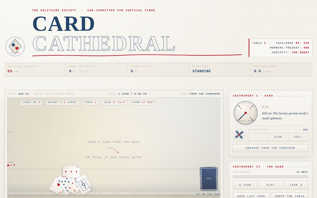
098
A six-night aurora crossing on the invented icebreaker S/A Polarvakt, sold entirely as the ship's own deck at night. Everything above the fold is one continuous physical field: aurora curtains drifting over the invented Cape Solen (68°22′N 18°51′E), their shimmer mirrored in the black sea beneath them, and the activity level belongs to the visitor, who drags a Kp dial from 0 to 9 and watches the sky answer immediately — thin green ribbons at quiet, folded and multiplied bands mid-scale, and at 8 or above a full corona fracturing from the zenith while the curtains drop to the waterline, the sea mirror stretches into long shaking columns, and the deck's storm lamp turns alarm orange. Below the deck the page reads like a shipowner's ledger: a six-night itinerary, an SVG hull profile with labelled callouts, three holdable cabin tiers, a field guide of real aurora physics, and a manifest footer that tallies claimed chairs, held cabins and the peak Kp of the session. Nordic-minimal, cold, precise and a little reverent — light Georgia serif against 10px micro-mono, cream against near-navy; the simulation does the selling, not the copy.
Open
Original prompt
Build one self-contained dark landing page that sells a six-night aurora cruise on an invented icebreaker, the S/A Polarvakt, to the invented Cape Solen (68°22′N 18°51′E). The whole page is the booking deck of that ship at night: you are standing aft, looking at the light. The tone is Nordic minimalism — cold, precise, generous with empty space, a little bit reverent, never salesy. No aurora clip art, no tourism clichés, no glassmorphism, no purple-to-cyan gradient wash. The light in the hero must be a real simulation, and every instrument on the page must actually work. PALETTE (contract hexes) #071120 night deck — page ground, sky base, sea base, hull black-blue #35D0A5 aurora green — the curtains' hot core, active states, primary rule accent #5E60CE violet veil — upper curtain falloff, the corona, quiet secondary accent #F4E9CD cabin windows — warm cream: booked windows, chair stencils, big numerals, deck lamp Supporting, always subordinate: #0B1A2B deck panel, #16283C hairline, #24405C rail, #8DA3C8 cold slate text, #E8EEF6 near-white text, #C1502E storm alarm (used only at Kp ≥ 8), #04090F water depth. TYPOGRAPHY Display: Georgia / Palatino / "Times New Roman" serif, set LIGHT and huge — the wordmark "Nightwatch" at clamp(54px, 11vw, 152px) in #F4E9CD with tracking -0.025em, and section numerals ("N01"…"N06", "117.4 m", "14 kn") at 44–96px in a 300-weight serif with tabular figures. Instruments: ui-monospace / Menlo / Consolas / "Courier New", 9.5–11px, uppercase, tracking 0.18–0.26em — coordinates, call signs, cabin numbers, Kp readouts, the tiny mono under everything. Body: system-ui at 15–17px with 1.65 line height, colour #B9C7D9. The scale contrast (10px mono against 150px serif) is the whole typographic idea. No webfonts anywhere. LAYOUT Fixed slim header: wordmark + mono position line at left, four anchor links + DECK AUDIO toggle at right. Hero = 100svh full-bleed shader canvas with the overlay arranged asymmetrically: copy block bottom-left, the Kp instrument rail at right (dial, huge numeral, quick 0–9 keys, status line), and along the bottom edge the DECK strip — a row of ten clickable deck chairs, a far headland with a lighthouse to the left, and the ship's deckhouse wall of cabin windows to the right. Below the fold, in order: ITINERARY (six nights, sticky left title, big light numerals), THE SHIP (SVG profile of the Polarvakt with labelled callouts + a spec ledger), CABINS (three price tiers as ledger panels, holdable), FIELD GUIDE (sticky aurora-lore sidebar with real physics), and a MANIFEST footer that tallies claimed chairs, held cabins and peak Kp. Mobile 360px: rail drops under the copy, deck chairs scroll horizontally in a snap row with a visible fade affordance, sticky titles unstick, nothing overlaps, zero horizontal page scroll. SIGNATURE MOMENT The sky is one continuous physical field. Drag the Kp dial to 8 or 9 and the aurora fractures: a pulsing corona bursts from the zenith — radial field-aligned rays with a violet core — the curtains multiply and drop all the way to the waterline, and the mirrored distortion in the sea stretches into long shaking columns so that the light genuinely dances down to the waterline and underneath the deck. The deck reacts with it: the storm lamp turns #C1502E, the rail status line rewrites itself, the Kp numeral grows, and the manifest logs the peak. Pushing it back to 3 settles everything. This must be visible, immediate, and real — not described in text. THE SIMULATION (WebGL first, canvas always as the honest fallback) WebGL: a fragment shader over the whole hero. Value-noise fBm, 5 octaves, domain-warped, drives four curtain layers whose vertical centres undulate; curtains are modulated by a high-frequency striation field stretched along the magnetic direction so they read as rays, with a hot #35D0A5 lower edge, green mid-body and #5E60CE violet upper falloff, plus sparse twinkling stars and a faint airglow. Below the horizon (u_horizon is measured from the DOM, so shader and deck always align) the sea mirrors the sky: sampled at (x + wobble, mirrored height), horizontally sheared by a two-frequency wave, dimmed with depth, broken by a glitter band of high-frequency noise. Kp 0–4 → thin, low, calm; Kp 5–7 → tall, folded, more layers, faster drift; Kp ≥ 8 → corona on, curtains to the waterline, reflection amplitude roughly doubled. Cap devicePixelRatio at 1.5 and total pixels at ~2.3M; pause the rAF loop whenever the hero leaves the viewport. If getContext('webgl') returns null, the page silently switches to a canvas version: the same four curtains painted as vertical gradient strips whose heights come from a JS value-noise, mirrored below the horizon with per-row shear, at half resolution upscaled for softness, driven by the same Kp state and the same rAF budget. Same interaction, same signature, no console noise. INTERACTIONS Kp DIAL — an SVG dial you drag in a circle (pointer events, works on touch) with 10 detents, role="slider" with full aria value text, arrow/Home/End/PageUp/PageDown keys, plus a row of ten real 0–9 buttons for one-tap setting. Everything eases (spring-damped) rather than snapping, and the shader, the readouts, the storm lamp and the copy all read the one smoothed value. DECK CHAIRS — ten canvas-and-wood chairs drawn in SVG, each a real button. Click one: it reclines a few degrees, a warm lamp glow blooms under it, its backrest takes a stencilled guest name in #F4E9CD ("A. LINDQVIST", "T. OKABE", "R. ØDEGAARD"…), the next cabin window in the deckhouse wall lights cream with a soft bloom, and the manifest gains a line. Click it again to release; the window dims and the stencil fades. Booking a chair while Kp ≥ 8 makes that chair's guest line add "saw the corona". CABIN TIERS — three panels (Bridgewing Suite 14 800 kr / Aurora Deck Cabin 9 200 kr / Hull Room 4 600 kr, per berth, twin occupancy, taxes in). HOLD puts a mono booking reference on the panel, lights its porthole strip, and adds it to the manifest; HOLD again releases it. DECK AUDIO — off by default, visible and focusable; synthesised only (filtered noise wind whose band and gain track Kp, plus sparse hull ticks), started on the click that requests it. Pointer parallax across the hero nudges the curtain phase a few pixels; the lighthouse sweeps; every link and button has a visible :focus-visible ring in #35D0A5 (in #F4E9CD on the dark dial). Keyboard: 0–9 set Kp anywhere on the page, M jumps to the manifest. ENTRANCE (first three seconds) The deck lights come up: a hairline of #35D0A5 sweeps the full width at the waterline, the hero copy lifts in on a slow custom cubic-bezier (0.16, 0.84, 0.24, 1) in five staggered moves, the huge serif wordmark unmasks left-to-right, the ten chairs drop onto the deck one after another with 55 ms spacing, the rail slides in from the right, and the Kp numeral counts 0 → 3 as the aurora brightens with it. Under prefers-reduced-motion the shader freezes on a composed frame, the corona stops pulsing, the chair drop and unmask resolve instantly, and every control still works. COPY Institutional and cold-blooded about detail: "VOYAGE 41 · DEPARTURE 12 JAN 21:40 · 68°22′N 18°51′E", "Six nights of standing still", itinerary nights with real-feeling times and place names (Solen Ytter, Kalvhavn, the Ice Gate, Fuglefjell), ship specs with invented-but-consistent numbers (117.4 m, 21.8 m beam, 12 400 t, Ice class PC3, two Wärtsilä diesels + azimuth pod, 14 knots), cabin tiers with berth counts and square metres, and a FIELD GUIDE sidebar of true physics: solar wind ~400 km/s, the Kp index as a 0–9 planetary magnetic index measured by ground magnetometers, O I 557.7 nm green at 100–150 km, O I 630.0 nm red above 200 km, N2 violet at the lower edge, substorm breakups, and the 1859 Carrington storm. Footer: "No. 098 of 100 — the collection's northernmost page." No lorem ipsum, no fake testimonials, no emoji.
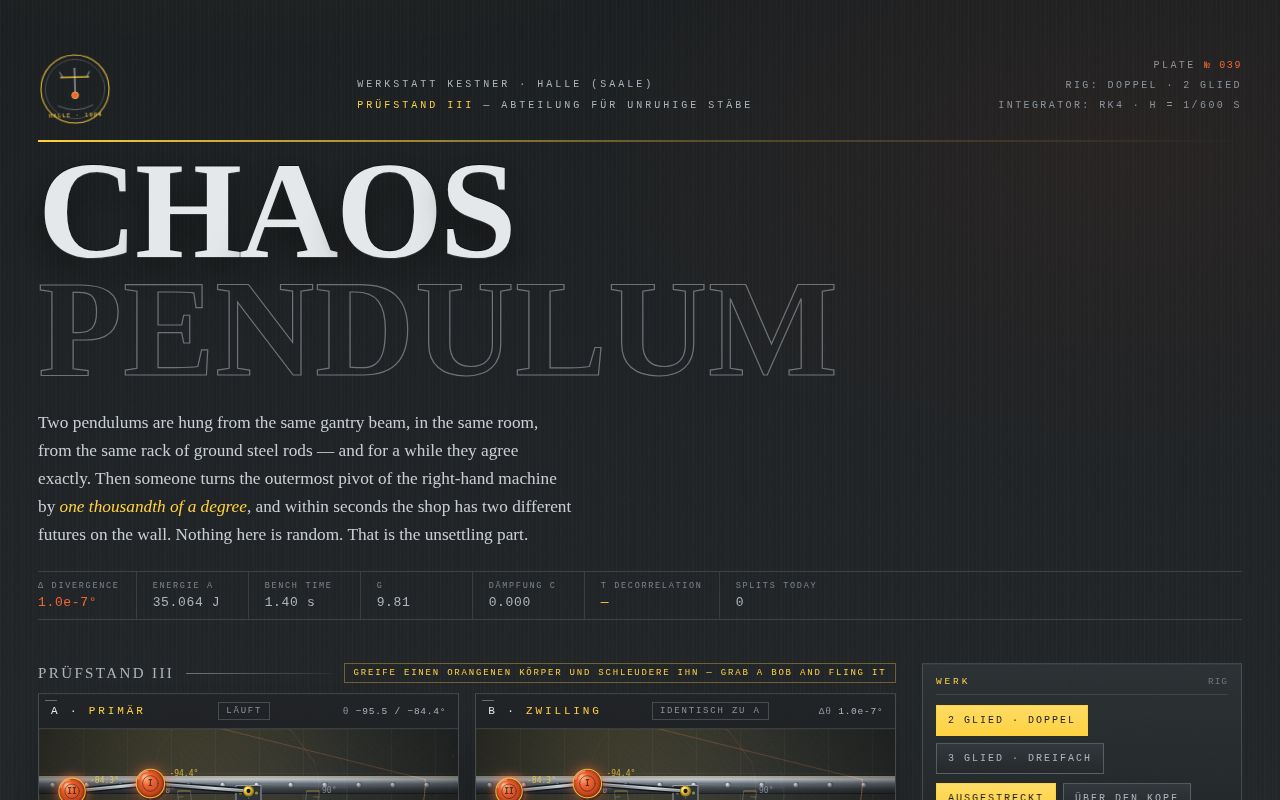
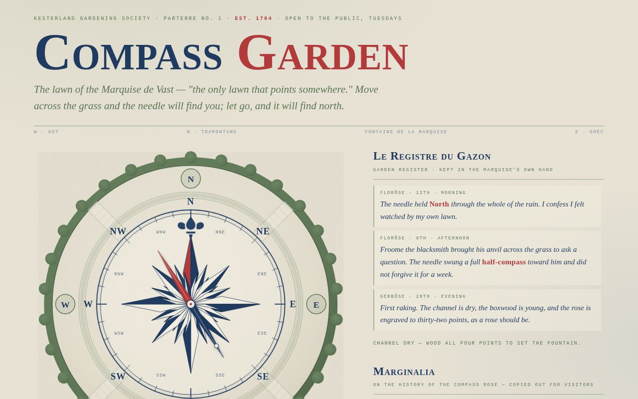
098-aurora-deck.txt
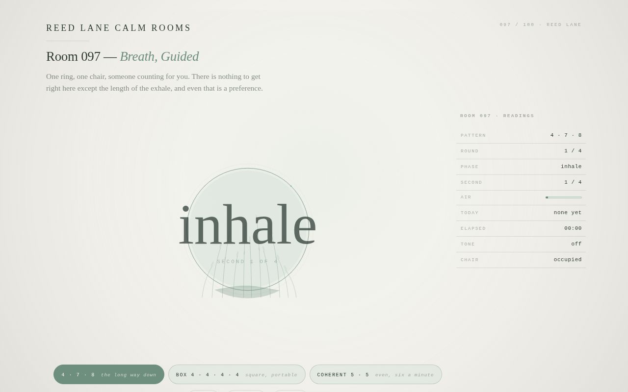
099
One long vertical plate: a Brooklyn-style fire escape at last light, drawn entirely in inline SVG and CSS over a dusk-pink sky. Three parallax planes — far sky with the milky band and a distant tower, a mid-wall of blue brick with twelve hoverable windows, and the near iron gallery with its platforms, balusters, scrollwork and stairs. Life on the escape: two laundry lines with a cream shirt, pink sheet, blue tee, pillowcase and socks that sway from their clothespins; a tabby cat with an eight-state FSM (trot, eat, groom, blink, stretch, yawn, watch, push); a geranium in a terracotta pot; a radio crate trailing SVG notes; four pigeons that flap, coo and scatter. Lighting windows turns on the street lamp and brings out stars; feeding the cat earns a "MAY BOOP" waiver; booping three times — or a random impulse after the ninth light — sets off the signature moment: the cat stretches, yawns, and nudges the pot over the railing. It falls with real gravity, grazes a platform edge, bursts into terracotta shards on the pavement, and the flower rolls to the gutter. A rain toggle drizzles canvas particles, drips the laundry, darkens the sky and rolls distant thunder. The stoop poem rewrites itself with every window lit, from a nine-word hush at zero to the cat's own apology at twelve. Sound is off by default: a Web Audio city bed of filtered traffic and bus brakes, plus a lo-fi pentatonic radio loop with crackle.
Open
Original prompt
Build one self-contained, hand-drawn SVG ambient scene: the last pink minutes of a Brooklyn evening, seen from across the court. The viewer looks at a neighbouring blue-brick wall full of dark windows, and at the fire-escape building on the right — iron scrollwork, two laundry lines with shirts that sway, a black cat on the middle platform, a terracotta geranium pot, a radio in a wooden crate, pigeons on the rail and the water tower. The mood is tender, warm, unhurried storybook-urban: a picture-book of the block, not a night club. Nothing is neon; the light is the sun that just left. PALETTE (contract hexes, non-negotiable) #F2B6A0 dusk pink — the sky body, the cat's nose, the flower petals, sheet laundry #5B7EA1 neighbour blue — the mid-ground wall you light up, distant towers, one blue shirt #2B2B33 iron black — the fire escape, stairs, railings, scrollwork, the black cat #FFD23F window-lamp amber — lit windows, cat's eyes, street lamp, sun, the tiny yellow sock Supporting, always subordinate: #FBE3C0 horizon cream, #F7E4CE paper/shirt cream, #C96F4A terracotta, #8A6F5B crate wood, #4C6C90 cornice blue, #D9BFAE warm pavement, #3E3A47 radio body. TYPOGRAPHY Display: Georgia/Palatino/Times serif. The title "Fire Escape at Dusk" in Georgia italic at clamp(34px, 6.4vw, 76px), tracking -0.02em, colour #2B2B33, with a 9.5px uppercase ui-monospace kicker "PLATE 099 · LAST-LIGHT STUDY · THE AVENUE" at 0.26em tracking above it. The stoop poem is Georgia italic 18–26px, line length capped, each line revealing on change. All button labels mono, 10.5–11px, uppercase, 0.18em tracking. Scale contrast 9px mono against 76px serif is the typographic idea. No webfonts, system stacks only. LAYOUT Warm paper page (#F7EEDF) with a fixed-feel masthead (title left, sound toggle right), then the stage: a full-width SVG scene (viewBox 0 0 1200 800, max-height 86svh, letterboxed on a pink sky panel), a canvas rain overlay pinned to it, then a control rail (Feed the Cat / Make It Rain / Boop the Cat / Sound), then the poem card ("Stoop Poem, in nine windows and a cat"), a small mono LEGEND of hints, and a colophon footer. 360px: controls wrap, poem scales, scene keeps aspect via preserveAspectRatio slice-safe meet, zero horizontal page scroll. COMPOSITION — three parallax planes FAR: #F2B6A0 sky gradient to horizon cream, low sun with a soft radial glow, drifting pastel clouds, a star field that fades in as windows light up. Drifts least with the cursor. MID: the #5B7EA1 neighbour wall (cornice, drainpipe, decorative ghost fire-escape silhouette), a rooftop water tower, one distant tower block. This wall carries the 12 hoverable windows. NEAR: the fire-escape building (dusky plum-brick #6B4A52 with patterned brickwork), the iron #2B2B33 escape — grated platforms, balusters, four spiral scrollwork flourishes, diagonal stairs, drop ladder — plus laundry lines, cat, pot, radio crate, and the street below with warm pavement, a lamp post, a hydrant, puddles. Drifts most. All three planes follow the cursor with a damped lerp (pointermove → target, rAF → eased translate in user units); with no pointer, a slow breathing drift. FIRST THREE SECONDS (entrance choreography, custom cubic-beziers, no fade-up defaults) Sky washes in → sun rises 22px and blooms → clouds slide → mid wall and near building rise from below on staggered 180ms beats (ease cubic-bezier(.16,.84,.28,1)) → the iron is DRAWN, every railing, stair and scrollwork path stroked in with stroke-dashoffset (pathLength=1) over ~1.4s → shirts drop onto the lines one by one → the cat trots in from the right and sits → title kicker, title, poem and controls stagger in last. prefers-reduced-motion: everything lands instantly, loops frozen, no flashing. INTERACTIONS 1. LIGHT THE WALL: hovering (or tapping / Enter on, keyboard focusable) a window lights it permanently — amber #FFD23F glow, sill highlight, and a tiny silhouette figure fades in: watching TV (flicker), playing sax (sway + drawn sax), watering a plant, reading with a cone lamp, on the phone. 12 windows. A mono counter "LIT n/12" ticks. Street lamp flicks on at 3, stars brighten at 6, sky deepens at 10. 2. FEED THE CAT: button — a saucer slides out along the platform on a long slow ease, the cat walks over (body bob, leg nubs), eats in dips, the saucer retracts, the cat grooms, then settles. One saucer per few minutes; the button says so. 3. MAKE IT RAIN: toggle — dusk drizzle on the canvas overlay (≈180 wind-slanted streaks, splashes under the cap), shirts get heavier sway and occasional falling drips, puddles appear with ripples, the scene cools behind a blue multiply veil, distant thunder-dot on the audio if on. 4. SOUND (off by default, visible toggle, Web Audio only, started on user gesture): a city bed — low brown-noise traffic rumble, a 55 Hz hum, occasional car passings — plus a radio snippet: a warm detuned-triangle pentatonic loop through a bandpass with AM tremolo and crackle, as if from the crate across the court. Event sounds: window ding, saucer tick, cat meow, pot crash. 5. BOOP: a transparent hotzone on the cat's pink nose; hover reveals a faint dashed ring, click/ tap/Enter boops. The cat tolerates exactly two boops (ear twitch, slow blink, tail flick) and then takes its revenge — see signature. A keyboard-accessible "Boop the Cat" button mirrors it. SIGNATURE MOMENT (must actually work, never merely described) The cat STRETCHES (front legs out, back arches, tail a high question mark), YAWNS (head tips, pink mouth opens, tiny fang, audible if sound is on), then leans over and KNOCKS THE FLOWERPOT OVER. The pot falls with real gravity physics — accel, spin, one heavy platform-edge graze, a floor bounce with correct restitution and angular velocity — then SHATTERS into 9 hand-drawn SVG terracotta shards (each with its own ballistic arc and settle) plus soil puffs and the geranium tumbling out, stem snapping to rest. The cat watches it fall, turns its head to the viewer, and blinks, unrepentant. The stoop poem gets the blame line. Trigger: the boop hotzone at the third boop, or randomly 6–14 s after the 9th window lights (once per visit either way). A "Replant the Geranium" button appears in the controls to reset the pot, soil, shards and flower. COPY DIRECTION A stoop-poem card whose verse changes with the number of lit windows (13 short verses, 0–12, tender, specific — bodega cats, the 5-4-3 bus, somebody's soup). Labels are shop-sign mono. Colophon: "Built by hand over one long Saturday evening. No stock anything. The cat is not sorry."
099-fire-escape-dusk.txt
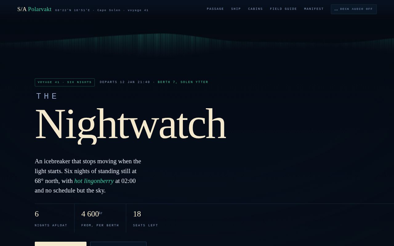
100
The page is the duty controller's desk at the Vantaa-Meridian Tramways: a light paper panel, printed rather than rendered, whose instrument is a live canvas route diagram of three loop lines — MERIDIAN in route green, RING NORRA in ink, KUST in ochre — carrying fourteen trams between cased bilingual stops, two single-track junctions with bypass chords, and a brass-gated depot. Time runs on its own and the timetable quietly degrades, so the work is headway discipline: press and hold any of the nine signals (on the canvas or in the mirrored rail) to brake the next car short of its stop and let the gap behind it close, throw a junction to the double-track loop to drain a queue, or dispatch one of three spare cars into the largest hole. About every ninety seconds a fault cascades on its own: a card slams into the CASCADE panel, a red 180-second timer starts down, the line's name goes red and the cars behind it bunch, rippling in translucent alert red along the diagram. Clear it — hold the trailing signal, drain the queue, fill the gap — and the headway board repairs itself in the signature moment: notches flip red to amber to green in a left-to-right zipper with a staggered ping, the dot-string relaxes to even spacing, and the typewriter SHIFT LOG types "ALL NOTCHES IN TOLERANCE" beside a punctuality score that starts climbing again. Every canvas affordance is also a focusable button; sound is synthesized, off by default, and the whole desk stays legible at 360px.
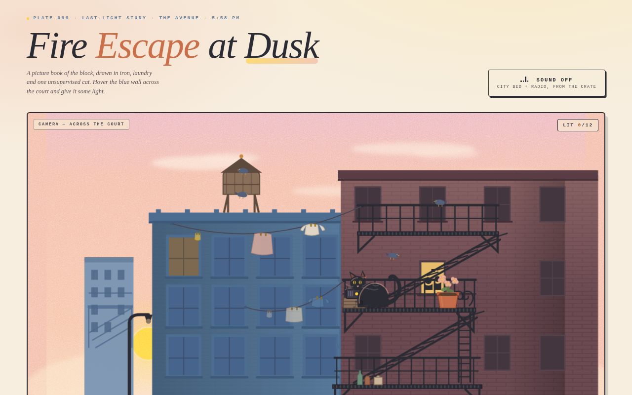
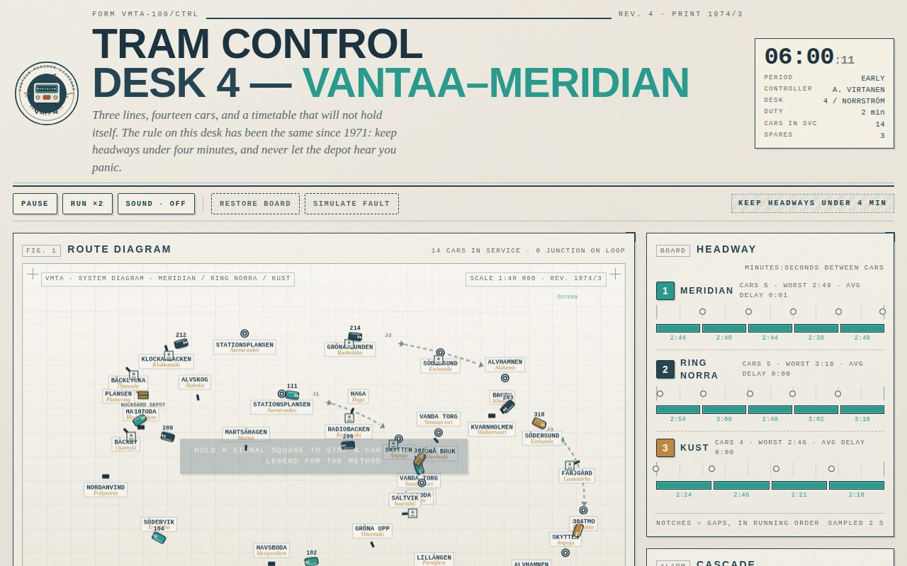
Open
Original prompt
Build one self-contained HTML page: the operating desk of the invented Vantaa-Meridian Tramways (VMTA), Form VMTA-100/CTRL, Desk 4 — a printed 1970s transit-authority control room reimagined as a live dashboard. The viewer is the duty controller. Three lines are in service, fourteen trams are running to a schedule that is quietly falling apart, and the desk rule is stencilled across the panel: KEEP HEADWAYS UNDER 4 MINUTES. Mood: paper, ink, enamel signage, relay clicks, total competence, no urgency theatre. Light page, never dark; everything looks printed, screened and stamped rather than rendered. PALETTE (contract hexes, non-negotiable) #E9E5DA control-desk paper — the page and every panel ground #2A9D8F route green — in-tolerance headways, Line 1 identity, the good state #C1502E alert red — late timers, bunched segments, out-of-tolerance notches #264653 ink — rules, letterforms, structure, Line 2 identity Supporting, always subordinate: #C08A3E ochre (Line 3), #EFECE3 printed panel, #F5F2EA paper field, #7A8C90 slate (inactive/notches/off-state), #5D6B6C label grey, #A8863C brass (crest, depot doors), #F7F3E7 plate faces, #1D3440 deep ink, #FAF8F2 stop-label plate. No fourth saturated colour; red is reserved for trouble and green for health. TYPOGRAPHY Signage: Helvetica Neue / Arial Narrow / Arial, uppercase, tight tracking for display (-0.01em) and wide tracking (0.26em) for hairline labels. Mono: ui-monospace / Menlo / Consolas / Courier New for every number, timer, board cell, log line and form footnote. Memo: Georgia italic for the supervisor's card and the colophon. Scale contrast is the idea: 9.5px mono labels against an 84px mono score and a 64px signage title. Letterforms drawn in the SVG crest are paths/text, not webfonts. LAYOUT Full-width masthead strip (ink rules top and bottom): VMTA crest left (inline SVG roundel, twin headlights, destination blind reading "DESK 4 · ROUTE CTRL", founded 1971), stacked signboard title center-left, and a mono shift card (clock, period, controller, duty minutes) right. Below: the desk grid. Main column: the canvas route diagram on a paper plate with registration marks and a corner plate reading "SCALE 1:40 000 · DIAGRAM REV. 1974/3". Under it, a printed legend strip. Then the SIGNALS rail (three rows of hold-buttons, one per line), then the ROUTE CONTROL / DEPOT / PERFORMANCE panel row. Side column: the HEADWAY BOARD (per-line dot-string + notch gauges), the CASCADE card with the giant red countdown, the SHIFT LOG typewriter, the supervisor's memo. Footer form line. At 360px everything stacks to one column, the canvas keeps its aspect, nothing scrolls sideways. THE DIAGRAM (canvas, DPR-aware, rAF) Three closed loop routes drawn as thick 3.6px round-joined strokes with 1px lighter centrelines: Line 1 MERIDIAN (green) runs the central corridor; Line 2 RING NORRA (ink) loops north and dips through the depot throat; Line 3 KUST (ochre) serves the waterfront. Stops are 3px white-faced ticks with ink borders, cased Swedish/Finnish names in 9.5px mono on paper plates (secondary name in small caps, ochre), interchange stations get a double ring, terminals a rounded cap, the depot a brass gate glyph. Junctions J1 (Bäckby throat) and J2 (Södersund) show a dashed bypass chord and a chevron point blade that turns from slate to green when thrown; the chord lights in the line colour while open. Trams are 16×9 plates in line colour with a roof bar, a running-in lamp, a heading arrow and a car number, with a soft desk shadow; they ease to stops with real deceleration, dwell, and brake when held. A bunched corridor between two trams ripples: a red translucent band with a travelling pulse rides the arc between them. Late trams get a red collar, a blinking "180 s LATE" tag and an amber queued line behind them. INTERACTIONS 1. HOLD A SIGNAL: pointerdown (or Enter/space held) on any of the nine signals, on the canvas or in the rail — the button physically depresses, a red hold band appears on the track, and the next tram eases to a stop short of that stop and waits. Release to clear. Holding the trailing tram of a pair is how you let the big gap behind it close — the real headway trick, and the core of the game. 2. FLIP A JUNCTION: MAIN is single-track, so a tram queued behind a stalled one is held at the throat (auth waits); the LOOP is double-track and has no signal, so it drains the queue — but it costs 42 s per traversal and drops line speed to 20 km/h. Throwing the switch mid-block re-ranks the queued tram and clears it within a second. 3. DISPATCH FROM THE DEPOT: three spare cars (301, 302, 303). Dispatch inserts a car into the largest gap on the chosen line (or at the depot throat if the gap is on the far side), with a departure entry typed into the log. Withdraw pulls the worst-offending car back in. A door test takes 9 s. 4. CLEAR THE BLOCK: on a cascading tram, press and hold its card for 1.5 s (the card ring fills, the canvas tag counts down) to cut a 48–78 s fault short. Tapping a tram anywhere selects it and opens its card. 5. DESK CONTROLS: PAUSE, RUN AT ×2, SOUND (off by default, Web Audio only, started on that gesture — relay clack, signal thunk, bell cadence, dispatch chime, cascade klaxon, log tick, a 90 Hz desk hum), RESTORE (sets everything back to a clean board with a logged entry). SIGNATURE MOMENT (must actually work) A cascade begins on its own about every 90 seconds: a card slams into the CASCADE panel, the car number stamps in, and a red mono timer starts at 180 s and counts down; the affected line's name lights red and the trams behind it queue and bunch, rippling red along the diagram. Fix it — hold the trailing signal, drain the queue through a junction, dispatch into the hole it left — and the headway board fixes itself visibly: notches flip from red to amber to green one after another in a left-to-right zipper with a staggered ping, the dot-string relaxes to even spacing, the ripple collapses, and the log types "ALL NOTCHES IN TOLERANCE". The cascade card stamps CLEARED and slides out, and the punctuality score starts climbing again. COPY DIRECTION Invented but utterly straight-faced: bilingual stop names (BÄCKBY / Ojanhylä, HAVSBODA / Meriporthem, SÖDERSUND / Etelsunda, NORDANVIND / Pohjavirta…), car numbers 1xx/2xx/3xx by line, real causes of delay ("PROPERTY DEFECT — DOOR 3", "PASSENGER OBSTRUCTION", "SIGNAL FAILURE AT SÖDERSUND"), operator voice in the log ("GAP TO 301 = 4:12"), a supervisor's memo signed "R. Halme, Duty Manager, 1974", a tip card that rotates through six real operating strategies as the score improves.
100-tram-control.txt
No studies match that search.